Transcripts
1. Intro: Have a character in your
head for your world, but you're not exactly sure
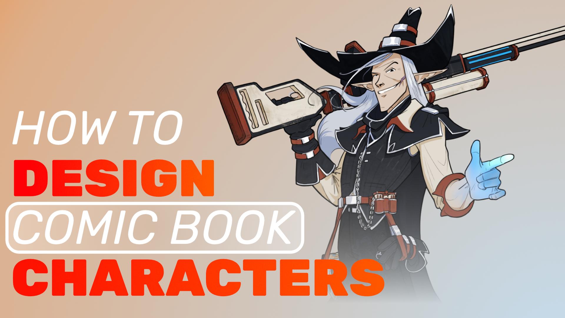
how to get it out onto paper, my how to design a comic book character
course is for you. I'm Triple Jazz, a
working professional in the AA video game space. And for the last
couple of years, I've been working on
my very own personal comic book called Magic Punk. And I have to tell you, one
of my favorite parts of designing this world has been
designing the characters. So I want to walk you through my ideation process
from concept to sketch to final presentation of how I design my characters. Going to cover the basics
of design principles with chapters dedicated to shape language and color theory. I'll give you basic tips on
anatomy, posing and gesture. Then we'll move into
some tips and to dos for clean line art, rendering
and presentation. Various chapters will also have accompanying
assignments you'll be encouraged to complete as
you move through the course. I look forward to seeing
what characters you bring to life by the
end of this course. Now, go and make good art.
2. 1-1 Design Principles: Are the design principles. These rules describe
most of art making. Knowing these, mastering,
and studying them will seep into all aspects of
your art making endeavors. It is vital to know these, but you have to know the
rules before you break them. The first principle is balance. This is the distribution of
visual weight in a work, and it can be symmetrical, evenly balanced as seen here. It can be radial
arranged in a circle or even asymmetrical balance
through contrast, which leads directly into the next principle,
which is proportion. Creating contrast through sizing relationships
between elements. You can also think of these
as big, medium and small, which I'll dive
more into later at the end of this section and also in the shape language section. I'm going to be hammering
home big medium, small, all throughout
the course. We have patterns, which are repeated elements,
whether shapes, lines or colors to
create consistency or decoration. Next is contrast. The use of opposing
elements, light versus dark, smooth versus rough,
large versus small, to create visual interest
and draw attention. Emphasis uses contrast to draw attention to a particular area or element as a focal point. Variety is the use of different
elements and principles to create visual interest
and avoid monotony. Rhythm and movement
use lines, edges, shapes and colors to
guide the viewers eyes throughout a design. And lastly, harmony
when all the parts of the artwork feel cohesive and
work together as a whole. These principles
directly influence composition and Totimage making, and character design is a
compositional challenge. To simplify, you can think of all these principles
in two buckets. They're just handy
tools to create either contrast or gesture. Here are a couple more principles
to consider big medium, small or the one,
two, three read. This describes a deliberate
use of scaling elements to grab a viewer's attention
in a descending order, starting with big, moving to
medium, and finally small. In character design, we
want elements to be broken up in three harmonized
chunks of unequal scale, a big shape, a medium
shape, and a small shape. Also, think of the
PretoPrinciple, or Preto's law. This is the 80 20 rule. The vital few, the trivial many, or perhaps it's the 70
30 or the 60 40 rule. Different artists use
different ratios, but the principle is the same. This ratio in character
design helps guide where to keep something
busy versus areas of rest. We either need to create
a character that's 80% busy with 20% areas of rest or inversely create a
character that's largely plain except for a small portion of its design that's noisy. It has to be a conscious
choice, though. We need to focus on the vital few elements of a
character that stand out, and the rest could
be a trivial many. Creating something that's
too noisy, for example, with not enough rest is
kind of irritating to look at while creating something too plain is just uninteresting. Next, we'll talk
about how to utilize these principles to
make pleasing shapes. Your assignment for this
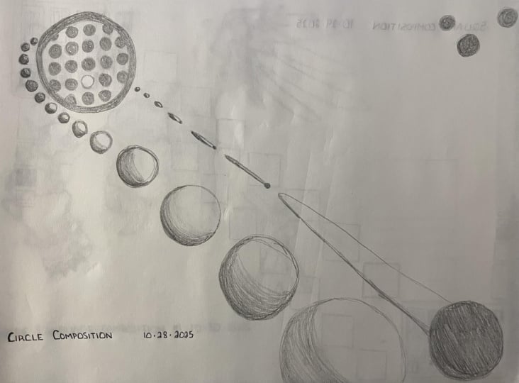
lesson is to practice design principles by creating three different 16 by
nine compositions, one using circles,
one using squares, and one using triangles. Think about big medium, small relationships,
contrast and gesture.
3. 1-2 Shape Language: The first question
to really answer is, what is shape language? Here's my definition. Shape language is
the repeated use of a shape's essence throughout a work to create a
cohesive design. Like a leap motif in music, it's a repeated use of a visual motif
throughout a design. All Toti image making can
be reduced to shapes. Compositions, lighting
shadows, lines, everything we do is in
service of arranging these basic shapes
in pleasing ways. But how do we create
pleasing appealing shapes? In the last chapter, we
cover design principles. Here are a few
more principles to keep in mind when it
comes to making shapes. First, the three
basic shapes are circle, square, and triangle. And just like colors, shapes also express something. They have an inherent quality to them that the viewer and
audience resonate with. Circles, for example, are
friendly comfy shapes, representing larger than
life characters who could wrap you in their arms or
smile with large cheeks. It's not impossible to make
villains out of circles, but it's certainly difficult and a little bit more subversive. Remember, we have to know the
rules to break the rules. Squares are sturdy, maybe the standard banner waving hero or the immovable, large brute. They speak to objects
that are hard to move and things that are strong and tough like a
building or a brick. Triangles are sharp and pointy, a character who is quick,
aggressive, lethal, agile. Swords, knives, daggers, all
these things have triangles. They imply some amount
of precision and speed. By combining different shapes, each with its own
meaning, you can evoke different aspects of
a character's personality. So think about that
as you combine shapes to create new characters. Then we have big
medium and small. We've talked about this already in the design
principles portion, but shapes can also come in
big medium, small sizes. You can also think
of these as primary, secondary, and tertiary shapes, or principally, this is just moving from simple to complex, from big to small. We always want to think big
and zoom into the details. And again, this applies
just beyond shape making. This goes into color theory, into compositional reads, and basically anything else
visual art related. This is a crucial principle
to understand, study, and be conscious of as you make creative decisions because it adds variety and
visual interest, and things that are
too even or too balanced or all the same
shape just look boring, and we want to create interest both for the audience
and ourselves. So what are some other
ways we can modify shapes? I'm going to do a
demo real quick, Insight Affinity Designer, which is a vector based program. And I just want to
use this to show you some ways you can think about modifying shapes
as you draw them. All shapes are made up of
lines of one of these types. I just think of it as ICS lines. This is our straight line,
our C curve, and our S curve. In combination, these can create a variety of
different shapes, and we want to use a variety
of ICS to create shapes. Now, the three basic
shapes that we have to start with were once again,
circle, square triangle. But we can play
with these shapes. For example, we can taper
a shape pinch its ends, and now we have a trapezoid. Or in a triangle, we can also taper it and squish it down. We can also squash
and stretch shapes. We can also push shapes. So instead of having an
equilateral triangle here, we can start to
move its point over and over and over as it
creates more and more tension. And now this shape
doesn't just imply something that's perfectly
even and sturdy. It applies almost a shape that's moving in some direction. Likewise, for an ellipse, we can squash and stretch it. We can shear it and extend it. Basically to push shapes means to exaggerate them
in some capacity. We don't want to just
create boring shapes. We want to create
something that's visually interesting and to create
visually interesting things is to create shapes
that are slightly exaggerated and have
some variety to them. We can also use other
shapes to carve shapes. So, for example, I could
start carving circles into this square and create a whole new shape
just by thinking of the negative shapes rather than just thinking of
what the basic shape is. Think of other ways
you can introduce shapes to either add
or subtract from them. We can create a variety of new shapes by simply subtracting and adding
shapes together. And again, I'm just showing
you this in a vector program, but I want you to be
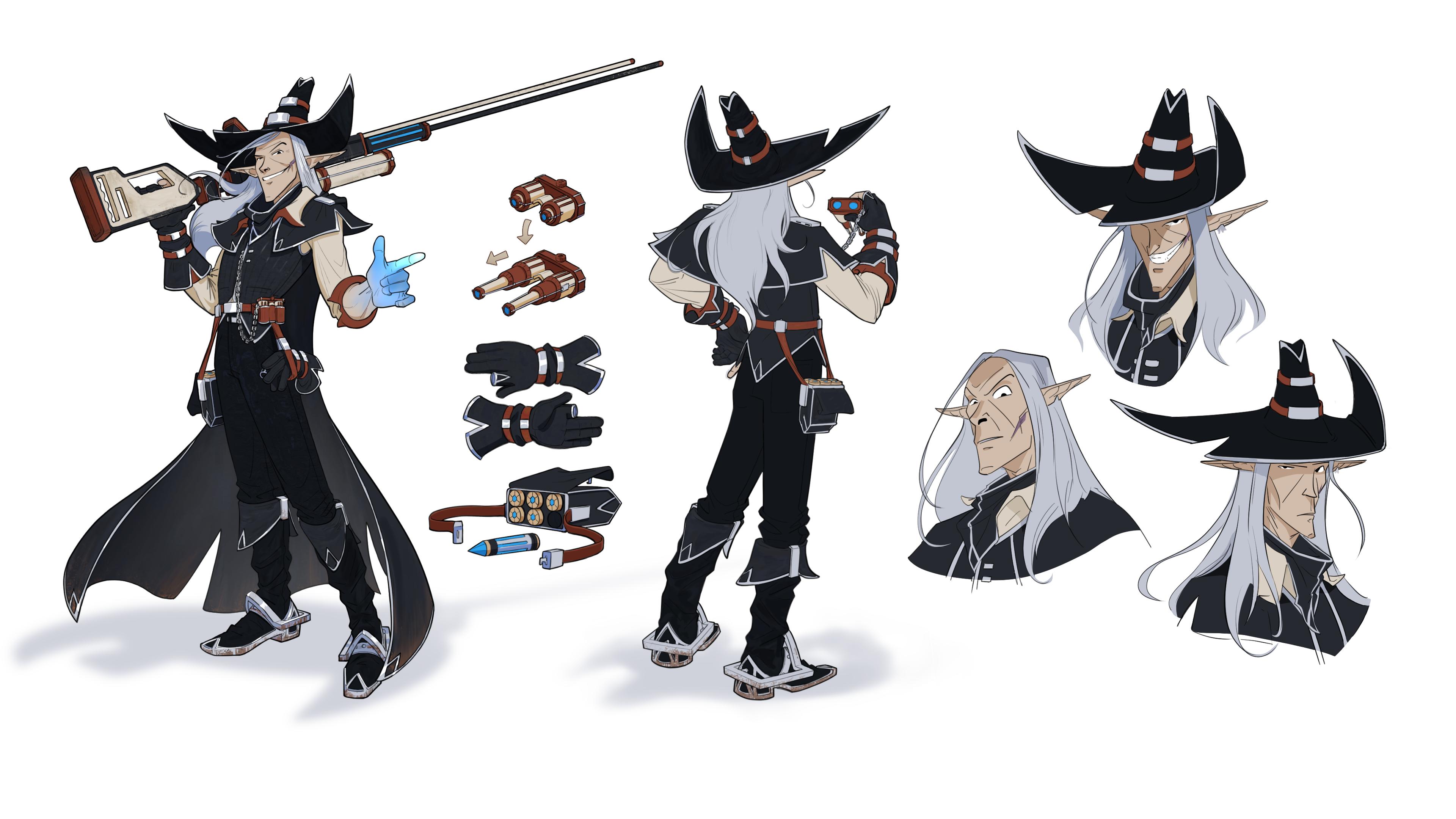
conscious of this as you make shapes with line. So let's take Scarper
here, for example. He's going to be the
character that I'm going to be making
from start to finish. But here he is in
his final form and his foundational shape,
it's a triangle. Everything about Scarper
relied on a triangle, and I took it one step
further, and I said, What if it was a bit more of a curved triangle?
Like an archway. And so this shape is repeated
all throughout his design. To the chip in his hat, to the filigree on his outfit and his boots,
and even his cape. I knew I wanted this
character to look lethal. He needed to be villainous. Now, of course, he
still looks friendly. He's got a smile on, but can
you trust him? Probably not. And, of course, the dark
clothing as well kind of sets him apart as someone not
exactly to be trusted. But really, if I had
rounded out all his shapes, he would have lost a lot of
that villainous intrigue that comes with something that looks sharp, pointy,
and aggressive. And even when thinking macro, I knew I wanted his body type
to be from the top down, even the shape of his face. While, all my characters
have pointy ears. That's just a rule I have
for myself in my world. Everyone has pointy
ears of some kind. There's no humans allowed. So that's kind of a given. But Scarper's face
and his whole body is shifted to look like
an aggressive triangle. And again, this is by design. Now, we don't want
to get too bogged down into a single shape, right? There's still so many
other things to solve. So the fact that I introduced
other kinds of shapes like these more sturdy rectangular
pieces that function as decoration for parts of him
create little contrast, but they don't upset the story
of the character at all. And even his gun his gun
is a lot more brick like. There's some story
related reasons for that we'll get into later. But the story drives the shape. What is this character?
What is their background? What is their story? He's
tall, sharp, aggressive. He needs to look villainous, and he also needs to have all this functional wear on him. To create your own
shape language, simply pick a basic shape, modify it, and repeat it as a visual motif
throughout your design. You can extrapolate
from the base shape you made to make more
complicated shapes, thereby using shape language to inform more shape language, and this creates a style guide. Remember to keep in
mind also big medium, small, to create
interesting shapes, we need to keep all
the design principles in mind to create
appealing, pleasing shapes. Shape language involves the
use of all of these things. We want to create
interesting shapes that are exaggerated We want all the pieces and all the shapes we
use to feel like they're part of the same visual family. That's what it means
to repeat its essence. It's all in the same family. If you're going to
make a triangle with circles carved out of it, then this needs
to be repeated in the weaponry and
parts of the clothes, we are keeping the ethos and the essence of this
shape throughout the design. And that's what I did
with Scarper here. The essence of this
is this archway here. It provides direction.
It looks lethal. It looks like the
end of a bullet. There are a lot of reasons
why this shape works. And part of the reason is using
it throughout his design, unifies this character to look like he got his costume
all from the same place. And the nice thing
is, is once you pick a shape and you
build a shape language, the rest of the design sort of just comes
together on its own, because the hard
part is creating a pleasing shape and then knowing when
and where to use it. But once you have
a shape in mind, you can start to think,
Where can I use this? Where does this
belong, and it'll help you create your
big medium and small. Lines, as well can create
big medium, small shapes. Remember, we talked
about the three basic line types, ICS. Well, you can create
boring ICS lines. Well, how do you do that? Well, one way is by always using a predictable line. This
just becomes boring. Instead, think
about ways that you can exaggerate your ICS lines, thereby not just
making something even, but something that's
slightly off centered with a big medium and small
even inside the line. We have our big
medium, small, big, medium, small, you can do that all throughout your
shape creation process. And by combining IC and S, we can create entirely
new shapes ICS ICS. ICS. So think about
ways that you can combine these to create really
interesting new shapes. Think of basic shapes, think of your lines that you
have available to you. Try to avoid shapes that
are even right next to each other or even in
distance across from each other. Try and offset the
balance in some way. Even when it comes to
drawing characters, everything can begin to
have very similar shapes. And this is just the way
anatomy works, right? But we want to avoid that by making something a little
bit more interesting. So pick one of these
to exaggerate. When you make creative decisions like this about your shapes, you create visual interest,
and people can tell. Even when it comes to
creating characters, it's super easy to
fall into a trap of evenly spaced elements. Instead, think about
big, medium, small. Lines and other shapes
break up existing shapes. When a character
comes to this point and everything is evenly spaced, at some point, we need
to make a decision. Something about
this design isn't working because it's repetitive. We have too many medium chunks
right next to each other. So we can use other lines and other shapes to break
up existing shapes. And think of this dynamically. We can move shapes up and down. Let's just say that I
move this piece down, and I just want the character
wearing smaller boots. So by simply paying attention
and being conscious of the shapes that we're making from macro to a micro level, we can create big medium, small, create a variety of interest, and create appealing characters. Your assignment is to create two pages of free handed drawings, focusing on pleasing shapes that have deliberate
shape language, whether that's a circle,
triangle or square, and big medium, small
portions to them. You can do this in
clumps of three shapes or focus on one shape that
has all this in mind. I hope you enjoy this
assignment. It's very relaxing. It might take you
a couple hours. Be very deliberate with
the shapes you're making. This should not be Willy Nilly. You can even copy
from other artists or franchises that you enjoy and focus on how they're using
shapes to create big, medium, small, and use a family of shapes to
create a cohesive design. My favorite places to
study shape language is from the incredible
artists over at Right. Games. If you go to the Mapp room Tera on the
Legal Legends website, you can begin to explore how shape language influences and creates cohesive cultures across this imaginary world. Just as one example,
here in Damasia, everything is this
sort of heightened, elegant, religious order. And so there's this wing like shape language
throughout everything, throughout the structures and the ornaments and the armor, even the weaponry,
everything has an organic gestural
quality to it, because the shape language
you can even see here on this helmet here
is that of a wing. There's not a lot of
straight parallel lines. In fact, a lot of lines actually taper together in
organic curves. So again, study your
favorite artists and what they do or your favorite
franchises and really pay attention to the shapes
that they're using to tell the bigger story
and how those shapes create cohesive visual locations and cultures and characters.
4. 1-2b Shape Language Demo: I understand shape language can be really difficult
to get a grasp on. It's a really ambiguous concept. It's one of those heavy intuitive you just have to learn as you go
type of things. So even though I
can point it out to you over and over
and over again, it might just be
most helpful to see some examples and then have a short demonstration where
you can follow along and see the thought
process that goes into building shape language. The second thing I want
to tackle here is just to remember that there are
more than just three shapes. The primary shapes are
circles, triangles, and squares, but there's
also pentagons, hexagons, septagons and octagons, and all of those evoke different things for
different people, and they can speak to
different parts of a culture or a character
that you create. So here's a pretty clear cut example of a circular character, a triangular character,
and a square character. Each one evokes a
different emotion based on the shape
language they use. But even the circular
ogre character, he still looks menacing, despite him having softer
looking shapes. Now, keep in mind
the characters that I'm showing you are
highly exaggerated, but they're exaggerated to get the point across very clearly. This is clearly a
circular character on the left, the
one in the middle, very obviously a triangle, the one on the right, very
sturdy, very squarish. It's important to know
how to push yourself far so you can always restrain
yourself and come back. I also want to
tackle another thing that I have yet to address, which is actually applying the design principles to
characters in a practical way. And one of the ways people
do this most often is by creating contrast and
asymmetry in a character. You're often going to see this in characters where there's a Padron on one side of the character, but
not on the other. This is a very, very common, almost trope in character
design to put a Padron or some sort of cape hanging over the shoulder on one side of
the character versus another. So you can see in this
ogre character here, he's got this
pauldron over here, and there's none on this side. In this sharper
looking character, he's got these feathers
hanging off his shoulder. And for this brute
guy, the asymmetry is created by the shield taking up the majority of his
character frame. So that's just something I
want you to be conscious of as you see other character
signs out in the wild. It's very easy to fall into symmetry when
creating characters. And so while it is trophy and
kind of almost predictable, there is something to be
said about offsetting a character's silhouette
in some capacity. Maybe you cut off an arm
and give them a cyborg arm, you know, a cybernetic arm. Maybe the leg is the
cybernetic offset. But whatever you
want to do, there's some amount of asymmetry
going on in your character, and it instantly creates contrast because a totally
symmetrical character, while scientifically is
more visually pleasing to us to have symmetrical faces
and symmetrical appearances, it creates a lot less interest. This is why a lot
of time character's hair is falling to one side, looking for ways to not create totally predictable
looking characters. But what I really want to show you is how to actually think through shape language and
pull from various objects. So here I have this photo
that I took of a crystal, and it has all these
interesting shapes going on. And I'm just going to pull
apart some shapes that I'm gleaning from
looking at this, and I'm going to show you how to manipulate them and build characters and worlds from a basic shape
language like this. So we have the shapes
of the light here. We have the actual
shape of the crystal. We have the silhouette
of the crystal. If I had to guess,
this is a hexagon. So the front of the crystal or top down view would
look something like that. When we stretch
out this hexagon, we can build all sorts
of shapes off of this. We could build structures from We could build
shoulder padrons for a character and other
parts of the armor. So as you think of a primary
shape to build off of, think about ways that you can, again, use it as a visual motif. What about this
crystalline language can we use to build more
structures out of to evoke maybe a people who worship crystals or
are around crystals. Think about how you can
exaggerate these properties. Remember, it's a hexagon, so as long as it has six sides, it's kind of fair game. Right? Pulling lines, like I did right here
on the building, pulling lines from
this shape language. You don't always have to
include the entire shape. Sometimes just a little echo of the shape would be enough to evoke that shape language. That's what we're looking to do. We're looking to evoke an echo of the same family
of this shape. This is how you build
shape language, right? You pick one shape,
you break it apart, and you reuse it
and modify it in different ways that stay consistent within the family,
the shape that it is. Think about how
shapes appear from the side as well from the top. Because all these things can
be combined, rearranged, stretched, morphed,
tapered, whatever you want, big, medium, small, arranged in asymmetrical, contrasting
harmonious ways, there's so many things you can
do with shapes that create interesting locations
and characters and appealing locations
and characters. And it all starts
with fundamentally sticking with a shape language. So hopefully, you can see
how just me doing this very quickly instantly creates
so many ideas and opportunities to build
off of when just using a single reference and just pulling a bunch
of shapes from that. Your assignment, I want you to go and find an object
in the real world, take a photo of it, and build
shape language from it. Things like plants in your
backyard, the grass, flowers, something that
piques your interest in terms of how it
looks and break it down piece by piece and push
yourself as much as you can to create a shape language
sheet from this photo.
5. 1-3Color Theory: Basic color theory creates the color wheel. It goes
something like this. The foundational colors are
called the primary colors, red, yellow, and blue. Combining these
between themselves results in the secondary colors, purple, orange and green. Interspersed as
gradations between these six are known as
tertiary colors. And together, this is
called the color wheel. We have a few terms to describe the relationships between
colors called color schemes. Analogous colors
are colors that are adjacent to one another
on the color wheel. Complementary colors are colors
that sit across from one another or opposites of one
another on the color wheel. Split complimentary takes
the analogous colors of a complimentary
color on either side. Triadic colors are three colors equally spaced on
the color wheel. Colors also have an
inherent grayscale value. This applies more to
an understanding of light and shadow, but
it's worth mentioning. Combining analogous
colors with a variety of values results in a
monochromatic color scheme. For simplification, we can
reduce all colors into two groups called warm
and cool temperatures. Cool colors make us
feel sad or alone, calm, or even chilled,
hence the name. Warmer tones can lighten
a scene's mood or make it scary through a proper
use of fire like imagery, almost Doomsday,
apocalyptic feel. Colors as well have emotions
and meanings tied to them. They make statements.
They tell a story. Purple, for example,
means royalty, Affuence. Red evokes passion, anger, fire. Green can be envy, wealth or an earthy rural feel. Blue can be sad, quiet, remind us of
water, something calming. Yellow is happy, spunky, joyful, or even gold and money. Even values can evoke emotions. White is clean, new and bright, Black is serious,
depressing, sombre. Because shapes and colors both have archetypes and meanings, when we combine them, they start to take on the form
of characters. Putting specific colors on characters should enhance
their existing archetype, hero, villain, side
kick, et cetera. Creating a proper color palette involves starting
with the story of the character and applying good contrast between warm
and cool temperatures. Some cheat sheet
palettes involve using those principles
we talked about earlier, as well as some helpful tools. We have a big medium
small palette, so we think about
the primary color, a secondary color,
and a tertiary color in descending order. The 80 20 palette, one color dominates
the conversation, and there's a small color
that acts as an accent. We can use tools
like the color wheel by Figma to generate color palettes and experiment with different types
of color schemes. Some drawing programs,
including Procreate, have built in color
palette generators in their color wheels. Your assignment is to create three different color
palettes that fit the story of the
character you're going to be making in the
rest of the course.
6. 1-4The Foundation: This is the foundation
of all good art making, and it's not a
technical principle. It's not a design principle. It's actually something that every human being
fundamentally understands, and that is story. When you see a drawing, what you're seeing is
the tip of the iceberg when it comes to everything
else that preceded it. A good drawing is dictated
by a good design. The drawing is the
final product. Before we get to the drawing,
we have to design it. And before we design it, we have to determine
what the function is. So function is going to
inform what the design is. There are other schools of thought on how to
design something. For example, if you
think of Apple products, Apple products are
not functional. And this is not a
value judgment on it. This is simply that the product in the end result is trying to hide as many bells
and whistles as possible versus a
functional design, lets you see all the
bells and whistles, it lets you see all the screws
Apple as just one example, does its best to hide
all the functionality. But I believe function
is the best way to design appealing characters and appealing vehicles and guns. And emotion guides the
function, meaning, what do we want the
audience to take away from seeing this object? And it could be something
as simple as a barrel in the corner of your
character's workshop. The emotion of whatever the workshop is supposed
to be dictates, then the function of that object and then the design
and then the drawing. And finally, what
guides the emotion? It's story. Story telling is the foundation of
all good design. So you need to ask yourself,
what is your story? What is the purpose of this
character you're gonna make? Next, you need to determine
what the genre is. Is this sci fi fantasy, something in between, steampunk? And what type of world does
this character inhabit? Next, you want to figure
out, is this more realistic or is
it more cartoony? Are we going for
stylized realism? Are we going for
stylized fantasy? We need to determine what the genre is and where
this character belongs, which then dictates the setting. What is the background
of this character? What region of the world
are they a part of? Are they a local or a nomad? Try to approach this
from the standpoint of knowing your
character as a person. What are their
personality quirks? What about them if you
met them would stand out? So just as an
example, Scarper is a part of my comic book
world called Magic Punk. It's a sci fi fantasy
romp about a mage who abandons his heir
to the Weaver Imperium, which is effectively
the Mj'sGildT find a mythical person
called the ambassador, starting a chain reaction
to hunt him down. Scarper is a villain
and an antagonist. He's from the Dreglins,
an elite assassin for the Mafiosos who run the
town called the Marauders. He's a smiling, gun toting
boots clean type of killer, and he is sent to find Machi. Start by writing some key words down about this character. You can write down a
series of words or use a mindmap to help explore
some concepts for yourself. Mind map is a helpful tool
in your designer tool belt. It's essentially a stream
of consciousness diagram showing all these different
parts of a character, location, or idea you
have, and how they relate. Simply write down
the core concept and start attaching
descriptions, thoughts, meanings or
emotions you have to this. Then as you write down one, more are going to come to mind, resulting in a spider web like formation with the core
idea at the center. You can use mindmaps to answer
all sorts of questions, but the most important
questions for a character in regards
to the story are who, what, where, when, why, and how. An example, in my case, Scarper is tall, thin, and sharp from head to toe. He's a villain. He's
a trained assassin. He's good at his job
and he's classy. His attire speak to his particularity and
his professionalism. Who is Scarper? What is villain? He's hired to take
out the protagonist. Where is Scarper
from? He sent from the Dragln Marauders out
into the wasteland to find Machi When near the
end of the first part of the story as the
final confrontation. Why? To prevent
Mache from reaching the dragons by request
of the Don techs. How? Using his sniper rifle and a gang of thugs he
brings with him. This is all story related stuff, but motivations
are important for telling a good story
and having good drama. You can do this for a whole
host of characters or even to build a culture
of imaginary people. Your assignment is to come up with a story for
this character. Choose your genre,
answer who, what, where, when, why, and how about this character or your
set of characters. Bonus is to make a mind map. Now that the story is in place, we can finally design
this character.
7. 2-1 Exploration: Before I show you my process for designing
this character, I'm going to go over a couple of concept art techniques
that you can use to help you get ideas out. So the first one is
called shape carving. You might have heard of this in some capacity, but effectively, what you do is you start with the big shape of the character or creature,
whatever you're designing. The big shape being the
silhouette of the character. And a silhouette is a very important primary
read for a character. Many characters that
you think of are iconic because of the instant
recognizability of them. Basically redrawing Scarper here just for demonstration purposes. And from here, you
could lock your layer using the lock transparency
tool or create a new layer on top and clip it I prefer to just lock my layers once I get a
few thumbnails going, and now I'm going
to carve into it. Or you can work without the carving and just
use black and white. I prefer to use kind
of a medium gray, and now I'm going to go in and start making secondary shapes. And don't be afraid
to reuse a concept. So if you scale this down,
move it off to the side, duplicate it by holding Alt and dragging it,
maybe from here, we do another variation
where I don't know, maybe the hat is not
as white on the sides, and it goes, maybe it's taller, and there's no Padrons here. And instead he has,
like, larger gauntlets. Maybe he doesn't have
a cape this time. Maybe he has, like, a cape
on his shoulder right here. You know, that's really
the heart of concept art is just asking the question, what if? What if the
character did this? What if he had this? What
if they looked this way? What if the What if their story went this direction instead
of that direction? So you can quickly
create a variety of characters using this
shape carving method. It's the method I'm going to
be using mostly for scarper just because I wanted to practice it for my
own characters. A couple other
considerations when it comes to the shape carving
method is the type of brush that you use and other tools you can
use to help you carve. So I've just found
that certain brushes make certain shapes that I like, and other brushes don't
make shapes that I like. So the tip of the brush informs what shape
you're actually making. And this is really
important because your personal preference and
what your goal is when it comes to designing a creature or character might conflict with the type of brush you're using, and you're going to be
fighting your tool more than enjoying the process of carving these shapes
and exploring. You can download my brush
pack for Clip Studio Paint. It comes with the course. Use these brushes.
Here's one of them. The Ellipse Carver is one of my tools that
I really prefer. You get this nice
flat look and also this sort of tapered round edge. I don't really like the feel
of a hard round brush and carving with just not giving
me the shapes that I want, and I feel like I'm fighting
this brush too much. Also, remember that you can just erase to help you
create shapes as well. So by erasing, remember back to the design
principles phase, we can carve into shapes
to create more shapes. As I'm laying down new shapes, I can also erase shapes
to create new shapes. The next brush I really
like is this solid carver, and it has more of a
brushy look to but again, it gets that nice thin
flat tip near the top, and then it can create kind
of more chunkier shapes if I need to by just pressing
down a little bit more. And then this is
the chalky carver, which also is the same thing as the solid carver shape wise, but it's a little bit softer. It has a little bit more texture to it as you place it down. And lastly, a lot of
people like using the Lasso tool to create shapes. And Clpsiopain has
the lasso fill, which allows you to
just make a selection, and it fills it
in automatically. So this is a very quick way to create shapes and start
designing characters. I'm bringing these up
to add more tools to your tool belt as you
work through things. You might find that you
prefer all sorts of different types of brushes
as you work through them. And for me, I don't
want to fight the tool. I want to enjoy the process. So finding the right tool
for me is very important. And I found that
the Lasso fill and the solid carver are some of
my favorite tools to shape, carve with and
create shapes with. Another method that
I like is similar, but if you're
someone like me who likes drawing and
actually sketching, then you might resonate
more with this. What we do instead is just
focus on the silhouette again. But I'm going to turn
this down to about 25%. I'm going to use a bit
of a softer brush. And now, it just feels
like I'm using almost like a wet marker to gesture
out this character. And it feels a lot less
committed because I'm not getting those dark values
on the page immediately. It feels like I'm
still in sketch mode. I'm still exploring what this
character could be like. I'm not worried too much
about anatomy right now. Mostly focusing on just capturing a humanoid
looking character that I can start ideating off of that will give me a
strong silhouette. Actually, maybe I make
his legs small, you know, maybe he's short and his
arm is as long as his body. And so from here, what you would do is create a new layer, and now you can
go in and you can sketch on top of this as sort of a structural lattice
that you can place things off of a
scaffolding of sorts. So you're not just totally
intimidated by the white page, but instead, you have this
some shape to work off of. And I actually like working this way for
hard surface design. So you're going to see
me use this when it comes to designing the vehicle. We'll cover anatomy
in a little bit, at least briefly, because
it is an important, crucial part of
character design. But right now, you know, I still want to be
focused on what is the story of this character. I have no idea what this
character looks like, you know? I'm
trying to find out. I'm exploring what they
could potentially look like. So that's another method.
And the third and final way is just regular sketching. The default round brrush is just the thing I
keep going back to because it just
leaves so much room for moving shapes around
and lines around. And I'm just exploring this character working
fast and loose. To get some idea on the page. And this is not, for
me, a finished drawing. This is not what I would
use as presentation. This is simply an idea. Kind of like this shape
that was going on here, you know? What if
I continue that? Just I got this oval
shape language going on. What if I just kept using that. And so the first thing we
want to do is capture ideas. And these three methods I
find the most helpful to toggle between when it comes
to communicating ideas. They're just things
in my toolbg I have in my artist's
tool belt that I can use and whip out at any time to just help me generate ideas. Sometimes it's drawing,
sometimes it's shape carving, sometimes it's just
silhouette and pencil. You just never know
what you can create and what you can find by exploring with these
different methods. So now we're going
to get into the actual meat and potatoes of Scarper and how
exactly he came about. Want to spend the most time
on the design portion. This is the most important part. Don't rush through this. Earn to enjoy the process of
designing things. And the easiest way to start with that is just
the general shape. What is the overall shape you
want the character to have? What is the silhouette
of the character? Let's spend some time exploring potentially how
this character could look. And so, before we move on to the details and
their clothing and the materials and all those bits and bobs that the character is going to have attached them, what is the first read
of the character? So let's spend some time
creating silhouette thumbnail. And something that's always
helpful for designing characters is putting
together a mood board. Put together a couple
pieces on a moodboard. However you want to
collect a moodboard, I like using pure ref, grab a couple
pieces of clothing, some detailed images and
maybe material close ups to help you make
costume decisions. Just things that generally
give you inspiration. What does the sense
you're trying to capture? You can use other artists work, but I think the best
ideas come from existing things that you can
manipulate and exaggerate. Moodboards are also helpful for pulling shapes from for
your shape language. If you're stuck on something or if you're stuck on a part of the character or
you don't know what a part of the character
should look like, having a mood board with
enough references on it allows you to take
shape language from existing real world objects and implement them into
your character design, giving it a grounded sense of
realism and believability. We use a character's
story and who they are, their personality to
inform the shape language. So if there's no
established story, then you won't have something
to say about the character, and the character doesn't
speak to anything. And I knew from the get go,
I wanted this character, Scarper to have sharp features
that were triangular, aggressive in shape language, and have a very long
and thin sniper barrel. I just had that
image in my head. And so, ultimately, it was
just a matter of exploring the potential outcomes
of this character, tall, thin, long sniper. I knew that's how I wanted
his silhouette to read. Now is also the appropriate time to explore various hairstyles, because hair is an important
part of your silhouette. It should also feed into the
story of the character as well as derive shape
language from the character. So in Scarper's case, I gave him long
thin, pointy hair. So you'll see me draw basically a silhouette
of his head that's very straight and narrow because I'm applying his hair
in that silhouette. Don't worry about strict
anatomy at this point. We're going to refine
anatomy in the next step, and I'm going to give
you some tips and tricks that I use to put all my anatomy knowledge into practice as I
create characters. And I'm going to be honest, I currently struggle
with creating a wide range and variety
in character silhouettes. And this is mostly for my own
personal stories because I can see the characters and the moments so clearly
when I think of them, that it's just a matter of
putting pencil to paper or stylus to tablet and
working out the details. So Scarper was never going
to be a wide character. He was never going to
be a short character. Again, because of
the story and kind of that archetype I
had of him in my head, I didn't want to veer
too far from that, but I didn't know
exactly how that was all going to play out in
the big, medium and small. However, it's totally
worth exploring a variety of shapes and sizes for your characters
just in case, especially if you're uncertain
what they could look like. Many times what's
in your head has a better solution once
you start exploring. In Scarp' case, though, he looks almost exactly
like I imagined him. As I'm working on these
series of silhuettes, I'm thinking of overall
shape, the big shape, the pose of the character,
and the type of attitude they're
communicating when you just see them from afar. We want to arrange
all these elements in a visually pleasing way. And you can tell
just by watching me work through
this process that I had a pretty strong idea of
who Scarper was as a person, like the attire
that he's wearing. I wanted it to be late 1800s, not Victorian era,
but more cowboy. And it turns out that a synonym
for Marauder is Brigand. So brigands were real
life historical figures that lived a life of
robbery and plunder. They were effectively land
pirates in the late 1800s. They were gang
members and thugs. And so this fit
perfectly with the type of crew that Scarper ran and I already had this
really sharp image of my head of Scarper having a really tall hat or some type of cowboy hat that really
just set him apart. And seeing the hat on a
brigand from paintings during that era really solidified this image of this character,
what he was about. I started with the
idea of a cowboy, some sort of gunslinger,
mercenary professional. And then when I was putting
together my mood board, I was given this
opportunity to think through some more costume
decisions simply by exploring real world
historical characters and events and people who lived. Pulling from real
world reference and historical reference is really going to help the believability
of your character. So your assignment is to
generate six to ten silhouettes using the shape carving method or whatever your
preferred method is, pay attention to big, medium, small shapes and
overall shape read. We want a variety of silhouettes to explore in the next step, and also create a mood
board that's going to help you really refine during
the costuming phase.
8. 2-2 Posing: In the design
principles section, I said all principles could be reduced to either
contrast or gesture. Gesture, like shape language, is about capturing the
essence of a thing, but in this case, we're
capturing the essence of motion. In figure drawing, gesture is about capturing the
motion of the human body. We again have ICS lines to help us describe
the human figure. The spine is one of the primary driving forces behind
gesture drawing. It determines a lot of
the movement of a person. This is typically called
the line of action. The line of action is a
summary of a pose's inertia. It's movement with
a single line. This line typically follows
the arc of the spine. The gesture of oppose
is what brings life to a drawing and directly
impacts storytelling. Nailing the line
of action directly impacts the
storytelling of a pose. If a person is standing
still, however, the gesture will come from
the curves of their body, the curvature of the muscles, and the underlying
curves of the bones. Gesture drawings
are exaggerated. They're attempting to capture the essence of a pose quickly, not outline it perfectly. You can better understand
gesture by practicing it yourself using free online
tools like line of action. I like doing 20 62nd
poses as a warm up. We're going to use gesture to work through poses
for our character. And when it comes to
poses for our character, remember storytelling is king. The pose should speak
directly about the character. Are they confident,
timid, aggressive? Coy. A viewer should be able
to tell from how they stand, hold themselves where they place their feet
in their balance, what type of character this is. And remember that
it's okay to steal. There's so much existing
character concept art to use as reference for yourself
or stock photos. Don't be afraid to use these. I am not saying to steal
someone else's designs, although I think it's
perfectly fine to take inspiration from existing
character artist designs. I think the best
designs come from existing real world
reference and your own spin and creativity
put on top of it. However, I don't believe there's anything proprietary
about a pose. So if there's a
pose that inspires you and you think would
fit with your character, I think it's totally fair game. Ask yourself some questions about the pose you'd
like to reference. What about it speaks
to your character? Is this the most dynamic option? Does this allow for
legibility of the design? We want to create a piece of art you can both show
in your portfolio, but also reference
for yourself or potential fans to create
further artworks from, or a potential three D
artist to work off of. Your assignment is to do ten 62nd gesture drawings using an online tool like line
of action, and next, explore at least six to 12 different thumbnail poses
for your character, focusing on personality and showcasing the design clearly.
9. 2-3 Anatomy: Knowing anatomy and knowing
gesture go hand in hand. So focus on both of them. A full anatomy lesson is outside the scope
of this course. However, I want to
provide you with some helpful ways to
simplify and utilize existing anatomy
knowledge to quickly create characters without overcomplicating
the muscle groups. Core anatomy knowledge
comes first. But if you're having
trouble applying it to your characters, this is
going to be helpful for you. First and foremost, we want
to focus on proportion. This is why understanding
the skeleton is so vital. If you can understand
proportion correctly, you can mess with
the stylized scaling of characters in
believable ways. This means understanding the
fundamental human skeleton and marquee bone landmarks. Next, we can use a basic skeletal structure to place geometric
forms on top of. I personally find this
simplification more complicated than sticking with important shapes like the
rib cage and pelvis area. So my ideal mannequin looks
closer to this third stage. And from this third stage
with more anatomy knowledge, I can add complexity to
create more realistic forms. So the basic steps
for easily creating mannequins is to create the fundamental gesture
of the skeleton. Think of the skeleton
as a wire you can then thread these
basic forms onto. From there, we can
complicate the form by further implying muscle groups
in the correct placement. Feel free to study these
images is helpful ways of simplifying the forms and
understanding proportion. But nothing is going to replace a true understanding
of human anatomy. The point is to get to a
place where you can simplify the bones and anatomy
and structure behind the human being in a way that's
comfortable for you. So, for example, a lot of people like drawing the
pelvis as a box, but I prefer drawing it as
basically just underwear. This shape helps me
visualize the tilt of the pelvis and the curvature of that bone a lot better
than a box wood. But I think it's worth exploring all different types of ways to symbolize the body so you
can find what works for you. These mannequins are
of an average male. The average female figure
has smaller shoulders, breasts, and wider hips, and we're generally going
to use softer forms and softer lines to indicate the female figure
versus the male figure. But a male figure is a great place to start
because from there, you can adjust it and make changes to quickly create
female mannequins. The three most
important parts for any character design
are the head, the abdomen, waist
region, and the hands. And the reason that
I'm bringing this up here is because you need to nail those three areas not only with the design and rendering,
but also your anatomy. People will recognize
instantly if a face looks off or the waist area looks off
and the hands look off. In Andrew Lemas'Fgure
drawing for all it's worth, he provides numerous
illustrations and poses for studying and
understanding proportion. Some of the most common
mistakes are improper sizing of the human head or the arms
being too short or too long. By adjusting the size
of the human head, you can quickly scale a
character's appearance. As you can see,
children's heads are much larger in comparison
to the rest of their body. As they get older, the head
apparently seems to shrink. These diagrams can be found on the Internet and are worth
studying and understanding. In this diagram, we can see
ums make work of tra posto, which is when the tilt
of the shoulders and tilt of pelvis are not parallel, providing a contrast
between the legs and arms, resulting in a more believable,
relaxed looking figure. There are a lot of flowing and contrasting rhythms to
explore in the human figure, but offsetting these
two main structures instantly creates more
realistic looking figures. I highly recommend studying
figure drawing with daily gesture drawings
of 30 to 60 seconds, as well as more detailed
study breakdowns of the human form using books like Michael Hampton's
figure drawing, design and invention or Tom
Fox's Anatomy for artists, drawing form and pose. I really like morpho Anatomy for artists and morpho
simplified forms. Unfortunately, there is no true shorthand for learning anatomy. It's going to take a
long time. It's very complex, but it's
really rewarding. However, I don't want you to be discouraged from creating
your own characters. You can have a basic
understanding of anatomy and use simplified forms instead to create fun,
believable, appealing characters.
10. 2-4 Costuming: Postuming is the stage where we get to use
the backstory of our character to inform their wardrobe and decide whether or not they have
a sense of fashion. Since I didn't actually
show the process of the pose creation in
the last section, I'm going to go over that now. And like I showed in the
last couple of sections, I use gestural sketches to lay the foundations of the pose. I explore a few options, even a different perspective, but land on a classic
leaning forward pose, knowing I want this character
to appear confident, animated, and a
bit more forward. I also have to consider the
size of his gun and how someone would naturally stand
with such a large weapon. This is where collecting
reference comes in handy. I'm going to continue to use
reference throughout pose creation in particular
to verify hands. Always use reference for hands. Coupling strong
core knowledge with good photo reference
makes your art appear more confident
and successful. I make small notes to
myself that I used a mirror to double check the
naturalness of the pose, making sure it wasn't
stiff and felt more human. Get up and check your pose. Notice the curvature of your hips and the contra posto between your shoulders
and your hips. What direction are your shoulders
going versus your hips? They're usually at
odds with one another, and that creates a more
natural feeling pose. Also, pay attention to where
your arms actually hang. A lot of the time, artists overcompensate or underestimate
where arms belong. And that just comes back to basic anatomy knowledge and understanding of
the proportions. Body language is a
huge component to how humans interact and how
we perceive one another. So think about how
the body language or the character you're designing
and the pose that you put them in is speaking to this character's
story and personality. Scarper's confidence,
his cockiness comes through in just lifting
his neck up a little bit. So think about ways
that you can denote a character's personality
through their posture, a less confident
character would have their head down and
their shoulders slumped. You can do a lot through a
character's storytelling just through the expression on their face and the
tilt of their head. Now that we have
some potential poses and a bit of anatomy knowledge, let's move forward with choosing a pose and
fleshing it out. I also note I wanted the
pose to feel relaxed. He's not tense or
ready for action. He's just a bad guy who wants
a stiff drink and could help old ladies cross the
street. He's a chill guy. Once the pose is solidified, I do two more sketching
passes on it, one to really tie
down the gesture and forms and a quick line art pass. I'm going to give you
some line art techniques in the third chapter
of this course, but this was merely to help place his features and make sure the anatomy red
like I envisioned underneath the clothes that
we're going to place on him. I'm not worried about the design of the
gun at the moment. That's going to be its
own separate section and its own distinct challenge. We can build our
character in pieces, especially with
critical unknowns, like the weapon he wield. That's a core part of
the overall design, and I wanted to give it its
own dedicated focus section. Even with so much existing
anatomy knowledge and drawing hundreds of
hands over the years, it's still really
important to capture the exact weight and
feel using reference. So I just went into the bathroom and took some photos of myself to help get those hands looking correct in
the right angle, the right relaxation,
the right gesture. And the reason I'm wearing a
towel is because eventually, I'm going to put a cloak
over his shoulders, and I use that for how
the drapery holds. The pose is set up with
a basic line art pass, we can duplicate our
character and treat this foundational
pose anatomy base like a mannequin, we can
try different clothes on. And here are a couple of
different techniques to experiment with trying
clothes on characters. Sort of like I covered in
the shape language portion, you can use these,
mix and match, but they're just tools
in your tool belt to move the project forward
and help you get ideas out. So the first one is
like shape carving. But what we're going to
do is create a new layer, and then Eclpsioaint
or photoshop, you're going to apply
this border effect here. We're going to set the
edge color to black, and I'm going to
go back to one of my carving brushes that I like. It's Ellipse one, for example, and just start
placing shapes down. I can even erase from this, and it will give me
secondary lines. So it gives me
little detail lines. Or I can change this
to a different color. And start mixing and
matching shapes. You shouldn't do this
in just two values. You can use as many values as you want to separate
the clothing. I also highly recommend
using as many layers as you need to get the
layers of clothing correct. The pitfall of doing this all in one layer is you'll
notice when colors mix, they don't have
strokes overlapping. So to get a stroke
in here, I'd have to erase, which defeats the point. So if you want new shapes, simply duplicate the layer. I have a hot key set to Alt D, so duplicate the layer and then just clear it with delete. And I can add
complexity as needed. So that's the first
method that I use here. The second method
is much simpler. Just going to duplicate this. Again, holding Alt and Shift. Just going to drag a
second character over. Going to use a white
fill set to about 70%. And let me drag this below so
that way he's not affected. This other one's not affected and create a new
layer on top of that. So I have two
additional layers now, and I'm just going
to take my default round brrush and
I'm going to start treating this like a red line as if I'm just exploring shapes, drawing. Look at that. I kind of like that. Maybe I'm going to
change design now. Pretty fun. Almost
Robin hoodesque. So you can just
draw right on top, just in case this
shape carving method isn't your style or your speed, and I can use the anatomy
base that I have to dictate where things fall on his body and where
they're placed. So these are just a
couple of techniques that I use to create costumes
in this next phase. As I mentioned
previously, my vision for this character was pretty
strong from the get go. Now I'm figuring
out the details. How thick is the
bell he's wearing? Does he wear a vest or just a biillowy button
down like a pirate? Does he have tall
boots or short boots? A lot of these questions
can be answered by reducing these shapes into
big, medium and small. I also want to explore
different hats. I had the idea for him to
have a wide flat brim hat, similar to characters like in the Western classic tombstone, but I thought it would be worthwhile to explore
different looks. Some of the hats I explored
in the thumbnail phase felt too witchy or wizardy. I wanted something that clearly
defined him as a cowboy. I knew Scarper was
going to have a cape, so designing what he wore
underneath felt more important because
what if I want to take the cape off at
some point in the story? I need to know what he's
wearing underneath. And don't let randomness
guide your design process, but rather think about the
story, shapes and function. What shapes support
this character's story? What would this
character carry on them? What would their
sense of fashion be? How does that fashion
operate in the real world? A lot of small detail
shapes come from understanding how objects
actually fit together. This is functional design. Again, reference is super helpful for these
types of things. You don't have to
figure out everything. You don't have to start
from the ground up. You don't have to
redesign the wheel. There are plenty of wheels
that are already designed. Pull from those and use them
as reference, so to speak. I remember as a
younger designer, I used to think, Where are people coming
up with these shapes? How do they just
think of this stuff? And over time,
I've just realized it just comes from
studying photos, just doing a lot of photo
reference studies to build your own visual library to pull from as you design characters. If you don't have a
visual library yet, start by pulling from your
reference board and make conscious shape decisions as
you design your character. Building a visual library
is really important. And it just comes from
repeatedly seeing the same things over and over again and then practice
drawing them yourself. The shape of boots,
the type of gloves, belts, buttons, whatever the world this
character occupies in, whether it's sci fi or fantasy, you should be practicing
the shape language and specific elements from those types of worlds that are common. Know what cloaks and
trench coats look like. But this one in
particular is different because it has a shape that
defines him as a character. It's aggressive. It's
flowing. It covers his feet. It looks more like a
cowboy trench coat than it does anything boring. And that adds character
to him because it pulls from believability,
and it makes it scarpers. It's scarpers cloak, not just any cloak. Same
thing with his hat. I needed the hat to also follow this triangular shape language. And I began to
think, like, what if he had double
buckles everywhere? And that became kind
of a secondary motif throughout his design of these double buckles that
were rectangular. Just added a little
bit of contrast and functionality to
everything that he had. And the shape of the buckles themselves being
rectangular versus triangular comes
from the fact that he lives in the draglin
and the draglins are a particular family
that are known for their metal work and their
functional machinery. So it speaks directly to where
he gets his clothes from, but also there's still a lot of his own character and shape
language that's in there, like those more archway type triangles throughout
his clothes. And, again, I didn't explore too many hairstyles because I knew I wanted him
to have long hair. That was already a done deal. So, again, a lot of this wasn't
just firing in the dark. I had a pretty strong idea of what I wanted this
character to be. It was just a matter of
figuring out the details. And I'm sure you yourself, have your own characters that you have running around
in your head, and you just need to
get them out on paper, and it starts by exploring them. In this second version, I was really pushing the
triangular shapes, trying to go for, like, a
big, spiky looking jacket. I felt like that was a
bit too over the top, and I wanted something
a bit more clean look. It looked a little
too villainous, almost like Zerg or, you know, something
a bit too cartoony. I wasn't married to what
his boots looked like or his gloves looked
like or even his vest or his trousers or anything. It was really more like figuring this all out in the process. And again, concept art
is all about what if. So as we design things, we have to play with the idea of what if this character had a belt loop that had binoculars on it
because he's a sniper. So he needs to be
able to see far away. I didn't want to give
him binocular vision. I thought that was a little too much for my world, but instead, I give him a very
functional practical device that gets its own call out
later that I get to design. And it serves as a
piece of story and functional luggage
on the character that he carries around with him. Same thing with his
belt loop. Where does he carry his bullets? How many bullets does he have? I started thinking
about these things, and then I get to design, an ammo purse for him, effectively, that he
carries with him. And he only has six
bullets that he carries with him because he doesn't ever need
more than that. And if the worst comes to worst, he has his hands to
shoot people with. This is all story related
stuff that I'm thinking about. And then I ended up doing three versions of the character, but the third version that
I did is I went back to the shape carving
method and just added a bit more
complexity in detail, and it's sort of
taking what I did from the second stage and applying it with a method from
the first stage. So as you move through ideation,
start combining ideas. Don't just leave it
at one or two ideas, but start combining them. Create a few variations
and then mix and match those ideas to get even more
variation out of your ideas. So I wanted to
give him something a bit more grounded and real. So I go back to this more
subtle look to Scarper, and I'm thinking
about what kind of colors and color palette
he's going to have, so I can tie those
to values that I use to then create
shapes for the clothes. If I know the color
of the cape is going to be a dark
gray or bluish gray, then I'm going to make it
black here so I can get a good read of how this
character reads from afar. And also, for this third look, I begin to include
those binoculars. You know, I'm answering
that question of what are these
gonna look like? Where is he going to carry getting more
into that filigree, you know, those
third shape reads, those tertiary reads of really small detail shapes that just add to the character. And third shapes are
really important, not to overdo them, but
to keep them there. They need to be present for character to really
feel believable. This is the filigree
on clothing and the sort of accents everywhere that really just
help things read and pop. And there's no magic
happening here. You know, there's no I'm not
hiding anything from you. This is literally just
a matter of putting pencil to paper,
stylus to tablet. And getting in there,
getting my hands dirty with this concept, with this character, and
figuring out what is going on. And if I ever get lost, you know, I use my
reference sheet. I go exploring on the Internet for
functional inspiration, other real world costumes and articles of clothing
from this era that I'm trying to
copy and replicate. In this next section, I'm going to teach you how to
self art direct. Your assignment is to choose a standing pose, flesh it out, and begin to wardrobe
clothes on your character, like they're trying out
clothes at a retail store. Reference your initial
fumail sketches and move board for
direction and inspiration. You should be thinking about
the functional design. Think about how pieces of
clothes are knit together. Again, this is where
helpful reference comes in. Think about what your character
needs to be successful, not just in terms of
their own mission, but the overall
mission of selling this as a believable,
appealing character.
11. 2-5 How to Self Art Direct: To step back and
examine our hard work. We want to simulate
if we were in a studio environment
and send our work up the pipeline for
notes and feedback to an art director.
But it's just us. So it's time to bring out our artistically critical eye and make some notes
on our ideas. We're here to assess the
tot visual strengths and weaknesses of our designs, as well as any missing
storytelling elements. For starters, I'm going to add a new white layer with
a reduced opacity, then add another layer on top. At my favorite digital
pen for writing. In this case, I'm
using my gel pen for my brush pack and a nice red or blue and start
writing down my thoughts. And this whole setup
is something I actually created for
my clipsuopaint, Auto actions which puts me
right into art director mode. And I'm just going to begin stream of consciousness writing. The first steps are just to
assess my existing shapes. And I push some of
these triangles more. Are there parts of the clothing
that haven't been solved? Write down whatever comes to
mind. Just like the mindmap. What do you like about
your existing ideas? What don't you like?
What's working? What needs to change?
Here, for example, I like the way the boots in
Concept two are looking, but feeling like the
design isn't quite there. So I'm going to pull ideas from various sources and
point to what I like and what I don't like so I can eventually combine
it into one idea. I spent about an hour critically thinking and
assessing my design. How's your story telling?
Does the character have everything they need
to succeed in this story? Are there accoutrements
or gadgets they need to have that
you've overlooked? Now is a good time to just write down any notes
that you think of, point to what you like
and what you don't like, and just make a stream
of consciousness markup. So I'm just making
very conscious notes, being mindful of the things
that I like and that I don't like, and just
writing them down. You know, in the
first concept, I just think his cape isn't
aggressive enough. It's not a good enough shape versus the second idea
has a nice shape. The first hat is a
little too maj like. It's getting to be a
little too wizardy. I'm seeing that the
clothes don't fit the form of the character
well enough that he's losing some of that strong
silhouette and the clothes are hiding the character that I
want people to see. I'm making notes about shifting of the belts and pointing out that there's not enough detail
that I haven't actually solved a lot of this
functional design. Some of the clothes
just seem random and haphazard versus well put
together and well thought out. I then go on to use
three different layers with three
different colors at lower opacities to identify
my existing big medium, small shapes and
figure out if I'm running into shapes that
are too similar in size. And as I move into this
breakdown of my shapes, I'm seeing that the
pants and the boots are too similar in size. So I'm going to make a choice
on breaking that shape up. One of them has to
give the shirt, the boots, the pants. They all have too
similar in size. Spend some time really being conscious of the things
that you enjoy and that you don't enjoy and how
they're stacking up to speaking to
this character, doing the shape breakdown
is kind of fun. It allows you to
see your character in a very graphic read. Kind of like what you did
in the thumbnailing stage, but now we're just assessing it as you move through
the costuming, and now we're just
doing a shape breakdown over all the linework that
you've put into these shapes. How are they stacking up
compared to your thumbnails? Remember, tall, thin pointy was sort of the three
main descriptions I had of Scarper in my head, and so I want to make
sure that his clothes are trim and that they
fit him really well. Again, coming back to those
story related questions, does he have bullets
on his belt? Where does he keep his
bullets? Does he need bullets? Does he just have
one bullet? I'm also wondering about the
design of the binoculars. Where do they go? I actually decided
that he's going to keep his binoculars sort
of tied to his vest, like a vintage pocket watch. When you get feedback
from a director, it's going to have a list
of things for you to do. And so you want to do the
same thing for yourself. You want to give yourself a
list of things to address. Again, what's working
and what isn't? How about those design
principles we covered? Is the design balanced? Does it have proper contrast? Does the costume have a
focal point of rest or noise or are there too many competing
distracting elements? This is a good time to evaluate the overall harmony and
address it properly. Sometimes less is more. In my case, I need to complicate the design
a bit further, but you might find
yourself taking away elements and
trimming it down. The 80 20 rule, shape language, all the
design principles we covered. Keep these in mind as
you're assessing your work. I'm taking in all the feedback
I just wrote for myself, and I'm doing a final
refinement pass on this design with just a red
line, blue line overdraw. As I go through
this final design, I'm thinking about how
I can push shapes. I'm thinking about
those details because I realized his design was a
little too plain looking, so I wanted to add more
small shapes to him, more detail, more filigree, give him a little bit
more presentation, a little bit more panache. Then I begin to think,
What if he did have a coat like the
Guys in Tombstone? You know, this large
over cloak that just hangs on your shoulders and goes down almost to your waist. But ultimately, I decided
to take this off, and you're going to see
this in the next section. I'm going to take
it off because it just hid too much of his design. But it's important to
explore these ideas, you know, again, the what ifs. And if it doesn't work,
we get rid of it. We just toss it out. Give yourself a list
of things to do, explore shapes, answer
story questions, and really just make
conscious critical notes. And then at the
end here, I'm just taking that fourth iteration, and I'm placing
it back on top of my original sized mannequin, and I'm blowing it
up and putting it over him so I can do a
final line art pass. Your assignment is to
red line and mark up your current wardrobe ideas
and thumbnails with notes. What's working?
What isn't working? What creative problems
need to be solved? What world building
questions need to be answered. Take notes
on your own work. Next, using these notes, do a refinement pass
on your character, clarifying shapes,
solving problems, answering questions
with your new sketch.
12. 2-6 Callouts and Backview: Helpful technique for drawing
a back view just to give yourself a base is to take
your existing standing pose, duplicate it, and
flip it horizontally. You can go to Edit, Transform and flip horizontal to do this. Now we can just
erase, fix anatomy. Remember to use reference
if you need to, and fix the planes of the feet. They should sit in
the same perspective as the forward facing pose. One of the main goals
of a character sheet is to provide yourself
a potential audience or a three D artist
down the pipeline with enough information to
see the character completely. A three quarter front
view is how we've tackled the front facing
portion of the design. Now we have to solve what the character looks
like from the back. We have to be able to see this character and
three D in our heads as well and solve the
costume from all angles. The footage you're
seeing now is obviously further along in the
process because to the left you can see Scarper is basically almost totally lined out at this point, and
the gun is designed. So this is later in
the design process, but it's actually good to
get all these elements arranged prior and just
have these solutions. But I had to figure
out what he looked like from the front before I figured out what he
looked like from the back because the
front is half the design. So all I need to do is solve the remaining half. In
fact, it's more than half. You can almost see the entire
design from the front, but the back view just offers
a little bit more clarity. After getting a good
sketch in place, I do another refinement
pass on him to clarify anything and figure out
what's going on behind him. That piece of his
vest that hangs over the shoulders like a cloak is actually separate
from the cape. And so what I can do instead, if I wanted to help
with presentation is draw the cape over the
design with just a light line. So that way, we're
not overshadowing and hiding all the details
from the back view. We want to spend some time
getting to know our character, and that's what expression
sheets are great for. You can do as many
of these as you want. I find them
really enjoyable. I like drawing faces
and expressions. But for presentation
purposes, I only did three. We only need to see a range
of the character's emotions. And since Scarper doesn't have
a huge range of emotions, I didn't feel the need
to showcase that many. I think actually the limited
subtle emotions that I gave him speaks loudly to the type of person
and character he is. This is also a good time to
figure out what the character actually looks like, what
their face looks like. And spending a
little bit of time deliberately tackling
and designing the face is going to help you solidify the overall
appeal of the character. Just think of the most common expressions this
character would have, not necessarily that all humans have this character
in particular, in Scarper's case, he's
not easily miffed. So I want to showcase some subtle emotions rather than really extreme
bold emotions. So I do one face
where he's sort of surprised or shocked or
kind of disgusted, almost, and then another where
he's disappointed, unamused and then another
one where he's just smiling. He has this recognizable
villainous smile, so I want to capture that
in one of the callouts. While we're doing these
expression call outs, we can mess with the geometry
of the character's face. How much can they move? How
expressive really are they? I discovered while doing
these that I really like the idea of the hat not
being on model all the time. There's almost an expressive
quality to the hat. So it sort of slumps. When he slumps and his ears
slump, you know, everything is sort of animated together because the
hat is a part of him, and that adds just an expressive
quality to the character. And so the fact
that the hat wasn't 100% on model is fine, especially for comic books. In animation, I would
have to solve this in a different way and probably change the
hat a little bit. But for the purposes of
two D illustrations, we can get a lot
more expressive. This is all about getting
to know our character in and out and for other people to get to know our
character as well. Notice how I'm zooming in
and out of my work a lot. It's sort of disorienting
from the viewer's point. But while I work,
I like to zoom out and see how everything
is looking overall. I don't like to stay zoomed in too much before I
get to the details. I spent a lot of time
on this back pose, probably more than I needed to. But there's kind of
a question you have to answer for yourself is, does this character retain the same pose as their
forward facing view, or do they have a new pose? In Scarper's case, I wanted
him to hold the binoculars in this back facing
pose so we could see the design of the
binoculars a bit more, and he wasn't gonna
be holding his gun. So I had to solve what his hands were actually
going to be doing. The legs also were a tough
thing to solve because it proportions have to match
his forward facing view, but now they're in
a new perspective. So these are just
things to be conscious of as you make a back view. The forward view and the
back view need to match, both proportionally and
in terms of design. They need to line up,
maybe not one to one because the back view is going to be a bit more in perspective, but they need to
be proportional. As for call outs, these are sort of like Zoom and
enhanced drawings that help describe and make sense of various gadgets or tools a
character might have on them. They should clarify the design and function of these things. Maybe your character
has a weapon that needs a dedicated call
out like a sword. In this instance, simply
do a front view of the weapon's design using
a symmetrical ruler. In my case, the gun will be a separate page rather
than a call out, since it's more like
its own character rather than just an accompanying
instrument for Scarper. So for the binoculars, I do two drawings to show the
animation of how it opens up. Thinking of how these open up directly led me to thinking
about its functional design. I originally thought these could be open
empowered by magic, but a more practical
mechanical design instantly describes
how they open up by just seeing them
for the first time. It also connects to other
design language I've used in other drawings with designs from this same locale. I also finally
begin to solve what this bullet pack
he has looks like. And then I find a place
to put it on him. Oh, carry it on his right side. It also adds to his silhouette. It adds a little bit of
balance and some contrast to his overall design that he has these sort of two
opposing elements, his binoculars on the right,
sitting in a little pouch. And then the left side of
him has this bullet case, where he carries these
large magic bullets. Design these sheets
like schematics for future artists
and your future self. Leave no stone or
detail unturned, both for the sake of
storytelling and believability. Your assignment is to create
a backview of the mannequin, as well as begin
sketching any call outs. Think about functionality and any animated portions
that need to be shown. The sheet should
speak for itself. If you have to verbally walk someone through your
thought process, there's probably a
better way to solve your functionality or
showcase your design.
13. 3-1 Line Art: The first thing to understand
about line art is it truly is an art. There
is a skill to this. Here's some helpful tips
you can practice and be conscious of as you make
line art for this character. It's important to know how to control the tool we're using. So here's a quick exercise
you can do to practice controlling your stylus on either your tablet or
your screen display. I'm using a ZencabsPen
Display 24. The first line we
want to make is going from thin to thick
at the very end. Next, we want to practice going thick to thin in the
middle to thick again. Next, let's do thick
at the beginning and slowly taper our stroke off. And lastly, let's do
a stroke where it's thin on either side and
thick in the middle. This should give you
a good idea of how to control your stylus
pressure sensitivity. If you need a little bit more
control over your lines, don't be ashamed
to use the brush, smoothing and
stabilization features available in Photoshop
EnclpsioPaint. EnclpsioPaint, you can find the stabilization bar in
the tool property panel. Utilize stabilization and
brush smoothing to create nice ICS gestural lines as
you create your line art. Thin lines denote something
that's not that important. Ticker lines draw
more attention. Thickness of lines also denote an object's placement in space. Ticker lines denote an
object is closer to us, whereas a thin line denotes
an object is further away. So objects in the foreground
get thicker lines, objects in the background
get thinner lines. So the first is that
a thick line near the bottom of an object
can denote a shadow. In the second example, you
can see that thick lines were used to denote the dynamic
corners of this object. So you can use thick lines to draw someone's attention
to a particular shape. The corners of the box are
what's being emphasized here. So again, thick lines
denote emphasis. If you do not want
something emphasized, do not put thick
lines around it. And the last example is
what I'm going to be using for my character, which is that big medium, small. So on the outside, we have this thicker line then
the secondary shape, which would be the
corner that separates the two sides of the
box has a medium line, and I added tiny little details that are kind of difficult
to see, but they're there. And that would be
small, my third read. So I have big
medium, small lines, and each of them
serves a purpose. So you can structure
your character in a way that denotes the largest
to the smallest, each gets its own line weight. And this just helps you keep
your line weight organized. I just get my character
to a really basic setup before I start line drawing, which is lowering the opacity
of all of my existing work, basically throwing,
again, another white fill background
layer on top. With a reduced
opacity, so that way, it kind of just makes
everything beneath it a little bit more opaque. We don't want this to be
just a tracing exercise. We want to create a new drawing on top of the existing sketch. I believe throughout
this process, I used a seven pixel size brush for all of the large lines, a five for the medium, and then I did a really light five for any of the third lines. Even in this final
line art phase, I'm still looking at
my reference sheet. I'm still looking
at my mood board. I'm still taking photos. I'm still referencing constantly, especially
for the hands. To finalize the hands, I took reference
photos that I showed previously in this course
that I'm using now, again, in the line art phase
to finalize everything. See me make design
changes throughout. I'm still solving problems. That's probably not a
good thing to be solving this many problems in
the line art stage, but it is what it is. As you move through the
character, you'll begin to see more and more gaps
in your design or things that you would
like to add. That's fine. The line art stage is for
that. You can do that now. And you can see that when
it comes to the boots. When I get to the boots,
I'm sort of at a loss. And what I ended up doing
was just collecting more reference photos of what boots typically look like and taking more of a
pirate boot approach. And that's just one example
of how I'm moving through my line art process and
designing as I make the lines. And every now and then, I'll
step back from my work, do a self art direct, make changes, and
then fix the line. Notice how the pose is
moving and animated. Not just his stance
being forward, but his hair and his cape
moving at the bottom, we want to be able to
imply this character is alive and standing
in this location. Look for some ways
to imply movement in your character to
bring life to them. We don't want these
animated elements to hide the design or obscure
important details, which is why I took the
cape off his shoulder, but we do want these elements to bring life to the character, and we want them to feel solidified in the
environment they're in, like they're being impacted by the environment
they're standing in. Now, I'm just going to let
the time lapse play as I move through this work
because it was hours of work. And so slowly over time, it's just going to
get more more quick. At the beginning here,
this is all in real time, and it's going to
slowly move to about 3,000 times as
quick as I worked. Take your time with this.
This is not a race. You're making a piece
of art. It's okay that things take
time. Be patient. If this version is a little
too disorienting for you, the next subchapter has the
clip sido paint time lapse, which is going to be just
a flat version of this, meaning there's not going to
be any zooming in and out. There won't be any
rotating of the canvas. It will just be a front facing flat view of the entire
line art process. So, if that interests
you more and you just want to see this
from start to finish, the next video will
be preferable. However, what you're
viewing now is more true to form of how the
whole process loads. So I leave you with
your assignment. Line art, the front, the back, and your call outs. I'll see you in
the next chapter.
14. 3-2 Color Flats: This process is called
flats or flatting. These are effectively
just the colors without any light
attached to them, whether that's a high
light or a shadow. Colors that are unaffected by light are called local colors. In three D, this would be like
the texture of the object. We need to take a couple steps before
getting into coloring. Because I've been
working eclipsioPaint, there are some tools
here that make coloring and flatting much
more efficient. The first is to designate
our ine art layer as a reference layer by
using this lighthouse icon. Next, select the one tool by pressing W and
make sure it's set to reference layer and give a slight increase to the
pixels added to the selection. Two or three is
usually good for me. Remember all that time we spent on silhouetting the character, altering shapes, making sure
the character read well. But we don't want to
lose that. So before we start just filling in
everything with color, let's create a base silhouette all the colors can
sit on top of. So create a new layer and
place it below your lines. Make a selection
around your character, including the negative shapes
between the hair, the arms, everything that
is not explicitly inside the character silhouette, then invert the selection and fill it with
a mid tone gray. I have this in my
auto action pack. It's called the silhouette fill, and it defaults to pure white. Now spend a little bit of time cleaning up the
silhouette in areas that you think were missed
using a hard round brush. Now we'll create a new layer on top of the silhouette base, clip basket using this icon and use this layer to
fill in our colors. We're going to bring in that palette that
we designed from earlier and place it on our
canvas for easy access. Select the fill bucket tool. Make sure this is also
set to reference layer, add a slight area scaling to one pixel is usually good enough so it gets right up next
to your lines. And I like to exclude
the current layer, which means any existing colors will not be taken into account, and the fill bucket will
rely solely on the line art. This is helpful when you need
to recolor certain areas. While you have the
fill bucket handy, use Alt to color pick
from the canvas. The color picket
uses is directly linked to the color pick settings that you
currently have. So if they need to be adjusted, go into the color picker itself and adjust
those settings. Sometimes color
picking directly from the same layer is more important than color
picking from the canvas, especially while
doing your flats. When the fill bucket
isn't cutting it for laying down colors, a solid, hard round brush
with no opacity or brush density changes
will work just fine. Now, I'm just going to
show you the process of how I colored this character. Although I have a
palette, I have no idea what this character
looks like just yet. So when I start
filling in colors, I place each color
on a separate layer. We'll combine them
all down the road. But for now, as I figure out
how I want Scarpa to look, to find the right
balance between all these colors, I
keep them separate. Again, like I said,
I now have to figure out where these colors go
and where they belong, and I have to find
the right balance between all these
different colors. That's why the big
medium small setup is so powerful is because it automatically decides for you what the ratios of
the colors should be. Because magic
powers my world and the magic that powers
it is a blue crystal, blue is a very prominent
color I have to consistently deal with and
how to balance all that out. And usually, with all my
character design so far, I lean into just warm
and cool colors a lot. Back to the idea of
him being a cowboy, I knew I wanted him to be in a dark suit with a dark cloak. And I thought, What if the charcoal was a
little bit more blue, a little bit cooler of a color. And so to balance that out, to create some nice contrast, I thought of the smaller secondary and tertiary
colors being warm. So we get this nice
leather color that comes in as this warm brown and then sort of a
beige to compliment his under and one of the decisions I made during the line art phase that you're seeing now is I decided to take off the glove in his left hand. I wanted to tell the story
of him being blue hand. You know, he's one
of the few mags and assassins who can actually
utilize magic properly. And one of the ways he
does that is by taking off his gloves and shooting
with his hands. Most other mags aren't
trained to be combat majes. They might have a peripheral
knowledge of magic. So I wanted to show that he has a unique skill in the underworld of being able
to utilize magic properly. And so taking off that glove and giving him a glove harness, it ended up telling a
better story and creating a more compelling character
design as a result. Plus, I just love the
contrast of the bright blue sitting against the
rest of this character. We want the character to
be pleasant to look at. Particularly when
it comes to colors, you really do not want to
lean into noise very much. We want areas of rest and things to look
coherent and cohesive. So think about how you can
push and pull on that warm versus cool and pull on
different ratios of colors. The nice thing about your
color choices, though, is once you've made
those decisions, you can just flood away and fill on every other
drawing, right? Once we get the
first front portion of the character's
color palette down, then we can just go and
apply it to everything else. So it's really about
solving that first read, your first front view
of the character that all the colors come
together and that really help you speed
up this process. It doesn't take very long once you've made all the decisions. Also, notice for his magic hand, I'm using a soft brush
to create a gradient and actually some layer effects to get that nice
glow on his hand. So you don't need to be tied
down into just creating hard lines for your colors.
Think of gradations. For example, in creature design, it might be more
beneficial to use a soft brush to delineate the changes between a
creature's skin color and its underbelly rather
than a hard line with just a simple
change of the edge going from hard
to soft we create a more realistic look
to the character. In Scarper's case, using a soft brush on his hand just allows you to
show that magic pulsing from his fingertip
all the way down his arm in a way that doesn't
feel blocky and stilted. So don't be limited to a hard
brush for your character. Think of ways you
can use a soft brush to delineate gradations
in clothing or their skin color or
even their hair that create some interest and
a nice transition look. If you bring in too many colors, the character just looks
disjointed, discombobulated. It ends up looking
very amateurish, not only just for the
character's story, but also you as the storyteller, it looks like you couldn't
make decisions on what the emphasis of the
character needed to be. And so, again, because
Scarper is clean, he's professional, he
gets a very professional, clean outfit with
a palette to boot. But color choice is
a design process. We need to be thinking
about contrast. We need to be thinking
about big medium, small, and we need to think
about how this character is balancing and harmonious, not just with his shapes, but also the colors as well. Don't want to go 50, 50, and this is why I think
the big medium small rule applies to coloring, as well. If we can get a
big primary color, which in this case,
is his charcoal, dark bluish gray outfit, then we can get those
medium colors in there, which in his case is more
of that silver, right? The silver filigree, the
metal pieces, his hair. And then we can move into
those warmer tertiary colors where things like his skin, his beige undershirt and
all the leathery pieces, they sort of just
shine and sparkle. As I go through, I have
to make decisions about all these different
call outs and all these little accoutrements
and gadgets he has on him. And as I update these and
any color changes I make, I also have to make color
changes to the other call outs. So that way, there's consistency across the entire design sheet. And so even these gadgets, all these gadgets
are pulling from this limited color
palette that I have. So again, the
functional pieces of his armor and leatherwre whatever the
functional pieces are, they get specific shapes
with specific colors. So the rectangular pieces
get a nice bluish metal, and the leather pieces
get a nice warm brown. It's not random how I've
selected these colors. I knew he needed some
warm to contrast it with, and it played off very nicely in his gadgets and
his accoutrements. I think, overall, this
came out very nicely. All the right things read, and we can use color to draw emphasis and
to make things pop. I really like the bluish
silver color that I chose for his hair
and all the filigree. I just kept it the same color. And I like this because
it draws attention to certain parts of his design that otherwise would be missed. Like, for example, I like the tapering on his boots
and the end of his shoe. If I hadn't used
that bluish silver, you wouldn't really be
able to see those things, but they kind of create a nice contrasting outline
to his whole look. Because the expression call
outs are sort of loose, goosey with some
lines here and there, I outline and manually
draw in a silhouette. That way, I can just
paint on top of them and drop colors in just like I
did with the previous method. But here, because I don't have as many
lines to work with, I have to do a lot more
manual selections, manual cleanup, but they just need to read
straightforward. There doesn't need
to be a lot of detail and render done here, and we're not going
to be shading and lighting these very complexly. So it's totally fine that your expression call outs look
a little bit more simple. The lines are a
little bit thinner, the colors are a
little bit more flat. It's fine. It gets the
expression across, and that's what we want. Assignment is to lay down
the flats of your character, their callouts,
their expressions. Anything you've drawn so
far, put all the flats down, which means it's time
to make a decision on the color palette
of this character.
15. 3-2b Changes: There's going to come a
point in your process where the layers stack up
and stack up and stack up, and you're going to
want to make changes. And to make changes,
you're now going to have to edit the line art layer, the silhouette of your
character, the flats, the colors, maybe even
getting to the point of having to reshade
things, relight things. So I'm going to teach you a very destructive method
to make changes, but I think it liberates
you from being totally dependent on layers
and layers structure. Now, this is not for
professional workflows. If you were doing this in
a professional setting, you would want to
edit all your layers. So if that's the route you'd
like to take, that's fine. But the way I'm
going to show you is effectively just treating this as a flat image that you
paint directly on top of. And so we have these colors. We have the lines,
and then we have this layer group here
called paint overver. This was done throughout
the process as I wanted to tell more story
about the character. And all I do is paint directly
on top of my existing art. So what you would want to
do is above your line art, create a new group, grab the same brush that you're
using for your linework. We're going to
change the settings of our eyedropper tool, our color pick tool to pick up from the obtained display color. Now, what this means
is that it's now referencing the entire canvas. So this allows you to paint
directly on top of anything. But if I want to make changes, I can do that by painting
directly on top of, and I have to add
lines manually now. It's saving me so much headache. Instead, I can just
paint directly on top of and clean things up. I'm going to speed
through the process of how I took a step back, did another self art
direct and realized the character was not telling
the full story yet either. I figured out so much stuff
about this character, but he just felt a
little too clean. So one thing in
particular that I did is I thought he needed a scar. And I gave him a scar that
was kind of a jokerish scar, you know, right on the
corner of his mouth. And the story goes is that he was in a close fight
with someone else, and a bullet from a magic gun, or a magic bullet whizzed past his cheek and
through his ear. And so, because the magic
is blue and blood is red, the scar healed as purple, and the bullet hole in
his ear also shares that curved triangle
look as the rest of him. And I think this just really
tells a better story. I always think
villains need scars, you know, they've
been in battles, they've lived through a life. And so for him to be the best
assassin sniper in town, he needs to have had at
least one close call where someone almost
bested him, but he won. I think that's an important
characteristic of Scarper that I added during
this paintover phase. At any moment, you can take
a step back from your work, self evaluate using the
self art direct method, and just ask yourself
what needs to change? How can I improve the story? And what about this character really needs to be
further refined to complete the image in the audience's head and in your own head of what this
character should be on paper. Also gave him a bandana
because he's a mage, so he can use a fint which is a speeder bike
that mags can use. When he's traveling
through the wasteland, he needs something to
cover his eyes with. You know, maybe the
binoculars can go over his eyes or he just
pulls his hat down, but he needed a bandana
to really cover his mouth while he's
on that speeder bike. So that just made
practical sense. He needed something to be
able to breathe through his I'm also adding some dirt and splatter to different
parts of him. For example, at the bottom of his boots, the
bottom of his cape, I'm dirtying up his gun a
little bit by just using a texture brush and just sort of smearing
some colors around. Even though his suit is
clean, his boots aren't know, the bottom of his cape isn't still has to
get dirty for work. For a villain, they
need to look like they get their hands
dirty a little bit. And so for him to
just walk around in totally clean clothes
and everything is shiny, sparkly, it just didn't feel appropriate. Again, I'm just
affecting the local color. There are no shadows
applied yet. I'm just applying
the color of dirt, what the dirt would be in the
wasteland, which is orange. It's an orange color. This dirt is picked
up on his gun, the dust is picked
up on the gun. The character is being affected by the environment
that they inhabit, and that's a really important
storytelling point is that this character needs
to look like they move around in the environments
that they inhabit. With these painto changes, we're going to get into the lighting and shading
portion of the course.
16. 3-3 Shading and Lighting: Show you a really basic setup for getting into
shading right away. But first, I want to explain
local colors to you. In the color portion, I
explained that a local color is effectively the color without any light or shadow
applied to it. So there's no
lighting information. This is like a
flat two D texture of the object that we're
trying to describe. And a lot of objects in the real world have
color variation to them. So this is the color of the leather that I'm going
to be using for Scarper. So if you go down to the
Subtool detail menu here, which is this
little wrench here, click on that and go down
to the color Jitter option. You can randomize the
colors per stroke. Changing the brush
tip color and making this jitter going to add a nice little bit of vibration
to your color. But to get a little bit more realistic
local color variation, I'm going to use the
randomized per stroke. My hue is set to five
and saturation to five. This way, I'm not messing
with the luminosity, which is going to adjust
the value of the color. Instead, I'm just
going to mess with the hue and
saturation portion to get nice variation
in the local color. This is before we apply
any light or shadow. I actually did this on Scarper to every piece of his clothing, except for the metal, I believe. So in his leather, what I did is I just took the
same color, right? I just color pick with holding
down Alt, the same color. And then I just did
some brushstrokes here to get some variation. And what I'm doing
is I'm describing natural color variation in the leather before any lighting
information goes down. It's very subtle, but it
adds a nice little bit of interest and warble
to your colors. And I'm going to show you
how I use this in scarper. So this is Scarper without
any lighting information. This is just his local colors. And you'll see here, I have his dirt applied to his
coat and his shoes. And then I also
have on his, like, black leather boots
this little warble, this nice little hue
saturation variation going on. Even his pants get this really
extreme texture going on. And this just adds to me, interest in helping to
explain the materials. His gun also has
dirt on it. His hat. Anything that I want
to look leathery and sort of have a
different look to it. You can see here,
the leather here adds a little bit
of believability. And the great thing
is we can take all this information
directly into shading. And just as a side
note, if you're wondering how I got that
texture on his pants, I use the brush tip color change rather than just the
randomized per stroke. So I'll show you what
that looks like here. And the color jitter here, we're going to
turn on luminosity and just mess with
this a little bit, mess with the luminosity,
so we can see more colors and values show
up. Something like that. It's basically how I got
the looks of the pants. So the great thing about
the setup is it utilizes all the existing
color information we've already applied
to our character. So what you're going to do
is just this as an example. Here's the silhouette
layer here at the bottom. Here's our local colors. We're going to duplicate these and then merge
them together. So if you have them in
a group like I do here, what you can do is
take your colors, duplicate them,
right click on it, and hit merge selected layers. And now it gives us a flat
of these local colors. See how there's no lighting
information on here. It's just the local colors. So we're going to do that here. Now we're going to
set this to multiply. We're going to press
Control U to bring up our huge saturation
luminosity adjustments. We're going to crank
up the saturation, bring down the luminosity. Now we have our shadows
ready to be carved out. But what we're
going to do now is we're going to
create a layer mask, pressing this mask button here. We can either carve out the light by having our
colors set to transparency. We can carve out the
light that's happening. Or if we fill this
with transparency, we can carve in the shadows. So there are kind of two
different approaches to it. If you're going for a more
shadow centric heavy piece, something a little
bit more dramatic, I think carving out light
makes much more sense. However, if you're going
for something subtle, like a cel shaded look, I think carving in the
shadows makes more sense. And I'm just using a hard
round brush to get this done and my trusty Lassofl. So if we take a look at
Scarper, you can see here, I have his set to 40% multiply. If we were to really
crank this up, you'll see how
saturated these are. I like that dark saturated look. I wanted my colors to pop, and I wanted his hair
to be silvery blue. So I really cranked up
the saturation on those, and I cranked it down to about
40%. So it's just subtle. And what we want to start doing
is carving out the shape, so that way, it
defines the forms, but it's not a render job. We're actually here to just complement the character
in the design. And even in your pinovers, you can use this exact method, which is what I did here
when I added the bandana, made it blue, made it
really dark and saturated. And you can check
this out in the file that I've provided for you. Now, you could do the same
thing with highlights if I were to make another
copy of the local colors, I could almost just
set this to normal. I don't even know if
I need an overlay or some other layer
type for this. It might be a little too bright. And you want to make
sure you're painting all of your changes
within the mask. If you accidentally
select the layer, you're going to start carving
out the local color here. We want to make sure the mask
is always the one selected. This allows us to make
changes non destructively. I just want to caution you
against overusing highlights. Not everything needs
to be three tone. I saved the majority of
Scarper's highlights, the specular, which would be the hottest point on an object, where the light shines the most. I saved the specular for basically the metallic pieces because what we want to do is, again, present our ideas
in a pleasing way. If the design starts to get
mumbled by the painting job, then we need to pull back on
the painting to make sure the design is front and center
the hero of everything. And all of Scarper specular, I painted on a separate
layer on top of the lines. So you can see the specular
goes over the line art layer. That way it breaks some
of those black lines. If I were to put it beneath, the specular would
just get lost. But this way, it allows
it to shine a lot more. And this was just using a
hard round brush with white, and I started painting
in little bits and pieces of the specularity. So keep the presentation simple. We're going to use
a el shaded look, which means just basically
a single shadow tone. We're not going to
account for ambient occlusion or ambient lighting. We're keeping things
really simple by just copying and pasting
our local colors, saturating them, darkening them, and applying it to multiply, and toning it down
just a little bit. So it's not as extreme. All we need is the
lighting information to describe the forms a
little bit more clearly, where things round off,
where there's a hard edge, how things turn in the light is basically
all we're doing. Keep things simple, and
now I'm going to show you the full process for this shading and
lighting portion. I use a round brush and the Lasso fill tool primarily to get all of my shapes done. Remember, I'm still keeping
in mind big, medium, small, ICS, all these things
as I design shadow shapes. Now that we're here
at this final step of shading the character,
just enjoy the process. For me, shading
is very relaxing. It's very calming, grabbing my Lasso tool and the
hard round brush tool. I just calmly, gently go through this
combing over shapes, trying to describe the forms, and pushing and
pulling on shadows. The first step to shading an object is to pick
a lighting direction. I like a top right
lighting scenario. Because we're not
doing a render job, I'm not going to include
ambient lighting or rim light or any other type
of lighting properties. I'm just going to do
a basic shadow pass. Some people call
this a shadow map, which is effectively
a two tone version of the entire form. We also want to focus on shadows that help denote the design and describe the forms which are the three D
shapes of the design. Common mistakes are to
have the shadows too dark or hiding information
or being distracting. The lighting should
complement the design. Remember that story is king. If the colors or shadows
get in the way of sharing that story, we
need to modify them. Use specular on
metals and the eyes. Too much specular homogenizes the materials and
confuses the viewer. Use a colored specular on leathers and other more
reflective materials. Matt materials do not need
reflectivity depicted. Think about basic forms. You know, an arm is a
cylinder, shade the underside. Sometimes multiply
doesn't saturate your white or lighter
colors properly. You might want to get in
there and manually color the local color copy to get those darker more
saturated whites. Like, for example, his hair
was sort of a silvery color, but to really get that
bluish hue out of it, I had to go in and
manually change the color. Again, I just save
my specular pass for all of the metal materials and the metallic materials because
it just helps them pop a little bit more and
quickly describes them. When it comes to
the expressions, I do include shadows
on the face, but mostly I just
keep it shadow free. I like the shadows in a couple of the expressions because I think it helped with the drama of the face that he was making. But you can leave your
expressions simple. We don't need to
overcomplicate the shading, just a basic lighting pass
on his face to describe the forms and geometry
of his chiseled look. Didn't end up shading his hat because the hat was
a very dark color, so I didn't want to add any
highlights or specular to it. It felt at the right value. I think this took
me about an hour. So just sit back, relax, enjoy the process of shading
and don't worry about it. This is a very non
destructive process. If you ever need to bring color back in or change anything, you have that mask there
to really help you out to push and pull
on your shadow shapes. Your assignment is to apply
shadows to your character. Make sure the
shadows are defining the three D forms of what
you're describing and that your lighting
information does not get in the way of
depicting the design.
17. 3-4 Final: This final section
is presentation. We want to assemble and arrange all of our hard work
for the public, whether that's for a
portfolio or social media. This is basically a
graphic design challenge. We're going to arrange all of our callouts, our expressions, the front and back
portion of the character in a visually pleasing way. All your design principles, especially the core
design principles, all come into play here. Now is also a great
opportunity to give your character a shadow
underneath them, as well. It doesn't need to be
true to the light, but it also should not fight the lighting scenario, either. So I put a very soft shadow underneath the front and
back views of Scarper. Also spent some time coming
up with a proper name for Scarper and I landed on
his nickname Blue hand, and I throw that
in the bottom left with a small little
lightning graphic. We want to create
something thematic. What sorts of visual interests
should you include that ties the final composition to the character
and their story? If you designed a character
of Arthurian legend, perhaps you would
show the pages of the art being torn or furled. If it's more of a
sci fi character, think of hard surface graphic
shapes you can include. The presentation should speak to the character and the
world they're a part of. In my case, I've already done a few pieces of portfolio
work for Magic punk, so I kept it in line
with that style. Bits of dirt flying around,
a nice gradient that emphasizes the character and the ground plane
they're standing on. And even now, I'm still
designing things. Shame on me. I should have already
solved all this, but I had this idea to give him a fingerless glove where there's a hole in the glove
for his index finger, allowing him to shoot properly. So then I have to
make these changes to the front and
the back portions, and then I choose
to do a call out of the gloves so they
can be seen clearly. Ultimately, I
redesigned the call out for the glove to be front
facing and back facing. So the view of the glove is
very clean and very distinct. EclipsioPaint captured
that, as you can see here. And that is Scarper
Bluehan the Voltsinger. If you'd like, there's a couple extra videos
that I included. One video for the
entire process of the gun and one video for the entire process
of the vehicle, and then a third video for
the whole thing altogether. I highly recommend you
take a look at those. Your assignment is to
finish your character, arrange them in a
visually pleasing way. Think about contrast,
balance, harmony, create a graphically
pleasing presentation of all the work
that you've done.
18. 4-1 Gun: For the designs of the
gun and the vehicle, I set up a basic
perspective grid inside eclipseoPaint that allows me
to get nice straight lines. Simply go to your ruler, go to your perspective ruler in the upper left of your canvas
or somewhere off screen, hold shift to snap the angle
of the vanishing point. And down. This sets up a single vanishing point
going in this direction. The reason that I set
it up in the corner is so when I'm drawing straight
lines back and forth, don't accidentally go
towards the horizon line. It allows me to quickly make straight horizontal
and vertical lines. Now, if I ever need to disable
this to get organic lines, I go up here to my toolbar and turn off
Snap to special rulers. And now I can draw like this. I also have this
set to a hot key, Control Alt two, so I
can turn it off and on. One more thing I want
to show you is that rulers can be applied
to entire groups. All you have to do with your left mouse button or
stylus, click and hold, and you can drag the ruler onto an entire folder to effect the whole folder
where you draw things. Now, right click on the ruler. Make sure show and same
folder is enabled. Now, any layers that are created in here are affected by this. To disable a ruler, hold down Shift,
and click on it, and you'll see the
X goes over it. To duplicate a ruler, hold down Alt click and drag, and you can apply it
to different layers. Now, with that quick overview of a perspective
ruler out of the way, enjoy the rest of the process. The bonus content is just more
things for me to show you. In this video, we're
going to be looking at the design of the gun
from start to finish. This is basically a
condensed version of the entire process that I've walked you through
up to this point. Scarper's gun was a critical
component to the character. He's a sniper. He's an assassin. It's what he uses to
get his jobs done. I wanted to give it this
exaggerated barrel, something that looked
kind of ridiculous, like, almost too
long to be true. So the starting sketches
were in Procreate, where I'm designing
the gun in the vehicle next to each other because I had this cool idea
that the gun could sit inside of the vehicle. Like, basically, the
gun would be placed in the middle of the vehicle and
Scarper could ride around. Eventually, I showed this
to a relative of mine, and he said, Oh, that's cool. So he uses the gun
handle to, like, navigate the car with as, like, you know, to basically
control the vehicle. And I said, No, he
doesn't. But that is sick. So after that conversation, I decided, that's a
really great idea. Scarper should use his gun, not just as a weapon, but also as a key component
to control the vehicle. So there's two call outs
that I do for the gun, and the first one
is for his finger that there is a second barrel. In case he runs out
of magic bullets, he can use his finger
to fire the gun. Because remember, he's
known as Blue hand. So effectively, the
gun would just service as a giant scope for him to aim, and his finger would
serve as the bullet. Magic takes a toll on the user, so it's not ideal to
be using all the time, especially if you're
not that great at it. And because Scarper left the Mags guild quite
early on in his life, he didn't receive proper
training completely. He knows how to use magic and
weave it through his body, which is why he's
highly sought after, but he doesn't know how to
use it non destructively, which just takes
mastery of the magic. So instead, he
uses it sparingly. It's a backup option for him. And before I get into
designing any of these things, I don't know what a
sniper rifle looks like. I don't know what looks
realistic or practical. So I pull references of real sniper rifles that have the look and
feel that I want, and I start pulling shape
language from them. And it ends up that the
gun looks a little bit more practical than I would
want, but that's okay. I actually think
this practicality, this more bulky look ends up working really well with
Scarper as a character. One of the main reasons,
I think that is is it just adds a level
of stability to him. It makes his weapon look solid. I think going for a more
organic or wispy weapon, I think it would just
make the character look a little bit
more unbelievable. And while this is a
stylized fantasy world, there's also an aesthetic
that I want to go for when it comes to how machinery
and mechanics look. And a lot of that is driven by the shape language for, again, the location that he's from,
which is called the draglins and they're in charge of
machinery and Blacksmith thing. So they have more of a solid, squarish, octagonal
shape language. Think like heavy
construction equipment and Mad Max vehicles. They're way more interested in creating functional, large, chunky things rather than slim down organic looking
metal works. This is a great opportunity for you to show your
design thinking, how the gun works,
how it functions. I get to design this little bottom side of the
barrel here that opens up in a flap and sort of comes down so he
can put his finger in. I have to show
this. So that way, the next artist who
receives it down the pipeline understands what
I'm trying to communicate, or the public understands what
I'm trying to communicate. And so while this is
tedious, you use shortcuts. It's okay to duplicate things. It's okay to speed up your
workflow a little bit. We're trying to visually explain how things function
and how they work. I also thought this
would be a cool idea to show the bullets and give a proper design solution for the bullets and really figure out
what they look like. And those long repeating
rectangles down the center is a motif that I have
in my world that indicates it's charged by magic. It effectively
means like this is a magic battery that's
what that motif means. So I put it on cylinders,
I put it on homes, I put it on other objects
in the world to basically indicate if there are blue repeating rectangles
around a cylinder, it indicates there's magic
inside of it that's working. The process here is
no different than the process I've shown you
all throughout the course. I just have to do it now
for the gun separately. I'm starting off
with silhouettes. I start off with silhouettes, and to get those
nice straight lines, that is not a technical
demonstration on my end. I am using a ruler in Clip Studio paint to get
those nice straight lines, which I highly recommend doing. It works very well
for profile views of hard surface things to get
a nice solid straight line, simply hold down shift
and put a ruler down, a perspective ruler
and hold down shift going left and hold
down shift going down, and then you will up and down in straight lines
because in Photoshop, you're able to hold
down Shift and get straight lines instantly
for concept art. Enclps you paint, you have to
set up a perspective ruler. And so I do this
for both the gun and the vehicle to get
those nice straight lines. And I'm using the same coloring process that I've
already taught you. We're going with a
silhouette, local colors, duplicate the local colors, a darkened saturated version, and then just reveal it slowly. Again, we want the shadows and the lighting to
simply indicate form. We're not here to do
a complex render job. Your designs will be the most
successful if they simply communicate what the form and the function of
these things are. We're here to problem solve. And so as I lay out
the final work here, I already talked about this
in the presentation section, but I'm doing it again here. I'm just copying and pasting
the same presentation, doing these fun
little almost like verbal call outs for the function of these things,
where the bullets go, how the hand works, you know, the second chamber,
how that works, and then also how
the handle works, that the handle can
twist and serve as a control mechanism
for the vehicle, which I'm going to show
in the vehicle portion how that all comes together. This final little part
was not recorded. I ended up doing
this off camera. What I did is I blocked
out some three D shapes and blender of the
side view of the gun, so that way, I could get a
proper front view of the gun. And then I exported that
model, traced over it, and made a front view
of the gun because I realized that a three
D modeler would not be able to create this gun from scratch without me
providing a front view. So a side view in front view is proper for a schematic
of this approach. And so, instead, the whole process was
just captured through the clip studio paint
time lapse feature, and you're seeing that now. In the next video,
I'm going to show you the same process that
I did for the vehicle.
19. 4-2 Vehicle: The gun and the
vehicle were designed alongside each other
because they went together. So I needed to get
the proportions right of how the gun fit
into the vehicle. And these beginning
sketches were just done in Procreate in my spare time. And eventually I brought
them over to KipsioPaint where I could sit
down and really think through and problem solve through a lot of
the functionality. And now I'm bringing
it into EclipseoPaint, and to explore these vehicles
a little bit better. I wanted a three quarter
view to really figure out how this vehicle
would look as it was traveling
through the wasteland. And so I'm using all the
tools at my disposal. I'm using the liquefy tool. I'm using the Lasso tool
and transforming things, the warp tool, whatever it
takes to get the right shapes. And you'll see me mess with
these shapes quite a bit, because that's what
we're here to do. We're here to figure out
the shape of the vehicle. You can almost post hoc, explain the functionality of a if the shape looks as if
it's designed to do that. I didn't need to
know how the gun fit perfectly
inside the vehicle. All I need to figure out was, what does this
vehicle look like, and does it look like
it could fit a gun? So as I'm drawing these, you can see me
account for the gun sitting between the
two wings of the ship. And again, these
are called fints. They are little speeder bikes
that only mags can power. And the reason is their
handles are locked to mags who can channel
magic through their hands. If you cannot channel magic
through your hands in some capacity,
cannot write these. So again, I'm just
taking you through my process of thinking
about these things. I'm taking all my own advice. I'm doing an art direct pass. I'm explaining things to myself. I'm walking myself through
what works and what doesn't do I like about these
ships? What do I not like? And then trying more ideas. As soon as I figure
out something I do and don't like,
I try new ideas. And I'm starting off
here with a lot of these sort of fin like
rectangular shapes. And this was the
direction I was going. But one, it's a little bit too close to the hero's vehicle, Machi's vehicle, which
looks a lot like this. And two, it's missing that
scarper shape language. So you can see with
this attempt here. I'm really trying to bring
in more curve triangles in that shape language that
Scarpers known for at this. Even though the gun was
built functionally, a fint the speeder bikes that Mags ride is so personal
to them that it should reflect
them as characters and their interests and
their color palettes. And so it makes sense
that if Scarper walks around in this suit in this cowboy outfit and he goes to the bike maker
in the dreglins, he says, Hey, I want a
bike that looks like me. It better look like Blue hand is riding this
thing around town. Says, a gun is a little
bit more utilitarian. It's not as personal because
anyone could use this gun, kind of, except for
the second chamber. But most people
could use the gun. No one else could ride this
bike except another mage. Remember, tall, thin, pointy. He needs a bike to
match that personality. He needs something that
looks tall, thin and pointy. His gun is just tall and thin, but his bike is also pointy. And it looks like
it could jab you as it's driving, and
that was important. The silhouette read of the vehicle was very
important to me, and I decided that
the silhouette was actually what I
was going to render. So instead of doing a three
quarter view of the vehicle, I end up just doing a profile
view and a front view, and that would have been
enough information for a three D artist to make a
model out of effectively. With this final red line,
this art direct pass, I'm really getting close to how I want this
vehicle to look. And this took quite
a while to solve. And I thought that
the fins should be more those curved
triangles rather than the rectangular fins that I
was going for previously. Once the shapes are in place, my secondary shapes
come into question. You know, where's the
seat of the vehicle? What is the filagree
of the vehicle? What are the details
of the vehicle? Where's the engine go? There's a lot of
functional problem solving to figure out now. And the cool thing is if you
do a little bit of research and a little bit of
reference board building, you can quickly figure
out the core components to anything you want to make. And so for this line art pass, I use the Bezier Curve
tool eclipsioPaint, which is effectively
the Pen tool, and I do that on a
vector layer to create the lines for this final
render pass on this thing, because I wanted it to look like a blueprint and a
schematic for the vehicle. And so here I'm bringing
in that schematic that idea of the handle
that turns the vehicle. Right now, we're just doing
a lot of perspective math, just trying to figure out how
this should read in space. And basically, what I
want to do is create a two frame animation
of this function. What does it look like standing up and how does it rotate? You grab the handle at the back, and then you rotate it over. And as I designed that function, I had to go and change
the front portion of the character because I decided the back of the gun was actually
going to be a handle. So I had to go back
and do a paintover that in the front view,
which I showed earlier. And so the cool part is, now that I have actually
figured out the gun, I can bring in a render
of the gun in sort of a grayscale version and
place it as a diagram and schematic in this
vehicle because they both go hand in hand together to complete the full
picture of Scarper. And I think that's one of
the main reasons that I wanted to include the
process for the gun in the vehicle is these were also characters that were
secondary to Scarper, particularly the gun was
obviously secondary, and his fint is tertiary. We got that big medium small. The character is the
most important piece, but his weapon is
just as important. And again, had it been a knife, had it been something smaller, a little bit more ceremonial
or just utilitarian, like a generic long
sword or a generic bow, I probably would
have put that on the main characters
page next to them, but I thought the
gun in the vehicle had such distinct
characteristics and cool world building ideas about them that I wanted to include
them on their own pages. And I wanted you to see
that process, as well. Like I did with a gun
and scarper himself, I'm dirting up the
vehicle quite a bit. I decide I'm going
to add a little bit more render polish
to this piece. And the way that I do that is by adding a glow dodge layer, which is unique to eclipsiopin. I think the equivalent in Photoshop is called
linear Dodge, or it might just be the
regular color dodge layer, grabbing a nice warm, very, very warm white, and then just sort
of airbrushing over the metal parts to give it a nice metallic sheen that really describes the overall texture and feel of the vehicle. Render treatments like this
should be used sparingly. So that way, the focus is on the design and not
our render skills. But I thought it appropriate
for the vehicle to have plenty of dirt on it and
also a little bit of machen. The final front view of the
vehicle was done off camera, but eclipsioPaint captured it in its time lapse feature,
you're seeing that here. And this allowed me to
actually solve for how the gun would sit I
made it really simple. The gun just sits on some bars
that basically hold it up, and it probably has
a locking mechanism towards the back
where the handle is, so that way, it can
rotate in place. No need to overcomplicate it. I just put a vent
there to explain that the vehicle at some point has
an exhaust intake and then some metal bars to uphold the sniper rifle as Scarpa
travels through the wasteland. So in the next video,
we're going to look at the final time lapse altogether
of this whole process.
20. Outro: Congratulations. By
now, you should have your very own fully fleshed out comic book character
brought to life by you. We looked at core
design principles, demystified shape language,
color theory, anatomy, gesture, posing, and
numerous workflows you can use moving forward to achieve believable,
appealing characters. We went through how
to create line art that bolsters your design, colors that tell a story and rendering processes
that you can use in future designs that will
just speed up your workflow. I look forward to seeing
what you've made. If this course is
helpful, tell a friend. If you want to follow
my work further, consider supporting
me on Patroon where you'll find a sketched
out blog detailing my design process in
written form as I make my way through my very own graphic
novel called Magic Punk. If you're interested
in Magic Punk and reading through the first
few pages that I have, you can do that through
Gum Road as well. Subscribe to my
YouTube channel if you haven't already for more
art related content. And as always, go
and make Good art.
 Tripplejaz, 2D Artist