Transcripts
1. Class Introduction: Hey, everyone. My name is Lisa. I'm a full time
illustrator and creator of Procreate brushes and other helpful
resources for artists. I love sharing time saving tips that I've learned
over the years. So in this fun class, we'll be exploring tips and
techniques for creating adorable vintage style
animals in Procreate. I'll be showing you my
creative process and include various techniques I use to add whimsical vintage
vibes to my artwork. So although I'll be covering several different
methods and techniques, please do feel free
to use as many or as little of these techniques
in your character drawings. My goal is to give
you as much info as possible so that
you can decide what you want to apply to your own work in your
own preferred style. By the end of this class, you'll have some handy techniques under your belt for adding a lovely vintage flavor
to your drawings. So I'll see you in class.
2. Choosing Your Colour Palette: One of the crucial
considerations for creating vintage inspired artwork
is the colour palette. Generally speaking,
vintage colors are muted and less saturated. I highly recommend
keeping it simple and either choose an
analogous colour palette, which are colors that sit
next to each other on the color wheel or a simple
complimentary colour palette. These are colors that sit opposite each other
on the color wheel. If you're new to color and would like to understand
color theory better, I have a wonderful resource called the colour
palette creator. This helps you create
beautiful palettes. Plus, it includes a mini
course where you'll learn color theory in a fun
and approachable way. Feel free to hop over to my website for more
details on this resource. In this class, I'll be using
a complimentary palette. You'll notice they are
fairly desaturated. Plus, I have a few
additional shades to give me more options.
3. Consider Your Character’s Clothing: Each creative decision you
make for your character will all contribute to
the final look and feel, which is why your
character's clothing and accessories are very important. Using reference is the
best way to achieve authenticity when it comes to
achieving a vintage style. My favorite place for
this is Pinterest. I find using images of children's vintage clothing
to be the most helpful. They are often way more
durable than adults clothing. I also like using old
sewing pattern images. These are super handy because the images are
illustrations already, so the items are more
simplified than a photograph. I recommend creating a
Pintres board where you can pin all your favorite images and patterns that
you come across. It's a really great way to build a reference library
for future drawings.
4. Character’s Pose: For extra cuteness, which we
can never have enough of, you want to be considering
your character's pose. And my favorite
way to tackle this is to look at toddlers
for reference. The body proportions are a great reference for
creating cute characters. And again, Pinterest is a wonderful resource
for reference. Just a quick note on reference. You want to be using
it to guide you only taking inspiration
from the image. Don't copy an image outright. Use it to inspire you to create
your own unique artwork.
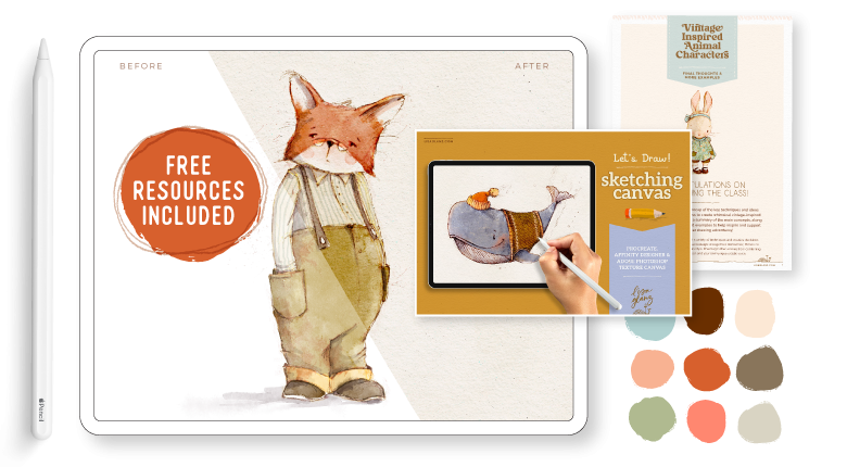
5. Resources I Use in Class: In this class, I'll
be using one of my premade canvases for
Procreate, called Let's draw. You can download from the
Treasure Trove on my website, which has a bunch of free
goodies for my subscribers. The brushes I'll be
using are mainly from Aquile two and the
Artist's Pattern toolkit. I really like using watercolour brushes for
vintage style artwork, but you can, of course, use any of your favorite
brushes you prefer. I've included links below to all the resources
I'm using in class, just in case you'd like
to explore them further. Now that we've covered
a few handy tips to get you prepped and
inspired, let's dive in.
6. Rough Sketch: Sketching Out Your Character: I've decided to go for
these two as my references, and if I just enlarge this one. So this one I'm going
to use for the pose, basically the position
of my little character. And I'm going to be
drawing a bunny today, and you could essentially use the same technique for any character that you want to draw, but I'm going to
go with a bunny. And the first thing
I want to do is just study the image and give myself some ideas of what
makes this pose cute and how I can achieve
the same thing in my drawing. So if I have a
look at her chest, you'll notice that it's
quite projected outward, and the body has quite
a nice sea cove. Well, it's a backward C.
And that is a nice clue, essentially, that's
going to help me get a nice dynamic pose
in my character. And then if I have
a look, her arm on the side is exposed, even though it is
behind her back, it's far more exposed
than this side, because she's
obviously slightly at an angle and she's
not facing us direct. So that also adds to the dynamic position
of the character. And then having a
look at her legs, you'll notice that
one of the feet are kind of moved sort of turned in, which is quite cute, and
the other one is facing us. And then her head is
pretty much straight on. So these are all clues I'm
going to use for my pose, and I'm going to apply
them in my drawing. So if I just come
back to the clothing, and this is really cute
kind of 70s style. So what I like about this
is the little shorts, and I like the little
skirt on the pockets. But I'm probably
going to come back to this when I
tackle the clothes. But I'm just sort of
familiarizing myself with the image just to keep
that in the back of my mind. So I'm going to move
on to Procreate. Okay, so as mentioned, I'm using the let's draw
Canvas, and when you open it, if you are going to
use the same one, you'll notice that there
are canvas effects, and there is a draw here
layer for you to begin with. So you always want to be drawing
below the canvas effects if you want those effects to be interacting with your drawing. But the first thing I want
to do is actually turn off the oatmeal paper because I'm not going to use that in
this particular drawing, and I'm just making sure that I am working on the
draw here layer. Okay, so we're just
going to use sketcher. You can use any
sketcher that you like, but I'll be using Lisa's pencil. This is the pencil that I use
in pretty much all my work, and it comes with
most of my brushsets. What I like to do, and
this is just my process, but I like to have the head and the body often on
two separate layers. This allows me not only to
play with the proportion, but also the angle of
the head and the body, and it gives me more freedom when I am just doing
the rough sketch. So starting on a new layer, I'm just going to start
with the belly part. As mentioned, I'm
drawing a bunny today. You can apply the same
technique with any animal, and I'm just looking
for the line of action. If you can recall we had that C, that backward C. That's
what I'm plotting out now. At this stage of my sketching, I'm just feeling
out my linework. I'm not worrying too
much about perfection. I'm coming up for
the torso area. I'm thinking about
those shoulders, which are probably going to
sit something like that. And as mentioned, really rough and I'm not looking for
perfection at this point. These are explorative
kind of markings. So those are my hips, I think. We're looking for some
cute little leggies. We want really short legs. This is why a kid's pose is so nice as a reference because they have pretty much shorter
legs than adults. And that 1 ft was facing
us, if you can recall. So I'm just drawing a
like a teardrop shape. And then this foot kind of turned in, if
you can remember. So if you're feeling
stressed about finding the right shape, definitely don't aim for
the first time around. You want to do lots
of rough sketches. I kind of eases the pressure. I'm just earmarking
the toe area, that really helps me
get an idea of where I want that toe area to be. Then you'll see lots of rough
linework and this helps me not feel so stressed but needing to absolutely
get it right the first time. So that one arm came down. Of course, you can
always go back to your reference image and
refer to that if you need to. The other one we pretty
much didn't see, but I just want to indicate
that shoulder area. Those are my shoulder areas. So I think that's
looking pretty good. And I'm just going to
move it down and then create a new layer and turn that layer off so
I'm not distracted. And now we're going to
start with our head. Now, I've drawn many
bunnies in my time. So I have a good idea of
the shape of its face. And there are, of course,
1 million variations. You can draw a wider shape, a long sort of shape, a short fat shape. Whoops. So if you need
reference for your character, please do, have a look. It really helps take
that stress out. But as I said, I
have a good idea of what I want my
bunny to look like. And again, even though I've
drawn it 1 million times, I'm still kind of using rough linework and just
feeling out shapes, giving myself an idea of where
I want the features to go. A bunny's head generally goes skinnier at
the top or thinner. Then the nice thing about bunny characters is that you can really play with the
size of the ears. Yeah, you can go really
big, small ears. It's entirely up to you this is your fantasy character
that you're creating. So again, we want to be having
a look at reference for the animal's ears because
they're clues that give the audience a clue
of what animal it is if you are a little
bit more realistic. So I am drawing fairly
realistic ears. And as I've mentioned, you definitely want to have a look at reference
if you're not sure. So those are the
little inner flaps. And that side. I think I'm getting
somewhere with a face. It's looking pretty cute. So turning our body back on, and I just want to move
the head into position. But let's move this down. Okay, so the nice
thing about having it on two layers,
as I mentioned, you can play around
with angles and sizes of proportions of
the body and the head. And what I like to do with
cute characters is have the body quite a bit small in comparison to the head because that really elevates
the cuteness. So I'm going to actually
reduce the size of the body because
it's slightly too big. That's already looking
a lot better, I think. And I'm going to tilt the head. It's a nice trick to use if you want to add a quick sort of dynamic element
to your character is just tilt their
head slightly, and that immediately
adds a nice sort of bit of life to the character. So I think that looks
pretty good placement. And now we're going to
tackle the clothing. And again, I like
using a new layer for that just in case I want
to make any changes, or if I want to try
a different outfit, then it's much easier that way. So coming back to Pinterest, and if I just have
a look here again, some of the key features is that sort of puffy sleeve,
that's really cute. And this flat panel and all these little creases
that come down with the top, and of course, these two
cute little pockets. And the dress is kind
of wavy at the bottom, so I'm going to
take note of that. And I can see she's also
wearing really cute shorts, which I think I'm going
to incorporate as well. And then she's also wearing a really cute sort of head band. And if we look at her feet, she's wearing cute socks
and those doll shoes, which I think are a nice touch. Okay, so let's tackle that on making sure
I'm on my new layer. And let's start with the sleeve. So it's quite puffy. And that other one probably
peeking out like that. So there's, like, a
tight little band. And I'm going to go for a round collar just
with a simple band, and then have that sort of
flattened area over here. If you're finding your layer
distracting like I am, I'm just going to
lower that opacity. And then we had a
nice swinging dress, so that's what we want
to capture as well. And if you're not sure
about how fabric behaves, then definitely have a
look at some reference. You want to be creating a fairly realistic feel to the fabric to
make it convincing. So I'm thinking about
adding some nice folds, just to give the
dress some volume. And then that would
be my puffy sleeve. Might be a dash too puffy. And then there'll be lots
of creases coming down. And then some shorts. Again, these are just
sort of peeking out. So you want to be taking the
shorts beyond the leg width, unless, of course, you
want them quite tight. But I don't. I want to give the view of the idea
that the shorts are, you know, sort of loose on her. Oh, and I wanted to
mention, of course, if you were drawing
a male bunny, This is a really great
way to establish the sex of the character is the kind of clothes
that you choose. All these kind of details add to your final characters reading and hard reads to the audience. And then some socks. And then we've got those
little doll shoes. Just kind of feeling
out things as usual. Strap will probably go
over her top like that. So as mentioned,
it's really helpful to draw that toe area because it gives you a marker for
the shape of your shoes. I think this is taking shape. And then I just want to come back to my reference and have
a look at that knot. So it's kind of a knot with a short little ribbon
coming out of it. So this would be our band. Which is totally skew. Could be if you wanted that,
but I didn't want that. And then it had quite
a squarish shape. And then our shortish
ribbon will probably come out to side like that with some creases and in your rough, you can decide how much
detail you want to add. This is entirely your, you know, up to you how you
prefer sketching. I'm often just rough like this. And then when I do
my final sketch, I add all those
intricate details. Now, what I've done is
made the mistake of making the ribbon shape a
little bit too straight. So I'm just going to
do a liquefy tool. So that would be under your
adjustments and then liquefy. And then I'm just
adjusting the size. So it needs to follow the
curve of a head a bit better. That's what's really
great about this tool. You can adjust things even
after you've sketched them. Don't be shy to do
that if you want to make any changes
to shapes of things. So I think I'm
pretty much done and ready to move on
to the next step, which is adding my final
linework and starting to paint.
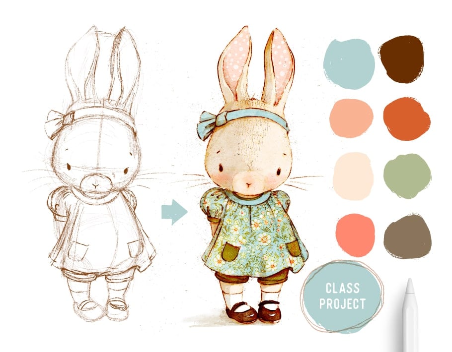
7. Clean Linework: Completing Your Final Linework: So this is my rough sketch
that I did early on, and I'm going to
be using this one as my base for the
final project. And just showing
you, once again, it's exactly the same structure. We have our clothes layer. Oops. I named them incorrectly. Okay, so that's
our clothes layer, that's our body layer, and then that's the head. And you'll notice
this one's probably rougher than the one
you saw me sketch out. So I wanted to
show you how rough my roughs really are
because I want to encourage you not
to think that you need your first
go to be perfect. And I'm going to move on
to my final linework. I need to create a
new layer above that, and I'm still sticking
to a sepia color, but I just want to fill
that new layer of white. And I'm going to set that probably to about where
we about 80%, 75%. And then create a new
layer above that. And I'm still on Lisa's pencil. So adding in this white
layer allows me to lower the opacity of all
my sketches all at once. So for my linework style, I like varying the pressure
of my pencil a lot. This gives me really
interesting variation in the linework. You might prefer a
more uniform look. But I find this gives the piece a nice
interesting character. I'm just using quick, soft strokes just to add
a little bit of fur. So your linework can
really influence your final look of your artwork. It's an opportunity to really let your personality
of your style shine through. So as mentioned previously, all those choices you make contribute to the final
look of your drawing. So I'm just gonna
have the pocket sort of sitting on that fold. It's a nice way to
show volume, as well. And then just making sure my
pockets are the same size. Maybe this one needs
to be dash rounder. I think B sketch layer is done, and now we're going
to move on to adding all those yummy vintage
techniques to our drawing.
8. Apply Colour: Add Vintage Style Colour & Detail: So what I like to do is have some fun with my linework and I play around with different layer opacities and blend modes. So I'm going to set
this layer that I've just completed to multiply, and then I'm going to duplicate that and come over
to my Gaussian blue. And probably just set it
to about three or 4%. So this would depend on the
size of your illustration. So I'm going to go about 3%
and then set that to color burn and then bring the opacity down of my
original sketch layer. So you'll see it starts giving that lovely bunt sort
of vintage vibe, and that's what we're going for. So you can decide how much of that color burn you
want to shine through. So I'm going to leave
it probably about 50%. And then what I like doing
with my rough sketch, I use it in my final artwork
as well, very often. So I'm just going to make a duplicate of that because
I just want to keep the original and flatten this. So I've turned off those
individual groups, and then I'm going
to move that up. We don't need this anymore,
so I'm going to delete that. And then I'm going to
set that to overlay. And I'm not going to do anything with the opacity at this stage. I'm just going to
leave that for now. But in fact, what I want
to do is just set that to multiply because I still want reference for her little snout. We'll change that to
overlay in a second. Okay, so now that we have
our different linework, I'm going to group all of those and then start
adding some color. Just want to Okay, so there's nothing
on that layer, which is perfectly fine, and I'm just going to move that and I'm going to start adding some colour
to her body first. So I'm using a
really pale colour and using the universal
watercolor brush from Aquarl two. This is like a
great all rounder. Just testing the size, so
I'm going to bring that up. And I'm just slowly working
my way around her face. Ideally, you don't
want to be lifting your pencil with
watercolour brushes, but if you do, you can
easily just blend that area. And work slow on the
edges if you need to. You don't have to rush.
Bringing that down. So I'm leaving the inside of her ear because I have a
different plan for that. So there we have a join, but because the color is so
light, you don't notice it. And sometimes those joins are quite nice and add
sort of an authentic look. I'm going to add a shadow
layer at this stage, and I usually add it quite
early on in my drawing. It helps me find the definition
of the form much easier. And I'm going to keep
it really simple. And essentially, I'm thinking of the light source coming
from this direction. I'm not going to be too pedantic about getting it
scientifically correct. I just want to get
an idea that this is your general direction
of my light source, and so that means a lot of the stuff's going to be in
shadow on this side. But the shadow is going
to be super subtle, and we're not aiming for too intense shadow with
this type of drawing. So on a new layer, and
I'm making sure I'm staying below my sketch group. I'm going to set
that to multiply. And then choose a
gosh, what is that? Like it's sort of a yellowy, unsaturated color, and using a brush called
the shadow brush. So that brush is perfect foreshadow work like
we're going to do now. But you can use any watercolor
brush and then just play with the opacity of that layer so that
it's not too harsh. So the nice thing
about this brush is it intensifies the
more you go over it. So I'm just going to lay the
first layer of my shadow. And this is why I wanted
that reference of my little snout area because
I'm going to stay around it. And then probably just bring some shadow
across like this. And if there's anything that doesn't blend the
way you want it to blend, you can just go in and use the blend tool just to
soften those edges. But this brush does have a really nice blending
effect that's built into it. So each time you go over it, it kind of blends with the previous ink
that you lay down. So I'm just going to
soften this edge, choosing one of the blenders. I'm just gonna use the
all rounder. That's fine. And I'm just pulling it upwards. So the shadow is going to be a little darker
underneath her ribbon. And I'm really just
winging the shadow. I'm just thinking logically
how shadows would fall if my light source was
coming in that direction. And because I'm not
using reference, I might make a mistake, but it's so subtle. It doesn't really
matter. So you'll see it's really giving that
ribbon area some nice form. And the inside of a ear will
obviously have some shadow. Just want to smudge, dash. Let's see. And as mentioned, if you want to intensify, just going over that area
a few times is a nice, quick and easy way
to doing that. And then I just lift
my pencil a few times, and then I'm going to
come in and smudge that. Whoops. Okay, so that
doesn't make sense. Is the lights coming
in that direction, so I'm just going to take that. So her head, essentially will create quite a bit
of shadow over here. So I'm just filling
in the entire area. And this part will be really dark in comparison to
the rest of the shadow. And these little folds, as well. So I like adding details
like shadow, well, a fairly realistic type of shadow because this play
between realism and fantasy, in my opinion, really adds an interesting level
to that vintage look. You're essentially
combining two worlds, reality and fantasy, and I
think that play is quite nice. And then I just want to
add some standing shadow. So this helps the character
look more grounded. But h And then we can use some
interesting blenders just to get it to sort of run a
bit more with ink. So I'm just inspecting my work, making sure I haven't missed
anything too obvious. Oops. And, of course, we
can always come back. Yeah, I think that
looks pretty good, and I'm going to move
on to the next phase. So I'm going to fill her dress
and introduce some colour. Actually, let's first finish her little face and
add some cheeks. So above that layer that we
just added for her body, I'm just going to create
a new layer and I'm going to choose quite
a brightish pink. And still using
the shadow brush, I'm going to add
some rosy cheeks. Because the shadow
brush is quite subtle, it blends really nicely and
I'm just going to set that to multiply and see that
looks pretty good. I'm going to use a
blender in a second. Coming back to my all rounder and just going to play around with pushing
that ink around a bit. I think that's
looking pretty cute. Maybe a dash more there. Yeah, I'd say
that's pretty cute. Okay, so I'm just
setting that layer, the rough sketch that
we set to multiply. I'm just going to set
that to overlay now. Make sure I'm in the
right. Yes, I am. Okay. I'm setting that to Max
and then coming to overlay. This will be quite a
subtle interaction. But as you paint, you'll see all these little
interesting scratches coming through from
your original sketch, and it's my taste. It may not be your taste, but it's fun to experiment and see if you
actually like that technique. So now we're going to
move on to the dress, adding a new layer
and I'm going to choose that brightish
well, sort of blue color. And using the watercolor brush, I'm just going to lay
my first layer down. So all the trimmings, like the cuff, I'm going
to use a different colour. Oh, I also wanted to mention
with the aquaril sets, they come with their
own set of canvases. There are quite a few
for you to choose from. So you can also use any one
of those for this drawing. So Having a look at, if I zoom in, you can see how all those layers are starting to interact now with
all this color. So this is actually my sketch layer that
you see coming through. And that sort of soft blurry edge is that color
boon layer that we added. And all these things add to interesting
textures to your work. And as I said in the beginning, you can use as many or as
little of these techniques. I just like adding as
much texture as possible, but in a subtle way that looks a little bit more authentic
and not so harsh. So now we're going to add some interesting
detail on her dress. I'm going to use one
of the patterns that come with the
artist pattern box. And I want to make sure
that I'm on a new layer. So above her little dress, going to use a white. So just making sure
I am, I'm on white. And it's one of the
double brushes. So the double brushes means that the pattern is made
up of two brushes. One would be, for
example, the flowers, and then the other
one is the linework, which is the one we're
going to use now. So I'll show you
exactly what I mean. So I'm using the Liberty floral and just making the brush really big because we're
going to clip this. So you can adjust the
size of the pattern. If you want the florals
to be a lot smaller, then I just want to
clip that to the dress. I'm choosing a clipping mask. Then on a new layer, I'm going to choose
another sepio color and this is the B brush. Liberty A has floral
A and floral B. This would be the
linework and this fits perfectly over the
underneath pattern we just laid. So these unique layer pattern brushes are
really handy for quickly adding some
interesting detail to your drawings without
too much effort. And I'm going to set
this also to clipping mask and change this
layer to colour bone. So that interacts quite nicely with the
pattern underneath. And what I like to
do is just give this a slight blow and
the reason for that, I think it just mashes
better with the drawing. It doesn't look so placed. So I might go all
the way up to two. I think that looks pretty good. And then on the same layer or a new layer, it's
entirely up to you. I'm going to choose
a brightish pink coming back to my
watercolor brush, and I'm just going to add
some color here and there. And you'll see how that
linework starting to interact quite nicely
with our pink. So this just adds another
dimension to the drawing. I actually realize
I need to delete this section. So I'll
come back to that. I think that looks pretty cute. So just using an eraser, I'm going to use Lisa's
pencil and just get rid of the pattern that is on
that flat part of the dress, if you can recall,
our reference. Of course, if you want to keep that pattern, it's
entirely up to you. I quite like the
sort of plain band. And again, you can
really start seeing how things are interacting
with the ink. Now, adding some
interesting colour for our little pockets
and the shorts. I'm going to use a dark, khaki sort of olive green. And still sticking to my
universal watercolor, there's no point in complicating matters if you don't have to. Oh, and I see I've nearly
forgot about her little ribbon. So coming back to our dress
layer and that same colour, of course, you can choose
a different color, but I like to keep my
palette quite simple. And It really adds to the cohesion of
your final piece. And then I just wanted
to mention if you don't have an interesting
pattern brush like this, you can use one of your
own pattern designs that you've created somewhere along the way and then just
import that as an image. It's a really nice way to add a special touch to your drawing. And if you can aim for a vintage looking pattern,
that would be even better. Often what I like to do is add patterns to the animal itself. And for example, inside of
bunny Is or elephant I. That's a really
quick, nice way to add a whimsical touch
to your drawing. So that's what I'm
going to do for her ez. And I'm going to
make a new layer. I'm going to go
with this color and using a cute sort
of dot pattern. Just filling that in. So I've made sure to work underneath my shadow layer so that the shadow layers still interacting with
everything underneath it. And if you recall, we made
our shadow layer multiply, so it will interact with everything underneath
that layer. Oops. Okay, that
might be too intense, especially given everything
else is quite muted. So I'm going to go
ahead and just slightly lighten that and maybe
bring down the saturation. I think that looks a bit better. And now I'm just going to do her shoes quickly. New layer. And I prefer doing everything
on a new layer because it just gives me freedom
to change if I need to. Coming back to our
watercolor and, again, the universal brush. So I'm just leaving a highlight. It gives the impression that
there's a shine to the shoe. And then again, I'm this shoe. So it's helpful to
draw your highlight first and then just
work around that. I really think
she's taking shape. So now what I want
to do is show you some other interesting
techniques that I use in my drawings. I don't often use them all at once, like I'm
going to show you now. But as mentioned, I
want to arm you with as much information as possible, and you can decide if you want to add that
or just leave that off entirely or perhaps only use that technique
in another drawing.
9. Finishing Touches: Add Charming Vintage Enhancements: So I'm going to create a new
layer and I'm going to set that to multiply because I want it to interact with
everything underneath. And I'm still on that
sort of sepia color. And I'm gonna use a dust
brush from Vintage Tales. And just here and there, add
some interesting markings. Of course, you can use any sort of texture dust
brush that you have. You can even create one. And if you're finding
it too harsh, you can always
lower the opacity, which we're going
to do in a second. So just bringing that down and coming over to my
nitty gritty brushes, I'm going to use a pencil
called grimy shy pencil. So this is quite a
scratchy pencil. And again, this is something that you can
create on your own. You just need to have quite
a contrasting texture. But I like how applying
these sort of scratchy, you know, markings
here and there, can give such
interesting results. I'm working on the
same layers the dust. But I'm going to lower that opacity because I don't
want it to dominating, but I do want this interesting sort of linework here and there. And this is, of course, a personal choice and
your style preference. Although it's quite subtle, all these little details add to the final look of your piece, and I'm going to
create a new layer and set that to colour burn. Coming back to the
Artist's Pattern Box, I'm just going to use
one of the tiny fabrics. So this will be just quirky
details on her forehead. Showing a little bit of fur. To a bit too small. So because you set
it to color burn, it's interacting with all
the layers underneath it. I'm going to come back
to that multiply layer. And again, just here and
there, add some detail. So this is sort
of adding kind of rough texture in a subtle
way to her forehead. It's just indicating some fur. But I'm hoping you are getting an idea how
you can have fun with the different blend modes to get some interesting
interactions. It's definitely
worth experimenting. I'm just going to use
the dirt brush in that. It's a different dirt brush. Making sure I'm on
the correct, I am. And just here and there, I might want that
more pronounced, so I'm going to
create a new layer, set that to multiply. So you'll notice I tend to layer a lot of this type of grit. And the reason why
I layer it and use different layers because I
like controlling the effect. If it's too harsh, then I
can just lower the opacity. So all these little grimy bits start adding to that authentic
vintage vibe, I find. Like it's an old illustration. I think I'm going to
stop there for now. I hope that's given you an idea of how you can experiment. I want to show you another
trick that I sometimes do. Closing or at least putting
all of this into one folder. So I've just
selected everything. I have my sketch now sitting
nicely in one folder. I'm going to turn
off my canvas effect and then I'm just going to copy all and paste. I'm turning my
effects layer back on and then come over to
adjustments and half tone. I'm going to select
a screen print and use the pencil mode. The pencil I'm using is
the watercolor brush, and then just simply here
and there, apply some Oops. Apply some half tone. Effect. I think that's
an interesting, fun way to add some more
interesting details to your work. And it's
just here and there. Then I'm going to
set that layer to colour bun and then just
play with the opacity. You could have fun with
any one of these blenms. You can even leave it on normal. But you'll see their
interaction is just subtle and it's just another technique you
can try in your work. Then finally, if you really want to ramp up that
old vintage look, you can create a new layer. You can choose a really
lovely mustard color, which as we all know, is very 70s thing and just
fill that entire layer. So obviously the canvas is interacting with
that entire layer, and then we want to set that to multiply and then just bring the opacity down until you are happy with the
effect that you want. That just adds another aging
effect to your drawing. That's it, our little
bunny is done. I hope you found that
useful and I hope you have fun using these
techniques in your work. Thanks for watching
and happy creating. No.
10. Class Download: A huge congratulations
on completing the class. I just wanted to
mention I've created a handy PDF download featuring all the key
points mentioned in class, along with a few
additional tips and examples to help reinforce
what you've learned. You'll find it in the
class downloads area. It's a wonderful resource
to keep on hand and revisit anytime you'd
like a little refresher. And don't forget to upload
your class project. We'd all love to see your
adorable animal characters. Thank you so much
for joining me in class and spending your
creative time with me. Happy creating. It
 Lisa Glanz, Illustrator & surface pattern designer