Transcripts
1. How To Create Professional Websites Witohut Coding: I've been trying to learn how to build websites. Or maybe you're a designer who would like to offer web depth services to your clients. Well, you know, designing is one thing, but then turning that to design it into a real live website. Well, that's a completely different thing. And for many, this may seem like some kind of b witchcraft. And many just give up and quick. But luckily, this doesn't have to be the case. Because in this course you will learn how to build websites from scratch without the necessity to code anything. And for that, we'll use oxygen builder, which allows you to create an control any aspect of your website. And along the way, you'll learn how to build headers, responsive menus, sticky headers, overlay headers. How to Build a hero sections within full-width sliders into background. And how to add animated icons, how to add contact forums, testimonials, blogs and blog posts, etcetera. But basically, you'll learn all there is to know to create a website using oxygen builder. I just find it to be the best solution right now to create professional websites, especially if you're coming from a design background. So if you're really interested in learning how to develop websites, the future proof wait, just enrolling in this course now. And I really do hope to see you inside.
2. Introduction: So tell me, have you been trying to learn how to develop websites? Or maybe you are designer would like to offer web dev services to your clients. You know, designing is one thing, but turning that design into a real website. Well, that's a completely different story and more complex story, I must say. And for many, this may look like some sort of a Witchcraft. When they think of developing websites, they get intimidated and often they just quit. But luckily, there's really doesn't have to be the case because nowadays creating custom professional websites is really easier than before. So is the scores just about that? Well, let me tell you first what this course is not. Well, definitely it's not another word, press corps. If you're a total Wordpress noob, I advise you to first learn the basics and then get back to this course. Now, War Powers is going to be an environment in which we'll be working, but we won't be focusing on it at all. And you'll learn how to build any kind of website using something called oxygen builder. Now, oxygen and Builder is a site builder, which means that it allows you to design, develop, and control basically any aspect of a website, your headers, footers, menus, blogs, settlers, templates for 04 pages, and so much more. And what's distinctive about it is that it gives you total control over their development part. It's, it's really hard to imagine and design that could not be developed with oxygen. And the vast majority of the designs can be turned into websites without even touching the code. I mean, you can use the tools provided and not write a single line of code. But of course, if you need something more complex, you can add extra code because oxygen gives you total freedom. And let me be clear. Discourse by no means is a sales pitch for the plugin. Now, our views and tested a lot of other builders have used Devi element or Visual Composer of Vada theme ultimatum. But they never really delivered what I expected. And really, I know it's a cliche, but to once I've found oxygen, I've never looked back. But of course, it's got its flaws. I mean, at first it may seem intimidating. And my designers, I doesn't like some of its usability solutions. But after a few minutes, especially if you're familiar with basically any design tool, advert and will start to make sense. And of course, I'm here to guide you. So fear not once we've installed oxygen, we will start developing a site. And along the way, you will learn various tools and aspects of the plugin. So we will build headers including sticky headers, footers and menus, will add sliders, including a full width background sliders like the ones you can, you know, like the one you can see here. So we'll add galleries, icons, videos, and portfolios. And of course we will make everything nicely responsible. And to finish the course, we will grab a ready made the design and recreate it using oxygen. And we will go from the header through the main sections with images, icons, transitions all the way down to an extended footer. And by the way, this will be a live website. You will be able to just search for it online and you'll be able to look at how it works, how it functions once it's developed. So really if you've been looking for a course to teach you how to develop professional custom web sites. And that would do it straight to the point. I think research is over. So let's just jump right into our first video.
3. 2.1What is Oxygen builder: So to build our site, we're going to be using the oxygen builder. In the past have tried other builders like Devi or elementary, but they always were Mason some, some features, especially in terms of block creation. Now maybe these days something, something has changed. But really when oxygen 3 or 3.1 came out, I really, you know, I was hooked. I decided to get it. I decided to buy it because I really saw the potential. The potential. And I really will finally found something that would allow me to build the sides. That not the way I really would like to. So if you go to the oxygen builder.com website, of course, you will be able to read some sales information about, about oxygen. You'll be able to check out the product tour or see the tutorials. You, you'll be able to maybe compare oxygen or with that, with the competition like elemental Beaver, Builder or Devi and builder. But what I would like to know, like, turn your attention to is that oxygen is not just a page builder, but it's also a, a site builder. Now, most of these builders, definitely DV or elementary, they use themes, so you always have to have a theme. You can have a free theme, but you always have to have one. Oxygen doesn't use themes, so you don't have to worry about it. And for you as a aspiring web developer and a graphic designer who wants to offer more services to your clients, offer a web developer services to your clients. I think that one of the most important things would be that if you get oxygen, that's actually just like Dv. Dv, you can just buy one license or byte one time and you've got the updates forever, lifetime updates. And you got your license is valid for unlimited number of websites, so you don't have to repurchase the licenses for each and every site that you are going to be created. So it's basically still hopefully forever onetime purchase for life kind of a deal. So this is just a brief video just to get your feet wet, just to show you what tool we are going to be using in this course. And in the next videos, we are going to take a look at how to download oxygen, but also how to try oxygen. If you first want to just check if it's really something for you. And you'll be able to, thanks to the, to this kind of like a demo feature of oxygen, you'll be able to do exactly what I'm doing in terms of building our site.
4. 2.2Don't buy it - try it: So oxygen is basically a plug-in. And if you are familiar with the very basics of Wordpress, which is kind of a prerequisite for this course. As I mentioned before, oxygen works like a plugin. So once you, once you get it and how one should download it, you'll be able to upload it just like a normal plugin. And you'll be able to enter your, you know, your license key and you'll be able to get free, free updates for that particular website. And we're about to do that. We're about to upload the plugin. However, if you're not convinced, if you don't want to buy it, you can just go on hand. You can just scroll down to, to this well footer. And you'll see this option right here that says try oxygen. So let's click on it. And in here, you can actually enter there a demo, a sandbox environment where you'll be able to use oxygen just like you would use it if you decided to bite, if you decided to download it. And in here you can choose the blank install, which I think it would be best because we really want to build our sign from the ground up. And we really want to learn all, well, most of the things that come with oxygen, definitely all of the things that will allow you to start using it independently. But of course, you could also choose the pre-built example Website, which would load some elements from the library that comes with oxygen. But I'm gonna choose blank install. And after a few moments we are writing the WordPress Dashboard. And in here you can see that we already have oxygen installed and we're able to use it just like you would use oxygen if you purchased it, if you download it and upload it to your plugins library on your side, of course, we got on our standard WordPress Dashboard. We can add pages, you know, change the appearance and change the manual, all of those things. So if you're not convinced that you want, that you want to buy oxygen, you can always just try Oxygen from their website. However, I'm already convinced. So I'm going to be using my own installation. I'm going to be using my own version or license of the plugin. And I guess we can start just building our website. Why not?
5. 2.3Uploading Oxygen to our site: So as you can see, I got a fresh as of 20-20 WordPress installation. And if you take a look at my address bar, you are going to see localhost. And that's because I'm running Wordpress locally. I just decided to do it like that because if I was to put it on a live server, I'm we might experience some connection loss, maybe some cash and problems. And I really wanted to avoid it. I really wanted to make things as small as possible, as fast as possible. Because of course it, you won't have to wait for the server to respond. And then we'll just have to wait for my computer to response or everything should be much quicker and easier to edit for me after that. But anyway, if you are, if you have your Wordpress installed only live server, of course you would have your domain name right here. And what we have to do is we have to login. So I'm just going to type in slash and then just WP dash admin. And in here I'm just going to use my login credentials. So right now we can actually upload the plugin. So I'm gonna go to plug-ins, I'm going to add one. I'm going to upload it. I'm just going to have to find it. Oxygen 3.5. And I'm going to hit Install Now. Once it's installed them going to activated. I'm running a multi-site so you could see a network activate the button, button on your servers. It's just going to be activate. And then you can actually start using oxygen.
6. 2.4Activating Oxygen: So once our plugin, once oxygen is uploaded, let's enter our licensor. Keep. Now, if you decided to purchase it, of course you will get it in an email from them, oxygen builder team. And if you're just trying oxygen on their server, of course you don't have to you don't have to enter the license, so you can just skip this video. So what I'm gonna do is I'm gonna go to oxygen and then two settings. In here. I'm going to choose license. And in here we're going to type in our license key. That again comes in an email once you purchase the oxygen builder, and then you can just hit submit and you're going to, hopefully you should see the text valid right here. And now it means that oxygen will get updated for life. You're going to get all the updates. Within your WordPress dashboard. You can basically update your plug-in just like any other plug-in that you can get it from the standard WordPress repository. So once oxygen oxygen is installed, once it's once it's license has been and it's put in right here, we can maybe move on to a bit more of a basically Wordpress related thin, not just oxygen related thin. We're going to add our pages to our site. So, so we, so we have something on our side. So let's move on to that.
7. 3.1Add the pages: So we add oxygen, we got the license. Now let's get some pages. When we go to our Pages menu right here, let's start. Maybe, well, let's first see what pages we already have. Well, we don't have any any paid right here, but if you have a fresh WordPress install and you'll probably have a privacy policy or a sample page. And what I'm gonna do is I'm just going to add the pages that we'll be using in our, in our case. So for the title, I'm gonna go with first home. This will be our homepage, obviously. Then I'm going to add another one. Since we are designers who wish to offer their web development and services, we are going to use it. Well, we're going to be needing a portfolio. So let's publish this site. Let's add, let's say that we got a lot of things to say, a lot of interesting things to say about our work. So we're going to be, we're going to be adding a blog to our site. And let say that we got a lot of things to say about us. So let's type in about, and of course, we need to add a contact page. So let's do that. Let's go to contact and let's publish this side. Now before we move on to actually creating or unchanging our home, the page, let's go to the settings, and then let's go to permalink. And let's make sure that we got Post Name selected right here. And right now when we, when we try to visit our page, we're going to have to just type that pages name and we'll be we'll be good to go. And that's, that's the best practice for SEO purposes as well. So I'm just going to save the changes. And if we go to reading options, we can use this your homepage displays option to actually display a specific site, so well page, so we could use your latest posts if we just had a blog. But we will have a more like a more developed side. So I'm going to choose a static page and my homepage is going to be home and posts are going to be put on my blog page. So I'm going to just save this. Now in here, I've decided to go with discourage search engines from index in this site because it's a local installation and well basically it won't affect the ranking of my pepsin sits is just on my computer. But when you are building your own side, your live site, you might want to check this because search engines might, might index your, you know, your progress once you're building the site. And if you want to discourage the search engines from that, you might want to check this. But of course, when you'll be using an SEO plugin, once the designers is done, this option should be unchecked.
8. 3.2Add the first template: So what are templates in oxygen or, or, or templates in general? Templates will be basically just like pieces of design and content that will basically look at work the same. Generally on the, every, every page that you create. Whether it's, it's a dynamic content-based page, like a blog page or it's a static page. So once you put in that template, that's gonna look the same on each and every page. The most common scenario for a template would be to add your header as a template and your footer as a template. Because a header will usually host your logo, the name of your, of your company or your services, or your name. And the menu at maybe some contact information or social media icons. And in the footer, of course, you would also need to add some more information. Maybe you would add some, some links, may be some other menu. And yen basically, basically you would need to create a template for a header and a footer. So if we go to oxygen and then templates, you can see that I got no templates right here. So I'm going to add a new template, and I'm gonna call it my main templates. I'm just going to type in main. If you take a look at these options right here, you can see that we usually we might be able to just add, inherit the design from other template. But since this is our main, this is our first template. There is nothing to inherit from from any other template. In here. We can tell oxygen to which part of our site at this template should pertain to. So if you were just creating a template for, for some singular, singular type of content, like a post or a page, or for an archive page for a specific category or for a specific author. You could, you would be able to add it right here. But we are creating a template for a header and a footer. And usually we would like to add the same kind of a header and a footer too, and to all of our pages. So let's keep it simple. Let's leave it like that for now. Let's assume that we want to add the same kind of a footer and a header to all our pages. So in this other section, we are just going to select this catch all option. And then I'm just gonna hit publish. From now on, this template is going to be, is going to be telling all the pages which headers and footers that specific page should render. So once this template is ready, we can, we can hit edit with oxygen and actually start editing this template inside oxygen.
9. 3.3Oxygen's interface: Before we start editing our template or adding anything to a website, it's a good idea to know what we are looking at first, especially if you've never seen oxygen before. So let's take a quick look at oxygen's interface. And actually, at first, it might look a bit scary because there's basically nothing here. We got just some blank canvas, some options, some buttons here at the top, some buttons here on the left hand side, and that's basically it. However, in just a few seconds you will see that oxygen's interfaces, I think quite similar to a lot of designer programs like Photoshop, Illustrator, designer, or whatever you're using for your design tool. So here in oxygen, we have tools on the left. If we just click on this add button, you're going to see that we got a lot, a lot of different, different tools that we can add to our website. So we got the basics like some containers, text links, and we could add images, videos, and other thins. We got some helpers, bursts, that's what they are called Helpers. But really they are just some, like most common things or modules that you could be using in web design. And so it's like a gallery post that we are going to be using Easy posts module for our blog. We got the header builder that we'll be using to build our header, social icons, testimonial, sliders, all, all those, all those things. We got some Wordpress, Wordpress, Wordpress related actually modules like a menu pro menu, shortcodes, commons and all of those. And all those things. We got some dynamic data. So these are the things that are going to be pulled out from our database, but that's for a later video. We'll get some widgets. So if we are using widgets for inside where first we can use, we can drag them from here. And we also have like library designer sets that come with, that come with, with oxygen. And we got some reusable parts, but we haven't created anything yet. So I don't have any custom made, made by us and parts that could, could be added to our design. So basically here on the left, you are going to see all your tools. And here, the top search and box we could just type in maybe like some, like an image. There we go, we've got our image module. Or we could type in may be some lighter or SL, And we got our slider and et cetera. So we can just simply type the fewer letters, the first few letters of any module's name. And that a module is going to be filtered out from this panel. Right here. Here on the right, top right, we got some buttons right here, and we got this big blue Save button that we need to, Well, we need to, it's a good idea to click it frequently. And we got some, some other buttons. So let's first click on the structure. Button and as you can see, we got our structure and in just a few seconds is going to, it's going to look like basically, basically like layers in Photoshop, Illustrator or designer. So all of our elements that we are going to be put in here onto our canvas are going to be represented here in this structure. No pain. We've got the history panel, but we haven't done anything yet, so histories empty. And we got the Manage options that allow us to get to a different, different settings or global settings. So for instance, if we, if we try to change some settings, for instance, we could maybe changed some pave settings we could set our page with. We could play around with global settings for animations. And, but also, if we just go ahead and choose a global styles, we will be playing around with these in just a second. We are able, we will be able to add our global colors that will be always present when we want to use the colors. There'll be, whenever we click on like a color picker, our global colors will be there. And of course we also have like fonts. So we could choose our default display font, display front of horses, a font for our, for our headings. And we also have fonts for our text. You could also add funds right here if you, if you would want to. And we could change our headings so we could globally set the size and the colors for each of our heading from one all the way to age six. And we could also change the body text, the font size, weight, the color of our well, this body text. So all of those things that, that you would like to set globally. Now, let's say that you just want to and set your headings to be, I don't know, written in Bree Serif font. And you want them to be read Always. You could just set that right here. And then when you're adding a heading from our, like this guy right here from our tools panel, then you wouldn't have to worry about the colors and the size and the weight and the line height. You can set it all here, right? So we talked briefly about that and the oxygens interface, of course, we are going to dive, dive in much deeper once we start to add in our elements to our website. But actually, let's maybe play around with these global settings. Let's actually some globals, color, global colors. And let's add some fonts to our, to our site. And for that, we're going to have to just take a quick look at some other sites that are usually using my designer scenario. And I just don't want to skip any step when creating this design. Of course, bear in mind that design itself is not the most important thing right here. The most important thing is the EU learning, or again, in all the skills that you will need to create, recreate your own designs. So let's actually move on to a site that I use to pick up some colors and some fans.
10. 3.4Global colors and fonts: So let's start maybe with adding some color sets to our website. So I'm going to choose, I'm going to go to a site called coolers dot co. And you probably well, you've probably seen this website or heard about it, at least. It's just a great site to come up with different color, color schemes. So let's start the generator. And a in here, as you can see, we got some color swatches. By default we got 12345 color swatches. But if you want to, you could just click on this, add colors plus symbol to just add another color swatch. And of course we could remove it if you wanted to. And we could do the same thing with other with other colors. So what I usually do, what I usually start with is I try to come up with them in color for my text and color for the text background. And I don't really usually like to go with Leckie plain black and plane. Why? Because I just think they're too overused the HIPPA, too boring. But of course that's going to be totally up to you if you wanna go with plain black and plain white. Anyway, I just like to use some very, very light gray color. And I know that the hex code for that is F8, F8, F8. We could also go with something even lighter, which would be F9. F9, F9, F9. There we go. And once I am happy with the color, I'm just going to lock it. And then I'm just going to try to come up with some nice background, like, uh, like the darkest color. I'll, I like to go from the lightest and the darkest and then we can try to come up with something else. So for this guy, I'm just going to maybe try to find some nice shade of this, maybe this ultra dark brown color that looks alright, and I'm just going to lock it. And then if we just tried to come well, if we just let the generator to come up with some other colors for us, we could just press the spacebar to just find some colors that we might use end those colors might be for our links. They might be for our buttons or hover states, all those, all those things. But the most important part here is to just first try to come up with your color scheme when you are designing your website. And then to use all these, all these colors, all these color swatches, maybe let's add one more. All these color swatches to oxygen. And that's basically what I would like you to learn from this video. So we've got this F8, FATF, F9, F nine of nine. I'm just going to copy this color. And I'm gonna go to oxygen. And I'm going to add a color set. And I'm going to call it maybe like default colors. There we go. And I'm, I'm just going to Edit. And now within this set, this default colors color set, I'm just going to add a color. And let's call it may be light gray. And I'm just going to paste that hex, hex value like that. So we got our, our light, light gray and then let's go ahead and. Grab this hex code as well. And this is going to be our dark brown. Dark brown. There we go. I'm gonna paste it in. And there we go, we've got our light gray and our dark brown. And of course, in your case, you would be adding different, different colors. Let's maybe just, just as the practice, let's maybe add some, maybe let's grab this lighter brown Y naught. This might be a good color for our buttons. So I'm just going to mingle it's called medium brown. There we go. And another hashtag and add the color. So I'm not going to save it. So this would be our default colors color palette. For now, let's keep it simple and keep it like that. As I said, is, it's not really about the design part. I don't really want to make it uber pretty. I just want to make it practical. I just want you to learn the skills. I just want you to learn how to handle oxygen to create your own designs. Of course will be creating a design along the way. But for now, let's just learn that default. How to set up some default values here inside oxygen. So these are our colors. So what about the fonts? So when it comes to fonts, I'd like to go to font pair. Fond parent. There we go from parent dot co. And in here we got a nice, quite an extensive set of different, of different we'll font pairs. And we could go with like Sans Serif and Sans Serif fonts or san-serif would be our display found our heading phone and serif. In this case, Alexandria, would be our body text font. We could go with sensor of san-serif, display and san-serif like this one, or display and Serif. And we could, you know, just choose whichever category we want right here. So all these phones are Google fonts or they are free and they come with oxygen as well. So let's try to find something nice. I know that I'm going to be using for our logo font called Bree Serif. So let's see if we can find it. There we go. We've got Bree, Serif and Laura right here. Let's see if it comes in another pair. Bree Serif and openness ends. And I think I'm going to go with this pair because it's just a nice contrast between kind of funky heading and a really legible text. So we could go with these font Paris, but we could also go to a site code site called Font font joy. There we go. And in here we could play around with this contrasting the slider, Contrast slider. So we could say that we would like to have more contrast between our headings and our text. Or we would like to have very, very low contrast. And you can see that we got the font name here on the left, and the font name for our subheading here on the left as well. And our texts and well, the name of our body text font is also right here. So if you wanna go with a very high contrasting font pair, we could do just that. So we would have an Enrico Letta and also antics lab for our, for our body text. But that's just another simple and a very interesting tool to find some nicely looking font pairs. So I'm gonna go with Bree Serif and Open Sans. So I'm gonna go to oxygen. My display font is going to be Bree Serif. And I'm going to leave it as open science and I'm just going to save it. So right now whenever I'll be adding some heading or I'll be adding some text. And oxygen is going to be assuming that I wanna use this Bree Serif font for my heading, an open sentence for my body text, but also for menus and ended links. So we got the colors, default colors, we got the fonts. We could also move on to our headings if we wanted to. So let's say that we would like to maybe let's keep this Heading, one as 36 pixels. But let's maybe add, well, let's change a color. So I'm just going to click on this color. And you can see down here we got our default colors displayed. So it could just add this dark brown as our color. And then just hit save. We could do the same for the heading two, dark brown. And now whenever we add this heading one or heading to, heading to heading three, if we, if we just add that color, we know that that's exactly the color that we'll be using for that heading. And of course, we could also change the font size if we wanted to. But let's now keep it simple. Let's just add the colors. We could always change them. The heading value of a specific instance of a heading once it's been put onto our, onto our cannibals. Okay. So we got the colors, we got the funds, we got some headings. We could maybe decrease the font size to maybe 15. And maybe let's change the color to our dark brown. There we go. Let's leave the line height for now, as is. We can change it later and I'm just going to save it. So we got our default values setup. We got to, we learn how to use the oxygens interface basically. So now we can actually start adding our template. And do we are going to start with adding, of course, a section. And we'll learn what sections are, what are columns and devs in subsequent videos. And we will start with adding our logo on the top left corner of our website. Website. So let's start doing that next.
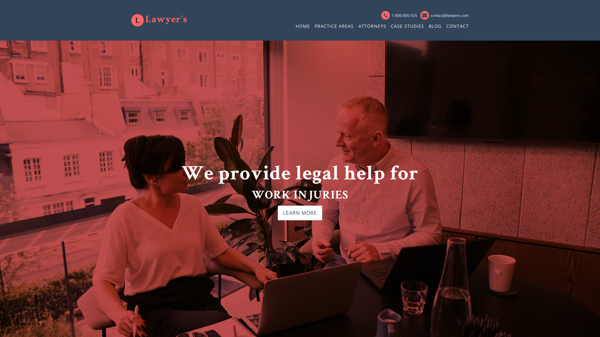
11. 3.5Start building the header: To start adding our logos and menus and social icons and all those things, we first need to think about where we are going to be putting that in. We need some sort of a container here inside an oxygen. And actually in any kind of weapon development project, it's a good idea to first have some sort of a container to keep all your smaller pieces, all your smaller elements. Now, usually in oxygen, we would start with a section and then we could add a div or columns. And we'll talk about those in a few, in a few moments. One of the, one of the upcoming videos. But we are building a header, our template with a header right now. So in oxygen, you get a Hadoop builder. That's a special kind of a section module element. So if we just type in header and then Hatteras builder, you can see that it's actually been added to our website. If we head over to our structure, you can see that we got our header builder. This is our main main section. And then we've got our header row with three elements. So we got our left element, center element, and write elements. So left, center, and right. And usually in a typical web design scenario, we would put our logo in the left part of our header. And for that, we could use the row left part here inside our header row. So let's actually add a logo of created is something like, well, a very, very simple, simple logo for our website. I call the wow design because y naught, I just took this simple icon from flat icon. And as you can see, I got two different versions of this, of this logo. One is, well, our dark, dark brown and one is our light, light, Great. So in this case, we could add our logo in two different ways. The most simple one, the easiest one will be just to turn this guy into a simple image and then upload it as our logo, which we are going to do now. And you would usually do it like that if your type is something a bit more special, something funky, something custom made, something that is not easily retrievable with just simple, simple text. So I'm just going to grab these guys. And I'm going to press Alt plus control plus Shift plus S to export these elements. As you can see, I'm using Affinity Designer, but if you're using Photoshop or Illustrator, you can basically turn your text and this icon into, into an image. So I'm going to choose the PNG because I don't need the background. And I'm just going to use selection without background. And the size is fine. I'm just gonna hit Export. And I'm gonna call it maybe logo one. And I'm gonna hit Save. And now I'm gonna go back to my design. And I want to add an image here in the left part of my header builder. So again, I'm going to choose add and I'm going to find an image. There we go. And I'm just going to have to find my image in my, my media library. So I'm just gonna go to browse. And now I'm just going to have to find that image. So once I found my image, I'm just going to double-click on it and just choose Select Image. And as you can see, that image has been put right inside my arrow left. So this is my logo. And, you know, if you want, and it, I think it would be a good idea. We could maybe play around with this image. I mean, we could, for instance, make it smaller. So let me just maybe change the height to something like 45 pixels, or maybe even last, something like 32 pixels, or maybe even 26 pixels. We could go down and down and down as much as we, as we want. So this is one way of adding on the logo onto our website. Of course, we still have to play around with some space in around all these elements. But for now, we are just learning how to add an element onto our website. And actually, if we just worked and save this, and if we were to grab our, our websites, well, adress, I'm just going to copy it. And since since I'm on a Firefox, I'm just going to use control plus Shift plus P keyboard shortcut to add to enter that the Incognito mode. But if you're on Chrome, you would use, you could use control plus Shift plus n to enter Incognito mode. So I'm just going to that tablet address in. And you can see that actually we already are starting to build our website. Let's check if that, if it works on Chrome as well. There we go. We got our website basically starting, starting to work really. It was, it was that that simple? But as I said, this is just one of the ways of adding a logo like this. What we could do, however, is we could maybe add the just our, at our image like this piece of our design. So I'm just going to grab it. And again, I'll control shift as PNG selection without background. Export. Export is, as you can see, already, exploited, exported it before. So I'm just going to call it login for save this guy. Go back to Firefox and again, add an image. And I'm going to have to find that guy. So once I found it, I'm just going to read it over, select an image. We're going to hit Save. As always, sometimes we just have to refresh the page and we got our logo put right here, again in our left, left row. If you want to, you could simply drag that image into another part of our, well, this header builder if you want to, but, you know, it's just, it's just a thing that you could do, but we are going to put it backwards and belongs. And I'm, I'm just going to remove this logo right now. So to do that, I'm just going to hover over this image right here, this Layer. And I'm just gonna hit this x Remove Component icon. There we go. So we got our image and let's maybe make it smaller, but we don't have the text, so how to add the text for our logo? When again, again, I'm just going to hit add. Well, let's find the text. There we go. And I'm just going to type in, WOW, design their ego. But since this is just a plain text and we set it to open sense, as you can see, our font is not the font that, that supposed to beat, supposed to be Bree Serif. We could change it right here. We could just go ahead and choose display the serif, or we could just let me just remove that. Or we could add a heading. So just type in heading. And as you can see, we already have the font that we need to. But since it's set, this tag is set to one. And in our global, global values, we set it to, I believe, 36 pixels. It's way too big, but still we could make it smaller, like 24. Of course, let's type in the text while design. And there we go. We could maybe changed some things. Maybe let me just make a town maybe just a bit smaller, 36 because this should be fine. And we could still maybe go to the Advanced tab, then topography. And in here, we could maybe increase the line spacing, letter spacing to main mu one to make it look something like this. I think it looks alright. Now, if you would like to maybe increase or decrease the space in between them, these elements, you could grab your text or your image in this case. And again, go to advanced, this time to size and spacing. And in here, you could, you could, of course, n changed their height or minimum height or width. But you could also play around with something called padding and margin. But let's talk about those two in the next video.
12. 3.6Add padding and marging to the logo: So let's now quickly talk about two ideas, two elements in a web development and are extremely important, but luckily extremely easy to understand. And they are extremely important because you'll be using them quite a lot. And those elements are padding and margin. And the difference between them is that they basically ad space around an object, but Padding adds like an inner space within a container and the margin Ed's outer space. But in our case basically right now we could use either one of these values. So if we would like to add, say, some space between our bird and the text, we could use either padding or margin. So if we just type in, say, ten pixels, you can see that we are expanding this container right here. You can see this line, this purple line, that's a mark in our container. And if we had the margin, you can see that the container remains the same. But we got some space between our bird and the text, just like we did with the padding, but the container stays intact. Now, another thing that we could do in terms of margin and padding is that we could add some padding to our main container, our header row right here. And you will almost always find some padding and margin options under the advanced tab. And then size and spacing. We are again within this padding, padding and margin options now. But before we start doing that, and before you really start to understanding the difference between padding and margin, especially when added to containers. Let me just quickly change the background of our header to something really arbitrary, Something like this. We'll change it in just a second. So again, size and spacing. And if we now add some padding to top and bottom, let's say 50 pixels and then 50 pixels, two top and bottom. You can see that our container grows. Now we got a lot of this pale red color right here. But if we added the margin, even though the values are the same, you can see that we are basically keeping the container intact in terms of it's visible or perceivable size. But we are adding margin to the top and the bottom end. Of course you can't see anything right now because it's white against wide. But if you just hover over this space right here, you can see that we are, we are actually adding in some margin. And by the way, if you don't want to add margin nor padding like manually like here, you could always just grab this like an edge of a container. Edges play around it, play around with it. And the same for the padding like this. And then as you can see, those values have been typed in automatically here inside our padding and margin values. Now, I don't want these guys to look like this. I do want to add some padding, but not that much. Let's go with maybe 2525. I guess this should be distributed, right? Maybe, maybe 18. Of course, if we had developed proper design before, we would already have all those values. But as I said, it's more about just the plain around a learning the skills to build a site than just actually sticking directly to our design and make an advert thin luca, the prettiest possible. So we got our logo setup, we got some margin, and we got some space right here. I haven't gone to, however, remove that background color. And we are back with our, our design. And if you want to check what it looks like, if we are not logged in. There we go. We got our well-designed and our logo right here in the top left. Now, this looks all, this looks all fine. But of course, we need to still remember about our design when it's going to be accessed by users from most probably a no mobile device. Nowadays, the majority of traffic and websites comes from mobile devices, not from desktops or laptops or whatever. So we need to pay attention to that. And I think that we should already start to understand how to tackle that issue right from the onset, right from the start, because it's extremely, extremely important. So it's actually start doing that in the next video.
13. 3.7Taking care of the responsiveness: So as I said, our design looks nice. Well so far our logo looks nice on desktop devices, but what about smaller devices? So we need to take care of the responsive side of things in here inside oxygen. And it's actually really easy. If we take a look at this little switcher right here on the left, you can see that we got some icons. And if we just click on any of these options, so let's go with page container, 1120 pixels and below. This is what our design probably, well, I mean, the size of our logo is going to look like a Most of laptops. So far, it looks all right. Let's go to less than 992. That might be like some larger tablet tablets. That's also fine. Let's go to less than 768. Now at this point, since we are going to have some menu right here, maybe we could change some things about it. Maybe we could, for instance, change the text size. So I'm just going to select, this is heading, this guy right here. And for 768, I'd like to maybe make it just a bit smaller, maybe this image as well. So I'm just going to maybe use this slider right now. And I'm going to bring this guy down to maybe like 18 pixels. And for this guy, maybe I'm going to, let's see it in pixels as well. Now that's going to be way too small. 2424 should be fine. There we go. So we got our hmm, you know what, maybe let's also change this. The size of our gap right here. Maybe let's make it just a bit smaller. And as you can see, if you go to size and spacing, we could maybe do like five pixels, not more. So if we now go to our old devices, so this is our logo. Then page container, then less than 992, and then 768. Now it becomes smaller and let's go less than four AD. For 80, it's still looks alright. Of course we are going to be playing with the responsive side of things a lot more in the upcoming videos. If you want, you could maybe, maybe because that's how you want to make your design. Let's maybe go to the, our header row. And let's say that maybe we'd like to change the color of the background for, for our like Cain, maybe like a smartphone view. Why not? Just, just for fun? So if we're on less than 480, Right now, we go to Advance. Of course we got our header row selected. We go to the background, background color. And let's slip maybe change the color of the background to this light gray or maybe even something visible. So just so you can see the change. And we're going to leave it like that. I'm going to save it. So if you now go to our old devices or large does a desktop page container nothin happens less than my 92, not much happens. Less than 768. The logo and the text changes now it's all smaller and less than four AD. And let's go to our, our design. And that by the way, we could, for instance, right now, just start changing the size of our view port of our browser. So as you can see, we are getting smaller now. The jumped too well to less than 768, I believe it was. And landscape evenness, smaller, smaller, smaller. And there we go. We got our smallest smartphone will had in the header row on the smallest devices will look like this. And if you don't want to keep these changes, these changes like this, just always remember to make sure that you are on the right break one. So less than four AD in this case, I'm just going to remove it. And let's go to less than 768. Maybe I'm going to leave it. Leave it like this, and always remember that all these changes work. Well, there is a hierarchy between all these, all these guys. So if you set something for like less than 992, let's say that you're going to change this text color to, let's go with something yellowish maybe or just something visible. There we go. So for less than 992, it's like this. So for the higher values, so for the parent element, we got still, we still got our original. But if we go down, if we go to the child, that value changes and then we go if we go to the another child, that value changes, but only the size changes because we didn't touch the color, so the color stays the same. If you were to change it to something like this. Then we go to 1992. We got green, then 768, we got brown. If we don't apply anything to it, and we don't apply the colour, color. Well, any attribute actually takes the values of the parent element, which in our case is the 992 Breakpoint. But of course we don't need the green color, so I'm just going to get rid of it. I guess we could stay with our with the size for our logo. This looks this looks fine. Let's keep it like that. So we've got our logo, we got well, we took care of a bit of a responsive side of side of things. So I guess it's high time that we added our main menu on the right. So let's start doing that in the next video.
14. 3.8Add the desktop menu: So now let's start adding our menu. This is kind of a, I wanna say, lengthen or complex process, but there's a few steps to building a menu on every, every website, not just here inside an oxygen. So let's start with adding our menu elements. So again, I'm going to just hit and, and then start typing menu. Now as you can see, there are two modules for our menu. This menu is the, well is I don't wanna say deprecated, but it's an old menu module. And since, I believe three-point oxygen, 3.2 or 3.3, we got the pro menu. So I'm gonna do, so I'm going to be using our menu right here. Now as you can see, it gets added to our first row, this row, left part, right here. And I wanted to be on the right side, so I'm just going to drag it to the right. Now by default, you can see that there are some simple dummy menu links added to our, to our menu. So I'm gonna go to the menu option. And as you can see, it's basically AMT we got nothing here. Well, that's because we didn't create a menu yet. So I'm going to just save my, my site. And I'm gonna go back to the admin panel. And from time to time you are going to see these messages right here informing you that some, some caching, that you change some global settings and you need to recast your oxygen settings. So let's just click this. And then you're basically then, as you can see, all done, universal CSS cash generated successfully. That's basically to kinda like refresh the memory of oxygen. So let's move on to actually creating that menu. I'm going to go to the appearance panel and then menus. And let's create our first menu. I'm going to call it Main Menu. There we go. And I'm gonna hit create menu. And let's just add all of our elements. So we got contact about AN portfolio. I'm just going to maybe move these guys around. Of course, we could also add some sub-menu items, but for now let's just keep, keep it simple. And I'm gonna hit create. And then we can go back to our pages Home. And then I'm just gonna hit edit template. And there we go. You can see that our menu is, is right here on the right, the right side. So as you can see, oxygen added our only menu right here where it's supposed to go. But of course, there's a lot of thing that we need to take care of. Right here. On the left you can see different tabs that control the look and feel of our, of our menu. So first let's go ahead and change some things about the desktop appearance of our menu. So if we, if we click on them and desktop menu, you can choose between the vertical and horizontal orientation of your menu if that's something that you wanna do, for instance, if you wanna do like a portfolio page. Or portfolio site, you could maybe just add a vertical menu on the side and like a big portfolio piece on the other side. And right here we got different at different times. And that will actually control the look and feel of various aspects of our menu. So if we go to typography, we don't need to play around with the font-family because no, our d, we already set the default for our topography for elements other than headings. So we could maybe play around with the font size if we want to. Maybe let's go with something like 14. And we could change the color. Let's go with our default color. And maybe, maybe let's Chido. Let's see what it's going to look like if we set it to the uppercase, uppercase, our text transform. We could also use lowercase if we wanted to, but I'm gonna go with uppercase. We don't have too many Menu elements. So I guess we could maybe make it more prominent, make it more visible by a change in the, by transforming the text to be upper, uppercase. Now, if you want to, you could also change the font-weight. Remember that this is the Google font, open science, open science, and that typeface. So we're going to get different font weights for this specific font and angle. Let's leave it, let's leave it as default. I think if you go with 600, that might be a bit too much. Maybe if it wasn't, if it wasn't uppercase, maybe that would look look better. So as I said, you got total flexibility when it comes to the change in the look and feel of these elements. And it will basically depend on your artistic tastes and your design and your clients expectations, what this is going to look like. But you know, you get all the, all the changes right here visually, nicely laid out. Of course, all these elements are touching each other. They are way too close to each other. So let's go to space in a line and border. So what I would like to do is I would like to add some margin between these elements. So let's see, eight pixels. Eight pixels might be alright. Now, if you would add, if you'd like to add some padding to your elements, you could of course do that. And that would, that might come in handy if you want to add some colors to this element, to the background. So let's say that we would want to add some autonomic. We like this, this kind of a, this kind of a color. And then let's go to our desktop manuals, base and align. And let's maybe add like ten pixels. And as you can see right here, you can, there's a, there's a little Apply All button. If we click on it, we are going to apply at the same value to all our, all our elements. But that's not really what I wanna do. I'm just going to delete all these, all these elements. And of course, I don't really want this guy to be this brown. I think that looks, this looks better. However, we could always just play around. With the topography, maybe maybe increase the Size since since we put it to a lowercase, maybe like 15. But as I said, it's going to be totally, totally up to you. And the last tab here in this desktop menu is the hover and active tab. All these elements, all these, all these values are going to allow you to change the appearance of your, of your menu links when they are Hubbard or when they are active. So when the specific page is active. So let's say that we would like to change the text color on a hover. Let say that we would like to make it out on our life. Funky red color. So whenever we hover over our piece of text, it's going to, it's going to change. Also, we could change the Hubbert background color. So as you can see now, we are changing the text and the background. And this is where that no padding would really, you know, play nicely along with these changes, we would have more breathing room here. We would have more space. So it would look definitely better. But you know, we are learning the options. So this is what this hover background color doesn't. You could also have a border. So if we hover over, our element is going to add a border. So maybe let me just remove that. Let's just add a two pixel border bottom. And as you can see right now, we already have this bottom, this bottom border applied to our, one of our menu items because we are previewing this page right now. So let's, if we preview about, that border is appearing under the about link right here. So this is something that she could do. Of course, you could also add the border top border top hover option. That's what you want to do. I think I'm going to leave it as one. I think I like this option. And I'm gonna get rid of the hover text color. I just want a nice, nice border underline. Whenever I hover over in, hovered over the menu, menu link you, we could also change the active text color. So if we're now previewing the about page, so this is our active page. We could change that color to, I don't know, maybe something, something like this. So whenever that page is active, that menu link color is going to change. And I don't want this color same for the active background color. And we could also change the duration of the transition. So if we want to add a color to our hovered texts class, let's go with the red again just so you can see everything better. And if we change the transition duration, so let's say, I don't know 5.5 seconds. If we hover over this element, you can see that it's nicely fading in when we're hovering over the link and fading out when we are hovering out like that. So that's something that we could do. I'm going to leave it and I'm going to just leave this Hover Border bottom. That's also going to be, as you can see, it's also going to be transition like this, but of course that's a weight too big. So one should be, should be fine. So this is our desktop menu. If we start to make in our side smaller. Now at this point, it's still looks all right, but only because we have not too many pieces right here, right here, not too many, not too many Menu elements. But once we start adding some more links right here, that would, you know, it would totally mess our menu up. It, it wouldn't look good. So actually, let's maybe add some more links to our portfolio. Just, you know, just to learn how to add those and what it would look like once they are in right here. And we could also add some sub-menu items just to see all the effects that we can add. When you are, when you have some sub-menu items in your, in your menu and what you can do with them here inside oxygen.
15. 3.9Make the meu bigger: So if you ever have sub-menu items in your menu, like we have in here, you cannot change their appearance right here. If it's of course, a desktop menu right here in this desktop dropdowns tab. So first of all, we can enable drop-down. So when we do that, we actually can see these elements right here. Of course, if we don't enable the drop-down, That's actually well, that's gone. It's still there. It's still in the database. We just, we're just not seeing it. So the first thing that we can do right here is that we can change the animation type right now it's set to fade, fade up. So maybe let's just see what it looks like when we, when we go out of this building mode, let's go into Incognito mode. So this is our, this is the animation that we have, this fade up animation. Let me just make, make it smaller so we can see right here. And if we go to something like, I don't know, let's go flip up. I'm going to save this. And then I'm going to refresh the page. You can see that we got another oil at different animation. Of course, I'm going to leave it up to you. We could increase or decrease the duration of this animation. So let's maybe see what that looks like, what effect it makes. You couldn't see them that no, right now it takes much, much longer to animate these elements. But of course, we wouldn't want the animation to take this long. I would say that something between 0.2 seconds to 0.4 should be enough. We want everything to happen at innocent dangerously, We don't want our users to wait for our magnitude to load. So this should be fine. So now what we can do is we could add a box shadow to our, to our menu. So this whole menu would get a shadow behind it. So I'm going to go ahead and choose a color, a shadow color. And usually says Should we something dark, but also, I'm going to decrease the transparency ever so slightly. Maybe do something like this. And now we could do maybe play with the horizontal offset values, vertical offset just to move our, our box shadow. And we could exchange, increase and the blur and, and increase or decrease the spread. Of course, all these options are for you to play around with. And they basically work the same like they work in any design and that design piece of software. So let's actually see what effect it, it did. So there we go, we got our shadow added. Of course, it looks horrible, but actually you can see it's simply works. And it's just up to your imagination, up to your app, to your design to make it look aesthetically pleasing. And to you and of course to your client, if you really want to do that, that the box shadow now it looks well a bit differently. Now, I don't really need this box shadows Amoco into just deleted. But of course, I wanted to show you what this option looks like because of course we want to learn how to use oxygen to build our websites. So now we can go to drop-down icon. And of course we can show the drop-down icon or we don't need to show that. So that would just know that that will leave from the user thinking if there are some sub menus we want to show, we don't inform the user that there actually is something hiding inside this link. But maybe this icon is not what you would like. I know, I don't really like it. So we could maybe find something else. As default, we can choose from and Font Awesome fonts or linear icons. There you go. Maybe we'll find something here. If you know them. If you know the, you know, the name of the icon, you can just type it in. Let me just see what this guy will look like. I guess it looks better than that icon, but maybe I'm just going to change the size, something like eight pixels and maybe increase the margin, maybe not to ten, but to like five, this should be fine. And if you want to, you could also rotate the icon. Maybe two, something like this. Let's see, 120 or 90. Know, whenever someone hovers over this icon, they would, they would see our, our sub-menu. So there's quite a lot of, quite a lot of options for you to choose from right here. And I think that these explanations are pretty clear. You can change the open rotation, you can change even that transition of that, of that rotation. But again, I'm going to leave it up to you, up to your design taste, an app to your experimentation, because this is really the only way you're going to get good at this. So that after the drop-down Ico, we got dropdown colors. So if we change the background color to maybe something like this. If we hover over, you can see that our background is, is changing. And if we change this hovered background color to something like this dark red, when we hover, maybe let me just save that would be easier to see the changes here. When we hover over, you can see that it's actually, it's actually changing. Our background is changing. So let me get rid of these guys. Of course, we could change the link color, the hover text color, but let's, I'm going to leave it up to you if you want to change that. And we could also change the child links or if we had like a sub-menu. Within a sub-menu, we would want to change all these guys in here. Ok, so I guess we got our desktop menu sorted. And we now I think we can now move on to actually making our menu responsive. So let's start doing that. In the next video.
16. 3.10Responsive menu: As we already know, once we started going, say luck, like less than 768, our menu looks horrible. It's breaking our site. So in here, when we go to our primary pro menu, pro menu elements, you can see this option right here that says Mobile Menu toggled below ones with twirling open, you can see that we can, that we got our break points the same as here. And also always and never. All these options control when your menu is going to appear as a, as a responsive menu. So if we do always, our menu is always going to look as it is a responsive menu. If we do, never, our menu is never going to look as a responsive menu. But if we choose, let's say less than 992. If we start previewing our, our side right now, when it's set to 11120 pixels and below, it still looks okay. But when we go to less than 992, you can see that our menu is changing into a, into a mobile menu, into the smartphone menu. I'm going to save my site because I think that I'm going to leave it as less than 992. It looks alright. So what can we do about our menu? First of all, when we click on it, you can see what our menu is going to look like when, when we open it. So when you go to the mobile menu option right here, and you can see that we got ton and ton of options to control our mobile, mobile manual. So first of all, we can check, we can see which well, which I can, We could use as our menu. So usually we would use something like a simple three bar. So let's see if we can find it. Maybe not like that. Let's see lines. While all well, maybe I guess we could use this one. But I know that there's a different, let me just start typing menu that maybe, that will maybe be better. So I'm going to choose and these bars right here, and you can see we are changing our, our menu, menu icon will basically instantaneously. And down here, you can choose to leave this as manual lever, this text as menu. We could type in something else like open maybe or like me. If you wanted to, that would be just the text for our menu, but usually I just leave it blank. So we've got just the simple menu looking length is, of course, if we click on it, you can see that we got our menu right here. We could of course change its size, make it bigger, make it smaller. I'm going to live. It won't be as 42. Why not? We could change the margin, we can change the color. So maybe I'm going to give it my default color. I know that there's not too much change, but I'm keeping and the colors consistent. We could change the icon hover color if we wanted to. So whenever someone would, well basically tap on it, then that color would change. We could change the padding. So if you wanted to have maybe like say, let me just maybe turn this guy black and then the I can color. Let's make it, let's make it white or off-white color. You can see how we can change the look of our button. Button completely. That's just going to be, well, it can be your design choice if you want to do it like that, and you could maybe just make them that Penn is smaller. So that's what she could do if you wanted to. Just going to maybe get rid of these guys and go back to our original. And I don't need the padding color. And I guess, you know, all these values are pretty self-explanatory, but you just need to click and check and slide. And it's just all these options just so you can see what effect they have on your menu icon. So this is the menu icon, but it's of course only the Open icon layout. If you wanted to change, if you wanted to have some text right here like that menu text, you can change, you can control that text from this Open icon topography. Now if we move to close, I can layout. That's going to be the UN, that menu right here. This, I mean, this icon right here. If you wanted to make it look different, let's maybe try to find some thing that would match our Open icon, like an ax or something like that, that would match our icon like baby, this acts that would look a bit better. And again, you could choose to leave that the, this icon texts as close. If you wanted to do that. Maybe we could change the position of our icon. Maybe move it from the left-hand side all the way to the right. And actually, I think this is I think that this is something that oxygen team could maybe change. I don't know why they, this icon is always set by default to the left when usually people are right handed. And I guess it's just a better UX usability when this close icon is closer to the right hand side and we don't, we wouldn't have to change. And all these elements, all these values just to move the icon to the right. And of course we have all the same options right here as we had with our Open icon layout. Okay, so maybe not, maybe let's increase this icon to 42. I think that open Eigen layout was set to open eigenstates was set to fully to, I believe, I guess we could always check it as 42, so we are keeping things consistent. Let's go to our menu styles. And I guess the most important thing here would be to change the item text align to center. Of course, if you wanted to have it aligned to the left or to the right, you could do that. But I usually, when I got an many looking like this, I usually keep it centered. So I'm just going to save this. And if we now just go to our design, you can see that and b, let me just do it bigger. If we now just make it smaller. There we go. If we start making our viewport smaller ones and hits the 992 break point is going to change into a simple Lebanon, that simple, but definitely a Mobile Menu.
17. 3.11Off canvas menu: Another interesting thing about the Mobile Menu Here is here and oxygen is the fact that you can make it off canvas. If you just click on this option right here, you're going to be able to kinda like animate the cam on the canvas at the menu. Kinda like it's coming from out of the viewport. So let me show you what I mean. So if we just remove this guy, so we got all the, all the default, default options right here. I'm going to save it. And then we go to our menu. I'm going to refresh the page. You can see that it's kinda like fading in from the right side. Right now. What we could do is we could do maybe increase the size of our canvas. We could maybe even make it, let's for now, make it smaller. Let's make it like sixty-six percent just so we can see what's happening. And I'm going to save it and I'm gonna change the background color just so you can see this menu a bit better. And so if we now refresh the page, again, you can see that this is our, this is our manual that is kinda like failing in from the right. We can of course change some things about it. Let's see if we align it to the left. And let's see what this will look like. And you can see that it's now being aligned to the left. But I guess from the right would be better. And we could of course, change the off Canvas animation. And there's quite a lot of options to choose from. Let's see, zoom out down and let's see what it, what it's going to do. I'm going to refresh the page. And it's going to look something like that. It's pretty heavy. But I guess maybe, you know, maybe this is something that you'd want to do. I would maybe decrease the duration to make it make it quicker. So let's see what it does right now. So you can see, I guess it's not the smallest of the animations, but to note something to something you could do. So I'm just going to maybe do something simple like like slide, slide left. Why not? Let's see, slide left. And like that. And it looks much, much better, much, much smoother. So of course, when we decrease the size of our viewport, since we, since this width is set to boil, set to percentages, you know, it's always going to take up the, a specific amount of space right here, shown in percentages. If we were to set it to just pixels. There we go. And let's refresh the page. Now it's always going to take up that value. But in pixels which doesn't look, doesn't look too good. If however we wanted to maybe like cover this whole page, we could use the viewport width value. And if we set it to 100, that means that all the view, all of the viewport will be hidden. So if you just save this guy and then refresh the page and we are going to increase it. And you can see that right now, our menus covering all of our viewpoint from the left to the right because this is what this unit VW viewport width doesn't. So I'm going to leave it like that slide left 2.2 seconds. That looks, that looks fine. So now that we got to our off Canvas menu sorted, we still could play around with mobile dropdowns. So let's open up our menu. And as you can see, we got our menus hidden right here, but they, they don't look all that good. We could maybe change the background color to what we would really want. We could maybe change the width of our border to like 1.1 pixels so it matches our desktop menu borders. And of course, if you wanted to but play around with the color you would the style. But I guess that looks, that looks all right. We got our Mm-hm. Mobile Menu. Menu. Pretty much, pretty much sorted. So if we just save this guy and refresh this page, and I'm going to just make it bigger. If we now start to go down, go down, go down. You get our mobile menu. If we click on it, you get our animation and we got our dropdowns. So everything is working, working smoothly, working nicely. So when working with menus here inside oxygen, if you don't want to play around with all these options, you could use one of their presets that come with the, with the program. So I guess we could just briefly take a look at those next.
18. 3.12Menu presets: Before a start to using D's menu presets, I'm going to save my own menu as my own preset. So I'm going to name it my menu. I know it's not to creative, but I'm going to save it just as my menu. And now it sits right here in my, in my list with other menu presets. So let's say that I would like to use the slider to write venue. And as you can see, not only the sliding effect is going to be applied, but also all the other elements. So for instance, the menu is set to mobile and as always, if we click on it, you can see that it's moved to the left and we got all, all of these elements. And if we go to, let's say desktop and mobile, you can see that again, the menu changes. It now looks like this. And of course we could, let's see minimal as my like minimalism. Well, that's not too to minimal divide days. Let's see what it looks like. When we, when we preview it right here. If we click on it, this is, this is our, this is our menu. It doesn't look all that bad, but of course we could still change the links. We could change the font, all those things. But again, if you want to use one of the, one of the presets that come with me, come with oxygen. You could definitely, definitely do that. But I think I'm going to stick with my, with my menu and I'm going to save it. And I just think that it, it looks a bit better. And this is kind of a look that I'm going for for this design because we are creating a design for our services as designers. So I think that if we just to keep it simple, that is going to show us as designers who, who got, who got taste. So let's leave it like that. But of course we are not done yet. We are not even done with our header. In the, in the subsequent videos, we are going to take a look at sticky headers and also add overlay headers. Here inside the designer, we are done with the menu. Now we are going to finish that header with the, with the sticky header and the overlay header.
19. 3.13Inner content: So now we are going to take care of the sticky header and also an overlay header. But in order for that effects to be visible at all, we need to have some more content on our website. And actually, it's a very important step here in insider oxygen because without that inner content module, we wouldn't be able to add anything onto our website once our templates are reading. So what I'm gonna do is I'm gonna go ahead to the oxygen templates and I'm gonna add it my main template with, with oxygen. Okay, so I'm inside my template and I'm gonna go ahead and click this Add button. And I'm going to start typing in content. And once I got this inner content module right here, I'm just going to click on it. And as you can see, it gets added to my structure and not much actually happens. I mean, we could style it if you wanted to, but that's really not the point of this module. Basically, this module is going to allow us to show everything on our website without it. I, I guess it would be possible, but we will be just building our templates. And now if you wanted to add images or text right here that day would be a part of the template. And they would be displayed onto, on each and every page that a user would see. So every time you just want to, you know, like finish designing of your, of your template, your main template. Just remember to have the inner content module ready and waiting for, for your next design steps. Because without it, they would be basically impossible. So once that's done, we just have to save it. Then I'm gonna go back to my admin panel. Because right now if we want to see that sticky header and if we want to see the, the, the overlay header effect, we need to have some content on our website, on our page. So I'm gonna go to pages and I'm going to add it with oxygen. I'm going to edit the home page with oxygen. As you can see right now we got to this click Add to, add elements to this area. And this button should basically correspond with this button. But since, since I can remember this, this piece of text is a bit different than this piece of text. I know is just the positioning of this plus symbol, but annul it always, you know, I always see it. I always notice it. But anyway, once we got this guy right here, well, we got this text. We know that we have to now add some elements to our website. So if we just go to add as, as usual, I'm just going to start with a section. And this section is going to be hosting our hero image. And I'm going to go to the Advanced and then background and inhere in the background image. I'm just going to add this image to my background. And as you can see, it's been added to my whole section and it says panning across the entire page by default, but that's not the case in terms of the size, well, the height of our of our section. So if you want, I can just go back to size and spacing. So if you want, you can set the height right here. And of course, if you set it to like pixels, 500 pixels, you are going to basically see this. And if we were to change the unit value from pixels to this time VH, which is viewport height. Now we are going to tell the browser to, you know, to spread our background image across the entire height of our, of our container and regardless of the basically of the container. So if we were to set it to 100, this design will, this image is going to take, take up 100 viewport height units. I know that we still can see like this, this piece right here at the bottom. But that's just because we got this header at the top and we are going to, once we initialize the overlay handled, we are going to fix that. But for now, I'm just going to leave it like that. And when you go to our main page, you can see that we got this image, image right here. So maybe let's add some more content. I'm good to go and I'm gonna go to the structure panel and maybe I'm just going to add section. And as you can see, it gets added right beneath our previous section. And I'm also just going to, I'm going to add some dummy text that I'm going to borrow from the lorem ipsum side. I'm just going to I'm just going to copy it. And then I'm just going to paste it. And maybe let me just duplicate this piece of text. And I think this should be fine. This is four. Now this is enough, enough text that we have just to learn how to use the sticky header and the overlay header. So let's start doing that next.
20. 3.14Sticky and overlay header: To add a sticky header and to change our header into an overlay hetero, we gotta do it from the, from our template level. So I'm just going to make sure that I got this saved. And we're just going to click on my header and click open and edit template. Yes, yes, open anyway. And right now we can change our, our header, as you can see our preview in homes. So we can see all these elements that would just set for our home page. And once our header builder is active, we can go to sticky and you can click on Enable sticky header. So this is going to do is it's going to allow us to create a sticky header, which would be visible every time a user scrolls on our website. So when someone scrolls down, we still can show that menu to our, to our users. So I'm just going to leave the scroll distance in a 2-300 because when users scrolls down in a 300 pixels, you can see that we got our menu and showing up, but we are going to fix this layout in just a second. So I'm going to leave it like that. I'm going to change the sticky background to this color. So now when a user's scrolls down, scrolls down, the user is going to see this, this manual like that. And I'm gonna choose fading, sticking that is going to just nicely animated. We could maybe increase this fade in speed. There we go. This would look, look much nicer. And I'm going to save this guy. However, we could maybe changed some things about our menu that is going to be sticky. I mean, I'm, I don't think they would want it to look like this. For instance, I would want this menu to be smaller. And maybe I would want it to be responsive always all the time. So for that, I'm just gonna go to my header row and I'm going to duplicate it. So right now we got two identical header rows. But what I'm gonna do is I'm gonna grab my image on the left and I'm going to make it smaller. I'm gonna make like 24, maybe even less than that, like 18. And I'm going to do the same with the heading. I'm going to make it smaller, like may be 16. This should be fine. And let me just grab the image may be and maybe decrease this margin ever-so-slightly to something like five pixels. And then I'm going to grab my pro manual. And I'm going to I'm going to tell it to be well, to be mobile. Always like that. And maybe I'm gonna go to the Mobile Menu and Open icon layout. And I'm going to make it smaller, like 24. Maybe this will be fine. So now we got two menus. Maybe I'm just going to also change this padding to something like 1010, or maybe even less than that, like 55, right? So I'm gonna save this. And if we now go all the way back to the primary, we can now choose to display this row, this header row only as a sticky header. So I'm gonna click only show in sticky. And I'm going to click on this row and I'm going to say hide in sticky. And now when we save this guy, and I'm going to refresh my page. If I now start scrolling down, you can see that that header is only been shown once the sticky is hidden. And when you go down, we got our menu right here. Of course, we would have to fix some issues right here, but of course that's, that's easily fixable. We can easily fix that. But the main point right here is that you can change the way this header stick hetero behaves. And once you scroll down your page, when we go up, that older header comes back. And when we go down, we got our new sticky header shown right here. So that's that sticky header. What about the overlay header? I'm going to remove this sticky header. I don't need it. Let me just save this and I'm gonna refresh my page. So I got my, my header right here. And what I'm gonna do is I'm gonna go to structure header builder. And I'm going to go ahead and choose Overlay. And I'm going to say that I always want to overlay the header, which is going to make my, my image go up and make my, my header go like over our main sections. So if I save it and if I refresh the page, you can now see that our, that our header is all been overlaid over this, over this section. And this image is actually right now because we set it to 100 vh, as you can remember, it right now, taken up the whole, this whole space. But of course some, well, this, well, we could maybe play around with all these colors who we might not want to make this look like this. So what I would do is we've got again, go to the header row and we could duplicate it, duplicate this header row. And no, I don't want to make it higher and sticky. That's not what we want. What we want is, for instance, we will want to hide this guy when it's in overlay. So this top header, so I would say Haydn overlay. But this bottom guy, we could maybe like change some colors. So let's go to, let me just grab my heading. And I would change the text color. Of course we would have to change this color while this image as well. But if you don't want to change it, if you don't want to just upload a white version of this logo, we could maybe do a quick little trick. We're going to go to the advanced than effect. Then you can go to Filter. And from here we could change, choose, invert, and then just go 100%. And we would simply invert the color of our, of our local. Now it works in this case, well because we are inverting black. So from black we are going to white. And if it was read, I guess good could invert to green or blue. I'm not really sure, but in this case, this effect works in, usually we would we would be better off if we just changed this image to a proper lighter version of our, of our logo. But anyway, we can do it like that for the time being. We can also go to our pro menu. And we could maybe change, change the color of our, of our menu. So we could change the color right here. We could grab the slider color. And I'm just going to leave it as is for now. Just, just to show you what this overlay header actually does in our case. And as you can see, it looks pretty nice. Basically, we got a proper contrast between our background and our header. So I guess we could, we could leave it like that. Of course we, I guess we would have to work on our on our logo, on our menu right here, because right now it doesn't look all that great. And you know what, I guess I'm going to go with this kind of a design. I'm gonna go with this overlay kind of a header. So I guess we could maybe fix this menu to make it look proper. So we could maybe play around with the background. We could play around with the links, the icon, solid, start doing that next.
21. 3.15Tidying up the menu: So let's fix our menu. Let's make it look nice. So I'm gonna go to my less than 992. And I am going to change this icon right here. So I'm gonna go to my mobile menu. I'm open, I can layout. And I'm gonna change the color to my lighter color like that. And if we click on it, let me see what it looks like. We got the background that we would have to change and the links that we will have to change. But to maybe let's start with the back ground. So I'm gonna go to menu styles, and I'm gonna go to background color. And let's remove it. And you know what, maybe let's try something different. I'm going to go with this darker brown color, but are going to decrease that transparency to some Psalm ten lie. So this should look fine. And now we don't have to play around with our, with our links because we've got enough contrast. But we have to go to our close menu icon, so close icon layout. And let me just find the color for it. So I'm just going to click on this option and change this to white. And maybe I'm going to try to move it to the side. So it kinda like covers this and this option right here, this part right here. So I'm just going to go ahead and do I can position left and I'm going to go with the percentages. And let's see 75, let's see 85. Let's see 19. Maybe 90 will be fine. Let's save this. And let's just see what it's going to actually look like. Once it's done. I guess it looks fine. I guess we could leave it like that. Or our well, almost all our menus are working fine. We still need to take care of the mobile dropdowns. So let's go to our mobile drop-downs. And I'm going to remove this drop-down color. So let's see what it looks like now. It looks much better. Let's save this guy, refresh. And again, and this is our menu. Looking, looking pretty nice, I think it looks all right. So we've got our, we've got our Header Menu completed. We also have our main image for our hero completed as well. However, we are going to play around with our hero quiet extensively in the upcoming videos. And don't forget that we still had our sticky header right here. So you might see someone glitches. Of course, if you want to keep the sticky header, you could do that. You already know how to do that. And I definitely, definitely encourage you to play around with all those options, but I'm just going to maybe get rid of that. I'm just going to go to the sticky options. And I'm going to disable the sticky header. And let's see if that worked. So I'm just going to refresh the page and as you can see, the sticky header is gone. So as I said, right now, we can move on to making our hero section right here a bit more interesting. We can add some heading, some texts, maybe some buttons, and maybe some slider, but we'll see about that in the next videos.
22. 4.1Centering the content in a section: Okay, so let's move over to our home page. So I'm gonna go to pages, all pages, and I'm gonna choose homepage and I'm gonna edit with oxygen. So this is our layout. So we have our own, we have our overlay header. We have our section two, which we added a background image, this one right here. But also as you may remember, we also set it to 100 vh. So this image spans across the whole height of our hero section. And of course we got some dummy content right here that I guess we could actually remove it, but let's keep it for now. So the next step here would be to make our hero image a bit more interesting. Right now we only have an image. And we basically, well, we're not communicating too many things to our, to our users. So what, what I would like to do here is I would like to add maybe like a heading, I would like to add some text. A may be a call to action in a form, in the form of a button. But before we're gonna do all that, and there's a few things we need to keep in mind. If we were to now just add, Let's say that heading. And then we would like to add some text. There we go. And then we would like to add a button. There we go. You can see that all of these things are being added in the top left corner. Of course, there is a bit of a padding right here because the section by default is set to have size and spacing is set to have 75 pixels of top and bottom padding and 20 pixels left and right padding. So there's a few things that I would like to do to make this text appear in the center spot, not only horizontally but also vertically. But I would also like to change this image a bit. And I mean, I like to make sure that this image in the background, that it is also centered. And right now it looks like it's centered, like it's alright. But when we start to make this whole design responsive, you will see that we are going to be losing our composition, so to speak. So let's take it slowly, step-by-step. So first let's take a look at how to make all this content, how to center this content in relation to our section. And you might be thinking that we have to maybe like grab the heading or the tax or the bottom. And then maybe like in Photoshop and Illustrator or any other program, just hits some alignment option right here at the top. But in in website building, I am, it would be especially here in oxygen. It would be a better idea to tell the section, this section right here how to render all the content. And that is actually being put into our section and in our, in our hero and hero section. So may be, by the way, let's just click on these, on this menu, on these arrows. And let's rename our section. Let's call it. Now let's call it a hero section. There we go. I'm going to save my design. So what I wanna do is I wanna make sure that this heading, that this text, and that this button is set exactly in the center spot vertically and horizontally. So when I, when I got my hero section selected right here, I'm going to move on to this horizontal item alignment options. And I'm going to click on center. As you can see, all of my elements are being now centered horizontally, but they are not been centered vertically. I want all these guys to be exactly in the middle of our section. So to do that, I'm gonna go to the Advanced tab and I'm going to go to Layout. By the way, all these elements stay look. Well like it's like, it looks like some pretty scary stuff here. But let me tell you that basically what we are doing right here is we are telling oxygen to write some CSS rules for us. And CSS of course stands for Cascading Style Sheets. Basically, those styles are responsible for making our headings look the way they are supposed to look. They are responsible for the alignment. All those things. I mean, we don't have to write any code. We can just tell oxygen to write that code, of course, in the backend for us simply by clicking on certain, certain options. So as you can see, we've got our align items center. That's basically what we did. Let me go to primary. That's basically what we did here. And now what we wanna do, again, layout is you want to put all these elements in the center. So to do that, all we have to do is to just click on this justify content Center option. And basically we're done. We set our content exactly in the middle. And if we now we'll save this guy and we start to take a look. And we'll take a look at our responsive options. You can see that all, all the time, all these elements will always stay exactly in the middle. Of course, as you can see right now, this tax is being put. It's been aligned to the center and we would like it to be aligned while it's being aligned to the left. But we wanted to be aligned to the center and we of course are going to take care of it in just a second. But also you can see that our background image, It's kinda like been cropped. Like we don't see that focal point exactly in the center. And that's something that we need to take care of as well. But let's start doing that in the next video for now, I just want you to understand that if you want to make sure that that you're aligning all of the content exactly in the center spot. All you need to do is to go to the Advanced tab and then to lay out and you get all of the alignment options ready and waiting for you right here. So now let's move on to aligning them or centering our image as well.
23. 4.2Centering the background image: If we start to preview our design f, as if it was rendered on some smaller devices. You'll be able to see that our background image is xm. It's kinda like getting cropped. We're not, we're not able to see our focal point, in this case our center spot. Well, we're instantly in the center spot. If we go to less than 480, you can see that, well, this kind of looks kinda weird and you think like this laptop is been cropped on the side and we basically are not sure what we are looking at. So in order to prevent this situation from happening, there's a quick little solution, a quick little trick that will allow you to keep your focal point exactly where you want it to be in terms of viewing your background images. Now in our case, we want the focal point we exactly in the middle. So what we can do is we can go to when our section is selected. You can go to the background. And down here you'll see these left and top options. So these guys allow you to move your background image in relation to the left point and the top point. Now, if we were to say, I don't know, do something like 50%. Now, at this point, not much is happening because we are previewing the large desktop. But if we started going down, you can see that actually right now our image is moving. If you can remember, when we were, when this was set to the 0, this is how, this was our, our background image. And right now we moved it to decide. And if you want to keep it like that, well, of course you could, but that wouldn't be a good production technique equal to mean good production practice. What's better to do it is to keep your left and top values always to 50% and to the left and 50% to the top because this will always make sure that your focal point is exactly in the middle. Of course, if you want, would want to put your focal point like in the top right corner, you could play around with these options as well. But if we now start to look at our design on smaller devices, you can see that our poco point, a focal point called B1, is always, always in the middle. So this is just a nice little production technique for you to, for you to use whenever you want to play around with the responsiveness of your background images and with centering your focal, focal point.
24. 4.3Adjusting the hero content: So once we got the background sorted, well, like in 99%, we're going to do a little thin once we got our content right here sorted. So of course, what I wanna do is I want to change the color of my heading. So I'm just going to grab this guy and just choose this light color. And I'm going to do the same for this guy. And I'm going to leave the button as is for now. What I wanna do is I want to maybe add some more text right here. So let's just go to lorem, ipsum. That's going to some Lorem. Let's grab some Lorem Ipsum text. This should be, I guess we can grab just this. And I'm just going to double-click here and just press control V to paste this guy right here. When we take a look at it, well, we got, well we got a few problems actually, not just one problem. So first of all, our text is been, well, it's way, way too large, it's way too, way too wide. Also, we could maybe play around with the spacing between all these elements, like between the headings in the text and the bottom. But also we, I don't think that we have enough contrast between our text and our background. So maybe let's address that last issue right now. So I'm still here on my section. I got my sectional selected. I'm gonna go to Advanced and then background. And down here we got this option that says image overlay color. If we choose our color, let's say I'm going to grab this guy right here. You can see that right now we are overlaying a color over our background image. And of course, that's not entirely what we want. Let me just grab the color again. What I wanna do is I want to decrease the transparency ever so slightly to summer here just to add some contrasts between myText heading and of course the bottom end, that background. So I'm going to leave it as a so that's one issue sorted. Now, the other issue is that if we start to make in our text, well, our viewport smaller, you can see that our tax system well is spanning across almost the entire and the entire page. And that's not exactly what we would want. So I'm gonna go back to my old devices. I'm going go, I'm gonna go back to this, well, this view right here. And what I would like to do is I would like to make all these guys smaller. I would like to, you know, we could maybe just grab this text and go to Advanced. And then to size and spacing and maybe play around with the width. Let's say that you would type in 50 pixels or 50% and make this guy smaller. And we could do the same for the container of our heading. But let's, let's. A bit differently, and let's actually learn one more, I think, very important technique here inside oxygen. Let's put all these elements into a specific container. And that container will be our div. So a div basically is just a kinda like a generic container that allows you to put other pieces of content inside it. And well, you know, it doesn't have any like specific attributes to it, but it allows you to control the layout and the size of very, very easily. And it's a, it's a very powerful, a powerful piece of, well, a CSS or HTML actually here inside the oxygen. So the way we could do this is we could simply go ahead to our heading. And again, use this little menu right here and just choose wrap with DIV. What it's going to do is it's going to put that specific piece of content, in this case the heading. And it's going to put it inside this div. And what I wanna do is I wanna just move these guys also into our container. As you can see, well, some things have changed, but still the tax is not working properly. So right now when we have our div, we could go to the horizontal item alignment center, put the content in the center. But I think that we should also go to our text than to advanced topography and align the text to the center as well. So now when we go to our page container, you can see that all these elements are nicely aligned to the center and you can go to less than 992. The same situation happens. Now at this break point, you can see that our heading starts to look, well, not the best we could maybe changed some things about it, but I think that we could maybe change the size of it, the line height, but also the alignment. So as you can see a when you, when you check your responsiveness along the way, if you don't wait till your whole design is, is finished, if you just adjust the responsiveness as you go, that's just going to save you a lot of time, trust me on that one. So I'm gonna go to all devices. Again, grab this heading, go to advanced topography and align it to the centre. So now if we go to less than 992 or 68, you can see that our heading is being nicely aligned. So what I'm also going to do is I'm going to maybe increase the font size. Let's see 48. This should be alright. And maybe let's type in something here. Let's say, welcome to wow, design. The place of your next project. Put it like that. I'm going to leave that dummy, dummy text as is right here. And now when we start to change our responsiveness, you can see that we've got a, well, the line height right here is, I think it's a bit too big. So I'm going to grab the heading again. And from the Advanced tab topography, let's check in and line height as one or may be 1.1. And I'm gonna go to page container 1120. I think that this should look alright. I think I think it's fine. But at the beginning as you remember, we put all of these guys into a specific div and we kind of forgot about it. But that's only because we started playing around with these elements. I, I didn't actin and forget about it. So how this, this whole div, situation can help us when we take a look at other smaller and smaller break points, you can see that this div is No to my base hits a bit too, it's a bit too wide if we go to our old devices. And then when the div is selected, when we go to this, let's go to our primary tab. And we got this with option right here. I'm going to change the units from pixels. Maybe let's go to percentages. And let's type in like 75%. You can see that all of the, all of our pieces of content or being and unlike re-adjusted to fit inside this div. So we don't have to just grab heading and then tags and then Barton to, to make them smaller nor bigger, we can just manipulate the look of our div, just this one piece of content to make it, make it smaller, smaller, or bigger. And at the same time, all of these pieces of content are getting smaller or bigger. But when we go to like page container 1120, I guess it still looks. All right. But why don't you go to less than 992? I guess we could maybe changed the width a little bit. So instead of, I think it was 75, let's do like 80% or maybe even 90, 90% percent should look better. And then let's go to less than 768. It's still 90%. And for 80, 90% should be fine. So when we just save this guy, and I'm gonna go to my Incognito mode again is I'm going to just press control C, control shift plus P on Firefox, control plus Shift plus n on Chrome. And I'm just going to enter that address. And when we start, just increase this guy. So what I'm going to go smaller, smaller, smaller, smaller. You can see how this tax is being nicely readjusted to our break points until we go all the way down here. Now of course, if you want to change the size of your headings depending on on your break points, but I'm going to leave it up to you. You already know how you can how you can adjust to that. So there's a couple of more issues that we have with these pieces of content. And that's the will, the padding or margin between all of our elements. And of course, we need to take care of our bottom. So let's start doing that next.
25. 4.4Add the margin to the content: So now that we've got our div center, we got our accountants center, it would be a good idea to add some spacing between all of these elements. So what I'm gonna do is I'm going to grab this text and I'm gonna go to Advanced size and spacing. And we could just add some margin and some top margin and some bottom margin. But we could also just grab our top border of our text and just add some spacing down here. And as you can see, we got these values. Will in, we'll put right here. And let's maybe do these equal like 20 pixels, 20 pixels. But of course we cannot forget to check what it's going to look like on our smaller page containers. So this is going to be our 1120. And let's see, 768. I guess it still looks fine, but maybe let's do 480. I guess maybe we could add some more padding down here for our button so it's easily l, will easily accessible on the smallest devices. So in just a few clicks here inside oxygen, you can really, really control the responsiveness of your, of your, of your design. So this is what it looks like when it's unlike the largest desktop. But when we started going down, you can see that our button is going to move all the way down, down here. And there is also another way of controlling the layout of content within, within a div. And that would, might work well in your designs. So I think it's worth to look at. So for now, I'm just going to grab this text and I'm gonna get rid of Margin values. And I'm going to get rid of this 50 pixel margin down here. So what I'm gonna do is I'm going to grab the div. And right here you can see this option that says space between what it does is it makes this all these pieces of content to be equally spaced out vertically. Of course, we cannot see much happening right now because our div hasn't changed its size. But when you go to the advanced than a size and spacing, and let me just change the height from pixels to percentages. I'm gonna type in like 75%. You can now see that our group, but all of these elements are being like, kinda likes glued to the top part of our div and the bottom part of a div and this text stays, stays in the center. If we were to make it like 50% or even 40%, you can see that we got nicely even doubt. Pieces of content and the spaces between these elements are, are the same. And of course we would have to make sure that this, this design is consistent through all of our, all of our breakpoints. Like in this case, we might want to maybe make the div a bit bigger, maybe like 40%. And we would just have to know, continue, continue this, this approach throughout all of these breakpoints, 992, it could go maybe like 45%. There we go. And then 768, maybe like 50%. Or even a 55 or even 65. So this is just another way of changing the spaces between the elements of your content that are put inside the, inside a div element. But I think that I'm just going to go with the margins that I added to my text. And instead of now just making all the changes, making sure that we got that we removed all these options from all these breakpoints. I'm just going to use the history panel here inside oxygen, but let's start doing that next.
26. 4.5Using the History pane: So here on the side oxygen, we finally have the history panel that is right here. And in here you're going to see all of your, all the steps that you took to get to this specific place. And if you want, you could just click this undo and redo button to just like go back in history or going forward. Or you could just click on any of these states to just, you know, go back to the spot where he actually would like to be. So I'm just going to go back. Let's see somewhere here, or maybe even summer here. This should be alright. You can see that we got 40 pixels of margin between this element and this element. And of course, if I were to change it, to say like 2525. So right now this change is being reflected right here at the bottom. So this is our last step. And of course we could go back, go back, go back if you wanted to. But I think that I'm going to I'm going to keep it as 25 by 25. So history panel is a relatively new to oxygen and we luckily have it. But once it's here, I think is a good idea to get yourself familiar with it. And then you can, whenever you make some design mistakes or development mistakes, you can just go back to history. You can go back in history all the way to your initial state. That would be something something like this, but I don't want to I don't want to go back to that. I want to go forward to this part right here. So now we can actually start changing our button. So let's do that next.
27. 4.6.Customizing buttons: Let's now take care of our bottom. So I'm going to select it. And the first thing that I'm gonna do is I'm going to just double-click on it to edit the text. So let me just type in view our portfolio. This will be our call to action. And once our button is selected on the left, you can see there's quite a lot of things that we can change. So for instance, let's set our URL. I'm just gonna click Set. And this will open up our insert edit link option. And what I wanna do is I want the user who clicks on that link. I want the user to go to our portfolio page. So I'm going to choose portfolio and I'm just going to click add link. So right now you can see that that link is being added to our buttons. So whenever someone clicks on it, you know, that person is going to be redirected to that specific page. So we could change the button style from solid to outline. If we wanted to. Of course we could change the size. So let me just maybe make this guy but bigger to something like 18. I'm gonna change the text. The button color may be to this darker or maybe this lighter brown and button hover colour. We could maybe grep the same medium brown, but let's maybe make it just a bit darker to something like this. So whenever someone hovers over an hour button, that person is going to see some kind of a feedback. So let's just save this guy. And I'm gonna grab my, grab this Incognito version of my site. And as you can see, when we hover over our button and that background color is changing. Of course, we could also change the text color from simple wide to our very, very light gray. And we could change the font size that might be just a bit too big, but if you want to, you can go crazy line that. I'm gonna go to something like maybe 1818 shouldn't be fine. We could also maybe play around with the font weight. So as you can see, it's pretty, pretty straightforward. What I would like to do, however, is I would like to check the responsiveness, how my button is going to, what my button is going to look like, how it's going to be behaving in ones and the viewport is smaller. So right now it looks fine. 99 to still find 768. I guess maybe we could maybe make it just a bit smaller. 14 and the text size to maybe like 16. And then let's go to 418. And I guess this should be fine. So all in all, as you can see, pretty straightforward process. Don't forget to enter the link to your button. And you know that you can change the style to solid or outline, and then you can change the colors and hover color. All of these options are within, within just a click that you can easily change the size of your button. Maybe I'll make this guy just a bit smaller to something like 16 and text size to something like 17. And this should be fine. So there we go. We got our hero section created. But this kind of a hero sectionalism, Well, it is. All right, but did, it's kinda, it's kinda boring. I guess. We could always just the ad, maybe like a slightly big, huge slider that would be spanning across our hero section. And within that slider, we could add different pieces of content. We could, for instance, change the background image. Because as I remember, we have like the Web Design, the branding, and the print design sub pages. So we could include them in our slider. And we could add some pieces of information and different call to actions, different buttons to, to those specific portfolios or are those specific pages. But we will start doing that next.
28. 4.7Add the slider: So before we start adding our slides, I gotta add some, some new images here to my media library. I've, I've prepared some web design, print, and Brandon images. I'm just going to open them up and wait until they upload. So now we got these images. Of course we could use our, our old hero image as well. So I'm gonna go to my pages and I'm gonna add it the homepage with oxygen. Again. We are not going to be using this this section with these pieces of content anymore. I guess we could save them. Maybe I'm just going to grab this div and I'm going to put it aside here. I'm just going to put it inside this section, so it's right here. It's going to be waiting for us once we start adding our slides. So that's just a, I guess a good production techniques, a ditch, everything. Let's save some things. However, what I wanna do is within Now my hero section, I want to get rid of this background image. So what I'm gonna do is I'm gonna go to the section background. I'm gonna get rid of this image overlay, and I'm gonna get rid of this, this background image. So now what we have to do is we have to actually added the slider. So I'm going to just press Add and I'm going to start typing in slider. There we go. And I'm just going to click it. As you can see right now, we don't really have much going on right here. In this structure pain. When we open up the slider layer, we got just three slides that we can actually, you can actually click on these and as you can see, there is some animation going on. We got some nice little dots right here, Navigation dots. And what I'm gonna do right now is I think that I'm going to just get rid of two slides and I'm just going to work with one because after that, we can just duplicate our first flight because we basically were basically going to have the same, same kind of content in our, in our slide. So just to see what's happening right here, I'm just going to add a background image to my slide. So I'm gonna go to advanced background, background image. And I'm going to grab, maybe let's start with our web design image. So this is this guy right here, and I'm just going to select it. So now we got our image, add to our slider. But there's a few things we need to do. So maybe before we actually start playing around with our slider, with the settings of our slider. Let's take care of the slide real quick. So as with our section background image, we can set the left and top points to a 50%, just make sure that our focal point is exactly in the center. Then we can grab our div. This is, remember that this was that div and I'm going to just put it right here in my first slide. So it sits nicely in my, in my slider. So this is our first slide, this guy right here with our div. So if we were to now just grab our first slide, may be, let me just rename it. Let's call it, think it's, let's call it a web designer. There we go. And then if we just click on this menu, Context Menu button and just click duplicate, we got another slide called web design of course, but let's change it to, maybe let's change it to branding. There we go. And then let's duplicate this slide. But this guy, let's rename it, and let's call it print design. There we go. Of course, all of these slides have the same background images. So I'm gonna go to branding. And I'm going to change the background image to my think was yay was branding. So branding, I think it was this guy. I'm going to select the image. Then I'm gonna go to my print design advanced background browse. And I think it's gonna be this guy. And there we go. We got different slides for different backgrounds for our slides. Of course, if we want to, we can still just go ahead and choose an image overlay color if we wanted to. For our slides, let's maybe do something like 40% of transparency. We could do the same thing for this guy. Of course, if we did it from the, from the onset, from the beginning, that would be much easier. We would have all of these guys already set up the way they should. So 40, let's do it like that. And the same for print design, background, image overlay this color. And to 40, I'm gonna hit save. So right now we got our slides set up so they are working properly. If we go to our main page and I'm going to just refresh this. Our slider is, well, it's technically working. It doesn't look properly. It doesn't look pretty, but it's going to look like that. It's going to look properly in just a few seconds. This is just the weight that you add, a slider here inside oxygen, and this is how you can add slides. And don't forget that within slides you can have basically anything you want. It's just a matter of adding a specific piece of content, a specific module inside the, one of the slides, right here, inside the slider module in the side, the slider layer. So let's start actually taken care of the slider itself in the next video.
29. 4.8Make the slider full width and height: So when we click on our slider layer on our slider module, you can see that primarily we got some styling and configuration options right here in these two tabs. So for the styling, we can choose between the horizontal or fade animation. So this is going to be our change if we choose to go with the fade animation. But I think I'm gonna go with the horizontal animation. We can choose to increase or decrease the speed of our slide animation that's presented in milliseconds. I usually think that's faster. This transition, the batter. And then we can choose the color of our dots. These guys right here, I'm going to change that color to our light gray color. And maybe I'm going to decrease the transparency a bit, something like 3%. And we could remove the padding around our slides. We could make the dots overlay our slider. And if you want to, if you had some different sizes of all of your slides, you could stretch them to the same height. So these are the basic things that will control our slider. If we go to configuration, we can choose the show arrows or not option. We can choose to show dots or not. And we can choose the autoplay function, which will make the slider auto-play. And you can choose the delay right here, which basically means how long one slide is going to be shown. And we can choose to set the infinite option that is just going to loop our slider. I'm just going to off click the autoplay for now just so our hats don't hurt. So we we did some basic housekeeping. If we just now refresh this guy, we got our dots right here. Well, our arrows right here and our dots down here at the bottom. But still the slider is not, is not being presented as full-width like our previous section or background image. So in order to fix that, we need to play around with some slider options that are net available right here. But they are available right here inside the size and spacing. So first of all, what I'm gonna do is I'm going to make the slider, sliders height 100 VH to make it like span across my whole my whole site. So it does take care of some things, but not all the things. Our slider is snapped, will is still well, it's not still full full height and a full width because our section has some default margin and spacing options assigned to it. If we go to the Advanced tab, size and spacing, we can see that we've got that we've got 75 pixels of padding, bottom and 20 pixels on the right and on the left. If I just type in 0 right here and then click Apply All, you can see that all that padding is gone. We can save this guy and then go to our Incognito Mode and refresh the page. And you can see we've got our slider being presented in full-width, in full glory and full height. Of course, it works fine. We can just move these guys like that. Whoever, when we take a closer look at our background images, we can see that they are kinda like being repeated in the background. And that's definitely what we want. And we can easily fix that. If we go to our first slide, then advanced than background. In here, you can see this background size option. And if we choose to cover option, this is going to cover our whole or a whole ground. Let's do the same for our branding. So advanced by ground, cover, print design, advanced background, and then cover. If we now just save our slider and refresh our page, you can see that we don't have any repeating backgrounds. And of course, all that's left is to check that responsiveness. So let me just maybe make this guy just a bit bigger. It looks fine. As you can see, our background is readjusted itself all the way to our smallest, smallest device. So there you go. This is how you can set our slider. And of course, what we would have to do is you would have to go to branding. We could maybe change this text to view our branding projects. There we go. We could maybe let me just remove some of the text to make it look like this. Same for the brand printed design, we could type in and view our print designs. And again, maybe just get rid of some text like that. Of course, we could change the text of our portfolio. Maybe we could type in something like maybe view projects. There we go. Same for this bottom view projects. Projects, there we go. And for our last button down here, you could do the same thing. View projects that are ego. Of course, it's all up to you. I just want to show you that you can basically put anything you want and change it adjusted. Anyway you like. And here inside designer when you are creating a, creating your, your slider. So if we now again and go back to our Incognito Mode, refresh this guy. You can see that our button has changed and we got our VR branding projects, our print designs. You know, it's all being instantaneously rendered within our, our browser. So I guess we got our hero section ready. We can now move on to populate in all these sections or with some, with some interesting, interesting content, we're going to learn in just a second how to use classes here inside an oxygen. But first we will add some, some icons and some text just to show like our services to the users.
30. 5.1First add the columns: Now we can start creating our services section and we already have our hero. So now we can start a section that is going to be put beneath our hero section. And we already have a section right here. And I think I'm going to leave it, but I am going to get rid of one of these pieces of text. I'm going to leave this one and maybe, maybe let's create everything from scratch. So I'm going to add a new section. There we go. I'm going to put it up here beneath the hero section. And maybe let's rename and let's call it services. There we go. I'm going to save everything. So what we want to do right here is we would like to add some kind of a heading and maybe some text down here. And then we would like to have, you know, like those small pieces of well, like small icons and some headings beneath those icons, some pieces of text. Just like you see on many, many designs because we would like to kinda like, you know, enumerate the services that we provide. So what I'm gonna do first is maybe I'm just going to borrow some of these guys right here. So I'm going to grab this diff that has this heading, tags and button. So I'm just going to grab this one. I'm going to duplicate it. And then I'm just going to move it in my services section down here. This is this guy right here. And of course, we have to change some things about it. So first of all, I'm going to grab the heading and I'm going to change the color, same for the text. So I'm just going to remove those default colors and we don't need a button. So I'm going to get rid of that, get rid of it. And I'm going to remove this width value right here. And maybe we could change the text here. Let's type in Discover. Our survey says, There we go. So this is our heading, this is our texts. I'm going to leave this piece of text just for now. So what we have to do right now is we have to add those icons that we mentioned. And this is going to be a great occasion for us to learn about classes. But before we move on to that, let's just beneath this div, let's add columns. We need three columns. So I'm gonna go ahead and click Add type n columns. There we go. And once you click on the columns, you can see that you have like predefined a column pieces right here. And what we need is we need three columns and the B-side. So we're going to choose 33 by 33 by 33. So I'm just going to click on it. And there we go. You can see that we have three pieces right here. And basically they are just three divs are one to actually, we might want to change the names so we can change it like into something like column one. There we go. Then we're going to call this guy column to their ego. And this guy will be our column three, just so you can see everything, you can understand, everything. You don't have to do it if you know what you're doing right here, but you definitely can do it. So we got our heading, we got some texts beneath here, we got our columns. And now we are going to be putting our icons and text inside these counts. But before we move on to that, maybe let's just add some, maybe like some margin right here. So I'm gonna grab my columns. And I'm just going to maybe put these guys a bit down, maybe somewhere here. This should be alright. Now we're going to actually start adding our content inside our columns and learn about classes. So let's start doing that in the next video.
31. 5.2Create the first icon: So what we would like to add here would be a, an icon, then some lucky small heading and some, and some text. So we can do this here inside oxygen in two different ways. So first we are going to learn the first way, and then we are going to learn the second way just so you understand what is actually happening here. So first we're just going to add an icon than a heading and then some text. And then we are going to use a one of the predefined modules here inside oxygen called the icon box. So what I wanna do is I want to add an icon. So I'm gonna go ahead and choose and, and start typing in icon. There we go. Then I'm going to add a heading. There we go. And then I'm going to add some text. There we go. So of course, let's, let's change this text to maybe let's first change the effect so we know what the change the text to. So I'm just going to grab this icon. And as you can see on the left, right here we got some different settings for our icon. So you can choose the outline, Solid style or well known style. So then we can change the color. Maybe let's change it Tower amoeba, let's change it to this color, though are a default color, one of the default colors. And of course we can change the space or the icon size. So maybe let's do like 442 should be fine. And then we've got two sets to choose from. So Font Awesome and linear, linear icons. So I'm gonna go with Font Awesome for this example. And as you can see by default, it comes with this thumbs up icon pre, pre-typed right here. But if we just remove the text, you can see that we've got all of our icons right here. So let's say that we provide something like web design services. So let's see if we got something here that would be like web design or maybe design. Let's maybe go with this guy, this desktop right here. Actually let's maybe make this like on a bit bigger. There we go. Then let's grab our heading and let's type in a Web Design, the Rio. Maybe you could change the tag to like Heading three and maybe increase the font size a little bit to something like, let's see, 26 or maybe 32. This should be alright. And let's just maybe borrow some text from down, from down here. The requirement is going to copy it and then paste it back in. There we go. So as you can see, we got our icon, we got our text will heading, and we got our, well simple piece of text. But of course, what we wanna do is we wanna make sure that all these guys are aligned to the center. So with my column once where my first DEF selected, I'm going to choose from this horizontal item alignment. I'm going to choose Center. And just like that, we centered our, our icon while our icon box, so to speak. Of course we could start maybe changing the colors, some texts, all those things. We could maybe add some padding or margin between all these elements. But still, we still need to add some text while this icon box to our center and the right column. So once we do that, we don't really want to know change like every aspect separately. We would like to just, you know, be able to change all those, all those things at the same time. Because basically and all these elements will be well even at exactly the same, but definitely very, very, very similar. So we before we like clone all these elements and add them to our remaining columns, we could add classes to our elements. But let's start on doing that and explaining the classes in the next video.
32. 5.3Classes and id's: When you select any item in oxygen, you will see here in the top left corner that it has a default ID added to it. And ID is just like, like a, like an ID, like a name, very, very specific, very original and unique to an item. But also you can add classes to your items. So let's do that. So I'm just going to click right here. And I'm going to add a class. I'm going to call it maybe like Services, icon. And I'm going to click add class. So now we got a class added to our item and an ID added to our item. So what's the difference? Well, basically both the class and an ID allow you to style h1 element. However, An ID is unique to each element. You can only have the same ID ones on your, on your page. And you can add the same class multiple times to different elements. So it's a good idea to have to use classes when you want to style multiple elements in the same way. And in our case, since we are going to be adding on the same elements to different columns, it's a good idea to have classes added to your, to these pieces, to this icon, the heading, and the text. So if you want to change some aspects of our elements, we can do that just by changing the class. And all those changes will be visible, will be reflected in all instances of that element that has that same class applied to it. So what I'm gonna do is I'm going to grab the, this web design heading. And I'm gonna add another class and it's going to be services heading. And then I'm going to grab this one. And I'm going to enter Services and then text, and I'm going to add the class. So now since, well, once these classes are added, we can now just clone all these elements. So I'm going to grab the icon, I'm going to duplicate it. And now I can move it to my second column. There we go. You can see that it's been added to this column and it still has the same, the same class applied to it, same for the heading. So duplicate. Grab the heading, I'm going to move it here. Do the same for that text. And I'm going to move it down here. And then I'm gonna do the same for the right column. So again, duplicate. Then I'm gonna go to column three. So you've got the icon, we got the heading, and I'm going to move it and the text duplicate and move it down here. Of course, we still need to grab our div and align everything to center. There we go. But now when we click on any of these elements, you can see that we got the same class applied to two our elements. So now you can change the icon. So we've got web design may be now let's do something like logo design. So let's see if we got some nice or maybe let's call it brand in. So I'm just going to grab this guy right here. And let's type in and branding. And then let's grab this one. And maybe let's say that we are offering SEO services. Let's see if we got some some SEO it down. You know, I can, I mean, maybe let's do like image editing or something like that. Let's grab this one is not really about finding the right icon, but about learning and how to add classes to our text. Okay, so we got all our elements added right here. So now we can actually start playing around with our classes and then actually see the difference between an ID tag and a class. So let's start doing that in the next video.
33. 5.4Editing classes and id's: Okay, we got the classes added to all of our elements. So now let's understand the difference between the class and a tag. As you can see, we are now added in our class and we got basically the same options as we had before. So once we start changing this, you can see that actually nothing is happening. We are changing the icon size, but the size stays the same. So why is that happening? If we go to our ID, you can see that we get some values applied to our, to our icon. And it's basically, since we've cloned all these elements, that value is the same here and here. And we can not see any change because ids always take precedence over our classes because IDs are more specific, as we mentioned before. So they will always take precedence over selectors that are less specific, so more general. And in this case, classes are like more general then IDs, whoever, if we just change that icon size, if you just remove that same for this guy and same for this guy, okay. There's nothing here. And let me, let me just remove that color. And let's remove all these elements. Same here. I'm gonna go to the ID, removed the color and the size. So now if we just make sure always we need to select that class first. And now if we start adding the colors, so it was this color, I believe you can see that all of these, our icons are changing and we can change the size if we want to, I believe was 48 before. But of course we could change the color if we wanted to. I don't know. Maybe it could go with this color if you want to. That's basically up to you. And we can do the same for our web design, well, for our headings. So he got services heading selected. Of course, we all know, we need to remember that we have some values applied here. So I'm going to remove all of these font size attributes. We're gonna go to the IDs, then select the class. And I think it was 32. There we go. And we can do maybe some spacing. So let's add some top and bottom margin. And like ten pixels and ten pixels at the bottom. There we go. And if you want to, you can change something about the text. So first I'm going to make sure that I don't have anything applied to myText. Seems clean here. So we can then just grab our class, go to maybe topography, align everything to center. Maybe changed the color to one of our default colors. And if you want to, we can change our, the, the font size. We could, even here if we wanted to, we could choose one of the Google font settings, one of the Google on the Google funds, and we can choose it right here. But I hope that you get the idea of what classes are actually doing right now. They are helping us in changing the elements that are similar or supposed to be similar. Basically in one go we don't need to, like with the ids, change each and every instance of our content. But we can simply just change some aspects of a particular class. And yeah, and, and that change is being applied to all, all the instances, all the instances that have that specific class, a class applied to it. So this is how you can build these icon boxes with classes. But in oxygen you can also create those icon boxes using icon box modules. So let's start doing that next.
34. 5.5The Icon Box module: So now let's add some more services here at the bottom. So what I'm gonna do is I'm going to grab this columns will basically div, and I'm going to duplicate it. And maybe let's go down here. Maybe let's change the name of these guys. Maybe let's change this guy. Let's make it a column for then this guy, and let's call this guy column five. And let's call this going column, column six. Just so we know it's easier for us to understand what is going on. So what I'm gonna do is I'm going to remove all these elements. We don't need them. Move, remove and remove. Then the same thing for the column, column five, remove them. And then in column six, remove them. So he got just empty, empty columns right here. So what I'm gonna do is I'm going to add the icon box module to our column four. So I'm gonna click Add and start typing in. I come and we got this icon box right here. And as you can see, we know one-click. We got all of these elements added to our, to our column. If we twirl it open, you can see that we got the icon right here. We also got this heading and we've got some text. And if we just select our icon box, you can see that we got some, some elements that we can, that we can change with regard to all of these, all of these elements. So what I'm gonna do is first I'm going to add a class to all my, all of my, well, this whole icon box element. So what I'm gonna do is I'm going to call it like icon. Maybe I come column like that. It's a good idea to use a naming convention that makes sense to you. Not necessarily make sense to me, but this makes sense to me. So there we go. I can calm. So now we can just play around with all these elements. So what I'm gonna do is I'm gonna go to layout and spacing. I'm going to alignment, align everything to center. We can choose where this icon should be positioned. So top, left, right, and bottom. But I'd like to recreate this. Look. Some are gonna go to top, which is the default value. And let's leave this eigenspace before as is. And maybe I can space above, I believe it was ten pixels. So let's do ten pixels having a space below and, and hadn't space below and heading space above, texts space. I think we left it. I don't think we did anything to the spacing of our textile. Let's leave it as is. Then let's go maybe to typography and to the typography, to the, to our heading. I think it was 32. Let me just quickly see. Let's grab the class yes, 32. So I'm going to grab this guy and let's change it to get image branding. Alice do SEO. Why not? Rocket? Maybe let's change that font set to Font. Awesome, Just so we got everything consistent throughout our recite. And let's see if we got something. Maybe let's go ahead and grab grab this guy. There we go. I believe that this text was, I think it was 14 pixels. Yeah, it was 14 pixels. So let's grab our icon box. Topography, text, font size 14, and color. This guy right here. There we go. And of course we need to change the color of our icon. So let me just borrow this colour. I guess we could maybe add this colour to our default color. So what we can do, we can just click on this save as global color icon. I'm going to click it. Let's call it. Let's call it the pale blue, for lack of a better term. And then we can just grip or icon and choose this guy right here. And there we go. We got our, our basically I can box created. So now what we can do is we can just grab this icon bucks. Let me just close this guy. We can duplicate it and move it to our column five. Then duplicate it one more time. And we can move this guy to our column six. So now what we have to do is we just have to change the icons and the text. But we also, I think we have to change the size of this icon. It's set to default, this default 55. But if we just grab, if we just grab our icon box, you can see that unfortunately, there is no default value for our icon. We cannot control it from, from the, from this level. You would have to grab the icon itself and then change the size. But I guess we could maybe try adding our class to, to this guy. So I think it was Services. I current, this is this guy right here and the size will change. So again, Service icon, this guy right here, Services icon and the icon is added. So let's now quickly change our icons. Let me just quickly grab any icon, maybe like this. And so we got web design Brandon imager in SEO. What could be this? Alice just called this web search. There we go. And then let's grab this guy and let's change some icon right here. Of course, if you wanted to, you when building, especially in this case, you don't need to choose an icon from, from oxygen. You can just upload your own image, your own icon and use it as well. But in this case, in this icon box scenario, you have to use the, this, this icon. Of course you could add an image also right here, but this icon box module comes with an icon like pre-installed. Let, let's put it like that. So again, I'm going to grab this icon and I'm going to change, change it to maybe like this book and let's just type in print. Print, design. There we go. And we basically got our services ready. And of course, let's say that she would like to maybe change only the colors of these, of these elements. But you don't want to change the class. You will just have to grab an icon, make sure that you are on the ID, not the class because, because if you were to change the color of this, this icon, you would affect all of these icons. So let me just go back to my previous color. There we go. So if we now just click on this guy, and then let's choose this fantasy icon, this ID. And I'm going to just grab maybe this color. You can see that we are just changing the color. We are changing the color of this particular instance, not all of these elements that have classes applied to them. So the ID is always more specific. So if you just want to know preserved the class, but to change his one little bit of it, you just need to target that ID, not the class itself. So I don't wanna do that. I'm just going to get rid of that. And there we go. We got our services section are created. But of course we still need to take care of the responsiveness. So let's see what it will look like on smaller devices in the next video.
35. 5.6Make the services responsive: So we've got our section created. Now it's time to make it responsive. So I'm gonna do, I'm gonna go to this guy right here, and I'm going to choose Page container 1120 and below. It looks kinda alright, but we could maybe change like the width of this text right here. So what I'm gonna do is I'm just going to go to advanced size and spacing. And let's maybe do like 75%. I guess this will look better. Maybe let's just go ahead and add some space and right here. So let's see what it will look like on all devices. It looks like this. Then on 1120 and blow it looks like this. Now let's go to less than 992. It looks all right, but we might want to maybe make this div a bit wider. So I'm gonna go to Advanced size and spacing and go to 100%. So when we go to all devices, it looks like this page container. While 1120, it looks like this, less than 992, it looks like this. And now these guys, I think we need to change these elements. So if we go to 1120, that still looks fine. 99 T2. Now at this breakpoint, we can see that these, these pieces of texts are maybe not just a bit too wide. So what we could do is we could, for instance, make these smaller if you want to keep these guys oriented vertically like this. But we could also force this previous horizontal layout. So when we select our columns, you can see that we got this stack columns vertically option selected right here. And by default, you can see that it says less than 992. So at this point, our columns start to stack vertically. But if we select, if you want at this breakpoint, if we would like our icons to be put next to each other at this breakpoint, we can go less than 768. And as you can see, our columns begins to look like this. They are being put next to each other. Of course, also we can see we got some problems right here, like this piece of text is not been properly laid out. So we could grab this guy and go to our services heading and then change the topography setting too centered. But since we are at this breakpoint right now, that change is going to be applied only to this breakpoint and below. And I would like it to be applied to all my, all of my breakpoints. So I'm just going to get rid of and get rid of that. And I'm gonna go to all devices. And right now I am going go, I'm gonna go to the topography and center. So now when we go to less than 992 and that guy is nicely been put where it's supposed to be. And also I guess we could maybe change the line height. But again, I'm going to go to all devices. And for the line height, let's just type in 1.1. And then when we go to less than 992, it looks, it looks much better. Now what we could also do is we could maybe want to change the size of our elements of these headings. So let's try and font size like 26 or 28. I guess this should be fine. And we could also maybe do the same for this column here at the bottom. So I'm gonna go to columns down here. And I'm going to stack them vertically below 768. So he got all these guys like that. Since we add these guys as simple, simple icon boxes modules, we didn't create them from scratch, like these guys right here, they look a bit differently. So if you want, you can just grab this columns right here. And I'm just going to, maybe I'm going to close all of these elements and I'm going to duplicate it. And now we can simply just change and these icons. So this is this, I think it was a signal icon. There we go and we can call it as CEO. Then we got the web search. Well, let's type in a search. Then we go and I'm going to type in a web search. And then we got printed design. I think it's gonna be a book or something like that. And it's going to be print design. And then we can get rid of these columns down here. Of course, it's all optional, it's all up to you. I just wanted to keep it simple and I wouldn't, you know, because this is quicker like that. But of course, it's a good idea to test on all these solutions out by yourself. You'd wanna use the icon box. Go ahead. If you want to go, you want to know, just create these icon boxes from scratch yourself. You know, that's just always a good, a good thing to learn. So we got our elements looking like this or now let's see what they will look like when they are on a smaller device. I guess it looks all right. And on a much, much smaller device, it's still, it's still looks fine. So I'm gonna go to all devices. And then we can maybe just see our, our design in Incognito mode as usual. So Firefox control plus Shift plus P, Chrome control plus Shift plus n other browsers, I'm not sure. So we got our design like this. I'm just going to make it smaller, maybe but smaller than this. So now I'm gonna just go down. We got our services right here. And when we go start going smaller and smaller and smaller up to a certain point, you're going to see that we are, that our design is fully, fully responsive. So we got our services created. Now we can move on to add in a gallery, a gallery of your images, images of your choice and, or the images that your client S2. So let's move on to that.
36. 6.1Create the gallery section: So I am here on the pixels.com site. That's my go-to site for free, royalty-free images. And what I wanna do is I want to just grab maybe like, I don't know, eight to ten photos. So what we can do right here is let's maybe search for design. And we got some images right here. So let me just maybe grab this guy right here. And here in the top corner, I don't want to choose like the original huge, huge size file. I guess we could go with the large size. And then we can, what we can do, we can just click on free download and just save the image, and then we're good to go. So what I'm gonna do now is I'm going to grab just like eight to ten photos and I'm going to save them on my on my computer. So I got my images ready. I gave them some generic names just to so just so we know what these images are supposed to present. And it's a good idea to give your images like meaningful names or at least names that make sense to you. And also these names will, will be by default use as our overlay texts and when we add to the gallery. So let's move on to our gallery. Let's actually move on to our page and start adding our gallery. So I guess I'm going to get rid of this text. I don't need it. And maybe this time I am going to change the background color of my section. Let's make it stand out a bit. So I have my section selected. Let me just maybe close these layers and go to advanced background by ground color. And we're going to choose this dark color right here. That again, we could maybe add some text right here at the top. So I'm going to grab this, maybe this whole div, and I'm going to duplicate it and move it to the bottom to this page. What of course we need to change change the color, so this lighter color and this lighter color. And let's change this. Our portfolio, let's call it, let's call it like that. And maybe I'm just going to remove this piece of text just to, just to make it look a bit differently. So we got our, maybe let's change the name of our section to portfolio. Let's keep everything nicely organized. Portfolio. So we got our, our heading, some text down here. Now it's time to actually add the gallery. So what I'm gonna do is I'm going to select my section, click, add, and then type in GAO GA. And we already got our, our gallery. So what we have to do right now is we have to add some images to it. So what I'm gonna do is I'm going to click on this guy right here, Media Library, and then click Browse. And as you can see, we don't have too many images right here. So I'm just going to grab my images. I'm going to select all of them and just move them right here and wait for them to upload. And once all of these guys are uploaded and they are all selected, this is a standard or press gallery. By the way, you can see that each of them has this title attribute right here, that it's been picked up from the filename. So what I'm gonna do is I'm just going to click create gallery and then insert gallery. And we can see all our images being presented right here. So if we now just save it and go to our page, let me just refresh the page and go down here. You can see that we got our gallery. And if we click on any of the some thumbnails, you can see that we got a really nice, clean, clean looking and lightbox effect right here. There we go. But of course we could change some aspects of our gallery. So first maybe, let's just add some space here at the bottom. Or maybe let's just grab this guy, like so. And if we click on our gallery, of course, we got some, some options to choose from. These image ids are simply being pulled from our WordPress library. So if you would like to change the positioning of these images, you could play with the IDs right here. So we could, you could just not change. Let's say that this guy's going to be 61 and this guy is going to be 60. And then the position will change of these images. And if you don't see any options been lid right here that says that they are being no on by default. So by default we got the link Images option set up and add light box. So we can actually see that the zoomed in version of the images. We could also change the thumbnail resolution. That is going to change all of these guys, all these miniatures right here, of course, depending on the size of your images. But we could also go to the layout option. And you can see that we got some options right here. We got the flex, which is that default that is going to try to make everything equal. But we could choose also the masonry option. And as you can see, it starts to look differently. And we can choose how many items per row we would like. So we couldn't go with like ten. So we're going to have a gallery looking like this. But I'm gonna go with two maybe. And you can see that it starts to look nicer. I've added 1010 images. So if we got to two rows, we got five images in one column in this, in this case. And if you go to flex with two images per row, you can see that it kinda like, you know, tries to make everything nice and nice. And even I think I'm gonna go with the masonry for this for now. And let's maybe let, let me just change the images per row to make it look like this. I guess we could maybe add another image right here to make it look, make it look cool. But it's no, it's just to understand what is happening. We could change the space around image value. So for instance, we could add like 50 pixels that is going to spread all these images further away from each other. But I guess 1010 pixels is final. Now, the next option right here is the captions, which basically will be like a title of our image that you can overlay, that you can put over your images. But I think that this is something that we could start doing in the next video. For now, let's keep it simple. So in this video, I just wanted to show you how you can add a gallery and what are the best practices of using of adding a simple gallery? Now in the next video, we will start to fiddle around with our gallery a bit more.
37. 6.2Add the captions: The next option in our gallery module is the captions option. But of course we could show the captions if you wanted to. And it's going to be on by default. However, there are no captions visible right here. And that's because we didn't add any, didn't add the captions to our images. So let's see how we can do that. First, I'm gonna go to, I'm gonna go back to my admin panel. I'm going to go to media and click on any MA and image. And as you can see here on the right, we got this caption and field right here. So what I'm gonna do is I'm just going to grab this title. I'm going to copied, pasted and then go to another image. And I'm going to, I'm going to do it for all of these, all these images that are put inside our gallery. Ok, so all my images got the captions. So now we can actually go back to our, well, we can go back to edit in the gallery inside oxygen. So I'm back in oxygen. And right now, if we just click on show captions, you can see that when we are hovering over our images, we can actually see our captions right here at the bottom. And this is the standard behavior because so we by default, we got to the show captions only on hover is set to yes. If we set it to know, the captions will be always visible. Also, if you want, you can maybe hide the captions on, on a certain breakpoint. So for instance, if you wanna go to, what? If you want to change this option, Hide captions below, let's say less than 992. And then if you go to that actual breakpoint, you can see that captions, that the captions are gone. I'm gonna go back and I think I'm going to Let's say that I never wanted I never want to hide the captions, but I do only want to show them on hover. So I'm gonna click on yes. So whenever I hover over an image, that caption is going to be visible. Also, if you want, you can change the caption color to know like you can change the color of the text and you can change the color of the background. So when you hover over, you can see that those, those changes are taken, taken effect, maybe let's change the transparency of this guy just a little bit to make it look, maybe that's a bit, that's a bit low to something like 56. This should be alright. So the last thing that we can change here is when we go head over to the hover option, we can choose the, the image opacity, you can change it. So let's say that the image opacity, like standard image opacity is going to be a bit lower, let's say maybe not 05, but like 09. And then the hover image opacity is going to be one. So now whenever we click on one, you can see that it's a maybe let me just change that image of passage, something even lower. And you can see that we got this nice hover effect. I can change this transition duration to something like really long. And you can see that it takes 1 second to go from that 06, 0.06 image opacity to one to 100, opacity like that. But I'm going to change it to 0, maybe 0 to, and I'm gonna change this guy from 06285. And then we got this nice, nicely looking effect. Of course, we can always chain and we can always check, check it on our Incognito mode. So when we hover over this guy, you can see that we've got our caption changing. We got, we got to this opacity transition going on as well. So what we could also do is we could change the number or even the whole look of our gallery when we hit a different break points. So we can actually change the responsiveness of our gallery as well. Because when we go to our Incognito mode, you can see that our gallery is going to change by default, like that. So the images do get responsive. But this whole, I guess this whole layout, while it doesn't, doesn't look too good, does it? So let's take care of the responsiveness in the next video.
38. 6.3Responsive gallery: So as I mentioned in the previous video, we can make our gallery nicely responsive. So what do I mean by that? So let's say that at this breakpoint, I don't these images to be put in three columns. I want them to be put, let's say in two columns I'm gonna change images burrowed too. Two like that. Then let's go to page container 1120. I guess it still looks. All right. Let's go to less than 992. So let's say that maybe this breakpoint, the 992 break point, I just want to see one image per rope. But as you can see, we got a bit of a problem here. These thumbnails or not been there, not being spread across the whole viewport right here. And that's because we set our thumbnails too large. But when we go to, let's go to all devices. I'm going to grab the gallery and let's go to thermal resolution. I'm gonna go to full. Ok, so we took care of our thumbnails. Now what about the responsiveness itself? We got the images per row set to two. But what if you would like to have maybe like just one row? When we go to say less than 992. Like these images start to look too small to my days, I would like them to be spread out across the whole viewport. So what I'm gonna do is I'm just going to set the image minimum width to say like 450. So now the browser will assume that you want your image to be set to at least 450 pixels in width. But once we start to change in our break points, you can see that it still looks fine. And then we go to less than 992. You can see that since we want our image would told, told the browser that we want our image to be at least for a 150 pixels wide. Now it's disregarding this image per row number. Now it's, you know, the image is spread across the whole viewport and that's the same as going to apply on our smaller devices like that. So if we now go to our our browser, let me just hit refresh. And then when we start going smaller and smaller and smaller, you can see that once we hit the right breakpoint, that that design and that design is changing, the design of our, of our gallery is changing, but of course, everything works as it's supposed to work. We've got our lightbox effect, and there we go. The gallery is working properly. Of course, there are other ways of adding galleries to your design and we will take a look at adding one once we start using a different plug-in simply for our portfolios. But that's going to be in one of the upcoming videos. For now, let's leave our, our section as is. We can now move on to adding another section, which would be something more like an about me section or about us section. And that section is going to be at the same time, full width, but divided into two equal parts. So let's start doing that next.
39. 7.1Create a full width section: Okay, we got our portfolio section. So maybe now let's do something like a, not like an about us section, but not just the simple, like an image and some text, something like that. Let's do a full width section that will be divided into two equal parts. And on one side, we're going to have a full width video. No, just to engage our users a bit more. And on the right side we're going to add some text. So let's start with adding a new section. So I'm going to hit Add and then just type in a section. And we've got a resection created down here. But as you can see, it's some, it's been it's not been, it's not spreading across our our whole, whole page. We want to make this section of full width. So with my section selected, I'm gonna go to Advanced size and spacing. And down here you can see this section container with option. So if we open it, we can choose h with full width or a custom if we want to enter some, some value right here, but I wanna do full width and it will spread this section like that. So now if I add columns and I'm going to add 50 by 50 columns, you can see that these columns are also spreading across our, our whole page, but at the same time that they are not touching the edges of our section. And that's because our section that we, by the way, I guess we could rename it. So let's call it about us. So About Us. There we go, because our section has some padding applied to it. You can see that when we hover over this section, this like a purple, purple color, purple halo appears. So if we just get rid of it, you can see that right now our sanction is actually being bean oil. It's touching all the edges. And if we go to size and spacing, you can see that we got 0 on top and on the bottom. And let's add 0 on the left and 0 on the right. And if you now just grab our columns, so this is our left column and this is our right column. You can do the same for maybe first let's do, let's do the same for the left one. And that's going to be our, our video. So I'm just going to rename this guy, and I'm going to call this video and this div on the right. I'm going to call it just plain text. There we go. So now we're going to actually add the video on the left. And we are also, well, we also would like to make it full, full width. So let's start doing that in the next video.
40. 7.2Add the video: To add a video, all you need to do is, of course, I will first select my div, video div. I'm gonna go ahead and click add. And then just start, starts typing in video and just click on it. And the oxygen comes with a like a dummy, dummy video, make my logo bigger cream. But what's more important is that we can still see some padding around our, around our video. So if I grab my div, my video div, I'm going to go to advanced size and spacing. And even though we can see 0 right here, you can see that when we start adding actual zeros, that, well, that value is being reapplied to our div. And now our video is being put as it should. Of course, we don't need to know. Well, it wouldn't be a good idea to, you know, to enter, to insert your own video. So if we go to our primary tab, let me just grab this video right here, this video layer. You can see that we got this YouTube or Vimeo URL right here. So if you just grab your YouTube video, you can just insert your link right here and that video will appear here in our div. So just as an example, I copied one of my videos, one of my video URLs from my YouTube channel. And I'm just going to paste that in. And as you can see, is being nicely put right here in our, in our def. And of course, if you want, you could change like this video aspect ratio if you wanna do that. But I'm gonna go with the standard 16 by 16 by nine widescreen standard. And of course, if you want to embed like an iframe for from some different source, you could do that right here. You could just paste your code down here. So this is how you can, how you can add the video. Of course, it's, it's normally playable. There we go. And now I guess what we could do is we could maybe add some text here on the right just to maybe like tell our, our users a few words about us. So let's start doing that in the next video.
41. 7.3Adding the text and fixing the responsiveness: Okay, so let's add some text into our text div. So what I'm gonna do is I'm just going to add a heading. There we go. And then I'm just going to add some text like that. Of course maybe I'll just borrow some of this lorem ipsum. There we go. I'm gonna go down here and just paste that in. Maybe like a couple of times, maybe even more omega. Let's just copy this whole, this whole paragraph and paste it in and black twice. This should be alright. So what I would like to do right now is I would like to put this heading and this text like in the center spot of my, of my div. But first of all, first let's maybe type in like about us. This should be fine. And I'm going to change the color of this text. So our default color, same for this guy. Of course, we could change some aspects of the texts right here. Maybe we could add some padding or margin between the Hadean and the text. But the most important thing that I would like to do here is to put all of these elements in the center, vertically in the center. And I guess I would like to make this text a bit shorter but narrower. So what this div text selected, I'm just gonna go to Vertical item alignment middle to put my text in the center. And as far as this text goes, this guy right here, what I'm gonna do is I'm just going to go to advanced size and spacing. And I want to change the width to maybe like 75%. This should be on the right. There was just a few more things that we could change about the way this whole section behaves. Not just in terms of the responsiveness, but also in terms of its, its looks like this. So what do I mean by that? Our columns are set to be 50% in width. So this video on the left is said to be 50% and this text column is set to 50%. But of course we can still change that. For instance, if we wanted to have this video bigger, we could maybe do something like 67. And our text div is going to get recalculated. Its width is going to get recalculated to look something like this. And of course, if we want the text to be bigger, we can do like maybe 60. And this guy's going to be shrunk down to 40%. And that's something that she could do. I'm going to leave it up to you if you want to do it like that, you could do it. You could, of course, maybe get this text div, and we could maybe just go to size and spacing. And we could maybe like increase the padding ever so slightly, maybe even more than that. To do something like that, you know, you've got total, total flexibility, total liberty in terms of adjusting the way all of these elements look. So if you want to add some more padding, you can do that at some more margin. You can do that, change the text, change the spaces between these elements. Maybe like that. You can do it very, very easily. When we start to look, start looking at this particular section, our full width section. When we start to check the responsiveness, you can see that it doesn't look all that great. I mean, we could maybe if you wanted to remove some text right here to make it look more or less like this, but it still doesn't look. Okay. What I think what I would like to do right here is I would like to stack these guys vertically. So I'm gonna grab my columns right here. And as you can see, we got the stack columns vertically option, and right now it's set to less than 992. So when we go to less than 992, you can see that these columns are being stacked vertically and it all looks fine. But I think that this particular effect is like full with huge, a huge section effect is good on like really, really big desktop, desktops. So I guess I would like to make these guys vertical, starting with 1120 breakpoint. So my column selected, I'm gonna change this option from stat coms vertically less than 992 to page container 1120 and below. And if you now go to that break point, you can see that our text is changing. And into this break point, I guess we could maybe changed the width of our text columns so we can go to Advanced size and spacing and just set it to 100% to make it just a bit, just a bit bigger if you want to. As you can see, we got these images right here and we got these, this video right here. But what if we wanted to change the order of these columns? So again, I'm going to grab the columns. And you can see that we've got this reverse column Order option right here, and by default, it's set to never. But if we choose Page container 1120 and below, that is going to change. So we are going to have these guys been put the B-side on like the largest desktops. But when we go to page container 1120 and below, we got our text. That's nicely separating our portfolio and our video right here. So this is how you can create full width sections and how you can divide those sections here inside oxygen. I think that to right now we might want to maybe move to something like know our services in terms of the pricing. So we could do something like pricing box below our, below our full width section.
42. 8.1Add the first pricing box: So whether you are creating your site for yourself to advertise your business, or you are creating a site for a client, you might want to include like a pricing section. So let's do that right now. I'm going to start as usual by adding a section. Course. It's not absolutely necessary, but it's a good production technique. Just No, keeps things nicely organized. And I'm going to rename my section and I'm going to call it rising. There we go. And I'm going to add select a heading and some text. And maybe I'm just going to borrow some of this text and then just paste it in down here. And I think I want to change the topography text-align center, same for my headings or advanced topography center. And I'm going to grab this pricing section and I want to align everything to the centre. So now that we got to our heading created, maybe let me just type in something like checkout. Our prices are prices. There we go. So now we can maybe add like some columns. I'm going to add columns, and I'm going to add three divs inside those columns. So you got 123. And these columns are going to be hosting our pricing boxes. So maybe let's add some margin between these elements. I'm going to grab my columns, advanced size and spacing, and then be like 5050 pixels. That should be fine. So what I wanna do is I simply would like to add. So my first pricing box here inside my first, the first div. So what I'm gonna do is I'm gonna go to Add and then type in pricing inbox. And I'm just going to click on it. And as you can see, it comes with some pre-installed, I guess you could say that preinstalled the text. And when you look on the left, you've got all of the elements that control each and every aspect of our pricing box. But if we total open our, this well, this first div, this first column, and then the price inbox layer. You can see we got the image and the bottom that are kinda like independent from the pricing box because they come on separate layers and you can control them separately. But we will get to that in just a second. So let's say that we would like to offer our web design services. So what I'm gonna do is I'm going to change this text to web web design. There we go. And I guess we can leave for small businesses. And if you want to change the prices right here, you can do that. You can just type in your price right here. But when we go to our pricing box panel, this tool panel, you can see that we can control like this, this price right here. We can add, actually click inside. We can, we gotta change it here. So let's say that we want to start it from, I don't know, like 859. Why not? And we can leave the decimal as is IQ if you want to, you can, you can change the currency symbol and we can change the term. So I'm going to, well, you can like get rid of it completely. But let's type in like something PR a website. And maybe let's change this normally three to something like one, like a thousand. Maybe. That's going to look at, that's going to look a bit better. And of course, down here we got our features that we can type in something here like professional design. Then maybe something like logo included if you want to do that. And let's type in free hosting for one year. There we go. So we got our pricing box created like that. But of course we would definitely want to change some aspects about it. For instance, we could maybe changed this like the size of our, of our heading, maybe of this guy right here. So I guess it would be a good idea to maybe add like a class tower pricing box. Just, you know, just to make sure that when we change some, some aspects of one-price inbox, that change is going to be reflected in all of the instances of our pricing. Of course, if that's what you want to do, and let's assume that you want to do that. So let's start doing that in the next video.
43. 8.2Add the class: So with my pricing box selected, I'm gonna go up here and I'm gonna type in the name of our class. And there's going to be rising. Let's just keep it like that. Let's just keep it, keep it simple. So I'm going to add the class. So now we've got our pricing box selected. We got our pricing class added right here. So maybe let's now duplicate our pricing box. And let's move this guy down here to my second div. And let's duplicate this guy again. And I'm going to move this guy to this third column. So let's say that we want to do like branding for small businesses. And let's do like maybe SEO for small businesses. And of course we can change the prices right here so we can do, instead of 859, let's do something different. Let's do like, I don't know, to 99. And let's type in per project. There we go. Let's say that, yeah, we do want to have a professional design, but maybe let's change the professor let logo included too. Free business card, maybe something like that. Business card for the business card. And maybe instead of free hosting for one year, let's do some ten like two revisions included. There we go. And for the SEO, maybe let's change this normally. Maybe let's do like 599. Why not? And for the SCO, let's do normally forethought not let's change this price to, I don't know, like 459. And let's do let's do it per website. And let's maybe changed these guys to like first page. Guaranteed. Maybe like Google and Bing. And for the third one, what could we add here for the SEO, help me out here. Let's do free consultations. That's going to be a bit generic, but hey, let's keep it like that. It's not, it's not the main purpose of this video, so okay. We got all of our of our, all of our prices included right here. So let's go to our pricing box. Let's make sure that our pricing class is actually selected. I'm gonna go to the title and two typography titled topography. And if you want, you can change the font family right here. We could go, we could go with our main and font right here. And of course we could maybe make it just a big, Just a bit smaller to something like 38. Then we could do the same with the subtitle. Let's keep the font as is. But let's make it smaller. Something like 18. There we go. This should be alright, maybe now let's go back and check the price, the topography of our price. And as you can see, we got a lot of, a lot of aspects right here. So let's go with four hours, go with amount main, we can change this text right here. Let's go with maybe like maybe just a bit bigger, like 58, I guess. Maybe let's change the amount currency to something but smaller to something like 22. I'm doing. I'm just so you can see what, know what possibilities, what options you get here when you're doing these, these pricing boxes. And as you can see, we can really take, take benefit of our, of our classes right here because we are changing everything in one go. You could also change the features, topography, we can make it smaller or bigger if you want. That's totally, totally up to you. And we got maybe just changed like the text on our bottom to something like contact us. Contact us. There we go. Same here. And same here. You could also maybe add a class to our button. Someone gone and just type in Prize bt, n. There we go. And now if we start changing the color of our, of our button, let's say to our brown color. And of course we need to add the same class to all of our buttons. Prize btn, and the last one, prize btn. Then if you want to change, like the button hover colour to maybe this darker color. Just, you know, just to see what it looks like. You can see that it's actually, it's actually affecting all of our buttons. Another important aspect that you need to take note of. You don't only have like a button here inside the pricing box, but also an image. So if you want to, you can add an image on top of your, of your heading in this pricing box. But let's take a look at that in the next video.
44. 8.3Add the images to pricing boxes: So inside it, the pricing box layer, the image on the bottom. So inside the pricing box layer, we have this image layer added as well. So by default, if we just select our layer, you can see that we got this like a dummy URL right here. That it's, well, this is just pulling in a dummy image from this place holder. It a website. And if we go to our pricing box and then graphic in here, you can see that we got to this include image options. So if we click on Yes, how something is changing right here. But since this is a dummy image, we cannot see it right now. But if we save it and then go to our site, there we go. We've got our image included. And of course if we change that image to something, something else, I'm just going to quickly just grab maybe this, this logo. Go into selected, Save it. Go back to our site, refresh the page, and you can see that we've got our image included. So this is just something that you could do if you wanna do it like that. If you want to add another, another image right here, you can't do that here inside your pricing and pricing boxes. But this is just an option. It's not, it's not necessary if you don't want it, if you don't wanna do it. Just to remember, to exclude now that image from your pricing bugs because in here you cannot actually, as you can see, you cannot actually remove that image. You can remove the button. But if you want to remove the image, you gotta go to pricing box graphic and just click on No. Then save and then go to our site. And there we go, that that image, that image is gone. So once we got all these guys sorted, what we could do is we could take care of the responsiveness, but maybe, just maybe add something like a quick little border to our pricing box. So from the Advanced tab, I'm gonna go to Borders. I'm gonna grab our color, maybe this dark brown, but I'm going to change that transparency. And I wanna make the width. I'm one. And I want to this border to be solid. And this is going to give me just a, you know, a bit more definition. I know that we are not following any specific, any specific design right here. It's more about learning how to use all these tools in order to make your own website. But, you know, I just think that it just gives our pricing and boxes just a bit more, a bit more definition. And maybe we could also just grab our section. Let me just see where we are here, the pricing, and maybe we could add like a very, very gentle background, like if very, very light gray color, something like F9, F9, F9. And if we save it, go ahead to our main site, refresh that. We got something like a nice, nice definition down here. Of course it's just an option. You don't have to do it, but you know, you have to know how to, how to do it. So now that we've got our prices created, maybe let's move on to creating some testimonials. Let's say that we want to brag about, brag about the results that we got and what our habit lines have to say about our services.
45. 8.4Add the testimonials: I'm going to start creating my testimonials just like any other mini-project inside this design. So I'm gonna go to Add and add a section that I'm going to call testimonials. There we go. And now we can just actually start adding our testimonials. So let's discover what would a testimonial module can do here. So I'm just going to add a testimonial module. And as you can see, we got some dummy content right here. Now, a good testimonial I guess is always comes with an image because we wanna make make our testimonial as plausible as possible. So I can go to a very interesting side that is called this person does not exist.com. And this is a project, an AI project that just, whenever you refresh the page, generates a random photo of anyone, well, of a person who does not exist. And then, but in our case, it will be, it will be, it will be a great source of portrait photos of people who do not actually exist. And all of these photos were generated by artificial intelligence, which is a bit scary, but it will do, it will work great in our, in our scenario. I'm just going to copy three of these images and then use them for our testimonials. Right. So I got my images created, will downloaded. I'm gonna go to my testimony. I'm going to make sure that it's selected and I'm gonna go to Image and then browse. And I'm going to select, well maybe I'm going to select all my files and upload them. So these are all these images. I'm just going to select them and open them. And I'm gonna go with this first image. I'm just going to select it, save it. And let's see what it looks like in the front end. So this is our this is our first testimonial. Let me just go back. So once I refresh my page, you can see that this guy is right here. So I guess what we could do again is we could maybe added like cloner This guy end, and then maybe change some things about it. But first, as usual, I'm just going to add a testimonial class to this. I'm going to type in test this testimonial. There we go. So this is our class. And I'm just going to duplicate it once and then twice. Of course it all depends how you want to how you want to present your testimonials for now, let's just keep it like that because I will just want to quickly change some aspects about it. So this is going to, maybe I'm gonna go with this image and then the 30 match. So brows. And there we go. We got all of, all of our testimonial. Testimonials will basically ready. So now, since we have got the class selected. We could go to the layout maybe, and let's see what we got here. We got the horizontal layout and the vertical layout. So as you can see, it quickly, quickly changes from horizontal to vertical. You could of course, align the content and we could even control how this whole section, what these testimonials are going to look like on our mobile, mobile devices. And of course we got the typography. So if you want to change the font size of testimonial itself, you could do that. We could change the author font size. Maybe let's do it just a bit bigger to something like 20. And the author info as well. We could do maybe something, something like this. And of course I guess it's a good idea to maybe at some margin between in these elements. So I'm gonna go ahead and choose like margin, top and bottom, like 25. And there's one very interesting and very important aspect of creating elements like this one. I mean, this is just an example, but you can use that technique anywhere on your side. Now, these testimonials look like this. They are being put to vertically like so. But say that you would like to keep them or make them aligned horizontally. So instead of just maybe grabbing, adding some columns and then put in all the testimonials inside them, which of course you could do. You could just grab your testimonials section. And in that section, you could, you could choose this child element layout. And by default, all of these child elements, so all these testimonial devs actually are being stacked vertically. But if we choose horizontally, you can see that these guys are nicely being put a next to each other. And of course, if we just grab one testimonial, make sure that our glass is selected, we go to size and spacing, that we could maybe just hit apply all just to make, just to make these guys look a bit, a bit differently. But of course, if that's too much for you, we could go down to maybe like eight, apply to all. You can play around with it. Of course I forgot to add maybe like this, like some, some heading, but that's just going to be super, super simple, super quick. We can just bring this guy over to the same, maybe not the heading, but the text. So I'm just going to duplicate it goes down here. But as you can see, since our stock stack child elements horizontally option is set globally, I mean globally on our, on our section, you can see that all these elements are being stack like horizontally and that's not really what we want. So in this case, what we could do is we could just and check this guy to make, to make these elements look like this. Maybe I'm just going to grab my this testimonial. And what I'm gonna do is I'm simply going to click on these three little bars and choose rapid div. There we go and then put all these testimonials inside. And again, what we could do is we could just stack child elements horizontally to keep them like that. And of course, I would like to align everything to the centre. Some woodman testimonial selected. I'm going to choose my first option, stuck child elements vertically and just choose horizontal alignment, center. And I guess we could maybe add some space down here. And maybe what kinda this heading, what our clients say. Then we go and we get our testimonials created. So of course, this is just one way of creating it. But what if we wanted to do maybe like a slider of our testimonials, just because we want to do it like that. We could of course do it. And that's actually what we are going to do in the next video.
46. 8.5Put the testimonials in a slider: So let's say that we want to make our, our testimonials a bit more interesting, a bit more interactive, so to speak. So let's put our testimonials in a slider. So what I'm gonna do is I'm going to add a slider. There we go. And I'm going to put it beneath myText somewhere here. And maybe I'm going to add some spacing. And let's like 50 pixels of margin. This should be alright. And when we totaled this layer open, you can see that we got the slide 123 and we actually have three testimonials, so that's good. So what we can do is we can simply grab one testimonial, put it inside this slide layer, do the same with the second one, and do the same with the third one. And AF we just click on any of these arrows. You can see that we got our testimonials nicely sliding. We won't be needing this div anymore. But we could maybe changed some aspects of our slides, of our testimonials so they look good inside our slide. So with my slide, would my testimonial selected and my testimonial class active. I'm gonna go to layout. And I'm going to change the layout to vertical. And I'm going to change the content alignment to center. And now if we could just start clicking on our slider, you can see that it's nicely changing. Of course, we got all still style our, our testimonial. Maybe I'm going to decrease this animation speed. I'm going to, maybe you removed the padding. Maybe let's not overlay dots, but maybe let's just change some configuration aspects. Maybe let's hide the dots altogether. Let's make it auto-play and infinite. And 3 thousand milliseconds, I guess that should be fine. Let's see what it looks like in the fondant. Just going to refresh this guy. And there we go, we get our slider. And it's being, it's, it plays automatically because that's what we said it did because that's what we set it to do. And there we go with our slider, with our testimonials. So basically, you can put any content you want inside hours, inside your slider here, inside, inside oxygen, right? So we got our testimonials section already. Maybe let's now start creating our footer because I think it's high time. We moved on to creating some more dynamic content like our portfolio, maybe our blog, you know, things like that, a single blog template. We still got quite a lot of work to do, but I just want you to thoroughly learn how to use this really, really awesome piece of software to create pages, well websites for yourself and for your clients.
47. 9.1Put the footer in the template: Now a footer is definitely a part of our main template. So we have our header. That is, there is a part of our templates, so the header stays the same on each and every page. But the same goes for for the footer. So I'm gonna go to my admin and I'm gonna go to oxygen templates. And I'm going to add it the maintain template with oxygen. So I'm inside my template and now I am ready to start building our footer. But I've decided that maybe this time let's just do it a bit differently. I mean, instead of just building everything from scratch, let's learn another feature here inside oxygen. Let's just add S1 of the predefined sections that come with oxygen. So what I'm gonna do is I'm gonna go to, and so what I'm gonna do is I'm going to, from my, from my tools panel, I'm going to choose Library. And down here we got designed sets. And in here you can see that we got quite a lot of predefined design and sets. And if we choose anyone of them, let's maybe go with this high period and let's see what that is. In here. We've got sanctions and elements. And in here we got footers. And let's say that I would like to have like maybe this big complex for like light big footer or maybe just a simple Fourier. Let's go with this big complex for, let's see what it looks like. I'm just going to click on it. And as you can see that as being nicely populated with our menus, with our fonts, with some text. We even have like a bottom down here. We got this image that we could maybe changed to our image. But of course, well, it would be a good idea to seed. So I'm gonna go to advanced affects and then I'm gonna go to Filter. And I'm going to choose Invert like we did before. But of course, if you wanted to, you could just add your own image down here. So this would be one of, one of our Fuller's. Of course, we could to play around with all these designs sets. We could choose some canals. Let's see one page two, whatever that means, let's find some footers and not too many. Let's go with something else. Maybe let's go with the first one. Let's see what it offers. Again, footers, there's quite a lot of these right here. Um, so maybe let's go with this guy footer logo centered. The fact that this footer is pre designed doesn't mean that we cannot change anything about it. So with this footer logo centers section selected, I'm gonna go to advanced back ground and are going to get rid of this color. And I'm going to add one of our colors. There we go. And we got to these, these icons, social icons down here. And they also have this atomic hippie blue color added to it. If you want to leave it like that, you can leave it like that. I'm going to change them. Do a different blue color like this one. Why not? And on hover, maybe I'm going to grab this color, but on, but on hover, I just want to make it a bit darker. Just like that. So whenever we hover on our icon that I can changes. And of course, each and every of these icons can lead to our social media networks. So we got these icons right here. So by default, they just Gamow like facebook.com, Instagram, Twitter. If you want to, wanted to add your LinkedIn profile, you could add your LinkedIn profile it right here. I'm just going to taping the pound symbol. And as you can see that that LinkedIn icon is being added same fully RSS and YouTube. This whole module, by the way, is the social icons module that you can easily add from our well Tools panel. This guy right here, the social icons. And of course, you've got different, different elements and different styling options ready and waiting for us. But this is just, just, you know, I think that this is just a way of quickly adding some elements. Of course, the same goes for the header. Maybe I'm just going to get rid of some of these icons. Maybe this guy and this guy we can leave and these icons as they are. So the same goes for, for headers. So let's say that I'm gonna go to Add and headers. And let me choose one of that, one of the headers. Let's let's go with this. May 1 be, of course, it should be put not in here, definitely not here. So let's get rid of, let's let's move it right here. And as you can see, we got our footer, we got our header added from our design set in just a matter of seconds. So if you don't want to start from scratch, if you just want to have something pre-designed, pre-installed, you can definitely do that here inside oxygen. But of course, I don't want this guy down here. I want it to be put right here. I'm going to change this image again to our design, well-designed genome. What maybe let's get rid of this image. I'm just going to go back to my basics and I'm going to just find text. And there we go. This guy right here. And I'm gonna get rid of this image. And I'm just going to type in while design Lao design, I'm going to change the font family to Bree Serif. Change the text color. There we go, and increase the font size to something like this. But as you can see in our panel right here on our Layers panel, this link, this text sits inside a link wrapper. So this link wrapper is actually a way of adding links to your, to your elements. And so let's say that I would like to, I would like this logo, this text link to my main site map, well, mime front page. So I could just type in the URL right here of my front page. And whenever someone clicks on this piece of text, they will be they will be directed to our, our front page. So let's see how our footer behaves. On smaller devices. It should behave properly. Let's go down less than 768. By the way, if you want to change this menu as well, we could tell it to become like responsive once we reach, reach a certain breakpoint. Let's say that when we reach less than 480, we wanted to be like a mobile menu. So I'm gonna go to mobile responsive. And I'm going to choose Mobile Menu, toggle below less than 480. And that menu is going to turn to a mobile menu on the smallest devices, on smartphones. So it's going to look like this. On the bigger devices and on the smallest devices is going to look like that. If you want to, you can create your own footer. And if you just take a look at the structure here, you can see it. It's just basically columns, just like we added columns before. And we got three div. So our footer is being divided into three columns. And inside we basically have like a menu, some pieces of text, some links, social icons. You could add more pieces of text. That's, no, that would be totally, totally up to you. But what this footer lacks is disliked a small copyright, copyright information that we could put down here, maybe below the social icons. So let's do that in the next video.
48. 9.2Add the copyright info: So now let's add the copyright symbol down here below our social icons. But let's not make it just like plain text with some words in it. But let's see, let's make it, let's make it dynamic and let's make it a future proof. I mean, it's a good idea to add a extremely, extremely tiny code snippet just to, you know, just to make sure that the data that copyright date is always, is always update. So you don't have to go back into this design after a year, two or three years to just update the copyright code. So how, how can we do that here inside oxygen? First of all, I'm just going to Google PHP copyright code. And I'm gonna go to this first result from CSS tricks. Now why did I search for the PHP copyright code? If you want to make it dynamic, if you want to, if you wanted this code to pick up the data from our database, from, from our system. Let's put it like that. You've gotta make it dynamic. And for the dynamic content will, you gotta go with PHP. So what I'm gonna do is I'm just going to copy this little snippet right here. I'm gonna go back to oxygen. And in here, in my last column, I'm just going to add, and I'm going to type in a code block. Now, you don't need to be a coder, you don't need to be a programmer. You don't need to know basically anything about coding to make this work. But you can't just grab them. Php and HTML tab. Remove everything, we don't need it, and just paste that code back in. Now in here, if you want to leave it as 2008, you can, but maybe I'm just going to change it to 2018. This is our start date. And I'm just going to hit Apply code. I'm gonna collapse the editor and you cannot see anything right here because we gotta change some things and how did we get to style it? So I'm gonna go to typography and I'm gonna change the color to my default colors. And there we go. We've got our copyright, copyright symbol down, down here. Of course, if you want to, you could change. Maybe let's say that we got this copy symbol and let's type in design. Let's apply the code. And you can see that changes instantaneously being reflected down here. And again, we could maybe just grab our topography settings may be changed the font size to something like 12. And maybe add some space in some margin to the top. And maybe let's change the color of this guy right here. Let's actually, this is this atomic, as you can see, this is from, from our, from this design set. So let's maybe just make it a little bit, little bit darker. So topography, our colors. It might be one of these colors, I guess. I guess it looks pretty all right, so now when we save this guy and we go to our main template, you can see that we got our, our copyright code down here. And as you can see, it says, well, it is 2020, so it's showing the right date and when turning 21 comes, this date will change automatically because we added m. We didn't know like just written the numbers. We added the code, a very simple snippet. And, you know, you can really basically forget about these guys. You can just be sure that this dice is, this date is always going to be there are no up-to-date. So there we go. We got our simple simple footer. Of course, if you want to change it, you can always change it. You can choose a designer set, you can, you can go crazy with this footer. But what I want to focus right now is another part of our website. So now we could maybe start creating our blog. Because let's say that we want to share some interesting thoughts with our, with our users, with our visitors, or maybe your client will be a blogger. So it's a good idea to create a, to learn how to create a blob using oxygen.
49. 10.1Add the blog posts: In the next videos, we are going to create our blog page and a single blog post template. And this will be a great exercise for us before we start creating our portfolio because we are eventually going to learn how to use dynamic content here inside oxygen and WordPress. But before we move on to that, we need to have some content, some block content on our page. So I'm hearing that plugins directory. And what I'm gonna do is I'm just going to add a new plugin that is called Faker press. And this plugin will simply allow us to add some dummy content to our, to our side. So I'm just going to install it and activated. And once it is installed, I'm gonna go to faker press. Then I'm gonna go to Settings. And once it is installed, I'm gonna go to faker press, and then I'm gonna go to posts. And basically the only thing that I will do here is I'm going to just type in, I'm just going to type in these, hence so three, so the minimum number will be three, maximum 12 of posts. And I'm just going to click Generate. And once it's done, I'm gonna go to posts. And you can see that we got 12345. And of course our sixth. Like the first blog post that comes by default with WordPress. But the problem with it is that, well, these posts, if we just added and added them, you can see that they do not come with a featured image. There is no featured image, and it would be a good idea to have one just so our blog post, just so our blog page actually looks a bit more interesting, I guess. Once we start adding, once you start playing with our different, different designs of our blog page, it's a good idea to have some images to see, to actually see what those designs look like. Also, as you can see right here, we only have one category that is called uncategorized. But what we want to do is we would want to add some categories like k, Let's say design. And I'm just going to edit maybe web design, web design and maybe branding. Let me just click and type in branding. And maybe, I don't know, let's go with, let's go with print design. And I'm going to add a new category. And I'm going to update. And of course, what we have to do right now is to just go ahead and grab all our posts and just add the change all these categories and ad featured images. So in order to add a featured image, or we need to do is to just go to our post, edit the post. I think I'm going to afflict the uncategorized. I'm just going to choose basically any image that we have here. This should be, this should be alright. So once that's done, I'm just going to click Update. And then I'm gonna do the same for all the remaining posts. I'm just going to add different categories to my post, and I'm going to add those featured images, right? So we got our boasts, we got our categories. I've added to the Ivory, the featured images, and I guess we are ready to start to create our blog page.
50. 10.2Create the blog template: Okay, we got our blog posts, so now it's time to add actually our posts to our blog page. So what we have to do is actually we have to create a template for our blog post index page. So what I'm gonna do is I'm gonna go to oxygen and then templates. And then I'm going to add a new template. I'm going to add this. I'm going to name this as blog posts. There we go. And we could inherit the design of our, of our template from our men main template if you wanted to. But we could also know just always create everything from scratch. So let's say that we only want to have the same like our overlay header on our front page, so we can leave it as like that. And on our blog post page we could have a totally different header and a totally different footer. So let's not inherit that main template. Let's leave that overlay effect on our home by just so when you, when you just preview that design on your computers, you can see different aspects of this design. So I'm just going to leave it as none. And then I'm going to go to other and then choose blogposts index. Because if you, if you want to apply this template to a specific, specific page, and we gotta choose this. Where does this template apply? And from this other tab, we gotta choose blog post, that index. And then I'm just going to hit publish. And when we go to our blog post page, you can see that we do have our post, but they are not been styled whatsoever. This doesn't look too nice, does it? And of course we can't see any header right here because we didn't inherit our header design from our main template. And we can see our footer. We are going to create a completely, completely different designs for this block poster, index page and for the singular blog post. Because let's say that you got in that you have to create a blog post to a blog, a blog for your client. And we are going to do that to completely from scratch. So for now we added some dummy content. We added a template, blog post index template. And now we have to style that template. So let's start doing that in the next video.
51. 10.3Add the header and a footer to our blog posts page: Okay, we got our posts, we got our template. But as you can see, our template is empty. We don't have anything here. And that's because we decided not to inherit and thin from our main template. And when we go to our blog page, you can see that the blogs, the blog posts are being displayed. But we actually doesn't look too good that that's not what we want. We don't even have a header or we don't have a footer and well, we basically have no styles here, so let's fix that now. So I'm going to start with adding a header, a footer, and maybe some, some section with the heading and some texts. But instead of just building anything of everything from scratch, let's add hours. Well, one of the designer set, so I'm gonna go to Add library design sets. And I think I'm gonna go with something really simple. So I'm gonna go with this Atomic section and then I'm going to finally header. Maybe I'm gonna go with headers simple centered. So this will be our header. And then I'm going to add a foot turd, which is maybe this centered Footer like that. Of course we can change our logo. So I'm just going to grab this image, as you can see here. I'm gonna go to Browse, grab our logo, and select that same for this guy, browse. And there we go. We've got our, we've got our logos created. And this menu, I believe, is complete the, well, it's the same. But this one has this one has some, some dropdowns. But I think that we can style them pretty, pretty similarly. So I'm gonna grab this menu and I'm just going to change the color of my text to our default colors. And I'm going to grab the menu at the bottom. And I'm going to do the same. But maybe I'm just going to also change the font size ever so slightly to something like 12. This should be fine. And maybe let's change the height of this logo to like 20. And for an hour social icons, let's change the size to maybe like 18 or maybe to Wendy. And again, let's change the background color to maybe this darker color. There we go. And on a hover, let's change the color to our brown color. So when we hover over our icons, they look something like this. Now you could maybe fixed some spacing issues right here. If we grab this image, let's see if you actually have some spacing here. You've got 12 pixels at the bottom. So let's do maybe like six. And let's check our menu. If we got some spacing here. On, let's just grab it like that. And let's go to 0. And you know what? Let's leave it like that. Let's keep it simple. It really is, it really is not about creating the best header and footer in the world for this design, we wanna add a blog page. So now I guess we could maybe add a section. And within that section, let me just put it between our header and our footer. So in that section, I'm going to add a heading. I'm going to add some text. Let's type in something like Welcome to our blog. And in here I'm just going to copy this piece of text and then paste it one more time because this should be alright. And I want to center everything within myself section. But I am also going to grab this heading and align it to the centre. Same here, and the line that guy to the centre. So the next step would be to add another section. So I would go and add a section. Let's just keep everything nicely organized. And in here, we are going to actually add our, our blog posts. We are going to add a module that is going to allow us to add a blog post. So our like the main part of our template is finished. We did it very quickly. So now we can actually move on to adding our blog post to populating our, our page with blogs, with block boats. Because when we go to our, our blog page and I'm going to just refresh that. You can see that you're actually starting to build our, our blog page. So let's add our posts in the next video.
52. 10.4Add the blog posts: Here in oxygen, there's a module that is responsible for displaying your blog posts. So what we could do is we could add a module that is called easy posts. And we go and as you can see, as soon as we do that, we are adding our blogposts to our page. And by default, WordPress is displaying a thing, 1010 posts. That's why we are seen all of them right here. Of course we can change that. So when we go to, when we go back to our admin panel and we'll go to Settings Reading. So in here we got this blog pages show at most ten posts in this case. So let's change that to, let's say before. And I'm going to save the changes. And then when we go to our page and refresh the page, you can see that we only have four blogposts being displayed right now. And we got this tiny little pagination here at the bottom. So how can we actually style our blog posts module inside the oxygen? Well, first of all, of course I'm gonna go, I'm gonna go to the templates and blogposts. I'm going to edit it with oxygen. And maybe I'm just going to get rid of this spacing because we got some spacing up here and within this section. So our easy posts module, as you can see, it's got some, some different changes. So it's got some aspects that we can change. So first of all, we got this query option right here that allows you to change that queries. So basically which posts are being pulled from our database. So it can be default, WordPress query, it can be custom, so you could choose the post type. And if we had some custom postdocs, we don't think we have any, right at the moment. We could do some filtering. So we could, for instance, just add like only specific, specific categories. Like maybe, let's say designing. If we add to that and save that, we are going to ultimately see our design opposed. But I believe that all have, all of our posts have this category. So let's see uncategorized. And let's go to our blog post page. And as you can see, we got nothing here because we just set an categories as our category. And I believe that we don't have any uncategorized post. So let's check print design. And I'm going to refresh the page. And we've got four of them have the print designer category. But anyway, if you want to just filter out specific categories, you can, you can do that right here. Now. We could also change the order, but descending or ascending and descending, or we could order the order them by date, tidal, and et cetera. So if we just refresh the page right now, our our posts are being filtered or sorted by, by the, by the title. Let's just go ahead and choose the default query. But in terms of, in terms of the design, this use Preset Options is the most important. So Grit image standard is what you're seeing right now. But we could go with any other when preset right here. So let's do grit image with animated dark gradients. So this is our, this is the look right now. We could go with image with gradient overlap to make it look like this. Or image with ripped rectangle overlap. So basically you get a lot, a lot of styling, styling options right here. And by the way, if you are wondering, how can you change this excerpt right here where well, that's that's not oxygen dependent. We can, we can fix that. So maybe let's actually do that. Let's have like maybe some smaller excerpts. I'm gonna go back to admin. We're gonna go to my boss. And when you edit a post here at the right, you will see your excerpt panel. So if I just get rid of most of this text, I'm just going to leave maybe like three lines of text. I'm going to update the post and I'm going to do the same with my other posts. Let's, let's keep it to two lines of text. And I'm gonna go to my page and oxygen and then templates. I'm going to edit the blog posts template with, with oxygen. And as you can see, my excerpts, excerpts are much, much smaller right now. Of course, whenever you select a different, a different course, I'm still on the easy posts. Posts use a dif, different preset. So maybe let's go with, let's go with a list with rectangles, overlap, overlap centered. This is quite a popular blog, blog design. So let's, let's keep this one. So now when we have this guy activated this preset, we could go to styles. And we could maybe no change some things about our design of our, of our block, both real, but maybe let's do that. Let's start doing that in the next video.
53. 10.5Style the blog posts: So now that we have our posts, let's start styling them. So I'm gonna go to styles and let's go to title. So let's say that I would like to change the color of my, of my title. And I'm going to go with maybe with my default color, this guy right here. And let's say that I would like to change the font size. But as you can see, when we start doing that, well, nothing is really happening. Well, that's because some of these, some of these styling options, even though that they are here, you can't really see and like the effect because the stars that are, that are being like manually coded or taking precedence over what we can do right here. So by default, as an example, if we go to templates, then Template CSS. Now there's a lot of code right here, but shouldn't be scared of it. If you just start reading the names of all these classes, you can see that they are basically, I mean, they are quite logically named. So for instance, this guy right here, OCC post title, you can see that it's got this font size, 1.5 m spaces. So we could either change the size right here. For instance, if we go to like 2.5 and then hit Apply code, you can see that it's actually changing. However, you could also just grab this font size. Just delete it. If you want to, then apply the code. And now if we go to, if we go back to our styles and then title and then font size, if we now just type in like, I don't know, 66, you can see that it's actually now no change in the our our title. So I don't want it to be that big. Let's go with like 46. This should, will write them like 42. This should be fine. I'm going to save it. So let me just hide this guy for a second. So this would be our title. And of course we can, you can make it bigger, you can make it smaller and smaller. That is going to be totally, totally up to you now. But what's most important here is that sometimes if you do not see the change when you are like adjusting some aspects of your blog post real, that's most probably because you, you, you're going to have to like check the code itself in order to make that specific, specific change. So next we got metadata. And let's see if we can change the font size here. Let's do 36. Not really. But can we change the color? Let's change it to autonomy. This guy right here. Well, we can change that matter right here. This your design, the author, author name. Maybe let's make it like this light gray. Maybe. Maybe let's go with this, this grey. And again, we can see in order to change the size if we want to, I'm gonna go to again, templates, templates, CSS. And this is this guy right here. I'm just going to delete that, applied the code. And then when we just refresh that, when we go to our easy posts styles Mehta, We can now change the font size of our, of our Meta metadata. But of course, I don't want it to be that big. 16 is still too big. Let's see, ten. Or 12. So as you can see, this is no there is nothing to be scared if you don't see any, any changes taken, taken effect. And you shouldn't be really scared of that code that you just saw. All of those classes are really logically named. And, you know, it's just a matter of finding something that sounds logically that most probably is responsible for change in some aspects that you see right here. So now let's see what we can do about the content. Let's see if we can change the font size. We can change the font size here. So let's just do me like 14. This should be alright. I'm gonna go with my default color. And then let's check the Read More. So as you can see, it can be a button or it can be just a plain a link. So let's change the text color to maybe our brown color. Why not? We are not going to be using a box on the font size. Let's make it just a bit bigger. And there we go. We basically changed the design of our blog, blog post real. But of course, you know, there might be some changes that you would like to implement, but they are not available here within the styles. For instance, this, this data does Date button right here, or maybe like the background. And if you can't see those options right here, you just have to go to this template, CSS. And for instance, let's say that you would like to change like this button right here. And you can see that this is this guy right here. Ok, suppose image date overlay and this is this date being overlaid. And you can see that we got, we got the position, we got the top and right and font size value. So let's say that you want to change the font size. Let's do like just so you can see the change less like 26 pixels. And then I'm just going to hit Apply code. And then you can see that our date being change and now it's way, way, way, way too big, but, you know, it works. So I'm going to go back to my previous, previous value. Let's do something like 0.9 m spaces. And I'm going to apply the code to have this data looking, looking like this. You could also change the background color if you wanted to. So I'm just going to maybe borrowed this guy. And I'm just going to type in something simple like read, maybe and apply the code. And you can see that it's been vetted, changing. Or we could do me like collide yellow. Let's see. And let's apply the code. And as you can see, these colors are changing instantaneously. And the names of these colors are basically simple sss, sss, sss names. If you just search for CSS color names, let's, let's search for this. We can go to maybe like W3 schools. And you can see that we got all of our colors that, you know, if you don't want to learn Xcode, so you don't want to use the hex codes. You can use these names. Let's say, I don't know, let's go with as you're so instead of light yellow, Let's do as we were. Apply code and that color is changing. I'm gonna go back to my original design that I, that I copied before. And there we go. Now, of course, if you would like to keep all these changes, it's a good idea to save your preset. So let's see that. Let's say that I want to change it as I don't know my blog preset and I'm going to save it because, because now when we tried to not just use some other presets, let's go with this one. And then we're going to then we know we decided that, yeah, I think I prefer one. So let's just go to myBlock preset. And as you can see, we got our, our blog, blog preset working properly. And of course, if we go to our main page, refresh this guy. You can see that we have our blog posts, blog page ready. But what if we click on one of these, one of these posts? You can see that, yeah, we got the content, but that content, it is not been styled properly. So how could we fix this? Well, we would have to just build our single post template for this. And that's what we are going to start doing in the next video.
54. 10.6Add the single post template: Okay, we got our blog page, created, our blog real pager created. But what if we want to see? What if you want to read one of the blog posts? So if we just grab our address, I'm going to go to our Incognito mode as usual. And I'm going to, and blog. And I'm going to click on any of these. You can see that, well, it's not what you want. That's not what we want to see. I mean, that content of that specific post is being output, but it's not been styled. And that's why we need to create a blog, a single blog, post a template. So what I'm gonna do is I'm going to go to oxygen templates. I'm going to add a new template and I'm gonna call it single post. And I'm going to choose singular. In the world does this template applying. And I'm going to choose all posts types and I'm going to publish this. And when we hit edit with oxygen, we are going to be able to style our template, but as you can see, it's just a blank page. We got nothing. And I would like to have the same the same footer and the same header as in the case of our blog post template. So if you don't want to inherit that design from your previously created the template, but you would like to use some of the parts of it. Here's what you could do. You could go to oxygen templates and then we got this template right here, blog posts. And I'm going to edit it with oxygen. And in here I'm gonna go to my structure. And I'm going to click on this header because I want to reuse it. And when we hit this menu, I'm going to click this make reusable option. And I'm going to call it blow header. Then we go. And then I'm gonna go to my footer. This guy right here. I'm going to do this. I'm going to click make reusable. And I'm going to call it blog footer and click OK. I'm going to save it because I like to say frequently. And I'm gonna go back to my admin panel. I'm going to go ahead and choose Templates. And as you can see, we got these two reusable parts right here that we could add it as well with oxygen, but that's not what we want to do. We want to edit our single post templates. I'm gonna hit edit with oxygen. And this time I'm gonna choose Add. And down here you can see this part. And that says reusable. If we click on it, we got our blog footer and our blog header. I'm going to click on it. And I'm going to choose single since, well, we could use editable which would make our reusable parts will editable if you wanted to change it, but I don't want to change it. I just want to put it on my site. And then I'm going to then I'm going to add another one, block footer and single. And there we go. We got our reusable post. This reusable footer, we could maybe changed its name, let's rename it to simply Footer. I don't need that bit. And for the header, I'm going to rename this guy as well. And I'm going to call it header. And basically we got our reusable parts. So we got, we borrowed our header and our footer from our previous template. And this is just another way of borrowing parts of other templates. If you don't want to base your template entirely on a, on a template that you've previously created. So we've got our header, we got our footer. Now it's time to actually add the blog posts bits inside now between our header and our footer. So let's move on to that.
55. 10.7Add the post main elements: So I'm going to start as usual by adding a section. So I'm just going to type in section and I'm going to put one right here. Now I think that the design that we are going to go for is going to be based on like two columns on the left, we are going to be seeing our featured image, our heading, the tax to the metadata and all those things that are usually for a single, simple, single blogposts. And on the right we are going to add maybe like some author bio, maybe like the latest posts or things like that might be some tags or categories. The usual blog, blog posts stuff. So in this section, I'm going to add columns. And let's go maybe with, let me think omega. Let's start with just two columns, like 60-40. But maybe let's change the size to maybe like Arno, 65, 35-40 think. Or maybe even 67. Let's keep it 67. This guy will be 333. So I'm going to call this div. Let me call this guy like blog post. And on the right, I'm going to call this guy sidebar. This is going to be our side bar. There we go. So before we start adding anything here, we need to understand one thing. The content that we are going to be adding here is not going to be like no content taken from each and every blog post. To make it work, what we need to do is we need to use the dynamic data. So basically we'll be telling oxygen to just import a specific bits of information from the database and to do it dynamically. And depending on which we'll post type or post, we want to preview that specific content will be pulled out from the database. So what we can do is first, of course, I'm going to click this layer with the blog post. And we want to do like, Hey, let's do like an image. And then let's do a blog post title. And then let's do some metadata and then blog post content. So I'm gonna do what I'm gonna do is I'm going to search for an image. And we could, of course, no, if you wanted to make it static, we could just add a add an image. Let me just save it and refresh it because sometimes oxygen doesn't really want to show me the images. So we could have an image like this one, but we wanna make it dynamic. So instead of just clicking on the browser and then adding an image, I'm just going to get rid of it. I'm going to get rid of it. And I'm going to click this Data button. And in here you can see that we got this post featured image option right here. And if we click on it, we could choose some specific, specific values for our size. I'm just going to hit insert. I'm going to save this. And let's choose preview one of our posts, maybe this one. And there you go. We got a featured image. If we preview Another one, that image is going to change. So we have our featured image. Now let's add a title. So I'm going to add a heading. Then we go and in here, and we'll go into double-click on this heading. And up here, you can see that we got this insert data field. So I'm going to click on it. And this will be our post title. So I'm going to click on that. And we don't want to link it because this is already in our post title, so we don't want to link to another post, some gone, I click Insert. And as you can see, that title is being pulled from our database. And of course we can instill style it the way you, the way we want. Let's add a class to it. So let's call it post title. There we go. And maybe let's increase the font size just a little bit. Something like 42. Should be fine. 42 going to check the change the tag from H1 to H2. And maybe let's go to typography and play around with line-height are usually start with one. And then let's try 1.1 or maybe even two on the right. This should be, this should be fine. And of course, once we start Preview and our, our posts, you can see that this title is changing. The featured image is changing. Everything looks as it should. Of course, Maybe we could add some space. Human ambulance go with, let's say with ten pixels of margin or 20 pixels of margin. And maybe let's do the same for top and bottom, because right now, Adnan, at the bottom, we're going to be adding some like Meta metadata, but let's start doing that in the next video.
56. 10.8Add the Post content: So I'm going to grab, I'm gonna grab some, let's just go ahead and just use simple text. I'm going to click on that. And again, I'm going to click inside. And I'm gonna go ahead and choose Insert Data. And let's choose maybe, maybe author name. Let's do it like that. I'm going to insert that. And I'm going to save that. So this is our author here. But of course what we could do is we could maybe type in written or posted by. Let's do posted by. And there we go. If we just save that, you can see that only that this dynamic data has been pulled from the database with this is my author's name and we can simply add anything to the side. And of course we could style that as well. So maybe I'm going to add a class to it. Let's call it post meta. Meta. There we go. And maybe let's change the font size is something like 12. And the text color, maybe let's go with some light gray color. There we go. And maybe we could also add like a date on the side. So I'm just going to I'm just going to duplicate that guy. And again, click inside. And maybe this time let's type, this time let's type in something like it's gonna be posted by your design. And then we go and this time, instead of this, instead of this oxygen data author, let's choose a different, a different dynamic data value. So I'm gonna go to Insert Data, and let's just choose date and insert. And as you can see, that data is being reflected. Reflected right here. I think that I have one bracket to many. And there we go. We got boasted by an on September 20th, 2020. But of course, these guys, I think that they should be beside each other. So what we could do is we could grab our first piece of text. This is our, our author name. And I'm going to click on this menu and I'm going to wrap it with div. So then I'm going to grab my date and put it inside that div. And this, this will allow us to grep this div and control the positioning of the pieces of information that are being put inside that div. So what I'm gonna do is I'm going to choose stack child elements horizontally from my layout child elements. When we click on it, you can see that this And these guys go sidebar side-by-side. And again, I'm gonna go to my class and go with side1 spacing and maybe add a bit of margin space to the right. And there we go. We got our metadata right here. And now what's cool about this is that we could add different elements here beside our, our pieces of dynamic data. For instance, if we grab our div and choose add, let's choose an icon. There we go. And let's find an icon. Maybe that's going to be simply like a person like this guy. And let's make it smaller, like 12 pixels, may be 14, maybe 16. And let's change the color. But I can't really remember the color of this that was atomic gray. So let's grab our icon. And for the color, let's go with time. Believe that was this guy or maybe this guy. That's what two, great. Okay. I don't want to spend too much time choosing, choosing this color. Yeah, I think is this atomic, atomic grape. And I'm gonna move this. I come all the way to the front. There we go. And then I'm going to marry, I'm just going to duplicate it. And I'm going to move it down here, so it's right here. And then beside this September text. And maybe I'm just going to get rid of this ONE. Text. There we go. And I'm going to change this icon. Let's try to find something like a calendar maybe. Let's see if we have this here. We got some, we got some time. Maybe let's go with this clock icon. There we go. And maybe I'm just going to grab my this piece of text. I want to, I want to target this class. And I'm going to add some spacing on the left as well. And when I grab my div right now you can see that the, these, these icons and the text, that they're not been aligned properly, I want to align them to the senders. So when we choose vertical alignment middle, you can see that these icons pop in right into place. So we can, we've got complete, complete flexibility when it comes to creating our template and in this case our Metadata box. So the next step would be just to add like an actual, actual content. So what I'm gonna do is I'm gonna add text. There we go. And again, I'm just going to double-click, insert data and post content. And we're going to save this. And as you can see, my content is being output directly, directly in here inside, inside oxygen. But of course, it's a good idea to put it where it needs to go. So I'm not going to put it right here. And we could maybe style it a little bit. So again, I'm going to create a class poll content. And let's maybe add some padding to this guy. Not too much, maybe like 12 pixels around. This should be fine. And of course, if you want, you can change the text inside here. You can style it the way you want. But, you know, that's, that's going to be totally up to you. What I wanna do is I want to save this guy, this template. And I'm gonna go to my page. And as you can see, my boast is being nicely, nicely displayed right here. And of course, if I go to my blog page and click on any of these guys, that template is being, is being assigned to all of my, all my posts. And I don't have to worry about styling into any more, at least in terms of adding my dynamic, dynamic data. So now let's practice our dynamic data. Let's take care of the cyber. Let's add some information about the blog owner. And let's add some categories. May be some unalike latest posts. All those things that we can do with dynamic data here inside oxygen.
57. 10.9Create the author info: Right now let's start to create our sidebar and let's start with adding some node like an bio, bio inflammation. So I'm gonna add an image and some text beside. So I'm gonna grab an image modules. I'm going to edit image. There we go. And I'm going to browse my media library. Let me, Mommy, I'm just going to choose this image. I'm going to select it. And again, I'm gonna save it and refresh my page. And let's preview some text. And this image is way too big. Let's see, maybe like 75 or maybe 100. This would be alright. And what I wanna do is I want to add some text on the side. So I'm going to add the text. But as you can see, it's been put beneath our, our image. So let me just grab some Lorem Ipsum. There we go. Let's just grab some of it. And I'm going to paste that m. This should be enough. Maybe let's just and one space. So how to make actually this piece of text float to the right? What I would do is I would grab this image and I would wrap it with a div, put that text inside that div. And with the div silicate, will this layer selected, I would just choose stack child elements horizontally. And of course Maybe we could add some content like the, I don't know, hi, I am Jenny. Let's go. Let's do it like that. And we could maybe like move this content a bit to the side. So would this text module selected, I'm gonna go to Advanced size and spacing and I'm gonna add some margin on the left like ten pixels. This should be alright. Now another I think, important thing to understand when creating pieces of content like that is that when you are then some, some tax like within a text module, you can still just manipulate style, just a piece of that text without adding any other, any other module. So for instance, if I got this Hi, I'm Jenny, piece of text. This guy right here. Let me just maybe type in the first hi, I am. Jenny. What do we could do is we could just select that piece of text and choose this span component. So right now when we go to our text, you can see that we got another layer called span. And what we could do, we could just change that single piece of text while being in a bigger text module. So we could do, we could change the text color, you could change that text, text size. Let me just go maybe to typography. We could maybe changed a line height again towards 1.1. And we can maybe transform it to uppercase Just like that, which would, which would make us, make the font size just a bit smaller to something like 20. This should be alright. And we could even maybe grab this, remove this paragraph space right here. But when we go to our span, we can grab the size and the spacing and we can easily manipulate that size, that margin gap between these pieces of text. So whenever you want and just styling a piece of text within a text, you can just select that piece of text and use this span component right here. So now that we've got our bio info setup, maybe let's start adding some more components down here. Maybe like some latest posts or categories, all those standard sidebar things.
58. 10.10Add the social media icons: So let's start to completing our sidebar may be first with some social media icons. Like we want the users to follow our blog author on social media platforms. But I guess it would be a good idea to have some kind of a heading before our icons that it could say like follow me or something like that. So let's, let's do that. So first I'm going to add a heading and I'm going to change to the tag to maybe like H3. And I'm going to type in something like come follow me. There we go. But I guess it might be a good idea to keep things nicely organized. I mean, to keep things consistent, maybe like this span right here, this heading could be the same as this one. So let's, let's see how we could do that. I guess the best idea would be to add a class. But since we already added some options, some selectors here for this span and for this ID, we would have to normally we would have to just change all of these values like the font size, line height, the color of this uppercase, setting, all those things, and then just add them to a class. But what we could also do is we could just copy all the values that are assigned to our, to our ID in this case, and move them over. So let's just see how that would work. So let's say that we want to change that font to this display Bree Serif font. And let's maybe set the line height to 1.1. Like that. Maybe let's increase the spacing to like 1010 pixels. So right now, all of our values are assigned to an ID. So let's create a class that is gonna be called like Sidebar Heading, like that. And of course, right now when we are on this class, we got basically no values applied assigned to it. So what I'm gonna do is I'm going to grab this. I'm gonna open this panel right here and I'm going to choose copy styles to another selector. So I'm going to click on that. And then I'm going to click on this icon right here on the sidebar heading that says copy styles here. And right now, all of those values are copied to my, to my class. So, so now what we could do is we could get rid of all these elements right here. So the typography, Typography values for instance, or the margin. So what we could do is we could just again open this panel and choose Delete oil all styles from this selector. Yes, I do want to delete all those styles because I got, I got them applied to my class. And if I just save that and refresh my page, you can see that I got my, I got my this star, all these styles, thanks to my class, applied. Maybe I'm just going to change the font-weight two because I'm pretty sure that this font-weight will be bigger than this one. So now if we just add that Sidebar Heading class to our sidebar, you can see that it's nicely been reflected right here. I guess we could maybe add some spacing between these two elements. So I'm just going to pull this guy down here. And now what we could do is we could add the actual social media icons beneath our heading. What we could do is we could add just a simple module called social icons. There we go. But to be honest, I am not the biggest fan of these icons right here. So I'm just going to delete this module and let me show you a different way of adding icons, like, like the social icons right here. So what I'm gonna do is I'm just going to add an icon like that. And let me just to remove this guy, let's, let's type in Facebook. This one right here. And I guess at this point it would be a good idea to add a class to our eigen. So I'm gonna get rid of the size and the color. And now we can add a class, let's call it as side icon. And we can change the size to, let's see, 3-6 distributed arrived space around icon. Let's see ten. Let's maybe changed the color to maybe this grey color. Why not? So now that we've got all of these attributes applied to our class, when we just duplicate this icon, of course, all these elements will be assigned to that icon and all we have to do is to change the icon to, let's say Twitter. Maybe this one. And as you can see that icon is now, well, it has all the same values as our previous icon. But we would like to basically be able to click on our eigen. So before I do, before I clone mine first icon, I'm going to wrap it with a link. So what we could do when all this icon is active, I'm gonna go to my ToolPak Tools panel, and I'm going to click on this link settings. When we click on it, you're going to see this insert edit link option. And for now I'm just going to type in the hashtags and symbol, a pound symbol, just to make it a link placeholder. And I'm gonna click add link. And right now in my Layers panel, you can see that I got this link wrapper with an icon to sit in inside it. Let me just preview again a normal, normal post. And now we can actually duplicate one, this whole link wrapper and again change the icon. So let's call it. Let's type in Twitter, maybe this icon. And of course what we have to do is we have to put these guys beside each other, but we already know how to do it. So I'm just going to wrap this first link wrapper with a div. And put this second link wrapper inside and make all these child elements to stack horizontally. So I guess the last thing would be to maybe changed the icon color on hover. And let's say that we would like to make the hover color correspond with the brand color. So what I would do is I would grab an icon and make sure that I am not on the, on the, on the class. And I would select the ID. And now what I would do is I would click on this state option right here that will allow me to mimic like the, the styling when, for instance, my icon is hubbard. So if I click on this hover option, if we now change this color to more like a way Facebook collar, which would be I guess, kind of a bluish color. Maybe let's do something like that. This should be on right? And now if I go back to my original state, if I hover over this icon, you can see that it's actually change in its, its color. And we can do the same for our Twitter icon. So again, an ID state and then hover. And for the color Nicholas, just this blue color, I guess it's Twitter like Twitter like and I get, I'm gonna go to the original. And you can see that that color is changing. Maybe I'm going to add, I'm going to select an icon and select the class. May be I will choose something like a margin on the right and blink ten pixels, or maybe five. This should be enough. And basically, all we would have to do right now is to just duplicate our link wrapper. And maybe one more time. Duplicate. And let's change this icon to maybe like Instagram. There we go. And the last icon, let's maybe change it to YouTube. Maybe this icon. And of course, less than forget that we have this hover state copied. So for the YouTube color, let's change the hover color. Maybe this red color, y naught, or maybe this red color. And for the Instagram icon, let's change the hover color from this blue to actually maybe this, maybe this pink color like that. So now whenever a user hovers over our icons, that callers who are going to more or less represent real correspond the brand colors of the all of these social media, the social media platforms. And of course, if you want, you can play around with the size of all these icons. They can be smaller. However, the like, the margin can be bigger, like maybe 15. That's just going to be totally, totally up to you who? Because we added a class to our icons, you can easily, really easily control. And basically all of the, all of the aspects of our, of our items. So now we could maybe actually move on to adding like some know latest posts here beneath the Follow me and maybe a search icon on top of it. So let's move on to that.
59. 10.11Add the latest posts: Let's now maybe add a search form before we add our latest posts. So that's as easy as just clicking Add and then search form that we go. And as you can see, we got some basic, basic, really basic options that you can set for your search box. I'm going to change the submit button from this. This very dark, dark, dark grey, Maybe something lighter like my Gray. Maybe this one or maybe this one. And maybe let's just add some spacing lifetime autonomic like 25. Or maybe that's a bit too much like 15 to the top and the bottom. Now we could just duplicate our heading. Let's duplicate this guy and put it beneath our search firm. And let's call it latest. And I'm going to save this guy. Of course, if you wanted to, you could maybe grab the search form and bring it down here, or maybe just duplicate this heading and then maybe move this search form up and call this guy search site. That's going to be totally, totally up to you. So now it's actually time to add those latest posts. So what I'm gonna do is I'm going to add my easy posts module. And it would be a good idea to move it beneath my heading. And as you can see by default, it looks more or less like this. If we save this guy, this is what it basically looks like. So what we can do is we can grab our easy post module. And maybe let's go first to our query. And instead of the default option, let's use a custom query. And what I wanna do is I want to change the order. I want to order it by date, and I wanna make it descending. So my latest posts are being displayed as the first. And I'm gonna change the count to, let's say maybe just the repos. I don't want to have more than three posts are being displayed in my latest posts module. So if we save that, you can see that we actually have three posts are being nicely ordered, but they are looking at horribly, horribly wrong. So let's change that. I'm going to go again to my easy posts and I'm going to go to my presets. And let's choose a list with maybe like an image on the left. And let's save this guy. And maybe let's also change the title, psi font-size to maybe like 18, and change the color to my darker color like this one. And I'm just going to save it. Now when we just refresh our page, we got our boasts right here that you need to remember that whenever you change your preset down here, that customer query might get lost. So you will just need to redo the whole process. Again, it doesn't work like that when you just change the styles, but when you change the whole preset, that might change. Now what we could do is we might want to like change or the excerpts, as you can see, like this excerpt is way too big. So I'm just going to change that. And we're gonna go to my posts. And to my, to my post. I'm just going to add it this guy and hear from my from an excerpt. I'm just going to choose, cut those guys out, delete these, faced them back in. And when we go back to our page, you can see that disposed is looking much, much nicer. However, I think that we might wanna get rid of some of these elements. For instance, I don't think that we need this author name. I don't think that we need this Read More button. So how we could do that? Maybe we could even get rid of the expert excerpt altogether and then just leave the read more button. We got total flexibility when it comes to changing these aspects. But we have to like, not like coded or cells, but just remove some pieces that are very, very logical and there is nothing to be scared of. So let's start doing that in the next video.
60. 10.12Change the structure to adjust the latest posts: So what we have to do is we have to just grab our easy posts. And that when we go to templates, we got this template PHP option. We already took a quick look at template CSS, and now let's take a look at the template PHP. Now in here we got some basically some snippets of code that basically tell this, well, this post this easy poster module to grab some information from the database. But as I said, we don't really need some of these elements. Like, let's say that let me just take a look at our, Let's say that we don't need this author. As get rid of that. Let's just leave maybe the title and the Read More link. So let's get rid of the author and let's get rid of this text right here. So we, in our case, we want to get rid of the meta and this excerpt right here. So when we take a look at this code, we can see that we get some pretty self-explanatory tags here. So we got this title, we don't want to touch the title. Then we got the meta and we do want to touch the Metta. Then we got some author regarding the time when we got the excerpt and content right here. So we don't need all of these elements, but we do need the starting class of OK, suppose rap, this is a div that is wrapping all of these elements. So I'm gonna just go ahead and remove this div that starts with oxy post meta. And I'm gonna go all the way down until I get rid of this excerpt and this closing div right here. If I just cut these guys out and going to apply the code, you can see that all we have is just our title and our Read More button. So if I just save this guy and then go back to our site, you can see that we got and this kind of a, this kind of an effect like this. And I think it looks, looks much better. Of course, we could still like fix the spacing between these elements and maybe we could add some margin beneath our, our title. But that's what we have to do that in the template CSS. So we got this oxy post right here. So let's change this margin bottom value to something like let's try 35 pixels. And I'm just going to apply the code, save it. And let's see the changes. You can see that it's now, well, these posts are much, much closer to each other. So let's now just maybe add some spacing between the title and the Read More link. So let's try to find our title. It's this guy right here. So if you don't want to code anything yourself, you can just select this margin bottom icon. I'm going to press Control C. And then we're gonna go down here, press enter, wants to add that line of code before this closing bracket. And I'm going to apply the code and let's see what it does. So maybe that's a bit too much. So maybe let's change that to something a bit. Like, I don't know, maybe like ten pixels. So let's do that. Let's do just ten pixels. Lie the code. I'm going to save it and refresh the page. This looks much, much better. And of course, if we click on it, we are going to be put to our, we'll be able to see our post because everything works as it should, because this is our, this is our easy boasts, easy both to module that, that's working with our Single Post template. Now, maybe when I'm looking at it, I'm, I'm thing that we might maybe do some, some things about these headings. I think that they might have some more space at the bottom. But whenever you do changes like these, like these heavy changes to your templates, like easy post templates, it would be a good idea to save your template. Let's call it sidebar hormone. Let's call it latest posts. And let's save this guy. And oh, just to make sure that if we mess something up, we can still go back to where we were before. So maybe let's just increase the size between these elements. As you can see, we got this class right here. So let's see what we can do in terms of bottom margin. Let's see like 25 pixels. That might be a bit better, but I still think it's not enough. So maybe let's just do some simple, simple changes. Like let's grab this div and maybe Perrin, this guy down, and maybe this guy down a bit to somewhere here. Same for this element. May be just a bit more. Let me just grab this div. And again at some more spacing. And now let's see what it looks like on our page when we refresh this. I books, I think it looks a bit better. Of course again, we could play around with the styling all day long, but it's, it's more important to learn how all these elements work because it's a lot, it's a lot to take in at one go. You need to really just click and check and make lots of mistakes just to really learn how it all really functions, how it all really works, and to find your own best to workflow. But here inside oxygen and you can really, you know, if you want to be total flexibility and liberty in them, in terms of designing and making things work as you would like them to work. Well, you got that right here. So we got the latest boasts. Maybe we could now add some categories below or tags, you know, things like, like standard sidebar things.
61. 10.13Add the categories module: All right, so we've got our latest posts right here. So now as mentioned before, let's add that category. So when we go to our WordPress panel and then widgets, now in here you can find this categories module. But when we go to say advanced and then topography, and for instance, you want to change the color. You can see that only the bullet points change their color. And then these guys do not because they are links and they need to be changed. And elsewhere. I mean, if we go to our managed settings and then when we go to global styles, global styles. And then when you go to links. And then all in here, when we actually start changing this, well, the color of these links, they are going to change right here. But you know what? There are some things you can do about it. For instance, you can make like change the declaration if you wanted to, if you wanted to underline your text, we could change the link color on hover, but it will be difficult, for instance, to change this categories. Will styling, because it's a, it's a Wordpress widget. For me, it's too much hassle. I would like to make it easier and I would like to use what oxygen offers. So for now, I am going to leave this module right here, but only because I need the links that are attached to these will the URLs that are attached to these links. So if I just click on each and every one of them and then move to the open stamps. You can see that we got the content, but we don't have the style right here and we're going to fix that in just a second about what we need from these pages is the URL. We are going to be using it in just a second when we start to style our own categories module. But for now, we would like to add a template to our category so they look like not like our blog post page. So in order, in order to do that, I'm just going to go ahead and click on this bag to workers and button and then choose Admin. And in here I'm going to choose a different template to, a different template to edit. And it's going to be our blogposts template. And in this part, where does this template apply? I'm gonna choose archive, and I'm gonna choose taxonomies, all categories. If we don't have that, you can choose a specific category. So if you want to choose a different template for a specific category, you can do that. But in our case, I want to have only keep my design consistent. I want to have the same, same, same look in category, same looking layout for all of my categories. So when we choose all categories and update our template, we can close it. And then when we refresh the page, you can see that our template is being assigned to our categories. And now it looks as as it should. So as I said before, we're going to be using these URLs right here when we start creating our own, our own categories, categories module. So let's actually move on to that.
62. 10.14Style the categories: I don't think that we're going to be needing this module anymore. We got, we're going to be taken our links from these URLs. So from LOS pages. So I'm going to just remove this module. So instead of our categories module, what I'm gonna do is I'm going to add a text link module. So I'm just going to type in text and then choose Text link. And this is going to be our sprint design. I believe this is our first link right here. So if I now just copy this URL, I'm going to paste that URL right here. And as I go, I'm just going to add a class to it. So it's going to be sidebar category. There we go. So now we can actually style our printed designer will this first category. But if we just save it and let me just show you that it actually works. If we click on our print design link, you can see that we are being redirected to our page with all our print design, a category blog posts. So this is what we have to do for all of those links. But first we need to style it. So let's say that I'm gonna go to my typography first and I'm going to try to change the color to this guy. May be, let's capitalize our link. Maybe let's sum at, let's add some padding. So I'm gonna go to, go to size and spacing. And for the Padding, I'm gonna go maybe like eight pixels up and down. There we go. And maybe let's go to size and spacing again. And let's change the width to 100%. Because what I wanna do is I want to add a nicely looking border here at the bottom there that will span across the whole sidebar. So for that, I'm gonna go to Borders and I'm going to choose the bottom border. I'm gonna go with the dark gray color. Maybe this guy right here, and I wanna make it one pixel and solid. So if you now refresh that page, will save that page. And let's go to our single post. So this is our first, this is our first category. And maybe let's do as well some, some like hovering effects. So I'm gonna go to hover and I'm gonna change the color to white, darker black. There we go. One pixel and then solid. And now if you go to our single post, there we go. You can see that when we hover over this border, it's an extremely subtle effect, but it is there. So when we hover over the, this category, that border changes a bit. So now all you really have to do is to just duplicate our text link That's going to go into our web designer. So I'm going to copy this address, grab this piece of this category. I'm going to paste that link. And I'm going to type in web design. Then I'm going to duplicate this guy one more time. And with branding, I'm going to copy this guy. And I'm going to type in branding. And of course, I need to change the URL right here. And the last guy is our well, design, plain and simple. So again, paste that link and change the tax to design and save that a guy. And if you now again go to our single boast, refresh the page. We got all of our all of our categories listed right here. And of course, if we click on one, you can see that all these categories are nicely, nicely function. And of course you can style these links the way you want. It's totally up to you. For instance, we could maybe also for the hover effect, we could them change like the color of our, of our categories. And we could also maybe animate them just a little bit just to show some movement on our page. And also most of all, so that you can learn how easy it is to add some nice transitions on harbor here inside oxygen. So let's move on to that.
63. 10.15Add the hover transitions: Adding transitions here inside oxygen is, is extremely, extremely simple. What I have to do first is I'm going to make sure that I have my class active and that I have my hover state selected. And then when we go to advanced, let's say that we want to change the link color. So let's say that on a hover, I want to see a different color. Let's say that I'm gonna go with this medium brown on hover. And what I wanna do is I want to, I don't want it to be just like plain and simple change in the typography color, I want to make it more smoother. So what I'm gonna do is I'm gonna go to effects. Then I'm gonna go to transition. And all we really need to do here is to set the transition duration. If I'm going to set it to like 1 second, that's going to be extremely long, but you will definitely be able to see that that change. So I'm going to just save my, my design. I'm gonna go to my single post. And if you hover over our links, you can see that they are very, very slowly changing that, that color. And I think that it's a bit too long. So I'm gonna go to something like 0.3 seconds. And maybe just to make this whole effect a bit more distinct, if you want, maybe go to typography and let's say that on hover, we want, let's say that we want to change the font weight. So let's go with like, I don't know, 600 maybe. And let's save that and refresh my page. And you can see that right now that changes also taken, taken f, Of course it's just an option. You can do that. It's more about learning the technique, it's more about learning the tools, how to do that. And as you can see here inside oxygen in transitions is a bruise is really, really, really easy end up like in general, like a rule of thumb when adding transition is that is to keep them quick because nobody wants to wait for long transitions loading and C and a kind of a feedback so that transitions are best when they are quick and not to like heavy. Like in this case, I think that if we just change the color without changing the font-weight, That would be even better. So what I'm gonna do is actually I am going to remove that font-weight change. I'm going to change, I'm going to leave that color changes for the sake of having fun with our categories. And basically we are done with our sidebar. I mean, what we could do is we could add the same thing for our tags. But the process would be, would be similar, well, would be basically the same. All we all we would need to do is to just add the links, proper links, and then style them. And that's basically it. So the last step here would be two, I guess, add a comment box here at the bottom if you want to allow for comments on your blog posts. But you can do that here inside the oxygen. So let's do that next.
64. 10.16Add the comments: If you want to allow comments for your, for your posts, you can do that here inside August isn't quite easily. So what I'm gonna do is I'm gonna make sure that I am on the right columns. So this guy right here, and I'm going to start typing in, maybe let's go to our main tree. I'm going to start typing in comments so we can add a comment, commons lists. So if you want to first show the comments, and then we can add a commons form. So if I just click on comments list and then on comments form, you can see that these modules are being added to our, to our blog post a template. However, we cannot see any list here, any, any common because this this specific bows, I don't believe it has any comment. So let's quickly fix that. I'm gonna go to my, to my post. I'm going to find those posts. I think this is this guy, so I'm going to view it. So this is our, this is our page. We're going to type in something like, I don't know if this is a comment and I'm going to click post comment. And there we go. We now got our comment added to my, to my page and to my post. So that's, that's really, really easy here inside oxygen. And of course we got some styling options here as well. Let me just refresh the page and let's preview that boast. So there we go. Here's our reccomend, here's our replying. And of course, if we, if we just go to our our post and let me just maybe grab this post and open it in our Incognito mode so you can see what it looks like. When the user is not logged in. In here you're going to get like your name, email and website fields that you have to fill out in order to, to actually post a comment. So let's go back to our design. There we go. So as far as our comments list goes, we got some presets, not too many get our default preset is this guy right here. And we can change that and change it to this grey highlight or white blocks. And as far as this leave reply comments form goes, we can change the background color of the button. We can change the border color. So maybe just to keep our design consistent, let's do that. I'm not going to touch the border radius, but I'm gonna change the background color of our button to maybe are brown color, text color maybe to our gray color. There we go. So let's see what it's going to look like on our front end. Let's refresh that page. And this is our comments box and this is our leave a reply, the module right here inside, inside oxygen. So all in all, pretty, pretty easy. If you wanted to change like more aspects of this, of these modules, I'm afraid you would have to dig into coding. But chances are also that she would like to use a use a plug-in for like social comments, maybe that someone would have to login to Facebook or any other social media platform to post comments on your, on your blog posts. And that's of course assuming that you want to add, that you wanna allow comments on your, on your blog post. So I'm going to leave it as is. I think that looks all right. So basically we got our blog post page created. So now we could move on maybe to our portfolio pages. So let's say that we want to show off our skills or that our client wants to show off their projects. So let's see how we can do that here inside oxygen.
65. 11.1We need some preparations first: So now let's move on to create in our portfolio. But they've decided that we could maybe take it to one level up. I mean, we could add a simple portfolio like a gallery to our previous designer. But I thought that, you know, in your design career, your development career, you might want to create like a more elaborate portfolio website. Or maybe you want to create a portfolio website for your clients. So it's, no, it's essential to learn some more layout techniques when creating portfolios and portfolio pages. So I thought that we might create a completely new design, a completely new and the new website that will basically will be, will, will allow us to learn new layout techniques. So I've decided to create a completely new page that I called just portfolio. Well, New New Site. And I've added some pages, 1-2-3, just four pages. And I also have a fresh oxygen install with, without any templates right here. So what I wanna do is I'd like to create a descent. Maybe I will show you what I wanted. Let's say that this is our front page. And what I want to have is I want to have a header, but a header there is going to be put on the side. And in here, what I want to have is I just wanted to have a simple logo. So let me just create a logo like this. Then I would like to have like a menu down here and maybe some, some copyright information down here, down here. And it all could be put to the center somewhere here or up. We'll learn both, both techniques. And then what I wanna do, let me just go to like starker, let's type like landscape. Then what I wanna do is I want to create a slider. And let me just put it to the back. I want to create a slider, but I want this, I want this slider to be like put beneath, maybe not 200 button, 2 thousand. I want this slider to be PUT beneath my, beneath my, this well does header like headers sidebar. But I want this sidebar to be, I wanted to be transparent. So I'm just going to grab this rectangle. Like he semi-transparent, something like this. And I want to have multiple images like in the background, but I want those images and to change, I wanted make it like a simple, simple slider. So this is going to be our first thin, our first order of business. And then when we create that, What I wanna do is I want to create a portfolio page. I want to create a portfolio template that would host some images and some text, a title just so we can show, show actually our, our portfolio to our clients. So let's start with creating our first template that's going to be, will this actual, actually the front page template. So let's start doing that next.
66. 11.2Create the front page template: So I am right here inside oxygen and I'm going to add a new template, this template town. It will be our main template. So I'm going to call it like that. And I am going to apply it to all of my pages. Let's put it like that. And I'm going to hit publish. Then I'm going to edit, edited with oxygen. And we will write here inside our template with my personal favorite blank canvas. I don't know. I really like blowing at Poseidon y. So what I wanna do is I want to create like a header on the left, like a header and sidebar and some, some tack weld texts a slider beneath that header. So what am I going to do is, as usual, I'm just going to create a simple section. And that section is supposed to be a full width section. So I'm going to go to advanced size and spacing. And down here I've got the section container with option, which I'm going to set to full width. And as you can see, our section is right now spreading across our page. And I don't want this section to have any padding whatsoever. I want all these values to be set to 0. I'm going to save this. So what I need right now is I actually need to div. So a div that is going to be on the left that would host our header elements. And then a, another div that will host our background images. So I'm just going to add my first div. And maybe let's call it something like, let's rename it. Let's call it a header. There we go. And then I'm going to add another div, and I'm going to call it, let's call it slider. There we go. So this is our header and this is our slider. But as you can see, they are being put on top of each other. And that's because our section by default is stacking child elements vertically. So let's stack them horizontally. And I'm gonna grab my header. And let's say that I wanted to be something like, let's see, 20% in width. And then I'm going to grab the slider. And for now I'm just going to set it to 80%, just so you can see what we're doing here. So we got our first DEF, our header, and then we got our slider, slider div. So as I mentioned before, I want this, this header, this header sidebar. I wanted to be like semi-transparent. So I'm gonna go to Advanced. I'm gonna go to background, grab the background color. I'm going to make it black, but I'm going to lower the opacity ever so slightly to maybe something like, let's see, 66 just for now. And now, if I go to again advanced size and spacing and grabbed the height option, set it to 100 v h. As we already know, our header is spreading from top to bottom. And if we do the same for our slider, so I'm gonna go to advanced background. I'm gonna go with background color for now, just so you can see it. And then I'm gonna grab this size and spacing to the same 100 vh. You can see that both of my sections are spreading and spreading from top to top to bottom. And this main section is spreading from left to right. But of course we want this slider to go beneath our header, but that's something that we're going to do later. For now, let's just start to populate our, our header with some information. So let's add a logo, lets add some like a menu. And then let's add some footer information down here. So let's start doing that next.
67. 11.3Add the header elements: So to our header, we have to add a logo, a menu, and then some footer information down here. So I'm going to start with the logo. So I'm gonna click add, and I'm going to type in heading. Let's call this. I'm trying to make like a photography blog, top photography portfolio. So I'm just gonna call it for top grow fee. There we go. And maybe I'm just going to add an icon like maybe, maybe not like beside but on top of this heading. So I'm just going to click add, and I'm going to just type in icon. There we go. And of course I1, this icon to be on top. There we go. So I don't have any like specific colors set for this, for this blog, for this portfolio or a website. So I'm just going to grab some my, some of my favorite colors like I'm gonna go with F9 or a fatal fate of eight for this one. And I guess we can add it. I'm going to call it what it is. So F9, F9, F9. And then we go and then I'm going to grab maybe first let's just decrease the size to something like 32. And then let's change this to, let's try camera. Maybe this camera retro. There we go. And for the photography, I'm gonna change the color. And I'm going to try to find a nice, nice-looking font. So I guess we could maybe go to found Google Fonts to find a nice font. Or we could just go with what we already know, like Bree Serif, this will look fine. And maybe I'm just going to try and come up with a nicer font-weight. Maybe this is a bit too big. This should be, this should be alright. So of course what I would like to do is I would like to put these guys to the center of my header. And that's super easy. I'm just going to grab my header and I'm going to horizontally align all of these elements. And I'm gonna go to Advanced size and spacing. And I'm going to add some padding to it, like maybe 50 pixels from top, may be on the bottom and maybe like 25 on the left and 25 on the right. Of course we could, if we wanted to, we could play around with the size of our heading as well. Maybe make a bigger, may make it smaller nodes going to be totally up to you. What I wanna do is I want to show you, I want you to learn how to play around with the layout options when creating that standard websites. Because we could like at a, like a header on top, put a logo on the left side, menu on the right. But that's a bit boring. And I mean, we want to, we want to do something extra for our photographer. So once we got the logo, we could maybe even wrap it with a div and call it a logo. That's, that would be a good organizational practice. But I'm just going to now add a menu. I'm gonna go ahead and choose the pro menu. And as you can see, this is my only menu, so it's been added instantaneously. And what I wanna do is I want to change a lot of things actually about this. Now this menu. So I'm gonna go to desktop menu. And for the orientation, I wanna change to vertical. There we go. For the typography, I guess we could go with something simple like maybe lotto. Let's go with that. I do want to change the color, but maybe this time let's change it to something like a bit more grayish looking. Maybe that I'm going to add it to my, to my global colors. And I'm going to call it dark gray. There we go. And let me just may be capitalize the font. Let's maybe spread the letters just little bit. And let's increase the font size to something like 22 maybe. And then I'm going to go to space in a line and border. And I want to align the text center. There we go. Maybe I'm just going to decrease that font-weight just a little bit to something like 20 or maybe even 18. There we go. And then let's go to again to hover and active. And I would like to on hover, lads may be, make it even darker. Maybe like this. And I'm going to add the color and I'm going to call it a hover gray. There we go. So whenever someone hovers over our menu, it's going to turn and really, really dark. And of course we'll still have to play around with the responsiveness, but we're gonna do that later. We're going to take care of the responsiveness for the menu for this header and all of our header elements. For now, let's just add the, the elements that we actually need in our header. So once we got the logo, we got that the menu. Let's maybe add the footer information. So I'm going to start with social icons. So I'm just going to type, type that in. And I'm going to add a lot of them are actually, let's add all of them, all of these icons. And definitely let's make them smaller to something like 18 pixels. Why not? And 1010 pixels of space around the, these icons is fine. Let's check the colors. Let's go with our dark gray color. There we go. And if you want, you can use brand colors. That's something that you could do, but I'm gonna go with our gray colors. And you can also play around with these options like Square, Circle and blank. I think I'm gonna go with square. I think they looked the best in this scenario. Maybe I'm going to increase the size and decrease the spacing between my icons into something like two. I guess this should be fine. And lastly, let's just quickly add some text information. Let's say that this is going to be our, this is going to be our likely copyright information, something like that. We already know how to do it. So I'm just going to quickly just type in something like Arnold 20-20 photolithography portfolio, something like that. And of course let's change the text color. Let's make it significantly smaller, something like ten pixels. And then I'm gonna go to advanced typography. I'm going to align texts to center. So now would be a good time to start to align in everything nicely. I mean, we could leave it like that, but it looks way too cramped to my taste. I think that we need some more space between all these elements, but we also need some nice alignment in relation to our header. So let's start playing around with the alignment options and the spacing. In the next video.
68. 11.4Change the alignment and layout: So I think that we should start with adding some spacing between these elements, especially the menu and the logo and the social, social media icons. So what I'm gonna do first is I'm going to grab the pro menu, go to Advanced size and spacing. And I'm gonna add some margin, like maybe 50 pixels to the top and the bottom. And if you wanted to leave it to like that, if, if we like this kind of a layout, now we could leave it at that. This looks fine. But what if we wanted to maybe like spread all of these elements are what if we wanted to use the whole space that we have here? What if we wanted to like, leave the logo on top, grab the menu and put it exactly in the middle. And then grab the social media icons and our copyright text and put it exactly at the bottom. So for that, I'm going to grab my header. I'm going to make sure that it's actually been selected. And I'm going to grab this option like this vertical item alignment option, last option as a space between them. Now what happens here is that all of these elements are trying to, you know, space evenly, vertically to like to fill this entire available space that we have right here. But since these elements are separate, you can see that they are taking the whole space bar and then edit the spaces between them are equal. But we would like this topography photography and the load will be together. And these social media icons and the copyright information, we would like it to be together. If this was a simple image, it would work fine. But in our case it is not. But it actually, it's a, it's a good thing because we'll be able to learn how to challenge these issues. So what I'm gonna do is I'm gonna grab this come layer and I'm going to wrap it with div. And then I'm gonna put the heading inside that div. And as you can see that that photography and the heading and the icon are now being wrapped in one div. And that div is actually been put on top of our, of our heading. But of course, all we need to do is we need to just align everything to the center. And then we do the same thing for our social media, social media icons. So I'm gonna wrap them with live. At the text, you can see an vertical lineman center. You can see that right now all of these elements are being put nicely together and exactly at the bottom. And let's say that you would want to put that menu on top along with Logo, but you would want to keep the social media icons here at the bottom. So how could we do that? Do that? Well, the easiest way would be to just grab the menu and put it inside that div. And it would go along with this logo photography, the icon, the heading, and an encompassing div. So this is something that you could do. And of course, if you wanted to have the menu at the bottom, well, you just would have to put it inside that div. So this option, just show it to you one more time. This option space between Allows you to space all the elements vertically so they fit, so they fill the entire available space. But I don't want this menu to be like that. I wanted to be separate. Of course, if we had some more pages right here, we could add them and they would fill this whole space nicely. But in our case we only have these elements. So now it looks, it looks like that. So now that we know, took care of our layout options, I guess it's high time we started to play around with our responsiveness. So let's start doing that in the next video.
69. 11.5Fix the responsivenes of the header: So to fix the responsiveness, what I'm gonna do is I'm gonna go to FirstPage container, this guy right here. And as you can see, at this point, I guess the menu looks all right, but this photography text is way too big, so I'm just going to make it smaller, something like 22. And I'm going to change the icon size to something like maybe 24 or maybe 22 as well. And as far as our social media icons go, we could maybe for starters, let's grab the div and let's make sure that we get our items centered. And then I'm just gonna go twice social media icons. And I'm just going to probably make these guys just a bit smaller to maybe something like 14 pixels. That should be fine. Now let's go to our page container. But before that, maybe let's just add some more room like here on the, on the left and on the right. So I'm just going to grab my header. And at this breakpoint, I want the width to be a bit bigger. Let's see, like 25. Or may be even bigger to something like 2727 should be fine. So then I'm gonna go to less than 992. I guess 27 will be fine. In terms of the in terms of the size. And all the other elements look pretty, pretty good. I think I think they look fine. Maybe let me just grab go to all devices. Now, I don't really like the space between the social media icons and this text. So I'm just going to grab this bottom text right here and this breakpoint, I'm going to add like maybe five pixels of margin, I guess distribute. Alright? So then when we, when we go to less than 992, it still looks fine. But maybe let's change that with to maybe like 33. So now let's go to less than 768. And I think that, that this breakpoint things will our layout will not work fine anymore. I mean, even if we have like a background image, it's still it's still won't look professional to my taste. What I would want to do is I want to like starting with this breakpoint I1, the layout to change completely. I want, I want to have like a standard header at the top. And I want to have like a, well our slider to be put horizontally, but more to the bottom. So how could we do that? Remember that our section still inherits stock stack child elements horror horizontally, this feature. So when we add this breakpoint, tell it to stack child elements vertically. You can see that right now our header is being put on top of our soon-to-be slider. But since this guy is set to be 100 vh for its height, its inheritance, that value. You can see that it's not taken up this whole space to the side. So what I'm gonna do is I'm going to grab my first header and I'm going to change that height. So I'm gonna go to size and spacing. And for the height, let's try Oran. There we go. And for the width, let's go with 100% to put it, to put it like that. And I guess at this breakpoint, maybe we could just grab our menu and maybe change the margin space. I believe it was 25 or 50 pixels. So let's go with like ten, top and bottom. I guess it looks all right, especially when we grabbed them pro menu, we're going to go into tell it to turn into a mobile menu at less than 768. And then we could maybe like change some aspects about it. So I'm going to get rid of this icon. I don't want to have the menu text. I want to have the bars. So let's start typing in bars. There we go. And I want to change that color to my slider gray color. There we go. And for now, I'm going to leave it as is. We could play around with the responsiveness, with how the menu or the menu looks like on much smaller devices, but we already know how to do it. And I just want to focus more on changing the layout options right here. So then when we go to less than 480, menus still looks fine. So if you now go to all devices, this is our, this is our header. This is our header at two hundred twenty nine ninety two. But then when we go to less than 768, you can see that our layout changes completely. So on smaller devices like smartphones, This is what we would see, right? So that's all good and fine. But how about how to, how to make this slider section go, actually go beneath my heterosexual because now it's set to 80%. But what if we wanna make it 100% in width? You can see that it's not actually going beneath my header. And if I just go to background just to show you what I mean, I'm going to get rid of that and I'm just going to choose any image. You can see that it's been put right here, but it's not going go in under our header and our header has a background color. That's true, but that color is transparent. Even if I get rid of that, you can see that we do not have this guy, the soon-to-be slider underneath our header. So how can we, how can we change that? We are going to change that in, in just a second. For now, let me just go back to my original color. I think it was someone somewhere around here. What I wanna do now is I want to actually add a slider to this, to this section. And I want to put it beneath my header. So let's start doing that in the next video.
70. 11.6Put the slider beneath the header: So we've got our template almost ready. What we wanna do right now is we would like to put the malloc, the slider beneath our header, but not just the slider. Since this is going to be our template. And we would like to allow our users to add like projects to our portfolio. We have to think about that too. So what I'm gonna do is I'm going to add to this section, I'm going to leave it as is, but I am just going to add the inner content to this section on only two that sanctions or I don't want to put it like everywhere. I'm just going to put that section inside that slider, slider element, like the slider section. And I'm just going to save this guy. And I'm gonna go back to admin. I'm gonna grab my pages and I'm gonna go to my home front page that I'm going to add it with oxygen and I am here inside my page. So what I really wanna do is I want to end at this slider right now. There we go. And let some, do some simple configuration. So let's change, let's decrease the animation speed like 350. I guess I want to remove the Perrin around the slides. I I I'm not going to be using that dots, so I don't need this dots overlay slider option. I want them. I want the slides to stretch to the same height. And for the configuration, I don't wanna show arrows. I don't want to show the dots. I wanna make it autoplay 3 thousand. Let's leave it like that, and I wanna make it infinite. So next, what I have to do is I'm just going to get rid of those two sliders. What I have to do is I have to add, but I'm not going to add an image to my slider. I'm going to add a background image because I want to play around with the positioning of the images. So what that slide selected, I'm gonna go to background image and I'm going to grab this option. And while this image, and I'm going to select the image, and right now for the background size, I'm going to set it to cover. I don't want it to repeat. And I want to put the focus point exactly in the middle. And we already know how to do that is I'm gonna go with left 50% and Top 50%. There we go. And of course, I'll want my slider to stretch across the whole, the whole height of my page or my viewport. So I'm gonna go to advanced with the slider selected. Then I'm gonna go to size and spacing and enter 100 for this 100 vh for my, for my slider. Then what I'm gonna do is I'm simply going to duplicate my slides twice. And let's change the background image maybe to this guy. And for the last guy, let's change the background to this guy. There we go. Let me just see if I set the slides to infinite yet infinite. So I'm just going to save it. And let's see our, let's see our page. I'm going to refresh that. And there we go. We got our slider functioning as it should. And of course when we make it smaller. So when we go down and down and down, the slider works and the Brewer breakpoints work as well. So we got our front page. I'll basically basically created. So now that we got this main layout to create it, maybe we took quite a lot of steps, but all in all, once you get the hang of it, you will see how much flexibility you get with oxygen when creating these nice layouts. And then now that we've got our front page created, maybe let me just turn off the autoplay. We got the page, main page created. Now it's a good idea to add some portfolio pages. We need that like a single, single portfolio page because we want to add like single projects for our portfolio. And of course we also want to create like a main portfolio page. So we're gonna do that using like a visual plugin called a visual portfolio. It's a nice little plug-in that allows you to create some really nicely looking, nicely looking portfolios. So let's start doing that next.
71. 11.7Add the Portfolio plugin: So in my plugins directory, I'm going to add a new plugin and going to search for visual portfolio, this guy right here. And I'm going to install it and then I'm going to activate it. So the way this plug-in works is it allows you to add portfolio items, which are basically single portfolio projects. And also it allows you to add layout so which control the way your portfolio. Portfolios, Basically portfolio galleries, Luke. So let's create a quick little portfolio just to see how this plug-in works. So what I'm gonna do is I'm going to add a new Layout. I'm going to call it my portfolio. And in here, as you can see, you could choose which elements are to be included in your portfolio. For now, we don't have any posts, we're going to add them later, but we can add images. So I'm going to click images and images. And I'm just going to add all of these images. Let's see what it will look like. Now this plug-in, since quite recently, it works using workers blocks for good or for bad. So here on this blog element, you can see that we got some options that we can, that we can add that we can change to our portfolio. So first of all, first of all, we got our image settings right here. So if you want, you could leave that titles to your, to your images. So when we hover over those images, you can see that we got and the image titles, we can set them to image title or we can set it to custom. I'm going to leave it to image title. We could delete that descriptions if we wanted to. We could say that, for instance, our description would be our image caption, old or description. But most of all, we can change the layout of our portfolio. So I'm going to click on this Items option. And by default we got these tiles right here, but we could choose the masonry if you wanted to. The grid justified or carousel. And of course, each of these, each of these layouts has there, has its own, has its own like secondary options. So let's go to tiles. And when we click on this Edit tiles option, you can see that we've got different tiles, different tile like layouts that we can use. So let's maybe use, maybe this one, this one looks nice. I'm going to leave it like that. We can change the gap between our images. I'm gonna go to maybe like tanner. There you go. And then when we go to items style, we can change the way this whole like this effect of this overlay with the color and the title, what it looks like. So I do and display the title, but I don't want to have the date. And I do want to display the overlay only on hover. So it will look something like this. Now we can of course changed it to maybe like classic. And this will look more or less like this. We can change it to fly, which would make the overlay, overlay like fly from a direction of your mouse cursor and emerge. It would make it look like this. I'm gonna go with fly. It looks nice. We could also change the overlay background color. So let's go with this black color, but I'm going to reduce the opacity. So when we hover over our image, it looks like this. And we could change the overlay text color if we wanted to. So instead of white, we could maybe do something like, like light grey, maybe like this. May be a bit lighter grey, like this, or even lighter than that. There we go. And there's items click action. We can like disable it completely. We could set the URL, the URL. And that would mean that whenever we click on an image, it will take us to a project portfolio and like a single project portfolio page. And then we can choose the pop-up, which would actually just to make our images be displayed in a pop-up window. So I'm going to leave this pop-up for now. I'm going to leave the image title and image description. That's all fine. I'm just going to click on update. What we are going to use is this layout short code right here. So I'm going to copy this and then I'm gonna go to my portfolio page and I'm going to paste it inside my section for their portfolio. But let's do that in their next video.
72. 11.8Add the portfolio: So I'm gonna go to the pages and I'm going to grab the portfolio page. And I'm going to edit it with oxygen. And in here I'm going to go to structure. And I'm just going to add a section. There we go. And inside this section, what we could really just do is to like add a heading. And let's type in just what it is portfolio. Maybe if we spelled it correctly, that would be even better. There we go. And then I'm just going to add some text. Just like that. And let's leave it, let's leave it like this for now. The most important thing here is to add the portfolio itself. So we've got the heading, we got the text. Now let's add the portfolio. So I'm gonna click add and I'm going to just type in the short code. And I'm going to paste that full shortcut we just copied. Just a second to go and I'm going to save this. And in this case you might, you might encounter a little, a little problem because when we just refresh our page, let me just refresh it. I'm gonna go to Portfolio. You can see our taxed, but that portfolio is not being displayed at all. And that's happening because our short code needs to have, let me go to size and spacing. It needs to have like a width values. I'm going to just type in 100 per cent. There we go. You can now see that the, this, this shortcut module is not, it's actually more visible. When we refresh this guy. You can see our portfolio functioning, functioning properly. And of course what I would like to do is I would like to maybe like add some spacing right here. So let's do maybe like 50 pixels. And I'm going to add, I'm not 50, 50% pixels. I'm going to save it. And then let's refresh this guy. And now our portfolio is, is functioning properly. So this is the way to add our portfolio. And if you want to leave this layout as is, you can do that. But we could maybe add like a nice sum in black, a nice background image to it, and an overlay. So let's see how we could do that. We could grab our resection. And right now as you can see, it's not stretching across our whole page. So what we could do is we grab our advanced options size and the spacing and set it to full width. But it will make our, our portfolio and our short code go all the way to the left. So what I would do is I would add columns module. And within that columns module, maybe let's do something like 50-50. And let's put this heading in our right column, that text in our right column as well. We just put it inside this div, Same for the short code. And now let's just change that with of bent, that div. So I'm gonna go to like 25 maybe or 22. And then I'm going to grab my section size and spacing. I don't want any padding. Well, I definitely I guess it could look like this. Let's leave it like that. And for the section, I'm also gonna go to background and I'm going to find an image. Let's crimp this one, going to select it, so it will look like that. But when we now go to our, our portfolio page, you can see that it doesn't look all that great. It's nice that this portfolio is like put like, you know, like on the whole page. But we have to change some things about we have to change this color. And maybe we could change them like the image in the back. And what I mean by that is when we got this background image, we could use this image overlay color option. So I'm gonna go with black, but I'm going to change the opacity to something, lie this to make it darker. And I'm just gonna quickly changed the color right here. And this guy right here. And maybe let's actually add some number. Let's bring that value back. So this 75 pixels, if we're top and bottom. And let's not forget to grab the background and a set our background to cover. No repeat. And let's set it to 50, 50% percent, just like we did before. Now when we save that and refresh the page or portfolio is looking much, much nicer. And we got our background image, and we got our portfolio with the static header like that. And our, of course, our background is also moving along with our portfolio. So this is how you can add a portfolio using this plug-in here inside, inside our, well, inside our page, inside oxygen. Of course, the design in this case is way less important. And what we still need to take care of his, of course, this will the responsiveness because right now it doesn't look all that great. So basically what we would have to do is to grab the columns. And we could just stack the columns vertically, maybe at less than 992. At this breakpoint. Let's maybe add some margin to our first div, this div on the left. Let's set it to like maybe 20%. There we go. So now we can see what it actually looks like. So as you can see, we still got some, you know, some responsiveness problems. I mean, when we hit that breakpoint, that portfolio is, is looking nicely readjust itself. But our, our dibs Do Not. So let's fix that in the next video.
73. 11.9Fix the responsiveness: So really, the only thing in terms of responsiveness that we need to fix here is this section overlapping our header? The header looks nice. The portfolio readjust itself, but this heading, and that doesn't look all that great. So what we really have to do is when we go to less than 768, this is where our layout changes. Will have to add some margin or maybe even better would be to add padding to our section because let me just go towers structure this section because when this guy hits this breakpoint, where our design hits this breakpoint, we need to add some padding because we want to keep our background image alone no, well, IntAct basically. So let me go to Advanced size and spacing. And I'm going to change this guy from pixels to percentages. And let's try and 40%. This should be fine. Let me just refresh the page and maybe let me just grab this guy and refresh the page. You can see that right now you got some padding space and we got some space right here. But when we go lower, when you go to for 80, you can see that we still need to add just that. So I'm just gonna try like 55%. And let's save that and refresh the page. And there we go. We got that responsiveness fixed. So when we got our layout presented like that, it all looks fine. When we hit that 7068 breakpoint, that whole layout changes. And for 80, layout changes here as well. So this is how you can create a portfolio is very simple portfolio page. With that plug-in called visual portfolio, all you need to do is to add a short code and never forget to set it to 100% in terms of width. If you wanted to be 100%, but always give it some width values. And if you want to create a like a gallery, will. There you go. But if you want to, like, make all these images linked to actual portfolio pages with some more galleries or tax or headings, all that stuff. Well, you need to create a different template here inside oxygen. And that's actually a very useful skill and a very useful thing. And we will definitely start learning it in the next video.
74. 11.10Add the single portfolio template: So before we add our single portfolio template, it's a good idea to have some portfolio projects already created. So to do that, I'm gonna go to our, our plugin and I'm gonna go to Portfolio items. And these portfolio items are simply custom post accustomed both custom post types. And you would add them just like your regular posts if you would want to write something as a blogger. So I'm just going to add new. And I'm gonna call this one portfolio item one or in portfolio project one and going to save it. And maybe I'm just going to grab some Lorem Ipsum as usual. Where do we have that lorem ipsum generator? And I'm just going to grab some of this. And I'm going to type MLK pace than n maybe with a space like that. And I'm also maybe gonna go to the document and maybe paste something as our excerpt. But not that much, but something like this. This should be fine. And I am also going to set a featured image maybe to this guy. And I'm going to publish this. And now I'm just going to create a, may be a couple more, maybe three more projects. No, basically in the same way. So I'm going to do that right now. Okay, we got three portfolio project items with featured images and some content inside. So now we're going to actually start creating our template. I'm gonna go to oxygen and then templates. I'm going to add a new one. I'm gonna call it the port folio items. I want to inherit the design from our maintain template. I want to, I want to have that same header effect. And then I'm gonna go to singular. And I'm gonna find portfolio items which corresponds with our visual portfolio items right here. I'm just going to publish this and edited with oxygen. And right now, all we need to do is to add the same pieces of layout as we did before with our portfolio page. So within my inner content with this structure, I'm going to add a section that's going to stretch out across the whole page. Because I want to I mean, you don't have to do it. If you just want to keep it like that, you don't want you don't need that. Like an overlay image, overlay kind of an effect. You can, we can just leave it, leave this page as is. That also will be fine. So since I would like my background image to change, I would like it to correspond with our portfolio item. I'm going to go to the size and spacing. I'm going to choose the full-width as my as my size. And I don't want to have any padding whatsoever. And now what I would like to do is I would like to go to the background, pursue option and choose background image. But instead of browse function, I want to click on the Data option and I want to choose post featured image. And this will be, will be pulling our, our featured image from our database. And of course, as you as usual, I want to go with the background size cover. No repeat. And I want to put it to the centre, so 50% for top and bottom. And then when I want to overlay a color, so again, I'm gonna go with simple black and I'm going to drop the opacity to something like 77. I guess this should be alright. And I'm going to save this because we added this featured image as, as our background image. Every time we change our project, you can see that that image changes. It's been pulled out from our data database. Of course, maybe you don't see I have written. Let me just quickly go to size and spacing. I'm going to increase the height to 100 vh. So this is our project, one project for et cetera. So this background image is going to change. So I'm going to save this. So now what we could do, what we have to do is we have to add the columns to host our content. Some gonna go ahead with columns. Again, 50-50. The left one, I'm going, I'm going to set it to 25. So the red one will be set to 75. This guy right here. So at this point we are ready to start populating our template worth some, some data pulled out of our data base. So let's start doing that in the next video.
75. 11.11Add the dynamic portfolio data: So within my right column, this div that we could actually rename, lets call it needle-like portfolio. Portfolio content. There we go. So what could we add here? Well, it will all depend on the portfolio, single portfolio layout you go for. So first of all, we could add like a post title. So I'm gonna go ahead and I'm going to choose WordPress. And then I want to choose dynamic data. And I'm gonna go ahead and choose title. Then go, We got the portfolio project for going to change the color to this white colour or the slide Gray, Maybe this white, almost white color. There we go. And of course we could always just change all these aspects. You could change them as you see fit. And of course, when we go ahead and change our, our project, you can see that the title dynamically changes. So below that, we could maybe add like a content of our, of our project. So what I'm gonna do is again, I'm gonna go to Add. And this time I'm gonna go with content. And as you can see, my content is being pulled from the database. And again, I'm gonna change the text color to this lighter color. But what we could do, we could maybe like at some like a description of our project, but maybe we would want to add some other pieces of information on the right. So I'm going to grab this div and I'm gonna add text, another piece of text. But I'm just going to click inside, grab the insert data. And I'm just going to hit on excerpt. And we're gonna save this. Now as you can see, we've got our excerpt displayed down here. So now let's say that I would like to put these two pieces of text next to each other. So I would grab my div and I would tell these elements to be stacked horizontally like this. And we could maybe add some spacing between them. So this first div, this guy right here, let's add like, let's see, maybe like 50 pixels of margin. And then I'm going to grab this piece of text and size and spacing. And I'm gonna add like 5050 pixels of, of marginal space. Now of course, these elements are like content related. This portfolio project two has only this piece of content, this text, and this excerpt. So I'm going to save this guy. I'm going to go back to my admin. And I'm gonna go to my portfolio portfolio items. And I believe it was the Project two. And now each change that we make right here is going to be reflected in our in our project portfolio project page. So as I said, our this layout, this discontent, is this content related. So. Wherever we put in here, is going to be displayed in our portfolio project. So it doesn't only have to be taxed. For instance, if we would like to add some images inside here, we could, or we could even add a completely new portfolio. But unfortunately here inside oxygen sensor, remember that we needed to add like a width value for, for our shortcodes. And basically, these guys won't actually work, may be when an update comes. But for now, if you click on this visual portfolio layout and choose your layout as you can remember, we already created it for our main portfolio page. This is going to work. So if we just add this layout, so if we go to our portfolio project page, you can see that we've got our title, we got our content, we got our sidebar. And well, this excerpt, and we got our portfolio right here. But of course we also have a bit of an issue right here. This section is not stretching across the whole height when we scroll down our image and while our, our, our portfolio page. So how can we fix that? When we go to, when we go to our, our template and we grab our section, we can see that we got this 100 vh set right here. If we get rid of it, This section is going to adapt itself to the content it hosts. But what we wanna do is we want to set the minimum height to 100 vh. So it will always be, No matter what content you have inside, it will always stretch across the whole height. Let me just save this guy right now, but it will also adapt itself when we scroll down. So right now, it, it looks like this. When we save that, refresh the page, that the minimum height is set to 100 vh. So it looks like this right now, but the maximum width is not to set mismatched set to 100 vh. So right now we can scroll down and we can see our portfolio right here. And of course, as I said, this, this portfolio layout is going to be totally up to you. You can put inside here whatever you want. Just remember to add, like the dynamic data, the title and the content and the exert. If you want to create something like a sidebar right here, if you want to like numerate the work that was created or the technology that was created. We will use to create that, that specific project. But the most important thing is, is that you will always see, you'll always see all your content would then your specific portfolio project, no matter which project you choose, it's all dynamic data and it all depends on what you have here. You will see it always here. But our portfolio page, if I just go to our portfolio page, let's go to portfolio. So our portfolio page shows images. It doesn't show our projects. And so how can we actually fix that? So let's fix that in the next video.
76. 12.1Add the contact form plugins: In the next few videos, we are going to take a look at adding a contact page to our website. And if we take a look at our contact page right now you can see that we only have a header and a simple footer. So what we have to do is we have to add some contact information between the header and the footer and also a contact form. Of course you don't have to add a contact form. You may just to enter some contact information. But if you do want to have a contact form, we are going to learn how to do it in the next few videos. So the first thing that we are going to do is we're going to add a plugin, actually a couple of plug-ins. The first one is going to be fluent forms. This is this guy right here. I'm going to install it and then I'm going to, and then I'm going to activate it. And the next one is going to be, I think the most popular contact form there is what's called contact form seven, you might have heard about it. So I'm going to look for it. We're going to install it and then I'm going to activate it. Why did I choose both of those plug-ins? Well, it does just to show you that to oxygen and works with any kind of any form of plug-in and that you may choose whichever you like. And one of these plug-ins, namely in the fluid forms, is you don't need to do a lot in order to make it work and look pleasantly. And I guess building a form is easier than with the contact form. But the contact form is really simple and it's flexible once you know how to do it. So I just want to expand your skill set. You're skilled portfolio. If you want to just go ahead with a simple like a drag-and-drop contact form builder. You can do it with oxygen. And if you want to go for something more like do it yourself, kind of a plug-in, you can do it as well. So let's start with the fluent forms. So this is this guy right here. We already have like a contact form demo. I don't need it. I'm going to delete it and I guess we are ready to add our first form. But before we do that, we need to have some like some containers, like some room to actually put our forms in them. So we're going to add a section and some content to our contact page first. So let's start doing that in the next video.
77. 12.2Build the contact page: The first thing that I will do is I'm going to edit my contact page with oxygen. And I'm just quickly going to add my reusable footer and header. And between them, I'm just going to add a section. And I'm going to put it where it needs to go. And now we could maybe at some columns may be some divs, but let's keep it simple. Let's just use some pre-designed assets. So I'm going to click on add. I'm going to go ahead and choose library design sets. Maybe this atomic sanctions and elements. And let's maybe let's just grab this first contact form. As you can see. We can even get rid of this, maybe this section, as you can see, we already have like a very simple contact and contact section ready and waiting for us. And down here, you can see that we got this div and that says Contact Form here. Oxygen works with any forms plugin. And this is actually a spot where you can put your contact form. Of course you can put it anywhere you want. But since we want to grab this design and we want to use it as our reference. We are going to put our contact form here. But in order to do that, let me just first remove the icon and text. And this is going to be our contact form. Weekend even may be renamed this guy just so we can see what we are doing here. So contact, there we go. And inside this div, this contact div, we are going to put our contact form. So let's now first create first contact form, and let's put it inside this div.
78. 12.3Add the first contact form: So let me just go ahead to our, to our plugin. So I'm going to grab our fluent forms. And I'm going to add a new form. And we could create a new blank form. But I'm just going to quickly use this basic contact form. And I'm going to click on create form. And in here, as you can see, we got our firstName field, lastName, email address, subject and your message. And when we hover over each and every of these elements, you can see that we can change some aspects about the mind, that some of the features might be available only, only in the pro versions of some plug-ins. But usually for like the basic, basic contact form of functionalities, they should suffice. So anyway, once you've made all your adjustments and no, I don't want to bore you with the, you know, clicking and change in every little aspect of it. I do encourage you to to change or to check all the available options once you select your go-to contact form plugin. But for now, we're just learning how to add a contact form to our page. So once it's ready, I'm going to choose On Click on Save form. And you can see that here at the top, you got this fluent form id equals two in this case. And this is actually something that is called the shortcut, which basically is a code that allows workers to perform a specific operation. In this form, it will allow us to display our contact form. So once we copied it into our clipboard, we can go to the oxygen visual editor to our page actually, right here inside this div, we cannot just paste that, that compact form shortcut in. That wouldn't work. We need to first add a special container for that shortcut for oxygen to know that actually it's supposed to render that shortcut. And that that module, that element luckily is called a simple short code. And when we paste that shortcut in this full short-cut box, you can see that our short code is being nicely rendered right here. So when we now go to our contact form gold contact page, I'm going to click on contact. You can see that we got our contact form ready and waiting for us. And don't forget that we can always make a change like this alignment from center to the left. We could also play around with this padding right here of this div. But if you want to change some aspects about that contact form, you need to do it from that specific plug-ins interface because this is just rendering our shortcut and the way it was set up here within that plugin. So this is how you can enter a simple short code, simple contact form. And now let's move on to our next contact form plugin, which is called contact form seven. And that plug-in is maybe a bit more difficult, I guess to start with. But it's definitely, definitely worth learning because it gives you plenty of, plenty of possibilities. So let's move on to that plug-in next.
79. 12.4Add the contact form 7: So our second contact form plugin is called contact form 7. First, let me just create a new contact form. So from the plug-in menu, I'm just going to click on add new. And I'm going to call it my contact form. And as you can see, it comes with some pre-installed codes and you know, like pre-installed fields that you can use. But if you want to add some more, you can choose from this menu bar, I guess here at the top. And basically, the way it works is just like any other contact form, any other short code generation generating plugin. So when we go to our contact forms, we can grab this contact form shortcut. I'm going to copy it. Again, go to our oxygen page. And now instead of this fluid form shortcuts, we can paste and that contact from seven shortcodes. And as you can see, we got our short code and our contact form created and paste it in. But as you can see, it looks horrible and it doesn't look that horrible only in the backend when you go to the front end, it comes completely unstyled. And this is, I guess, one of the biggest challenges, I guess every designer or even developer faces when working with this contact form, it comes completely unstyled because it aims to be really lightweight and fast. So there are no style is assigned to it whatsoever. And this is something that we have to we have to do manually and you could do it by a plug-in. You could grab another plug-in and just use templates. You can discover them for yourself. But what I would like you to understand and learn is how to add custom code here inside oxygen. This may be a bit more advanced, but it's definitely, definitely worth it. And, uh, once you get better at developing websites, you'll be definitely want to, want to be using, if not, editing the code, at least just grabbing some code that you find it online and then just paste it inside the oxygen. So let's actually do that in the next video. Let's see how we can apply a liquid pre-rendered code that I pre-rendered the pre wrote here inside a contact form that you can add to your contact form, seven forms.
80. 12.5Style the contact form: So if we want to know how to style your contact form seven, we can go to Contact Form seven and dialing. Let's put it like that. And then we go to the official contact form seven page. You can see that we got some nice pieces of information that you can just basically just copy and paste in so you can style your contact form n. Well, this is very handy. I recommend that you keep this side handy. But what I would definitely recommend even more is to keep this code handy. This is the code I wrote that you can use. Definitely, let me just maybe clean it a bit. And we are going to apply it to our contact form. And you will see how quickly we are going to change the look and feel of our contact form and you'll see what this code does. So what I'm gonna do is I'm going to just copy all of these CSS rules. We're going to go back to oxygen. So from the manage and then stylesheets panel, I'm going to click on add style sheet. And I'm gonna call it contact, contact form. And I'm going to click on OK. And as you can see, what we get is this blank, blank canvas, I guess blank window, where we can actually add our custom, custom CSS. So what we really have to do is to just paste that colon. And as you can see, this whole, whole contact form changes in an instant. And if you just take a look at these selectors right here, you can see that they just pertain to our, to our input. No text fields, email, text area, which is this guy right here. This guy is our submit button, this guy right here. And all these, all these CSS rules are pretty easily, easy to understand. All we are doing here is we are making the width 100%. We are telling that the font-family is supposed to be rubato, the font that I chose. So basic, basically you could use your Google Fonts right here. And we can maybe, because when we hover over this guy right here, you can see that it's changing its color, collect very, very light gray. But I want to grab my default color. I think it was global styles. I'm going to go to colors and default colors. And this is, this is, this was this brown copied. Gonna go back to my contact form Stylesheet and I'm just going to replace that contact. That background color on hovered to this brown color energy community when you hover over, this guy, changes like that. So I'm going to save this guy. And then I'm going to just refresh the page. And you can see we got We got our contact form created, and of course it's working properly. But all of these elements need to be taken care of like this requirement fields all these messages. They, they have to be taken care of from this plug-in, a plug-in interface right here. So we've got our label right here. We got to this email, we got your subject. And of course we need to tell to which email this will all form submissions have to go. You got the message body. Really. At first, this plugin may look like it's a bit difficult to learn, but once you just give it like a few minutes, a few minutes, you'll see that it's actually quite easy to understand what is, what is going on right here. So there we go. This is how easily is to add a contact form here inside an oxygen. And as I said before, you can't just leave your contact form pages with some simple contact information like like here. But if you want to add a contact form, you need to add a contact form plugin. There is no like an inbuilt module inside oxygen like there is one indivi, numb, but I guess it gives you more flexibility, whichever plugin you want to use for your contact forms, you can use it here inside oxygen and it's just a matter of adding a shortcut. By the way, can we edit wherever you want? When we go to our page, I'm just gonna go to my structure. I'm just going to duplicate this short code. And let's say that I want to put it out. I don't know. Let's say maybe somewhere here. You can see that shortcut is been rendered up here. So no matter where you put it, you're going to see your contact form. Exactly where you, where you put your, your short coherent side of this structure and these layers. So there we go. This is how you can create a contact form here inside oxygen. As you can see, it's as simple as just adding a simple short code, a simple plug-in, and you're good to go.
81. 13.1Explore the design for a lawyer's office: In the next few videos, we are actually going to learn how to create a site, of course inside oxygen. And this time we will be following a certain design. It, this one would be about learning all there is to know about oxygen. We will rather focus on actually creating the site base on a base on a design. And I decided to just create a lawyers website that will be roughly based on this design. And I just decided that it's, it has, it's not maybe like the best design in the world, but it, it just has like the most, the most typical and components in a website like this. So we got a and a sticky header right here. And that header is, well, not too complicated, but not too simple. We got some information here, logo and a menu. Then we've got a slider. Will they beg grumble like a bag ground slider with some text right here. And then we got some text, some images like these images are, they don't look all that great. So we will exchange this section right here. Maybe we will, we will do some parallax effects. Then we got some icons right here with some transition effects. We will do that as well. But maybe we will do a different transition effect. Then we got some section with, with some texts, we got a team section, and we got another slider with some testimonials, a blog, a simple blog, real, right here. Another section with some background image and overlaying text. We've got a, we've got a contact form right here, like a contact section and a simple footer. So all in all, we got quite a lot of elements that you might want to use and create in a typical website. So I thought that this would be a good reference point for us. Also, I have my design right here, so I just, I just call Pete. I took a screenshot of that website and that allowed me to create a design system like a very, very simple design, a system for our site. So we got the colors that we will use in our design. We got the fonts. So for the heading, so we're gonna be using the crimson text and body tags will be opened sense. And both of these typefaces are Google Fonts, typefaces, I quickly created a simple logo, which is basically a letter L to take them from the crimson text typeface and put against a round background. And I just downloaded some icons from flat icon and I added that, that same pale red color and to those items. And I've also added some, some images, so these are my icons. I also have some images for our slider, for our team and for some parallax or background images effects. And I'm going to upload all of these images to our website. So I guess we are ready to, ready to start creating our design. And we will be creating that design on a completely new WordPress installation. And this is a real server, so you'll be able to see that design later on. And the first thing that we are going to do is we're going to add like a homepage or maybe just add a simple, simple menu and then start creating our, our page, our site in oxygen.
82. 13.2Add the menu items: So I've decided to create a simple menu for my site. So let's go to Appearance and menus. And in here, as you can see, I only have one page. That is going to be our home page, and this is this page right here. And I've also decided to add some simple menu items like practice areas, attorneys, case studies, blogged, and contact. And as you can see, they are all simple, simple links. They don't link to actual pages. And if you wanna do it, you can just go to custom links for the URL, just type in the hash symbol. And for this link texts, I guess we could maybe typing something like three free quote, add that to our menu. And as you can see that custom link is being added to our menu. But I don't want to have like a free quote link here because we are going to be adding a button to our, to our menu. And so I'm just going to remove it. But this is the way how you would create like a dummy manual here inside, here inside WordPress. So just add custom links if you don't want to add the pages and you'd be basically good to go. So once we, once we got the menu, we go towers Settings, Reading, and let's make sure that we are actually seen. Our static homepage is our main page. And when we go to our site, you can see that we basically don't have anything right here. And that's because we first need to create a template that our main, main template for the heading and for the footer. So that's what I'm going to do next starting in the next video.
83. 13.3Add the main template13: So let's add our main template and I'm gonna go to oxygen and then templates. And in here I'm going to add a new template that I'm going to call main. There we go. And when we go to other, and then let's choose catch all. That's just going to mean that this template is going to render all the pages on our, on our site. And I'm just gonna hit publish. There we go. So now I'm going to click edit with oxygen. And before we start to actually put in some, some things to our template before we start adding the header and the footer and the inner content, let's actually add our design elements. So let's add the colors. Let's set the font. So I'm just going to quickly grab or first color, this guy right here. And then I'm gonna go back to oxygen. And right now I'm gonna go to manage settings. Then I'm gonna go to global styles, colors. And in here I'm going to add a color set. I'm going to call it TM lawyers. I'm going to add that set and I'm going to start, start adding other colors. So our first color will be like dark blue. And I'm going to add it that hashtag, that hex code actually. Then I'm going to grab our red color. So I'm going to copy that color at the color, I'm going to call it a pale red at that color. Then again, I'm going to grab this like almost black color, I believe, add color. I'm going to call it. Let's just call it. Let's call it text. This will be our text color. Then I'm just going to, I'm going to add this plain white color. Let me go back and color. I'm just going to call it White. And I guess we could even just grab it from our selector, not plaque. I want it to be white. We go and then let's grab this pink color. There we go. Is go back to oxygen and color. And we're going to call it blink. And that code at the color. And I'm just going to save everything. So he got 12345 colors and I guess it's a good start. We can leave it like that. But now I want to add the fonts. So our display font is that the crimson text? So if you can't see it right here, just type in crimson text. And there we go. And our typeface for the text font will be open. Sans. There we go. And I'm just going to save that. So now we've got our colors, we got our fonts. So now we are actually ready to start adding some content to, to our template. So let's start doing that next.
84. 13.4Add the header: So our maintain template is basically going to be hosting our header, the inner content, and the footer. So I'm just going to start with our header. So I'm gonna go ahead and click Add and type in header. And I want to choose the header builder. And inside that header builder, we of course got our header row. So our header row, if we take a look at our design languages, go up, up, up, all the way up here. It simply has like a dark background. We got a logo on the left. We gotta, we gotta menu and some additional information with some icons right here. And so we are going to add all these components, but maybe we are going to change the layout a bit. I'm not a big fan of how this layout is been laid out right here. I want to put them and the menu on the right and the logo to the center. But I think that these guys can stay up here. So what I'm gonna do is I'm first maybe going to add a background color to my, to my menu. There we go. I'm going to save it. And now I'm just going to add a logo. So for that, I'm going to click and, and I'm going to type in an image. And I'm going to try to find it from my, I'm going to try to find it in my media library. This is this guy right here and I'm just going to paste that in. Going to save it and refresh the page. So I got my logo right here, but it's, I think it's a bit too big. Let's try something like 50 pixels. I guess this should be on the right. And I would like to know, simply type the text lawyers here besides that L logo. So what I'm gonna do is I'm just going to click add. And I'm going to type in heading. I'm going to click add. And I'm gonna change the text color to this white color. Or maybe let's go with the red color and let's type pin lawyers. There we go. And let's change the size of this text. And let me see maybe something like 32. I guess this should be fine. And when we go to typography, I wanna make it capitalize. And maybe I'll just enter like the one pixel for the letter spacing. This should be fine. And when we go to our structure, you can see that this actually met this image and this heading are being put in this row, left part column, I guess. But we cannot actually selected, we cannot do anything about it. And I would like to maybe add some spacing between these elements. But what I would definitely like to do is to make sure that these guys are nicely centered vertically in relation to each other. So what I'm gonna do is I'm simply going to grab this image layer and I'm going to click rapid div. Put that had an insight that div. And when the diff selected, I'm going to make sure that my child elements are being stacked horizontally. There we go, and that the vertical alignment is set to middle. Then I can just grab the image and maybe add some space into the signed duck. Let's select ten pixels of margin. Maybe less than that. Five should be. Alright. And maybe let's just add some, some spacing for our, for our row. So I'm gonna go to Advanced size and spacing. And let's try like maybe 25 pixels of padding top and bottom. Or maybe even more than, than, let's see 35. I guess we can change that later. So as you can see in just a matter of few clicks, we added our logo. Maybe I'm just going to make this guy just a bit smaller to something like 42, maybe even 36, or maybe even four. Let's go with 40. But there is lucky small problem with it. I mean, I want the people to be able to click on this logo if they want to go back to our front page. And as you can see right now, I can click on any of these elements. So I'm gonna grab my div. And here in the top left corner, I'm going to click on this link settings option. And this will actually wrap this whole div in a link. And for now, I'm just going to, I'm just going to select this home page and then add the link. So now every time someone clicks on that div on this link, rapper, he we were, she'll be directed to our main, main page. So I'm gonna save this guy. And I guess we've got our logo complete. So now let's maybe add like that additional pieces of information, these guys right here on the right. And then let's add our menu. So let's start doing that next.
85. 13.5Add the menu: So let's start with these guys, then, the icons and the text. So what I'm gonna do is I'm going to add an icon. There we go. But I want to make sure that this icon is been put here in the row, right? And of course I am going to change this guy's on color to our red color. And I'm gonna change it from the thumbs up to something like a telephone. I believe it was OR phone. Let's go with this one. And up here we got these icon style options so we can go with outline, solid or non. I'm gonna go with solid. And I'm going to change the color of the icon may be to our, this our main dark color. And I'm gonna change the background color to our red color like that. And of course, let's change the size to something much, much smaller. Somethin like maybe even 12. And let's change the space around the icon to something like may be ten. I guess this should be alright. Of course we could play around with these values may be like make the space around icon to something like five. Make the icon like some like 16. That's going to be totally, totally up to you got total freedom when it comes to creating these icons or adjusting these icons here inside an oxygen. So next to that small icon, we need to add the text. So I'm just going to click add and then text. Let me just click on this guy right here. And I believe that this was the phone number. So let's do like 180080555. Why not? And let's change the text color to our White. And let's maybe changed their font size to something like ten maybe. Or 12. I guess 12 should be, should be alright. And also, let's maybe add some margin to our icon. So let's go to Advanced size and spacing. And let's add something like let's see, five pixels of margin. I guess this should be alright. So now when we want to add another set consisting of an icon and a text, if we just were to duplicate this guy and this guy, we still would have to change like the positioning of these elements. So I'm gonna grab this text and put it up here. And maybe let's add some spacing. So again, advanced size and spacing. Let's do something like Stan, ten pixels of margin. I guess this should be fine. Let's change this icon to like mail icon, something like that. Maybe envelope. This one would be better. And let's change this text. Let's like contact at lawyers. Lawyers.com was do it like that. Maybe without the apostrophe. Let's just do lawyers.com. This should be alright. So the next step would be to just add a menu beneath these elements, so beneath these pieces of text. But before that, I would just like to check the responsiveness because it's a good idea to just check the responsiveness as you go, just to avoid some nasty surprises. Later on once you got other elements of your design added to your site. So before we start adding our menu, let's check the responsiveness. In the next video.
86. 13.6Check the responsiveness: So now let's check how our hetero would behave on smaller devices. So let's go to page container 1120 and below. It still looks all right, 992. That's fine to 768. Now, all these elements start to look a bit too cramped to my taste. So what I'm gonna do is I'm just gonna go back to all devices, are going to grab the header builder, or we could grab the header row if we wanted to. And then right here you can see the stack vertically below option. So when we choose stack vertically below less than 768, when we hit that breakpoint, you can see that our elements are starting to look much, much better. But also maybe grab our logo. So this is this link right here. And maybe we could add some more spacing like that. This should be, this should be alright. So I guess that when we go to 488 still looks alright. So now we could simply just grab our menu like pro manual element for instance, and just put it beneath these elements right here. So this telephone number and email address right here. So let's start doing that in the next video.
87. 13.7Add the menu elements: So from our tools panel, let's add a menu. And I'm going to go with the pro mania. And of course, I don't want to put it right here. I want to put it right here. But as you can see, it doesn't look all that good. I mean, we want this menu to be PUT beneath our elements or beneath these icons and these pieces of text. So I guess what we could do is we could simply grab these elements and wrap them with a div, because right now they are beans tech insight and the same div and they are being put horizontally next to each other. So what I'm gonna do is I'm just going to first grab this icon and rapid with a div, put that text inside. Then in, grab that icon and rapid with a div and put the text inside. But of course, these guys shouldn't be looking like this. So I'm going to grab the div and I'm going to stack the child elements horizontally and align them to the middle. Same for this guy. Stack them horizontally and align them to the middle. But of course, this doesn't solve our problem. So what we still have to do is we could simply wrap all of these elements within 1. including the pro menu. So what I'm gonna do is I'm going to add another div. So I'm just going to wrap, this guy wouldn't add a div, put that div inside, and then let's put that div inside here. So at this point, what we wanna do is we want to have these elements being put horizontally next to each other. But at the same time, we want them to be put to the right and of course, above our menu. So with this major div selected, this main container selected, actually you could maybe even call it main. Like that just so we can see what is going on here. This guy selected, I'm going to just to make sure that every, all of these elements are being put to the right side. There we go. And then I'm going to grab this div, and I'm going to wrap it with another div and put this div inside this div. So there's quite a lot of divs right here. But maybe when I start changing their names, let's rename this guy. So this is going to be this, this will be our contact info. There we go. So right now, this div is hosting this telephone number and this contact information. And of course, within these guys, we got our icon and our text. There we go. And each of these divs, so this one and this one are displaying our child elements horizontally. But we want this main contact information, div to be displaying these elements horizontally as well. And right now, the, that div is displaying them vertically. So when we just click on stock cello child elements horizontally, you can see that right now we got the effect that we were looking for. And at this point we could maybe just add some, like some spacing. Let's see, like 25 maybe. That might be too much like. Then this should be alright. So now we can actually move on to our pro menu. So I'm just going to grab it. I'm not going to be spending too much time right here. I just want to make it look all right here on the desktop and on, and on smartphones, I guess. So I'm gonna grab the desktop menu, option, topography, and I'm gonna change the color to white. I'm gonna make all these elements uppercase. I'm going to change the size to, let's say 14. Maybe even 13. This should be fine. Let me just go back to space alignment border. And maybe I'll add some margin on the left. Let's see like ten. I guess ten should be alright, maybe let's go like 15 even. Why not? And lastly, I'm going to go back to typography and I'm going to add like one pixel of letter spacing just to make these elements look like that, let's maybe actually see 14. Yeah, let's go with 1414 pixels. I'm going to save this and we can actually go to our front page and refresh this does address. And there we go. This is what our, what our header looks like at this moment, but of course, we still need to take care of the responsiveness of our menu elements. So I'm just going to go back and I'm with my pro menu, menu selected. I'm gonna go back a few times. And I want this menu to be actually, you know, mobile when you menu, once we hit the 768 breakpoint. So when we go to 768, our menu starts to collapse to a smartphone version. But of course we need to change some things about it. So let's change the Open icon layout. I don't want to have the text. And I think I want to have the just the simple bars like that. And I will change the color to white color. There we go. I don't think I want to have any padding right here, or maybe just like five pixels, but not, not too much. And of course, what we want is we want this menu to be put here in the center. So I'm gonna grab this main container, this main div, and I'm going to click on this stack child elements vertically, even though it's set by default. When we click on it, we can see all these elements again. And I'm going to click on horizontal item alignment Center. And our menu is being nicely centered like that. But of course, when we click on it, this menu doesn't look too good with. We still need to fix it. So I'm gonna go to mobile menu. I'm gonna go to background first. And I think I'm going to choose our dark background like that. Let me just go back right now. I'm gonna go to close icon layout. And I'm going to go in and change these bars. I'm going to just use this this cross icon. I don't wanna, I don't want, I don't need any text. I'm gonna change the color to white color. There we go. So now let's take care of our topography, of layout of our topography. So let's go back. Let's go to Menu styles. And I want the items to be aligned to the center. So let's save this guy and let's refresh our page. And let's check actually what it will look like on the smaller devices. And there we go with this is our, this is our mobile menu. Again, I don't wanna make it too fancy. I would leave it up to you if you want to add some transparency and maybe play around with this icon or some hovering effects. It's going to be totally up to you. I just wanted to make it plain and simple just to make this menu work as it, as it should. Of course, we could maybe add some, maybe some margin. Actually, let's go to size and spacing. Of course I've got my pro menu active, and let's maybe add something like 12 pixels of margin. And there we go. When we go to all devices, this is what our menu header looks like. And once we hit that 768, this is what our menu will look like on the smaller devices, like tablets and on smartphones as well. And by the way, if you want to, for instance, at this breakpoint before 68 or even 7068, if you want to, if you want these elements to be stacked vertically, or you have to do is to grab our contact info div. And again click on stack child elements vertically and then make them centre like that. And of course we could still maybe add some spacing. So I'm just gonna grab this telephone number. This telephone number div, and I'm maybe let's just try like ten pixels. And this should be fine. Of course, this is an option. You don't have to do it. But you know, with oxygen you get a lot of flexibility in terms of designing this elements. I think I'm gonna go back to where it was before. I think this looks a bit cleaner. And yeah, there we go. We got our header. Well created. But one thing that I would like to do is I would like to add like a sticky header. As you can see, we got a sticky header like this on our like reference design. So let's actually start taking care of our and sticky header in the next video.
88. 13.8Add the sticky header: So now let's actually do this sticky header thing. So we got this header, that is our regular header. But we want to add it like a smaller version of a header once the user scrolls down on our page. So we got this header row, I'm going to duplicate it. And let's say that for my, my stick Keller, I don't wanna see these information, these pieces of information up here. So I'm just going to remove them. So I'm gonna go main a contact info and I'm just going to remove it. There we go. I just got the menu. And I guess we could maybe even pull it up right here. And we don't need this div. And I'm going to make it smaller. So for the desktop manual typography, I'm going to make it like maybe like ten pixels. This should be fine. And for our logo, let me just grab the logo. Let's make the image smaller, like 25 maybe. And the font, let's make it 25. Or maybe even less than that, let's see 18. So to make that sticky header effect actually work properly, we need to grab our header builder. And here for the Sticky option, let's choose enabled sticky header. And I think I'm going to leave the scroll distance as is, but I want to fade on the sticky header to fade in. And I'm gonna make this fading animation a bit quicker. 0.2 seconds. There we go. And now I'm just going to select this had a row that's supposed to be sticky. And maybe I'm just going to decrease this padding value to, let's say ten pixel like that. And I'm gonna go back to the primary tab, and I want to only show it in sticky. There we go. And this first header row, I want to hide it in sticky. So I'm going to save my menu, will save my page. And then let me just refresh the page. And right now we won't be able to see our sticky header because we don't have any content right here. But if we just add some, some like really arbitrary things, let's just go do a section. Let's add some text, like some dummy text. Now I'm just going to quickly copy a lot of texts like that. And I'm going to save it. And then I'm going to refresh the page. We get our our texts, and then we'll start scrolling down. You can see our sticky header nicely fading in. Maybe if we made the animation a bit longer, Oh, that animation would be nicer. But I think that this works totally, totally fine. So of course I'm gonna get rid of this section. I don't need this text. But what I wanna do is I just want to add the inner content module so we can actually make our template work. And we will take care of the header once we got all the other elements in place. So we got our header, we got our inner content, and now we're actually ready to start building our page, starting with the header. Well would the hero and slider. So let's start doing that next.
89. 13.9Add the slider: So now let's take a look at how to create the slider. We are going to create a, just a few slides with some background images and some text. So what I'm gonna do is I'm gonna go to my homepage and I want to edit it. And I do want to edit it with oxygen. So okay, we can start to by adding a simple section to our page. So I'm gonna type in section. And I want this section to be stretching across the whole, the whole page. So I'm gonna go to Advanced size and spacing. And I want to set the sectional container with to full width. And I want to get rid of the padding. So I'm just going to type in 0 and then just click apply. All. So now we don't have any padding applied to top and bottom, left and right. So within that section, we are going to insert our, our slider. So that's what I'm gonna do. I'm just going to click on Add and type in Slider. And there is that there's a few things we need to do when we are creating our slider with those full width and height background images. For starters, I'm just going to get rid of two slides. I just want to have this one because we are going to be duplicating until later. And when would the slider selected? I'm gonna go to styling and I'm gonna go with the faded animation. The speed is OK. We can leave it at that. And I'd like to remove padding around slides. And when we go to configuration, I don't wanna show the arrows. I don't wanna show the dots. I do want the slides to be infinite, but eventually, we'll want to set this to autoplay. But for now, I'm just going to leave it like that. I don't want this to be on a plane here in this preview window. So last thing to do here will be to go to size and spacing and set the height of my slider to something like 90 vh, which would more or less stretch across well stretched from top to bottom of the remaining part of my viewport. Of course we could later on just maybe increase or decrease this value. That's going to depend on how big you're going to set your header, how told it's going to be in your case. So we got our slider setup. Let's now just quickly set up our first slide. So I'm going to select it and I'm gonna go to Advanced. And I'm gonna go to background. And I'm going to browse for a background image. I'm gonna go with this one, heroes slider one. I'm just going to select it. So we add it to the first background. But as you can see, we are not seeing like the whole background image. And we could, for instance, just increase the size of the slide. But we could also just go to our slider, go to styling, and then just choose all slides stretch to same height. And there we go, we can see our image. So basically, these are our preliminary configuration options that we have to set for our slider to work. Also, let's just quickly go to our slide advanced and then background. We did set up that background image, but let's also set the background size to cover. And then let's make sure that the focus point is set exactly in the center spot of our image. So I'm going to for the left value type in 50%, and I'm going to do the same for the top. And we have our focus, focus areas set to the center of our viewport. So now we actually can play around with our background image if you want to leave it like that. Well, that's up to you. But what I wanna do is I want to have a lot of contrast between our background image and the text that, that is going to come next. And I also would like to add some like design specific. Dana's like the thing that i specific to our, to our design, which will namely will be some, something like overlain and maybe like a color or just playing around with the Blending Options of our background image. So let's start doing all that next.
90. 13.10Add the first slide: So let's start maybe with adding some color over this image. So still, in my Advanced and then background options, I'm going to choose the over image overlay color. And I'm gonna go with our saved pale red. And I'm going to decrease the transparency while the opacity actually do something that maybe like 2.750 to 75%. And if you want to go with this kind of a, an effect will be my guest. You could do that, but it could also play around with our background background blend mode, but also with our background attachment, which, which maybe we'll talk about a bit later. So the first thing that I would like to do is I would like to maybe add, some, will eventually add more contrast between the background image and the text that is going to come in just a second. So from this list, what I'm gonna do is I'm going to choose multiply, which will actually darken the darkest areas here in my image. And in this case, maybe we could maybe make this image maybe even a bit darker and increase this, the transparency to maybe something like this. Maybe let's make this guy just a bit darker. Something like so this should be, this should be fine. Okay. Let's leave it like that. So right now, if I just still on my slider layer, slide layer, if I'm going to add, let's add a heading. There we go. And I'm going to change the text color to white. You can see that right now we have a lot, a lot of, you know, just playing a contrast between our background image and our text. And we also add it to our main design, who might buy in colour accent to our background image. So what this guy selected, I'm gonna go too well. I'm gonna go to my options. And I'm going to increase the font size to something like maybe 66. Let's, let's do maybe 66. This should be aligned. And I'm going to type in I belive in the original was we provide we provide legal legal help for and I'm gonna go to advanced topography. And in here, maybe let's just increase the letter spacing to one. That's going to add some. Possess our design. And let's go to line height. I'm going to set it to 1.1. And I guess that's it. I'm just going to make sure that my tag is set to H2. And right now what I'm gonna do is I'm simply going to duplicate this heading. And maybe I will decrease the font size, something like maybe 48 or maybe even less. Because when we go to typography, I wanna set it to uppercase and line spacing one is fine. So let's say that this will be like, I don't know, work in Andrew Reese. And maybe I'm just going to decrease the size ever so slightly delight 3-6 maybe, or 38. This should be on the right. And I guess the last step here would be to just add a button. So that's what I'm gonna do. I'm gonna add a button and I'm going to type in something like come learn more, plain and simple. Learn more. And I'm going to change the button color to white. Why not? Button hovered to our plain pink. I just want a simple, simple feedback. And I'm going to change the text color to black, or maybe this very like dark blue color. There we go. And as far as the typography goes, I'm gonna go to advanced typography. I want to set it to uppercase. And maybe again, I'm just going to increase the letter spacing to one pixel. There we, there we go. And maybe I'll just introduce some spacing around this work injuries heading. We're gonna go to Advanced size and spacing and add the islets like 25 top and bottom. That's a bit too modulates coaches 1010 at the bottom. And there we go. I'm just going to save this guy. And now I'm just going to see my page in Incognito mode. And there we go. This is, this is our site. This is our page right here. And of course the last thing to do would be to just duplicate this slide and then just the change of that text.
91. 13.11Finish the slider: So really all we need to do is to just grab our slide and I'm just going to duplicate it. And I'm gonna duplicate it twice. So for our second slide, I'm just gonna go to advanced background. And I'm going to grab this hero slider to JPEG image. And for the third one, and we're gonna do almost the same. I'm going to look for this image right here, hero slider or three search image. And let me just change this. Maybe let's start with the second slide. Let's just type in like traffic accidents may be. There we go. And for this one, let's type in something like personal issues. And I believe that we have the background edit here. That's not what we want. Definitely. That's that's this personal issue has been sold. So let's just save this guy. I'm going to go to slider again. And now I can actually enter will turn on the autoplay feature. And now when we go to our site, let me just refresh that page. And then we go, our, our slider is working, working fine. Of course, if we make it smaller, you can see that it is completely, completely responsive. Everything is looking, looking nicely. So there we go. We've got the slider. I think I'm going to turn off the autoplay just so our heads don't hurt. And I guess we can move on to our well, another section, I guess, which will be this section right here. We got some text put in columns. We got some like a huge piece of information right here and we've got some images down here. But to my days these images are like just, you know, put their Just so there is some images, they don't serve like a, like a bigger purpose. It does design to my days at least. So we're going to change that. We are going to actually add an image and maybe we are going to add a parallax effect to it. And maybe we are going to overlay something like a, I don't know, getting a free quote texts or something like that. But first we are going to create this kind of a text right here. And then the tax in these three columns. So let's start doing that next.
92. 13.12Add the info section: So now let's start creating the following section with some small pieces of information. So as usual, I'm gonna start with a section, this one right here. And I'm not going to change the width of it. And I think I'm not even going to be changing the padding. Let's just leave it as is. And of course, I want this section to be not in this section, so let me just take it out. There we go. So in this section, I'm just going to add a heading. And I want, I think I want all the elements in this section to be set to center. So that's what I'm gonna do. And I think I'm going to grab this heading. And let's type in. I believe it was our firm. Let me just check the text recovered. Okay. Our firm. Recall vert. Okay, so I'm just going to increase the font size. And again, I'm gonna go to typography and increase the letter spacing. There we go. And we could I guess, just follow this design and a bit more closely and make it like an open assonance font instead of our heading. But I would think I'm, I think I want to keep it a bit more consistent, so I'm just going to leave it like that, but I guess we can maybe like add a subheading right here. And we can write it with openness, sadness. So before we do that, let me just check the line height. I'm going to make it 1.1 because it will basically work fine across all our devices, specially smaller devices. And then I'm just going to add a text. There we go. And in here I'm just going to type in. I think it's going omega. Let just do plus all as two over just so you can see, just so we can see what we are about to see. So bear with me for a second. So let's just type in over. And then I'm gonna type in plus. And let's type in the dollar symbol, 100, k. Let's leave it like that. So what I wanna do right now is, well first let's me just increase the font size to something like maybe 32. And what I wanna do is I want to keep this guy as is this. The world is over text. But this text, this plus 100 k. Or we can do 100 thousand if you want to. I want to make it different. I want to want to style it differently. So the way we could do that is I'm just going to select that piece of text that I want, that I want to style it differently. This guy right here and here at the top, I'm just going to click on this rap with Spanish component of buttons. I'm just going to click on it. And right now, if we go to our text, the module, you can see that inside we got this little span module, which basically will allow us to now just change that little piece of text. We can now make it bigger. We can make it smaller and definitely we can change the color of it to something like this. And we could maybe just gonna grab the span and maybe let's change the font-weight to something a bit bigger, like 600. Maybe. This should be alright. And maybe I'm just going to grab this over text and I'm gonna make it just a bit smaller to something like 20 pixels or 22. But as you can see, when we are making changes to this guy, well, the alignment is, well, it's just not there. So what you could do is you could just grab this text and we could go to advanced than to layout. Click on this display flex option, and then just choose a line items centered to make sure that these are actually aligned nicely to the sensor. Like guess this would be a bit redundant too well, like this piece of text over and then plus right here. Maybe let's just remove this guy. And instead of over, I'm just going to type in more. Then there we go. And maybe instead of this space, let me just grab this span. And then I'm gonna go to size and spacing. And I'm just going to maybe insert like a small small margin on the left. So that would be that would be well, that would be that. And I believe that in our original we have since 1970. Okay, so let's type that in. So again, I'm just going to add text. There we go. And I'm going to type in since 1970. And let's make it let's make it 600 maybe. And maybe let's make it like 18 pixels. Maybe even, let's see 700. Let make a difference. It will. And there we go. We basically got this gut the section and created. So the next thing that we would have to do is you would have to add these three little pieces of text beneath this section. So let's start doing that next.
93. 13.13Add text in columns: So as usual, I'm just going to add a section. And inside this section, I'm just going to add columns. And I'm gonna go ahead and choose this three by 33 by 33. So he got three columns for our text. And to populate our texts with the, with some dummy content. I'm gonna go again to learn. I'm just going to search for some Lorem Ipsum. And I'm just going to grab some of, some of this text. Let's just maybe go some amulets just corrupt this whole paragraph. Why not? So again, in my section, I'm gonna go to my first div and I'm going to add a text like that. And I'm just going to type that in. Then we go on maybe let me just, let's just leave it like that. And maybe let's just like click, press Enter here. Just, you know, just to have some, something like this. And let's do like that. And I guess we could just duplicate this tax. Let's not less than make it too complicated. But maybe we could Let's just maybe remove some of this text like that. Just so we got just so you get some variety, let me just delete this. And let me just delete this typo. And again, I'm just going to grab this text. Maybe I'm just going to duplicate it. Then we go and then just put it in that last div right here. And maybe this time I'm just going to leave just this one paragraph like that. But when we take a look, let me just save it. When we take a look at our original, we can see that we have this first, unlike an indented, like an indent, that this letter is bigger than all the other. So it looks like when all we are starting a paragraph in a very, very fancy way. So again, what we can do is I'm just gonna grab this first, let me just grab this first letter. As you can see, sometimes it's not that easy. And again, I'm just going to click on a span. And I'm going to maybe change the font-weight like 700 and increase the size of this guy to something like maybe 60 pixels. Then I'm going to maybe increase the margin around it to like maybe ten on the side. And then may be ten at the bottom. And when I'm gonna go, I'm gonna go to typography and change the line height to one. And maybe let's get rid of this margin down here, so our paragraph looks a bit better. But as you can see, we got a bit of a problem right here. We got too much space here at the top. So to fix that, I'm just going to grab this span right here. And again, I'm gonna go to advanced layout. And in here I'm just going to select float left. And there we go. The remaining piece of texts right here is being put on the right, and this guy floats to the left. So if I just saved this guy and let me just refresh my not that let me just go ahead and refresh the page. I'm going to go down. You can see that we got our text right here. And our wealth, this piece of text right here. And if we just make it smaller, we can see that we still need to fix some things, but our paragraphs are working nicely. If I just grab our unbelief, This was this guy. And I'm gonna go to advanced typography. I'm going to text alignment to center. So let's see if that helps. Let me just refresh it. There we go. We've got our textbook to the center. Maybe we could decrease this sum, this gap between these elements. So I'm just going to grab this section. Go to Advanced, I'm gonna go to size and spacing and maybe get rid of this, get rid of this padding right here by inserting just 0 pixels. And if we just save that, again, refresh my page. There we go. We got it. We got it fixed. So now the next step would be to, as I mentioned before, just add like a nice divide an image here at the bottom. But we are not going to be just, you know, entering. We're just pasting in just two random images like that. We are going to make a full page section, pool width section with they parallax background image. And maybe we will add some text over that image. So let's start doing that next.
94. 13.14Add the parallax section: So again, what I'm going to start with is I'm going to add a section. There we go. And this section will be stretching across the left edge of our viewport to the right edge of our viewport. So for the section container with, I'm gonna go ahead and choose full width. And let me just add a background image to it. And from my images that I have right here, I'm going to choose the one that I called parallax. So I'm going to select the image. And I guess maybe we could add an image overlay color. So I'm gonna go ahead and grab my dark blue image and just decrease this SY, Well the, the, the opacity to something like that. And I'm going to add some text. Again, I'm gonna add a heading. So a heading like this one. And let me just quickly change its color to white so you can see it. So let's just type in, get a free consultation, something like that. And I'm going to maybe increase the font size, something like 55 and just see those 56. So 56, there we go. I'm gonna go to advanced topography and we're going to make the text alignment to center letter spacing to one line height to one, 0.1. There we go. And I'm going to grab my sexual and make sure that everything is nicely aligned to the center. There we go. That let's just add some simple texts beneath this. Get a free consultation on text, and we're going to borrow the text from here. So maybe I'm just going to duplicate this guy and put it beneath my heading like that. And I'm also going to make it white. And I guess we can align it to the center. And we go and maybe let me just call rabbit and make it look like this. There we go. And if you want, you can add more text down here. But I think that I'm also going to add some spacing between my heading and the, well, this piece of text and the bottom that is going to be that I'm going to put beneath this piece of text. So again, I'm gonna go with 1010. And the last thing to do here, to just add a button. There we go. And I'm just going to type in something like, well learn more like that just like we did before. And maybe I'm just going to change the button color to this pink color. And as far as the button size goes, let's just try 12. And maybe let's change the text size to 12 as well. And I'm gonna go to advanced topography, uppercase letter spacing, line height 1.1. This should be fine. And you know what? Maybe let's just add some more padding margin between that, that piece of text and, and this, this button. And maybe let's actually make the button a bit bigger. Let's make it a bit bolder. Something like 18. And I'm going to increase the text size to something like 16. This should build right? And maybe I'm just going to add more spacing, more padding for to my section because I don't know, I guess we could. It will be just easier for us to see the Parallax effect. Now once we wanted to add more, more space between these elements, so what would my section selected? I'm gonna go to advanced background. And for this background attachment parallax, I'm gonna choose fixed. And of course we still need to set the background size to cover. We don't want it to repeat, and we want to make sure that our, our focus point is set to the center. And we go, I'm gonna save it. And let's now just go to our main page. I'm going to refresh it. And when we now scroll, you can see that our background image is actually scroll. Well, it's, it remains fixed, but all the other content remains the same. And if I just, just, just to see a bit better what this effect is actually doing for us. I'm just going to duplicate this section. Going to put it down here if I can. Sometimes with oxygen needs a bit tricky to get it right. So we got this part right here. And let me just refresh this guy again. So now if we, if we move it, you can see that we are actually, you know, we have some more, well, all of the content is moving and that bed ground remains fixed. And maybe we could just grab some more text. And let's just, just to make the section of a bigger, going to enter some more text, save that again, and refresh my page. And now we can see that we are seeing a bit more of our of our background image in the background image in the back, yes, background image in the back. But most important thing is that it is a very simple way to get this parallax effect that will work, you know, across all devices no matter how big or small it is. And yet there we go. This is how simple it is to get a parallax background section here inside oxygen. And I think that it looks much, much more engaging and interesting than just these two plane images that are here in our original design. So I'm not going to be using the section. And the more, I do want to add another section which will be this practice areas section. So this guy right here, first we gotta add like this legal help text, then this practice areas heading, and then some, some icons and a button down here. So let's do that next.
95. 13.15Add the practice areas section: Alright, tweak at the or get a free consultation sections. So now let's add this practice areas sections. So we will start with some, with some text here at the top, and then we will add these icons right here on the bottom, of course, at the bottom. So let's add a new section. I'm just going to click Add section. There we go. And inside I'm going to add my text module. And then I'm going to add a heading module like that. So I'm going to select my section first and I wanna make sure that horizontal item alignment is set to center. Because, you know, we want to keep everything nicely oriented, nicely centered. And let's type in here. I think it was legal help like that. And let's change the text color to a red color. And Mindless Change the font-weight to something like 700 or maybe 600. And then let's go to typography. Let's make this guy uppercase. And maybe let's actually add one law, one pixel of spacing like that. And I'm also going to underline this piece of text. I'm just going to set the text decoration to underline like that. So we got our first bit of text. Let's actually do 700. And maybe let's do like 1212 pixels or 13 pixels. So now all we have to do here is to just type in PR practice areas that we go. And I believe that our size was 56. So I'm gonna go ahead and type in 56. And let's go to typography. I'm going to align it to centre and do one pixel of letter spacing like this. Maybe let's also add the line height to 1.1. There we go. Now if you want to, you could maybe add some spacing down here to make an ode, to add some whitespace, to let some, let some air in between these two elements. But that's all, that's all a matter of taste in this case, because what is most more important here is adding these icons right here. And we have to, we have to do some thinking before we actually add all these icons that, and we gotta do that thing. We gotta think about it. And just to come up with the best, best practice, best know, best steps to take in order to make that, make the columns, make those columns or make that section as easy as possible and as fast as possible. So of course, what we will need is we are going to be neatness all columns. So we got four icons in like that. So I'm going to add a column or columns actually, and I'm going to choose 25 by 25-25. So we got four divs. If we just take a look at, take a look here, we've got four divs in total in these columns. Maybe let's just move this guy just a bit down. So in order to make the process as fast as possible, I would recommend using the classes in this case, but not just for like an icon or like a heading on maybe some piece of text beneath that hadn't, but also to the whole container. Because what I wanna do is I do want to get this kind of a effect right here. Like what the, what the borders, but I want to make it a bit differently. So let me show you what I mean. I'm going to maybe first rename this guy right here. So this is our first columns. I'm just going to name it as one. And inside I'm gonna add a div. So just a simple div. So now we got a div inside that div. So what I wanna do now is I'm going to add a class to that div. So let's call it Icon, maybe like icon, a column like that. So what I wanna do with this guy is I wanna make sure that it's set to 100 pixels, 100% in width. So I'm just going to type that in 100%. And I want to make sure that all the child elements are been staggering sight vertically, and I'm going to align them horizontally to the center and vertically to the middle. So I'm sure that all my elements will always be in exactly well in the center, both horizontally and vertically. What I would also wanna do is I want to add a border around this div. So I'm gonna go to advanced borders and I'm gonna grab, maybe let's grab our pink, pale pink color. And I want to make sure that the width is set to one and that it is set to solid. So I know that it's very, very light effect, but I hope you can see it. Maybe I'll just grab my page and I'll paste that URL in Incognito Mode. And of course it would be a good idea to first save my page as usual. And now I'm going to refresh this. And here's our div. I know it's a very, very light effect, but it is there. So what I'm gonna do now is I'm going to add a state to our class. So we got our class, this icon column. What I wanna do now is I want to click on the state option, and I wanna go ahead and choose hover. And on hover, I want this, this border to change. So I'm gonna go to Advanced. Then I'm gonna go to Borders. And we're going to choose my color, this guy right here. And width is going to be one pixel. And that's going to be, well, the border is going to be solid. So when we save this and let me just maybe quickly add some like a bit of text inside so you can actually see that border. I'm going to save it. I just want you to understand the effect. So we got our, our div right here. And when you hover over, you can see that our border is appearing when we hover over this div. But I don't want that, I don't want this border to be appearing just like that. What I wanna do is I'm gonna select my div. I'm going to make sure that I'm on the hover state. And I'm gonna go to advanced. Then I'm gonna go to effects transition. And I'm just going to add a slight transition, transition duration to 0.3 seconds. When we save that and refresh that. You can see that that border is nicely transition is it's not like he's like it's not like an instantaneous jump. It there is a slight fade in. And I'm doing all of that because I want that all these changes and to be applied globally to my disk. So when I then just to copy the copy that I want all those all those CSS elements or all those adjustments to be added to all own all my divs. So that div is created. What we can do right now is we're going to actually start adding the like the icons inside and the text and the heading. So let's start doing that next.
96. 13.16Add the icons: So if we take a look at the original, we can see that we got a, we got a car right here. We got some texts, will a heading. And that's basically, of course we got some, you know, some animations right here and we can, well, we could do that if you wanted to. So what I'm gonna do is first I'm going to maybe add all the elements that I need. So within that div, I'm just going to add an image. There we go. And I'm going to, maybe you start with this car and I'm going to select that image, going to save it. And I'm gonna refresh that. And there we go. We got our image right here. And I think that I'm going to well, I mean, we could make it smaller or no, do some things about it. But before we do that, I'm just going to add a class going call it tau like icon. I don't know I can image. Let's make it like that. I'm going to add a class and I'm going to change its height to maybe like 35. That's way too small. But 42 or 55 or 58, I guess 58 should be fine. We can always change it later. So what we could do is, well, our div on hover has a very, very light border. But you know what first maybe let's just change the border around this, this div right here. Let's make it, let's make it, this is very, very light gray color. I want the width to be one pixel solid. Let's save that guy. And let's refresh the page. Let's see what it looks like. There we go. We've got a very, very slight, slight border around our, around our car right now. So what I wanna do now, so maybe we could try to like a mimic this hover effect also on our car. So it changes from a gray color. Two, like this, our main and dominant red color. So what I'm gonna do is I'm going to grab my car. I'm gonna make sure that this icon image class is selected. And I'm gonna go to advanced affects. And I'm gonna go to Filter. And from this list, I'm going to choose grayscale. And I want to apply 100% of that effect. So it, you know, so it's basically great. However, when we now choose state hover, I want this filter so the grayscale to be set to 0%. So when we save that guy and refresh our page, right now, our car is grayed out. But when you hover over these guys, you can see that our icon is, is changing as well. So he could make me also add a transition to this hover state. So I'm gonna go to transition effects transition. I believe it was 0.3 seconds. There we go. And let's refresh the page. When you hover over this, you can see rates nicely, nicely transitioning. So all we need to do right now is we need to add some text. So I'm going to add a heading. There we go. And again, I'm going to add a class to it, so I'm going to call it ICOM heading or ICANN had thickness that will, that will be fine. So I'm going to change the font size to something like maybe, let's try 18. There we go. We're gonna go to typography and we're gonna set it to center. And the line height to 1.1. letters space one. And maybe let's type in like, I don't know, car accidents. And maybe let's increase the font size like 20 to maybe let's get rid of that space in an item. I don't think it will like it. And then let's add maybe a bit of margin like ten pixels on top and then on the bottom. Because right now what I wanna do is I want to just add some text. So I'm just going to add text. And again, I'm going to call it, I'm going to add a class, so Icon, text, add class. And again, I'm going to go to typography aligned to the center. And maybe I'll just change the font size to something like 13. I guess this should be alright. So the last thing to do here would be to add maybe like an awesome spacing inside, inside our div. So I'm going to select it, go to Advanced and then the size and the spacing. And I'm gonna like Demi like eight pixels of padding around, or maybe even ten pixels. And then let's just save this guy. I'm going to go to my page, refresh that. And this is our, this is our icon looking like this. Of course, if we wanted to, we could maybe add even more space in. Maybe let's do like 20 pixels. Maybe. This will look just a bit better or even like 25. No, it's it's totally up to you. You can do you can do whatever you want with the padding if you don't want if you don't need it, you don't have to put it inside. But I just think that like that It looks just a bit better. And we got some funky little effect right here. Also, if you wanted to, you could maybe on a hubbard grow this div a bit like in the original. So all we need to really do is to make sure that we have our class selected, that we are on our div layer. And then from the state option, I'm going to choose hover. And then in our advanced affects, and we're gonna go to transform, going to add a transform. And from this drop-down menu, and we're going to choose scale. And other one does like, you know, increase in scale to be too drastic. So I'm just going to go live with 1.2, maybe for the scale x 1.2 for y. And we're going to save that, refresh my page. And then you can see that it's nicely ecologists like, more like a grow in effect when we hover over our div. So once we have this div created, it took us some time, but we did all that just because we can now save a lot of time when adding and event. Well, maybe changing if you would like to, some aspects about our, our icons. So let's see how we can actually benefit from those classes that we just added them. How we can benefit from all this, the steps that we took. And in the next video.
97. 13.17Add the remaining icons: So really all integer right now in order to populate the remaining columns with the, with our icons, is to just duplicate this div. And I'm going to move it inside my second column. If I can just put it inside here, maybe I will just rename this guy. I'm going to call it number two. Then I'm going to duplicate this guy one more time. And I'm going to put it inside our third div. There we go. And let me just rename this guy. I'm going to call it three. And this guy, I'm going to duplicate it and move it inside my div that I'm going to call. And I'm gonna call for. There we go. So really all we need to do now is to just change the, the icons. So I'm gonna grab this icon and I'm gonna choose maybe like this house. Why not? Man, I'm just going to call it. I don't know. Property may be property law. Let's comment like that. Then I'm going to grab this icon, and I'm going to just choose this one. And let's call it auto. No inheritance may be y naught. And now the last icon, lets choose this guy right here, this icon, and I'm going to call it, I don't know, health care. Just because So now we've got all our icons. Let me just save that. And I'm just going to refresh the page. And as you can see, we got all our icons and they have all these nice animations happening. But let's say that we don't know that we would like to maybe grow these elements even more. Or maybe we would like to change the transition or we don't like the border and, you know, things like that. But, you know, it would be it will take us a lot of time if you wanted to just change them each and every bit, each and every icon. The step-by-step, all we really can do is that we can just grab one of our divs that has that class attached to it. And I'm gonna go to state hover. And let's say that I don't want it to grow that much. So I'm gonna go to advanced affects transform. This is our transition, our transform. So let's say that I wanted to grow just by 1.11.1. We're going to save it. And then when we refresh the page, you can see that all of these guys are growing in the same, the same way. Also, let's say that I would like to maybe increase them at the margin between our will, this heading inside here. So again, I'm going to make sure that I have this class selected. I'm gonna go to Advanced size and spacing and I'm going to increase the margin, top margin collect 16. But I'm going to decrease the bottom margin to something like eight. As you can see, all of these elements are changing. So even if you go to 0, you can see that we are changing all over all the instances of our, of our heading at the same time. So this is just, this is just the way to work smarter, not harder. And you know, if you're just dumb. Work a bit harder, but definitely way more, way smarter at the beginning. Later on, everything will be much easier for you. And even now, I'm just going to duplicate these columns. And as you can see, we got our icons and ready and waiting for up for us. They have the same classes, so they're behaving exactly in the same way. And all we really need to do is to just change that, change the icon. So I'm gonna grab this heart, broken heart, and I'm going to go with them, divorce. The worst. There we go. This guy will be our week already have the car. So let's do this. Gonna go in like, I don't know, Tax Law, Mamie, something like that. This guy, maybe I'm going to grab the hammer and the ranch and let's call it call instruction. There we go. And for the last guy is going to be, I think it's going to be this one. Let's call it let's call it company law. Company law. There we go. And let's save it. Of course, if you want to change the text down here, if you don't want to see this as a block of text, of course we could do that very, very easily. And also we have this class added to it so we can, so if we just decided that we want to make it bigger, we, we can make it a big M. We're not going to make all of the, all of the instances of the class bigger. So I'm gonna go back to 13. There we go. So I'm going to save this guy. And I'm going to refresh my page. And as you can see, we got all of our guys ready nicely behaving. And I think that this looks pretty, pretty clean and that it's appropriate for a lawyers lawyers website. So the last thing to do here, it would be to just add a button. So what I'm gonna do is still within that section, I'm just going to add quickly, just gonna add a little button down here. I want the button to be read. There we go. I'm just gonna call it like Learn more. Learn more. There we go. And we're going to go to advanced typography. I'm going to do uppercase. And I'm gonna save this guy. Also. Maybe let's, let's change the behavior of our button. Let's maybe thing, let's, let, let's say that we want to maybe like change the color, reverse the color scheme right here when we hover over our button. So with the button selected, I'm gonna go to hover state. And our button color will be over white color, or we can make it even transparent. Then we go and I'm going to change the text color to red. There we go. And maybe I'm just going to introduce a simple, simple border. So I'm gonna go to Effect well advanced borders. And then I'm gonna choose this red color. Wanna make it very, very well, very, very solid and very gentle. So just one pixel. Let's refresh that page. So now when we hover over our button, you can see that it's that it changes there. Maybe we could try to introduce some transition as well. So I'm gonna go to effects transition and just do like 0.3. as usual. So let's see if it's changing anything. I'm just going to refresh the page. And as you can see, we got a little nice, nice transition going on right here when you hover over our, our button. So there we go. We got our practice areas complete. Well, almost we still need to take care of the responsiveness, or at least we need to check if the responsiveness is working properly. So let's do that in the next video.
98. 13.18 Check the responsiveness: The section ready, so now let's check the responsiveness. So let's go to page container 1120. It still looks like, right. Let's go to less than 992. I guess it looks fine. I guess we could leave it like that. Let's go to 768. It still looks good. And let's go to our four AT this looks definitely, definitely the best. So for instance, maybe there's a bit of a problem with this, with this topography. Here. Let's go to less than 768. And less than 768, I think it looks fine. Let's just go to 480. And let's just grab this guy. And I'm gonna go to advance topography and let's check the line height if we just type in a one. And that's going to look a bit better. And maybe when we go to like 7068, Maybe we could make these, well, this whole part right here. So maybe even the whole columns a bit like a bit smaller, or maybe all the divs inside, just a bit smaller. Since we added the classes here, we can just grab up this guy. And let's choose, let's select 85 in terms of the width, eighty-five percent, maybe even less than that. Let's to 75. This should be all right. And now I guess these are dibs look fine, but no, they are not been properly centered. So what I'm gonna do is I'm going to grab aid like a div, like this, like the first div. And this guy doesn't have a morally, doesn't have a class. So let's now just quickly, let's maybe just quickly add a class to it. So let's call it like, I don't know, like div 768, just to know that it's just for this that it's just for this specific breakpoints I'm going to do like 768. And what I'm gonna do is I'm going to tell oxygen that, yeah, I do want to stack the child elements vertically and I do want them to be horizontally aligned to the center. And all we need to do now is to add the same class to the remaining div. So div 768, this guy, div 768, and this guy, that's going to be this number four, that's going to be DIV 768. And again, sin goes for these elements, there's these divs. So the first one, so that's the div, 768, second 1. Let's give 768. As you can see, if we did, if we added a class, you know, at the beginning. Definitely save a lot of time, but it's, well, you know, what, you know, you learn from your mistakes. So now when we go to less than four AT this, well, as you can see, we are inheriting that size of our div from the seven or 68 which we set to I believe we set it to a seventy-five percent. I think it was 75. So I think that all of these elements were set to 75. So this breakpoint at 480, we could, we can set them to 100, 100 per cent. There we go. And it looks much better. So if we now just save that and refresh the page. Now let's just check what is going to look like on smaller devices. So let's go down, down, down until we hit a 992. This will look like this online, 92, and then let's go 768 and to 418. So there we go. We got well, we took care of the responsiveness. Of course, we could play around with all these options all day long may be making these dibs even smaller if we wanted to. So let's say not. Let's actually leave them at 775. So let's refresh the page. And we would have we would have it looking looking like this, basically the same like like before. So there we go. We got, we got the section created, so we took care of the responsiveness. So the next section would be to add this, why choose us section? And I think I'm going to add an image in the back. But maybe we could add like a background, like a gradient background overlay. We can do that, definitely. Why not? And yeah, so let's start doing that in the next video.
99. 13.19The why choose us section: So now let's create another section. Let's call it the why choose section. So as usual, I'm just going to create another section. And I guess we could maybe borrow these two like headers, this piece of tax and this header. So I'm just going to find it right here in my well Layers panel. I'm going to put it down here. And the same goes for this heading. I'm going to just, I'm going to just duplicate it. And I'm just going to move this heading down here. So we got our section, we got our text right here. And I guess we can maybe changed that tax to let's let's leave it as legal help, but let's do this. Let's change this flux to why. Choose us? There we go. So what I wanna do right here is, well, actually I want to do three things. So I want to add a background image, but I also would like to overlay to the gradient. And then I want to add some text beneath right here. And I want to put it into columns. And then I just want to add some like some numbers indicating, you know, our experience or the experience of our company. So before we do that, let me just add some text just so we can see something right here. And I'm just going to ambulate, just grab some Lorem Ipsum this time. I'm gonna just grab this paragraph, I'm going to copy it and just pasted inside. So as I said before, I'm just going to grab my section, go to advanced background and grab me this time this, I'm going to get this one, this fixed dot-dot-dot JPEG image. And I'm just going to select it and I'm gonna save my page. And I guess we could maybe changed the colors. So this legal help, let's change the color to white. Same for our heading. Let's change the color and same for this text. And there we go. Now at this point, we can see that. We can't really see much. I mean, there's, there's not enough contrast. I guess we could maybe long like overlay some color over this background. And booklets will actually its overlay a color, but let's make it a gradient. So again, I'm gonna go to advanced background. And down here we got this gradient option. And here inside oxygen you can have as many color stops has been grading stops as you wish. So what I'm gonna do is I'm going to maybe add to color stops. And I'm just going to grab my color. And of course this is not, this is not the section I want to, I want to choose this is this section right here. So again, advanced background gradient, add two colors. And I'm gonna go with this dark color and this dark color again. And of course we can't see much right now. But once we start dropping down the opacity, you can see that we actually are now making our like color overlay a bit see-through. So let's maybe do something like 0, like 95%. And as far as this guy goes, let's maybe make it like 75%. There we go. And the great thing about gradients here inside the auxin is that as I mentioned before, we can add color stops. So for instance, if we were just to grab this guy and add a color, stop and add a color. And then maybe we can agree with this one and put it all the way down. You can see that we are basically just, you know, doing something like a C directly transparent gradient. So it goes from this darker color, this dark blue color, to basically transparent color, and then again to our darker and darker color. So this is what we could do if you wanted to, but I'm just going to maybe grab this guy, grab our color and drop the opacity down to something like that. And same for this one but ever so slightly. So we got, you know, like a semi, semi-transparent background gradient. And of course, if you want to, you can change the type from linear to radial. It you want to have a radial back go back ground. Or we can choose a linear up and we can change the angle to like 90 if you wanted to. If you want to change like the flow of our gradient, that's, that's possible too. But I'm going to leave it like that. So at this point we could maybe just add some spacing down here. And the next thing to do would be to put this text into columns. And there are actually two ways of doing it. We could just basically grab columns and add two divs and put that tax inside those lives. But we could also use a CSS property called along like columns or column-count and calm gap to put this text inside a columns if you wanted to simulate the text flow between our columns. So let's actually see how we can do both of those things. And what are the challenges and differences between those two approaches? So let's start doing that next.
100. 13.20Text in columns: So if we grab our piece of text and then when we go to advance topography, you can see that we have no option to put our text inside columns. Texan columns is a bit, well, it's not that commonly used, commonly used CSS selector. So maybe that's the reason why it's difficult to find it in many different website builders actually. So let's see how we can challenge that issue our results. Well, first of all, what we could do is we could simply add columns right here. So that would be the easiest way, I guess, to columns and columns with two divs inside. And then when we were just know, grab our tags, megaliths duplicated, if you were to put it inside our divs. So one. And then let's just move it. Let's just put it inside the div. You can see that we got our text in flowing into column. So I guess this would be the easiest way to do it or the most obvious, I guess. But there is also another way of doing it. So let me just go back a few times until we have like maybe just like this text and I'm gonna get rid of these counts. So what we could do is we could simply tell the browser to display this bit of text as, you know, as columns. But in order to do that, we need to code it a bit. There's not gonna be much, it's going to be plain and simple. And I think that it's, you know, it's just a good idea to learn how to use that technique because all while almost all other things you can you can adjust from our tools pain, but that specific thin and all it's not available here. So what we have to do is we have to go to advanced, of course would this layer selected. And as you can see that this guy right here that says Custom CSS, when we click on it, you can see we've got some room to enter our specific CSS for that. And luckily, that CSS rules for this effect are pretty logical, I guess self-explanatory, all I need to type in is just column count. And let's just type into because this is what we want. And then let's just close that, that rule. And as you can see, all we need to do is to just type in column count and then just how many columns do want to have. If you want to have five, I'm gonna put it in five columns. And the best part about it is that this text is flowing between these columns. If you just were to put that text inside of separate dibs, we would have to manually just no cut and paste men that piece, well, those pieces of texts. But using this method, we can just let the text flow between these columns. So I want to have two columns. And by the way, if you want to control the gap between these two, these two columns, you can simply type in a column and then dash gap. And you can set it to like, I don't know, a 150 pixels. Let's go like that. And you can see that that gap is, Well, it's definitely too big, but this is how you can control and that, that gap. So I'm going to apply that code. I'm going to collapse the editor, but I'm going to copy this rule. And now a challenge, another challenge with this, this effect is that yet you will, it is easy. I mean, in some, I guess the flow of taxes is a nice effect. However, when we go to say less than 768, right now that these two columns, I don't know. I just think that I just think that it looks weird. I think it would be better if we just had Minow, likely single, single column right here. So how could we challenge how can we resolve this issue? Well, still inside my advanced Custom CSS, I'm going to paste that rule back in. And we're gonna change the column come from two to one. And that's it. We are, we can basically in a very, very simple way, just change no specific CSS rules for specific breakpoints simply by adding them here inside this custom CSS and the panel inside the tool Spain. By the way, we could maybe and like the, I don't know, like a bed and a background. We're gonna maybe just, I can see that this is just one big paragraphs. So let me just maybe I don't know. I'm going to I'm going to pretend that this is a paragraph. So now when we go to our all devices, you can see that this paragraph is actually here, but the text still nicely, nicely flowing. So we have, this is how we can create the text in columns here inside oxygen and basically in any, in any builder or because it's just a plain simple as CSS style who wrote. And what we still have to do now is to add like just grab the original these global customers years of experience, team experts, awards and honors these numbers here, just to add some, and I would just like a proof that we are that we are a good good lawyer, a lawyer office. So it's actually you start adding those next.
101. 13.21Finish the section: So to add those pieces of information, I'm going to add columns. And I'm going to make good to 25-25 by 25 by 25. So I want to have four columns in total. And i'm just going to move them just a bit to the bottom like that. So we've got four divs and I guess it would be a good idea to add classes to them. So I'm going to add a class that I'm going to call choose div, just like that. And I'm going to quickly add it to all of my diffs. So choose div, this one, to close div, this one, choose div. And what I wanna do with that class is I wanna make sure that all of my elements have been centered horizontally and vertically. Why not? And now what we have to do is to just add that pieces of information inside. So I am going to add text and then another text. So basically have just 22 simple pieces of information, simple, simple text. And I guess we could add classes to those two. So I'm going to call it like to lose had for heading. And this one is going to be choose text. Choose, choose text. I'm going to add the class. So for this guy, I'm going to make sure that this has this white color, that it's definitely bigger. Maybe not that big. Let's go to 32. And the first one was global customers. So let's do ten. Okay, there we go. And let's make the font bigger. Let's make it thicker. There we go. So it can be even bigger than that, like 82, this should be alright. And then I'm going to grab this bottom piece of text. I'm going to add this color to it. I believe it was customer's. There we go. I do want to make the font-weight a bit thicker and I think the size will be fine, but let's go to typography. Let's make sure that it's set to text-align is set to center. I'm gonna make it uppercase. There we go. And I think that it would be better to grab this guy and make it a mega text aligned to center as well. And maybe let's change the line height to something like 1.1. so there we go. Maybe let's just add some space here like that. Maybe not that much. This should be fine. So all we really need to do is to just duplicate these two elements. So I'm just gonna do that real quick. So I'm going to duplicate this first text, going to put it inside this div, and then I'm going to duplicate this bottom div, put it down here. Then I'm gonna do the same. So duplicate, put inside here. Then this guy duplicate and put it down here. And again, duplicate and put it down here. And duplicate and put it down here. I guess we could maybe wrap both of these elements in a div and then just clone a div. But I just don't didn't want to do like div and the dividend, dividend if I didn't want to do too much div nesting. So we got, okay, so years of experience. So let say that we are a company. Let's say we have, we have like not that many, but to a 124 years of experience, that's a thing that's enough. Years of x. Let's do like maybe, I don't know within that time, Let's do like, I don't know, 15 thousand solved cases like that. I don't know. Cases. Or maybe let's do like 34 members like that. And let's do my I don't know, 19 worldwide partners, let's put it let's do it. Let's do that. Worldwide. Partners. There we go. So let's save this guy. So now let's go to our page. I'm going to refresh this and let's make it smaller. So let's see what it will look like on smaller devices. So let's change that, change that. Once it hits these break points, you can see that it all looks pretty, pretty nicely. Okay, so we got this section created, I think at Old starts to look pretty nice, quiet professional. So the next part would be to add a like the team members section. And we know in the original gapped this professional team right here. But since we are saying that we have like 34 members, let say these are our team members. Let's do something else. Let's actually create these, like these cards, I guess, bonk, let's put them in a slider so we can actually click on left and right, just see like, like a carousel of our, of our team members. So let's start doing that next.
102. 13.22Start the Team section: So let's start with adding a new section. So again, I'm going to just hit me up and just select the inner content. And then I'm going to just add a section. This will allow us to add this section exactly right here where we want it to be. And I think I'm just going to borrow these two pieces of texts, this mini heading and this main heading. So if you don't want to use the context menu right here, you don't want to click on it and then choose duplicate. You could just grab a piece of an element that you want to duplicate. And you can go here to the tools pane and you can just click duplicate component. Same for this guy. And all I'm gonna do is I'm going to bring these guys down here. So this is this heading and this piece of text. So I guess in here, I'm going to type in our team, maybe something like that. And here, meet our lawyers. Maybe let's, let's capitalize this word. And of course I'm gonna grab my section and I want to align everything to the centre. And if we could if I could just spell that correctly, that would be that would be good. Okay, so now all you really need to do is to add a, well, I want to make it like simple cards with some images and text. I want to make it a slider. So because we have like 34 members, so I guess we can say that we have like 34 lawyers. So let's show more than three, but let's make this section compact. So what I'm gonna do is I'm going to add a slider. And in that slider, we are not going to have images or something like that. We are going to add columns. But first, I'm just going to maybe get of these two slides. And maybe I'm gonna go to styling. And I wanna make the animation horizontal, but I wanna make the animation faster. I want to remove the padding around slides and I don't think I wanna see the dots. So I'm going to remove the show dots, and I do not have the infinite option turned on. So basically, these are just these few things that we need to do right here. So now that we have our slider setup, we got our slide. What I'm gonna do is I'm going to start adding divs to this slide. So I'm just going to click add. And I'm gonna type in div. And I'm going to click on this one. And I want this div to be like 33 pixels in width on 33% in width. And I want this div to be set to 33% because we're going to have three divs in a row. So I'm just gonna go thirty three, thirty three and thirty three. And when this guy is added here, if we just go tower slide and, or if we just duplicate our div. There we go. You can see that we are adding them vertically and that's, that's not what we want. What we want is we want to stack them horizontally. So let me go to our first slide. I'm going to stack child elements horizontally. And there we go. All our divs are set beside each other. But for now, I'm going to remove these two divs because I want to, I want to duplicate this div, but I wanna duplicate it with, with all its contents in just a second. So then all you will have to do is we will just do no change. And I change some aspects of our lives without adding all the elements over and over again. But before I do that, let me just quickly add a class to our div. I'm going to call it maybe like Team. And I'm going to add a class because I want to be able to just manipulate that container. And ultimately I want to be able to manipulate all the containers for my team members and, you know, at one go. But let's start doing a lead in the next video.
103. 13.23Add the slides: So I guess what I would like to do first is maybe I would add some padding inside my diffs. I'm gonna go with maybe something like 12 pixels all around. This should be enough. And of course what I wanna do is I want to add an image. So I'm just going to add an image inside, going to browse. And I think that this was my first team one. I'm going to just select that image, going to save it. And again, I'm going to have to refresh my page to see that image. So there it is. And beneath that image, what I wanna do is I want to add something like The name of this person. Maybe add his position, maybe some text, and maybe some social media consumption like that. So within that first div that we might want to even change its name if you wanted to. So I'm going to rename it to, I don't know, just maybe team one, like that. I'm just gonna add a simple piece of text. There we go. And I'm gonna call it maybe this guy. Let's call him the CEO. And let's maybe add a class to the selectors. So let's call it position, maybe team position. So team position. There we go. And let's make it our read. Maybe. Let's make the text typography. Let's put it to the center. And maybe let's change the font to something like 500 or 600, or maybe even a 700. And maybe let's change the font size to something like 13 or 14. And maybe let's add some spaces. So I'm going to add like maybe let's see like ten pixels of margin to the top and maybe something like ten at the bottom. And of course, I'm gonna go to my team one container. And within that class, I want to stack, I want to put everything, stack everything to the centre. So I'm gonna choose step child elements vertically. And I'm going to set this horizontal line item alignment to center. So the next piece of text is going to be like the name of our team member. So I'm going to add me, I'm going to add a heading. There we go. And I'm gonna make it neglect heading for h4. And again, I'm going to add a class like team, team name. There we go. And I'm gonna change the text color to this one right here. And maybe let's just give this guy a name. Let's call him like Michael Arnold Johnson or something. My contract some lag, the famous athlete, Michael Johnson. Let's go to topography. Maybe let's change the font size to something like 16 or 20, or 26, or maybe even like 28. We can always change that later because I'm maybe I'm going to introduce some letter spacing. And this should be, this should be alright. So now let's add some text, just some simple text. There we go. And maybe I'm just going to borrow some of this text from here and paste it right here. And again, I'm going to add a class, some like Team on description. But I think that this text looks alright. We're maybe, let's maybe just change the font size. Just ever so slightly. Something like 14. This should be alright. And the last thing to do here, I guess, would be to edit the social media icons. So let's try and social icons. Facebook, Instagram, Twitter. Yeah, okay, let's leave it like that, but let's change the icons. Let's maybe change the icon style. Let's see what it will look fine. Maybe square. Maybe let's change the background color to our red. And let's change the icon color two, like this, pale color or maybe even this lawyer swipe color. We go, this should be alright. So maybe when you hover over this icon, let's grab our red, but let's make that a bit darker. So when we hover over this icon changes a little bit. And maybe let's change the size of the items. Let's make them significantly smaller. Maybe like 26. And the space between icons, maybe like six. This should be fine. And I'm gonna add some margin at the top like ten, or maybe even like 26. This should be all right. And of course, as you can see, I forgot to add a class to my icon. So I'm gonna go with like, I'm going to add a class called Team icons. There we go. I'm going to add to my ID right here, and I'm going to click copy styles to another selector, and I'm going to just paste them to my team icon. So now our team icons class has all, all these values. So I guess now we could maybe just add some spacing right here. Let's add, let's put it somewhere here. So now when we grab, our team won and we duplicated, it, can see that right now our slider is looking, looking much nicer. I'm just going to rename this team one to two. I'm just going to change that image to this, to this image. Let's call her. Let's say that this guy is the CEO, so she will be like the Chief Financial Officer, maybe CFO. Why not? And let's call her. I don't know, Jane and Jane Grey knot. And now let's grab team too and lands duplicate this guy. And let's, I'm going to rename this, this team to, I'm going to call it T3. And this image is going to be ID. Let's grab this image. And she will be like chief operations officer. Why not? And let's color. I don't know. Let's call her Margaret. Margaret read. Why not? Maybe let's just add some more text down here. I'm just going to grab some of this text and add another and add some, some text like that. And same here with the paragraph. Or maybe less than that, the paragraph, let's leave it. Leave it like this. There we go. And same here. Or maybe I'm just going to copy some front little bit this piece of text angularjs at some, at some variety here. There we go. So we got our, our team members. Let me just save and save it. So now all we really need to do, let me just close this. As we can see, we got three divs inside this slide and menu. We can rename that slide to, let's call it slide one. And then let's just, I'm going to close it so you can see everything better. I'm going to duplicate this slide and I'm going to rename it. I'm going to call it slide two. And inside this slide, I'm going to just go into, again, change all the images. So I'm going to grab this one. Let's grab this image. And then I'm gonna go to team to, I'm gonna change this image to this image. And I'm going to, I'm not going to bother with changing the name change in the position. I'm pretty sure that by now you already know how to do it. It's just a matter of changing the text. And there we go. I just want to show you how this slider thing works. So let me just now preview that page and you can see we got our slider working with our different, different images. So right now since we have our classes and added to our, to our team members, we can for instance, change everything one in one go. We can change this text size. Let's say that I want to make it 18. And maybe I wanna change the spacing idle one, this margin to be that big, for instance. Or maybe I'd like to make this font size bigger. I want to make it like 32 or something. And maybe I want to add some spacing at the bottom. You know, we got the classes. So we can now make, make everything work much, much smoother. We can make our process and much, much smoother. So I'm going to save it. Am I going to spend too much time and no change in the way these guys work. So we got our slider and that I forgot to set to autoplay, I believe. So I'm gonna go to configuration autoplay, gonna save this guy. And I'm gonna refresh my page. And now our, our slider is working as intended. Yeah, so there we go. We've got our, I think it looks pretty, pretty nice and our, our slider. So I guess we can now move on to our next section.
104. 13.24Start the testimonials section: In the next few videos, we're going to create our testimonials section. And for that, we are again going to be using the slider, but this time we are going to populate it with the testimonial module. So as usual, I'm just going to create a new section. Let me just see my structure. And we're going to add a section. This is this guy right here. And that section is going to have a background color of this pale pink right here. So I'm going to add a slider. There we go. And as usual, I think I'm going to just get rid of these two slides. I'm going to use this one. And of course we could do some configuration options and with our slider. So depending on what you wanna do about it. And we can, you can have the animation set to horizontal fade speed, all of those things. Now what I'm gonna do is I'm going to add change that color to this one. I think I'm going to remove the panning around mind slides. I think I'm going to stretch all the slides to the same height. And of course later on, I think I'm going to use the autoplay option and the infinite, but for now I'm not going to be using the hub because, you know, I just, I don't want our slides to just jump back and forth. Biologists, I know. I want to, I want to keep it simple for now. So we then our slide. I'm going to add a testimonial. Testimonial. There we go. And we get some get some pre-designed testimonial elements here inside. So we got the text, we got the name, and we got the, oh, I guess the company that this person works for. So what I'm gonna do is I'm first going to add an image to my testimonial. And I think I'm just gonna go with the same images as we did before. So I'm just going to select one. And again, I'm going to have to save it and refresh the page so you can see that image actually being added to my, to my testimonial. And I'm gonna go down, down, down here so we get our image at it. But of course we can change some things about it. First lens, we can grab the layout. I want to make it vertical just NOW, just like it is in our, in our design reference. And then I want to align the content to the center, same for the mobile, mobile version. So all in all, I guess we could call it a day. But, you know, there's just a couple more things that I would like to do. So first of all, when we go to our image panel, we can set, of course the image size, but most of all we can set the image position. We can make it before the content, or we can make it after. So I'm gonna make it after. And I think I'm going to decrease the image size to something like maybe 66. This should be, this should be alright. And when we go to our topography and then text, we can change this first that this big taxed too well something else in our case, you can see that we have like this, I think is simply a different, like a serif font. So what I'm gonna do is I'm gonna change that font to something, something, something serif. I'm gonna go with Laura. This is just a nice serif Google font. This guy right here. And I think I'm going to, I'm going to go into slanted like that and maybe make it just a bit smaller to something like maybe 18. And I'm going to increase the font weight to something like 600 distributed right? Now if we take a look at our design reference, we can also change those bits right here. So what I'm gonna do is I'm gonna go back to my, to my typography, gonna go to the Author section. And I think I'm going to make this guy just a bit smaller, but I'm going to increase the font weight. Maybe even more than that to something like 700. And maybe I'm gonna grab this, this main tags. I'm gonna change the font to something like 500. And again, I'm gonna go to author. And maybe I'm gonna make it uppercase and make it just a bit smaller. There we go. And of course we could also change the author info. And so this bit right here, but I think that they look, they look alright. So I guess we could maybe just like borrow some text from here and paste it in. Here. There we go. And of course, we could maybe just some change that text a bit. I think that maybe that topographies still too big, like 18 points is a bit too much. Let's like 16 points. And basically we are done with this slider, will this slide right here. But of course we still need to duplicate and change some things about it. I mean, we would like to have some more testimonials on our site. But when we take a look at the original, you can see that we still have like this, some quotation mark, I guess, right here before each and every, each and every piece of text right here. So how could we achieve that? Well, it's actually quite simple here inside oxygen and we will just need to add a like a CSS state to our slide. And it might sound a bit like difficult, but it's really not. Let's actually start doing that in the next video.
105. 13.25Add the before state: So we already know how to work with the hover state, but also here inside, inside oxygen and in CSS you can also use the before and after state. So if we choose the before state, you can see that the first thing that we can entered here is the Content area. Well, we can insert some content because after and hover states usually allow you to add some thing, some, like some design elements or some content before or after a specific element. So in our case, what we would like to do is we would like to add the simple like a quotation mark option. Well, like his symbol, quotation marks symbol. So what I'm gonna do is when I'm on this testimonial, I'm gonna go to the state before. And in this content, if I just type in something like I don't know before, you can see that this is actually now being displayed before my testimonial. But I don't want to just type in before. I'm just going to maybe add like this quotation mark like that. And now I'm gonna go to advanced topography and we can change the font size. Let's sit like 46. You can see that it's actually changing right here. And we can, we can, if we want to, we can change that text. Nothing the font-family to say like our display crimson text. We could change the font weight, something like May 600 be. And we could also just go back. We can change the line height to say u one. We can change the letter spacing if you want to, but it wouldn't, it wouldn't really work here. But most of all what I wanna do is I wanna go to size in space in him. And right here in the margin option, if we of course type in like 25, you can see that everything is spreading out. But if we do like negative 25, you can see that our margin is reduced and our text is but closer to our, to our quotation mark. But I think I'm gonna go with like maybe minus five or maybe even a 0 for that matter at the GIP looks alright. And maybe I'm just going to increase the topography to something like may be 56. This should be, this should be alright. So as you can see, adding elements to your Before, before and after actually states is actually really, really easy and we can add it to our testimonials, whatever testimonial module. So now as I mentioned before, let me just quickly save it. As I mentioned before, all we really need to do is to just duplicate our slides. Let me just do like maybe two. And then all we have to do is to just change the names, the text, and the images. But let's start doing that next.
106. 13.26Finish the testimonials: So first I'm going to move to my second testimonial. And in here, of course, I'm gonna change this image to maybe this one right here. And this guys, I'm going to be called Jane Doe is going to be called Jim, DO that. And I'm just going to grab maybe this text from here and paste it inside and save this guy. And then I'm gonna go to this testimonial. And again, change that image, maybe to this image. I'm going to upload that. And this is going to be like, oughta know Mary, Mary Johnson. There we go. Maybe she doesn't work for Jarvis web solutions, but for outer no super cleaning solutions or something like that. Super choline solutions. There we go. Just fix that. And I'm going to save this. And let's just now take a look at our, at our page. So I'm going to copy this and paste that in my Incognito mode. I'm going to go down all the way down here. And as you can see, our slider is working, is working properly. Of course, if we wanted to, we could grab my slider right now. And I want these animations to be quicker. So I'm going to do like Arnold 350. And for the configuration, I'm going to add the autoplay, gonna save that. And now let me just refresh the page. And as you can see, everything is working nicely. Everything is working properly. So I guess the last thing to do here would be to just check the responsiveness. I'm gonna go to page container 1120, but before that, I'm going to afflict the autoplay. So I'm gonna go to page container 1120. Looks all right. 992. Looks fine. 768. I'll still looks on the right. And 80. That's still, that's still looks fine. But as you can see, this divs are not taking the entire available space. So we're gonna grab my team one div right here. And I'm gonna make sure that I'm on the on this IDB goes. We added the size to our ID and I'm just going to make the width 100%. There we go. I'm gonna do the same for this team to div. And 100%. There we go. And for this one, this is, I think this is the team three. Again, the same, a 100 per cent. The regard now it looks much better and we have to do the same for our, for the Will these slides. So first I'm going to grep the slider sludge dude, this guy right here and it won't, all of these elements can be stacked vertically. I'm gonna make sure that they are centered. And again, T1 to block 100 per cent. This guy, the second one with 100 per cent. And the last, and the last one. Let's go to with 100 per cent. There we go. And I guess maybe when we go to 480, now, I guess it's still it's still looks alright. So there we go. We created our testimonials. We fix some responsiveness issues. And as you can see here, in terms of our testimonials, maybe these arrows don't look too great. So I guess maybe we could get rid of them. So we could get rid of these arrows. We got, we got the dot. So if someone really wants to know, Browse through our testimonials, they could always just click on these, all these bullets. So I think it was this slider. So I'm gonna go to styling. Let me just go to configuration. I don't wanna show the arrows. So now when we go to less than 768, there are no arrows and it just, it just looks cleaner. And if we set it to auto play, it's going to autoplay. So I guess we are good. We are good to go. So I'm just going to save it. And our our next order of business would be to add something like a, something like a quick blog, real like we can add, we just take a look at the original. We could add just like this latest news part right here. But we're going to start doing that in the next video.
107. 13.27The Blog Posts section: In the next few videos, we are going to create this blog post section. And we're going to first borrow these pieces of tax and then we'll just go into add. Just lucky three. Blog post will basically, basically blogposts to excerpts. So as you can see, I've just to quickly added some boasts, just to, not to bore you with the same process again. So I'm gonna go to my pages and I'm going to edit my front page with with oxygen. And as usual, I'm just going to start with creating another section that is going to go down here. So first I'm going to borrow this text, this our team text. I'm going to duplicate it and put it down here in my section. And then I'm going to duplicate this heading. And I'm going to put it down here. So of course it needs to go below this, this text because right now you can see that we got this our team and meet our lawyers pieces of text. And so I'm gonna just be, let's type in news. And I'm going to type in like from our blog. And one son while I'm here, I'm just going to make sure that this that this piece of taxi set to center. That's all fine. I'm gonna go to the section and I'm going to center and written like that. So what I'm gonna do now is I'm going to add my posts. So I'm just going to add our easy posts module. And there we go, we got it right here. So if we take a look at our design reference, what we have to do is we have to add first the featured image, then some metadata like the date, the categories, then the title, and then an excerpt. So first, within my easy pose module, I can choose like this first crit image standard present. And I'm gonna go to Query, and then I'm gonna go to custom. And in here I wanna change the account. I'm gonna go with like three because I believe that we had three posts. And I'm going to just save it. And then I'm going to apply the query parameters. And as you can see, we got our post being displayed. But of course there's just a few problems. So first of all, I'm just going to maybe increase this spacing right here. What we wanna do is we definitely don't want to have tell these bigger and bigger excerpts. So what we have to do is we have to change these, and then we have to change the date. It's supposed to be right here over our title. And then we have to add them categories and maybe get rid of the read more button. So let's start doing all of that next. First what I'm gonna do is I'm gonna go to Admin and I'm just going to clean up my posts. So what I'm gonna do is I'm going to just, you know, fix those excerpts. I don't want those acts are excerpts to be that long. So I'm just going to quickly fix that and then we can actually move on to styling and our blog posts.
108. 13.28Styling the blog posts: Right, so now let's start to styling our blog posts. So first of all, I'm going to grab my easy boast module. And I'm gonna go to querying custom count. And I want to show three posts. So I am going to apply Query Parameters. And we got our posts right here. So at this point we could start changing some things about our, about our blog posts. But, you know, there are some things that we will, we will be able to do just from our and I'm this tools payments heading Spain. But unfortunately, in order to recreate this kind of a design, we will definitely have to dig into some code, but it won't be difficult, it won't be anything scary. So you should be scared URL. So before that, let me just maybe add some spacing right here. And the first thing that I wanna do is maybe I'm gonna change the color of our titles. So I'm gonna go to my, of course, to the easy posts to Styles title. And let's change the color. Let's try this may be this darker, well, almost black color. And maybe I'm just going to save my, my template. So I'm going to save this as my posts preset, and I'm going to save it. So if we take a look at the original, there's a few things we need to do. First of all, we don't have the date right here at the top, like we do in our case. We have the date and the categories right here. We don't have the read more button. And we got an excerpt right here. And of course the categories are styled a bit. So let's start with getting rid of this state right here. And let's put it after the title analyse. Let's at the same time, once get rid of this admin and no comments were links. So what I'm gonna do is I'm gonna go to templates, and I need to go to templates, PHP. So when we take a look at our, our structure right here, we can see that we got this first. Well, the first is the image, but then we got this div, OK, supposed image date overlay, and then we got this date function right here. So all we really have to do is just to grab this guy. I'm going to cut it. And then I'm gonna go down here where we can see our post matter author, post meta item. And then we got to post meta comments, or these are all, well, these two, these two links. So basically what I'm gonna do is I'm going to get rid of all these elements and I'm just going to paste that date function right here. And when we apply the code, we can see that our date just jumps right here, jumps right, right into place. And at this point we don't need this div right here. Let's keep the code a bit cleaner. I'm going to get rid of that. And at the same time, down here, we can see this oxo read more. And we don't have a Read More button right here, so we can just get rid of it. So I'm just going to select it. And then let me just select it. And I'm just going to remove this guy, apply the code. So we get the title and we got the, well the date. So now we have to add the categories right here, right here. But before we do that, I'm just going to save everything. So right, 90, all we really need is we need the categories besides right here. So to do that, I'm just going to borrow this piece of content, this PHP d x hurt. I'm going to copy it and I'm going to paste it in beside my date. And of course, if we apply the code, we're going to have an excerpt right beside our date right here. So all we need to do is to change this piece of text, the excerpt to can't go, go. Of course this is not a oxygen then is a WordPress thing. And if we just apply the code, we got our categories being displayed along with the links. But of course they are not styled the way we would like them to be styled. And that's, you know, that's the thing that we are, we are about to change. But you need to remember that there are like war general WordPress classes that are responsible for making these classes look the way they look, look the way they look. So it's not oxygen dependent. So I'm afraid we are just code just a little bit in order to make this look. What will make our categories look like in the original. But I think it will be a great exercise for us and transmit. The rules that we are going to write are going to be really, really simple. So yeah, that's maybe stop talking. And let's actually get onto style in error. And our categories.
109. 13.29Styling the categories: So as I said in the previous video, there are certain classes or a class that are responsible for styling the categories on those are the WordPress classes and oxygen classes. And if we inspect this lid right here, you can see that we got this unordered list class post categories. And within that class we've got list items. And within those we get, we've got links. And we are going to be using all of these three elements in order to make our categories look as they should. But we will start with post categories. So what I'm gonna do is I'm going to go back to my templates, to my template CSS. And down here, I'm just going to type in period post categories. There we go. And then just opening and closing bracket. So what we want is we want these categories to be beside each other. We want them to be inline. So I'm going to start with the type it in display flex. So this is one of the rules that we usually set when we want to manipulate our sections or devs. And then I'm going to say flex direction, rho, going to apply the code. And as you can see, our elements are being nicely stacked beneath oil beside each other. So I would also like to get rid of these bullet points. So I'm gonna go to my, We'll post categories. Well, rule and I'm going to type in list style. I want to set it to None. And then when we apply the code, you can see that these bullet points are gone. So now what I wanna do is I want to style the NGO individual pieces like these individual categories. So I'm going to paste that in, and this time I'm going to hit, well, I'm gonna type in LI, which is a list item. And I'm going to open and close the bracket. And what we want to do, I guess we want to add some padding. So I'm gonna type in padding. Let's see like maybe I don't know, ten pixels. And let's apply the code. There we go. Then lends to maybe like a background color, background color. And I guess it would be a good idea to borrow our colors from our global colors. Let's do this one. And I'm just going to paste that in. And there we go. And I'm also going to set margin, margin, right? To maybe, I don't know, like five pixels. And then I'm going to apply the code. So we could also maybe do like text transform and make our text uppercase. And let's apply the code. Then we go. And of course, as you can see, that the text here inside our categories, it doesn't look too good. I mean, the color is not right. And even if we just type pen like Arnold color, white. And then applying the code, you can see that nothing is changing. And that's because we still have that. When we go to our Incognito mode, you can see that we also have a link right here. So we've got a link within the list item within a unordered list. So I'm going to call p the scattered, well post categories and a list item. And then I'm just going to add an anchor link right here. And then I guess we can just copy or paste these guys. Let me just close this bracket. And then you can just open and close the bracket, paste that value N, and then just apply the code. And as you can see, our, well, it changes, our, our categories change. But I guess they should be put like beside each other than the October, the date, and then these guys here as well. So in order to do that, we're going to have to go to our oxy post meta and rule. Because when we go, let me just maybe save it. When we go to our template PHP, you can see that we have this div class OK, supposed to mentor. And within that we've got this date and our category. So this is actually an, an oxygen class. So when we go to our ox supposed to mete, This is this guy right here. We got already they already this display flex and flex direction set to a row. But let's just type in a line items center, and then let's apply the code. As you can see, now, they are looking much, much better. I guess we could also may be just type in text to text transform uppercase because I think that in our yeah, these guys, as you can see, they are set to, well, they are all uppercase. So that's what I'm gonna do. I guess we can maybe even borrow this text transform value from this guy. So I'm going to just paste that in and apply the code. And basically our categories are created and just going apply and save. And then I'm going to go to my main page and I'm going to refresh the page. And as you can see, we got our categories right here nicely displayed. Maybe let's just get rid of them. I guess there's too much Perrin right here. For our categories. I guess we can make them a bit smaller. If we take a look at our original, You can see that it's much, much smaller. There's not too much padding on top and much more to the sides. And the font size is smaller too. So maybe first let's grab this font size right here. And let's try. Let's try maybe something like, I don't know, 12 pixels. Let's see what it does. It might look better. So we got the font size fixed, but let's maybe take care of the purine. I. It's too much of, too much Perrin right here. So what we could do is we could maybe like add more padding on the sides and less betting on the top. So with these rules, you can, well, we CSS rules, you can follow one rule, at least in terms of padding and margin. We can, within one rule, one line of code, we can add several values. So if we now just have it like ten and pixels, and if we leave ten pixels, it means that we have 1010 pixels of padding and all around. But if we like, add, let's say 20 pixels and then just apply the code. As you can see, it's first it's adding top and bottom padding, and then it's adding left and right padding. And if we go like five pixels and 50 pixels, right now, he's going to add a different values for top, right, bottom, and left. So it's going clockwise, top, right, bottom, left. But of course, I don't wanna do that. I just want to add a top and bottom. So let me just move that. So top and bottom is going to be like five pixels and left and right is going to be like ten pixels. So let's see what that looks like. I guess it looks, it looks much better. So I guess the very last bit to do here would be to just get rid of this space between our categories and the date. So let's go to our, Let's go to our code. And I'm just going to find my post categories. This is this guy right here, this line. And I'm just gonna type in padding, padding left. And let's see like ten pixels. And I'm going to apply the code. I guess ten pixels should be fine. Let's see the, the original. I guess this is something like ten pixels. So we got the we got the categories fixed, we got them, we got the date. I don't think that it will be creating like a single port for a single post page. We already did that before. So I just don't want to bore you with criminal simply adding dynamic data to your template. What we're gonna do, however, is we are going to add this work. I think we are going to skip this section because we already have something like this. So we are going to move on to this, well, this basically contact form section. So let's move on to that now.
110. 13.30Start adding the footer: So let's start to add in our footer. And as usual, I'm going to start with adding a section. And it's going to have our dark blue background color. And within that section, I'm going to add columns. And I'm going to add the 50-50 division right here. So on the column on the left we're going to have our text and some contact information. And on the right we're going to build like a dummy contact form. So in the first div, this div on the left, I'm going to start with adding just some text elements. And I guess we could add just three texts elements because we're going to have, let me just go to our design. We're going to have this Contact Us. And then we're going to have this free case evaluation. And then we're going to have this piece of text right here. And of course, you probably noticed that we're gonna use, we're gonna do something a bit different. I mean, we decided to skip this section because we already did something like that before. So let's do like a big bold footer with our contact information and these columns. So right, right here, because we want to like separate our blog posts and the from our footer. So I'm gonna go back and inside oxygen, I'm going to type in will in this text module, I'm gonna type in contact and I'm gonna make it, let's make it this far. Let's, let's do it. Our white colour. And maybe let's change the font size to something like ten. On. Then let's go to typography. Let's underline it. Let's maybe do an uppercase. I'd like to now, just to mimic this design, the size right here. And let's see if we do like 600. I guess we can make it just a bigger I guess 12 would be fine. Let's maybe see like seven hundred, seven hundred will be better. So we got this contact right here. Now I'm just going to duplicate it. And I'm going to change the font family. I'm gonna go with our display crimson text. I'm going to increase the font size to something like 56. Of course. Let me just go down here. And let's change. Let's not have like this underline going on right here. And let's listen to capitalize it. And I guess this font-weight is just a bit too big. Let's go with like 600. And let's type in. Let's see, free case evaluation. So as the free case E valuation, there we go. And of course, the last bit here would be to add this, this bit of text right here. So again, I'm just going to add some text. This guy right here, and maybe I'll just borrow saddam some Lorem Ipsum. I'm gonna grab some Lorem Ipsum. So let me just look forward some Lorem Ipsum generator. Let's grip maybe this part. There we go. And I'm going to paste that m. Of course it needs to have a proper color. And maybe let's change the font size to something like 14, because this should be all right. So that's all pretty, pretty simple. The most, I guess, challenging part would be to add this bit right here. But I don't think it's going to be really difficult for us, right? All we really need to do is to add a div inside that div, this left column div. So I'm just going to type in div and added here. And inside, I'm going to have an icon. There we go. And let's change the icons colored to maybe this red color. Let's change the icon itself. Let's type in Maurer. Occur. There we go. And let's make it smaller. Something like 36 should be. All right. And inside, inside this div with this icon, we gotta add, let's add some text. And let's type in, I think it was adress. Now it was office. Okay. So office. There we go. And let's change the color to white color. And let's change the font size to like 12 maybe. And let's go to Luke. Let's change the weight. 2s like 600. Let's go to advanced topography. Uppercase. And is it underlined? No, it's not underlined. So obviously we'd like that, but maybe let's add the letter spacing. This should look nice. And also let's add and while the actual address. So again, I'm going to add some text. There we go. Again, change the color, change the font-weight to something like maybe 700. And I believe it was 40 park Avenue. Let's go Brooklyn. And why? And let's increase the font size to something like maybe 32. This should be, this should be fine. So of course, now what we have to do is we have to make these elements to be stacked like beside each other, not like that. So within this div I1, these elements to be laid out horizontally except for these two pieces of text. So I'm going to wrap this guy with a div and put this text within, thus def. So we got two pieces of text. And there we go. We basically got these guys fixed. But of course maybe we could make this guy smaller, says something like 28 maybe. And I guess the last part here would be to maybe add some spacing. So you can grab our icon, go to advanced, and may be at like five pixels of margin. And if you want, you can a grant this encompassing div. And you can say that you want to vertically align the items to the middle line that. And lastly, let's maybe add just some margin like that. And there we go. In just a few simple steps, we added. Now this, this piece right here, I'm going to just clone this div. And I'm just going to click on this duplicate component once and then twice. And if we take a look at the original, we can see that we got this phone and then email. So I'm gonna change this icon. I'm going to start looking for phone. This will be this guy right here. And of course, all we need to do is to just change the text and then just add some random telephone number like that. And the last icon would be our email icon. Let's see email. Nope, let's see envelope. It works with with an envelope. So let's type an email and let's type in the email address. So contact and lawyers.com. There we go. So now all we need is to add this Google Google map. And let's actually try this. This address, 40 Park Avenue, Brooklyn. Let's see if it's a real address. And of course, the ad that Google map, we need to find a map module right here. So we've got this Google Maps module. So let's type in 40 Park Avenue. It was Brooklyn, I believe. Oh, yeah. It's I guess it's a it's a real address. So there we go. And of course we can still spruce things up a bit. We can change the appearance of our map. So let's add a margin up here. Now let's make sure that we set it to full width. There we go. And let's change the height to something like, I don't know, for a 150 pixels might be or maybe 350 pixels. I think that this should be alright. And within our, within our module, you can see that we got this zoom options so you can zoom out. We can zoom in just to change the appearance of our, of our map. I guess this should be, this should be alright. So the last thing to do here would be to add a contact form. So let me just zoom out a bit. So this contact form right here, but I'm not going to be adding a real contact form here. I just don't want to have any spam coming in from this from this side. I just seen we already added a contact form before when we were learning it. We're learning how to use a contact form here inside an oxygen. So let me just quickly add some, some simple divs within this div. So I'm just going to do like a div and I'm going to do 100%. I'm going to make the background color and be Tower pink. And I'm also gonna do like a 50 pixels of height. And I know that you can see much here, much, much of a change in terms of the height. But trust me, it is happening. It's just a guess. It's just the rendering thin here inside oxygen. If we just refresh that page, you can see that we got our Our, well, let's say this is our name field. Maybe you can actually make it a bit bigger. So I'm gonna go with like 75. And I'm also going to add like a piece of text. And that's not going to be inside that div. Or we could make, maybe make it sit inside the div y naught. Let us just type in something like your name. There we go. And I'm gonna make this div, horizontal alignment to the center. Or maybe let's go with the left, but let's actually add some spacing inside. I'm going to add like ten pixels of padding all around. And then I'm gonna just drop that height to something like 50. I'm going to save that. And let's see what it looks like in the front end. Let me just go down. So this will be our your name field. Maybe let's actually do the high. Let's make it just a bit bigger, something like 16. And then all we really would have to do is to just maybe clone this guy. So let's say that this would be our your email. Let's do your email. There we go. And let's maybe add some spacing. And 25 then lends duplicate this guy. Again. Let's make it subject, I guess. And then let's duplicate this guy again. And let's call this one message. And of course this guy has to be a lot bigger. So let's go to Advanced. I'm gonna go to size and spacing. And I'm maybe I'm gonna do like percent. And I'm gonna go with like 50% maybe. And when we go to our primary tab, I want to align this guide to middle. I wanted to wanna put it like that. And the last thing to do here would be to just add a simple submit button. Button. There we go. This would be our button, and I would call it submit. Then we go, let's change the color to our red. Maybe let's change the typography. So I'm gonna go to typography. I wanna make it uppercase. Maybe i'm going to space out the letter a little bit. Make the font size just a bigger but not that big. Let's go with 18. And I'm also going to add some margin space-like to the top. And I guess maybe we could make the button to be stretched, stretching from left to right. With that button selected, I'm gonna go to size and the spacing. And let's see, 100%. There we go. I'm gonna save it. And maybe for our padding I'm gonna go with like, let's see like 15 on top and 15 pixels on the bottom. Let's save that guy. When you go to our front page and refresh this, gonna go all the way down here. And we and we got our NOT a real I know it's not a real a real contact form, but I really don't want to have like no, any spam coming in from the sides are not gonna be, you know, adding a real contact for my, I just want to keep this side to life for you so you can experiment. So you can see it actually. And you can see how, how it was, how it was built. When we go to our original, we can see that we basically got our, well, this partner created. Maybe we could make them go to our diffs. And let's say that this guy will be just a bit bigger. So let's do like 60 or maybe 55. But of course, it would know it would make us do some more cleaning right here. So I guess maybe it's a good thing we can just crap this topography topography. And for this hadn't, and I'm just gonna do like 1.1. And we go. And then let's just check the responsiveness. Let's see if we got that written, right. This looks fine. Lets in 1992, it still looks alright. 768. That looks fine. And four AT that looks fine as well. So yeah, we got our contact. Well, let's say it's a dummy Contact Form created. We got these guys right here created as well. So now all we have to do is we have to add these three, basically columns, right? Right here. So let's start doing them next.
111. 13.31Add the footer elements: So I'm going to grab another section. I'm just going to add a section. This guy right here. And of course it needs to have a, have a proper background color. So why don't we take a look at the original. We get basically this section is first divided into two, well into three columns, but also two rows. So I guess maybe we'll ultimately, ultimately at another section. But for now let's focus on these three columns right here. So what I'm gonna do is I'm going to add columns. There we go. And I'm gonna go with this guy. And if we take a look at the original, we got these titles About Us Contact and quick links. And then we got some, some information inside. So let's start with about us. So in our first div, I'm just going to add a piece of text. And I'm going to type in and bound. As There we go. We're gonna change the text color. And I think I'm going to change that, well, this font family to our display font. And I'm going to change the font-weight to something like 600 and increase the font size to, let's say 22. This should be fine. And I'm not sure if the texts was centered here. Yeah, that text is centered. So I'm gonna grab my div and I'm gonna make sure that everything is i in nicely aligned to the center. And then I'm just going to add another piece of text. So this guy right here, and I'm gonna borrow this text and paste it inside here. And of course, when we go to typography, we gotta make him, we've got an alignment to the center and change the color. There we go. Maybe let's decrease the font size to something like 12. Maybe. That's maybe let's make it 13. And there we go. So now I guess we could just duplicate these, these elements. And if we take a look at the original, we got to this contact and these pieces of information. So I'm going to grab my heading and I'm gonna duplicate it. And I'm gonna move it inside this div. And I'm going to call it I think it was contact. So let's do contact. And we're gonna make sure that everything is aligned to the center. Then I'm going to borrow this paragraph and move it down here. And this is going to be our thick. It's going to be our address. This guy right here. So I guess I'm going to leave it as our address like that. Or maybe okay, let's let's do a proper address. It's going to be this 4040 Park Avenue, Brooklyn, New York. There we go. And then I'm just going to press Enter and I'm going to do something like telephone 180459845. And I believe we got two lines of address. Oh, we also have a an email right here. So let's do that. So that's and why so I'm just going to type in New York some lucky zip code, I guess. And then let's do USA. There we go. And also down here, I'm going to add a contact at lawyers.com. And let me just fix the spaces right here. And the last bit here would be to just duplicate my text, well, this heading and go to the side. And I believe it was, it's quick links. Okay, so let's call it that. So let's make it quick links. And then let's grab the div center everything. And for the quick links, we could add just simple text links if you wanted to, if you wanted to make it for 100 to make them different than our menu. So I guess maybe we could do that. But I'm gonna wrap them with a div. So first I'm going to create a div. And inside the div I'm going to add a text link. This guy right here. And let's change that. Let's see what we have in the, in the original get home about, I guess this is just our menu. So I'm gonna go with first with home. So with my first link selected, Maybe I'm going to add a class. I'm gonna call it TM footer links. There we go. And let's see what we can change about it. Maybe we can change the text color. Let's change that. Let's change the font, font size to something like maybe 13. And let's go to typography and lens do uppercase. There we go. And when we go to our primary tab, you can also set the hover color. Maybe let's do our erect color. Why not? So when you hover over, we're going to have this effect. So once this guy is edit, maybe let's actually before, before I clone that, I'm going to add like a bit of spacing and like five pixels. And then we can actually cologne this guy once, twice, maybe three times. And I'm gonna change the text to practice areas. So practice areas than we got torr nice regulates the blog. And then let's do contact, con, tact. And of course within my div, I'm going to make sure that everything is also centered just like we have in the original. But these, these links are not, well, they are not to upset in uppercase. So maybe let's change that. I'm gonna go to my class, Advanced topography and get rid of the uppercase. But maybe let's capitalize them. There we go. And voila, we've got our three tabs right here. So the last thing to do would be to add our icons and some normal like this copyright information down here. But since we have columns created right here, I don't want to use these columns to add those lows elements. So within that section, I'm just gonna go ahead and choose social icons. And I'm gonna grab this section and I, of course, I want to align everything to the centre and these icons. So all, first of all, they need to be smaller, lacked something like 18. Let's change the icon style. Let's see square. Maybe let's go with blank. And I'm gonna change the color to maybe my like super light, pale pink. There we go. And let's look at the original. We've got, got a bit of a gap here. So I'm going to bring these guys down If I can just grab them, maybe it will be easier to just add some margin to the tablets, like 25%. That's going to be way too much. So like ten or 66 should be enough. And maybe let's just think those lipids are a bit bigger, the original. So let's actually make these icons a bit bigger. So let's select 20 or even maybe 22. And you know, I don't really like this Facebook icon right here. So we could either get rid of the Facebook icon, Well, the Facebook link from here and just replace it with the LinkedIn icon. There we go. It looks a bit better. So we've got the social icons. Now let's add the copyrighted information at the bottom. So what I'm gonna do is I'm going to add an icon first. And within the Font Awesome set, we got a copyright information eigen, so I'm just going to start typing in copy. And this is this guy right here. And let's change the size to something like maybe 12. And of course let's change the color to our pale pink. There we go. Now we can add some text and we could type in like, I don't know, 2018 to 2020 lawyers.com. I can't really see what I'm writing and I really need to change the text color. There we go. I believe it's I believe it looks fine. And we're gonna change that size to 12 as well. So of course, that copying icon to end the steps need to be, need to go side-by-side. And that's real easy. We have to wrap these guys with the div. There we go. And then just make sure that our child elements are being displayed horizontally. Let's align them to the middle. And if you want, you're going to add some spacing to the right of the icon. And there we go. And maybe I guess we could add some margin here for our we could add some space right here to make it look more or less like this. And if you know, save it. And let's see what it looks like. It looks prettier, right, to my taste. But I guess maybe what we could do is we could maybe add like a touch of separation between the contact information elements and this bottom part of our footer. So I'm gonna grab my section and we can just maybe grab our color and make it just a touch darker, just like that. And then save this guy. So let's go to our main site. And there we go, you can see that it actually looks quite, quite alright. So there we go. We got our page created.
112. 13.32Summary: Okay, so there we go. We created our page. So first we added the header along with our overlay less sticky header. We added this background slider. Then we got this section with the, some funny little text elements. Then we got this nice section with some parallax fixed bed ground effect. Then we created these icons with a button. There we go. Then we added this text in columns. Remember how we added the column count, a CSS rule. Then we add our lawyers, which actually we said to be a slider. And of course, if you want to look them, if you want to make them play automatically, you just need to set the slider to auto-play. And then of course we got the slider with our testimonials. We created the blog, and then we added our footer with some contact information, Google map and these links and these columns right here. So as I said before, this design is going to be, you know, live. You can see it anywhere and anytime you want. So there we go. I hope you liked and creating this design. I hope you created it along with me. And I hope that you will quickly understand the liberty and the power that oxygen Builder gives you. And that you will build, expand your skills portfolio and that you'll be able to create your own websites and of course websites for your clients easily. So as always, have a nice design.
 Dawid Tuminski