Transcripts
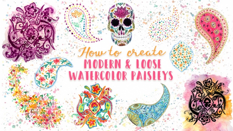
1. Intro: and you ever wanted to learn how to create some amazing facing with thieves. Hi there. I'm Francesca. Any talent excited surface. But designer I have worked for many years for a company that it's known worldwide for their amazing basically collection, and it's being working there developed my passion for these motive, and I think that probably you have, and an idea off these motif of something is a bit old or super complicated, and yes, it can be. But in this class we're going to learn a lot off different techniques to break very fun and very modern busy pattern. So we are going to start with some very simple techniques that you can even do with your piece if you want to like using Q tips or using splatters with sensitive. And then we're moving a little Bates toe higher difficulty like using inks on watercolor and then even some masking fluid. And also we are going to create some amazing shape. I am going to go. It's specifically s got the one like the other was worth us that it's internment with basic . So we're going to cover nine different techniques, and during this process, I'm going toe explain step by step What I'm doing. I also hate it. Work she with all the different shapes and borders and effects and a lot of different motives that you can use in your basically butter. So I think you will be super fun. And I hope that you will join me in this process and ASEAN class by
2. Materials: supplies for this class, you're going to see a lot of different supplies. But don't worry. The most of them are things that you have a regular home, and some of them are just optional. So I'm going to show you because you're going to see me is them. But you can substitute them with something that you already has, for example, and wins using a razor a pencil, so something I think you have. I'm using Crayola markers. You can use any other kind of markers that you have and the cheapest one. It's perfectly fine. Some black fine diners. This one must be waterproof, since we're working with watercolors and amusing is 0.5 sides is 0.2 sides and a 0.8 sides . I'm going to use also some rushes, and I'm using it. What a brush sometimes just cause I like to use it. But if you has regular brush, it's fine, and the one that I'm going to use the most easy is a three sides brush in synthetic one and for fine details. I'm going to use a Russian. It's actually not an art brush, but it's a nail brush it someone for painting your nails and I bought a pack of them. There are all different sizes for like less than $2. So it's something that I really like to use. And then I'm going to use a couple of permanent markers. The biggest one is just for me. Easier to use it for covering big areas when I have to cover them. And the other one? It's just the regular one that can wrote on city, so something that you already probably has a home. What are colors? I'm using a Chinese white cagney a local you cadmium orange, you permanent rose permanent red light moved Cerulean blue. You twas emerald green and very young green. So these are This is my personal choice of color. You can, of course, use whatever color you prefer. Minor wintering. You don't cut my line in tombs, but you can use whatever type of weather color you prefer even the cheapest one. We work fine with this type off art, and I'm also using some plastic collects toe makes my quarter paper. I'm going to use some watercolor paper, so it has to be at least 300 GSM or 140 libbers. So it's something that can really hold work well, the water. And then we're going to need one acetate sheet is something that it's really easy to find in any stationery shop, some sketch or printer paper, just the regular 1 80 grams, very easy to find and some tracing paper, the one that you use when you want to say something and it's something you can find for bed cheap in an exceptionally shop. Then we're going to use some water, so we need the water container on a paper sour on. We're also gonna use its pre, but it's prebuttal. I like it, especially when I do something like irregular background because it allows you to spread the water in the different ways. And it also had me to wet the color on my palette. But it's something that you can use or no is just up to you anyway. You can find it very cheap in the travel section off any shop tracing tool, so I'm going to use a light box. Lightbox is something that you may think it's something professional and expensive. I actually both mind very recently, and I both it from Amazon for like £14 so less than 16 or $17. And I love it. I mean, it's super thin you're going to see in the videos when I use it. It's super theme. It's any four sides, and it just plug, too, and USB, and it's something that it's really super before. But if you don't want to invest this money, you can and you have an iPod you can use and then up that it's a free up. It's called lightbox race, and I'm going to show you how it works. And just for these, for the purpose of this class, I suggest you to use one of these two tools cause since we're going to paint directly with water colors on the tracing surface, the window, it's not a good option. Sorry. So I hope that one of these two option will work well for you. They're up. You just open up. Yup, And then you can select any picture from your iPod. You can recite it. There are some option below. You can recite it, you can rotate it, and when you are satisfied with the sites and the position you can lock it. And then, as you can see, you can not be able to move it so you can just use some what she taped toe, secure a page in a sheet of paper to the iPod and just start so tracing. It's really simple to use, and here it may seems a little bit messy because there is the light in the room. But it's super easy, and another option is that you can just look like the white background off the iPod and use with something that you have printed like I'm doing here. So it's really a nice option, and it's free. So if you have an iPod, I strongly suggested we're going to have fun with some other supply. And so, like Q tips. I think you would probably be having them at home, or they're super cheap to find some salt Caesar, an Exacto knife. You can just use Caesar, but it's going to be treat here so better if you can find an Exacto knife, a dotting tool. I got mine from the same package off nail art stuff that waas same less the $2 I really love it for making small dots. It's much more easier than using a brush. Then we're going to need some rubber bands. These are just the thing that leaves me them. Mail guy when leaves me my mail. So something that I just found at home and wash it eight or any other kind of tape that doesn't rip the paper. A white ink, even a white gel pin would work fine. I like to use black ink for some splashing instead off the Blackwater color, because it's more deep color. But you can use black watercolor as well and the masking fluid. This is something that it's really helpful for some of the things we're doing, and it needs like an old brush or like in my case, another off the nail art brushes or something that you don't care about. Kids can really ruin your brush tip. In the project section of the class, you're going to find a super detail work sheet with all the basic shapes, the borders Ah, the drops, everything that you need to start so practiced with the paisley shapes. So go there, don't load it. And then I have prepared some, um, words for Pinterest for you to see a little bit more about basically. So there are two birds that are one. It's called basically, and another one is called basil products, so you can see all the different Ah uses you can make with busy. And they are in my account would be put the link in the about section and it's the traveling scripture so you can go there and there two of them busily busily product. So let's start to work.
3. My method: before diving into the work. That is something I would like to explain. It's about my method, so as a mission before I'm a textile designer. So I'm used to think as a designer instead of an artist what it means. It means that for me, it's much more easier to think about wheat singular elements that overlaps, or there are just place one next to each other on the page and then combined them with for the shop in a second moment. Because when you work as a designer, openly work for clients and then you show them your initial studies and your first designs . And then they for sure, has some things that they want to change or modify. And if you has the elements separates, it's much more easier than if you have it completes out artwork, and that's something that it's like a different If you are not this, probably your main goal is to create an artwork, that it's Justin's for himself. So that's why you're going to see me do things like in physical layers as I'm working for the shop and then, um, cause it's just my way of thinking. But off course you can just do them exactly with the same techniques as an artwork so you can just overlap them directly, drawing on the ground layer, for example, or combining the element and create some cluster. Don't worry. I mean, it's just my method, but it was something that I want to explain is probably where you will be asking why. And another thing that I want to explain is just probably you're going to see me using a mood board, have it. It's the one that you are seeing right now and in Woodward is something that it's again more related to be a designer than to be an artist. But it's something that helps me focus. So, for example, I create these mover for me for this project, and it's just something where I have some ideas off the style and want to have on the car you want to use. And for me, it's much more easier to work with decided palette to have some kind off consistency when I work with the same elements in different techniques like in this case. But it's just my personal preference, so it doesn't meant he has to be yours. You can just use all the rainbow if you want to in your project doesn't you don't have to create a mood board or a color card or a palette just works every in every way you find fun and relaxing any spotting for you. Last but not least, this is how I mix it my color. So basically, I'm doing something that it's not what the most off the watercolor artist do. So I'm using the white, white, water colored something that it's really debate cares, since it's not a proper color. I mean, you cannot use it for coloring. You can use it just for lighting up some color. It's something that gives, um, makes the watercolor looks less transparent. So makes the color looks a little bit more like wash instead of a watercolor. But for me, for this type of project, it's not an issue at all, and I really love the ability to change the color you and the intensity. So here I want to obtain some kind off aqua green on. I needed white. There was no other way for me together, and the same for the light blue that I'm gonna see dangle, use So you're going to see me mixing it with white. It's something that it's my own personal preference. There are artists that doesn't like to use the white at all, something that use it just up to you. You can do whatever it please. But it was just something to say that using why it is not a shame you can do it if you want to.
4. Let's warm up: Let's start sweet, some warm up. But first, something about the basically. So what's The paisley motif? Basically is usually defined as a twisted teardrop shape or a comma shape, and its original Persian name is Budi or Buddha. So this is basically just a few information I want to give you about Paisley story, cause it's super long and super detail. But just a quick review. Ah, what inspired the motif? There are several furies. Some say that it's yellow for being young. Someone say that it's part so a date. Paul, also known as for Baby only in and person as the Tree of Life and for someone eats, comes from Cyprus cause when the snipers are bended by the wind, the top of their head similar, it's similar to the comma shape of the paisley, or another option is that they resemble a pine cone. Historically speaking, the first appearance off the motif. It's around the fifth century in person, and it waas as an ornament in architectural, probably a celebration off the ball as the tree of life. And then it became. In the 17th century. It became very known because was used for the Indian Kashmir shawls, and they were made for the King of India for the higher purpose. But the East India company recognized their beauty and so purchase some shorts and important them in Europe beckon. And there were all woven fabrics, so they were extremely lucky look, shooters and expensive. But in 19 century, the shorts that were important in Europe were copied by the British textile manufacturers, and especially from the Scottish ones. And this company were located in a town near Glasgow that it's called Paisley, and that's why where the name came from and they became printed instead of woman. So the price became a sense off the regional ones. And so the cashmere starts to lost these popularity in terms off luxury product. But it's so famous and so in shipment, if cannot just disappear. So in the sixties it was bring to a new life with all the psychedelic colors and these giant motif, and it became something very feminist that it was. Even friends are fender guitar that was make with these, but earn so everyone's wants something with busy. In 1981 in Italy, a fabric company and a fashion company opened up it was a true and it's still well known for is amazing. Busy pattern, the picture you're looking at its from the spring summer 2010 collection. So I mean, it's their company, uh, image on basically the entire company. It's built around the usual pattern, so it's something that it's going from the eighties. So nowadays, with no interruption, another back from the past, it's the use of Hannah, and that's something that it's traditional in a lot of culture, like the Northern African culture Indian culture. But these days it's going to be discovered by a lot off trendsetter. So it's used in the like in the music festival with this bunion style that is going on. So it's something that it's became ing more and more popular, as along with the with the PC pattern and the most the biggest trend. Right now it's the Bogota to that has these huge, amazing pattern made with Beasley and mandala skills, mandalas and peacefully or something. There are really connecting to each other and the artist you're going to see here. It's Julia Milton that it's agreed that two artists, and that's one example of our work just for showing you how modern and contemporary can be the the basically motive, even if it's so tensions. So after these very quick, he's circling for mission. Let's see how to use the PdF work sheets that are prepared for you. So you're going to find several shades. Several sheets and there are different divided by shape, so you will have a sheets in entire sheets off drop shapes, and these drop shapes are basically the most common of them. So I may I and drawn them to give you a lot of different size eights and curves and all the elements that you can use. So here we have all the basic shapes and some ideas off borders and some tops and extras you can use for combined with the drop shapes. If you go to over the Pinterest board, as I was suggesting in the Matula said lesson, you're going to see how all these things can be combined. And then there is these flower section, where I also put some lotus flower. If you want to do something that it's more modern, as I was showing before we the Hena and Bozo tattoos, for example, and several more traditional flowers. I've also drawn some more flowers, some Zwiers, a lot of different something. It's more traditional and something. It's a little bit more modern, so you can combine them and find out which one is the bet your best, your style or what gives you some more emotions, for example, and then here there is the medallion and the branches, because there are elements that can be very recurring in the basically. And then there is a your patterns area. We're going to show you how to work in a while and some modern details that you can add forgiving Mora Botha to look if you want to, and a space for your details and any other thing that you want to draw and sketch. So let's start to see how they works. One off. The easiest thing to do for starting is to trace from the the worksheets. So basically, you are just racing. I'm not using even m the up or the light box scores. It's pretty. I make them pretty dark just for being even easy to see from behind a printer paper, Um, and then you can start up when you are taking a little bit of confidence with basic shapes you can start, so just go and drawn by your hand. I want to say something about tracing so tracing. It's usually seen as something that it's really bad. In this case, it's not, so you can do it, and I'm going to explain how, why in some further classes. But don't worry. You made you countries here, and then you can starts. Probably one good exercises to do these basic shapes all over again until you find comfortable to drawing these very simple things that they're basically some curves, some scallops, some triangular shapes, some like flower shapes, some crown spirals, something that it's very easy. And you can try to apply some borders and some teacher some teardrop shapes, so I mean everything. It's much more easier if you start to practice. You can use your pattern sheets for drawing some lines and practicing with all different bottoms that you can put inside your Buddha, and it's it's something can gives a very modern look. I put plenty of spaces so you can just throw some lines, some circles or some curvy lines, something that it's more like, um, a herringbone. Whatever kind of partner you prefer, you just go there and just throw them. It's a super simple exercise, but it will help you a lot to lose your hands.
5. Technique 1: watercolor splatters & stencil: technique Number one Watercolors. Blatter's instances after practicing for a while, the drawing off a drop shape with Freon. We can draw it using a fine line in a permanent one on our acetate sheet, and then we can just starts to cutting using Exacto knife. This should be done really slowly because the risk off cutting, uh, something that you don't want to cut. Actually, it's really high, and I have made some dense that I don't want to intent to make, and I show you in a while how to fix it. Doing it with the Exacto knife instead of the Caesar allows you to have a positive and a negative. I mean, you can use both the inner drop shape or the outer line, and I'm going to show you how you can use both for these fun technique here. I'm trying to do it very thoroughly along all the border and the edges. And if something, you make some mistakes and there is something that you cut accidentally or that you don't get properly, you can use the Caesar to refine the edges and cutting out some smudges, and you can also use some washi tape to cover up. If you have make some dense because otherwise the paint will go under it this way. It's really simple to do it, and you can use the scissor to refine the edge off the drop shape itself. So it's three easy and no time consuming at all. And just now, just grab your brush deep into your favorite color and using something hard there like a marker like I'm doing here. You can start to splash. I'm using several colors, like the yellow, the pink and the aqua. I'm sorry for the lines that you are seeing, but unfortunately, is the effect of the estate sheet. And it's not something that I can correct in editing. And you can keep going on doing these, adding more color mixing them because since they are still wet, they're going to mix up a little bit. If you want to have perfectly clean collar, you should wait before one color. It's dry before to out the other one, so you can do it like I'm doing here one after the other, so you will be attained some strange and Mahdi collar in between. Or you can just wait until one color. It's done. And if we drive before adding the anyone when you remove the senses, the drawing, it's perfect, and it's super nice to see. And then you can use the opposite one. I mean, the positive actually goes when you draw something and you cut it out. I mean, generally, consider the positive the drawing that you have made. So the drop shape here. But you can use it toe decorates to the great, the negative space. So you put in in the middle of your paper and you just start splashing. Just go as wide as you want it, something Superfund. You can do it even with your kids, and the closer you are to the paper and the biggest, the drops will be the forest you are from the paper and the smallest the drops will be. And if you add more water, you will have bigger drops as well. Or, if you are less water, there would be smaller. Uh, in this case, you have to be careful to remove the I said eight, just when everything it's perfectly dry because it's super hard, otherwise, to remove it without smudging the borders. If you do it when it's dry. Study will obtain a super nice background with these super funny. Basically shape empty whiten in the middle, and you can use it for maybe making a title or for drawing something. Ah, some calligraphy. So as you can see here, these technique, it's super simple, but it gives you two super nice results, and it's really quickly. I guess that the video took me like, 10 minutes from the starts to the end, so something that you can do really quickly and really fun.
6. Technique 2: q-tips & stencil: technique number two Q tips and fancy. We're going to use again our stance you to do something super funny. You can take one a Q tip for each color, and just be sure that you'd very well. Very well. The color. You need a lot of water. You take the two deep. Put it in the color and be sure that the most of the color it was absorbed by the tip off the Q tip. And then you can start to use it as a brush. You start so making some small dots all around the shape, and in this case, you can go off course. Friend. I'm using the Stancil because it allows me to Don't waste time concentrating about keeping all the That's in perfect line to create the shape, and it's faster. But of course, you can go free end on. It's really easy and simple. It's another technique that also your kids can do. It's super quick. American gives very funny results, and it's something that it's as some even historical idea skills using the block print. It was one of the technique that it's more common for printing the busily pattern and sometimes they has a small neighs that makes this very nice daughter defect and to give a little bit off more interesting. I'm using the dotted, um, tool for nails, basically to add some very tiny dots all around. So I'm alternating one big dots and wants more dots off purple here, for example. And then I'm going to add a lot of them, even in the middle, to add some more interest. It's something that it's fast to do, but it can be really interesting and give you some unexpected results. These drawing that I'm doing here, it's pretty simple, but of course, you can add more details and much more structured shapes on dfid yers toe inside. I just up to you. The second elements were going to draw is basically have to save a mistake. What? I was recording the technique number one. At some point I realized that I was actually not recording, So I start over and I have these left over a piece of paper with some splatter long. So what I did was just toe put the estate Stancil trying to match the original shape, and it just starts adding some random dots with the Q tip off course. Want too deep for each color and I just go random and without any kind off planning. So it's something that it's very relaxing, something that also you can do with your kids. But if you want to be more precise, you can try to drawing some kind of shape, and I want some more interesting to these drawing. I have used the positive stencil to cover up the image, and then I'm just splashing some black ink around it to give these double effect off different splashing. So it's really funny and risi really easy to do. So it's another technique to spice up your paisley and make them something modern at interesting.
7. Technique 3: q-tips painting: technique Number three painting with Q tips For this technique, we are going to grab a bunch off duty apps and basically create some original kind of brushes with them. So you grab a bunch of them, you hold them tight and you try to align the best that you can the tips in order to have them. Uh, even so, they can be actually touching the paper, the most of them, at least, and I'm me. I'm making three Bunches off to tips because I'm going to use three color. But you can use a zoo much as color as you want, and I'm making them in three different sites cause I want there is much more off pink and then a little bit less of yellow and then just some touches off Bakwa. So the first thing is to has some container with pains and a lot of water, and you need a lot of water occurs. You need that. The deeps absorbed the most of the color, and you can check them. You just deep the keeps into the water with the color and just wait for it to be fully absorbing, and then you can just start starts to dumping on the paper, and it's super fun. I mean, you just need to try to create something that's resemble a drop shape, like the busy one. And here, if you want to obtain pure color, you need to wait for the first color to dry before applying the second. But I want to make them instead because as you can see the color, it's going to combine together. So you're going to obtain some super amazing effect off yellow and orangey color. So where there is more yellow, you will have a lighter orange or where these more think you will have a darker orange. So it's super interesting and super beautiful. And if you have some areas where you have an excess of color, you can use the opposite side off the tips to observe it. So it's, I mean, you can t just everything with just some bunch of Q tips. So how fun is this thing? I know that I've said fun a lot of times during the even the previous lesson, but I mean, this is a fun itself to do, and here I'm adding some bits and pieces off aqua color and Yaka is going to create some strange car or somebody ones. But overall the effect. It's amazing. And here I'm trying to keep the color balance. So I want to have some ah aqua, but not so much as the pink and the orangey yellow. And I'm using the Afghan tool to speed up the drying process because I want to add some extra dots off uhm pink here and there and for doing that, I'm just going to use, I thought, at least to use at the beginning, I thought to use all of my beauty bunch. Then I end up using just one Q tip, and now you see the color. It's super darker compared to the other because the color is still wet. But if you want to liken up, it is a bit you can just up into the water a bit before actually touching the paper. And I'm adding also some yellow and just going while I mean there is no rules. Here is just a way to create an a super modern and very loose kindof, basically something that it's totally different from the traditional idea off, basically. But it's so fun and modern and lose that it's super relaxing to do so. I hope that you will really enjoy this technique as much as I did.
8. Technique 4: ink & watercolors: technique number for ink and watercolors. This technique we will start to approach unless lose way to create our paisley motif. First of all, I drove the toe teardrop shapes with pencil and then interest them with the black fine liner, the key thing to draw a nice basement. It's realized that the most of them, even the most complicated ones, are often just a commune Ishan off a few elements repeated over and over again. The left Bailey is made by only four elements or shapes that repeats constantly. Um, the first and the most obvious is the drop shape. I use it twice. Drawing is Muller, one inside the main shape. The second element is the circle. I drove a lot of small circles in the space between the two drops and also a few bigger ones in the inner drop, reducing the sites while moving from the junkets part towards the pointy edge. The third element is enough circle, I repeated all over the borders, creating a scallop decoration and also around the circles in the center of the motif. The last element is a fine points flower that I added wrong me. Inside the smaller drop and also inside the bigger the bigger circles to create some extra decorations using a reduced number of elements, really simplified the process and convey a lot off consistency to the motive. But at the same time there petition that also give a consistent look a level of complexity , making the motive look more intricate and elaborate than actual It actually is. It's a double win. I use the very same criterium also for the right. Basically, the basic shape I'm working with here is it that you're drop. I'm using it with different core pitchers to draw the leaves around the center branch to create stylized flower petals and also as a background decoration Just by repeating the same elements in different sizes, positions and curvature. You can obtain a great variety of effects, but since they all has a common basic shape, the look is consistent and harmonious. I also at some borders to make sure that every medallion style areas has the same and decorated. I use a simple zigzag line and to make the petals papa more, I decorate them when some watch marks. After drawing everything with pencil, I just go over all the details with my fine liner, the black one, and it's, I mean, just something that, for me, it's easier to do with pencil before and then move toe the finer. But if you feel comfortable enoughto go straight with the fine liner, it's perfectly fine as well. Of course, after outlining everything with the ink, it's time to are the watercolor. So in the basically on the left side of the page, I'm going to use a full coverage with watercolor and for in this case, I'm trying to months saying some kind of consistency between the color. So I'm using the yellow toe, make the outside borders off. Everywhere there is some kind off bump or Scott look borders. I'm going to use the yellow and everywhere else there is some kind off circle stuff. I'm going to use this kind off peach color. So even inside the circles in the middle, off the drop and also in the middle borders that it creates between the two drop edges, I'm applying the color evenly without any kind off washing effect, or it's I mean, the same kind of effect in this case can be obtained, basically, even with wash so I'm not using any kind off. I'm not exploding any off the properties of water color here. And I'm using the pink, my brighter pink to color, the inner drop, and you're on applying a couple of layers because I wanted really darker compared to the beach color on the on the border. And I've also coloring the inside off the dots with the same pink. So as you can see here, it's very flat as image. It's not super interesting, he said, The one on the 1st 1 on the right. I'm going to use a different approach, so I'm leaving a lot off small dots. Whitespace. Um, you can see that the car it's not applying evenly. There are. I'm living intentionally some white areas because I want to give to these, um, sketch and much more. Yeah, sketchy look and something that it's some seems more handmade and less precise. And this is something that it's really one of the, um, most interesting effect that you can obtain with watercolor so living whitespace. It's something that it's more prerogative off the watercolor compared to the wash, for example, and to refine everything. I'm just splashing the colors around, and I'm trying to use the the same car I've used for the inside on the outside. So I'm using much more. Splash off yellow and pink on the left, Beasley and much more off blue and green on the one on the right, and I'm also adding on the pinkish one. Some Sprinkles are white ink because I think it would be convey something more interesting and pop up more the effect. So, as you can see, it's something really quick and really easy to do. But you have created something that it's much more what, probably you think it's a traditional paisley compared to the previous one that were super lose, so let's get ready for the next technique.
9. Technique 5: watercolor wet on wet & ink: technique number five watercolor wet on wet and ink. In this nick technique, we're going to work with Western Worth. So first of all, I'm adding two extra caller to my palette, purple and orange. And then I'm going to wet the paper using some water spree. And you can, of course, use the brushes you prefer. For me, it's easier with this pre bottle. And here I'm going to use just three color for the background orange, pink and purple because this color are analogous color on the color wheel. So it's a really nice look and presence. The I and I'm using some salt to give a different kind of structure, and the soul needs to be used when it's super dropped. Super wet. Sorry and so the sooner you put it on the paper, the better it is because it can absorb water and make super funny effect on the background . Basically, I'm just keep adding colors randomly, trying to has the same kind off arrangement with yellow, orange, pink on purple and the spry. It's really nice to use because it allows you to don't touch too much the color itself with the brush so you're not deciding, actually where the paint is going to move. But since your spring, the color mix in a very natural and fluid way, and now it's time to move to the next part. So here you're going to see me drawing on the dressing sheet. It's something that it's my own personal preference, and it's even something that helps me to control what I'm doing. But if you prefer to go directly on the background, just waited for its be dry and then you can draw on it like a regular piece of paper. So my method for drawing this kind off complex basically class er it's basically using the tracing paper. I go over the worksheet that I prepared for you. I know the tracing may sounds like cheating in some way, but actually it's the way that everyone hold Rose. Professional Peasley used to make them, uh, symmetrical and look like one like to each other. So you're going to see me drawing 1st 1 off off the pattern and then you're going to see me mirroring it on the flipping, it basically on the opposite side. So for doing these and be sure that all the elements are the same, and there are exactly symmetrical. This is the only way I mean his whole tolerated to do it. But if you want to do something that it's more free and more, um, Hann drawn without any kind off perfection off symmetry just go wide and go directly are on the tracing sheet or on the background. Whatever I really strong, I recommend you. If you want to use your own paisley pattern, for example, or your own personal shape and you don't want to, um, use mine because I mean you want something more personal, I get it. What I can suggest you is to draw first the basic elements like like like I did and then, um, using the tracing paper, copy them and turning them, flipping them upside down. So it's the easiest way to obtain this kind of look. And as you can see me doing here, I have already copping the every time that I place an element in one direction, I'm going over and placing even the other in the opposite direction. So the first elements are placing just by around, Um, I mean where I think they look nice, but after placing the first three or four elements. When I started to have an idea of the kinds of repeats I want, I started to draw one elements and then flipping the paper and drawing on the opposite direction. So it's much more easier to manage to have them all, exactly the same position. And it's even something that speed up. The process goes, even if it's super Uh um faster the video here. Actually, it took me almost an hour to make the entirely out even tracing it. So this is the best way for being quick but even precise in your drawing. And you can, of course, see here how I'm using or the working sheet. So I'm using different elements in different position. I'm looking for some more flowers to are the digression inside the drops, and then I'm going free and cause I mean these new rules, I can do whatever I please with mine, uh, read my sketch. And here, for example, I'm doing the inner border off the biggest bigger flower so you can go as much as precise or detail or as while does you prefer after the main. After positioning the main elements. I'm going just to throw with hand with any kind off references. So I'm placing different, kind off motive. The only thing that I pay attention to do it's every time I draw something in one direction . I immediately draw the the the between saying the opposite direction. So it's much more easier to be precise and and symmetrical because the whole point of this kind off drawing is actually the symmetry. So it's really nice. In this case, you have a direction, a direction. It's something that you may or may not having a partner. If you don't have a direction, you can just rotate and place it wherever you like. And it's something that it's really useful when you do, for example, pattern for clothing or for textile design. In this case, you actually had direction because that is one elements, and it's the flower in the middle of the medallion in the center that has a specific direction. So when you have a specific direction, the entire if you flip it upside down, you realize that it's upside down. So it's something that if you want to use it, for example, as a repeat for other type off materials or other type of product. You should think about it and don't and to use something that has a specific direction otherwise go wild in this case, the drawing that I'm making. I'm going to use the same, um, Potter here for the next two, um, techniques, because it's much more easier for for me to show you how it works and how you can even obtain totally different effort. Even if it's the design needs the same as I'm gonna use when you use different techniques and different colors, the effort could be totally different. So there was something that was important for me to show you and also cause drumming each this kindof complex pattern. It's really time consuming, So I wanted to show you how you can exploit the maximum off their potentiality without wasting too much time drawing so many different details every time. And here I'm using the 0.8 fine liner, but in a while you're going to see me is watching for the permanent marker goes for drawing bigger areas. I prefer to use that one, and it's something that it's my own personal preference. Of course, you can obtain the same kind off coverage with your fine liner is just that. It's easier for me and quicker and another thing that I'm going to do after and I've never mentioned before. But I'm actually doing after each technique. It's the scan, everything. So these is going to be scanned, and I'm going to use it for creating some Internet interesting button and other kind of effects on for the shop. And it's going to be part off the next class that I'm going to release in a couple of weeks , and it's going to be based about these techniques. But we're going to see how to create actual, basically partners more than, ah, experiment with techniques like these glass walls. And so that's why I'm drawing on separate layers. So this way I can mix them up to the other and obtained Superfund effects. But again, if you prefer to draw strictly Diet Lee on the was her color background, it's super fun anyway. And in while you're going to see me just placing my painting. Actually, the artwork drawing on the prison paper on the was the core of Bagram. You're going to see how it's it's a nice strange effect here. I'm removing the salt because you see the tracing paper. It's not perfectly transparent, but anyway, Ah, this is the simulation that I've made with my two skin. So how, Ah, it can be combined in for a shop in a second moment if you want to. Otherwise, this is the effect that you will obtain if you draw directly on the what's your color background. Just remember that if you want to draw on the background straightaway and you want to obtain this kindof symmetry and this type of effect, you should definitely use lightbox because otherwise it's or the window if you have. Because there was her color paper, it's pretty thick, so I'm not sure that window will do the trick. But you can try, of course, but this is the only way you can obtain a perfect symmetry. Otherwise, I mean, you should be super precise and be basically an architect, because otherwise it's really difficult. But it's totally do about If you would just use like books, you can solve the issue
10. Technique 6: watercolor & light box: technique number six, watercolor and like box. For this technique, I'm touching with some washi tape, the dressing paper where I've drawn my butter in the previous lesson to the like box. And then I am placing him paper, a watercolor paper on top of it and securing it. This is important girls. If it moves, it's going to be a total mess. So just use some washi tape or some masking tape that doesn't rip up your paper. And then, for this technique, I'm going to use just one color purple. And it's going to be super simple because the only thing you have to do it so basically go over every line and every details with your brush. Um, these In this technique you can I'm using the watercolor. But of course you can use the same kind of process with any other kind of medium, like wash or even markers if you want to change your color in him very and made way, he said of using, for example, for the shop. And the only thing you have to keep in mind is to pay attention to those month the color when you move your hand so trying to work, like in a clockwise or counterclockwise or intuitions so you can just move and wait a little bit for the color you have made before it's dry or otherwise. Try to not, um, hold on your head directly on the paper. And, as you can see here, lightbox, it's super easy to use. And it's super light. Eso you can even see perfectly through the watercolor paper, even if if these one, it's 300 GSM. So it's pretty thick. And for this technique, unfortunately, the window. It's not a good option because you will have the dropping off the color. Probably, although the up that I have mentioned in the materials lesson would be worked perfectly fine. And here I'm trying to add some, um, extra details with watercolor. So I am placing some, um, layers off watercolor in some plate in some areas to give more depth and a little a little bit off more water calorie effect. Because otherwise for this type of painting, you don't see so much the weather color effect, and sometimes you see me using a finger Teoh breast down the paper. Since it's pretty thick, sometimes it's not so easy to see all the tiniest details eso When you do it, the attention to those much of the color and the most interesting things for me about this technique is the fact that it allows you to don't use any kind off pencil lines, and it is super useful, especially if you want to use very light and right color. Because, as you know, the water car is transparent, so you will see the lions underneath. And it's really hard to draw these kind off complicated on details motif without any kind off guidelines like the one you should probably make with pencil. So this way it's so much relaxing because you can just cover whatever you have on the background and enjoy the painting process. So less stress and another thing you can do. It's at some points to use in air dryer or, and it's going to like I'm doing here in a moment to speed up the drying process, especially when you have to go back on smaller areas in the middle, so to avoid any kind of smudges, it's a very artful trick. Think to make the smallest details I strongly suggest you to take a very tiny brush. So I'm using these kind off nail art brushes that are super thin and supers more than I used to make to draw like flowers or dots of these kind of more things on nails. So they are super cheap. And if you are, if you're just starting out, you probably don't want to invest money in somewhere more frenzy. Watercolor brushes, especially the tiniest one for details. And this is a very cheap and easy to find solution. Our artwork is done, and I'm going to scan it as it is for future references. But what I want to do here, it's to give a little bit off extra something, and I'm going for a vintage look and to obtain it, I'm using the purposely water that it's basically the water what have clean my brush for the entire process. So it's par polish, and I'm going to use it for creating these effects. So I'm reiterating the the color, and it's going to reactivate the pigment and give these kind off watery and a little bit messy. Vintage Look that I think it's much more interesting than just leave the painting as Iwas, but Of course, if you prefer to have it nice and clean, you can just skip these parts is just another option for you.
11. Technique7: watercolor, light box & markers: technique Number seven watercolors like books and markers. In this technique, we're going to use again our paisley pattern. And here we are doing the same kind off. Ah, thing that we did in the technique number six. So we're just using the watercolor directly on the lightbox. And this time, though, we are going to use several colors. So basically, I'm using all the color in my palette and to obtain a nice effect, I'm selecting some the color and placing them in the same area. Um, each time. So, for example, all mine. Both of my bigger flower will have the pattern inside in orange, and the leaves there are near the medallion will be in aqua and so on. These technique again has the advantage that you don't need to use. Ah, fancy for sketching before, And also, since you are looking at the black outline design on the bedroom, you can realize where you need to add some extra caller or where, for example, there are the bulkier black areas, so probably there. It's nice to have a strong color or a light color to balance the color composition and the color combination. So it's something that it's really nice and helpful. And as you can see, it's super fast since you don't have toe bother staying in the line as you should be. When you have the pencil line on the background cause you have tow, understand that you don't have to cover them if you want to raise them after it's right. If watercolors goes on top off the fancy, it's impossible to areas depends it underneath. So and you're going to see it because it's transparent and it's not the nicest thing for me in this painting. I want to have the key elements that are doubled so everything that as between in this kind of mirror repetition to be in the same color. But if you prefer to have a different color, it's going to add something a little bit off an extra effect. And it could be even more different from the previews version that you have made your going to see in the end of the video the comparison between the three of them and you're going to see how different they are, even if the drawing basically it's the same. The color composition and the technique you are going to use it dramatically changed the overall effect. Okay, after finishing to draw everything there waas on the original artwork, I'm going to add some more tea tastes. And for doing these, I'm going to use some markers and some white. Think im. I'm using the waterproof white ink from the doctor Ph Martin's, but you can use a wide Japan. It's perfectly fun, anyway, and I'm using a brush for the bigger areas and a dotted tool, the one for name art on for the smaller the taste, such as the very small dots in the aqua, basically the one with the pink flower and the rest off the the taste that I'm going to out . I'm going to add them using markers so these are basically Crayola markers, the cheapest you can find. But it's I mean, the nice effect that is that you can use them without any kind off worrying about to ruin the cheap, for example, since they are so cheap and another nice thing that I'm trying to do it. Soup combined the color. So I have taken the same color that I have in my watercolor palette, but I'm not necessarily using them one on top of the of each other. So, for example, I'm using the aqua marker on top off the how was her color. But I'm using the orange marker on top of the yellow watercolor so you can mix them and create new effect, and you can use them for giving some shades and adding some other dots or some extra details. I'm doing a lot of zigzag effect in the borders so you can go on at as many details as you want. And since they are transparent, but they are much more intense in color, you than the watercolor you're going to see pop up so much these kind of details. And as I was mentioning before, as you can see here, the tree design that we have made with three different techniques, even if the artwork behind it is the same looks totally different. So my your point year was to show you that even if you start with one artwork, the technique that you use can totally change the overall effect and give you the ability to create interesting and what do you do not artworks
12. Technique 8: masking fluid & watercolors: technique Number eight, musk in fluid and watercolors. For this technique, we're going to go over our worksheets and select two different shapes. One. It's a drop shape, and the other one, it's a medallion. These is one that you're see me going over here with the irregular edges, and I'm tracing them directly from the worksheets because I want them to be exactly look the same. Um, even if the drop shapes eats, um, flip it horizontally, but it's something that I want to have exactly as they are. But if you prefer to go free and just go free and of course, and here I'm applying the masking fluid, the masking fluid. It's a latex based fluid that it's great with water colors because it helps you to preserve some areas off the paper that you don't want to be covered with watercolor. So, in this case, using it around the edges off my shapes because I want that the inside will stay white. Why I want to go over the background with just one color and using the masking fluid allows you to be much more free when you call the background, especially when it comes to something very details like the profile off the medallions, because otherwise you have to be very careful. And with the masking fluid you can skip that, um, must confer with, though it's really a mess when it comes to your brushes. So you something that you don't care at all something old or something very cheap. And the other thing is that you have to be careful toe weighted that it's completely dry before use the water column. And as you can see here, it has changed the cholera beat. It's not no longer white, but it's much more yellow. And the last thing I want to mention is that you have to remove it as soon as the watercolor is dry. When you finish there to work and it's totally dry, just remove it right away, because after one day, at least, a top is going to rip off your paper and sometimes depending from the brand's, even after three or four hours. So the soonest and the fastest you can remove the masking through it, the better these. You can also use it and just be super careful when it comes to go around the edges. But for me. I always like when I find a solution that makes easier and faster for me to drop. Here, you can, As you can see, you can remove it just with your finger or with, um, a rubber and a razor. It's perfectly fine. It's easy to remove, really. And now that we have removed all the masking fluid, we can start to color the inside of our shape. So I'm looking through the working sheets to see if there is some kind off idea that I want to replicate some kind of flower. So I decided to go with these very still eyes kind of flowers, and I'm making them differently in in the different shapes. So I'm using these kind off branch a motive with a pink flower in the, um, basically shapes, and instead I'm going to use the same kind off flowers, but more lose and random in the medallion, and I'm basically doing the same things all over again. So you're going to see me creating the branches after first of all, a place, the flowers and then a great branches and other leaves in order to have the composition quite balanced. After placing the main details inside the shapes. I'm going to out some smaller details, like the center of the flowers. So I'm using, like the pink inside the orange flowers, and I'm going to use the dotting tool to create some very, very tiny dots all around. And I'm using the yellow for making these and I think this convey a little bit off something more extra Falk and, uh, ethnic Two different tow The drawing. As you can see all mine butter here have bean quite whimsical and modern, but in a little bit about away a little bit bohemian because this was there. Look, I was trying to convey. But the look depends much more from the colors, actually, than from the techniques. So you can use the techniques that have show you for any kind of results, depending from your palate and also from the details you decide to use. So our artwork is done, and it's time for our last technique.
13. Technique 9: shapes with watercolors & ink: technique number nine shapes with watercolors and ink. For this technique, we will use the silhouettes you confined in the product section of the class. I have chosen the skull like the ones for the other loose Martos toe. Any Spanish speaking watching. Please forgive my appreciation, but you will find also a captain a dog if the skull is a subject that you don't like. The main point here is to recreate this low it without drawing any outline just by placing shapes inside the inside that we feet this through it and helped to visualize the composition as a skull. I use the light box with my silhouette and the watercolor paper. Attach it with washi tape in the center of the forehead. I've placed a losses flower. I'm tracing it using the worksheet just to speed up the drawing process. But I could have drawn it every end off course. The nostrils are already close to a paisley shape, so I just alter them a beat and I decide to make the eyeballs in a flower shape. But you can add some decoration inside it if you like to. I prefer to have some black solid areas to make the rest of the decoration pop up. I left that they was her color paper, often to check if I need to add some for their elements to fill the gaps and obtained the shapes right. Since baseless drops are really versatile and can be long and narrow or short and wide, you can combine them easily to be the spaces and follow the outline. The element the only elements I trace as it is, are the teats. Since I don't want to overdo with embellishments and once you are satisfied with the composition, you can remove the paper from the light box, and we can start to have fun. The first thing to do it's using your fine liner to a trace on drink, basically all the shapes that you have drawn, and I'm doing these very thoroughly to add them as much as details as I can. And as you can see here, I haven't at any decoration inside because I want to add them later because I want to use watercolor first this time. So this is just something that you can do before or after is up to you. But I wanted to show you that you can use ink for adding details even after the watercolor . Not just before that. It's something that I usually do, and now it sums for our watercolor. For this technique, I don't want to have my watercolor that perfectly matches all the lines in on the details. So, as you can see me doing here, I'm trying to leave them. There is a bit lose, and for the lotus flower, I'm using the wet on wet technique. So I have put some water first and then some drops off pink and some drops off purple this way there, Ben, blending together and mixing and hasn't creating these nice effect. It's a bit of the galaxy effect, and I'm doing the same with these, basically on the bottom, putting together some light blue as some purple. Then I'm just going over the each single element, and as I did before, seems basically I have done the same elements on the left side and on the right side of the composition. I'm using the same colors, both sides, so if there is something that it's on the left, it's purple. It's going to be purple on the right and if it's aqua is going to be up on right. This is my own personal preference. You can do each single elements in a different color. It doesn't matter. It's just something that needs to be your way to communicate. Ah, the color impression that you has its not a rule. - After finish with watercolor, I'm using the permanent marker, the biggest want to going over the eye box or for my head invincible and in the nostrils. And then I'm going to use, um, fine liner to at all this multi tastes for these purpose. I don't have follow any specific group except what I self imposed to myself. To have the same kind off elements as they did for the color is something as a flower inside on the left side. It's going to have the same on the right side, but it's just my personal preference. You can even use so many different elements all over. Each single shape needs just a matter off personal taste. I like to work like these for consistency because I think it's more inquisitive look, but again, just it's something that is connected to your own aesthetic, and there is no rule. I cannot say that one way. It's correct and the other it's not. And just keep adding as many details as you want. I'm adding some dots and some matching marks and some flowers. Some leaves, Ah, a lot off dots in different dimension and even some inner shapes, like some drop shapes inside the others. And I just keep adding them until I'm done This technique, it's super fun, and I think it's like a little bit therapeutical cause you keep adding things and details and decorating in a very freeway. Uh, it's, though it's time consuming. It took me, like, one hour and 1/2 from start to finish it, but I think it's something that can be really relaxing like a mandala. Uh, I feel it like in the same way, so I hope that you enjoy the technique and that you want stride
14. Outro: Thank you so much, guys, for taking in this class. And I hope that you enjoyed it. And I'd love if you try some of the techniques, all of them, or just one and you show share your project in the project section of this class. If you have any questions or feedbacks, please write to me in the discussion section. And if you want, please follow me because you will be updated when I create a new class. And the next one is going to be how to design Mother Paisley patterns. And for this class, we're going to use all the art works and the elements we create in this class and using Anna Logic system like tracing paper and light books and also digital, like for the shop. We're going to create some patterns that you can use for actually selling your artwork as a product, So it would be super interesting. And I hope to see there by
 Francesca G., textile & surface pattern designer