Transcripts
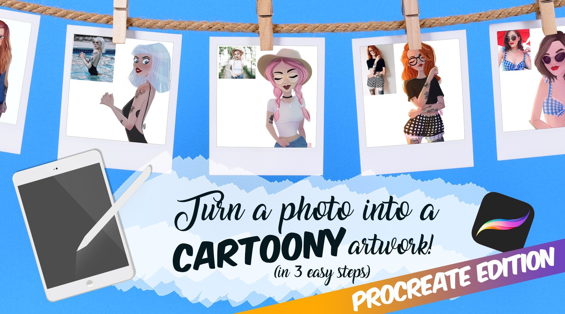
1. Introduction: Hi, everyone. I'm Memo, an illustrator, author
and very tired mammo too. I run the art account at
a free memo on Instagram. You might have seen
my course, start a successful art
account on Instagram. It's that thousands of
artists grow online. But that course is from 2019. And if you've ever used social media for
more than 3 minutes, you know that five years
is basically a lifetime. So I'm back with a
shortest bit update, focus on something that has
been working really well on Instagram in 2025
Posel specifically, how to make ones
that get shared, saved and maybe even seen by almost half
1 million people. Your class project is simple. Make your own Carousel using
the tips I teach you today, post your work in progress in
the class project section, upload your final
version there too, and if you post it on Instagram, tag me at Alphe memo so that I can give you
feedback and share it. You only need appropriate
and 10 minutes of your time. So if you're ready, let's go in the next video and
let's get started.
2. Why Carousels: Carousels are Instagram's
not so secret weapon. Why? Because they
keep people swiping. Which boost engagement,
which boost reach. The algorithm loves that. And here's a little bons. If someone stops swiping
halfway through, Instagram will often show
them the carousel again, starting from where
they left off. That means more chances for your content to be seen
without you lifting a finger. Plus, with a new pos button, shaability matters
more than ever. A post that's easy to share has a much better chance of traveling beyond
your own audience. The ones that go viral, they're usually either
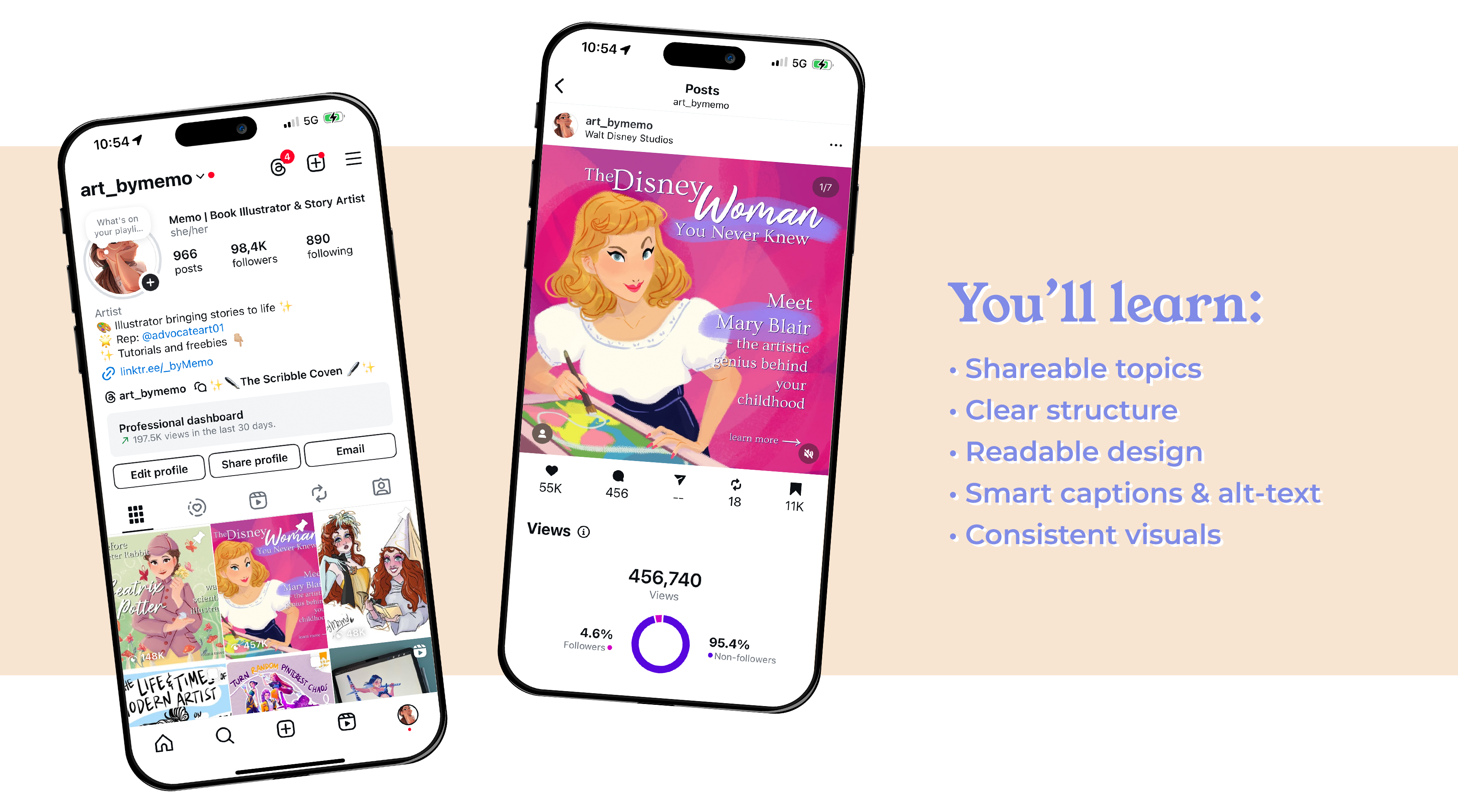
super educational. Deeply related both or both. Here's an example. My
Mary Blair Carousel, part of my women who
changed our series, was viewed more
than 450,000 times. Most of these times it was from people that weren't
even following me. That's the power of shaability. This Carousel was
informative, visually bold, and it told a story that made people feel smart
for sharing it. That's exactly the mix
we're aiming for today.
3. Choosing the Right Topic: The right topic.
It should live at the intersection of three
things, your niche, what your audience already
loves and something that a non follower would find interesting enough to
stop scrolling for. If you're an artist,
don't just post a portfolio down. Find an angle. If you're into fantasy art, try mythical creatures
that deserve better PR. If you're a character designer, maybe something like
five facial expressions, you're probably drawing wrong. If you've got a skill
set class like me, you can make a carousel that
complements or updates it, which is exactly what I'm going to be doing
in today's project. It's very meta, I know.
4. The Structure: Structure. Structure makes
or breaks a carousel. My go to formula for educational or storytelling
posts is this. One hooks like both
headline instant curiosity. For example, the Disney
Woman you never knew or five mistakes artists
make in a carousel, which is the one that I'm
going to be making today. There's a reason
these work so well. Slightly provocative
or negative hooks, like you're doing it wrong. Here's what no one tells you. Tap into our brain's natural
problem solving mode. When people see a
possible mistake or gap in their knowledge, they have to click through to find out if
they're guilty of it. It's not about me and
me. It's just about framing the topic in a way
that's irresistibly clickable. Two, the intro, the quick
context, MtXPut it Y. Number three, story
slash Mid slides, three to five slides of
useful scannable information. Then number four, optional spiclideOten used when I do storytelling or
biography parables, the unfair bit, the
drama, the plot twist. And then 0.5, why it matters. Bring it into the present
and make it relevant. Then 0.6 call to Actionside. Ask them to do something. This is very important and
we'll see why later on. Once you get this flow down, you can adapt it for
pretty much any topic.
5. The Content Walkthrough: Content work for you. Come
with me as I'm going to apply this knowledge to
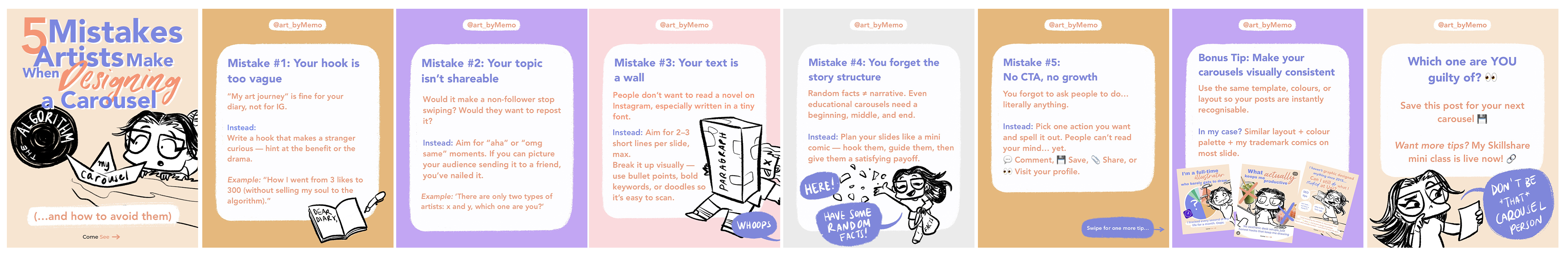
creating a new carousel. Former carousel, I wrote five mistakes artists make when designing a Carusel
and how to avoid them. This tells you
exactly what you'll get and hints at a benefit
fixing your mistakes. My design thinking was
that I made the text bold, big and easy to read and added one of my middle
comics to set the tone. The comic works
as a visual joke. My poor carousel is
being tossed into the algorithm pool and makes it instantly recognizable as me. For your carousel, try to brainstorm three to
five title options, and for curiosity, drama, or a clear benefit. Pick the one that you
click if you were scrolling at 11:00
P.M. Half asleep. This is where I started
listing the mistakes. So mistake number one is
that your hook is too vague. For example, my art journey is a line that is
good for your diary, not for strangers that
need a reason to care. Onto the next slide,
mistake number two, picking a topic that
nobody wants to share. Sharable content makes
people think, Oh, my God, same or, you know, my friend
needs to see this. So when you workshop your topic, you really need to think, would this Cavazel make a non
follower stop surviving? When I wrote this slide, I
thought about my audience. Artists who want more
reach on Instagram. So I gave a quick
instect and an example, so it's easy to steal
and, I mean, adapt. In terms of design, I
kept the text short and sunb I use a single bold color
block background per slide for view of insistency all these colors are
of course part of my palettes that I use across on my social media
posts and my website. In the next slide, I
approach the third problem, which is the text wall. So Mistake can be free is to make people read
a break of text. This is Instagram, not a novel. I aim for two to
three short lines per slide and break things up
with doodles or icons. For example, I also added a
comic here and it's me being squashed by a giant paragraph because if your design
makes people work too hard, they'll just swipe away. It's social media.
As an exercise, edit your draft text until it fits two to three
short lines, Mt. If you can't probably
two different slides. Moving to the sec number four, don't forget your
story structure. Damping random facts with no narrative will not
help your carousel. Even educational carousels need a beginning, middle, and end. You need to hook your viewers, guide them, and give them
a satisfying payoff. From a slide, I illustrated a mistake like I did in
the previous slides. I gave an instead tip, and then I drew a
little comic of me literally handing out
random facts da fully. In terms of design,
you can actually help your Caosel by thinking of it as a mini comic where each slide move
the story forward. Finally, we have the fish
mistake that is most common with people who are
beginning to create carousels, which is the CTA. TTA means call to action and
a lot of people miss it. People are psychic, so you need to literally tell them exactly
what you want them to do. Do you want them
to come and say, share or visit your profile? You think it's kind of obvious that you want that
since you're on social media. But people will probably forget if they don't
see it physically. I list a few actions with modes, so it's easy to scan, and that tiny bit of prompting massively
increases engagement. Then the next slide, the bone
stip. This is a new slide. This is a tip that I thought of while I was
making the carousel. It wasn't in my
original structure. And this is why you
should always say flexible when creating
anything really. Basically my bonus
tip is to make your carousels visually
consistent between each other. Use the same colors,
template or layout so people instantly
recognize your post. In my case, for example,
as you can see here, I have a similar layout, my signature color palette, and my little train my comics. They all bring together my visual identity and
brand recognition. Of course, in my own carousel, I will have my own CtA
for this carousel. In this slide, I like to ask
questions of my viewers, try to make it more
relatable so they can share their experience.
It's very simple. I restated the main question, which one are you guilty of
and then prompted people to say the post for later if they want to
create a carousel. Because this is your last
chance to get engagement, make sure that it's very clear and very obvious and catchy
what you want people to do. In terms of actual
design, as you can see, I created this carousel
on my procreate, I have basically a template that I always use with
certain brown colors, with fonts, I keep my text editable so that I don't have to recreate
this structure every time. I use my notes app to write the text and then I just paste in the text into my Procreate.
6. The Design: Really talking about how to
make these graphics from scratch in terms
of practical steps because that would be
another video much longer. But this is where artists have a major edge because you already have a visual
identity, most likely. Here's the key, clarity
over complexity. Use a consistent palette, stick to one to two
typefaces maximum. Keep your layout clean and easy to read on a phone screen. I'll give you a
very real example of when I learned
this the hard way. Let's go back to my
Mary Blair carousel, which by the way, was one of the first carousels
I designed back in March. It went absolutely wild. It was shared everywhere, partly because Mary Blair is just an incredible artist and the topic
resonated instantly. But in the comments, a lot of people a lot told me that they could barely
read some of the slides. The font was too cursive, the text was too small, honestly, they were right. I had designed the whole thing on my giant computer screen and never checked how it would
look on an active phone. Now I make sure that I check
every carousel at 25% zoom. Before posting. If I can't read it comfortably at that
scale, it's a noble. I also now limit
my cursive font to big bold titles
only, no body text. If your drawing style
is painterly or detail, try pairing it with bold
clean text overlays. If you lean graphic, then let the shapes and
colors do the work. A tip that helps
me is to think of each slide as a page
in a picture book. What's the emotional bit here? What's the takeaway? What does the viewer feel at this
point in the story?
7. Sharing it the Right Way: Sharing it right. Now you've made your beautiful
swipe worthy cause. Now, please don't
just post it ghost. First, post at your peak time. For me, that's about
6:00 P.M. CET because most of my audience is in the
US and I'm based in Europe. You can check your
Instagram insights to figure out your own sweet spot. Again, if you want a new short class on how
to read your new insights, please just comment about
it and I will do it. The difference between
posting at the right time and the wrong time can be
hours of wasted momentum. Second, write a caption that
actually works for you. Don't just rely on
hash tags because they don't really work very much
nowadays on Instagram. You need to use keywords that your audience
might search for. For example, instead of writing my latest carousel,
hope you like it, I might write how to design an Instagram carousel that
gets more states and shares. That's a very
searchable phrase that Instagram can just index. Third, add old text to
your slides when you aplo. It's good for
accessibility and bonus, Instagram uses it for
search indexing too. So it will only take you an extra minute or so,
and it's a win win. When you actually post or if you schedule it and
then it gets posted, then you should be online
and on Instagram for the next 10 minutes so that you can share your
stories immediately, and you don't just put
the carousel there. You give people a reason
to click through. Maybe tease one of the
tips or use a poll sticker to increase reach
of your stories. For example, something like, which of these mistakes
are you guilty of oh, let me know in the comments,
something like that. Then, as I said, you can
stick around for a bit and reply to comments as
soon as they come in. Quick engagement right away after you post tells
the algorithm, Hey, people are into this. If it's doing well, don't be shy about reposing it
a few weeks later. Most of your audience won't
have seen it the first time. Here's one more
little growth hack. If a carousel really takes off, repurpose it into a reel. Just pick a few key
slides or tips, animate them, or even just
talk to the camera about them. Reels reach way more known
followers and a strong reel can pull new people back to your profile where they
will see the full carousel.
8. Your Turn: All right, your turn. Your class project is to make your own carousel using
what we covered today. And yes, it can
totally be inspired by your existing work or as in my case, a
class on Skillshare. You should upload your work in progress and final version in the class project
section and tag me at arpa memo so that I can
share it on Instagram. I've got a list of other
social media tips that I'd love to cover in future
short Skillshare classes. Update my main startup successful art account
on Instagram course. Things like what the algorithm is actually
prioritizing right now. How to write a killer media kit to pitch yourself to brands. And yes, you can get collaborations without
a massive account too. I have it on good authority, literally from people
at Meta that brands are actively seeking out micro and even noun creators
at the moment. That might be a good
class to follow. If there's a topic, any
topic, any question, they might pop into your head that you'd
like me to cover, post it in the student board and you might just be in
the next mint class. This was how to make a killer carousel for
your art account. Now go make one
worth swiping for.
 Maria Lia Malandrino, Story / Illustration / Animation