Transcripts
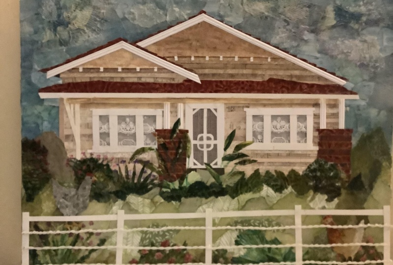
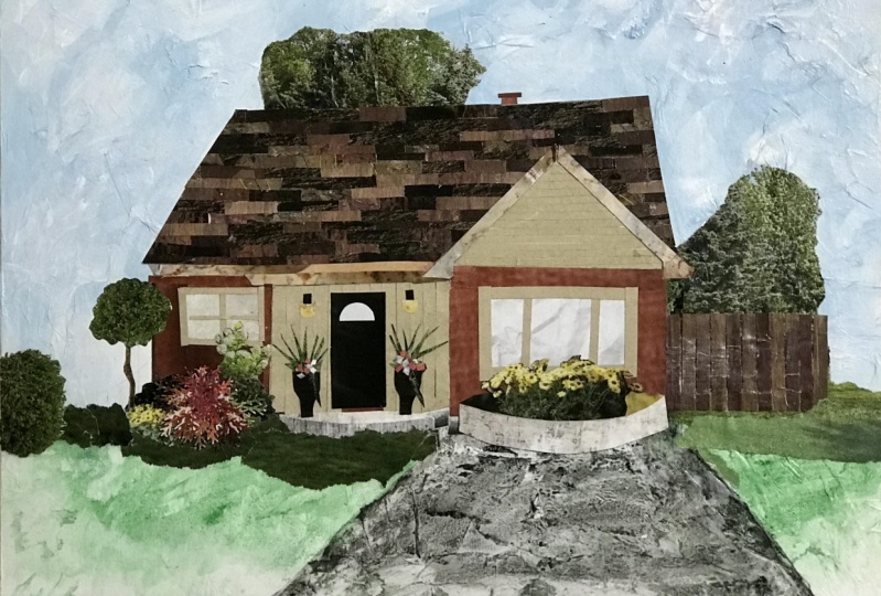
1. Introduction : Your home is the place that shelters and protects you. A can be a labor of love. But at the end of the day, it's where the heart is and where the art is. No matter whether you rent or own, Everybody has a special home that they've loved. It could be the home you live in now. The home you grew up in, or even the dream home in your minds. My name is Jennifer Laurel Keller. I'm an artist and instructor, but what I really do is help people gained creative confidence. I loved creating this class because normally, architectural rendering can be kinda dry. There's perspective, the Romans, and tricky angles, and it can be intimidating for a lot of artists. But in this class, home paper scissors with mixed media collage. I took the pressure off of having to make things perfect through the process of collaging with acrylic paint, you'll create a fun portrait of your home that goes beyond the building. In the lessons, I'll share techniques for how to create a dynamic sky with loads of texture. You'll learn how to the right dimensions for your unique cows so that it seems very familiar in Hami, there'll be tips on layering, depth and color. And finally, I'll show you how to enhance your yard into a lush dream garden. Even if you don't have a green thumb in real life, this class is right for you if you want to learn collage techniques that balance, having a plan was staying in the moment and allowing the process to guide you as you go. Once you learn these skills, you'll wanna make one for all of your friends and family. House warming gift anyone. So are you ready to make some memories? Come on home and let's get started.
2. Materials: Hello and welcome to the Materials lesson. So I am starting with an 11 by 14 canvas. And you can use any size that you want. Mine is on a panel instead of a stretched canvas. I also have a palate. Mine is a glass palette with the edges taped off. I have lots of acrylic paint on standby. But in this class I only ended up using titanium white, and Payne's gray, which is a navy blue color in Golden, and also burnt sienna. Just a little bit. Of course, I'm going to want some scissors and I have a variety of brushes nearby and I only used a couple of them, but I just have my enclose. I use matte medium. This is going to be for gluing down my papers and I put it in a squeeze tube to make it more accessible on the palate. And then I have a printout of my house and I actually reprinted mine a little bit bigger for the project. So that's just a smaller example. I use one to two pints of water, a paint rag, and a pencil. And then I have a variety of different types of paper. And when I pick out my paper, I'm looking for textures, patterns, botanical papers, papers with writing or sheet music. And it's nice to have an animal in the garden if you like. I used to bird. And I'm using colors both dark and light with Brown's, greens, blues, neutrals, and even some metallic paper. And the colors of your paper can be changed with acrylic paint going over the top so you can always alter them a little bit, but that's everything for now. And up next we're going to start working on the sky. I'll see you there.
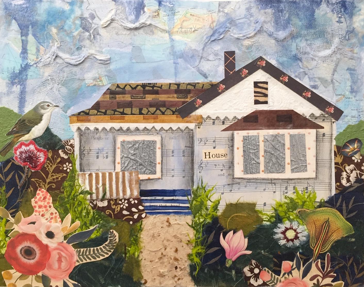
3. Sky: Hello and welcome to the sky lesson. As you can see in this lesson, we are going to make a gorgeous textured, colourful sky. And I cannot wait to get into it. So let's have a look. Okay, so I have this printout on 8.5 by 11 paper. And it's a little small for my canvas panel. So I'm thinking about reprinting it and scaling it up. But I thought I would just cut it out any way to see how it fits on the page. And I can try it out horizontally or vertically. And you'll want to consider that too when you are picking out the orientation of your Canvas because some people will have really tall houses, some might have really long houses. So if you print out your page, you can scale the image to fit really large within an 8.5 by 11 sheet of paper. And you just go to the scale and adjust that until it really has very small margins on it and then you can print it out. So I redid that for myself. And here is the larger one. And also when you take the picture, makes sure that the image of your house is really filling up the image in the picture. So the night just trim around the house and you might run into some plants and trees that are in the way of your house. And I just trim those off where I know the the the shape of the house is behind them. So I continue my cuts through anything that's in front of the house and just kind of imagine where it sits on the ground. There are plans in the way. And also you might have cars that are parked in the street or something like that. And then once it's cut out, you want to decide whether you want it centered or off centered. And I chose off centered because I was thinking about making a tree on one side, which didn't actually end up happening. But the piece will kind of take its own direction as you begin to work on it. So just allow yourself to be open to change and have fun with this. So I'm just tracing around the outer edge of the house and there it is. And then you can clean up any lines in the end. And then you have the shape that's really accurate to the dimensions of your house. So I pulled some blue papers. I have these paper samples that have these labels on them. Some of them are really textured. Some of them have maps, I have some maps, I have some natural fibers and some of my papers. So I'm just collecting papers that I think would be good. And this was interesting. I pulled out label off and it tore some of the top layer of that textured paper which ends up working for me in a little bit. And we'll get to that. So next time just tearing in, I want smaller pieces so that they fit around my house. We're going to fill in mostly. So here I have that texture paper remember at Tor and its kinetic and bossed over this gauze. And I figure out that I can peel it away from the gauze because the gods won't rip its fabric. It's really lightweight fabric. And then I have this cool piece of gauze that I can use later as a different layer. And I can rip into my top layer of paper, which is really thin tissue paper, and then has this embossed pattern on it that I thought would be queued for clouds. So I'm just going to tear that up and then rip into My Maps and it's okay if you have some colors that are not blue on this because we're gonna do a layer with blue paint and we can kind of make those more, more blue. So I'm gonna squeeze out some acrylic medium onto my palette and I want to coat my brush really well, pick up a good amount. And I'm going to use my scraps of paper to fit in and around the house. And you can get nice and snug up against the line of the house. It's okay if you overlap it, even because you want the house to be overlapping the sky later. So you want to come in a little bit with these papers and then eventually the acrylic paint that we also use. So I'm just applying a good amount down to the canvas. And then I will position the paper where I want it to be. And you will have a little bit of time to reposition things. If they're not where you want them to go right away. And then you just smooth it out with your brush with the rest of the acrylic medium that's on your brush and around the piece of paper on the canvas. And this gives you a really nice seal over the top as well. And you'll eventually figure out how much you need as you work through the process. So it's okay to have some white of the canvas showing through because we are gonna do the acrylic layer and camouflage all of the white of the canvas and make everything a little bit more unified. So just use any straight lines that you have in your paper scraps against the house where there's also straight lines. But if you end up not getting it up right next to the house, that's completely fine. And also, it's okay to have a few little crinkles and ripples in your paper. The wet medium will do that to paper, especially glossy paper. And that's okay because we are going for kind of a textured look. So any crinkles, we'll just add more character to your sky. And here's that embossed paper. And I love how it's going to stand out, especially once I paint over the top, it's going to be really interesting. And the thinner parts of it just kinda melt away into that background and create a really cool effect. Here's the gods that I peeled away from that and I'm gonna do a layer of that over the embossed pieces in some areas and it's just going to give it a neat woven look that we'll just add a little something extra. And it's kind of frayed on the end, which I really like as well. I love ripping into things and having frayed edges just because I feel like it's a little bit softer look than a harsh cut line with the scissors. Although I do use my scissors quite a bit as well. So I put some white and some Payne's gray down onto my palette. And I'm going to mix in some of the acrylic matte medium to give it more of a transparent look. And I would start with a lot of transparency at a good amount of mixed media and then you can always add more paint. It's good to be able to add more paint, then take it away if you add too much because I want to see the texture. I want to see some of the words in those maps and the land forums and some of the the print on those maps. So it's nice to be able to see through. And I'm going to put the most paint down where the white of the canvas is showing. And I'm just kind of blurring the edges between those scraps of paper. And the more pressure you put on the brush, the more paint will come out of it. So if you want a transparent look, you can just paint from the end of the brush and Julia, really light, wispy dry brush kind of look. But then if you want more coverage, say over the white of the canvas or something that you don't really want to show through. As much. Like the edge of a paper or something. You can press down on the bristles and more paint will come out and you will get more coverage. And if you cover something up two months, you can come through with your rag and wipe it away. You work quickly enough. There is a drying time that you have to consider and you can even dip your rag into the water and have it be wet before you come through and wipe something up as well. Now, let's try some drips. So I'm doing it now so that I can layer the house over the drips that go below the sky area. So first I have a little bit of paint on my brush and I'm just going to dip it into my water and then drag the brush across the edge of the canvas. And this brush right now is pretty watery because I'm working from the end. Let's do a darker color. Sometimes with watery drips. They pick up paint that you've already applied and it'll take it away. So this paint has a little bit of weight, a little bit of Payne's gray, and then I dip it into the water and then drag it across the edge. And now we can see some really high contrast. And that drip didn't have as much water. So I went back in and added some more and so you can dilute them as well as you go. If something's too strong of a color, you can add more water into that droopy area and it will dilute it a little bit. And it's better to put pain on your brush first and then dip it into your water instead of the other way around. Because then you add a ton of water to your palate and things can get kinda messy. So this is looking really good. I really like where it is right now, so I'm just going to stop while I'm ahead and avoid overworking it. And then I wipe up the wet areas on the canvas with my rag. Just so I don't have to wait as long for those too dry and I can keep working. And I accidentally dragged my rag through some of that Payne's gray. And so I'm gonna get that cleaned up as well. So watch your tabletop. You might want to put down some newspaper. And I grabbed a new rag because I didn't want to run into that problem again with the pains grade that was on my first rag. So that's nice and dry. And you can see that if I use the shape again, it will overlap that line and we'll have a nice clean meeting of those areas from the sky to the house. And then I just decided to pop in that line again for some reason it really didn't matter. You don't have to do this because it's gonna get covered up with the garden. But I think I was just kind of working with where that horizon, the ground was going to be in my mind still. And then I'm going to park my brush in the water so it doesn't dry up. And I think that we're looking pretty good here. So up next we're going to work on the roof and the walls of this house. So I will see you there.
4. Roof and Walls: Hi there, welcome to the roof and walls lesson. So I have my cut out of my house and I'm going to reestablish some of those lines so that I begin to have an understanding of how the layout of the house works and what I'm doing is lining up the house. So all of the the lines, I can just look down and see where they match up. So the corner of the roof matches up with the corner of the roof on the picture, the edge of the house lines up and I can start to work on the main shapes of the house. And I also keep it kind of rough because it's okay. If something isn't exact because this is not an architectural rendering, nobody going to build this house based on your blueprints here. It's really just about making the shapes that will work with your house. And so it's recognizable and feels like home to you. And also you can line the house up so you can look and say, okay, the stairs and here. And I'm just lining that up. Okay. And then from there I'm working on the stairs, so my porches raised. There are three steps up to my or three or four steps up. There's the railing. There's a window and little picket overhanging right there. And so I'm just popping those in and I actually lose a lot of these details once I do the walls because I do one big shape for each side of the house, just a big square on each side of the house. You'll see it later. So you don't have to take it this far, but it is kind of nice to mentally go over it with that hand-eye coordination and get a sense of what elements are really going into this piece from the reference. So now I'm ready to look at the roof. So I'm picking out some brown papers. And if you don't have all of these varieties of brown papers, you can just use one or you can use a color that's close and then go over it with a transparent layer of brown paint like we did with the sky. And I'm also looking at the front triangle of the house. And I noticed that this DOI Lee has kind of this picket triangular line on it, which is going to be perfect for doing that element of the house. So that was an exciting discovery because I don't I would have had to cut that by hand. Okay, so for the roof, I wanna do these little strips of different papers, like they're coming down, similar to shingles. But the shape of the roof that's exposed is very diagonal and it would be tricky to do all of those strips one-by-one and have everything line up perfectly. So what I'm doing is cutting out the roof. And then I'm cutting out the strips. And I'm going to line those up and gloom then down to that piece of roof. That's the right scale and the right shape for my house. So I'm just using a few different papers for that. And if you just have one or two, just make it work. It's all about staying in the moment and having fun and not sweating the small stuff. So I took that smaller house that I printed up first and I'm taking some acrylic medium and I'm applying it to the top. And then I'm just going to lay down my paper strips one by one. But I want to reapply the acrylic medium over the top of the one that I just laid down so that they are I get a nice coverage. But I don't want to glue it down to the paper behind. So I pulled it up so just to stay keep it clean. It's good to work from the bottom up so that the top strips are overlapping, the bottom ones just like on a roof. And so it wasn't that big of an area. I just made sure to get it laid down nicely over that cutout. And you wanna make sure you do it on the right side, which could possibly, you might get confused and flip it over and then you would have the wrong side glued. And so here we go. And I'm just going to let that set up for a moment. It doesn't have to be at a 100% dry, but it should dry up a little bit. And then you cut around using that roof shape as a template. And then you have a really nicely textured roof with lots of pattern and you can just kind of set it into place. The line of my roof that I did by just eyeballing it was a little off soy erase that line. And there you have it. But here's the thing. I want to put the walls down before I glue the roof down so that the roof can overlap the walls. So I'm using sheet music. And I wanted to use a nice page that was kind of relevant and had nice words on it. And I found this sheet that had the word house on it in the title. So that was really fun and I'm gonna save that for later because it would make a nice element in my collage. So I'm cutting off the margin of machine music. And if you don't have sheet music, You can use journal pages or anything with some written word, any kind of pattern or texture you want because we're gonna paint over it with the color of your house. So I'm just lining it up with the shape of the front of the house there. And I laid it down and just kinda eyeballed it. And then I'm going to fold the left-hand edge there. And this paper is old, so it just kind of tears away really nicely. And that's the shape that I am going to use on one side of the house. So you see, I lost a lot of the details that I drew down, but it's fine. I'm not going to sweat it. And then I'm gonna do the same thing here. So I'm just holding the paper up to the house, making my first cut. And it's okay if your paper isn't the right shape exactly. You can always come in and make some adjustments with your scissors or later with your paint that I'm going to fold this over and rip off the excess. Just like that. Alright, so here I go, laying down a really good amount of acrylic medium and lining my paper up just right. And you can reposition it. You want it to be really, really close. And you might need to put some Under the edges to make sure that they lay down really clean. And here's the other side. I'm going to get it right up under that roof and touching where the line of the roof. And again, you can keep adding if there's if you didn't go far enough, maybe you made your shape too small. So there's always ways you can correct things by adding more papers or more acrylic paint. Then I'm going to lay my roof down. So there is a little bit of a gap, but I'm going to come underneath the roof line with that little picket triangle area and make adjustments that way. I'm going to cut one little strip for under the roof, there's kind of an overhanging there. So I came through with one more and see you can always fill in any gaps if things don't line up perfectly. So now I'm going to cut away this joy Lea area. And I want to use this on the point of the house, but it's not quite the right triangular shape. So I am going to trim and crop it where it needs to be. So I'm lining it up centered. I'm gonna use my finger as a place marker and then hold that place with my finger and trim up to that point, keeping the width of that triangle intact. Laying down some acrylic medium. So this is going to give me a really nice texture that's kind of unexpected, but it's the right color. This area of my house has vertical lines in it with the boards on the citing. And so this is, I'm going to be subtle, little bit different, a little bit unexpected, kind of quirky and fun. And then I have to lie in that area with more roof. So I'm going to trim another strip of paper and I like how their flowers and thus it makes it really sweet. And so I'm just going to bend it where it needs to be cut. And then I'll hold the other one in place and rip that where that's gonna go. And then apply it down with acrylic medium, kind of scoot it into place. You want the point where if you have a roof line like this, you want the point to be nice and clean. So just make sure the top point of the roof lines up really nicely so that it's doesn't look sloppy. And then you've got a nice roof line. And then there's this vent up here, which I'll do with another piece of paper. You could paint things in or you can find something with lines in it. So I found this piece of paper and I was kind of it had lines but they weren't really straight. And I like that a lot because it's a different representation of event. And now it's kind of, it's almost like an animal print, but it's really kind of loose and lined. My papers drying up there some ripples that I just pushed down. And we're going to cover that sheet music with the color of my house, but I want it to be transparent. So again, I'm using white and pains grade very similar to the sky color. And I want to warm it up ever so slightly because it is less blue, it's a little bit more gray. So I'm going to use a burnt sienna color in just a touch, just a little touch and white and the Payne's gray. And then some matte medium that was a little too opaque. So I brought in more matte medium. And now I can paint my house the same color are the color that is close to my actual houses color. But I see the sheet music coming through, which is adorable. And if you don't have sheet music, I highly recommend picking some up. You can find it at thrift stores, bookstore, used bookstores. It's not very expensive. You get a lot of sheets, and it's just a really charming element for your collages. So I'm just painting really lightly over the top. And then the left side of my house is a little bit darker because that porch has more shade on it because there's an overhang. So I brought in a little bit more Payne's gray for the left side, it's barely noticeable, but it is going to give me just a little bit darker of a color on that side. And that's good for now. Up next we're going to work on more of the details on the porch and the windows. So I will see you there.
5. Porch and Windows: Hello and welcome to the porch and Windows lesson. As you can see in this lesson, we're going to really enhance the house with more details. So let's have a look. I'm going to start with that picket line on the porch, that overhang. And so I noticed on this joyously piece that there is a triangular edge to it. And I would have had to cut that by hand. So I kind of lucked out in this situation. And so if you keep your eyes open to the supplies you have around you, that sometimes you can really improvise in some interesting ways. So I'm just cutting these strips off and they're going to be along two areas. So I'm just going to rip them down to the right width. And that one I could have actually made a little bit longer, but no big deal. And then I'm going to cut another strip for the porch. So fetches was a fun little element for me. It's really personal. And I can remember how I found this little bit of triangular edging for my porch, which is kind of a big characteristic of my house. So now I'm going to glue those down with the acrylic medium. I have a smaller brush now because we're working with smaller details. And I'm going to apply a small amount to that line where the siting of the house changes and line that up nicely and precedent. And I wanted to move that over just a bit. So you can hold one end down and then position the rest so that it lines up nicely. If you do something like this, everything I do in this class is just four examples and inspiration. Your house is of course going to be much different than mine. So just gets all that nicely smoothed out. And you can see how cute that is. It's not the same exactly, but it's darn close. Okay. So now I have this bay window that is on the front of the house and it has its own little roof. It's like a miniature roof above the bay window. So I'm cutting out the shape of that and it comes above that white area. So you can see how the window is. And I'm comparing my papers to my printout to just copy the same size. You can just hold it up and eyeball it. My cares my I'm using this polka dot paper for the trim on the window, and I'm just gonna do two rectangles. Ones even a little lopsided, which I think is kind of quirky and cute. I'm not going to sweat that too much. Line those up and I actually end up lightening those two squares with some white paint in a moment, but I just want to get them down. So that one is for the porch. It's a thicker paper, so I have to push and work with it just a little bit longer than a thinner paper. Okay, this window is not centered on my actual real house, which is always kind of bugged me. But so I just moved it over a little bit to the right and then put the roof over that. Right? And I found this metallic silver paper which I'm going to use for the window panes. And so there are three window panes on that bay window. So I'm just going to cut across. But I didn't want to get into a bunch of angles and stuff like that. So I'm just keeping it kind of loose and free here. So I want to lighten up the trim. Soil mixing a little bit of white over the top with some matte medium in it so that I still see those polka dots because I find those very cute. So I'm just going over the edge with a lighter color. And I'm just looking for a small change here to make it match the rest of the house. And because I'm going to layer the panes of glass or my silver paper over the middle of those squares. I don't have to worry about the, the middle so much because it's going to be covered up. So I'm just going to bring those in one by one, get them positioned, and then I'll do a top coat Over the ad. Great. So I love that clincal look of the metallic paper. It's not highly metallic, but there is a little bit of a shine. Okay, so now I'm gonna do the railing on my porch, which in the picture that I have some Garland up for the holidays. So I'm going to measure just hold that up eyeball where it ends and then how tall it should be. So I'm using this corrugated paper. It's kind of like a cardboard, but it's not quite as thick. It's made with kraft paper. And so the porches raise so it's not going to meet the bottom of the house. I'm going to elevate it just a little bit. Come in with that acrylic medium. Either, you know, this is a thick piece here. And I'm just gonna plunk that down in the medium. It's going to grab it, it's gonna hold, no worries. I can use the brush under the edges to get a little extra secure. And then I'm going to use that acrylic medium over the top. Because it's what I do, it's what I like to do. And then I'm gonna do this little dry brush technique over the ridges to give it this feeling that it has the the wood, the white railing, and then you can see through it. And then I did some trim. I just added some white around the edges of the house, some lines. And then here is some straight Payne's gray on my brush and I'm going to pop in some steps just with paint. So here's the top of the porch. This is the floor of the porch that I'm painting right now. And I'm going to add the garden. And it's going to cover up some of the edges of this paints so I don't have to get it really clean. If I wanted it super clean, I would work with the pain a little bit longer to get the corners of the brush to cut in a clean way. But because those edges are going to be covered with plants, I'm not going to worry about it so much. And then I thought it would be cute to add the word house from the sheet music that I used for the siting of the house in my designs, I am just cutting out the word house. And you could make this the numbers of your house. You could come over with your address and just add that in wherever it looks good. So I'm just going to pop that in. Just as kind of a homage to the music that I used for this piece. And that looks cute. Alright. So there are the details for the house and we are ready to move on to the garden. So I will see you in the next lesson.
6. Garden: Hi there, welcome to the garden lesson. This lesson is so much fun. So as you can see by the end of this lesson, we're going to have a nice lush garden. This garden is way nicer than the one I have in my own front yard, but is kind of similar. Some of the things are in the same place. I just didn't hands them a lot. So let's see how this process works. Okay, so I have my stack here of some different grain papers. If you don't have a lot of art, decorative art papers, you can use Magazine cutouts. You couldn't use neutral papers and paint over the tops. You just want a variety of light and dark greens and something for contrast and variety is so it shouldn't all look like the same exact paper unless you have a really modern yard. But I want mine to be kind of wild. I even use some brown papers here. This one is brown and has some floral elements in it. So you can really get creative with this. And I'm just ripping into these. I'm looking for very rough edges. I don't want any straight lines and look at this. That paper is amazing. It's like fabric shreds or something. And they, Oh my gosh, the textures, incredible. That one has some lovely leaf patterns and balance even more like a peacock blue. So the darker colors are going to make some great shadows and make great contrast so that your house pops. So I put some darker colors around the walls of the house. Pretty high up. I went above that little line I had put in. Because I really want it to seem like this garden is growing really wild and free. So it's reaching way along the sides of the house. And you can even go above the roof line of the house and make it seem like trees. So now I'm starting at the top of my garden and I'm gonna make a little nest for my house. So it's going to overlap. Each scrap is going to overlap what's above it. So that one is going to overlap the piece of paper and the sky. And then as we move down, it's going to seem really lush and full. So here That one's overlapping, what's around it? Except for the edge of the house. I wanted the edge of the house to be a clean line. Now look at this paper, I'm in love. Oh my gosh. It's like the perfect thing. It's too bad. I only had a really small sample of it because I would use that all the time. Now it's gone. But I just want to use what makes sense. And I'm looking for contrast. So this one's fun because it's like it's growing up the side of the porch. Oh, the texture. And that is just incredible. Love, love, love. I hate to cover any of it up. Okay, so that one's going to look really cute along the side of the, the steps. And I do have a plant there. And you can rip into things to give them a little bit more shape. And just make sure it's overlapping the bottom of the house. And if you just have lawn in your front yard, you could absolutely do some more horizontal shapes and do the same thing. It's just not going to be as tall and big, but for me I just wanted this really lush look. Now, remember how I said I use a squeeze bottle to manage my palate and that makes immediate earlier and the matte medium, this is why I ran out of matte medium, it my squeeze bottle and I just went and poured the jar out way too much onto the palette. It can be a little bit tricky, so it's all good in the end, but that's why I do that. Okay. Overlapping some more. Now, I do leave a few little gaps here in there. Oh, before I get into that, let's talk about the pathway. So I have this paper here. I'm going to cut it. I do a little indentation with my scissors just to mark how wide it should be. And then line it up with that space and make a cut to indicate where it should end. And I'm gonna glue that down now with perspective when there's something on the ground. In real life, the lines of it are going to be angled a little bit. But I don't care because this is a fun little collage. And so I just made it straight down and everyone's going to get the point, right. But if you wanted to be more realistic, you might make those lines converge a little bit more at the top. Okay, so I'm really paying attention to the tops of my scraps because those are what are going to show. It's okay if you have more straight lines at the bottom because those are going to be overlapped later. And I'm overlapping my path a little bit as well just to get that feeling that the plants are growing over the edge of the cement and then filling in all the way down. Now, I was going to mention earlier before I started talking about the path that I do leave a few little white areas showing and I'm going to fill those in later with flowers. So this is the base of the garden. It's not the final layer that I'm gonna do on this space. So I can come back in and just cover things up that don't meet with my flowers. And we'll get into that very shortly. Okay. And for the bottom of the canvas, you can line up at any straight edges, which is a nice way to save time so you don't have to make any cuts. There are a couple of papers that I left hanging over the edge of the canvas, which I'll show you how I take care of those. You can cut them away, but I end up gluing them around to the back, just bending them around the edge of the canvas. But here we are, covering up the edges of that pathway and just finishing up our lush little garden base. And I do have some floral elements here in print. And in texture, but they're not the main focal points of the garden. So I have these larger flowers and the scale of these are ridiculous. And that would be a huge flower in the garden. But because of perspective, maybe it's closer to the viewer. We're just going to kind of use our imagination and let things go really wild here. So I'm cutting in, I do it a rough cut on this paper and then I'll come in and cut into all of those cracks and crevices of the print. And this far right hand area that I'm working on right now, I'm going to cut that away and separate it and use that on one part of the garden. And then that bigger flour I'm going to use on the left-hand side. So you'll see how that kind of lays out as we move along. So you can add or subtract anything you want by where you make your cuts. You can crop things. You can use the background color to add a little extra contrast if you want. Just give it to the right size. And I'm going to lay that down right about there. So I'm going to finish working on the background because it was such a big piece. I wasn't sure if I needed to finish the background, but I do because it's going to show through. So I'm going to continue working on that where it's going to show through the cutaway of my big flower focal point. And now being much more careful with my matte medium. Overlapping. And finishing out that corner. Very fun. It's all just play, you know, like you can use lots of different colors and then come over this with a transparent green layer in a couple of different greens and blues and mix things up. Have it be really, really fun, like the sky is, right? So now I am putting down my floral focal point, that big red flower to give it a pop of warmth. Because so far this piece has been kind of cool, right? Lots of blues and greens. And now we have some warm tones to round out our color palette. And I'm gonna do the same thing with the other piece that I cut out down at the bottom, lining up the edge with the edge of the canvas and make that easier. And then I have this really cute fabric piece that is in, embroidered on like a mesh fabric. So I'm going to trim away some of that mesh. But it's not very obvious once I get glued down, you can see right through it kind of like how tissue paper melts away. This mesh isn't very obvious though. The fabric takes it soaks up a little bit more of the medium. So you want to apply a little bit more down. And then here I have another floral, botanical piece. This is kind of interesting. So I thought that would be fun and I like it over there. So we'll put that down. So I just kind of love the whimsical look of these bigger floral pieces in the yard. It just makes everything seems so extreme and Lachish and whimsical. Okay, here's another flower that I cut out. So we'll just add that. So the closer you can get it in on the margins, usually the better, but it's okay to have some margins on your flowers as well. So there's the beginning of my garden up next, I'm going to do a little bit more in the final details as well as some details on the house. So I will see you there.
7. Finishing Touches: Hello and welcome to the finishing touches in this lesson, you can see that we add a little bit more to the garden. I added an animal friend to my garden as well, which always gives a piece more personality to add animals. And then I added just a bit of shading on the house to give it more dimensions. So let's have a look at this process. I'm just taking a regular number two pencil. If you weren't darker shadows, you can use a charcoal pencil as well, but it will smudge. So you might want to use a spray fixative over the top to keep those lines in place. But I'm just going to go into my details here. I'm going under the roof of the porch and around the citing. There's a post there on my porch. And then I'm going to fan out my marks a little bit more softly as they they come out into the light. And this is just going to help everything stand out a little bit more and give you more dimension, more depth. Here we go around the window. It's really easy to do. And then I just smudge it out with my finger. But you can do this however you want. You can use acrylic paint. You can use pen. If you want. Some pens, might not work as well over the acrylic. So you can do a little test spot off to the side where it's not very obvious. You can use pastels, you can use charcoal. So really any medium is fine, except probably watercolors and water-based inks. So pencils are just really easy to have her. You know, everyone's got a pencil around usually. And you can now erase any mistakes and get your piece looking like there is some shadow in there. And it's just gonna make all of those details stand out that much more. All right, so that looks really good. Let's make that little piece of citing standout as well, such as some crosshatching and then I run my fingers through it. And that looks good. Okay. So I wanted to beef up the left-hand side of the canvas because my house is not centered. So I felt like I needed to balance things out a little bit more on the left side, just raised the garden up a little bit, made some larger plants. And I like how the top of the garden now is a little bit lighter than some of those darker papers because light does hit the top of the plants. And this just gives it a little bit more light, so it's slightly more realistic. And I'm using this little piece of textured paper. Next to that, it'll give it some variety and make it seem like it's sloping down towards the house, kind of like that nest D look like I was talking about before. Here's an embroidered flour. It came from the same piece of fabric that the first embroidered Flower came from. And I'm like deciding which side I want to show. So I think that's actually a little bit cuter with more detail. All right. And I have a, another cutout of a flower. I wanted to hide some of those straighter reps. So I just popped a flower over where they met the rest of the garden and it camouflages it a little bit. So those two pieces of paper are not cropped off. I let them hang over the side. So all I'm gonna do it and you can come through with scissors or just take some medium and bend them over. And then if you frame it, you're not gonna see that adult. Ok, now I have my little bird friend here. And I'm going to cut that out just so and I think it's going to look cute. There was thinking maybe on the roof, but I think right above that flower is going to be nice like it's sitting on the flower. So I'm just taking some medium and getting that down. Perfect. Very cute. I love it. So here's the final bit that I have to do. I have a chimney that I forgot. So I'm gonna hold that up, kind of memorize the angle there, and pop that on. And so I just need a little bit of medium and I'm using more pressure. That paper was a little bit stubborn, so I just cheat and use more pressure for longer and it stuck down. So this is the piece I had so much fun with this. It was such a personal fun project. I love the idea of having this forever. And even if I move, I can display this in my next house. Or imagine what you could do with this process. If a friend moved and bought a house, you can make them a sweet little household ring gift with us. So i, There's a ton of potential through the idea of home. It's so special, it's where we spend so much time and so many memories are made. So I hope you have so much fun with this. Thank you so much. Thank you so much for joining me for this class. I had an absolute blast collaging with you. I would love to see your project if you feel like sharing it or would like some feedback, I encourage you to post a picture in the project gallery and let me know about your experience. If you enjoyed this class, please consider following me for future updates on new that I offer. I also have several other painting classes which you can view on my main class page, which is linked to below. And remember, Art is meant to be fun. So if you show up and practice with an open mind, you'll learn something new every time. Happy collaging, and much less. Okay.
 Jennifer Keller, Express Yourself with Creative Confidence!