Transcripts
1. Intro to Graphic Design in Adobe Animate: Hi there, welcome to this class on how to use Adobe Animate as a design tool. My name is Yvonne, I have close to 20 years experience working as an artist in the animation industry, and I'm passionate about teaching the skills and the workflows to help you build your own career as an artist or an animation professional. Over the years, I primarily work in Adobe Photoshop to create backgrounds or concept arts. But every so often, I'm called upon to create graphics that are vector-based, and to do that, my program of choice is Adobe Animate. While Animate does have the same tools and capabilities as something like Adobe Illustrator, the processes are much more closely aligned with Photoshop. That is to say that drawing and painting in Adobe Animate is just really direct and really straightforward, so if you are a designer or a digital artist looking for a quick and easy way to create vector art, this class is for you. In this class, you're going to learn everything that you need to know to create stunning and complex graphics. First of all, I'm going to give you an overview of the workspace and the tools and how to set things up for designing. Then we'll put to practical use all of the tools in four fun projects. You'll start out creating a super-simple set of icons with using shapes and lines. Then you'll develop slightly more complex work with two graphics for a logo design. In the third project, you're going to build an even more sophisticated and intricate graphic, learning how to use gradients and masks. In the final project, you'll get to recreate a beautiful movie poster based on an iconic design. This project is going to teach you how to make a double exposure effect, as well as how to import bitmaps, how to use effects within animation, as well as blending modes. Finally, I'll show you the capabilities that Animate has to handle type and how to customize your own unique fonts. People often think of Animate as having just two sides, it's either a web development tool or it's used for animation. But there's a third and powerful side to Adobe Animate, and that is its capability as a graphic design tool. I'm really excited to share this with you and to give you the option to create vector graphics quickly and easily. Let's get started.
2. Your Workspace in Adobe Animate: In this lesson, I'm going to start the tour of Adobe Animate. I want you to get a really good idea of all of the tools and the windows that you're going to need for design. To start off, I'm going to show you how to set up your workspace and how to customize it so that you can easily follow along with me. When you open up Adobe Animate, generally we get to this welcome screen. If you're not opening up some of your previous documents or your recent projects, then you can come over here and click on Create new. This is normally what I would do straight away. You can also hit "Command" or Control N on your keyboard. Either way, it'll bring up another little dialogue box like this, where you can choose some parameters for your document. At the very top of this, you've got different templates depending on what your output is going to be, whether you're working for web or you want to create social media things, or you're working for games. Since I'm generally coming from an animation point of view, I naturally default to this tab, and underneath I choose one of these presets. What I will say is that it doesn't matter hugely, you can think of this 1920 by 1080 as a default Canvas size across a lot of projects. That's an easy one to start out with. Let's just click on that. I will mention that if you did want to make something very specific, if you had a client that wanted you to create a portrait image or an illustration or something, you could also just change your pixel size here, swap these around, and then you'll get a different orientation. But leave it at that for now. We don't have to worry about frame rate, we don't have to worry about platform type, we're just drawing and painting and designing. Let's go ahead and click on "Create." The first thing that I'm going to do, and I'll suggest that you do this as well, is come up to the very top right-hand corner up here where it says Workspaces. If you hover over this tiny little icon, it'll say workspaces and once you click on that, a drop-down menu appears. Let's you and I both choose Essentials right off the bat. That way, we're both starting out on the exact same page and any changes that I make from here, you'll be able to easily follow along with me. This is it. This is Adobe Animate. If you have worked with other programs in the Adobe Suite, you're going to be more than familiar with the concept behind the workspace and that is to say, you can drag Windows out, you can move things around and you can customize it quite easily. Say, for example, you did have the properties open and you close this by accident, all you have to do is come up to window and under this drop-down menu, you can easily find it again. You can just click on Properties, but you can see that there are tons of other windows that are available to you as well, should you need them. I'm going to click on Properties. It's now flourishing, so that's okay. I will drag it over and when I see this blue highlight, I release and it'll nest itself into there. On the other side of properties, there are different windows again. I've got color, swatches, this is the transform box, this is align, and I don't need to worry too much about them right now. That's all fine. I can leave that as it is. The one thing that I'll do is, nested in with properties is this other tab called Assets and I definitely don't need to have that. I'm going to come over to this drop-down menu and hit "Close." I like to keep things as specific to the project that I'm working on as possible and not have any extra windows that I don't need. Properties, I will keep open while I'm working because more and more it seems like animators leaning towards a little bit of an illustrator mindset and in a lot of these objects or tools that we are working with, you can tweak the properties or tweak the parameters to a certain extent and so it's handy to have it open. Over here is the tools. These are all your creating tools and editing tools. In the next lesson, I'm going to go through them and explain also how you can customize your toolbar and take some of these tools away if you don't need them. Down here is the timeline which I'll explain shortly. But just so that we're starting out on the same page, make sure that you can set up your animate screen to look exactly like this. If you've got any problems whatsoever, you can just send me a message and ask me if you've lost a window, if you don't know how to set it up. If you're happy with that, you can come back over to Workspaces and what you can do is you can save this as a new workspace. Let's call it Design in Animate. Save Workspace, great. We're all ready, and meet me in the next lesson and I'll go over some of these drawing and painting tools.
3. The Tool Bar: In this lesson, I'm going to talk you through some of the most important drawing and painting tools over here that you'll find in your toolbar. I also want to briefly explain how you can edit this toolbar to add new tools to it or to take tools away. For me, it's always really important to have easy access to all of these tools. I could just drag the side of my canvas out to make my tools a little bit more prominent. Or if I wanted to, I could just drag it in so they're just all in one long line. But what my personal preference and I'm not saying that this is the way to do it, it's just the way I'm used to working in, so I'll drag it out so that they're in two rows. For me, it's easier to see them. If you look very closely, you'll see a little line under a group of these tools and that just indicates how they're grouped together. For example, the way I've got it set up at the moment is this first group is all of my selection tools, underneath are my drawing tools, underneath that is the eraser and paint bucket, and underneath here is the pen tools. If you don't have the exact same icons as I have, if you don't see them on your side, just come down to these three little dots down here. If you hover over them, it'll pop up and say edit toolbar. I'm going to click on that. What that does is open up this other window where you can actually add or take away tools. For example, if I wanted the 3D rotation tool, then I'm just going to click on it and drag it over here. Then as soon as I see a little blue highlight, I can release and it'll pop itself over there. If you didn't have, say, the selection tool or let's say the pen tool, then look for it over here, find it, click on it and drag it over. If you have choose on the side that you don't need, let's say I don't really need the 3D rotation. Then I'll just click on it and drag it back. Now it's gone from there. Then when you're finished, all you have to do is click on the drop-down menu and come down and close it off. The main drawing and painting tools that I use are obviously the brush and pencil tool or line tool, as well as the shape tools. If you click down, you'll see there are other options like oval primitive tool or rectangle primitive tool. But for our purposes, we're just using the straightforward regular polystar, square, and oval, as well as the line. Then I've got bucket and eraser over here and I've got my pen tool. The pen is also a very useful tool for drawing and designing. You can at this stage go ahead and just start experimenting with some of these tools. If you click on the classic brush tool, for example, you'll see that two other icons appear. If I go back to V, they've gone away. I'm just going to click on that again and the keyboard shortcut is B on your keyboard. I always have this use pressure. I have that switched on. If I don't have it switched on, the brush will look like dash. I'm going to click that on and you'll see that you can get a nice tapered line. It's very in tune with the pressure, the amount of pressure that you give to your weights. So if you press very hard, it'll come out a lot stronger, and if you press lightly, it'll come out a lot lighter. The other option for that brushes to use tilt and I generally don't really ever use tilt. But you can play around with it, an experiment. For me, I just want to make sure that I've got the pressure sensitivity on. That's fine. One thing to note and I will explain a little bit more about fill and stroke later on, or fill and line, is that the brush tools, generally speaking, work with your fill color, and the pencil tool or the line tool will work with your stroke color. That's the line tool. Then if I hit B on my keyboard, that's the brush tool. The line tool is different to the pencil tool. The line will give you a straight line between two points. It will only make two vector points. Whereas if you work with the pencil tool, which is over here, or Y on your keyboard, that will actually go a little bit more fluidly and you'll see that it can create quite a few vector points that you can then manipulate and change if you wanted to. The next drawing tools that are very useful are the rectangle and oval. You just click and drag out on your canvas. The thing to note about this is that when you do this, both the fill and the stroke appear on your object unless you specify that you don't want that. I'll show you how to do that in a minute. But essentially, your fill color is in this swatch and your line or stroke color is in the swatch down here. You can just click on it and choose a different one. But if you wanted to make that outline a lot thicker, all you have to do is double-click on the outline so that it's all selected. Come over to properties now and then underneath this object tab, you'll be able to see your stroke properties so you can see the color, let's change it again, and then the stroke size. You can either drag this up to make the line increase or you can actually put in if you're working with a lot of lines that all have to be exact same width. You can put in a number over there. Underneath that, you've also got style, width, and scale. Style means basically do you need it to be solid or dashed or different other kinds of options. Later on, I'll be showing you how to add custom brushes to this drop-down menu. But for now, I just leave it on solid. That's how you would affect the outside stroke. If you wanted to change the color, well, there's two ways to do that. You could do it over here on your main swatch. Click into this front square where it says Fill Color, and click from any one of these default swatches or custom swatches underneath. Let's go with yellow. If you're not familiar with drawing and painting in a vector program, it's very different to Photoshop. What you want to do is understand that this line is made up of four vector points. As I move my cursor along the edge, when I get to the corner, you'll see that it changes. Right now it's got like a curved line. As soon as I get to the corner, it's got that square line. That just basically means that there's a vector that I can click and drag if I wanted to change it. Whereas in here between the two vectors, there are no other points and that's why I can do this with my line. The same can be said for the fill. The fill will have four vector points in between any two vector points. I'll be able to affect the line curvature. If you have an object and you want to quickly see where the vector points are, then what I do is I always hit A on my keyboard or come up to the subselection tool like that, and click on the line or click on the fill, and it shows you all of the vector points and lines in between. Then if you wanted to, you could just grab one of these vector points and change it and you could grab one of the handles and change that as well. The idea really is in Adobe Animate that it's very direct. It's a very direct editing software in terms of the images, you don't really have to do much else other than just click and drag your way around objects and shapes. That's what I love about it so much. I love that it's a little bit more intuitive and a little bit more immediate as I said and direct. As you'll see, this becomes a really interesting way to work.
4. Understanding the Properties Tab in Adobe Animate recover: In this lesson, I'm going to go over the Properties tab a little bit, and just get you familiar, and up to speed with what you need to know about what's going on over on this side. I've explained quite a bit already in terms of very simple shapes. That is that if you wanted to change, say for example, the width of the stroke, you do that over here in the Properties, but just be aware that, let me choose the Pen Tool, you can also choose Properties relating to the Tool. With the Pen Tool selected and switched on, the properties for that pops open and I can again change the stroke size. Let me dial it up, with a style with things like dash. When you don't have any tool selected, then the properties that is open will be for the document itself. You can change things here that might be very useful and very handy when you're working. For example, the one that I think is most useful to look at is Snap to objects. If I turn that off and I start drawing with a line, if I'm trying to make a shape and I want to fill it with something, well, I could just do something, let me do dash, and I'll use the Paint Bucket tool, which is K on the keyboard. But I can't fill that shape the way I can fill that shape and that's because if you look down here, this corner is not closed. I'll have to go back in, and try and close this, and really see if it's close, and try it again, and it doesn't work. That can be quite frustrating when you're drawing, especially if you draw a complex thing and you just don't know where the joint is that hasn't closed. Like even now, I think that I've closed it completely and it's still not filling. That's where this button comes in very handy. If you're drawing with lines, I always try to turn it on so that I can just easily snap corners together. By doing that, it just means that I know my shapes are going to be easily filled. However, it's not always useful to have that on. Sometimes, it can be very annoying. If you wanted to move this line, and have it be somewhere, and it just keeps trying to snap itself to somewhere else, that's very irritating. If that happens, you can just turn it off. But just know that that button can be very useful when you're using lines to draw with. The one thing that I did want to point out, if I grab the rectangle tool again, there are two modes basically, you've got just the regular mode of drawing and then you've got something called object drawing mode. If I turn object drawing mode on and I create a circle. I'll show you the difference between each. Essentially, if I select this, you can see dotted pattern appears. That means that the entire thing is selected, and also, it means that it's directly editable, so it can go in and start making changes and doing whatever I need to do. But on this object here, I can't make any editable. I can't really edit it. All I can do is move it around. You'll notice that when I do select it, it doesn't have those dots to tell me that the actual thing itself is selected, it just has this blue bounding box. Basically, an object drawing mode is the same as grouping things together. What you have to do is double-click onto that to go inside that group. Up here, you'll see that we've moved from being in our main scene to inside this drawing object. Now, I can easily select parts of this and start editing away if I need to. But then to go back out onto the scene, I can either click this button here to get back out or just double-click anywhere on this white space, that brings me back out. Now, why would you need something like this? Well, it's handy if you're drawing complex things with different shapes. I'll turn object drawing off for the moment so that you can see what happens. If I draw a rectangle and then I draw a circle, what tends to happen is that objects cut into each other and you can't have one on top of the other because they will create issues. Whereas if you turn object drawing mode on, you don't have that issue, you can draw things on top of each other, move them around, and it's fine. This is the exact same thing as working with layers. In other words, you can work with the object drawing mode if that helps you to keep things separated, or you could just make separate layers. Turn object drawing mode off. My personal preference is to work with layers as opposed to the object drawing mode because I can just very quickly edit as I go, I don't have to worry too much about double-clicking into the item, making changes, double-clicking to go back out. To me, it's just easier and handier to be able to work on layers rather than with the object drawing mode. If you did have a shape that was in object drawing mode and you wanted it to be just a regular object, all you have to do is hit Command or Control plus B on your keyboard. What that does is it breaks it apart. By breaking it apart, it just simply means that it takes it out of that group or out of the object drawing mode and into just being a regular object on the stage that you can now customize and change however you want to. That's a basic overview of the Properties tab and how you can use it to adjust settings and parameters of either the tool that you're using, the object that you're drawing, or indeed, the document that you're working in. Remember that snap to objects button is an important one to keep in mind, as well as object drawing mode. That's another important one to keep in mind. Both of those can now be found in the Properties tab. In the next lesson, I'm going to talk you through the final piece of this workspace puzzle and I'm going to explain all about the timeline, about layers and about folders. I'll see you in the next lesson.
5. The Timeline and Stage in Adobe Animate recover: In this lesson, I'm going to explain to you all about the Timeline and the Stage in Adobe Animate. As I've said before, I love the way you can draw and paint in animation. It's so intuitive, it's so direct, and it's a very powerful, expressive way to be able to create artwork. But the other side to Animate that is really powerful in my mind is obviously the Timeline. Because that's where you can animate things and much like everything else in Adobe Animate, it's very, very intuitive and straightforward. You simply make a shape on your Stage, you go forward in time, and you can create another position for that Stage and then you can simply animate them and you've created motion. But we aren't really here to animate, however, I wanted to point something out to you, which I think maybe Adobe Animate is off-putting to a lot of designers because of this Timeline and because they think they don't need to get involved in creating motion, they just want to be able to create artwork. Well, if I drag this Timeline out and released and still it's floating, and if I just drag all of this over to here and drag this down a little bit, and I'm going to close Output. You might now start to see this Timeline as being something a little bit different or maybe even a little bit more familiar, especially if you are a Photoshop user, you can see how this is actually very like Photoshop. You can create layers, you can create folders. If I create this folder here, grab these layers and nest them by dragging them up so that they are indented underneath the folder, Release. I've now got a folder with a bunch of layers in it and this big open space here for designing and drawing. I think this is very interesting now as a drawing tool, looking a lot different to something like Adobe After Effects or Premiere. I've gotten rid of all of that Timeline that I'm not going to be using while I'm drawing, and I've just feel a lot more comfortable because this is a layout and a space that I'm very familiar with. If you're a designer who's used to working in Adobe Photoshop, then suddenly this can be a lot more interesting as an option for creating vector artwork. Of course, the layer stack works exactly how you would expected with things or objects on the first layer being underneath anything that's on the second or subsequent layers above it. Got a character on my Stage. This is a character I used for my animation class. This guy has a lot of layers and they're all named. What you can do is just double-click on that name and write whatever you want. That's how you name your layers, then you can lock layers as you need to, while you're working on them. You can also hide and reveal layers that you don't want to see. This column here, essentially, the color tells you what it's like, as associated with that layer, you can also change that under Properties, you can change the outline color to something different. It comes in handy when you're working with a complex illustration and you want to trace things, you can click on this and it turns that into an outline, which sometimes it's very useful. You'll see an application of that later in this class. I'll be able to show you how we can work with that. If I wanted to put all of this guy into a folder, I would just come up here, click, "New folder." There's nothing in that folder at the moment. You can see it's open, so I'm going to click the first layer, go all the way down to the bottom, hold down shift and click on the last layer then go back up to the top and simply drag the entire layer stack until I see this little line go to an Indent underneath the folder like that then release. Now I can close that folder up and everything that's there is in that folder. I can now make a new scene underneath and put them into a frame and start creating a background behind them. The very last thing that I'll explain for our workspace as we start to move into the rest of the class, is this entire area itself and how you work with that. Normally this white area on our screen is called the Stage. The stage is an animation term, it's simply means it's useful to call this a Stage because we can have elements offscreen like that. When we export our movie, eventually anything that is outside of this white space doesn't get exported. You could have a scene where you've animated this character walking into frame, when you export that movie, you don't see him off screen at all, you'll just see him walking in. That's why this is called a Stage, but for illustration and design purposes, it's your canvas, that's really what that is. Okay, that's pretty much all of the basics covered for Adobe Animate and for getting started, creating artwork, and drawing and painting. If you've got any questions up until this point, let me know, be sure to send me a message, I don't want anything to be unclear or confusing whatsoever. Feel free to just send me a quick message if you have a question. When you're ready, join me in the next lesson.
6. Creating a Set of Farming Icons: Up till now, I've explained how Adobe Animate can work for you as a design tool. I've shown you the most relevant tools, the properties tab, and I've explained the layer stack and the canvas. As we move through the rest of the class, each of the lessons will give you the opportunity to put all of that to practical use to four specific projects, the best way of learning any program is to use it. I've chosen what I think could be the most applicable projects for a designer. I'm going to start you out on something very simple, like an icon set. Right away I'll just create a new canvas and I don't need to do any specific size. I'll just go with the default one and click Create. Then I'm going to immediately come over and just choose any old color. What I'm going to do first of all, is sketch out my ideas. With the brush tool selected, I'll make sure that I've got Use Pressure turned on. You can use the tilt as well. I tend not to do that. Over in the properties, you will find the exact same controls, even your fillers over here as well. Then I'm using just a simple round brush and I'll keep the size to about, let's see, 10, looks good. You can copy those settings if you want to follow along with me. This is one of the things that I love about Adobe Animate. You don't have to draw your ideas out on paper and then scan the page in and create a JPEG and export it and then import it. You literally sketch very fluidly right here on your canvas. For me, I'm going to go ahead, I want to draw a little leaf icon like this. I've got about four or five icons that I'm going to do, that I'll create with you. As I said, these were based on a brief from a client, so each of them needs to relate in some way to the products that they work with on their farm. I'm just trying to be as loose and rough as I can with these sketches to get my idea down, not worrying about details or proportions or anything like that. Just sketching out what I think would make a good visual for an icon on a website. The other item that they wanted was an icon for a bee to indicate that they make honey and harvest honey on their farm. We do a little bee over here. Then the fourth icon that I'll do is a generic standard of farming tools or farming implements, I'll just draw a pitchfork and a spade over here. In fact, even with just as a very rough idea, this part is probably good enough for me to start working on. I don't really need to refine these drawings or do anything else. I'm immediately ready to move into the next phase. The next phase of this, we'll be using the shape tools to make very, very simple graphic elements. As a design project, I haven't really set out any specifications or limitations, or parameters around creating these. What I'll do just to keep it very simple for this first project is, I think at the most I will create a rectangular box. I'm going to go over to the fill and I'm going to turn the fill off because I just want to draw an outline of a box. Now you can hold down Shift as you click and drag out, and that will create a perfect square. That looks about right to me in terms of the proportions, but I just want something that's going to fit each one of these icons. Because I want to make sure that at least, at the very least, the icons are the same within the same proportion. As you can see, I've got snapped to objects on and snap a line turned on over my properties. That's going to help me to create consistent line work and to match things up. It's very useful, if you want to check that you've got those on, then I'm going to double-click on the line and I'm just going to drag it across to see that more or less each of these is going to fit in. This is going to be my template if you like this square. Perfect, so I've created a new layer above everything and I've locked the two previous layers. I'm going to go back over to my fill and turn it green, and I'm going to turn my stroke off. I just want to create shapes that are fill color and don't have any outlines. With the oval tool selected, I'm going to click and drag out on the canvas and create sort simple oval. If you go hit A on your keyboard or come up to this icon up here which says subselection tool. Click on that and click around your objects, you'll see all of the vector points. I'm going to click on the top one. Now I'm going to get rid of these two side anchor points. You can do that by just selecting them and hitting backspace. Pretty much I am going to manipulate the edges ever so slightly and move them around because I don't want these to be absolutely generic. I want it to be a little bit of character or personality into the shape. I find that making small incremental adjustments to the oval shape can really do that for you effectively. It doesn't look like it's been a really standardized. That's great, that's one leaf done. Now I'm going to do the stalk or the stem and make that green obviously. I will just come over here and switch these colors around by clicking on that little arrow. Now the stroke is green and see see for the size, I'll bump this up to 20, which looks actually a bit too big. Maybe I should try it a little bit smaller, I'll try 14, and I think that looks perfect. That's one part of the stem and I'll just draw another one out at about 45-degree angle for the second leaf. You can change your line work if you want to make it a little bit different and just make it look like it's got a curve. Then I'm going to do is click on my first leaf. I'm going to hold down Option or Alt on my keyboard, drag it out, then I go to modify, transform and flip this horizontal so that it's in the opposite direction. Hit Q on my keyboard, and then you can rotate it to the angle that you want. I like to move this pivot point down to the bottom and rotate it, gives you a lot more control over the angle. Perfect. Now, for the last one, I'm again, I'm going to click Option, drag and release, and then hit Q and rotate it into place and nudge it down. It's one icon done, so very fast, very quick and effective way of creating very simple graphics. There's not much more you need to do. This is simply lines and fill, and you can leave it as it is. Because most likely this will be exported as a PNG. For now, we'll just move it over here into the box and make sure that it's a good enough size. Now as I go, I'm going to be naming my layers, so I'll double-click on there and call this plant icon. When you're ready, join me in the next lesson and I'm going to fly through the rest of these icons, going to create the hen and the honeybee.
7. Designing the Hen and Bee: In this lesson, we're going to forge forward and keep going with this project. What I'll do first is just go back to my square, because again, this is my template of sorts, this is what I'm creating everything to fit into, so make sure I have that as a reference. I've created a new layer, and in here I am going to start working on my hen. For the fill color, I want a rooster red color up there is such a thing, maybe it's like an orangey red, or orange. Then I'm going to start with my circles. I'm going to click and drag out a circle shape. Now you can hold down shift, as I keep saying, to constrain the proportions, but I'm going to be moving these around quite a bit anyway. That's the head, and that is the body. For the neck, I'm just going to click another oval shape, and this time just drag one side of it in and see how that works. I think we could be getting there. What I'll do before deselecting is just skew it and scale it using the queue, or the Free Transform tool. What I'm going to do is go up to my layer stack. For this layer, I'm going to click on this icon, and it turns my artwork on my stage or canvas into an outline. This is going to help me to much more accurately line up my shapes as you can see. Then you can just go back and click on dash to go back to your shape. That looks quite seamless. That's all right, that looks very nice. Now I'm going to grab the outside line and just drag it up slightly. This is all one entire shape. Now everything is joined together and I'm just going to move things around a little bit. That looks good, actually. Nearly there in terms of a hand shape. Let me go back to this tool, and what I'm going to do is use it to create the top of his head. I'm going to copy a couple of these shapes over beside each other. One is going to be slightly bigger, so I'm going to scale it up. I'm going to nudge it over and join it up with this one over here, then I'm just going to copy that one out. Now I've got three of these little oval shapes, which I can join together, and that'll work very nicely for the top of the hands with the chicken's head. Scale it down a little bit, and that's perfect. You can even use an Oval tool to make the beak. Just click and drag it out, push one side of the oval in on itself, and that's created an almost perfect beak. The last thing is the tail feathers. Again, you can even do this with the Oval tool. Copy the shapes out, and orientate them using the Transform tool, and now that's all one shape. Drag it over to my main shape, and scale it or rotate it into place. I'm going to make sure that it's going to fit into the bounding box that I've chosen for myself. Now I'm going to make the legs. I'm going to swap my colors around so that the stroke is orange, and just click and drag out a line. For the feet, I'll go back to the Oval tool, I'll turn the line off, and drag out a shape to manipulate it into a nice interesting shape for chickens, and basically that is just about it. As you can see, the leg is aligned, it's quite bendy, but it'll do. An option, drag it across to duplicate it, and that's my chicken, or hen icon finished. That looks awesome. Just move this over here, I'm going to double-click onto that layer and call it hen icon, and move on to the bee. For the bee, it's under farm implements, it'll be the exact same process, and by now, you probably get the idea. Very intuitive, very simple way of drawing, but there's a couple of tricks still that I want to point out to you especially for when we're creating the bee. I'll just quickly go through the same process, and show you how you can actually change some part of your fill to be another color. Let me just grab a bee color to start out with something dark brown. If you get a little icon like this, a pencil with a stop sign, or do not enter symbol, what happens is that if you click and drag across, it'll tell you that the layer you're trying to draw on is locked. I'm just going to click "No" on that, and I'm going to create a new layer. Everything needs to be on separate layers. If you ever get that symbol, that icon, that's what that is. Again, turning the line off and just using a simple shape and create a circle for the head, and a squashed oval for the body of the bee. I've shown you before how you just use the Subselection tool to edit or move the vector points or the convert anchor point to delete the curvature on it, and then just drag this vector point down into a nice point. If you wanted to do something like stripes on this object or this shape, there's a couple of ways you could go and grab another rectangle, and click and drag it out, and try and match it up. But what I like to do, it's very simple, and quick, and effective, is use the Selection tool, which is V on your keyboard, and simply click and drag across like this. What that does is it selects only that part of the fill or the paint. You can see that by the area that's in dots, that means it's selected. Then I'll hold down shift and click and drag across again more or less the same size, it doesn't have to be exact, and then click and drag again, still holding down Shift. I haven't let go, or I haven't deselected. I'm going to keep them selected and choose another color, but if, for example, you did have your selection, and then accidentally clicked onto the canvas like this, your selection would go away. If that does happen to you, all you have to do is hit Command, or Control plus Z, and it'll bring it back, since this was the last action that you did, so don't worry if that does happen. You can just click "Undo". Now go over to your fill color, and see I'll choose a nice bright yellow for the stripe of the bee. There we go. Now we can deselect by clicking anywhere onto my canvas. That's a very quick and easy way to make different areas of color in the fill. I'm just going to make the antenna and the wings. I'm going to use the Line tool for the antenna, and then I'll hit V on my keyboard to give it a little bit of a curve. I'm going to copy that across, and then go to Modify, Transform, Flip Horizontal. You don't have to draw it twice, just copy it over and flip it around, and then grab the Oval tool, swap my colors, because I want the brown and I want to turn my line off, and then click and drag out a very small little circle like that. Again, to copy it over, just click and hold Alt Shift, and drag it over. Now the lines are way too big, so I'm going to select them and bring it down to maybe four or six maybe. That's the bee almost done. For the wings, I will go back to the Oval tool just to stay in the same zone of creating. I want the stroke color to be the same as the bee, and I can actually choose a fill color, it doesn't matter. For this example, let me just leave it as a random color. Then I'll delete the fill color, and what I'm left with are the two lines which I'm hoping is going to work for the wings. But this would read as wings for the bee.
8. Finalising the Icon Set: In this lesson, I'm going to show you how to create an icon using just the line tool. So far we've created the other icons with shape, which is to say essentially just worked with fill color. But this icon is a good opportunity to practice drawing with the line tool. So with the line tool selected and the shortcut for that is N on your keyboard, just click and drag to create a line. Now I'm going to double-click on this line so that it's selected and I can change its properties over here. Like for example, the width let's just go with 10. Next, go back to the line tool again. So N on your keyboard and I'm going to draw out a u-shape with two forks inside, simple line like this. Now as you can see, they're all different heights at the top is super easy way to make them the same height all along is just simply go to your selection tool, which is V on your keyboard and drag across the top so that just the top is selected. Then you're able to delete that by just hitting backspace and now they're all the same height. Then if you did want to nudge any of the individual lines, just double-click to select the entire line and you can use your arrow keys to nudge them to the left or right, or up and down. Then for the spade, I'm going to double-click my line and copy it across. I'll just drag and hold down "Option" or "Alt" if you're on a PC that copies it over. Then let's just revert back to fill for the main part of the spade. Going to click and drag out an oval without an outline. Then with the selection tool, I'm going to just drag over it so that half of it is selected and then hit "Backspace" to delete that half. So that's a spade shape or might tweak it slightly to make it a bit more pointy. But then I want this to be oriented the other way, like upside down. All you have to do is select your shape, go up to modify, transform, and this time, flip it vertical, so it goes upside down and then I'll just place it over here. For the handle of the spade, you can go back to the line tool and again, just create a very simple shape. I wanted to show you that you created your shape somewhat complex like this, but it's not symmetrical then all you need to do is delete half by drawing over half and deleting it. Then "Option" or "Alt", drag the line across to duplicate it over and flip it. That's perfect. I'm going to line them up and scale them to fit into this frame so that they match the proportions of my other icons. Now if I drag these guys back and reveal all the other layers, we can have a look at all of the icons together. Looks awesome, I'm happy enough with dash. For the very last step in this process, I would like to put a rounded square around each of these, because it's a good chance to show you another tool that's actually nested within the oval and the rectangle tool. If you come over to say the rectangle tool and you click and "Hold-down", you'll see that there's another option called rectangle primitive tool. The same is also here in the oval tool. This primitive tool gives you a lot more editing capabilities within the shape itself. Like, for example, with a rectangle, you can create a rectangle with rounded corners. Let's choose that and I'll turn off the fill and I'm just going to click and drag out a rectangle line like this. The first thing that you notice are these corners. There's actually two vector points at each corner. If you come over to the properties and scroll down, this is where you can adjust the values for these two vector points. At the very bottom, there's says rectangle options. I can click in here and put in a value, say, of 25 and then notice on the stage how the corners of my square around it out to that amount. Now just be aware that by default, the primitive rectangle or oval is in object mode. So in order to edit it, you have to double-click go inside the object. Now if you wanted to, you can edit your line work here. Going back out, let's see if this fits over my icons. The one thing I'll do is maybe change the color to match each of the icons. My last step is, as you can see, my plant icon is on a separate layer, but I want them to be on the same layer. What I'll do is select the box or the rectangle, use "Command" or "Control" and X to cautious from that layer. Then click on the contents of my plant layer and hit "Command" or "Control" press "Shift" and "V" that will paste it in place and now they're both on that same layer that's named plant icon. That really is all there is to that in terms of steps, it's a matter now of just copying and pasting the box or the rectangle onto each of the respective icon layers to finalize this document or this project. I'll change the color on each one to match the icon. Very simple, very effective, and very easy. I think maybe you should have a go now at creating a quick set of icons like this and check out the primitive tool in both the oval and the rectangle. Then when you're ready, I'll meet you in the next lesson and I'm going to start to show you how to make a little bit more complex or sophisticated graphics. I want to show you how to add much more artistic flare or interest to line work by applying brush styles. I'll see you in the next lesson.
9. Creating a Lion Graphic: In this lesson, I want to show you how you can apply brush styles or varying widths of line in order to create visually interesting graphics and to make your line work look a lot better. Now to do that, I'm going to show you an example of a very simple graphic that we could develop as part of a logo design brief. You're going to learn how to apply to different profiles to lines and how to join them and also how to use the pen tool. For the logo, I want to draw a lion's face to go along with the topography. My first step is I'm going to sketch my idea out with the brush tool. I'm going to go ahead and just draw a very stylized graphic for a lion's face. This step really can be as creative as you like since this is the rough sketch, that's going to be the basis for your logo. Now, I've made a new layer above my sketch and then I'm going to hit "N" on my keyboard for the line tool and simply choose a starting point, click and drag the tool to where you want the endpoint to be, and your line is there. Now, because this creates two points at either end, you can then bend the light in the middle to cover this nice and evenly. Before I go any further, I just want to switch snap to objects off. If it's on, the lines are going to snap together like this, and if it's off, I've actually got a lot more control over where I want the endpoints of the lines to be. Now, I just want to show you a quick way to bend a line in two sections. Let me just turn off the drawing so that you can actually see better. I'm just going to drag a selection around part of the line. When that is selected, I can actually bend the non-selected part separately, and that gives me two distinct sections in the line. That's a handy trick. I'm going to keep going and work around this drawing. I'm just doing one side only. I don't need to do the whole face because what I'll do is just copy the one side over and flip it around. Once the first half is complete, then I'll select everything. I'll turn off the sketch so that you can see how this goes. Notice that for the pupil of the eye, I just did a line. I didn't bother doing a circle or anything like that. I've got everything selected. I'm just simply going to copy, paste. Then I'll come up to Modify, down to Transform and flip it over and then move it up into place. That's pretty close. I will turn snapping back on and then close up these gaps. So far that's all very straightforward. What we'll do now though is change up the look of these lines and start to make them look much more interesting. Select everything again, come over to your properties, and come down to where you can see width. If you click this drop-down menu, it's much like Illustrator, you'll see that there are a whole load of other options. Already that looks a lot better, but what I'm going to do is prompt the size up, and now it's looking very strong. A couple of things to note. One is that to complete the rest of the drawing and to make the lion's mane with all these curves, you can use the line tool. You can work around it and just push the line to bend it into place to make those curves. Another thing to note though, is just be aware that the profile of this line that I've selected is defined between the start and the end point. So one line is going to have its widest part, in this case, in the middle of the points. If you attach another line to it, then the profile adjusts because now there's a new endpoint, if you know what I mean. This is now the widest part, that's the start, that's the end. Just keep that in mind. That's the reason why I didn't join my lines up at the beginning. I wanted to first of all see how they would look individually. If I do go ahead and join some of them now, it's easier to see the effect. I'm not going to join all of them. I think that looks really good and I'm going to leave it at that. As I said, you can use the line tool to draw the mane, but what I'm going to do, is use the pen tool. Hit "P" on your keyboard or you can find it here, and then all you need to do is click your start point and then click and drag on your end point. When you drag, you'll immediately see these two handles, and these affect the degree of each half of the curve. The more you drag them out, the bigger the curve will get on either side. If you click another point though, notice that the curve is going to go like that. What I actually want to do is try and make a point. Come back to the endpoint and hover over it, then you'll see a little v icon like this. That means you can click back onto that point and it's going to collapse the second half of the curve so now you're going to go one half. With that, you can just simply click and drag the other way and create a very nice sharp point. I'm going to work like this. Just note, when I want to make new lines with the pen tool, I always deselect the pen by hitting "V" on my keyboard, and then I'll go back to the pen tool again to create separate lines. Otherwise, the lines are all joined up. Just as I did with the face, what I'm going to do is only do half of the mane and copy it over. If you hit "L" on your keyboard, you can actually use the lasso tool instead of having to individually click on each of the lines. This lasso tool will select everything for me, paste it, go up to Modify, Transform, and flip it, and then I'm going to drag it over to the other side. Using my arrow keys, I'll enlarge it a little bit. That looks pretty good. My last couple of lines are going to be down at the bottom here and at the top. Just given, obviously, as a lion, you should have a crown-like top of his mane, should look a little bit like a crown. I'll just put it in a few more mane shapes up here. I'm finished with the lion and I think it looks great. Up next, I'm going to show you how to customize this a little bit further. When you're ready, join me in the next lesson.
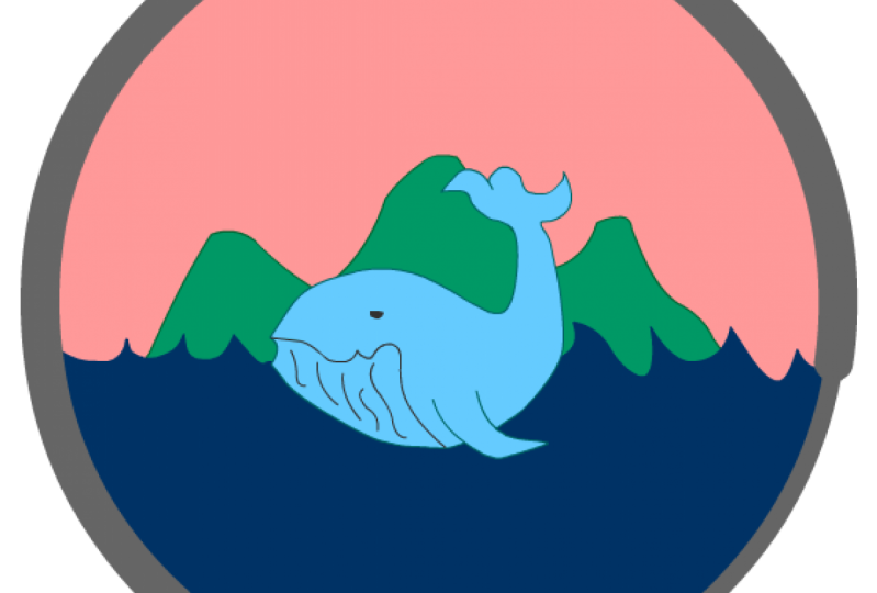
10. Creating Whale Coast Graphic: For this project, you're going to get to work on a graphic for logo design using fill rather than line. We'll be working with sections of color in this lesson. The brief for this logo or for this project is for a fictional tourism organization called Whale Coast. The three main graphic elements that our imagined client needs to be represented are, they want the whale as the organization's mascot. Then also something about the landscape. Something like the sea and say mountains and sky. That's my brief for sketching out my ideas. I'm just going to jot all of these ideas down. Drawing a very stylized cartoony whale, his tail going up. Maybe even giving him a bit of a smile. Then I want to have water, mountains. Then something very, very simple like that. Then I think I want to enclose this all in a bit of a circular, round shape, which will give us nice negative space for the sky. My drawing is done, and I'm happy now with that. The next step for me is that I want to now create a color palette to start with like a starting point so that I'm working within a defined set of colors rather than just picking colors as I go. Over here, I'll just very simply draw a few swatches. That's all you need to do. Just grabbing colors from my default swatches and drawing little patches over here. Lovely blues, obviously, a light blue for the sky, maybe a greeny blue for land. Then I also want a dark blue for the whale. All of that's done. My prep work and my idea phase. The next thing that I want to show you is how you can create a grid for your design using guides and routers. Let's first start out with a brand new canvas. For this, I'll make it a square 800 by 800. Then over in your properties, if you click on this icon, you can turn on your routers. Just like in Photoshop or Illustrator, or you need to do is drag guides down from here. These are going to be my bounding guides. Then I'm going to make a halfway mark in the middle vertically and horizontally. I wanted to show you a very great quick cheat that I tend to use for creating guides. If you don't want to have to count out all of the pixels along the rulers, a very handy thing to do, or what I like to do is just draw out a square on your canvas like this. If you select it and hit Q on your keyboard, the transform tool, there's going to to automatically be these halfway points, and what you can do is keep the box selected and simply drag your guides to each of these points. That's a very quick and effective way of getting evenly spaced guides. I've got my document completely set up and ready to go. Now all I'm going to do is copy my color palettes and my sketch over from my previous document. I'm just going to drive the pellet off to the side and paste my sketch down. Then I need to just match it up with my guide so you can transform that and scale it and tweak it as much as you like. Next, I'll create a new layer, then choose the oval tool. From the very center point of your Canvas, just click and drag out and hold down shift. That will create a perfect circle, and this is going to be my base that I work with. Then I'm going to turn that layer to outline. I'll also vert quickly name that layer. I'll just call that layer base. I'll create a new layer above it. I'm now going to draw or trace the whale. The one tool that I work with is the pen tool. Just click and drag round this whole entire drawing to make the shape. If you're happy enough with that, that's great. I need to just tweak my shape a little bit. What I'll do is switch to the sub selection tool, which is A on your keyboard, and I'm just going to refine some of these curves before I go any further. Now going to turn snapping on and then join up my lines. Then to color it, just simply choose your fill color, and with the bucket tool, which is K on your keyboard, tap into the middle and fill that with color. Then you can delete that outline. I'll call this layer whale. I will also turn it to outline just for the moment so I can see what I'm working on. The next step really is just to add a couple of lines for detailing on the whale before I go further. But to add any details on this whale, I'm going to do it on a new layer. I don't want to draw or add anything onto this layer just yet. On a new layer, I'll choose a gray color, grab my pen tool and trace out this line for the smile of the whale and this other line for the side of his body. Once that's done, then I'm going to select both. I'm going to cut them from that layer and choose the whale layer and then paste them in place. I tend to do that because it's easier than trying to edit everything on one layer. That's looking good, but obviously I want the line to look a little bit more interesting. Just as I showed you with the last lesson, I'm going to come over to the properties tab and change the style. That looks much better. That looks awesome. Now I feel like I could even probably add in a few lines for the belly of the whale. I'll do that like this. It's looking fabulous. I've added in a small circle for the eye, just to give it a bit of character. I think I'll nudge the bottom of it up like that, and that looks like he's smiling a little bit. The rest of the elements, really all that remains is just the water and the hills. Again, using the pen tool and the fill, I can complete that incredibly quickly. Few clicks and you're almost completely finished with the artwork. Remember, we created the sky at the very beginning where we made our base layer. In this very last step, I'm going to show you how to use the base layer to tidy up these layers that I've have just created the water in the mountains. Over in the layer stack, right-click on base layer, choose duplicate layer, and that will create this layer base copy. Click on that, and then drag it up to the top of your stack so that you can see what you're doing. Then if you come over to where the paint bucket tool is, click down and hold, you'll see another tool nested inside. That one's called the ink bottle. Where the paint bucket is used to add fill, the ink bottle is used to add lines or strokes to fill. It's an incredibly useful little tool. I love it and I use it all the time. I'm going to show you right now how I use it the most. You select the tool, then come over to the circle, tap on the edge, and then you can delete the fill and you're left with just this line. Now double-click to select the line, copy it or cut it, and on the land layer, paste it in place. This now allows you to delete the bits that are outside. You can do the same thing with the water. Then when you're finally finished, you can delete that outer line or you can keep it if you want. That's it. I've pretty much finished and created my entire graphic for my logo. Now that I see it altogether though, I am starting to see that my colors weren't quite what I wanted and they're not that great. That's just really a matter of tweaking colors and making final adjustments. As you can see, this really is the last stage, and hopefully you've seen that the process of getting here is very, very simple, very easy to do. I encourage you to have a go right now at creating either this logo or a similar logo using just fill and shapes and keeping it very stylized. In the next lesson, I'm going to be showing you some more advanced features of color in Adobe Animate things like gradients and the color whale. This is a head of the next project which we're going to work on, which is going to be using a combination of all of the skills that we've covered so far as we create a custom badge for a canoe club. When you're ready, join me in the next lesson.
11. The Color Wheel in Adobe Animate: Up until now we've worked with basic shapes with a little bit with the brush tool and with the line tool in order to create simple designs, and icons, and logos. In the next couple of videos, I want to walk you through some more advanced applications of color, and I want to show you how to make gradients inside of Adobe Animate. Up until now, I've been choosing color from the default swatches over here, but for the fill color as well as the stroke color. But I want to also start to use a different window now. As you can see, the default swatches only give you a certain number of colors to choose from. I'm going to come over here and I'm going to click on this little icon here which says color and if you don't have this visible, you can come up to Window and you'll find it down here somewhere under this section, you'll see color. Either click on that or if you have it over on the right-hand side, click on it over there. I'm just going to click on the name and drag it out so that it's floating and we can have a look at it a bit better. Now unfortunately, it doesn't get much bigger than this, but this is still, I think, a lot better to work with than just the default swatches. Because now what you can do is really fine tune the degree of color, the degree, I should say of saturation, or hue and brightness. If yours isn't set up like this, like mine, yours might be set to this kind of a layout and that's because this little box is checked here, which has an H next to it, which stands for hue. As you drag the color picker from right to right across this window, you'll change the saturation. Or as you drag it from top to bottom, you'll change the brightness so it goes from light to dark and the hue is changed on this slider. With S checked off, you see all of the colors on the spectrum so you drag up and top to bottom for brightness, left to right for the hue, and then the saturation is changed in the slider here. I like to keep mindset onto saturation because I like seeing all of the colors that are available. It is nice just to have this window available when you're building much more complex shapes or graphics and you want to really try and effect the color beyond what the default swatches allow you to do. Just make sure that you are on fill color if you want to change your fill so that little pocket up here indicates fill color and the pencil indicates your stroke color. By simply dragging the slider along, I can decide, okay, I want to blue it to be like that. Hit K on my keyboard and change it up. All right, I'm going to drag this window over to, let me see in between my timeline and my properties so that I can have easy access to it, or you can keep it floating as well, that's fine. In the next lesson, I'm going to explain how you can make and create gradients in Adobe Animate and use those in your designs before we move into the project for this section, which is going to be designing a batch. I'll see you in the next lesson.
12. How to Create a Gradient in Adobe Animate: In order to be able to create a fill color that is actually a gradient, it's very, very simple, and if you've used Photoshop before, you might be quite familiar with this. It's a specific tool called the gradient tool. In this lesson, I'm going to show you how to work with that. The first thing I'm going to do is click and drag out a color so that we've got something to work with, and I'm going to demonstrate how the gradient works. I'll get rid of that line. Select this color. Make sure that you're on the fill color. Next to there it says solid color with a drop-down menu. Sure enough, if you click on the drop-down menu, you'll see there's options to add like a linear gradient or radial gradient. Just click on linear for the moment. Normally, the default linear gradient is black and white. If you haven't previously used a gradient, sometimes the last gradient that you used will still show up if you click on this. But if yours goes to black and white, way to change the colors is just by clicking into one of these little markers down here. If I double-click on that and choose, say, a purple color, and then double-click on this and choose peachy color. You'll see that the gradient has been added and that's smooth enough gradient going from left to right. However, that's not the color we started out with. We started out with that blue color. I'm going to select this again and go back to solid color. What I would suggest to do at workaround is just to make two little swatches of the gradient colors that you want from the very beginning. Let's say I want my color to start at blue and end a very much lighter blue. Just have those ready off to the side. Then select your color and apply the linear gradient. Now it's going to obviously, do the last one that I used, double-click on the first little swatch and then using your eyedropper tool, you can select the blue over there. Double-click on this one, and then you can select the turquoise. I can get rid of those because I've applied the linear gradient. But for me, let's say I wanted it going from top to bottom. Obviously, the orientation isn't right for me there. If you wanted to you might think, I'll select it, and I'll hit Q on my keyboard and simply use the transform tool to turn it around. You can obviously do that. But inside of the transform tool there's an actual dedicated gradient transform. If you come over to the menu bar and click onto your Free Transform Tool, you'll see underneath it is another tool called Gradient Transformed Tool. If this isn't on your toolbar, then just make sure that it isn't inside of these backup tools. If you click on these three little dots, you might find it there. Should be in this area, but if you have it to hand over there, that's perfect too. We've selected that, and you can see that the handles or the control things are totally different from the normal free transform tool. These allow you to do quite a number of things with the gradient. You can rotate your gradient. The actual shape doesn't necessarily change, but the orientation of the gradient will. You can also effect where you want the gradient to start. If you wanted to start very sharply in the middle or have it move towards the edges. Then you can also grab this centerpiece and move it up. If you decided that you had too much of the dark blue, just move your central line up. Or conversely, you could move it all the way down as well and have just a very subtle hint of a gradient at the bottom. But that's the gradient transform tool and it's incredibly useful. Let's see if we can apply a radial gradient. I'm going to go back over. One thing to note is that if you try to change up the colors of your gradient and it's not changing on your Canvas, it means simply that you need to select your color first and then you'll be able to change the color of your actual swatches there. Let's see what happens if we apply a radial gradient. I'll de-select. You can see it starts in the center and it moves out in a circular, radial way. If I go over to the free transform or the gradient transform, then the controls are more or less the same. You can adjust how you want. You can make it more oval. You can also make a scale in and out a lot more if you wanted to rotate it in this way. Then you can grab the center and move the center off to the side for different effects. In case you didn't want the dark blue to be in the center, you wanted the light blue to be in the center, you could just click and drag these sliders around and swap them. Click that one right there, and click that one to the end. Now it looks a bit more like a natural, like there's a highlight or something. The last thing that I wanted to point out, because this is often quite useful. You can also effect the transparency of any of these gradients. If I click on this last thing here, and I know it's selected because the triangle at the top has turned to black, I'll just drag this 100 percent all the way down to zero and it should effect. You'll see there, it's going to make this transparent towards the edges. That can come in very useful for different things, especially as you start to make much more complex designs and illustrations. But hopefully I'll be able to show you some of these applications in the next couple of videos. Because from here on out, I want to show you how to go about building quite a complex illustrated design for something like a badge. When you're ready, join me in the next lesson.
13. Creating a Badge Design: The project in the next few lessons we'll put to use all of the tools and the techniques that we've covered so far. Plus, I'm going to introduce you to one or two more advanced creation techniques. A unique feature of Adobe animation terms of drawing is how you can use the Lasso tool to literally draw into fill color directly with the Lasso. That sounds a bit odd, I know, but I'll show you how to do that in this project. The brief for this project is to create a complex logo or a badge design. You can choose your own idea or work alongside me with my own, I've decided to create a badge or a canoe club so for that concept, I know that I want to be able to create mountains, a forest, a river, and also importantly, a gorgeous gradient sky. Let's choose a Canvas and I'm going to change up the dimensions over here. I'm going to go with the width being 40 and the height being 600. Something portrait for a change. Then hit "Creation." We'll start this project a little bit differently to previous ones. Because I want to show you how you can actually import a reference sketch. You can, of course, draw your initial sketch right here on the Canvas as I've shown you in previous projects. But this time I wanted to show you how you could import your image. Maybe if you've drawn it on paper or if you've drawn it in another program. For example, I drew my sketch in Photoshop. What I'm going to do now then is go up to "File" and come down to "Import." You'll see that there are two options. Import to stage or important to library. We don't really need to worry about the library option right now since we're just working with one sketch. We can go ahead and just directly imported onto the stage or the Canvas. If I do that, I'll be able to choose the sketch from my folder if you don't see it or if you can't import it, just make sure that all files is clicked on over here, then click "Open." If it comes in massive like this, just hit Q on your keyboard and scale it down into place. Here we go. I've even made some color swatches already so that I know what to work with for color ideas and I've drawn out a very rough idea. The first thing is that I will name this layer sketch and I'm going to lock it and from here on out, it's just a matter of building this up progressively through layers. I'm going to go straight to the shape tool, I think the rectangle selected and choose my base color, and now to center this onto your Canvas, simply select it, go over to the align window and then just make sure that align to stage is checked on. You can click to the vertical and horizontal alignment here and here and now it's centered perfectly onto the stage. Now, that I know that this is perfectly centered, I can go ahead and turn on my rulers and take and drag up my guides so that it matches up. Perfect. I'm ready to start building and creating. As you can see, if I hover over the edge of my rectangle, I can round out the edges like this and the same on the sides. But down at the bottom, what I want to do is actually hold down "Option" or "Alt" on my keyboard as my cursor hovers over it. Then if you click and drag down this option while still holding down, what that does is it actually creates another vector point on that part of the edge. That creates a nice point and then I'll just drag these edges out to randomize as a little bit as well. I'm going to go ahead and name this layer base. Now, this is an important layer because it's going to be the boundary or the bounding box of my entire design, and we need to come back to that later on. I'm just highlighting it right now, just so that you're aware. Because this shape really is the foundation for the rest of the design. I know from the outset that I want to have a bit of a frame around everything so first off, I'm actually going to duplicate the base layer. Then I'm going to transform and scale it slightly inwards like this, while it's still selected, I'm going to change the color to one of my lighter colors and so you can see immediately the effect that this has gives it the look of having an outline or stroke around the edge. Next up is the mountains. On a new layer, I'm going to grab the pen tool and I'm going to keep it very graphic and simple and just create a stylized mountain silhouette, very nice and angular. Then fill in that shape with color. If you're happy enough with that you go ahead and delete the outline. This is where I'm going to introduce you to the Lasso tool as an awesome option to use as a drawing tool. Lasso is L on your keyboard, and the tool is up here on your toolbar. If you click and hold down, you'll see that there's actually a polygon and a lasso. Polygon and regular lasso. They both do the exact same thing in that they are normally used as selections. The regular lasso is more fluid though, whereas the polygon gives you straight lines and edges. For now, I'm going to choose that. Then right on my fill color, I'm going to select an area or shape like this. Now I know it's quite hard to see this election, but to close off your selection, just double-click. Then hold down Shift on your keyboard and you can make another one and it will still remain selected. I'm going to keep going and make sure that I hold down Shift whenever I started new selection so that they all stay active. Now, come over and simply click into the fill color. When I choose a lighter color, you'll instantly see the effect that this has. If you wanted to, you could tweak the shapes a little bit more, get them more the way you want it to look. But I'm happy enough with that. I'm going to go ahead and I'll name this layer mountains and then lock it. So very simply put, is a great process for drawing and I'll use it again to create the trees. What I'll do is this time I'll just draw a simple box and I'll use, let's say the regular lasso so you can see what that's like. Essentially, I'm just drawing silhouettes of my trees, and then I'm going to delete the area that I don't want. I will say it does take a little bit of control with the Lasso tool because you're holding it down for the entire time. But definitely with practice, you can get good at this, plus you can always just delete what you don't want. Copy, what does work, and create a whole forest just like that. Now, my final step for the forest is simply that I'm going to select the whole layer again. I'm going to copy it. I'm going to paste it in place and now in the color picker, I'm going to lighten the color up ever so slightly. Then drag that layer below the original, go up to modify, transform, flip horizontal and now it looks like we've got layers of trees over there. That's really quite a nice effect. In the layer stack, I'll name that layer forests two. It's looking good. All I'm going to do now is I want to make my ground plane the same color as the trees. I'll just create a rectangle, choose the same color and I will call that layer the ground. Really, I'm up to the final step in this section, which is to draw my river. I'm going to make a new layer, switch to the pen tool, and then choose this blue color from my swatches. I want to be able to see my sketch though. What we'll do is go over to this icon, show all layers as outlines. I can click into it on the top there, which will affect every single layer. That means every layer will now go to an outline and then I'll just undo the individual layer that I want to see, which is the sketch layer at the very bottom. Then on the top layer, I can draw my river, once it's done, I'll just finish, add, delete the outline. That's looking awesome. We can tweak things as we go, but I'm pretty happy with this right now. In the next lesson, I'm going to go ahead and add the person in the canoe into this illustration, and then we'll add our gradient and we'll mask up the artwork, and finalize things. I'll see you in the next lesson.
14. Drawing the Canoe: In this lesson, I'm going to add the canoe to the river. What I need to do though, is I need to be sure of how much of the river is going to be visible. As I also want to have texts put over top of this, just as a preliminary step, I'm going to figure out by placement first. What I'll do is I'll come back to that base layer. Remember, I said that this is going to be used eventually to be the boundary for the whole design and which we are going to use it as a mask for everything. What I'll do now in preparation for that and as a way to help me see my outline, is to duplicate it. I'll name it guide just for the moment. Essentially, this is going to show me the extent of my design. I'm just going to drag it up to the very top of the stack and then click on shows outline. Straight away, I can perfectly see very clearly the outline of the edges of my work. I'm going to roughly sketch in a canoe, a person and where more or less I want my text to go. I want a banner here with the text that's going to say Canoe Club. Yeah, that's looking okay. What I'll do now is just add a new layer and I'm going to just simply trace over the sketch. I will turn this layer to outline, and grab my oval tool, turn off the stroke, and simply start dragging out some very basic shapes. I'm going to mold this into a simple silhouette of a person by dragging the edges around. I don't want anything detailed at all, just really a head and the back and arms and obviously this person sitting in a canoe. For that part, I'll use the pen tool. I basically just shaped and pulled this fill color into a vaguely kind of human-looking shape. A person sitting in a boat. Again, just to stress that this is such a small element in the design, it needs to be very graphic, very simplified in order for it to read, so I don't want any details or things like dash. For the oar, I'm going to use a rectangle tool and drag out a long skinny rectangle like this and simply use the oval for the paddles. I'm thinking this one here would be nice to have it dipping into the water. I'm going to just chop off the bottom of that by using my selection tool to click along the bottom and then delete. If you wanted to, you could get a bit creative at this stage and add a reflection. What I did was I just used the pen tool. I made some organic looking shape and just pushed and pulled the sides in a bit to give the effect of water. Very easy, very simple. I'll leave the text and the banner for now because what I'm going to do is come back later and show you how to work with topography in the final section in this class. For now, the next step is just to add the gradient sky and to mask off the artwork completely. Meet me in the next lesson and we'll finalize this badge.
15. Adding a Gradient a Mask to Your Design: The next step in this process is to add the gradient sky and then to mask of everything so that it fits inside of our design. What I'm going to do is create a new layer underneath the mountain. Click and drag out a rectangle and at this stage, it doesn't really matter what color it is. Delete the stroke line around the edge if there is one. Then just make sure that you select the color and then come over to the color window, drop down this menu, and choose linear gradient. You can see that the color changes and that's totally fine. From here, we can just click into these little tabs and pick colors from our swatch and then over here in the spectrum, if you need to adjust the hue of the color or the saturation so that you've got a very nice gradient just like that. Then come up to transform. Over here, click and hold on the tool so that you can access the gradient transform tool. With this selected then, you can use the rotate handle to turn the gradient around so that it's going from top to bottom instead from left to right. From here you can also change the position of the gradient to suit your placement or even drag it to another color point or you could even add another color point over here on the slider if you wanted to, by just clicking into the slider and then choosing a different color. Next up, I'm going to mask off everything. I'm going to drag my sketch out from underneath and in fact, I don't need it anymore so I will delete it, keep my layer stack tidy. Remember that we made this top layer, this guide here, I'm going to rename this layer now to Mask and then right-click on it and come all the way down and choose the Mask option. You can see that the icon of the layer is now changed to a mask and the layer that's directly beneath it automatically gets masked, if you like, and it's got that little icon. That's the canoe layer. Now, just to point out, we actually don't need that layer to be masked because it's well within the [inaudible] boundary of the design. We want anything that's outside of this boundary to be masked but I will point out that because all of the layers are in a very specific order, we have to stay within that order at all times. What you need to do is you need to mask all of these layers regardless of whether they're inside or outside the guide. I'm going to grab the River layer, then hold down Shift on my keyboard and select the base layer and now every layer selected, I'm going to drag the entire stack up to underneath the canoe, then when it's indented, you can just release. Now, as you can see, nothing really happened except for that all of the layer icons changed. That tells us that they're masked but just note that you don't see the effect of the mask until you lock the layers. To do that, you just click on the padlock at the very top which will affect all of the layers in your stack in one go. There you have it. Now if you unlock the layers, this happens and as you can see, that's a little bit unworkable. If you wanted to basically edit your artwork or go down to a layer underneath, what you need to do is remember to just set your mask layer to outline if you unlock the layers, and then you can easily work on the unlocked layers because you can see what you're doing. Now what I'm going to do is take my two base layers that I made at the very beginning. I want to make these guys go a little bit bigger, you'll see why in a minute. I'm going to drag them out from under the mask and then with the base selected, I will hit ''Q'' on my keyboard to scale it up. Let me just quickly lock everything so we can see what I'm doing but I'll unlock the base layer. I want to scale this up and as you can see, it's now outside all of those mask layer, so it's going to be visible. That's great, that's exactly what I want, and then I'll grab my second base layer and scale that up and we've got our nice border back around everything. The final step is to add the banner. I'm going to do that on top of all of my layers. I'm going to use the rectangle tool, click and drag out. This is where my text is going to go. The banner looks great, but I don't really like how the river continues underneath it. I prefer this was all one color. To do that, I'll create a layer inside the mask. Just draw a dark green rectangle, turn the padlock on, and there you go. Now it looks very cool. Now if you want to make it look like it's wrapping around your badge, quick and easy way to do that is just to simply add a couple of shapes at the bottom of your layer stack. What I'll do is add a layer underneath everything and with the pen tool, I'll click from the corner like this over here, just a small triangle. Fill it in with the same color. Then just select it and copy it over and flip it and nudge it into place. That is really effective. It gives it a very nice finish. At this stage, I might adjust my colors. If you wanted to adjust your palate or your colors, you can go ahead and make any changes that you want. I just really tweak the colors of the sky and the river. The very last touch, if you want to get fancy, is that you could add in some reflections in the water so that it doesn't look so flat and uninteresting. What I did was I used the pen tool and just drew some really elongated triangular shapes to give it the effect of maybe reflections of the trees and then make them the same color as the ground. All I did was just duplicate them, tried to look like they might be like reflection and then copy the whole selection, flip it over, and bring it to the other side. You can make some slight adjustments so that they don't mirror each other exactly. Randomize them up a little bit, and you could even select the whole shape and Option or Alt drag it to copy. Another thing you can do is use the transform tool to scale the shapes down or even skew them by dragging the top handle horizontally. That's the final finished artwork for the banner design or for the badge design. I'm happy enough for that. I'm not going to work on it anymore. Have a go at creating a badge design like this, if you can and putting some of the techniques to use that we covered such as using the Lasso tool to make drawings or selections, and the gradient tool. When you are ready then, I'll meet you in the next section, we're going to look at recreating an iconic poster design.
16. Setting Up the Poster Project: To set up our Canvas for this project, I want to have a portrait orientation, so I'm going to switch up the width and the height, and then click "Create". But now if I zoom out, you can see it's a little bit too long. I wanted to show you how you can change your documents settings once you've actually created a Canvas. To do that, go up to modify document and from here, you can actually change the size and the width. If this little chain is broken or unchecked, then you can change one variable and the other will stay the same. Let's see. I'm going to put in 1,100 by 1,650, hit "Okay", and yeah, that looks perfect. For this project, we're going to recreate an iconic Star Wars movie poster. It's one of my absolute favorite posters. It's by an artist called Ali Moss. If you google image search Star Wars posters, it usually comes up. It's very striking. It's also one that's influenced many designs ever since it was first created. I'm hoping Ali mind if we take inspiration from his work and use this as an opportunity to recreate the look and feel in our poster. Specifically, I want to be able to show you how you can use masking techniques and try and recreate this idea of double exposure. What I did was I went to unsplash.com and I did a search for royalty-free images for Star Wars. There's actually a ton of awesome images to work with here, and these are all completely free to use. I found this great photo of C3PO that's going to work really well. I also found this beautiful photo by Casey Horner, so that's also royalty-free. We can use that in our project. What I'm going to do is work with these to recreate that poster. First thing that I did on the C3PO image was I just obviously wanted to slightly tweak the pose because I wanted his head to be tilting and his shoulders to be slightly tilting, and really that was just a matter of a very rough cut and paste job with the Lasso tool in photoshop. It doesn't have to be perfect because I'm just tracing over it. But I just needed a basic reference, so I didn't mind if the actual image didn't look grayish. Then over in animate, I will now import this. I'm going to show you how to import to your library. Instead of choosing Import to Stage, choose Import to Library, click "Okay" and then what happens is you don't see it on your canvas. What you need to do is find it in your library. If your library is not over here on the right, then just simply go up to Windows or Window and select it from this drop-down menu. Here's my library. I'm going to drag it over and if I click on my image, you can see this is the one that I just imported, so I'm going to drag it onto the stage or Canvas and scale it down into place. Perfect. That's my setup phase, and in the next lesson, I'm going to show you how to start recreating and tracing over this image.
17. Outlining the Image: In this lesson, I'm going to outline the image and now finish with color. It's a very, very simple process. I'm simply going to grab the Pen tool and start clicking around the canvas and tracing my photo. I'm being careful with the outline. But just be aware that I will also come back in after I've made the initial pass and really start to refine the vector points. At this stage, it doesn't matter if you make mistakes with this tracing process. I just wanted you to know you can always fix it or tweak the linework later on. I've worked all the way around, now I'll just turn off the photo layer and you can actually see the outline. It looks okay. What I'm going to do now is zoom in and tidy up the shape. If it's difficult to see what you've traced because the line is in the way, what you can do is go over to the layer stack again and just set that layer to outline. What that will do is just give you a better chance at seeing your photo reference very clearly, then you can go in, you can still edit the line even if it's in outline mode. I use a combination of just moving the line itself and using the sub-selection tool if I want to tweak any specific vector points individually. Believe it or not, it doesn't take very long to do that. Now that it's finalized, I'm very happy with that as a silhouette and I can get rid of that photo layer for now and start to add color. I'll click into my fill color and from the default swatches, I wanted bright red or pink since that matches the reference that I'm working to. If you want, you can also tweak the color over here in the color window, refine your selection if you think it needs it, and then click into the linework. Then double-click on the outline and get rid of that. Now it's looking pretty good. The next step is going to be to draw the outline of the landscape. Remember that this is like a double exposure effect going on and there's a landscape of tattooing inside of the silhouette of C-3PO. I'm really just going to approximate that as best I can. Again, you can also go in super close and you can move your line around and just try to make it look like an outline of structures and buildings and things like that. Then I'm going to fill this with a darker red color, again making any adjustments as well to the fill and move the line around. That's the great thing about vector work, you can just move your edges and get it to look how you want. Now what I do, I want one more layer in here, but instead of redrawing anything, I'm simply going to select this layer up here in the layer stack and as I've done in many other projects, I'll duplicate the layer and now select the underneath layer and change the color of that over here in the color window. You can't see that yet on the canvas because it's underneath, but if I use the arrow keys on my keyboard and just nudge it into view, then you'll see the effect that that has. Then go in, make any adjustments that you want to so that the two layers are not the exact same. There's some slight variation. I might even add to this with the shape tool and tweak it. For now, that looks pretty good. There's still a bit more to go in terms of this landscape. What I'll do is, in the next lesson, I'll walk you through the next phase.
18. Creating the Landscape with Shapes: In the previous lesson, we made basic paths on the landscape and it looks okay. But if you wanted to add more detail, then you can always just add bits and pieces as you see this, just like I'm doing. Once I'm happy, though I am going to start on the main black section that creates the very striking silhouette in the foreground landscape. Again, I'm going to use the Pen tool and draw that shape, and then fill it with black, and then delete the outline once I'm done. The next step is to create some sort of spaceship style structures or buildings that are much more defined than the background organic shapes. These are going to have to contrast with those soft ground shapes that are seen in the layered background. What I'll do is use the Shape tool, and start just drawing out angular square shapes like this. I wanted to point out that when it comes to adding details, you'll see that I'm really just sort abstract shapes to fit the scene, and I think it's important to note that because in no way am I trying to approximate a building or a landscape, I'm thinking instead of just compositional shapes. If you do that, it makes it a lot easier and a lot quicker to do a project like this. I think it also makes it better overall because the composition then ends up being much more simple and therefore much more visually clear. I'm using a combination of adding shapes with the rectangle, and then also using the Selection tool to delete the shape out by simply dragging across the fill and then hitting backspace to delete, and that's actually a very effective way of shaping an object. You can get super detailed here, and I'm probably getting a bit carried away, I keep saying keep it simple, but you can see how easy it is to add detail on top of detail. At least this is a silhouette, so it's not too bad, it will still read as a very graphic and strong image. The next phase is going to be just a mask off all of these layers, so that they fit into C-3PO silhouette, and then add the texture for the sky. That's the last two steps left in this process. I'll see you in the next lesson.
19. Creating the Mask: The mask layer is actually incredibly easy to make, and in fact, I would say that all of the very tedious and tricky detail work is done on this project. This is actually very close to being finished artwork. You'll see that by adding a mask, it makes this whole thing come together, and really, it makes the poster look complete in just one click. In this lesson, let's do exactly that. The first thing that I'm going to do is just organize my layers. On the bottom layer, I'm going to double-click and rename this BASE. Then this layer, I'm going to call BG_3, this one is BG_2, and this main one is BG_1. The top layer has nothing in it. What I'll do is copy all of the contents of my BASE layer, and then click into that top one, and use the Command or Control plus Shift plus V keyboard shortcut to paste it in place. That will paste it exactly in the same place as that BASE layer. Then I'm going to rename this layer MASK_LAYER. Now all you need to do is simply right-click and choose Mask. As you can see, I just need to drag the other layers up into that mask and then lock everything, and you'll see the effect in simply. If you wanted to go back in and do further edits or tweaks to your artwork, make sure to turn your MASK_LAYER to an outline so that if you do unlock specific layers, you can actually see your artwork. That all looks very good. The one thing I forgot to do, though, is to make the hinges for C-3PO's arms, so I'm going to do that quickly. I'm going to do it in the exact same way that I made some of those buildings and spaceship types of structures. I'm simply going to use a rectangle, the selection tool, and make generic shapes. I'm not sure what you call them; hydraulic things for his arms. One thing to note is that I will have to add this onto a layer above that MASK_LAYER, because if I added them underneath it, they'd disappear. The final stage is going to be adding in that sky photo that I downloaded from Unsplash. I'm going to go over that with you in the next lesson, and explain how you can turn any image into a symbol in order to add effects onto it.
20. Adding a Bitmap as a Texture in Adobe Animate: The last step in this project is going to be adding the bitmap texture and putting on a couple of effects to make it really work for this image. What I'm going to do to start out is create a new layer at the top of the stack. Then I'm going to go up to File, Import to Library, and I will choose that sky image that I got from unsplash.com. Then open up the library and you will find the image there. Now, when I drag it out onto the stage or Canvas, it's going to be very big. If that happens, just scale it down and place it over the artwork however you want, something like that. You could use this obviously as a background, but what I want to do is actually mask it off inside of the artwork so that it looks or gives that effect of the double exposure. I'll drag it underneath the mask and have a look at it there. It looks okay, but I can't see all of the background landscapes that I made. If you want to use the image like this and then have it blend with the layers below it, I will show you a couple of options that you can do right here in Animate with something like this. Because this is a photo inside of Animate, you can't really edit it to any great extent, like you can't change it up the way you can in Photoshop, but you can apply some effects. To do that though, you're going to need to convert this photo or this image into a symbol. A symbol in Adobe Animate is simply an asset that can either be animated, can have effects, or it can be reused multiple times as an instance of itself, as opposed to duplicating itself. We don't need to worry about instances because we're only using it once, and we're also not animating it. So you don't have to worry about that. But we are going to apply some effects like opacity and tint. To make it into symbol, go to Modify, Convert to Symbol. Here, you can just give it a name. The type should be graphic, and then you can click, "Okay". Now, if you go over to your Properties panel, and I'll just drag it out so that you can actually see it a bit better. You'll see that because this is a symbol, there are a few more options available. If I click on this drop-down menu, it's set to none. The effects are set to none, but you can choose one of these options. You've got tint. If you choose tint, you can choose a color like red. You could affect the strength of that tint. If you go into Alpha, you can see that this is something now that starts to look very interesting and it's coming a lot closer to that double exposure effect that we want. You can also use the layer itself as your opacity blending mode. To do that, you just right-click on the "Layer" and bring the opacity down. When you do that, you'll see a little icon on the actual layer to indicate that there is transparency. Another option is go back to Effects and choose Advanced. In here, you can actually change the Alpha as well as the color. My last step, I'm going to add in a background color. For that, all I'm going to do is create a layer at the very bottom of the stack, outside of the masked layers, and then drag out a rectangle. I nearly forgot one final detail. In order to finalize it, I've got to give C-3PO in his eyes. I totally forgot to put them in. That's very easy. Is two circles, but what I'll do is I'll make each eye on a separate layer so that we can have one being slightly different to the other one. I'll just copy this onto a new layer, drag it underneath that sky layer. It's got a bit of an effect already, but I could even lower the opacity of that layer. That's perfect. That's our artwork for the poster, completely finished. We just need to add text to this poster, but we're going to tackle that in the next section, where I'll show you how to work with text inside of Adobe Animate.
21. Intro to Typography in Adobe Animate: Working with type in Adobe Animate is very straightforward. In this lesson, I'm going to show you the basics of how to apply type to your artwork. To do that, let's go back to this logo design that we worked on in one of the earlier lessons. What I'm going to do is put all of my artwork into one folder and I'm going to double-click on that to name it, and I'm going to call it graphic. Then I'll grab all of these layers and put them in there. Now I can close that up. I can even select the folder itself, grab the whole thing, and scale it down. If I hit "Command" or "Control" plus the semicolon, then I can view my rulers and guides and I'll scale it and nudge it into place exactly how I want it. I want the text to go underneath this image. I'm going to create a new layer and then simply grab the Type tool or hit "T" on the keyboard. When you click onto your Canvas, you can then type out your text. Then over here, in Properties, as always, this is where you can change parameters of this text. You can choose fonts from the drop-down menu as you would in any other design program. Here you can change the size. You can also manually input values if you want your font to be very big. To change the color, simply select here, choose whatever color you want with the color picker. As you can see, it's really easy to change the font, and to add new layers, and to type over top of the first layer just like this. This is all very straightforward. Let's look at actually customizing this type a little bit. To change it up, I'm going to hop over to this design, the one of the lion, I will type a bit of text out, let's say, this is just simply lion brand. I'll move it over here. I'll just create a line using the same profile sessions as the drawing. As I said, you can change your color. Let's just make it orange for now. Now, this is all one editable text field. But if you wanted to edit the letters individually, what you can do is use a very handy command that will break up all of this into individual letters. That's Command or Control, Plus, B. That is the break apart command. As you can see, I now have each one of these that I can move around and kind of effective the placement if I want, while keeping them all still editable, if I actually wanted to change one of these letters. You can then break these apart even further. That's going to convert them from editable type into actual pieces of fill color. Here you can really change them up and customize each letter to make a very unique mark. You could also click and drag a selection across, delete part of the mark altogether. There's a whole lot you can do, there's a lot of potential and flexibility with this. Another thing I'll show you is if you wanted to mask off the letters, let's for example, bring in an image of a fire, something like this, just to show you, I'm going to place it underneath the letters. Then on the letters layer, I'll turn that into a mask and you can see that effect. Additionally, if you wanted to put outlines onto your letters, then what you can do is, I showed you before, grab the "Ink Bottle Tool", and add a stroke to each of these. That can really customize the look of the text. But remember to do this part, you would have to break them apart so that their fill and not editable text. While animate really does give you tons of room to create and design images in a vector space that I think is just a very straightforward and intuitive workflow, there are some limitations to the text. For that, you might want to bring your graphics into a program like Illustrator and work with type and fonts over there. In the next couple of videos, I'm going to show you how you can export your files if you want to deliver them as JPEGs, and crucially, how to export your files and send them over to Adobe Illustrator.
22. How to Export Images from Adobe Animate: As we come to the end of the class, I want to show you a couple of ways that you can export your artwork. One of the first ways would be to simply export out a flash image and to do that, you go to go to File and choose "Export". But now you can see that there are actually a couple of options. There's a few options for exporting and there's actually two different image options. I'm going to explain the difference here. Legacy refers to the old way when this program used to be called flash and so what that does if you choose the "Export legacy" is just that it gives you the option to simply and quickly export a standard common file formats like JPEG or PNG. You can choose that here in this drop-down menu. Let's choose JPEG and then here you can check your dimensions and check if they're the same as your document. You can also decide if you want the resolution to be high for print, maybe something like 300, and as always, I'll point out just ensure that the quality is always set to 100 if this is your final export for delivery. If you want to send an image off to the client, make sure it's at 100. If you want to export a quick test version for yourself and you don't need a big file, you can set it lower, but I tend to just always set this to 100. Let's look at the other option then. The other option is just simply export image. That's going to give you this whole complicated-looking screen and essentially this just gives you the same output you can choose JPEG or PNG. Let's now export the icons that we made. Let's say you wanted to individually export these, but you want a file that's going to be constrained to the exact proportions of the artwork. I'm going to copy this icon into a new document to show you one way of doing it. Once it's there on my stage or my Canvas, I'm going to go up to "Modify" document, and then I'm going to check on or click on this "Match content". Now I've got a document that fits exactly my artwork. If I go to "Export Image", I'll choose "PNG" for this. I'm going to make sure that this transparency is switched on. Everything else is good and I can export each one. In the next lesson, I'm going to show you how you can now send vector art that you've created in Adobe Animate over to Adobe Illustrator in a way that it's still directly editable. You can still change up the colors or change up the text or anything like that and this is really useful if you did need to hand off your final artwork to your client as an actual illustration file. Say, for example, you are given a brief and it was just much quicker and easier to create the artwork in Adobe Animate. But the client wanted to receive an Illustrator file that's what you can do. It's a very, very simple process to copy or to export your file out so that it can be opened up in Illustrator and further editions.
23. Sending Adobe Animate Files to Adobe Illustrator: In this last lesson, I'm going to show you how to send your animate files over to illustration. As I said, this is very useful to know in situations where you created complex artwork in Adobe Animate but your client wants to receive the final file as an illustration file. I'm going to show you this process using my poster design and I've added in some live type here so that we can see that when it arrives in Illustrator, you'll still be able to edit it. If you go up to File and choose Export Image, this option is actually only going to give you the ability to export as a PNG or a JPEG from this drop-down menu. As far as I can tell, this is not going to work for us because what this does is basically it flattens out the artwork and when you open it in Illustrator, you can't change anything. What we want are editable pads and things like that. Let's cancel that and make a note not to choose that one. Instead, go back to Export options and this time just choose Legacy. In this simple dialog box, the drop-down menu will give you the option to choose SVG right here. SVG, as you probably know, stands for scalable vector graphic, and that's the one that we want. This option is going to keep all of our parts and vectors as live and editable. Do that, click "Save". Then in sessions, you can choose to have your images embedded or linked in a folder. The picture, for example, of this guy. I'm just going to go with embedded for now. Just click "Okay". Now here's my poster, 1.svg. I can tell though from the some notes it's not working quite right. But let's open up Illustrator and see what we've got. Here it is, everything's here, the photo here here. But as you can see, the thing is that the transparency that we used on the photo inside of Animate is missing. It didn't somehow translate. But you can see all my layers are in here as groups and if I drag them around everything I've worked on is there. It's actually really awesome to fix the transparency. It's just a really simple thing. You just need to come back out of the Layers panel and go to the Properties panel and write here, just drag the opacity of that layer or that group down to whatever we had before, which I think was about 50 percent and ta-da, that's the exact same artwork. Now you can change your text, you can change colors. You can do whatever the illustrator thing is that you want to do in order to hand off your file to your client or work on this further. But for me anyway, the point is that I haven't had to labor through difficult and awkward illustration processes to create this. Sorry, but that's just my own point of view coming through here about Illustrator, I'm not a fan of Illustrator. But I hope that I've demonstrated throughout this class that you can at least create fabulous vector artwork in Adobe Animate. It's so easy and you can still bring it into Illustrator if you need to. Since we're at the very end of the class, all that's left for me to say is that I really hope that you've been able to see the usefulness of this application of Adobe Animate as a design tool. If you're like me and you're completely averse to using Illustrator, now you've got a wonderful option for vector art and I hope you have a lot of fun creating from here on [inaudible]. Thank you so much for spending time with me throughout this class and throughout the lessons. I really hope you learned loads. Please do send me a message if you've got any questions. I'm going to look forward to hearing from you, and I'm going to look forward to seeing your work. Thanks again for being here and I'll see you in the next class.
 Siobhan Twomey, Artist, Illustrator, Instructor