Transcripts
1. Intro: You ever feel like
the drawing apps that we have are
just too complex? There's just an
overwhelming amount of tools and options
and settings. Have you ever wanted something
light and playful instead? Well, in this course,
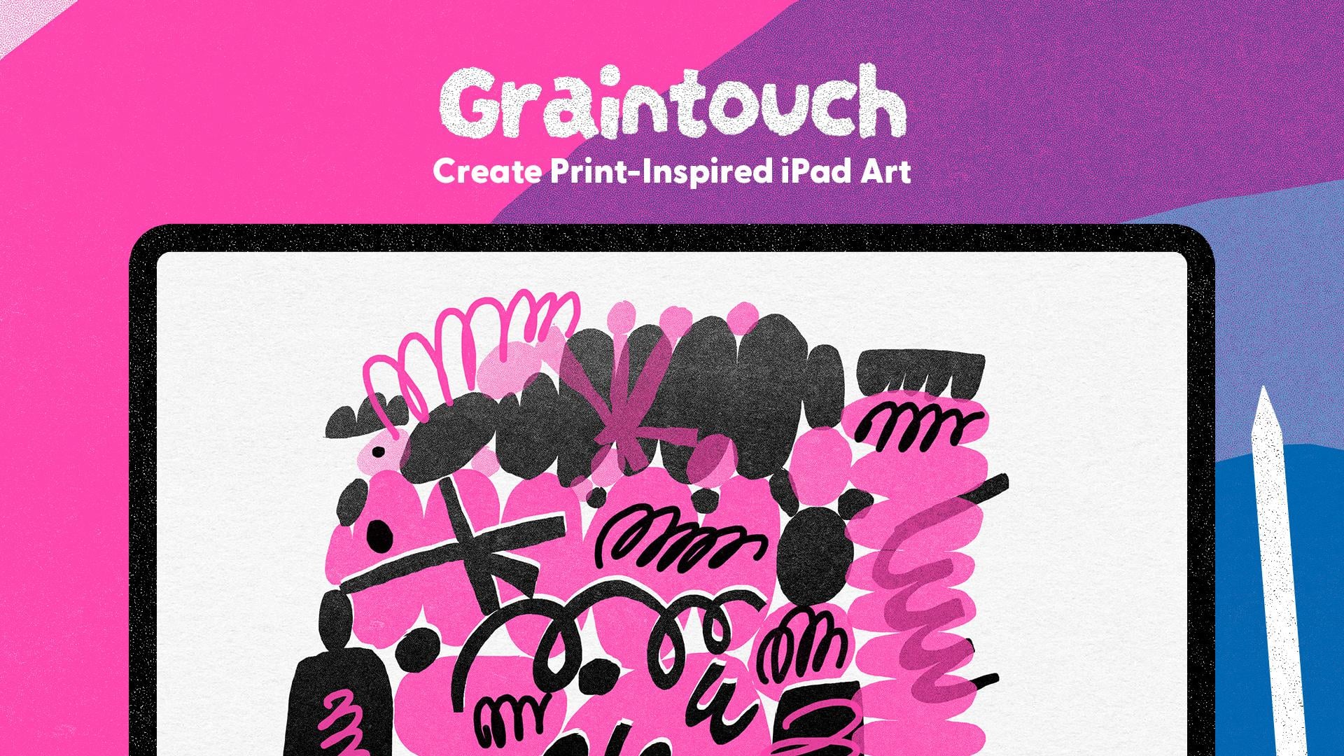
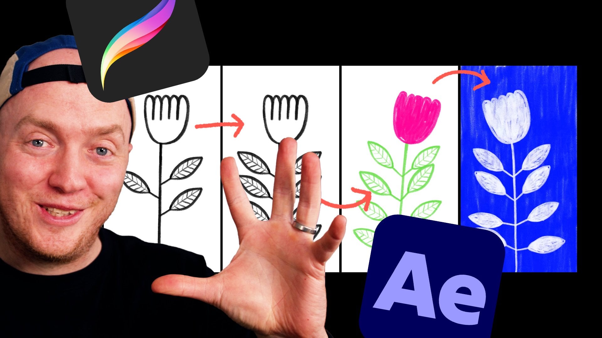
I'm going to show you a delightful iPad app. It simulates the
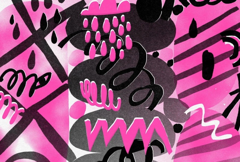
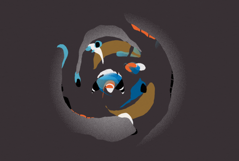
texture and grain and gradients and misalignment you get when printing in real life. Think risograph or
screen printing. It's got minimal tools, minimal UI, minimal colors. But because of
these constraints, it allows our
creativity to flourish. Seriously, it's beautiful. And it allows you to
create these beautiful, grainy, textured, printy
looking digital illustrations. The iPad app is
called grain touch. And in this course,
I'm going to tag you through all the
tools and settings, how beautifully layers
interact with each other. How to make your illustrations look super printy and handmade, how to access the SVG
files behind the art in the app and a bunch of
examples, tips, and tricks. My name is Rich Armstrong, and I'm an artist
who loves making digital art that feels
handmade and analog. So if you want to
have some fun and create some textured gritty, grainy, printy looking art, then come take this course.
2. Download Graintouch: Hey, welcome to this
class. In this video. What I'm going to do is
show you how to download Graintouch from the app
store on your iPad. So if you've already done that, you can skip this lesson. If you haven't done that, then stay tuned. We're
going to get into it. So if you don't have
Graintouch already, let's go to the app store.
Let's search for it. So gain touch. You got to spell it correctly,
of course, Graintouch. There we go. It's this one, the one that looks
textured and pretty and lovely and beautiful.
Tap on that. If you've already got
it, it'll say open. If you don't, you'll be prompted
to buy or reinstall it. And what I like to
do is just put it in my dock next to the Loom
icon or the Loom app. And Loom is an amazing iPad
animation app built by the same people that built
Graintouch Arama Studio. Now, let's open up
this one, Graintouch. There we go. And
that's all you need to do to get it installed
and to open it.
3. Graintouch Basics: In this lesson, I'm
going to take you through the basics
of using Graintouch. You'll notice that
Graintouch has a lot of constraints or not a lot of tools and not
a lot of colors. And I love this. It sparks creativity.
It makes us, you know, think outside
of the box. It's playful. There's not just, like, endless amounts of overwhelming options. So I love it. But
sometimes it's like, Oh, how do I do this? It's not like a usual interface. So I'm just going to
cover the basics. You can refer to this
lesson as you go through the class and yeah,
let's have some fun. Okay, so this is the
Graintouch homepage. Let's tap on this
button at the top left to create a new
document. There we go. If you want to rename your
documents, you don't have to. But if you do, tap on this
little gray bar and you can type in New dark or whatever
you want, press Return. Same thing here.
Hey there, return. You just tap on a
document and then tap on it again once
it's got a bit bigger. And this is your interface. It is beautifully simple. Now, this is our
layer. It is green. Now, if you hold down on it, you'll see a couple
of things pop up. These are all of the
colors for your layer. So maybe let's start with
a little bit of blue. And you'll see you've
got two tools here. You've got your draw tool and you've got your arrays tool. And in each one, you've got
three different settings. So this one is selected, so I'm going to
hold down anywhere on the document or the canvas. And you'll see
you've got monoline, you've got pressure sensitivity, and you've got film mode. You've also got your thickness or your brush
thickness over here. So what we've got here
is pressure sensitivity. Let's have a look at
what that looks like. Hmm. Okay. Now, you could
hold down anywhere, but what I prefer to do is actually just hold
down on the tool. It makes a lot more sense to me. Let's pump up the
size of the brush. And you can see that Ooh, we're getting some
lovely texture here, and it's pressure sensitive. Fantastic. Next, we've got the monoline tool or the
setting for our draw tool. And it's probably
my favorite way to draw or to doodle,
just like that. And then finally, we've
got the film mode. This is so cool. So you just
fill a shape like that. Oof. There we go. Now, this is your erased tool, so just tap on that and
you can select anywhere on the page to then change the
settings of your erased tool, which is different to the
settings on your draw tool. So here we've got our fill mode, and here we've got our
pressure sensitive mode. And here we can just erase
and erase and erase. And, hey, if you wanted
to erase the whole thing, you can just like that,
which is pretty cool. So that is some of
your layer settings. You can also adjust
the density over here. So if you then, we're
still on an arrays. If you go back to
your draw mode, you'll see that it's
not quite opacity, but it's like it gets,
like, less dense. You can get quite a nice,
little dotty texture here or go for quite
a nice full texture. But it is quite textured, like
a little bit of gradients. It feels like it's printed, which is just amazing. Now, your paper. How do we change
the color of that? You've got these little
three splges here, hold down on that, and you
can change the paper color. Not so many paper
colors over here. But I like this paper
color the most, so it's probably the one I'm going to use for the
rest of the class. But if you want to change
it, yeah, go for it. You can also put a grid on. I don't normally like this, so I turn it off,
and I'll get to what that does in a later video. Oh, you can also
scale all the layers, and I'll get on to layers
in the next video, but you can just pinch and pull, and it scales all the layers. Right now, it's just one layer. You can also undo and
redo or tap two fingers. I thought that you could
tap three fingers, but that actually doesn't
work, so you'll just have to undo. But beware here. So if you scale and you undo, it's not going to undo or redo any scale or scaling that
you do. So just beware. Also, if you change the
color of your layer, it's going to change
everything on that layer. And so if you undo or redo, hey, it's actually not going to undo the change of color
of your layer. So beware. Now, how
do we get back home? Well, you just tap on
this little home icon. There we go. And there's a couple of settings
that you can check out. So if you've got a stylus
or an Apple pencil, you've got this setting enable. You can also select to
draw with your hand. And if you are left handed, you can select this
left hand option. I'm going to tap on this one, so it selects my stylus
or my Apple Pencil. If you've got an author remote, which I don't, you can also select that and play with that. Alright, let's go in here, and this is the left
hand interface. You'll see that the
color is over here. You've got your
layers over here, and then the home button
is on the left now. So, there we go. And that is the basics
of grain touch. Amazing.
4. Ink Layers: In this lesson, I'm
going to tell you all about Graintouch layers or ink layers and how they
interact with each other, what settings you can
change and use to, you know, make some really cool
artwork and illustrations. And I think this is probably the most exciting and
most important part of Graintouch is how these layers
work. Let's get into it. So let's create a new
document and go into it. I've got a green colored
layer, which is great. My tool, I'm going to
go for a full tool. And I'm going to create
this bobby kind of shape. So it's got some nice
print texture already. What I want to do now
is add a new layer. So, hold down on
these three sploges and I tap on that
plus icon over there. Then to choose a
layer to work on, I just tap on it and it
slides to the right. Then I can change the color. So I'm going to go for
a pink, which is great. And I'll draw on top of it. Now, I can pinch and pull, rotate, reposition and
reposition scales. It does everything to
all of the layers. If I just want to reposition and scale this particular layer, I hold down on the layer, and I reposition it. Or scale it. There we go. Fantastic. Now,
you might be like, Okay, what else can we do here? Well, I'm going to
just take that off and scale this
back a little bit. Hold down on this.
You will see that this one has a nice
little knockout icon. The one at the bottom does not because it's
the bottom layer. So let's go for this one. Let's turn that on. And
what this does is it knocks out all the ink beneath
it, which is pretty cool. So if we change the density
of this particular layer, I could say opacity, but it's really density because it's printing with
these little dots. And so here it's
like low opacity, but it's really like lit
little little it little dots. If I reduce this all the way, hey, it kind of looks like
there's this cutout shape. And so if I scale this
and move this about, you'll see that it's dynamic,
which is pretty cool. So let's go back here. Pop up the density again. So that's the knockout
effect. It's pretty cool. If we take that off, it again, looks like it's
been printed on top of this green ink already there. Okay. This little guy is your gradient tool for
this particular layer. Right now it's on solid, but we've got a linear gradient, we've got a radio gradient, an inverse radio gradient, and this splogy
kind of gradient. So I'm going to turn
on the knockout tool to show you what these are. You'll notice that once you've
turned your gradient on, there are these two tools
that pop up over here. This means that you
can rotate, scale, reposition, either your layer
or the gradient itself. If we tap on that, you'll see that I can do
that to my layer. If I tap on this
one on the right, you'll see that I can affect the gradient inside
of the layer. Turn on knockout or turn it off and it changes
things quite nicely. Want to keep it on, so I
can show you the gradients. So something like that
looks pretty cool. Radio Inverse radio. Oop. Sometimes that does happen, kind of feels like
you didn't undo. Just tap on redo and
you're back in business. And this is like a splogy one. Kind of reminds me of a zine. I really like it. It's great. Okay. So let's go back to
this cool linear gradient. There we go. What I
like to do now is duplicate this layer and have a gradient between two colors. So I can tap on this one, hold it down, and then
swipe it to the right. And you'll see that this is also a symbol of a knockout effect. So if I take this
knockout effect off, it's just on the top
one. Huh. Pretty cool. Yeah. So let's put that on. This one, I'm going
to take it off, and then I'm going to change
this to a yellow color. And then I've got
this tool selected. There we go. There's a little
bit of white in the middle, so I'm going to go
back to my pink layer and I'm going to select
just flat. All right. So if I take the narco
off, there we go. Okay, so that looks pretty cool. Now, what else can
I do with layers? Well, if I wanted
to delete them, I just hold down
this little button, the bottom left and drag it into that cross button
and alla It's gone. I can also undo that. And I can also rearrange my
layers quite easily. Let's change it like that. I'm not quite sure what this is, or I'm changing the actual
texture or the gradient. There we go. Okay. So that is how you use layers inside of
grain touch. They're awesome.
5. Layer Misregistration: In this lesson,
what I'm going to show you is how to simulate misregistration when printing or misalignment
when printing. Like, how this would
work in real life is if you're screen printing
and you do one layer, and then the next time you do the next set of ink
or the next layer, your little screen just like shifts slightly to
the left or the right, or the paper shifts to
the left or up or down, and you print it, and
there's this, like, white gap or the ink is slightly to the top or
to the right or something. Sometimes you see this on packaging or in
newspapers, as well. So I'm going to show you
how to do this grain touch. Create a new document,
tap on that one. I'm going to change
it to a blue, and then change my tool to the fill tool and create
a little gin bottle. There we go. I'm going to create a duplicate
of that layer, change it to pink,
pop on a gradient, and then make sure I'm going
to change the gradients. There we go. I'm going
to add a new layer, make it a yellow layer, and then draw a nice little
label on it like so, and then duplicate that layer. You can do it. There we go. And then let's
go for a pink there too. Let's go for a gradient. Okay. Nope, don't do it all. Something like that
looks pretty cool. Then a new layer. And
let's go for black here. Change it to a monoline tool, and I'll call it Rich's gin. I know super original. There we go, and then make
it just a little bit smaller and then use the knockout
effect for something like that, and then do a couple
little lines here to replicate the bottle top or cap or something like that. Okay, so like a really
simple illustration. But now if we're going to
do some screen printing, if we're going to
simulate this like misregistration or
misalignment of layers, how do we do that? Well, we tap on these three
little spludges over here, and there's this miss
registration button here. You just tap that, and you can see that things start
to get misregistered. But, but if you're like, Yeah, but it doesn't
change that much. Just like zoom out a little bit. Let's try it again. Maybe
tap on this button, which is like your
randomized seed button. It's like, Let's
randomize things. Boop. Boop, boop. And you see the pretty
cool effects here. That's pretty cool. I like that. And what you'll see here
is that if you zoom out and you press
this Princed button, then the misregistration
will be bigger. So if you want big
misregistration, zoom out, press that button, and then zoom back in. If you want, like, slight misalignment, then
zoom all the way in, press that Prinsed button, and then zoom back out again.
Depends what you want. Just keep on going here until you find something that
you're happy with. Yeah, that's pretty
cool. Like that. And as you're
pressing this button, what's also changing is your paper texture and all of the other textures
in your documents. It's like the big random paper
generating print button. It's awesome. And so, yeah, that's
pretty much how you do miss registration
in grain touch. If you want to go back and, you know, work when
things are aligned, you just tap that button and to misalign things again,
you tap it again.
6. Graintouch 1.1: Okay. Grain Touch has just
released version 1.1, which means there
are some new things that I want to take you through. Also, some things have changed. And if you're like,
I'm following this video and I'm confused,
yeah, you probably are. So I'm going to show you all the new things and the things
that have changed. Okay, so inside of Grain Touch, I'm going to add a new document. Let's go into it. And
here, you'll see that, Ooh, there's a nice little
something has changed there. Yes, if you hold down on screen or if you hold
down on the tool, you can then change
between your tools here, between your eraser
and your pencil. So the selected one now has a little squidgy or
whatever tool you're using. So the monoline one is there, the full one is over there. Okay, so let's go for
the monoline, okay? I've got blue selected, and here you'd be like, Okay, but now, how do I change the
thickness? Where is that? Well, it's over here, and
the way that you change your thickness is just
with a finger on screen, and you go up and
you go down and it changes the thickness or
the width of your brush. Pop, pop, pop, pop pop. Go down. Go down. It's really small. Okay. So that is one change, and unless you know what
you're looking for, you're like, I have no
idea what's going on. This is crazy. The next thing I
want to show you is the inverse fill feature. So if we go to our fill shape and we create a nice
fill over here. You tap down on your layer, you change your fill type. So there we go, make sure that you're adjusting your
fill or your gradient. So, and then you can tap
on this invert button, which then inverts the gradient
or inverts the fill type. The next one that I
want to show you is a new fill type or a
new gradient type. So if you tap on or
hold down on a layer, let's go all the
way to the bottom, and you can select an image to fill your shape with.
So just tap on that. And then it takes a little
bit of time sometimes, and I think you have to take your finger off of the layer. So tap on that. There we go. And then
you select an image. So I'll just go for this
one. And there it is. And I'm going to
hold down on this, make sure I'm on the
texture or the fill. And then you can adjust. And it automatically tiles, which is really, really cool. We go and you can
also invert it. So yeah, I think that's
a really cool feature that they've added.
Looks really cool. And the fact that it's,
you know, already, you know, like one color,
mono color is really rad. I love this. Super cool. The next thing I'm
going to show you are reference images, and you hold down on
these three splges and you tap on this
image button like so, and you got to unhold
it or just release it, and it takes a little
bit of time to come up. So let's go for this one. Oh, like, really big. Yeah. Now, to resize just
the reference image, hold down on your
three splges and then resize it cause if you
don't hold down on that, you're going to be
resizing everything. If you want to just
resize your drawing, just hold down on that
layer and resize it. And if you want to resize
just your reference image, the three splges
and resize that, you can change the
opacity really easily. You can also tap that
and then it's gone. Then to get it back
again, you need to tap it again and release those three splges. There we go. The next thing that I want
to show you is that you can undo and redo shape layer transformations
and the fill or the texture of those
shape layer transformations. So I'm going to draw
a little cloud here. Great. And then I'm
going to hold down on that layer and I'm going
to increase the size. Now, when I undo, it's going to go back one step for
the transformation. Previously, it would
have just undone the creation of that shape
layer, which is pretty cool. And then if I change
the gradient, something like that, let's make sure I'm changing the
gradient. There we go. If I undo that, redo that, it's also going to change
the transformation of that gradient,
which is great. Now, the final thing that I
want to show you and I'm not the biggest fan of is
the portrait mode, and maybe it's my
iPad, maybe not. But you can now
do portrait mode. Tada. But it's not
really portrait mode. It's like landscape mode
when your iPads portrait. So I'm hoping that
this is my iPad, but I'd really
like to see it go, you know, all the way to
the top and all the way to the bottom for the interface
to actually change. But yeah, maybe I'll keep you updated on this because I
think this is a kind of weird, I don't know, bug, maybe on my iPad. But I'll be
in touch with them. Alright, those are
the grain touch 1.1 updates that I wanted
to take you through. Hopefully you're not
freaked out too much. Hopefully you're understanding
where everything is now. You're stoked about the new
things that have been added. And, of course, as
new things come in, I'll update this course. Alright. Happy creating,
and I'll see you soon.
7. Manage + Share Your Documents: In this lesson, I
want to show you how to manage your files
in Graintouch. So how to rename them,
how to delete them, how to duplicate them, and how to share them as
a PNG. Let's dive in. So it's quite easy to
select a file to work with. If you want to go
into it, you tap it. You know that already. If you
want to create a new one, you just tap on that button. If you want to rename it, you tap on this gray bar at
the button at the bottom. Let's go for bottle and
either press Return or done. If you want to share it, you tap on this
button over here, and it shares it as a PNG. In the next lesson, I'm going
to show you how to access your SVG files, which
are vector files. Now, here you can
share it to Dropbox, any kind of cloud storage, save to files, airdrop it to your computer,
whatever you want. Okay. Now to duplicate it, once you've got a file
or a document selected, you just hold down or
tap on this button, and it creates a
duplicate. There we go. To delete it, you have to
select it and then hold down until it deletes. You got to go all the
way until it deletes. There we go. And
once it's deleted, there is no going
back. And there we go. That's how to manage your files or your documents
in grain touch.
8. Access SVG files: In this lesson, I'm going
to show you how to access an SVG version of your
Graintouch files. Why this is important
is because when you export a Graintouch
image as a PNG, it's not the biggest file size. So if you wanted to print a massive poster or
something like that, the quality just
wouldn't be good enough. So what we can do is
access that SVG file, which is a scalable
vector graphic and take it into a vector
app or program, something like
Adobe Illustrator. From there, we can then scale it up as huge and as
big as we want to. There is a caveat, which I'll
cover a little bit later. But right now what's
important is to rename your file that you
want to access the SVG for. I'm going to go for Gin
bottle, press done. Now, we need to open
up our Fils app, so I can just swipe up
and access it in my dock, but you might be like, I
have no idea what it is. I didn't even know
I had a Fils app. So go to your home screen, pull down and either tap on Files if it's there
or search for Files. Boom. What you're going to do here is go and tap
on on my iPad. It might be hidden under
locations like that on my iPad, open up the grain touch folder, open up the masters folder, and you can see why
naming it is important. Because if you didn't
name it, there's a whole bunch of
letters and numbers, and it's just like,
Whoa, that's crazy. So, here it is, Jen Bottle. Now, hold down on this, and then you can either share
it to your computer with AirDrop or Dropbox or something
like that or hold down, and we're going to copy,
which is over there. Copy it. I'm going to go to
ICloud Drive next and then into Download and then hold
down over here and paste. And this will come
through on my computer, which means I can open it with Adobe Illustrator or
other vector apps. Now, if I hold down on this, I can say get Info and you can see it's called Gin Bottle SVG. But if I open this, you
might be like, Yeah, that does not look like anything like we've
been working with. And that's because it
doesn't have any of the grain touch gradients and textures and
stuff like that. It's just the vector file. It's like tensil file. So you lose all of the
grit and the grain and the texture that you
have in grain touch, but what you gain is an SVG file that you
can make really small, that you can make really
big, that you can print. So it's really up to you
what you want to work with.
9. More Background Colours: What I really like about Graintouch is its limitations
and its constraints, like how few background
colors there are. Now you might be like, Yeah, but I really want a
certain background color. Well, you can make it. This can be your
background color. So tap on this layer. Let's go for an orange
kind of background color, and then make sure that
you're on the fill tool, draw yourself a big rectangle, which is now your background. Then tap and hold on your layer and then just make that big. So now you have an orange
textured background that you can also
drop the density on. Also might be helpful to
do that because yeah, you can't really see
where your layer is. So drop it down a little
bit until you're finished. Then let's add a new layer. Let's go for white and
add a cloud in da da da, pop up the density. Let's add a new layer here, BP. Let's put in some thunder
or some lightning rather. There we go, pop it underneath. Then let's pop up the density of your background layer,
and there we go. You now have an orange
background layer that works well with the
stuff that you then print on all the
other layers on top.
10. Mixing Colours: One of the other great
constraints that Graintouch has is the amount of colors that you can choose from when
it comes to layers. Now, you might be like, but I
want a very specific color. Well, there's no way to
choose a very specific color, but you can have some fun
and mix two colors together or more to create a new
color. So let's try this out. Let's go for a blue. Let's just go for a full too and create a bit
of a rectangle here. So yeah, you've got this really
nice kind of blue color. Let's add a new color. Let's go for pink and
do the same over here. So here, bup bup, bup, bup, bup. There we go. So here you got pink, blue, and in the middle, you've
got something different. And if you reduce the density, hey, you've actually got
a little bit of a purple. That is really interesting
because it's got some texture, and there's some blue
dots and some pink dots. Yeah, it becomes very cool. And if we add a new layer here, maybe we go for yellow. What does yellow do to this? Let's just pop that out there. So yellow on white
is pretty yellow, but now like, Oh, like what is actually
happening here? There's a lot of
things happening here. It's not just like one color. So maybe if you pump up the intensity, it's pretty yellow. If you drop it down,
yeah, what is that? It's like a brown or something. Like, it becomes
really interesting how you make these
different colors. So, yeah, that's the constraint, and this is a workaround. It's very fun, and
you can come up with some really interesting
effects just by mixing two or more
colors together.
11. Now It’s Your Turn: Okay, so you've learned
a whole bunch of stuff about this awesome
grain touch app, and now it's your chance
to produce something, to illustrate, to design, to play, experiment, to engage in the constraints that this
awesome app has given you. You can make a greeting card, a postcard, a poster, maybe just some kind
of cool illustration, experiment, play, you know? On top of that, what
I'm going to do is show you five start
to finish examples. Sometimes I make mistakes. Sometimes I'm not really
sure what's going on. It's all part of this natural process that I
want to show to you. I'm not just like Pera
making perfect stuff. I'm playing, I'm experimenting. And so I want you
to do the same. And then if you're up for it, upload what you've created to the Skillshare
Project Gallery. That means that I can
give you some feedback. Other people can give
you some feedback. We can drop some comments. We can see how awesome
your illustration skills or we can say, Hey, why don't you try this?
What about this? What about that? It's also a great way to get
involved in the community. So, I'm looking forward to
seeing what you create, and yeah, have a watch
of my five videos, and then I'll see you in
the conclusion. See there.
12. Example: Tomatoes Postcard: And. I'm going to do in this example is create
a postcard or a poster, something like that
to do with tomatoes. So maybe I went to the Mediterranean and
I'm like, Oh, yeah, this is a great postcard, or I'm walking around and I want to create my own postcard. So maybe I'm in Italy or
Greece or somewhere like that. Mediterranean tomatoes,
postcards let's go. So let's go and create a new
document and go for red. Gonna go for my fill tool. And then I'm going to
create some pretty, like, random looking tomatoes. Some of them, I guess will be
a little bit more regular. Just like, really
fill up the space. Because really tasty tomatoes aren't necessarily the
best looking ones. And, man, I have
sampled some really, really good tomatoes in my life, especially from
the Mediterranean. Okay. Something like
that looks pretty good. I'm gonna add a new layer. Gonna make it green,
probably that green. Yeah, I like it.
Okay. That looks pretty cool already. Okay. Yeah. I really like that
one. That one's great. Hmm. I feel like eating
tomatoes right now. Okay. I guess what's
important to note about working in grain touch is that you kind of need
to have a bit of a plan. So what I want to do is
put a gradient on this, but you can't really put a gradient on it
and then keep on working the gradient only works
if you duplicate a layer. Well, you could put a
gradient just on this, but I want it to be a
multi colored gradient. Yeah, so I think that
looks pretty cool. Maybe not so much that one. So I go do it. Let's make this one a
nice big leafy thing. Okay, that looks really cool. I like it. So I'm going
to duplicate this layer. Make it into go for
a bit of a pink. Yeah, that looks pretty cool. Maybe I should have a look
at what this looks like. Yeah, that looks really cool. I like that a lot.
Then my green, what I'm going to do
is do a punch out, have a look at what
that looks like. I think that looks pretty cool, or a knockout, should I say? Let's change the
knockout off of that. Let's go for a lighter
green and a gradient. Oops. Let's do that. Okay, so there's like a
gradient that goes along, which is pretty cool. Zoom out a little bit.
Yeah, I like that. I like that a lot. Now I want to add a little bit of
misprints into it, or maybe even
duplicate this again. So let's duplicate it again. Let's maybe go for a
little bit of yellow. Sometimes there are
yellow tomatoes. Yeah. Something like that. Yeah, that looks pretty
cool. I like it. Epic. And then I want to
put on some misprint. Yeah, so have a look at
what that looks like. Oh, I also have an idea here. So I'm going to duplicate this. This one, I'm going to reduce
the opacity or the density. Still got the
knockout effect on. Can take out the knockout
effect on this one. Can change just to black just to show that it is actually
a knockout effect. See, it's got a
little arrow there. Now, let's put this
on. Yeah. And so here, yeah, it just puts this,
like, little white, misprint area, misalignment on. So something like that looks
really, really nice. Oof. I like that. What about
this one hiding it? Yeah, that looks cool. Yeah. I like that a lot. Okay, epic. So that's
an example of how to quickly create something
that looks really nice, looks misaligned,
misprinted. Fantastic.
13. Example: Abstract Poster: In this example, I want
to create something that feels very
handmade, abstract. Maybe like a kid has cut out a bunch of elements
with some scissors and, you know, pasted them on paper, combine that with a
graphic designer sense of color and layouts, maybe even a background for
a graphic designers poster, something like that plus risograph printy
texture kind of stuff. Let's get into it. Quite like
this color. Orange is cool. I might go for a red, but drop the density down
to be a little bit pink. So yeah, let's start with some
orange and go for my fill. And what I love
about the fill tool is making these clouds. You can make some
really cool clouds. So I'll just do a
couple here and there. And there's really
no real way of doing this right or
correct or perfectly. I'm just putting them
where I want to put them. Yeah, it looks pretty cool. Then what I'm going
to do is create a new layer and I'm
going to go for a blue. Maybe this kind of a blue. Yeah. And then go to put in some shapes in between the clouds
as if they were, like, balancing somehow on the shapes or in
between the clouds. Something like that. Get this really nice, like
balanced composition. Yeah, it feels really cool. There's balls or eggs
balancing on the clouds. But also some squares and
rectangles and stuff. Yeah, I really like that. Then I'm going to
create a new layer, and let's make it a red one and drop the
density down like so, and then create a
bit of a background. Maybe like that. Maybe drop the density
down even more. So something like that. Yeah, it looks pretty
cool. I like that. Then we can maybe add some
white pieces in here, too. So let's go for white. Yeah, let's bring
up the density. It. Yeah. I like that. Maybe here what we can do as
well is create some more, like, free flowing
kind of shapes. So something like this. There we go. Let's erase
this a little bit. So yeah, this feels very
much like a 4-year-old or 4.5 year old's cut and
paste school vibes. That's great. Mm. What
do I do here again? It's a little bit confusing. But hey, that's okay. It's almost like I
messed it up a bit, but, yeah, that's pretty cool. Let's go back to the
blue, and let's draw. Is that working?
I don't think so. I need to think a little bit harder about what I'm
actually doing here. She. Is that what I'm doing?
I don't think so. I think I need to go inside. I still looks pretty cool. Figuring it out here. Yeah. Maybe one more
somewhere up here. Maybe this one I can get right. That one's pretty
hard to get right. So maybe I'll do it
like this. There we go. Yeah. I think that
looks pretty cool. Perhaps the blue. I can create a little
bit of a gradient. So let's duplicate you
and then we'll pop on. Oh, yeah. Something like that. Make sure we're on
this gradient, yeah. Yeah. I like that. Now I want to do it on
the orange, too, maybe, or maybe reduce the
density a little bit. Cool. Let's create
a new one here or a duplicate. Go for a red. Mm. Yeah. Use. Scale that again. Yeah, that's great. Okay. And then maybe I
will duplicate this one, too, and this layer underneath, I'll put on a knockout and just reduce the
density all the way down so that it would
look something like this. But let's put all
those layers back on, and then let's do some
print misregistration. There we go. Yeah,
that looks cool. Is bottom layer, I want to make maybe a little bit smaller. In all about that size. Yeah, that looks pretty cool. If it was vertical,
it might work out, too, but definitely landscape. I could work for a postcard, a greeting card, or, you know, like the
background for a graphic design kind
of poster. I like it.
14. Example: Cute Characters: In this example, I'm going to
go full on cute characters, you know, with eyes, maybe like a children's book
illustration, you know, maybe a start of a book, the book cover,
something like that, or a poster for kids, something that's very fun
and cute, full of character. And if you've taken any
one of my classes before, if you know me, you know
I love characters, cute. So yeah, let's get into that. So yeah, let's go
for a green, maybe. And the full. Maybe
not this green, this green is and I'm going to go for maybe like four, maybe five characters. And I'll just do the
base colors first. Go for orange, maybe. Yeah. See how quick this is. This kind of reminds
me of a carrot. That's pretty cool. Yeah,
let's go for a new one. Maybe a pink. Cool. There we go. Maybe one more. This blue? Mm. Maybe
a darker color. Red, maybe this blue. Yeah, looks pretty cool. Maybe we can give this
guy some legs, as well. Hmm. Maybe they can
all have some legs. Or some little feet
or something. Yeah. Yeah, I like that. Cool. It looks great. Okay. New layer. Let's go for a white here. Let's do some eyes. Eyes over here,
maybe for this guy. And then one more Black. Looks pretty sad. Okay. And
then go for the monoline. Be like Yo Mm. Hmm. Looks bit weird. Something like that
could be pretty cool. Maybe I'm gonna do some
more arms or something, so I go back to the fill. Yeah. I guess I can give them all. So fingers. Yeah. Hello. This guy can have some shoes or
feet or something, too. I guess he can have
some ears. Yeah. Hm. Let's put both of
them over here. Yeah, I like that. That's cool. Now, I wonder if I can duplicate all of these and give them all a
bit of a knockout. Yeah. Reduce the
identity, knockout. No. No, that's the maximum. Oh, well, let's see
what that looks like. That looks pretty
fun. I like that. Maybe we could add a
little bit more black kind of happenings, ya. Yeah. I think I like that, maybe give this guy a bit of a beanie. Something like that. You can raise. Looks pretty cool. Yeah, let's put a bit of a gradient on. Yeah. Yeah, that looks cool. I
like that. That's great. Could work as a poster or a
greeting card or postcard, something like that,
or even, like, a book cover. It
could be really fun.
15. Example: Happy Birthday: Okay, so what I want to
do in this example is to create kind of like a sun over here or perhaps on this
side, saying, thank you. Or maybe we can say happy birthday in a bit
of a speech bubble. I that'll be pretty cool. So I'm gonna create
a new layer and just drop that away.
Go for yellow. And let's go for a full. I'm not that good
at drawing, like, complete, good, awesome circles. And we'll create a new layer. Then we go for purple, blue? Blue, blue, might be cool. Yeah, that could be
cool. Very cool. Blue with yellow and white. Mm. I like that. Okay. So here, Something like that. And then on top of
this, we've got yellow again for the letters. And I'm going to go for full letters because
they're pretty cool. So it just looks far more like handmade. Pink. Br Br. I'll do some erasing
tomorrow. Berth. Day Maybe I can even do that. Yeah. Looks cool. Something like that. Where is my yellow? Yeah. Okay, let's do some
erasing. It's the same tool. Just like that. Alright. So that's
pretty fun. I like that. Then on this guy, d d do. We've got full too. Here, we could be like
same kind of colors. Mm. Let's go forward. Mmm. Yeah, so what I want is
the eye to be there, 'cause that's how I
like drawing my sons. So I guess what we
can do is create a new layer and do it like that. So we
can move it around. And then this happy birthday, I'm just going to create
a new one over here. Let's go. Shoot.
Sort of comes under. Okay. Pop this one. Away. Nope. The other one, this one away. Okay. There we go. Kind of looks weird, right?
Okay, let's check that one, too, create a new one. Let's go for a Yeah. Okay. That looks great. I'm going to duplicate
this writing. Make this one, knock
out and no density. Okay. Then here, I'm going to add a couple of little rays, maybe a little bit bigger. Yeah. It feels like, you know, super fun, playful, almost
like a kid's done it. Okay. Almost there. Very cool. Yeah, almost like
you've, you know, cut these things out and then pasted them or
laying them on the paper. Yeah. I like that. And then let's go and put some
little eyebrows. Yeah, that's cool. Yeah. I like that. I like that a lot. And
then maybe height. Let's put some
teeth in here, too. Like a little Yeah, that's pretty cool. Okay. So we've got those
two, and we've got this one. I think I'm going to
duplicate this one, which is our son and give
him a little bit of orange. Just a little bit. Okay. Something like that. Okay, now let's
see what happens. When we miss line. Whoa, that's a lot. Okay. Yeah, I think that's
pretty cool. I like it. I like it a lot. And maybe this guy, we can put a little
gradients on him, too. Something like that. Alrighty. There we go. Happy birthday.
16. Example: Dancing Sheep: In this example,
I want to create some sheep like hang fing
sheep or dancing sheep, something like that, and I
want them to be in motion, but I really want to
create a new aesthetic. So I'm kind of like pioneering a new style or
a new aesthetic that I can use in different
projects or to convey information or ideas to
reuse over and over. I'm going to try do it really simply so that that texture, that grain can really add to the simplicity
of these sheep. And because it's
so simple to do, it'll be quick to
do in the future. So this is my first
pass at that. Let's get into it.
So I don't really have a blue background or
the one that I want to use. So I'm going to start with
this very light blue, and then I'm going to go
for a dark blue layer, make sure I'm on the fill tool, and here create myself
a bit of a background, just Whipsy, just zoom
it in quite a bit, or scale it up, and then I'll
create a new layer here. Go for white. And then what I'm going to
do here is just put in, let's say, five sheep, doing different kinds
of dances or something. I kind of looks like clouds now, which is kind of the point, very fluffy. There we go. And then they'll have a head maybe this one's
head can be here. Yeah, da, dap dab dap. This one over here,
this one over here. Cool. And then what I'll do is I'll make
this layer black. I'll come back to the
white layer in a bit, and then here, we can start putting in the neck
of each other sheep. Hello. There we go. This is quite a small head. And then you can also
put in the legs. So some of them might
look like they're swimming or running,
general dancing. I like that. That one's a little bit small, I think. There we go. U. Okay, so that's pretty fun. Go to go back to my white layer. Add a little bit of coolness, as if they're like pouches
or pouches, poodles. Well manicured sheep. Yeah. Cool. Almost there. And then we need to add
the faces of the sheep. Okay, let's go back to
the Black air. Yeah. Okay. There we go. And that looks
really, really nice. I'm going to duplicate
this white layer, so it's a little bit
less transparent and drop the density
down a little bit. And then misalign everything also gives it a little bit of, like, a blurry, cloudy
kind of a feel. Yeah, something like
that looks pretty good. So I've used the
background hack and yeah, just generated some
kind of a sheep aesthetic that I can use over and over. I think
it's pretty cool.
17. The End: Okay, this is the
end of the course. I hope you've had fun. I hope you've learned a lot. I hope you've been
challenged, and, like, your creativity has been
gently massaged because of the constraints that
Graintouch puts on us. And seriously, I would love
to see what you've created. So either mention
me on social media. I'm at Rich Armstrong, or you can upload it to
your Skillshare gallery, and you can upload it to
your Skillshare gallery. And that way, I can
give you feedback. Other students can
give you feedback. You can kind of show off as well and get involved
in the community, which is always really cool. And then if you haven't already, please review this course. Seriously, it means a lot to even if it's negative feedback, it allows me to make my
future courses even better. And then for students, it allows them to know whether they should or shouldn't
take the course. And if you want more
of me and your world, you can find me at
richarmstrong.net. I have a whole bunch of
courses and resources, and I also send a daily email that has a story in
it, a lesson in it. Sometimes I'm talking
about creativity, other times about productivity. Sometimes I'm just telling
you some awesome stuff. Alright, that is truly it. For now, I will see
you soon. Bye bye.