Transcripts
1. Intro: Join me for some gouache basics
and sketchbook practice. The main focus in
my work is food. There's something really fun and inviting about painting it. So many opportunities
to play around with different colors,
shapes and textures. And although I mostly
work in watercolor, I also love the
more graphic look that you get with guash. In this class, we'll
be focusing on one of the most colorful
types of food, candy. We'll be going on
some basic techniques and then go through
the process of painting two camis focusing on bright color and
capturing light. If that sounds fun to you, let's jump in and get started.
2. Materials: Let's take a look
at the materials our supplies will be
using in this class. First, we're going
to need quash. It doesn't matter if your quash is in tubes or a
palette like this. We'll talk about that
in the next lesson. At the start of each lesson
where we'll be painting, I'll show you the
colors I'll be using, so you can pick similar ones that you have available to you. They do not have to
be the exact same. For paper, I'll be
working in this Canson graduate
watercolor sketchbook. Watercolur paper works
great with quash, but any paper or surface that can withstand
wet media will work. We'll need some brushes. Typically, when
painting with quash, I'll use a variety of brushes, most of which are super cheap or I'll use my retired
watercolor brushes. So watercolor brushes that are quite one and that I'm no
longer precious about. However, in this class, I'll be using a couple of these
ones that I got recently. These are meant to be
synthetic squirrel, so they're quite soft. Usually, with quash, I'll
use a more hot brush. But what I do find is that a softer brush like
this can make it easier to layer and blend
the paint without disturbing underlying
paint layers too much. So go ahead and
grab your brushes. I'll be using a flat
brush and a round brush. If you're working on
loose sheets of paper, you may need some
painter's tape, or if you're working in
a sketchbook like I am, you'll want a couple of clamps to help hold down the pages. We're going to need a pencil
and an eraser for sketching, a cloth for wiping our
brushes, some water, as well as some tissue
or paper towel to help lift paint.
Let's get started.
3. Palette VS Tube: Palette or tube.
When you buy guash, it typically comes
in tubes like this, similar to watercolor, and
a lot of people will use it fresh and simply squeeze them out whenever they
sit down to paint. This is simple, it's
convenient, and it works. If the paint dries
out on your palett, you can reactivate
it using water, and although it may not have the exact consistency as it would have fresh
from the tube, it's still perfectly
fine and usable. Can also put your
gouache into a palette. Some people will keep
a wet palette where they'll use airtight palettes to keep the paint
from drying out. These palettes will require some maintenance to
keep that paint fresh, but again, it's a really
convenient option if you want to have all your
cars ready at all times. Personally, I prefer
keeping mine in a dry palette similar to how
you'd use watercolor paints. This requires no maintenance. The main difference compared to the other options is that here, you're not using the
paint fresh, so to speak. So if you prefer working with the consistency of the paint when it's fresh out of the tube, this may not be for you. However, for me, I
find that this is the most convenient
option as I don't have to monitor the paint
if it's still wet, if there are mold growing
or anything like that. It all comes down to
personal preference. If you want to set up a
dry pellet like this, one thing you want to
be aware of is that although Gah and watercolor
are very similar, gouache tends to dry up
more than watercolor does, and it will usually end
up becoming very hot and crumbly and can be quite difficult to work
with and reactivate. An easy solution to this
is to add some glycerin. This is pure vegetable
glycerine that I got in a local
health food shop. You simply add some
to your paint, approximately ten
to 15% glycerin in relation to the amount of
paint and allow it to dry. This will keep the paint from
drying out quite as much, which in turn will make it easier to reactivate
and work with. If you add a bit
too much glycerin, your colors may remain
sticky in the pan. You can see a couple of
mine are very shiny. I haven't experienced
any issues, though, when using them for paintings, but try to stay within
the ten to 15% mark. For the ones in my palette
that have still cracked, I've either not added quite
enough glycerin or it could just in some cases be those individual colors
that dry up a bit more. But it's still
easier to use these than it was prior to
adding the glycerin. It's completely up to
you if you want to use your paint from the tube or
from any kind of palette. I'll be using the guash from
my palette for this class. So let's move on and pick
some colors for our painting.
4. Basics Pt 1: This exercise, I'm going to
be using magenta, yellow. I'm going to go with cool blue, although you can also
do warm if you want. Black and, of course, white. Let's go with some basics. I have my sketchbook
and my palette here. I have my water off
to the side as well as my cloth for
wiping my brushes. Instead of using a sphere or
a cube as our test subject, I figured we should use candy. But the very first thing we're going to do before worrying about any kind of technique
is to do an underpainting, which in this case,
refers to a color you put down as a first layer
before doing anything else. There are different reasons why someone will do
an underpainting. In a lot of cases, you may do this to get rid of the
white of the paper, which can help you judge your values and
colors a lot better. Which color do you choose? Let's put down a thin
wash of our primaries, a red or magenta,
yellow, and blue. Underpainting can technically be any color because with guash, you have the ability to
work in opaque layers. Now, depending on the specific pigments in the
colors you're using, the brand of paint, and even
how much water you add, the opacity can vary. Of course, we can just add even more or even
thicker layers of paint, but we can also use
this to our advantage. Example, let's say we want to paint something
bright orange. Let's pick up some water, and whether you're working with paint from a tube or a pen, we want to apply the same amount of paint to each
of these watches, preferably not fully opaque
and then let it dry. And because I'm working
with the dry pens, I'll just add some
water to the pen to let that soak and soften the
paint while we wait. And once dry, we
can see exactly how the different underpaintings
affected our orange paint. With the magenta, we have more red but still beautifully
bright orange. The orange I used is
very yellow toned, and so the pale yellow didn't
really affect the paint. It looks like a
vibrant, sunny orange, and with the blue,
we've got more of a brown or shadow color. So if the subject we're
painting is bright orange, we may not want to pick
blue for our underpainting. Although if we want, we can, of course, add thicker
layers of paint, in which case, the underpainting isn't really going to affect
the color we put on top. But in this case, for
our little sats, licor, the pink appears to be
on the warmer side, and we do have some yellow tones down where the licorice
meets the white. So I'm going to go with
yellow for my underpainting, but you can choose
whichever color you want. So let's paint a
thin layer of this, making sure it's big
enough to fit the candy. Sketch or painting within. While waiting for that to dry, let's talk paint consistency. This is one of the questions I see the most when
it comes to guash. And oddly enough,
it's not something I think about when
painting. Hear me out. So scrolling through
social media, I've come across
short form videos where people will go the
consistency of gouache, and it looks
something like this. We have the paint
straight from the tube, which is going to
have a consistency somewhat resembling butter, thick and spreadable, but may still show texture
from the paper. If we then add in some
water just a tiny bit, we'll get a consistency
closely resembling cream, which is going to be very
smooth and easy to apply. A bit more water
will give us milk. A bit more coffee. And finally, tea, which of course is going
to be the most watery. If knowing about
these ratios and mixtures or consistencies
help you out when painting, by all means, use this method. There is no wrong way when it
comes to art and creating. It's all about
personal preference. Of the reasons why I don't personally worry
about this is one, when mixing your colors on a flat surface like this and especially in small quantities, it can be really difficult
to know if the paint on your palette is the consistency
of cream, milk or coffee. But the more you paint and
get to know your materials, the more you'll develop
a sense of when the paint has the consistency you need for whatever
you're painting. And luckily, with quash, in most cases, it's
really not a problem. Let's say we put some paint down on our paper
and it's too thick, it's showing texture,
not what we want. All we have to do to fix this is dip our brush into the water, wipe off any excess, and then use this
to help spread it. Of course, there are going to be situations where paint that is too dry or too wet can
cause some minor issues. But, luckily, Quach
is very forgiving, and I will bet my whatever it is people usually bet on
that it can be fixed, even if it means redoing a small portion
of your painting. Typically, you want to aim for the thicker
pink consistencies, so butter, cream, or maybe milk when applying
your paint and layering. But all of these
paint consistencies definitely have a place
where they shine. So let's get started
with our licorice candy, and I'll show you what I mean. First, we want to do a quick
sketch of I want candy here. It does not have to be perfect. Nothing in this class has to be perfect. We just
want to have fun. If you want, you can
hold your pencil to your reference to
help get the angles. I'm just going to eyeball it. Something else we can
use to help is looking at the line between
these two outer corners, which in this case, are basically at the same
horizontal line. And we can also look at the top and bottom
corner and try and judge how far those are offset to the left or right
from each other. We can even measure the angle
between the two if we want. And just drawing
approximately what I see. And with each layer, I'm trying to see how straight or slended those
vertical lines are. But again, it does not have
to be perfect or accurate. Even the candy itself
is not perfect. If I took a different
one from that same bag, it's going to look different. Each one has its own
personality, and it's okay. So grab your brush. You can use a round brush or flat brush. It's completely up to you. I'm just going to continue
with my flat brush. And I'm going to first mix
some of this yellow into the magenta because
we want a warm pink. We can then rinse our
brush and pick up some white to help us mix
the different values. My white is quite
soft because I've added some water and
just allowed it to soak. Because you do tend
to use a lot of white when painting
with wash, typically, I'll just add some water
to my white paint paints and allow those to
soak so they're ready for me to pick up a bunch
of paint when I need it. Let's start with the daca
values on the shadow side. I'm just going to go in like this and he can
have a color shift. Right now, that's not something
we need to worry about. We can always layer
more paint on top. We just want a slightly
deeper or darker value here. We can add in some
more white to mix a slightly lighter value for the top portion
of our candy. And right now, I'm not at all concerned with
pink consistency. All I'm looking at is if the color I'm putting
down is the color I want. So with my darker shade, it does have more water in it, and the liner shades because I'm adding
more and more white, and I'm not really adding
more water to my brush, the paint is becoming
more concentrated. In certain places you can still see the pencil
lines on mine, and that's completely fine
if you've covered them up. Perfect. If you haven't,
perfect. We can still fix it. And it's just an exercise. The final pink
side of the candy, I want an even lighter shade. So let's pick up
some more white, mix that in, and test it. It's a bit too light, so I'm
just going to add in some more of the darker pink
mix. No need to stress. Also feel like I want a
more defined separation between the shadow
side and the top, so I'm just going to add in some of this light of mix right here. This is, of course, optional, but feel free to play around
with stuff like this. I've cleaned my brush,
and then moving on to the licorice
or black portion, let's pick up some
black and then go straight in and
fill in this area. Feel free to use a smaller brush relative to the size of your
candy than what I'm doing. My brush is definitely on the bigger side
for this painting. But what I like about this is that if you have a
tendency to nitpick, this helps to loose you up and it also just fills in
the areas much faster. That black is too light, so I'm going to go in
with a second layer on top with more
concentrated paint. Just like this. And the gouache is
drying almost instantly. There may still be some
moisture left in the paper. If you put your hand to it, you can feel that it's cool, but there's not enough water present for me to
worry about the black and pink layer blending
or mixing on the page. For the white layer, we're
going to take some white. Oh We can add in some blue. And if we then go in and
apply this in a thin layer, because we have a
yellow underpainting, it's going to help tone down and make this pastel blue
a bit more murky. It's not going to
be a clean blue. If you find it's looking
a bit too green, you can add in some
pink as well because when we mix our three
primary colors, we get our neutral, so
our browns and grays. For the shadow side, I'm
even going to add in a bit more yellow just to help
dirty up that color a bit. Your colors do not have to be perfect at this
point because one, it's just an exercise, two, artistic freedom, and three, we can always go
back and fix it. We just want to try and
get in the right ballpark. The final color we're
going to need for now is a background call, and you can add
any call you want. To keep it simple,
I'm going to go for gray to somewhat
match the reference. So I'm just going
to mix together a bit of all my primaries and white and see if we can get a colour that
looks kind of gray. You can also add some
white to your black paint. It's completely up to you. Ideally, when mixing
a background color, you may want to mix a
larger quantity of paint. Gach can be at times
challenging when it comes to mixing the same color that you've used previously, partly due to that color
shift as the paint dries. So if you're painting something and it's important
for you to have the same color for a large
area or something like that, you may want to mix a
larger amount of paint. In this case, not a big deal. My first layer here
is a bit too pale, so it's showing a bit
too much of that yellow. So I'm just going to go in with a second layer with more paint. I'm going to roughly
clean my brush and then pick up some of our black, just a tiny bit and apply this here to get the
look of a shadow. If your paper looks visibly wet at this point where that
shadow color has been placed, just wait and let it dry a bit. Then wipe your brush
and just carefully go back in and blend
out those edges. This is one of
those things where a softer brush can
help you not disturb the underlying layer
because when going back on top of previous layers like this with that
background colour, those layers aren't
going to reactivate. Before moving on
to the second part of this exercise, if you want, you can use the same
technique to blend out or soften the edges on the rest
of this piece of candy. So rinse and wipe your brush. We only want enough water
or moisture in our brush to help just reactivate
that top paint layer. We can then take our brush
and using a light touch, carefully go with those edges. This again is optional. If you prefer having a
more clear separation between the layers and having this more graphic
look, just leave it as is. This technique can be super helpful for blending
and in this case, for making this piece
of candy look a bit softer and more
natural or less graphic. You want to avoid going over the same area too many
times because then you may start to lift too much paint and we'll see those
underlying layers. Once you're happy with it, let's move on to the next
set of techniques.
5. Basics Pt 2: Next, let's have a
look at layering. We've already kind
of layered paints up here and maybe even a
bit on this painting, but let's do some
troubleshooting and have a look at some of the problems you may experience
when layering guash. Say we want a blue
background and we want to paint our pig
piece of candy on top. So we're going to wet
our brush and pick up some blue and apply
that to our paper. We're then going
to take some pink. I'll just mix up a bit more, and we're going to go straight
in on top of the blue. Because our blue is still wet, the two cols will likely start mixing and now we have lavender. There are definitely times
where painting and mixing on the paper like this might
be exactly what we want. But in this case, the first
tip for clean layers is to make sure the underlying layers
are dry. Let's try again. We're going to wit our brush, pick up or reactivate this
pink again, and then go in. This time, the paint
is very watery, so it's not opaque enough.
So let's add some more. And now, not only is the
paint on our painting, Lavender, we've also transferred some of the blue to our palette. The more you go in
and work the paint, even if we're working
on top of a dry layer, the more you run the risk of reactivating that first layer. So the second tip is to try and minimize how much you push around any new layers you add on top if you want those first
layers to stay in place. Let's try one more time. This time we're aiming for
a more creamy consistency. I'd say this looks
similar to cream. If we apply this and we're just going to go in with a
couple of clean strokes, trying to not push around
that paint too much, the pink colours
are now not mixing, but it's still less
opaque than what we want. Instead of panicking,
we're going to wait for this to
dry and once dry, we can go in and do it again, reactivate the paint, and
apply a second layer on top. If it's still not opaqu enough, we can go in with a third layer until we get the desired effect. Alternatively, we can go in with even thicker paint and go
in with a single layer. But this is just to
show that even though the first version wasn't
the effect we wanted, there is still a way to fix it. We can also take a look
at the other end of the spectrum and mix up some
much more watery paint. We're looking at
something similar to the coffee consistency. We can then apply this on our background color
in one clean stroke, making sure not to
disturb that base layer. So we want to use a light touch. Again, a softer brush may
work better for this, and a flat brush
may be easier to control for this
than a round brush. So in this case,
we are glazing to slightly change or
alter that color. If we see some
pulling at the end, we can wipe out
brush and use this as a mop to help pick
up any excess water. You can also use a
paper towel for this. Glazing is not as common
with Guach because you do run the risk of reactivating
those previous layers, and it may not be ideal
in all situations. But if we wanted to
quickly deepen the colour on the shadow side here
on our piece of candy, without using a lot of
paint, we can apply a glaze. So I'm going to mix in
my yellow and see if I can dig up some of the pink
to get a nice warm pink. Again, going for a
coffee like consistency. We can then go in like this
and just deepen that color. And we can do the same
with the white layer. So if we mix all
three primaries to get a more dirty or murky color, we can deepen this color
as well, just like this. If your paper has a wet
sheen, wait for a bit, but otherwise, use
a clean damp brush to clean up the edges. I personally love
glazing in quash. You can also glaze on top of
your guash using watercolor, which will sometimes result
in a more vibrant finish. Next, we can take
a look at lifting. I've applied a thin layer of
our yellow and let it dry. Next, we can mix up
some nice thick paint in any colour and
apply this on top. Then let that dry as well. The easiest way to tell if your paint has dried is just to lightly touch your finger or the back of your
hand to the paper. If it feels cool,
it's still wet. Before continuing, I want to
quickly interrupt and take this opportunity to talk about the color shift that
sometimes happens with guash, where light colours
will tend to dry darker and dark colors
will tend to dry lighter. This is one of those
things or quirks that you'll get better at anticipating the
more you paint. But if you want
to make sure that the color you've mixed
is indeed the right one, what I'll usually do is just
take a piece of scrap paper, do a small swatch,
and then wait to see if the color is what I
want once completely dry. Some brands of
paint like Holbein advertise their paints as having minimal to
no color shift, but it's one of
those things where the best piece of
advice, in my opinion, is simply to get to know
the materials you're working with by practicing
and playing around. Okay, back to lifting. If you've used watercolors,
you may have done lifting. So basically, it just refers to lifting
paint off the paper. If we take a clean,
wet or damp brush, we can go in and
reactivate this paint. I'm cleaning and wiping
my brush in between. We can then use our
paper towel and lift the pigment to expose that
yellow layer underneath. There are different reasons for why you would
want to lift paint. On our reference as an example, we can see that our candy has a slight textured
look on the side. So what we could do is use
lifting to help add some of that texture if we layer a light and a dark paint
layer on top of each other. Or it could simply be that you've applied a bunch
of paint layers and instead of continuously
adding more paint on top and building thicker and thicker layers to cover
up the previous ones, sometimes it's nice to just
go back and start fresh. Another way of
creating that texture could be to go in
with thick paint. In this case, similar to
that butter consistency, so we can get more of
a dry brushing effect. Although in my case, this brush does hold onto water very well. So I'm not quite
getting that effect. If this is the case
for you as well, you can just use a
paper towel to get rid of even more water
from your brush, which should take
care of that problem. We're not looking
for accuracy here. We just want to try out
different techniques. If you find that this
effect is a bit too harsh, take a clean damp brush. Once it's had a chance to dry, use a light touch and lightly go with this paint to
soften those edges. It's okay if you
see some lifting. The yellow from my under
painting is showing through a bit because these
layers are quite thin. That's not something we need to worry about in this exercise, and you could even argue that
it's quite a nice effect. Having a bit more of
that color variation. It just depends on
the look you want. You can always go in
and cover it back up, but I think it's time to move
on to the first painting.
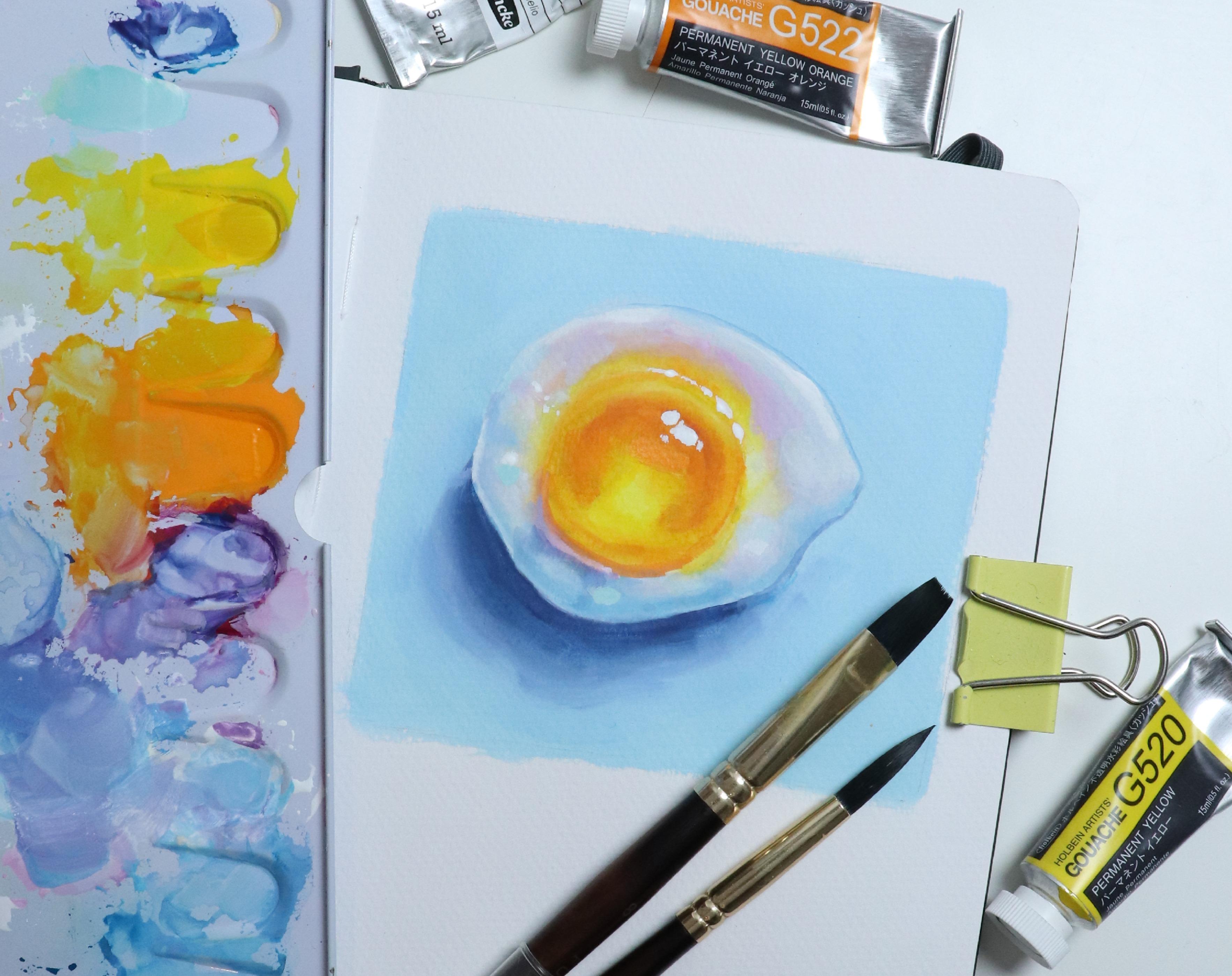
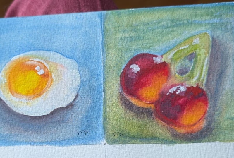
6. Egg Pt 1: Okay, for each painting, I'll be using the right page in my sketchbook
for the painting itself and the left side for any additional
tips and information. First things first,
let's create the sketch. You don't have to follow
the reference exactly. Feel free to make
any adjustments you'd like to the
shape and details. First, I'm going to rough out the approximate size and shape. Then place a yoke
somewhere around here. If the yoke was the
face of a clock, somewhere up here
around ten or 11, there's a small bump
on the white portion. So I'll start here and
move my way around. I'm looking at how
close or how far the outer perimeter is in
relation to that yoke. On the right,
somewhere before 3:00, we've got the point that's the furthest away from the yoke. It then comes down in
a curve comes out, goes back in kind of
in a wavy motion, and then back up
somewhat like this. We can then clean up as well as lighten those lines
using our eraser. The lighter your lines are, the easier it'll be
to cover those up. But I'm going to
try and make sure that you can still
see my sketch. If you want, you can draw in the outline for the
background as well, making sure there's enough room for the shadow below the egg. So let's have a look at the colours we'll be
using for this painting. We're going to need
yellow for the yk. I'll be using my
warm yellow again. I'm going to use the same
sunny or yellow toned orange from the previous lesson. If you don't have an orange, you can mix your own using red. So in this case, I'll mix my
warm yellow with a warm red. If you mix this in
the right ratios, this will produce a
pretty good orange. And depending on the colors
you have available to you, in your palette, you may
have colours that'll mix an even better and
brighter looking orange. It's not always as simple as
just mixing red and yellow. Some colors depending on the pigments will create
a better, more clean mix. And the more pigments you
start mixing together, the less clean your colors
will typically look. This is one of the reasons why a limited color
palette often works so well because you're
not overcrowding that pool or selection
of pigments. That's not always
the case, though. So the first tip for
keeping colors bright and vivid is to test
your color mixes. So feel free to play around with the colors
you have available to you and pick your favorite
option for this color. Speaking of limited
color palettes, to keep it simple I'm going to pick my remaining
primary colors. My blue, I'm using
my cool blue again, which is technically turquoise, but it's more blue
than turquoise to me. Now, one of my very
favorite colors of quash is coupled
turquoise light. It is in watercolor as well. It's just that perfect fun color to add a bright punch
to your painting. If you have this or something similar, feel free to use that. But in this case, I'm
going to limit myself. So going back to the cool blue
or turquoise from before, if we add in a tiny amount of
yellow and then some white, mixing on the paper may not be the best solution
in this case, but if we get the ratios right, we can get a color
that's fairly similar. So I'll be using
this mix instead. Because this egg aside from
the yolk is very pale, I'll pick my gentap for
my red primary color. That way, we can get
some nice pastel pinks. And of course, we'll be
king our white as well. Now that we've
selected our colors, I'm going to get some
paint out onto my palette. If you're using
paint from the tube, you can squeeze out a
small dollop of each. If you're using pink
from pens like I am, you don't necessarily
have to get out the paint
beforehand like this. I'm mostly doing this to
keep my setup as compact as possible while filming so we can zoom in and still
see the colors. Oh The second tip for keeping colours
bright and clean is to plan your colour scheme
or color palette. So if we were to
paint the egg as is, it might look
something like this. We have the yellow yolk. And there's still some
pigment in my brush, so my yellow is not as
bright as it could be, but that'll actually work
in our favor in this case, because it's closer to being the color we see in the picture. Mixing together our primaries
will get a grayish color. That we can then use for
this shadow portion. So let's put that here. Mixing in some more yellow. We can put that up here. And we can add in some blue for some of the shadows
or shading down here. As you can see,
paint consistency is not a concern at this stage. I'm very much using
it as watercolor. But these are just about the colors we can see
in our reference. So how do we turn
this more colorful? Next tip is to amp up the saturation because we don't have to always
paint what we see. We can instead paint
what we imagine the most delicious version of
this candy would look like. So we can go in with the
yellow again for the yolk, making sure that it's nice and bright and the
brush is clean. The yellow is our light. Next, pick a shadow column. Since the shadow tone
in our reference do have a slight
cool or blue tint, what if we just turn that
into a more vibrant blue? We also going to
need some mid tones. If we mix yellow and blue, we're going to get green, and you can use green if you want. But if you know
anything about me, you'll know that I
like adding pink. And in this case, it'll work great for a few
of those mid tones, maybe together with some purple. Plus, this will work well with both the light
and shadow colos. If we add the pink
to our yellow, we'll get orange, so those will be the
colours for our light. And if we add pink to our blue, we'll get purple, so those
will be our shadow colours. And the pink itself can be added anywhere we want because
pink is beautiful. Already, this would be the realistic version and this would be a slightly
more colorful one. If pink and blue
is not your thing, feel free to pick a
different color scheme. Keeping it simple, we'll use
yellow for the yoke again, though you could make this blue, pink, purple or any
other call you'd like. What if we use green
flower shadows? It all comes back to
personal preference. Oh then for the mid tones, if we mix green and yellow, we'll get even brighter greens, maybe even some acid like tones. You could pick a
different color, but let's just add this in maybe with a few
pastel tones as well. Then to add in some
more color play, what goes well with green? That could be blue? What goes well with yellow? That could be blue as well. So let's add some blue
in the shadow portion. And why not add some pink
up where the light is? And like that just because this could make a
really fun painting as well. It's all about having fun. So feel free to play around or go along with the
colors that I've chosen. The main thing is
to be consistent. If your shadow color is green
like it is in this example, you want to try and keep your
shadows green throughout, or at least mostly green. Likewise, if we
decide that yellow and pink are the
colors for our light, we want to try and keep that
fairly consistent as well. Of course, there are always
going to be exceptions, but this is the easiest
way to help keep that painting from looking
too busy or confusing. Another tip when it comes
to vibrancy is to look at the transparency or
opacity of a color. If we go back up to
our turquoise watches, although this may not be a completely fair comparison since different
pigments are involved, if we look at the Copal turquoise light
straight from the tube, it has a nice vibrancy to it. And of course, the color itself
is a great vibrant color, but some of it
also comes down to the fact that we have the white of the paper shining through. The one we mix ourselves is much thicker in application
and more opaque, and it overall
looks less vibrant. If we were to recreate
the same mix, but leave out the white and instead apply it as
a transparent glaze, we'll instantly get a
more vibrant appearance. So let's keep that in mind
and get started on the egg.
7. Egg Pt 2: Getting started with the egg, we want to add our underpainting, and thinking back to
the previous lesson, knowing what we know about
transparency and opacity, if our goal is to make the yolk super
bright and luminous, we may want to
limit the amount of colors or layers in this area. And for the remaining portion
of the underpainting, to really emphasize that
light versus shadow, let's go with blue, which is our shadow
color in this case. So let's jump straight in
and apply the underpainting. Consistency wise, my paint is somewhat in that
milk like range. It's really not too important, but let's start
thin and then build up thicker layers
as we progress. It's okay for the yellow
to go outside the lines. Besides, we want
some yellow up on that upper portion of the white as well, just like
in the reference. And then for the
white of the egg, as well as for the background, we can mix a light blue. No need to worry about
getting the cols to be the exact color or value
as the ones I'm using. We can always make
adjustments and alterations, as you can add as many
personal touches as you want. The only thing I'm trying
to avoid is mixing that blue and yellow because I don't want it to turn green. Though it's not a big
deal if it does happen, we can always add paint
on top to cover it up. Finally, for the underpainting,
I want to cover up the remaining bits
of white paper here. But to avoid mixing green, I'll use one of the
transition colours instead. So I'm going to mix up
a pinkish purple colour and add this to the
last bit of egg white. One thing to note
is that purple and yellow when mixed will
make gray or brown, so you may want to be
careful with this. Though it's okay to have
some more neutral colors. Not everything in a
painting has to be colorful for the painting to be perceived
as being super colorful. Neutrals or slightly
more muted colours will help create
a great balance. Just try and keep it away from that bright yellow yolk because we do want that part
to be super glowy. Once we have that, we can use
a clean damp or wet brush and use this to smooth out some of those edges and transitions. It's not a necessity, though. While waiting for that to dry, we can take a look
at another tip for creating bright, luminous
looking paintings. In order to have light or to have something that can
be perceived as light, we need shadow or
darkness as well, or in other words, contrast. So let's try and paint the yoke similarly to what we
see in the reference, starting with the
bright yellow base. We can then add the shading, which is going to be a darker
version of this color, maybe even slightly green, but I'm not going
to make it green, so I'll mix some orange, a touch of blue, pink, and some of the yellow, and then add this roughly where the shading or shadows
are in the picture. We can mix a slightly
darker value with a bit more blue
for the darker portion. This may be a bit more pale than the reference,
but we get the gist. We can see from
this that we have an area with light as
well as some shadow. But to really make
that yolk light up, we can push the contrast and the difference between light
and shadow even further, starting with the yellow again. And so for the shadows,
we're going to push both the contrast
and saturation, bringing in some orange, maybe even with a touch of the magenta to help
deepen that color. The more we push these values
and build up the shading, the more that yellow is
going to light up because our eye will automatically start comparing it to
the surrounding area. Also, keeping that inner
portion of the egg, so the egg yoke, not
necessarily transparent, but if we avoid
using too much white and we then use plenty of white and opaque colors
for the egg white, that difference in opacity will help make the egg
yoke glow as well. I'm going to switch
to my round brush, just to have slightly
better control, though the flat brush will
work great for this as well. So starting with the yolk, if we take a look at the values, we have the lightest
value in the center, then there's a ring around it, which is somewhat of a mid tone, and then we have the deepest
values in the center. So if we pick up some
orange for that outer ring, the consistency of my paint is still somewhere close to milk, though this is not
at all important. When working with colors
that are dissimilar, we don't have to worry
as much about the colors mixing on the pig bar
because it won't make much of a visible
difference unless you're using a bunch of
different paints all with different pigments, in which case, you
may want to be careful to not mix
them all up too much. Because as we talked
about previously, the more pigments you have
present and mix together, the more muddy or murky those
colors may start to appear. As long as you get the effect
and the result you want, you've got the right
pink consistency, and if not, we can
make adjustments to that consistency accordingly. Next, if you want, you can lift paint to lighten
some of this orange, but I really want to start
building of the layers, and I also want to make sure
to cover up my pencil lines, so I'll just go in with
some more yellow on top. Although subtle, this will make these areas appear brighter because we associate
the more yellow tones with the color of the light. For the deeper values,
we can go in with a more saturated thicker
layer of the orange. And if needed, you can
deepen the color further by mixing in some of the
magenta or even some red. The great thing about
gouache is that you don't have to be particularly
net or careful, and these little gummy candies
are so much fun to paint. So definitely just enjoy
and have fun with it. Play around with
different effects and techniques and don't be
afraid to try out new things. We often learn best from
just experimenting. Once we have that, we can go ahead and smooth this out a bit. One option is to take a
clean brush, wipe that off. Then just like we did
with the licorice candy, we can go in on top and
slightly blend the colours. For a round brush like this, it may be easier
if you hold it at an angle so more of the belly of the brush is
touching the paper. Another option is to mix a
few transitional values, so values that sit in between the ones we've
already applied. Especially around
the inner portion, so the lightest
part of the yolk, I'm working with
pretty watery paint to keep this section
fairly transparent. So while applying the paint, the water from the brush is also reactivating and
blending the paint that's already on the paper. But since I'm only really
working with yellow and orange, I don't have to worry about
unwanted color mixes. If I get pigment or paint
where I don't want it, I'll just clean and wipe off my brush and then lift
it to clean it up. We want to follow the value changes we see in the reference. At least to some extent, it doesn't have to
be 100% accurate. Up here, I have some
visible pencil lines, so to conceal this, I'm going to go in with
white or a pale yellow, and then let it dry. Prayer. Once dry, we can then go in on top with some
of the yellow. Because of that white paint, this will make this small area look less luminous than
the rest of the yolk, where the layers are
more transparent, especially in real life. So I'm going to limit the use of white as much as
possible in this area, but it is the easiest fix in this case to hide
those pencil lines. Next up, we can start adding
in the shadow below the egg. Looking at the reference, the
outer portion of the shadow is a similar value to the
shadow within the yolk. So we can use this to help estimate how light or
how dark we want to go. Since I know my background
is going to be blue and a lot of the shadow color on the egg is going to be blue, just to add some
more colour play, I'm going to add some magenta to the shadow color to get
kind of like a blue violet. And since I'm using
the round brush, I'm again holding the brush at an angle to help blend
some of the edges. Though, once again, blending those edges is not at all
important at this stage. It's more of a personal
peace of mind kind of thing. You can clean your brush as
much as you want throughout. I'm mostly cleaning mine if I'm switching between colors
to keep the mixes clean. Or in this case, if I
want to blend some of those edges and there's too
much pigment on my brush. Lastly, for this
lesson, at this point, my background color
and the white of the egg is almost
the same value, so the egg doesn't
really stand out. So I'll quickly go in and deepen the background
color just a bit. Once you're happy with
the base layer, we can move on and start
building the shading same as well as
adding some details.
8. Egg Pt 3 And Class Project: Okay, let's finish up the yolk. Because there's a lot of
going back and forth, I'm going to speed up a
portion of this lesson. But I'm still going to talk
you through the process. I'm going in with my flat
brush in order to get a more clean or smooth
look more easily. Starting with
yellow, I'm going to go in near the center like this, covering up both a portion of the bright yellow and orange, then mixing the yellow
and orange to get a mid tone or transition
color and working with a more creamy consistency to get some really nice and
saturated strokes. Just like we've done previously, I'm cleaning and wiping the
brush and then going in with a few light strokes to
smooth everything out some more and blend
out those hard edges. Then continuing with the orange, as well as the slightly darker version with
magenta mixed in, basically going with the
same steps from earlier, which is also one of
the reasons why I'm choosing to speed up a
portion of this lesson. We just want to deepen or
enhance the saturation and contrast while at the
same time clean it up a bit. This is a part of the
process where you can so easily get lost in
going back and forth, playing with color and adding new brush strokes or details. So don't rush,
enjoy the process. Keep an eye on the
reference to get an idea of where to place
the different values, but don't worry about making it look exactly like the picture. We're making our own version. Down here below the yolk, there is a thin line of
light shining through. So I'm going to go in with the white and at the same time, concealing a few
more pencil lines. Then let that dry and go
in on top with the yellow. I could honestly go back and forth forever with
this type of painting, playing around with the class and just making the light pop. But we're going to come back
with the final details. So for now, let's move
on to the egg white. For that egg white, let's
start with the light blue. I'm aiming for about the
same colour and value that I've already got on that
lower half of the egg. This way, we can use it to
clean up the shape and make everything look a bit more even before going in
with more colors. We can also go in and add blue to other places
with slight shadow, like up here, as well as on the left where the
edge has a few tents. I'm going to mix in
some magenta to get a more purple color and then put this next to
some of the blue. You can use it between the blue, so the shadow color, and then the areas
where the light hits as almost like
a transition color. But you can also play
around and try placing it simply for the sake of
having a bit more color play. For the upper half where
there is more light, I'm going to mix some pink. As we've established, pink will work great as a transition between the yellow and blue or between the yellow
and purple tones, and adding this up
here is going to give this half a warmer feel
compared to the bottom, which has the most shadow. Right now, the egg white
consists mostly of mid tones. So in order to give the
egg some more form, we can start introducing some lighter as well as
some darker shades. I'm going in with
the white up here where the brightest highlight
is on the egg white. We don't want it to
be bright white, so if it doesn't dry fully
opaque, that's perfect. We also want to add some of this white to the texture
on the left. And you can even put some of
it down here if you want. Mixing up a light blue
and going back in on the background and giving it another thicker layer of colour. And then I'm doing the same with the purple or blue violet
shadow below the egg as well. Uh We want that shadow to be darker closer to the
egg and then fade out. Now that the egg white
has had some time to dry, I'm going to use my clean
damp brush to blend out some of those areas to get an
overall more smooth finish. There's nothing
wrong with having a lot of these harder edges. It's just going to give a more impressionistic or
painterly feel, so feel free to keep it as is. I prefer a slightly softer
look to my paintings, generally speaking, so I'm just going to blend
it out a bit. Okay, it's starting
to look really cute, so let's add some more paint to the shadows and highlights. Keep referring back to our
reference picture to see where the values change and
follow the shapes you see. Try to mostly keep
the shadows blue or purple and the mid tones
pink or pinkish purple. We want to reserve the white for the brightest highlights,
and by all means, do not worry about
making it perfect or making it look exactly
like the reference photo. We don't have to follow
the reference photo to a We can play around and make alterations as much as we want. If you add a shadow or a highlight that you're
not quite happy with, just go back in, lift the
paint or simply paint over it. You can also play around
with adding more contrast to the shading by including
a wider range of values, where you can keep it light,
similar to the reference. I highly recommend just
playing around and trying a few different
approaches because that's genuinely the best way
to find the techniques or the style that you
personally like the best. Don't be afraid
to make mistakes. We might as well
get it over with. And honestly, the more
mistakes we make, the more chances we have to learn how to fix
those mistakes, which in the end is going
to lead to us being a lot more confident in
our painting process. Even if it doesn't feel
like it in the moment, mistakes can be a good thing. At this point, we
can also go in and start building up those
highlights using the white. For these first
layers or strokes, I'm not using the white
at its full opacity. I'm just slowly building
up those values, adding more and
more dimension and depth until I'm happy
with the way it looks. Then carefully going in and softening those edges
with a clean brush. If you don't feel confident or comfortable using a
large brush for this, you can definitely go in
with a small round brush or even a small flat brush and tuck at these edges with
more precision, but it doesn't have to be
perfectly even or blended. If you've got some messy
looking edges like I have, we can go in and clean
those up a bit as well. So I'm going to go in with the dark blue violet
shadow color. To make my egg white stand out from the
background a bit more, since the colors
are very similar, I'm going to add a
thin blue outline around this top portion and
blend out the edge a bit. Because this is where
the most light hits, this may not technically
be unquote realistic, but we don't always have to
follow the laws of real life. That's a great thing about art. Sometimes it's okay to
make little alterations if we think it adds something
positive to the final result. And I personally
like how this looks. I'm not super happy with the shading right
below the yolk. It looks a bit too muddy to me, so let's add some pink, which is the perfect transition between purple and orange. Everything is starting to
come together quite nicely. I'll go over some of
these blue shadow tones one more time just to deepen
the value a bit more. And with that, I'll go in and deepen the shadow
below the egg as well. A This is definitely the most relaxing part
of the process to me. Just being able to go
back and forth with these final
adjustments and making those final decisions
about the painting. I'll never get tired of
seeing a subject coming alive on the paper as we
build up those paint layers. I really appreciate how
Gach allows you to make corrections a lot more easily than something
like watercolor. Sometimes it's just really nice having the option to work
with different mediums, depending on the subject you're painting, the look
you're going for, or simply what
type of techniques you're in the mood for
using in that moment. I'm pretty happy with this. So if you're ready,
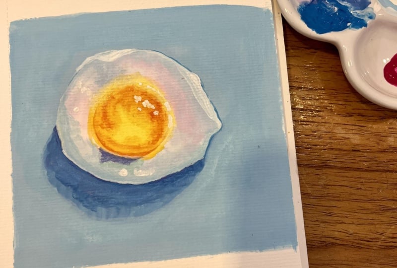
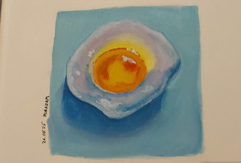
let's go in and add those final highlights to really make this little egg pop. For the class project, I'd like you to paint this egg. If you're watching this class at a time where more
lessons have been added, feel free to paint one of
those candies instead. Or, I'd love for you to paint more than one and share
them all with me. But no matter how many you
decide to paint and share, I'm so excited to have you
as part of this class, and I'm really excited
to see what you create. For the very last touch of colo, I'm going to mix up
a light turquoise and add a few dabs like this. It may not have a
dramatic impact, but it doesn't have to. And that's it. If you want, we can move on and paint
the next piece of candy.
9. Cherry Pt 1: Now, with the egg, having that yellow yolk be
bright and luminous is fairly logical because light is often thought of as
being white or yellow. But what if we have something that isn't your typical
color of light? How do we bring in that luminosity to a
different subject? Let's try and paint
this cherry gummy instead, starting
with the sketch. And if you want to
paint the color gummy as well, feel free to do so. I'm going to focus
just on cherries. For the basic shape,
we're just going to start with a triangle. Again, you can use your pencil to check the ankles
by holding it up to your reference for the size of the cherry itself or the
actual fruit and not the stem, we can see that it goes
up to here on this line, which is about the
halfway point. So we're just going to draw
those in roughly like that. And then we've got
that hole space in the middle between
the two stems. Something close to this. It does not have to be perfect. And then we're just going
to clean that up a bit. And finally, I'm
just going to put a bord eye around it
like I did before, making sure there's
enough room below the cherries for that shadow. Let's have a look at the colors. So our main colors are
going to be red and green. For the red, you can
definitely get away with using just one red.
I'm going to be using two. I'm going to be using a
slightly more cool red and a slightly more warm red. I'm going to explain
why in just a second. I'm choosing to
mix my own green. I'm going to need some yellow, and I'm going to use this
nice warm sunny yellow again. So the reason why I'm choosing
to use two different grids is because I know I'm going
to want some orange as well, and I'm not going to be using any premixed orange
for this one. As we know, some
combinations of red and yellow are going to mix a
better orange than others. Typically, a warm red and a warm yellow is going to
mix a better orange than a cool red and a warm yellow or even a cool red
and a cool yellow. So I want that warm red
to help mix the orange. But the cool red is
closer to the color that I want the main portion
of the cherries to be. And we're going to come back
to these two reds in a bit. So let's take a look
at our fourth color. I'm choosing my same
cool blue from before, which is helio turquoise. This will enable us to mix a beautiful range of
greens for the stem. Now, we've got all
our primaries, and so this means that we'll
be able to mix our neutral, so our browns and our
grays and blacks. Looking at the reference, we know that we're going to need some shadow tones for
the red portion as well. If you want, you
can definitely go in with more shades of red. If you have a deep red, that is going to
work wonderfully. But we can also stick to
our limited palette and mix our red with the blue to
create those shadow tones. Both of these mixes are going to work great as shadow tones, but one is going to
be a lot more almost purple in tone or at least
a cool shade of red. Whereas the other one,
even though it doesn't technically contain
a yellow pigment, it still has that warmth
being warm or red. So this one is going
to mix a shadow color that is more of a brown
tone. Both can work. It just depends
on what you want. And so for me personally, this is one of the
reasons, again, why I'm choosing to use two
different shades of red. I want to be able to mix
a nice bright orange, but I also want to be able to mix that more
purple shadow tone. Last but not least, we will of course be using
our white as well. Once you're happy with
the color selection, let's get some paint
onto our palette. And hopefully you can forgive me, but because I'm filming, I decided to try a slightly more compact setup for this lesson. I'm going to quickly
do a rough gradient here representing the
order of the color wheel, and I'm going to borrow
some magenta from my palette in order to get
those pinks and purples. So how do we bring in
more light and make a color that isn't
typically thought of as being the color
of a light sauce, glow and appear more luminous. One way, like we talked about
previously is contrast. As an example, this red on its own doesn't necessarily
appear to be glowing. But if we introduce
a darker color into that same painting, now when looking at the
two colors together, we're going to perceive the red as being the one
with the most light. It's all about putting
things in the right context. We can also choose to
add in even more light. So let's look at
how light travels. Typically, when we have light, we think of white or yellow. And shadows are typically
more so in this blue zone. But we've got all these
colors in between. So when we have a
subject in this case, which is not in the
typical zone of light, but where our lightest
color is red, we can still utilize these lighter or warmer colors to help bring in
even more light. So even though we
don't see yellow in our reference down near the bottom where we have
the most light coming through due to that
slight transparency, we can still add in
some of that yellow. We can use that same
color wheel order for the shadows as well. If we have the stem, due
to the transparency, the shadow may start
with a reflected green, but then it will
move into the blue. With the red cherry, we may start with more purple shadow. But again, the further
we get from the light, the more blue that
shadow may become. The closer to the light, the further to the
left will be on the scale and the further
we get from that light, the more to the right
will be on the scale.
10. Cherry Pt 2: Not going to do an underpainting for this one, but
you can if you want. I'm just going to
go straight in and start placing the
different colours, starting with the cherry
itself. So the red. For now, I'm not going
to worry about adding in any of the yellow or orange. I'm just going to go
with the warmer red down here where we
have the most light. Cleaning my brush
before going in and picking up some
of the cool red. We can then make
some of the glue to create a shadow
colour. Not too much. We want to be able
to go daga later. And then place that here, following what we see
in the reference. Right here close to the edge, we do have a slightly
lighter colour due to the light coming in. And even if the cola
kami was not there, we'd still have this
light coming in, so we can add in some of our cool or warm red or
even a mix of the two. It doesn't matter too much. For the stem, I'm going to start with
a pale wash of green, keeping the pink
consistency pretty thin because we don't need
much piment right now. We just want place of collars. And if you want, you can start blending that into the red, though this is going
to be a lot easier once we get some more
pigment onto our paper. We've got the most color
intensity in this area, and the light is coming from this angle going
through the gummy. So I'm going to add in some more yellow tones
to warm this up. Keeping this closer
to the edges, And then for the center portion, where we have the
darkest values, which is going to be our
shadow and shadow color, I'm going for a slightly
more cool green. Let's try and blend that first
layer using a clean brush. And don't worry if it
doesn't blend too well. Once we start adding
more pigment, it's going to blend
a lot more easily. And once you're done, you want
to allow the paper to dry. Once dry, we can finish
up the red portion. So if we notice here
along the edge, especially next to
that shadow color, close to the edge, the
color is slightly lighter. So let's take our main red. In my case, that is going to be the cool red and place
this along the edge. And if we look at the reference on that left portion
of the cherry, even in that spot where we've got the most light
coming through, there's an outline
which is slightly darker than the light colour. So I'm going to create
an outline around those lighter areas
as well. It's okay. If it's not perfect. We
can always lift the paint. Then let's take a look
at the shadow shapes within that cherry
and the darker value. Mixing in some more of our blue. On this left one, we got almost like a half moon
shape. Something like that. On the other one we've got, if we look very close, it actually separates in the
center with the dugest one being up top and a slightly
lighter shape below. Staying away from
the edge for now. And once you're about
happy with that, we can add a thicker
layer of our main red, so the cool red on top to both help blend the
transition between the two shades or values as well as just build up that color
and create some more depth. We can add another layer
to our wore red as well. And then start blending
those two reds together. We've got the right
colors now and about the same colors we
see in the reference, but it looks a bit flat. So let's increase the contrast. First, going back
to the outline, we want to make sure we've
got that outline that is dagger than the color
within the cherry. How much dagger is up to you, there is no right or wrong, but wherever we've got
the dagest values, we can add a daga outline. And where we've got
the lighter values, we want a slightly
lighter outline, even if it's still darker than
that inside main her cola. Same for the shadow
shapes on the inside. Keeping it dagger
towards the edges and then blending that into
the rest of the color. I'm even going to create an outline between
the two cherries, so where they melt together to help give
it some more form. Then down here at the bottom, we can introduce some of that yellow or orange
we talked about. I'm first going to
take my wet brush and some tissue or
paper towel and see if I can lift up
some of the paint just to make it easier to layer on top with a lighter colour. And why not do the
same here as well? For this one, I'm going to
go in with straight orange, making sure it's not too
yellow because I want to maintain the most light coming through down
at the bottom. And then we're going
to do the exact same thing at the bottom, starting with a
more yellow tone, then transitioning into
orange and then the red. Allow yourself to just play
around and have fun with it. And then blent that out a bit. Then once we have that, we can move on and paint the stem.
11. Cherry Pt 3: I've made some room
on my palette to be able to fit in some
more shades of green. So first, I'm just
going to add in some white and mix a
few pastel shades. And because I'm
working with the pens, I'm going to add some water to my white pen and allow that to soak for a bit to
snap some more white paint. Now, looking at the stem up
here at the gathering point, this is going to be our base color and base
value for the stem. I feel like mine
is a bit too pale, so I'm going to go in
with another thin wash to ever so slightly deepen
that color and value. And I'm using a
fairly cool toned or blue toned green
mix for this. Next, let's look for some of the shadows or deeper values. I'm going to again use a
fairly blue toned green for this and just go in and follow the shapes I
see in our reference. And maybe mixing in
a bit more yellow for the other side where the
light source is coming from. And just like with the
cherries themselves, we can create a Daka outline. Just like this. I'm gonna allow that to dry
and then go back in and plent it out
to soften the edges. And down here where
the green meat is red, we can
blent that as well. I know the cherries don't look particularly cloy or
bright at this point, but just wait until
we start adding the highlights as well as
a background and shadow. Now let's add the lighter values using some of our white mixes, and we just want to follow any value change we see
in the reference. So up here near the edge, as well as close to
the inner portion. Let's pull that down here a bit. Add some right here,
close to the edge. And then a tiny bit over here. Right now, these may look like highlights, but they're not, so we're
just going to allow them to drive a bit and
then blend them out. Because there is a lot
of white in this mix, it is going to look quite pale. So once we're done, we can create a glaze using green with no white
and apply this on top. I'm first adding a
green mix with a bit more yellow and adding
this to these areas. And then using a
green mix with a bit less yellow for the rest. At this point, we can
evaluate what we've got so far and see if we need
to make any adjustments. I definitely feel
like I can push the contrast even further
in the daka areas. So I'm just going to
mix up some daka green. And then go in and add this right here to those
deeper values. And then lightly blend
those edges as well. I feel like I still
want a bit more colors. I'm going to mix more vibrant
green still with some white and go in and add this to a few places just to
above that intensity. This is not going to be a super bright green if you have a premixed like may green or spring green that would
work great for this. But I'm going to just add this, let that dry and then go in
with a thin glaze of yellow. And then right here where
this green and red meats, I feel like it's gotten
a bit too muddy, so I'm gonna go in
with some more red, the cool red to help
clean this up a bit. And blend out those edges. Okay, let's move on and add the background as well
as some highlights. Uh,
12. Cherry Pt 4: Let's add a background colour. You can add any colour you want. I'm gonna go for a background that goes from blue to green. I'm just gonna mix a
few different shades, not worrying too much about the colour and see what I get. The only thing we want to
be aware of is just staying away from that bottom portion of the cherries where there is the most light because
we're going to be adding that cast color from those cherries on the
background as well. Inside the hole
between the stems, you may still want to add
green to the left portion, even if you're not
using green for the background color because we do have some cast color from that stem on the
background in this area. Having the background in place, I can definitely tell that
I want to go slightly darker with some of
the other values. I'm going to do a quick
reassessment of a few of those. I'm going to be adding
a deeper outline and deeper value to
a part of the stem. I'm also going to add in
some deeper shadow tones on the cherries themselves. Due to the mad
nature of gouache, that colours will look
slightly lighter when dry. There are a couple of things
you can do about this. One is to varnish
with a gloss varnish, which is going to make the
colours look a lot more intense and make them appear
as when the paint is wet. You can also pair it up with
something like watercolur. I personally almost always use watercolur when
painting with quash. And there are different reasons depending on the effect
I want to achieve. But one of them is to be able to get more
intense deep tones. It's all about personal
preference, though. There's nothing wrong with
the natural look of guash. I love the mad look. It has very much this
vintage or retro feel. And I mean, how can
you be mad at that? For the color reflection
below the cherries, I'm going to start with orange closest to the cherries and red, and then I'm going to mix
kind of like a muted purple. These colors don't mix a bright purple and use that for the main
portion of the shadow. The main thing here
is that you want the orange to be the
lightest in value. You want the red to
be the mid tone and the purple or whatever shadow
color you want to mix, be the tagest value. And then as we're moving
away from that light, I'm adding some blue to the
outer portion of that shadow. Adding in a tiny bit of
white to that purple color. Quite honestly, my purple with these colors is going to
look more like a deep gray, almost black, but that's okay. Once it has dried, we can
blend that out and if needed, add some more paint
to help blend it. But hopefully you
can see already that now the lighter
portion of the cherries, as well as that orange on
the background looks almost as if it's glowing because we have those daca value
surrounding it. Now, I'm gonna be
completely honest. Right here, I've
completely forgotten to add the green from that
stem on the background, so I'm just going to quickly add that in by first
lifting some of the paint and then adding in a light green almost as
if it never happened. H And then from here, we can start adding
in that shadow going from the green to blue. Definitely, feel
free to play around with the different colors
as much as you want. And depending on the color you've chosen for
your background, you may even use completely different colours
for the shadow. And then we want to blend
that into the other shadow. And then let's blend
that out, as well. It's amazing how these
shadows that are so simple can make this
cherry Come come alive. Don't be afraid to play
around with adding different colours or even making the shadow
lighter or darker. Each small change can give it a completely
different look. I'm also going to
add that tiny bit of shadow right here in the
corner between the stems. And if we look closely, we can see that
this forms a curve, which is the shape of the stem. I think we're about ready
to add some highlights. Okay, so looking
at our reference, there are definitely some
highlights that are more white, more bright than others. So for these ones
that are more subtle, I'm gonna mix in some of the color corresponding
to that area. As they dry, we can
start to judge how transparent or opaque they are and whether or not we need
to add another layer. I'm also adding a couple
of different mixes, so some with more or less red because I just really
like how this looks, and I'm actually not going to be blending these highlights. At least not too
much, just a bit. You definitely can if you want. I just like how they
add kind of like a fun and cute touch and also gives it more
of a paintly feel. For the green highlights, we can even add in
some blue as well for some color play and
maybe even some yellow. And then, of course, for
those final highlights and to add a bit more sparkle, you're going to be using
straight up, opaque white. Blend out some of those
for a slightly softer look somewhat following the placement of what we see in the reference, it does not have to be perfect. Do Okay. I think I'm pretty
happy with this. Hope you enjoyed this class, and I can't wait to
see what you create.
 Tanja Jensen, Artist - Sculpting, drawing and painting