Transcripts
1. Introduction: Okay, in this class, we're going to
paint a color chart and make it super easy. Anyone can do it? Yes, a color chart. When I first started
watercolor, I thought, I do not like this idea
of painting these charts. Like, why don't we
even see these charts? And this doesn't seem
fun at all to me. A guess why? Once I tried it, I thought this is actually on, in this class,
we're going to chat a little bit about
why the paint, the color charts in
the first place. Once we know a little
bit about the why, then we'll talk about the
how and I'll show you how color charts actually work, how you put them together, and all the parts
and pieces of that. And how we're going to paint
one together. As we go. I'm going to be sharing
all my tips and tricks for making
this really simple, really easy, and
doable for anyone. No measuring is
involved in this class. So now that we know
the why and the how, then we're going to
put it into practice. So I'll take you step-by-step
through drawing the grid, painting, the pure pigments, the pure colors, and of course, filling in those color mixes, I'm going to make it
really easy for you. This is a real-time
class where I take you through
everything step-by-step. I'm with you through
the whole process. And I'm also giving you my thoughts as I paint
and explore these colors. Excited to share
this class with you, I think you're going to enjoy
making this pleasure and seeing the gorgeous colors that you can get
with your paints. So come along with
me, let's pay.
2. What a Color Chart Teaches You & Project Chat: Yes, a color chart. Hey, my friends,
welcome to this class. I'm so glad you decided
to continue on with it. Now, many of you who follow me already know that you got
to vote on the color. And you've got to choose
between these two sets. We had the marine scape and
we had the shades of summer. You guys chose that you
chose shades of summer. It's a gorgeous color palette. And so we're going to
make a color chart, or maybe two, maybe
two with these colors. And basically it's a way
for you to get to know your watercolor paints when you're starting a new set of
colonize familiar with them. This is a great way
to get familiar, and you'll also learn more about the color temperature
of your paints, the values of your paints. But mainly you learn about the gorgeous colors
that you can mix. Strong or weak. I'll be honest with you. When I first started
watercolor, I thought, I do not like this idea
of painting these charts. Like, why don't we
even see these charts? And this doesn't seem
fun at all to me. A guess why? Once I tried it, I thought this is actually fun. It takes some time. Don't get me wrong. Making charts. The watercolor
charts takes awhile. And the more colors you have, the longer it will take, you don't want to
make a big sheet with a whole bunch of colors, just pick a few of your colors, even two or three, to make your chart. And you will learn a lot about those if you're only
going to pick three. Here's a pro tip for you. Pick a red, a yellow,
and the blue. And that will give you
all kinds of color mixes. I am excited. I actually really do love
making these color charts. They're not hard. One can be a little confusing, but I'm going to
explain that to you, so don't worry, you'll be able to do it by the time
we're finished. By the time we
finished, you'll be able to make a color
chart for sure. So let's get started.
3. What Is A Color Chart? + Supplies: Yes, a color chart. Now, what is the
color chart anyway? Well, as you can see, color chart for mixing colors. It's so you'll know
what your paint colors are and what they do when
you mix them together. Then watercolor, your
colors, move and blend. And you want those gorgeous
color mixes that you can get. If you just have
the right colors, you can get any color. But it's important also to
get to know your paints. Because your paints will make
beautiful, gorgeous grace. They'll make colors
you might not expect, I know that I've done
charts before and I'm like, Wow, I never expected
this to make this color. So that's why you would want to make a color mixing chart other
than the fact it is fine. It doesn't look very fun, but it's fun especially
once you start painting and getting
those beautiful mixes. You'll, you'll fall in love with your watercolors all over again. Okay, So this is an example, not an example but a template. And I will give you copy this
template in the resources, so be sure and print it out
if you need a little help. And it'll tell you exactly
how to make a color chart, including where to
put what paints. This is how you set
up your color chart. And then once you
get it all set up, this tells you how to
mix which paint where. I'm going to demonstrate
all of that for you. I do have a few tips and
tricks as we go along the way, but I'll discuss those
a little bit more. But depending on the
number of paints, you will pick the
size of your paper. The more paints you'll
need bigger paper. You can also change the size of your squares in your grid. That will also make a
difference in how many paints, if I'd made my squares smaller, I could put more paints on this, but I'm only doing five. So I was fine just to do on
this is a seven by ten sheet. And you'll see I have a trick for you for
making these squares. That's super easy. So there you go. You can use a pencil or a black marker or
tape to mark your lines. For this class in particular, I'm going to use this black pen, but sometimes you
might want to see the colors next to each
other more clearly. And in that case, you could either use the
tape to mark off the lines. You can use a pencil which can be erased later
if you wanted to. There is that you're also
going to need a ruler. Now, I happen to
have a T-square. And I love this T-square because when you put it
down on against the edge, you can make straight lines. Make straight lines. Now if you're using a spiral, you're not gonna get
a straight lines. This is just my template, so I'm actually just
going to be doing it on my watercolor paper. Now, you have options when it comes to using your
watercolor paper. If you're concerned about
the expense of the paper, then you can use
a practice paper. You can use, you can use
Canson watercolor paper, or wood pulp watercolor paper. I'm going to be using my cotton watercolor
paper because frankly, once I started using
cotton watercolor paper, I never go back. The colors are just
more vibrant and they behave better on cotton papers, so it's worth the
investment if you can, but if you can't, that's okay. There are also other
kinds that have part cotton then be twenty-five percent
cotton and wood pulp. It'll just be called watercolor paper if it's made of wood pulp, so it won't stay wood
pulp on the label. It will just say
water color paper. But if it's made with cotton, it will say cotton. And it'll tell you
either 100% cotton or it will tell you twenty-five percent
cotton or whatever. This happens to be
Legion Stonehenge, Aqua, one of my very favorites. It's pretty cost-effective
and has a light texture. This is cold press, has a light bit of texture. I'm trying to see, maybe you
can see that on the camera. And it really is gorgeous paper. I loved the way it
works with watercolor. Now I use it the colored
papers, other papers too. So you don't have
to have this one. Use what you have. So you can do the project. And if you try out cotton, watercolor paper some
time and you like it, they go with cotton, but if
you like the other paper, fine, Do what works for you. I always say that. Okay, so I'm using this paper, I have a cut to size. It's not exactly the same
size as my template. If you wanted to, you can
trace over this template, but it's not hard to draw it. So I'm going to just
start drawing it for you.
4. Tips Before We Get Started: Yes, a color chart. This particular set has
five tubes of paint, which is why our color chart
has five spaces for pain. And they come in tubes. Now, your paints may not come
in tubes and that's okay. It doesn't it doesn't
matter whether they're tubes or
pans or whatever. It doesn't matter if this
just happens to be tubes. So if you have two paints and they're not
already in a palette, what you can do is you
can take a pallet. It can have any kind of
palette you can use. This is one of my favorite
kinds of Alex right here is just this little metal box and you can put all the colors
in different size tins, which you can buy
these individually. And even though
the lid is silver, I can still use for mixing. Hi, anyway, so any
kind of palette. And I've squeezed my tubes into my dish that I want to use. My palette in this case, actually get these Dicer, which is the Japanese dollar
store near our house. They're really inexpensive
and they make great palettes. I love them, I love them. They have different
sizes and shapes. They're made they're
made for cooking. They work for what? So that's a little little
little bonus tip there. Okay. So these tubes, if you're new, if you're
just now trying out tubes. Always squeezed your tube
from the bottom because Well, you know, you have
maybe toothpaste in a tube and you can
squeeze it from here. And all the the toothpaste, they'll get back here and
you can squeeze it forward. But usually watercolor
tubes are metal. And you always want to
squeeze from this end because you're moving your paint
toward the opening. And you also want to
squeeze and gently because your watercolor
is just right there, often, is just right there. So you want to make sure you want to be
careful because it may, it may have pressure
on an already and go out that ordered speech. Um, but this one doesn't, and these I put here. Let's go and I'll let them sit so they were dry and
harden a little bit. M Graham is made with honey
so they don't completely dry. It just depends on the
watercolor you have. You don't have to use these. You can use any colors.
You want to try. But I just wanted to show
you that you can just squeeze them out
ahead of time and let them dry a little
bit if you want to. Always squeeze from the
bottom of the tube. And they have these cool
gadgets and I don't have one yet that goes on the tube
and then you roll it up, that'll make sure you get
all of your pain out. Because you know,
watercolor paint can be expensive because
it's highly pigmented. So there you go. Here are the five colors. And you see we have an orange, a yellow, a green, a green, and a blue.
What is up with that? There's no red. There's no purple, right there. There are colors
that you think of. Like if you think
of rainbow colors, red, orange, yellow, green, blue, oh, Violet, we
don't have those, right? We have a specific
color palette. In this case, you can actually mix and
match your own colors. Like say, oh, I want to
try these three colors together than a color chart is a great way for you
to get an idea of how they'll look
together and you may do it and go, oh, no, no. This is not because
this is not good. And you wouldn't know that if you didn't
make the color chart. So we have our
colors squeezed out. They've dried a little. If you want to know the
actual names, this is garlic, pyrrole, bismuth,
yellow, permanent green. Flip this one over. Sap green and cobalt teal. And I have not made a color chart with
these colors before. My favorite color in this
set is the Cobalt Teal. And it's one that I feel like this one is special,
but that's just me. Then I have also made
a little swatch chart. Now, I didn't record
when I made this. But basically you just
put a little swatch of paint and you add some water. You can see what the
colors look like. So you see them here and
then you see them here. But we're going to see them
on our color chart because all of these outside areas are where we're putting
the paint colors, right? M Graham, sticky. M Graham stay sticky and
it will attract bees. Any, any honeybees, watercolor will stay
sticky and attract bees. Doors and just be aware of. All right, but these are
beautiful, they're gorgeous, they're easy to rewet and all of that because
they're honeybees. To take this, set the colors in. And then we'll get started
with our color mixing.
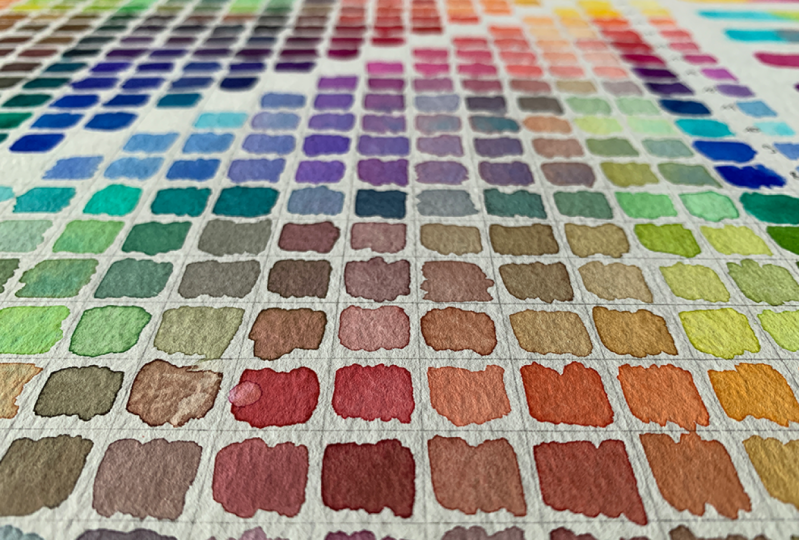
5. Drawing The Mixing Chart Part 1: Yes, a color chart. Let's get started
drawing our template. I'm going to make
this super easy for you because I lived
for things to be easy. And I'm going to leave
a space at the top. I know that my chart
will fit because I have my template and this paper is a little bit larger
than this paper. And I had played, I had
this space at the bottom. I had a room at the top. So I'm going to leave
some space at the top and space on
the sides for the, for the paints, for paint swatches of the pure
color of the pure paints. So that's what those are. I'm going to start there. And all you're going
to do is you're going to take your t-square or your ruler or straight edge
if you don't have those. Let me flip my paper around
because that edge is a little bit not even but this one is more even because I
like to tear the paper. So I will leave space at the top for my paints
and for maybe a title. So a little bit extra space. I need to make sure
I can fit my five. So if I just have an idea
that would be 12345, you can see I'm not being
very precise right? Now. Some people like to be very precise and you can
measure if you want to, you can say, I want
one inch squares and so you can mark up
your paper and measure. But I'm just going to do
this the easy way for me. And I'm going to
actually use the size of the ruler to be the
size of my squares. So that makes it super easy. I'm going to leave that
extra space at the top. Like I said, if you want, you can go for pencil first. I'm just going to
go ahead and go for my mark there because it looks like everything's
okay here. And just going to
start all the way. I'll just start all
the way to the edge because that's convenient. You can make a space
over there if you want. And I'm going to
make both sides. I may have to put my
hand in the frame here because I need to be able to see my line and make sure
I got it on straight. Then maybe stand up, which I am doing now. So I can see my line and
then hold my ruler steady, steady, steady, and
then just draw my line. Now this is cold press
paper has a bit of texture. And guess what? This is for my reference, it doesn't have to be perfect. So now I have a horizontal line. Then. I'm just going to go
ahead and demonstrate this for you right now. You can do it whichever
order you want. I want to leave a space again, and all I need over here
really are my colors. I don't need a gap. Here. I needed a title,
but here I want my colors. So I need space for my colors. And then I need, I need
five spaces for my colors. There we go, 123, like that, and I'll need five going for us. This paper is plenty wide, so I'm just going to bold
it straight and bolted down and we go and then I'll
do the same on this side. Now. I went all the way
to the top here, which means no room for title. So in this section, I'm going to try to
remember and the way I would try to
review that section, I'll just draw a line there with my pencil so I can
put a little title. And it'll just draw a
pencil line across. And I'm not measuring because I'm not I'm not
worried about that. Okay. So now remember to
stop there when I'm making my vertical lines. You may have to move things off your table by the way,
I kinda had to do that. Now look, you can
see here no line. What am I going to
do is, you know, the width is your ruler,
your straight edge. So you just look at back, then, line it up
and do it again. Remember, it doesn't
have to be perfect. It's a chart for your reference. Okay, so I'm going
to finish this. I'm gonna do 11 more slower and then I'm
going to speed through. I'm going to speed the video
up for you because you don't need to see this repeated. So there we go. But down, making
sure it's straight. Holding my paper and
my straight edge, trying to at the same time. And not pushing against that straight edge because that might make it wiggle or move. Again, doesn't have
to be perfect. And then back that
line was a perfect. Okay, so there we go. That makes my spacing super easy by using the
width of the ruler. 1234, I need one more space. Moved. This is very easy way because
you don't have to measure, but you do have to
hold the ruler. So that's kind of
a straight edge. So 12345 actually have
an extra at the bottom. No big deal. Alright, I'm gonna
do the same thing, the vertical spaces,
I need 5510 spaces. So I'm just going to repeat the process and I will
speed this part up for you. Stopping at my line. I find it easier to go faster. Let's see, 12345
interior spaces. So that's enough for five amps. And all the rest of
this is chest bones. So to sell it, I'll know that that's
what I'm where I'm stopping. There we go. I have a bigger piece
of paper that I need. But over in this
area I can put nodes or I can put other
interesting color mixes. There are lot of things
you can do but this side, so this is a very
traditional kind of colored chart that you see
people make all the time. But now you have an easy way to measure
between the lines. And you know that you
need the number of spaces based on the number
of pants are trying. Now you need five horizontal, five horizontal,
and five vertical. Because you're going to put
the paint on there two times. So we'll get started
in just a minute.
6. Drawing The Chart Part 2 - Details: Yes. A color chart. Just going to double-check
back with my tube that I made. Like I said, if you want to just trace this on your
watercolor paper, that's fine. You can put it up to a window or use a light table or lightbox. And you can just trace it. I have all of my squares or rectangles or whatever
shape you ended up with, depending on your shaded. The straight edge, and use the same one, I'm
going to end up. Okay? So I have this line
that is missing. This line is
important because it helps keep you from being, okay. I like to leave these
spaces blank, right? The ones along the diagonal, because these particular squares are where the paint
intersects with itself. So on this line, paint two intersects
with paint two. So you get, hate to say this is cobalt teal and this is cobalt teal and they
come together here. Guess what? It's Cobalt Teal and it's not really a color mix. Now you can do whatever you
want with these squares. You can make a gradient here if you want or do
something like that. But for the purposes of making
this chart more useful, I like to leave them blank. I'm going to put
this diagonal line because it's a reminder that this is where the paint
same color intersects. And it gives me these two areas in which
to do my mixes so that I can do light mixes and dark mixes or some other kind
of interesting combination. Okay, so there we go. That let me put in this line and then we're going
to keep on milk. And all you do to put this line in is you take your
straight edge. Take your straight edge and you put it on
this intersection. You put it on this intersection. And voila, you have your diagonal line right
through the center. Should have taken a weight off my wife are
first, but I didn't. So now I have to load
it back up again. Thank you for your patience. Your awesome. I'm leaving. I'm not going to put
it in this square, just these that are going
to be in the chart. Right? There. There we go. That's perfect. Now we know that
everywhere we have this line, it's blank. That square is
blank. Now we know. It's easy reminder. Let's just go ahead
and put our title now. You can make a
really fancy title for yours if you want to, but I'm just going
to keep it simple. And I'm going to put
shades of summer. I am going to try and
use neat handwriting. Some of you probably know that my handwriting is not the best. I have to slow down to do it. Shades of summer. And then I put real
small up here. Right? Now, it's C. I add all this room
at the bottom. I could have left more room
at the top and all of that, but it's working just fine. I may put a line
on that bottom of that box pen because
I think it will look better and I want my chart
to be appealing and nice. And like I said,
you can make them really fancy if you
will, to fight. I like to keep things simple. So that's what I'm going to do. And brown shades of summer, I guess I'll put it here
because it is a set. You can buy it as a set. And also you may have gotten
the dark parts for me. So that's pretty awesome.
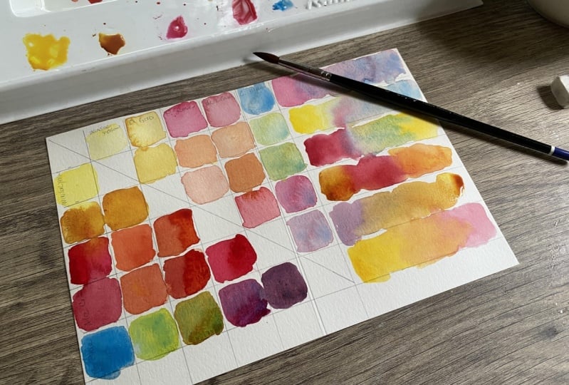
7. Painting the Pure Color Swatches: Yes. A color chart? I'm all set. I have my paints ready. I have my paper. I hadn't lined up
on this side here. I can turn it and have
them lined up on the top. What works for you? And I have them
in rainbow order, even though I don't have
all the rainbow colors, they are in rainbow order. And I have brushes
to choose from. Now, normally, when I'm
painting a painting, I try and say, use
a bigger brush because it will help
you be more loose. But in this case, I want to use one holds
less water because it's going to be easy to
manage in my squares. I have a smaller version. I have this number ten,
Princeton, Neptune. I can use this, but this holds more water than my Da Vinci cosmic
topspin paint brushes. So I'm not going to use the Neptune has lots of water
and I don't need as much. But then I have these three. These are called The
Vinci cosmic topspin. They're great brushes there. If you're used to the
Princeton Neptune, which I use a lot, these have a little bit
more snap to them. They're a little
bit more springy, a little bit more firm, and they don't hold
as much water. So they're great for
making this flowchart. Now if you want to make, you could use a flat brush
or this is sort of a hybrid, kind of a I don't know
what it's called. I don't know what
the shape is called. It's it's almost around, but it's also flat. And then this one is around. So I think actually
I'll just use this one because it
seems like it will work, but I can always switch
later if I need to. Okay, so let's refer
back to our chart. And let's see, we're
gonna put paint one here and paint one here. Paint one and paint one. Hate to, and paint two. And we're going to
do it in that order. So that way we're only touching the color wants
and we're going to do the top and the sides, all in the same group. So let's do that now. I have my two jars
of water. Two chars. Want to keep my brush nice
and clean in-between colors, because I want is pure color in the middle as
I, as I can get. If you want to, usually I write the names of
the paints afterward. But if you want to,
if it'll help you, you can write the names of
the paints in the boxes. Before. I will start with the pink one, which is my pyrrole red. And I'm just going to
get a pretty strong, not much water, pretty strong. And I'll just put it here so
you can see, there we go. I've got my scarlet
payroll all ready to go. I have enough to do
these two squares and I can add a little bit of
water as I go, I want. So I'll just start here. And I'm not worried about going all the way straight
to the lines. In fact, it might be
better if you don't, Just because you're going to not run the risk of touching the paints
together when they're wet. So I'll add a little
water to my brush so I can get a little movement, tap it off on my cloth. I do have this microfiber
cloth which is very sorbent. Then I can get a little bit of colorful colored
float out nicely. And it not really
demonstrating that in this particular
exercise, but it's fine. I'm already having fun. Okay, next, wash your brush
in your first jar of water. Wipe it off. Watch it again in that
same first DR. a. Water wipe it off and
then go to your jar. They sister dirty jar and
Mrs. your clean dirty. And what you wanna
do is keep most of the paint that just
coming off your brush in the dirty jar and as little
as possible in the clean, a clean your brush really
well in the dirty jar first. So that'll help you
keep your paint colors. Sure. Because in this particular spot, that's what we're doing on this section of the color chart. Pure colors. The pure color. So this is the bismuth yellow? Yes, bismuth yellow. It's a very, to me that's
a really neutral economy. Yellows, not too much, a little warm, not
too much on the cool, but of course all the warm, cool idea, That's all. It's all relative. So painting in my squares, not going to the edge. I don't want to touch
the other color and have them run together. In this case, it keeps
painting, I would love that. But making this
chart, not so much. I'm gonna get some
water and I want it to be clean water to my
brush really well. And clean my brush here. Tap off. I don't want
that much water. Some. Okay, So now I think you
can see the pattern. You same color, same color, same colors and color.
I'll do one more. Maybe do more. I'm going to do them all, but I might do more
in regular time. What do you think? Should I do them
in regular time? Okay. This is permanent. Rain, hail or mint
green pale. This one. Some very yellowy
green, isn't it? Might call it a warm green. Again, I want to get
a strong colors I can lean and a lot of
words that town, I don't want that much water, so I'll just take you over here. I dried my brush so that will be thirsty
and pick up that water. So sap green. Now, you can get very sciency
with your watercolors. And you can write down what
pigments they are and how opaque or semi-opaque are
opaque and all that stuff. You can do that on these charts. But I'm just keeping
it simple this time. My brush really,
really clean and then trying to get as
much pure thickness, I can dry that off because last time I didn't
do a very good. And here we go. Kinda gives us a range
of how it looks. Also tells us how much
the color will move. But you may look at this. It's got to bloom because
that color just didn't flow into the water very much right there, but
it did flow there. I don't know why. Well, actually, I do know why. It has to do with how much water was already in the
paint on them on there, like the evenness of the water. But the different, That's a different
class, different lesson. Alright, so now we're on to my beautiful
favorite Cobalt Teal. There we go Again, we want that deep as deep
of mixtures we can get. While it's still has water. Yes, I dipped into
my clean water. That's because I knew I
didn't have enough water on my brush and I'm just
going to absorb the water. It did get my did
get some blue in my water bill because
I'm I'm almost finished. And I only have this
polar left, right? Okay, so Cobalt Teal, as I said before, be as
careful as you want. You can go all the way to the lines if you like
doing it that way. I just like to keep
it relaxed and fun. And it's just to me
better that way. But that's me. Know, if you want
to be very precise, please feel free to do so. I have a feeling if you're
watching my classes, maybe more interested in
loose watercolor anyway. Okay, so I have
all of my colors. I have scarlet, pyrrole,
bismuth, yellow, permanent green, pale, sap
green, and cobalt teal. Now, now the real fun
begins because we're gonna get to see how these colors work in mixed together
and has soap. So fun.
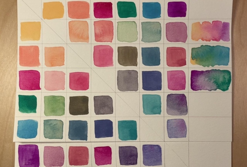
8. Our Approach To This Chart: Hello. I'm all set up down to
fill in my squares. And let's refer
back to our chart. And I'll tell you a little bit about what I'm going to do. Now. I have decided that I
want to put dark mixes on the bottom and light mixes on the top of this
diagonal line. That's just because it tells me a range of
values that I want. Now, these may not
be super light, they may not all be
the same lightness or the same darkness. I don't really care
about that personally. But I want to make these
strong and these less strong. That's the main thing I'm doing for this particular chart. So this Park will be dark, this part will be lighter. But the colors, I mean, you'll be using some
of the same colors in opposite squares. So it's like this
mirror image here. So for example, Paint 3D
and paint two goes here. This will make more sense when we put the colors in there. So I'm going to explain it, but I just wanted to give you an overview of what we're doing. So Paint 3D Paint Tool go here and paint and paint
two will go here. I'll use a dark one in this space and a light
one in this space. And we'll have this diagonal
mirror image of the colors. So paint five and paint
one will go here. And paid five and paint
one will go here. So if you folded it, these this color and this color, they're the same color, but they're different
lightness and darkness. Only difference is how much
water they have in it. That's the only change
we're going to make in this particular chart. Now there are other
ways you can do it. But this is where this
is the most basic way. I think. That's why I'm
presenting to you this way. So there you go. These will go together. These will go together.
So it's a diagonal Flip. Let more water,
less water, okay.
9. Painting The Mixes with Scarlet Pyrrol: Yes, a color chart. The first color we use, we're going to use
scarlet apparel. And I already have
puddles, right? But I actually need, I'm going to mix this
with 1234 other color. That means I need a color or a spot on here that I can
mix with the yellow spot. I can mix the green spot, I can mix with the sap green
and spot I can mix with it. So I need 1234 areas of
the sporangia and it's easier and you do like lists changing around if
you just start that way. So I have one right here. It's a strong one. I want strong ones because
I want to do the darks. And then I'll add water
to do the lights, but I'll do at the same
time. I'll show you. Don't worry, you've
got this, don't worry. You can do it. Alright? So we need one for each
of these colors on 1234. And you can see
they're strong mixes. They don't have a lot
of order infected. Not even moving, right? Not even moving. It's okay. Alright, and I'm going to
clean my brush really well. And in fact, if you wanted to, you could have separate brushes. They have one brush for
each color. Am I gonna do? I'm just going to clean
my brushes in-between. Right? But especially for the yellow, you know, you need
a clean brush, okay, so I'll mix the
yellow with this. Piracy is put together.
Here's my yellow. I'm kind of trying to get equal. Strings. Somewhere in the
middle is what I'm going for. Now, you may have to add
more or less yellow, more or less of the warrant,
the scarlet chiral. It's up to you. I need a little more water. I'll dip in and get a
little bit more wine. Get that, Pete. I
like this color. It's a nice like pumpkin, orange. If you want
to call it that. And it's going to go
where the orange, I'm calling this orange
bit scarlet parallel or the scarlet Powell meets
the business yellow. And it's called Carl
meets the visits yellow. This is my dark mix. So I'm going to put it on
the bottom of my chart. That's all I did.
You go and you have a nice little swatch of color that you mixed
from these two colors. Now, I just need
to add some water. They have options here. If you want to keep
your water really clean, just going to drop her. That way you don't put your paint brush in
the water too often. Okay. And then you can
see it's moving more. I just want to put like
Tableau drops those two more. So it's going to be probably
quite a bit lighter. So you see it moves a lot more. This is a great
way to learn also about the viscosity of your
watercolor because see, the port wasn't
moving at all, right. These are even
derive dry already. Okay, so that is
quite a bit lighter. I'm just going to go orange and yellow for simplified reasons. And now that's much
more transparent. Say that's another
thing we can see. How much transparency
are we getting? I'm going to just do like I did these swatches in this top area, and I only have those
two colors right now, so I'll have to worry
about that water too much. So now I can see I have the
exact same color mix, right? I didn't add any more pigment. I didn't add any more paint. I only added water. And now we can see the
difference, right? Alright, so that's business, yellow plus girl power. Well, let's go to
the next color. Now we can guess, we can try and guess
what we're going to get. We're going to mix the
scarlet power rule with this permanent green pale. And I think it'll
be a brown color, but I'm honestly not sure because I haven't used
these colors before, so I'm honestly not sure
what this plus this will be. So let's just find out. Pick up that green. I have some here so
I can just use it. I'm gonna get a nice
thick consistency there. And yeah, it's gonna
be you at Brown. Okay. But is a warm brown. So the question is,
do I want to add in more and scarlet pyro or more of the green to
see what happens. I didn't want to
add in more than clean because I feel like the Scarlet Powell is a
stronger strength pigments. I'm going to clean my
brush really well. Have two off some of
that excess water. Yeah. It's a real strange color. Well, it's a very
earthy color actually. So now you can see I have more
green than I have pyrrole. I'm going to mess up
my little puddle here. I don't need it for
anything really, so I'll just add a
little bit more. Okay, I have a very
strong color or not. I think I have very strong
emotions about this color, but that's not the point, right? It's a brown. It's, it can be a brown when you mix
those two together. And that's kinda what
I expected because of just kinda where they
are on the color wheel. You're going to get
a neutral could be grey, could be brown. So let's just put that they're not sure how I feel about that. Well, I don't I am sure how
I feel about this color. I do not like there could
be uses for it though. I mean, what could you use
it in a sunflower, maybe. You might be able to do so. Okay, let me add some water. And then we might like it
better when it is more transparent than that's
pretty deep, dark. So this is this and green. So now we need to go to
Scarlet power rule, angering. Remember it's a mirror
image in the diagonal. Let me not turned
on by this book. Like a Ms. Keller, I feel like I'm doing something wrong because I don't
like this color so much. Okay. Who knows where to
find something? Also weight. Okay. So
let me stop and think. This snail looks
like a raw sienna. Now that I have thinned it, it looks like raw sienna, which is a very useful color. So if you're thinking about summer and
summer vibes, well, this can be wet sand or a rock or something
that is a rich brown. It is a very rich brown. Yeah. So anyway, I'm liking it better. If I first gut
reaction was like, but I'm liking it better now. Okay, so let's continue. We're doing our pyro,
scarlet pyro mixes. Okay. What color is next? Sap green. This is a yellowy green. This is just, I don't know,
it's a deeper darker, it's a little blue or green and then the permanent green light. So I just, you know, I think actually I
like the mix better. I'll get this strong mix I have here already
and mix it in there. That's a reddish brown. Let me stick with that. Here. It's pretty strong,
pretty strong mix. There we go. Then I'm just going
to add some water. Again. You can dip your brush in this pretty small
puddle of paint. So I didn't add a Twitter, scarlet payroll, and greens. So you have to stop and think, where does my color go? If you're doing this way? So we're going to spring. It's not bad. I think this could be
like a coral color, a little bit more of
the orange in it. So again, you get lots of
ideas when you're doing this, like add a little
more of the Scarlet, scarlet pyrrole to this green. What would I get? It? You get your creative juices flowing by doing this exercise. Okay, Next is spiral
apparel and Cobalt, Teal. What can you guess? We'll come out of a an
orange or bright orange and a blue-green. I don't know. Let's find out. Make sure my brush
is really clean. Me use this puddle
right here because I already have it.
It sit right in. Again, we have a red, yellow, blue, red, and yellow. This is blue and yellow, red, yellow and blue
mixed together. So we're going to
get a neutral feel like I need more of both colors. So let me do that. Being my brush again, pick up some paint
from the year. Well, I think he could do a
whole color chart of this mixed between these two
because look how interesting. It's like a slate
gray, blue-gray. If I get some more scarlet
firewall that we're getting. Interesting, trying really hard not to contaminate my
fillers with each other. Maybe the hardest
part of doing this. So it goes from like this. I don't know this. I can't
even describe it anyway. This is sort of, it's definitely a great That is definitely very interesting,
very interesting. Gray, if you ask me,
will look at that. I think that's gorgeous. Okay. Um, and then do, oops,
I have to add water. We add water. Now, this cobalt
teal is granulating. So also think you'd get some interesting effects
from the granulation. Okay, So this, this and
this. So there you go. So thank you may get
some color separation. You're gonna get
some granulation. Really, really interesting. Just clean my brush. And to me it's
super interesting. It's a super interesting
color, color mix. We go. Okay, so now you
can see I've done one color with all
the other colors. And one has less
water and one has more water and I
have here and here. So that's the way it works. It's like an L shape right? From inside to add
upside down hill. How about we call upside down L? Right? It's sort of like an L-shape and it reflects across
this diagonal line. Okay, I'm going to continue.
10. Important! Clean Your Palette: Okay, an important
key before we go on to the next color used
to clean up our palette, because we have all of these color mixes
there to call it, there are two of our colors
already mixed together. So all I'm going to do
is take some tissue, just going to wipe it
out with my water. So I didn't get that.
No, not really. It comes right up
right off the reddish. Why am I leaving that one? I don't know. I don't want
to leave it actually. I want to just two colors for
every one of these squares. So it's important to
clean your palette in between all that paint on there. Okay, There we go.
11. Painting The Mixes with Bismuth Yellow: A color chart. I did go and change my
water route in-between. I know that's
completely necessary, but I'm just trying to be
like extra extra cautious. Yeah. You don't have to
necessarily do that. You just need to for
sure they'll have the two jars of water,
the dirty in the clique. Okay, so now we're going to do the yellow with
all the other colors, but we've already mixed the yellow with the
scarlet pyrrole, right? So we don't need
to do this color. And we don't need to
do yellow and yellow. We're leaving that
blank, remember? So we're going to do
yellow and green. Yellow. We don't need
that one in green. That's the color we're
doing right there. We need three puddles of yellow, 1231 for each color. Alright, so here we go. I'll make my puddles. Well, I'm put it
in the wrong spot. It's easier if you put
it next to the color you're going to take from, again, I'm making
these nice and thick. I mean, they do need
to have some water and I don't want them
to touch each other. Yeah. There we go, one
from each color. Now I'm not even going
to use these anymore and I could have clean
them up but I didn't. But I'm not using them because they are contaminated with them. They're contaminated
with scarlet pyrrole. So I don't want to
use these pedals are there on my palette. So I need low and
permanent green light. So I'll go here and get, you know, not too much
water on my brush. I tried to tap it off,
clean it off a little, get a thick mixture and
go into that yellow. Now, there's something about color strength that you've learned when you're
doing these charts. Because now we have the
screen and this yellow, and they're actually, they could be pretty equal
in color string. So May 1 not
overpower the other, but this scarlet
pyrrole overpowers this yellow takes a lot of yellow to change the
scarlet pyrrole, but it's not going
to take much green, the green and yellow
kind of equal. But like these darker colors, It's good to take
a lot of yellow or a tiny bit of the darker
colors to do our mixes. So there's something
to keep in mind. So let's mix that. So say I have nearly
enough yellow because I actually
had just too much green because it
completely took over. It looks almost like the original clean my
brush really well, this is just something
to be aware of. It. It doesn't hurt anything. You're not gonna have
any problem here, this part of the process, right? Part of the process. So it's part of warning
about your paints. You're learning more and more about your pants as you do this, but just exciting because
then when you use them, you can go off your intuition. You can go off your gut
because you already know. Or you can also look
back and go, Whoa, what wellbeing great color for this project
that I'm working on. And you can see, yeah, okay, so I need more
yellow because that green totally took over.
I use too much green. So I've got some thick yellow. Alright, now we have
a pretty good mix. I think that's a pretty
good base because this is a this is a yellowy green and
this is a yellow. So we've gotten a lot of yellow. I think that's a
pretty good mix there. So let's do that for
our dark yellow. There we go. That's like lime lime
green right there. I think. Yep. Okay. Then we'll add a little
wider couple of job loss, but one job, I have a lot
of paint on my brush. I couldn't use a smaller brush. Pests like using
this, this is fun. It's working. It's
working great for me. It doesn't have too much water. It's not making a lot of
blooms and stuff in the paint, like there's not puddles. I didn't want petals
for making this chart. Okay, so green, yellow, and green right here,
the light color. So again, in referencing
color string, you can see that there's not
a whole lot of difference in these two colors as
far as like strings, they're like rural
similar in a way. That's because this doesn't
have a whole lot of coercion. That's kinda separate class, I guess poets shrink, but it's just something that you learn. You're learning
about your paints. And you don't have
to necessarily think of it in terms of color Street. But it's just, you can
think of this is not, this is not going
to change a lot. Adding more water to it, it changes some but
not a lot, right? You can just think
of it that way. Just know these things. So then when you paint, you'd be like golden, you're guilty. You paint something
other than chart. Okay. So next, we need What
Tell her we doing yellow. Yellow, sap green. Now, the sap green is very
strong compared to the yellow. So we know we don't need much. I'm just going to tap the
tip of my brush in there. Get a little more. It's pretty good, I think. Otherwise it's just
going to be very, very much that sap green color. So I think I'll go
with this and we'll just see what kind of
different kind of yellowy green we're getting with this mix instead of
the green and yellow. Green and yellow. Some water. Then this yellow. You don't have to do that
every time it just helps me. You can just go oh, I went
there last time I go to the next when their last
time I'll go next. You can do that if you want to. Okay, so there's a
difference in these. Just gonna do this for fun, fun, fun, fun piece paper. Here's a random piece paper. Still kinda pretty
much the same color. Just slightly darker. That green is just
really strong, so the yellow doesn't
have much effect on him. That's that's kind of the
way I feel about it anyway. Okay. So we have one wrong color to mix with our
yellow and that is our cobalt TO little bit
of that again, are yellow. Does it do a lot
tinting strength? I'm not mixing and all that
yellow because look at that. That's a very interesting. Even though it didn't have
a lot of water in there, it's still a very light
color and very transparent. So that's pretty interesting. I don't want her drop. Maybe I'll add a
couple of water drops because my brush
absorbed the water. Vestibule light. I like that. It's
really interesting. So I just want to see, oops, I went into the
R-square little bit, sets a really light mix. Let me see what happens and then just go a little bit more. There. Again, I'll do this. Watch here. See it's about the same color, but it's a little darker. So that's just shows that the yellow is not
a super impactful. It does make a difference, but does that make
a huge difference in the darker colors? That's why you can pick yellow
first and then go over it. And you'll have a
sort of a glow. But it won't affect the
other tours that much as far as like their color are. Right. Okay. So next we've done
all those next, it's time to clean up clean
up this folks right now.
12. Painting The Mixes with Remaining Colors: Sarah, next color? Permanent green, pale. Okay. And we only have two other
colors to mix it with, so we just need to puddles of permanent green pale,
which is this one. So we need one big
number changes. So you can see as you go, it gets faster and faster. Do the chart at the beginning. It's more because you
have more mixes to do, but you've already
mixed some of them, so then you have
less and less to do. So you only have these two
instead of three secrets, smaller as you go. So it actually doesn't
take too long. Now it's taking me a while
because I'm doing a lot of explaining and also reacting. Because I love them.
I love the pain. Okay, So I need to
mix this green. Nothing goes here because that's where the
green is intersect with this green. Let's
find out what happens. It's a mystery. Now, this one is super
dark value wise. This one is in the
middle value wise. And as far as color string, this one is stronger than
the permanent green, so you may get a
different color, but this is taking over. I use too much of the sap green. It's easy to fix
that thing and you just clean your brush
really well, no problem. And get more of the color
that you're lacking. In this case, the
permanent green light. Alright, so somewhere in there, That's kinda, that's kind
of a good mix of those two. It's kind of in the
middle somewhere, so I'll go with that. It goes here, the dark
version goes here. The reason I'm putting the
dark versions at the bottom is because that's the way the dark versions
they have the weight. I wanted to get some
more dark green. You're going to be darker because I was
talking about darker. Okay. So that's why I put
the darks of the bone. It looks visually
more appealing. It doesn't feel like heavy
at the top and the bottom. So anyway, that's just a
composition tip for you. All right. It's more water. Maybe even a little more water. Got a puddle noun. Oh yeah. There we go. And then that one is going
to go here and here, here, here, and here. Reminds me of the
periodic table. I don't know why, Because you don't do that in periodic table, but it does have rows
and columns of things. I don't know, I'm
not a scientist. I'm an artist. Look at that as a nice, that's a nice
neutral light green. Like. Look how much darker
this one is. This one. This ones with the yellow. This one is with the
two greens together. So far with this particular set, we have a lot of
greens to choose from looking at
all these greens. It's a lot of greens, but that is kinda be
expected because we have these greens, right? So you know, that's
going to happen. Alright, so now we're going
to be the Cobalt Teal. There. Yeah, that's my puddle. This is a little
stronger but not much. So I'm getting like a puppy, like almost a neon
neon green here. I'm gonna go with that home. I could add more or
less of either color. Right? It's like a
Kelly green, I think. I don't have much water
in my brush shape there, so it's kind of dry
going on there. That's okay. Let's add some water to my
brush can absorb water. Second, three drops. Now, get a nice light mix. And where does it go? We have our we have our
permanent green light right here with cobalt teal area. Now, I'll go back at
the end and talk about these color mixes
after they're dry. So you can get an
idea of what I think about when I'm
looking at them yet. So hopefully that'll
be helpful to you, but that's going to be later. Okay. So we have our two
mixes, That's it. We only needed to puddles. We did here. We did our mix. Ands
are getting all. Here, right? So we have here where they meet. And so it gets a little bit
more confusing in a way, but in your space gets smaller. So here you can see that's
a Kelly, Kelly green. I'm looking at these
colors on my goal. I'm seeing some
interesting things happen. Like I said, I'll talk
about that later. Alright, So I don't really
need to clean up these petals because I have this
next color to do, which is sap green. This is empty with cobalt teal. Alright, that's the only
color I have left because this is an empty
square, this md square. So we just have this, this color, these two
Sap Green, Cobalt Teal. So I'll just make a puddle
or Saverin only need one. Notice we had fewer
petals as we went. Nice strong puddle. I'm calling it a puddle, but I'm not really putting
a lot of water. And then I'll just get a
strong with this to mostly what happens a little bit more. Now I'm contaminating these, I'm not worried it's
my last mix so I can have more freedom. I think I was just painting. I wouldn't worry about
getting colors in these except maybe the
yellow I would try and keep. Otherwise I wouldn't care. Okay, so dark mix right here. That's like a sea
green kinda cover. I'll see if I put more of a not supposed to be doing that. But anyway, I did it a bit
more of the blue on this part. So you can vary these a little
bit with this way I was choosing to do and
he got off track a little because I'm
not good at Falling. Water. More water. We go. I really hope you're having fun. I'm having fun. So I hope actually you'll
just turn this video on and then play it and do
your color swatches. Pause it as you need to
do your color swatch, turn it back on, we'll
talk about it just fine. Okay, so this is the watery
mix of the same Sap Green, Cobalt Teal, both strong colors, although the sap green is
very strong on this palette, There's a very strong color
in this palette of colors. That, and I'll do a little
bit more water at the bottom. Because I want to see how the
lighter version guess why. Our official color chart is telling our official
color chart is done. It's Isn't that awesome? Look at the color
mix. This you get. Now these are not
the only color mixes you can get, right? Because these are kind of
an even mixture in a way. I tried to get it like halfway between when I was doing these, she could do all
kinds of color mixes. So this is just one example. I'm super happy just
looking at just the colors. Just make me happy. I hope they make you happy too. So I am looking forward to
seeing your color charts. It's gonna be amazing. I really hope you'll share them with me, but please share them in the discussion section or whether you share them
on Instagram with me, just tag me, discuss and
there's art can be bad. It was.
13. Playtime - Painting Color Bars: So now that our official
color chart is done, Let's pile and we've got
place-based over here, which is one reason why many bigger piece of paper because
I thought it would be fun. So one thing I'm going to do to play is going to
take this color. I'm going to start with it. Then I'm going to add
all the colors as I go. I'm not going to
worry about keeping my palette nice and pristine like I've been doing
while making the chart. I needed to do that for
the chart at don t have to do it anymore. If
you wanna do it. If you want to keep
your palette clean. Mile means we want
to keep the colors very point by all
means, do that. But I'm not concerned about it. So I just wanted to play
let loose and have fun. I'm gonna do that
here in this section. Alright, here we go. I'm going to start with
this scarlet power rule, and I'm just going to
go straight from here, add a little water and get
it go in because that's fun. My brush really well, get the yellow more water to it. So let me just do that. See now have it
moving a little bit and I'm just gonna
go right in there. Then pick it up now
a little bit more. Now I may not get all
these colors because, you know, but I might not know. Let's find out. Once I find out, I'll look back, rain,
push that yellow back. Did you see that? Did
you see that happen? Maybe I can replay it. Next is the sap green. Last but not least, my favorite. Okay, that'll look, we have such a fun little
array of colors. Now you can do that
same thing again. You could start with your yellow and then add all of
these colors in. But we kind of have
that here already. So you could just
make some notes here. You can do some
other color plays. You can say, well, I really want to see what
happens if I progressed from yellow to say, cobalt teal. So we can just do that. This is going to be yellow to cobalt teal with none
of the other colors. You can do whatever
colors you want. But I think it's just gonna
be very interesting to see. So that's the one I picked. You pick the colors you want. Try not to go over
the lines because then you'll get into
the next section. Now I'm adding more water. I started with a strong yellow
mix, adding more water. This is bismuth yellow. I'm going do the same with
the cobalt turquoise. And sometimes you might
want to turn your paper. I'm going to turn
my paper in this case just because it's easier. Hello, more water by dependent on dipped in the
clean because it's really, really dirty and I don't want to get all that green in there. And this brush is thirsty, so it's not going to release a lot of pigment
into that water. It's going to pick up the water and drink it up
instead it's thirsty. All right, now, might use gravity to move that
around a little bit. Keep in mind this is
going to move to, because it's still wet. We could do some
mixed in our palette. And this is why you
can do with this, just playing with
it and go back in. This is all still wet. So I'm doing a
little mixing with my brush there in the middle. You can use gravity. You can do however you like. Remember however you want. There you go. So that's a really,
really interesting. I think that's really
interesting when it's dry, it's gonna be really,
really pretty to look at. Okay. Got a few more spaces out if I want to fill them
all up right now, I may want to leave some room
to experiment with them. But I'm looking at my chart. I'm going, well, what is a really interesting
color mix over here? Something that I'm seeing that's happening on my chart that I find compelling and interesting. And really there are some
very interesting ones. But this is a very unique
kind of thing going on. It's got some color separation, It's got granulation in there. So I think a transition between these colors
would be cosine. So let's do that. I'll start with cobalt tail because
I already had that going. I'm just going to find, or do I want to
start on this? Now? Now it comes to like, Oh, do I wanted to match or do I want to do
something different? And I think I wanted to match. So I'm going to
turn this around. So starting with
the cobalt teal. But that's a nice,
really thick mixture. Now, not being perfect because
I am far from perfect. I'm not a perfect painter. I don't want to be
a perfect pain. Can be a loose teacher. It's just being, you want
to be a perfect painter. O means precisely
fill in the lines if that's what you enjoy,
that's what matters. Okay. So we got that Cobalt Teal, it's nice and juicy there. And let's get the scarlet
firewall. Now want it to move. So I'm going to make
sure I have it. I'm putting on my
palette and I make sure that it's moving here, that I have enough water
that's actually moving. Some of the mixes
before remember, they were not moving, they were just seeing him. They had some water but
not enough to move. So I think that'll work. Then we're going to start here. Quite strong color. And I'm just gonna go
straight into my cobalt teal. Just let it trickle in there. No, I'm not trying
to find out who is more bossy in this case. I'm just trying to
see what they do when they mix together and use a little gravity
in my favor here. Look at that. This is gorgeous
thing is a gorgeous gray. Like it's almost a purple, which kind of surprised me. I think that might be the most surprising color in this set. Okay, so that's just a
fun thing you can do. You can look at your
chart and I want to see more of these
two colors together. Say I want to see this one
and this one together. How, how will they
go together if I wanted to paint a tree? And I use these two colors, like, what range would
I get kind of thing. So you can do that also
really interesting color. There's so many
interesting colors. I'm excited. I'm so glad
you guys choose this. But the other, the other
said it's nice to you, but I'm having fun
playing with these. These are just
really rich colors. And here are quite summary. So I think the name
is appropriate.
14. Thoughts On The Colors: My thoughts on color
mixes for this chart. And I'm just going to keep
this short and sweet, I think. So. I love the colors. They definitely
say summer to me. I see some white coral
kind of potential. Some purple, purple me crazy, that I didn't expect. That's the thing about
making these contracts. Sometimes you get
things that you didn't expect in
their wonderful, It's sometimes you
get things that you didn't expect
and you're like, I don't know about that. But it's still could be useful. So that's the thing
you might let her go. Oh, I know exactly where
to use that color. I remember it, so
that's just helpful. When I do notice
about this palette is very heavy on the greens, like this whole session. Green of some sort. So it's very heavy
on the greens. So if you want to paint green
something greens, you can. Now, I could have possibly
made a stronger mix between the greens
and the Cobalt Teal, adding more cobalts
and make it a more green color, right? So that's a possibility that I could do and I
could still do that over here if I wanted to. Just say, Well, how, how what what range
of color for blue? Because this is your only blue, is this cobalt teal blue brain. It's the only blue you have. What range of blues can get. If I mix it, say, with, with one of these greens, wait, and with even
with a yellow, right? So there are options there. If I was trying
to go from blues, I would pick one of
these greens to mix it over and make a bar of color. What kind of green? I think this one is
pretty interesting. So I would choose these two. They are equal or close
to equal in strength. So I might choose
these two to make a bar over here,
something like that. Just to get an idea
of the color mixes. I think they're really pretty, you can tell that this is fairly opaque because
everything we mixed it with. You can't see through as much. Now it's not so opaque
that you can't a, can't get that light
bouncing back, but it is somewhat opaque. If you looked it up on their website, on M
Graham's website, you might be able to find
more information about the opacity of the colors, but this one is probably the
most opaque that we have. These sort of semi-opaque
if they're really strong, but they, they, they
all get transparent. Much more transparent the more
water you add, obviously, but, but definitely more opaque. So that's something else that you can learn
from your chart. I noticed some certain things, like you can see some granulation and some
separation of colors. For example, if you can see
those little specks in there, those little tiny specks, That's the Cobalt Teal granulating
and this color and you can see it this color as
well right in there and see, see that how granular sites and separates this separates
from that bismuth, sorry, from that Scarlett,
Scarlett pyrrole. So very interesting to see that. You can see it here as well. See those specs of
blue in that colour. That's just love it. I don't see that kind of
granulation in the other colors. So I think mainly it's
this cobalt teal, the granular sites, which is one of the reasons why
I love this color. As far as color separation, I see some cool separation here. I see a little bit here. I'm here, and a little bit here. Well, a little bit here. I can see it in this with a
yellow, nicely the colors. So you can see it
has this kind of yellow edge on it so that yellow is separated
from the other color. It's not like a
smooth mixed light, so this is very smooth, right? There's no, there's no evidence
of two colors in there. It just a spoof bits, but this one you can see it's more than one color
mix together. I think that's true for
all the Cobalt Teal. And it probably has to do
with the granulation and the properties of
this particular paint because you don't really
see that in the other cell. Anyway, just another
thing that you can learn. Now what you can do, you
can take this information, you got it, you know it. And you can refer back to it
when you use these paints. And you can also
just, you know, it. So like you can take a
pick at before you paint. Just look at the colors,
enjoy the colors. And in doing that, you're going to sort of get
your visual memory going. Then when you paint, those colors are going to
come out into that painting.
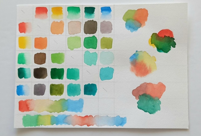
15. Bonus - Another Way To Paint A Color Chart: Yes, a color chart. You're going to make
another color chart. But we're gonna do the
colors a little differently. In the bottom part,
I'm going to do charging in and the top part, I'll do wet in wet and
let it mix on the paper. And I'm just going to speed
through that process. We've chosen to use
three different brushes to make this process quicker. One for each of the two
colors and one for the water. In the top section
will do when wet, which means we're
going to put water, clear water on the paper first. I'll use the mid sized brush
to get the first pure color. On the bottom section
of our chart, we're going to do
charging in which means we're going to paint
a square with color. Then take the second color, which in this case
is the yellow, and dotted into the orange. So we'll have the pure
color and then we'll charge in a second color to
create our swatch. Once we have the two
paints on the brushes, then we can go back to the top section where we're
doing the wet and wet. And we'll just drop
in each color. So we'll drop in, in this case, the yellow and the
orange into the water. This approach to making the
color chart is going to give us even another idea of how
our colors work together. So now we'll be
able to see if we do these techniques
on our painting. How will the colors
react to one another? Once your two squares are done, then you'll need to move to
the next colors in the chart. But the beauty of having separate paint brushes
is that you can keep one of the colors loaded in your brush and then you can
just switch out the other. So in this case we'll keep the orange loaded in the brush. We didn't need to
clean that brush. And we can just clean
the yellow and switch that yellow to the
permanent green light. And then we'll do our
charging in technique. Once we've done the
charging and technique, we'll do our wet
and wet technique and the top part of the chart. So in this way we will
complete the entire chart, will switch from color to color and move
through the chart. Doing are charging in on the bottom section and our wet and wet technique
in the top section. And when you're finished,
you're going to have a lovely chart. It looks completely
different from your first chart because you
did different techniques. So now that, that
colored part is done, Here's another way that you can play in that extra
space you may have. I'm going to do some
three color mixes. I'm going to use the wet
and wet technique and drop colors in just like we
did before on our chart, except this time I'll use
three different colors. You see that's one thing
that our chart doesn't show. It does not show us what happens when we mix three
colors together. In this way, I'm going to play around a little
bit, have some fun, and see what happens
when I put my colors in this wet in wet technique. In the second place space, I want to see how well
these colors play together. Size started on dry paper. I put down our bismuth yellow, I put down or scroll at Pi
role in our car, Cobalt Teal. And let's just see what happens. I noticed that that orange
is pretty bossy over that yellow but not so much
over that cobalt teal. I'll just continue playing
like this and seeing how the colors work
together, move together. Which ones are a little
more bossy than others, and how they interact
with each other. And just finish out this play
space on my paper. For you. You can make the choices
you want to make here. See what appeals to you. What do you want to
experiment with? I tried first I try a wet and wet and then I tried
starting with yellow, then I started with
a cobalt teal, and then the next I
started with the orange. And I use all the same colors in different ways and just to
see what the results were. But you could try
something different. So you just have a
play, have some fun, and just explore your pains and watch them and see what's
happening on the paper. And also check them
out when they're dry and see what you think
and see how they look. And just enjoy the
process of painting. That is the best part because if you don't
enjoy painting, you're really not gonna do it. You're probably not gonna do it. The point of painting is to relax and have fun and enjoy it. And yeah, so have a
play, Give it a go. Try this second way to
make a color chart and do a little play some place
circles and see how your colors interact with
each other and have some fun. Okay, Thank you for watching
and talk to you soon. Bye.
16. Bonus 2 - More Mixes: So I saw these mixes
with this color, this Scarlett pyrrole,
these mixes like this. And I'm just
wondering what would happen if I flipped it and put the other color first and then charged in the
scarlet parallel. Because I love like
this kinda interesting, really interesting
mix of colors. Like to me it reminds me of
a coral reef or something. I don't know why, but
that's what it does. So I'm gonna do a
little quick flip of this and see how that looks. All right.
17. Project & Thank You!: Yes, a color chart. So for your project, I want you to make
a color chart. Now, let me just say you don't have to use
the colors I use. You don't have to use
the pain settings. You don't have a use as
many colors as I use. If this is intimidating
or if it's a little bit too much for you,
well, that's okay. Choose three colors and you'll have a chart that
has the breeding. There'll be this big of a chart. Just three colors. You'll have three spaces
and three spaces. You can do it that way. So if you want to start
smaller, by all means, feel free to start small, but do a color chart, just give it a try. You might actually enjoy it. You might really love it. I was surprised to find out. And I want to see that. I want to see your
projects to share in the project section or on Instagram and tag me at
Jessup has Sanders art. Beautiful friends. Thank
you so much for joining me and I have enjoyed
teaching this class. If you have any
questions, let me know. Thank you for taking my class. Thank you for coming
along with me. I really enjoyed painting and
I enjoy teaching painting. I'm just having a lot
of fun playing with these watercolors and I really appreciate that you
were here with me. And if you enjoyed this, you can go ahead and take a
look at my YouTube channel. You can follow me on
Instagram at Jessup, the Sanders art, and of course, children, you could
tag me, right. So I can look at your art and
we can talk about it again. Thank you so much for
watching this class. And I have more classes
available if you're interested. I have some beginner classes and some a little
bit more complex, but I always try to keep it
light and fun and enjoyable. I love getting
your feedback too. So if you have feedback for me, if you have ideas for classes or if you want to
see something painted, then I love hearing
those ideas as well. So thanks again. I'll see you soon. Bye.
 Jessica Sanders, Artist | Designer