Transcripts
1. Welcome to Class: Hello skillshare. Let's get to know our
mixed media art materials are the actual best. Why not use everything
at the same time? This is why I love
working with mixed media. I can use so many different
materials to achieve different looks and textures and don't have to commit to one. I don't have to be a master of one media but can
dabble in many. I also have very
little self control when it comes to purchasing, trying new art supplies. So this is a great outlet to use everything up.
Can anyone relate? Hi, I'm Christina Chants, an illustrator and
surface designer from Mariefred, Sweden. I consider myself a
digital artist because that's what I've been working
with for the past decade. But I did go to art
school back in the day, over 20 years ago, and I just thought it was the
most glorious thing to be, paint splattered, and my hands were always covered
in charcoal smudges. And it was really just the best. But digital art is really
convenient. It's not messy. It's easier to work with
clients and make all, you know, boring
stuff like that. But I really missed working
with traditional media, and I had neglected
that practice for a long time when I was
just working digitally. So in 2020, I rekindled my love for a sketchbook play and
I started fun Friday. So every Friday I skip my other work stuff
and I just play in my sketchbook all day long. And I cannot tell
you how much this is brought to my creative
practice, my creative life. Like my regular life, I just feel so fulfilled again. And art is my hobby at
the same time as it is, and I just want to
share this with you and that's what we're going to be
doing in this class. We're going to be deep diving into our glorious art materials. In this class, I'm going to be taking you along as I showcase my favorite materials and demonstrate the
properties of each one. We're also going to
jump into color theory, but in a way that is
actually helpful and not the usual red is the complimentary
color of green stuff. Finally, we'll create a gorgeously textured
mixed media landscape together for our class project. I really hope that you're
going to learn a lot and be really inspired by this
class. Let's get started.
2. Why I Love Mixed Media: All right, before we get started on learning all about our
materials and color theory, I just want to share
with you my journey and my love for mixed media
and why I like it so much. In this section, I want to share with you a peek
into my sketchbook and how I have come to
love mixed media so much. Okay? I want to tell you about why
I love mixed media so much. Mainly I love mixed
media because I get to play with every single
art supply that exists. I don't have to just pick one, I don't have to become
a watercolor expert that makes beautiful just
watercolor paintings. I can play around with
different materials and I can just play and
whatever material works best for a certain
texture I can use when watercolor is great for maybe a sky or a wash
or like the base layer. And then maybe a soft
pastel is going to give me that creamy texture that looks like the hills
in the background. And then maybe I need a colored pencil to get some
details such as branches or little like the windows on a house or
something like that. I love mixed media
because we get to play, we get to layer, we get to play with textures of all sorts. Yeah. And I don't have to become an expert in just one thing. I don't have to become
a painting expert or a colored pencil expert. I can just like fiddle around with all kinds
of different materials. Here's one page in
my sketchbook that really shows my love
for mixed media. Here I have used soft
pastel, water color, gas, neocolor crayons
and colored pencils. I think that's it. I love
how these turned out. I get granulation from the water colors
in the background. I get like a soft, gritty texture from
the soft pastels. I get some details in here with the colored pencils
to make everything start defined and so you can see that they're
trees and things like that. I love the layers of
different textures and water based
media and dry media, and this just excites
me to no end. Let's see if, what
else can we look at? I have tons and tons of pages and they do get
messy because this is my sketchbook and I don't always fixatives, but
I think it's okay. I'm just playing and learning. And if I were to do a
piece that I really loved, I should probably fix it. Or I use pieces of paper in between my pages
to protect them. Here's another work that
I've done recently, a winter scene using the pinks during the
winter in Sweden, we have very long
hours of twilight and the skies can become
so pink and gorgeous, the landscape becomes
very pink and purple. It's not this intense, but it's fun to capture, again, with tons of different
media with gash in the background and
water color on top and pastels and new colors for more texture on top of the trees to
show like the snow sitting on top of stuck to the
bark and things like that. Yeah, in this class I'm
going to be going through all my favorite materials and ways that I like to
create mixed media pieces. We're going to be going through all my favorite materials in the next section and one
of the next sections. Yeah. You're going
to hopefully fall in just as much love with mixed
media as I have become. So let's get started.
3. Color Theory That's Helpful: All right, in this section it's time to talk about
color and color theory. I know this section is usually something
that maybe you skip in other classes
because we feel like we've always heard
the same thing. Like we look at the color wheel, we make a color wheel together. I understand that it's red, Yellow and blue are
the primary colors, but I'm going to try my best to take color theory
to the next level so that you can actually use it and understand how you
can use it in your artwork. Even if you don't work with primary colors and you
use color intuitively, I swear this section
is going to give you a little tidbit of more
understanding of color. And I'm really excited about
sharing this with you. So yeah, please
watch this section. It's going to be
great. All right, my friends, now we're
going to get into color. And I'm really excited
for this section, like I said in the intro, because I think color theory sometimes can be a
little bit boring. And you just get the basics like red and green are
complimentary colors, or this is when you mix yellow
and blue, you get green. And that we learned
in elementary school. But how can we actually use this as a professional
illustrator or hobbyist, or want an art lover? How do we actually use this color theory in our
artworks to make them better, more harmonious, more exciting? So let's get into that. To start off with, I did want
to show you a color wheel. I printed this out
from the Internet. And then once I realized, once I looked at it, I realized that it wasn't
didn't make any sense. Like there's way too many
pinks and blues over here. Orange is across from
blue instead of N. And then where's the red is
supposed to be against green? Complimentary to green. I don't know who did this one, but completely messed up. I made my own so we can
take a look at that. Just to remember, if you forget, since elementary school, the
basics of the color wheel. We have our primary
colors, red, yellow, blue. Those obviously, they
feel really good to us because to our eye, because we're used to that, we know those are the primaries. They look really good. Blue
usually is a darker color. Red, it's like a mid tone,
and yellow is a light. Then you have like
that value there. We have our complimentary colors that we know a lot
about with red and green and blue and orange,
purple and yellow. But then we have the
secondary colors and tertiary colors such as
purple, purple and yellow. But then there's like
the reddish purple that goes with the
yellowish green. But for the most part, when we look at a color wheel like this, it's always in the
super bright colors. There are lots of artists who work with this color palette. But that's not me when I've learned this
information before. I'm always like,
okay, that's nice. But I don't use bright red with green because that's gross. Was that just doesn't
appeal to me whatsoever? Yeah, blue and
orange looks good. Yeah, sure, But it's
also still too bright. I want to take this
color palette but then show you how you can do it with more sophisticated colors. I have my cup of colored pencils here
and I'm just going to quickly show you some
ideas around this. If we're going to start off with our primary color palette, which is red, yellow, and blue, you don't have
to choose these brights. A yellow can be a soft, oh, that was dirty. A soft yellow that has like some creaminess,
like almost a cream. And a blue can be, this
is a Prussian bre, blue. It's a little bit darker
than the usual primary. But also you could do
a really dark blue as your blue and have a pop of red. So there's your primary palette. But already we're
stepped away from this super bright also. When we did this palette, we even went a little bit further and
thought about value. Here we have this red
and this blue that are in that mid tones. And then we have a light
tone and a dark tone. Then again, you have a really harmonious
palette that's going to be easy to draw with
because you have a light and dark,
and middle colors. With this, you have
so much more variety of what you can draw and create, which is really exciting. What else that we
can have this here. So we can be reminded of the
kind things that we want to do when talking about
complementaries like this. Green and red can pick out
a nice green that we like. These are all considered greens like the yellowish
green to the bluish green. They all go with red. You can split complementary
as it is called, technically the red, You don't have to go
completely across. You can split it to go to this side or this side of
the actual complimentary. It sounds complicated,
but it's not complicated. Just think red goes with green. It doesn't matter
what green here, we have tons of different greens that are a little
bit more bluish, That are, here's a
nice bluish green. We also can think red. What are different tones of red? Red mixed with a little
bit of white is pink. Now, this color combination is a complimentary
color palette. But it's not that Christmas
red and Christmas green. It's a really beautiful, harmonious palette like
this to start with. Then you could put in
another pop of red. Here's a darker red. This is like a burgundy color that compliments this as well. I love thinking about
monotone color palettes. If you have a green,
that you should have like a light version
and a dark version, if we choose here we have another version
that's like a bluish green. It's good to have one
dark and one light. You could even have a
middle tone as well. We have the start of a really beautiful complimentary
color palette. And then you can add
some other neutrals just to have different colors. Like here's a
neutral, warm gray, that could be
interesting to have a nice lighter color or something to fill
out the background. And then it's a dark, let's see, really dark green and
that could be your dark, and it's almost black, but it still has
some green in there. There we have a
really nice palette then what else can
we think about? One of my favorite color
palettes is purple, purple, purple and yellow. Or like the red purple
with the yellowy green. That's one of my favorite
things to play with, this swampy yellowy green. Again, we can do a really
sophisticated dark purple. It doesn't have to be
that super bright purple. And then I have
other light colors. Here's another grayish purple, or here's a little bit
more dark and rich. And then you could even, let's see, do I
have a true purple? Rises purple. It's like a pinky purple. There's a start of really harmonious palette
that's interesting. Again, we can add in
those different neutrals. You can bring in
something unexpected. Here's like a crazy neon color, all of a sudden like why not? Yeah, just continue from there. Just playing in this notebook, I have sketched out
some color palettes. Let's see if I can find
them somewhere. Here. I was doing some of this before. Here again, here's the yellow, blue and red palette. Here's like a creamy
with a light blue, adding an unexpected
colors. Fun. And some neutrals. Let's see also. Yeah, here I want to talk about, this is the color palette of, this is a red, yellow
and blue color palette, but it doesn't have any
of the typical primaries. Let's look at that real quick. I will re enact this for you. Let's see, starting with this beautiful
light bluish color, that's our blue for the palette, I did this creamy
yellow for the yellow, but also for the yellow. I can think about like a
darker, like warmish brown, that also could be
considered the red, then adding in those Burgundies. As our red. So we have the red, yellow and blue just
feels really harmonious. I can't say why, but because we're
choosing the darker, more sophisticated
colors or grayer colors, it just feels more harmonious. Again, let's see you
like a pop of pink. The pink is really, is a red as well. And then we're thinking
about having those dark, let's see which one
of these is like a really dark blue or
this one's even darker. It's almost like a black. It's like the details. Yes, I love it here. Again, talking about the complimentary colors
of red and green, using pink and green color here was with the
bluish greens and like a moby pink or hot pink that works in thinking
about having neutral tones. And the neutral tones can
be greens or pinks as well. Having light colors in your color palette
as well as darks. Here's another version
of the pink and green, using a more like
mossy green with a moby pink and a really
like grayish green. There's like endless
possibilities using this, and I think it's really
fun to play with color. And I hope that
maybe that awakens some ideas for you with how to use the color palette and thinking about
complementaries again. But without having to worry about using these bright colors, just use this as a guide. And you can have the
traditional palette to remember that you can
use like an orange. Let's do one more together if
we're using like an orange, which I don't use very often, but it would be fun to
figure out how to do that. Let's say that this
color is orange. It's a really warmish brown. It has orange tones
and feels too, it's like a ly orange brown. That's more my style than
this bright orange look. If we're going to find a color
that looks good with that, that would be some blue, or bluish green, or
even purple here. If we choose a purple,
what would that look like? That already looks really sophisticated and nice together. We can see what the brightish
blue looks like with that. And that looked really exciting. And like we had up here, that light blue again looked really beautiful
with this tone. I like that here is like a
pink instead of the purple. That looks nice, but let's see more like this color with the green instead
like a greenish. Because the orange look good
with like a greenish blue. This looks harmonious as well. All of these look
great together. You can include that split
complementary instead of we have all these colors that look good with the orange, that isn't even a true orange. We can add some ocher. Lighten it up. Yeah, that is my look and
my take on how I think about the color wheel and how I incorporate it into my work. I think about it
slightly when I am thinking about my color choices. But mainly I use just my
intuition and my color loves. But also is grounded in
sometimes feeling like, why do I like a certain thing? We can also think about
color, temperature and moods. And there's so much
more that you can think about with color, but that is like a
whole other class. Okay, so that is my little
lecture about color. I hope that you found
that useful and maybe awakened a couple of ideas of how to think about color
and the color wheel. And thinking about darks
and lights and colors that are either the lighter
version or darker version, or a little bit more
grayer in tone. And you can think
about not always doing a complimentary exactly across from that color that you like, but you can do one
of the ones to the side also just pick
colors that you like. And usually the colors that
you like are harmonious. They're harmonious to your eye. At least then also when you're thinking
about color palettes, make sure that you are
picking colors that are like mid tones and then some
lights, and then some darks. And then you'll be able
to create artwork that has contrast and interest, and value and beauty. Yeah, that was really
exciting to share with you. Yeah, let's get into
the other sections.
4. Sketchbooks: All right, so now it's time
to get into the best part, which is talking about
all the materials. So to start off with, we're going to talk
about sketch books. All right. Time to talk about all of our, my
favorite materials. And these sections are
going to be so much fun because talking about materials
is seriously the best. In this first section, I want
to talk about Sketchbooks. These are the three Sketchbooks that I am currently using. And there are two different
types of sketchbooks, and these are my favorites so
far, especially these ones. We can start off with this one. This is the Lestrm 19 1917 Art Creation sketchbook. Has white pages that are 100 and I don't know
what do they say, 150 GSM. The super white. This is the square, obviously, I don't know what size it is, 22.5 by 22.5 centimeters. This one has a
much thicker paper than the other sketchbook, and it takes paint quite well. Even though I've been
filling these pages with a lot of different media, especially wet media, that it has been handling it quite well. And I've been filling the
pages all the way to the edge. This is my pretty sketch book. This is where I do
final final artwork. And not just every day sketches, I think because the paper
is so white and crisp, I want to do more final
artwork because Yeah. And then the pages
do feel thicker. So it feels like yeah, just pressured to do
something more final. The pages are really
smooth and again, they take mixed
media quite well. Not tons and tons of
watercolors, super wet. But I usually try to
use my watercolors quite thick or my wash quite thick and it's
just like a base layer. And then I do other
dry media on top. So it's been working out for that sketchbook and I'm excited to continue
to fill it because, because this isn't
my main sketchbook. It takes a while because I
have to sit down and be like, oh, now I'm going to make
a finalized artwork. That's that one? Yeah.
It's a good sketch book and it comes in a
couple of sizes. My other favorite sketchbook, or the one that I've
been using mainly for the past couple of years, is the Royal Talents Art
Creation sketchbook. I have it in two sizes. This is what is it, 13 by 20, 1 centimeter size. It's a little bit
skinnier than an five. And this is the four
size I like both. I do actually prefer
the larger one. I feel like I have more space to move
around and do things. The smaller one, I kind of
feel slightly confined, but what I like about these ones is the price is really good. You get like a proper sketchbook
with a gajillion pages. I think there's like 90
spreads or something in here. But this one I think
for me in Sweden, like $77 and this one's $14 is that's a nice enough price where it doesn't feel
like I have to be precious with every single page. And also, there are so
many pages that it feels like I can do stuff in
here without being like, oh, every page has
to be perfect. Like the other one I showed you, the pages are cream colored and they're
quite yellowy, cream. At the beginning, when I was so used to working
on white paper, this felt really
weird to work on, but now I've gotten used
to it and I do also, that becomes like a barrier
from the white page. It's already like
cream and welcoming. I like it, the pages
are so smooth and nice. And these ones I
think are 140 GSM, so it's a little bit thinner
than the other paper, but they feel quite thin. But even still, it takes
a lot of media as well. I have a older one that
I've finished and yes, it has buckled a little bit from all the paint and
things that I've used, but it's not that bad. Yeah, I really like this one for exploring and testing out different things and messing
around and playing with textures and color palettes
like I showed you and doing. Yeah, just play some
works that are finalized. But my main it's fun to
decorate the covers also. That's what's fun
about these ones, the royal talents, art creation. They come in lots of
beautiful colors too. It's not just a
black sketch book. They have yellow and pink
and purple and mint, green and blue and coral and all kinds of
different colors here. Yeah, again, in the larger one, I can have space to play
with materials when I get new things finalized. Sketches finalized. And here's what I
showed you before. Just play and figure out what kinds of
art I want to create or test a different color
palettes and figure things out. So if I were to create a finalized piece on a
beautiful piece of paper, I've done all the
work in here of exploring fiery things out. I really like this sketch book and I think I'll
continue to use it, but it would also
be nice to have. I do like having
this one for play. And then maybe the next
step is I would do a piece in this sketchbook
with even nicer paper. And then the next next step, when I feel like I've
explored enough in these two, I would move to a final piece
of paper that could be, maybe in the future,
sold as an original or just framed in my studio. Those are my favorite
sketchbooks.
5. Sketching Tools: In this section, we're
going to be talking about my favorite
sketching materials. All right, quickly,
I just want to talk about my favorite
sketching materials. I don't sketch so much anymore. If I do, I'm just going to
use a nice regular pencil. Here's my pencil case. Let's see where I have two mechanical pencils
that I love to use. One has a fine regular, like, what is it, 0.07 nib. And then this one, oh, I don't remember
what size this is, but it's like a bigger lead. You can get really thick lines. These are both from
Coco sport luxurious. To me, it's nice when you get some Christmas money
or something like that to buy something that fell. You want to sketch more. And just playing with this, it makes me want to go and
sketch stuff in pencils. I forget about the
humble pencil sometimes, but yeah, that's a
really nice favorite. Also with this size, I
purchase colored lead, which is really fun
also from Vico, and those are really
fun to sketch with, so you can switch these out and sketch in
a different color. These have a really weird, hard, waxy feel to them, but
I really like them. I have an example somewhere
in here of a page of sketches. Where was that? Here we go, having a
page of blobs of color, and then using a red
sketching pencil on top, just made this so much more
exciting to me than using a regular pencil that is one
of my favorite materials. Then finally, for an
extra bit of fun, I have they call progress magic pencils for those rainbow pencils
that you've had as a kid. Those are fun to sketch
with and write in your journal or whatever because you get different colors. This is just like for
extra fun, the same thing. I think it would be
fun to do a page of blobs of color and
then just create some sketches of things using these silly
rainbow pencils. Yeah, those are my favorite
simple sketching materials.
6. Colored Pencils: Moving on, I'd
like to talk about colored pencils and why
they're such a versatile, great thing to use in
mixed media pieces. Now let's talk about
colored pencils. I've shown you quickly some
colored pencils that I love. But to recap, I have
this pencil role. I think my favorite brand of colored pencils
comes from Derwent. I love the Derwent
drawing pencils. These are the orange,
they look like this. They're really thick,
like fat pencils, which is just
delightful to hold. But they're also super
soft and creamy. They have those weird, dusty colors that
are hard to find in regular colored pencil packs
or what do you call them, sets I, these kinds of colors. Just the way that they both how they draw and how they feel in your hand. I
really like those. I also, they have a
set called Ink Tense. They have lots of
really dark colors, which is also I feel hard to
find in colored pencil sets. They're always so bright and
light and these are great. They're also water
soluble so that you can wet them and they turn
into some really intense, as the name says, ink. That's also fun to play
with with mixed media. These are really intense colors and those are really nice. But I think sometimes water soluble colored pencils don't feel really
good to work with, but these ones feel
really good to work with. And you can work
over on wet media, can dip them and draw
with them wet like that, Just like a really fun
versatile kind of pencil. So those are the Derwent, those are my favorite,
but like everybody else, I love the caran dash
luminance colored pencil. They just are really,
really creamy. Again, they also
have really like a fat shape, really creamy. And they have all
these sophisticated, weird colors that you don't
get in the usual set. Lots of creamy and
just nice colors. They blend beautifully. I don't really blend that much, but those are the, these are very expensive. I almost don't want
to use them sometimes also has a set that is
slightly less expensive, but I think they're
just as good. I like that the coal pencil
is the color as well. They're a little bit thinner. These are called Pablo. They also have a nice
range of colors. I have the full set of, I think it's 40 here. Again, it's the
main bright colors. But those are good to
have as well sometimes. And I thought it was nice to
purchase those that are in a slightly more
affordable price range, rather than the alumina
which are exclusive priced. Any other brands? I have two whole buying pencils. They're really good. I just
bought the fluorescence. I've been testing out the range. They're called polycolor
because again, these lumin so expensive. I don't want to use them all the time for some colors
that I really like. I have tried those out and
they're really nice as well. These were like a
third of the price. This is, again, polycolor. That's a beautiful blue. I think it was cobalt. Yeah, cobalt. Here's a
nice light ocher color. I have this nice burgundy
that I showed before up here. Burgundy? Yeah, those are my
favorite colored pencils. I think colored
pencils are great. I don't like to use
them on their own. I haven't felt
comfortable doing that. I feel like I always still feels to me like a
kids school project, but layered on top of
paints or markers, or pastels or
something like that, then they start to,
just like I can get all the details that I
want so they're really handy. Another thing that
I want to mention about colored pencils, that becomes like
weirdly addicting. Like you have to
have all the colors. With paint, you can mix your colors to get
the right color, but with colored pencils, you have to have the
color that you want. And I feel like I constantly
feel like I have to update my colors because I
don't have that right color. I don't have that exact
blue that I want. That's something that it's
like a constant struggle and something that I'm
trying to get around. Like I don't know, how do I have like hundreds
of pencils right now, but I always feel like
I don't have enough. So I need to get
into the mindset of, okay, maybe I don't
have that color, but I can use this
color instead, or I definitely probably
already have the color. Just use a different color
or just use another color. Maybe you'll be surprised by it, but that's one thing I think
that I get sucked into with colored pencils is that even though they are expensive, sometimes you get sucked
into wanting to have all the colors or the full set even though you
don't use all that. Yeah, I highly suggest trying to figure out the kinds
of colors that you want and adding to
your collection as you go by having some
darker pencils. Because that's something
it's hard to find in a set, looking for like
darker colors or special colors that you
really like in your work. And working from there and
adding to your collection. As you go, when you create
a piece, you'll be like, oh, I really need
like a dark green. And how many dark
greens do we have? Like this isn't dark enough, then we need even darker green. Here we go. So maybe
one day you'll find it that's colored pencils.
7. Paint: In this section, we're going
to be talking about paint. Now it's time to
talk about paint, and I think this is
like, so exciting. I love paint. I love that I can mix
whatever color I want. And I love how tactile
it is to work with. I love that there's
different textures you can get really thin washes
or really thick and gloopy. I just really love paint. The only downside to paint is that you have
to wait for it to dry and waiting for paint to dry is like
watching paint dry. It takes forever. It feels like it takes forever. That's why it's nice to have
multiple sketchbooks or different pieces of paper
that you're working on so that you can get more done. So the kind of paint
that I like to use is wash paint or water color. We can look at my
watercolor first. This is my I have a
regular Windsor and Newton set that I have then added to. So it has the regular
primary colors that I came in the set. I don't remember how many,
14, but I've added to it, so now I have a GaglianHwever
many are in this. This is my color palette. If you're interested, I have from different
brands as well. I have the Windsor Newton, like I said, The metallic
ones are from Vango. I have lots of granulating watercolors from
Schmik I even have now started to test out
these big pans are from a Ukrainian brand called Rosa,
and they're really good. I'm really into watercolor
because I love how portable this tiny palette is and I have all the colors
that I could ever need. I love that I can get
slightly thicker washes. I love the granulation
you get with watercolor. I also love mixing this with guash so that I
get those washes, but also some areas
that are thicker. Okay. Instead of just
talking about it, I think we need to start
playing with actual paint. So here, I want to show you the Ukrainian ones first
because I was really happily happily wants it surprised by how
beautiful these were. For the price, they were
very cheap, I'd say. Like, for a full pan,
it was 28 crowns, which is like $2.80
for a full pan, and they're so creamy and
such a delightful color. This olive color gorgeous. These super granulation colors, I think, are
delightful to watch. This is the tundra
violet color by Schminke and it is so fun. Like It starts off
looking like this, like grayish purple. But then it starts granulating and it has
these warm brownie tones. We'll add some more water in
there just to p with that. There's different tones.
There's this forest green, I think it's called.
Tundra green, sorry. That one also
granulates beautifully. Glacier green is amazing. It's like a mermaid color. It's this beautiful
turquoisy blue, but then it has these
flex of pink in it. I really like
watercolor for that. It's fun with stuff like
metallic water color. Well that didn't show up. Here we'll do it darker. Here's a bronze to
bring some sparkle into your works that I
how fun is that. And Yeah, that is watercolor. I think we all know
and love watercolor. But I think watercolor sometimes is used really preciously. It's used so like
these washes or it's always like loose florals. But you can use watercolor
in quite a grungy way. Use old brush. Use it quite sick,
lots of layers, and then with mixed media, we can get on top of here
with colored pencils and crayons and pastels and Yeah. All kinds of fun stuff. And are you getting
you're starting to see the granulation
happening here? It's pretty spectacular. So that's my love
for watercolor. Here we can get some gorgeous granulation going on in there. Okay. The next step we have guash, and I have two kinds,
slash three kinds. Starting off, I have
this guash pan set, and it's kind of like something a hybrid between water
color and guash, I'd say, because it is a pan. You can't get really
thick colors, but it's still more opaque
than regular water color. The only difference
between watercolor and guash is that there's
more pigments or there's a different
kind of binder in gas you get more color. It's more opaque.
I'll try if you just work the pan a bit, you're going to get
more thick color, as you can see here. It's more it's opaque. It's not a thin wash
like watercolor. With watercolor, you
would have to do several layers to
get that opaque. But you can also
with this kind of watercolor use it as a wash, if you use less or more water. So that is this color this set, and I think it's really handy to use because it is
quicker to use, and I do like the ability to
use it as a watercolor set, but also get some areas
that are thicker. Use it in conjunction
with my watercolor. So I get those
areas that are thin and have the washes and
then some that are thick. Also, in this palette, I've squeezed out some colors that I enjoy that weren't
available in here, like a turquoisy color, and then these are tube wash, so then of course, I can
get a thicker consistency. But I just block
plop them in here. I have a nice turquoise, a really bright purple and a super hot pink
that are fun to use. When these run out,
I think I will use this kind of water. I think I will use this
kind of gas to squirt into the pan so that I have this
kind of palette going. But having tubes like this
gives me the ability to mix a lot of color if
I'm going to do a big background or
something like that. I also buy large tubes of white guash
because that's one of the colors that I
definitely go through a lot because I do
like my pastel colors. This is a really
quite cheap brand it's just like a
regular studio guash, but I haven't noticed
anything weird about it and I use it to mix
with my other colors. So that's something
that's good to have a really large white
because these small ones, I would run out in
a couple of days. Okay. That's good to have. Then we have this one, that's a gimmick that's, I don't know, been trending on YouTube or Instagram and
that's jelly guash. But I quite like it. I have to say because
it's nice to have a palette that is
ready to work in. Everything gets wet,
so you can just dip your brush into a color
and use it immediately, and you have a sick coverage. But you can also water it down, can use the palette that
it comes with to mix and create your own colors
and use more or less water. And I've been really
enjoying using these. They were also really affordable
and it's fun. It's fun. They do dry out after a while, and I let mine completely
dry out because I didn't know that if you just add water to them,
they stay wet. But even when they
completely dried out, I added I soaked each pan
and water and the next day, I mixed them around, and
they were goopy again. They're not quite as jelly like as they were when
I just bought them, but they're still really good. So yeah, these are
fun and they have fun colors and it's nice. I especially like to use
these when I'm doing a whole background or want to paint a
little bit more sick. Yeah. These are my
favorite paints, and I really enjoy not only using the colors
straight from the pan, I really, really enjoy mixing. I went to art school back in the day and I learned to mix, and it's really intuitive to me. I also like that when you have
a dirty palette like this, you can find new colors and colors just like get
on your brush that you weren't expecting to use
and it just becomes a lot more artistic and I just
want to do this all day, add colors and see what
happens and layer, that's one thing to mention, because these are both water
soluble types of paints, when you have a
paint on the bottom, if you add water,
you're going to be able to mix it together. Layering can be a problem
if you're doing a lot of layering in your
work. You can do it. You just have to be a
little bit quicker. So if you wanted to lay a different color on top
of this brown, you can. You just have to lay it down quite quick
without mixing a lot. If you start mixing
And blending, it's going to blend together
with the other color, and that could start to
dirty up your painting. So that's one thing
that people complain about with traditional
gush and water colors. That's just one thing
to think about. But if you're doing just
laying out some ground colors, and then you can add
a couple layers, but you just do them
thickly or quickly, like I can show one more time. Here's just a green and you
just add it quickly without starting to blend
it in with tons of water. Then you're
going to be fine. Like here is starting to
blend into the paper. Also, this kind of paper doesn't like being blended
and worked so much. You can see that the
paper is starting to peel a little bit
when I did that, when I get it too wet and
I start to mix too much. Be nice to this kind of paper just keep it quick and easy. That's my love for paint. I could talk about this all
day, but I need to stop.
8. Markers: In this section, we're going to be talking about paint pens, watercolor pens. All right? I want to talk about a
fun alternative to paint. If you aren't really into the color mixing and the layering and all the
gorgeous texture that you can get from paint or you're
out on location and you don't want to deal with bringing water or stuff like that. Then another option for getting down lots of color on your
page is like a base layer. Are paint pens. I have water soluble, like watercolor pens from the
brand Ecoline or Choline, and they are fun to use. You can get like big washes
of color down on your page. And they do blend quite nicely. I don't do that so much. They mix into each other. Just keep working it and then
your brush will be fine. Yeah. Give you the ability
of getting down lots of color but much quicker. And they dry in a
couple seconds rather than several minutes that
this is going to take. They are water soluble because
they are water colors, so you can work
them a little bit with water as well if you
want to push them around, if you want to blend
them or something. But I think the main point
of using these kinds of markers is so that you
don't have to deal with water. I just wanted to
mention that in case. Yeah, I prefer paint over
marker just because of all the texture and the mark making that you
can get with actual paint. And also that I can mix whichever color that
I want with markers. It's only the amount of
colors that this brand has. This brand has lots of
brights and the usual, but they also have
lots of these nice, neutrally kind of
colors and gray. It's quite versatile. And then you can mix
other colors on top. Another thing with markers
is that you always get that marker line. I think it can be
a little annoying. And also again, gives me those school art like
a little kid art, but that's also like
charming at the same time. And you can work over with other materials so
that you get rid of those marker lines or they
can be a part of your work. I prefer paint, but
paint markers like this, watercolor markers
are really nice. Another brand that's
really popular is Tombo. I've never tried those.
Windsor Newton have the same kind and fabric
castel watercolor markers. There's also alcohol
based markers. I don't like those
because they bleed through the paper like
crazy. These ones do not. That's all I really
wanted to say about that. There are other kinds
of paint markers like acrylic paint markers like Posca pens and Molto
pens and what else? Ten, what are they
called? Whatever. Anyways, I also try to stay
clear of those because I'm not really interested
in using acrylic paints. But they are good to have if you are finding that you want to layer more and you want
thicker consistency. Yeah. I just want to mention
that that is markers.
9. Soft Pastels: Ooh. In this section
we're going to be talking about my new
favorite material, soft pastels, and why
that's so versatile, and yummy, and delicious. All right, now I want to talk to you about my newest love, and that is soft pastels. I think that they
are just so tactile. I have a set from Royal Talents, is again like a
slightly cheaper set with the primary colors. I have broken them into
different pieces on my desk, in these smaller boxes. Since this box is quite big, I just have them like this. But these ones, they're
just so fun to play with. Because you get, again,
like the markers, you get tons of paint, paint, or color color down on your page and you
could smudge them. You can blend them
different colors together. You can layer them on
top of your markers that you just created to
get more texture. This is from Van Go. Like I said, I also
have the brand or extra soft pastels and they're really
beautiful colors. Again, look, you can just
use them on the side. You can get a hole, lay down, tons of
color like this. Could be a, a lake or water, and they're really beautiful
to work on top of. Pastels are insanely
dusty and messy. It's not a good idea
to blow them off your page because it can go into the air and
into your lungs. But if you tap them on
the side into a trash can or go outside with
them when you want to brush it off,
that's a good idea. Also, you might need to
use fixatives on top. You can use hair spray
if you just want a simple solution or you can use a proper
pastel fixative. I would use that outside, both of them. Hair spray too. I just really love
how I can get tons of color down really quickly
and I can mix them. I also love getting messy and feeling like
a true artist by mixing together my different
colors and get all tactile. I also have a set
from Jackson's. They're handmade
colors and you could pick 14 of your choice. This is the color
palette that I chose. Again, I chose colors
that appeal to me, that don't come in like
a traditional box. I bought really like muted, weird greens and a purple,
really muted purple. These are so creamy, they all have
different textures. And they're all creamy. But these ones are especially
like really smooth, um, really bright blue. You could put that over
here with the blues. I like to smudge them in
and use them like that, but if you had
proper pastel paper, they get the grit better. This kind of smooth paper isn't
really meant for pastels, but you can still use it. Yeah, I bought fun super neon colors because
it's just exciting. This one got some dirt on it. That's a problem with like, yeah, they get all messed up, but it adds to your artwork too. Another thing that I find extremely exciting
with pastels is that they are pigments, like smushed into a stick. You can use them as paints, you can add water and turn
them into a painting. Some of them are easier to
turn into paint than others. I feel these Jacksons are a little bit resistant to water, but once you get them going, you get some incredible
paint textures. Here you can see they resist water look that became
like water droplets there. But if you just keep
going and force them, then they start
to water soluble. This also helps with the dust
problem and they be set. You get some insanely gorgeous
textures when you do this. I love it. I love this so much. I have to say these ones
that were the cheapest, the Vang ones are really
beautifully water soluble. They turn into a
watercolor immediately. This one was one of those. Those ones aren't resistant
to the water at all. Just immediately see if
I can show that to you. Let's do this brownish color. If I add water to that, it just immediately turns
into this gorgeous paint. That's something
you would have to test different brands to see how they work with water, if you wanted to, if that
was interesting to you. But these Jacksons, and
they extrasoft pastels, they do become water soluble
and make beautiful textures. I love them. That's mainly how I've been
using them because I feel like the regular pastel
texture is gorgeous. But it's so messy
using it with water, it just makes it
somewhere in between like paint and pastel. I love that. So exciting pastels also come in a convenient pencil form and that makes it
a lot less messy. You can get small details. These are also water soluble, you can work over
your other artwork. This isn't completely
dry adhering so well and it's going
to rip up the paper. But I choose up here
where it's drier, you can work them
a little bit more. So that's a little bit
more convenient if you don't like getting as messy as you do with the other
soft, regular pestanshew. All right, that's enough about pastels and my love for
those because again, I could go on and on
for all day about this.
10. Neocolor II: In this section, I
want to introduce you to neo color twos. If you've never played
with those before, they're also a
really fun medium. All right, now it's
time to start talking about like the
icing on the cake. Like these are the kinds
of materials that I use only on top of
these other materials. Like we have paint and
markers and pastels that I use on the bottom layer,
like the background. And then we have
the colored pencils that I use for details. But then what other kinds of materials are there that
you can use in mixed media? We can use one that is really fun and nice material
if you like pastels, but you don't like the mess. Neocolor wax crayons. These are the neo colored two. They are water soluble but they don't have
that oily feel of oil. Pestels, They're not
chalky soft pestels. These are crayons for adults. They are just really
beautiful and creamy to use. But yeah, again, they have
a way better texture. These go over anything. They go over paint, they go over markers. Obviously, they go
over the pastels. The only thing that
nothing pretty much goes over N colors except
for neo colors. You can use these, but
you're going to have a hard time drawing
with pencils over them. As you can see,
there's quite a lot of resist because they're so waxy. But if you use this as like
the last layer on your piece, then you get tons
of gorgeous color. Here is wet There, I can show you how
they're water soluble, so you can use them
as a water color too, to get some wash when they
are washed out like this. You can work over
them when they're dry much easier than when
they're thick and waxy. But it's still a material
that is quite difficult. It's notoriously
difficult to work over, but it has like a
beautiful texture. You can get fine
details too with them. You can sharpen them. One tip that I have, if you
do plan to sharpen them, is to save the sharpenings, because those can be
turned into paints. I took this old kids palette that I had that
was pretty much run out. And every time I
sharpen my new colors, I add the sharpenings into
the different color sections. And then you just
spray or drop water on them and they turn into water
colors that you can use. I thought this was such
a great way of not wasting the colors because
these aren't super cheap. It's nice to use them here. You get beautiful thick. Like it's almost something
like quash paints like that. Karen D set it feels
like free paint almost. That's my little
tip for the colors. But yeah, I like they have
a gorgeous color range. I like that they go
over paint gorgeously. But they're also
like thick and have nice texture and
they're not sticky and they don't smudge like
oil pastels or soft pastels. These are really, it's
like a crayon for adults, I think that's and you
can get really sick. Yeah. I just really like them. Neo neocolor twos
are my favorite. They also have a
neocolor one version, but I've never tried that. That one is not water soluble, so that would also be
interesting if you wanted to use that underneath things and let ca wax resist or something that's not Yeah, when you paint over it,
it's not get watered down. I can't think of words. Yeah, that is neocolor. It's pretty
interesting material. I have the 40 set and
I've switched out some of the colors for other colors that I prefer from the main set. My kids love these very
popular, fun material.
11. Oil Pastels: Last but not least, we're
going to be talking about oil pastels and how they're like the cherry on top in
a mixed media piece. Last but not least, I want to, I want to
talk about oil pastels. Oil pastels is something
that I don't use very often, mainly because of
how sticky they are. Then you really have to
find a credible fixatives to make them not sticky in your sketch books or the pages when you
put them together, they just squish together. Or you have to have pieces
of paper or glycine or something like that in between your pages so they
don't get all smoohed. But I still find them
exciting to use. I have this set from
crap that I bought, I think seriously, 20 years ago, but they're still going strong. I also have this tiny
little pentel set with neons because I've
been finding like neon colors really
exciting at the moment. Then I've also been
trying out ran dash. Since I love all
their other products, I might as well try
their neo pastels. I bought a few colors
that I thought are nice. Again, with oil pastels, it's not something that I
use as like a main thing. It's just like
icing on the cake. It's like when you have tons of layers of stuff and
you can't quite get that colored pencil to go
over something like you want a bright pink and
that's not bright enough. Then you have oil
pastel that goes over absolutely everything and
can be your pop of color. Because they really stand out
over on top of everything. You can smudge them in as
well and get another texture. But again, they have the stickiness that is a
little bit annoying and it's going to make
your pages really sticky in comparison
to other materials. Like if you just use paint and new colors and colored pencils, there's not as much transfer. But when you start
using soft pastels and oil pastels,
they're really messy. But again, there is fixative that's also sometimes part
of the fun of using textile, tactile materials
that are gloopy. Let's see, I need to
get this one out here. I bought like a beautiful
green because I thought that would be
beautiful on top of things. To make little details, these ones aren't as
gloopy as these ones. I don't know if it's
because these are 20 years old or if
they are just like a, what's it called, formula. This is like a nice light pink to go over different areas. Or I thought like sometimes with ocean waves you want to
bring in here white. And you can do like
the crashing waves, like the white
foam on the water. It's like a good texture like that is like that exact
texture that I was thinking. And here's like a gray. Just to make shadows. Yeah. Oil pestels are another
fun thing to play with. Again, if you have done a
final piece and there's, you need a couple pops of
color and there you can't get it with your colored pencils
or your no neo coolors. You can try oil pastels to get that last like top of color. Yes, we're finally
gone through all of my favorite materials and how I use them and
every tip that I have. It's time to get into the
actual class project. In the next section,
let's get started on swatching and layering even more than what we've
already done here.
12. Swatch Play: Okay, I know that we're itching to get into
the class project, but before we do, we need to
do some Swatch layer play. We did a little bit of that in the previous sections with
the materials Deep Tive. But now we need to
explore our materials, so we are ready to go later. And we learn new things and we discover new
textures that we love. This section is really
important and really fun. Let's get swatching and
layering and experimenting. All right, before we get
started on our class project, when we're going
to be illustrating a scene in our sketchbook
with mixed media, I thought it would be important
to have some Swatch play. We did spend a lot of time
talking about our materials, but maybe you didn't
play along with me. And I think it's
really important. This is something that I do
all the time to understand my materials and figure out
what kind of textures I like. I have prepared my page here with some swatches of different materials so
that they could dry. We have one guash square, I used the jelly guash thickly, and then I have a
watercolor wash. I have marker, those
equal line brush pens. I have pastel that I wetted has that texture and
then the neo color that I used as a water color, which can be difficult to go
over but usually not when it is wet and a
light layer, yeah. Now we're just going
to take all of our different materials and
see what goes over them. I'm going to just take a
dark colored pencil and see how that works really well. On water color, it works just as well on
guash feels really good. And the texture where
the paint is glupier, you get more texture.
I like that. And getting really dark in
some areas in the marker. How does that look
in the pistels? They're all going pretty
much the same look. The neo color, you can
see it is resisting. It doesn't like to have material
that one you've learned, something you can try
like a lighter color. This one's quite light, so the wash was light. So the white doesn't
really show up on the guh. The white is really
showing up on the markers. Coming up a little bit. The pestel is nothing, but this was very light. And the same thing on
this new color wash. It doesn't really want to go on. That's something
fun to play with. We can test out one
of the soft pastels. I have these ones
from the No brand. You can use them dry like
this and just like smoosh them in to get some
textures going, which I think is nice. They go nicely onto
both the guash and the water color in the marker. I like when you put the pastels over the
marker because it starts to blend away those marker lines so they're not so prominent. The pastel over the
pastel works really good. Let's see if this feels
over the new color. That's good to know,
that can be used. Then we have the new color. I'll use the salmon pink, that usually goes over anything. The water color is fine
and the wash is fine. But as you see if there's
more texture to the paint, there's going to be even
more texture with these. I'm not going to get like
super little details. I like that. Then on the marker, you can also go over other
stuff like the new color over the pastels and
the marker became a little bit gluey guy, like it. Some resistance over the pastel is good and over the neo
color of course is frying. You learn some stuff. We can also try the pastels. Let's try these nice
green that I have from, and the neo pastel, they go over really smoothly on the water color and the ga, and the marker and
pastel that I've wetted. And the neo color. So they go over everything,
but like I said, they have a sticky finish, which these aren't
the stickiest. But still, you get so messy. I'm still undecided about my
thoughts about oil pestels. What else can we try? Of course, you can go over
with paints and things. Yeah, just keep playing
with different colors. Also, we can play on the
other side with dry media. We think about color palettes and how we could mix
colors together. Making a ground like that
and then adding some color. Just playing with
your materials, not having like your drawing, not particularly
drawing anything. You can smudge out these oil pastels
quite a bit with your finger or with one
of those smudger tools. They become less go, all the glue is on my hands
instead and you can test out what it would be
like to draw over that. This becomes a surface that you can draw over
in comparison to. If you did have the full pestel, you can draw over,
it's almost like you remove the oil pestels. That's something
that you can do. I mentioned the neocolors
are difficult to color, so we do a larger layer. They're very difficult to
go over with the pencil, but you get some marks. At least that's something
you can play with. Continuing to work
with your materials, to play with what
you like layering and I think stuff like this
is really, really fun. I also like to work
on little like, I don't know what
can we call these, like blobs of bushes or like
a little mini mountain. And work on as if I was creating a little landscape or some
kind of detail like a rock. Or how would I add depth and different
textures and things when it's just like a
little piece like this, it's fun to work on, see what kind of textures
and things you can get on top of different materials. Unexpected colors
together are fun. Spend about 10 minutes filling your page with
different swatches, with different colors,
layer different things, try to do as many
different combinations as you can go to colors. Do you want to test if you
have a painting in mind? Is there something that
you want to try to mimic? Do you want to practice? Um, some flowers or there's like water that
you want to practice. We can test out a little
water right here. I love using pastels as water base here and
we can add some blue. Then I love wetting pastels. Like I've mentioned
so many times here, I can play with making
it look like water. The blue one really leaves the marks and doesn't
want to lift, which is also interesting
when it's wet like that. Making more then using like
water soluble new colors. What does that look
like? When you add that, it starts to get messy. Yeah. What else? Another color
like this, lighter blue. Some dark there. Yeah, there is plenty of
things that you can play with and explore with
your materials and layer. And I can go over this when this dries to see how can I get like the white of the waves crashing your like
foam from the water. I could possibly use the neo color or I could
do a little bit dry. Patel. Go Patel. I can continue to my layering and trying to fall in love
with oil pastels. We'll see, it just
feels so messy. But maybe one day I'll
become an oil pastel lover just because I
really want to look. This looks like moss
on top of a rock. That's really exciting. You can make what's it
called, discoveries. You make discoveries like this. All of a sudden I was thinking
this was like a bush, but now it feels more like
a rock covered in moss. And if I want to continue
with that thought, how do I add to it so
it feels more moss? Let's see, I had a gray also. Here's make it more like rock texture with the gray
pastel almost like a shine. That looks fun. See, you're starting to explore and realize new different things and
making color discoveries. What does this look like? With that, as this
starts to dry, we can go in with
colored pencils to add more blue or
different colors. It's still a little wet, but we'll try the
white for the waves, like sea foam.
That's Swatch play. I spend, I do a lot of
these kinds of pages. We've already did this together just like layering and going over things and you're going to learn a ton from
these kinds of pages. There's more playing with
different colors and textures, Just figuring out layers of what does water color feel like with gash on top or how does it look when we try
to do light layers. I love doing explore
pages like this, especially because
you make discoveries like I love this
color that would be perfect for the
side of a building, or this color would be amazing. To do this, I layer
these things. You can make notes because
this is your sketchbook. Sometimes it's really difficult to remember what you've done. Write little notes like this, is this watercolor mixed
with white guash or this is this watercolor with this specific colored
pencil on top. You can do lots of arrows to things and highlight
things that you like. Make notes of what you
were doing and why. Because in a few months, when you come back to this,
you're going to be like, oh, don't really remember
what I was doing here, but it looks like
it was a fun time. Let's see if we have
any more Swatch pages, then you can move it
up a notch to try out doing the same scene
but in different ways. Like in this way I have done, I tried out, yeah, different materials
like this one I did mainly water color
in the background. This one I did thinner
watercolor with some wash. This one I did
with just pastels. Now we're starting to I
don't know what I did, mix of everything and probably a mix of everything
here at the bottom too. I think it was a lot of
pastels as well that were wet and then
just add onto it, so you start testing out like drawing a little
landscape in one way, try it in a different way with
slightly different colors. I try it a third
way, a fourth way, a fifth way, and you're going
to learn different things. I want to show you another thing before we move on to
our class project. I love this concept of doing the same illustration several times because you
do learn so much. It's something that I
don't do very often, honestly, because I get tired
of doing the same image. But I need to remember to do this more often because
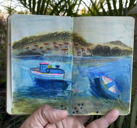
you do learn a ton. Recently I fell in love with
image on the Internet of a. A yellow boat and I had to
draw it. So I drew it once. This is with mainly
pastels and water colors. I did the boat and
I really enjoy the texture and the water
that I got this time. Because sometimes,
you know, when you're painting it just feels like you're lucky get these textures especially
working with watercolor, like can't really control it
and it just turned out good. I like how the boat looks, but then I wanted to try a different version
because there's a lot of different mixed media
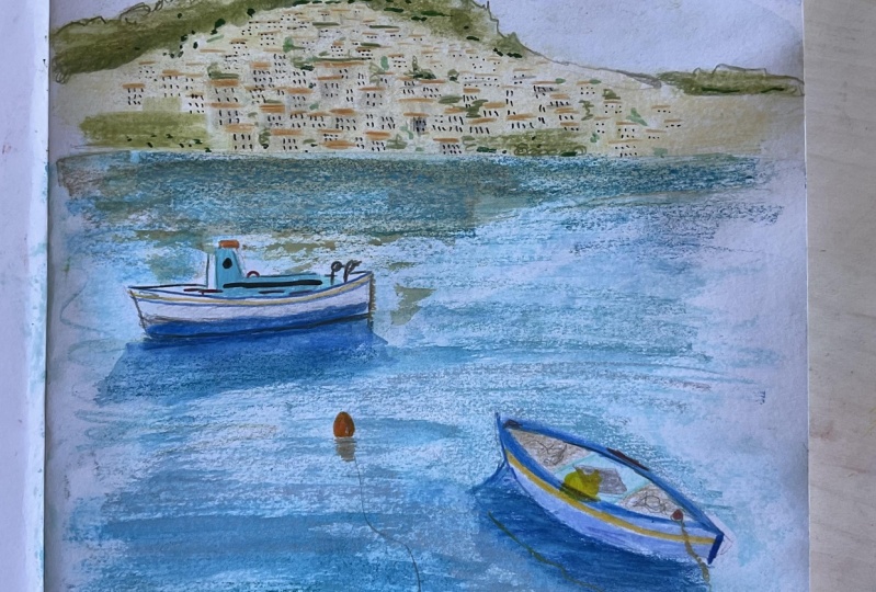
mixes that I like. This was beautiful with
the softs, water color, a little bit of regular
colored pencils for details and new colors too. Because I have to use
all the materials. I got a nice mix, but I thought it
was a little soft. I tried the next version, I did mainly with guash and I tried to really
use it thicker. The background has a
lot more texture in the greenery in the background. The clouds, I made it really
moody with a darker sky, with clouds and more
like a peach tone, maybe it's like sunset time. The water need to
remember my words. The water is a lot more
textured with the Gah paint, but I also did meal colors on top to get these scratchy bits. And I really like this one. This is my favorite out of
the three that I did because I really like the texture
and the thick paint. I'm really into paint right now. Then I did a third
version where again, I used the pastels and the water color and
I used neo colors, also wetted to do the boat. This isn't my favorite at all. Out of the others, I don't know. It just fell a little bit flat, but I feel like I could have worked on it
a little bit more. The yellow also
feels a little off. I really like this more
orange, yellow that I used. I think I got more shadows
in depth in the water. In the other two pieces, more shadow and depth. This one felt a little flat, but that's what you learn when you are testing
out different things. In the next section, we're
going to be jumping into our class project
where I also want to be doing at least
two versions of the same illustration in different mixed
medias so that we can really play and
figure out what we like. Also, you don't have to figure
out what you like forever. For every piece, you can use
slightly different media, whichever one you
feel like is going to match the subject matter. Let's get into the
class project.
13. Class Project: Reference: Okay, in this section, finally, we're getting started
on our class project, and that will be to create
a yummy textured landscape. Follow along in the next videos. My process of building up
textures and layers of different materials to create
a beautiful landscape. Oh, right now it's time to choose a reference
photo for this class. I have picked out some
images from Pexels. It's a royalty free
site so that we're free to illustrate them and sell
these images if we want to. And it's all good so you don't have to worry about
copyright issues with these. You can, of course,
choose to illustrate or sketch your own images that you take with
your own camera where you live or on vacation, or choose your own images, but I just wanted to make sure that I had
something available. You can feel free to
follow along with the same image that I've
chosen. I chose this one. I also made sure to
pick out a few that were slightly less advanced. Also, you can choose to illustrate how much or
how little that you want. It's completely up
to you choosing a reference image is like
what mood you're in. I really enjoyed
illustrating those boats. The other day, I feel
like I'm in a boat mood. I wanted to pick out some
other fishing boats. They have some fun
bright colors. The water is fun to illustrate
and play with, texture. You don't have to
worry so much about reflections if you
don't want to. Yeah, I thought this image had some interesting
houses in the background. If you wanted to attempt to illustrate a
little bit of that. The water is beautiful, There's like the two boats and then even in the foreground there's some rocks
that you could add and lots of texture
and details to. I thought there was a lot
in this image to work from. Yeah, it's pretty much
time to get started, but before we get started, let's think about colors.
14. Class Project: Color Palette: Before we get started, we have maybe all of
our art supplies. I have all my art supplies
out in front of me, and that can be a little
bit overwhelming, possibly. Before we get started,
we don't know what colors we're
going to reach for. Maybe thinking about
a color palette would be good to begin with. You can pick out a color palette that has nothing to
do with your image and use that as a
challenge and parameter. I think sometimes having rules can make your
creativity stronger. Let's see, I can show you like using a limited
color palette here. I just chose purples and blues and created
landscapes with that. When you have limited supplies or a limited color
palette like this, then you're forced
to think about how, which areas is the water
going to be purple, or the blue going to be purple, Or in the mountains going
to be dark or light. That is something to consider. Or you can try to mimic
the colors in the image? Yes, I often try to use
a limited color palette. You can mark it on your page, in your sketch cook, I think
that's always a fun detail. Not only does it like design
your page a little bit, but also if you want to go back, you can reference which
colors you were using. Let's see, do I have
any more versions? Here's also another
color palette. This one has gotten dirty
from materials I've used. But yeah, here, just choosing
a smaller color palette, I think it would be
fun to just go through this image and pick
out some colors that I know that I will want to use. Let's find a Swatch page. You can use this page where we were swatching colors before. I know boats are super blue. We need a incredible blue color, I feel like don't. How blue is this? That's too dark then this one's too light
in the neocolors. I could use this one possibly for some details, but
I need like that. Like ultramarine blue maybe? Yeah, that could be
good for that boat. We also I'm going to
keep it to the side here so I know that I have I don't want to
go digging for it. There are these
the neon buoys and that could come in handy
with my new non this pencil. I definitely need to
sharpen that also, that blue, there was like a more turquoise blue that
could be a better match. With that, I have my needle colors to the side
here and all the blues, these lighter blues would
work for the water. I really want to use my pastels. And I think this light
blue with the green, maybe even olive color by the stones would look
nice in the background. We also have some light colors, so I can use some of the light tones that I
have in my pastels here. Like the light blue
and cream and peach. Some of the robes are this nice color that
could get messy. I might for the rob, this nice terracotta color. This one's called Mars orange. That one would be good to use
for those roofs over there. We also have the background, the sky is a really light blue. I really like this pastel
from an that's like that. It's like the exact same
color as the sky there. We can also swatch of these, the water that we were talking about a little bit of that. Then the water gets a
little do up to the top. Can gray also a gray gray in the top because it's
quite grayish blue. I think having the gray mixed with all
these other colors, it's going to look
really beautiful. And then have the pop of the
boats with the white and all these blue tones in that
fluorescent is going to be really nice if I think
about the background. Now just to think about that. We do have a, let's see, the green then with these
peachy tones for the Lots of the buildings. The roofs, I'm going
to look like this. Then There's
different blue tones in there and that can also be with colored pencil later. Then I think I need some other, maybe this for
buildings as well. What is this, French gray? 10% So it's a warm gray so
I can get some details in the houses and then we need a really dark for
all the windows. That one I think either
may be one of these here. What's this All of earth and
the details in those trees. Yeah, I like that. And it could also be used to
make the windows, to keep that cohesive so we don't have too
many different colors. And this one also
could be used on those rocks in the foreground. Same with this? Yes. Okay. So we
have this color. These are the colored pencils
that I have picked out and then I'll be
mixing in some paints. And what is that? It 1234561? Yeah. So those are the main colored
pencils so I don't have to go through my stash
the entire time. There's a little bit of yellow
to in one of the boats. That could be fun. Could this be good? Yeah, I
like that one. All right. I think we're set for the but these are
all the same tone. The blue and this green are
darker, I think I will. And then the pastels
are going to be used as my light get off my
page. They're so messy. I use hair spray a lot
to set pastels that works nicely because not as horribly toxic as
the other fixatives, and it's usually
smells really nice. Anyways, Yeah, that's my color palette that
I'm going to start with. The subdued pastel colors in the background that
I'm going to be like, the gray blues that I'm going
to be using for the water. Then I like bright
blues that I'm going to be for the boat here. I have all my blues in the
neo colors to make that pop. And I have a fluorescent
and a little bit of yellow. I think this is going to
be a great color palette. I can put away my oil pastels because I don't think
that I'll be using those. I'm ready to go.
Also, I was thinking about my boats and how it's fun to create
different versions. I'm going to do two
versions with you. You can follow along and try out slightly different
materials on both sides. Maybe one will be more guache heavy and the other
one is going to be more of my pastels and
watercolor that I like to do, so you can see how
those compare. So that's what we're
going to be jumping into in the next section. Let's start our under paintings.
15. Class Project: Under Painting: Okay. Trying to get started. I thought that this
side will play with tons of pastels and watercolors
and that sort of thing. This side is a
little bit thicker because I'm getting
close to the end. This side I will mainly do like a guash painting underpainting, but then we'll add more
stuff on top of that. I have the reference
photo open on my computer that I can see
off screen. You can't see? Yeah. And then we can just jump in or we
can do a slight sketch. I can use one of
the lighter colors, this is that French Gray. I also like sometimes
to use yellow, but let's see, can get
in the sketches here. Oh my gosh. Okay, here's the horizon line,
then boat again. Remember that this
is your drawing, so you can make it your own. Down here, we have those rocks then in the
background like this. See they already look different. Just sketching them. Slightly different, but I think that's
just a good thing. Then the boat is like this. I'm going to simplify my
image and I don't think it's necessary to get
all the details mainly. I just want to know
where the boats are because I don't want to put too much paint right
where they are. I have that down. Let's get started on the messy. What are they called, pastels. I'm going to start putting in the blue over here. There was a lot of greenish
in the, in the water. I'm not going to go all
the way to the edge, I'm going to leave a
little bit of a border. I'm going to try to the
up here at the top, it goes quite light to
use my lighter blue. Then it goes dark up here,
but it's still blue. I'm going to mix that. I was going to use
the gray gray here and some of the gray down here and a little bit of this darker blue
around the rocks up here. And that's going to
mix together and smudge maybe even a little bit darker green down
here in the water. I think it's really
fun to use the pastels because I don't know what
it's going to look like. It's going to mimgetherh
when I start to paint. And here, the rocks, I want to put a little of this
color in there. And I also want to bring in, I have this neutral color
from the Jackson's one. Maybe I'll bring that up into the water up
here a little bit. Yeah, we'll start with that. I think that's exciting. Then up in the sky, I think this light blue, again,
really stunning. Sometimes I like to
use white gas to mix with the pastel.
I could try that. I think I'll do the
water in the sky first, then we'll go in and
do this background when those two are dry. So I'm going to go in
with a flat brush. Tens of water. And
I'm just going to start to wet this down. Go, there's the sky. Try to
leave some texture in there. So we something's going on now. I need to get these
castells to work with me. I want these colors
to blend together. I'm trying to keep the brush
strokes going horizontally, so that it has the
feeling of the water. So that I don't have too
many brush strokes going in a random direction. But as you can see, look, I just love how the pestels turn into a paint and how they
give these brush strokes. And sometimes you
keep some of the, the scratchiness
of the original, the original pastel
drawing here. I want it to look like
it's under the water. Incorporate some of that out. Okay, so that is my
first under painting for this side and it's really
dreamy and beautiful. I'm going to remove some of
this dust with this paint, with this fluffy brush
that I use for clean up. There we go. And we're going to
let that side dry while we jump into
the other side. On the other side, I think. Oh my gosh. Pouring
out my water. All right. I had a little
water disaster and then I started adding watercolor
details to this side. But I forgot to press record. Very classic me. But anyways, I was adding some definition
to these areas with, let's see, what color is this? It's one of the Schmit
super granulating. It's the deep sea indigo and it has a really nice,
beautiful granulation. And I'm just bringing it in to the water around the boats
to give some shadow. It's also nice to
do several layers with water color on top of the pastels because
this brush has some nice texture in it because it's getting
old and scraggly. Get some dry brush, look on some of the waves. We wanted to look good. I wanted to have
different areas. Here is darker and darker up here if it's
lighter over here, so we can bring back some
of that lightness later with another material
once this is dried. But I think that, that
feels good to me. We have the water color
going and when it dries, it's going to granulate
a little bit more. That's beautiful. I might want to add a little
bit more on these rocks, I think to show that there's water
coming up on those. It's fun to play with texture. You could just
continue doing this, but we're going to jump
to the other side. I have my jelly guh
over to the side here. With the palette, I think I'm going to switch to
my slightly larger brush so we can get even more
like Baker strokes. I'm going to get a nice white. And this blue that I have
for this sky already, the blue that I
chose is a little bit brighter and darker than the image or
what I did over here. But that's just good
and we're going to continue to use this
color as a base. And then I'm going
to start adding these greener tones that I
have on my palette there. Okay, we're going to keep
adding in different layers. And what's fun about working with a palette like
this is that you can get the random colors
mixed together. I really like that. I love these kinds of
flat brushes where I can get a lot of texture
and a lot of paint on. I'm going to try to
get some more lights over here on this side, a little bit more blue. And then, let's see, we want to get a little bit of the darker blue up at the top, but I don't want
it to be to blue. So I want to, let's see
if I can get like this. That was nice. See, this
is what's fun about paint. You can get really cool
textures with a paint brush. I think that's some fun
textures done there. Okay, we have to get these rocks that are
kind of in this like creamy beige color hair. Get that in. There's some
greenish tones in there too, on the rocks, get some
texture in there. That's fun. Okay, I like that again. This is just the base layer, so this is just what
we're working on. Now, I want to go back to this side so that I can work
on the background here. There we had this nice like, I want this green
in the background. Also with my other, this soft green color because that's like in the
background that there's some kind hill and then
the rest is quite creamy. And I thought that like this peachy color maybe
mixed with this cream. And then I can go over with
the other colors again. I will use the
smaller flat brush. I'm just going to do the light colors first
to get those in. Then scribbly, bring
these colors in. There's also some of those
greens down at the bottom, so I can use some of what's on my brush to
bring that into the seam. And then on the other
side, we'll do the same. We'll try to find like a
creamier Beijing color. You can use this one
that we were using before as like a
base for everything. I think it will look nice and
warm against. There we go. Then I will use these
nice greens that I have, blue or green. And then again, add
some down here, a little darker tone. We can always more. But to begin with, I think that is a good base
for our paint to base. We have one that's thicker, more guache, that kind of look. And we have one that's more
water color and pastel, so they both have completely
different looks already. We have made the color palette slightly different because of the different materials and the types of colors
that we have available. This is exciting to me
to see what I like. I like things in both versions. I love the water in this side, we have a lot more
texture going, but I do love like thick
brush strokes like this. And I think that
putting the boats, the colorful boats on top of this is going
to be really fun. Let's let this completely
dry and then we can start working on adding
the next layer of details.
16. Class Project: Final Details: Now that these are both dry, we can go over with our
dry materials to add all the beautiful
details and everything. We're going to start I think I'm going to make these similar and
how I create those, I might jump back and
forth with the same items. Let's start with
this little boat. I think it's really sweet. I have chosen different
colors for the water. I might change the blue on
this side to be darker. This one, I think
would be fine to use if I bring that in. Again, this is a sketch. This is your sketch book. It doesn't have to be
a finalized drawing, but I am going to mark in and make note of all
of these fun colors. Then we have this blue also the colored pencil
that I thought would be a perfect color. It has a stripe, a white stripe there. Could try to ice melt it into the water
there a little bit. Add some details
here into the boat. I had the yellow
details on here. I missed that, so we'll
just put it here instead. There are also some red items. Don't really know what
these things are. And we had that red buoy in
the water that we can add and it does have
like a line to it. And then again, adding
some details with the colored pencils and more of this to brighten it up. That's good. I think has went slightly
darker by the waters. I'm going to add
this colors well, to get more contrast and into the water to give
that some shadow. Mm hmm. Like that. I feel like that
boats looking good. I guess we can
continue to this side to keep working on
the same thing. I'll add this color to
the bottom of the boat, then it has one of these. I'll do the Turquoisy blue has a stripe in the
middle of the boat. Then this part of the boat, that nice turquoise blue, I'm going to leave, there's some red details here and here on the top of the boat, there's something
going on there. But otherwise a
lot of this color, then adding some details
to define the boat. Again, the neo color is so
difficult to color over, so you pretty much have
to use another neocolor. Again, I want to add in some shadowing from
the other boat Down here has a lot of other details on the boat with lots of
things coming off of it, but it makes it messy. But I'm going to just add some sketchiness
there so that you have an idea that there's
something going on. I think I want to bring this
blue up a little bit higher and the white is very white. So I just want to
dirty it up a bit. Let me go, that's fun. I'm going to bring
in some yellow here. It's not in the picture, but I just wanted to bring
that in just to make it. Similar pop. I feel like this looks naive in comparison to all of
the details going on, which is a bummer. What else can we add? There's lines going out
into the water here. We want to have this one
so you can know that it's tethered to something
in the water. We can add some more texture in detail with the neo colors. I really like this light one. The light blue can add
some of those lights, maybe made it too dark up here a little bit
around this area. Also, when you give
layers on top of paint, you get like the surface
area of the water. And then there's
deep water as well. Up here at the top, it's
quite dark as well. We could add in a little
bit of the darker blue. Okay, that's starting to
look nice and scribbly. Down here at the bottom, there's some like sea urchiny
thing that has fun texture. I might add in those
with this blue, I want to bring in this
olive earth pencil and get those rocks going. You can kind of
tell that this is a cliff giving some
texture down here. Real quick I get slightly stressed being on camera and having it rolling
and I don't want to have like 5 hours of
footage of me just sitting here like drawing
little urchins forever. But you can take as much time or as little time on these
drawings as you want. Is it just a sketch to realize
the colors and it was fun? Or do you want to take your time and spend an hour on this with tiny little details
and go in and painstakingly draw every little detail that
you see in the boat. Or do you just want
to just show like the overall picture
here in the background? I'm starting to think about all of these buildings and I'm like, I don't really want to draw every single house and
every single window, but we need to hint
that they exist there. So I'm going to bring in
this dark olive earth to bring in that there
is the trees here in the background get
that more texture and a bit dark by
the coast there. And then we also have
to figure out how to do the dock is lighter right
by the water there. I thought that light
color that looked nice. Then we can go in and start to give some hints that
there are houses over here, some are a little bit blue. We can give some of
them the gray color. We can set houses. I'm not sure how this
is going to look, if it's going to just
look silly and messy, and then we have all
the little roofs. Again, like this
could take forever. And I don't honestly have the patience to go in and
do every single house. That's not my favorite thing
to illustrate and draw, but let's see how
this will look. If we can mimic some
houses back here in the background, okay? Do some Al like windows and we can do
some darker windows. I don't know, I feel
like this needs to have a little bit more defining
features. Unfortunately. This kind of looks random,
like what even is this? I thought I could get away with not sketching
so many houses. Mm hmm. Maybe. Okay. But for now, let's see. We'll move on to the other side and see what we
can come up with. On this side, we can start
with those houses again. On this side, this is
a little bit darker, so maybe these colors are
going to blend in more. It would be nice if
this could just melt in and would hint at being a city. I don't know. Let's see. And adding in a couple of the
windows in the darker Tom, then some of the
houses are blue. We're going to bring
in the, the shrubbery. And then there was bits
within the city as well, quite a bit over here. Like I need another
green color in here. I'm going to use
another New York color, this like lighter one. Does that look like
just to give Mgy green, maybe this is looking a
little bit better, maybe. I'm not sure. I really
liked how the white, really light blue looked there
at the edge of the water. And I want to also bring that in here because
I thought that looked nice to make that
reflection look pretty. Um, we'll see the chalk up here. Also, maybe bring in a little bit of this
green into the water. To hint at some reflections, it would be nice to bring that Beijing color down. Does this. So if I could find a peach to mimic the city that's
going into the water, bring it down here just to
have it another place as well, just to warm up the water. That is really pretty. Okay. I'm going to add a
few more windows and things because I think it is when I start to
add a little bit more, here's a little bit too empty. But if I'm starting to
add a little bit more, I can get the houses to
look more like houses in the background and I'm going to make some of the roofs a little bit more defined. Okay. A little bit
more happy with that. We go and we could there was a little bit more of that
blue around there. Now that I have this peach too, I can bring that into some
of the areas to warm it up. Okay, that looks pretty good. Some of these areas, I'm going to darken a lot. Okay, fun. And then down here, I want to use again, this dark earth to
bring in those rocks. And I like these blue, I think, the little sea urchins. Again. I want the water you to know that there's
water over here. Let's see, the
water goes on top. All right. I think that's turning out a
little bit better. But yes, you can see
like you learned some stuff by hinting
that this is town. I think, I this one needs to have more of the
greenery going on. So if we go back in here and maybe work more of
these darks into it and nestle the houses a little bit more
into the greenery. I think that's going to help adding a little bit more greens
in here and a little bit more dark as I'm using it for all these windows
going on again, maybe define a few
more of the roofs, bring in the blues, that peachy color that we added. We don't have to
do the same thing, but I like how that turned out, so I'm going to add a
little of this peak into the water to help with that look of reflection without having to do
a full on reflection. Has the warmth of the
city into the water. Now we're going to do
our boats over here. Again, this one I use slightly different
color in the water, but I think it will still work. I'm going to try using this color that we used
on the other boat. There we go. And then I had this cobalt blue for
the actual boat. Again, we're going to use
some of these that is nice fluorescent colors to add some fun details that
are going to out of this. All right? And then we need I
have the yellow, some kind of thing, and then adding some definition to the boat, so it looks more three D. Okay? And then again, the
boat needs to look, I guess sitting in the
water a little bit more. So I'm going to add more
shadow and texture there. Then we have one more
boat, very exciting. I have the cobalt for
the bottom of it. And, and then we're going to try, I think I'll keep this
darker line for the line. And shall we try this turquoise
sat for the front of it. Here we have a nice could do, like a really red life preserver and there's some other
really red details. And then the top,
I'm going to make this nice red
fluorescent or hot red. And then we'll add
in this nice blue. I want to add in the yellow two because I
thought that it was a good complement to
all these other colors. And we'll do another stripe
with this color, stylish. And then I want to define
the boat a little bit. Should have a name
here, let's see. Bring some ties, a little bit more shadow
for this boat as well. So it also kind of feels like
it's sitting in the water. Boy, maybe I want some. Okay. I think that I am pretty
happy with these sketches. We learned some stuff
we got to play. We have two different versions. I'm not sure which
one's your favorite. I think there's certain
areas that I like in both. Like, I really, I definitely like how my house has turned out up here
and this version, I think I worked more on it and I made them come alive a little bit more
in the background there. Water, I think maybe I prefer
on this side just because there's so much texture
going on the boats. I kind of feel
like I should have added a little bit more
love and detail to the boats since I
feel like I gave more detail to the other
parts of the image. But I can go in and
already just add, define the boats a little
bit more because I feel like everything else is
sticking out of the image. But my boats which are like
the main part of the image or not as important in the
way that you see them. But yeah, I hope that you enjoyed watching my
process as I think through materials and try different things and
figure stuff out. And I hope that you will
also enjoy this process. I can't wait to
see your versions of these illustrations now. All you have to do is maybe write the date to remember
when you created these. Just like looking at
them more and more, I'm more and more happy
with how they turned out and I'm so happy that I
got to share this with you.
17. Next Steps: All right, so we're done
with our class project and before we say goodbye, I just want to talk about your next steps for continuing with your
sketchbook practice. I would love for you to adopt
some kind of fun Friday. If you can't have a whole work day towards
sketchbook play, could you find an hour
or two on a Friday, or Monday or Tuesday, or any day that you can find
time to just do art for you, rather than always do
working on a project or a client project or something
for your portfolio. It's really freeing
and really wonderful, creating some kind of
daily art practice or one day a week where
you focus on this play. I highly suggest it if you also feel like you have a
difficult time with coming up with what to
do in your sketchbook. There are so many artists to follow on social media here on skill share on other sites that show art prompts that
share art challenges. There's so many
art challenges on Instagram that you can
come, that you can join. There is October, October, There's Mermaid if you
like drawing mermaids, there's so many others. Childhood Week by Beatrice Blue. Just research and ask your
fellow illustrator friends, you can also start
a 100 day project. Like self prompted or Yeah, just do all the challenges. Do as much or as
little as you can. It's supposed to be fun. Yeah, just have fun with it. That's like my main advice.
Just have fun with it. Just play, Yeah,
it's no big deal. If you finish your 100
day project on day 99, it's about the process anyway. So you know what else
can I give you for nuggets of really good
inspiration. Motivation? Yeah, that's pretty much
it. Just keep going. Just make sure that you're
creating in some way, even if maybe you're
not feeling like creating a beautiful
masterpiece, do a scribble page
or a page with lots of swatching and remember your materials again and
what they look like. Or just like just
do the swatching and write the name
underneath just to remember what
colors you have. It's not always important that
every day you sit down to create a amazing
sketchbook spread. Some days or about
those scribbly pages or those quick sketches or
getting those ideas on a page. Just remembering to have
that art practice and cultivating your creativity on a daily or somewhat daily basis.
18. Thank You for Watching: All right, that's it.
Thanks so much for taking this class with me and learning
all about mixed media. I cannot wait to see your mixed media landscapes
in the class project gallery. So please make sure to
upload those so I can give you some feedback
and cheer you on. And Google or glorious textures, because textures are the best. If you'd like to hang out with
me outside of Skillshare, you can find me on
Instagram at Matina. You can check out my website at Magstina.com if you love
the Front Friday concept. In fun with me on Fridays, you can join my Patrion
Group fun Friday and get monthly drawing prompts
and follow along my process and get to peek at
my sketchbook every month. It's a good time. Otherwise, make sure
to follow me here on Skillshare so that you'll be notified when I come out with
my next class. Until then. By.
 Kristina Hultkrantz, Illustrator & Surface Pattern Designer