Transcripts
1. Introduction: In this step-by-step tutorial, I will show you how easy it is to create a watercolors sticker in Procreate 5, We will start painting or rosemary stem. Then we will use layer masks to apply paint only inside the needles. And finally, using the selection and the color drop tools, we will add a white border to our illustration. By the end of this class, you will have a sticker ready to be printed it and the knowledge to create new sticker you want in Procreate.
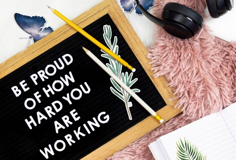
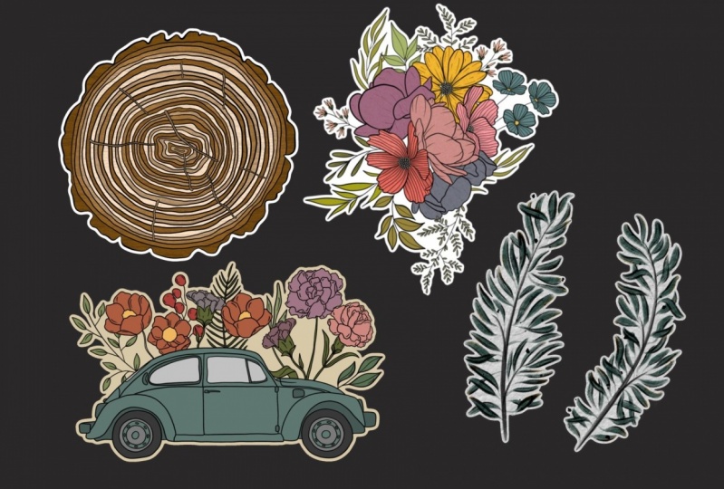
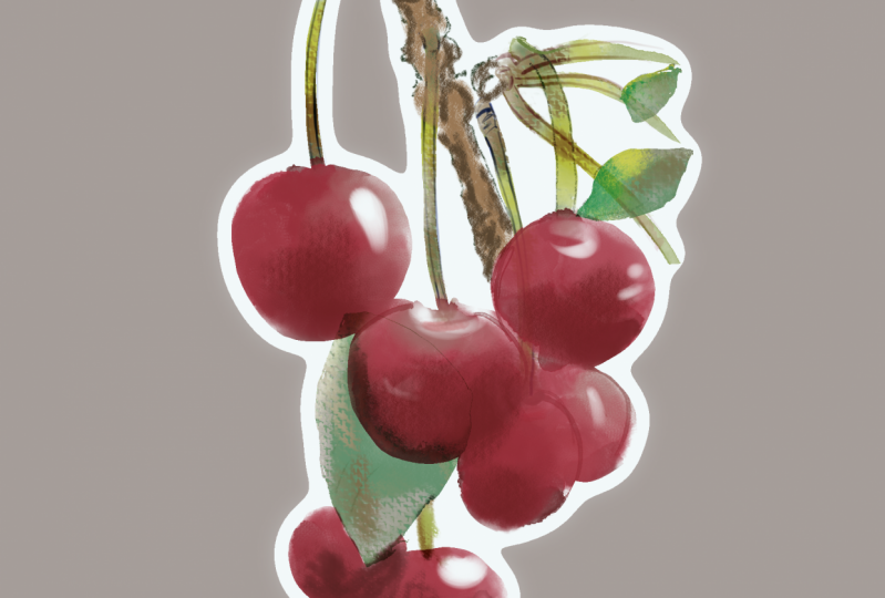
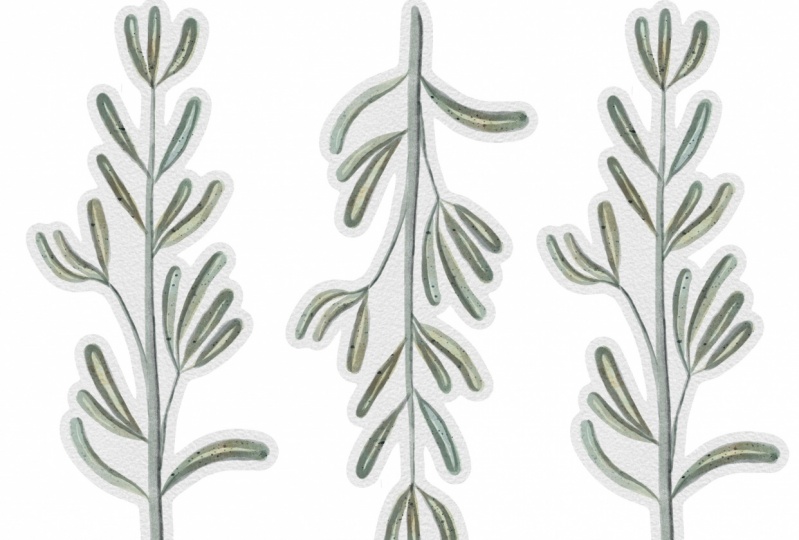
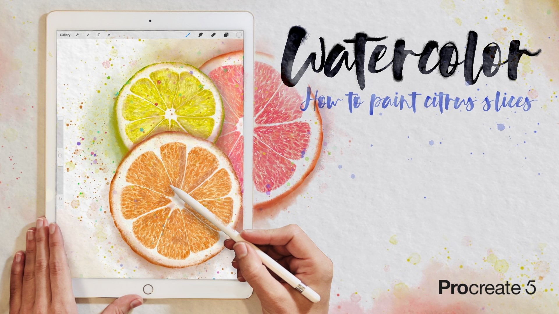
2. Creating Watercolor Stickers: Create the size of your canvas according to the dimensions specified by your print on demand shop, printer or cutting machine. Use a paper texture brush or import a paper image. I will use my watercolor paper improved. Duplicate the layer to add more contrast, and then merge the two layers using the pinch gesture. To create the watercolor painting, I will use some brushes of my “Essential collection of watercolor brushes for Procreate 5”. But of course, you can follow this tutorial using your favorite watercolor brushes. Let's start painting the stem! Create a new layer and change the blend mode to Linear Burn or Multiply to enhance the paper texture. Choose a brush which size changes with the pressure you apply, ok? This will make your stem look better. Start applying light pressure and increase it as you go down. For painting the leaves, we are going to create two layers. You will see why in a moment. Don't forget to change the blend mode or the paint will look more opaque. Choose a light color for the first wash. And again, at light pressure at the beginning, and then more pressure to create the rosemary leaves. Leaves are not identical to each other, so no pressure. They don't need to look perfect. Go to the “Leaves 2” layer, and select a dark color. Paint some leaves facing forward, and others facing back. Apply more layers of paint, if you want them to look darker. Create a new layer. To make sure we will paint only inside the leaves, we will use the selection tool. Tap on automatic, then tap on the background. Finally, choose invert. Make sure the threshold is set low, or this won't work. Now, go to the “Final touches” layer, and create a Layer Mask. Tap on the “Final touches” layer, We don’t want to paint in our Layer Mask. And select a dark blue color for painting the back of the leaves. I know, this is too dark. We'll fix it, decreasing the layer opacity. Much better! Let's add some splatters! Watercolor illustrations without any splatter look too perfect, right? I will paint them in a new layer because the opacity of our current layer is reduced. The splatters will add texture to our painting. I think this needs more contrast... Let me add some ochre. Finally, let’s paint some shadows in order to create a sense of volume. Turn off the paper and background layers, Swipe with three fingers down on the screen, and tap on copy all to take a picture of what is currently on our screen. Go to the top layer of your layer panel, swipe with three fingers down again and tap on paste. We no longer need the rest of the layers, so tap and hold on the visibility checkbox, to turn off the visibility of all the layers but the image we’ve just created. Use the automatic option of the selection tool to select the background of your illustration. Modify the threshold if necessary, then tap invert to select your painting. Tap on “Feather”. The higher you set this percentage the thicker will be the border. If you prefer, full bleed, printing, the feather will be set to 0. Okay? Now create a new layer and fill it with white. Place the white layer below and, let's repeat the process. Select the background. Modify the threshold if necessary. Different threshold values will mean different border finishes. Tap invert. Fill the layer with white. Ta-da! Here you have other examples in which I varied the selection threshold and the feather percentage. As you see, the borders of each one of them are different. If you want to add paper texture to your sticker, move that paper layer just above the white layer and turn it into a clipping mask. Don't forget to change the blend mode of your painting to enhance the paper texture. Use the “Copy All” option again. Don't merge the layers instead or you will lose the blend modes effects, ok? Now, you can duplicate the sticker, move it, change its size... whatever you want. Once you have filled it printed area, this will be ready to export it. I usually exported into PNG in order to keep the transparency of the background. Now, you just have to send your file to an online print site. Or print it at home, importing your file into the application that comes with your printer. Thanks for watching. And if you have any question, please leave a comment.
3. Q&A: Pixelated Border: First of all, keep in mind that the paintings we make in Procreate are raster images. For example, let's take a look at one of the images that come with the app. If you zoom in really close, you will end up seeing the thousands of small squares that painting is made of. Those are small squares are called pixels. That's why when we see them on an image, we say that images pixelated. If the only thing that you see pixelated is the border, not the illustration, probably, the problem is that you set the value of the selection threshold too low. There are three things we have to pay attention to when creating a sticker. The shape, the opacity of the outer edge of our illustration, and the size of our canvas. Let's start talking about the shape. As I said before, Procreate is a raster program, so it is easy for it to create a smooth lines by simply lining up the little squares called pixels. But, oh boy!, to create a circle with little squares, it's not so easy. So, to create a border from it, isn't easy either. You have to adjust the threshold according to your illustration. If you don't do it, the non straight parts will look jagged. See?, the straight part looks smooth. But this one doesn't. What can we do to make that part look fine too? Well, at this point, we have to talk about the other important thing, the opacity of the outer edge. When we use the selection tool and tap on the background, we are selecting the background. In this case, if we change the threshold, we can barely see the difference. That's because the outer edge of this image is opaque. When we tap on invert, we select everything but the background, in this case, the green line. When we use the feather tool, what we are doing is to apply a Gaussian Blur effect to our selection. So the farther the pixels are from our initial selection, then lower its opacity will be. If I zoom in, and change the background color, you will clearly see the gradient. In this method, when we use the selection tool for the second time, we are working with the gradient image we created from our original painting. Now, when we increase the threshold of our selection, we can clearly see that the area selected varies. That's because the edge of this image is not opaque. So when we tap and hold on the background and set the threshold to 0, we will select only the empty pixels. As we increase the threshold, we will select not only the empty pixels, but also the ones with very low opacity, low opacity, medium opacity and high opacity. Stop increasing the threshold as soon as the border looks smooth enough for you. Usually, you should not need to set it higher than 10%. Tap invert... And the border is done! If the border is not thick enough, you can repeat the process. Another option is to increase the feather. But be subtle, or your sticker won't look good. To wrap up, let's talk about the size of our canvas. The bigger the canvas, the more pixels our illustration will have. The more pixels we have, the smoother our edges will look, because it is easier to create a smooth curve with more squares than with just a few, right? To sum up, to get a sticker with a nice and smooth border, use a big canvas, and adjust the threshold of the selection carefully.
 Lettie Blue, Architect & Digital Illustrator