Transcripts
1. Introduction: There's been a little
life-changing moments in my life. One of them has got to be
the moment that I bought my first iPad Pro and
installed Procreate. It's absolutely
revolutionized my workflow. I am creating better
quality personal work, and I'm also creating
a better quality and quicker artwork for my
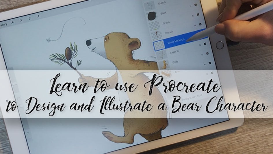
commercial clients as well. [MUSIC] Hi, I'm Rebecca Mills, I'm a commercial illustrator based in Perth,
Western Australia. I'm best known for my
artworks that are bright, colorful and a little bit silly of animals doing
ridiculous things like giraffes going down hills on mountain bikes and sharks going out to fancy
dinners in top hats. I'm a trained graphic designer. I worked as a graphic
designer for 10 years before, about five years ago, deciding to give illustration a shot and see how that went. Since then I've been
absolutely spoiled by the clients that I've worked for and the projects
that have come my way. Some of the things
that I've worked on include multiple
Procreate commissions, stamps for Australia post, jigsaws for crocodile
creeks and a bunch of products for
children merchandises. You'll find my
commissioned artwork on anything from new rules to tau's and water bottles
to books and book covers. This class is going
to answer some of the most common questions that I get asked on social media, like, how do I select my colors? How do I add the
textures to my artwork? How do I get that really
clean and crisp [inaudible] look to my artwork in a
raster based software? In this class, you're
going to learn how to use your iPad to gather
inspiration and references, sketch effectively
and purposefully, navigate the
appropriate interface, utilize my favorite tools, the symmetry tool, Quick Shape, color harmony, all which will save you a bunch of time
when you're illustrating. I'll show you how I add
textures to my shapes. You get to learn these all while drawing along with me creating our own really fun illustration of an animal playing guitar. This class is great
for freelancers, side hustlers, or even just hobbyists
that want to get a bit more art appropriate. You'll be able to use all of these skills to create bright, vibrant illustrations that are not only beautiful to look at, but are perfectly set up
for the end destination, whether that be for Instagram or for print for your clients, or to go off on
third-party sites like Society6 or Redbubble, where you can earn a
bit of passive income. I'll guide you through my
proven process all the way from start to finish and give you all the tips that I've
learned along the way. So get your iPad, take a seat, and let's get ready to go on a character creation
journey together. [MUSIC]
2. Class Orientation: [MUSIC] In this class, I've decided to set
the class project as a animal playing guitar, which I realize is pretty niche. But I think it'd be a lot of fun to work
through it together and it will enable me
to illustrate all of my favorite features
of Procreate. Then at the end, I
have this dream of a project gallery full of different animals playing
different guitars, just jamming out together. I think it'll be super fun. You get to pick the
type of animal, and you get to pick
the type of guitar, and then I'll talk you through
how I use Procreate to combine elements to create
a finished illustration, all the way from ideation
through to finish style. Once done, please share your character in
our new Ben gallery, the project gallery below. I can't wait to see them
altogether jamming out.
3. Creating Your Canvas: [MUSIC] We're going to jump
in and set up our Canvas. Setting up a Canvas is very important to get right
in the beginning. If we set it up too small, we might have
pixelization issues when we post it on Instagram. It might print really
blurry for our clients. But similarly, if we
create it too big, we will limit the number of layers that we can
have in Procreate. We're just going to create
a file that's too large or fill up our storage space
more than it needs to. It's just about finding the right balance
between a production needs and also the constraints of the software
that we're using. I'm just going to
open up Procreate now and I always have it in my doc because it's essentially all I use my iPad Pro for. Open it here and it takes you straight to
the gallery page. In the gallery page, you've got all of the files
that you're working on, it'll be ordered in a sequence. Once you've opened it, it brings you straight
into gallery page. From here you've got the option to either select your images, import images from your
filing system such as iCloud, or if you're using
Dropbox app on your iPad. Then you've got an option
to import in a photo. Check if you want to draw
on top of the photo or if you want to edit an illustration that
you've created in other software or you've taken a photo of some line
work that you've done, this is how you get it in. But for now we're going
to create our own brand new Canvas by clicking
this plus button here. In here, in the
new Canvas panel, you'll see all of the sizes that I've
worked on recently, and you've got the option
to select screen size. But what we're going to
do from here is select this little icon which
will give us a new Canvas. You can see that it's
defaulted direct to my favorite personal
project size, which is 3,500 by 3,500 pixels. I really like this
size because it just works nicely for
personal projects, you get a really
crisp illustration when you post up on Instagram, and you have a nice number
of layers to work with. This will also give
us enough resolution. At the end of it, if we
love our illustration, we can chuck it up on a
third party seller site like Redbubble and put it on
some mugs and sell it. There's some other
options in here as well. We've got options to
adjust our color profile. If you're working on
a file that you're hoping to use for print, I still recommend
setting it up as RGB just because the blending
modes will behave better. All the colors in ISO, you can use the full Gamma and then we can
change it at the end. Just try and avoid things
like super bright pinks and long greens and the colors, because they're out of spectrum. Here is the time-lapse settings. I have mine set to 4K and on
lossless just so that I can have the highest quality time-lapse a
Procreate can create. If you're worried
about storage or if your iPad is running
out of space, you could scale it back through this data 1080p and low-quality, and that will take up less
space on your machine. We've also got
Canvas properties, which are just a
couple of settings that I don't typically use. We've set it all up. We haven't really changed
anything else and we're just going
to click "Create". Here is our already
to go Canvas. We've made sure that the resolution is correct
for our output needs, and we've made sure that our time-lapse
settings are correct, so at the end when we export it. We've got the beautiful
high-risk time-lapse. The white square might be
a little bit intimidating, but now I'm going
to talk you through some ideation ideas
on ways to come up with what you're
actually going to draw on this whitespace.
4. Ideation & Resource Gathering: [MUSIC] Now that our
Canvas is set up, and we're going to
do some ideation and resource gathering. When I was designing
this Skillshare class, I was really tossing
up whether or not I should include this as
one of the lessons, just because thinking
about what you're going to draw is not as fun
as actually drawing, but it's a super important component of actually working as a commercial illustrator and
even creating personal work. For instance, I'll quite often
get briefs from clients, so it will say draw
five animals at a cafe, or draw an animal
dresses at night, or we're doing a party
scene with some animals. It's not always animals, but a lot of the time,
it is animals. Then it's up to me to decide what animal that
I'm going to draw. Now it's up to you to decide what animal are
you going to draw. There's 8.7 million
animals in the world, so we really need
a starting point. The one constraint that I'm
going to give you is I'd really like you
to pick an animal that's got some
forward-facing eyes. The main reason for
that is I would like to demonstrate to you
during the process, the Procreate symmetry tool. This symmetry tool has been absolutely
life-changing for me, and it saves so much time when it comes to
drawing objects, buildings, character's faces, so I'd really like to
introduce that to you, and we'll do that through
the face of the character. We want it to be forward-facing. The ideation process
that I'm going to run through as well is also awesome if you're under an
artist's block, and to be honest, I've struggled with that a lot over the
last couple of years. I've got two young children, I am tired, and sitting down to
draw personal projects, sometimes getting the
energy for it is hard. So being able to sit down and you can't think
of something to draw, this is a way that I would work through figuring out
what I want to draw. Some of the things that you'll
learn in this lesson are how to set up a split
screen on your iPad, and also how to use Google
images just to bring up ideas that will help you work through what it is that
you really want to draw. Like I imagine, some of you already know what
you want to draw, and those that don't, this is how we'll figure it out. Firstly, we need to
split-screen our iPad. Do you have a web browser
in the dock of your iPad? If not, I'll show you
how to do it and how to access your dock
from within Procreate. This line here down the
bottom is part of our OS. You just put your finger
on it and drag it up, and you can see all of the apps that you've
got in your dock. Is there a web browser there? If not, I'll show
you how to add one. We're going to go back
to the home screen. To do that, all I've done is just swipe up out of the app. We will select the
app that we want. I'll just use this
Google Maps icon. Put your finger on it and drag it and drop
it into the dock. Now, when we go back into Procreate and we
pull up our dock, we can see that new app
is accessible there. Now to split-screen the iPad, all that we need to do is pull
up our dock and then drag and drop the Safari over into the second
half of the screen. I don't want it to take
up half of the iPad, so to make it smaller and take up only
a quarter of the screen, we just need to drag
and drop it this way. There we have it. We've got a great screen for
creating references there, and then our working space here. Now we have access to the
Internet while we draw, which is great because the
Internet is pretty big, it has a lot of stuff in it. First, we've got to
select our animal. To narrow it down
for this project, I really want to show you
the symmetry tool later on. We really want an animal
with forward-facing eyes, so that should cut
down some of those 8.7 million species that I
talked about earlier. Some animals with forward-facing
eyes include a bear, a quokka, a red panda, an owl, a koala, a big cat, or even a household
cat, and dogs. Typically, they don't
have forward facing eyes, but you can draw
their eyes front on in a character, and
it will look great. My first recommendation when
you're picking a subject for a personal project is to
pick something you're super passionate
or excited about. Are you a big dog fan? Are you interested in weird
and wonderful things? Is there an animal that jumps
out of your head and says, draw me? Well draw that. In this instance, we
want something fun. Let's start basic and start
searching fun animals. Just click up here. Just before I go ahead, I am running Safari on iOS 15.1, so the way that I'm searching and the way
that the browser works, and the way the tabs work might be different
between your browsers. I'm going to click up here
and look for fun animals, and click on images. Resource gathering as well, it's really important to
remember that we're not looking for something that
we're going to copy exactly. A lot of these images here
are covered by copyright. We want to respect the creators. What we're looking
for is inspiration and some ideation, really. It's just a bouncing point, it's a coagulation of all the different
images that we see. You can just scroll
through these until you find something that you're
really excited about. If nothing comes up, you can try a different tact. Sometimes I want to draw
an animal with stripes, so I search stripy animals, and sometimes I want to
draw something Australian, so I'll just look
for something there. I really like the
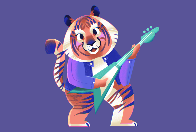
koala, he's cute. I think I might go back. I love a tiger, which we saw here. We will search. These guys are cool
too. Let's do tiger. I really like drawing
tigers just because of the fun markings, although it gives a really
nice contrast and they are great example of a
forward-facing animal. Now, what I'm going to
do, is I'm going to save this reference tab of tigers for later and create a new tab to search for a
reference of the guitar. Now what I'm going
to do that I've got a bunch of different
references here of the tiger, I'm going to create
a secondary tab by using this plus icon here for the reference of the guitar. Actually, I'm going to
search for types of guitar, or, here we go, types of guitar anyway. I think a tiger would probably
use an electric guitar. Now that I've chosen
electric guitar, I'll just bring out some
references of that. Heaps of images of
very cool guitars. Then we need one
final reference tab, which will be our reference tab for the pose of the character. Obviously, there's not
going to be a heap of references of tigers
playing the guitar, so we'll just look
for a person instead. We want him to be full body, so maybe person standing. When trying to find
your character pose, it's always a great idea as well to find something super dynamic. White on different [inaudible], leaning, something with
a lot of action in it. This guy, he's a
little bit static. Then we're going
electric guitar. Look at this dude,
he is awesome. Maybe something like that. Great. We have
split-screen in our iPad, we have got all of
our references set up so that we've got access to
them while we're drawing, we've decided what
animal we're drawing, what guitar we're drawing, and the pose in which we are going to be drawing the animal. Now we're ready
to start drawing.
5. Making Our "Messy Sketch": Now after all that boring setup; the Canvas setup,
reference setup, we're ready to start drawing. I am excited to talk you through my process of creating
my messy sketch. The messy sketch is essentially just a
compositional diagram. It's a very blobby, rough sketch that will be the foundation of our
illustration working forward. I'm going to show
you brushes that I like to use for
messy sketching. I'm going to show
you how to set up the layers for messy sketching. I'm going to show you how to create the wireframe pose
as well for the character and how to stylize
your character going forward from the
references we've created. I'm also going to introduce
you to the symmetry tool, which is one of my
all-time favorite tools in Procreate with picked a
forward-facing animal character for this one reason, and it's going to save
us so much time when it comes to drawing the
character's face, being able to do it on one
side and not the other. First thing that we want
to do is select our brush. You can find the brushes under the little brush
icon here in the menu bar. My favorite brush to sketch is the Nikko Rull here
in the recent menu, which is just introducing
the latest Procreate. I use it so much,
it's always here. You can find it if
you haven't used it before under the
painting menu here, and down here you
find the color. What we want to do
is make sure that we have got stabilization
turned off. By clicking it again, it will bring up brush studio. In brush studio, we
have our heap of options to adjust a lot of different things
with our brush, so the tapper, the shape, how it renders the textures. But we want to turn
streamline off, which is here.This is all
the brush stabilization. There's a couple more
options that were added with the latest Procreate. Streamlines always going
to be my favorite, but we still need to
turn it off for now because we want the
brush to go down really smooth and natural
and feel like it is just not being hindered
or adjusted by the software. We've got stabilization
of brushes done. To adjust the sizing
of our brushes, these over here, size
we want, I don't know. If you've got the
same Canvas as mine, pick something around
13 or 10 percent mark. The brush sizes in
Procreate are linked to the size of the canvas because
of its pixel dimensions. If you're working on
a smaller canvas, you will need a
smaller size brush because that size brush will
be bigger on your canvas. Down the bottom here
is the opacity. I don't tend to use the opacity. I keep it at 100 percent
for pretty much everything. But it's great to know if you're kind of a person that
doesn't like to use that. Here we go. Now I'm going to introduce you to some quick hand gestures that I use a lot with
drawing in Procreate. Obviously, you've got
the two-finger tap undo and the
three-finger tap redo. You can also undo and redo using these buttons
down the bottom. There's also pinch
and zoom to navigate, which will allow you to zoom out and then
zoom all the way in. If you get lost at any stage, you can just do a quick pinch
and I'll take you back. Now our next step is to
select our brush color. We want to pick a color
just for sketching. I'm going to go through
colors in detail in lesson 7. But in this step, all we just wanted to do is pick something that's not black. I am allergic to black. I really find as well
that using a cooler, darker color gives
you a sketch like a professional clean look to it, and that's what I do when I'm sending our artwork to clients. Your colors can be
selected up here on the right using the color menu. We've got a few
different ways to select our colors: disc, classic, harmony, value. I use classic the most. It's how my brain
works the best. We've got light
colors at the top, dark colors, so
it's all one hue. Light at the top, dark at the bottom, saturated
here, desaturated here. I've got it on a
blue at the moment. You can see adjusting the slider here will
adjust the hue. We want to a bluely purple
and we want it around this mark. There we go. I think that's really
nice sketching color. Now we need to sit
our sketch layer. Our layer is up here, this is the layer panel. By default, every file has Layer 1 one a
background color. The background color is just the background color
of the artwork. We're going to use this Layer 1 here for our messy sketch, but I just wanted to
rename it first so that I don't get lost when
we're sketching. To do that, you just click on
the name and select Rename, and then your keyboard
will come up, so I'll just call
it messy sketch. Now we can get drawing. As I showed you before, just two-finger tap undo. Undo and redo will also
adjust layer rename, so we don't want to
do that for now. Another way to get rid
of all of this mess off our canvas is just to go
into the layer panel here, we want to click on our
messy sketch layer, and then there's an
option here to clear it. Now it's all nice and great
for us to start sketching. I'm going to just zoom
out a little bit so that I can see my canvas bounds. This is where our references
are going to come in. We're going to start with
our posts references which are already up. We're going to find
the ones that are less static where
they're balancing on the white is distributed in a different
way of exciting angles. We want something
that's just really fun. I just loved this guy here. What I'm going to do now
is using the Nikko Rull, just basically get down a wireframe of how the
body parts are sitting. So his shoulders, his arms, like this. This is just a basic wireframe, so we need to obviously
add our guitar as well. See how that leg he's got and this leg is all
the way at the front. I don't know about this leg. How's that attached
to these pillars. What I'm going to do with this back
leg is erase it. The eraser tool is
obviously up the top here. We've got a brush smudge eraser. The eraser tool is
currently got it set to Nikko Rull because obviously my favorite
messy sketching brush. But if you want to set
your Nikko Rull as well, the easiest way to do
it is have brush tool selected and then hold your
finger down on the eraser. Now, we can use the
eraser to erase the back leg because that just isn't
anatomically possible. Here we go. Off his
pelvis, back leg. This isn't much, but it's a great start for
our composition. It's a basic pose, are we happy with how
everything sitting? If you want to move anything, you can either erase
it and redraw it, or there are options as
well to transform objects in an illustration using the
select and transform tool. This is the selection tool here. The best one to use for
this thing is freehand. What freehand, freehand selection
essentially lets you draw the selection on. Say you weren't happy with
how this leg was and you wanted to move it or you wanted to extend it or shorten it. We've got the selection
tool around the leg. Now we're going to use
the transform tool here. The transform tool allows
you to move around objects. It also allows you
to increase the size or distort them and there's
a warp option as well. But what we're going
to use for now, often the easiest
one, is distort. What we can do with
the distort one is pull out from the corners or from these middle
points and just pull it around until we're happy
with how that is sitting. I think I've got the angle
of his leg a little wrong, so it should be like this. He's got his name on it. Then I think I'm happy with how this messy wireframe looks. When we are gonna be
stylizing our character, we have to look at our
reference and realize that we're not going to
be copying this exactly. We're stylizing it
and bringing over some artistic flair
when we're creating it. It's about recognizing
the geometric shapes that exist already
in your character, in the animal that
you're creating. For instance, if you're
creating a bear, make the arms and legs
chunkier than they should be, or the body a
little bit shorter. I find the easiest
way to make things cute is to make them shorter and squatter and try to round off
the elbows and the knees. You can see as I'm working
through the tiger, I'm making this tiger, his body is like a quarter of the length of a real
tiger and his legs are super chunky and his head is
just if it was real life, I don't think you'd
be able to set up. But this is the principles
behind making things cuter; big heard, big eyes, mouth close to the
eyes and smaller. Just keep playing
around with what works. But remember, these
references are a starting point and
we're stylizing. Now we need to add some white to the body parts to match the
animal that we're drawing. Navigate back to the tab that
you have for your animal. Here's your tiger. Now we're
doing a character here, so we're not going to
match this exactly. But it's important to
figure out what parts of the animal are chunkier and where we can
draw emphasis from. Obviously, the stick figure, it doesn't look
much like a tiger. I think I actually
want to increase the size of the head
before we start as well. I'm just going to do that using the select and transform tool
that I showed you before. But rather than using
the distort option, I'm going to use free
form because I want to increase it in a
rectangular format. You need a big head. My characters always, they
just need a big head. It looks cuter. Here we go, and recent to the illustration. If you don't have
anything selected and you select Transform, it will just drag the whole
artwork that's on the layer. This is where we start
adding some thickness. Some tips when you're
doing this is to think of your animal as if
it's built of sausages. This back leg here. He's going to do with this. We're turning these sticks
into sausages, really. You can erase as you go your center framework
that you created. Really being sausages and it does not matter
if this is a mess. The whole point of this
is that it's a mess. We want it to grow and evolve and it's just
playing around at this stage. Don't put too much
pressure on yourself. The more pressure
that I put on myself, the harder that is to draw. Just have fun with it. If it takes longer,
it's completely fine. Just adding in my tile, which I forgot to wireframe on before. I think I need to add
in the guitar now just to see how that's sitting
with the body as well. I was just thinking
that may be one of those really cool '80s electric guitars would be great for a tiger
like this one here. Flying the electric guitar. I'm just going to draw that in. When I'm drawing in objects, if it's going under things, just draw the whole object
and then you can erase sections that are
obscured by others. Like this arm, it's running on top and you can just erase it. I'm still not happy with how wide
those legs are. They're got to be really
fat English sausages. Now, we're going to do
his head and this is where we get to use
the symmetry tool, which is super awesome
and it's one of my favorite things I got
introduced to at Procreate. I think that was in 4.2. But up here under the canvas panel, there is an option to
turn on drawing guide. If we turn this option on here, it'll give us a grid, but we want to turn on symmetry. We go Edit Drawing Guide. There's all these
different options here. We've got 2D, we got isometric, if you really like doing
isometric drawings. We've got perspectives
if you're doing city scenes and symmetry here
is what we're looking for. Even in symmetry,
there's a bunch of other options as well. Radial is great
if you want to do beautiful Mandela's or flowers. But we just want vertical. Once we've got the
vertical guides selected, you'll see a line
appear on the Canvas. This blue dot will
allow us to move it around and the green dot
allows you to rotate. What we want that
line to do is run right down the center of
the head of that animal. There we go and
just select "Done". It's important to note that
the symmetry function is actioned on the layer rather
than the whole OK document. If you see here,
it's on this layer, it says it's assisted. That means drawing
assist is turned on and symmetry will
work on this layer. But if you put a new layer in, this layer will not have
Drawing Assist attached. I use drawing assist so much that I've set
my Modify button, which is this button here so that it turns
off drawing assist. It just saves me
from having to go back and adjust the
layer each time. If you see here it's changing drawing assist on and
drawing assist off. We've got Drawing Assist on now, but to make it so that
that button turns on drawing assist on and off I'll show you
how to do that now. We're going back to
the Actions menu here, which is the little spanner. Then we're going to
go to preferences. This is where you can
personalize your interface. Just for now, we're
going to select gesture controls and then
select Assisted Drawing. We want that to be on
tap the "Modify" button, which mine is here.
That's all we need to do. Now, that button will turn
off and on Drawing Assist. We can see our symmetry tool
in action which is awesome. What we're going to do
now is messy sketch the face using the
symmetry tool, which is why we picked an animal with a
forward facing face. We can draw in the nose and eyes on one side and it's going to
match it to the other, which really saves
a heap of time. Sometimes I find the eyes really frustrating
to do so I might actually draw his whole head first and
then add in the eyes last. I'm going to bring up my reference layer for tigers so that I can see
what they look like. When you're drawing your character's face as well, I always like to
add in eyebrows on characters even if
they don't have, no animal has eyebrows,
though not many. But I add them in because
they're the easiest way to add emotions to characters. If we just, eyebrows this way, angry, eyebrows this
way, a bit worried. But eyebrows like up, happy. You can do so much just
with the eyebrow placement, which is why I
might show that add them even to characters, animals that do not have
any eyebrows at all. I also tend to do small
mouths and bigger eyes. Now, we're just going
to keep playing around until we're happy
with the head shape. I don't think I've given
him a big enough muzzle. I'm now making his head
a bit bigger again. Now it's too close to
the top of the page so we just transform
and move him down. Just keep playing around with your illustration until you're happy with
how everything is looking. If you want to go back and
adjust any of your body parts, just remember to turn
off Drawing Assist. Now, we can use that
modify button here. I think he needs a bigger
body to match his head. I'm just going to thicken it by using the Select
and Transform tool. Then I'm going to
adjust the angle of this leg using the Select
and Transform tool. Still not happy with how
thick that layer is. Nothing in the eyes. When I draw eyes, it probably takes me
four or five goes during an illustration to get
them the way that I like, they express so much emotion
and it's so important to how your character looks that it's really important
that they are right. I'll put them in as
place holders for now, but you watch, I'll
probably adjust them later. The wrong transform mode on it. We just keep playing around with
the illustration until we are happy with it. Tail, not happy erasing that. I want to make his smile
look a bit smilier. I think I'm pretty
happy with how the messy sketch is looking. We've used the mica
roll brush, the eraser, the select transform
and symmetry tools to create a
very rough sketch. These are very early stages
so don't get scared, but it's starting to
look like a thing. Now that our messy
sketch is done, we are ready now to
go on and progress it more into a refined sketch. This is a great starting point. But looking at this, I don't think many clients
would know what I'm going for. I would tidy it up in the next video before
I can send it out.
6. Refining Our Final Sketch: Now we're going to
refine our sketch. We've got this very
messy sketch which will act as a great basis
for our illustration. From here, we're going
to get a finer brush, we're going to rely heavily on the Quick Shape tool to get some really clean
and crisp lines. Quick Shape's my favorite
tool in Procreate. I can't wait to
introduce it to you. Once we will finish
up the artwork to the stage that I
would typically send it out to a client for
approval and it will act as a super great basis for adding
some color to later on. First, we need to
set up our layers. We're going to have to
adjust the layer opacity of our messy sketch and add a new layer in for
a clean sketch. When we go into the layer panel, this little in here tells you
what the blending mode is. It's always default to normal, and when you click
on that in as well, it will bring up
the opacity slider. We want to slide the opacity
slider all the way down to probably around
the 20 percent mark. It's just acting like a ghost tiger image
in the background. Then we'll add our clean
sketch layer on top, which if we click here, rename, and we'll just
call that one sketch. Now, we need to change
our brush as well. We're not going
to use Nikko Rull anymore even though
we love it so much. We're going to go
into the brush menu, and then we're going to
pick a sketching brush. A pencil or something
similar to that. My favorite one is
the one all the way down the bottom,
the 6B pencil. We're going to just go
into brush studio now by selecting it and turning the
streamline all the way up. Mine's all the way up because
I've been using it before. That's all we really
need to adjust. You're welcome to
play around with stabilization and
motion filtering. This is brush panel here. You can just try it out directly in brush studio
so you don't even need to leave to have a look at how the
brush is behaving. Once you're happy with what
stabilization you've got on, as I said, streamline, then you can click ''Done''
and you brush is all set. Now, we need to
select a brush size. We don't want it to be
as big as Nikko role. I'm just testing
what are these now. I'm quite happy with that size, but if you didn't want
to adjust it, remember, we have this option here on the side to adjust
the brush size. I think mine is
probably remembered it from a previous job, so just have a play around with different sizes and what
feels good for you. Remember that when you are
selecting your brush size, that the brush size is
linked to the size of your document because it is setting pixels within Procreate. If you've got a
very big document, you need to set a bigger brush, and if you've got a smaller
dimension document, you need to pick a
smaller dimension brush. What you can do as
well once you've found a brush size that you're
really happy with, you can set it in as a
brush size preset by just selecting this little dot here and then putting the plus. This is new in the latest update of Procreate and
it's great because if you then adjust your brush down here to
do some finer details, but you want to go back to
the size that you had before, you can just click
directly on this spot. Let's do some actual drawing. First, we're going to
start by drawing the head. We want to use the symmetry
tool on this layer. If we go into the layer panel
now that you can see that the messy sketch is still got
Drawing Assist set to it, but the sketch layer doesn't. Every new layer in Procreate has not got
Drawing Assist set onto it. We can use our
Modify button over here to turn Drawing
Assist on to this layer. Remember how we talked back at the messy sketch stage about
simplifying our shapes. What we're going
to do now is tidy those simplified shapes up
using the Quick Shape tool. I always use leave
my eyes for last just because I find that such an important part
of the character that if I do it first, is
really distracting. In Quick Shape tool, what you can do is, if you just draw a
straight line and hold it, you get a line. It's awesome. If you want a circle, you can draw a circle, you get an oval, and then you put your finger
on, there's your circle. We can do things like squares or rectangles or even
just weird polylines, which is super handy because if you're drawing man-made objects
like cars or buildings, you can adjust the
points as we're going. But obviously with a tiger, we don't need to
worry about that. We'll start by drawing the
sides of the face with one of my other favorite
Quick Shape shapes, which is the Arc tool. If you just draw a
very rough arc shape and then hold the end down, you'll see that it snapped
into a nice smooth line. If we go Edit Shape
here at the top, we can then adjust how
that line is curving. It's a really awesome
and quick way to be able to see how different face
shapes look on your animal. I like that kind of bear shape. We're going to go through now, and put in some line work over the top of our messy
sketch from before, simplifying down into Quicks shaped geometric shapes
as much as possible. Clean line, sharp line, sharp corners is what
we're looking for. I see this ear, obviously a tiger's ears very fluffy
and not exactly round. But what we're looking
for is a stylized look so got it nice, natural on the inside and
then an arc on the outside. We do a straight
line for his nose. You just keep an eye
on your character. Does your character
have a lot of geometric shapes
in how it's built? How are you simplifying yours?
I can't wait to see it. Here we go. Here's a little muzzle and
there is an arc there, and there will be
another arc here. I might add his eyes in now. We're going to do
those as circles. I typically do my eyes the
same way every single time. Just in a circle, do less pressure on your brush
so that is a finer light. Then we will turn off Drawing Assist
because if we don't, we leave it on for now
and I'll show you why. Draw in, not ideal. This is color drop as well, which is something that
I use all the time. It's great fulfilling,
closed in shapes. We're going to use it
a lot when it comes to color blocking our character, but see everything there, it just means you've got
to adjust the threshold. What we've done is, you hold the color drop over the top and then
pull it to the left. I'll go through that
again later on. I'm quite lucky in the
cross side eyes so we'll leave them there for now. Just keep going through and
simplifying everything. Once you've finished
with the head, you can go through and turn off the Drawing Assist using
the modify option. The less lines that you
can use for each shape, the better in my opinion, and if you can draw hands, well, I am just. With the guitar again,
like we did before, I'm just going to quickly
put that in as a polyline, and we're doing it over
the top of the arm so we can delete the
sections that we can't see. This is the great thing. We
can figure out exactly where the guitar is
hitting the arm and adjust the points and
see what we like. It's super handy. I'm just going to adjust my
brush as well because that's still stuck
on Nikko Rull. I'm going to match
it to my brush again by just holding down the eraser tool and now
it's a 6B pencil again. With the fade, what I cut off and like to
do as well is just draw a single ground line across
the bottom of the page, holding down my finger
once I've done that. Now I just need to add his
tail which will be a bit tricky because
there's no s shapes in the QuickShape menu. It would be nice to
have a s shape I think. Now, what I might do
for my own as well, because I've done the tiger, is drawing his stripes quickly. If you have an animal
that's got markings, you could draw in some stripes or spots on yours as well
to match your animal. Otherwise, if you don't
have stripes or spots, something like a t-shirt
could be really cool, it'll give you a way to add some color to the
illustration as well. Let's just add a t-shirt, and it's super easy. I'm
going to do a long sleeve. What I've done is just drawn
a break line in the arms, and then in here, it will be an open t-shirt. Draw that quickly.
We can turn off our Messy Sketch now
and just have a look with eyes or to looking at
what bits we've missed. We can go back in and
add some finer details, like the fluff around the face. I'm going to turn on
the Drawing Assist to do his markings. I find sketching so meditative. It's one of my
favorite things to do. I read somewhere once that those that
suffer with anxiety, that doing things with your
right hand just like drawing and stuff is one of
the best things that you can do to try
and counteract that. I certainly find that if I'm
anxious and I'm drawing, it just calms me down. I don't know about
those closed eyes. That's our ColorDrop
going crazy again, maybe I didn't close that here. Here I have made the
mistake of drawing the tail stripes tail
while I had QuickShape on, so all I need to
do is undo that, and that's why it
would've been filling in because I had done
that by mistake. The ColorDrop would
have been filling in the other side
which didn't have the tail border on it. Let's fill out most shapes quickly, and there is some
stripes on his legs. This is where streamline
really helps out because it's smoothing all these
strikes that I'm putting down. It makes it look like my hand is really steady
when it's obviously not. I'm just adding in
the final details. For the guitar, what you could do as well is use the symmetry tool
for that as well. If you've got something
like an acoustic guitar or if you're using one of those really
symmetrical, electric guitars, we can adjust our drawing guide, and we will change the rotation of that so it matches the location
of the guitar. This will also help us draw the top portion of the guitar. I have it running down right through the
middle, there we go. Then when we turn
on Drawing Assist, we'll be on this angle instead. I'm going to go back to
my guitar reference, which is not really
relevant for me anyway, because the electric
guitars don't have symmetrical heads, but if you did have
an acoustic guitar, you can use this to
draw the head of that using your
QuickShape obviously, and then use it to draw the shape of your
guitar in down the bottom. I'm going to turn it
off because it seems like these guys have the tops looking at a little
bit like that instead. I'm not sure about the size of that all angle so I'm
just going to adjust it quickly using
the transform tool. It's not always a
linear process, sometimes when
you're illustrating, you'll find that things aren't looking exactly the
way that you want, and you just have
to keep working on moving the shapes around
until you're happy with it. Now the best thing about
digital artwork is that you've got infinite
possibilities to change it. We could turn this into a
leather jacket as well maybe. Put a collar on him and adjust his jacket so it
comes out a bit further. This whole section is more just about mending up that sketch until we're happy with
how it's looking. This would be the level of artwork that I would then send out to one of my clients. You see I quite often lose track of what tool I'm
working with at the time. There we go. I just
turn off my symmetry guide as well so that it's not interfering with how
it's looking visually, and adjust this guy so he's sitting in the middle
of the Canvas. Well, that was a really big one. I hope that you got
through it all okay. We've covered a lot of concepts, we changed our brush again, we've changed our layers, we changed the layer opacity, we've gone through and used
a heap of QuickShape tool, we've tried to stylize our character in a
way that's still recognizable but not
exactly realistic, and using quick strong lines. We should have a
character at the end that is something that we're
really happy with, because this is the
last stage that we will be sending
it off to a client. If you're not happy
with the proportions or how your character's
face is looking, feel free to take the time to go through and make
some little tweaks. Sometimes it's only
just a little tweak that will make a
really big difference, like changing the eyebrows or moving the eyes down
or further apart. It is really important to
get it right at this stage, as once a client
has approved it, it's really hard to
make further changes. Obviously, you can do it, but they're going to
have an expectation that your final artwork is going to look the way that
the sketch did. Take the time to get
it right and make sure that you love it at this stage before
you start coloring.
7. Introducing Color - The Color Composition: Now we get to design
our color composition, which is a really
fun thing to do. I'm going to take you
through the process of designing a really
interesting, bright, and vibrant color palette based
on one single hero color, utilizing Procreate's
color harmony tool. When setting up
your color palette, if you're working for a
piece of art like mine, that's vibrant and bright, the best thing to
do is stay away from using desaturated colors. Black in particular, if you use it as a shading
tool, not as a background, it's fine as a background,
but if you use it as a tool to shave your artwork, it will just pull back
all the vibrancy. It muddies colors. When doing shadows or
anything like that, always pick a darker
purple or a darker blue. It'll cool things down but still keep some vibrancy
in the colors. First, we need to turn our sketch layer
into a reference. We're going to change
the layer mode to multiply on our layer, which we just do through
our layer panel here and we're going to turn
these into multiply mode. Multiply mode is great
because what it does is it darkens every layer below it. It's perfect for creating a color block because even
if you use dark colors, it'll always be darker
than the colors below it. Yes, perfect for this thing. We go to this sketch
set to multiply. It might just bump down
the opacity a little bit. We're going to
create a new layer called color composition. We're going to drag
underneath the sketch. We're also going to delete
the messy sketch layer now because that's all done. Now we're going to
change the brush. My favorite brush to use
is the charcoal brush, the charcoal block, which
is in the charcoal panel. It's just a really
nice thick one. It's like [inaudible] but
it's blurry on the edges, which is great when
you want to blend colors together in that thing. We've got charcoal block and we've got that on our
color comp layer. With the charcoal block as well, we need to make sure that we
turn our stabilization off so we're just going to
go into the streamline, make sure that
streamline is off, stabilization is off, and motion filtering is off. We test our sizing. I think that sizing
is about right, but if you wanted to
adjust your sizing, you can do it over here as well. There's something about this
because we're wanting to get down a lot of
color very quickly. Now we need to pick
our hero color. The hero color is
going to depend on the animal that
you've illustrated. Obviously, you want to pick the predominant
color of the animal. For me, a tiger, it's
going to be an orange. But say if you've got a koala or a cat or something like that, pick something that's
specific to the animal. If you're doing the koala, do it like a purply gray. We don't want to do a gray or black or anything like that, something that's got a
little bit of color to it. If you are doing a great
animal like an elephant, I would avoid doing a
desaturated gray all the way. I would pick one around here and make it
like a cool tone, like a purple or something just so that there's a
bit of interest in there. We don't want flat grays,
we don't want blacks. They're a bit boring and
they have no color offer. It's not correct. In the color menu, there's a bunch of
different options as I went through earlier on how
to pick the colors, there's disk which has got
the lightness at the top, darkness at the bottom, and the saturation on a diagonal, and you adjust it through here. I like the classic square
motors I mentioned earlier. Then we've got the
color harmony tool. What I'm going to do
is pick my hero color, which I think obviously being a tiger is going to be
something like an orange. I'm going to hue shift over
to an orangey ready color. Here we go. Then I'm going to pick the color harmony tool. What the color harmony tool is, takes that hero color and gives you some colors that are
going to compliment it. There are a few different
options of modes in here. There's complimentary,
which will give you blue and orange, split complimentary, which is two colors
that work with orange. Now just which is two colors that are close to
orange that were really nice with the
pink and yellow, that's a really nice
warm color palette. Triadic, which it was before, and tetrads, which is
four different colors. I had to look through all of
those and I think for me, I'm going to try the split
complimentary this time. It's completely up
to you what you use. It doesn't really
matter because all of these color palettes
are going to work really nicely together. This is just an awesome
starting point for us. Using these three
dots here we need to, on the Canvas, draw down
some little swatches. I'm just going to zoom
out a bit so we've got some clear space and I am going to chop down some color based
on these three swatches. The orange is already selected. We'll chop down some orange. We got the aqua blue, check that down here. They're very vibrant,
vivid blue, cobalt there. These three swatches
are going to form the basis of our entire color
palette for our animal. As I said, you can pick
any of the blending modes. Even two will be fine if
you decided to use the complimentary rather than split complimentary, that's
completely fine, but two or three
colors in swatches, quite large on the
Canvas is great. Now we're going to use these
three colors to design our full color palette because this is
looking a little bit flat and we don't have
enough tonal range to illustrate the shadows
or the highlights. What I do is take the
selection tool over here with the freehand selection
tool selected and draw around the bottom
section of those swatches. What we're going to do is
create the shadow tones. From here, we're going to use a hue saturation adjustment. All of the adjustments live
within the adjustment panel, which is up the top
here in the menu. If we go hue,
saturation brightness, that's what we want to use here. There's so many options in here, but the hue saturation
brightness is what we're going to use to
design the color palette. With the HSB slider and all of the adjustments
that are available in the adjustments menu, you can either adjust it by the entire layer
or using a pencil. What the pencil will do
is enable you to pick a pencil and only apply the color changes
to certain areas. This is awesome
if you're wanting to adjust the hues of
multiple colors at once. But for now we're just going
to use the layer adjustment. What we want to do to
make the shadows is obviously make it just
a little bit darker. There we go. Then we'll push this one to stop
it from selecting. We need to now do
the highlights. We'll select the top section, HSB again in the
adjustments menu, and then we just want to
brighten it slightly. Then I just want to do one
super highlight on top of that , so selecting again. With this super highlight, I just always like to adjust
the hue of it slightly, I don't know, left or right. You have to try what's best, but we want something that's
just a bit different, like a beat out of the comfort
of those three colors. Something a little bit
of an unexpected pop, and then brighten it so that it's visually broader
than the one below it. Looking at your animal as well, there'll be some colors
that you're going to need that will not be included
in these swatches. Like for me, I think
I'm going to need some light green colors
around his muzzle. What I'll do for that is just
color pick this color here, and then go back up to
the color menu here. What I'm going to
do is go back to my favorite classic
mode and drag that dot up so that it's lighter
and a little bit desaturated. This is just going
to enable us to have a shadow for our whites. We're also going to need
our replacement black, I really do not like using
black, I've said it before, but black, it just drains
illustrations and there's no need to actually use
it if you don't have to. We're just going to pull
down that last blue, desaturate it a little bit, and then this will be
our replacement black. It looks almost
black, but it's not. Now just before we confirm
this is our color palette, I like to do a quick little
hue saturation adjustment on the whole thing to make
sure that we're happy. No matter where you
switch this it'll work, because it's based on the
principles of a color harmony. But it just helps you make sure that you're
a 100 percent in love with the colors that you're going to be using
for your illustration. That's come out nice, I think. What we need to do now is
to set a background color. When I'm doing the color black, I like to have a black
background color that seats nicely. It helps the colors pop. I've rarely used a
white background, quite often I'll use
something quite dark. For my background color, I'm going to pick something
that's in the blue tones. I think I'll use something
similar to this, but a little bit desaturated
so that when I do use this color in the
illustration, it still shows up. Just going to quickly
pick a gray blue, which I'll drop in here as well, maybe a bit lighter than that, which will act as a
background block holder for the moment while we're
doing our color block. I'm going to just
add that new layer. To change the order of layers, you just hold down on that
layer and pull it below. That's going to be our background
for their color block. We've got the gray
already selected. If you wanted to pick the gray out of this swatch directly, you just hold down and you
use the eyedropper tool, which is just simply
holding your finger down, and then you can color
drop this whole layer. There's our background color. The reason that I've created the background color
on a separate layer is just so that we can tweak it independently of the
character later on. Now, we're simply going to color him in using these swatches, which we can use the
eyedropper to pick from. We're just going to very messily on a new layer above
the background, draw in some colors. We turn back on our
drawing guide as well. We edit our drawing
guide like we did before and change the angle
so it matches the face. You can also move
this rotate button really close so that
when you zoom in, it's easier for
you to adjust it. It helps if we're using
zoomed in angles. There we go. It needs to
be centered on the nose. Often central on the nose
because it's easier. Then trying to get it between
those two top straps there. Then he is all centered. We can now use drawing assist again to quickly
rough in our colors. We're just going to
do our hero color first because that's
going to give us a real good indication of where that main color is
going to be sitting. We go back to the color comp layer because the one thing I forgot
to add was a white. We've got in there a very light, like a shadow for white, but I didn't put
white in there and it's just handy having it on your palette so that you got something
to color drop from. We go back here. We've got
something to color pick from, sorry, not color drop. We're
going to go back here. Then we're going to use
our white and blocking his tummy, blocking
some shadows. Do his fluffy mane and his ears. What color are tiger ears? They are a bit black on the end, a bit gray on the inside. We're not using
[inaudible] we're using a replacement instead. What that does is it just pops against the
orange and gives that really unexpected twist that will bring the
color palette to life. His eyes. I don't know
about the cross-side still. I'm really not convinced. Color that in some
shadows on the nose. Now his shirt. We have to pick a color for
the shirt and the guitar. If you've got three
colors in your palette, one of the colors will be for your shirt and one of the
colors will be for your guitar. As a general rule, with colors, warmer colors will
come to the front and cooler colors
will go to the back. I have one warm
color and two cools. But I think I want his shirt to be in the blue to
match his ears, and then we'll do
a green guitar. This is all comes up to
personal preference. This is where you can be really creative with your
color palettes. I'm just going to
quickly mock that in. I said that was going to be
a leather jacket before, but obviously that's
gone out the window, and guitar, I think I might
do it in a darker color. Just playing around until all the colors are in
the right balance. What I mean by balance is that nothing is fighting
for attention. There's some really
interesting pops of color. It's starting to look like the animal that
you're wanting. I didn't have drawing
assist turning in. The one final color that I always like to add
the illustrations which is controversial and not everyone's going
to want it to work, is that I just add blushed to every single animal
that I have a drawer, fish, tigers, anything, blush. It's just like a
trademark of mine. I find that it just gives that extra cute
feeling to everything. I like a warmer pink up here. I'll check that in
on a new layer. All I did there was
pushed a little plus and we're going to put the blush with drawing
assist on Rebecca. See, he's just cuter. He looks amazing. He could get a job with Revlon. I think I'm pretty
happy with that. What I'm going to
do quickly now is just pop in some
of the shadows and highlights so that
I'm happy with how everything is looking. When we are also designing
the color palette, we have to think about where
the lighting is going to be. Typically when I'm
doing the light, is either from the top left or top right corner,
is very simple. My illustrations are very flat. I'll put like my sunlight is going to be coming
in from this angle. Just when you're
putting in the colors, take into considerations where
would the sun be heating, put the most vibrant and
brightest colors there, and where is the sun going to be obscured like
on this leg here. No sun is going to hit that because the
guitar is in the way. I'm just going to
remove that quickly, to remove this arrow in the top, I'm just going to quickly
use a "Cut" command. All you need to do to
access cut and paste is three-finger swipe
and a menu will come up. To "Cut" that, to
make it go away, the easiest way to do it is
just like that and he's gone. There we go. What
I'm going to do is flatten the swatches
into his layer. We've got there. I don't know why I've
decided he's a boy, but we can quickly adjust that using the hue saturation again
just to do a final tweak. I think I'm happy with
how that's looking. What we have to do now
is turn these colors from the messy sketch
into a color palette. There's a couple of
ways to do this, which I'll show you now. I'm just going to move
my references off the page so that they're
not obscuring so much room. We just take that and
push it off to the side. We can get that back later. One of the options is to save it off as a
JPEG and bring it in. I'll show you that first. We'll turn off our sketch layer, and then we're going
to go "Actions", "Share", "JPEG", and we're going to
save the image. What that's going to do is put that image into
your camera roll. To create a palette based on that image that we
just saved off, we need to go into
the color section, into palette, and then we're going to
select the "plus", which will make a new palette. We want to do new from photos and select our
image and bring it in. What that's done is created
a color palette based on all of the colors
that we had over here. The other option that I
sometimes like to do as well is to create my
own custom palette. I just like to sometimes
have my colors in order and I know these don't
look like they're in order, but that's because
I typically like to have my color palette floating. To float your color palette, you get this line at the top and float
it down like this, and see, we've got now
the color palette here. It's a bit messy but you
can scroll through and see the color palettes
I've used recently. Now that they're in
this grid shape, they're a bit more organized. What I'm going to do here, unfortunately, when we're
floating the palette, we can't add a new
one. We go back here. We go palette, we add a new
one and create new pallet. We drag this down here. We want to just color pick from the swatches and drop
them into the squares. Color pick, tap. I've tried to arrange all the swatches in terms
of hierarchy of color. You don't need to
be that organized but it helps sometimes
to keep track of things, especially if you're adding new items to an
illustration or you need to figure out like
the hierarchy of colors. Yes, that is the option where we bought it straight in from
the camera roll. That's option of
just color picking and creating our
own color palette, which for me this feels
a bit more organized. Something that's really
handy in procreate, which they've added recently
in the last year or so, is the reference panel. The reference panel is up here underneath the "Actions" menu. We turn on the "Reference" here. This is currently just mirroring the Canvas,
which is awesome. If you want to just
come in really close and do some
detail work here, it will mimic it
over on this screen. But what we want to
have is a record of this illustration when
we remove all the colors, so we're going to save it out. We go Canvas, "Actions", "Share" "JPEG", "Save image". Let's save to camera roll. Now with our reference panel, we can select "Image". I'm going to import the image from camera roll. There we go. Now when we make changes over
here on our illustration, it's not going to make
the changes over here. We can turn off this
messy sketch layer now, and we are ready to
go for the next step. We started with one hero color, which for me was the
orange and we used the procreate color
harmony tool to create a palette and adjusted
that to create a beautiful range of
colors that we could use to color in
our illustration. Our color sketch looks
really exciting, hopefully. We've got our reference
panel ready to go and our palette is
full of our colors, ready to start color blocking. In the next class, I
realized looking at my palette that it
matches my shirt, which was a complete accident. I didn't mean to do that. This would have worked
with any set of colors. I did not channel my
t-shirt on purpose, so if you would like to use the color palette
that I've designed, as you work through
the color blocking, you can access it, is a download in the
description in the video.
8. Creating Block Shapes: Now we're going to
create the block shapes, which will create the
foundation of our artwork. This step is where we create the vector look at the clean, crisp edges, that's
in all of my artwork. I'm going to show
you how to set up your layers and introduce you to clipping masks and when
the best time to use them. Now we're going to
create the block shapes, which will build
our illustration. This is what gives it that
clean crisp vector look that I love so much
in all of my artwork. To make the really crisp edges, we're going to need to
change our brush again because charcoal block is
just not going to cut it. We're going to go
down here and we are going to pick an airbrush. When are the air? Here we go. There's one down here that's
called hard airbrush. Go into Brush Studio and you
can see on the end of this it's got pressure
sensitivity that we really just
don't want to have. We're going to turn off the
opacity streamline on this. First we need to up the
streamline all the way, which will make the
strokes run really smooth. Now we need to adjust the flow. To do that, we have to go
into Apple Pencil and Flow, and turn that all the way down. What that does is just remove
that taper on the opacity. If we turn it up, it goes back and if we turn
it back down again, it's crisp clean edges
and that's what we want. We want a line that is solid and thick and consistent
the whole way through. Here we're going down, now we need to change the
size to a super small size. The smaller that brushes
are in procreate, the crisper they are, like if we use this brush
very big and you zoom in, it's not going to be as crisp as if we used it really small. See how crisp and clean that is. Small brush is better. We'll just get rid of that. What we're going to
do as well, is just save that off as a brush size preset and we got our
brush ready to go. But before we can start drawing, we need to get rid of our color sketch
layer. Turn that off. Then we're going to
reduce the opacity down of the sketch until
we can just see it. We'll also just delete this whole color sketch because
we don't need it anymore, because we have it
recorded over here. Now we're going to start
building in all the shapes. I like to work from
back to front because all new layers
that are added are added on top of previous layers, so we don't have to be
dragging layers around. That's the reason we're going
to start on the leg first. I don't tend to name layers when I am doing
this section as well. Just because there's so many, you can see what they look like despite toggling the
layer on and off. We're just going to
create a new layer and we'll do back most object, which I think is the
body of the tiger. Just like we did
with the sketch, we're going to be focusing
on using quick shape. That's the wrong
color, isn't it? We are just going to draw in the outlines of
all the shapes. Holding quick
shape, the snap-on, and using arcs wherever we can. If you're not a fan of the
sharp corners like I'm not sometimes, just erase it. Again, we're going to switch the eraser back to
the same tool that we're using and erase that. Then you can do a
little arc between the points and that'll just soften off his
leg a little bit. Going over all of your outlines with a really thin sharp pin. It doesn't matter if you crossover on the
inside of the shape. It doesn't matter if
your lines don't meet exactly because we
are going to fill all of that section in anyway. That arc was not locked in. I'm just going to erase the end of that toe
like I did before. Then what we need
to do is make sure it's a closed shape,
might include this. If it's below and other shape you don't need to
be neat with how you're finishing it off
as long as it's closed, and from there, we just
take our color and we drop it in and there's
our shape for his body. Now we're going to
do the shape for the guitar on a new layer. We had the guitar
in that dark teal. What we can either do is pick from our color
palette or you can color drop from your color
sketches, whatever is easiest. I think I switched
between both of them depending how I'm
feeling at the time. I've created a polyline
for my guitar, but you might need to use some curves if
you've used an acoustic. If you use the
symmetry tool before, you can always go
back and adjust your symmetry layer
so it matches your sketch and use that
in this part as well. I'm going to put the top of the guitar in on the
same layer as the body. This section here is
why I said early on in one of the first lessons that we need to make sure that we've got a bunch of layers. When it comes to adding
textures later on, we'll be putting the
textures within the shapes. I might just put the neck
of the guitar underneath. When you wanted
to create a layer that's underneath
something else, you can either just create
a new layer on top and then drag it down like
we've done before, or we can just click this
layer and put a new one. It's all slight making
delicious continental sandwich. Making sure all the ingredients
are in the right layer. I think I might have this
slightly tape it out. The important thing
when color blocking is just making sure
your shapes are close. There's so many
times when I'm doing an illustration that my
shapes aren't closed. Particularly in situations
like this where you cannot see what's going
on behind shapes, really just have to trust that you've done
the right thing. If you want to do
multiple objects that are the same size, I've just drawn in that circle, and I'm drawing in
another one on top of it, holding it in at the same size. Then we go Edit Shape
and we drag it to the new location. Fill them in. Now what I want to do as
well is make a thicker line so that I can just
use a single stroke to do the joining bits. I'm increasing the size slightly and just
drawing them in. Then with the magic of
brush size presets, we can go back to the
exact same line shape. Do I need to do things on the wrong layer
like I've just done then, we're going to use
our selection tool. We're going to draw
around this section here, and then we're going
to use cut and paste. We've got three finger swipe, cut and paste and
then on this layer, we are just going to erase the things that
should not be there. We're going to make
our brush bigger. It doesn't matter that those
light green lines are there. We will fix that up later on. Now we have got our guitar
neck on its own layer and we can fix up our mistake. There we go. Excellent.
We're going to add a tile and that's
what I was about to do before realizing that
I had stuffed up, do the tail slightly lighter. If you're doing a shape that's
below or above a shape, but it's a similar,
the same color, just pick one either side. When it comes to adding
the textures and stuff, it's not going to
matter anyway, we will adjust everything. We'll make it also
the same color. We're just about being able to see the edges of the stage. Unfortunately again, the S-curves, we
don't have S-curves, so we just have to try and use a very steady
hand when we're drawing things that are an arc. The other way to do it is you could potentially draw arcs, like an arc in here and
then an arc in here. But it's really quite tricky to get the joins to look right. It's better just to embrace
the fact that this is going to be a bit more of
a natural curve, and just do it a
bunch of times so we can undo, we can re-do. That's why we did you up. Now I'm going to do his top
arms before we do his head. Putting that in there to
correct layer order obviously. I can always flip in the
canvas around to make sure that I'm working with my wrist rather than against it. It's so much easier
to draw curves in the same way that
your wrist action works. High-quality hand and
I close that off, which you're not going
to see the top of it because it's behind
his head anyway. There's a thumb at the back and then fingers at the front. Don't come at me for
my hands, please. We might tweak that
again right now. I'm actually going
to put that arm on a layer behind this one, the layer behind the neck,
so back with the body. Just so that by looking
at this over here, you can actually
see that much of the forearm the way
that I've sketched it, so I'm just changing
that a little bit. Always an organic process. We're going backwards and
forwards all the time. Somewhere, I have not
closed that shape, so I'll just go from the
end and back over to here. Now here is closed. Now, this is all of the shapes that we
need for his body. Now we can switch over to
his head and with his head, we're going to do with Drawing
Assist. Go to the top. Remember when we
use Drawing Assist, the new layers don't
have it applied, so we need to turn it
on for every layer, so actually, we'll
do his ears first. Drawing Assist is on. You
can see it at the top there, Drawing Assist is on and I'm
going to draw in his ears. Now we're going to do a new
layer Drawing Assist on, we're going to draw his mane. The key fundamental is just
work from back to front, outlining your shape
as much as you can using Quick Shape. Lots of arcs and simple shapes. Eventually, it'll start to look a bit like
a paper cutout. Drawing Assist on again. I don't know if there
will be at a handle that arc but I might do it
separately, actually. I did the top one there. I might delete that middle bit of mane that he had. Then the next shape on this
layer will be his muzzle, which I'm doing in that tan color because
we're going to come back and add textures
and everything in. Actually, I think the next
step will be his eye markings, which I did not check if
Drawing Assist was on, Drawing Assist is on now. Make sure that's closed. Now a new layer on top of that. What color have I used here? I'll use the liner version. We are now going to
do his bottom chin. We'll use the tan
on his bottom chin. Make sure that's closed. Muzzle, turn on
Drawing Assist again. Sometimes when you're working
with a piece of software, it just has a moment. Just maybe give it some time. Now, we're going to be adding in the sections that are
clipped within others. Clipping masks are
grateful when you have a shape that is clipped
within another shape. Like for instance, on my animal, we've got the hand, we also got the t-shirt which is clicked within
the body shape. We have the stripes on the legs, which is clipped
within the leg shape, and the stripes on the tail which are clipped
within the tail shape. Anything that's really
confined by another shape, this is when we add it. The first object that needs something clipped
in it is his arms. We'll go down to that layer and we're going to create a
layer on top of that. Then we will click
on the layer name, select Clipping Mask
and you can tell that Clipping Mask has gone on
with this little arrow here. What Clipping Mask has now done, has made it so that you
can draw within the shape. Everything is clicked
within that shape, it's not going to
go outside of it. But it's also great because the shape is its
own separate shape. It's just kept within the
confines of the one below it. The only issue with
Clipping Mask is that you still need to have a fully closed shape before you fill it. We've drawn that line, if I was to color
drop it while it was Clipping Mask onto there, it's just going to
fill in the hole. What we need to do is it's
probably easier to do the shapes before you clip them. We've got the line
and then we just close it up like that
and then we can fill it. I want this hand over here
to be orange as well, so I'm going to click
that orange as well. Clipping Mask and see he's
got the colored hands. Now back on his body, I wanted to clip in
Clipping Mask, his shirt, the same color as this one inside of the
Clipping Mask layer, which I am going to
turn off Clipping Mask, like I just mentioned
because this is quite a complex part of
the illustration like, I don't mean it's
complex illustration, but it's a lot of objects
going on and I'm not going to be able to tell easily
if I don't close the shape. It's going to be bad time. I can't see anyway because
it's underneath his head. Drag and drop. Now we can click that within
the one below it. I think I might add the colors
as Clipping Mask as well. With this color, I'm
just going to go lighter blue and
the darker blue. What blue are we using? We're using the
darker one, so I'm going to use the
lighter one now. Here we go. Now I've just
got to add in his eyes. We're going to do the
eyes on the top layer and make sure that you
turn on Drawing Assist. Put a new layer in, turn on Drawing Assist and we are going to drop in his eyes. I'm going to draw a circle and color drop the eyes in here. There's a couple of
ways to do this now. He's got some very
cooky eyes going on. We're going to create his
pupils and I'm going to see what he looks like cross-eyed
and see if I like it. Otherwise, I'll show
you a different way. This has got Drawing
Assist on as well and we are color
dropping into there. We're going to click this below. Then he's got his
little cross-eyes, which does look pretty cool. I don't know if I'm going
to go for a cool tiger or a slightly silly one, but we can try anyway. We'll turn off the layer
that we've just created. Another way to do the pupils, which is the way that
I normally do it, is to duplicate this layer, and then we can color
drop into that. Sometimes color drop
doesn't want to work. When color drop doesn't
want to work like this, sometimes I just
close out of the app. I'll reset the app. If you
encounter any issues like this where the commands
that you're doing are not being responded
to by Procreate, the way to reset the
software is to drag up from the bottom until you
have all of these tabs and just swap out and that
will shut it down completely. You open it back up. You can go back into your
illustration and then hopefully it's feeling
friendly again. Maybe it's my color
drop threshold. It was just feeling unfriendly. What we're going to do now
is create a Clipping Mask on those eyes and drag
them out of the area. This is looking a bit creaky. I'll turn off the sketch so
we can see it a bit better. I like the cross-eyes. I'll delete that layer
that I didn't like. On the layer below
the eyes as well, we're going to create
some eyelashes. I always do eyelashes. Everything looks
better with eyelashes. I can't do a winged liner but all my animals
wear a winged liner. We have a new layout
directly below our eyes. We've got Drawing
Assist turned on. We're going to draw the
eyeliner out to the side like that and we going to do a little curve and bring it up to
the top of the eye. I didn't close that obviously. There we go,
beautiful eyelashes. To merge layers together, which is often a good
idea if you're going to be working on a complex illustration
with a lot of layers. It's a good idea to
merge layers that you don't think you're going
to be adjusting again. I don't think I'll be
adjusting the eyes again. I can just pinch them
together with my fingers like that and that will save me two extra layers that
I can keep using. I might also draw on this layer, her, I think she's a her now, nose and also her eyebrows , which I don't know. I might leave the eyebrows
to the end because I think these shapes here are acting
like eyebrows for me. We're going to go back to her
chin and add in the mouth by our Clipping Mask
and Drawing Assist on. Then last is just
all the stripes. I'm going to put the stripes as clipping mask objects as well. Actually, we haven't
done her belly, so I need to
illustrate her belly. One thing if you close out a
procreate and come back in, the reference panel
will go away, so you have to just
bring it back up again. It will say that it's
too long but it's not. Then bring up over here. We're going to draw in here, bring down the palette again, a pillow and eye as well. We're going to draw in the
stripes and to the tummy. It's clipped underneath
the shirt and her tummy would run
something like this I think. Then we've got to do stripes. The stripes will be
under the shirt, so this was her shirt. If you ever get lost on
what light you're on, you can just turn on and
off the visibility and then I'm going to quickly
draw in all the stripes. You might do the stripes
actually in this dark blue. I'm making sure that I close up all those shapes
before I color block blob. Some stripes on the title. Before I click this one, I'm going to clip it without the clipping mask
on so that I can see that my shapes are closed. I haven't used quick shape here. It's good to have a good mix of when you get to adding
these final details. Adding in a little bit of more natural flowing
shapes is okay. It's mainly just those
shapes that we created. Now with stripes are clipping, I don't know about
that top stripes, I just want to adjust
that top stripe, so I have selected it and then I'm going to
use the transform tool. With the transform tool as well, there's also a
rotate option here. I'm going to rotate that down. Then I might add an extra
stripe just to fill in that little gap and
then that device, which I need to add the
stripes above her eye things, so I'm going to add stripes
here and I'm going to turn on the drawing assist. I also want to bring back my references just
to make sure that I'm getting them accurate. Each tiger has got
different markings, so it doesn't really matter, but it's nice to try and
bicep a little bit on, are they all literally on. Again, I'm not using very
much quick shape for this. The stripes look a little
bit stuck for now, and if you're markings
look a bit stuck for now, don't worry because this is still just blocking
out the shapes. This is not the final artwork, we're going to be adding in some pretty cool textures
and shading next, which will come down the
really rough contrast. Maybe some more stripe here. I need to do that on
a different layer. Just adding some more stripes
in the back of the legs, because it seems like the tigers have stripes coming
from both sides. Oops, I didn't close that. I'm here adding some more
stripes to the legs. I'm going to add the
dark sections to the feet which I realize I
didn't get in exactly right. Just let them look toy marks. I'm going to add blue, the stripe layer on the tummy
layer in the white as well. Actually, I want to
keep it independent to the tummy because
I want to have a different color to see how on the tiger at the shading
underneath the legs. Just going to add that in and
then on the tile as well. Every time a layer is added, it tells you what
one you're up to, so I have 50 layers that I'm
allowed and have hit 25. If you just keep in mind
how many were allowed. If you want to check how many
layers you have got left, the way to do that needs
to go into canvas and then go crop and resize and I'll tell you at the top
how many layers. If you need more layers, you can obviously erase
it down in this section, but yes, obviously you don't really want to be doing
that if we don't have to. Hopefully this is enough space. I'm going to get rid of
my reference layer now. I'm going to get rid of
my color reference now, and now I'm going to get
rid of my sketch as well. I just want to erase this
one bit of your space. I'm not quite happy
with this curve here, so to fix that up, I'm just using the
hard airbrush. The eraser is a
little bit bigger than the pin that we
were drawing with, which is fine and
erase it all away. Then I'm going to have to
draw his neck a little bit more because I
erase that already. Make it a bit bigger
and easier to fill in. We've got a very basic tiger, it need some blush which
we didn't save the blush. We didn't save that
switch from before, but we can just bring back
up our reference again and color pink from over here. I think I'm actually
going to leave the color reference up. Drawing assist on, brush back down
to our save size, and then edit the shape to the location that we're happy with and
drop in some pink. We didn't draw his mouth either. Sketch back on. I'm going to put that underneath
his muscle. Drawing assist on. Just clipped. Sometimes if you move a layer around within a layer panel, it will clip to the wrong
object and you can tell that it's been clipped because it's got the little arrow on it. All we need to do here is select clipping mask and it will be unclipped and then
we will clear it. I want to just do
the curve first. This will be its smile. Like we've always done, we always have to
make sure that it is a closed shape before we
bring in the color block. That's much better. Now she's got smile. You might look at
this and think, we've got a lot to
go and you're right, but that's what the
next step is for. In this lesson, we broke down
our animal into segments, we have drawn the
outlines in a very hard, fine airbrush and using
a lot of quick shape. We filled it with the
color drop tool and put everything onto
separate layers. Now it's set up
perfectly for us to add some textures and some final
details in the next lesson.
9. Adding Lighting & Textures: This is the most
exciting step for me. I get asked most how
do I add my textures, and I'm going to walk
you through it now. We're going to use
some alpha locks, I'm going to show
you my favorite brushes and we're going to give animals playing
guitars some final judging. Before we start
I'm just going to get you to backup
your files again. Backing up the files
is super important in case we make any changes that we're not super in love with, it's going to give us the option of rolling back to a
file and starting again. It's also going to mean that if we're
flattening anything, we can go back and
adjust elements later. It happens all the time
with my commercial clients that even earlier
this year I had a jigsaw puzzle I
created for a client, and they decided they wanted some foreground
elements swapped out. In the final artwork, I'd actually flattened
everything together, but I was able to roll back to a previous version that
had them still separated. It's just really handy. Before you flatten,
which we're about to do, or before you make any changes
which we're about to do, we're going to
back up our files, which is just
duplicating the canvas. We went back to Gallery
and I'm going to select Team and then Duplicate. Then we've got two of this file, we can just open the newest one. Now we've got to pick
our texture brush. Obviously this is
very personal choice. I like my tried-and-true
Bonobo Chalk, which is native in
the Procreate app, so everyone has got
Procreate has got it. It's just found in
the brush panel. My sketching, it's in the
sketching folder right there. When we're doing Bonobo Chalk, we just go in here
and make sure that all of the stabilization and everything is turned off
because we want to use it like is going to
be a natural brush. That awesome noise
texture that you get varies with how hard
you push on the brush. It's great for shading
and doesn't give that really super
digital look to it. What are we going
to do now is use this brush to add texture and shadows to our shape that
we've already created. Before we do that, I'm just
going to add in a nose. I realized I forgot to add in the nose section of the tiger. I'm going to go back to my
recent brushes and pick my hard airbrush and
put a new layer, which I've done here, turning on assisted drawing and just draw in
this little noise. You have to be funny with that. I couldn't figure out
what was going wrong. There we go with
that little noise. Awesome. Now we can add in our textures using
the Bonobo Chalk, we just go back and
pick that brush again. Before I start shading,
I'm going to turn off the layers that have the
straps of the tiger. I just want the straps really
distracting when we're trying to get the
body shape right, so we'll turn those off. Then we're going to in, we'll start with the face and start adding
in some texture. What we need to do now is use something called
an alpha lock. An alpha is just another
word for transparency, so locking alpha lock. Turning on alpha lock just means that you're locking the
transparency of the layer. The pixels that
are on the layer, you can adjust those, but you can't add any
more pixels to it. It's awesome if you want to add textures to a shape or
something like that, which is exactly
what we want to do. To turn on alpha
lock in Procreate, you take two fingers and
you swipe to the right. You can tell that alpha lock is now on because you can see a little textured checker
pattern in the background. That means that the background's
all transparent and we're only going to be drawing
in that shape on his face. When I'm doing these
small areas at the front, if you don't have
drawing assist turned on, I'll show you what I mean. Let me pull out my swatches. You can get a weird
graphic mirroring effect, which I don't love,
so I'm just going to turn it off and now. Undo with two-finger tap. I'll use it on a lot of
layers, just not this one. Now we'll go through and
add in some textures. I'm going to pick the
color of the face. You can obviously adjust the size of your texture
brush whatever you've picked and find out
what works for you. We're just going to
keep moving down the list, swiping right, turning alpha lock
on and then turning off drawing assist and
drawing within that shape. I'm going to change
my image over here for my messy sketch
just to remind myself what that looked
like. There he is. We had white on his muzzle here, maybe I will have drawing
assist on for this one. Everything seems to be
trial and error for art and illustration
and that's okay, just keep trying to find
something that works for you. It's different for everyone. We're not going to
touch his mouth, we'll do inside his mouth, and then this is his bottom lip. Since we're using the
darkest color for white, this is the white shadow, rather than adding a
shadow to this section, we're going to add a highlight. When we're adding
these textures, the face doesn't
matter so much when we get to body parts
and stuff like that, it's lighter colors at the top, darker colors on the left, except for things like markings. We'll go down here to
his main head shape. We know that with a tiger, they have a slightly more
orange top of their head. I want to show you on the
reference panel. There we go. See that the top of
their heads is a beat darker as is the cheeks and that kind of thing, so
we're going to add a bit of, this is more of a
marking element rather than shadows
and highlights. If you find that you've
put in too much shadow, you can just color pick using
your finger on the Canvas. Your normal background color and coloring over the top to
bring it back a little. I miss this little
peanuts over his eyes. This is his main and his ears. I realized with
his ears as well, I didn't draw in the
middle of the ears, so I'm going to
draw those in now. The inner fold sections, turning drawing assist on, and they went
something like this. From here then we
can draw those, turn those into alpha locks and draw some shadows
inside those. I'm just color picking from
my darker color down below. Some shadows inside the ears. Then this is the outer
section of the ears, which on tigers
are dark as well, so we're going to use the
black color at the top. This one is the hands, so we use the dark
color for the hands. I'm not happy with the shape
over here of the hands, so I'm just going to go
back to the bottom shape, which is the best thing about using clipping masks and stuff. I can just adjust this bottom
shape and it will adjust all the things locked
within that. There we go. A bit more of a mitten look, but I think it works
better for the tiger. I'll turn this back into
alpha lock as well, and add the highlight
color, maybe a bit bigger. Now for the guitar,
I think I'm just going to leave that bit. I'm just going to add
a very basic highlight across the top, like this. Using the quick shape tool
for this to put the lining. Just add a little bit of
texture to the shape. Then I'm going to add a little
shadow underneath where the arm goes by darkening this. I don't have a darker teal here, which I want to add a little
shadow below the arm, I'm just going to
darken it by going into classic view and
then darken it here. Then I can chuck a little
shadow in quite quickly. This is the neck of the guitar, go back to the Palette view. Then the arm and the color. I'm putting the shadow in here because it's
underneath the head, and here's the shirt, alpha lock on, tiny color that we created. Down here on the foot
we'll be adding the white. But I realized here with the leg that I should've done the feet
as well in this shape, so I'm going to switch
back to the hard airbrush, turn off alpha lock, color pick from here
and draw in the toes. Turn Alpha Lock back on
and add some textures. Now, we'll go over to the tail. On the top of the tail,
add some shadows in there. Now draw in the shadows. There we go. I think
I might just add some more shadow to the
back parts of his shirt and then we can bump in the stripes again. I think they're a
little bit strong. What I'm going to
do is turn these all into Alpha Locks as well and then fill them with some of
the darker brown in sections just so that
they're not so much. Was using a very light touch. Now we can still keep
the blue color in there, it just softens
them a little bit. I think that looks much better. Go down to the
stripes on the legs and then the stripes
on the tail. Because I only want to put
the shading on the bottom of this section and on
the top of this section, I'm going to use the
selection tool to do that. I'm going to select this area here and then when
I use my brush, it'll only stay within that and won't go on the end of the tail. Then I can turn the selection off and do the top
view of this one. There we go. I think I might just
put a bit more blue in there and adjust the
face a little bit. I'm thinking maybe
lightening up behind the stripes just to bring it up. Then we've got to adjust the blush which
I'm going to bring behind just here, I think. I'm going to use
the bonobo chalk. To get access to
the bonobo chalk really easily as an eraser, just have it selected as a brush and hold our finger down on the eraser and we can soften the edges of
this a little bit. I think I might try
what it looks like down here, below the stripes. Nice. Now that we've got
the basic textures added, what are we going to do now
is add in some finer details which will help make
the illustration pop a little bit more. I'm going to start by adding in some details into the shirt, such as some seam lines
and that kind of thing. We're going to navigate
down to the layer that has the shirt arm on to it, put a layer above it, and change our brush back in the recent gallery
to the 6B pencil. We'll just draw in
the stitch lines. The reason that I did this on a separate layer
is if we do it too strong or we're not happy with how much
emphasis is taking, we can always scroll
back our opacity and make it read a little bit simpler or not punch me
in the face so much. Pull it back a little bit then. I need to add some
stitching on the other arm. I also think as well on
this arm what I might do is extend some of the brown down the arm by putting another clipping mask and another object clipped
to it underneath. I'll just extend the
arm a little bit. I'm just going to
change the hand, the way that it's blending. So that it's blending
into the arm, just reduce the size
of the bonobo chalk. There we go. Now, we're going to go to
the color of the shirt. Back to 6B pencil, back to our dark blue. If you're finding that it's
not showing up enough, like it's about
the same color of the artwork that you've
tried to put it on top of, you can change your
blending mode here to a multiply and then adjust the opacity
until you're happy. Multiply will always
make it darker. Then the last one is
the stitch lines on this shirt which we'll also switch to multiply because it's not really
doing that much. There we go. Another detail I want to add is to make the
fluffy bits fluffy. If you've got any fluffy
bits on your animal, for instance, the
mane on my tiger, to emphasize that, the way that I like
to give it a bit of detail is so I've got
the 6B pencil here. We're going to turn
the eraser into the 6B pencil and we're just going to chop it out
with some little triangles. I've used the 6B
pencil here because I like the really
rough feel to it. It adds a little bit more
texture and a bit of interest. I had the Drawing
Assist on for that so it's mimicked
exactly side-by-side. But I prefer not to, I think it needs to be
different on each side, so I'm going to undo it. Turn off Drawing Assist and
erase in the triangles again. There we go. What I'll do also with the 6B pencil
selected is just draw in some light lines,
very simple lines. But you want Drawing
Assist off as well so that it's slightly
different on both sides. Now, I think the only last
detail that I want to add is maybe on the guitar. I'm going to add
in that section of guitar that acts
as the base plate. I'm going to put that
on a layer above the guitar and use the hard
airbrush on the edge as well. It's like this shape. There we go. I'm just going to turn Alpha Lock on and
color that in with the sandy color and
then add some strings, which I'll use the airbrush for. That increases the size
of it a little bit, and I'm going to use the white. You can see as well that
we haven't used all of the colors that we said in the beginning, and
that doesn't matter. This is a creation
of a color palette, we don't need to use everything, it's just the assets
that we have. Then finally, I want to add some little shadows underneath the hand on the neck
with the bonobo chalk, doing it on the neck layer. There we are. There we go. I know I've said
finally a few times, but I think finally, finally on the collar, some little white dots like press dots but they will need to go above the stitch line. That's one the wrong
side of the stitch line but no one will notice. The last thing
that we need to do for this illustration is to add those fine highlights that run along the
edges of the objects. I really like adding them, I think that it
just makes it pop. There's a couple of ways to do this and I'm going
to show you two, so you can choose to do
it whatever way you like. But first we need to
backup the illustration. We can get rid of our reference
layer and we're going to backup by going
back to gallery. Look how much better he
looks from the last one. So what we need to
do is flatten all of the major planes together, so anything that you think you're going to want
to add highlights to, we'll flatten that all together. I think what we'll flatten is, we'll flattened all
the front pieces of the face together, and then we're going
to flatten all the midsection of the face together. To flatten things, we're
just pinching them, and so that pinching them will
merge the layers together. We're going to merge
together the ears, and then we're going
to merge together the front arms and the
buttons will go with that, all of the guitar, all of that arm over
to the right here, we're going to merge the
collar and all of the body of the tiger together or of your character together
and then all of the tail. So everything that's being merged is part of
the same object, we're just trying to
reduce it to objects. There's two different
ways as I said, to add the highlights. First, what we need to
do is select the brush because both use the same brush. We want a really thick
pencil looking brush, something like the
6B compressed. I've used that before, obviously it's in my recent library, but you'll find it
down in the sketching, and there it is there. So we get the 6B in first. We want a little bit of
streamline on it just to make it easy to get the edges
nice and cleanly, so maybe like 70 percent or so. The first way that you can do it is by creating a clipping mask. Again, like we've done before, new layer, clipping mask, and then we pick a really
bright yellow color, so something like here, then we just draw
in the highlight. This is the top shape here, make it a bit smaller. We draw in a
highlight like this. Then we use the
magic of blending modes to turn that into
just bright light, which is like add. What add does is it just
painting with light essentially. It just gives everything like
a really nice bright glow. It's awesome for places
like this where it's only really one color that
it's interacting with. If you really like this method, all you have to do
again is drawing the outline with a bright
yellow color and set it to add in the layer blending mode and then reduce the
opacity of the light. The next option, which
I'd like to show you is the hue saturation
painting brush. When you're doing hue
saturation adjustments, which are in the
adjustment panel here, there's an option
to do it by pencil. When you're doing this, you're drawing on
with an adjustment, essentially anywhere on
the canvas which is great, so you can apply small shifts to color or big shifts to
color to certain sections. There's a couple of downfalls
of doing it this way. Number 1 is if you
start drawing, you cannot adjust
the symmetry tool, so if its on its on. Secondly, quick shape
won't work in this mode, so if you want to use
arcs to do highlights, you won't be able to. But I'm just going to hop
out of it for a second because I need to turn
off drawing assist, because I'm going to do
mine using this method. So hue saturation,
brightness, pencil. Adjust the hue to
about 50 percent, which is exactly no changes, we want saturation up
and we want brightness slightly up and we just apply it to the
sections that we want. What that does is well
as you can see that the blue is getting
more vibrant, but it's not like more
sunny vibrant, it's bluer. So add hue make it brighter
but not necessarily bluer. I like this because it gives you more quirky effects
with the colors. So we'll just go through and do that to all of the
different layers. Let's see, drawing
assist on that one too. Now add little bit of layer and Check that you've got
your drawing assist off. I won't do the ears because I want to
keep them quiet dark, but I will do this arm. See how the blue's gone bluer and this bit's gone brighter. Just love this tool
for doing that. Then the guitar, so with the guitar rather
than going brighter, what I might do is actually
go put a shadow on it. We still want it to be saturated but we want the
brightness down instead, so I'm just going to draw
along the bottom edge, maybe with a slightly
bigger brush. Remember when you're
using the pencil, you can also use the
eraser at the same time. So we want to use
the same eraser, and then that will
just erase where the saturation changes
are happening. I'll leave that layer, I'll add some
highlights to this one. I want pencil, I want 50 percent,
brighter, brighter. I'm on eraser. We only do this really
for highlights, so we don't add more
shadow because we want it to be brighter and shadows
will bring things back, so we're just trying to
highlight things at the moment. There we go. I might
just add quickly in some little nosy noses, little muzzle spots here. Now we drawing. I'm just going
to turn on drawing assist. There we go. I'm just
thinking he needs a tiny bit more shadow
behind these eyes to make it stand out from
those little peanut bit. So I'm going to
add a shadow layer with the pencil underneath, just so it's a bit loose. Perfect. What a big change
from the start of this class? Using Alpha Locks,
we were able to add textures super easy. I showed you my
favorite texture brush, the bonobo chalk, and we added some details with some pencils, and then we flatten
everything down and added some finer highlights, either with the add
layer blend mode or the hue saturation slider
applied with a pencil. Here we go, he's almost done. Now we've just got
one final step left and we're going to
do some final finessing, and then I'm going to talk
you through how to export the file so that the world
can see the magic that is, your animal playing guitar.
10. Final Finessing & Exporting: [MUSIC] This is
our final lesson, and our artwork is looking
pretty much ready to go. But I'm just going
to walk you through some little tweaks that we can do inside of Procreate
to make it really seen. Once we've done that, we're going to walk
through how to export the file depending
on the output location, whether it's going
for print or web. I'll show you how I like to export my files and the
process that I use. Before we start, I'm just going to get you
to backup again. I know that we've
done it a few times, but it is super
important to do it anytime that you're going
to flatten a layer. If you are flattening
things together, which we are about to
do in this lesson, you lose the ability to edit the objects and move them
around independently. I use it all the
time when rolling back to old files all the time, especially for
corporate clients. I did a jigsaw puzzle for a client earlier this year that delivered in March and just last month they came
back and wanted me to make some changes to the
foreground elements. I was able to access
an older file before I flattened it all together
to save space for layers, and fix it all up
really easily for them. Backing up is a really
important habit to get into. Click "Gallery",
select Duplicate. Here we go, we've
got our new file. We want to merge all the
foreground elements, so merge all the
layers together. We want to see if we
want to adjust any of the Hue Saturation globally
on here. Just have a look. Always find that at the
finish illustration, if you just pull her to
the left a tiny bit. Just one or two points makes
a really big difference. Now what we're going to do is adjust the background color, so this is where we fix up
our background to make sure it's perfect for the
illustration that we created. See back here, we go. Adjust the hue saturation again, I might bring up the
saturation a bit, and bring down the brightness. There we go. There's also something else
that you can do to your illustration in
which I really like to do sometimes for things that are going
onto social media, and not so much for
things that are destined for client work, is add a filter over the
entire illustration. To do that, what you can do, before I make this adjustment, I'm just going to clean up
the layers that I've got and also duplicate
these two layers, so that I have them if I decide that I hide the adjustment
that I've done. So drag this background
below the top one, these ones spare and we'll
merge these two together. In Procreate, there
is a bunch of adjustments here in
the adjustments panel. You can add noise, you can this bloom which
brings out the white section, that's great for
realism artists glitch. So many things to play with. I really like
Chromatic Aberration, like it only is a
very subtle filter. It gives the artwork
this look like it's been used in a
professional setting, and it has those old
TV, old CRT vibes. It's not much, but it just turns off the
dial a little bit. So under the adjustments
panel you'll find a Chromatic Aberration
here down the bottom. Then you can slide right
to apply the effect, and you can see it's
applying around the edges. This is the focal point here, and I'm going to leave
it in the middle, you could move it up to
the face if you wanted, but I'm going to leave it here in the middle
of the illustration. You can see what it's doing, is just misaligning the
channels a little bit. We don't want to
do it that much, we want it to be subtle. I'll bring it back down,
maybe around there. Then to apply and we can just
click out to another tool. I haven't done much, but it's just done
enough to make it look like more cohesive, has bought everything together. Another thing that you
can do as well is, if you're not really happy with the grade the colors
are gelling together, you can add a layer of
color over the top, something like a magenta
often works really nicely, so drop that over the top, and then change the
blending mode to a color or hue and just
bring it all the way down. It's not much again, but it's a little bit enough, it brings all of the colors
cohesively together, it makes them all
in the same family. It just that little bit
of a tweak to make it more professional and cohesive. Now you've got a
fantastic piece of art, how do you share it and
where do you put it? If you want to export your file, all you need to do is go through the Actions menu
and click share. There's a bunch of different
options here at the top. I generally just send a
PNG to my phone to post on Instagram or over
to my computer. If I've, saved the background
as a separate layer, I'll save it as a
Photoshop file, and send it over to my
computer to make any edits. From there, you can make this animal that you've
created into a pattern, you can put it on some
products or red bubble. You could even roll back to one of the
previous versions where we use layers, and play around with. I've got some great
recommendations for that, which I'll post on screen now. Lastly, the export
of the time-lapse, which would be super
great for social media, I actually really
like watching back my time lapses and seeing whether I could've
done a better job. Your time lapses are up
here and actions as well, video and time-lapse replay. That'll just show us everything
that we've done today. You can also export a 30-second version
which is super handy for those like Instagram reels or just posting on
Instagram itself. We've finished polishing
our character, we have used the Chromatic
Aberration filter just to bring a bit of vintage vibe
into the illustration. Then I talked to you
through how to export the file off your
iPad through Airdrop, as a PNG to your iPhone or a Photoshop file
to your computer, whatever you need it for,
depending on the output.
11. Conclusion: [MUSIC] Great work making
it through the class today, there's been a lot to cover. We have gone through
quick shape, we have gone through
the symmetry tool. We have done clipping masks, we've done brushes
and erasers and layers and brush sizes and liquify and selection tool
and the transform tool. It's been a lot. I hope you've managed to follow along okay and that you're happy with the illustration that
you've created at the end. These techniques open up a world of possibilities
with illustrations. You are not limited just to
animals playing the guitar. You can apply it to any
illustration medium or topic. I cannot wait to
see how you use it. If you do create anything
using this process, please put it in
the project gallery below along with
your animal playing the guitar because my tiger is in dire need of some
backup guitarists. If you've got any questions
or comments about the class, please leave them below. I'd really love to
hear what you think. Thanks again for joining
me in the class. I've had so much fun and I hope that you've enjoyed
following along too.