Transcripts
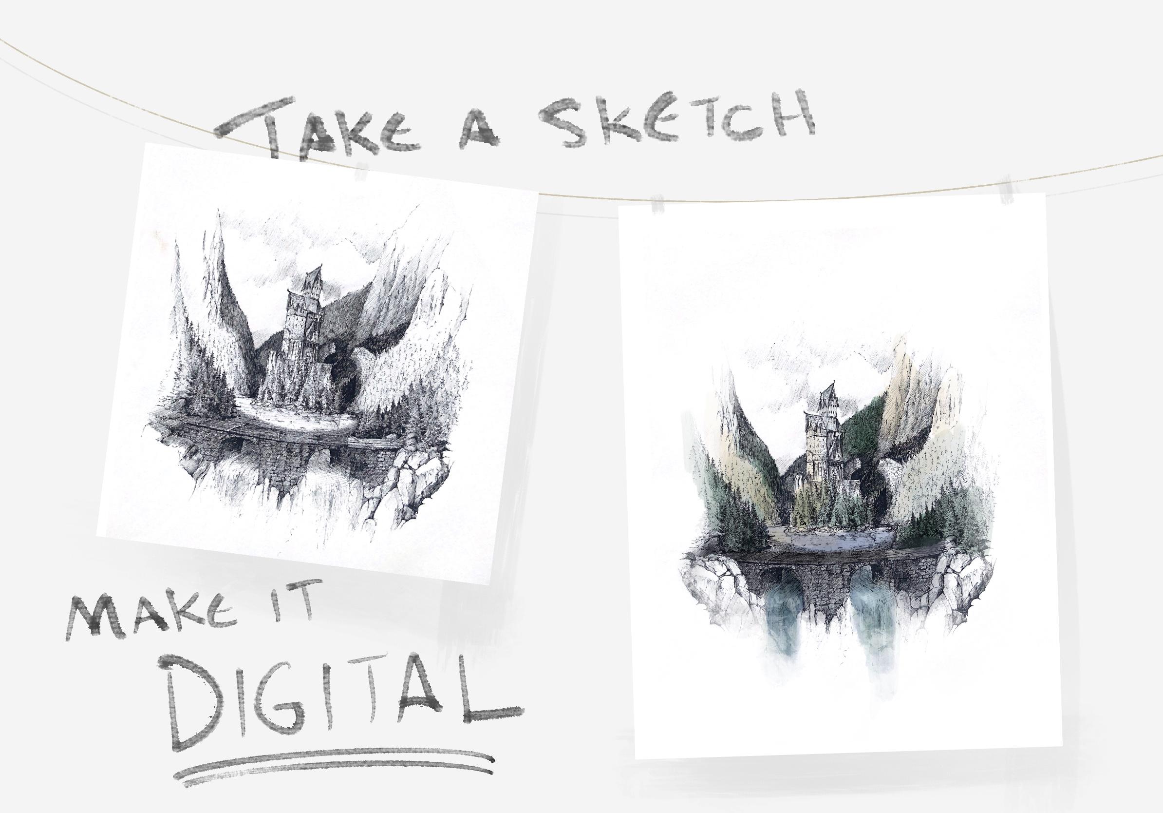
1. Introduction : If you've just
downloaded Procreate or have dabbled in the app for
just a couple of weeks, you're likely
impressed but a little intimidated by all that
the app has to offer. However, along with creating
entirely new art on the app, Procreate has a suite of features that can
help edit, enhance, and embellish artwork
you've already crafted and give it new life. Stuff you've already made with your paint brushes,
pencils, or pens. Hey, I'm Sam. I'm an
artist from Ontario, Canada, primarily working
with pen and ink. I've done work for
professional clients, publishing houses,
music labels, and more. Ever since I got Procreate
about two years ago, it's become an
invaluable sidekick. I can easily send
proofs to clients, conceptualize new artwork, or edit, or change the lines that I've
drawn using the app. In this class you'll
learn a handful of easy and instantly
applicable ways Procreate can help elevate
your existing artwork. You'll gain an
understanding of how to import art into Procreate. I'll go over how to edit, resize, and crop your artwork, change the white balance or the contrast and
exposure of your art. Then I'll go over how you
can add color and use Procreate's brushes to really easily tweak and
embellish your artwork. By the end of this class
you'll be equipped with a whole bunch
of bite-sized tips, ways that you can reuse and
re-imagine your old artwork using Procreate's moderate and really innovative and
intuitive features. This class is perfect
for beginners, those who are new to
Procreate and want to pick up skills and become
more comfortable in the app. Not only will the skills in
this class come in handy as you create new
digital artwork but it might give you a
new understanding or appreciation for how physical art and digital art can intermingle and be combined. I'm excited to get going so
let's dive into exploring how Procreate can help elevate and enhance your existing artwork.
2. Project Description : At the end of this class, you'll have five
different methods you can use and tips that may help you increase or
enhance your physical artwork. I invite you to post
whatever tip or whatever technique you find most helpful in the
class project page. You can either follow along in each lesson or just
watch and observe and take part in whatever
lesson you find most useful. There are a couple
of tools you'll need to complete this class. First, and maybe most
obviously it's an iPad. You'll need an iPad Pro or an iPad that can run Procreate. But what else do you need? You need some of
your own artwork. I find using a pencil or pen sketch especially
helpful in this class. Something with a
white background can really help some of
these tips really pop. However, even if you have a painting that'll work as well. Throughout this class, I'll be demonstrating these tips and tricks using a pen
sketch of my own. As far as projects go, what I want to see from you in the project page is a drawing, a sketch, or a painting
that you also imported into Procreate and I'd love
to see what you do with it. If you add color,
if you edit it, anything you want post
that in the project page and describe how you use
Procreate to enhance, embellish, or just add beauty to the art
you've already made.
3. Touch-ups : [MUSIC] Procreate
gives us unique ways to perfect or
enhance your image, whether lighting size, cropping, or even orientation on the page. Let's start with the basics. The first stage of editing
your work in Procreate is making sure that your
scanned image or the art that you've
done in the real-world that you're importing the app is being drawn on the
right size document. What I mean by that is you
can see here that I have the scanned document
and if I go out to the main page of Procreate, you can see that it has
the file dimensions here. Those are the dimensions of basically my iPad
screen because that's the way that I scanned it in. However, if you scan with a conventional printer
or another method, you'll see the
pixel count there. This one is 1845 by 2388. Now that's pretty high-res
for what we need it for. Even though, as I mentioned, that this import is not the highest resolution that
I could get with a printer. However, we want to
design our Canvas with the final output in mind. There's two ways
to go about this. First is considering where
your image will end up. If you're importing your art and editing it for posting on
Instagram or Facebook, then maybe the aspect
ratio is more important. That means determining
the size and the length of the width of the drawing and the
length of the height. Basically, do you want
it to be a square or a horizontal Canvas or
a more vertical one. In that case, we can
go to new Canvas and select from one of
the Procreate menus that they give us
or create our own. If I'm creating a
drawing for Instagram, then the pixel count
can be quite low. By quite low I mean, like 1000 by 1000. That will give us
a square image, and it will create a
fairly low file size. Now I can go back to that
image we scanned in. I can press "Copy", I go back, and on this side
under the actions, I press "Add" and then "Paste." Now obviously we have some
editing to do on this image, but we can scale it upwards
in our square file. However, if you are importing your image via a high
resolution scan, maybe not something
that's done on your iPad, and your end goal is
to print your drawing, maybe in a larger format
or out of printer, or just any application where it needs to be
out in the real-world. You want to design
your Canvas to the dimensions of the
final printed document. That's the best way I can go about it or the best rule
of thumb that I have. In order to do that,
you go to plus, you're making a new
Canvas and then you can design it any way that
makes sense to you. I found really helpful way
to think about this is by using the inches method. I'm going to inches and
then I can just key in the final dimensions
of the page. For a print like this one, where it's on 8.5 by 11 paper, I design the Canvas
just by 8.5 by 11. You want the DPI to
be usually above 300. That's the dots per inch
and size of that will determine the image quality and the fidelity of the final image. If DPI is less than 300, that's when your image
becomes a little bit grainy. If I create this image, then that means that when I
paste this in, right now, this would be a
good representation of what this image
would look like when printed on 8.5 by 11 paper
at 300 dots per inch. As you can tell, it's
a little bit grainy, but that's because of the scan quality that I
used by using my iPad. If this was scanned on
a professional printer, it will be a little bit of
a more high-fidelity image. But now that we know that
this is the final file size, we can zoom in and make
edits easily while knowing that the
final thing that we draw or the edits we make
on this image will be translated accurately from
this Canvas to the real-world. Well, using the Apple Pencil is the most fun way to
edit your artwork. Procreate also has photo
editing tools which allow you to edit the color and the lightness and
darkness of your video. This is especially useful
in cases such as this scan, which carried with
it a little bit of a bluey tone or it's not
really quite accurate. It doesn't look like the black and white
pen lines that I originally drew
this drawing with. Well, to adjust this, we can go up to the
Magic Wand tool, which is on the top-left, and that gives us
multiple different ways to adjust the color
in the layer. I say a layer because you
want to make sure the layer that you're trying to adjust is selected before you start this. Once you have your
layer suggested, you can choose from either using the hue saturation
and brightness, or try and color balance, or trying curves, or even
doing a gradient map. Now for the purposes
of this class, we're going to go over
these fairly quickly. However, for a deeper dive, I've linked some other
helpful classes below. Hue saturation and
brightness is really the simplest way to change the color
balance of your image. If you click on the
Magic Wand tool and then click on the hue
saturation and brightness, you'll see that there is a hue saturation and
brightness slider down below. It's self-explanatory
from this point, and this is the most useful
when working in black and white because we generally
want the brightness up high, and if it's black and white, we can turn the saturation
or the amount of color that's present in the
image all the way down. Doing this reverts it to
a black and white image. However, if you're
doing a painting or adjusting lines or
paintbrush strokes that you've done in Procreate, this might get a little bit more complicated and you might
turn to the hue slider, which generally tells
you which color is going to be most
present in your work. In black and white, you tend
to favor a neutral hue. However, try moving the
slider back-and-forth and seeing how the colors
in your image change. Color balance is
another method and that is basically showing the three primary colors which make up the entire range of
colors you see in Procreate. Color is formed in
the app consists of a mixture of the
three primary colors, red, green, and blue, and it's combining all
these colors that gives us the wonderful and
multi-million shade Canvas and palate by adjusting the amount of yellow or
blue or magenta or green, or cyan and red, you can change up the entire visual makeup of your drawing. Tapping these shadows,
mid tones and highlights, button effects which
part of your image or your painting or your sketch is affected by the color changes. By just tapping the
shadows means that just the darkest parts of your
image are going to change. Well, mid tones or highlights
mean that in those cases the middle tones in your image or the lightest
tones will change. If you have a white
background then the Highlights button is
the most valuable for changing the overall
makeup of the image if most of the background
is white, for instance. But adjusting the mid tones is probably the best for making the color adjustment
even all around. Mid tones are
selected by default, and that's the way you can
change all the colors at once. Finally, the curves is maybe the most in-depth way you can
change color in Procreate. If you select the curves model, you'll see a histogram. That's a representation of
the balance of the red, green, and blue colors in your drawing or
in your painting. By tapping on the straight line, you can add curves in this histogram and by
dragging that up and down, you can see that you are
affecting the amount of gamma, the amount of red, green, and blue in the image, in the high tones, mid tones, and shadows. Dragging one of those dots
upwards affects the lightness of the layer while dragging
it down makes it darker. Then moving it left
or right affects the contrast or the amount of the color in comparison
to the others. By default, you're
selecting gamma when you open the curbs model, and that means you're selecting
all the colors at once, changing the general
saturation or the darkness or lightness of the color balance in your image. But I'd always the best way to go about this is
by experimenting. Gradient mapping is a way to do what I just described
almost automatically. It analyzes the highlights, mid tones and shadows of
your painting or sketch, and then replaces
that with new colors, completely changing the
entire mood or feel or scene. There's a whole
bunch of presets in Procreate that you
can choose from, that change the mood of your color library that's
present in your image. It's really fun to play around with these
and see how that changes what you've
drawn. [MUSIC]
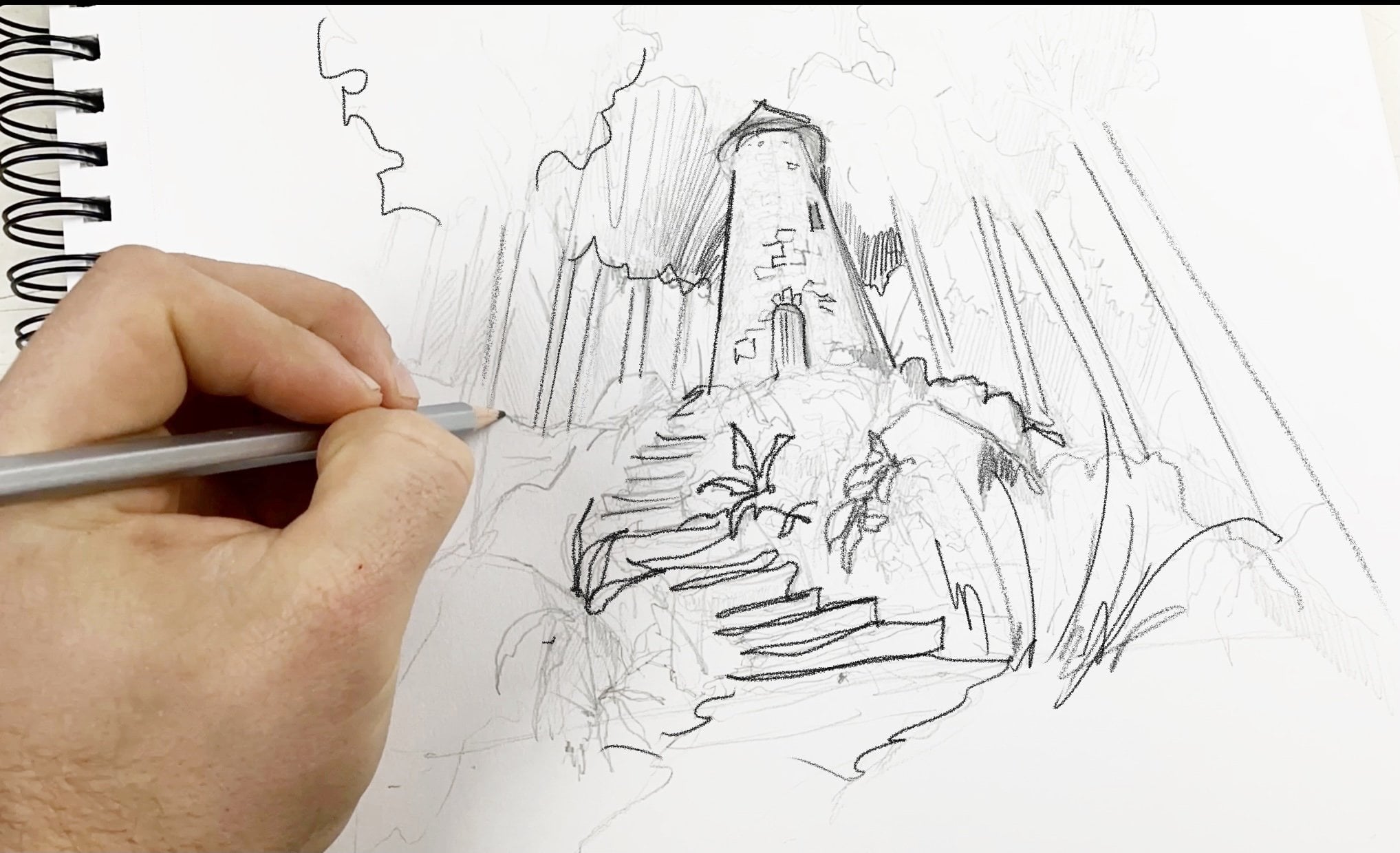
4. Editing with your Pencil : The main draw of Procreate, pun intended, probably has to do with this little
tool, the Apple pencil. It's a great app for
drawing in the medium, and creating really
unique and interesting and professional level now, digital art. However, just because you are editing artwork created
in the real world, created with an analog tool, doesn't mean you can't put
some of those brushes to use. In this lesson, I'm going to go over my techniques and my tips for how I use Procreate
brushes to enhance my artwork. Let's dive back
into this drawing that I've scanned
in with my iPad. As you can see, we
have the drawing here and it's in the app. It's on a canvas. But there's some splotches here. There is some distortions. On this side you can see
the grain of the paper. This is where the Apple
pencil really comes in handy. My favorite brush for making these touch-ups is an airbrush. It's pretty aptly named
for these purposes. You want to be full opacity. I like the airbrush
because it's soft, which means that it is really easy to blend into the
rest of your image. Now, you could select white, but there are a million
different whites. You actually want to long hold on the image right
beside the splotch. As you see, that selects
the right color white. I usually go with
a smaller brush. Then I can just color
into those awkward and obtrusive parts
of the image. I often also will use the
Select tool to make sure I don't damage the
rest of the lines. For example, like this
mark here was larger, I could create a selection to make sure I don't
mess up at all and I don't go back down
into the actual pen lines. This may seem pretty obvious, but another really great thing you can do with the
Apple pencil is by adding to your lines
or adding shading, complementing the work
you've already done. Again, I selected the
color of these rocks here. I am just airbrushing
over top of them. Lastly, a way I use my pencil to edit my work is using it
as a really precise tool for even re-purposing
different parts of your image or your painting. In this case, I'm going up
to this Tape Measure tool or the S up here, going down to Freehand. I'm going to try to select
these rocks in order to mirror them on the
other side of the image. With the Apple pencil, I find
this is a lot easier to do. As you can see, this
shimmering line marks where I am editing
up and around. I'm hugging the contours
of the top of this rock. Now that I have it selected, I'm going to press
"Copy & Paste". It's copied and it's
pasted on another layer. From selection that's the
shape we just copied. I'm going to that
Arrow tool to move it. I can move it to this
side of the image. These tools down here are
really important in this. In this case, I can flip horizontal and
position it right there. Now that I have this selected, I could also distort it if
I want to change the shape. We want to change how
those rocks are appearing, or even warp it if I
really wanted to do that. However, for this case, I'm just going to
leave it neutral. I deselect. Even without any other
further editing, you can see that that's
a really cool way to replicate textures. Can you imagine if you're painting
something, for instance, and you're painting
millions or thousands of little houses on a valley. You can use this tool really precisely to make your
life a little bit easier. If you have a high-quality
scan of your painting, you can cut out the houses and replicate them
without having to paint all those tiny little
monotonous shapes.
5. Planning with Procreate : A lot of artwork is high
consequences stuff. I draw with pen and
I can't erase and I can't take away from the
drawing after I've started. That's why Procreate is such an excellent way to
plan out your artwork. I use Procreate almost
as a drafting table, creating the draft for my
work and then transposing that onto the sketchbook,
onto the canvas. Let's dive in. I often plan
my drawings out in Procreate. As you can see here, it's sketching out the
drawing that I scanned in originally that I ended
up completing with pen. I use the Procreate
pencil brush the most often when I'm planning
because I really appreciate the way it seems and
feels like a real pencil. In my mind, I just
associate pencils with the concept
phase of a drawing. I can sketch out around
the [inaudible] of canvas. I want to make sure
that the canvas I'm drawing on is the
same aspect ratio, meaning the same ratio of height and width as the final drawing
page that I'm working on, or this can apply to
a canvas as well. Another method that
I can use to more accurately plan out
drawings and then transpose them on the page
in the real world, is by drawing in quadrants. I click on the little
wrench and go to canvas, and then I'm going to go to drawing guide, edit
drawing guide. You can see that there's
a blue 2D grid menu, and then there's a grid
opacity thickness. For the purposes of
this short class, when I talk about the grid size, and you can scale it up and
down as big as you like. I'm not a stickler for exact
dimensions, so for me, I want to get it roughly
an inch-to-inch ratio. But in this drawing,
you can see as I'm doing it a lot larger. The drawing is made
up with quadrants and I'm roughly trying to scale it. You can [inaudible] for
you, but once you have the square on your
Procreate page, then you can transition to a
real-world piece of paper. If you find it helpful, you can draw the
same grid pattern on your piece of paper. That means that when you have a finished Procreate sketch, you can easily draw
the same thing on a piece of paper and keep
the same dimensions because you can refer to how
large objects were on the page and how large they are on Procreate in the same way even if the size of the
paper is a little bit different or it just feels different drawing
in the real-world. The other reason
why Procreate is such a great planning
tool, is because if you find that the
composition is off, or you sketch a little part
of the landscape or the part of the character and
you find out you want to focus on that more, you can click the
little arrow tool, which boxes in the entire layer of work that you're working on, and then you can edit it. You can shrink it or you can move it around to
a different part of the page and do this with
as many layers as you want. That really gives me
the creativity to see how objects look in certain dimensions of the
page and experiment with different compositions. [MUSIC]
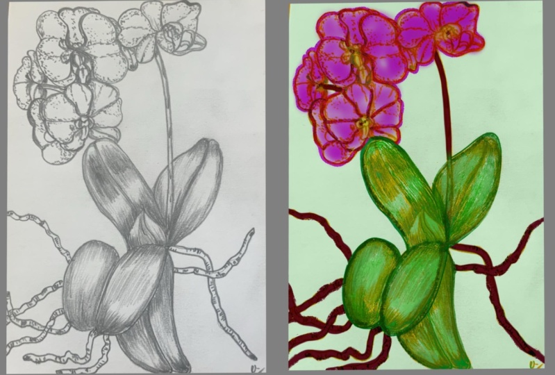
6. Add Colour Under your Art : [MUSIC] Now this
tip is my personal favorite and it's
something that I found really helpful
when I first learned it from a
friend on Instagram, Sarah, and you can find her
at this tag right here. This is how you add color
underneath your artwork. It's especially helpful for
pen and ink drawings or any drawing or artwork
with a white background. Let's dive in. The first
thing we're going to do is add a new layer, Layer 2, and then you're going to click and drag it
underneath Layer 1. Then we're going to rename it. I find color a useful
one must be direct. We want to click on the
menu beside Layer 1 with the N and we want to scroll all the
way up to multiply. Multiply is the word we want. So then the N should
be an M. Then we want to re-select
the color layer, which should be underneath
the modified layer. Now, if you try coloring on
the page with any brush, you'll notice that
the black lines or whatever patterns are on the top layer still
shine through. You're coloring
effectively underneath these lines or underneath
the image on top. It's non-destructive
editing of the top image. It means you can add color
to your analog drawings, the drawings you've
done in the real world. This is huge for me because it's allowed me to really
experiment with color in ink drawings
in a way that doesn't really destroy or impact
the original work. I can test out different
color schemes or even create final print drawings just
by experimenting with colors in the Procreate app. As you see here, it's also
a great way to learn how colors work without
any consequences. As you experiment, you'll find what brushes work best for you. Do you like the soft airbrush or do you like
something a little bit more speckled or textured? I really do enjoy textured brushes when coloring
underneath in Procreate because it adds and compliments the textures of your work
that's already there. It makes it appear a
little bit more lifelike I find when the brush itself has some varying
textures in it. As you'll see here
though, I'm selected the full opacity in the drawing
on the right-hand side. That bottom slider
is at the very top. I'm pressing a little bit lightly because I want
a wash technique. [MUSIC] But you do you,
I'm really excited to see how you experiment
with this method.
7. Exporting your Art : [MUSIC] There are
thousands of websites and online printing
options where you can create high resolution and dynamic printed
products with your art, or even creating Etsy listings or other online applications. However, often the scans that we import into procreate
or the pictures we take of the artwork don't translate well into
these applications. In this last lesson, I'm going to go about
exporting tips. How to make your artwork shine in different mediums
across the web and in print and how to set up your canvas in order to do so. As we mentioned,
the biggest part of exporting art comes when
you create the canvas. If your canvas is too
small, for instance, if I want to export this
1,000 pixel by 1,000 pixel square image for an
11 by 14 inch paper, it's not going to
work because that pixel count will mean that when it's blown up, it'll be
blurry and pixelated. However, this image
here, for example, is 8.5 by 11 and that's the size of
conventional printer paper. While it's smaller on your iPad, if we approximate the size of an 8.5 by 11 piece of paper, we can see that we don't
lose any image quality. This size of image or this
quality of the scan is a little bit lower
because I scanned it using my iPad, remember. However, now there are many different options for
how we can export this image, and that all depends on how
we want to use the image. If I'm exporting to Instagram, great method is a JPEG. That's the most common file
type and it's the kind that your camera or your
phone often shoots. PDF is perfect for
file distribution to printers because when
you export a PDF image, someone who receives
it or who prints it, it'll print exactly as it
shows up on the paper. PDF is a set image type in
printers, easily recognized, and can easily print PDF images with the same quality
that you send the file. PSD up here, you might be wondering what
that stands for, and that's for easy application into Photoshop, Adobe's program. Now, I much prefer Procreate even for image
editing to Photoshop, not the least of which
because of the price. However, with PSD, you can share the image and it's ready
to go into Photoshop. Procreate is a great way to save a file for your
external hard drive or even for uploading as backup on Google Drive
and it preserves the individual files and images to be easily
re-edited in the app. If you download a
Procreate file, you can edit it or open it up in Procreate with a
snap of your fingers. A TIFF file is primarily reserved for professional
designers or illustrators. It perfectly
preserved your image and this will
flatten your layers. It makes a larger file
size and unless you're planning to send this
to a graphic designer or a professional illustrator, you don't really need
to worry about TIFF. All these options other
than Procreate and PSD, all these options
flatten your image, meaning that the
layer is up here will become one layer when
you reopen the drawing. If you want to
preserve the scan that you've made and for instance, the color that you've drawn
underneath your image, you can choose from one
of these down here. I really like PNG files
because it preserves the opacity of the image that you've created and the
opacity of your layers. Saving it as a PNG file, you can export it, and it saves three images, 7 megabytes, so a fairly
large file but I can save these three images
or save to files. I usually like to save
to files or just save them in one location. [MUSIC]
8. Next Steps : That's it. You made it to
the end of this class. I hope these five tips have
been useful and helpful. Procreate is such an
excellent art platform and it really has expanded
my own creativity, and I hope it does
the same to you. As you get to know the platform more and become more
comfortable with all of its thousands
of tools and brushes and methods
of creating art, I hope you don't lose track of the fact that the
artwork you create in the physical world with analog tools can be
integrated into Procreate. It's emerging
digital and analog, and it's a really exciting
time to be an artist. As you continue to create, keep these tools in the
back of your mind and post what you've learned in
the class project page. I'd love to hear from you. I'd love to hear what tips
you found most useful, what you'd want to
learn more about, and check out what your
classmates have made as well. Pick up your Apple pencil, keep drawing and let me
know what you create. Thanks for watching this class.
 Sam Gillett, Pen // Pencil // Procreate