Transcripts
1. Hello from Shane: Hi, I'm Shane and
I'm an artist and creative director living
in Oakland, California. I'm excited because
today I'll share my favorite illustration
technique will create flowers that you can
use for greeting cards, art prints, pattern
designs and more. I love this technique
for a couple of reasons. First, it looks like watercolor, but you can scale it
to any size you need. And second, will create these
flowers piece-by-piece, which will give us a library
of shapes that can be mixed and matched to
create endless variations. Okay, here's the plan. First, we'll check out
the materials we need. Next, we'll find some
inspiration to get us excited. Then we'll jump
into painting with India ink, like it's watercolor. Finally, we'll photograph
these elements, bring them into Photoshop
and Illustrator, assemble our flowers
and color them up. This course focuses
on a technique that you can use to create
endless projects. But to get you started, we'll focus on an art print that reminds you of your
favorite place. I love where I live in
Oakland, California. My city inspires a
lot of the work I do. California poppies
remind me of my home. But you can create a flower that reminds you of your
favorite place. Even if you're new to
Photoshop and Illustrator, I encourage you to
give it a shot. We'll take everything
step-by-step and I'll show you where to find everything in the
interface instead of hopping from shortcut
key to shortcut key. This is my first
Skillshare class and I had a blast creating it. But what I'm really excited about is to see what you make. So please upload your project
and share your creations. Alright, let's jump
in and get started.
2. Materials: You'll want some watercolor
or heavyweight paper. Water black India ink
for maximum contrast. A white mouse
container to hold ink. Any medium paint
brush you can find. Good old drinking straw. Cheap plastic pipette. These are a lot of fun. Rag or towel. And for the digital
parts at camera or phone and Photoshop
and Illustrator.
3. Get Inspired: Where to get inspiration? Where do I find in? I've got a different
idea. Follow me. Let's just take a walk
and see what's blooming. Oh, this is perfect. This is my favorite flower,
the California poppy. They grow like weeds
around here in Oakland. And I love the color in
there, simple shape, checkout, the top view of its petals compared
to the side view. Almost exactly the same shape. You'll see why
that's helpful later when we put all the
pieces together. Alright, that was a great walk. Let's keep going.
4. Painting with India Ink: Okay, let's do this and
paint with India ink. I got my supplies ready, solid. Just pour off some ink into the larger
container to start. Usually make quite a mess. And now I'm ready to go. So I'm painting these doodles in a notebook because
it's great to have a library of these to
refer to and reuse later. I never throw these
out because at the least you can make a
cool collage from them. So I make these flowers
piece by piece and then I'd put them together
later in Illustrator. So you'll see that working like this will give you
endless options later. So let's get some petals going. First, I paint the
shape with water. It's kinda like a
teardrop shape. And this is a simplified shape from our reference earlier. Then I drop a little dab
of ink right at the base. Go. You can see the water, ink and physics just
kinda doing their thing. Then I use the brush to guide the ink through
the rest of the water. Great, Let's create
a few more petals. Create the shape with water. Then I dip a dab of
ink right at the base. Sometimes you can also just
move the paper around. Now that the waters
a little dirtier, you can kinda see
the shape better. Now I'm going to
fill up the rest of the page with little petals. You see this one's a little
taller and narrower, which is just fine. It's good to have variety. What I'm trying to get
is a range of values. So dark to light and some
mid tones in the center. Right? We're back. These are some good
looking petals. I know it doesn't
look like much now, but these petals and pieces
are just what we need. So I'll make some stems. I'm going to grab my pipette
and drip a tiny bubble of ink right down here. Okay. Then I take my straw and I angle it almost parallel to the paper
and bloat evenly. Sometimes I'll either leave
it as a single stem or I'll put another drip of ink at the base and below again
for a branching effect. Gonna make a few more. You'll notice I'm using pretty small notebook
for this demo, but you can paint
any size you want, and the process
will be the same. Next, we'll make some
extra drops and drips. So I'm gonna grab my pipette from a few inches off the
surface of the paper. I'll make some drops. Sometimes I'll grab my straw, hold it perpendicular
to the paper, and give it a short
burst of air. And this will create
a starburst effect. You see these are kind
of close together, but that will be okay
when we digitize this and we can always put
some space around those. In Photoshop. I'm going to make a few more. I can place them
anywhere on the page. Can always edit later in
Photoshop and Illustrator. Now I'll make one
more starburst. I'm happy with my collection
of slats and drips. Let's take a photo and get
these into the computer.
5. Photograph Your Ink Doodles: So I'll show you how
to do this using just my overhead LED
lights in my studio. So let me turn off the lights. Okay, you can see that
it's not too bright. But the important
part is to just have even light across the whole
paper and no shadows. So then you just frame the photo so it fits the screen as much as
possible. And shoot. There we go. And
then you upload to your computer and
we'll go from there.
6. PhotoShop: Saturation, Levels and Channel Selection: Okay, We're going to
jump into Photoshop. But first let me show
you the image we need to prepare and to give you an
idea of what we're after, this is what it'll look like. It's red shapes on a transparent background and
will transfer this detail to vector shapes
in Illustrator so they can scale to
any size we want. I heard somewhere that red gives the most range when
you change its hue. And we want to be able to change these elements to
any color we want. So read it is. So let's work on preparing
our ink elements. We painted. First, import your photo of
your painting from your phone or camera and place it in
a folder on your computer. Okay, now in Photoshop, go to File Open and navigate to your
photos and click Open. Next, duplicate your background
layer of your photo by dragging the background layer on top of the icon
with the plus. Rename the layer to photo by
double-clicking on the name. Be sure to save on
the top menu File, Save or use the shortcut keys. Verify it is being saved as a PSD Photoshop
file and hit Save. Next, we need to
desaturate the photo. So all the color
information is in a value scale from black
to white in the menu bar, go to image adjustments, hue saturation, and move the saturation slider
all the way to the left and click OK. Next we'll white balance the photo using levels. This means we'll make
the white parts of the photo as pure
white as possible. In the top menu, go to image adjustments levels, and then select the eyedropper
icon with the white on the bottom to select the
white point of the image. Drag your cursor over to a part of your photo that
should be pure white. And click will want to get as close to a pure white
background as possible. We do that by moving the
slider on the right, slightly to the left until
the background is pure white. Experiment by moving
the other two sliders. But the goal is to keep a nice range of
values and details. Click Okay, when you're
satisfied with the result. Save your project by going to the top menu File Save or
using the shortcut keys. A little bit of the
background noise can be erased later in Illustrator. So don't worry about
getting it perfect. And now it's time to
select the Alpha channel. Alpha channels control the
transparency of a color. On the right near
your Layers window, click on the Channels tab. If for some reason you
don't see the channels, go to the top menu, select window, and channels. On the bottom of the menu, you'll see a dotted square. This will select
the alpha channel. Click it. Now you will see
your image has been selected. Click on the layers tab. The Layers window can also
be found in the top menu, select Windows and layers. On the bottom of
the Layers palette. Click the icon with the plus in the box
to add a new layer. Rename the new layer mask. And we'll want to fill this
selection with the color red. Click on the swatch at the
bottom left of the toolbar and slide that cursor all the way to the top right corner for red. And click Okay. Select the paint bucket tool. And sometimes only the
gradient tool is displayed. So right-click the
gradient tool to find and select the paint bucket tool
if that's the case for you. So when I move my cursor
to the canvas and click, the paint bucket is filling
the negative space. So to fix this, go to the top menu
and select Edit, Undo paint bucket, and instead will invert
the selection first. Go to the top menu,
select and inverse. Makes sure your layer
called mask is selected. Now click with the pink bucket
anywhere on the canvas. Now the flower shapes
are colored red. To see our work more clearly, click the icon to the left
of the layer we named photo and the background
layer to hide them. On the top menu, go to Select, de-select. Now go to the top menu
view and zoom in. Click and hold while pressing the shift bar to temporarily get the hand tool to move around the Canvas and see
all the detail. The areas that were
white or transparent. This is exactly what we want. So if you're seeing
this great job, zoom out to see the entire canvas and don't
forget to save your work. Top menu File, Save. Next we'll fire up Illustrator and get
our work copied over.
7. Illustrator: Image Trace: Keep your red ink alpha
mask open in Photoshop. Then launch Illustrator, go
to the top menu File and New. I'm keeping the 612
by 792 dimensions. On the right side of the screen, choose pixels in the dropdown. Scroll down to Advanced
Options and select RGB color. For my purposes with
digital printing, RGB color works great. Click Create. Now switch over to Photoshop. Make sure you can see your
entire canvas by going to the top menu view fit on screen in the
toolbar on the left, select Polygonal Lasso Tool. If a different one is showing, right-click to see
the other options. Next, we'll select
the mask elements we want in Illustrator. With the lasso tool selected, click around the areas
you want to copy over to Illustrator and return to the start point to
activate the selections. Verify the mask
layer is selected, and go to the top
menu Edit Copy. Now return to Illustrator. Go to the top menu,
Edit and Paste. Again, top menu view, zoom out as many
times as needed, or use the shortcut keys. And select your inked elements. Click and hold the corner of the selection while holding
down the Shift key. And this will
uniformly scale it. Repeat until your mask
fits on your canvas. Top menu View, Fit art
board in the window. And save your project by
going into the top menu. And then navigate to
the folder you want. And save. Next we'll turn our inked
pieces into vector shapes. Go to the top menu,
Window, Image Trace. This has a lot of options, but you'll only need to
work with a few of them. Preset and view. I have not changed, but the mode should
be set to color. The color slider determines the amount of individual colors. For this project. Let's choose 12th. That should give
us a good balance of detail and simplicity. Click on the Advanced
drop-down menu and check Ignore White. That will make sure it keeps the transparent areas transparent
in the tracing process. Now click Trace. If you get this warning,
just click Okay. Then let the robots inside
illustrator work their magic. This may take some time. This is an important part. I always forget. While the image is selected, go to the top menu
Object and Expand. Make sure the object and
fill are checked and click. Okay. You'll see that that final step change the image
to a bunch of points. We are now vectorized. Click outside the
bounding box and view, zoom in or use the shortcut
keys to see the results. Hold down the space
bar to move around. So go to the top menu, View, Fit Artboard in Window. Save your project. And next we'll group the individual pieces to
prepare for coloring.
8. Illustrator: Group Elements: It's easiest to group the
pieces before coloring. You see right now they're
all grouped as one. So in the toolbar on the right, select the Lasso tool. You draw around the
shape you want to group. And then in the top menu, go to Edit and cut. And then top menu again, edit and paste or use
the shortcut keys. And leave it selected and go to the top menu Object and Group. Click the selection tool in the toolbar and move
off your art board. It may be easier to zoom in to lasso and
group the pieces. Draw around the shape
you want to group. Top menu, Edit, Cut,
top menu, Edit, Paste, and leave
it selected and go to the top menu
Object and Group. It's a little tedious. But what you're doing is making the building blocks
that will let you create endless variations. I'll use the shortcut keys
and speed up the rest, and I'll see you shortly.
9. Illustrator: Floral Silhouettes: Now we're going to put
these pieces together to create interesting
silhouettes of flowers. You can refer to your
inspirational photos for this next step. Or just use your imagination. I'll start with moving all
my pieces off the art board. Then I'll drag a petal
shape over like this. And take some stem
shapes like this. I'll take another
petal and all overlap. You can see how fast these
start to come together. Use the corner widgets to move, scale and rotate the shapes. I'll scale these pieces until
I get a silhouette. I like. The other tool I
use quite a bit is the eraser over here on
the left and the toolbar. You can control the size
up here or just hit the bracket keys on your
keyboard to adjust the size. We're just playing
with silhouettes here. So have fun and use
your imagination. Reuse the shapes to
make other shapes. Here I'll make this petal
shape into a little bud. These splatters are super
fun if you are going to erase the shape or
change it drastically, I just copy and paste it
over to your art board. Because what I want to
do with it is chop off the bottom using the erase
tool for a grass effect. See how many variations you
can make with your shapes. Obviously, these aren't
botanically accurate. That goes without saying. But if that is important to you, you can use this same process
and just take time painting accurate elements
in the beginning when we're working
with the India ink, I'm going to fill my page
with some other variations and we'll meet back here
to jump into some color.
10. Illustrator: Edit Colors: I hope you got some
cool variations. Let's color them up. You can color piece-by-piece or select several
pieces at a time. We're going to use the
re-color tool to do this instead of the
swatches over here. The reason is using
the swatches, we'll change that whole shape to one color and wipe out
the subtle details. So instead select a
pedal and go to Edit, edit Colors, Recolor Artwork. This is an amazing tool, but today we'll just
stick to the basics. You should totally search out other Skillshare classes to see what else this tool can do. For now, just make
sure this link is on. To link colors. Grab the large bold
circle and move around the color wheel to
find the color you want. I'll go to an orange color. If linking is turned off, only the selected color moves. You can always get back to the original color
by hitting reset. But that only works when
the tool is active, not after you've saved a
color style like this. So I'll undo that. And like I said, you can color multiple
shapes at once. Hold down Shift, and
use the selection tool to grab a few of them
and then go to Edit, edit Colors and Recolor artwork. I'll show you a
trick at the end to add even more depth
and interests. After we color all our flowers, repeat the process and
color all your flowers. And that's the basics. Let's color up another one. This slider controls
the brightness or click the other to
control saturation. I like to vary the
shades and tints. Petals next, to add a
little more variety. Okay, and let's go
to grant the stems. Okay, I'm going to
speed things up. I hope you like how
your flowers are. So let me show you
a little trick I use to add some
depth in the petals. I'll select the top petal. I'll go to Window
transparency. You ready? I love this trick. From the pole down,
select Multiply. Now you see the shape underneath and the
colors are multiplied. Play around with this. This works great on
a white background. But if you have a
colored background, you'll need to
experiment a little bit. Now we have a whole
page of cool flowers to make prints or patterns
or other art with.
11. Class Project and Farewell: Now that you know
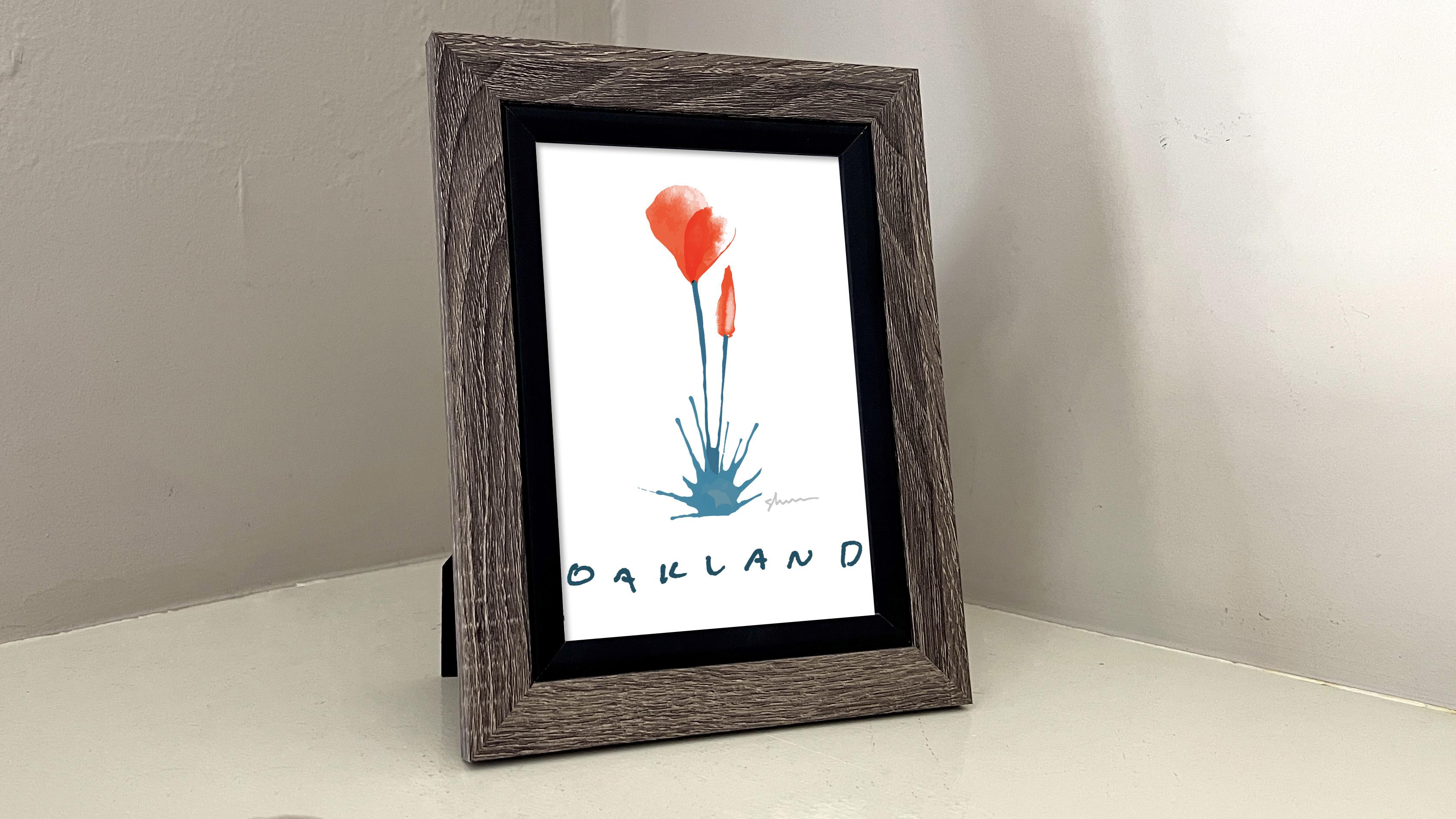
this technique, Let's make an art print. We have our flowers, but let's add some text
using the same process. Write a name of a
city or place you'd love or call home in
black ink or marker. Also write your signature so you can sign your work
just like before. Take a photo and upload it. Next, we'll D saturate the photo image and
Hue Saturation. Go ahead and take the
saturation slider, slide it all the way
to the left and click. Okay. Next, levels, go to
adjustments and levels. Take that white eyedropper icon and select where you
want pure white. Adjust the sliders as needed. Make sure it's all
white or close to it. Over here is okay
to be like that. And we'll click, Okay, now we'll select our channels. We'll go over to the
channels palette and select the icon with the dotted
Square to load the channel, go to Select Inverse. And next we'll fill with red by going first to our Layers panel. Create a new layer. Go to your swatches. Make sure it's pure red. Click Okay. And finally go back to your paint bucket tool
and fill the selection. And now select all edit, Copy and we'll head
over to Illustrator. Okay, here we are
in Illustrator. Let's go up to Edit and Paste. I'm going to hold down
the Shift key and scale the text down so it
fits better in our window. You can see there's a little
color here and that's okay. Let's trace the text
Window and Image Trace. Set it for color. And since this text
is pretty much solid, we only need two colors or the lowest setting in the
advanced panel will click, Ignore White and trace. Okay, that's all done. We'll close our
Image Trace window. Go up to Object and Expand. Object and fill are
checked and click. Okay. Let's separate Oakland
from my signature. Will do that by going to
the direct selection tool. Selecting Oakland, going to
edit and cut, edit, paste. And then finally
object and group. And now, when we go to our
Direct Selection Tool, Oakland is separate
from my signature. Now let's make our art board. For our art print. You can make sure your
art boards window is opened by going to
Window and art boards. And we're just going to create a new artboard by
clicking this plus icon. And I want my print to be a five inch by
seven inch print. So I'll click on this
icon to set the size. And when I type
it like seven IN, illustrator knows
that I want five by seven inches and my okay
buttons hidden here. So I'll go to my second
monitor and click. Okay, great. Now we have our new art print. Next, select the flower
you want to use. I'm going to select
this grouping here. I'll move it over, make sure it's centered. And then I'll grab my text. I'd like this to be under the flower and kinda
centered across the page. That's working well. Before I zoom in, I'll grab my signature. I'll scale my signature
down holding the Shift key. And I'll zoom in view. Zoom in, or by now I'm sure you're using the shortcut
keys if you're new. For my signature, I'm going
to choose a light gray color. I don't need it that prominent. And for Oakland, I'm going to choose a color
within the flowers. So I'll go to my Eyedropper
tool and select the blue. I want that color darker. So I'll go to the swatch, double-click and
change the value. Great, let's zoom out
to see what we have. Fit Artboard in window. I'll go to my selection tool and select off. See how we did. The color of the Oakland
text is a little dark. I'm going to back out using
Control Z or edit, undo. And I'll double-click
on my swatch and just choose a slight
less dark color. Great, I'll zoom
out a little more. It looks like the flower
could be a little larger. Select the flower and my signature hold
down Shift and Alt, and I can scale it
from the center. Yeah, that looks good. And just so we know everything fits well on the printed page, I'll select everything,
hold down Shift and Alt and just
change the size. I like how that came along. So let's export it
and print it out. We'll go up to File, Export, Export for Screens. And you only want the
art you want to print. Checked. Pdf is a great
format for printing. Select the folder you'd like to keep it in, and click Export. Okay, I've been looking
at this for a bit now. I think I want to
change the text. I love handwritten texts, but this is looking a
little too chunky for me. As I said earlier, I love keeping the pieces and bits that I've done
for other projects. And I have some handwriting
from my daughter. I think I like this better, so I'm going to just select it. Go up to edit, copy, return to this
and edit paste. This deep green color
was, was working. So what I can do is go to the eyedropper tool and
just select that color. Now, I'll go to my selection tool and click on the old
texts, move that away. And just size my
daughter's text to fit. She writes in this
really crazy small font. I loved the personality of it. I'm much happier with that. So let's print this up
and see what we got. Here. It is all framed up. I hope you've enjoyed
the class and see the possibilities of
using this technique. Thanks for joining me and
I'll see you next time.
12. BONUS: Color Fast Track: Hi, it's me again. Since launching this course, I've been experimenting
and I've learned some more techniques that
I'd like to share with you. This lesson will
include a technique to vectorize fully
colored illustrations. I'll also share one of
my favorite new tools and we'll dig deeper into
the re-color artwork tool. So let's jump in. So I'm keeping the materials
simple for this lesson. My favorite art tool of all
time is Crayola markers. I picked three colors
and got some paper too. I got some hot tea nearby. So I'm ready to go jumping
in with the yellow marker. I'll just make a row of yellow petals and make this
last one a little wider. Next, I'll get the orange marker and make a row of orange petals. Again, I try to
vary the size and shape slightly of each petal. And finally, I'll make some loose sketchy
stem and leaf shapes with a blue marker. Some single ones,
some double ones. I'm just trying to get
myself options later on. I keep these shapes
super loose and embrace my over
caffeinated drawing style. These are looking good. So now I'm ready
to take the photo. And I don't suggest
you drop your phone. You're barefoot in your jammies. But whatever your style is, frame all the elements
and make sure you're in as good a light
as possible and shoot. Okay, now open your
photo in Illustrator. You might want to zoom out. So go to the top menu, view, zoom out, or use
the shortcut keys. Select the photo
and right-click, and then find crop. Move the handles to crop out any extra areas of the
photo you don't need. Click Enter to
commit the changes. And now with your
photo still selected, go to top menu
Window, Image Trace. For the mode we'll pick color, and we'll choose six colors. Under the Advanced tab, click on, ignore white. And then click Trace. Click Okay on the
warning pop-up. Great. Next you'll go to
the top menu, Object, Expand, make sure object
and fill are checked. And click. Okay. Now you can close the
Image Trace window. This is a great time to save. Alright. Now click on the
direct selection tool. Then go and click on a background color
you want to remove, go to top menu, select same and fill color. This is my favorite new
tool I've discovered. This selects all the same colors in your image in that color. Repeat this process until all the different shades of
the background are deleted. Now I'll just size all these elements down
to fit the artboard better by holding down the Shift key while moving
the corner handles to fit. Top menu view, zoom
in or shortcut keys. Now it's time to select
a few of these elements. For our example. On the side toolbar,
click lasso tool. Select an image element. Top menu, Edit, Cut, top menu, Edit, Paste. And finally top
menu Object Group. And I'll get this guy here. Then I'll click on
the Select tool and move the element off to
the side of the art board. Again. Side toolbar, lasso tool, select an image element. Top menu, Edit, Cut, top menu, Edit, Paste, and then
top menu Object group. Or you can use the
shortcut key is of course. For this example, I'll
grab four petals. I'll grab this stem here. And with the selection tool, I'll select the other elements and move those to the side. Click and drag to select the elements we
want to work with. I'll move those
onto the art board. And this is another
good time to save. Now I'm just using the selection tool to
rearrange the elements. And now I'm going to click and
drag to select everything. I'll go to top menu, Edit, edit Colors, and
Recolor Artwork. At the bottom of the window. Make sure the brightness
adjustment is clicked. Now, I'll slide the slider to the right to
brighten my colors. Click the art board when
you're done adjusting. Now with the selection tool, I'll move the petals into place. Just as before, select, rotate and scale the pieces. And finally, I'll
grab the stem and scale and rotate that a little. I'll click and drag
to select the petals. Top menu window transparency. And select Multiply. Now I'll just close that window. Again. Top menu view zoom in to see. And I want to adjust the
petal colors a little more. So I'll click and
drag to select them. And then go to top menu, Edit, edit Colors, and
Recolor Artwork. And I'm going to
adjust the slider to the right to brighten
my colors even more. Click the art board when
you're done adjusting. Now I'll adjust the
colors on the stem. I'll click to select it. Then top menu, Edit, edit, Colors, Recolor, Artwork. This time, I'll click
on Advanced Options. Towards the bottom
of the window. Click the button with
3 bar and you'll see the Global Adjust at the
bottom of the drop down menu. This will give you individual
sliders for saturation, brightness, temperature,
and luminosity. For now, I'll just increase the saturation and
lower the brightness. That looks good.
So I will click, Okay, save your work. And I'm going to call
this done for now.
 Shane Donahue, Let's create together.