Transcripts
1. Welcome!!: Hi and welcome once again to my four seasons banking series, where we let nature be a guide and our teacher. This time, we're finally in summer where trees are like fashion models parading, flaunting their latest outfits. So much so that this parade consumer little overwhelming, but worry not. In this class, we'll look at using contrast of the essential elements of art such as shape, color, and light to simplify the seemingly complicated works, I will take you on a catwalk with a cat or not. And then backstage or other bucks to, to have a closer look at our models and study them better. By the end of the class, having studied the trees all dressed up, you may realize not all need that close. Don't hide them when covered them up, but actually reveal more about the personalities. We might get to know them closer and even make lifelong friends. So what are you waiting for? Jump in and join me on this adventure?
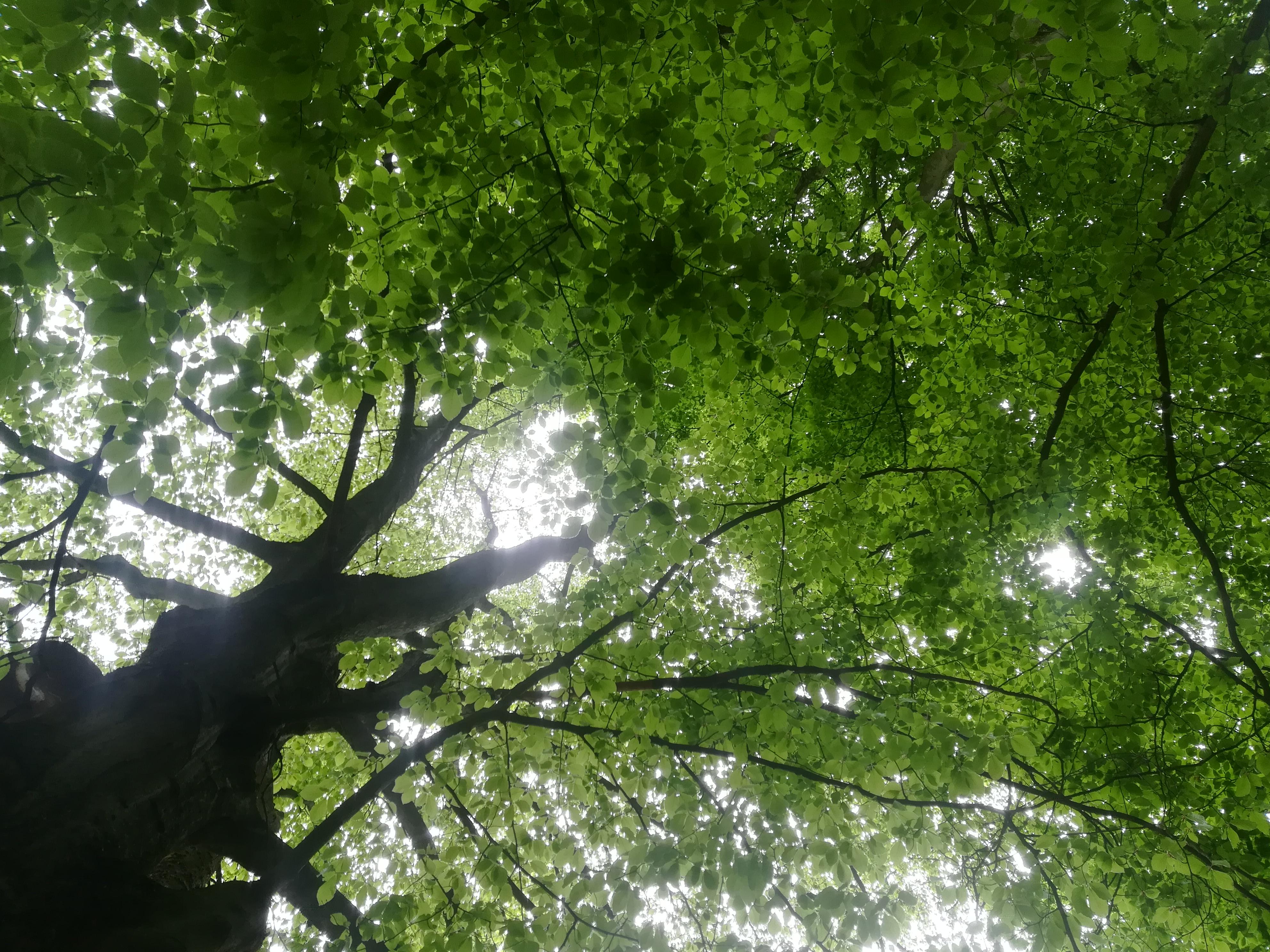
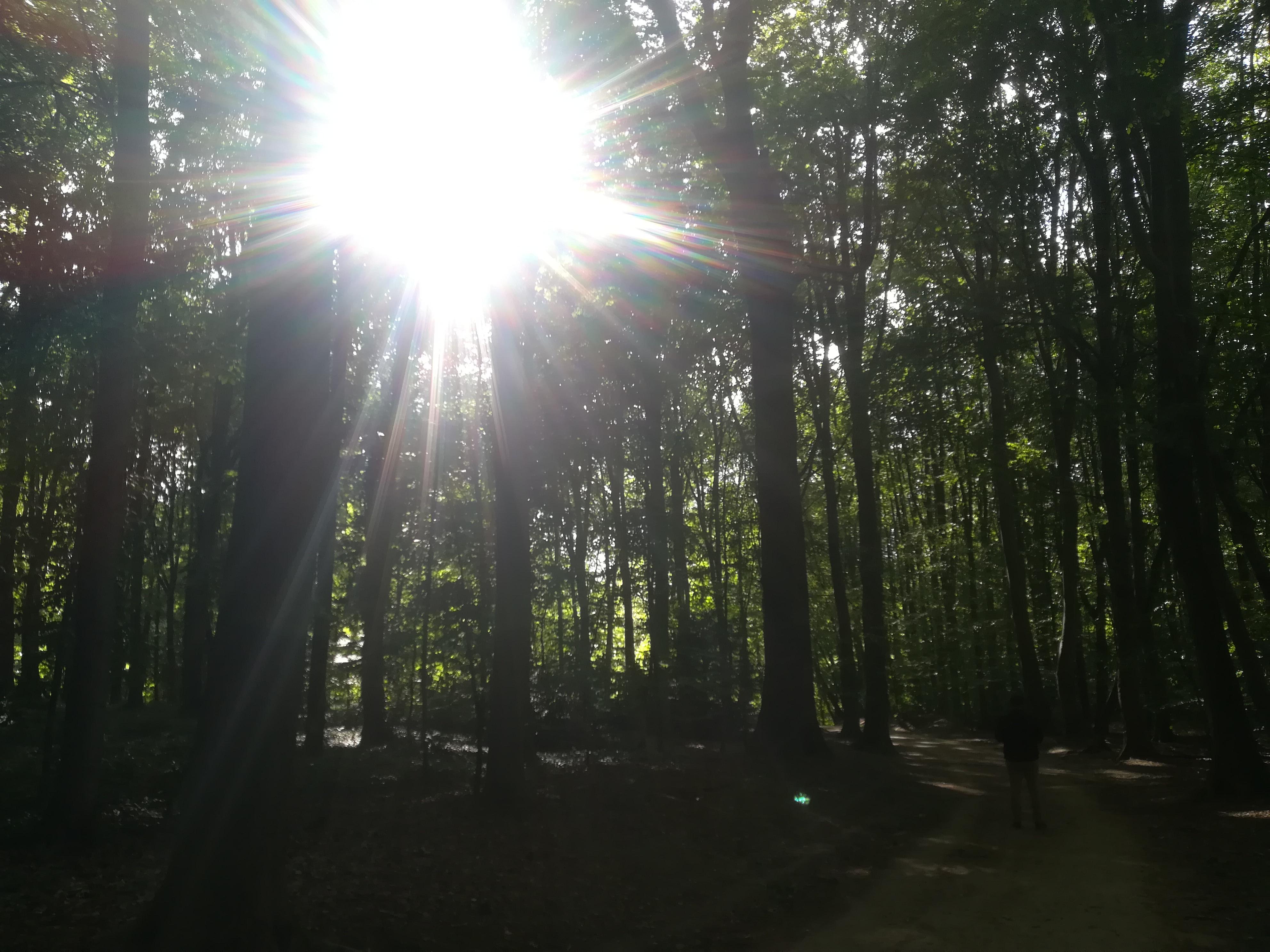
2. Let's go on a (cat)walk: Okay. So I first mission a studio on a walk. Yeah. Because I'm models don't come to us. So we're going to go to our models. And in this case we're gonna take a camera and maybe a sketchbook or a pencil or something, you know, to make quick sketches or just to collect materials. And we're going to have a look around. Obviously observe things and absorb the ambiance of being, for example, in the forests, if you have one handy, just lying around outside and like I do. But if you don't have a V1 and maybe you didn't have time to go for a walk, although it would be much better if you do it. It's very meditative and you place yourself in amongst your model so you can really absorb everything that's happening around you. And not just look at things is very important. But if you really count them, there's always, always the Internet, so collect some photos that you like. But otherwise, let's get going. Let's get those cameras flashing. And this iss nicely trained. So you know, like when we look at trees, when you're in a forest or whenever you look at trees around you to read for me to come up with strange that in winter when it's freezing, they stand around completely naked and cold. And then in summary, is really hot and they get their clothes back on. That's really where the medallion just an observation about weirdness of nature. And so let's walk around in beginner, ready to look at things slightly differently to up to how we look, maybe day-to-day. Let's have a look around at shapes. What kind of shapes you see. Just by looking for 1 second of the tree, you can already sort of gauge our brains are very good at this kind of engaging overall structure. Like what is it like a square, circle, more rectangular, triangular trapezoidal. That all they really come in all shapes and sizes just like people. Some of them are tall and skinny, like you see here. Some are other curvy and fall and delightful, playful it looking. You also have really light wants darker ones. Chunkier wants more lighthearted, playful one's really, you get all sorts. So pay attention already at the lights and the shapes and the colors of the trees, because even within the green spectrum, there are so many different shades that I don't think you maybe even realize. See how many shades of green you can see wherever you are, like look around you and just make a note. That's another super nice exercise. Actually do, do, do count shades of green. You will really learn a lot about how many of them there, then what kind of different types also, but also things like textures. Pay attention to the foliage. What's interesting is if you do go for a walk is that foliage can move and branches move. So have a look at the way they move. They're not just static, they dance, they interact and they touch each other, they talk to each other. Pay very close attention. Maybe even sit for a minute and just stare that tree and look the way it moves when wind comes and then when the wind goes, what happens to it? How it's different the light in an owl to when the sun's out, when the sun's bit as Bacchae in. What happens to the various scenarios like this where you could totally, we can learn so much about trees in summer that you may be doing normally. Notice, and then, Sure, Let's get collecting some things. So for example, some pictures of landscapes, trees joined together. You will need for this class some scenarios where you Trina kinda like joint that or just the big mass on them, slightly confusing mass of stuff. And then also trees completely stand alone. That's also nice. Them go and look up. What's up there, what kind of patterns you see? Maybe take some pictures, maybe make a study, maybe just try that. Remember we saw, then look down, look at the shadows. They cost on the floor or on the ground. Have a look at the leaves that have fallen down. Pick up some of those leaves with the branches. Because also something we're going to need for this class. And basically just get collecting, get absorbing, enjoy the experience, and take everything you've got back into the studio and you never know what kind of surprises you're going to come across like some bananas. And where there are bananas, they're always monkeys. And maybe an odd elephant and the gorilla and the lemur. And you see it just keeps going up.
3. Art Supplies: Okay, So if materials are usually not using anything super exciting, I'm going to use just plain paper. It's actually your sketching paper. So I'm using this art part and all the essentials brands in there. But I'm using it just because they have it lined around and because I like the paper that's like a 100 gram doesn't map. And I just cut some 85 side is instead of sort of just like using the Mayflower sheet there it comes in. I cut them in half. So it's just easier to make paper go along the way. Then. Basically basic sketch, sketching paper. That's what I'm trying to say. And then I suggest that we use pencils. And why? Well, no real particular reason. Excellent, but I want to work with pencils today because they're kind of more control. But at the same time you can layer the color. You can do a lot of the things that you could do with paying even so, you can draw an indicator paid with them. And that's for that reason that I'm using the watercolor pencils. Again, you know it because you can do both control and kind of dilute them. So you have the control and flexibility also. And the kind of colors of tourism, a sort of yellowy, greeny colors. And again, you know, here we don't. So I have this real watercolor brand. And some of them, I'll pick dura brand. But there are also some completely tropic colors as kids, big stuff from a normal shop. So yet nothing super fancy. You can do it with anything you want. And of course not, that it can't be done with just a normal pencil lie, that it will just be the same thing, but it's more fun to do with colors, right? So that's basically it. If you want to sound like what a brush if you're working with watercolor pencils. And otherwise, yeah, you just going to need sketching pads and a bunch of petals. So let's get started.
4. Warm Up Exercises: So we're going to start with just simple exercises. And let's see what we can do with our pencil sketch. One exercise that suggests that I really like is to just kinda roll the pencil around. So you could just got rolled align. He, I'm just holding it from different angles. I do this a lot of people in thirst and also because it helps you relax your hand. You can talk while doing it. I can meet, explore your pencil. And eventually you will see that you sort of have like an organic, organic line emerging there. So that could already become a tree. So imagine if you were to draw a tree freely like this. So you could kind of go just, you see how I'm just drawing in the pencil or something like that. And that gives us an interesting kind of organic shape without thinking at all. Your pencil lead to a different shape. Something like that. You see we're getting trees without trying at all. So we can just call someone a 100 while doing this. It's kinda like fun to do. And this is the same for bushes. And I like getting organic shape. Make it as big. So that's one. Now I'm just going to stay with the same paper. This second exercise is to show you kinda like the power of your pencil to lay down your color. So if you hold it lightly, when our preferred way of holding the pencil is, you know, you kinda get this nice even coverage depending on the texture of your paper, which is really cool. That's why I'm using this not completely plain printer paper but like Sketchpad thing because every bit extra, so we did it's got an ice. So this is really lightly. I'm really not pressing at all. But he go on to start pricing. I also get to emphasize some parts of it I'm going to press. And then if I really want to press parts that I calculate this and this will help us a bit to do kinda like the foliage and to emphasize different parts of the trees. So yeah, it's the same with a line. So you can draw a line very, very lightly. Press and then a really pressing on, see how the quality of it changes now becoming fat and also really kind of dark. That's what you can do with just one pencil. And of course you can make like value scales. You know, we have sort of in my spring class, I explain this in a bit more detail, but with watercolors, which is pretty much the same. Theoretically. You could start, you know, with this lighter color like this y to fill this in really lightly. Little bit darker, again, a bit darker. And then full power for example. So it there, you already see the difference that you can make it. Okay? And then while we're on this topic, let's practice some strokes. And the structure we're going to practice is just whatever comes to your mind. So for example, imagine you have just straight lines. Because, why not right? Then you can criss-cross them a bit. Smaller. Zigzags are wavy lights. All lines that kinda go like that. And other kinds of strokes. These kinds of things at really cool for drawing. Or just any sort of textures. Pencil here now because they otherwise type and you just try curling wants the opposite way. Curls, dotted ones. Also don't forget we have shapes. It's also nice to practice. And if you want extra fun, you can always turn this into a Verdi and of x because you might ask. Okay? So I'm going to do some strokes like these strokes like that. The petals are also very different like this one isn't really particularly sharp. So he kinda draws bald lives. Whereas this one is a very different kind of personality altogether, also spirals something that has a bit more bold. These are really super calming a student anywhere all over the page. Kinda like roses. So try to fill up the entire page and not leave anything. Just continue whatever marks you can possibly make. They will all be handy for our foliage. We can have. And then we tried to make them all saying different values. And then the other exercises I wanted to quickly show you. So how we can layer pencils because of psi. With pencils you can do, we'll patch like this, lay some sort of a color mixing version of tensile. And then we'd go with something blue to give a blue pencil line. You can layer on top. You have sort of like a green thing. Imagine that superposition, both, those two guys. So, yeah, you can do that with pencils to the opposite ways to go. It's not really a cross and pencil of course, but just to give you some basic ideas on what can be done that you see here we have predominantly blue and yellow. And they sort of like mixed towards a green. So if you don't have a greens or you just want to explore, the same would go for whatever else you want to layer. If you need. For example, you want to put some reading here. You know, they got a nicely makes, especially considering that these are watercolor pencils. To show. This, we could also add, wasn't particularly clear. We could also tiniest drop of water. You see satellite. Now they blending some magic tricks with the petals, practice those.
5. Gesture, Direction, Tree Personality: Sorry, yeah, Let's say we've collected, we've been a normal curve. We did some observation, we've collected some pictures, so whatever some materials and, or you back and we try to find a way to draw a fewer things in the collection. So I already did a pretty in-depth class. I'm kinda trees personalities. And what you notice in them in winter because they say is like the opposite season for me and summer and winter? Yes, with clothes on or off. So you can already go and check that class out if you want to see naked trees. Happy working with them straight away with their clothes on. Go ahead. So some things that I when I see a tree or a photo of a tree, notice straight away is shapes. So let's make the list to shape of the tree. And by that I mean kinda like general, what does it kind of like? If I wanted to encase it, what would it be? Would it be a square roughly over it? Maybe be like an oval. Maybe it would be more triangular. This is kind of like can be simplified to this if you really want to go to your metric. Um, but rounded corners kinda work better for trees of course. So you can even have like a diamond shape or it will be something like this. You see a lot of them. So even very round was almost perfect circle. So that's one thing. Then I also noticed the direction and bidirectional it going to mean like overall posture would say. So, you know, I like it. There are some trees that could be described as a gesture like that. For example, the wheels. It's kind of a bit sad, always pointing down. You can imagine branches going this way. And there are some like really perfect triangular beauties that's just stuff like that upright. But also the direction of the foliage. So like here, if the leaves are kinda generally, I mean obviously they might differ, but generally kind of pointing this way. Or are they more downwards? Something like you see here we get to practice strokes and all that. And learning how to draw the entire tree. Not at all. You're just going to hint at it with a hue of this tricky thing and the shaded part. So of course, if you think like the light falls, for example, from there, so you would get the shadow more around this edge. And then the other thing would be to see the trunk. And so here, I mean like how much of the tree is taken up by the trunk? This would be your whole tree from here today, for example. How much of it's the trunk like here the trunk is bigger or the visible parts of it. I mean, imagine that we've got braces. So this part is like in relation to that is a little bit bigger than this part in relation to that. So these kinds of things in Kyiv a lot away about the essence and the personality of a tree. And these are to bear in mind. So yeah, these are important basically direction of leaves for making marks and also direction of the general kind of shape like the trunk, that would be chocolate including like here for example. We would have something like that. Okay. Also for and like the willow, maybe we'd have like a trapezoidal or something. I had kind of save because it's pointing downwards. And then near the trunk here, you know, so with the leaves and branches pointing this way inside it. So that's another way of simplifying the two shapes and forms. These are the important things. And then also you have sections which could be interesting, again to simplify stuff. And by this I mean, okay, so remember click technique from the other lesson where we just drew very a quick silhouette line up. You could look at the tree and you can see if the light's coming from here, whatever, whatever is coming from, you immediately start seeing there are some sections, like maybe this one section dove and this one's darker. And let this one's really dark maybe. And then there's another random patch here, let's say. So you could already do this kind of division. And then you know that this is sort of lighter sections. And then these are the really kind of like maybe medium to dark. And then this one will be like the darkest, maybe here or there. So that's another way. And then because you did it in pencil, you can just erase it later. So for example, if you were to use that kind of intensity of the pencil that I showed you before. Some of these you could even leave, always done, touched. And that's something that this can be darker. And then again dark. And I'm really pressing hear a lot is just a real quick click immersion that still gives you the idea what I'm trying to do it. And then you're like, okay, but I don't like that section parts. While you just get rid of them. You could have like a nice I'm looking at tree underneath. Of course they could also be very cool. So we're not keep them just like you use it as your guide. Okay, so that's the basics of pen, shapes, personalities, and simplifications. And now let's look what else we can do without trees.
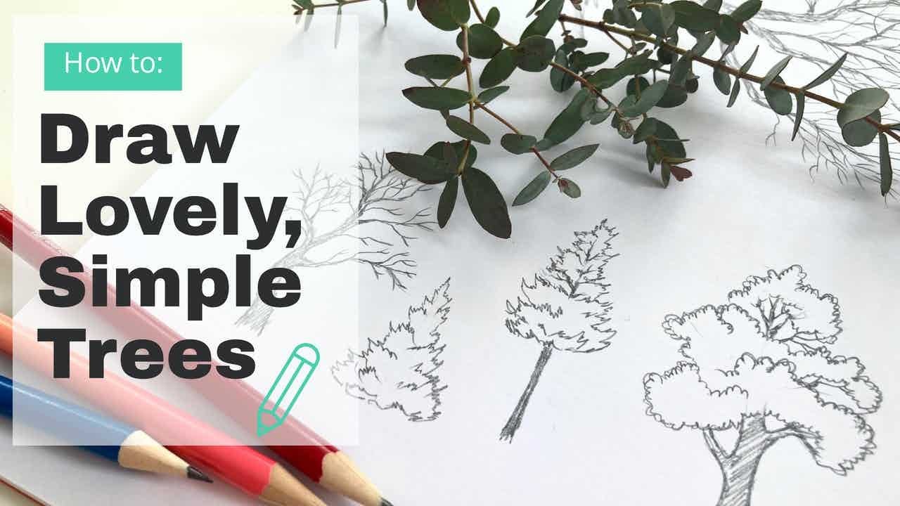
6. Tree Studies: All right, so let's just go ahead and do a couple of examples to illustrate the things we're talking about in the previous lessons. So I'm just going to use this green pencil here to draw an oak tree. And I'm really going to work super small. You can see the old tiny, tiny frame. And then I'm just going to use that technique that I showed you already. I am not. I'm destroying the pencil. They'll thinking too much. Okay? So that would be, for example, tree. And then inside I'm going to start making marks. I'm not sectioning anything here. I'm just making kind of marks. Try to notice where the lights and darks Sal you're going to be squint your eyes. Kind of help to you. I'm pressing harder on this bit because as we've seen before, is bits typically equate dark somewhere like this. And it's really nice if your line isn't straight. And that's also why you want to take your pencil up because it's eidetic and typically, you know, this leaves out straight that shape up the leaves so the tree. So it's it's kind of more realistic if that's what you want. I'm going to pick up some sort of a darker pencil here. Actually maybe not really dark edges and prone to do the bits of the truck that we can see. Okay. Something like that. So this was done like in terms of the financial, I just did it with one green pencil. Okay. That's one option. And that's kind of like, OK. At least I like. And then another one I'm going to show you is this one. So I'm gonna do, I'm gonna do another pencil for this. And actually I'm just going to go wild and this one. And I want to make a sort of cool that was too wild to make it a place that tight pencil with someone else. That's one thing about them. They break even cooler because he added something. All right. So this one, you could roughly say that that was like an oval, right? So let's say it goes something like that. Maybe. What does this one is on this side? Because these trees light or I feel it's not, it doesn't have the same quality of kind of heaviness. Stability as the AUC is more kind of playful. Personality is translate. Maybe for the blue, which is this little violet. So basically if you have a bunch of colored pencil line around and they'll serve you very well. See it, this one's a bit funky, but you're already starting to explore your own ways of drawing tree. So here, what happened was an accident with a pencil. So if we just continued and then we added another pink on top, kind of gives it a double line, which is really cool. And then I went for a totally different cost came to this. So that's another way you can express something. And I glossed, I want to show what shall we do? Well, I really like this. Diamond shapes. I'm going to show you that. And this time I'm actually going to go ahead and just draw it lightly. So that's your diabetes shaped thing. Again, going to change change to this. And in this one, I noticed that lie like leaves and I just the direction of the leaves. So I'm just going to turn it, keep to that. And if, you know, sometimes you just can't. If you start liking and you see the color I like the shape, I like that the strokes let me down because Make the day and not reflective of the personality of the street like, you know, like I was doing this and I know it just kind of jacket that to misuse the street isn't real. I love. It seemed more calm. So I immediately change to sort of circular motions. And now it's sort of you see this kind of rough lines, Tony, I don't feel it through the suits, this tree, which is totally cool graphics into seconds. And that's why again, it's so nice to work with pencils. You can transform things as you go along in this part of it.gov cause. And it's funny because we can already see where the branch is, Mike. I'm just going to do them in a different setting and do them on this purple one. Okay? So you don't see every branch, of course, speech system. And then you do the bottom. Something like pressing a relationship. Depends on the light. Goes. Sometimes if the light is, light is very flat and you know, what can you do? You just have to kind of invent your own lighting. That's another way. And again here like showed you before, we can totally erase all of this stuff. And now you can see like a K to a stray diamond shapes, I would say. So it's more or less the shape. Okay, so three guys right there. Feel free to play around with all these different shapes, structures. You know, there is also, of course, the triangular trees. They're really, really circular. Oh, well there's infinite possibilities, of course, is guys. You can simplify actually literally any tree into a shape like that, then it's easier to work with. Maybe more stylized also. Just simplifies your work. Okay, so let's see what else.
7. Landscape Studies: Next step we have, moving on from the lovely trees. We have groups of them. Because I think you often have only see the personality of the tree really very well when he standing next to others. So it's often the case that it helps to put your tree against allergies. Maybe it's the same with people. To see their personality is better than one, they just alone. So here I suggest we do it a couple of examples like we did before in the previous lesson. Again, we continue working very small and I'm going to continue using fanout tensile. So okay, how are we going to simplify little landscape, for example? Well, we can go Ready. Say something goes right. Here. We are allowed to invent we want. So we don't have to keep the exact thing that we see. And we can rearrange everything. And one of this kind of mushroom things. I'm going to make that mushroom me think double up in a way. Isn't it? There's another one there. And then maybe like a no green triangular thing. Okay. So I don't lie that part, so I'm sure that slanted of it. Okay. So here we have, I mean, you could say that it's inspired by the original setting. But it's simplified to kinda like cold, a shape who've learned about in the last lesson. And now we're going to continue. So as we didn't kind of like a contrast of shape here, It's also nice like, you know, sometimes you would have two very similar cheese. You could just feel free to transform them into contrasting. I'm like maybe even opposites, you know, like these guys, we didn't nice with a sort of triangular pointing upwards thing. It would be very boring if both of them are like all of them, whatever were the same shape as nice if contrasts of shapes. It also goes the same, goes for color. So here for example, I can see that the little guy is quite dark. So I'm just going to go ahead and do him in this kind of violet color or shade it. We don't really know I was giving them their violet and even add some magenta ish colors. So he becomes kind of, yeah, I might think of quite a few colors there, but I wanted to make him a shade it and not really flat. Sorry, that helps. And I don't know if I'm gonna do a stroke a little bit, okay? And what goes really well, contrasting is kinda like almost a complementary. And I say here again, we can just thin and then again I continue. My strokes changed. If you noticed this one was kinda up and now I'm doing circular motion. That's it again, I'm doing that. So I went to maintain because I wanted to maintain the contrast. And I would say that maybe this next one is also sort of green. And the bottom parts. Okay, So now we're off. And so this I did actually want mistake going to spiral that we practice right here. Right now with a different coefficient. This is more to kind of illustrate what can be done. You see this one was a circular. And this one is going to at most five. And that one is going to emit hectic for that and Wingate. Now I just continue. Immediately. You can sense the cheese personality is from a few touches. And then you can see already if you feel you're on the right track or if you need to change your direction of the strokes, for example. And this one, I'm gonna make this not a lot of contrast between the two, but it's also not always a program flow out some yellow here on the sides. So that's kind of a nice. And if we just blend it a bit more, it would work really well. If you feel like azure skies disrupting, which is fixed on the trees, That's essentially they're okay for the ground. You can kind of make this the strokes week practiced before she should the next one. Let's do something a little more stylized would say. Okay, so imagine we have this group of trees that's kinda like this was a bit more obvious, right? Okay, what's happening to that image? If we ended up in a forest and it's just like all green and all like What do I do here? Okay, so we could go and start doing a more organic kind of layered something like almost a slice a watermelon has to him. Okay, You see that's interesting. So I'm just gonna separating them. Don't know who's going to be on top here. Maybe that one. And then do the same here. And like that. Okay, interesting option. Now we tried to, I want to show you that there's a panel, a bit hectic, it is a bit more involved. This was actually a garden. Cities are kinda comma. And for this one analytic error there, it's like paper for estate, bit more wild. Some of this Gs are hard to make out. So which kinda like a mass of stuff. A lot of the time what we do is we just far, we amass exactly of stuff in front of us into something digestible for ourselves and for the viewer. And becomes easier to prices actually draw shapes. So you see how it's kind of emerging in an interesting way. Again, layering things. I'm gonna give it a couple of playful green modes. Again, I'm using the power stroke is. And then this one maybe I just want to do like you can decide basically of course, keeping it nice contrast there. And you see immediately how these guys are interacting, right? Like what the relationship is between them, which is really, really nice. So that's another little group of trees there. Should we do? Well? And let's try. Let's try and do a simple thing like this. So I'm not going to bother with the mechanical pencil pollution couldn't go straight for the shapes. So the idea is kinda like more fluid. In this case, I'm not going to color them all. Let's say I wouldn't just kinda focus on the line and really just give them very few small definitions. Didn't do that with some different colors. So these ones, no trunks like Hey, kid him, the little shadow if it's for them. So this one is focused much more on the line than previous ones. And the marks I'm making a fluid for spiral from organic and geometric I can previous one. So these are the examples, as you can see, the overview and texture layer. And again, if it helps you see we could erase some of these lines already and it becomes a little bit more organic or you can make them a different color. We shall see cool. And that case they'll stand out more. So yeah, that's it.
8. In The Shadows: And then in this one, we're going to look at another very interesting way of observing or just doing things with trees in the summer to look just at the shadows actually. So not even at the trees, but the shadows are webcasting. And this works best with kind of smallish trees because with big ones is just like a mass of stuff and yeah, okay. Maybe there's also something interesting going on there. But they access them about suggest is better for smaller tree. So find something like younger ones. I'm going to cover this whole sheet in yellow. This is really best done on very, very sunny days and in summer because they, you got best of both the sun and the foliage that reflects that casts a shadow onto the ground. And that's where you get rid of cool things. So what is interesting about shadows is that they create cool, crazy angles. So like him, because they fall on objects. And I don't know, this fell onto sidewalks. It's a bit to the side. And it's really just make it all one color is just to show interesting things to pay attention to. Here is of course the direction. Same as with the tree itself. Which isn't the branches go. Job is a little bit simpler here in some senses. Because it's on the floor. It makes I think it makes a difference. So you kind of just like looking at it as a projection on the floor flat. And you don't have any of the 3D noise of the real things distracting you that somehow you can just tell. There's something about it. I'm going from this simplified circular strokes parts. I believe this one's cherry tree casting a shadow. Just for reference in case anyone wants to know. So, yeah, basically many, many ways to interpret the shadowed just as well as not that because it's flat, it suddenly becomes boring. Not at all. Just to list sketch itself, you could put here quite some protection. So they go, so that would be, for example, one of your trees. And I'm gonna do another one straight here on the same plate. I'll say if it helps, you could do the same when my stroke. So again, a bit circular on this one. Because I'm actually trying to create something that's kinda even circular motions. Okay? Maybe I want it this way. Anyway, play around here obviously. And then maybe the last one, you do see which way. Obviously you don't have to put them on the same paper is just the way I kinda like doing. And try to really see it. Flatness. Most fascinating quality of this thing that your drawings, how flat it to this. Indeed, it's still very much like it has plenty of personality, direction and all these other things we've spoken about. I think this one's easy. Okay, so now we have this composition. It's interesting, you see? And that's kinda what we're looking for. And somebody gives us, there's benefits of contrasts. Nice clothes reflect the trees. Personality is very, very well known because that is, it's produced by them. So this basically goes into that super interesting way that you can play around with your trees.
9. Drawing Between the Trees: Okay, so now for something, I'll be different. There are other ways of misleads. You find structure in a mass of stuff. So one of the ways is by drawing the negative space. So not, for example, not the trees, but like the kind of things you find in between the trees. I'll show you what I mean. And also, I did quite an in-depth lesson on this already. And that was in my winter class. So if anybody wants to go check that out, feel free to all continue kind of showing you the similar version of it. If you need more information, check out the link for the winter one. So for instance, imagine that we end up wanting to draw sort of a scene where you've others like a way for the forest and loads of tree trunk sharing. And it's kind of all a big mass of stuff and you're not quite sure where to begin. Well, you can kind of separate it into three chunks and then the rest. So you could already kind of imagine it. Could be kind of draw on enjoying what is between. If you see where I'm heading with this, between the branches. And sometimes, of course, I'm going to just make it up, simplify stuff. And it's also up to me how I do that. Obviously. Sometimes I will stay true to what I see in front of me, but it's totally up to us. And this way you can also create some really cool stylized trees. Cerebri. Now it's going to make an app, This bits. And so you can see already there's a tree that kind of just emerged because because if I was doing like they gave the trunk by not giving it a trunk in a way, drawing what was around it. And the same here. Once you've done quite a few those, it will come very easily and you will see if you can make up your own shapes on how these things go. All right, so imagine we ended up with something with this. We say certain parts. We're going to fill in with a certain cause. I'm gonna go ahead and undo some healing on the course here. Or you can also add some blue. Sometimes makes everything cool. Thing about him is this. Shapes exist because they can fit filled up with stuff. Maybe this one. And then think maybe this one. And in this case, for the trunks, I could also go with a sort of green, maybe a totally different version of a green or a blue. So for instance, just going to see a blue would work maybe like for mine. Because often what you see is the way the light and the sun hits, like imagine the sounds coming from there. The traumas go really dark. And then the backgrounds kind of like a gloriously beautiful inlet. So that's kinda maybe I'll add an elderly. And this could be some kind of know, bushy tree. Oh, cool. So created a turquoise you see accidentally. And in fact, I like it. As you just saw there, I created a new color by randomly select scientist because I didn't know what it was. And now I'm actually going to use it. What do you see? You get the gist, basically doing dark strokes and everything else nicely simplified. And you adopt with a really funky, super-strong looking, striking composition. And then, you know, you could do the same. I'll just end up kind of here. Shadow comes lesser. So that's one way, a really super strong composition there. Another way that I discovered on my adventures is maybe easier, maybe I don't know who she is for you. But sometimes you see behind the tree and the tree is another beautiful tree and it's not the same color. So like I come across this really super cool, super cool. I'm kind of pink, orange and pink tree. So what I'm gonna do is I'm going to lay down, first of all, the pink patches. And I'm going to just do it fairly roughly in strokes. Similar to the kind of strokes that we already practiced in a previous lesson. Let's just continue. I see this way. I'm sort of doing the same negative shape situation, but I'm just taking the pink petals of the tree behind. And eyes. I'm taking that, I am hoping that this silhouette and the other undefined parts will say, All right, I've done the pink parts. Now we're going to go green parts. C. So I'm now doing the foliage. It's kind of almost like you're layering parts of the picture. On top. We've got to start somewhere, you know, and why always start from shapes if you can start with indeed strokes and kind of patches of color instead. And so it here also maybe I want to change my pink halfway through. Okay, I'm gonna wanna do is add blue because, well, yeah. So another very interesting striking way that we could draw this. Now, you can sort of see there is a silhouette or a hint of estimator of a tree which is left you see like as the white of the paper. And so you could emphasize already in its own right, in its own way. Something lot of keep going with layers to, for example, add a little bit more. So this is also a nice way for cherry trees that come kind of late spring. This was not a cherry tree, but it would work for those two. I do have a class on cherry trees, actually specifically for spring. So you can check that one out for the techniques on watercolor actually in that one. But here you see the branches showing only with white parts off. That's the basic idea here. So we don't overwhelm the viewer with stroke. And again, interesting. You see how I created with two very striking her interesting patterns. And there the thing is like you've noticed, I've used the color here. So if anybody needs a refresh or a good introduction on colors and this kind of stuff, how colors work makes how to play with them. Check out the autumn class because that one is good for yeah, exactly. For colors. To get introduction for that. Okay.
10. Lets draw the leaf!: Okay, now we find the late afternoon quite a few trees. We're getting to the foliage, you know, the close of the tree, the clothes that she's wearing and the season. So they could be super fun to draw because you learn a lot about the tree by drawing. It's closed because it's like it's really cold it at the tree kind of just makes its own clothes. It's something we have to, by r. Well, we can make our own goals, but not the same way, I guess. But the tree is, does it and so they kinda really nicely reflects its personality. So if we pick it up a couple of leaves which are very easy to do, you could just do a couple of really super quick studies that can be realistic if you want, but you could also kinda take it a bit further. And in this case, I should see what we can do. I tried those apps and help us to bit longer, to try and trace them right? And this way. And doing it very lightly, and maybe not super true too with this guy. But that's not a problem because I just want to get the overall idea of what this guy is about. So if I lift it up, you see that's the kind of shape. And this is a linden tree leaf. So we're just going to keep him by the side and we're going to have a quick look inside of it. So here we see like the long line that goes this way, right? Think of it as a sort of a trunk. Now we are getting some little light indicating them and notice something that I found very interesting. So these guys are not in line with each other. She like that. Like one is higher than the other. It's very cool and then they continue this way. So they're not, even though they are pair, they only in line with each other there. And from here only diverge slightly higher up. Okay, So that's what we've got from this one. Then the other thing that we should notice me is interesting is that this edge is not straight, but very cool. So and then inside each one of these guys on camera, maybe not. But each one of these branches, further branches out. So in a way, this space in here is kinda divide it by the things that branch of each one of this. So we could think of that as just kind of connections from there to there that go like this you see, because it branches out this way. And so that's okay, so super realistic, but it's sort of quite realistic though. And it gives us some detail. This way. Again, as you remember, we did with the trees, you can cut a shaded color. Should continue playing pages. This is really very addictive. Soon as you start getting this texture, It's very easy to do with a pencil. This rough texture, and I just kinda arrived, so it's by itself. So you can just continue playing, playing, playing with that. That's just one way of getting leaf. Trace it, study it a little bit and see kinda like what was going on between each one of these things. Because now it's broken itself up into sections. It's easier to see what's happening as soon as it's simplifies itself. So it's easier to see its little marks and textures and names. And the way I see this, you can go very long time. And the way I see this is like a tree itself, right? So you could think of that as a linden tree already and why not? And in fact, this is a way to do that. I like to draw trees to put them as to imagine, okay, we have our little guy here and here, I could just make a little linden tree that's like this. And y naught or more realistic. Maple is allowed that light up too. So that's our way of kind of making it quick. Funky landscape. And then this one is, I think SHE, I'm going to show you on the same page because why not? And this one we're not going to trace that. I think I'm going to pick up different car for that. I'm just going to instead, you see, it's kind of like I would say, it's a diamond shape. And in fact, many of my observations, so it doesn't always work. But oftentimes it does that the CI and I like same or very similar shapes. So that's why, that's where that comes from. So maybe not always true, but it's true a lot of the times that I've noticed. And it's a really super cool, fun way of drawing, I'll say. So that's your leaf. And actually many of the trees have the same room around sort of diamond shape. One of the ones that we did in the beginning, in the beginning of the lessons. See if we can maybe still exists. Well, this sort of shape, right? Shape there. So that one is a lot like it. That's basically what I'm talking about. And we also did, I think in our first second, so one of the first videos, we did a little study of this sort of diamonds like shape. So that's basically the same sorts of things. Actually. I think this one right here. That's the sort of thing I'm talking about. You see the leaf that was from an ash tree. That's sounds like an ash tree. That's a really, again, a case where it actually works really well. So this, you could basically abstract to kind of mica, wrong shape. And so imagine if you will, this is you can continue, you know, OLC, anything you like. There are so many supercool leaves you study that you can kind of like foot next to the tree and see, okay, This is very interesting because actually very similar. And it gives you many ideas about the personality of the tree you're working with other things. Also, you could do something really fun, which is basically do like a stylized landscape of leafs. So instead of drawing trees because you already figured it out, so you just go. Miseq is also branches kinda go the same way, one after the other and not from the same position. Anyway, you can learn a ton of very interesting stuff. It's kind of like maybe this is a bit like a star. It's about DICOM. Let's start with coming in here. Or you could have another leaf. There you go, You see, so that's another interesting way to draw a landscape just by actually drawing leaves. And then, you know, you can add like some bushes whenever you want. Um, yeah, boilers. And some of them indeed can be quite like the diamond shape, just made up. And then it gets dropped. Okay.
11. Gorgeous Russian Tree Paintings for Inspiration: And while obviously there are lots of ways to draw paint trees, there have been millions supports, studies, millions of things done on this topic already. But I wanted to show you just a few for inspiration to kick you all for your project. Or you know, just to show you like some different views and points of view. And also because these are unlike the others you may have seen already, this is not a typical standard painters that you see going by going in a gallery or just like a standard painting book. This is some old, weird and interesting Russian books that are accumulated of Russian painters. And they loved to paint trees, as you will see. So starting, I've got a few examples until starting with this one as he's called Fishkin. Just trust me and if you can't read this and relics Ivan's Fishkin and this Ivan she can, he painted wonderful landscapes, very realistic ones. So quite often, well, very famous painter in Russia. And this particular one. What I like to see here is he's contrast of lights and darks like you will see. Like inner class also, we show, I'm kind of speak about the way lighter shades superpose with the darker shades of greens or even yellows. And then he has very dark ones by the side. So it's almost like he laid on one shape onto the other, one color onto the other. And because of this interplay of contrast, this picture becomes ridiculously realistic. Actually. He does it so well, so masterfully, you know, like this part is so nicely well-defined and dark that everything else kind of stands out, comes forward in relation to it. And how this shapes. That is very inspiring. For some of us studies. That, you know, you have one type of color and then right next to it, you end up playing a much lighter one. And so, and then again you go back to dark. So you see here that dark, light, dark. So here is very nicely contrasted. Of course. He also did a magnificent job on just realistically rendering leaves and these kinds of things. But even from quite a distance, you can already see how I'm on the level of shapes. This is really inspiring. And these are the kind of things exactly that we do in a class. Precisely separating treason sections or different trees is not the same tree. These are the trees behind these ones. So it's very nicely done, this one. But he did something that was like very straightforward and very kind of realistic style. Then another guy, this one is much more graphic and insert the eyeline. And so this guy is called our hip, Quinton. Quinton. Yeah. He emphasized again something we do in a class. The shapes, you see, the shapes in between and you see how wonderfully he simplified shape. And that's when we talk about negative space. That's what we do. We simplify this thing into shapes, but also the way he simplifies this, I mean, this is a mass of leaves, you know, and he nicely simplifies it. It's an easy organic form that stands out because of contrast of color against an invaluable so against the background. And just how beautiful it is simplified each one of this and also the branches. How shapes inside of the tree simplify it, I think is very stunningly done. And the background shapes you see, he went for really kind of making shapes out of Gs. And this is a very big contrast, how straight these edges are, and then very organic bushes in the background. That's also something that we cover and talk about how to simplify the shapes. How to housing of contrasting shapes can not work. So I've got to mention the beautiful little light contrasts that he put on his birch trees, which were completely fantastic. Can you see this is getting a little bit slightly like more stylized and less realistic living. And now we get to this guy who also like a lot. And we have a completely different ways becoming very abstract. And in fact, he has quite a few of those simplified forms of trees that we talk about all set. So kind of triangular overall, maybe even rectangular load shapes. And you see what he does there with a long trunks. This is a very interesting example of a tree with a completely different personality. In fact, a long, long, long trunk and then just some kind of foliage and marks you see it. He's use of strokes, in this case with paint is basically a lots of what makes this picture so interesting is because of his different strokes and how we practice these strokes in our class too. So this gives us an idea of what you can do. So to flake dry brush staff and then here I guess like this, and then slightly more greedy brush to define the trees in the background. And again, key scholars, irrationally, very simple. It's just kind of like a mixture of a few greens. Sometimes he adds blues. There are some browns and yellows obviously, but there's nothing, you know, outrageously complicated in that sense. He makes great use of indeed strokes, brush strokes, and simplification, sort of obstruction of the essence of the personality. And I said all this stuff that we covered in class. So with the information that you've got here, you should be able to already make your own wonderful studies. And by the way, this guy is parallel, so it's pull, quizzing itself, causing itself. So just in case somebody wants to take him out on day, I also like a lot of his things. And then just as a side note, something I found recently that I thought Our interesting is actually the cover of moments. That's totally answers movie moments, which is so beautiful it down and like here is another thing that we talked about in class, where we'll look at sort of structured trees and the spaces between them and how to simplify that space. And what's done here is this spaces between the trees or don't darker and like there's mystery and shadow, hiding something and the trucks are lighter. So this way you also get wonderful structure and the near Gaya contrasting creatures. So that's another thing we talked about in class. And here's a very beautiful example. They go.
12. Thank you and your turn!: Well, well, well, what can we say? We did a ton of work here today, so we started with this. Squiggles, did a bit of proxies, practice of strokes, practice the shapes warmed up with some line drawings. Then we went to move them to the personalities of trees, looked at simplify them which shapes, directions and sections and lines. And then we men, went further to actually do a few studies to show that in an example. And then we did a nice job group retries to see, you know, how they actually act and how the personalities show up in a group instead of just doing the isolated loads. And I also look at techniques there if bit funky, such as drawing negative shapes for example, which is very interesting ways on itself. And then we also looked at drawing trees, leaves of the trees, and seeing what we can learn about that. Even simplified landscapes just made out of leaves. And we also looked at how to play around with funky shadows in the season. So thank you so much for watching the class and the entire series of goals. If you're interested, as I said, there are other clauses this fall season serious that you can check out. Just have a look at the links. Otherwise, I would love to see your projects as soon as you're done. And this could be anything. Again, it's a study of your choice. It's up to you. So again, you could pick out a study of shadows like this or stative or leave or maybe even surprise me with a little leaf on the landscape. Maybe negative shape is your finger and I still do that. Surprise us all with a couple of personality is something that you noticed about trees and to share a group of trees is also an idea. You do a study like this, just a couple of thumbnails would be fantastic to see how you see. And even the fiduciary of scribbles because why not? It's always fascinating. So have fun, enjoy the season, enjoy summer, get out, and do some wonderful, fantastic studies of this amazing creatures when they've got some clothes on. Thanks very much again. See you next time.
 Yana Knight, Story of Yana