Transcripts
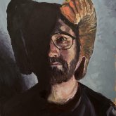
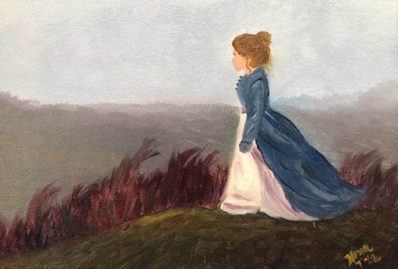
1. Introduction: Hi everyone and welcome to my Skillshare. So my name is Michael Hurst-Mawasse, and I'm a portrait and figurative painter. I work primarily with oils, but the kind of things we do in this lesson are applicable to acrylic painting and oil painting as well. So what we're going to be doing in this first session is we're going to be looking at how we can create this painting right here. What we'll do is we'll go through the entire process that I would usually go through. So that includes making the panel and priming it ready for painting because I work on wooden panels. We'll then look at creating our color wheel, which we'll be using a limited palette of only three colors. Red, blue, and yellow. We'll then move on to the underpainting to establish our positions and the values within the painting. Then finally, we'll go through all the stages and the over painting, looking at how we can create the figure and creating interesting and moody landscape like this one here. So I really hope you enjoyed this lesson and that you get something out of it. And I really can't wait to see what you produce, so please share it underneath with everyone else. And I can't wait to see what you do. Thank you very much. Hope you enjoyed.
2. Equipment: So here in my studio, you can see that I have my oil paints hanging upside down. That's just so that more of the pigment goes to the cap side of the tube. Now in the lesson you'll see me using this pochade box. It's usually used for plein air painting, but it's a nice little compact studio. And string is a good thing to have (for measuring) along with cotton buds/ear buds. Then you can see that I have the container for my solvent and my medium. Something to hold your brushes. Just a collection of brushes. Baby wipes are really good to use as well for cleaning your palette. Now here, the majority of the brushes that I use in this video, I don't use them all, but just to give you an idea, these are the different types. So I use most often a long flat brush. Those are on the left-hand side there. Then I've got my dagger brushes which create a nice sharp edge. Then my filbert brushes, domed filbert brushes and finally the pointed rounds. I also have palette knives and a one-inch brush. So it's important to know at this point in time that I wouldn't necessarily go out and buy lots of new brushes or the things for this video. I'm just going to explain why I use what I use if you happen to have it. Great if you do, but don't worry if you don't, just use what you have. Now in the top left-hand corner, you can see that we have our solvent and our medium. So for this painting, if you're using oil paints, then you will need the solvent. You don't necessarily need the (Liquin) medium. So because we're painting an Alla prima painting where there's only really one layer and we're not going back to our painting, and waiting for the paint to dry. We don't need the medium to make the paint fattier (oilier) or more flexible. So the only reason that I personally use this medium in this painting is to make the paint dry quicker. In the bottom left-hand corner, I have an alternative to the solvent (Sansodor) up there. If you want something that's a little bit better for the environment and that's maybe a little bit safer to use. Then I'd go for that option down there. So we also have our paints, I've got a yellow light by Old Holland, then by Langridge, a pyrrole red and by Michael Harding, an Ultramarine blue. Those are the main colours we are use for the painting, along with titanium white for the underpainting, I use burnt umber, which is a nice transparent paint. But I'll talk more about those in the section where we talk about making the color wheel. And the final thing we need is something to paint on. So I'm using a 9 by 12 inch wooden panel, which I then primed by using the acrylic primer that you see there. If you have any acrylic gesso paints, that will do fine. But you can also paint this on an already primed panel or a stretched canvas. It's completely up to you. It doesn't have to be this size either. It could be bigger and you can just scale up the painting. And that's all the equipment that I use in this session. So again, if you don't happen to have some of the equipment, that's no problem. Just go with what you've already got and have fun painting.
3. Making a primed wooden panel: So to get our panel ready for painting on, I'm using an acrylic primer. The type of brush that I'm using is quite a soft brush. The reason for that is because if you use quite a hard bristle brush, you'll then get a lot of the impression from the brushstrokes into the primer. And really we want to try and make this as smooth as possible. So as you can see, I'm not adding too much paint onto the brush. What I've found in the past is if I try and do this as quickly as possible and add lots of paint at the beginning on the brush, you then get a very uneven surface and it takes a lot longer to dry. So what I've done is I've speeded this part up because it is quite repetitive to watch. When you do this in real time. It should only take about 4 to 5 minutes to get this done. And just to make sure that all those areas are covered. Also, make sure that the paint is evenly distributed across the whole panel and that you don't have more paint in one area than you do in another. One final thing, it's best to make sure that once you've started doing this, that you finish it. Hopefully within about 4 to 5 minutes. If you keep going over the same areas over and over again, what you'll find is that the paint will start to become quite tacky. And you'll actually make it really difficult for this to become an even surface. So get a thin layer of paint on as quickly as possible and then allow that to dry for around about one hour. And after one hour we now have our surface. Now you don't have to sand in between, but I tend to like having a very smooth surface to paint on. Now already, I don't know if you can notice, but in the middle of that panel, I can see some ridges from the brush strokes of the primer that I added. If I don't get those out at this point in time, they'll continue to show through the subsequent levels. Now just bear in mind that you don't want do this too much. This is very fine piece of sandpaper. I think it's 180 or 240. And we just want to get a nice even smooth surface. And also to note when you're sanding, it's very good idea to do this in a well ventilated area, preferably outside if you can. If you can't, then you'll need to make sure you have the windows open and you are wearing some sort of mask to protect your lungs. So as you can see in this section, there is a little bit too much paint added on. So in order to actually make that smooth, I've really got to spend a lot of time going back and forth and back and forth to make sure that that paint is evenly distributed across the panel. So for the primer that I'm using, I only need to add two coats and that should be enough to seal the panel and to give us a nice smooth surface to paint on. Just make sure before you add the paint on that you've actually cleared away any of the sanded pieces of paint from the previous level. So once you've finished adding the final layer, just make sure you put this somewhere safe so that it doesn't get touched and nothing can disturb the paint as it's drying. And after another hour we should be ready to sand. And then we move on to our final sanding. And this is just to make sure that we get a nice smooth texture on our panel. If you want there to be some texture from the brush strokes then you can leave that in as well. It's completely up to you. But for this painting, I want to make sure there's a nice smooth, even surface. So that's why I'm going through sanding a second time. Now getting back into real-time. You can see when I'm done and I'm just wiping away any excess dust from the panel. And I've gotten it to the level that I want. And then it's ready for painting.
4. Colour Wheel: And now we're going to make our color wheel. So the colors that we're using, our yellow light, ultramarine blue, and pyrrole red. Now if you don't happen to have these exact colors, That's no problem. Other alternatives could be the cadmium colors, which are usually the traditional colors that most people start with. But don't worry if you don't happen to have those colors. Just try and go for a very strong red, blue, and yellow, very chromatic colors. However, if you only happen to have a yellow ocher as your yellow, Give it a go, see how that affects your color wheel in comparison to the one that I'm making. And if you like those transitions of colors, then try it out in the painting. It would be really interesting to see if other people use a different variation of colors to see how that affects their painting. And it'll be great to see how many different variations we get of this painting based on what colors you have or what colors that you prefer to use. So to make the color wheel, we just need to add in 12 sections going around the circle. And we'll have our red at the top, yellow to the right, and blue to left. If you've changed the color wheel around, don't worry, it's no problem. One thing I'd suggest you don't do is exactly what I've done just there do not shade in any part of the circle. You'll find that when I actually show you a comparison between the one I've done now and a color wheel that I've done with different versions of red and yellow. That even though I'm using the same red and both wheels, because I shaded it in at the beginning just to signify where I wanted to put it. It actually makes the color a lot darker. And this is a good way to show how oil paints work. So all the subsequent layers that you have in oil painting, when the light passes through those layers, it is going to be affected by the different colors and pigments that the light is traveling through. So because I've accidentally added in a shaded area on the red, the light that then passes through that and bounces back into our eyes will be darker because of that shading. So I strongly suggest that you don't do that when you're making your color wheel. So now we're going to move on to actually add in the next step in the color wheel. Now, doing this process is really good for another reason because we get to see how our paints work together. As I'm using pyrrole, red and yellow light. I'm noticing that I need to add a lot of yellow to get this red to change, to shift, to write orange. And it just shows you how pungent, how strong that red is. So that when it comes to our painting, we know that if we're using this color, this exact color here, when we want to change and shift the color more to read or mortar warmer color, and we add this red. We have to be really careful about the amount that we're adding to that mixture. So when making the next step along between the two colors, between red and yellow, all I'm then doing is then taking a section of the previous color as a starting and then adding more yellow to it. Now the colors that we add or make for this color wheel are not the only colors that we can make with the three paints that we're using. They are just the most chromatic versions. The colors that we can use. And what I mean by that is that it would be the most saturated, almost colorful version of that color that we will be using. And now we move on to yellow. Just make sure when you're adding a color that's straight from the tube onto this wheel that you're cleaning the brush in between. Now when I added this yellow to the wheel, I know is that the transition from yellow, orange to yellow was too strong. That wasn't a good enough transition. So I've went back and add some more yellow into the yellow orange to make it a more subtle transition, rather than quite a stock strong transition between those colors. Now what you'll notice as we move away from yellow to blue, and we get those greens added into the color wheel. That the colors we're getting are a lot darker. So the tone of the color becomes darker as we go around. So this is a good thing to note when we're actually making this color wheel, we can see that transition, that change from dark to light. And if we look at our color wheel and we squint down, we can see that the yellow is the lightest. The value of the color is very, very bright. So when we're actually making our color mixtures, it's a good thing to know that if we add yellow, it's going to shift the value of that color, going to make that color lighter. So just always bear that in mind when you're mixing your colors, that if you're adding yellow, it'll one, make it warmer, and two, it will make it lighter as well. Now as we move between blue and red, we get to see some really dark colors. This is good to note because we don't have a black in our palette. If you want to add black to your palate, give it a go. Don't just stick to these three colors just because that's what I'm using. So if you want to use a black, try it. But if you want to make your own black, based on what we're looking at in our color wheel, we can see that red and blue will make a very dark color. It's a very dark violet. Now, if you want to make it easier for you to see those transitions from blue, violet to red. You can add a small amount of white to the mixtures just to help you see that color because of the many are just looks black. Whereas if you add maybe a little bit of white, you'll be able to see the color for that violet and the blue violet a lot better. And it might be easier for you to see the difference between those colors as they move around the color wheel. So what you'll see me doing in a moment as I add a small amount of medium. So I use liquid just to help make the paint a little bit smoother and make it a little bit easier for me to see that violet and what it looks like. So I'm adding a little bit of feathering around just so I can see that color a little better, a little clearer. And that's a color wheel finished. So if we compare this to another color wheel that I've made, now this is the same red, but when we look at them next to each other, the red on the right, which is the one we've made for this session, is a lot darker. So that was because of the graphite that are used to shade in underneath, which you shouldn't do for yours. But you can see the difference in those two colors. It's the exact same pigment, exact same color. But because the light is traveling through and then hitting that dark graphite underneath and reflecting back through the aisle color. It's then changing how we perceive that color. So the line that I'm drawing through here is separating the colors between warmer and cooler colors. Even on the cool side, there are warmer versions. So for example, a violet is warmer than blue. But if we compare them to complete sections, the colors on the left-hand side would be considered cooler and those on the right would be considered warmer. And now the final step, so we just need to make sure we're keeping an accurate record of what colors we're using. So at the moment I'm just writing down the brand name, the pigment number, which you could see there. So this one's PB 29 for the ultramarine blue. And just making sure we get the name written down as well. And that is the colloquial finished.
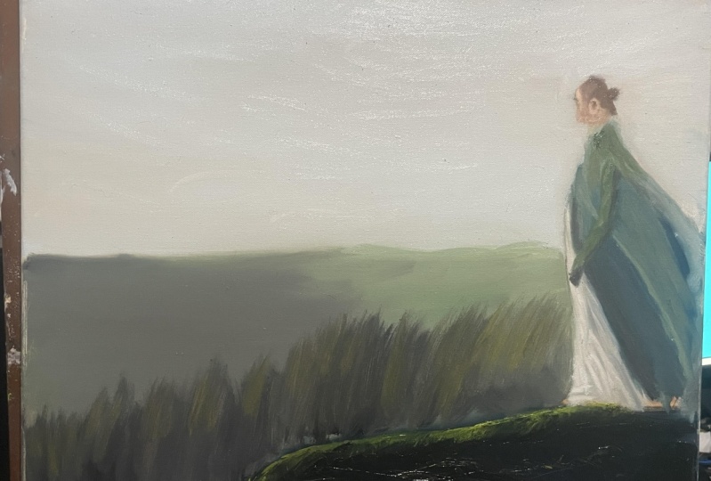
5. The Underpainting: And now we're ready to start our underpainting. So far our underpainting, we're going to be using a burnt umber. So this is a transparent color. And along with using a medium or a solvent, it will help to make the paint thin and it will dry very quickly. And for this section, you only need a small amount of paint around about the size of your thumbnail. And the type of brush that we're using is a long flat. This is often really good at getting basic shapes and helps to keep those lines really smooth and straight. So we're not focusing too much on getting detail. And in this point, it's just about getting the basic shapes of our composition. So the moment I'm focusing on the darkest areas in the foreground. So I'm just starting at the bottom of the canvas. You can see that this paint is very thin, it's already slowly starting to move down the canvas. And that's the consistency we want because we want this to dry quickly so that once we've then made our color palette, by the time we've made those, this section should be dry. And in this moment I'm just marking out different sections on the canvas. So I've marked thirds and I'm just trying to figure out where I want things like the horizon line, where I want the figure to be placed, whether it's going to be between the two thirds or whether it's going to be half away. So it's just getting some of those basic reference points added in. And in the top left-hand corner you can see the palette view. On the left-hand side, I've got the sansodor. the solvent. And on the right-hand side I have my medium, which is called Liquin. So you can see how wet that paint is, how fluid that paint is. And it just goes straight onto the canvas there. So it is very, very thin. the purpose of this under painting is first to figure out where the position of the figure is going to be. And things like the horizon, the grass sections, the head there and so on. So doing this, it's a lot easier to focus just on the tone. So when I mean tone, I mean how dark or how light a section is. So by just using this one color, that's all we're focusing on. We're looking at where the position of objects and things are in the painting, and how dark and how light they are. Now I'm looking at where I want the horizon to be. So I want the horizon to be about halfway up the pallet. I just want to very quickly mark it. So once I've got this section and I'm starting to look at where I want that hill at the bottom of the painting to gently rise up. And I'm leaving a white section here. So the reason for that is linked to what we were doing with our color wheel. So if I was to paint on top of the section that is darker. So at the bottom of the hill, we've got a lot of burnt umber. If I'm painting on top of the that, the light that's coming through is going through, let's say we use a green for that. And it's also going through and hitting the brown as well. And when it's reflected back, we then seeing a combination of those colors, the light reflecting off both of those colors. Whereas if I was to use the exact same green on the section that is painted white just above where the field is disappearing, then that is going to be different. It's going to be brighter. We're going to get the white and the green. So we get a much brighter color coming through there. So now I'm just figuring out, where do I want the figure to be? So this part, I'm drawing smooth lines, but you don't even have to do it in that much detail. There can just be very short, sharp, straight lines. And now I'm just looking at the bottom of the figure and the top of the figure. So where the feet and where's the head? And you can see in this section, the head is very simple. It's a rectangle. And as we go down to the form, I'm just drawing some of those straight lines in. So that's all we want to do for this section is just getting basic shapes, lights, and darks. Now a really good way to do this is if you're looking at the reference photo at the bottom left-hand corner. A good way to get really simple values. So your lights and darks and getting simple shapes is to gently squint down. Because when you squint, you're getting rid of all of the extra information, all those subtleties, all those mid-tones going through from light to medium to dark. And you're just getting the light and the dark. And then it'll help you to make decisions when you are painting. So just squinting down and figure out, okay, I don't really see any light sections in here. So you paint it in that value. Now when you open your eyes again fully, you're seeing those subtleties and differences. However, at this point in time, That's not what we're looking for. Just looking for simple shapes and areas, light areas, and maybe some of the mid-tones in-between. This part of the cloak is in a lot of shadow. So when I squint down, I do see a lot of dark and a little bit of midtone in the middle section there as we get to the bottom part of the cloak. But at this point in time, we can just pull it in as a dark tone. So the length of time that I spent on this part of the painting altogether was about 20 minutes. Now this isn't the first time I've painted version of this painting. And the first time I did it, I added in a little bit more detail and I spent about 40 minutes doing it. So if you spend 40 minutes doing this, that's not a problem. It's a really good idea to make sure that you've got the position of the figure, the head, the light and dark areas as accurate as possible here. Because what you find is that the underpainting really establishes the the structure of the painting. And when we move on to adding color, we use this as our guide. So you really want to make sure everything is as accurate as possible in this section here, with the positions of all the objects and so on. So that in our next stage in the over painting, we just have to focus on color, temperature, and value. Because if we're having to focus on those three things and the positions of objects, it gets very complicated very quickly. Now when I first started painting, one of the issues I had was that I spent more time painting than I did observing what it was I was painting. So by that, I mean that in reality what we should be doing is you can think of it as, I guess, three-to-one system. So I spend three moments observing what it is that I'm painting. Then I spend two moments thinking and comparing to my Canvas. And then I spend one moment applying the paint. So we should be spending more time observing and thinking then we actually do adding paint to the canvas. So if we do that, it seems odd, but if we do that, it means that every time we add a color or every time we add the paintbrush to the canvas, I am looking at the reference and going, is this what it actually looks like. So you get very quickly absorbed in that section there if you're not going back and forth looking at the reference. So some of the other things we can use to help us with the underpainting are paper towels, which I'm using now, and cotton buds or ear buds. So the paper towel just helps to wipe away some of that pigment (colour). So we can start to see those mid-tones coming through. Now that'll help us to understand how that form of that object is changing and how the light is hitting it. An idea of where the hill is leveling off and where the figure ends and the hill begins. I'm just going to add more paint onto the brush just to get some more dark in the sky section. I'm just going to use a large brush. I think this one's okay. So if we want to use any large brush, in this section. then that's Okay. And now before we end the underpainting, I'm just going go back over the figure to get in some more nuanced changes between the lights and the darks. So, I can understand for the cloak where the darkest areas are the lightest areas are. And getting some more of those mid-tones in to help see the change in the form as the light hits it and as the form turns away or moves into the light. okay So for this section now, I'm going to be using the paint brush and the brush strokes to help show the movement of the grass and how that hill is moving up and towards the light and moving away. So that's why those brushstrokes are in that particular pattern. It helps to show it moving upwards towards the figure, on towards the light. Okay. So now I'm going over the figure one last time before I call an end to the underpainting section. So I'm just squinting down, looking at the darkest areas of the figure. I'm making sure that it matches in my underpainting. Now in reality, we could continue adding more and more detail and refining it more. But what I want for this is just to get a very loose idea and proportion. And we've got a good foundation moving ahead for when we move on to the over painting. Because we have been using solvent as our medium to help make the paint more fluid and easier to apply. It means that this painting, this under painting, will dry pretty quickly. And you'll find that when we go through the next session to make our color palette, because we're going to make the basic colors before we start painting. By the time we get on to painting, that the underpainting will be pretty dry and ready for us to paint on. You could even leave this overnight and attempt the next part of the painting later on. Or you can start pretty much straight away once we've got our colour palette ready. And that's it. That's our underpainting done, well done. And next we'll move on to making our color palette.
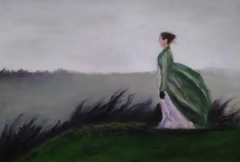
6. Colour palette: So putting our colors
on the palette, we've got quite a bit of white there because that will be used to make the colors less
chromatic and less bright. We have a blue or red
and also our yellow. Here. The two
palette knives I'll be using to help mix my colors. Now the interesting thing
about the palette that we have with the blue, red, and yellow is that every
color that we'll be mixing two to the painting is a combination of
those three colors. So we won't just be
adding red and blue or red or yellow
for all of them, every single color we have, it is a combination
of those three. Start helps to
create cohesion and a harmony with the colors
that we use on this painting. So here I'm making quite a dark brown and you'll
see in a second, in order to get that more green, I'm going to start
adding a bit more yellow and blue to the mixture. So here we have quite a
rich green and adding blue will help to make
it a lot darker as well. And that'll be a really
good color to use in our foreground with the
hill that is in shadow. So what I'm doing at the
moment is I'm just spreading out that paint just to make sure that it is spread evenly and that all the
colors are mixed in together. Using a glass palette
is really good for this because
it's easy to clean. It's a very smooth
surface to work on. For wooden panels, I'm not
a huge fan of them myself, just because sometimes they
can get chips and grains in them and the paint gets
stuck in those grooves. The color that we
end up getting is quite close to viridian green. It's very rich green. And when we add more of a blue, where then changing that
tone and making it darker. So to help with
understanding the values, it's a good idea to, like we did in our
underpainting to squint down at your reference photo and look to see how the color mixture
that you're creating, how it compares to that on the actual painting
or the reference itself, how dark it is. So if you actually squint down, you get a good idea. It takes away all the extra
information and you get a good idea as to how dark
or how light that color is. So to help with making
the other colors, I'll usually then start
off with taking a section, a small part of the
color I've just mixed and work from there, because within that we've
got all three colors. And I can then change and adapt our color to suit what I need. Because it's the tone
that I'm looking for. I want something a little bit darker, a little bit warmer. Because we're going to
have a lot of purples, really dark rich purples
to show the header. So I'm adding in a bit of red to that to really
make it strong. Now at the moment that is
quite a very deep, rich red. And I will start to tone that down by adding in
the other colors. So if you have something
that's really chromatic, looking at our color wheel
at the top left-hand corner. If I have something that's
too yellow or too green, and I want to tone it down. I need to look at the color
opposite on the color wheel. By adding in color, we start to bring
it towards gray. So if you had a 5050 color
combination between, let's say yellow and violet, we would start to get
quite a strong gray. And it's the same with
all of the other colors that go opposite on
the color wheel. By adding in color,
you're desaturating it. You're making it less chromatic
and making it more gray. So a good way to see
watercolor really looks like because it's a very dark color there to see what it looks like. If you add a little
bit of white to it and then brings our color out and we can see we get a better idea of what
color we're working with. So now I've cleaned
up the pallet there just so I can move on to
making our next colors. I'm happy with those
two very dark colors, very dark tones there. So we can help to use, get a bit of variation in the foreground and in the header that's
behind the figure. So the colors that we have
there on the only colors we'll use in the foreground
and background. They're just a good
starting place because when we squint down, those are the two main
colors that I see. I've got some dark rich
violet, red colors. And then I've also got some dark rich green colors as well. There will be
variations that you will see as we go
through the painting, but that's the starting
point we have. At the moment, what you can
see that I'm doing is I'm now making the colors
for the figure. So now you can see how the white has affected the color
that we're making. If we look at our value
scale on the left-hand side, it has decreased the value, so it made it lighter. However, by doing that, it hasn't made it
less chromatic. It's less colorful. If you want to bring the value
down by making it lighter. But you still want a chromatic color to
add to your painting. You're going to have to
keep going back slowly, adding small amounts
of the color in. So if we wanted to
stick to a green, we'd have to keep
adding small amounts of yellow and blue. Now obviously, every
time we add the blue, it's going to bring the value up again so it will get darker. So it's about
balancing that out. So above we have our lighter
value for the clock, but we need some areas that will show the
shadows sections. So we'd need a higher value. And I get that by starting with the color from
the lighter value. I then bring that value up, I make it darker. So by doing that, I'm slowly
adding all of the colors in. If I keep adding in yellow, It's going to make it to green. And two light. If I add in too
much of the blue, it'll just make it too
dark and too cold. If I add in too much of the red, it'll be too warm and to violet. So it's about going back
to each of these colors, mixing them all in, and slowly getting to
the point that we need to show the darker
values in that cloak. So now you'll see
that I'm going to be moving on to making the colors for the dress
on the skin tones. So I started off
with red, white, and I added in a
little bit of that green that we had from
the previous one, just to make it less chromatic. Because if we look
at our color wheel the minute it's too right. So if I want to bring
the saturation down, I need to add in a green. That's why I added
that green into this color just to bring
that saturation down, just to make it less colorful. And adding in the white
brings a value down, but again, makes
it less chromatic. So we just have to
be careful about how much white we add in. The process that
we're going through here is just about getting the main colors that we
can see in this painting. And then from those
main colors we can add all the variations to make
this an interesting painting. So if you were to do this
with another reference photo, you would squint down, you'd look at those values, you think how many dark values
and that color do I have? So if I have a lot of
green in the painting, how many different
values steps do I have? If we look at our value scale, Do I have mainly 2s and foals, or does it go from one to nine? You just have to
make those decisions when you're squinting down, getting the very basic
information from that reference and deciding how many values steps
you want to do. Then also, what colors, what are the main colors that
come out in this painting? Then from then, we can then make our variations and differences that will make the
painting more interesting. So as I was mixing this one, the color one a
little bit too green, but you see the pyrrole
red dot we have, I've added that in and
it's shifted the color far too much to warmer color. It's far too saturated. So I want that color, but I don't want it
to be that saturated. So I need to, I want
to bring the value down and I also want to
bring the saturation down. So that's why I added
in the white there. So by returning to the
colors that we've already mixed to help change the
value or the chroma. It helps to bring harmony
to this painting. So we're getting all the
colors that on our palate are being used in every single
color that is going on there. Again, like we said
at the beginning, we're not just gonna
be adding just a red or just a red and a yellow, or just a red and a blue. Every color on our palate is a combination of those three
colors to varying degrees, which is what will bring the
color harmony to this piece. So looking at our
palate at the moment, on the right-hand side, we have our colors
for the foreground, for the Hill that the
figure is standing on. In the center, we
have the colors, the base colors we're going
to be using for the clothes. So the figure on
the left-hand side, we have the colors that
we're going to be using for the skin tones. What I'm doing now is
making the colors for the background and the
eventual color that I want, as you can see in
the left-hand side, is quite pale, tone down purple. Now this is the second time
that I've made this painting. This version of the
painting is a lot warmer. In the other version
of the painting, I've made it a lot cooler. So the sky is a very pale blue light you
can see now on the palette. But I wanted to give
a bit of variation. You can go where you
want with this painting. You can choose the
colors you want. If you want to change the color of the foreground background, It's completely up to you. I know it'd be
really great to see all the different variations that people will come up with. It'll be interesting to see
how different the paint and looks with a cooler or a
much warmer background. I'd really love to see those. If you'd like to see
the other version of this painting as a
reference photo. So maybe you prefer
a cooler version. If you go and have a look
on my YouTube channel, there's an entire
walkthrough of that. You can see the
whole process there. And it just gives you an
idea of a different option. You could different route. Now you can take
this painting in. You can see there
that in order to make this a little bit warmer, I'm going to have
to add a little bit more red in there just to change it from
a very cool blue, pale blue, into that much
warmer purple, violet. We have there that you would
usually get around. Sunset. There we go. So we've got our main colors
for our paintings. So again, this is
just a starting point from which we can
then make variations. But it's a good
place to start from. We've got the main
colors for our painting. We have an
underpainting as well, which we can work
from and build on. So we know the proportions
of the figure, we know what the
major landmarks are. So when we move on to the over painting
in the next stage, in the next video,
we can dive straight in because we have
everything there already.
7. Background: To begin with, we're going to add a little bit of Liquin (oil medium), our medium onto the palette. So you don't want to use too much because we want to retain the quite stiff nature of the paints that we have so far. So you can see it's only a small amount on the end of that palette knife there. So like the solvent, it will make the paint more fluid. But the difference here is that the liquin, like adding more oil to an oil paint will make it more flexible. However, for the purpose of our painting, we're painting, Alla prima, Alla prima paintings are done in one sitting. So you don't have the same rules that you might have heard before, when you paint fat over lean. And that just means that the first layers of paint will have less oil in them. And if you paint in layers, you will have more oil on the layers above. But for our painting, because it is an Alla prima, it's in one sitting. We're not really painting in layers. The reason why I'm using medium like liquin is because liquin is a fast drying medium. So this will help the oil paints and the oil painting to dry much quicker. And that's the only purpose for the medium in this. So if you don't happen to have liquin or you don't happen to have a medium at this moment in time. Don't worry, because you don't really need it for this painting. It depends on the type of oil paints you have as well. Usually paints that are cheaper will have a lot more, oil in them anyway. So you don't really need to add any more oil or medium to them to make them more fluid because they'll have more oil in them by how they're made. Usually the handmade paints, more expensive ones, they have less oil. So sometimes you might want to add a little bit of medium to help make them more fluid and easier to use on your painting. So if you don't happen to have any, it's not an issue. It's really just to make the paint dry faster. So if you don't have any, it'll just take a little bit longer for this painting to dry. You're looking at more like a week to two weeks where it will become dry enough to touch. If you want to varnish the painting, you'd really need to wait probably three to six months. So as you can see, we're just adding in the background layers. And first, so far in this painting, we're going to be working from the background to the foreground, and then moving on to the figure. And then doing any final details and additional touches to the painting. So the brush that I'm using is a one-inch brush. The purpose for that is just to really get this area filled in as quickly as possible. No other reason than that. What I'll do because as I'm noticing with this paint brush, the bristles are starting to come together and I'm getting these streaks running through so I don't really like the pattern that it's making. So I'm just going to use this brush to get the paint on the background, fill it as quickly as possible. And then I'm going to use a smaller, long flat brush just to have a little bit more control and some smaller brush strokes in the background there. So I'm just going to add a little bit of white so that I can have the sky being lighter at the top of the panel and and it gets darker as we go further down. And as you can see, I'm trying to have a mixture in the different brush strokes I'm using. So I'm trying to create quite a textured pattern at the moment. So it's not just all in one direction, it is twisting and turning the brush, trying to get more dynamic brush strokes in there just to make the area a little bit more interesting, rather than having broad sweeping brush strokes that are all the same. And now I'm just bringing the brush strokes further down into the painted sections that we've already done. The elements of transition. So we're getting a nice transition from those already added going up into the lighter purple sections. So now the background is in place. I want to change some of the brushstrokes, so I want to have a little bit more blended areas. So I'm using this brush, an evergreen long flat. It's another long flat brush, but you can see it's a lot more flexible, it's a lot softer to touch. And that will enable us to blend in those areas. And you'll still see some of the brushstrokes, but not as many. So at the moment I'm just lightly grazing the paint there. I'm not really applying any pressure is just lightly going over the top. So we still see some of those areas where there's dark sections and light sections. It's not completely blended in. But we are getting rid of some of those starker brush strokes from the more stiff brush that we were previously using. And here I just want to add some small touches. So adding a little bit of white in there to blend in, just so that there's not a huge block of one color. So there are some changes as we move up from the horizon up to the top of the panel. Now's a good time as we're moving into a different section of the painting, It's a good time to just clean that brush, get rid of any of That quite light purple color from the brush because we are going to be moving into a darker area of the background so we don't want those two areas mixing. So I start with using our darkest color that we had for the background. And I'm noticing, I'd like it to be a little bit warmer side adding in a bit of red and then I go further a little bit of the yellow as well. So I want that to be more of a connection to the horizon and the ground just above it. I'd like it to be a similar color but just darker and warmer. So for the left-hand side of the background, I just want there to be slightly different brush strokes. And as we move across to the right-hand side of the horizon, it flattens out and becomes less detailed. But on the left-hand side, I want there still to be some detail to show that the fog is moving in from the right to the left. But on the left-hand side we can still see elements of those plants far off in the background. So we've got those little jagged, quick brush strokes in there. And just to add in some variation, I add some green in between here because I didn't want that to be too much purple just running straight through that background. So it's just about making those decisions when you look at anything, okay, I'm using too much of one color. How can we make it more interesting? I'll be going to change an element of the value. Well, there'll be something there that's catching the light. Or if we're keeping it the same value, then we can try and make something warmer or cooler, or change the chroma, change the color there just to make a more interesting on the eye. And here we're going to start blending in those areas just to show that fog coming in. So we can have a nice blend from the background of the fog going down into the valley section behind the figure, and moving off to the right. So you'll notice that the right-hand side is much more blended in the transition. There is very, very slow from the top of the painting down to where the figure is standing, but to the left-hand side of the figure. It's a lot starker or there's much more of a starker contrast. And that'll help to create that idea of the mist coming in from the right-hand side of the painting. Two. Okay. And we're now done with the background. So that's all set in place. We can go back to it later on just to touch things up and make some smoother transitions. But for the moment I think this is a good place to stop and then move on to making our foreground.
8. Foreground: So for the foreground, we're going to start off with our darkest dark at the bottom right-hand corner there, the painting. And we'll just use our darkest color that we've made and fill in some large sections there. The brushstrokes we're using are trying to show the movement of that hill and the form of the hill as it goes from dark to light. So we want that almost diagonal brush strokes going up and around. And in this section I'm just going to mark where the hill is meeting the figure. So we can start to see that difference between the background and the foreground. So to add variation in there, I'm adding in the dark green on top of that very rich dark violet. And I'm just making sure that I still allow that violet to show through. So it's not just covering it. You can still see sections where the dark violet is showing through alongside that really rich dark green. And using our dark green is a starting point. I'm adding yellow in there in order to decrease the value. So if we look at our value scale on the left-hand side, I want to move it down to make it lighter. So I don't want to use a white because if I do that, it'll make it less chromatic (colourful). So I wanted to still be quite a chromatic color, but I also want to decrease the value. So that's why I added yellow in just there. And because we have large sections, they're big brush strokes of the light green. I just want to punctuate that where some of the darker greens as well. So I don't want there to be too much of one color in one place. I wanted to be a gradual change from dark to light. And in-between those just have some different, either chroma or different values in there just to make it interesting. Now I'm going back to the very rich dark purple red that we have. I'm making a slightly orange color just to show some different variations of chroma. It's a similar value. It's a little bit darker. But I just don't want there to be just one or two colors in that foreground. So I want there to be a mixture of many earth colors. We've got the greens, the dark greens, light greens, we've got the purples, the oranges there. It's almost like a yellow ocher, a little bit warmer. So we're just adding that in just to create some variation and interest in that foreground. And you can see I'm doing a few different types of brush strokes. They're almost like zigzags and some long brush strokes. So having those variations in there with the color, the value, and with the brush strokes just makes it more interesting. So for the heather and the reeds that we see in the painting on the left, I'm using a different brush. I'm using a filbert brush which will give us some very interesting brush strokes. It's more natural, it feathers away and it's not as straight and angular as the long flight that we have been using in most of the painting so far. And to get the feathered effect that you see in the reeds and the heather on the left-hand side, you're going to be lifting the brush off away from the canvas as you go nearer to the top. So you're pressing down and as you get close to the areas when you want to show the feathering, you're then lifting the brush off and away from the canvas as sweeping motion. And then what we'll do from then on, it's just the same process going down, left, getting darker and darker. At the points where it touches the hill, you'll have the darkest areas and dark green. And closer to the top, we're going to have more of those very rich purples and reds there. And we'll just continue that same process going all the way down to the left. Just making sure that if you see a big block of one color where punctuating that with a different one. So I think we've still got the orange. They're sort of orangey yellow ocher at the bottom left-hand side on our palate. We still have that. So just use that one because it is a similar value. And just have those dotted throughout just to make it more interesting. And here I'm just filling in some of those sections creating that transition from the head on the background. So there's some of that heather color going back into the background from the foreground. And what I'll do then is to make sure that those brushstrokes, because that quiet uniform, I'll then go back over those with a long handled filbert brush, which is similar to the one we're using, just a bit thicker, and just blend those sections in. So I getting that color slowly transitioning from the foreground into the background to make it a bit more interesting. So the area where the most intense light would be in such a Gothic and gloomy painting. I want that to be slightly more chromatic and a lower value, just one small part of the painting. Not to overpower it and not have it in too many places, but just at that very peak of the hill as it's about to then go over into the heather. And that's the end of painting, the foreground. So we've got a large section of the painting done already. And next we'll move on to painting our figure.
9. The Figure Part 1: The Cloak: So to begin with, I'm using quite a large, long flat brush. I think it's size number 6. So it is quite a big brush for such a small figure. But I just want to get some very basic shapes in there. So I'm starting off with what I think are the darkest areas in the figure. I'll paint those sections and first, and then what I'll do is I'll then move on to the lightest areas. And the next step after that, we'll then be looking at how we make those transitions a little bit more natural. So in this section, it's really important that we are observing those rules where we're spending a lot of time observing the reference, analyzing it, and then applying the paint. So it's very easy to just get completely absorbed in the painting. It becomes quite meditative and you just get so absorbed because it is a complex process. Every time that you put paint on that paintbrush, you're thinking about multiple things. You're thinking about what is the value that I'm putting down? How does that value compare to the value next to it? How chromatic should this paint be? Is it similar chroma? a similar color to the one that's next week too? Do I want it to be warmer or cooler? So there's lots of different things to think about as you're painting. But the problem is you need to make sure that you step back as often as possible and go back to observing the reference and thinking about it each time you add paint that painting. And as you can see, the shapes that we're making are very simple. So it's just this one color, this one tone. Getting in those darkest areas. We're not getting bogged down in too much detail. Just very simple brushstrokes, very simple shapes at this moment in time. And what you find is that these abstract shapes then start build up into a more a coherent, recognizable figure. So after stopping and observing, I found that the color I have been putting down wasn't really dark enough. So I decided to shift that colour to a higher value to make it darker. And here we have the lightest values for the cloak. So don't worry too much about the transitions at the moment. Once we've got the whole cloak filled in, we can then look at making more interesting transitions, movements around the form to show more complex relationship between in the form and where the light is hitting it. So now the major sections of that cloak are done, I want to start adding in some smoother transitions. So I'm using the similar brushstroke I use for the feathering for the header. It's applying pressure at the beginning part and then lifting off as you move away. So you get this nice feathering effect with your brush. And now we have the major elements of the cloak added in. I just want to have a smaller brush to add a little bit of finer detail. And we've got a lot of very similar colors. I didn't so we need something a little bit different. Just to add a little bit of interest in there. So I add a little bit of yellow to the color that we've been using for the highlights. Just to show more of that sunlight hitting in those areas and to create a little bit more interest in the chroma and color that we're using. Okay? Ok. And it's always good just to make sure that you've got that relationship between the lightest lights and darkest darks in those transitions in between. And as we go through, you'll start to notice and think, okay, So the arm isn't in exactly the right position or the shadow isn't in the right position. And we start to then make those changes. So in this section, we can start looking if there are any elements we didn't get correct and the underpainting. Or there's something we just want to change to emphasize a certain area. Now is the time that we can do that. And as you can see, I'm moving the arm and it's making it slightly thinner at the top.
10. The Figure Part 2: The Dress: So there are brushstrokes on there that I'd like to change, that I can see too much of the brushstroke in there. And I'd like to make it a little bit smoother. But for now, I'd like to just move on to getting the dress in there and get in that figure in place and finished. And then any of those elements where you want to change your brush stroke or just tweak a little part, make a part lighter or darker. We can then move on to that when we go into the final stage in those final details. So now we can move on to the dress. Now again, same as before, very simple shapes, just filling in those blocks of color. And then we can add the detail over the top of that by changing the temperature, the color, or the value of the paint that we're using. And for now can, because there are times when I just notice something and it takes me in a different direction. I just wanted to go back to that foreground and add a little bit of a darker color to the, to the heather. So that we've got from the foreground at the bottom of the panel, it goes dark. As we then go to the top of that hill, it gets lighter. I'd like it to be quite dark again, and then getting slightly lighter and more chromatic where the top of the heather is. So we've got that shift from dark, light, dark, light, and so on. So I'm just adding in those darker tones there, just to make that a little bit more interesting. And now we can move on to adding in the shadows just to give some form to this part of the dress. And this is a good example of when you think you've got the right value on the palate and then you put it onto the painting and the relationship between the color and those around it, it then becomes evident. So when I put this on, that color there for the darkest shadows on the dress I realized that wasn't dark enough. And I wanted something a bit punchier and a bit darker. So I then added this very dark purple in there to really get those shadows in place. And again, as we move through, we see a lot of those brush strokes coming in will leave some of those in place, but others we will smooth them out. Because when we look at things in nature, we can have that feathering effect because it looks natural, but in the dress, it then changes the feeling of the material. And we don't really want that look for this dress. We want there to be a lot smoother transitions between the dark and the light. But for the moment we'll just add in those colors. And then when we go back to the final details at the end, we can then smooth out those different areas just to make those transitions a bit smoother. So after observing the reference photo again, I decide to make some more areas of the heather a little bit darker at the base. And to create more of a contrast between the Heather and the hill where the light is hitting it. So what we're going to be doing now is going back to the background to help lock in the position of the figure. And this is a good way of almost it's like using the paint as an eraser. So we're actually going over and changing the direction of the dress. If we think one part of it is going out too much, we then just uses the color of the background. And almost it's like erasing that section. Or it's creating a nice transition between the dress and the background. So you can have these very strong lines as we have at the top of the figure. But as we go down the dress and the right-hand side, it's a lot smoother and blends in with the background. Now this is a part where we have to be quite careful and you have to be very slow and you have to go back and observe your original reference photo a lot just to lock in the shape of that face. And after we've blended the background back in place, we're now done with adding in the figure. So what we'll do next is we'll go on to adding in the face and the head of the figure.
11. Painting the face: So for this section, even though it is a smaller section in comparison to the figure, we spend about the same amount of time on it because it's the part of the painting that is most recognizable to people. And if you are off in this part of the painting, it really shows. But when we look at creating the head, we just need to make it into very simple shapes. So when I squint down and I look at the reference photo, I just see three dark areas. So a dark shape under the chin, a dark shape going from the cheek to the ear, and a dark shape going across the forehead. And then there are two very similar values from going from the eye to the hair and from underneath the cheek to the ear. So really, you could just have those three colors, in there to get the basic shape of the face. And then you can start making those very subtle simple transitions with a much smaller brush. So now going back to using a long flat brush, the reason why we're doing this is we can use the same technique we did before, where we use the background color to almost erase the different sections so we can actually get the shape of the head that we're looking for. And again, in each part, every time you put down a brushstroke, keep looking back at your reference to make sure you're going in the right direction. So when you're observing your reference photo, you're looking for what is the angle that the brush stroke is going in? What is the chroma or color? How warm is it in comparison to my previous brush stroke or the paint next to where I'm painting? What value am I looking at? And then we move on to our analysis. So we are comparing our painting to the reference photo and making sure that we are going in that right direction. Once we've looked at those and once we've considered those, we can then go to applying that paint. It's interesting, especially in such a small scale. We can't really get a lot of detail in here because it is on such a small scale, it's about an inch or so in height. So it's really interesting when you look at painting the ear, it's only really one dab of paint. And then you do get the impression you just know from looking at it. That's that's the ear. It's in the right position. So when I'm painting that section, I don't think of myself as painting the ear. I'm just looking at the reference photo and I'm thinking I'm painting the dark areas. So that's what I'm doing at this point in time. So the moment I go into the chin and then I go back into the ear and I'm just looking at it and I'm painting in. Just to get some more variation. I'm just adding in some very small highlights just to show where that light is hitting the air as well. Now if you get to the point where you, think something just isn't right, it doesn't look right. You need to just put the paint brush down, step back. It's a good idea that after maybe every 10, 15 minutes to actually step away from the painting. Look away, look at something in the distance, look at something else. And then come back to the painting with those fresh eyes. When I painted this entire painting, I did the whole thing in about three hours or so. But during that time I took many breaks and I was constantly looking away. Sometimes what really helps is if you use a mirror. So if you place a mirror next to your painting and you look at the reverse image of your mirror. For some reason sometimes that clicks and you start to see some of the mistakes. What I often do is then take a photo or my iPhone. So if I take a photo on my phone, It's like when you're about to post something online, as soon as you've taken the photon you've posted online, you then look at it and you realize, Oh, there's so many mistakes. So it's kind of like that process. So I take the photo and I'm looking at the photograph and then for some reason I seem to notice the mistakes a lot more then because I'm looking at it through a different medium and I'm looking away from the actual painting. So if you find that things just don't seem to be working, just move away, put the paint brush down, give yourself a bit of a break, then come back and observe and just spend 5, 10, 15 minutes observing and comparing. Again, looking for angles, Tone, chroma, then on to the warmth or coolness of a color. So the brush that you see here is called a dagger brush. So these brushes are really good for getting fantastically straight edges. So when you're doing figure work or portraiture work, these are really good at blocking in the form of the head and the body as well. So you can use again, as we've been doing in the past. We can get the color of the background to this dagger brush and help that together very straight, precise lines to help block in that figure. So once those area to in, I just want to make it a little bit more interesting. So I let the brush move into their hair to show a small transition so it's not really blocky. and then I just do a few wisps to show that the hair is moving. You don't want do this too much or go over too often because then you'll start to blend everything together. So just go through, do a few marks and then leave it alone. But I would only do that pot at the end when you've actually solidly got that figure in place. Those kind of details are the final things you do on a figure. All those really interesting details that you've seen paintings. That the last things that are to be done because you need to get that background in place first, you then need to get the figure. And then you can add those details. And it's the very fine details like the hair, some different values, some very bright values on the top of the head and so on. And finally to add in a little bit more variation in the cloak because there are large sections where the colors are very similar. I'm adding in color That's one or two steps above the highlights, but it's a little bit more chromatic. So the highlights we have here, the values are very low, so it's very light, but they're not as chromatic. So I wanted to add in a little bit of yellow in those more mid-tones as a transition from the light to the midtone to the dark. And add a little bit more chroma to it, a bit more color in there. And now we can move on to some smaller details. So I've got a very, very fine brush. I'm just using the very corner of that long flat and just adding in the buttons on the jacket. And then I noticed that the foreground, the brushstrokes are not ready to my liking, this still too big. So I'll just go through some of the sections and make it a little bit smoother. And what we can do now is we can take a break, take a step back. We'll move on to looking at the final details in the last part of this lesson.
12. Final Details: So for this part, we're going to be looking at how we can add some more interesting details into our painting. If we see sections where there's a big block of color That's the same. That's what I'm looking for. If I can try and add a different chroma or color. Just to make that interesting, then that's what I really wanna do in this section. So here you can see that I'm making some very rich dark red colors and I get red and a very dark violet in there as well. I'll be using those for the dress on the figure. I'll be using those also in the plants and the reeds. Now we have in the foreground as well. So when looking at the reference photo, I then realize that the proportions of the arm aren't really correct. So then I go back over that section there and the size of the glove, and make it bigger. And then I use the color of the dress to help cut out sections of the glove so that it's moving higher up. So as we move away from the details and the dress and the figure, I then look at the background again. And I've noticed that I could do with some more chroma, so something that's a little bit warmer because in the background we've got lots of greens and lots of purple. But I'd like something more on the warmer side, solidly in the warm side. I love to create something that's close to like a very deep orange, like a yellow ocher. And then I add that in sections in the back and then blend those sections in a bit. So once those sections are added in, I'm going back to using a size six filbert. And this one is a clean brush, so you have to make sure when you're doing the blending, it's dry and it's clean. And we're just going to very gently stroke that over the top of the paint. We don't want to press down too hard because I'll mix it into fall. So it's just very gently blending in those sections there. So now we're going back to using that same brush stroke. So why we're lifting off at the end to help create that feathered effect for the header. And we really need to take care for the direction that we're creating these brushstrokes same because we want to show the wind moving from left to right. So you'll notice that a lot of the brush strokes, in the heather and in the foreground on the hill, they're all going in that same direction. So to give the idea of all the natural elements being forced and push to the right through by the wind. And you see using a clean brush there, I've added in a little bit of yellow to the green that we've been using and just adding some very small highlights into the fog there. Just so that it wasn't just a very pale green. We're getting some nice very bright chromatic highlights running throughout the fog in the background. Now it's at about this point where I thought I was done and then I leave the painting alone. But then I put it up on the wall just to leave it somewhere, safe to dry but I realized that I didn't really like those very stark dark sections. So i then very gently blended in those sections. And I did the same in the cloak as well. So that's where you'll see it in the reference photo. It's a lot more blended in. And there we go, We're done. So if you've made it this far, congratulations. I'd love to see what you've created. If you've done anything different with the types of colors that you've used or you've made a different version of this painting with different colors for the background and the dress. Please share them. I'd love to see them, and thanks very much and I hope to see you again in another lesson.
 Michael Hurst-Mawasse, Writer - Artist - Teacher