Transcripts
1. Intro: Creating intuitive and user
friendly digital products is essential in
today's digital age. A software or application
success relies heavily on its user interface and the simplicity of
its user journey. Many digital products that
have failed in the past failed because they skip
the crucial step of designing a prototype, which led them to make poor
element placement decisions, leading to poor customer
user experience. Instead of diving
straight into coding, it's important for you
to engage a designer to create a detailed
layout for each page. This allows you to see how the final product will
look before you build it, enabling you to brainstorm improvements before
touching a line of code. And if you can
design it yourself, then that's even better because
you won't have to spend a lot of money on
a UI UX designer. And this class is meant to
show you how to do just that. I'll be showing you how
to use FIMA to design beautiful user interfaces for your software apps
and website products, ensuring every
element is properly placed for an enhanced
user experience. And by the end of this class, you will have built
your own dashboard for a fictional finance company, and you will have
the skills to build your own user interfaces
with Figma going forward. And just in case
you're wondering who I am, my name is Ken, and for the past five years, I've been helping people
learn how to build professional websites
with Elementor. Can check out my profile
to see my recent work. Throughout the course, I'll show you around the Figma editor, teach you how to use the most
commonly used Figma tools and show you how to organize
your design projects. And as I mentioned,
you will learn by working on a
real world project, which will result in a beautiful dashboard for a
fictional web application. We're not doing theory here. So, as you can see by now, this class is going
to be hands on, it's designed to take
you from a novice to a confident
Figma user quickly. But you might also be wondering, is this class for me? So who is this class for? Well, this class is for aspiring UIUX
designers who want to get up to speed on
the most popular UIUX design tool
in the industry. So if you've always wanted
to learn how to use Figma, which is the leading
UIUX design tool, this classes for you. This class is also
meant for entrepreneurs aiming to create their
own digital products. So if you're an entrepreneur
or web developer, but you want to gain some
design skills so you can design your own software
before you write your code. This class is a
good start for you. So I'm feeling very
excited to get started, and if you're feeling
as excited as I am, let's explore the world
of Figma together. But before we dive in, let's have a quick look at
the class project we'll be working on throughout
the class. Here we go.
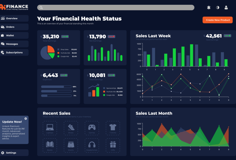
2. Project Overview: As I always point out, the best way to
learn a new skill, especially a technical skill
is by working on a project. In this lesson, I want to show you what we're going
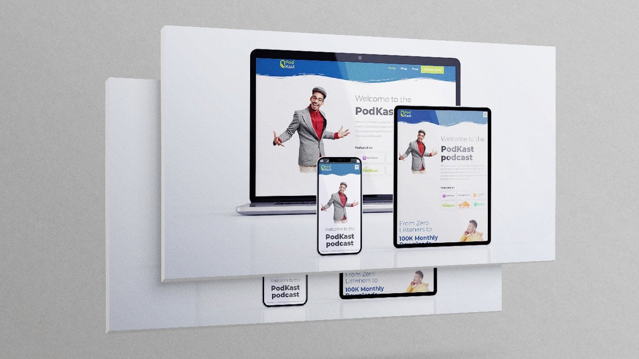
to be building. So I'm inside my editor, and this is the dashboard
we're going to be creating. As you can see, first of all, it's very well organized. We have it as the dashboard. But now if we start expanding every part
of the dashboard, You will notice the dashboard is made up of three main parts. Search bar, which is this section that has all these icons and
the search bar itself. We have the side bar,
which is made up of the logo and all these side
bar buttons and this content, and I can drag it around. Selecting this, I can
also drag it around. And we have the main content, which is made up of, of course, the main content that you
want to have a look at, and I can drag
everything around. If I expand the main content, it's also well organized
into the different parts. So let me just click away here. If I hover over any element, you will see it highlighted
within the artwork itself. So just have a look at that. For example, if I select
this total earnings card, and I'll call it total
earnings because, of course, it's the card that
shows the total earnings. This is the net earnings, pending payments,
expenses. This is grouped. I can carry it around and
rearrange the whole section. The thing is, it's also a
group of other contents. We're nesting items or
elements deeper and deeper. We started from the dashboard. Nested inside the dashboard is, are these three elements,
these three groups, and nested within
the main content are the cards that hold
different types of content. And within each card are other elements
that make up the card. For example, we have
this group that has the percentage
increase or decrease. In the past, maybe in the total earnings or
in the net earnings. There was a drop of 3.4, an increase of total
earnings, 3.8, and that is a group
that also has the 3.8, the arrow and the rectangle
that's holding it. So nesting elements within
elements within elements. I'll show you how to
organize your work, and I'll show you how to create every single part of this dashboard so that
by the time we finish, you will have a
dashboard like this to show or to showcase to your
friends or colleagues. At the same time, remember we're going to
start from scratch. We're not going to use
anybody's templates. We're going to start
from the background. Then add buttons. Add the logo. We're going to create every
single card from scratch, adding every single element. That will allow you to
understand how to use all these different
tools that you will be using most of the time
when working in Figma. That's the goal to
give you a guide on the most commonly used
tools through examples. This is the best way to learn
how to use those tools. And by the way, I
will provide you with this design template
so you can explore and see exactly how I created every single part as you
work on your own parts. So just check below this video player in the
projects and resources tab, and you will find the
template in there together with any other asset I
find useful for you. Just in case you want
to see how I made mine, don't forget to download it. So if you're as excited as I am, if you want to
learn how to build this dashboard and
gain the skills to build any other type
of UI UX design, this project will be
a good start for you. So without wasting
any more time, let's meet in the next
lesson and create a Figma account. I'll
see you shortly.
3. Create a Figma Account: Welcome back. Now that we've had a quick overview of what
we're going to be building, it's time to create
an account on Figma. I just want to exit from here. I'll come to this dropdown menu. Then click back to files. Now, I'll be brought back to my homepage for this
specific account. If I click this drop down
menu, as you can see, I am currently logged
in as this profile, but I'm also logged in as
this other profile here. Let me log out like that. Log out of all accounts. And this is what you will
have when you visit FIDMA. So I'll click Get
Started for free. We're going to use the free
account. And don't worry. I'm going to talk
a little bit about the free plan in
the next lesson. So let's just go on and
create an account for now. Now, I'll just continue
with a Google account, and I'm going to use this account that I've
never used before. I'll click Continue.
A, here we are. Because this is our first
time creating an account, we're going to go through
this onboarding setup wizard, which is very easy. This is how you'll
show up in Figma file. So I'll just go with
the default name, but I can click in
here and change it. Let's just say Can
the D, then continue. You can also choose
to skip some steps. Continue. What kind
of work do you do? Let's say I'm in
software development, because I'm assuming you
might want to design interfaces for your software.
Choose whatever you want. You can also choose other. Software development, continue. Do any of these describe your
work at an agency founder, let's say I'm a freelancer, or let's say I'm a founder. Continue. Who do you
usually collaborate with? Teammates, clients,
nobody, just me. Continue. Want to invite
some collaborators. No. You can skip this step, but if you want to
collaborate with people on this
particular project, you can send them e mails. You can input their
e mails in here. Skip that. What brings
you to Figma today? Setting it up for my team, starting a new job or project. Yeah. And here you can
select a number of them. So just checking things out. Continue. Have you used
Figma for products before? No, it's my first time. Continue. Which plan
would you like? I would like this plan. So I'm going to talk
more about the files and projects that you have access to with this free plan
in the next lesson. So let's go ahead
and click Continue. What would you like to do first? So let's talk about designing with Figma because we don't want to use Fig Jam. That's a whole course on itself. Finish. And here we are. So the moment we finish
that setup wizard, we're going to be taken
to this quick tour that shows us the different
parts of the editor. We're not going to
go through this, but take a moment and go through the entire tour to see the
various parts of the editor. But you're going to get
used to using them as we build the different
parts of our file. It seems because I loged out, I don't have the file open. What I'm going to do is log
in to my other account, add it here so I can also see what we're going
to be building. Basically, that's how to
create an account on FIMMA. In the next lesson,
let's talk about files and projects
in the free plan. I'll see you shortly.
4. Figma Editor Overview: I. And welcome back. So now that you've
created a Figma account, it's time to have a quick
look at the editor. And if you've gone through
the editor too that you were prompted to go through with that bubble that was here, you must have seen
that blue bubble. You went through a few steps and saw the different
parts of the editor. And the final step was to either continue practicing here
or open up a new file. So I've clicked,
create a new file, and now I'm in a blank editor. These are the same thing. But now, of course,
this has some content. So here's a blank editor. Now, of course, the first
thing I want to point out is you can change the name
of this particular file, this design file, and it's
currently inside drafts. So what I want to do
is give it a name, maybe AI finance web app design, because we're
designing a web app, web app UI design or
something of that sort. If I now go back to files, We're immediately
redirected to the drafts folder under Ken Koko's team. As you can see, we have one
automatically generated team. When we finished
the Setup Wizard, Figma automatically
created this team for us, and we have drafts, and we have all projects. Now, inside all projects, we have just this team project. We're going to talk
about what a project is, what a team is, what a page is, what a design file is. So don't feel
overwhelmed by all that. The point to take
away from this here is these three files
are inside the drafts. These are the practice
files we were looking at, for example, this one Figma
basics, Figma basics. Now, we can move this file from here by right
clicking it, move file. And under Ken Koko's team, this team, we have drafts. As you can see, we are currently inside draft, that's
why we have the tick, but we can move it
to Tim Project move. So now the drafts folder
has just these two files. Now, if I go to Tim Project, we now have the AI Finance
web app design file. Now, let me double click it. The first thing to do when
you want to start working on a project is to use a frame. So I'll click that. This is the frame tool. If you click the dropdown menu, it has a few other tools
that I rarely ever use, but you can find out more
about what they're used for. But a frame is what I
like to call the screen. So for example, when the
moment you select frame here, we see templates of
frames that we can use. So if you're creating
a phone app, but now this is a web app, so let's say, desktop. Let's go with
desktop, for example. Now, this is a
screen we can start populating with our design. If I delete it, and we
have the frame active. We can also draw it manually. And if we want to edit the size, we can come in here and input
our dimensions manually. So the width, the height, the width here can be 1920. Control and scroll
wheel to zoom out. Middle mouse wheel press down
middle mouse wheel to drag, and the height can be
1080. That's full HD. So that's how to create
a screen or a frame. So of course, there
are other tools here. This is the selection tool, and we have other tools here. So of course, you probably already know
what these tools do. If you want to add some
text, you can use that. Of course, I know I'm
skipping through these tools, and the reason is because
throughout the class, we're going to see how to work with the most
commonly used tool. So don't worry about that.
I'm just showing you around. So the next thing you
will have noticed is when we added a frame, this was automatically
created as a layer. Whenever we add anything, if I select the rectangle
tool and add a rectangle, it'll be added inside here, but it's its own layer. If I add some texts
and start typing, That's another layer. If I add a line, that's
another layer. Everything exists as a layer, but we can group them. If I select the line,
it's already selected, and that rectangle
and the texts, you will notice they're
also highlighted here. If I hit control G, I can group them and
now they are group one. I can call them elements. If I expand the elements, now you can see the three
elements we have in here. Inside here, I can also pick
these two and group them, Control G, and inner group. Now this inner group is
nested inside elements, which is nested inside frame. If I expand it, now we can see these two. If I select the group itself, I can carry those two around. If I select this, I'm carrying the elements group, and if I select the frame, I'm carrying the
entire frame group. So I hope you understand how
to work with groups now, the hierarchy of groups. Now, if I select that, control shift G, that groups whatever groups
you've selected. And of course,
we've first of all, ungrouped the outer group. Now, if I control shift G again, we ungroup the inner group. You can let me undo that. You can also select
Now this is a group. If I right click, I can group, just like that. Now, once we have this
rectangle selected, we will bring up some properties
here that we can change. For example, the fill color, select that, we can
change that to red. We can also add a
stroke as we can see. So selecting plus here
adds a black stroke. And if I zoom in, notice we have
that black stroke, and selecting it again, we can go to the stroke
and add its width. Selecting in here and using the app arrow
on the keyboard. We can also change it
to a dashed line by going to this menu and
change from solid to d, and now it's a dashed line. While it's selected, we
can remove the field by clicking this minus sign. While it's selected, we can also play around with
the border radius. That's the corners.
We can also just go directly here and
pull these dots. Or we can come in here, click in there and
input a specific value. Maybe 20, and now it has
a border radius of 20. If I say 50, just like that. If I select this independent
corners icon here, we can change the
top bottom left, top right, bottom right. Let's try that. Top right 50. Now, let's say top right zero, and bottom right
bottom left zero. There we go. If I selected, we can go back and
add a fill color once again and
remove the stroke. When we select the text, we bring up properties
that pertain to text. We can change the font
thickness, extra bold. We can also change the size by coming in here and
typing maybe 32. We can change from inter
to a different font. Let's type maybe
Montserrat Enter. We can change the
alignment of the text. Now, if we have a paragraph. For example, let me just
copy a paragraph from one of these copy that.
Paste that there. Now you will notice I pasted
a long paragraph here, but it's in one line, and that's because of
this setting right here. It can either be auto width, but if you click it again, it can either be auto width or you can change
it to fixed size. Now, let me select this corner here and
put it right there. Now, if I expand this, you will notice this has changed from or width to fixed size because it has to fall within
the specific dimensions of this text box
that's holding it. Now, if we switch it
again back again, it changes to that
single line. All right. That's basically a quick
overview of the editor. We will get to learn more about the different parts of the
editor as we continue. Remember, my goal with this class is to
show you how to use the different tools
that you will use most of the time
when working in Figma. And with that said,
let's move on to the next class where we will
be talking about teams, projects, design
files, and pages. What do they mean? What
falls within what. Let's find out.
5. Teams, Projects, Files and Pages: What I want to do is go to this drop down menu
and back to files. So this is the project I was in. Now, before we go too far, I first of all want to come
to this drop down menu, and as you can see, I
can add an account. So let me just add
account because I want to open up our
reference design, the one I had designed earlier, so let me just sign in. And this is it. Let me see. Let me double click that. Yeah, here we are. Now, if I go back to files, on this tab, I am
logged in as Ken Bs. Let me just drag it to
be the first one here. On this tab, I'm
loged in as the D. You can be loged in as different accounts
on different tabs. That way, if I go back
to Ken Bersa account, can now double click this. And open it, and I can
just undock it from that window and leave it as
its own window so we can switch between the two with
alt tab, just like that. Now, going back in here, when we finished setting
up our Figma account, when we went through
that set up wizard, Figma automatically
created a team for us. Right now, you should
be having a team here saying something tea. With that done, I
just want to get rid of that because that's clatter. And now that we're
inside this team, Ken Pumas team. Let
me just click that. Yeah. So make sure
you just click the dropdown menu
and click your team. Now you're inside your team. In here, we have one project. If we want an extra project, we will need to upgrade
to the pro plan. If I click this to add
a project or here, I'll be met with this prompt
to upgrade to professional. But one project is
more than enough for our work, our
personal projects. Of course, you might want to change this name of the project. So I'll go to this
dropdown menu, rename it, and I'll
call it Control A. Delete that, AI finance,
and I'll rename it. That's the name of
this particular team. Let me just add the word team. Team there. There we go. If we click this
dropdown menu here, you can also create
another team. Maybe you have a Fitness
team, Fitness App team. So you have another team that's
working on a fitness app, and you can choose to collaborate with
people or ski for now. Choose starter. And now your
inside Fitness app team. Click in this dropdown menu, you can switch back to AI Finance or create
yet another team. So I want to go
back to AI Finance. There we go. And every team
will have one project. So AI Finance team
has one project. But every project can
have three design files. So as you can see, we
have this original file. I can add another
one, another one. But if I go to the fourth one, I'll be asked to upgrade. So let me just
double click this. And call it maybe
AI finance web app. So let's go back to files. So we're inside
the team project, we can rename the project. This team project right
here is if I click the drop down menu and just
select the AI finance team, I this team project
here that's holding the three design files that
we're about to create? If I right, I can rename it to finance design files. Sorry about that. AI Finance design files. So there we go. Now, remember we've created one file called AI
Finance Web App. Maybe this is the
file where we use to design the web application
version of it. Now, if I add another one, Now, remember we're inside
AI Design Files project. This one can be called
AI Finance mobile app. Going back back to files. Now, as soon as we
leave a design file, as soon as we leave the editor, we are redirected
back into a project. And remember, we only have
one project for every team. So right now we're inside the AI Finance Design
files project. Let me just call this project. AI Finance Design Project. But we can also go inside the team that's
holding this project and all the other projects in it if we're in the paid plan. If I go inside AI Finance team, All the projects we have in here will be listed under the team. But remember, under every team, if we're using the free plan, we can only have one project. Now, when we're
inside a project, this project that's currently
inside AI finance team, to see everything that's
inside the project, we can just click that. Now we're inside the project
that's inside the team. Now inside this project, remember we have
two design files. We can add one more design file. Now, this is the third one. Let's say maybe we also have a website version of our app, I Finance website. That's for
informational purposes, and we want to tell
people about our app. Now we have three files in here, AI Finance website, AI
Finance Mobile App, AI Finance Web app. If we try to add a design file, we'll be met with
this message here to upgrade because we can only have three design files inside a project that is inside a team. Now, I think I had created something here to
help us with the hierarchy. Let me just open up adobe
Illustrator very quickly. And here we are.
We have one team. For example, we have
this AI finance team, and the team can only have one project if we're
using the free plan. One team can have one project. If we want an extra project, we have to be in the
professional paid plan. One team can have one project. One team, the AI finance
team has one project, which is the AI design project. Let me just go inside
the team itself. It has just this single project called AI Finance
Design Project. If we want to add
extra projects, we will have to go
to the paid plan. One team has one project. But you can create
multiple teams. We have Fitness App team
which has the same hierarchy. If we switch to that, This has a project which
we've not renamed, and the project does not
have design files yet. We can also create a third team. Maybe we have a marketplace
app team. Create that. Let's skip for now. As you can see, we
have three teams so far and you can
continue creating teams. Let me just switch
back to AI finance. O AI finance team
Team has one project, one free project called AI
Finance Design Project, and every project can
have three design files. This AI design project
has three design files. If we want an extra one, we also have to pay three
Figma Design and FIJ files. Now, once we're
inside a design file, we also have access
to three pages, but I never use more than
one page by the way. If I for example, open up the mobile app, double click that, the
mobile app design file. We're on page one right now. If we want extra pages, we can come here.
We're on page one. I can add an extra
page, page two, enter, page three, enter, If I try to add an extra
page, I can't get it. So I typically
just use one page. Let me just delete that that, and now I'm left with
this single page. Let me collapse that. In here, this is where I
can now come and start adding items layers
within this first page. For me, it's typically more
than enough for my project, and you'll get to see that. But right now, I wanted
us to have a quick look at the hierarchy
and how projects, files, and pages are related. We're not going to touch Fig Jam because that's a whole
course on its own. Maybe I'll do that later. Right now, we're
just focusing on designing this dashboard
using the Figma editor. We're not focusing on Fig Jam. Now, with that said,
I think this lesson has become much longer
than I expected. But I really wanted
to drive that home. I wanted you to have that
clarity because this is one of the most confusing parts
of Figma to beginners. They don't really
understand what's a file, what's a project, what's a team. Now that you
understand all that, I think you're ready to start
building our dashboard. In the next lesson, let's see
how to create the sidebar. I'll see you shortly.
6. Add a Background and Logo: So now we're ready
to get started with the actual designing
of the dashboard, and we say we're going to
start with the side bar. So as you can see, the first thing we need
to do is import the logo. So switching back to our
workspace, where is it? Here we are. So now, we're working on the web
app version of our app. So I'll double click that
and now here we are. The first thing we want to do is create the actual screen. To do that, I'll select this
tool and once I select it, it's going to reveal
several templates here that we can quickly
get started with. Because this is a desktop, I want to select, let me collapse the phone
and expand desktop. Then I'll choose the
Macbook Pro 16 inch. Or just, let's choose
that. There we go. Of course, as you can see, if I select this
tool once again, if you wanted to
design for phones, you can choose whatever
phone you want here. With that, the next
thing we want to do, let me just switch
back to our reference. I want to add this
faint line here. First of all, let's
add the background. Switching back, I'll come here and select the
rectangle tool. If you can't see
the rectangle tool, click the drop down menu and
select it from the list. Then I'll just drag and cover the entire
screen with it. Or frame. With that, I want to select
a very dark First of all, let's switch to blue. Let's say that blue, and then s to maybe that dark
blue like that. I'm just doing it
freestyle, but for you, you have to work with
specific color codes. Here's the color code. If you want to use the
colors I'm selecting. Let's make it darker
up to that point. That's the color code. Now let me select this drop down
menu and choose line. Select to constrain it to just top and bottom and
not moving left to right. You can hold down shift. That means you will only
be moving up and down for an arch rate vertical
line. And there we go. I want to select the line
itself and select stroke color. I want to go to this and drag
it maybe up to that point. Just to make sure it's dark. I think that's a good spot. Now to import the logo, I'll click this dropdown
menu file place image. As you can see, we have
a shortcut Control Shift K. I can just
click anywhere here, then Control Shift
K. It'll open up the Explorer and I can go directly to where I
have those elements. I have this polo call assets. We have the logo here
if you want to use this logo and clicking
anywhere and dragging. Will place the logo here. So I'll hold down shift and then select one of the corners
and drag to resize it. If you don't hold down shift, the frame will
move on all sides, but if you hold down shift, it will only move
proportionately. Remember, control shift K, double click, then select
anywhere and drag to import. So there we go. I think we'll stop this
lesson right here. We've learned how to
create the background, add that line, change colors, and import an image. That's also the
same way to import any other type of image
you want to import. So let's stop right
there for now. In the next lesson, let's see how to
create a button. So I'll see you shortly.
7. Create the Sidebar Buttons: Welcome back. Now that we've created a
background and added the logo, it's time to create the buttons. Let me just zoom
in by holding down control and scrolling
with the mouse wheel. Then holding down the
mouse wheel alone. I can drag and place this in
the middle so we can see it. Now, you will notice here, we have some texts and an icon. And of course, we have
the button background. Switching back here. Holding down control, and scrolling with
the mouse wheel. Let go of control, hold down
the mouse wheel and drag. I want to come here and select this rectangle tool and drag and drop and drag and
release at that spot. Now, you will notice
it has sharp corners. To give it rounded corners, we can click in here. And give it maybe ten enter, and I think that's a good
rounded corner button. Now, of course, on our
reference design here, this is lighter than
the background. Selecting this, we'll
go here to the field. Select the background. I think this is the
background color we select. No, that's the background color because now we can see it, but now I want to
make it lighter. Maybe up to that point. We're just trying to
play with colors. But remember, if it's an actual
brand you're working on, you need to use the brand
colors. Be creative with them. I think I like that. Next
thing I want to do is select the text and
click anywhere, not necessarily
inside the button. I can also click here
and type overview. Click outside or anywhere
here. Then select that. Let's make it size 16 and
the text 16, just like that. You can change the
font if you want. Right now it's ter. We can select maybe Monat Enter. We can change the
weight so I can select bold. There we go. Now the next thing we
want to add is the icon. So switching back, you will notice I had already opened
a tab here for vector icons, and it's called flat
icon or flat icon, depending on how you
want to pronounce it. So I'll type what we have here. Analytics, for example, enter. All right. So here we are. I have this analytics
right here, and I'm already logged in. If you're not loged in,
you will not be able to edit the icons before
you download them. If I select the icon itself, it'll bring up the
option to edit icon. I'll click edit icon. While this is selected, I'll click the color and
change it to color white. Then download it. I'll
select size 64 pixels. Free download. Now that
we have it downloaded. Let me just switch back here. We have it downloaded. I can drag and drop it in here. Hold down shift, then select one corner here and resize it. Place it there. You can also come here and click this icon right
here to show in folder. It will open up where it's
located in your downloads. And then you can drag
and drop it in there. Delete that. You can also
control shift K, remember. Then go to downloads. Double click that and drag holding down shift to
resize it proportionately. Those are all different
ways to do that. There we go. Let me just Position that. Now, one way to
position items within your artwork is selecting
maybe the text, the icon, and then
finally, the button. Now when we align the items, there will be aligned in
reference to the button. If I come here to align align vertical
centers and click that, as you've seen, they've moved relative to the button
background itself. It's not moved, but
everything else has moved because it's
the last item I selected. So once again, if
I put that there and I want it to be
vertically in the center, I can select it, then
the button itself, the item I want the other
item to be aligned to. And then click this
vertical align centers, and now it's in the center of
the last item we selected. So with that, I'm going
to select these three. Control G and group them and
rename them to button one. Now, if I hold down Alt, as you can see the mouse
cursor seems to be duplicated, and that's an
indication that we're about to duplicate this button. And dragging hold down shift to constrain it so that it doesn't move
to the left and right. Hold shift, release
it right there, and then control D to
continue duplicating it. Control D, and now we
have several buttons. Now I'm going to repeat the process for
these other buttons, the same process of
editing this text, I'll select this text, change this two orders. Then I'll go to flat
icon or flatcon, and maybe search for orders. Let me just search for orders. Just look for nice
creative icons. Let me see sales. All right. So L et
me select that. Edit icon. While
this is selected, White download PNG
64 free download. It's downloaded.
Switch back here. Zoom in. Go here,
drag and drop that. Hold down shift, get one corner. Select this, remove it. Now, when you have a group, and you want to select one
item within that group, hold down control, you can select a single item
within any group. If you let go of control, you won't be able to select items within the group
unless you double click. Now I want to reposition
this, hold down shift. And I'll leave that right there. So I'll repeat the same process for the rest of the buttons, and I'll see you once I'm done. Now, just in case you find that an item is not within a group
that you wanted to be in. For example, this icon is now not inside this
group, it's outside. If I select this group, it's button three, and
the icon is up here. Here's the group, and
here's the wallet. I can just drag the
wallet into group three, just like that,
drop it in there. Now if I select the group, each one single group. So messages, let's
go to messages. Let me just drag this to
the bottom like that. Change that to settings. Select the selection
tool. Then here I'll. Select that. Dit the icon. Change the color to white, download, PNG, 64,
free download. Go back in here. Drag
hold down shift. Of course, it's outside, this is button number six, so it's automatically
inside, so no problem. Hold down control to
select this icon, remove it, hold down
control to select this. Let's place it there. Maybe hold down shift and select that. It's properly aligned. I'll just drag that. I hope you've followed
the process we did with the first button and now you
have a couple of buttons. I think this is the
end of this lesson. In the next lesson, let's see how to
create the search bar. I'll see you shortly.
8. Create the Search Bar: Welcome back. Now it's time
to create the search bar. We're going to employ
the same principles we employed right here. Switching back to our editor. Here we are. The first
thing we need to do is select this rectangle tool. I'm just going to drag and maybe release when I
get to that point. Now, of course, I need to
give it rounded corners. I'll select that
and give it 50 to make sure it's
completely rounded. As you can see, we
have this search icon. Let me just zoom in, search. So I'll go to flat icon. Then search for Search Enter. And here we go. We have
so many lens icons here. Let's go Let me
go with this one. I'll click Eddie icon. Change that to No, let me make it grayish. Then 64 free download. Going back in here. In fact, let me just close all
these others like that. Now, going back in here, I'll go to downloads
and drag this in here. Now as you can see the two
colors are almost similar, so you can see the lens. I'll select the sarge bar
and make it maybe darker, slightly darker, just like that. Now you can see the lens, and I'll hold down
shift to resize it. I might even put it on
this other end because the curve is on the left side on the right
side, just like that. Save. And I forgot to
switch on my light here. So I hope you can
see me clearly now. What else do we have here? We have these buttons, notifications, dark
mode and user. So switching back here. Notifications. Let me select that change color. Download PNG 64
Pixels, free download. We need dark mode enter. We can select maybe this
or maybe this, edit icon. Let's change it to
white, download, PNG, free download, and finally, er. I'll select this or maybe this that icon
change that to white. Download that PNG
64 free download. Now, let's go back in here, notification. And do that. Notification, drop it there, brightness and
contrast and user. Selecting the three
of them by holding down shift to resize them. Now I'll drag and place them. In fact, now that I have
the three of them selected, I can align them vertically
in relation to each other. I think we're now starting
to have some good design. I think for now we're
going to leave it there. Let's look at what we have next. In the next lesson, let's see
how to create these cards. We're going to start
with a text here and then create one card. I'll see you shortly.
9. Total Earnings Card: Now it's time to start creating the main parts of the dashboard, and these are the cards. But before we do that, let's
first of all, add this text. I'm going to hold down
Control to select this text, triple click copy. Then I'll switch back to my editor right here.
Select the text to. Click anywhere in there and
then control V to paste. All right. So I'll just
position it right there. And I'll come and
triple click in here, copy that Hall down at in here, and drag triple click paste. Let me use my keyboard
arrow buttons. Now, for you, you
will be typing. Let me just select T, and then type financial health. Status, escape or click
anywhere outside. Now you can go to the text. You can change it to Monsat, or any other phone you want. Then you can increase
the phone size. Maybe let's say 36, and maybe let's say
weight is black. I'm just showing
you how to do it if you're not copy pasting
it from somewhere. Let's also this is an overview of your financial
standing this month. Clicking anywhere outside.
Now that we have that, I can change this
maybe to size 12. Let's say 14, and let's
change this back to regular. Basically, that's
how to do that. But now let me just delete that because I
already have my text. Now we want to create this card. Before we do that,
let's add this button. I'll just select this, hold down and drag that. Up to that end. Then I'll hold down control to select this
background itself. Now that it's selected, I can hit I to bring up the dropper tool and I can
hover over this orange, and that will apply this orange color to the item
that's currently selected. So click in that. Now our button has that color. This say is create new products. Create new products. Click anywhere out here. Hold down Control to
select the button, remove that, hold down
Control, to select that. And don't worry
about organization. I know everything
here is disorganized, but that's a lesson on its own. We're going to
organize everything because we will need to group
everything accordingly. Next thing we want to do
is create this card here. I'm just going to
hold down at to duplicate this and let
me place it right here. In fact, I'm going to
ungroup it for now, right click group, and now
it's no longer grouped. I want to resize this
2255 by In fact, let me just do that manually. The width is 259, height is 252. Let's make this 260. By 26260. Now it's squared. I want to select it
and tap I to bring up the eye dropper and
then select that. Then click outside. That will give it that
same color as the buttons. Let's create the
amount copy that. You can also just drag this, select this, and maybe
let's put it aside. Let's say 43,210 outside, click. Put that there. Double click this. Maybe I
can call this dollar sign, click outside, drag and
drop it somewhere here. O we need to make
it slightly wider. We don't necessarily have
to have it as a rectangle. Total earnings. I'll just
drag no, select this. Total earnings. Just like that. Now
we have these three, shop cells, YouTube
ads, Google ads. We can select this tool. We can select this rectangle, create some tiny rectangles
holding down shift, I want to o in by
control and mouse wheel. Then let's give them a rounded corner of maybe
three, just like that. At and drag this. Shop sales. YouTube
ads Google ads. So click anywhere outside. Select that and that.
Before we do that, let's make this regular. Let's make it maybe Size. Select that Add then control
D to repeat the same move. Google Ads YouTube ads. That's the income we
made from all that. Now let's switch the colors. Can give this a light gray. Let's switch to blue, then give it that light blue. Let's give this maybe
some red color. Or should I say orange color? Yeah, let's in fact, let's hat I to bring up the eye dropper
two while this is selected, I, and then tap that. And then we also have
some nice green. So opening this I think
that's a nice green. Now, in the reference
design here, if I hold down control
and select this, as you can see, this
is Pi chart icon. So switching back here, I can go to flat icon. Pi chart, Pi chart, enter. Now I think this is it, but I want something simpler. Let me just select
that. Edit icon, and now we have three colors. I can change this to
which color was this. Let me switch back to here, selecting this, copy that. Control C to copy
this color code, go back in here, paste it there. Oh, we're supposed
to go in here. S elect this orange. Copy that, switch here. That's the blue color. Double click this,
paste it in there, and now it's orange. Finally, we have this green, double click that,
Control C, select this. G in here, double
click that, enter. Now we have that. Download, PNG. Let's download 512. Free download, and there we go. Now, coming in here, we can drag and drop this here. Hold down shift, resize it. And now every
portion of the Pi is represented by
these values here. Let me hold down shift
and select all of them, hold down shift to resize them. Drag and put them there. Select the text itself, and let's give it
maybe size ten or 11. There we go. Now let's also let me hold
down control and zoom in, holding this and
shift, then that. Let's align that to
the small square. Hold that, then shift. Align it, select that,
hold down shift. Align that. Now, selecting these three at and drag the right. Holding down shift to
move in a straight line. Now let's switch from left align on the
text to write align. Let me select this,
then this, then this, and align them to the right
in reference to this, then drag them up to
maybe that point. Because we want to come
and add these figures, $12.05 3,000 and something. Dollar sign 3,522, dollar sign 10,320 and dollar sign 2,410. We can also select
the text the figure itself and control
B to make it bold. Control B or go directly
here and make it black. But that's bold extra
bold. Switching here. These are a little bit faint, so I'll select the
three of them, go to feel and drag
them up to that point. This is also faint. I'll drag it maybe
up to that point. Now, you will notice, we need to do some
arrangement here to make it a bit more
appealing and organized. But generally, I love what
we have so far. Save that. Now, let's push this inwards
together with all these. And finally, we need to add
this performance indicator. So of course, we
can just drag this. Hold on, drag that. Then let's just resize it. 3.8 up by 3.8 this month. Now, this is behind that box. So I can just drag and put it on top.
Maybe somewhere there. It's still not on top, so I'll still keep
dragging it up to the top. Let's place it right there. U by 3.5%. Click outside. I'll
make it green. So I'll just hit while this is selected eye to
bring the eye dropper, just like that, then
control B, to make it bold. And of course, now we
need to find this arrow. So I'll just go in here, close that, then arrow. I like this, select
that, edit icon. Change it to that green. Going back in here, I'll select. No. Let's go back to our artwork because we want
to have this accurate green. Control C to copy that. Go back in here, double
click this paste. Download PNG 64, free download. There we go. Go back in here, I'll drag and drop this in here. Hold down shift. Then rotate it holding down shift to make 45
angle increments. And do that, hold down
shift and start rotating. Let's place that there. And there we have
it. Now, in fact, I'm going to select
everything here. Let's see. Yeah,
everything is selected, Control G. Then I'll select
while it's still selected, the group, I'll all down shift and select the card that's
supposed to hold them, then now align everything
to the center of that. There we go. So, we
have our first card.
10. Assignment - The Rest of the Cards: In the previous lesson, we created this card, and I'm leaving you
with assignments to create these three
cards, one, two, three, and as you can see, this one is a bar
just like this, and it's green in color. If I hold down control
to select this, it has this light blue color, but it still has rounded
corners and all that. Now, I just wanted to provide further clarification for this, how I created this
was, if I zoom in, as you can see, this here, is a rectangle with
rounded corners, but at level three. So that's why they're not meeting in the center like that. So going back to level three. The same case applies to this. But now this does not
have a field color, it has a stroke color. And I basically
placed this inside this to create this
effect of levels. I hope I'm making sense. And for this last one, what I did was The
same thing I did here. I went to flood icon and
searched for what is this, by the way, Fecast. Let's just go in here and
see if we can get forecast. Wha we get? All right. Now, what we're getting
is weather forecast. So I think sales forecast. Yeah. You see
documents like these to represent pending payments. But as you can see, this section here is pretty similar to this, and that's something
you can do very easily. I just wanted to help you with that clarification so
that you don't get stuck. Let's see what you'll be
able to come up with. Also, feel free to create
something of your own. You don't need to create
these bars or these here. Let's see if you can
get creative and design something
different for the cards. In the next lesson,
let's see how to add these bar charts and graphs. So I'll see you shortly.
11. Adding Graphs and Charts: Now it's time to work on this card right here
and probably this. Switching back to our artwork. I want to select this group and this card that's
holding them, and in fact, group it
all together. Control G. Now it's one single card
that I can drag around, or there is this
number here that I also hold down ship to select
both of them, Control G. A. I'm unable to put that in there because it's
in a separate group. Let me first of all, ungroup it. What's in here? Let
me just ungroup it. Now we have 3.5. Let me
drag it inside group three. Now it's inside that
group. All right. Now let me hold down and drag
maybe up to a space of 25. And do the same control D. Now the spacing is
equal all through. But of course, I'm
going to expand this. But before we do that,
hold down shift and shift and drag that
spacing of 25 once again, release it right there. Now, delete that, then ungroup this because I want to
get group it once again, and ungroup it once again. I want to separate them
into individual Thank you. Elements, Let me
delete all that. Let's switch back to this. It still has this,
so I'll keep that. But what I wanted to do is resize this to make sure
it's reaching this point. But I want to expand
it a bit to make sure this pacing here
is the same as this. That means we'll
move the button. Select the button and hold
down shift, select this, then align the button to the
right in reference to this. Same case applies to these, hold down control
g to group them. Then hold down shift and align them to the
button just like that. Now, switching back to this, this is in the right side. So hold down control to zoom
in with the mouse wheel. First of all, let
me just group this. Select that, that and then what's holding them and
align them like that. Then control G to group them. Now this is one group. I'll also while
this is selected, select that and that control
G to group them together. Now I can carry them as
one group, just like that. I want to select this
and this hold down at. Now they're behind that. So I'm going to drag
them up to the top. Then hold down shift. No. Let's just resize. First of all, what does it say? Sales last week. Sales last week, and this should be white. This is how you
performed last week. All right, just like that. Let's dry and put that there. Now, we can make this size
can use the mouse wheel. I mean, I can use the arrow
keys on the keyboard. I think 28 is okay. Push it down maybe to 13. Now, let's say 12, and then push it
up, push this down. I think that's a good position. In fact, let's push this down, just to align it to this. Hold on control to select
the figure itself. Select total
earnings, push it up. Select this group,
push it up closer to the number. There we go. Save that. Now, to add these Pi
charts and graphs, let's right click anywhere here. Hover plug ins, manage plugins. That will bring up
the plug ins pop up. There we can search for
whatever plug in we want. Let's type chart. And I think this is
what we need charts. By Sam Mason. I'll click. Let me just say Run. Yeah, and this is it. We can change the number
of data points. I'll just leave it at ten. We can decide if we want
it to be a scatter or area or bar Pi D a chart, I'll switch back to line. We can change the range, maybe this is 10,000. That changes to 10,000. We can change the dataset range. Let's say two. In fact, speaking of bar, let me change that to bar, and I can go ahead
and say add chart. Now, it will be placed
on your artwork, and if I zoom in, you will notice
the text is black and these lines
pointing to the text. First of all, and I don't
think it's grouped. If I use the mouse wheel, holding down the mouse wheel
to drag it's not grouped. I'll hold down. First of all, let me zoom in with control and mouse wheel. Then I'll select the
text, this other text. In fact, I don't need the grid. Let me select the
grid and delete it. I don't need it. Now texts, the other texts, and the bar. Now if I drag them, the only thing left
is the grid bars. Control G to group
them. All right. Now let me just drag
this and put it here. Hold down shift to shrink it. Now you will notice
because we've shrink it, the text has collapsed. I'll hold down control to
select individual texts, to select multiple
texts together. I'll hold down
control and shift. And I'll pull that to
expand the text holder. Then hold down control and shift to select the
text once again. Fact, let me select
all of it like that. Then change the color to white. I'll select I fact, let me select that. Hold down control. It's
a bit over tedious task, but we have to do it, hold down control and shift
to select the different. Let me start at the top, control, and this
other one at the end, hold down shift and control. Then let's select
the middle ones. And this main one.
Change that to white. Let's repeat the same for this. Hold down Control.
Control shift. I'll select these. And I'll change that to white. Now, for this color, the blue color,
I'll select that, then hold on control shift. Hit the eye key on the
keyboard to bring up the eye dropper and select this color just for uniformity. I think I like what
we have so far. Let's have a look at
what else we have. Let's get this type of chart. I'll right click plug ins. Now we have charts
because it's one of the recent recently used. Let's give this five. Let's give it three points. Hide grid, and there we go. Add chart, and that's
the chart we have. Now I'll repeat
the same process. Make sure you select every
element in the chart. I don't think I've
left anything behind. First of all, let
me select this. If I selected before
grouping everything, now I have the option to
change the different color. I can change the
fill color to white, everything that has a
field color is white. Then stroke color to white, everything that has a stroke. Same case applies to this group. Fill color white,
stroke color white. Now, I want to select this. It's yellow, but I want it
to be this orange color. For this second one, I want it to be
that bluish color. There we go. Now I
can select this. Control G to group it. Then I can shrink that.
I need to push this. Let me just undo that. There is this clipping
that's happening. I think let me just expand
it up to that point. I don't know what that is. Let me just undo that. Then drag it once again. Let me put that there, then just resize it
while we're still there. I don't know why this is
happening. But it's okay. Now, hold down Control. What is this? I don't
know what this is. I think it's the clip
outside the chart. But honestly, I don't
know what it is, but it won't stop us
from doing our job. Holding down. Let me just
delete that. Delete that. Holding down control and
shift to select those. I can now expand that. There we go. Control
S to save that. And now we have a
nice dashboard. Now, of course, I just
duplicated these. Of course, yours
should be unique. Each of them should
be different. I would have done the
same for this part because it's all about
coming here right charts. And this should be area
and repeat the same. But I'm not going to do that because that's something
you can do yourself. My goal here is to give you
a nice guide for you to follow and come up with your own creative version
or the dashboard. What I'm going to do
is select this and this and these texts, and this. Then finally, this control
G to group it all together. Then hold down out
to duplicate it. And then with a
spacing of 25 there, I'll drop that there. And it seems we've not
really grouped this because it's in a different
group, but no problem. We're going to do some cleanup when we're organizing
everything. So I'll drag that holding
down Alt to place it there, and all I have to do is change it to say
sales last month, but I'm not going to do that. In the next lesson, let's do some final touches as I explained how you're
going to do this. So that's all for now, and I'll see you in
the next lesson.
12. Assignment - Finalizing the Cards: So right now it's time
for another assignment, and it's going to be a
very easy and quick one. Now, if you look at this
section right here, it has these most recently
sold items in your inventory, and you will notice, of course, these are icons I
downloaded from flat icon. And that's something
you already know, visit Flacon to download them. The other thing you will
notice is this heading and this subheading is pretty similar to what we
already have here. That's something you
can quickly create. Finally, we have these broken
line squares right here. Creating a broken line
square is very easy. All you have to do, in fact, let me show you very
quickly how to do that. Going back to our work. I'm going to hold down
control, then select that, then out and drag to duplicate
that with that duplicated, in fact, it's grouped. Let me just group it. Group. Once again, group, and now this is a single, and now this is an
individual card. While it's selected,
I'll go to stroke. And add and now it has a stroke. Then I'll subtract the field
to get rid of the field. Now if we zoom in, you'll
notice it's just the stroke. While it's still selected, I can give the stroke this light bluish
color, just like that. I can also increase the width. Let's say I can give it four. I can choose to have the stroke
inside outside or center. Right now it's inside. We can put it outside as well. Now it's outside, and we
can put it in the center. Now, if I go to this
menu right here, we can go to this
drop down menu and change that to d and that
becomes a dashed stroke. That's how to create this. You're going to play around with those settings and see
what we can come up with. Having described everything that you should do to create this, I think that's going to be
an easy assignment for you, and it should be very interesting to see what
you will come up with. This is very easy to create, just basically duplicating
this or creating it from here, and then adding some texts, go to flat icon and
select a closed button. As you can see, this is removed. If you go to flat icon, you can say maybe close because it's a closed
icon, and here we are. Take your time and complete
this card, this one, and this upgrade now card, and I'll see you in
the next lesson, where we'll be talking about how to organize everything here. Because if you look at what we have on my reference website, on my reference design, This is the reference actually. If I collapse that, it's very well organized, so I'll see you in
the next lesson.
13. Organizing Components: Welcome back. Now it's time to organize our design or our file. And looking at our reference
design file right here, how I had organized it. As you can see, we have the
search bar that's at the top. We have the side bar, and then
we have the main content. If I expand the main content, it's also sub categorized
into different sections. As I hover over different parts, you notice everything
is very well organized, and I can just come and carry that and put it aside
or that and put it aside. So let's do that on our project. Going back in here. Now, let
me just get rid of that. Now, of course, let's
start with the search bar. It's made up of the search icon, then the search bar itself. I'll select the two of them, then Control G to group them. Now I can carry the
two of them and do. This is already grouped. Remember we selected
the three of them. Now while that
group is selected, I can select this other
one holding down shift. In fact, they're not aligned. Since I've selected this last, we can align these three
to this. Just like that. Now if I hit Control G, we formed a new
group called group 16 and I can just
carry everything. This group 16 can be called
the search bar enter. Zooming out, holding
down control and mouse wheel scrolling. Now, we also have these buttons. Remember we grouped
every button, so I can carry that around just to confirm that
each one of them is grouped. All right. I'll
select this button, hold down shift to select all of them together
with the logo and this line, then I'll control
G to group them. Now, if right now I'm unable
to group all of them. If you notice that behavior where you've
selected everything, you hit control G and some items are not
included in the group. You can ungroup them, so I'll ungroup them. Now they are individuals. Now let me just look for
the group. It's group 16. Let me just call it side bar. Now I can come to
the project logo. Let me just call it logo and drag it into
the side bar group. Select this line as
well, side bar line. Enter and drag it into the
side bar group as well. Drop it in there. Now, if I collapse
the side bar group, I can carry the entire
side bar just like that. Now, remember we
had created this as a group, so no problem. This was also a group. This is not entirely a
group because this text was not joining the group when we tried Control G. So let me see. This is called sales
Last week group. While it's selected,
I'll just double click sales week card. Now, this is the Group 13 sales last week card title. And now I can drag it into
sales last week card. Now if I drag and
move it around, it's moving together with a group because it's
part of the group and make it a habit to label every single thing
with its appropriate name. If it's this amount here, that does not need a label. But now for this card, we can call it total
earnings card. Card. Oh, eight. We labeled the wrong thing. For example, this
group right here, let's call it Total
earnings card because it's the
total earnings card. As you can see right
here in our reference, if I select this, it's called total earnings. If I select this,
it's net earnings. Select these expenses,
just like that, and it has everything
else inside of it. Switching back to our cards. Of course, I won't spend time
labeling these other parts, but you get the drill. Now, of course, this here is also not entirely a group
unless we change this. This is let's say this is earnings last month. Month. Clicking outside
and selecting this. This group is last month, Let me collapse that. Let me select this.
This is Group 14. Let me just double click it
and call it sales month card. Now, sales month title. And drop it in there. Total Earnings card, which is this button seven
side bar, Search bar. All right. Now we want to
create the main content group. Now let's repeat what
we just did C G. Main content. If I
hide it, that's co. In fact, this text should
also be in the main content. So let's just drag and put it in there and this button as well. Let's call it create button. Remember, guys, this
is just a guide. Take your time to organize every single element in the way that makes sense to you and your team members
if you have a team. So what's this rectangle? I don't know which
rectangle this is, if I hit, and this
is the background. B ground. So I'll put it in the
main content as well. And now it's above everything, so I'll drag and put it
below total earnings card. Now, as you can
see, the side bar is not visible and
search bar because the background is inside
the main content and the main content is
above the search bar. In fact, we haven't
put it inside. Let's drag the side bar above the main content and the search bar above
the main content. Now inside the main content,
drag the background. Right below the total earnings. Now, let's double
click Macbook Pro, which was the frame
and call it dashboard. Now we can collapse
the dashboard, and that's where we begin if we're describing this
project to someone. Dashboard is made up of the side bar bar, and
the main content. And the side bar is made
up of all these buttons, and I can collapse the buttons. Side bar line, the logo. You can rearrange stuff. You can put button
one above button six. You get the drill by now, I'm pretty sure you can continue rearranging and
organizing everything. Before you share this
project with someone, you need to have it
organized that way. So far, I think we
have covered most of everything you
will be using most of the time when you're
working in Figma. Of course, this is just
the first installment in a series of classes, I'll be publishing
regularly about Figma from the basics
to the advanced stages. Before you leave, I have
a few final thoughts, I would like to share with you, so I'll see you in the
final lesson. Don't go far.
14. Final Thoughts: I just want to take a
moment to say a big thank you so much for sticking around with me until
the end of this class. I hope you found it both
informative and enjoyable and that you're now feeling more confident in your figma skills. By now, you have a fully designed
dashboard that you can share with your friends
or work colleagues, and I'm very proud
of you for that. In fact, I encourage you to pat yourself on
the back and take a moment to celebrate because many people
can start a course, but few people
manage to finish it. And you have. So congrats
on that achievement. If you enjoyed this class
and found it valuable, I would like to ask you
for one simple favor. Please take a moment, in fact, less than a minute to write a review and tell others what you thought
about the class. Your feedback is incredibly valuable because
it helps me know if I'm doing a good job and helps other students
discover this class. When students come across
your review of the class, it makes it easy for them to decide if it's a good
class for them to take. So as I mentioned, it will
take you less than a minute, but it will make a
huge difference. Just click on the
review star below this video player and let me know what you thought
about the class. And don't forget to check out my profile for more
classes on UI, UX, and web design. I have a variety of
courses designed to help you continue
building your skills and advancing your career. Because remember, we're
living in a digital world. And having those
skills is crucial. So check out my profile
for more classes. And once you finish working
on your dashboard project, don't forget to share it right
here with the community. We love sharing our
projects to get feedback from fellow students
and from teachers. Let me just show you an
example of a recent class. Here's a class I
published a while ago. And under the projects
and resources tab, here are some examples
of projects that students have submitted
to get some feedback. So All you have to do is
go to the Projects and Resources tab and
click Submit Project. And right there, you can upload a screenshot of your completed. Don't forget to give
it a project title and maybe a project description. So I'm really looking forward to seeing your final project. Once again, I want to say, thank you for joining
me in this class, and I look forward to
seeing you in the next one. Happy Designing piece.
 Ken Mbesa, Web Designer | 3D Artist