Transcripts
1. Introduction: Welcome to this class. Are you excited to bring your app design ideas
to life in FICMa? Whether you are
completely new to UIUX or you already have
some design experience, this class is designed to
guide you step by step, helping you turn concepts into real professional
mobile app designs. Hi, my name is YatanhoTri and I am thrilled to be co teaching this class with Abdu Salamhab together, we will guide you from the very basics of
FIGMA all the way to designing advanced
interactive prototypes that you can proudly
showcase in your portfolio. In the first part of the course, I will introduce you to
the fundamentals of FIGMA. You will learn how to set up
your project efficiently, explore all the essential
tools and create some paul prototypes that help
bring your ideas to life. These foundational skills
will make it easier for you to tackle more complex design challenges
later in the course. Then Abd Sala Mahbub
will take over and guide you through designing a complete shoe shop
ecommerce mobile app. You will learn how to
structure an app from start to finish following
industry based practices and creating a polished
user experience. He will show you how to
design reusable components, maintain consistent
system designs, and create advanced
interactive prototypes that feel just like a real app. Throughout this class,
we will also focus on building comprehensive
style guides, implementing typography
and color system, and organizing design
elements in a way that makes your work
scalable and professional. You will work on every important
screen in a real world ecommerce app from
product listings and product detail
pages to the card, checkout SARS and category
navigation screen. At the end of this course, you just have a
finished app prototype, you will have the knowledge and confidence to design your
own project from STRS. You will understand how to
build cohesive design system, craft smooth user experience, and present professional
interactive prototypes that can improve your portfolio and impress potential clients or employers. So if you were ready
to dive into FICMA, improve your UIUX skill and create a complete
full featured a prototype. This
class is for you. Join us, and let's take your design skills
to the next level. We can't wait to see what you will create. Let's get started.
2. Create a Figma File and Basic Structure of Figma: Welcome to this lecture. In this part, we are going to
start working on our Figma. So when you log in
to this Figma site, you should see this
kind of interface. If you are new and didn't
work on any project, then you should see
some empty space or maybe some built
in Figma project. But in general, on the top, you should see these
kind of options, and from here, you
need to click on the design to start
with Figma project. So when you are here, you will see this kind of interface. So first thing first,
I'm going to give you an overview of the Figma so that you guys can understand how it works and what kind of
options we have here. For example, in the website, we have this section where we
can see the pages, layers. The right side, we will
have this design and some variable styles
and a couple of other options that will appear here and also the prototype, and at the bottom, we
have this toolbar. So first, let's talk about these few things like
the basic stuff. And after practicing
all these basic stuff, we will start working on a real Walt project so
that you guys can have clear ideas how this
figma work and how you can work in a real Walt project. In the left side, you
have these options. One is called file and
one is called assets. So inside the assays, we will have all libraries and the components we will prepare. And in the file section, we will have two options. One is pages and one is layers, you can add multiple pages. You can have as many pages
as you want, for example, maybe one page you want to prepare the typography
in one page, you want to prepare colors, and one pass low
fidelity design, and one pays high fi design, or you can have like anything. And of course, you can
rename these things. So you have these options. You can rename the pace name. For example, I'm going
to say the past name is color for this one,
something like this. And then this is how it works. And at the bottom, we have all the tools that
is available in Figma. For example, here you
can see hand tool, these things, and here we have this frame section
and slice tool. And here we have rectangle line, arrow, ipe, polygon,
ester and images. Each of the tools has
different kind of uses. So we will learn all of
these things one by one, and then this is
for the text tool, and this is for comment and actions, and these
are the options. And in the right side bar, you will have a
couple of options. You can see in the styles,
text, color effect, and more options
appear when we add any kind of frame so to start, for example, let's say we
are in phase two now. Okay. So to start with Figma
project in real, for example, if you want to
design a mobile app, UIUX or if you want
to design a web app, UUX so first thing first, you have to create a frame. And so here you will
see these options. So when you click on the
frame in the right side bar, you will see a lot
of options APR here. For example, for phone, then they have these options, Android, iPhone, and you
can choose any of these. For tablet they
have these options. And for Dkstop, for example, if you're working for
web project design, then you can have these options. You can choose any
of these paper, social media, Fika
community or anything. Okay. So they have a
lot of options here. So first, let's see how
a phone frame look like. For example, if I
select iPhone 16 P, and if I click on it, you will see a frame is appearing here. So this is the layout. This
is the frame you can set. And you have the
option to increase it, decrease it or anything, you can also remove this one, just select it in the keyboard, you can simply press the back button or the delight button. So again, I'm going
to add a frame here, and let's say this time, I'm
going to choose iPhone six. This is how the iPhone
six frame will look like. So this way you have
multiple option. I can add more frame here. For example, I'm going to add here Android Android medium. So this is how it
will look like. So this way you can
have multiple frames. Let's remove this one. And if you for example, let's say I want to have iPhone 14 plus, so it will
look like this. Either you can simply add a different kind of frame
from here by clicking these options or you can
also duplicate one frame. For example, let's say in
our mobile app project, we want to have the same frame for all the screen,
all the pages. So in that case,
what we will do, we can simply select
this one and we can press Control D to
duplicate this one. So then now I have two. Then I can again duplicate this. I can press Control D on
keyboard, then it will do. It will duplicate
the same thing. And also you can do it
from here, for example, iPhone 16 like this, or it was like this. And if you dragon
drop these things, so Pigma will show you these kind of things
like the space and all. Now, when you select
a frame here, you will have a lot
of options here. For example, you have options
to position this item, rotation, layout, clip content, appearance, color,
stroke effects. So all these options you will have to use when you want
to design something. And from here, also you also have options to rename this one. Okay? So you can
simply slick this one and you can put a lend. For example, this
one is for homepage. Maybe we can say homepage or we can say home screen
or whatever you want. And then maybe this
one we can say details screen, details screen. And maybe this one is
what what it called? Maybe a screen. Just a random name,
rela at name. I'm just giving just to give you an idea as how
it works, okay? And let me remove this one
we don't need all this. So now we have this
tree screen here, okay? And in here, we can
have multiple designs. For example, let's say we
want to have a circle. So to have a circle, we have
a tool called Ellipse tool. So when you slicked on it, will have this kind of
cursor on your mouse, and then you can simply add this round chef. You
can simply draw this. You can play around with this. You can simply do these
things. You can have this one. For example, once it's here, then you can also customize
it like this, as you want. So now we have this one. So by default, it
will have a color, and in that case,
the color is gray. Now, when you selt this one in the right side bar,
not only for this one. Anything you add in your frame or anywhere or maybe you were
creating a component, then you will have all the design option
in the right side. So you will see
these options here. You can see the dimension here and the appearance
and also the color. For example, you want to let's say we want to change the color. Okay? So this is the item,
so I'm going to click on it, and then a color pld
will appear here, and then you have options
to change the color. Now, see the color
is getting changed. So this way you can add color. And let's say we want to have
a border around this one in the routes like around
all these corners. So how we can do it.
So to add a border, you have this option
called Estrok you click on this plus icon. Okay. And you will have an option to choose
the estroklor. For example, let's
say I want to have this as estrokelor and then it's not clearly visible at the moment
because it's really tiny. So what can we do here? We need to change the
weight of the stroke. So let's say it's five now. Okay. Now, you will see we
have this kind of stroke. Or maybe let's change
the stroke color to black maybe or red. Yes, let's say it's red, then you see these things. Okay? Now, we will have these
options to have effect. For example, we want
to have a shadow. So the effect is something
that we have here. Like you can see
the drop shadow. It will appear this drop shadow, background blur, noise,
and other options. So let's say we
have this shadow. Now it has created a shadow. Let me, remove this struck. So now, once you add something and if you
want to remove this one, then you will have
these options. So there is a remove
there's a minus sign icon, so you can simply click
on that and then go. Okay? Now we have this and you can see
this little shadow. And let add this shadow. You have this option to
position the shadow. So you can change the
value, for example, five and then five
and then five. And it has these options also. You can also use the library, o and then you have options to have the
color of the shadow. So now the shadow
look like this. So this way you can
customize these options. All right. So now let's say we want to have
more options here. Maybe we want to have something. Let's say we want to have
a text inside this circle. So to add a text, we simply to click on this T and
then we press on it. So when you press on it,
then we will have options to write the text one moment. So it's selected like this. So first, let's select the
and then we select it here. So you will see this indicator, and then you can
add the text here. For example, let's say
we want to say Apple. Oh, sorry. So let's
say we say it's apple. And now, once this
apple appear here, then we can drag
it in the center. But you will notice
that it's very tiny, so we can increase the size. So here, in the
right side, again, as I said, any design you do, it comes in the right side. So here you will
see the options 12, you can increase the size. Let's say 24. Okay. So if I slip 24, then I will have
these options here. So the Apple is now on the
center of this circle. And you also have
a lot of options. For example, you can simply
change the typographic style. So for example, you can
change this bolt semi bolt, and it has a lot of font style. So you can definitely choose
all these options here. And it has some other fonts. So you can definitely choose these fonts if you want to use. Okay, for example, this, this, this, and maybe this. So let's use a normal
extra bold font for now. Alright, so now we have
this Apple and this circle. So you have learned
how you can create a project and how you
can have multiple pages, and you can add frame, how you can use some
tools and add this one. So you got some
basic ideas Okay. And in the lab
site in the layer, it will add all these
items that you add. So you see this A screen, tail screen home screen. Inside the home screen,
we have two options. One is this text and
one is this LLF stool. So this appears in your lapsit. So you can also target
these options here, and then if you
want, you can also change the name from here. Okay. So I'm going to stop this video right
here for this lecture, and we will continue
from the next lecture.
3. Usages of Figma Tools: Welcome back once again. In this part, we will
continue working again. So in our preface part, we discussed how we can
create FIMA project and this basic frame set off. Okay, so now in this part, we will discuss more about
these tools of FICMA. So let's talk about
this rectangle tool. So rectangle tool is something that can generate you
a rectangle like this. Okay. So you can have this way. If you have, for example, a button, a button
looks like this. And once you select this, so you can do this kind of
design using a rectangle. And in the right side, you will have a lot of options. So you can also customize
the white from here. For example, I
want to have white 100 and then put 100 here, and then this reduces here. So this is how you
can also control your tools or any design
from the layout option. So like this, you can also
make it a little increase. And in the field, you have these options to add the background
color up the button. You can choose any color you
want. That's not a problem. So this is the color
plate for this, and you have these options. Now you also have options to play with this kind
of gradient that has, for example, linear
gradient radial radial, and these kind of things
you can definitely choose. And maybe angular like this and the diamond
will look like this. So this kind of chef you
can also add from this. Okay? So you click on it,
you go to this field, and you choose the
color from here, and then you have
these options here. You can also choose the
color for this design, and it has a couple
of other options here for Images and all. So if you want to
have, for example, let's choose this radio, it looks like and now you can
also change the color from here for that particular
radial chef, okay? So this way, you can also play with this, it'll
look like this now. It has a lot of options, so you can choose
anything that you need. And okay, so let me go
back to the red one. Okay? This little light,
and it looks better. Okay, so now you
have this rectangle and you can also add
a border from here. You can also the effect, for
example, the shadow here, we can add drop shadow, and then we can
choose border radius. For example, I want to have a border radius from
all four corners. So here you will see that there is option
called corner radius. So here, if I choose 20, then I will get border
from all corner. Okay. But you also have
option to choose the corner. So if you click on it, not here, in here, when you click on
it, then you have this option to
control the border. For example, in the left corner, I want to have only two, and then the bottom
will look like this. Let's say I want to have also two from the bottom
right corner. Let's say two. And now the
button will look like this. So this way you can
customize your design. So you click on it, and then you play around
these things. So you also have
these options to change the opposity of this, but it's okay, I think for now. And so we learned
how to use most of these options from
here. We have the layout. This is the wide and height, and this is the position. So if I drag this thing, you can see in the position, these things are
getting changed. So these are the positions, and you also have the
options to rotate from here. So if I do it like this, like this, and you can
rotate these things. And then you will see this this rotation is getting changed, and you also have options
to play with this one. So you are learning
the uses of all tools. So you can also like this. It's for the flif horizontal and for the flaif
particle like this. So you can also control
these things like this. And these are the
options for alignment. So if you want to align, like, for example,
let me rotate it. Let's make it zero,
like regular one. And if I put it zero and
then it looks like this, and now let's say you
have this button here, and now you want to
align it properly. So here you have the
option called alignment. So if I first thing first, for example, I don't want to have design anything
for this one. I want to have
design for this one. Okay, so I slick this one here, and then I click
on the alignment. So I click on the alignment. Left, it goes to the left. I click on the top, like in the center,
Align horizontal center, you see, it goes here and
it goes in the right side. And it goes on the top, if I place this one.
And it has the name. You can see align top
and aligned particle, and then align bottom. You see, it calls align bottom. Okay? So this way, you can
also use this alignment tool, and then you can
say in the center. Okay? So now we learn this uses of this
tool here, alignment, positions, rotation,
layout, appearance, color, stroke, and also
these corner radius. Okay. So we have learned
the UJS of rectangle tool. Now, let's talk about we
already use the Ellipse tool. So the line tools
look like this. So it's just to draw a line. And then once you have a line, you also have the
options to control it. So the weight is here, let's
say, I want to put it five. So this is how the
line tool will work. Now we have this arrow tool. So arrow tool look like this. It will basically
design an arrow. And once you select this tool, you also have options
to change this one. Let's say the weight is five. Now it will look like this. And the same way, you also have all these options to play. Now, we already worked
with Ellie tool. Now let's talk about
the polygon tool. So the polygon tool
have this kind of chef this kind of shape. And when you double click on it, you will have options like
this four corner appears, and then you can just simply change the appearance of this
one like this if you want. And then you have this. And now the same way, you can also change the background color of
the tools like this. So now we have this
and you can also increase it by
doing these things. So now we are going to
use the Ester tool, so it will basically create
a Ester chef, nothing else. So once you create
this Ester chef, okay, you will have options
to change the color. Like, you have the options. You can change simply
to change the color. Also the count, for example, we have five corner
now, one, two, three, four, five, so you can
change that corner, like let's say eight, and
then I put it like this. Then it changed to eight corner. We have these things. Also, you can change
the high Timon shown, rothwn and alignment and
everything like this. So we have learned most
of the tools from here, and then we have a text tool. This text tool is basically
used to add a text. So you want to add a text, you select on it, then
you click on it, and then you can simply
write any text, a new text. Or any text you want to add. Once you add a text,
you can simply drag and drop and
position it anywhere. And here we have a pen
tool and a pencil tool. So a pen tool is something
that you can draw like this. So maybe you so you
are in a situation when you need a custom area
or circle to draw like this, around shape, around shape
like this, like this. So you can just click the
pen tool and then you just draw your design as you wish and then finish it at the end. Now you will have this
f and close on it. Now you have this circle. And now, once you
have these things, you can simply add
all the design. You have this option also.
Okay, let's do these things, and now you can simply
change the stroke color. So these lines are
called a stroke. Okay? So you can simply
change the color like this. This is the stroke
color, and we can also change the
weight of the stroke. So it's one, and then
if I put it five, and then it will look like this. So the stroke look like this. Okay? And now you'll also
have option to add the fill. So you can simply
fill this item. So this way, you can
have a custom design. You can infiel this item
using this pen tool, and this is the pencil tool. So you can simply draw
it like a normal pencil. Nothing else. Once you
draw something with this, then you also have options. You can simply change
your stroke color and the wet color and
then these things. For example, Okay, sorry,
let's select this, and then you have this pen. So you can choose the pen color
like this look like this, just a regular pen that we
have in other software. So that's all for now for
all these basic tools. I hope that you guys got overall ideas how we can use
those tools and how we can. So once you slip these tools, so your mouse will always
have these options. So in general, then you
can click on this one. Then you will have
these regular options, regular mouse keyboard,
like the mouse symbol. So I hope you guys have
learned all the tools, and in the next part, we will start learning more techniques. So I'm going to
stop this lecture right here. See you
in the next lecture.
4. Grouping Items in Figma: Welcome to this
lecture. In this part, we will start learning some
other techniques and tools. For example, so we have
learned all the tools. So now we need to learn some shortcut and
the basic tips or basic technique to design
a complex mobile app, UIUX or WebApp UIUX. So one regular thing that we
need to learn is grouping. Okay, so what is a grouping? So when we use multiple items, like several tools, and we want to group it
to repeat these things. For example, we have this
apple here and a text here. Now, this is not
group at the moment. So if I want to duplicate
these things, for example, the same thing I need to
write here two times, maybe three times, four times, then I cannot do this thing. If I remove this one,
for example, ops. So if I want to remove this one, then you will see the text is not here and the text
is right here, okay? And this is the circle. So we need to group this
text and the ellipse, round circle. So
how we can do it. So let me put it in
the previous position. So now we have this position. So I want to have group
these two things so that I can reuse it or I can place
it together anywhere. So to do these things, I need to select
these two options. It can be multiple
items, not only two. So for now, we have only
these two options like this text and this ellipse. So we can simply press Control and then select
this and also the text. Okay, or you can also
select it from here. For example, you
can press Control, then select the text
and the Ellipse, and then these two are selected. Now you can right click. So when you right click, you
will see a lot of options. So here you will find out
called group selection. So here you can also
see the shortcut key. So you can simply
press Control plus G on your keyboard to
group these things, or you can also select these two options
or whatever items you want to have in one group, then you can press on this
group selection. Okay? Now these things become a group. So here you can see it group
and now if I click on it, so these two things are
in group and by default, it gives a group name. So if you want, you can
also change the group name. So you will have these
options called name. So instead of group one, you always need to write
a meaningful name. For example, when you are
working in a real project, so you will have a
different scenario. You will have to group
different items. So obviously, you will put a meaningful name
so that later on, you can always identify and you can edit or update it based on your client requirement or
the project requirements. So if you just randomly put group one group to group
three, the different them, then you know actually what is inside a group one
or what is a group two. So we need to give
it a meaningful m. For example, we can say it, um we can say circle or maybe we can say
fruit list fruit items. Anything that is
meaningful for we have apple as a fruit and we
can say of fruit items. Simple. Now we have now
once I group these things, then you can notice here whenever I click
on these things, it select the whole thing. So I can simply drag it here, I can drag it here, I
can drack it anywhere. So this is the
benefit of grouping. So it group all these
two things together. Okay. Now I can also let's
say I want to have two, three or four items right here, how I can do these things. So I can simply select
this one as it's group. Now I can press Control
D to duplicate this one. So I pressed Control
D on my keyboard, and then it
duplicated two items. So you see, it's
duplicated items. And now if I press
Control D again, then it will add
more options here like this. I can duplicate it. And you can also see
this especially. Now if I press Control
D one more time, then it will duplicate more options, more
items like this. This way, you can
duplicate items. The same thing you
can duplicate. So now let me re arrange. Let me remove these things. I think it's better. We
don't need it anymore. So I'm going to
remove these things, and then I'm going
to put it like here. Now we can duplicate
this like this. So if you press Control D, and again, press Control D.
It'll just come like this. Okay? Like this and you can rearrange it anyway
you want. Okay? This is the benefit of grouping.
You can have like this. And now you want to
if you want to have a different color for each group items, then
definitely, you can do it. And in here, you
will see that as we duplicated the same thing
multiple times and inside this, you will see this group is
duplicated multiple times. Inside each group, we
have these options. Now we can also
also do one thing. We can also change the
color of this one. So for example, we want to have a different
color for this group. So definitely you can change
the color of this group, so we can have this group also. The same way, you
can also change the text color or text style, so you can simply
change it from here. And this way, you group this duplicate
things and you still have all these options to duplicate it or do
any kind of design. So this is the benefit
of grouping items, okay? All right, so we have learned
how we can group things, how we can duplicate items, and how we can also change
this name and all these items. Okay? Now, we want
to discuss about, um, how we can create a
componen and to use this one. For example, now we
are in phase one. Maybe on phase three, we will have a different screen. So let's create another
frame on phase three. For example, this frame, we can say Iphone 16, and this is the frame. Let's say we have and we can give it a product
name or something. Okay? So on page three, and we can also give it a name. So let's rename this
instead of pase. We can say product pase, for example, for now, and this is we can
call it Min home pase. Main pace or whatever. Just for now, we're going
to give this random name. But when we work
in a real project, we will have options
like color, typography, low flity, high flity, and then system design
and Eternal guide name. Alright, so we learned how we
can duplicate these things, these items and everything, how we can have
multiple product. Now, I want to have a thing. I want to teach you one
thing, for example, this design or maybe a
button that we need to use in multiple pages in multiple
frame, how we can do it. Obviously, it doesn't
make any sense to design the same thing
again and again. And for that reason, we have options called prepare component that
will appear here, and then we will have an options or you can say it's kind
of a library thing, and then we can
use it anywhere in our in our project or pages. So we will discuss it
in the next lecture. I'm going to stop it here and see you guys in
the next lecture.
5. Learn to Create Reusable Components in Figma: Oh, welcome back once again. In this part, we will learn how we can prepare a component. So what is a component? A component is kind of a library so that we can reuse
it in multiple pages. For example, we have
this product page, and now if we want to
have the same button, then we don't have
any option to access any of the design
from this page. Okay? So this is the
reason that we need to learn how we can create
a component for anything. For example, it can be a button, it can be a bottom bar, navigation bar or anything that is re used in multiple pages or multiple um, multiple frame. So here in the asset, our component will appear. So at the moment, we
don't have any component. These are just a built
in component built in libraries that
comes from Figma. So now, first, I'm going
to come here and let's create this button component. So first, I'm going to add
a text for that button. So I'm going to set
that text here. So I can say it's a submit. Okay, so this is
a submit button. I can set it here in the center. Now, it is not a group, so you can see the text and
the rectangle is separate. So first, before we do or
prepare any component, we need to make it a group. And then I'm going
to make it a group. We can say group selection. And here, I'm going
to rename this one. So I can simply say
it's a submit button. Now, as a group, I can just drag and anywhere, and it remains same. And I'm going to
duplicate these things. So let's create
another back button. So I'm going to say
this is a B button. So this is a back button, and I'm going to put
it in the center. And also, let's change the group name because
this is not Submit button, so I need to put a
meaningful names. Instead of submit
button, it's going to be it's going to be
our back button. So it's going to be
our back button. Now I want to have a different background
color for the back button, select the B button,
and then you can come here in
the color section, and here you can
change this color. So I'm going to choose
this color maybe. It looks nice. So this color just to have a different look. Right, so now this is a group
and this is a group button, but it is not component
at the moment. So to make it a component, so first, I need to click on it, and then I'm going to see here you will see an option
called create component. So I'm going to click on
this Create component. And then it becomes component, and then you see it
has a different icon and it says it's a component. Now, if I come to
this asset directory, then here you will see this created in this
file one component, I click on it, then you will
see this option appear here. Now let's make this button
also a component similar way. So I'm going to create
component and it appears here. So these two buttons are
going to be a component here. S, and the icon is
also get changed. Now from this asset file, I can reuse this one. For example, this back button I want to put in this space, and this back button I
want to put in this space. So we can use it as
many times as we want. Now, if I come to this
product base here, and the product base,
we don't have anything. We don't have any design here, but we have a component now. And we can simply use
this component here. Now we have this option. So I'm going to add this
submit button here. All right. So this way, you can reuse your component. And you can see this
is a component in this space and it appears
here and all these things. And of course, you have options
to change these things. And it's not only for button,
it can be for anything. For example, I want to make
this one this one component. So it's already a group, see? We can move it, and then
I'm going to click on it, then same way, create component. Now I come to this file page. So if I open this product page here and click on the asset, now we should see
three components, and one is this one, and I
can simply drag it here. And the same way, I can duplicate it to have
multiple options. So to place it multiple
times and I want to have more like this and
then more like this. More like this. And
here like this. So this way, you can
reuse your component, and you also have options to change the color
or design if you want. For example, I want to have
a different color for this. Let's say this one. And also for this one, I want to have a little
different color, maybe this color. Like this. So this way, you can reuse your component and also customize the design. So you have learned how you can prepare a component for any
design and reuse this item. In the next path, I am going
to show you how we can do horizontal scrolling
that you will often need when you
design application. So I'm going to stop this
video right here and we will start working in
the next lecture. See you in the next lecture.
6. Figma Basic Prototyping: Welcome back once again. In this part, we will start
working on our prototyping. I wanted to add lectures
on horizontal scrolling, but this horizontal scroll
view is related with some other things like particular
horizontal scroll view, and how we can add all
these things together. So I have decided to add this in the real project
instead of adding it separately because
it only be possible to understand the
real scenario of it. So instead, I am
going to show you the basic prototyping part in this lecture that
is really important, but we learn advanced prototyping in our real project that we are going to do in this. So in this lecture, I'm just going to give you
an overall idea so that you get an idea how
these things work. And then we learn the advanced and
real world uses of prototype in our real world application that you
are going to design. In that project that
you will design, you will have a lot of options
like changing the size of the shoes and also moving one piece to another with
animation and multiple options. But before we do the
advanced things, we need to learn the
basics of prototyping. So let's start with the basics. So we have three screen now. And within the three screen, I just want to have
a prototyping. Okay. So before we do so, I just want to add a
simple text here so that it's more organized or we can understand in
whose space we are. So first, I'm going to
add a rectangle here, a simple rectangle, and then I'm going to add
a border shadow here, and then I'm going
to add a text here. So I'm going to say
it's a details screen. Here's the detail screen or
we can say detail space. And the same thing we need. So let me change the design,
like the background color. Maybe this background color. And for the text, I'm going
to change the color now. Instead of black, the color
is going to be white, and I can simply make a
little large not here. So the font size, I'm
going to change to maybe 32 I did it like this. So let's change it to 32. Oh, sorry, I'm going to remove
this white that I choose. And let's make it 36. So detail space.
And I'm going to make it a group so that I can
duplicate it for this one. So I'm going to
say this rectangle and then this detail
space and then press G. And I can simply
change the name here. I can say it's a pase
title, just an example. And I'm going to
duplicate this here also. Instead of detail space, I can say this is about pase. So I'm going to double click, and here we're going to change
it to about Perfect ups. Okay, so we have
these two things. So we can also maybe change the background
color a little different. Okay. So now I am going to
teach you how we can add some basic prototyping between this screen and let me
remove this button from. Okay, we can keep it outside
of this one here. Okay? So maybe if in case
you don't know, you can also put your icon or design
outside of the frame, and you can see it shows
like this and all this icon because because we
prepared it for component, and that's why we
have this symbol. Okay? Anyways, so now to add prototype
between these pages, we have these prototype
options here. So you come to these
options called prototype, and in here, we will
get all these options. So, for example,
from this space, to this space, we want
to have a prototype. So let me have some space here. So when you click on
the submit button, and to add a prototype, first, you need to be in
the prototype options. Okay, then how we want
to do the prototype. You need to think about it. So I want to have prototype. When user click on the button, we want to go to
this space, okay? And so if you are in
this prototype pase, then you will have then it
will show these options, see? So anybody you hober
about this button, you will see these options, this plus button,
and these options showing from four
corner from four side. But if you're in the design
pase, then it on shore. So what you have learned, you learned it when we are in prototype pase,
we have these options. Now I can simply click on it, and then I can simply
connect it to this space. So it's connected
with this space now. So it means when we
click on that button, we will navigate to this space, and now how we want to
navigate to this space? So they have a lot of options. It calls interaction,
a pop up will open, and here you will have option
to customize these options. For example, on trigger. On trigger means
when we click on it or on drug or hovering, a lot of options they have. But for now, let's
keep it on tap. Now Navigate two. It shows that Navigate two or B or chains or scroll to a lot of
options they have, but we want to navigate to. It means that we
want to move from this page to that page. And here it says
the destination. So you can see that
all the pages we have, all the frame we have,
it is showing here. We can say we have
this details screen. We have this above screen also. Okay, also, we have options
to connect this button. So for this, we want to
move to the detail space, and it's detected because we
drag it from here to here. Now animations, it comes with
a lot of animation options. So they have these options. So for example, in move out, push, sliding, slide out. Let's say I'm going to
choose the sliding, and once it's sliding, then you can you will have option to see
how it looks like. So sliding means it
will look like this. And then we have these options
to change the duration. You can play with the duration. You can increase the duration. And then it has
easy in, easy out, easy in and out, and
a lot of options. So like this, it will do like this if you choose like this. And it gives you a preview. But if you choose genta, then it will do like
this, like this. So you can just play with this. So for the bounds, it
would look like this. So we can simply play
around with this and EZ in, I'm going to choose like this. Okay? Now, I'm going
to run this prototype. So how we can run the prototype? So we slick the whole frame, and then we come here and
then we click on the preview. So when you click
on the preview, it will show we
are in that pace. Now, so if we have for example, when I hop at this item, it doesn't show it doesn't show the hand symbol that is
kind of a clickable symbol. But it's not showing for the mouse for this item because we didn't add any prototyping
for all these items. But we have added
prototyping for that button. And for that button,
it says that like this hand
symbol, you can see. So when I click on that, we
move to this detail space. But now, if I click
on the back button, it is not doing anything, okay? So it's not doing
anything because we didn't add any animation
any prototyping for that. So now I want to move I want to move from detail space to home pace when I click
on that B button. So how I can do
these things, I can simply click on the back button, and then it comes here, and then I can simply
drop to this home screen. And then, again,
this pop up comes. And in that case,
I'm going to say it's easy out like this. And you can definitely
choose anything. Animation is slide in.
Animation is slide out. I can choose or maybe
maybe push or maybe. Okay, let's keep it like this. Now I'm going to
run this preview, click on the submit button. It comes to the ditaspace and click on the back and it
goes to the homepage again. This. See? So this way,
you can play like this. Now, let's say we want to add one more button here and
come to the design here, and then I'm going
to duplicate this. I can duplicate this and
I'm going to add it here. And instead of submit, I'm going to say it's for
let's say it's for about. Okay? So when you click
on this A button, we want to move to
this about screen. Okay? Now we come to the
prototype, click on this button, and okay, so it shows it's already here because we
duplicated the same button. So first, I'm going
to remove this one. Okay? So now it's not
connected with this. But this one is connected
to the details screen, but this button is not connected
with the digail screen. So what I can do, I can
simply select this one and I can simply come
to this about screen. Now it's connected to
this about screen, and you can simply do
these animation things. And when we are
in the back page, when you click on
the back button, for this about screen, we want to move to
the home screen. Yeah. And then it shows here, we are going to the home
screen and also Im, we can say dissolve,
just for an example. So this way, you can always
control the animation. And I click on this one. So now I'm going to click on
the summit button. We are in the ditalspace and now it shows
all the connected. And then click on the B button,
click on the back button. It shows the Submit
button, Summit button. We're in Ditilspace,
click on the B button. We're in the homepage. And now if I click on
the Ace About button, we're in the At paseo. And now if I click
on the Back button, we are in the homepage. So you see, it has a
different animation, but it has a
different animation, but it has a
different animation. So this is how you
can add prototyping, and you can also add
animation and all. So if you need to update or so when you add prototyping
between all of your screen, it will always show like this. So this one is connected
with this one, this one is connected
with this one, this one is connect
with this one, and also this button is
connected with this one. So let's say you
added a prototype, and now later you want
to make some changes, maybe for animation
or for anything. So you can simply you can
simply click on that line. You can see that
line. Then this box will again appear here, and then you can simply
change to a different one. For example, now it's sliding. Okay? Now, if I run this one, then I click on the body, now it has different sliding. This way. So this way, it will always show like this. So I hope that you got little ideas about
this prototyping, how you can connect, how
you can use animation, how you can choose
different kind of animation and all the meanings of these
items and how it works. But it's just to give
you an overall idea, how you can just to just get to know you
that all these things are available here in the
prototype section and you can just connect and you can do the basic configuration with this. But we are going
to have details, explanation for all
the prototype section. With a real world application, and there you are going to
learn a lot of things with real world examples that will definitely help you to
understand the whole scenario. Also, you will practice different kind of things
from the trigger, actions, animations, and more. So I'm going to stop
this video right here and we'll see you in
the next lecture.
7. Shoe Shop E-Commerce App Figma Project Setup: Hello, everyone. I hope
you all are doing well. In this video series,
we're going to design a shoe shop
application from scratch. And the software
we're going to use to design our app, it
is called Figma. And in Figma, we will see how we can design
an app from scratch. So to work in Figma, at first, we need to create
a new design file, right? So after coming to Figma, we'll see this
kind of interface. And at first, we need to
create a new design file. So you click here and this
window will pop up, right? And this is our artboard. We will work here. So I can rename this title like shoe shop application or shoe shop mobile
application, right? Okay. So this is
our project title. So to design a shoe
shop application, we need to organize
our project, right? So at first, at the left corner, we can see here are some pages. So we have to create
some pages by ourselves. So the first page, I will give the name. It will be Style Guide. And the next one, we
can give the name to low fidelity frame. Next one, we can give
high fidelity wireframe. And the last one will be
our design system, right? So, yes, we will work in these
four pages or four tabs, and we will create
manually our style guide, low fidelity Wareframe then high fidelity Wareframe and a design system
for this project. So I have already
created the app design. Let me show you our final app will look like this,
something like this. Yes. And we will create or we will design these whole
apps from the scratch. So this video, I will in here. In this video, I just showed you how we can create a
project in figma, and what is the thing we actually need to create
to start our project. So see in the next video. Till then, take care. Bye bye.
8. Creating a Color Style Guide: Hello, everyone. Welcome back. In this lecture,
we will see how we can create our style
guide for this project. So to create a style guide, we have to keep in mind
that a style guide is basically consists of
two types of elements, and those are a
color style guide and a typographic style guide. So in this lecture, we will see how we can create
a color style guide. So to create a color
style guide, at first, we will take a frame like
this and maybe we can rename it like Clortyle Okay, so in a color style guide, we have to have some
types of colors. We have to decide
some types of colors. We will use in this project. Suppose we have to have
some primary color, we have to have some secondary, tertiary and some gray colors. So at first, I will
quickly write those names. Those types of
color we will use. So Okay, so I have already written down all the types of colors I
want to use in this project. So now we have to
create some shades according to our decided colors. So how can we create
those shades? So for that, we
will use a plug in, and to use those plugins, we have to go to the
plug in section. So if we notice at
the top left corner, we'll see this icon, we click here and we can
see there is a plug in options and we will
search for tailwind. CSS color generator, right? So we'll see this plug in
and we'll double click here. And here we have to paste our
color code we want to use. So for this project, I have
decided to use this color. So suppose for the primary
color, I will use this one, for the secondary, I
will use this one, and for tertiary, I
will use this one. So I will copy this one. And I will paste it here. So you will notice that it automatically
generates some shades according to our primary color. So I will rename it
like primary color. I will take this mark and
I will hit cut styles. So after I hit this, it will automatically generate
the shades, if you notice. So what we can do, we can resize it to
fit it on our screen. So something like this. Okay. So here is
our primary color. So at the same way, we will create our secondary
tertiary and gray color. So I will fast forward
it to save our time. Okay, so we have created
the shirts for our primary, secondary, and tertiary color,
and for the gray color, we will select here a black color shades and it will
automatically generate the gray color shirts for this. So we'll name this gray color
and we'll generate styles. Okay, so we will get our gray color shades and I will just place
it and adjust it. Yeah. So then we can adjust the label with the
proper adjustment. Okay, so here we go. We have already created
our color style guide. And in this way, by
using this plug in, we can easily create
our colour style guide. So I will end this lecture
here and in the next lecture, we will see how we can create
our typography steel guide. So till then, see you. Bye bye.
9. Creating a Typography Style Guide: Everyone will come back.
In the last lecture, we have created our
color style guide. So in this lecture,
we will try to create our typography
style guide. So without any further ado, let's design our
typographic style guide. So at first, I
will take a frame. I will rename it to Now
we will use a plug in. So we will go here, we'll go to the plug in tab and we will search type scales this one. So we'll double click here. Then this pop up will came. So I will keep the
base size as 16 and I will keep the scale 1.2
and the line height, I will make it 1.4, and then I will hit generate. So then you can see a frame has already
been created, right? So we don't need this frame.
So we can delete this. So I can keep it here
and I can rename it Typo gra that right. So now what I will do, I will select all these
layers, this one, and I will hit Control
Shift so that I can select each of these
layers, two, three, four. And I will duplicate
all of this, so I will press alter and put all of these
out of this frame. And then I will press Shift
A to make all of this a Oto. Shift A, right? Now it's under a frame, and then I will give it a fill, and I can give also some
padding from both side, something like 2020, I can adjust the frame
so that it fits well. So we don't need
this frame anymore. So I can dealt this, right? So I will adjust it here, and then I can rename it. So I have copied the name,
now I will paste it. So until the
typography style that. So now what we will
do, if we click this, we can see at the left corner, we have nine different
text layers, right, so we need
to rename this. So at first, I will
select the 51, then I will press
Control to select. So two, three, four, five. Then I will press Control R. And now this will
be our heading, right? So H, then I will give the
dollar sign dollar N, right? So you can see it automatically created the number serial. So rename. So this five will
be our header one, two, three, four, five,
then the next two. So I'll select this
two, Control R. It will be our title.
Than dollar sign. And so, okay. So this will be our body text. This will be our caption. Text. Okay. So now what I will do, I will select the frame. I will press Enter to select
the inside layers. Enter. And now we need a bold text styles for all
of these nine layers, right? So I will press Control D to duplicate all
of these layers once again. And now what I will do, I will make it bold. Right. And we also need to
rename this, right? So I will press Control R. I will take the current name of all
of these text layers, and I will add bold at the last. So and another thing we need to do we want to change
our text style name. So I will select the frame, press Enter to
select all of this, and we will change it to Hopins. Okay. And then we can
address the frame. Okay, so so far so good. So we almost created our text
styles for our typography. But for the proper
documentation, we will use another
plugin that will be called text tile generator. So I will go here, textile generator, and I will
select generate textiles. So you can notice it automatically
created our textiles. So now we will use
another plug in to make a proper documentation for
our typography style guide. So I will search for
typography style. So I will select this. So now you can see it has
automatically generated a proper typography
documentation for us. So we don't need this one.
I'll just copy the name. I'll delete this frame, and I'll just past it here, right? So if you notice that it
has automatically created a proper documentation for our typography style guide
with the proper heading, textile name, pixel,
wet, everything. So that's how we can create
our typography style guide, and by this, we have end
creating our style guide. So I will end this lecture here. In the next lecture,
we will see how we can create our low
fidelity wireframe. So see you in the next lecture till
then take care. Bye bye.
10. Creating a Splash Screen & Home Screen : Hello, everyone. Welcome back. In the last lecture,
we have created our style guide for our color style guide and
typography style guide. And from this lecture, we will start creating our
low Fiddle tuer frame. So before we dive into designing our main design
or high fiddly tour frame, we have to create our
low fiddle tuer frame. So I have already created
our high fdlturframe, right? So our main design
will look like this. Yes. So at first, we have our splash screen, home screen product
details screen, and we have our card screen. And we have at last our place order successful
screen, right? So for the splash screen, we have a full
background image behind. There is a text here. We have a text also in
the middle and a button. So at first, let's design
our splash screen, low fiddle to WRFrame. So we'll go our low
fiddle to Wireframe page. We will take a frame that
will be our 14 plus. I will change it
to splash screen. Then we can change the color to something like gray. Okay. So we have a full size
background image, so I can write full
size background image. Cc so it will be our full
cell background image. Then we have some text here, so we can indicate them
by some straight line. So one I will select all of these and go here, and I will select distribute
vertical spacing, right? So then I will just decrease LN. I'll just decrease LN. Okay. So from left side, we
will have 32 spacing. Okay. Then in the middle, we have also a text. So I'll just give some text. Okay, then we have a
button here, right? So I'll take a rectangle
to indicate those button. This button will look like this. I will change the color
to something this. Okay, so so far so good, we have created our splash
screen low fidelity wafme. Then we will have
our home screen. So let's see how our home screen structure
will look like. We'll go here. In
the home screen, we have a menu icon here. The logo here, we have a card icon here,
then a search bar, then our category section, best sellers section
with some cards, and at last, we have a
bottom navigation bar. So let's create it. We'll
go to our LofilFrame, take a frame of iPhone 14 plus, change the name to home screen. Change the color to this one. Okay, so now we have icon here, min icon, a logo and cardagon. So I indicate them with this min icon here,
change the color. This one. Then we
have a logo here. Well, it will be logo here. Then we have a card icon here. From left side, it will be 32. So from right side,
it will be 32. From left side, it
will be also 32. Then we have a
search bar. So let's indicate that search bar. So this is our search bar. 32, 32, change the
color. This one. Okay. Then we have
our category section. I will write category. The category section, we have a horizontally
scrollable option. So I will just indicate them
with multiple rectangles. So then we have our best
seller part, right? 32. Okay. So it will
be our best seller. So best sellers. So in the best seller, we have some cards. So I would indicate them
with big rectangle. Okay. So I will just select
this two and shift A, this two and shift A, and I will select this one
and this one and shift A. So now we will adjust them 32, 32, a little bit. 22. I will select all of this and shift A
to make it layout, it up. Okay. So at last, we have our bottom
navigation bar, right? So I will create a rectangle. And we have five
tabs here, right? So I will indicate them with small I will select all of
this by pressing shift. And then I will press Shift
A to make it auto layout, decrease the spacing
between them. Okay. So yes, we have created our splash screen and home
screen low Fidelity wireframe. So I will end this lecture here. In the next lecture,
we will continue creating our low fidelity
wireframe from here. So till then take care. Bye bye.
11. Creating Product Details Screen, Cart Screen, Purchase Success Screen : Eon, welcome back.
In the last lecture, we have created our
splash screen and home screens, low
Fiddle diaframe. So in this lecture, we will create our rest of the screens low
fiddle diaframe. So our next screen is going to be our
product details screen. So we'll take the frame or we can actually duplicate
this frame so Control D. We can
change the name to product details square. We can select this and press ender to select
all of this item inside. We can delete this by
pressing leg, right? So, okay. So now, the most of the thing in
the upper part is same. So we can copy these three
things and paste it here. We have a big image
in the middle, right? So I can indicate that
with bigger rectangle. Now we have a big text
here the description. Then we have salt color, select size, price
tag, and a button. So we can indicate that Then we have some text. Small text, right? One To. Then we have our
select color section. So it will be our select color. We have some options
here, right? So and I will put them in auto ship A. Then we have our
select size option. I will just copy this whole
section one more time. Select size. And in the select size option, we have multiple
option to select. So I will just
select the last one and press Control D to
duplicate a lot of time. One, two, three, four. Now, we have a price tag
here and a confirm button. So I'll just make it
a little smaller. I will select the bottom button, place it little up. Then we have a price
tag here, right? I'll just copy this right price. And the price, we can
indicate that straight lines. Then we have a
confirmed button here. I'll just make a button. Okay, so so far so good, we have created our
product details screen, low fidelity grape. Then actually we have our next screen that
will be our card screen. So I'll just duplicate
it one more time. And I'll just press Enter to select the inside elements
and I'll press Delight. So let's change the
name to card screen. We'll copy these items again. Control C, and we'll test it by Control V. Then
we have our list. So we can indicate that with tangle in the list, we have image here,
then we have a title, the type, then we have a
increase or decrease button, and we have our price here. So So I will just select all of
this and make a group. So Control G, I'll
duplicate it one more time. And I will duplicate it
another time by pressing Control G. Then we have
our total section. I'll just Then we had our confirmed pain button. Okay, so far so good. So we have done with creating our low fdlty ware
frame for our card screen. Now we have left just one screen that will be our place
order successful screen. So I'll just duplicate
it one more time. I'll change it to
place order success. Fool Okay. I will press Enter and
delete all of this. We have a big icon here. We have a big text here, right? We have small text here. Then we have our
back to home button. So yes, our place order successful screen
will look like this. So that's it. We have created all
of our screens for our low fidelity waframe and I will end
this lecture here, and from the next lecture, we will continue creating
our high fidelity waframe. So see you in the next lecture. Till then, take care. Bye bye.
12. Designing a Splash Screen: Hi everyone. Welcome back. From this lecture, we
will start creating our high fidltyerfame or
high fidelity design. So at first, I will go to
the high fiddltyerfame, then I will take a frame that will be splash screen, right. So I will give it
curve to 30 or 50. Okay. So now we will have a
full background image, right? So I will go here. I will
go to this image option. I will choose the image. I have already downloaded
the image. This one. So see, now we have a
full background image. Now, to make it a little darker, we can use a rectangle. I will just I will
leave it a curve to 50, and I will make the color
black and I will decrease the opacity to something
like four to four. Okay, so now we have
a text here, right? So I will take a text. Okay, we can use
this font busts. You use this font. You
increase the size. From left, give
the padding to 32. And if we want to we
can decrease this. Okay, so far so good. So now we will give
a gradient color. So I'll choose this gradient. I'll choose this color with something like Yes, orange. Right? We can make it like this. We can increase the
size a little bit. Okay. Okay, so far so good. Now we have a text here, right? So I'll take a text. And I will decrease the size. I have copied the text, and I will test it here. And this is here. Okay, so we have our text. We can make it a
little bit down. And now we have to create our
button. So let's create it. I'll take a rectangle.
I'll take a circle. Now I have to bring some icon. So from where we
can have some icon. So we'll go here. We'll go to our plugin and we will search for feather icon, right? So we will double click here. Now, we will use this
icon. I will click this. You can see we have
our icon here. So I will just place it here. So we can place here. I will change the color of this. I select this two
and I will change the color to this one. And now I will select
this one and this circle and Control G to make a group. Okay. So now I will
write a text here. It will be our get started. That's right. I'll increase this
make it a little bold. So now, I will select this one, shift this one, shift this one, and make it a group control G. So we have our button, so it will be our button and
bit started button, right? Okay. So we have
created our button. So this is our splash screen
high fidelity design. So I will end this lecture here, and from the next lecture, we will try to design
our home screen. So till then, take
care. Bye bye.
13. Designing a Search Bar : Vivon welcome back.
In the last lecture, we have created
our splash screen, and this lecture, we will try
to design our home screen. So first, let's see how our
home screen will look like. So if we see our low
fidelity structure, we can see here we
have a main icon, here we have a logo, and at the right corner, we will have another card icon. Then we have a search bar, then a category section, then our best seller section, then we have our
bottom navigation bar. So let's design. So at first, we
will take a frame. We will name it home screen. We'll give a cap to 50. Then we actually
need a top bar here. So we don't need to actually
design our top bar. We can get it from
our Figma community. So we can go here,
our home screen. We can explore the community. We can search here IOS 14. You it for Figma, so we
can double click it. Then we can open in Figma. So here we can search
our top Nevar. We can zoom it and see
we can get it from here. So we will just try to get it. Okay. We'll just copy it. Control C. We'll go
back to our design. We can just past it
here, Control V. C, then we can just adjust. Right. So then we can
give a carve to 50. We can remove this if we
want. So just remove it. And I think this
50 carb is much, so we will just give
the curve to 30. And for this one, also, we will give the carve to 30. Give the curve to 30. Okay. So so far so good. And for the height, we can get it to 44, right? And for the background color, we can give the background
color a little bit gray. So I just choose this one. Okay, so now we
have a menu icon. So for icon, we'll go here. We will go to our feather icon. We'll choose a menu. So maybe we can choose this
one. So choose this one. So we have our menu icon, then we have our logo. So I have already collected
all the pictures, and I have already
made our logo, and I have keep them
on our design system. Don't worry. I will show you
how to get these pictures, and we will also show how we can design our design
system. Don't worry. We have our lectures on
design system briefly. So for now, I just collected all the pictures we are
going to use in this series. So this is our logo.
I'll just copy it from here and I'll go back to our hid our frame
and I'll just paste it here. Okay, so I'll just place
it in the right place. Okay. Then we have
our card icon. I'll go to Feather Icon again. I'll search for Card.
I'll select this. I will drag it into
the home screen. We have to have another thing on our card that is
our number, right? So I will just draw
a circle here. It can be this color, and we can have a number here. It will be zero. So I
can decrease the size. And place it here. I will make
it a group, control the G. I'll make it a group with
this also, so control the G. So now we have our card. Okay, so so far so good. So now we have almost
done with our upper part. Then we have our
search bar, right? So let's create
our search board. I'll take a rectangle Okay, 25 is okay, I think. So now we will have our
search icon. I'll go here. Further icon search. So I will click this rectangle. I will press Control alter
G to make it a frame. And this search icon we will
drag into under this frame. So now it's under this frame. See? No, still not, so we will just drag it here. Now it's under the frame. Okay. I will just
place it right place, and I will give it
little dark gray color. I bet this one. Oh,
man, this one is okay. Okay. So now we will have a text. So it'll be I will click this one
and I'll click this one, and I'll press Shift A to
make it at way out. Okay. And so we have created
our search Bar. So I can rename it to
search Bar, right? So I will end this lecture here. From the next lecture, we will continue designing our
home screen from here. So till then, take
care. Bye bye.
14. Designing a Category Section : Everyone. Welcome back.
In the last lecture, we have ended up designing here. So from this lecture, we will continue designing our
home screen from here. So I will take a text, query and select our
textiles from here, something like this one. Then we have our horizontally scrollable category section. So we will design it. At first, I will
take a rectangle. Then I will draw a circle here. Okay. Then I will make it also white, and I will give
you a drop shadow, not inner shadow,
and it will be two. And it will be
something like this. And we will place picture here. So I'll go to our design
system, take a picture. This one, I'll copy it. Past it here, and
I'll place it here. So 24. Four. No, it will be 24 and 20. Okay. So yes, I will click this one and this circle and
make it a group. I will make it a frame
so control alter G, and I will place this one
inside the frame three, and make it category one. I will write here
the category name, so it will be our life style. We can change it to this. So we can change the
color to something gray. And we won't make it bold. We'll make it simple, right? Okay, so can we make
it a little smaller? That's fine. Yeah, I think
this is okay. It looks good. Okay. Now it's perfect. So we will create,
so category one. So now I will duplicate
it one more time. 16, duplicate it one more time. And I will give the name it. Okay. I will give this one's
name one page football. I will delete. This picture, I will
delete this picture. I will take other two picture
from our design system, so I will maybe bring
it Th one, the copy. Pst. 24, 20. Let's Here's Okay. Then we have our football. Let's bring this one. Cope. Pst. 24. Twinle. So now I will select, this one and this one,
make it auto out. Shift A, Alt, cat Cory section. Then if I want, I can duplicate another one. So I will just duplicate
it one more time. Control D, right? So now I will take
it out of the frame. I can change the
name to basketball. Okay. Now we will let this picture bring
another shoe, copy this. So now I will
select all of this, make it auto lot again, and I will rename it
category section. Now I will place it
on the right place. 32 28. I will just hit Control
and resize it like this. And I'll go to the prototype and enable horizontal scroll. Okay, so now it will be
horizontally scrollable, right? Okay, so we will end
this lecture here, and we will continue
designing the rest of the part of the home
screen in the next lecture. So till then, take
care. Bye bye.
15. Designing a Cart Section : Everyone will come back. In the last lecture,
we have ended up here. Now, after our category section, we have our best seller section. So I will write it. Then we have to create
some cards, right? So I will take the rectangle. Now, we have a big image here, then we have our title, the shoe type, then our price. And we have our increase
or decrease pattern. So now let's take the picture.
So I will just copy it. I will go to the high
fiideltorFrame, I paste it here. Okay, so now we have to write
down the name of the shoe, so it will be our Then we have another
text, it will be. And we have our
price here, right? So I will just put this one in auto
layout. Control A. Okay. Now we have our
increase or decrease butter. So I will just
make it little up. I will make this
rectangle a frame, control alter a G. I put all the elements
inside this card. So now we have to create our
increase or decrease button. So I will tick I will give this one and this one a fill color of this one
and this one I'll give it. Now we have to bring a plus icon here and
a minus icon here. So I will go here further icon, plus and a minus. So We have a texture, right? So it would be zero. I place it in the right place. I will just make
this to a group. So it will be this. Okay. So now I will
just select this one. This one. No. This group, this group this group. I'll create a BR card Right. Let's see it is working or not. Yes. So now I will check
whether it is working or not. So yes, we have created
our first card. Now I will just
make a duplicate of this select these two. Shift A, I'll
duplicate it again. And I will select this one and this one and shift it again. So it will be our card section. So we have created our
best seller section. Now we have just left
our bottom navigation. So I will end this lecture here. We will continue designing our bottom navigation
in the next lecture. So till then, take
care. Bye bye.
16. Designing a Bottom Navigation Bar : Everyone. Welcome back.
In the last lecture, we have created our
best seller sections. Now we have just left to design our bottom navigation
bar in the home screen. So without any further
ado, let's design it. So first, I will
take a rectangle. Okay. Now, at first, we have our home tab, so I'll just take a home icon. I'll take it home. Then we have our card icon. Then we have on notification. Con then we have our
person icon, right? So we have four tabs, not five. So I'll just separate them. So at first, this is
our home ca, right. So what I will do, I will take a circle here. First, I'll take a circle, which will be 46 46. I will change the color to this. Now I will take an ellipse and I will make it 11, two, 72. I will give you a stroke, and it will be like this. So I will copy this and I will click multiple times
here and I'll paste it here. So now we can make this See? We can do like this. From here also. To like this. Yeah. We have to put it in
front of the epsi. And now we can give it a fill, remove the stroke, and this
fill should be this one. Now, see, it looks like this. We can make it a little down. We can make it a little Okay. So now we can bring
this this one. Then to the middle. We can put them into a
group Konto G. Also, this one, we can
put them a group, Konto G. It will be our home. Then we have to place then we have to place
our other icons. So I'll just select this three and enter Shift
eight to make it auto layout. And if I want, I can just remove the auto layout and ungroup. Okay. And here we have a text. So I'll just write
the text to hold Okay, so then we will select this rectangle and
turn it into a frame. So control alter g, and I will put all the
elements into the frame. So this home, it will be in the frame this icons text. So this all will
be in the frame. And I'll change it
to bottom left bar. See now, we have created our bottom navigation bar
of these home screen. So we have finally designed
our bottom navigation bar. And by this, we have finished
designing our home screen. So I will end this lecture
here and in the next lecture, we will design our
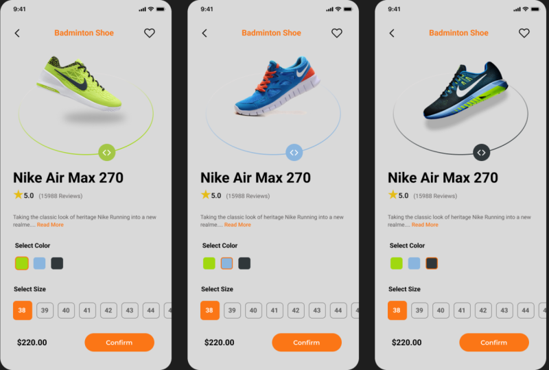
product details screen. So till then, take care. Bee.
17. Designing an Image Section : Hello, everyone. Welcome back. In the last lecture, we have
designed our home screen. In this lecture, we will try to design our details screen. Without any further
delay, let's start. At first, I'll take a frame. IPhone 14 plus. I'll give this 113. I be our product details screen. I'll just copy this one and test it here, right? Okay, so then if we notice
our product dts screen, we have icon here. It will be our back arrow. We have some text here, and we have another icon here. It will be our hard icon. Then we have a big
image, then some text, Silet color section, silt, select size section,
price and button. So let's design it. So I will go to
our feather icon. We will choose this B arrow. I'll make it 32 or 36. I'll put it here. Okay. Let's see. It should be. Okay. So then we have a text here and we have a icon here. So I will add icon
first so we can go again to the feather
icon. We can search heart. I'll be okay. Then we
have a texture, right? So your bed. So. We can select the
text. Do this one. Spur pick this one. Think. Yes. Okay, so I'll just
put it in the middle, change the color to this one. Okay, so then we have
a big image, right? So I'll go to Artisan's system
where I kept our images. I'll just copy this.
I will test it here, and I will increase the size.
Sort of thing like this. Then we have a
shadow here, right? So I will add a shadow. I will add a stroke, drop shadow, or layer blur. I'll just make it like this. And I'll just decrease the color. Okay. So now we have arrow, circle arrow to
rotate this shoe. So how can I gree
that? We can create that by an ellipse or a circle. So This color, I'll give it to gradient. So this one should be white. And this one, it should
be taken from the shoe. So it would be this one. Okay. So we can
make it like this. Okay, yes. We can
make it like this. Then we have to create a circle arrow here. So
we'll take a circle. So then I'll take this
group and this one, and make it a group again. I will place it under this. Okay, so far so good, we have created our upper part. So I will end this lecture here and from the next lecture, we will create the rest of
the part of this screen. So Tin then, take care. Bye bye.
18. Designing a Product Details Section : Everyone. Welcome back.
In the last lecture we have ended up here. Now we will continue
our lecture from here. So after this part, we have
our title of the Shom. So we will write it then we have the reduce text, I'll just write it. We'll select this
one and make it this little or we
can just plate this. We can copy this. We can paste it. And we can just select this
two and make or out Shift A, this decrease it four. We can make it bold. Okay. And we can change
this color to gray. This gray. So I'll just place it here, and we have a star
icon here, right? So let's create it. And we can elet this too
and make it at it again. I can make it. Four. Okay. So so far so good. Then we have a
description text, right? I have copied the
description text, so now I will test it here. So then we have our select color section, right? So let's create. M. Now, I can select one, this one, and this one and
keep it auto you. I'll just copy this
one. Just write. So now we have to
create our size option. I'll take a rectangle. So now, we'll make it a group. So I'll duplicate it one times. I will decrease the size to 38 and I will decrease the
size of the text to this one. It will be here.
I'll just copy it one time and I'll just
duplicate it multiple times. So now I will just change the
name of change the number. I'll keep all of this. Mm hmm. Mm hmm. Outside of the frame
and make it at. Shift A, I will change
it to 45, right? So then I will just
change for this one, I will just give it a feel. Remove the stroke,
the fill color will be the text color will be white. I'll place it here. And I will adjust this one. And I will just go to the prototype and
enable the horizontal scroll. Okay. So now we have our price here and we have
our confirmed button, right? So then let's at the price. It will be then we have our confirmed
button, right? Make it a group. But so that's how we have finished designing
our product details screen. So I will end this lecture here, and from the next lecture, we will start designing
our card screen, right? So till then take care. Bye bye.
19. Designing a Cart Screen: Hello, everyone. Welcome
back. In the last lecture, we have designed our
product TTS screen. So in this lecture, we will start designing our cart screen. So at first, I'll duplicate it. I will select inside
the materials, so I'll select the
frame and press Enter, and it will select all of this. So I'll just delete all of this. And I'll just copy, this one and this
one and this one. I'll just duplicate
all of these and just place them their place. Okay. So I will delete this one. I'll write checkout. And here we have to
have our items count. So I will take this 10. Well duplicate it,
write it items. I will change it to So I will just place it here. I will just place it here. I'll select these two and
press Shift A to make it a layout tribs count. Okay, I'll just place them. Okay, so so far so good. Now, we have to have our list. So at first, I will create an icon card when our at
to card screen is empty. So I'll take a rectangle. Then we have to bring
a shopping icon. I'll go here, go card. So this will be our icon make this rectangle
the frame so control ter G. So I'll place this
This one pander this one and I'll place this
shopping car under this frame. This and I will
increase the size to 40, something like this. Okay, so far so good. Then we have to create
our added to card list. So h. Then we have our Nemo pho. Right. Then we have our type of that Sure. Then we have to bring this
icon from our home screen. So I will just press
alter and duplicate it to this screen and
try to place it here. So it will be placed. Okay. Then we have our price. So the price here. Okay, so far so good. So I will just duplicate it two more times. Then I will select this
one, this one, this one, and this one and press Shift
A to make it a layout. I will decrease the
gap between them. I will remove this one. Then we have to make
our total section. I would just Then we have our confirmed payment. So that button will
look like this. I will just copy this one. I will increase the
size of both side. So we have successfully created our cart screen. It
will look like this. So I will end this lecture here, and in the next lecture, we will create our last screen. That will be our place
order successful screen. So see you in the next
video. Tim, then, take care. Bye bye.
20. Designing a Place Order Success Screen: Everyone, welcome back.
In the last lecture, we have designed
our Card screen. So in this lecture, we will design our
last and final screen that will be our place
order successful screen. I will select this one and
duplicate this one more time. I will just write Let's order That's good. Okay. Now, I will just select the
frame and press Enter to select all of the things
and just press still it. Okay. Now we will try to search icon of celebration
or tick mark. So I'll go to the Chrome and
I'll search for Plat icon. So here I can search for caret. So then we can choose
any of the icon we like. So I will choose this
one. So here is a trick. How can we download the
icon in SVG format? To download any icon from
flat icon in ABG format. We need to purchase
the premium version, but there is a trick. We can do it in free. So we'll go to this edit icon. Then we will we cle and inspect we'll try to
find the SVG tag. So I find here. So we'll just
click this and copy Control C. We'll come back
to our Figma and just test it here by ControlV. See? Now this icon has
come in our SVG format. So I will just resize it. Now we will search for
another icon that will be our celebration icon
or something, er. So we'll bring the cracked icon in front of this
celebration icon. And what we will
do, we will select this and this and this will
make it a little smaller. We can make it like this
and we can bring here. Can adjust the sich. Then in the same way,
we can select this. I'll select this. I will
just resize it like this. I'll bring it here. I will just took it like
this. Bring it here. Adjust so yeah, so far so good. Then we have a text here. So our text will be so now we have
another text here. Then finally, we have
our back to home button, and this button is
something like this. I'll just copy it
from here to here. The height, I'll increase
the height by four. I will increase the width,
something like this. Make it center. I'll write it. Okay, so we have done
creating our okay, we can increase the height
a little bit by four. Okay, so we have
successfully created our place order
successfully screen. By this, we have ended up designing our whole
hyped T design. So from next lecture, we will start designing
our design system. So I will end this lecture here and we will see on
the next video. Till then, take care. Bye bye.
21. Creating Image and Icon Components: Hello, everyone. Welcome back. From this lcture, we will start creating our design system. So before creating
our design system, we have to know why we
actually need a design system. So a design system is basically made of lots of components,
variables and variants. And if we notice our
hype to our frame, we have lots of buttons, cards, some elements, some
card list, and other things. So icons. So as some
icons and buttons are repeated multiple times
and we actually created. So we actually create
our tian system so that we don't need to do the
repeated task multiple times. And we can change the elements or we can modify something if we need so easily. That's why we need
our tian system. So let's start designing
our design system. So let's start creating
our design system. So if you notice,
we actually created our image in the design system, the images we have used, but we have to convert them on the components so that we can easily replace
or modify something. So if we notice on
our image frame, we have some images. So at first, I will click. So at first, I will click one, and here in the top, we can see create components. I will just convert
it to a component, so I will just
click it component. I will do this for
all of the pictures. So so we have created components
for our images. Now we have to create a
collection of our icons. Those have been used on our
high fidelity design, right? So we will take a frame
and we name it icons. So let's see which
icons we have used. So at first, we have
used this icon. So we just copy it, paste it to our design system. This is our one icon. I will just convert
it to component. Then we will go back to
here. We have a menu icon. I will just copy it, paste
it to our design system. Component. The same way we
will do for each of these. Mm hmm. Mm. Mm. Mm. Mm. Mm. Mmm. Mmm. Mm. Mm. Mmm. So, we have successfully created the
components for our icons. Now we can easily use
them from our asset tab. You can see if we go
to the asset in icons, we can see all of
the icons we have. So we can just use it
from dragging this. So we will use it later. So now I will end
this lecture here and we will continue creating our design
system from here. So see in the next video.
Tell them, take care.
22. Creating Button Components : Man we come back. In
the last lecture, we have created our components
for images and icons. Now we will start creating our components and
variants for our buttons, cards, and other parts. So I will take the frame I will rename it lengths and variants, right? So now we will at first create our components for our buttons. So let's see what kind
of buttons we have. So at first, we have
this get started button, then we have this
confirmed button, then confirm payment and
then back to C button. So let's take it. I'll
just copy this one. I will go back to our design system and
I'll paste it here. Now, I will just convert
it to a component, right? So yes, now I will make
three variant of this. So I will just press it again. Okay. Set firsts This variant too will be like this.
You will be here. And this text will
be our welcome. Text, it will be in the middle. Or if I want can
make it little here. Then at last, we
can make a variant and we will delete this
one. We don't need this. We will change the color
of this one too white and we will change the color
of text to this we will add this to this rectangle, we can add a stroke, I'll say stroke of
this color. Okay. Okay, so now we will rename
all of these variants. So this variant is our default. This will be our sliding when we are sliding
this sliding, and this will be our slide Okay. So we have created
the components and varions for the date
started button. Now, let's create or
this confirm button. I will just copy this.
I will test it here. Make it component, I
will create a variant of this and I will give
the name to Her. When we are hovering it, it will be a little
bit darker than this, and there should be a shadow. Okay. So we have made
variant for this. Another one, this
confirm payment. Copy past make a component, add a variant the same
way we will do this, there will be an effect, and the name of this
state will be Huber. Okay. And at last, we have to quit for
our back to Hamby. It's a copy. Make component at variant over. I just change the color of
this to white and this one to black black and gives
outside stroke. Of this. Okay. Okay. So now we have created all the components and
variants for our buttons. So now we will replace these buttons to our
high fdltalframe. So we'll go to our
high fdl dual frame. We will go to this asset tab and we will
go to our local components, and we will see all the components and
variants are added here. I will just drag it here. I'll just cut it. I will go here and I will
just select place to replace, so it will replace
automatically. The same thing we will do
for rest of the buttons. So we have replaced all
the things automate. So in this lecture, we have created components
and variants for our buttons, and I will end
this lecture here. From the next lecture,
we will create components and variants for
the rest of the things. So till then take care. Bye bye.
23. Creating a Category Section Component : One will come back.
In the last lecture, we have created our buttons
component and variance. And in this lecture,
we will create the category section components and this bottom navigation bar. So let's design our components for this category and
bottom navigation p. So we will just copy this conto
C and best it here. We will adjust a frame size. Okay. Now, we will make it component, then we will add variants. One. Okay. So this one we will make it this color, this text, we will make it zero. And we can give it effect
that it is selected, right? So we can name this
second variant that life is selected, right? Then we'll make another one. And the variant, right? So we will select this one and go to this the same way
we will create this, the color, we will give it
to white, give it a shadow. Okay. We will give this name. That Running variant. Running, selected. Right? Then the same way we
can make another variant. Like this, change
the color to this, text color to this. And we can give an
effect of this. And at last, we will
make another one. So just create another variant elepTh one, why Effect. This one. So far so good, and this learnm will give. Basketball. And this four Okay, so we have created this category section
components and variants. And now what we
will do we will go to our high fdlty or frame. We'll go to our asset, and we can see here
we have our sections. We will just drag
it here, cut it. We'll go here and we will
just replace it by this and we will adjust it by this. And we will enable
horizontal scin, right? So we have already
enabled the her into a scone. So it's okay. So we have created our category section
components and variants, and in the next
lecture, we will try to create our bottom
navigation bar. So till then, take care. Bye bye.
24. Creating a Bottom Navigation Bar Component: One will come back.
In the last lecture, we have created our components and variants for the
category section. Now in this lecture, we will create our components for the bottom navigation bar. So I will copy this one
and go to design system, and I will increase the frame size, and
I will past it here. So this will be our
bottom navigation bars. I will make it a component. I will make a variant of this. Now what I will do, I will just select this
circle and this one. I will here. Okay. So then I will just select
this and I will move it here. I will change the color
of this to white. And I will move it also here. Card at just alignment. And about this home I can I will just change
the color to gray. I will move it here. Okay, so this is our card tab. This is our home tab. Okay, so then we will create another then we will create
another variant of this. So the same way, I will select this
circle, this one, and this and I will just
drag it from here to here. I will select this, place it in the middle. Change the color
of this to white, change it to not a fade cation Change the color to gray. Place it in the middle. Okay. Okay, so now we will rename
it to notification tap. So we will create our
last variant that will be our person selected, right? The same way, select this
circle This one and this one. Place it here. White. I count do the right alignment. And we'll place it. Change the color to gray. Okay, now, then I will
rename it to account tab. Now, we have created our bottom navigation bar
components and variants. So I will go back to our
high fidelity frame, go to the asset, drag it here, cut it, and I will replace it. Replace this Okay,
so far so good. So we have successfully created our this part for
components and variants. In the next lecture,
we will continue creating other components and variants for our design system. So till then, take
care. Bye bye.
25. Creating Select Size Section Card Components: Everyone, welcome back.
In the last lecture, we have created
our components and variants for this bottom navigation bar on
the home screen. Now in this lecture, we will create the select size categories
component and variant. So I will just
copy it from here. I will test it. Here. Some are like this. I'll adjust the size. Okay. So now I will
make it a component, then I will make a
variant of this. And I will just select this
and change those items. 38. It will be 39. Then the mate. It will be 39, then it will be 40. Then another one So we have created our components
and variants for this and so I will so I will now go back to
our high field Dover frame, and I will just go to our asset. I will drag it here, cut it. I will just replace it. I will adjust the size
and go to the prototype, and it is already
horizontally squaring, right? So so we have done creating
our components for this. Now, we will try to create
components for this card. So I'll just take go to the design system.
I'll place it here. This picture, we have to use the picture from our components. So we will use this one. I will just copy this and I will paste it here,
replace, right? So now I select this card, I make it component. Then we will make this
title this category, text, price, everything, automatically
changing components. So how can we do
that? So for that, we need to make local variables. Okay, so we will go to the local variables or
we create a collection. So I'll rename this
collection to product Okay. So we'll create collection. So we'll create variable. And the first variable
name is duct, A. So I will name it ni
ax tom set and zero. And I will give the name
of the al to the same. Then I will create another one. It will be our hype. So the first one
will be our Don so. Okay. Then we have our
price. It's a number, right? Sit the price, it'll
be 220, right? Then we have our item count. This one is our item count. So I'll make another
one item count zero. And another one we
have to make that is is this item is
added to card or not. So we have to make bullion
property or bollan variable that is added to card. So it should be furs. Okay, so now we have to create for all of these
four card, right? One, two, three, four,
so let's create. So another one, we can name it. Soren M I round. This one, it will
be our shot Shoe. The price will be 350, and this will be the same. We'll create another one. So far so good. We have created all
the variables we need. So now what we will do? We will go to this text. We'll go here and bind it
with our product name. For this one, we'll go and
bind it with our product. Type. Here we have to modify
a little bit that will be This will make a duplicate of this and I
will just still it this. And for that, I will
just till it this. So this is our two tags, right? I'll bind this one with press. And I will apply variable to this text with our item count. Okay. And another thing we
have to do here for the image, we will apply instant
swap property. So I will select the
image. I'll go here. I'll write image, and I will add the collection for
the winshRt shoes. The one I will apply this one and this
blue shoe. Yeah. I'll just create this property. So now we will go back to
our high fidelity or frame and we'll go to the
asset add it here. Cut it, and I will
select all of this. One, two, three, four, and I will replace
in all of this. Then this one is already
applied the variables. And now I will select
this and we can see we can change the shoe. We can go here and go to the products and
select the second one, it will automatically
change the title, shoe type, and everything. The same thing we'll do here. See how we can easily
weight components. By the local variables, we can easily change
and modify our cards. So I will end this lecture here. From the next tecture,
we will continue wetting our design system from here. So till
then, take care. Bye bye.
26. Creating Cart List Components : Ian will come back.
In the last lecture, we have created these
card components and variants with
our local variables. Now, we'll go back to
our hypedl design. And in this lecture, we will create this
card list components. So I will just copy this. I'll test it here. So now what we will
do for this picture, we'll replace it by the
components we have created. So just copying
this I'll go here. I'll just replace this. Okay. We will actually create another local variables
for our card screen. So I'll just create collection. It will be our card. Now what we will do, we will create another card collection. So we will name it card, then we will create
some variables. So one of the variables actually is empty or not. So we will make it
true by default. So now what we will do, we will tie this one and we will apply variable
in the product name, this one, the product type, and this one with our price. And this one we will bind it
with our item count, right? So if you notice here we
don't have our dollar sign. So what we'll do we will
just create $1 sign, and we'll just adjust it here. And we can adjust it
a little bit here. We can adjust this, right? So, so far so good. So now we will make
it a component. For this image, we have to apply our instant swap property. So we will click here images. We will add collection
for this one. This one and our black
shoes collection, right? They small ones, right?
Okay, great property. Now what we will
do we will go to our high pedal intervaframe. We'll go to our asset. We'll
drag it here, we'll cut it. We'll select this two, and we'll replace
it like this. Okay. So now, the first to is okay. But the second one, we can go here and we
can select this one. And for this, we can just
select the second work. See, it's changed automatically. Okay. So that's
how we can easily create components for
our cart screen list. So by this, we have ended up creating our components
and variables, and we have successfully designed our design
system for this project. So I will end this lecture
here for the next lecture, we will start doing
our prototyping. So I will end this lecture here, see you in the next lecture
till then take care of the
27. Splash Screen and Home Screen Prototyping: Hello, everyone. Welcome back. In the last lecture, we have successfully finished
designing our design system. From this lecture, we will
start doing our prototyping. So let's start doing our prototyping from
splash screen, see? So we have a button here. So whenever we will come
to this splashy screen, we have to drag this button from left side to right side and we will
have a welcome text. So to do this prototyping, we have to go back to
our design system. And we have to do this prototyping here
in the main components. So what we will do
we will select this. We'll go to the prototype mode. So we will select this one, and we will track to
the second variant. And here we will select
on track, right? And we will select Smart
animation is out, it is okay. Then from this one to this one, we will select after delay and it will be out,
so it will be okay. So now if we go back and check, is it working perfectly or not. So then from this
one to this one, we can go to our home screen. Okay. So now, how we will
check our prototyping. So we will select this frame. We will press Shift space. Then here a preview will
come up and we can see. So we will drag it from
here to here. You can see. Now, it is welcome, and if we click, we'll go
back to our home screen. So yes, it is working perfectly. So then in the home screen, we have some prototyping
we have to do. So let's go back to
our design system and let's do the
prototyping here at first. So when we will select
this lifestyle, we will go to our
lifestyle variant. When we select when we
select this running, we'll go to our running variant. When we select this football, we will go to our
football variant. Basketball variant.
And everything will be smart animation. Or we can give it to
instant, instant. Not smart. We will give all of this
to instant transition. It will be our instant. It will be our instant. So we will do the same
thing for rest of the item. Okay. So so far so good, we
have done protypingT one. So let's check. We'll go back to our high
fdl Dower frame. We will select this frame
and just shift space. And we can see that we can
spall this one, right? So if we select this one,
it will be selected. This one, it will be selected. This one selected,
this one selected. So it is working perfectly. Okay, so we can do the
rest of the prototyping. We have this menu, this bottom navigation
bar, right? So we have to do the
prototyping for this. So I'll select this. When we select this card icon, we have to go to this one. Instant. Okay. Yes.
When we go here, we'll not give instant. We will give this one
to smart animation. When we go here, we will select this one, the
Smart animation. This one will select this
one to the Smart animation. So let's do the same thing
for rest of this option. Mm hmm. Mm hm. Mm. So I will select this home
screen again, shaped space. Now, we already did
this one, right. So now let's check if
we select this one. One. This one is working
perfectly, right? And then we have to do
our prototyping for this. We will select this item, and we will move to this
product datas screen. Okay. So in this lecture, we have done our prototyping for splash screen
and home screen. In the next lecture, we will do our prototyping for the rest of the screen. So
till then, take care. Bye bye.
28. Product Details Screen Prototyping: Everyone. Welcome back.
In the last lecture, we have designed this bottom
navigation bar prototype. And now in this lecture, we will try to design this
component or we'll try to apply our prototyping
in this component. So let's start. So
before we move, we need to rename all of
these variants, right? So the first variant, it should be named as 38. This one should be named as 39. Okay, so now what we will do we will go to our
prototyping mood. Whenever we are
selecting this 39, we should move to this one. 40, we should move to this 40, and we should change
it to instant. This one, also, we should
change it to instant. Okay, then 41 should
take us to this one. 42 should take us to this one. 43 should take us to this. 44, this one, 45, this one. Okay, then this second row. Mm hmm. Mmm. So we have done our prototyping
for these elements, and let's see, we'll go back
to our high fid tier frame. We'll go to our asset. And we'll select this one. We'll cut it and
we'll replace it. I'll just replace it.
I will resize it. I will go to the prototyping, and it is already horizontally
scrollable, right? So now, I will check whether it is
working perfectly or not. So shift space. So you can see this scrollable, and we can select each of
these, right? So, yeah. So I will end this lecture here. We will start doing
our prototyping from the next lecture for
the rest of these elements. So till then, take
care. Bye bye.
29. Complete Product Details Screen Prototyping: Everyone, welcome back.
In the last lecture, we have done our prototyping
for these elements. Now, we will go to our
high fetal der frame, and we can see we have done
prototyping for this one. So in this lecture, we will try to do
the prototyping for the rest of the elements. So we'll go to the
prototyping mode. After we click the
confirm button, we will heading to this
one, right? Let's see. Did we apply prototyping
on these buttons? No. So let's go back. Whenever we are selecting this, so we should move to this one. It should be our smart
animation and hover, yes. When we are hovering,
while hovering. Yes. The same thing we will do
for the rest of the buttons. While hovering. Smart animation? Okay. They should be like this. While Hering. Smart animation. Okay.
So now let's go back. So we have done prototyping
for this one, this one, and now we have to apply prototyping for this
color section, right? So what I will do,
we have to create two other pages of variants for this
product details page. So I will move these
two a little bit. I will duplicate
this 12 times, one, two, a little bit more. Okay, so what I will do, whenever we're getting this one, we have to move to this
page or this screen. Okay? It should be our instant. Okay, so far so good. And whenever we're
clicking this one, this black one, we
should move to this. So now we have to change the shoe color and shoe
type, everything, right? So I will change this shoe. So now what we can do, we can actually delete all of this. So I will separate this
shadow a little bit here. I will delete this one, this one, and this one. Now I will go to our asset. I will select this one. I will adjust the size. I will adjust this
one also to here, let's see whether it is under
this, product screen. Okay. So now it's looking good. So for this one, we will
actually change the color. So we will change
this color to this, and we will change
this color to this, maybe a little darker. Okay. Now we will select the
blue shoe. I'll go here. I will go to this one and
I will just drag it here. Let's see what is the
size of this 377, 308. So 377308. Okay. And we will just drag this shadow from
here to here, can we? I'll just copy this shadow. And I will paste it here. Okay. So it's good. I'll also paste it here. And for this one, we can
change the color to black. This one should be black and This one should
be also black. All right. So now we will
choose our black shoe. So here is our black shoe. The size will be 377 and 308. Okay. I think it's
looking a little bit big, so I will decrease the
size a little bit more. Okay, so so far so good. So whenever we are
clicking this one, it is taking us to this
frame or this screen. Whenever we are
clicking this one, it is taking us to this screen. So we should do the
same thing to here. So I will, what I will do, I will just move it here. I will give it to this
color, and this one, I will give it to this color. Okay. Means it is selected here. The same thing I will do I will give it to
this black color. I will give it to
this blue color, and I will give it
to this green color. Okay. So now what we will do we will apply
prototyping here also. So when we are selecting this, we are going to this frame. When we are selecting black, we should be in this screen. When we are selecting
this screen, we should be heading
to this screen. This blue should
heading to this screen. Okay, so far so good. Now we are almost done
with this prototyping, and at last, we can
apply prototyping, apply prototyping
to this Back button also back arrow, where
is our back arrow. This one is our back arrow. So we can when we
are clicking this, we should take to the
home screen the same way. When we are selecting this, we should be taking us to
this home screen. All right. The same way then we have to do the prototyping
for this confirm button. So whenever we are hitting
the confirm at last, we should taking back
to the home screen, taking back to the home screen, taking back to the home screen. So we have almost done with the prototyping. So
now let's check. I'll just select the home
screen and press shift space. And suppose we have
selected this card, we have been taken to this
production data screen. Now I can select the size, select the color.
And it confirm. Okay. So now, it is working perfectly. So now I will select all of this again and apply
horogen to this sic. Okay. So I will end
this lecture here, and from the next lecture, we will continue doing our
prototyping from here. So till then take care. Bye bye.
30. Card Components Prototyping: Everyone, welcome back.
In the last lecture, we have done prototyping for
our product details screen. So now we have to do the
prototyping for these cards, these specific cards and
our card screen, right? So we will start doing our prototyping
from the main components. So we will we can go to the main components
of this in two ways. We can go out design system, or we can select this one. And here you can see we can
go to the main componenc. If we select this, we will be taken to
the main component. So now we will apply our
prototyping to this on. So now what we will do. I will just copy this one, replace it here, and also here. Right? So now what we
will do wherever we are, as you can see, we have already created our local variables. If you notice we have products. We have products, collection. We have already created
our local variables. So what we will do, whenever
we are selecting or whenever we are clicking these plts we have to create
some interaction. We have to be done
by some interaction. So I will select this
report to set the variable. And we have to do the
addition to our item count. So item count the item
count plus one, right? So we have done our addition the same way we have
to do for this one. So interaction, set variable, item count, item count, subtraction minus one, right? But here's the treat. When we're clicking the minus, it can be taking us to the
minus value item count. So we have to
restrict it, right? So we have to apply a condition. So we will apply condition,
so we'll go here, we'll apply condition if our item count is greater
than zero, right? If our item count is
greater than zero, then you can apply
this cell variable. So I will just crack it
here. So now let's check. We'll go to our high
feed door frame. We can see if we select
this shift base, now, if you notice that plus, see, and minus minus minus. But when you're
clicking it again, but it is not going back
because we have set condition. So it is work perfectly. So now what we will do we have to set variable for
our car, right? So we will go here,
local variables. We have to go to our
card collection. Here we have to create
another variable that will be our card c now, we'll go here and here. If you see here, we'll double click
on this number. We will apply the card count. We have to apply our
card count here. But how we can calculate all these item counts total and show this
on our card count. For that, we have to apply our condition on the
plus button, right? So let's go back. Now what we will do
we will go here. Now we will set a variable again and this time is for
our card count, card count. Is actually item count, item count plus item
count, plus item count. And this item count is actually the first item. This
is the second one. This is the third, and
this is the fourth, as we have four elements or four cards in our
on screen, right? So the same thing we will
do for our minus condition. We will set a variable. This time, our variable
is for card count. It will be our item count plus item count plus item
clump plus item count. The same web, first item, second item, third item, and fourth item, right? So so far so good.
So let's check. When we're in our home
screen shift space, Now, I guess you notice one, it is changing, two, three, four, five, six. Now if we set up a minus five, four, so it is
working perfectly. Right? So at last, when we are clicking this one, we should be taking us
to our card screen. This all. Okay, so
we have done typing. So now I will end
this lecture here. In the next lecture,
we will see how we can play prototyping in
this cartridge screen. So I will end this lecture here, see you on
the next lecture. Till then, take care. Bye bye.
31. Cart Screen Prototyping: Everyone, welcome back.
In the last lecture, we have done our prototyping
for these parts. Now, we will start doing op prototyping
for our card screen. At first, I will bind this
number with our card count. Yes. And then I select
this card outside, and I will add these things two
more primes. Sorry. Okay, so now I will place
it in the middle and I will adjust the frame and I
will change it from here. For this one, I will
choose this black one. And I'll choose
the for this one, I choose the blue one. I choose this I choose. Okay, so so far so good. And what I will
do, I will adjust this frame side, click content. I will take it here. You can make it. So now what we will do we apply our variables here,
the Boolean variables. For this one, I will go here. I will right click in this icon, and I will apply this is empty. For this one, I will go here, we apply to at two card
because it is false, so it will not be shown here. So for this one, right
click at two card. Now we can see as there
is no item added, so it is not showing,
and we have to create another variables
in our card collection. That will be our number
of total, which is zero. I will apply to this
text or total variable. Now, we have to control this card list from our main
component. So we'll go back. Let's go to the
prototyping mood. And when we are
hitting our plus icon, we have to set the variable
that our added two card. Where is sorry, added
two card should be true to false, right? And our we have to
set another variable. Our means empty should be false because we don't
want that empty card item. So we have to do the same
thing in our minus condition. So when we're hitting our minus, we have to remember that if our item count is equal to zero if our item
count is equal to zero, then our added to card where added to card
should be false, right? We should not missing
that card, specific card. Another variables we have to
add that is our total card. Our card count is
equal to the O. Then is empty. Our empty shouldn't
be true again. We should show our
empty card iPhone. So let's see, is it
working perfectly or not. So we'll go back to our
high fidelity frame. Now, we can apply here to
here this homicel. Mm hmm. And at last we can apply this because now check whether it is working
perfectly or not. So I'll go here, shift space. Now let's see that at
first, if we check, we don't have any item added on the cloud,
so we'll go back. If we select this, you
can see, one items added. If we select this C
three items added. Now, if we click this one, it will be equal to zero, right? The curve item count will be
zero. So it will be vanish. Sees Vanish. This is vanish. See it is two, this is Ngansh
and this icon is showing. So it is working perfectly. Now, what we have to do we
have to calculate all of the items price and
show in the total. So let's do it. So we'll go back here. And in the class, what we'll do we will
set our variable. And this time it is our total, right? So it is our total. And this total is
actually our item count, multiply by price plus item
count, multiply by price, plus I count, multiply plus, sorry, I count,
multiply by price. We have to do it four times. Why? Because we have
four items, right? So the first one will be this one price will be
the first one, second. So Third, third,
fourth and four. Seeing now we have
that calculation. We have to do the same
thing for R minus. So, you know, go here, set our variable for total. Okay. So now let's check. Now we will go here
we press shift space. Then if we see, there
is no items selected, so the total is zero. We can add one items, two items, three items
or item, we can go here. We can see it is
showing perfectly. Suppose this is so this
is the sum total of this. If we don't want this,
sum total of this. If we don't want
anything, then again, we can go add itans Wiens, and confirm, we will be heading
to the five hoar squad. So at last, we can add this
to our home square. So yes. So I will end this lecture here. In the last lecture, we will see how our final prototype
will look like. So I will end this lecture
here till then Bye bye.
32. Final Prototyping: Hello, everyone. Welcome back. In the last lecture,
we have finished doing our prototyping
for all the screens. So now in this lecture, we will see how our final
prototype will look like and how does this application
is actually working. So I will select this. I will go to the
prototyping mode and I will select the class. So now we can see we have
a beautiful splash screen. Now I will just drag
it from here to here. We have seen a welcoming
message. I'll click it. We will move to our home screen. Suppose I have select this one. I want to see the
details of this item. I will select this. We
can see the details. We can change the color. We can select the
size. We will funf. And if we go to our card, we don't have any
items added till now. So now we will add our item. So we can add items from here, and we have an interactive
bottom navigation bar. See? Now what we will
do we will add items. So I will add this
one, this one, this one, this one. And we go here, we can see we have
added our items. So maybe we will add this
one too. We can see. We have a total scale. We have a two layer, suppose, yes, then we can confirm. Okay. Our order has been
placed successfully. We can go back to our
screening. That's it. That's our final
prototype will look like, and that's how our
apps will perform. So this was our whole project, and I hope you enjoyed this project and learn
how we can design a full shoe shop application
from the scratch and do the advanced prototyping and create an interactive
design system. So I will end this series where
I hope you enjoyed a lot. So till then take care bye bye.
 Yazdani Chowdhury, UI/UX Expert, Mobile & Web App Developer