Transcripts
1. Introduction: Welcome to Figma for
the beginners course. This course is meant
for absolute beginners, junior designers and
those who wanted to switch careers and
become a designer. We will learn all about
3D interface, components, styles, auto layout variants,
prototyping, and plugins. If you don't know
any of these words, I just said we're in that I will explain everything
you need to know to have a solid
foundation for designing in Figma just to
manage expectations. This course is not a
replacement for school. And also you will need
to practice on your own a lot to become a designer. Depending on when you're
watching this course, I might already create more
courses around design. If they don't exist yet, don't worry, they
are in the works. I plan to cover topics
such as design systems, how to lend the first job, how to improve visual
skills, and so on. Now let's head to video number
one, vigorous interface.
2. Figma Interface: We will learn the most important
buttons and features of Figma and continue to expand our knowledge
with every new video. To start, we only need
to focus on two views, top-level view in a file view, aka where we design. When you first open Figma, you will see this interface. So this top-level
one on the left, you have menu that holds files. Drafts is a folder with
your private stuff. It's excellent if you're
working solo or practicing. On the other hand, themes are helpful when you have more people working
on a project because hierarchy is a little
bit deeper and offers advanced features
related to design systems, which is not covered
in this course. But I will mention a thing
or two along the way. On the top level is a team name, and then inside is a project aka folder where you
keep your design files. I would say this is
it when it comes to the things you need to know
right now about this view. So let's make a new file and explore what
you can do there. On my left you can see
that I'm in drafts and I will start by
clicking on a new file. I bet you will spend most
of your time in this view. So I will go through all
the important buttons and sections and tell
you how I use it. On the top-left, we have a
menu with tons of actions. But the only thing that I ever interact with is in preferences. The nudge amount nudging
is done by arrow keys. Basically, you can move
your layers with arrows. When I'm designing, I mostly use arrow keys for moving
objects around because I know that I'm moving them in increments of one
or eight pixels. That is related to grids. And if you have never
heard about it, you can check my
YouTube channel. I have some videos that
explain what a grid is. It's a vital design knowledge. Check it out. Now let's continue with
the other buttons. If I don't mention a button, it means I don't really use it. Proceeding on the right
we have a Move tool. It's essential tool for
moving things around. Next one is a frame. Remember shortcut F, because the frame is a backbone
for every design. You design everything in frames. And also on the right panel, you have some templates. And usually you need to
just choose whatever is the latest iPhone and
design inside that. Unless you are
working on a website, then you use some different
template or you can just put your width and
height as you please. Then we have some
geometric shapes. Remember, are because
you will use it a lot, sounds crazy, but most of the interface is actually
just rectangles. Then we have a text
tool with a shortcut T. Also worth remembering
because it's one of the core
elements in designing. So usually I just press T
and make my text layer. Then we have a hand tool, but I never use it like this. I just press space. Drag canvas around. And lastly, we have comments, the
bread and butter of Figma. You can leave comments to your teammates and
they can reply. It's super useful and
I use it all the time. You can even tag legless. If you don't want to
see comments all the time while you are
designing Shift C and their governor shifts see there back when
you select an element, you see various properties. Offset element, right
side is where you manipulate the visuals
in simple terms. Design, this is it for now, we will learn
additional features as we move along the course. Next up, our components.
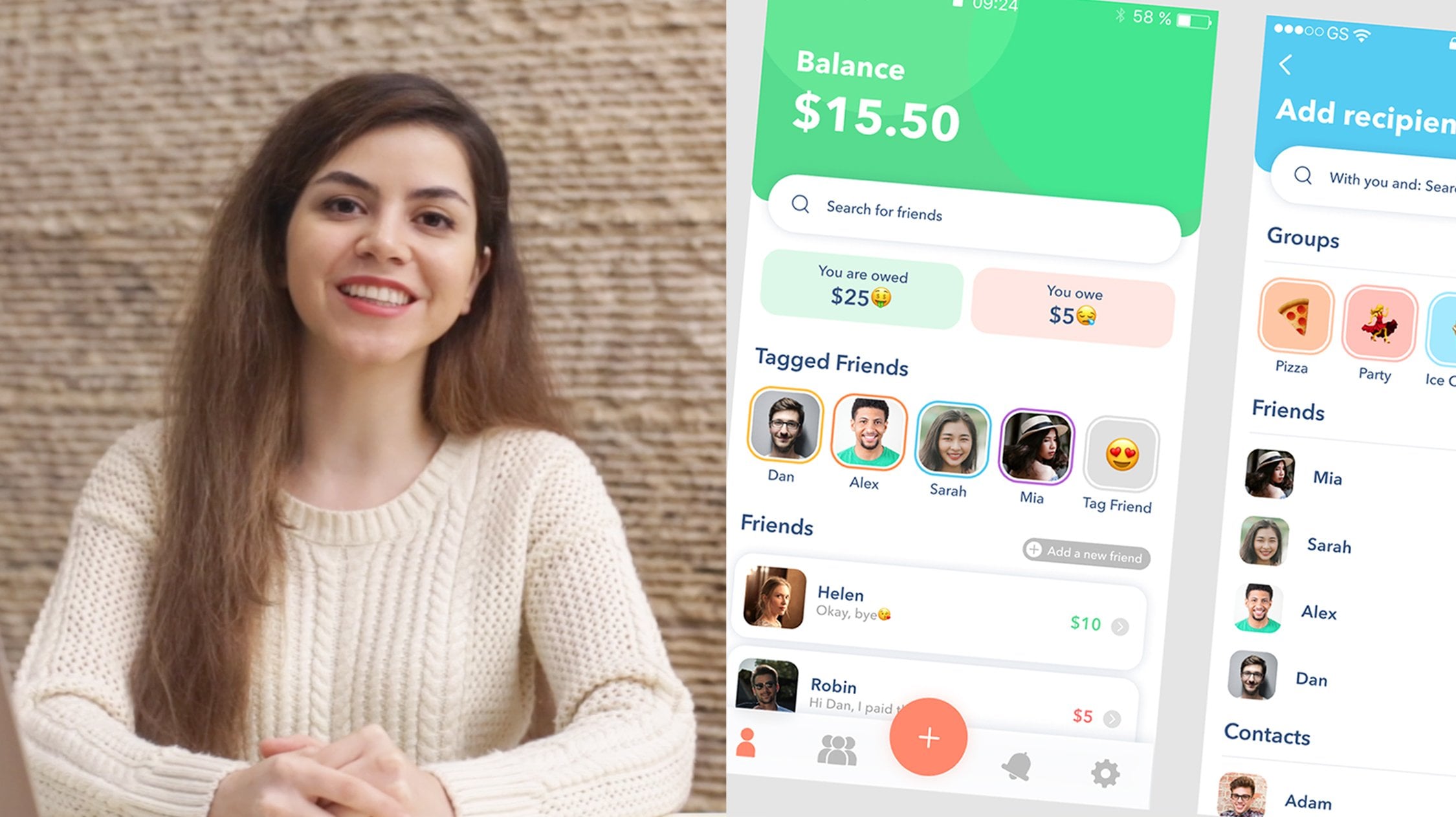
3. Components: Components or elements you can
reuse across your designs. Let's say you have a button that we need to use in every view of your design with
usual copy paste, they wouldn't share a
single source of truth. If you change the
background of one button, others wouldn't
be aware of that. Enter components. If you have a component
that is a button and you use instances of that
button in your design, then whatever change you make on the main component will be
reflected on instances. So you don't have to search for every button and
tweak it manually. Imagined time-saver,
you can create components from any layers
or objects you designed. This could be a whole range
of things like buttons, icons, layouts, and more. We will make a button
component and learn from it. So let's make a
background, some text. Center it. We will select all
on the left you see button and this rectangle,
and click here. Now we have a
component and also we want to call it button
that component one. Okay, now that we
have a component, how can we access this
button component? Well, there are few
different ways. First, you can go to Assets and then you can
see our local components. We can just drag it to your
designs like this. Very easy. Then you can click on this icon and you again have your
local components over here. It really doesn't matter
where you access them. Also, if you press Shift I, this resource panel will open
and it's the same thing. Now, this group over here, these buttons are just
instances of this one. You wouldn't naturally put this kind of component
into your designs. They should live somewhere
else separately. It can be in some other page
or even some other file. And I can show you the magic
of components real quick. Let's pretend this is
dispersed throughout design. So I want to spice up
this button a little bit. I want to change the color. Lets us something blue
and also the text. So it's legible. And maybe we want to put
some border-radius there. Now it looks much nicer. The next thing we need to do is make this button responsive. What does that mean? If I drag this doesn't
look very good. It looks broken and we want it to be smart
and responsive. So let's head to the
next video, auto-layout.
4. Auto layout: In this video, we're gonna
talk about auto-layout. It's very advanced
and very complex feature that many people struggled to understand
how it works. You can do a lot
with auto-layout, but I will try to explain
in a simple language with simple examples how it
works and how I use it. I already pre-made a
little bit of design over here so we can move
faster out loud, makes your designs
smart and responsive. Let's start with
a simple example. A button, I will
make button again. So you see you can position content of a button
by manually dragging. It's just put it black. You can also select two
elements and then position. So it's aligned, seeing
that it changes. But this is not how we want
to design because this is not responsive or smart. So we want to select this. Let's make a component. Let's call it better button. We can also add a little
bit of spiciness over here. One thing, I put corner
radius over here, but it didn't
reflect and designs. This is because you need to
check clip content because then it will clip whatever
is underneath this frame, which means that then I
will see my corner radius. Next thing I want to do is add auto-layout to this button. Why? Because when I stretch
it, it looks broken. So let's add it. We got a new section over
here with tons of new things. So let's try to explain this. First option is where your auto layout goes
vertically or horizontally. Well, I want things in button
to stack horizontally, so I'm going to leave
it at this one next, alignment of content of a frame. Well, I want it to
be centered because I want the text button
to be centered, not leaning on one
or the other side. So in the center, this is spacing between items. This is useful when you
have more than one item. Of course, I can show
you quickly here, so I will duplicate. As you can see, it's
set to eight pixels. If I would increase it, then the spacing would increase. Of course, bottom
row is for padding, meaning space from the edges. I don't want it to be this much. It's a lot. Let's put 16. Okay, This is more reasonable. Let's also deleted this
extra label over here, and this is the padding
for top and bottom. It can be 16. Sure.
Or if you want, you can independently decide what are the paddings
from each edge. So now if we try to expand this button,
it's in the center. It looks and behaves as
I want it to behave. You can see that underneath
we have something called hug. So what does this mean? Well, when you
enable auto layout, you get some options on top in this frame
section as well. You have how width behaves, is it fixed or it will
hog whatever is inside. If you put hug, then it will contract wrap around the
content of this frame. If you try to extend it, it will immediately
turn to fixed. Let's go back to hug because
we want everything to be responsive and we don't
know what is going to be the content or a
name of that button. So we want it to
expand accordingly. Let's say if the button has a label order than if
we would put fixed, then you can see that
this doesn't work. This is not smart or responsive. So we want it back to hug. Of course you can do different settings
on instances itself. Also a way to do it. But I would recommend
you to put a hug because we want it to be
responsive out of the box. The next one is height. Is it fixed height or
it will hog contents? If let's just move this here. If I expand the height
of this button, because we aligned it in
the middle, in the center. Now it's centered,
it works even if I would expand it like this. But with alignment,
I can dictate where is my texts happening? On which edge does it stick to? I want it to be in the center because in every case I want
it to be in the middle. So this is perfect for me, but I don't want it to be fixed both horizontally
and vertically. So I will just put
everything into hug. That way, whatever I
write for a button title, it will expand or
shrink accordingly. If you think that's a lot
of information, watch this. So we have some simple
design over here. We want to make a feed. Or a menu list with items
that repeat in a column, I will show you how I do it. So first, I'm going to
select everything over here. I'm going to use the
shortcut Shift a for creating auto-layout from
selection. There you go. My design changed now,
but that's alright. I want spacing between the items in this outer layer
to be, let's say eight. But now I want pizza and
price to be in a row, not in a column. So what I'm gonna do is
I will list auto layout. I'll create a new one. Well,
those two are selected. Shift a, we will now
change direction. We want it to feel container. And then you can
see that the whole boundary expense to the
size of a container. But I don't want it to
be on the left side. I want pizza to be on the left and price to be on the right. So what I'm gonna do is
go into advanced layout. In our layout settings, spacing mode, I want to change
that is very important. And I will choose space
between this will push all the elements to decide. Like this. Now we have pizza on the left and a
price on the right. What would happen if
I duplicate price? Let's say I want to
apply a discount. It will be in the middle
because it's calculating the equal space between the
items in given container. But if I want to have these two prices
again on the right, well, I need to wrap
them in another frame. I will use auto layout shortcut. I will put, let's say 16 pixels spacing
between these two items, I will zoom in a little bit. Let's select one price. Extra options for text, then decoration, strike through. Maybe this can be even smaller. And we can maybe change. Takes a little bit grayish, and this can be maybe
red. There you go. So if we select this
frame over here, that's called frame
to wear descriptive, we can see that we
have two items, one text layer and another frame that happens
to be auto-layout. And because we have only
to the space between them, will actually push
them to decide. This is very useful
in designing, especially in web design, when you have like headers
and you need to push, Let's say logo or a
title on the left and Home menu thing
on the right. But we're not done with
nesting auto layout. We have auto-layout
as container for this picture and also this pizza and price and
also some description. I will make auto-layout out
of this, this whole frame. Shift a. Now it's auto-layout. It's hugging. I can even put fixed height and put some pixels
over here if I want. And now if I
duplicate this card, this is not the effect
I really wanted. So I will change
the direction of the top level or
layout over here. And I can just duplicate, and it is smart, it's responsive, it just
sticks exactly how I wanted. One thing I want to change
is spacing between items. 32 seems like a good number. If we don't want to see, like design spilling
over the frame, we can clip content.
There you go. Another thing that
I want to mention is you can put things
inside of auto-layout, but just dragging would say, I want to put this order button and I want it to be full size. So I'm gonna just go to this option over here
and select Field container. And this is how you can
expand your button or any other element within the
frame that is auto-layout. All the things that are
inside of a frame that has auto-layout can be expanded
to feel container. That is an extra
option for objects, elements that happen
inside of auto-layout. Also, if you want to change
the order of elements, you can just select one element. And then with arrow keys, you can just go up and down or left or right and position your elements
however you want. All the spacings will be consistent because
Auto Layout is smart. That's all I want to share when it comes to auto-layout
with you in this video, this was a lot of information. There is more to auto-layout, but all other things
are even more advanced. So let's just stop here. Let's think about
it a little bit. I recommend you to
go and practice, try to make the same
interface I did over here. Or you can just take a screenshot or look at
your favorite app and try to replicate the interface a little bit using auto-layout. Next up, our variance. That's related to components. So see you there.
5. Variants: Welcome to variance. This topic is a little bit
steeper learning curve, but I will do my best to make it as simple as
possible for you. So variance and properties can be applied only
two components. I have a button component over here and see this row
called properties. When you press Plus, you have four options. Let's try each and
see what happens. I think learning by doing is the best way to learn
variance and properties. So first of all,
let's use boolean. Boolean means that some layer
can be hidden or shown. So we can, for example, show and hide an icon. So we're going to do just that. Let's call it has icon
default value, true. Alright. And then we need to
select this icon and we find Layer row or
here, click has icon. Now hooked everything together. And if I make an
instance of this button, I have this property
called has icon, and I can show or hide icon. Simple, right? Also you can just select anything
that you want to show or hide and
click on this icon. Create new property from here, you don't have to create
first property from a parent. You can create property
from sub-components. So let's try it this way. Let's call it has
text. There you go. And now, when we click
on the instance, we show or hide text, with just a few clicks, you created a button that
can look very differently, but you only have one
component that's pretty slick. So remember how we had like
four options over here. We only explored these Boolean. So we can also create
an instance swap. I'll find some icon, doesn't matter what
great property. And as you can see, it's not hooked to anything.
We just created it. This is why I like to
create these things from actual components
that will change behavior. And then you don't have
this exclamation mark and it's a little bit faster. So I will find my calendar. I will click on this icon, and I will choose this
one and only option. So what happens is we have
icon over here and we got this little
drop-down where we can change the icon
to something else. And of course, other
options still work. And the last option was text. So I'm going to create it from the layer that will
change behavior. So content, I'm going to
click on this icon over here, or we can just create property. It detects everything that
you already designed. So it's a little
bit faster to do it from the inside of
our components. So on layers that
will change behavior. And when I click
on the instance, I see my text and I can
write something else. I have a simpler way of managing icons and changing
text in components. So when it comes to
different icons, I just find my icon, I just drag it, press
Option Command. And when you see these
purple outline on your icon, you just release it. And there you go. It's swapped. So no need for this instance
swap thing over here. When it comes to text, I don't use this text
property or here. Because if you press T, it can just change
texts just like that. It's not so hard. So I don't
have a need to actually use this text property
because I just changed it on them,
design itself. The last thing we have
is variant itself. So let's click on this one. When you see this dashed
line that signals that this component has actually variants inside
multiple components. So I'm going to
create a new variant. Let's change design
a little bit. Now it looks
completely different. And because we edit the variant, we immediately got
this property one. I want to rename it. So just double-click. Let's call it style, and then you need to select every component and
adjust the name. Default is fine for this one. I'm going to leave
it for this one. I don't want it to
be very intuitive, so I'm going to
call it negative. So when I select my instance, I can just choose different
style, like negative one. And I can again manipulate other properties
like hide icon for example. And it also works
when you go back. I've only two variants
in button component, but look how many different
options available. So this is the power of
variants and properties. Just because variance are
a little bit confusing, I recommend you practice. Try to make even more
complex buttons. Tried to make card elements, input fields, and so on. The more you practice, the easier this gets. Next up, styles, something very similar to components together.
6. Styles: Welcome to styles. Styles are very
similar to components. It's just a set of properties that you
saved under one name. And then you can use that style. Wherever InDesign you want. You can have color, text, and effect styles. So let's start with color. I will tweak it to
be, let's say purple. And I'm going to
create new style. Awesome. I'm going to
create another one. Let's have, let's say blue. Excellent. Now, if I
create another oval, and if I click on
the style icon, I can see that I have these
two styles over here so I can just apply it and
it's going to look the same as this one. So this is the gist of styles. Now let's try to do
the same for text. Again, style icon plus. And you name it. Big. My strength to
be smart over here, let's just change it. Pretend that it looks
like like this. And then you want it to look exactly like
this text over here. So you can just click on
this new text element, go to style, and
choose your style. Now let's try to
do Effect style. So I'm going to first week effect a little
bit so it's visible. And now we're going to name it. If we click on Canvas, we can see effect
styles, this shadow. So I can apply this to
other ovals, even a text. These are styles,
they're not that hard. It's just a set of
properties you want to reuse throughout your design. In next video, we're gonna
talk about prototyping. So see you there.
7. Prototyping: In order to actually
show you prototyping, we need to have some designs. So I found this
file from community and it's gonna be excellent for demonstrating prototyping. First step is, let's
go to prototype mode. Now, the interface looks
a little bit different. We're not designing.
I'm going to zoom in. And let's say from login, I want to end up in homepage. So I'm just going to
select Login button and release when this arrow
touches homepage frame. Now we have some interaction
details over here. There are many, many
different ways that can trigger something in Figma, like showing a model or
moving to another view. But mostly I use onclick, but just so you know, you have a lot of
other options as well. Then next option is, do we navigate to a separate
view or do we open overlay, swap overlay, close overlay, go back, scroll to
or open even a link. For now we actually just
want to navigate to some view because you dropped this arrow on
Homepage, fig molar the nose. So it's over here. Now we can also
put some animation into our prototypes
so it can be instant, it can dissolve, it can
smart animate and so on. We will check Smart
Animate a little bit later because that's
interesting one. But for now let's
just use instant. Okay, Let's close this. And then if you press
this Play icon over here, you will preview your prototype. So it's loading now. Alright. If you click outside, you will see clickable hotspot. Now let's click on Login, and this is exactly what we
set up in our design file. Now, if we want to send money, let's select this icon or here, and that's our next screen. This is so fun. Let's close it. So I will tap on here and I'm exactly where I want it to be
in send money view. Now if I want to go back, I will press plus
and interactions. Click back. If I click back,
I'm gonna be there. So now we have a full
circle over here. Then. If I press Send, I want to end up in this
view. And it works. So this is the gist
of prototyping. You're just creating hotspots
and then what happens next? Which view do you load? You can rename. You can put like main flow, and then let's try to do
something differently. So I'm going to take
this out duplicated. And also I'm going to take
this keyboard over here. Go to design mode real quick. First, we need to
make this a frame because groups don't
work with prototyping. And then let's go
to prototype mode, connect these two frames. So on click, I don't
want to navigate, I want to open an overlay. This is correct. Do you want it to be centered? No. I want it to be bottom centered and I want to close
when we click outside. And yes, I want to add
background behind overlay. We can even tweak the animation. Move in and you have little video here so you can preview what's
going to happen. Yeah, this is exactly what
I want from bottom to top. And I'm going to close. Now in prototyping
mode, the sidebar, I can go to a different flow
and now I can tap on send. And indeed we have a model. I can close it by
clicking outside. This is exactly what I wanted. I can even tweak animation, live it to be faster. I can put a 150 milliseconds. Now it's faster. It
looks snap here. Next thing I want to show you that's actually quite useful in prototyping is smart animate. So for purpose of this, I'm going to create two frames. Going to make a circle. We're going to call it circle. And then I'm going to
expand it in next few. So basically, I am keyframing my animation because I want
to use smart animate option. It's important that elements
are called the same. All elements that you
want to smart animate, shoot, share the same name. Now let's go to prototype. Connect to the other frame. We don't want to do it on click. Let's use after delay. 800 milliseconds is fine. Animation, smart animate. And you can even choose what
kind of animation it can be. Bouncy, for example. What happens here is it
works automagically. You can even make a loop. So this circle
would just bounce. We don't want to use on click. We want to say after delay, smart animate, bouncy, great. Now when we preview, it jumps like this by itself. So you can create quite
interesting animations. Before wrapping this video, I want to show you one
of my own projects. It's not big one, but I have some
connections over here. So if I open my prototype mode, you can see that I connected
a lot of elements together. And usually files look
like this after you apply your connection points. I believe this is
enough information to get you started
with prototyping. You can do really crazy
things with prototypes. I've seen really amazing things on Twitter that people do. And sky's the limit. In next video, we're
going to check plug-ins. See you there.
8. Plugins: Welcome to plug-ins video. This one is going to
be very short because plugins are really
straightforward. If you want to install a plugin, you just in your
Figma dashboard, click on Community
tab over here, and then you have
access to all kinds of free assets and
plugins and whatnot. It's really filled with super useful stuff
and less useful. But it's amazing how
people put so much effort into sharing their
assets and plugins. So for example, we can click on some category and we want
to search for plugins. Icons are quite popular
plugin, I have to say. So maybe we can
try this one out. Free icon pack by I conduct. You just run it. The plugin is loading and let's say
you click on this one N. Here we go. Every plugin works a
little bit differently. Of course it would make sense for me to go through
each plugin and show how it works because you
just need to read documentation description of
the plugin and then use it. I don't use that many plugins. You can see that
these two I installed just for the purpose
of this tutorial. But, and also this one, the ones that I use, sometimes Unsplash
ProtoPie is useful because I like to do my
product types in this tool. Fixed. San Francisco is
a really good one because when you
San Francisco font, when you change sizes, letter spacing also
needs to change. So this excellent
plug-in to have it pixel perfect and
how Apple intended. And this last one is
actually my plug-in. I wrote it, it
makes icon library. This is something that
I'm going to show you in my next course for
design systems. If you find plugins
necessity in your work, you can just install a bunch of them and use
them all the time. I personally like to keep my files not relying
on plug-ins because they can disappear tomorrow and then you are in a problem. But of course, I
didn't experienced any plugins missing or
anything like that. I can show you one more plug
in how it works on splash. And we can put some texture. Now this rectangle has
this feel of this texture, is pretty neat and it saves
tons of designing time. I encourage you to go
to community tab and explore different assets
that people are sharing. There is a ton of new
plug-ins every day. And also you can
find design systems, some boilerplate
for different stuff visually acids and so on. All these things can help
you become a better designer and actually see how other
people do certain things. And it's a rep, we learned everything we
need to know in order to be successful in using Figma. There are, of course,
tons of advanced stuff that I might cover in
some of my next courses. But so far, you have a really solid foundation to start designing
efficiently in Figma. In my next video, I'm going to share some of my
list words with you. So you there.
9. Outro: I hope you enjoyed this
course and that you have confidence to start
designing in Figma. We just scratched the surface
in this course and you can unlock so much more
knowledge if you practice, you can find me on
Twitter and also YouTube where I have
tons of Figma tutorials. If you like, podcasts, Check my podcast designed party. Have a good one and
happy designing.
 Antonija P.