Transcripts
1. Welcome To The Class!: Hello, everyone, and welcome to today's class on painting
a rainy street scene. And I'm so excited about today's class because we're
going to learn how to break down the
fundamental principles of watercolor and work
out how we can take a complex scene
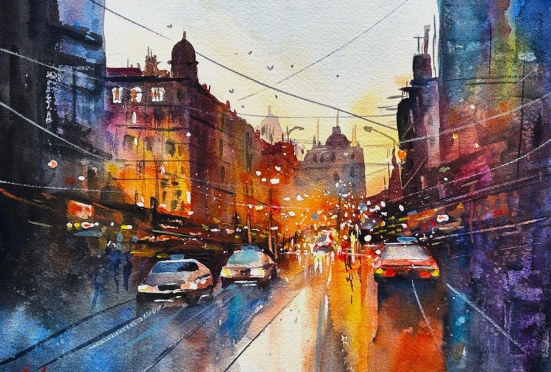
and actually break it down into a very
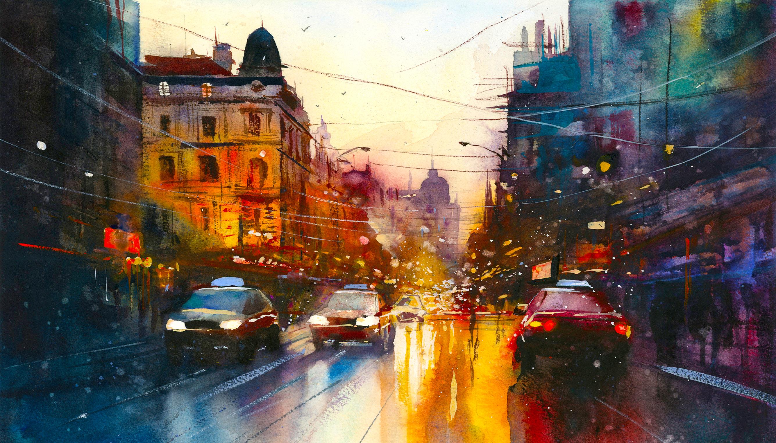
captivating image. When you look at this painting, it looks like it's full of
lots of little details. But actually, when you zoom in, you just see that
it's abstract shapes. And the principles that we'll be using demonstrate and
show us how we can break down complexity and
use the spontaneity of the medium to create truly enchanting and
captivating effects. One of the most
important things about watercolor is letting go and allowing the
watercolor to speak for itself and let that magic shine. And if we focus too much on controlling technique
and forcing the image, then we lose that magic. So this is a perfect class for getting us to loosen up
and trust the process. It really doesn't matter
about your end result. All that matters is
allowing yourself to see how the pigment moves and not be scared of
where it might lead you. I've been a professional
artist for many years, exploring lots of
different subjects, from wildlife and portraits to cityscapes and
countryside scames. I've always been entranced by the possibilities of watercolor. But when I started, I had no idea where to begin
or how to improve. I didn't know what
supplies I needed, how to create the
effects I wanted, or which colors to mix. Now I've taken part in many
worldwide exhibitions, been featured in magazines, and been lucky enough to win awards from well
respected organizations, such as the International
Watercolor Society, the Masters of
Watercolor Alliance, Windsor and Newton, and the SAA. Watercolor can be overwhelming
for those starting out, which is why my goal is
to help you feel relaxed and enjoy this medium in
a step by step manner. Today, I'll be guiding you
through a complete painting, demonstrating a variety
of techniques and explaining how I use all
my supplies and materials. Whether you're just starting out or already have some experience, you'll be able to
follow along at your own pace and improve
your watercolor skills. If this class is too challenging
or too easy for you, I have a variety of classes available at different
skill levels. I like to start off with a free expressive
approach with no fear of making mistakes as we create exciting textures
for the underlayer. As the painting progresses, we'll add more details to bring it to life and
make it stand out. I strive to simplify
complex subjects into easier shapes that
encourage playfulness. Throughout this class, I'll be sharing plenty of
tips and tricks. I'll show you how to turn
mistakes into opportunities, taking the stress out of
painting in order to have fun. I'll also provide you with
my watercolor mixing charts, which are an invaluable tool when it comes to choosing
and mixing colors. If you have any questions, you can post them in the
discussion thread down below. I'll be sure to read and respond
to every think you post. Don't forget to follow
me on Skillshare by clicking the Follow
button at the top. This means you'll be the
first to know when I launch a new class
or post giveaways. You can also follow me on Instagram at Will Elliston
to see my latest works. So if you want to
take your watercolor painting to the next level,
this is the class for you, because I'll show you how you
can be loose and expressive whilst also ending up with
a very captivating result.
2. Your Project: Thank you so much for
choosing this class. I really appreciate
it as always. I really think
you're going to find this class very useful because we're going
to be practicing techniques that
might feel scary, and you really got to dive into this process
to make it work. And it's through
this letting go and allowing the watercolor
to speak for itself that really
makes the magic shine. Now, don't be concerned if your en resolve
isn't quite like mine. I could never paint
same painting again because I'm allowing
the watercolor to do a lot of the work for me. So the way we follow the painting is by using
principles of contrast and warm colors and
dark colors and contrast of tone or light
and dark and texture. So when we think
about what's missing or how to construct composition,
this leads our way. We don't need to think
about detail, so to speak. Because if you zoom
into the painting, you can see that it's
actually quite abstract apart from a few things
that anchor it together, they're all suggestions of details rather than
details themselves. So Trust the process, and hopefully at the end, your painting will tie together, and it'll be a unique
piece that has feeling, which is the most important. In the resource section, I've added a high
resolution image of my finished painting
to help guide you. You're welcome to
follow my painting exactly or experiment with
your own composition. As we're going to be focusing on the painting aspect
of watercolor, I've provided templates
you can use to help transfer or trace the
sketch before you paint. It's fine to trace when using it as a guide for
learning how to paint. It's important to
have the underdrawing correct so that you can relax and have fun learning the
watercolor medium itself. Whichever direction
you take this class, it would be great
to see your results and the paintings you
create through it. I love giving my
students feedback. So please take a photo
afterwards and share it in the student project gallery under the project
and Resource tab. I'm always intrigued to
see how many students have different approaches and how they progress with each class. I'd love to hear
about your process and what you learned
along the way, or if you had any difficulties. I strongly recommend
that you take a look at each other's work in the
student project gallery. It's so inspiring to see
each other's work and extremely comforting to get the support of your
fellow students. So don't forget to like and
comment on each other's work.
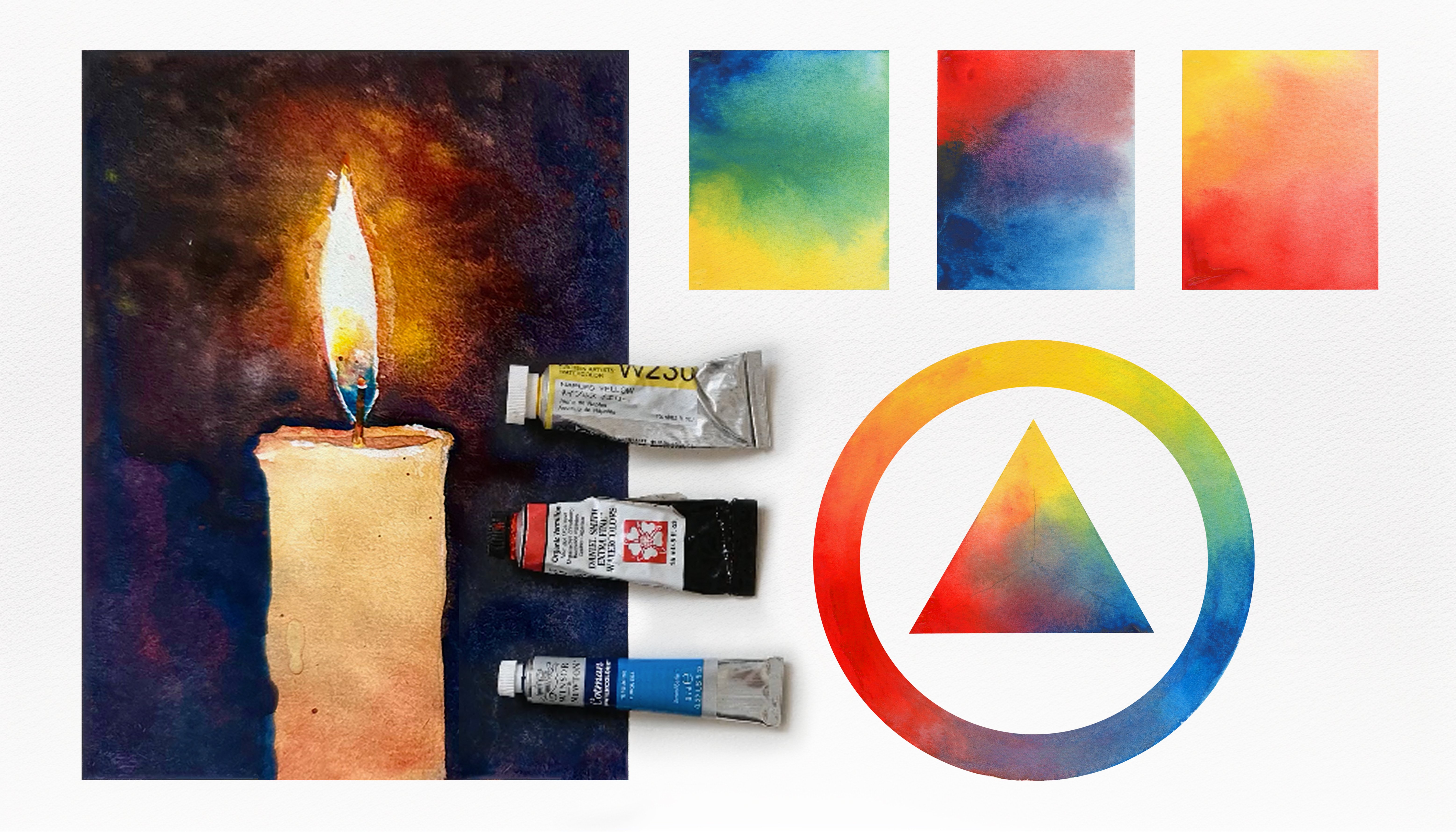
3. Materials & Supplies: So let's go over all
the materials and supplies I'll be using
in today's lesson. Having the right materials can greatly impact the
outcome of your artwork. So I'll go over all the supplies I use for
this class and beyond. They're very useful to
have at your disposal, and will make it easier
for you to follow along. L et's start with the
paints themselves. And like most of the materials
we'll be using today, it's a lot to do
with preference. I have 12 stable colors in my palette that I
fill up from tubes. They are cadmium
yellow, yellow cha, burnt sienna, Cadmium
red, sarin crimson, ultramarine blue, cobalt
blue, cerliu blue, lavender, purple, Vidu black, and at
the end of the painting, I often use white guash
for tiny highlights. I don't use any
particular brand. These colors you can
get from any brand. Although I personally
use Daniel Smith, Windsor Newton, or
Holbein paints. So let's move on to brushes. The brush I use the most is
a synthetic round brush like this ascoda pla brush
or this Van Gogh brush. They're very versatile, because
not only can you use them for detailed work
with their fine tip. But as they can hold
a lot of water, they are good for
washes as well. They're also quite affordable, so I have quite a few
in different sizes. Next are the mop brushes. Mop brushes are good for
broad brush strokes, filling in large areas and creating smooth
transitions or washes. They also have a nice tip that can be used for smaller details. But for really small details, highlights or anything
that needs more precision, I use a synthetic
size zero brush. All brands have them and
they're super cheap. Another useful brush to have is a Chinese calligraphy brush. They tend to have long bristles
and a very pointy tip. They're perfect for
adding texture or creating dynamic lines
in your paintings. You can even fan them
out like this to achieve fur or feather
textures as well. And that's it for
brushes, onto paper. The better quality
of your paper, the easier it will be to paint. Cheap paper crinkles easily
and is very unforgiving, not allowing you to
rework mistakes. It's harder to create
appealing effects and apply useful techniques
like rubbing away pigment. Good quality paper, however, such as cotton based paper, not only allows you to rework
mistakes multiple times, but because the pigment
reacts much better on it, the chances of mistakes
are a lot lower, and you'll be more likely
to create better paintings. I use arches paper because that's what's available
in my local art shop. A water spray is
absolutely essential. By using this, it
gives you more time to paint the areas you
want before it dries. It also allows you to
reactivate the paint if you want to add a smooth
line or remove some paint. I also have an old
rag or t shirt, which I used to clean my brush. Cleaning off the paint
before divving it in the water will make the
water last a lot longer. It's always useful to
have a tissue at hand whilst painting to
lift off excess paint. Also, you never know
when an unwanted splash or drip might occur that
needs wiping away quickly. I also have a water dropper
to keep the paints wet. When you paint, it's
important to have them a similar consistency to what
they're like in the tubes. This way, it's easier to
pick up sufficient pigment. A hair dryer is useful
to have for speeding up the drying time and controlling the
dampness of the paper. And lastly, masking tape. And this, of course, is just to hold the paper down still onto the surface to stop it sliding
around whilst painting. Also, if you plan on
painting to the edge, we'll allow you to create
a very crisp clean border. And that's everything
you need to paint along. I suggest you
experiment and explore all different kinds of materials
to see what suits you. But let's carry on and
start the painting.
4. How to Sketch It Out: In this class, I've included
two tracing templates, one with simple forms, and another one with the full details of the
scene such as the buildings, the windows, the
cars, and the lights. The first thing you want to
do if you're drawing this by yourself is to mark
out horizon line and then put a point right where all the perspective
lines lead to, known as the vanishing point. I'm just going to rotate the paper drawing very
straight lines, and this will help guide us
throughout the painting, not just the drawing, for the depth that we
want to create. This will be a very
useful way to guide us when it comes to brush strokes or finishing off the drawing. And I always start off with
big shapes to begin with, so I'm marking out a circle
there for one of the cars, and As we go through this class today
during the painting process, I'll explain a bit more
about the composition. At the moment, we're
just sketching out, and you can see that I'm not putting any details
in to begin with. I'm just blocking
out shapes because that's the core of a good
composition is simplification. We don't want to fuss
it out with details. We want to get the main image, the main message, the main
shapes accurate first. If we can create a
powerful image just with a few strong shapes, then we can add
details after that, just as a bonus. But it's not the details
that make a painting, it's the larger shapes
and their interactions. I've put lines for the building, outlines, very simple blocks, and now I'm just
putting these circles, trying to get a
spatial awareness of where I want to put the cars. There's four cars. One of them, it's so small in the distance, it's barely conceivable
as a car really. You can see, I'm trying to
make my verticals very strong. Se having the balance
of verticals with strong horizontals is a pleasant compositional
trick as well. When it comes to
drawing these cars, we'll use that
vanishing point and these diagonal lines to
make the perspective right. Now, using the fine
tip of my pencil, just to define the
buildings will have a little bit more details now that we've blocked them out. And we can take as much
time as we want to get the painting as detailed as we want it to be because
it's the backbone. It's really what makes more comfortable we
are with the drawing, the clearer it is,
the more likely our painting will be a
success because we'll know the plan, the idea of it. So you can take your time looking to see how I'm
drawing these cars and you can pause it and slow it down just to see
which lines I do it. I usually do the window
first at the top and then the car lights, and then the bonnet on
the wheels at the bottom, so I work from top to bottom. If you think about it, it's very simple
shapes altogether. They're quite a
simple thing to draw. If you've never drawn it before, it might be a bit of
a learning curve, but it's always the same
thing when you draw cars. We don't need to be so specific
about different details. It's really, these cars are the only thing in the painting that
has a lot of detail. Maybe we'll do a few dry
brush marks for the windows, but it's very generalized. The drawing stage, of
course, is just line. We can't demonstrate where
different tones will be. We have to leave that
for our imagination. But you can see there's a lot of empty space going on
on either side of the road. Putting in a guidelines for the windows,
I'll paint on later. But other than that, it's just empty space. I'm always trying
to be conscious of where that vanishing point is, and I won't rub that out because I want to see where that is when I'm
painting as well. Eventually, the
paint will cover it, so we don't need to rub it out. Now, it's going to take
a bit more time for me to refine the drawing, so I'll come back
when it's fully done.
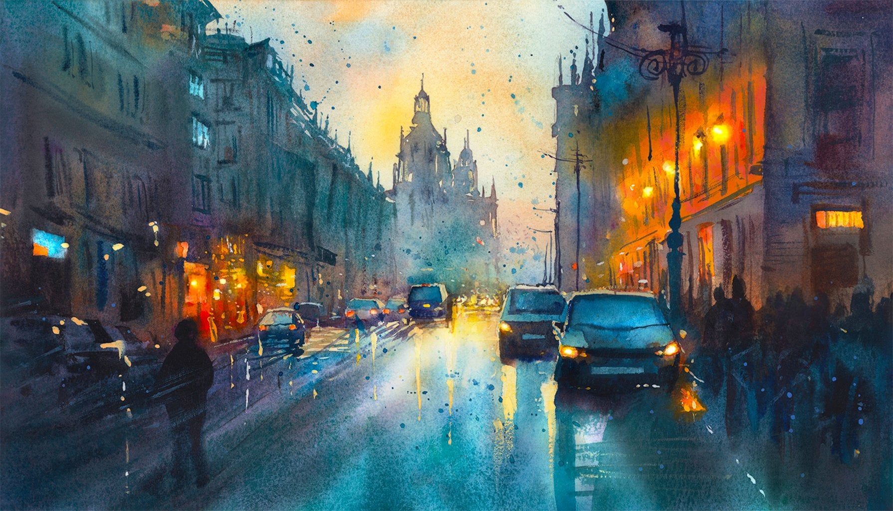
5. Applying Masking Fluid: The first step of the
painting procedure actually before we even get the paint of the paper is to apply
some masking fluid. And you can see, I'm not actually applying the masking fluid
directly onto the paper. I've got a little
old palette here, and I'm using a
little stick just to dab it in into
the specific areas. And although this might
seem a bit fiddly, The result at the
end will be very impactful because
we're going to use heavy use of tone and take advantage of strong contrasts to make this very captivating. So preserving this white of the paper will look
so bold at the end, and the scene that
we're painting today is a rainy scene at sunset, really. There's not going to be light. A lot of the light will
be artificial lights and street lights and
things like that. So that's what
these little marks of masking fluid are going
to convey at the end, or the street, the sign
posts, the shop fronts. That's a good example of
what I mean in this lesson. It's going to be a
repeating point is that I'm not going to be
so specific with details. There's just
suggestions of details, and we leave the imagination of the viewer to
fill in the gaps, whether it's conscious
or not that we don't need to be so direct
with our details. So you can be experimental as you want when applying
this masking fluid. I will say, don't leave
too many large marks. Even these small little dots that I'm putting
on there will be very obvious because of the high contrast between the
white and the dark tones. So if you put your marks or preserve too much of the
white of the paper, it will be overwhelming, will be distracting
from the vocal point. Even when I'm applying this, you can see I'm
rotating this stick, this point so that marks that
I'm preserving those dots, they're facing towards
that vanishing point. I'm rotating the
stick around so that there's it's drawing you
in towards the center. I'm not trying to
make it too obvious. They're not all in
line with each other, but you can feel that as they're coming
towards that vanishing point, they're getting closer
together and more dense, and as they're spread out
towards the edges of the paper, they are are a bit
more space around.
6. Painting the Sky: Now, I made sure I
used a hair dryer to completely dry the
masking fluid. I want you to take a look
at the final image to see where these preserved
areas of white have ended up. I don't expect you
to follow along with the painting without first
watching this whole way through just to see how
it works because a lot of water color is preparation
for things towards the end. You might be doing
things without context, it's always useful to look at the full process before
you attempt it yourself. I'm starting off of a sky using cadmium yellow and
a bit of blue, and I'm doing it so faint
that it's not actually going to mix into a green like yellow and blue
usually would do. I want to have strong
contrast ins painting, so I don't want the
sky to be so dark. I want it to exist,
but be very subtle. I'm using a big brush for this because if you use
a small brush, it won't be a smooth
gradient sky. I will be too distracting. If there's too much
going on in the sky, it just needs to be subtle. I have my painting
on a slight tilt. So that the water
gradually falls down, and we're using this gravity to help control where the
water cooler goes. Because if the paper is
flat on the surface, then you won't know where
the water will spill to if there's too much water or where you create your washes. But if you have a slight tilt, you always know it's going downwards and
there'll be a unity to the painting because
all the pigment will have this feeling to it, this vertical essence to it. So I've done a light
wash for the sky, but it's a little bit
too pale at the bottom. I want it to be a bit more vivid at the bottom whilst
it's still wet. I'm adding a bit more yellow into there to
give it that glow. This first stage of the painting
is actually the easiest because we're painting
the less obvious things. We're painting the underlayer. So we can be a bit
more expressive. We don't need to think about details at all at this stage. And I want to apply, I want to increase
this wash onto the buildings actually to give some warmth to the buildings, like there is artificial
light glowing. And again, look at the final image to see
what I'm talking about with the yellow on the
left hand side building. Because when we begin
a painting like this, it's easy to get
caught up in thinking, we need to be precise and exact with every
single brush stroke. But really the beauty
of this piece and water general lies in its
spontaneity, its energy. And the main idea for
this class is not to get bogged down in
technical perfection, but to embrace the
fluidity of watercolor. And the way we handle the
brush, the flow of the water, and the unpredictability
of the pigments, all of this breaths
life into the work. It's about capturing
a moment or a feeling rather than reproducing
every tiny detail. Because if you try and
replicate it as close as possible without
allowing the watercolor to do its own thing, then a lot of the magic is lost. For example, when you paint this yellow glow of the
building on the left, the water might not spill
into the exact same areas as it does with me just because of the
spontaneity of the medium.
7. The First Wash: So I'm bringing this yellow down onto the road
beyond the cars. And I'm doing this
because I'm trying to mimic the reflection
of a wet road. So these buildings are
going to have yellow light. The sky will be somewhat yellow, and it'll just give
that feeling of light. We're using wet on wet
technique at the moment. So not many hard edges
for the time being. So as we work for this painting, remember that we're
aiming to convey the vibrancy and the
movement of the scene. And our strokes don't
need to be precise. In fact, the looser they are, the more we invite the viewers imagination
to fill the gaps. The expressive quality of this medium is what
makes it so powerful. We're not painting a
photograph, of course, we're creating a dynamic
evocative interpretation that leaves room
for imagination. Of course, I know this scene does seem overwhelming at first. There's lots going on. We've got cars, buildings, street lights,
reflections, et cetera. But I want to reassure you that it's not as
complex as it appears. And even for me, sometimes I make it more
complicated than it needs to be. Often, when I finish
the painting, I think I could
have done that much quicker if I just
allowed the watercolor to do its magic,
not interfering. A lot of the times
when I interfere, I actually make it more
complicated than it needs to be. It doesn't add to the
painting, it takes away. There's a natural incarnation to want to overdo it to
control the medium. And of course, technique
is a part of that. You do have to know technique, but it's not technique that makes the
painting in the end. When we break it down, it's actually really just about layers of color,
shapes, and light. And we're not trying to render
every single car window, every brick of the building, every street light,
every text of the road. We're focusing on the
overall mood and atmosphere. And we're doing that by
simplifying the forms. A few well placed strokes can suggest something without
fully defining it. And that's, if anything, the most difficult thing is to find those well placed strokes. And that comes through
exploring and being fearless, which is exactly what
this class is about. Once we understand that,
the whole painting process becomes much more approachable. So try not to feel intimidated because
by working loosely, we're freeing ourselves from
the pressure of perfection. And you can see in
this painting that for 75% of the
time, it's a mess. And it's just in the last few strokes of details at the end that
just hold it together. Every painting starts off messy. That's just part of the journey. It's in those rough abstract
beginnings that we start to build the energy into
the final piece. At the moment, I'm still working on that glow
of the buildings, but I'm making sure not
to paint over the cars. I'm bringing it down just
to the roofs of the cars, and apart from the
middle of the road, this orange isn't going
past the horizon line. You can see the vanishing point. It's barely going underneath
that at the moment. Again, you can look
at the final image to see where I'm
taking this orange. Another thing is
not to be put off by ugly results because
at the beginning, when you're a student, they are going to be ugly. But this ugly duckling will eventually turn
into a glorious swan. If you keep this
habit of respecting the watercolor medium and allowing it to do its
thing without forcing it, it will grow and you'll
mature as an artist.
8. Suggestion Over Exactness: Now I'm going to extend this
wash to the right hand side, and I want to use some
bold red for this, and I'm going to be quite
expressive using my mop brush, maybe even achieve
some dry brush marks, and you can see
using vertical lines and also lines that point
toward the vanishing point. Just to get that glow.
This red glow is at the bottom where the
street lights will be, or the signposts, or the shop fronts, where that artificial light
will be coming out of the windows and
signs and glowing the bottoms of the buildings
rather than the top. I'm just going to
clean my brush and flick a bit of water
on the bottom left of the road just to add a bit more texture and
a feeling of wet drops. I think what makes watercolor
so special is that it invites suggestion
over exactness. If we zoom into any
part of this painting, if you look at the reference, you'll notice that what
looks like detail from afar is actually
just a few splashes or abstract gestural marks, and that's the magic. We're suggesting detail
without actually painstakingly painting
little thing. When we imply
rather than define, we allow this interaction with the viewer and
their imagination. It makes a painting more
interactive and engaging. We're guiding the eye, but we're leaving space
for interpretation. And the viewer might
look at the scene and immediately feel the bustling
energy of the street, the glistening of light
on the wet pavement without needing to see every
individual car or person. In fact, I don't think there is a person at all in the scene, just a suggestion
maybe in the shadows. It's the mood, it's the
atmosphere hereafter. And the approach of suggesting rather than
rendering is one of the main elements to really take hold of when it comes to
watercolor specifically. I relates to other
mediums as well, but it helps create a
painting that feels alive. I'm starting to paint one of the buildings in the
distance there and I'm keeping it light and tone because I want to add
to the atmosphere. Realism is, of course,
very impressive, the talent and technique that they've spent
years working on. But it doesn't allow for the
viewer to fill in the gaps. It makes a painting more
personal but more evocative, and that's where the real
power of Watercolor lies in its ability to hint at something and let it unfold
in the viewer's mind.
9. Chaos & Control: Now, I've dried it completely
with the hair dryer, and I'm going to start painting the main wash
on the buildings now. I'm going to mix
quite a dark tone, but keeping it quite watery, it's not going to
be a thick pigment. I'm going to keep
it quite neutral, quite brown and muted. Using the tip of my brush, my ascoda perla brush. Another thing to add is that although we're working
with spontaneity, we still need a strong
underlying composition, an idea in our mind that guides us throughout
the whole of the painting. This will also help guide the viewer's eye
through the painting too. That's where balance between chaos and control
comes into play. We use composition and contrast to bring
order to the fluidity. Think about where we place the darkest values or the
brightest highlights, and these points of contrast, not only create depth, but also direct attention to the focal areas
of the painting, which would basically
the horizon line or the vanishing point is where everything
comes together. It gives its structure and purpose despite the
abstract nature of the piece in general. This structure or composition of a painting can be boiled down
to a few simple principles, and there are principles that
interact with each other, so it's quite dynamic. But in general, these
principles anyone can follow, no matter what your
skill level is. We're not relying on
advanced techniques. Instead of we're focusing
on the principles of composition and the
elements of design, which are the building blocks
for any strong painting. And all the masters and professional artists use these principles
of composition and elements of design to make their artworks stand out and what makes their
artwork so special. To put it very simply, when we talk about composition, we're talking about how we
arrange the elements of our painting to create
balance, movement, and focus. For example, we use contrast to direct the viewer's attention to the areas that matter most. We think about balance,
not necessarily symmetry, but a visual balance that makes the piece feel cohesive
and harmonious. We guide the eye
through the painting with movement using lines, shapes, or even
color transitions. At the same time, the elements of design, things like line, shape, color,
texture, and space, help us bring the
composition to life. The line can create
direction and rhythm while contrast between light and
dark gives depth and mood. All of these things come
together to form a painting that feels intentional
and also expressive.
10. Contre-jour: So I'm just dabbing out
some of this orange here because it's a bit too dark. I in the center here. I just want to bring
back that yellow. So I'm just rewetting it with my brush to get
that yellow back. So we've laid down
the under layer, and we're starting to work on top of it with
darker tones now. As I was saying before, contrast is one of the most powerful elements and principles of
design and composition. And one of the most
popular lighting schemes you can use for a painting is
something called contrade. And this scene is a
good example of that. It's a French term that
translates to against daylight. And this technique
involves placing a light source behind the
subjects, in this case, the buildings, creating
a striking contrast between light and shadow. It's a powerful
method that can evoke emotion and drama
in our paintings, making it particularly
relevant to this piece. You can see how it
plays a vital role because it shapes the
overall atmosphere. It also actually makes it
easier to paint because by positioning the light source behind buildings and
street elements, we create silhouettes that stand out against the
illuminated backdrop. This approach not only
enhances the visual interest, but also contributes to the paintings sense of
depth and dimensionality. When we observe the
glowing street lights and the warm hues reflecting
off the wet pavement, it becomes clear how
contradue allows us to explore the interplay
of light and shadow. The bright areas draw our eye while the dark regions
create contrast in tension, making the scene feel
alive and dynamic. This contrast adds to the emotional impact
of the painting. You can see a lot of
these contradu examples in very famous works of
art or even photography. William Turner or Mone masterfully use this
technique in their work. You can see Turner with his
atmospheric landscapes, often painted scenes
where the light of the sun spills
across the canvas, creating dramatic silhouettes
against bright skies. And I Monet's paintings, we can see how he used contrad to enhance the
vibrancy of nature, allowing sunlight to
filter through trees or illuminate fields with
many dazzling colors. So when working on
your own paintings, try not to shy away from
experimenting with contrade. Play with the positioning of your light source and observe how it transforms your subject. Notice how shadows can actually define shapes and
create a sense of mystery that invites the viewer to look closer and to engage. So Contradur is more
than just a technique. It's a way to express
the relationship between light and dark
energy and tranquility. It allows us to explore
the emotional depth of our subjects and convey a story through
our brush strokes. So as we continue on
with this painting, let's keep in mind the
power of light and shadow, and how contradur can
guide us to create more exciting and
inviting images. So I've started the main
shapes on the left, and I'm just using the
tip of my brush to bring the wash down to the very
edges of these cars. Try not to paint
over the cars yet. Now I'm using a dark
pigment just to create that contrast between the car
and the bottom of the road. And you can see how the masking fluid is still
preserving that paper, and we need this contrast for that white of
the paper to pop.
11. The Principles of Composition: Now let's talk a bit more about the principles and
elements of composition because it's these
things that can help develop your own compositions
and your own paintings. By getting to know
these principles, you'll have a better
understanding about what I'm trying to achieve and what other artists
are trying to achieve. You can notice these things in other artworks
that you might like, and you can integrate
them into your own. As I go through them, you'll see that
there's actually a lot of crossover because it's all very dynamic
and they relate to each other even though they're
not technically the same. The first one we're
going to talk about is balance or symmetry
and asymmetry. Balance in composition is
all about creating a sense of stability and harmony
within a painting. It's one of the key principles
we can use to guide the viewer's eye and create a cohesive feeling in our work. In watercolor, balance
doesn't mean everything has to be symmetrical or
equally weighted on both sides. It's about how we distribute visual elements,
whether colors, shapes, or values achieve a sense
of equilibrium as a whole. Symmetry refers to
creating a balance by mirroring elements on either
side of the composition. Think of a reflection in water or a perfectly centered
building in a landscape. Symmetry often evokes a sense of calm or order and stability. For example, in a street scene, by placing a large object like a building in the middle of the composition with equal
visual elements both sides, it can create a balanced
and harmonious feeling. Symmetrical compositions can
be formed or structured, which gives them a
timeless classic quality. However, we need to be
careful with symmetry because if everything is too
perfectly balanced, it can sometimes feel
a little contrived, a little static or predictable. It's excellent for
certain effects, but over using it might make the feeling of the
composition less dynamic. Another example could
be in a landscape. If you have symmetrical
trees on both sides, while balance is maintained, the scam might feel a bit too structured and it lacks
movement or energy. That's where asymmetry comes in. Asymmetry brings a
sense of energy, movement and interest
to a painting. It's about creating balance using different elements on either side of the composition. But they aren't mirrored images. Instead, we might place
a larger shape on one side and balance it out we have a group of smaller
elements on the other. It's still balanced,
but in a way that feels more spontaneous
and dynamic. With this street
scene, for example, you can tell that it's not
symmetrical on both sides, but it's pretty well balanced. On the left hand side,
we have big buildings, and on the right hand side, we also have buildings, but they're not symmetrical, but they're weighted the same. Likewise with the cars, even though we haven't
painted the cars yet even, we can see there's two cars on one side and
two cars on the other. But you've got a smaller
car with a bigger car, and it evens out, if you can imagine
them on a scale. It balances out because the bigger car is
further away from the center and the two bigger, other cars are not so far out, they're closer to the center. But there's other ways to distribute the visual
weight as well. We can use the street lights. We can use figures possibly. So the painting
remains balanced, but it feels more
lively and less predictable than
strict symmetry.
12. Balance: Now I feel like
gang a bit bolder, so I'm going to use very
thick pigment and I'm continuing on with
this purple mix that I have mixed on my palette. And I want it to be thick because It's going to integrate when we add
more water later, and it's going to create
some spontaneous effects. Again, we're allowing
watercolor to do its magic. So I'm not being afraid to really pile on the
thick pigment here. It's very dry brush
effects at the moment. I'm also planning
for the future. So you can see in
the final image, again, that we've
got purple here. We've got orange,
and I'm going to add turquoise green
on there too. And those are tertiary colors. If you had primary if you
look at the color wheel at the primary colors and then rotated the color wheel across, you'd see that they line
up like primary colors do, purple, turquoise
green and orange. They work together
in a beautiful way, a bit like complimentary colors, but three ways rather
than two ways. So I know we're covering
up a lot of this red, but that red is quite a nice pigment because
it stains the paper, and later on, we're going to use a palette knife or you
can use a regular knife or that you want a ruler to scratch some of the
pigment away and expose some of that
vibrant color underneath. But you'll see as we
get to that later. I'm just explaining what my intentions are
for the future. Watercolor is
particularly suited to asymmetry because of
its spontaneous nature. We can let a wash flow unevenly
across the paper or allow one area to remain light
and airy while the other is filled with bold, darker tones and textures. Asymmetrical compositions
often feel more organic, like the natural world itself, where things are rarely perfectly balanced
in a mirrored image, but still maintains
a sense of harmony. It's also important
to think about visual weight when
considering balance because visual ight refers to how much attention
different elements in the composition draw. So a large dark
object will naturally draw the eye more than
a small light object. So we can play with
these relationships to achieve balance. A small but brightly colored
car might balance out a much larger neutral
tone building because the color
draws attention. Likewise, a dark,
heavily detailed tree could be balanced
by a light open sky on the other side
of the painting. It's not always about size. Sometimes it's about
color, texture, or even how busy or quiet
an area in the painting is. One of the exciting things about asymmetry is how it creates
a sense of movement. We don't want to have
perfect balance, obviously, because the eye
naturally moves around the painting, exploring
different elements. This movement keeps
the viewer engaged, encouraging them to linger
and discover new details. It also gives us the chance
to play with direction, perhaps leading the eye
towards a focal point or guiding it along a path of the street or
the river or the roads, up the pavement, wherever. So the best way to get
comfortable with balance, whether it's symmetrical or asymmetrical is to experiment, play with different compositions in your thumbnail sketches. Try placing a focal
point dead center for symmetrical composition, almost like this one, really. Then shift it off to
one side for asymmetry, and notice how the energy of the painting changes by
doing things like that.
13. Using Contrast: And always remember that balance doesn't mean
everything is equal. It means that everything
feels right together. Whether you're using
symmetry for calm and order or asymmetry for
energy and movement. We want our compositions to feel like they're working in harmony, even when we're embracing the beautiful unpredictability
of watercolor. I know there's lots of things going on in the painting
that I'm doing, and I'm not necessarily explaining every single
step of the way, what specific colors
I'm using, etc, et. But if you've seen
my other classes, you can see my palette there and you can know what
colors I've got and you can see me mixing
them and you can and rewind at any section. I actually think it's
more important and you'll find more growth
in your paintings when you hear these principles. And concepts about
art in general. And on that note, let's move on to the next
principle, which is, of course, contrast, and it's one of the most powerful tools we have to create visual interest, depth, and focus in our
watercolor paintings. It's essentially
about opposites. Light versus dark,
soft versus hard, smooth versus rough, warm, versus cool, et
cetera, et cetera, and how these oppositions can work together to
guide the viewer's eye, create a sense of
drama and bring certain areas of our
painting into focus. Usually, the first thing we
think about when it comes to contrast is light and dark. And this is known
as value contrast. By placing light values
next to dark values, we create a striking visual difference
that draws attention. Light against dark is how we make certain areas of
a painting stand out. For example, in this painting, at the vanishing point where all those lights come together, where it's very dense
with masking fluid. We've got a
concentrated patch of contrasted areas that really draws the focus into that area. And you can see
as we expand out, that contrast almost dissipates because it's not so
dense or close together. Let's say we wanted to add
figures into this scene. You know, we're painting
a street scene at sunset. If we wanted the
viewer to focus on a particular figure or
a particular building, we could place it against
a contrasting background. Imagine a figure in a white shirt standing
in front of one of these dark buildings,
shadowed walls, for example, the bright
shirt will immediately grab the viewer's
attention because of the strong contrast between
the light and dark values. And on the other side, if the same figure were
wearing a dark jacket and standing against a
similarly dark wall, they would blend
into the background, and the contrast
would be much weaker and the figure much
less noticeable. The contrast between
light and dark values is key in creating depth. In watercolor, we tend to use
light washes to push areas back into the distance and darker washes to pull
elements forward. And you can see that in the foreground on the
edges of the paper, our use of pigment here is
very thick, very black, and in the center
in the distance, that's the lightest
building we have, that purply kind of
tone we've got there. But this goes beyond
a city scene. This could be a landscape with distant mountains that
might be painted in soft light blues and
grays while the trees in the foreground are
dark grays and browns. So it's the contrast between
the light and dark that creates a sense of depth
and freedimentality.
14. Lost & Found Edges: And then there's
hard and soft edges or as it's sometimes known
lost and found edges. Of course, hard edges are where one shape or color sharply
ends and another begins, creating a defined boundary. Then we have soft edges, where of course, two areas
gently blend into each other. And in some cases, it's so gradual that you can't
even see the edge at all. It's a lost edge, as it's known because
there's no clear separation. In watercolor, we have a lot
of control over edges and how much water we use and
how we apply the paint. Hard edges can be created
using less water and by letting one layer of paint completely dry before
adding the next. Whereas soft edges, in contrast, can be achieved by using
wet into wet techniques, allowing colors to blend
and bleed into one another. A lot of this painting
is wet and wet. And by looking at the screen
now you can see where the hard edges are and the
soft edges are At the moment, there are a lot of soft edges, a lot of undefined areas. But as we draw the painting
to a close, later on, you'll see more hard
edges coming in because we're focusing on the
wet on wet at the moment, so that's where the soft
edges really excel. Hard edges are great for
drawing attention to specific areas of the painting,
like the focal point. For example, when we paint
all those street lamps, which again, at the
vanishing point, we might use hard edges. When we take away
that masking fluid, they'll be very hard edges because masking fluid
has that hard edges, not a gradual edge. We might want to soften
some of them out, but for example, with what I'll do later, you can look at the
final reference image. The lights on the cars, even though we've
used masking tape, and it's got a hard edge. Actually soften them out of
it because I don't want them to take so much of the attention because
they're not the focal point. I don't want them
distracting from the central drawer
of the composition. That's what hard edges do. Soft edges can be used to create a sense of atmosphere
or distance. In this scene, you can see the distant buildings
have softer edges, suggesting that they
are further away, of course, and we're seeing
them through the smog of the city or the mist or the visibility that
goes at twilight. This contrast between
hard edged foreground and soft edged background
as depth and interest. It's a lot of things to consider because we have to think of ways to integrate
them into your composition. But through repetition,
you can retain these concepts and
you'll find them coming through in your
work through intuition. You don't even need
to think about them. They have a sense of what
feels right eventually. But like I think,
it's repetition. Then you've got smooth
and rough textures. Texture contrast is
another powerful tool, especially in watercolor, where we can create textures
by varying how we apply the paint and the type
of brush strokes we use. Smooth textures are obviously achieved with even
controlled washes, while rough textures
can be created with dry brush techniques
or splattering or lifting the paint off with
a sponge or scraping.
15. Smooth & Rough: Imagine we're painting
a cobbled stone street. We might use rough or
broken brush strokes to suggest the texture
of the stones, contrasting with the smooth
wash of the sky above. This contrast between
smooth and rough texture adds tactile interest
to the painting, and it invites the viewer to imagine the feel of
the different surfaces. Contrast in texture can also create a sense of variety
and visual excitement. If everything in the painting
has the same texture, whether it's all
smooth or all rough, the composition can start
to feel monotonous. By varying the
textures and placing smooth areas next to
rough ones and sa, we can keep the viewer's eye
moving around the painting, making it more engaging. Now let's talk about
contrast of color, especially between
warm and cool colors. It's another effective way to add dynamism to your painting. Warm colors like reds, oranges, and yellows tend to advance
in the composition. They feel closer to the viewer. While cool colors
like blues, greens, and purples tend to recede, creating a sense of distance. We can use this
temperature contrast to create depth or
highlight certain areas. Looking at this scene
we're painting today, I've actually pretty much broken that rule because I've
got cool colors in the foreground and I have that glowing orange yellow going all the way
into the distance. I might have those distant
buildings of purple, which can be considered
a cool color, but it goes to show you can
sometimes break the rules. But maybe if I were to redo this painting and I were to think about
all aspects of it, maybe the composition
would be improved if I kept the warm colors to the foreground and only had cool colors
in the distance. There's also an emotional
aspect when it comes to colors. Usually warm colors,
evoke feelings of warmth, of course, energy and light, while cool colors evoke calm serenity and even
sometimes melancholy. So in a more abstract sense, we might want to use
warm and cool colors to create movement and focus
in the composition, a warm splash of red in
otherwise cool area. In fact, we're going to
do that on the left. You can see those
little red highlights. I have splattered on at the
last stage of the painting. That contrast of the red on the blue composition immediately grabs the attention because of that strong contrast
in color temperature.
16. Guide the Viewer’s Eye: So all these principles of composition in order to help guide the viewer's
eyes in different ways, and contrast is no
exception to that. By strategically placing areas of high contrast next to
areas of low contrast, we can control the flow
of the composition and make sure the viewer's eye
lands where we want it to. For instance, let's say we are painting a
busy market scene. The overall scene might
be filled with lots of mid tone values and
soft blurred textures. But we could place a figure
in the foreground with sharp details and
strong value contrast, perhaps a dark figure
against a bright background, and this will immediately pull the viewer's attention to that figure because
of the contrast, making it the focal
point of the painting. And from there, the viewer's eye can explore the
surrounding details, but that initial point of high contrast acts
as a visual anchor. And contrast can also help
create rhythm in a painting, leading the viewer's
eye on a journey. So after that initial,
that visual anchor, It can explore around the
painting in a landscape, we could alternate
between areas of light and dark
values in order to lead the eye from the foreground
to the middle ground, and then the distant horizons. Contrast helps create a
sense of movement and flow, as well as making painting feel more dynamic and engaging. And then we can incorporate the idea of balance of contrast. So while contrast
is a powerful tool, it's also important to
use it thoughtfully, because too much contrast
can make a painting feel chaotic or overwhelming, while too little can make
it feel flat or lifeless. The key is to find a balance that suits the mood and
the message of the piece. What do you want to convey? These are the kind of
questions you have to ask yourself before you begin
a painting, really. Of course, it's in your mind
whilst you're painting, but when you're
looking at a subject, you got to ask, what is it
that I'm trying to convey? Keep that message and
idea firm in your mind. And then you'll be
able to structure these ideas of composition
around that idea. In watercolor, we have the advantage of working
with transparency, which naturally lends
itself to subtle contrasts. We don't really need to rely on harsh or stark oppositions
to create impact. However, as you can
see in this painting, that's exactly what we're doing. We're using intense contrast because that's what
this painting, this is what I wanted to
convey in this painting. It's a rainy scene
at sunset in a city, and maybe people are
rushing to get home, so that contrast adds to
the feeling of the energy. Now, if it was a
countryside scene with no cars at all
and not many figures, maybe I wanted to convey that
there's tranquility there, so maybe I wouldn't use such harsh oppositions
to create impact. Sometimes the gentlest
contrast between a soft wash and a
slightly darker one is enough to create depth and interest depending on that message that
you want to convey. There's a whole spectrum of these contrasts and elements that integrate with that
message you want to convey. That's how emotion and feeling can get incorporated
into your paintings.
17. Examples of Contrast: You can see I'm starting
to use my palette knife to scrape away at the paint, and you've got to do this at
a certain level of wetness. It can't be absolutely sodden. The pigment has to be malleable. Owise, you'll see it runs back. You can see, in fact, as
I attempt it on my left, you can see that the
bright colors underneath, but because it's so wet still, they're immediately
covered up afterwards. So I have to be careful not to overdo it or maybe
wait a bit later and come back because
it's a bit too wet. I can move large
sections like this, but I can't do fine lines like I did on
the other side quite yet. We can see how that color that stained the paper below
is coming through. And amusing excess paint left on this surface of
this palette knife to imply details
on the building. It's not necessary
to do it like that, but I'm thinking, why not? I've got the paint
on my palette? It doesn't need to
be super detailed. It's just a suggestion
of detail rather than highly planned out
and thought detail. If you haven't noticed already, you can see I've added lines
to the left of the ad, the left side of
the road to help direct the viewer's
attention into the center. And by now you can start to see around if you go around
clockwise, the composition, all the various lines that I've hinted at to kind
of suggest a kind of or visual to
the of the middle, where the vanishing point is. So let me give you some examples of contrast in watercolor. For example, a city scape, if you want to attempt your own, contrast could be used between
hard and angular shapes of the buildings and
the soft flowing sky or the water reflections below. The rigid geometric lines of the architecture are contrasted with the fluid
unpredictable washes, and it creates a dynamic tension that makes the
painting feel alive. In a portrait, contrast
can be used to highlight the face by placing light skin tones
against a dark background. The contrast between light and dark draws attention to
the subject's features, giving the painting a
sense of focus and depth. And then you can even relate
it to abstract pieces. We might play with
contrasts in texture using smooth even washes and some areas of rough
text struts and others. There's a lot of that going on here with the
buildings at the moment. It's completely abstract. So you really don't have to worry about adding
too much detail because they're just
a whole mishmash of soft textures
and high textures. We just need a few
things to anchor it. And these things that I'm mentioning is what
does anchor it. So while it seems like an
intimidating painting, by trying to remember
these things, you can work out how
to control the chaos. The contrast keeps
the viewer's eyes moving across the painting, creating a sense of
energy and excitement, even without a clear subject
or narrative sometimes. So the relationship
between elements, whether it's through
light or dark texture or color is important.
18. Emphasis: So you can start to understand now what these principles
are trying to do, and their main
purpose is really to guide the viewer's eyes,
the audiences eyes. And where do we want to guide these audience sides
to? The focal point. Every painting needs
a focal point, as well as it's a lost painting. And what are some of the ways we can make
the focal point clear. That's the next principle
called emphasis, it's one of the most important
principles of composition because it really does give us control over where the
viewer's attention goes? We don't want every part of the image to demand
equal attention. Otherwise, it becomes overwhelming
and hard to navigate. Instead, we can use emphasis to direct the viewer's
eye to specific areas. Sometimes we can have
multiple focal points if they help tell a
story of the piece, but usually it's just one. I only has to be a
simple little idea, like the banishing
point in here. At the end of the day,
emphasis is about creating a hierarchy
in your painting, a clear visual path
for someone to follow. It's like guiding someone through the experience
of looking at your work. Usually, the focal point is
the area of highest contrast, greatest contrast or interest or importance in
the composition. It's where we want the
viewer to stop and focus before exploring
the rest of the painting. Watercolor with its inherent
fluidity and capacity for bold contrast gives us so many opportunities
to play with emphasis, whether we're using color, value, texture, or contrast. We can create areas that stand
out and draw the eye in. But the focal point doesn't always have to be in the
center of a composition. In fact, sometimes placing it slightly off center
like we've done here makes the painting
feel a bit more dynamic. So there's many ways we can lead the eye towards
the focal point. We've already talked
about contrast. Which is one of the main
straightforward ways to do it. We've talked about color
and the contrast of color or the vibrancy of color
that creates the emphasis. Perhaps in a landscape, the entire scene is
painted in soft rv tones, but there's one figure wearing a bright yellow jacket
walking through a field, and that will definitely take the attention
to the focal point. Then we have
sharpness and detail. I did say that there's
limited detail in this. There's a lot of
abstraction going on, but one of the
ways we can create emphasis is by using detail and sharpness only in one area of the painting and leaving the other parts
abstract or blurry. So when we paint a scene, we don't need to render
everything equal detail detail. In fact, part of the magic
of watercolor is how beautifully it allows us to suggest detail without
spelling it all out. If you wish to do your own
city scenes or city scapes, you might choose to focus on one building and
rendering it with sharp lines and distinct windows while letting the rest of the
city blur into soft washes. Gradually, as you go further
away from that vocal point, and the contrast between the soft and sharp shapes makes that one building
the vocal point capturing the attention.
19. Positioning & Size: And then we have positioning, where we place the vocal
point, also affects emphasis. Like I said before,
although it's tempting to put the vocal point
right in the center, that can sometimes make
the painting feel static. Usually, if we place it
slightly off center or even better along one of
the thirds of the canvas, the rule of thirds, it creates a more
engaging composition. Imagine a beach scene where the main focal point
is a sailboat. Instead of placing
it dead center, you might position it to the top right third
of the canvas, and the rest of the composition
is flowing towards it. This off center placement
still draws the attention, but it feels more organic
and less predictable. Lastly, for emphasis is size. Larger elements in
the painting tend to naturally demand more
attention than smaller ones. By varying the sides of the
objects in the composition, we can sometimes emphasize
one area over another. A large tree in
the foreground of a landscape will naturally
become the focal point while smaller less
detailed objects in the background serve to
support the main element. That said, size doesn't
have to be the only factor. Of course, these buildings are very big compared
to the focal point, which is the center,
sometimes a small, but highly detailed or
brightly colored object can stand out even more than
the larger muted shapes. It's all about how we
balance these elements. And while many compositions have only a single focal point, some paintings
benefit from having a secondary focal point or multiple secondary
focal points to create a more complex visual pathway. Secondary vocal points
can be areas of lesser emphasis that still
draw some attention, but don't compete with
the main focal point. A bit like the cars. The cars do have some attention, but because they are
all in perspective, they're leading the eye
closer to the middle. Again, like all these things, their main aim is to help guide the viewer's eye through the painting and to
create movement and flow. In a landscape painting, maybe the main focal point might be a mountain
in the distance. But you could also have
secondary focal points like trees or a ther
in the foreground, and these will be
positioned in a way that lead the viewer's
eye towards the mountain. These secondary elements
are supporting actors, so to speak, to the
main leading actor. They support the composition
and add depth without contrasting from the
primary focal point. And something I should
emphasize while we're talking about emphasis is that it's important
to remember that not every part of the painting should
compete for attention. When there's too many
areas emphasized, the viewer becomes
overwhelmed and doesn't know how or
where to look first. That's why it's
crucial to create a balance between areas of emphasis and quieter more subdued
sections of the painting. In watercolor, this balance is often achieved through washes. A large area of soft, neutral tone wash can serve as a quiet background that makes the focal point
stand out even more. For example, a bright
red flower will pop if it's surrounded by
a soft green field. So by keeping the
surrounding elements simple and understated, we ensure that the vocal point remains the star of
the composition. You can see now how I've splattered the
canvas with water, waited for a bit, and using
the tissue to rub away.
20. Removing the Masking Fluid: And whilst I'm rubbing away now, I'm actually using the
tissue to take away the rest of the masking
fluid that's on there, revealing the white
of the paper below. And you need to make sure that the pigments
are completely dry. You don't want to be smudging some areas that haven't
already dried yet. Now all the masking tape
masking fluid is off. You can see the contrast and how powerful that
white of the paper is. We're coming towards the
end of the painting now. We're just tying it
all up together. I'm using pure white pigment
in some areas again to help lead the eye into the center of the
focal point there. And using a few splats. Now, a lot of these
whites are too white. But that's okay.
We're going to use the transparency of watercolor. So we needed them white
in the first place, but we're going to go
over a lot of them with some vibrant yellows
and oranges just to slightly bring down
the whiteness of them. And also starting to
detail a lot of the cars, adding little highlights, a
few dots in little places. Not many details at all, a few well positioned
strokes and dots gives the
illusion of detail. And you can see underneath
the cars the bonnets, it's all in shade. It's all in dark, so we
didn't need to really paint the wheels or even really make obvious where the car ends and the floor or
the ground begins. You can see going
in to these whites. This reflection in the very
middle is white of the paper, which is very important
because that's the very high contrast area. It's the largest area
of white on the paper, and it's a vertical leading
straight to the focal point. It's interesting that the
focal point in this scene doesn't actually have
a real subject it's just the center all the
perspective leads to. And you can start to see how suddenly there's an
illusion of detail now. Now that we've added these
whites of the paper, or rather we've taken away the masking fluid to reveal
the whites of the paper, and we're starting
to do a few details. It just anchors, the painting, and it gives the illusion of detail where we've only got 3 minutes left
of the painting, and 90% of it was
pretty m abstract.
21. Finishing the Painting: So we've talked about a
lot of concepts today, and it might be difficult to think about how you
can incorporate them into your paintings. Now, some of the ways you can
do this is to just observe your own paintings or
your favorite paintings and consider how these elements and principles relate to them. Maybe you can ask
yourself questions like, is there a clear vocal
point or can I create one? Because without a vocal point, it can feel disjointed
or aimless. So you've got to
ask yourself each time if there's one strong
element that stands out or if you can
even manipulate the scene to create
some kind of focus. Then you can ask, is there a natural flow or path
for the eye to follow? You can look for elements
like roads, shadows, rivers, or lines in architecture that can naturally lead
the eye through the scene. If the scene feels too chaotic, with no clear flow, it might be challenging to organize it into a
strong composition. And then you're going to think, does the scene offer contrast, your subject that
you're choosing, can you see contrast in color, value, light and
dark or texture? If everything is the
same, in color, tone, it'll probably end up being a flat or uninteresting
painting. A lot of the time we've got to simplify the scene in order to achieve these things
without losing its essence. Busy scenes like this one have to be simplified
with abstraction, because with too many
competing elements, it can be difficult to
paint and difficult for the viewer to connect with. So we have to try
and visualize how we might simplify
parts of the scene. And that will most likely mean removing details rather
than adding details, like we're saying
at the beginning, leaving more to the
imagination of the audience, rather than actually directly
putting in all that detail. This is how we create art full
of emotion and expression. Paintings are most compelling when they do express an emotion, and consider if the scene you want to paint makes
you feel something, whether it's calm,
whether there's tension, or it's or inspiring. If you can get in touch
with that feeling, then you can work out
how to convey it with these principles in
almost a formic manner.
22. Final Thoughts: Well, welcome back.
How did it go? If you haven't already
done the painting, I suggest you
really give it a go because even though it might seem like a more complex
painting than usual, really pushing
yourself out there and being fearless is what makes
watercolor so exciting. When I started, I was
creating terrible paintings, but just by keeping on and working out All these unique
things that you can do, only through pushing yourself is really what takes
it to the next level, and you've got to go through
a rough state before you get to that place where
you're satisfied. And really that satisfaction is ongoing because once you learn how to do something,
you want to do another thing. So even if something
seems overwhelming, it's still a good idea when it comes to watercolor
to push yourself because the level will
improve much faster and your intuition will really
improve in the process. Remember, watercolor painting is not just about technical skills, but also about expressing your creativity and
personal style. I encourage you to continue
exploring, experimenting, and pushing your
boundaries to create your own unique
watercolor masterpieces. As we come to the
end of this class, I hope you feel
more confident and comfortable with your
watercolor painting abilities. Practice is key when it comes
to improving your skills, so keep on painting
and experimenting. I want to express my gratitude for each and every one of you. Your passion for watercolor
painting is so inspiring, and I'm honored to
be your teacher. If you would like feedback on your painting, I'd
love to give it. So please share your
painting in the student project
gallery down below, and I'll be sure to respond. If you prefer, you can
share it on Instagram, tagging me at Williston, as I would love to see it. Skillshare also love
seeing my students work, so tag them as well
at Skillshare. After putting so
much effort into it, why not share your creation? If you have any questions
or comments about today's class or want any specific advice
related to watercolor, please reach out to me in
the discussion section. You can also let me know about any subject Wildlife or scene you'd like me
to do a class on. If you found this class useful, I'd really appreciate
getting your feedback on it. Reading your reviews
fills my heart with joy and helps me create the best
experience for my students. Lastly, please click
the follow button up top so you can follow
me on Skillshare. This means that you'll be
the first to know when I launch a new class
or post giveaways. I hope this class
has inspired you, and you're excited to push
yourself further with more exciting
watercolor techniques until next time bye for now.
 Will Elliston, Award-Winning Watercolour Artist