Transcripts
1. Class Introduction: Hi. I am a lettering artist and a designer. I do lots of projects of different kinds for my clients. Whenever I do Cali graphic work, my friends ask how you do this well. Calligraphy with nib and egg requires lots of practice and sufficient amount of effort. There is actually a way to cheat calligraphy. This class is called faux calligraphy for beginners, where I will take you through the required process and techniques for creating a modern script calligraphy piece from zero without touching live and ink folk. Allegra fee is great for beginners who are intimidated by a dip pen or nib. Or if you want to do script calligraphy occasionally for some of your seasonal projects, then this class is just for you. I will teach you how to gain the same results as the depend calligraphy with other tools that are already with you. At the end, we will do a custom postcard addressing project. You can send your own postage is with beautiful addressing and wishes to your friends and family after following this class, so come right in and let's get started with. Though calligraphy
2. Tools + What Is Faux Calligraphy ?: first, I'm going to show you what kind of tools we need for Foa calligraphy. So first you'll need a piece of paper. It has to be a bit thicker than the usual copy paper because we'll use different pens and inks, and it's going to bleed. If the thickness is not much, we'll need a mechanical pencil or a simple pencil to sketch what we're going to write a liner pen around 0.3 size. I use Faber Costel because it's really good, and I love to draw with it a Micron pen around 0.3 size, because will be using this for practicing strokes and lines. These are my favorite brands, so I recommend hm, But you should consider experimenting with your tools. I use a variety of tools for different projects, and I'm using these tools for this project, but I can vary it for another foe Calligraphy project. As different projects have different needs, we're going to see what's the difference between foe and modern calligraphy. So first will need a Drunk Inc for it. It's not a special one. You can buy it in every art or hobby shop. You can choose any regular ink, which is easily available at your location. We'll need a nib and a holder. I recommend Browse nib. It's the most popular and the best. We have to use a handkerchief or a tissue paper to sponge up the unnecessary Inc. Keep these well working, so these are the basic tools you will need for this project. But do open yourself for new tools and new experiments. For the final round, we're going to write an envelope with an address. I'll use a C six envelope in vanilla color for this. This will also be your project for this class. You can buy such envelope, or you can create one. So, as I mentioned earlier, I'm going to show the difference between foe and modern calligraphy. I picked the word dream for this, and first I'll sketch the whole to see what it'll look like, and I can modify it. If I don't like it this way, you will also understand the core concepts. Then I'm going to draw it with my liner pen again. We just have to redraw it because later we'll do the strokes. After we finished this process, we're going to erase the pencil lines. Now you'll have to thicken the down. Strokes down. Strokes are the lines that you draw while moving your hand downwards. You draw a second parallel line to those. I chose a thicker pen to see it more all lines should have the same weight. Believe all up strokes the lines that go upwards alone. Then I feel the spaces which will take some time. This is the way you create faux calligraphy. I will cover every detail in later videos, but this is the basic way to create vote calligraphy. The main difference between faux calligraphy and modern calligraphy is that in modern calligraphy, we use Callie graphic pen or tools to create calligraphy, whereas faux calligraphy is fake calligraphy. Faux calligraphy is a great way to achieve the visual effects of modern calligraphy if you're not accustomed to the pointed nib pen yet, or if you want to write on materials that are not suited for Nibs. Modern calligraphy is original calligraphy, whereas faux calligraphy is imitating representation of that. Now we'll show you the modern calligraphy. It's much easier because you don't need anything else. Just the ink and the nib. With Holder, it'll add the thickness to your down strokes automatically, so you just have to write your word. The only method is to dip your nib to the Drawing Inc around every letter, start with a thin line and pushed the niv a bit downward to make this beautiful stroke for your letters. Now, in the next video, we will start with practice drills and strokes.
3. Practice Strokes & Curves: So here all shows some stroke thickness to see how faux calligraphy works. And as I mentioned earlier, I use Micron Pen. For this, we start with the thin minds than add some strokes and fill the space between the lines. That's how you create calligraphy effects by adding stroke according to its shapes. We continue with curvy lines, which remind us to use a letter E or an L add strokes to the left side, gently from top to bottom, which follows the down strokes. Now I draw a spiral where you can practice the down strokes and how to add a plus line to them beautifully and always keep in mind. You just have to think the down strokes and not the up strokes. After this, fill the space between the lines. This could take some time, but try to focus and stay in the lines. It might look easy by seeing, but to do it perfectly, you will need lots of practice info. Calligraphy. The stroke should be according to the flow of shapes. Otherwise, it's look will not come out well aesthetically, but practice by creating different shapes and then by adding strokes to it for the next step, I choose the W because it's straight and curvy at the same time. Here I draw little arrows to see the way of forming a letter and where those strokes will go, starting from the left side, thick the down strokes that leave the up strokes and repeated again. Fill the strokes. And now we're ready with our first folk Allegra fee letter. Once again, down strokes. Follow the up strokes. You just have to fill the left side of the lines. Understands the flow of each letters. Look at different focal a graffiti projects and observe them. Develop an eye for detail ing and practice more and more to develop this skill.
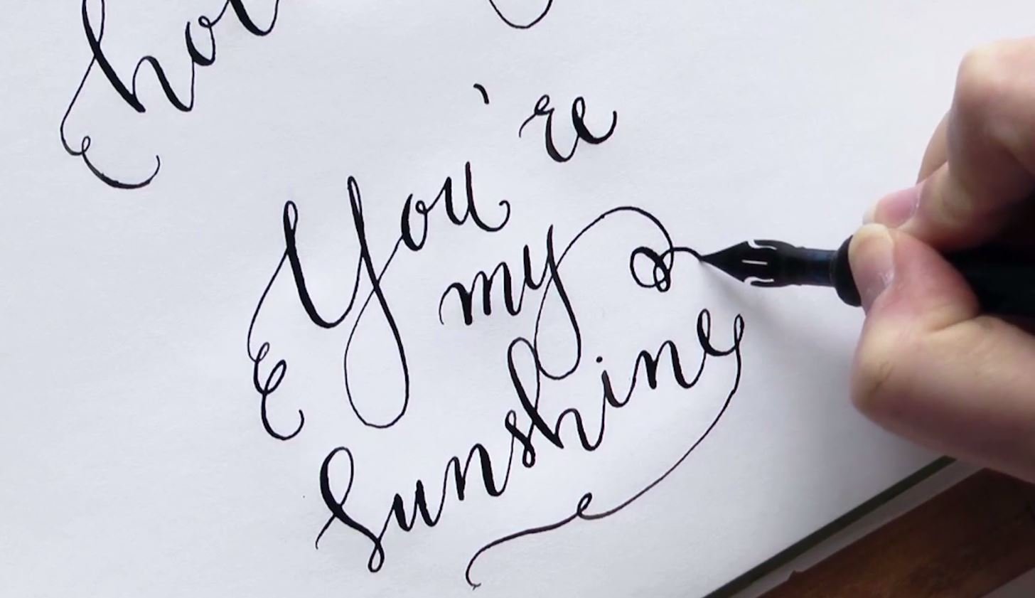
4. Drawing Beautiful Letters: Now we know how to use our liner pen. For foa calligraphy, it's time to draw. Letters were going to write a letter, a first slowly from the top to make the lines direct. Then it follows an E and I l o and finally an s. So here I'm not going to use a pencil for sketching because for me it's easy to use just the liner pen for writing. But obviously you can sketch your letters first in the beginning, after you redraw it with your liner pen, don't forget to erase the pencil lines. These were the most common alphabets for practicing to see where all those strokes will go , as we learned in the previous section. Always thicken the down strokes gently from the top and try to follow the curvy part you'll see and feel which way you should follow and how to draw these strokes. Repeat it over and over. I am showing you view of the most used alphabets, but you could practice all of them. You should understand each alphabet and work with them in detail. Then only you can master the art of faux calligraphy. As a final movement, you will have to fill these spaces and leave the up strokes alone. But if you feel like it's too thin than thinking it gently with your pen now, I will fill these strokes and then we will be finished with these alphabets. Creating this type of calligraphy is actually more time consuming than using a dip pan, because you have to carefully fill in the down strokes. However, if you just have a simple phrase, you will find that this technique is fun and renders awesome results every time. Folk calligraphy is a helpful technique to understand how riel calligraphy works, but not a requirement. Folk calligraphy is great everywhere, where you can't write with nib, pen or ink or when you can't bring your equipment. So for the next step, we have to practice how to transition one letter to another. I don't use pencil here lighter because, of course, you can sketch this, too, when you're ready with a simple writing, you can think in the down strokes. I recommend a thicker pen for the filling. It's more practical than the liner pen. It takes time. Now we can follow with the next round and write some words and practice different styles
5. Experimenting With Different Styles: so I'm going to show you two different styles for folk calligraphy. Of course, there plenty of styles that you can explore if you don't really like these. But it's the most popular and the best way to practice foa calligraphy At first, I chose the word fantasy for this step because it's really simple, short and full of curvy letters, so that you can easily practice the strokes and writing marked it with one into the different styles. For one al right in a cursive style, which looks really beautiful on envelopes or just on a simple letter invitation card, for example, and for two, all right in an exaggerated style, which is really good for calligraphy, prints or posters, for example, the method is, as we learned it earlier, sketched the word with your mechanical or simple pencil. When you sketch with pencil, it is the stage where you can explore different styles. After that, there will be an inking stage, and you can't erase them. You can simply doodle at this stage and explore styles in different direction. By doing that, you can get a new style and maybe your signature style, too. After sketching, then redraw it with your liner pen. At this stage, the skeleton will be ready. So take your time and slowly work on redrawing the word. After drawing skeleton, you can finally race the whole before thickening those down strokes after creating skeleton . The next step is to add muscles to it, So start with the 1st 1 You draw those lines on the left, next to the down strokes beautifully from top to bottom. Keep in mind, though, it's the best if you draw them slowly because they'll be strong and direct. Continue with the second version. It'll be a bit different now because we can play with the strokes, not just drawing them next to the lines of the letters. Now you can thicken the strokes to give a funny look and make the word boulder. I think you'll feel it were in Tala to add those strokes, but best if you think in from the middle of the lines, fill the space with your pen and see that you don't leave the lines. You can also use microns for this purpose. You can refine the word here and there. It's a bit time consuming, but you'll like the results This is how you can create any words by first creating connections between each alphabets, and that's the beauty of calligraphy. We can create relation between each Alfa, but so always keep yourself open to explore new style until our new tools and techniques. That's how you can grow yourself as a designer. Now, after we finish the process and we feel like we're good enough, let's prepare our envelope for posting. We will use all the learnings to create one project.
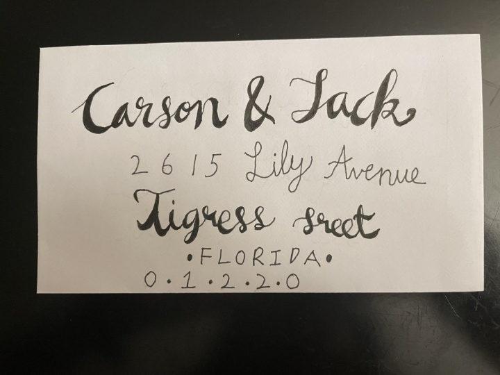
6. Creative Envelope Addressing: Now we're ready to write a full address to an envelope. So first I'm going to show you mine. I use a C six envelope here in vanilla color. It's the most common size, and you can find it in several colors and shops. We have the address where we'd like to send this post. So I copied it to a piece of paper where I can clearly see it during sketching. I'm going to use my mechanical pencil for sketching and a ruler for drawing added lines, which will help me to see where I should put those names and ex Edra. Usually, I don't use a square ruler to be very, very exact, because I can see it right with my eye where to draw the line. But of course, you can use one to be more correct. Count the rows and roughly dragged the lines on your envelope by creating lines. I create layouts for the design so that I'm sure about the placements of each elements where I am designing when you're ready. With this, you should design the address writing first, use a piece of paper and try to figure out how you'd like to write the names. Address country X. Edra. I chose the cursive style because, as I mentioned earlier, it looks really nice on envelopes or invitation cards. Start from the top to the bottom, right, the names in two rows. I think it's better if they're a bit bigger than the other texts. Follow with the address, which should be a bit smaller. Then continue with the streets, country name and finally, the ZIP code. Be explora tive. At this stage, you can also include any ornamental elements or details that can make your envelope better . You can add different styles for different elements, or you can keep one style for all. All these minor decisions are on you. At this stage, you're free to explore a different direction and just see what looks best after first doing it. Roughly, I am going to begin with the names, so you have to start from the left side and roughly position it. You can see that how long it will be from your sketch. So now you can guestimate were to write it. We can't put it too far to the right because we have to leave some space for the stamps follow the address and copy the information to your envelope from your sketch. If you make a mistake or positioned it too far to the right or left, you can modify it because it's only a sketch and you could erase it at any time. As we know the layout and style that will be used for this design, I am confident about the style I could go on and complete the sketching process quickly. It's so important to plan everything before jumping to the man project. This makes life and a lot easier. If you'd like some flourishing, decorate with something or make some curvy lines next to your writing. You can make it now before you redraw it with your minor pen. And, of course, you could modify and erase it. If you don't like what you draw now, redraw it with the liner pen and eraser pencil minds to prepare it for making the strokes so slowly from top to bottom. To make the lines strong and direct, take time at this stage. Be slow and precise. You could see I'm doing this whole project with basic tools, and that's why folk Allegra fee can can be Handy's at times If you don't know the basics of calligraphy, still, you can create a holographic project. Now I will erase the adding and pencil lines as you can continue with strokes the next step . As you know, if adding stroke to these skeletons, I decided to thicken only the names and the second row of the address, so I just make them bold using just the down strokes. Give them a curse of look and repeat it with the street name. Fill the spaces with your liner pen. We don't use a thicker pen for this because the weight of the paper is too thin and probably it's going to bleed, so we don't really want to ruin or work. When you're ready, you can put some dots or some decoration points next to your text. Now your envelope is ready for posting. So that's how you create your own folk holographic envelope design. Try it yourself
7. Thanks Everyone!: So here we are at the end of this class. Thank you for taking my class. I hope you now have had great fun with faux calligraphy and you can use them in creating various projects. I hope you have understood all the practice drills, tool and techniques that I've shared with you. Practice them to take your skills to the next level and be perfect Folk Ali Graphic artists I have created this project in a way that you can use everything learned in this class. So for your class project, you have to showcase the use of faux calligraphy and by doing a simple project on envelope addressing, you can be creative and fresh relative to color, style and decoration, and you could use any tools that you already own or want to try. You can use any regular envelope, or you can create it by yourself. I'm leaving the creative part and taste at your disposal. You can decide on the dimension of the envelope, color address or anything you want to add. Upload your beautiful projects. I can't wait to see it and leave feedback in the community or discussion and or you can also leave a review for this skill share class in case you feel it was helpful to you. The deliverables for project will be the brief of all the information that you will add on the envelope an image of your pencil sketch, skeleton sketches, ink sketches and, lastly, image of your final design and have fun with the project. So I want you to grab your tools and start creating beautiful faux calligraphy. Don't stop for another day and just try to have fun with it. See you in my next class. Bye.
 Sheila B, Letterer + Maker