Transcripts
1. What Makes a Font Fast?: It has gone. My name is **** County.
I'm an artist and designer based in
Southern California, usually a little bit sunny
here than it is right now. Gray skies have
decided to come in and perfect day for me to talk
to you about fast bonds. That's not vast,
vast, vast parts. It's entirely possible
that I've had entirely too much coffee
and to celebrate that, I'm going to have another
set, but the purpose of this course, It's
pretty straightforward. It's showing you how to create your own fonts, your
own typography, for your own personal use, or if you wanted to sell it, to share it with other people. I'm here to show you how to
make them quickly and get them into the hands
of the people as fast as you possibly can. But let's be honest
for a second, the technical aspects of how to design one of
these typefaces, at least in the past, was a lot more difficult
than it is today. Today we can create
a typeface in 1 tenth of the time that somebody would
do it in the past. So we're going to talk
about the technical aspects of how to build a
font from scratch. But we're also
going to talk about the philosophy and the
craftsmanship behind topography, at least from my
limited experience of creating letter forms, I'm gonna graphic designer
for over 20 years now, one of the things
that I probably struggled with the most
is lettering in general, drawing my own letters. It's not my forte. But I did learn a few
things about what real typographers do in order to make their typefaces
even better. I'm gonna share with you
my knowledge on this, but I'm also going
to share with you my resources that helped
me along the way. So teach you a little bit more about the art form
that is topography. But we're gonna keep it
fun. We're going to keep it light. We're going
to have a good time. And at the end of this,
you're gonna have two different
typefaces that you can use for your own personal
benefit or didn't, like I said, sell it
to somebody else, give it away to other people, use it however you want. As a kicker, you're
also going to get the typefaces
that I created. How's that for a bonus. So sued up strapping, grab yourself a steamy
cup of something, and let's get to work, shall we? What would a fast
months? That's not.
2. What to Expect: Here we're gonna
do the remainder of this course here
in the studio. This is what I call the shed. Here. On the contrary, quarter acre or the CEQA, as I affectionately
have just decided to refer to the homestead. Anyway, in this
video, what I wanted to talk to you about is what to expect after you've
finished this course, the most tangible things that
you can expect to get from this course is to new typefaces. If you follow along all the
way through and do the work, you will have at least two
new typefaces that you can use for yourself
or give to others or sell or whatever it is
you decide to do with that. That's the bare
minimum. Actually, it's not the very minimum because I'm also going to give you the
typefaces that I created. So you're going to
have those as well. And that also includes
the bonus type based that I created before, the one that we will
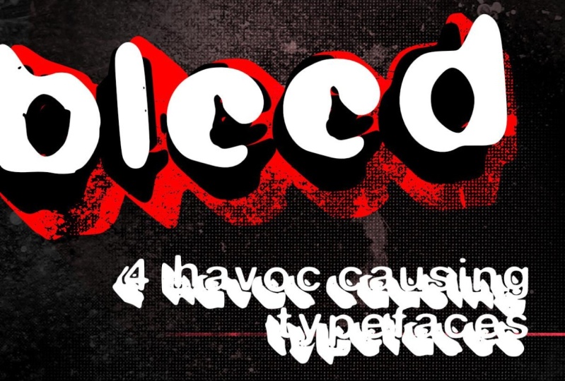
talk about later. It's called bleed. It's the first time I ever
created my own typeface. Give that one to you
because number one, I wanted you to have it. Number two, I want
you to be able to reference it because we're gonna be talking about that one. I wouldn't say
extensively, but we're gonna be talking about
it quite enough. That gives you some
perspective on my personal experience with this hole font creation thing. There are lessons to be had, things that I've learned, the mistakes that I
made that though, the answers to the questions that you may already have that I didn't have and I had
to go learn myself. I'm going to share all of that. And it would be good
to have the typeface itself as a reference so
that you could be like, hey, I know what he's
talking about here. There's the typeface. This is my brain trying to
ingest all of this stuff, right about this moment,
you're probably say new stuff. What did I get myself into? Don't worry, I'll tone it down a little bit,
but just a little, but on top of the tangible
things that you're gonna get, you're also going to
have more understanding about typography in general. You're going to have
a better appreciation for what it takes to
build these things, but also the appreciation for how easy it is to
make this stuff and how quickly you'll be able to regenerate new
ideas on your own, not have to fret
about the process because it isn't difficult. It's time-consuming, but it's
definitely not difficult. And when I say
time-consuming, I mean, it's not going to
happen like that, but it will happen
pretty quickly. We are going to be moving
through this pretty fast. And I guarantee
you that the most time-consuming aspect will be the time you spend writing
out the different letters. There also be some time
when you're trying to tweak and make it like make it make it just just just so you got to make it just
so that'll take some time. But other than that, it's gonna be, gonna
be moving in grouping, we're gonna be
debited best fonts. I plan to have a good
time this old time, and I hope you enjoy
what we got going on. So if you ever have any
questions along the way, you know where you can
reach out to me to ask those questions because
I'm sure you're going to have them and I'm
gonna be here for them.
3. Downloads & Gear: Okay, Just a real quick note
about the things that you're seeing listed below in
this particular section. Number one is all the
different typefaces that we just spoke about
in the last section. There's also a list of some reference
material that we're also gonna talk about
in a little bit. So you can go ahead
and check that out. There's gonna be the
forms that we're gonna be using to actually write
out our typefaces. You're gonna have a chance
to do that on your own, but I've included them down there in case you
wanted to get started. And I might throw
some other things in there just for the fun of it. Things that might
be helpful to you. I don't know what those are yet. So if you see some
extra stuff down there, I'll probably will have done
a new video that talked about those things too,
but no guarantees. Just click those
links and I promise every single one is going
to be helpful to you. Maybe, Possibly, probably, maybe that's the
introduction out of the way. Now let's get into the meat. Head on over to the
next section so we can start talking
about typography.
4. What is Type?: Okay, Let's talk typography. This is gonna be
interesting to some, actually, this should be very interesting to
a lot of you folks. And if you're an
experienced designers, some of this stuff
is probably going to be rudimentary, basic stuff. I don't want to get too deep
into typography because it is an entire course unto itself. But I want to impart some
wisdom to share my thoughts, give you some design theory
regarding topography. And that way we, going into the next stage, we have a little bit more
better understanding about what's gonna
be happening next. If you have no experience
with typography whatsoever, this is gonna be
perfect for you if you have some experience
with typography, but don't necessarily
know all the nuances and things like that. Well then this is going
to be new information, maybe some new
information for you, or it's just me rambling on about something I geek
out on a little bit. But before we get into
the nitty-gritty, I want to talk about one
clear distinction that we need to set straight
right here and now. And that is the difference
between a typeface and a font. These two terms get
thrown out a lot. In fact, it's probably more
ubiquitous for people to use the word font when they
are talking about things. Because it's just one of
the things that people just associated with doing stuff
on a computer or whatnot. But they are not necessarily
they're not alike. I mean, they are like
there's similar. They are parts of
one of another, but they are not
exactly the same. The most basic way to
explain this is that a font will always
be a typeface, but a typeface may
not always be a font, or fonts as the case may be. And before we even get into the difference between
typeface and font, and let's talk about type. What is type, plain and simple? It is anything that is letter representation of
language put onto something. If you type a letter
that is type. If you write on a
board that is typed, if you put letters into
a design that is type, anytime you see letters
somewhere in some fashion, that is type in comparison
and maybe contrast. Topography is the
deliverance of that type. When I write this stuff
up on this board, this is topography in action. That's me creating typography
when I start to type into my machine and
create something on one of my design apps
that is typographer. When somebody's hand
lettering a chalk mural inside your local coffee shop. That's typography type is
all the stuff that we see. The topography is the
act of doing that thing. So then what's a typeface
and what's a font? Helvetica isn't typeface. Helvetica Black is a font. You, Ciara is a typeface. The future of bold
italics is a font. Arial, Georgia, Baskerville,
Bodoni, stencil, factor. All of those are typefaces. And within all of
those typefaces usually exists multiple fonts. But here's the rub.
We're building a font for ourselves or
to give away or whatever. That font is also a typeface. Now there have been people
out there that have argued in the past that a font
is really the digital. It's the vehicle for getting that stuff into the computer. That's the weight like, Hey, I've got this file
that will allow me to type funny things in
letters that I like. And that's relatively true. But these things were fonts long before the
computers were ever invented. When you've went back and looked at old-school type setters, they had collections of different typefaces that all
contained different fonts. Helvetica existed long before Steve Jobs decided to incorporate
it into the Macintosh. That typeface and the
collection of fonts within the typeface have
existed since 1957. So yeah, it's been a font or typeface or both
for a very long time. So why is font so much more
ubiquitous than typeface? My best guess would
be that it's just, that's the word that
everybody uses when they go to Add fonts to their system, doesn't say typefaces,
it says fonts. And so everybody thinks
of font as the thing. When you go to
other websites like 101 fonts or font
shop or duff font, don't say typeface
or 10001 typefaces. It just, I don't know, maybe it just rolls off the
tongue a little bit better. I mean, imagine if I had called this fast typeface and trust me, I wanted to call it
something typeface, but it wouldn't,
it wouldn't have sold as well because
people who had been wet, but font works,
it is what it is. Most people are just never
going to conform to the idea that what they're
actually looking at is a typeface versus a font. And you probably don't care, but now you know it
and now you are, you are doomed forever. To explain this to all of
your non designer friends, trust me on this. They will be annoyed
and you'll be smug. As you explain it to
them. You're welcome.
5. The Superheroes of Typography: In this section here, this is gonna be a little
bit more philosophical. We're gonna be talking about the superheroes of
modern typography. A little bit op-ed,
a little bit, a little bit straight from the heart conversation about the things that I
believe in the people that I believe are responsible
for what we're doing today in our computers or even whatever we do
on paper or whatnot. I think that there's at
least two men that are responsible for how we
interact with type today. Now use the term superhero
pretty loosely for this one because it's not
like they're just men. But when I think about
the relationship of like say like Batman
versus Joker, I think about how
Batman comes from this lawful good
side versus jokers, complete unlawful evil side. And it's the Yin and
Yang of those two. And I wouldn't, when I, when I think about
these two men, not that they are diametrically opposed to each other and
they hated each other, anything like that.
It wasn't like that. They attacked the idea of typography from completely
different perspective. First one I'm gonna
talk about is probably gonna be a huge surprise to you. That would be Steve Jobs. Steve Jobs. Why is Steve Jobs responsible
for modern typography? I don't know how
much you know about Steve Jobs in his younger era when he was going to school. And he was learning electronics and technology
and things like that. And while he was there trying
to learn these things, he wasn't really super inspired
by what he was learning. But at 1, he got
involved in calligraphy, but he went to school at
a different school to learn how to in an embrace, handwritten tight,
believe it was actually a Jesuit Catholic something
college or something. I don't recall the name of the
month that actually taught Steve Jobs about typography
or about calligraphy. But it implanted
something within him that made him think about what he was creating on a
whole different level. And it was that new
thinking that got him to the point where he
would wanted to create the Macintosh computer, depending on how old you are, you may or may not
remember the era where there were no
wysiwyg displays. You just essentially
typed letters into a keyboard and saw
them on the screen, and that's all you saw. You may have played 8-bit video games on
your Commodore 64, but there really wasn't
the kind of heads-up display that we have on our
laptops or computers as, as we do now, that didn't
exist before Steve Jobs. And one of the things that Jobs was adamant about making sure his computers could do was
create beautiful typography. I say that pretty
loosely as well because back then, the Macintosh, it could create nice
tight, but it wasn't like, it wasn't super beautiful
by today's standards, it not even close. In fact, you'd probably be
able to create something more beautiful using the
traditional paste up method before
computer design was even a thing that you probably get something
better with that, at least during that period. But over time, Apple got better and the topography got better, and just the act of doing
the thing in the machine got better to the point of
board that really defined Apple as the machine to use
if you were a designer, I don't know if Apple
is still maintains the same dominance in the
design industry as it once did. But when I was coming up in
the 90s and early 2000s, you didn't use a PC
to design things. Some people did. But for the most part,
if you wanted to look professional than
you worked on a Mac. And that was all
because of Steve Jobs. Steve Jobs is Batman
then who's the Joker? That guy right there. This is the end of print. It is the graphic
design of David Carson. You probably know
who David Carson is, and if you don't know who
David Carson is, well, you need to go ask
somebody because David Carson change
the way we use type. The thing is, is that Carson
wasn't even a designer. He was actually like
a philosophy teacher at a high school in
San Diego County. But one year the
administration was having fliers passed
out to all the kids. That said like, Hey, come do a internship of
three to six weeks. I don't remember how long has to learn how to do graphic design. And Carson said, wow, this actually looks
kind of cool. I'm gonna go do it myself. What he learned in that process was how to do things
to paste up way. And so that kind of informed his understanding about
doing graphic design. If you're not familiar
with pay stuff is basically imagine a board where you put you put your type and you
put your pictures, and then you take that,
you take a picture of it. You put the Ascend
that to the printer. And then they print it onto
something that was paste up. That was old school.
That's how I got started. I hate it, but Carson loved it. Now he's still used a computer, but he really embraced the combination of
the two technologies. In fact, if you look at his work now and I'm getting a
little bit divergent here. But if you look at his work now, a lot of his work
is a very tactile. It's very like gluing paper to other pieces of paper
to create something. But the most important
part of all this is that Carson didn't know all the design rules
that we learned when we go through that
traditional design course. He knew just enough to get by
to be able to do the thing. But he had a very
creative mindset when it came to creating things. And so what happened was
that he just would destroy type on purpose because
it just looked good. Designers are super
cringy about that idea because they don't believe
that it's functional. They believed design
should have a function, it should communicate
their view is that if type is illegible, then it's not doing its
job as a design element. And Carson would come
back always and say, just because something
is eligible, doesn't mean it
doesn't communicate. Carson broke the
rules almost daily, but it's hard to say
that he actually broke the rules because he didn't
really know the rules. Just like Jobs knew
that creativity was an aspect that was
going to help him improve the technology
that he was creating. Carson knew that the creativity
was going to help him improve the designs
that he was made designs creativity that
kind of goes hand in hand. But when you're dealing
with a bunch of other designers who are
grid-based design and everything. And you go and just throw
it like painted the wall. Well, that's going to
disrupt the situation. I once had a conversation
with one of the big come ups in the early 2000s in
the web design world. And we were talking about the book that
he had just released. And he pretty much flatly told me that he wasn't going to make any money on the deal. It was really one of
these legacy things that he just wanted to do. And I said, Well, why would
anybody design these books? I mean, does anybody
make any money? And he said, Well,
Carson made money. This book was the number one selling art book in the world, not just design books, the number one selling
art book in the world. And the reason I believe
that happened is because carson showed us that the rules were all made up and that we could
do what we wanted. There was a whole sea of graphic designers and
artists that were just waiting for somebody
to tell him it was okay to mess
things up on purpose. I'm willing to bet
the Steve Jobs and David Carson never
met each other. In fact, I'm probably never even in the same room together, but they are as important
to graphic design and important to topography
as anything else out there. There were other people
out there that made impacts before and after. But when we're really looking at modern typography and
the way we do things, it is my personal opinion
that those two men are the most important
figures in the design world, at least as far as
we're concerned when it comes to typography.
6. The Cornerstone of Design: It is my philosophy
that topography is the quarter stone of graphic
design because without type, you don't really have design. I'm sure you can have a logo
without any words on it. What's a logo? If it doesn't have a brand and what's a brand if it doesn't have any kind of representation of what the company stands for. And I'm sure that that
is their philosophy that a lot of designers
probably standby. But what I've
noticed by a lot of graphic designers is they don't
necessarily live by that. They, they'd create
things that where the type is just there as if it was placed on the page as an afterthought place that
I've seen this pretty often, especially on Instagram is, and these daily poster designer, as much as I believe
in the idea of doing a daily practice
in any kind of field, whether it's art
designed, whatever, something about that just
helps you grow faster. But what I have noticed is that there are a lot
of designers out there that are just willing
to put forward just enough effort into
that to be able to satisfy that daily requirement that they've given to themselves if the Internet is dictating it to them and they
need to just do it. They're putting work out
there that is substandard. And I don't think they're
learning anything from, since we're talking
about bolstered, Let's jump into the
screen so I can show you exactly what I'm
talking about, kicking it off. We're gonna go here to
everybody's favorite purveyor of posters, Etsy. I mean, I don't know if
it's everybody's favorite, but it's a good place to look at pollsters of all
Elk's, good and bad. Now there's some nice ones up here and I'm just
going to scroll through until I find some
representations of both. What I believe is
good typography and some that are not so good. Let's start with this
Wilco poster right here as simple and straightforward
is this is, I believe this is perfectly executed type because
you obviously you have three bottles of
condiments and we all understand what those bottles economists are supposed to be. They have used
type in a way that is both creative by number one, interlinking these
bottles together and overlaying the
type on top of them. But we also see these other different
representations here. Now, I'm not getting
really deep. I can't see what everything says because the picture
is small, but I mean, this is the town, this is where it's at, the trolley stadium there. This is the date of the event. And obviously Wilco and then with the people that
are also in the show. So I think that as
simply as this is done, it really communicates
well and it's an effective use of typography
in this poster scenario. I also think it's
important to note that although the typeface may not necessarily represent
the Hines brand, It's still works with
what we're talking about. In contrast, there's this
one done for the luminaires. Beautiful design. The illustration is excellent. I can't knock this illustration. The illustration is great and I think it perfectly
represents the band. But this topography up
here at the top just looks like it was just it was
just dropped in there. It's not expertly done. I mean, it's not bad, but it's not good either. It's just there. And I don't think
that that's the job of a designer or as us, as people who were
designing typefaces. I don't think this is
what we want to see with our work now this one here, this is exactly what
I'm talking about. It to me, this is the design aesthetic of a lot of graphic
artists right now, at least the
Instagram designers, where it's just like it's done, but it's not really done. Well, it's, it's like
almost anti design. I'm going to talk about that
more in another section, but this is just, I don't know if I'm
very passionate about this, as you can tell, there's nothing really
that stands out here. It's almost meant to be purposely ironic
in its execution. And the type, although
not terrible, again, doesn't do anything. I don't know if the designer of these particular typefaces was intending it to be this doll. They have a display
here, but another one, this one's actually, this
one's more interesting. It's essentially the
same exact poster. They've done the
exact same poster. They changed out
that band names, changed out the artwork
and change the color way. But it's essentially
the exact same post that's lazy design. And I don't think that
we are here to design these typefaces so that
they can be used like this. And you shouldn't be
designing typefaces so that you can use them
yourself like this. And I know this course isn't
about typography design, it's about designing fonts that people can use their topography. But I think it's really important for us to
truly understand what good typography is so that we can have a
better understanding of how it's going to
be executed when we release these fonts
into the world, or again, just using it
for our own designs. The more that we know about
what makes good type, the better the chance
that we're going to make a better font. Just like I said
in the beginning, type plays a critical role
in designing general, it is the cornerstone. And when we know this about it, we should have a better
understanding of what we're creating because we have a responsibility not
just to ourselves, but to the other designers
that might use our typefaces, educate ourselves as much as
we can about how type works, what makes it good, what makes it not great. And that will ultimately
result in a better product.
7. Typographic Styles: Let's talk about
typography basics. Once again, this is not meant to be an exhaustive conversation. I'm not here to break down every single aspect of
how topography works, the nuances, all those
different things. Number one, I don't think I
have the skills for that. Number two, I don't
think it's essential for what we need to learn for
this particular course, I'll give you the basics
here just enough to get you dangerous so that we can go
and get this thing handled. The thing about type design is that it is a craftsman game. It's definitely one
of these things that requires a lot of attention. And patients, maybe
you've seen some of these demonstrations
or you've seen the images up on
Instagram or somewhere. It's like it's like somebody's designing a letter and
then part of that letter, it's got all these
little circles design. This is how I'd made
the arc of the T on this side and the arc of a
t down here on this side. And this is where the
golden ratio exists. And here's the lines and arrows. And think that if you're
gonna become a type designer, you really have to be meticulous in your
approach to that. Especially if you're building
something as fine as like Helvetica or Bodoni
or something like that, or even a display font that just happens to have a
lot of detail to it. I think you're going to
need to be very I focused and attention to detail and a whole lot of
patients, not this guy. That's not what
we're here to do. We're here to just make
a mass and turn it into something that I can type on a keyboard at some 0.1 things. First, let's talk about
styles and I'm sure you've probably heard all of
these different styles and these are just a few of the main ones that you
pretty much come across. There's some other ones that we don't really
need to necessarily concern ourselves or rather subsets of
some of these ones. If you're a designer and
you know all this stuff, well then maybe you
can probably skip this unless you just want to
listen in for the fun of it. On the page here, serif
sans serif, Script, monospace, black letter display and blender lingo or symbols. I mean, if you are
brand spanking new to design and typography,
then you probably, you may not know this,
but my guess is the tube, please see me use these
or understanding. I want to say serif
is self-explanatory, but maybe it's not. It's basically when you have letter forms that have
these little feet, dangling bits, these
little swashes. And I'm gonna zoom in
here, that's swash. That swash and this the little, little nub right there, san-serif was basically designed by a bunch of Danish
guys and said, You know what, we don't need
all those dangling bits. We want straight lines, we want edges, we
want sharp things. Now, script typefaces
are probably one of the oldest letter forms
and maybe not necessarily. Well, what is going on here? Look at that, look at what
is that mass right there. We're going to have to fix that. And there too, I'm gonna talk about this in just a moment. Monospaced typeface is
basically mean that every single letter takes up the exact same amount of space. And if you look at this
when I typed it out, like the kerning or letting, it is basically identical
across the board. Don't know what Kerning
and letting is. I got you covered in a minute. Monospaced lettering
was specifically made for typewriters
because when the keys would have to come and hit the paper in
different spots, it all had to hit the exact
same spot and they had to make sure that the
spacing was exactly the same because they
didn't want to have all these different
sizes of things just to make sure that what
fits and what doesn't. They didn't want to have to worry about tracking
and kerning. They wanted everything
to be the same so they could be easily consistent. And then you can
just get your letter done as fast as you want, never typed on a
typewriter before. I recommend it just for
the aesthetic appeal. And then quickly diminish that device somewhere else
because it's not as fun. It feels very nostalgic
for about three minutes. And then you're like I'm
over this black letter typefaces are meant to
have a very Gothic. Gothic is the wrong term. They're just meant to have
a very particular type of field kind of feel
like they mean darker, like evil or, or
wicked or foreboding. The sense that you get with the back when they
were originated in earliest 19 know, probably 1300. I don't know. They were
just meant to be bold. They're meant to
be bold and stand out and also have some flourish. And you can see that
just like the serifs, they have a little
bit of flourish, a little bit of kick,
a little bit of, a little bit of dangling bit. That display is an
interesting one because display can pretty
much be anything. It doesn't fit into any of
these other categories. Anything that would look like you would put it
on a headline at the top of a nameplate
on whatever it is. It's not something that
you would type out an entire letter
in this typeface. Just wanted to be
like, Hey, this, that, that's what a
display typeface is for. And it can be anything. It can be this one
That's another style, that's another one,
that's another one. There is no particular
definition. It's really just anything
that you wouldn't normally just put
as like body copy. Again, you're the designer. You make the rule. Last but not least,
would be symbols. And this is zap Ding bats. When you need little
icons and things, when you need a
little bullet point, or you need some
industrial feeling things, or you need some, it flourishes. So there's some really
big flourishes, again, no rules as to
what these can be. It's just a way to quickly throw down a bunch
of different symbols if you needed them
or if you wanted something like a bullet point, but not necessarily
irregular bullet point, then you've got this and it's
not like anybody is going to do an entire layout in
nothing but zap dig vets. Remember that guy? That was him. So those are
the basics and it just to give you an understanding of these letter forms
so that you know, you may be able to
incorporate what you've seen here into something
that you're doing. But you don't
necessarily need to. It's just good to know some things just
between you and I. I've got a little bit of
a plan for Dean beds. It's gonna be fun.
8. The Anatomy of Type: The next thing we want to
talk about is type anatomy. And this is just
basically understanding how these letter
forms work together. How they should be shaped, how I should be size, how
they should be spaced, so that we can design the best possible
typeface for ourselves. And whoever else decides
to put their hands on. This graphic is
actually something I gracefully stole
from font shop.com. They actually had a graphic
very similar to this. He was like this big and so
I had to recreate it for any other reason that it's just a really nice typeface
that I like to use. We're currently looking
at basketball is regular. This word is typed
out just as is. I didn't really adjust
any of the spacing between the letters because I just wanted them
to stand alone. Most of these call-outs
you're not really going to care too
much about unless you are getting into
that point where you're really going to design a
violin crafted typeface. If that's not your bag, then you don't really need
to know all of these things, but I'm calling them out just so you can get an understanding. Of course, this is
serif typeface and of course we've got our
dangling bits here. Now before we get
into the letter bits, I want you to see
these three call-outs right here because I think
these are essential. In fact, they are essential, they are absolutely
100% essential. These are probably the most essential things
you're going to learn in this moment
up here at the top, we've got our cap height, which is where the
capital letters exist. If I scroll back
over here to the H, you can see it ends right
on top of the cap height. The x-height is the top line of any lowercase letters and I don't have an x,
but if I had an x, you would see that just
like this be it sits right on that line and the bottom of it
would sit on that line. The baseline is the
bottom and the x-height is the height of the
lowercase letters, at least the body of
the lowercase letters. That does not include
things like this, which is the descender
of that lowercase y, or the ascenders, the lowercase l and the lowercase
d, as you see them here. Again, this is a Serif. Obviously, this part of a
serif is called the bracket. Anytime you have a crossbar, whether it's the h or the a, That's what that is. This stem is basically
like the trunk of a tree. It's the trunk or the
stem of the letter, the terminal is the
point like say if you were writing this
with a quill pen, it would be the
port where your pen hits the paper. That
would be the terminal. Now this next one here, I'm
not a 100% sure about this. I think I know the definition, but I'm not a 100% sure
because if you look at this, it says counter and that refers to this
space inside the D. But if you look
over here to this, oh, it's called a bowl. The only thing I can
think of that why they have two different names
is because the counter, it has a flat side. So if you had a B, it
would be the reverse of this and it kind of has
that one flat flush side. I don't know that for a fact. If you really want to
know, go look it up. Like I said before,
these are the ascenders. The ear is anytime you have a serif and it's got this
little dangling bit like that. The link of the neck is
this little spot offer to the main body of the letter. Now you'll notice that
this g doesn't fill the entire x-height right there. It actually, I mean,
this is technically it, but really this is
the body of that g. But because it would
look funny if you had this big loop here and then the dengue bit all the
way down here like that, it would just be
too far extended. So type designers and figured out that the spatial
relationship, it should be a
little bit tighter. And then this one actually is compensated by that link neck. By doing that, you
might also see this. Where would you see
this? You might see this in a DJ, maybe. Maybe, maybe a J
or a lowercase z. And the ball is the loop of
a full circle like that. This would be the bowl
of this particular G, o. And over here, this a, this would be the
counter for that a. If I have my
definitions correct, the axis is the
point of like say this g or this o
where it lines up. And as you can see, if I
zoom in really closely, you'll see that this isn't perfectly 90 degrees and that's because the OH isn't
perfectly 90 degrees. And in fact, some letter
forms when you type them out, background, I'm just going to change something
here real quick. So this o is Iowa, and if you look at this, the axis is actually
somewhere more like that. They're just some letters
that are written like this. I'm not a 100% sure, but I believe this
is referred to as a Gothic letter form. It doesn't seem to follow
what you would think about Gothic means that you really
like what I think a Gothic, I think of the black letter, but it dope that
actually refers to how there's a slight
tilt the things. And this is a perfect
example of that. And that is the axis of a Gothic versus the axis of
this basket bills, as you see here, next
is the overshoot. And that's basically
anytime you see an extension of a letter that
goes below the baseline. And you'll see this often
in letters like O's and iz. Sometimes in these b's, you'll see it in use
if you were to size up this o to be perfectly
aligned with the x-height, it would end up looking smaller than the
rest of the letters, even though technically
it would be the same height as the x if you put it right
next to the X in fact, so let's, let's do this. See the x, you can see
it's pretty close to it. But if I took this oh, I don't know if this is
going to let me do that. That's about their height,
that's above that. They've taken up the
same amount of space, but you can kind of see that
the OH, just looks smaller. It's kind of weird, but it's how they compensated for making these letter shapes feel like they fit with everything
else in there. The AI is kind of like a
counter except this way. Maybe the aperture is the gap in this space like between this part of the
e and that part of the E, the shoulder is anytime you
have a dangle like this, this would be the N
or the M or the K. Maybe the tail is where you
would finish In your letter. It's almost relative
to the little dab of ink that ends anytime you
finish a letter form, like there's a little
bit extra ink at the end because you kinda
rested for a 2.5th. So now you'll see these
dotted lines up here, and this is kind of
like the ascender line. And down here is
the descender line. I drew these out because
they really can have, they don't really have
a particular definition of how far they should go. There is definitely
some relationship to line height when the
letter forms are being made, they're trying to take
into consideration that if all this type was written out in different lines
like in a paragraph, where should those exist? This ascender space here, in this descender space here is all kind of
compensating for that. Now as you can see, I drew
my line up here because I was taking that from
the original design. But this particular typeface
is a little bit unique in that these ascenders only
go up to the cap height. Sometimes ascenders
on some letters will go up above that. And even some ascenders on letters will be different
from letter to letter. For instance, if
you had this d in this L next to each other
for whatever reason that l might actually be taller to
compensate for that thing. If I had that L right here and they were
current pretty tightly, it just looks a little
too close together again, these are things that you might consider as you are
making your typeface, your hand lettered typeface, but not something to take
too seriously because hand lettering is
meant to have the, your personality, your nuanced. It's not meant to be
perfect necessarily. It's meant to be interesting. It's meant to reflect your hand. Your hand doesn't necessarily
follow these rules. Well then so be it, That's your hand.
It's not their hand. But at least if you're
considering some of the things, especially when I was
saying about the O's, how they get a little bit bigger than some of
the other letters, then you have this
understanding that okay, well, maybe I should make
them attempted bigger than the other ones just so they look
better on the line. And if you decide that
you really want to get into this, and this
is one of these things. This is the area of typeface design that
you're really gonna, it's gonna be a test
and tune situations. You make it, you test it, you go back and fix it. You test it again.
If you go back and fix it and you test it again, and it's just one of the
things that we will have to massage it a
little bit as we go. And if you wanted
to do something as beautifully crafted
as basket bills, then it's gonna take you
awhile to get this right. But that's not what
we're here to do.
9. Typographic Spacing: Let's talk about spacing. When it's a spacing, I mean tracking, kerning and letting. I can tell a Pro Designer from an amateur strictly by how
they Kern they're tight. What does that mean? It means the space
between these letters, how consistent are you
getting that spacing when you are putting
it on a page by kerning isn't
the only spacing. There's also tracking
which is related to a different thing
and then letting which is related to
a different thing. Let's talk about these things
that they're related to. The difference
between kerning and tracking is that when a current, I am actually
adjusting the spacing between each letter
of each word. Like I'm adjusting the space
between the H and then E. The space between the V
and the quick tracking is if I'm selecting a
whole word or paragraph and I'm adjusting the
spatial relationship of everything at the
exact same time, kerning is letters, tracking his words or paragraphs
or whole documents. And letting is equivalent
to the line spacing. So the space between the top
line and the bottom line is my letting and I can
adjust as I see fit. I mentioned in the last
bit that type designers will take into consideration
that line spacing, that letting as
they're designing these things because
you don't want to have an improper amount of letting that letters just
bump up against each other. Let's just say for instance,
I had a J right there, so that j and that Q are
dangerously close to each other. And if my lines were
spaced inappropriately, then it would be
weird if I if I bring my like that, we
don't want that. That's just a little
too close for comfort. It just makes for a weird
when you see it on the page, it just looks odd. If I have to fix that, then there's ways to fix it. In fact, one of the easiest ways to do it is just to adjust the kerning that I can get these letters to line
up more perfectly. I don't know why the
redraws a weird on this, please excuse the
blurriness of this. I'm not sure why
this is happening. It's not meant to be doing
that, but there you go. I want to do this actually feels better than having it listed off to the
side a little bit. But my point being is
that we want to maintain that line spacing so that it feels good to the
letters as we go. We don't want to have
something that droops too far down and then ends up
running into something else. Let me give you a
really quick example. I'm gonna bring this up
here and I'm gonna change this to zap phenol, which is a notoriously
the encroaching typeface. It just bananas. I
mean, look at that. It's all over the place. Interesting as it could be. I don't use this typeface
because I don't know how. Wouldn't know, even
know where to begin to layer these things on
different lines with each other. I mean, look at this
hot mess right here. What does this even say? If you're a zap fino
fan, more power to you. Something else to
note is that some of these designers that they take
really good care about how they release these typefaces
into the world because they want them to be almost like ready to go
out of the gate. They want that kerning
to be perfect. And Helvetica here is actually a really good example of
one that does this well, but they can't negotiate every
particular circumstance. For every situation. They understand the
spatial relationships and some of these letters
and sometimes they just they just aren't
going to line up, correct? When I first typed this out, you can see that aside from those little touches
I did here and here, everything looks
pretty well spaced. Contrast that to my
least favorite typeface. That's also very similar. This is Arial, which
feels, I don't know, it feels a little bit lazier, like look at this space here, that space, but then
the space gears weird. Every single typeface deals with this issue is you're creating
your typeface or font. You're gonna deal
with this issue too. And it's something
that a designer, a pro designer is going
to have to negotiate. So they're gonna
have to go in and look at this brown
and realize, well, it looks good, but this is bigger than that space and that space is bigger
than that space. So what do we do? We go in
here with our thing and we go do that and then maybe
tighten that up like that. And they just did
that one hot second. It just looks better,
just like that. We're designing are things we're going to have to
figure out, okay, what's the best
spatial relationship of the letters as we
put them onto the page. Here's a little side bit on kerning that is like it's one of these things like sometimes
you're just going to come across a word that is just, just, just confounds you. It's just one, It's just a
difficult word to get right. For instance, woman here
and this one in particular, one of the notoriously the, the most difficult typefaces the garden sometimes is Futura, just because of the shapes
of all the letter forms. It's just sometimes it's
a little difficult to get something that looks good. No matter how many
times I do this, some things are just not
going to line up right there. Just gonna feel like there's
just gonna be a gap. Let me just throw a bunch of different letters
in here real quick. Let's say, let's put
a y and then put an a and then put an M, and then we'll put a V, E naught V, and, uh, you know, it's like look at that gap right there between
that Y and that egg. These are just
things that you just can't account for some time, just kinda have to play
with these things. Sometimes it's just never
going to, you know, you can get it good, but it's never gonna be great. This space I like this one I hate when I click
away from this. This looks weird. Did you just can't get
away from it unless you do something really
bonkers, you bring that. Why? All the way over here, somehow, this is not a
word, this is not a word. I'm not writing a word, but you get what
I'm saying between that WY and that a and m, this whole thing makes
me really uncomfortable. It almost looks like
three different words and it has certain point as
we're designing these things, we're just going to have
to be like, You know what? I'm just going to have
to give it up to chance. And hopefully the
designer that's using the typeface
that we're building. They knew how to
figure out what the two with it when they get there, do consider these things
because they are going to be important to you or whoever
else is using your font. But don't overthink them
because if you overthink them, then you'll never get this done. We can always tweak,
we can always massage, test, and tune. Like I said, we can
do that later on. You can always even replace different letters and
fix things and do that. You can do all of that stuff. What's most important is just
getting to work in getting this done so that we can
get it into our hands, at least get to the
point where we can massage and then put
it out into the world.
10. Font Design Applications: Now we're getting into
the nitty-gritty. This is where we start books. This is how we build. Let's talk about fonts software
before we go any further, because I think it's important
to understand where we're headed before you even begin. You need to know
where you're going and where we're going is didn some sort of font building software
because we're not, we're not going to code this
thing ourselves, are we? I mean, if you can code
this thing yourself, the near a better
person than me, and you shouldn't have paid
for this course anyway, let's get into the different
font app building options that we have available to us, including the one that we're
actually going to use. First one we're going to look
at here is font creator 14. I've heard good things
about this from people who are PC users, Windows users. If you want to get
into something heavy, but don't want to necessarily
spend a ton of money, then you want to maybe
checkout font created 14. And the reason that
I say this very specifically to the
PCs Windows users, is because they do not
operate on the Mac platform. I can't attest to the
viability of this because I'm on a
Mac, don't know. But hey, look, it's got a five, almost five-star review up here. That means anything to you. But I've heard that this is
actually a decent program and you can do some really
cool stuff with it. I don't know. Go check it out. It's
not super cheap, but it's also not crazy
expensive either. You can get the home
edition for 50 bucks, you can get the
standard edition for 150 or the professional at 199. And I think that this
main type is like, It's kind of like
a subset, like a, like a micro version or
maybe it's an add-on. I don't know if you can do that if you
want, but check it out. You can find that over at high logic.com, font creator 14. The next one is fought forage. And I've also heard really
good things about this. This is a free download
and I think it's got a Linux oriented situation, but you can also get it from
Mac and, and other places. Or maybe it's just messy. Mac Windows, GNU, GNU, Linux. So all different types of
options you can get this free, it's all free and it's actually
a really good program. But again, this is a very
robust piece of software. So there will be
a learning curve. And usually when it comes to free software than
you were having to rely on documentation
that is built within, like some sort of
forum or Discord or maybe YouTube
videos or whatever. There's not a
concentrated effort to introduce a whole manual
on how to do this. So if you're interested
in doing that, you should go check
this out on forage.org. Next one is photographer five. And photographer was actually the original program
that a lot of people built apps in
way back in the day. I don't even know if
they're really fully developing this one anymore because this company font lab, I think they bought it from whoever else originated
photographer, you know how software goes. Sometimes somebody
build something and then they decided to build something little
bit better off on the side and that thing ends
up being the better thing. But they still have
this other thing here. If you can imagine
Adobe InDesign back when they still
had a pacemaker. These are pacemaker
and InDesign. The exact same time in pacemaker was Adobe InDesign
was still get at MIT, but then Adobe InDesign got way better and then
pacemaker width. But this company kept both. Bond typographer five was the program of record
back in the day and has gotten maybe a
little bit better and not terribly inexpensive. I mean, $259 or 129 for
the educational version, it's a really good program.
I remember using it. I mean, it has its
quirks and it was tough to use and it was like
one of these things like, I don't have the time for this
back then, but who knows? I might dive into something like this later, but actually, I'm not going to use photographer five if I
wanted to because I'm going to go to the
new thing that's actually even better
and easier to use. And that's gonna
be font lab seven. Let's see, Let's go more info here so you
can see everything. It's essentially it's
the new standard. Anybody who's making
really robust, detailed, high-quality
sans serifs. Serifs display types, if they
want to do something really good and intricate
detail that you can get into designing
these typefaces. This is the app you want to use. Now the problem though is that that price tag right there, Look at him for $159. Unless of course you
want to get pay more for twice as much if
you've found yourself being so interested into type design that you
wanted to go further. You really, really loved
those letter forms. This is the program. This is what you want. Is it the only option? Note these other ones
were probably work too, but this one is from
the people that I know who do letter
forms, typefaces. This is what it doesn't,
don't worry, we're using, know what we're using is a very simple app
that you can find on the web that's
really inexpensive, called calligrapher.com. Calligrapher. There's no there's no why am I using this one versus
any other ones? Because it's well, you can do a free version or you
can do a paid version, but the paid version
is really inexpensive, that you can pay
for one month of calligrapher for eight bucks. And you can build as many fonts as you want in that time period. Or we can pay for six
months and get it a little bit longer or
whatever you want to do. It's just enough to get the job done for what
we're looking for. If you want to go deeper
later on, go for it, but this is gonna be perfect
for getting our feet wet. And why this particular
app versus other ones? Well, if you look
at their features, you've got standard
top font files. You can get a true type
font and an open type font, which is important
if you're trying to do any flourishes, ligatures, variations, or whatever,
then you're going to want that open type one character
randomization ligatures, customized templates, which is actually
super easy to use. That was part of a two
is it was super easy to execute on and we're
gonna go into that later, but it's like it's just easier. A lot of modification
options available to you. Is it the easiest to modify? Know, is it wouldn't be a lot easier to modify in
a more robust app. Yeah, absolutely. But can you do some modifications
here? Yes, you can't. It could be cooler,
but it's not, but for the price
it's pretty rare. So there's plenty of
options here, availability, I will leave links
to all of these in the resources down below. But of course, calligrapher
is gonna be the one we use. So let's push forward,
get started on that. Time to get dirty.
11. My First Font Experience: What we're going to talk
about right here is my very first experience of building a fought
for the first time. That's our first
experiences work there The first time I had
a vision for what I wanted to create and I
knew I was going to use the calligrapher app
to help me with that. And then I'm just
going to execute. I executed and I
learned a lot of things that I'm gonna
share with you right now. If you go to my
website right now, Dave Cambria.com, you
don't have to go. But if you did, you
would see that I have that very first
type based available. It's called bleed and it's an adaptation of a font
that I know and love. I said what would
happen if I took Helvetica to the extreme
and then made it my own. But of course they
didn't just do it once. I did it four times. As you can see here, I've got bleed 102030, bleed 40. I built these with
the intention of them working together as layers, I believe 40 you obviously can't read or maybe your freak
like me and you can but I meant them to be layered
so you would use bleed ten on top of leave 40
or maybe Bleed 2030, whichever I wanted them to be. A mix of things. For those of you who are like me that liked to make
a mess of things, just to go back
and clean it up a little bit before
you make it a mess. Again, this typeface is so far out there that I
don't want to expect a lot of people to use it. I don't know if you
actually solve this though, but it's up there for
you if you wanted to download it and check
it out for yourself. And if you do decide to use it in something
that you've built, please share with me
because I would love to see how you've used it. And I originally
called this typeface Helvetica because it's a
Helvetica and I'm like, Yeah, but I decided to change the name because
number one, I thought, well, maybe it's a little
too close to home, maybe it's a little
too on the nose. I didn't want to get into any trouble with
the people over at EITC or Adobe or whoever owns Helvetica
anymore, I don't know. It was in that arduous process that I decided to create
this course because I didn't want you to suffer
through all of those things. I wanted to kind of help you get through the tough parts
of difficult parts. I believe discovery is
an important thing, but sometimes you
don't necessarily need to walk completely
off the path in order to find out who you are as a designer,
recreate or whatever. I think sometimes you can't follow a path and just kind of maybe diverged as you see fit. But when you get to
the treacherous parts, you know what's the
best route to go? And so that's why
I'm doing this, to kind of show you the path through these treacherous parts. And let's be honest,
nothing's all that treacherous here we're
building a typeface, not traversing the Amazon River. But we'll get through this
together tip number one in regards to moving forward
with this particular project. And this is actually going
to be really easy for us as we do the
handwritten version. But if you decide to do the deconstruction
of another typeface or something like a digitally, I think there's something
you need to heat because it will make
your job so much easier. So what we have here
is the template that calligrapher gives us 4
billion our typeface. And this tip is actually
more geared towards when we do like deconstruction
of another typeface. I recommend that you
type everything out exactly as you see it on this
template. I didn't do that. I actually did like, Oh, I did all the ABCs
and 12 threes and all those things that I
did him in a completely different order the
first time around. And what I ended up
having to do is cut and paste every single one of those elements and put
them into these boxes. Whereas if I were to
take this template into Affinity Photo, Photoshop, adobe Illustrator, affinity
Designer, publisher, InDesign, whatever app that I decided to use to
build my typeface in. If I'm typing it out
exactly as it's written on this particular template
is just going to make it so much easier to get
it where it needed to be. The second thing and we're gonna actually going
to go into detail on this later once we start
to build our typeface. And when you go to
download that template, you have a chance to change the size of
these template sales. If I go back over here, you
can see that I don't know, these are probably sitting at about an inch a high all
the way across the board. And it's still
renders itself into two different pages for
this particular layout, you're going to handwrite this. I recommend that you do
it at something that's gonna be comfortable for
you to write your letters. So if you write small, then you're probably
going to want to have smaller template size. And just because you don't
want to overcompensate for the size of your letters
because they're bigger, you probably don't naturally
right at this size. So maybe you want to
come down a little bit. I tend to write a little bit
bigger and I'm probably, if I'm gonna do a handwritten
one with ink and pen, I'm probably going
to use a Sharpie. And so that's gonna be, it's gonna bleed a little bit. So I have it a
little bit bigger. I definitely recommend
when you get this point, you draw
the help lines. And I also recommend that you have your characters
as backgrounds. That's this gray area back here. You can go without
this if you want. But I definitely recommend
that this is what you do because you're going to want to put
these in the right places and you're going to want to give a good spatial
relationship to everything. We're gonna go over all of
this in more detail later. I just want to put it out there
just to reiterate because sometimes redundancy
helps solve problem. The next step I have
for you is to make sure that you keep your
files clean if you're using a pen or ink that might have
any kind of splatter. I want you to know
that that stuff is gonna get picked up
by calligraphers system. You want to make sure that whenever your letter forms are, that you keep them as clean
as you possibly can because the tiniest little mark could end up affecting
your letter spacing. Now I cleaned this up
considerably, but as you can see, there's these little
fragments every once in awhile in
these spaces here. And these fragments sometimes added a little bit of a problem. If I had this extra
dot over here and I didn't compensate for that or I didn't erase it,
didn't remove it, then either this S or the T would pick some of that
up and that would get carried over into the
typeface itself and create this weird spacing issue. And if you're doing this
with pen and paper, I recommend that you
keep yourself like a handy-dandy little
thing, a whiteout. You're going to need it to
mark out these little things that happen if the mistakes happen and if they don't
happen good for you, but if they do happen, just, just work as clean
as you possibly can. Third thing to understand
is that we only building one font or at least
individual fonts. We're not building an
entire typeface family like I seem to have here.
But here's the thing. Even though I have these
four different fonts that should be within one
particular family, they are not in a family. Calligrapher does not
have the capability of Bringing typefaces
together into a family. I've actually reached
out to them and ask them Is this a possibility? And they have responded
that it is not it is not something that is
possible at this point. If you did want to create a typeface family and have a
bunch of fonts within that. Well then you're going to
need to do that within one of those other apps that we talked about in
the last section, be prepared to spend some money then number four
is pretty basic. I would go ahead and pay for the pro version of this at least for one month while we
get this bond process, you can do a free one
and it is unlimited. You can only have one
font going and you can have up to 75 characters. The problem is, is
that if you want to do even the most basic
Latin letter set of numbers and letters just
enough to cover what's on the keyboard by itself,
that's 79 characters. So you're going to
be four characters short if you decide to go
with the free version, which letters or numbers
that are you going to sacrifice in the name
of keeping a free? Just go ahead and pay for the $8 for the single
month and get it done. And that way you
have full access to over 480 different characters. Or if you anticipate being super ambitious with your
typeface creation, just pay 24 bucks per six months and you're
golden for awhile. I mean, $24 from being able to do this whenever you want
it for the next six months. Come on. That's easy peasy, Dave. So cheesy. Well, why
wouldn't you do that? And finally, and this is an essential part is
that calligrapher is a really good option for us because it's inexpensive
and it's easy to operate, but it is not pro
level equipment, so we should not expect
pro level results. We need to be okay with the tiny little things that
are gonna make this quirky. This is a handwritten
typeface and that's meant to be
a little quirky or this altered typeface that
we're going to create also, it's meant to be
a little bit off. So calligrapher works for that. If you're gonna create
a script typeface, I definitely wouldn't
recommend calligrapher because it's probably not going to come together like you expected. Is it good? But you're gonna work
really hard to get there. We need to be okay
with a little bit of chaos that we're gonna
be working with here and understand that
that is what's going to add to the personality
of what we're creating.
12. Some Important Considerations: We're getting so close. You're getting so close, we're almost ready to start
working on this thing. Just need you to watch
this one more video before we get into the meat. Because I think
there's some things that we need to
consider before we go forward because there's
the sub-questions need to be answered
within yourself, within the work that you do
before you go forward again, these are some things
that I learned in my process of doing
the last typeface, that if we ask ourselves
these questions, will be able to better
understand what we're doing when we actually get into it and make that whole journey
so much easier. One of the considerations
that we need to make right now before we even begin is
whether we're gonna actually do ink and paper. If we're going to
do this digital, I've already done this in
an ink and paper version. I did this mostly just
see how it would feel. But personally I am not particularly stoked about
how this turned out for me. I use a blunt sharpie to create these letter forms and I'm
not particularly stoked. I may keep it and I'm not a
100% sure if I'm going to go this route because
what I want to do is I want to take this
same template. I'm going to bring it into
one of my apps on my iPad and I'm going to hand draw
it with my eye Apple pan. I want to do that
for two reasons. Number one, I want to have the flexibility of
doing a command Z. I can't command Z on this. I can't undo anything
that's been done here. And if I wanted
to undo anything, I'd have to print out another sheet and start
all from scratch, or at the very least, redo
certain letters and then cut and paste them onto
the page as needed, which I don't want
to do that either. The other aspect of me doing
it on the iPad is that I get the flexibility of
using different brushes. And different brushes
are going to give me a different response
to the letter forms. Maybe a wanted to be
thinner in some spots, maybe I want it to be more in other spots whenever it means I want to have that
kind of flexibility. I don't want to test and
tune that as I go or I end up doing it
multiple different times in multiple
different ways. And it becomes a
whole new subset of fonts that I've created. I don't have that flexibility
with pen and ink. That being said, pen and ink has a certain amount of cache
that is attractive to me. I'm not gonna get the
same nuance out of an iPad app as I do
here with ink and pen, It's totally up to you
which one you choose, but I would pick one
now before you begin, your gonna have
an opportunity to create a template all your own, based on whatever glyphs and letters and numbers
that you want to use. But I've included two
up there for you. One is the basic
Latin character set, and the second one is the
standard Latin character set, which just kind of expands on
that a little bit, expands, expands, expands on that one
just a little bit again, the decision is completely up to you and it doesn't matter
one way or the other which way you go because the result is all
going to be the same. I would just make the decision
now rather than later. Like I said just a moment ago, you're going to have the
opportunity to create a template that's
perfect for you. In fact, if you're working in a different language
outside of English, you're gonna have the chance
to do all kinds of glyphs, letter forms that you can use for the language at
the using or if you just wanted to really expand the
realm of what you want to put into this template that's completely and
totally up to you. But one thing I do
want to caution you on is that you can have almost 500 different
characters in your template, but that's 500
different characters that you're going to
have to hand letter. When I go into the
calligrapher template section, I have the opportunity to add all of these different types, minimal Spanish, minimal French, middle determine
minimally English, Japanese numbers, punctuation. I could also add the more
robust Dolby Latins, the modern Greeks, the ancient
Greeks, the surrealists, and then moving into
the miscellaneous, I have mathematical punctuation, extended currencies,
ligatures, Ding bats, and then all of these
different languages. If I wanted to go
there, this combination in this templates that
I have going right here is 434 characters and that includes
all of the Latin, that includes some of the
mathematical, the punctuation, and includes all of these
ligatures down here. I could do this if I wanted, but it's gonna be
in a lot of work, but I have to question myself, what are the people
that are downloading my typeface going
to actually use? Are they really going to need all of these different symbols? Some of these, yes. Some of these, not so much. Have you ever used any of
these symbols in your life? You don't have to have them all. If I wanted to print out
this entire template, but only draw in the ones
that I actually want. Calligraphers only going to use those because those
are the only ones it's going to see
what you decide to use in your template is
completely up to you. Just make sure that
you're getting all the characters that
you actually need. And then maybe stripping
down the ones that you don't think are actually necessary
for your typeface. Not every typeface has to
have every single character. In fact, I'm sure you've
probably downloaded some, you've used some that don't use all of the different
glyphs available. You don't have to
be robust as one of the more popular
typefaces up there, you could just have
whatever it is you want or whatever
works best for you. Again, make that choice now so that you don't have all
this excess work later. Last thing I want to talk about
real quick is file types. When we're finished working
on our font in calligrapher, we're going to have an
opportunity to download either the true type and
or the open type formats. But what's the difference
between two type and open type short history? In 1984, Adobe launches
the first postscript. Type one style of font, and that was
available for anybody who was doing desktop
publishing at the time. Somebody wanted to take whatever they were building
in their Macintosh and turn that into
something that they could actually print or
sent to a print shop. They were using the
type one style fonts. Even when I was coming up as a designer in the late nineties, the postscript type
fonts were the ones that the printers were
recommended as US, they could use a true type
font if they needed to, but the postscript clients were just a little bit better
quality typefaces, at least from a
technological standpoint, they've just were superior. Somewhere in the late eighties, apple decided to invent the true type
typeface font system to compete with the
Adobe Postscript style. And they ended up actually licensing that to
Microsoft for free. And I think it ended
up becoming one of these things where like
if you were on a PC, all you could use was
true type because postscript didn't
even work on Windows. So if you were trying
to export something out of your Microsoft PC and
get it to your print shop. You only had the opportunity
to use True Type, which was kind of like it's
almost like it personally. It was like this little dig like like what you don't
work on a man. That was a big thing in the nineties and
even in the 2000s, like people who worked
on PC versus Mac, it just, it was just,
it was bragging rights. But in 1990 for
Microsoft and kind of jumped into the game and
they invented open type, which ended up becoming the
standard for most typefaces. They didn't actually
become ubiquitous within the industry
for many, many years. But it recreated a new
opportunity to make fonts a little bit better and open type created new
opportunity for us. It created opportunities
for ligatures. It created more
opportunities for glyphs. It created even opportunities for alternative letter options. So if you ever have a typeface that might have and like I say, the E can go one way or
it can go another way. And you just have to
choose which one you want. That's because it's open type. So even after all
these bragging rights about who's better,
the Mac and the PC, it was actually Windows who
invented the system that we use universally now should you use open type versus True Type? I don't know. I don't think it really
matters all that much, but I believe you have
more opportunity to create something cooler with
an open type typeface. My personal recommendation
is when we get to the point where we're
downloading our typefaces, download both options
and if you're gonna sell or give away your
typeface to somebody else, give them both options
and let them decide. And now I believe
that covers all of the things that we
needed to talk about before we actually get started. You're halfway into
this course and you haven't even put
pen to paper yet, promise you, you're
gonna be better off for having all
of that information. As I said earlier, if you have any questions about anything that we've
talked about so far, please drop them
in the comments. I will be going and
reviewing all of that stuff. And if I need to add more
content to this after the fact, now let's get, let's
get the font making.
13. FF Calligraphr Walkthrough Final: Now there are effectively
two different phases to this process. There's the before,
this section stage, what would I call that?
The before stage. And then of course, the
after stage obligated man. Essentially what that means is everything that happens
in calligrapher. Before we get to the
point where we start to draw all these letters
on a piece of paper or draw them in your computer
however you see fit. Or once we scan the sheets
back into the computer, or we've created a
new PDF with all of our art on top of
the original layout. That is the after stage. We're going to head over
to calligrapher.com. Remember no, e, It's a
calligrapher for now. I already have an account,
as you can see down here, when I look under current plan, I am using the pro version
and I have 134 days left because I've started this last month just to run
down what's going on here, you can see the features of everything that we've
got available to us. They offer these two
different types of files. You can do this randomization as we talked about
with open type files. You can do your
ligatures and you can customize your templates and you can modify after scanning. These are primarily the reasons
why I decided to choose calligrapher versus any
other options, because one, it's less expensive to, its easy to use In three, that they just give you enough flexibility to
make you dangerous. Pricing is basically
two different options. Well, technically three,
you've got your free option, which you are required
to register, of course, and then you can create an
unlimited amount of fonts, but you can only have one font currently going at any
given time on here. Once you have downloaded
the one that you created, you have to remove it and
start with a new one. You only get a max
of 75 letters. And we've already discussed how even the most
basic character set of English or Latin
letters, numbers is 79. You're going to have to sacrifice
some if you'd want that or be really super
handy about like, hey, these are the
numbers and then these are the letters,
and then do it that way. If you're super eager about not spending any money on
this project, well, you're going to have to rely on ingenuity to figure
out how to get around this particular valley. You're gonna have two
variants per character. And that basically
means like say you have an a that
has the bar at the top and then one that
doesn't have that bar. You can have that in here. The one thing that
I've don't know is if those variants count against
your character count, like if you have two
variance for one letter, does that mean you
have two characters? I'm not a 100% sure about
that. I've never tried. So if you're going to run
the F31, you're going to roll the dice on
that one a little bit. So again, use your ingenuity. You're not allowed ligatures and you're not allowed to adjust your spacing for any
single character. Your data storage is your
browser and you do not have any prioritized processing
mount is a tongue twister. Now of course, the
pro is eight bucks a month for dollars a month. If you decided to go for
a six-month stretch, it's like $24 per six months, you have an unlimited
amount of fonts as well. You can have 12 different fonts concurrently in the system. So if you go over
12 and then you have to download all
of those and kind of shelved the ones that you don't want it so that you
can add a new one in there. You can have a maximum of
480 characters per font and a maximum of 15 variance
for that, bond. Ligatures are loud, adjust
the letter spacing is allowed and they hosted on their server as well as on the
browser itself. And you do have
prioritized processing. In my personal opinion,
it is a no-brainer. You should just go for
the pro version, it's $8. You're making an $8 investment in creating this
typeface for yourself, which if you sell it one time
to one person at guarantee, you're gonna make at
least eight bucks back so you can get
started for free. And it's really
simple. It's just like signing up
for anything else. He's e-mail address,
password, and that's it. That's all there is to it. And
then I think you'd have to confirm if you want to get
some updates, whatever. If you just signed up
for the free account and didn't have the pro version. The only difference that would
be here is that if it said current planet would just
say free and it would tell you what's
available to you, your limits right down here. And if you wanted to upgrade
everything else between free versions and what I've got here are exactly the same. So there is no other
bells and whistles except for the things that you know
that you have the limits on. I'm going up here to templates and you can see we are empty, which it should be empty for
you as you go through this, you have these minimal options, which is when I click on that, That's English is just
the basic characters with some punctuation, your uppercase and
lowercase, that's it. You can also add minimal numbers and then minimal punctuation, which are the
extended punctuation beyond basically everything
that's on the keyboard. When you look down
on, you look down here in the far right
corner and you can see how many cliffs we
have available right now. That's 79. That's for more than the
free account will allow. You would have to
sacrifice four of these in order to get this one done
with the free account. And if you wanted to
do that, so be it. So what you would do
is you would click on maybe that parentheses and say
delete it, click that one. In fact, I'm just
gonna go ahead and do that and click that. And let's see, I don't
need plus signs. Who needs plus sign? And then maybe I don't have question marks, hoot
questions, anything. If I don't have a plus sign, then I'm not going
to be doing math, so I'm not going to
need an equal sign. And now back here
you can see 75. I now can make this a
free font if I wanted to. That seems kind of
ridiculous, doesn't it? To sacrifice those
four basic characters or whatever else did you
could have available to you. For a mere $8? I don't know. I mean, hey, you do your thing, whatever feels best for you, but I would say go ahead and upgrade to the pro
so that you can go and add all of these in or go one better and just
to add Adobe Latin one. And that basically
includes everything that you need for
most characters. Or you can go Latin to
or Latin 30, ambitious. Do you feel, when I
do that you see 326, which is actually what I'm going to be using,
like I said before, the more characters that
you add to your thing, the more work you're
gonna have to do, you would you feel is best for yourself just to run
these down real quick. Modern Greek, ancient Greek, Adobe Cyrillic, in Cyrillic to, I don't know who uses Greek, except for Greek people
have more power to you. Ancient Greek, I have no
idea who does that except for fraternities and then
Adobe Cyrillic or Adobe. So really to this is
if you are Russian, Belarusian, Ukrainian,
I don't know. Those folks up there
in the European North, you can add basic math
or full mathematical, which I believe would
take you way over the top with your
actual glyphs here. If you have any intention of doing mathematical
equations with your typeface, well then maybe you
create a secondary one. That's just that, that way you have one font that
is your letter, most tight, your Latin stuff. And then you have another
one that is just your math. The basic punctuation,
extended punctuation, you have currencies and there are a lot of
currencies in here. You can see there's the
pound right there, the yen. That's just sense. There's dollar signs,
there are zeros in here. If you want to go
further with currencies, like take them even just further
than that, then you can. And then if you wanted to
create Ding bats, you could, but this kind of nuts, you can create two Dang beds if you want, but we're
not gonna do that. In fact, I'm gonna go ahead
and I'm gonna have to clear all these out and
start from scratch. So we're gonna go back up here. Common scripts go
to Latin three, I'm not going to use any
of those other ones. We're going to add the
basic punctuation. I was thinking about doing ligatures for the
handwritten one. I don't think it's
really a thing. I just don't see the
functionality of having ligatures with the
handwritten one because in my lettering is
not, it's not gonna be great. You, could you imagine what this would look
like with ligatures? Your writing might
be much better, much cleaner than mine. If you want to add
ligatures, go for it or don't do your call, you
can do whatever you want. Hey, if you want to
create nothing but a Cyrillic typeface,
more priority, once I have my full letter
said what I want to create, I'm just going to go up here and I'm gonna download template. I would go ahead and
change the file name, DC handy sounds
like a good name. You could choose PDF or PNG. You're going to print them out. I would go ahead
and recommend that you do the PDF because then
you have one document, PNG, I believe it will create separate documents
for each page. Now at the page
size is going to be dictated by the size of
these templates cells. If I reduce the size of
this template cells. And again, this goes back to how small do you
write naturally, if you look at the
size of these squares, there may be a little
less than an inch here. And when I'm in the sharpie, when I was writing over the space of the
letters themselves. You'll notice that I've got some room still and I've felt almost a little
bit constraints. So I would actually
go a little bit bigger if I were
gonna do this again, which would mean that
I would probably extend this to four page. If you write really small, then you may want to reduce the size of these
template cells. I'm actually going to go up to about the middle point here. I would go ahead and
draw the help lines in because that's going to
help you set your baseline, your x-height, your
ascender line, your descender
lines and all that. It'll show that on here. You can't see it here because my printer sucks
for printing light gray and your printer, you
probably better than mine. So go ahead and put those in just to give you a
guideline so that you can, you know, we talked
about this now, you don't have to have your
characters and backgrounds, but I'm not a 100% sure how
you would do this otherwise, if you look at the
template, I don't know how close I'll be
able to get with this. You'll see you The
each box where it has the letter or the
character itself, but in the corner of the box, it'll tell you what
character is supposed to go into that box. You don't have to use the characters as backgrounds
when you do this, but it does just kinda help you give you a guidance
about what they're looking at when they are making their adjustments to the
spatial relationship. When I say they, I
mean calligrapher, what you might also do is create different PDFs just so
you can see for yourself, one without any
guidelines or characters, great characters
in the background, and then one with
just the help lines and then one with the help
lines and the characters. Just so you can see all
three side-by-side and make a judgment call about what he feels is gonna
be best for you. Again, those, those help lines and those characters
in the background, those are all going to disappear once you scan this back in or upload it into their system from your own PDF and then
you click Download. It processes. So
what I'm gonna do is I'm gonna
right-click and then my Download linked file
as just for our purposes, I went ahead and downloaded
both the PDF and the PNG file so you can see
what's going on here because I upgraded my cell size to significantly bigger
than what they had. You can see that it actually created 12345678 different PNG. If you want to manage a
different PNGs, go right ahead. It's kind of a non
factor because even if I were going to
use just the PDF, I'm still going to have to bring each PDF page into my
iPad at once really, it's just about whether
you want to print these out or do them on your screen. It's totally up to you. There is no one better
way than the other. It's just a matter of
what you like best. So now here's the fun part. This is where we
take our templates and we go draw our letters. Now I will share a small
portion of how I do that myself in the next video
because it's really, it's just you going in and
lettering however you see fit. There's no magic to this
is no instruction really. It's just a matter of like,
Hey, copy these letters is right back into kindergarten era where within the lines of
your dotted line favored, That's really all this is. So we'll get to that
point in our next video. And then we'll take our sheets, will get them back
into calligrapher, and then we'll noodle. Let's noodle as test and
tune, tweak and noodle.
14. Building a Font - Part 1: Okay, let's build a font. Let's take this or this
and turn it into this. But wait, there's a lot going on right here and
we need to talk about it. I decided to go ahead
and push forward with the paper one because
I wanted to test it. I wanted to see because
I haven't actually done this technique just
based on what I created here. I was like, man, I don't know if it's
gonna work too well. I decided to go
forward because some of you are gonna be doing
this thing and I want to show you what I
experienced when I did this. I just want to head over
here real quick because this is actually where
I built my templates. I took photos of these
and I then brought them into here so that I can
create a PDF out of this. Then I could import
that as one piece. You could use any app for this. It doesn't have to be
Affinity Publisher, could be an InDesign, could be Photoshop, could
be any of those over here. What I did is I had to make some adjustment
to the levels. And I'm gonna zoom
in here real quick just so you can see
what's going on. I'm going to unclick
that levels. And you can see there is a ton of stuff going
on in the background. That's just because
even though I made some levels adjustment
to the image before, when it just wasn't
quite enough. When I brought it
in, what happens? And I'm gonna zoom in here, you can see that there is a lot of residual things happen. Part of me is like thinking
like, oh, that's kinda cool. It's just a little bit of grit, little bit of added extra thing that would go into the typeface. But unfortunately what's
happening and you can see it, especially I'm gonna
zoom in real close to this V right here so we can
get in here and show you, you see that little glitch
stuff happening there, even on the EU and
the R over here. Like I said before, if you don't create
a really clean file, what's going to happen
is those little dots there are all going to be included in the spacing
of that letter. So when I click over
here to English and we'll get to
this part later. But when I click over
here to the English part, you can see that it's
just creating weird gaps. I'm assuming this is a
snippet from what is it, Moby ****, just the word
scenes look out oddly spaced. It is because of all
that stuff happening. It took all that stuff
from the maybe it's the S and maybe it's the C. It might, it's probably the sea. So that gap between the sea, that gap there in the e. But it's weird, it's
different here. It's not fluid. And it would require an inordinate amount of
tracking and kerning to get it to look good for anybody who wanted to use this
typeface, even for myself. And I'm not creating this to make it harder for
people to use. These little elements are cool, but I don't think it's going to, it's not going to add
to the experience. It's actually going
to probably detract from it because people
are gonna have to spend so much time trying to tweak it to get
it to look right. That's not what we
want. So going back over here to Affinity Publisher, I went ahead and
added that levels adjustment and I went
pretty extreme with it. And I'll show you here by
when you open this up, you can see I
essentially went full contrast all the
way to 50% on both. This layout is probably
going to look a little different if you're doing this
and one of the Adobe apps, but this is what it
looks like, an affinity. And then I brought the gamma all the way down so as
bright as it can get, it normally sits up here, but I brought it all
the way down like that. I literally wanted
straight black and white. I could also have just dumped a threshold filter on top of this and that
would've I would've taken care of a lot of
them once I did that. You can see that there's not a whole lot of that
line happening anymore. It's like it's pretty clean now. Not perfectly clean. We just totally okay. I don't necessarily want
it to be perfectly clean. I just don't want to have
all this excess stuff that might be a little
bit pushing it, but because it's
not moving outside the ln of the box
rather of the why. It's not too bad if it was outside here in this S. In
fact, let's go find that. See, where's that cx? Let's find the CEE. Let's find the c. Don't mind
me. Okay, here's the sea. You can see I've got a little
bit of stuff happening, but that's not really
going to affect the kerning or tracking of that particular
element because even at the edge of this C here, or on this side, it's
not a big issue. What was the H? The
H was another one. A little bit of stuff
happening here, but not externally on
these sides, this side. So I'm not too mad at now. Next we're going to
go ahead and jump in to how I got all these pages up into calligraphers
step-by-step and showed you how I tweak them
and did all the thing. If you go over here, this
thing is ready to go. All I gotta do is right-click on either one of these and I can export this typeface
out just like that. It's ready. It's good to ship,
but it's not, is it? Because it looks like
crafts. So the point being, we're going to do all
that step-by-step. But make sure before
you even get here, before we even get
to the point where you go up here and you create a new font and then
upload your template, makes sure your files are as clean as they possibly can get.
15. Building a Font - Part 2: Back into calligrapher. We'd go instead of being in the template section,
as you can see here, we're gonna go to my fonts and you can see I've already got my old fonts bleeds and
then my crave Beta, which is what I'm calling
this one right here. And this one is gonna be
crave alpha. Why crave? Well, it's kind of a family
story about my name. My first name is Dave, my middle name is Chris and
some people call me Chris. Some people called me
Dave, somebody who said, Well, why don't you just
call yourself crave? It's kinda lame. It's just a name however, because my first one
is called bleed. This one's kind of like
it's all about the things. It's almost like
these action verbs bleed for me, crave me. I know. Weird. Just stick with me please. Anyway. So what you're
probably looking at is a completely clear slate. There's nothing on this page. You won't see any of these
things here because, well, you haven't
made anything yet. All you're going to
need to do is it Upload Template and then you are going to go find your
files and do that thing. If I hit Upload Template
to this one right here, what it's going to
do is it's going to try and upload the template on top of what I've
already got in this font. I don't want that if
you've already tried to dabble and you've got
a font already there. Then what we're gonna
do is hit new font. I'm gonna call this one crave
Alpha just as a default, I like to kind of
bring my letter spacing down to about 85. That's personal preference only because of some of the
things that I've seen. We're probably going to
tweak this even more, but I'm just going
to leave it there and leave the font
size at a 100%. And word spacing is what it is. I don't know why they don't
give you a percentage here. Maybe to data, we can
choose our font-style. I'm just gonna call it
regular because we were only going to be one
of this one just because these choices
are here does not mean that we're
building a font family. Even if we had multiple fonts, you can sort of build
them like that, like I did with bleed, but you can't
encapsulate them into one typeface and have all of them just housed
together like that. I wish good. But you can't go anywhere.
We're gonna do that. We're going to have version one. And if you update this at all, it will just start upgrading
that version by itself. Copyright notice I'm going to you can put whatever
you want here. Yeah, David Kanri
aren't designed. Dave Conroy is the designer. Description is
whatever you don't necessarily need that
licensed description. I'm not going to
put anything there either. I'm going to hit Save. And now I'm ready to
upload my new template. Now, for this particular one
I didn't save as one PDF. I actually saved as eight different PNG
files because that's what I got from them to
place into procreate. What I have to do is pick these and bring them in
some Choose File. And it's these files right here. Now, this is the tedious part. I wish you could
just select all of these and bring
them all at once, but you can't one at a time. I'm going to have
to go in here and click that and you can
see it got added here, but I want to show you something
real quick and I go in here and this right here, this PDF, this size
19.7 megabytes. When I click this, you're going to see
something happen. You need to look at the
bottom of the screen down here because I didn't see it the first few times
and I was like, why is this not working? Look down here at the
very bottom of the screen after I hit this Open button,
this file is too large. Maxilla is file size
is eight megabytes, so that's eight
megabytes per file. So if you have one PDF that's in less than
eight megabytes, cool. If you have six different JPEGs that are each less
than eight megabytes. Cool, a scratching my head. Why is this not working? Picking all these
files one at a time. I'm gonna go through
this real quick. We'll meet on the other side. Okay. So here's something
I didn't anticipate. I haven't run
across this before. This is new territory for me. So it's good thing
that had happened here while we're
watching is only able to add six files
to this first starts, so we're gonna go
ahead and upload these templates and this
is going to take a minute. So, so far I've got 192 glyphs in the six images
that I uploaded. If I wanted to add new variants, I could at this point, but we'll get to
that point later. And I don't have a way
to just automatically go back and add the other two
templates that are still left. So I'm just gonna go ahead and hit add characters
to your fonts. So now these are all in
and everything looks good. So I'm gonna go back up
here to upload template, and I'm gonna choose those last two files that seemed to work. But what I've seen in
the past or what I've experienced personally
in the past is if I was trying to add
to crave beta and it's solved this same code here. It's going to just try
to replace the code for these characters on
this particular sheet. If I had printed out a new
version of this sheet and then written in new styles, did these characters
then I could add variance to this
one if I wanted to. But otherwise it's just going to look at that code
and it's gonna say, hey, are you trying to replace
what you've already done? Which could have happened.
You could have said, well, I really didn't like what I
did there, so I did it again. You could do that if
you wanted to anyway. So we're gonna go ahead and
move to add characters to font and build this even larger. If you look here at an
corner and bottom right, it says glyphs 255, There's something I
wanted to show you here. You've seen this
sheet right here. I did not fill out
the entire page and I did that by design. Most of these are
lowercase letters. And the reason I
did that is because I tend to not write in lowercase like I want this to be reflective of my own
personal handwriting. And so I don't
write in lowercase, not enough for me to
use it as a font. So I'm just doing only
uppercase letters. So the only exception
to this is obviously these marks that I've
been there a little bit smaller than the glyphs, the symbols or whatever. But as you can see even
on this page here, it's the same letters. All uppercase, but let me get one in
particular. Let's see. We've got the NOP QR here, but then we've got NO PQR here. And what that's going to do
is it's going to give me a variable option just by
hitting the shift key. When I type NOP QR without hitting the
shift key or lower caps, then that's what
they're gonna get into. And if I hit the ship key, they're gonna get
this one up here. So it's a built-in variant that I don't really
have to worry about. The regular open type
where I have to go and try and figure out the
very end for that one. I didn't do that. I just have to hit Shift key. It's a hack. You might have
lowercase letters, may want lowercase letters. They, they have no business. In my typeface, maybe a
little bit of business, but I don't really see a desperate need to have
them there's again, just go with it, but
do what you wanna do. Just let me do
what I'm gonna do. All right. Get off me. Oh, there's one more thing
that I almost forgot. I want to caution
you when it comes to the templates because
they have a little bit of a trap aspect to them that I just want you to be mindful
of before you get started, it's kinda hard to tell. But in some of these
letters you can kind of see the gray template version
behind my letters. I hope this focus is my letters. Template discussion. To your benefit. Don't get trapped into
thinking that you have to follow those gray
letters in the background. Exactly because that's
not what they are. Therefore, they are
merely there to kind of show you
height in depth, width of that particular letter. If we're talking about
building the typeface that's based on your
hand lettering, then you should be using
your hand lettering. It's not about
tracing the letters, It's more about using your style and flair of your
particular hand lettering, just with that kind of
guideline there to help you. So your A's and your ends in your EMS and your bees in
your whatever is your ones, twos, threes, all
of those things should feel like
they came from you. Not like Oh, I have to
follow the line exactly. That's not what it's there for. Okay, moving on now, just to review what
we've looking at here, you can see with
each one of these, it gives you the symbol
up top what it should be. This is the exclamation point. You can see the exclamation
point up here in the corner. You can also see this
number right here. It says one, and that
means that there's only one variant to that symbol. Let's say I wanted to
add some variants. Do these symbols here, I would just go every
print this page out, rewrite all of these symbols
and then upload it again, and then I can add
them as variance. And they would, then
that number one on there on the screen
would turn to a two. Now, because this was all
done in a digital format, I don't have to worry about
the cleanliness of it. I don't have all these
random little blips and blobs of ink isn't or like the things that got scanned in
with the paper sheet. Worried about that. So I'm just going
to go ahead and hit Build Font grave
alphas, the name. I'm not going to
randomize my characters and I'm gonna hit bill. Now I do this just to review
because really it's kind of a cart before
the horse because I haven't tweaked anything yet, but I want to see what's
happening here on the screen. And if you look at
this compared to crave Beta, it's pretty clean. I mean, the spacing
is a little bit wider than what I would
expect, but that's okay. That's just the
way they operate. You remember I went
back and I told him. I said I'd like to give me and I'll bring this
basing debt a little bit. But that's just because
I need to see what it looks like first before we go and do some heavy tweaking, everything looks
pretty solid here. I'm satisfied. I'm gonna bring it up
in size just so we can see a little bit
closer and I did it. I'm feeling this already. Let's look at the alphabet now. This one here, size comparison. This is kind of
cool. I like this. What this does is it gives you a kind of a relationship to what a standard point size of whatever that font would be. So if you imagine like a, like a 14 type in Helvetica versus your font. That's what's looking at here. We click that you can
kind of see this is what whatever that
font size would be. It's not, it doesn't tell me
what the preview size is. Let's say this was a 48 typeface right here or right here. How does mind compare? Now my dollar signs
and little small, some of these are a little
bit small and honestly, I'm not that worried about it. When this becomes an issue
is if you're trying to mix and match typefaces in say, a particular paragraph or a
line or something like that. And you want to throw
in a different font for emphasis or whatever. And you want the sizing
of that to be the same. That's where this
would be an issue. I don't see people using this typeface intermixed with
Helvetica, it could happen. In fact, I might actually do it. So if I'm going to do that
and even considering it, then probably wouldn't
want to do is just up the size of my typeface, just a little, but let's say I'm cool with whatever
is happening here. All I got to do is
go right-click and then Save link as and boom, you've got yourself
a true type font or an open type font. But I'm not terribly
cool with this. So I'm gonna go ahead
and close that. And then I'm gonna go here to Edit Details and
I'm gonna go in. And I definitely want to, I think I'm just
going to start with the word spacing
and I'm going to bring that down significantly just so I can see
what's going on. The problem here is
that sometimes when I do this in calligrapher, it doesn't render well, they're rendering of what the adjustments that are
making doesn't translate. I almost have to download the
typeface to test it myself. I'm gonna go a little
bit heavy handed here on this one just so I can
see what's going on. I'm going to keep my
letter spacing at 85%. I'm trying to think about
where we were before. So I'm just going to go up like 125% and I'm gonna hit Save. Now I'll go back to build
font one more time. Hit build, raised the preview
size up just a little bit and you can kind of see
it tightened up quite a bit, which I'm okay with. But what's bothering
me just a tad here is that word spacing also affects
this space between words. So anytime I have a gap
or a space between. They say scenes and
however are temporary, it's affecting that as well. And things are getting
a little bit too tight. But before I go and fix it, I'm gonna check size comparison. And when we look at
this side-by-side, I'm pretty much right
on where I need to be. Everything looks pretty good. I'm gonna leave it at 125%, but I'm going to close
this again one more time. Go back to edit font details. I'm gonna take the word
spacing back up again, but I'm gonna bring
my letter space down. Let's maybe go 50% and then
build font one more time. This is much better. So I'm happy here, but I think
I'm still going to open up the word spacing a little bit more just to give
it a little bit, little bit more edge, fix that. It saved one more time. Build font one more time. Let's see where we stand. This is the test
and tune process. This is what I talked
about in the last one. It's just one of
these things you just kinda have to tweak until you find out what
works best for you. But we're still not quite
out of the woods yet. Even if I do like this, there's still one last testing system that
we need to work on. But because I'm good now
I'm going to right-click on this Save link
as find my folder. Now you notice that the
name it changed it crave Alpha and then it added that regular because
when we change the, the type details we added regular as opposed to bold or italics or bold or
italics or whatever. So that's why it's
adding that regular. You can keep that if you want
or you can get rid of it. It's up to you and
then I'm gonna do the same to the open
type font again, do I need both? Probably not. Do I even need the
open type font? Probably not. It's actually a little
heavy handed for what we'd going on here because I'm
not using any ligatures, I'm not doing any variance. This font is pretty
straightforward, but what I've found is that people want to buy a typeface. They really liked that
open type aspects. Now we have to experiment
with the typeface. So I'm going to
bring in a new file. I'm just going to bring
in a text box here, and I'm just going to fill
that, insert filler texts. This is just for
testing purposes. Now, what I need to
do is load my font. I use a font app
called right font. You can just load your
apps directly if you want. But I like to do this. I'm gonna load my open
type font right here. And what I'm gonna do
is I'm just going to drag it right here
into font library. This one's ready to go. It's already into my
system and all I got to do is go over here and
change it there it is. All snap. Look at that. I'm gonna duplicate this layer just so we can see
what's going on. Duplicate this layer changes
that one too recent. I just used it. So let's turn the
Helvetica offer a second. I don't know. I'm pretty
happy, pretty stoked. So now what sometimes
happened here, like I was talking about before, is that in the execution, things don't quite line up the way that I expected them to. I find some, some glitches that didn't exist and
that way especially happened with this one here. If those little glitches that we talked about
in the beginning, we're anywhere in here. I might not have seen them in this sample that
calligrapher showed me. But if I added more words and more type and more combinations of letters and stuff like that. They would probably
jumped out at me more so than if I did that, I would have to go back in, maybe clean that particular
file up and then re-upload it and then write
over whatever I did before. I don't know, I'm pretty happy about what's
going on here. I'm pretty stoked, so this
is actually ready to go. And in fact, by the time
you see this video, there should be a file in
this particular chapter. You can download this one and all the other ones
that I just created. If you follow it along with me, congratulations, you just
created your own font. Yes, there's still one test
that I need to do here. Let's see. I'm gonna go Kanri a, B, C, D, E, F, D. Oh my gosh, I can't type D E F G H I J K
L M N O P Q R S T U V W X Y. Am I talking like I just typed
all of those in lowercase. If I go and do the
same exact thing, I'm going to hit Caps Lock
here because you can see these ones up here
are all lowercase. These ones here
are all uppercase. So if I wanted to change
my letters at any moment, all I have to do is
hit the shift key. Just like I said, look at how different each one of these is all at all
happy with the result. If you've followed along, I
hope that you're happy with the result if you
have any questions about what we just did, which I anticipate happening, the comments are
below, hit me up. In the meantime, the
next section is gonna be dedicated to taking a font that we know and love and completely destroying
it for our own benefit. See you over there.
16. Let's Talk About Fair Use: We are about ready to destroy a font for
the greater good, well, at least for
our own purposes. But before we go there, I want to talk about fair use. What exactly is
fair use you ask, Let's look at Merriam-Webster's
definition is a legal doctrine
that portions of copyright materials may be used without permission of
the copyright owner, provided the use is
fair and reasonable, does not substantially impair the value of the
materials and does not curtail the profits
reasonably expected by the owner. Now how does that apply to
what we're about to do? This is Helvetica bold, and this is my derivative
of Helvetica bold, which I've called bleed ten. It was originally going
to call this bond held yada because I knew that I was going to take
my most favorite font and tweak it, but I thought better
of calling it that because I thought
maybe there was just a little too close to home
that maybe Helvetica people, it might not take
too kindly to that. Even though I have
done what I believe is enough distressing, enough, messy enough of the original
typeface to make it individual that
nobody is going to confuse this with Helvetica. If somebody wanted to
go buy Helvetica from whatever website and they solved this font right next to it. Nobody is going to look at
this and ago, is it the same? It looks almost the same. Nobody's gonna do
that, especially if they look at bleed 40, which is also a
derivative of Helvetica, but completely totally distress. Before we go any further,
I want to make sure that I'm clear about something.
I'm not an attorney. I don't know anything about copyright law other than what
I've learned over the 20, some odd years that I've
been doing this job. This is not legal advice. If you have even the
slightest question about what you're doing and if it falls within the realm of fair use or
copyright infringement, then go ask an attorney
who knows better. When I worked on bleed, I felt like I had created enough of a disparity
between Helvetica and what I've got here to obviously make it a
Fair Use situation, could the owners
of Helvetica and take a look at bleed and say, You know what, This is
a little too close. You're basically you're
stepping on our toes here, Dave, here's a cease and desist. If I got a letter from monotype
saying cease and desist, do you think I'm
going to fight that? I would have every right to do so because I feel
like I have created a clear-cut differentiation
between Helvetica bold, which you see here, and bleed. But that doesn't necessarily
stop them from taking action again because me and if they
did take action against me, would I be able to
afford the fight? Probably not because they have deep pockets
and I don't know, I don't say that to scare you. I in fact, I'm still going to encourage you to do what you see fit to whatever typeface that you want to kind
of make it your own. I'm just putting this out
there is a caution to take it as far as
you possibly can. And if you feel
like it's still a little too close
to the original, well then maybe you need
to do some more tweaking. Innovation and creativity
usually happens when we take something that we already know and we do something to it, we distress it,
we tear it apart, we break it down, we've built it back together and
make something new. That's how creativity works. That's how we come
up with new stuff. Helvetica wouldn't have been
a thing if not for accident. Garamond wouldn't have been
a thing if not for Bodoni. It is our job as
creatives to push things, to take what we see and
make an interpretation. That's what we're here to do, but we're not here to step
on other people's toes. And we definitely don't
want to do ourselves a disfavor by getting
into legal trouble. The unfortunate part
here is that it is impossible for me to define
where that line exists. I cannot sit here and
tell you what is enough. How far do you have to go? It's one of these
things that it's like I'd only know it when I see it. And I'm not gonna sit here and review everybody's version. You're just gonna have to
make this call for yourself. Use good judgment. Also use extreme creativity and don't be afraid
to push the envelope. That's exactly what I'm gonna do is you're gonna see
in the next video.
17. Reinventing a Classic Typeface: Are you ready to destroy a font? Let's go tear
somebody else's stuff apart and put it back together
and make something cool. I hoped you want to do
that because that's what this video is about and
that's what I'm gonna do. This is obviously the second font that we're
gonna be creating. And this one will be
a little bit shorter because the process is almost identical except
for I'm gonna show you kind of what I'm
doing to the font. I'm working with my font. You can work whatever
font you want to, but let's just show you
what we got going on here. If you take a look
at the screen, you will see everybody's
favorite Ding bats. Well, I don't know if they
have everybody's favorite, but it pretty much everybody
knows these Ding beds. They've had them
on their computers since the beginning
of computer time. These are just typed in here
and convert it to curves. There's nothing
fancy going on here. The only thing that I did here that I probably
should've done differently and I will
probably have to go back and change is I didn't create enough space between all these because once I get
into true destruction mode, you're gonna notice that
things are a little bit tight. I want it to have some space there so that these things don't bleed together and create
one bleeds to the next. And then there's a cut line. And we don't want to cut line, we want, you'll see what
I mean in a minute. But if you're gonna do
something like this, just make sure no matter
what typeface you use, just make sure that you
give it a little bit of breathing room between
all of your characters. Now I've already gone through and mess with this a little bit. So I'm not gonna go
through the whole process. I will say that again, I'm using Affinity Photo for this
particular project. You can use whatever
app you choose. You can use Illustrator
to do the tweaking. You can use Photoshop
to do the tweaking. You can use whatever, whatever app you feel
is best you could use, go back into procreate
and do the same thing. What matters is how
much you alter it. And we talked about
this in the last video, but we really want
to make sure that we're doing enough of
a distortion here, enough of a reinvention that it doesn't just
automatically feel like, oh, I just threw a filter
on top of Dean Betts. This was the first
iteration I did just to show you guys
what I'm talking about. And essentially you just
put some pixelation in a little bit of Gaussian Blur and then through a
threshold on there, when I click this off and on,
it's obviously distorted, but it's not so distorted that it wouldn't raise some
red flags over it. The zap family or whoever again, whoever happens to own
the typeface anymore, That's not fair use. So if you're going
to do something like what we're doing here, you need to push it, revisiting our good friend
David Carson again, you're going to want
to do stuff and I have to look at the
book at the same time, but you're going to
want to do stuff that really takes it to
the next level. So you either add some
pieces like this, take the E and
make a smaller II, maybe mate, reverse out an e and make a white
II on top of a, a black film over here. Look at this, this
union right here. Look at that, like that. That's distortion. That's enough of a distortion. I don't know what
typeface I've in fact, I would guess that's probably Helvetica bold or
black right there. And he's done enough of
a distortion to people to know that that's not so he could create a
typeface side of that. In fact, some of
these, I think he did create a typeface
out of them. Another option would be
to take your letters into an app like whatever, Photoshop or Procreate
or whatever, and then redraw them with the pen tool like
he's done here. And then obviously he
took this and he probably distorted it against some
more within the app, twisted and turned it in,
whatever it did that. Now these are just
graphical treatments. But we need to think this way when we're talking about
what we're building here. When I built my bleed
typeface, especially bleed, bleed 30, bleed 40, I really pushed it. If you look at this,
you'll see that it does look like Helvetica. If you dropped
Helvetica on here, you would see the correlation. You would see that they are, obviously it was a
derivative of that, but all of my corners on
every letter around it. And then of course
with this one, it's just got all of these
different elements that just add to what
was already there. But it took some stuff away, added some stuff to it, and just get distressed
it and tore it apart. I did as much as I could to separate myself from the
original typeface yet still wanted to have
a little touch of it. I wanted people to
recognize it and then understand what
I tried to do too. So although this one here is fairly well distressed
and probably about as distressed as bleed ten
I believe this one is just a little bit to like these icons are just
two identifiable, especially when you
get into these stars and these bullets or whatever. Some of these are just two
recognizable as adapting vets. And so we needed to push
it a little bit further. So the first thing I
did is I took what I'd made and then I threw a crazy amount of blur on top of it and just use the
Gaussian blur there. And then on top of that, I threw a little bit
of a half toning. And then on top of that, I throw a threshold and came up
with this full disclosure. I don't know if I'm a 100%
where I want to be just yet. I mean, of course I'm
gonna have to redo this because like I said before, some of these are so tight
onto each other like here, this is not going to serve
my purposes to well, we need to do some
separation so that there's a clear delineation between
all of these icons. I mean, maybe this works. Maybe it doesn't. Maybe you're looking at
and this is going like, why would you want that as a bed so it doesn't look like any it looks
like a hot mess. And the answer to
that is I'm not looking at this as
being a typeface. I'm not looking at these
being little icons that are going to represent
the exact same thing that Dean Betts is
going to represent. What I'm looking at this as is. These are gonna be elements that will be dropped into a page. So maybe you'll type all of
these and you'll squeeze them together and you'll lay them on top of each other and
they'll create texture, you know, anything about
me and what I like to do tax year is a huge
part of my process. Or I could also
turn some of these into brushes and use those as stamps or whatever to
create even more opportunity. But let's say you
want to work on something other than
like a ding beds. So let's say you want to
work on your own Helvetica, your own future or
your own Gotham, your own Dido, whatever. Here's Bodoni Bold, and here's Bodoni Bold with the
exact same tree, but this one doesn't quite work. Uh, probably need to back
this up quite a bit. In fact, the first
thing I would do is I would go here to
the Gaussian blur. Maybe reduce that
down a little bit. Go here to my half tone, maybe change the
direction just a tad and play with the halftone. Tighten it up or loosen it up. And again, you're
starting to see kind of what I did for
bleed in the first place. Just making little adjustments until I find something
that looks good. And then I go to my threshold
and it's pretty intense. So I'm going to be
put up a little bit. And just for our purposes, let's just say this
is what I wanted. It looks like a weathered and torn Bodoni that been sitting on maybe a crate or
a or some sort of signage on the side of a window that's been there for too long. Maybe this is also another
secondary option for me. I can take this same font layer, change the font to
anything I want. In fact, let's just change
it to something else. Let's go Zap fino. I mean, look at that. How bananas, nuts that I
could do that if I wanted. It's totally up to me and it's totally up to you. Do
whatever you want. Just make sure you
take it far enough. Let push it, push it real good. That was a little uncomfortable. Moving on. I did all the tweaking to all the characters and
spread them apart. And I've already dropped
them into this template. This template right here is just the characters
that you would see a standard keyboard plus
the Shift button, right? So I'm gonna hit all the
capitals and all the lowercase, and then hit all the ones and zeros and then all of the assembles
that you would see, whatever you see directly
on the keyboard. That's what I've
included in here. The only one I couldn't
find within the template actually is the arrow
above the little six. I couldn't find that in
the template anywhere. I know I've used
it, I've seen it. I couldn't find just
that one character. I figured well, okay,
so I'm one character short from what?
It should be here. Whatever we're going with, this is all ready to go. I've already exported
this as a PDF, but I wanted to give
you some thoughts on this before we move forward. The first one being, when you put these
characters in here. And when I did this, I basically had to
massage them and move them around because I just
typed all the characters out. And again, this is not the
smartest way to do this. I would definitely, again take that template yet use
those gray letters, or at least at the very least, just look at the
boxes on the top of these templates
squares and use that. That's how you type
it out your template. And then just use that as
you're typing it out and then hit your hard returns for your next line and
so on and so forth. I had to massage
mind quite a bit. They weren't fitting
the right way. These shapes are also vastly
different and the spacing between kerning and tracking and whatever between
these things. It wasn't lending itself
to good equal spacing. So I had to tweak some of them. He didn't take me
too terribly long, but it was something I'd
definitely had to consider. And when I was going through
this and checking it out, I noticed that some of
these were a little bit too close to one
edge or the other. It seems fine at first, but then I did a test
and I imported it just to check it out just so I could see
what was happening. And I noticed that
some of them we're still hitting against the line. There's something about
the transition from the template here until we
upload it into calligrapher. Something about that. Sometimes these things
shift a little bit. In the backend, it's in their
programming or whatever. When you put these
characters in here, just make sure they are as
close to center as possible. Just so you don't have
to keep going back and tweaking back and forth, back
and forth, back and forth. Another thing to
keep in mind is that these characters are
gonna be vectorized. They are going to lose a
little bit of their edginess. I go in here and I see some
of the edginess of this. I mean, this is pretty blobby. Some of this is
going to maintain, but there are gonna be
aspects of this that will not maintain
once I get it up there because they're
going to round off even though edges a
little bit just something to think about if you've got some really fine detail while some of that
detail is going to, It's gonna be going finally, when you export
this out as a PDF or PNGs or whatever else
you decided to do it you'll probably be a grayscale image that'll help you keep the file size down because
when we saw in the last video, you have to have that file like I think it's
under eight megabytes. This one is actually not very large because it is grayscale and because I was exporting
as a digital PDF, I wasn't doing it for print or high resolution or
anything like that. I just wanted to go like
high-quality digital PDF. And that was perfectly fine. So jumping back over
to calligrapher, I'm going to start a new font. I'm going to call
this one ding blobs. I'm going to keep
my letter spacing is 100% and I'm gonna bring my font size up to about 110 because I did
already put this through. I'm not really worried
about word spacing, so I'm gonna leave
that as is not making words at a dig bed,
so it doesn't really matter. Then I'm gonna go and upload
my template it upload and bam, bam, bam, bam. Oh, did I forget to add or
I forgot to add my details? Let's go back in and
make sure you do this. Folks do not skip out on this part again,
keeping it regular. I'm gonna go add my drop in my copyright Option G brings up your copyright
symbol for Mac users. If you didn't know that
all that information in, I don't need a description. You can put it in license in there and you wanted
to look into that. Go ahead. But I'm not gonna do it and we're just gonna
go ahead and hit Save. We should be good to go. I'm gonna go and build the
font in Bob's is the name, hit Build, and we
do our check now, this is just doing bad. So it's really
difficult for me to say what's going on here. It really doesn't matter
because we're not meant to be typing this
out in letter forms. But here's the alphabet size comparison really This is it. I'm going to actually bring
the preview up just a bit. Again, this doesn't necessarily
have to be perfect. You don't necessarily have
to match at 12 size two, from one font to
the next to the x. So next, in fact,
if you typed at 12 font in even the top most
popular fonts out there, every single font is gonna
be a little bit smaller, bigger because these things just don't get rendered
perfectly all the time. Then they render
different and every designers dip, it doesn't
have to be perfect, but I'm just trying to keep it relatively the same
because again, if somebody's typing in Helvetica and then they want
to drop in for some reason, if they wanted to drop it in
one of my goopy Ding blobs, you don't want that
thing to be super tiny compared to everything else or gigantic compared
to everything else. I just want to keep it close to what would be the standard. And then once it's
loaded up as a font, you can go up and down in size, however big or small you want. Right-click on both of these and save these somatic my font, drag it into my font library
on my right fancy font app. And then I'm gonna go find it. Blobs. Here it is. Right-click on that to
activate it back over here, I've got Helvetica
lined up already, but we're gonna go
find Ding blobs. Ding blobs. There are she blows.
Pretty small though. So let's go ahead and boom, bring up the size
and just go big. And what I'm gonna do here is kind of tighten
this sucker up. A whole bunch, does like that. I've got texture or you can
use any single one of these, That's the x right there. I know it doesn't
look like an X. That's supposed to look like
an x, but that's the x. Change it to o, w or two, or V. Just little elements
that I can drop into my documents
at any given time. That's just one way
to go about this. You're probably
going to go about it a little bit different. But again, as always, if you have any questions
about what we did, drop them in the comments, we'll see what we can do about
answering those for you. And if you haven't
following along now you have two fonts that you can use to do whatever
you want with them. I hope you feel good about
yourself because it's been a long journey,
but fun journey. I hope. Now you have amazing
opportunity and that's actually gonna
be the conversation in the next section. What are we gonna do with
these now? See you over there.
18. Some Final Thoughts: It's now you've got yourself
some fancy new fonts. What are you going
to do with them? Well, that's a
complicated question with several different
types of answers. First and simplest answer
is you just use them. You just use them. You do you put them to work
and maybe share them with some friends if he felt inclined to spread
the love around. If you do intend to maybe
sell them in the future, but aren't quite there
yet then what I do recommend is you start
using them in your work. Calling them out, saying I made my own first font that will intrigue some people and
they wonder how you did it. And then you're like,
Well, hey, guess what? My friend Dave over there taught me how you
don't have to do that, but i be stoked if
you did regardless, just you getting out there
and using your typeface, using your font and
sharing it with other people will get
some interest in it and maybe at least gauge how well it might sell
to other people. And if you do decide to sell it, where are
you going to put it? That one comes with
quite a few options. There's a lot of
different options out there as far as
where to put it. If you wanted to be generous, you could just upload
it to a site like say, 10001 fonts or duff font.com
and give it away for free. And just maybe linked
to people saying, Hey, make sure you just give me credit that you got it from me. You have an Etsy account
and you wanted to move more into the downloads
and digital goods. You could put it up on Etsy if you do want to
put it up for sale, but you don't see yourself going to deepen a digital goods. You just want to sell
this one thing or maybe you're too
both of your things. If you've got two fonts or six fonts or however many
you did end up making if you just wanted to sell just
the fonts and not have to worry about a shop or Etsy
or any of that stuff. You can put it up on gum road. Gum roads are really good
option where you can just put it up there and
people will pay you in, they'll get instant
access to the download. You don't have to
worry about hosting, you don't have to worry
about Etsy and LSPs. It's just the fee that
comes with whatever used to do gum road and people just go by that one
thing and then that's it. Of course, if you've
got your own website, whether it's Shopify
or Squarespace or WooCommerce or wherever it is that you're hosting your stuff. You can load it up
there and given all the bells and
whistles and then promote it and share it to your, all the people or the world. I want to put it up
on Facebook ads and share it with everybody,
knock yourself out. You want to just promote it into the other different
communities to do that. But at least you have an
opportunity to possibly get it in the hands
of other people and for a nominal fee, I mean fonts,
especially the types of work creating the
not meant to be big, huge packages like,
like the big dog. You go and buy
olive Helvetica and it's going to cost you
about a couple of a 100, a $1000, maybe not that much, maybe it's just like several $100 to get all of Helvetica. We're not doing that to
1520 bucks per font. I'm sure people were willing
to give it out to you. There's a lot of
different options. It's just a matter of how
much enterprising spirit you have within YouTube. Go and push this
out into the world. Like I said, just give it away. Just be one of those people that gives your stuff
away and everybody just gives you a high-five for doing cells
begin to give away, as you should know by now
that I have dropped bulb that the fonts are
actually probably all three of the fonts
now into this, into this, into this ecosystem somewhere in different places. Go get it, download it, and then if you do use
it, just let me know. Let me know how
you felt about it. Let me know how it worked, let me know what
you've made with it. I really like to see what
kind of stuff you make. Now we're done. Pat yourself on the
back if you follow it along or if you're
still going to go and do this later on, you have access to this to
come back anytime you want, come check it out, do
it all over again. And it's gonna be here for you. You are tremendous.
You're amazing. You're unbelievable that
you've made it this far. I'm super stoked that
you are part of this. And again, I'm always
inviting you to critique, to give me a little
bit thoughts. I would really like
to hear what you thought about the whole process, whether it was too short, too long, enough detail
in certain spots. This was the first
time I've ever created one of these courses. And I tried to make it fun
and tried to make it light. And I know that some of these probably
went on a little bit longer than they should have because devs with
chatty chatter box, there's anything
about this that you felt like maybe I could do
a little bit different. I'm totally open to
hearing your suggestions. Will I make every
single one of them? Maybe, maybe not,
but do appreciate when people share their
thoughts or if it's just general questions on how
to do a particular thing, I'll be happy to help you
as much as I possibly can. I do hope you enjoyed
this journey. And if you did enjoy
the journey and you've got some good tidings to share, like a testimonial of sorts. Be open-minded to that. I would love to be able to share those thoughts with other
people when they came around. Or if you decide that you want to share this with your friends, I'd be super stoked on that too. There's, you know, especially, especially good at goodies
for the people that do that. Referrals are welcome. Sure. I'm gonna show
this a little bit, but that's really just
for the people who feel compelled to share. No pressure. I know I keep saying
this, but thank you very much for
being part of this. I really appreciate you for
being here and stay tuned because I've got more things in the works coming
later this year, probably sooner than you think. Maybe, maybe not. This course took me
longer than I expected. So we'll see how long the
next one takes things to come in the future and I hope to see you come back for more. Remember, be good today, be even better tomorrow. See you.
 Dave Conrey, Art and design geek in a black t-shirt