Transcripts
1. Introduction: So what will we learn? His class? We'll start by talking about the layout of the city. Think about how people move from place to place, and how did it affect streets? Unless you're going to focus on a specific district, you will probably want to show some of the surroundings of the city. Is it built a couple to heal next to a river? Maybe your city is built on an island. In this laughing. We're going to focus on drawing the during in which your city has been. Then we're going to explore how to door draw the different elements of your cities, including walls, castles, buildings, important locations, docks and surroundings. When all the elements are drawn, it started to add some color to our metal. Start by drawing the flat colors for the terrain and details. And then we move on to the simple techniques to add detailed shading and lining. 40. Finally, it's time to label the map. I'll go over the process of marking each important location and creating a title and Keith , When the map itself is done, it's time to add some finishing touches, such as making to Leinart and text blending with the map nicely and making all the elements of the map bought by having a simple decorative border to the map. So that's what we're going to do. I'm excited to get started and let's head onto the first lesson.
2. Layout: So now we're going to. Our house is in place, and I've got a technique for that. I want to share with you. So that's still in a bit. So select a shape toe and it will be obvious to say that we want a rectangle directing. This would allow us to draw the shape of the house, Um, rotated. Put it in position. It's to shape a bit. Andi done. And then we do that for a couple 100 houses, and that's going to take very long. The way I like to do it is to select the Lyinto instead at a stroke to it, a black hole since sketches red. Let's take a red Strip stroke, said it to a 10 pixels and said, Wait off the line to 75 pixels. What this does It's created a line this size, and this way you can create a square. And, you know, in no time we've already drawn a couple of houses here way faster than we would have reused the rectangle. So that's how I like to get the house is in place. Um, on what? I always keep in mind, that this is by no means the definite layout, then I'm going to use for houses. But it gives me a nice idea, you know, size to keep the size consistent. It helps me get an idea of how close the houses were going to be in a section out for part . I want them to be that sort of being in the general shape. But what you can do, what you can obviously do is you know, when we're starting to do the line work for this nap, just take a couple and putting together and single block off a couple of houses in Rome on you know, you can absolutely do that. And it's, um, interesting shapes its address. So this is just a tool to help you get the layout of the buildings right? But don't feel like you have to stick to what you're deciding here. Another thing that I like to do to keep the focus on the main road is to have all the houses that are built along the main road be directed towards it and not away from it, so not towards the secondary or a minor wrote. For example, I thought this area here, I want to be sort of like the slums off this town. So I want smaller buildings here, so I'm going to increase the weight of the lines to 50. Andi, just build it. Arctic patrol throw like this and in the slums, houses are going to be very crowns together. And now for the rest of the town, that's pretty back to 75 pixels again, Andi, as you can see on fitting fitting in pretty much every space there is, um, for now, I'm just doing this kind of mindlessly. But when I'm going to draw in some, my house is I'm actually going to decide some places that are going to be less densely built. I'm thinking off leaving this area here a bit less dense, where we're building now and around the western side of town. Think I'm going to leave now a little less densest. Well, that's going to be more she compartment, and that's all the houses for our town in place. We've got around 700 buildings. That's something you can keep him like when you want to decide the population of your town . Now there's Manny Factors which decided the population of your town so It's not as simple as this, but a guideline that I often news is say, I count all the houses in my water buildings in my town and I multiply it by five. Approximately on that gives you an idea of how many people lifts away. So this time would have around 35 100 people living here lower capacity for this a bit. Um, we've got a sketch for our town. Ready Now. We're good to move onto the next step and start drawing to line work for map.
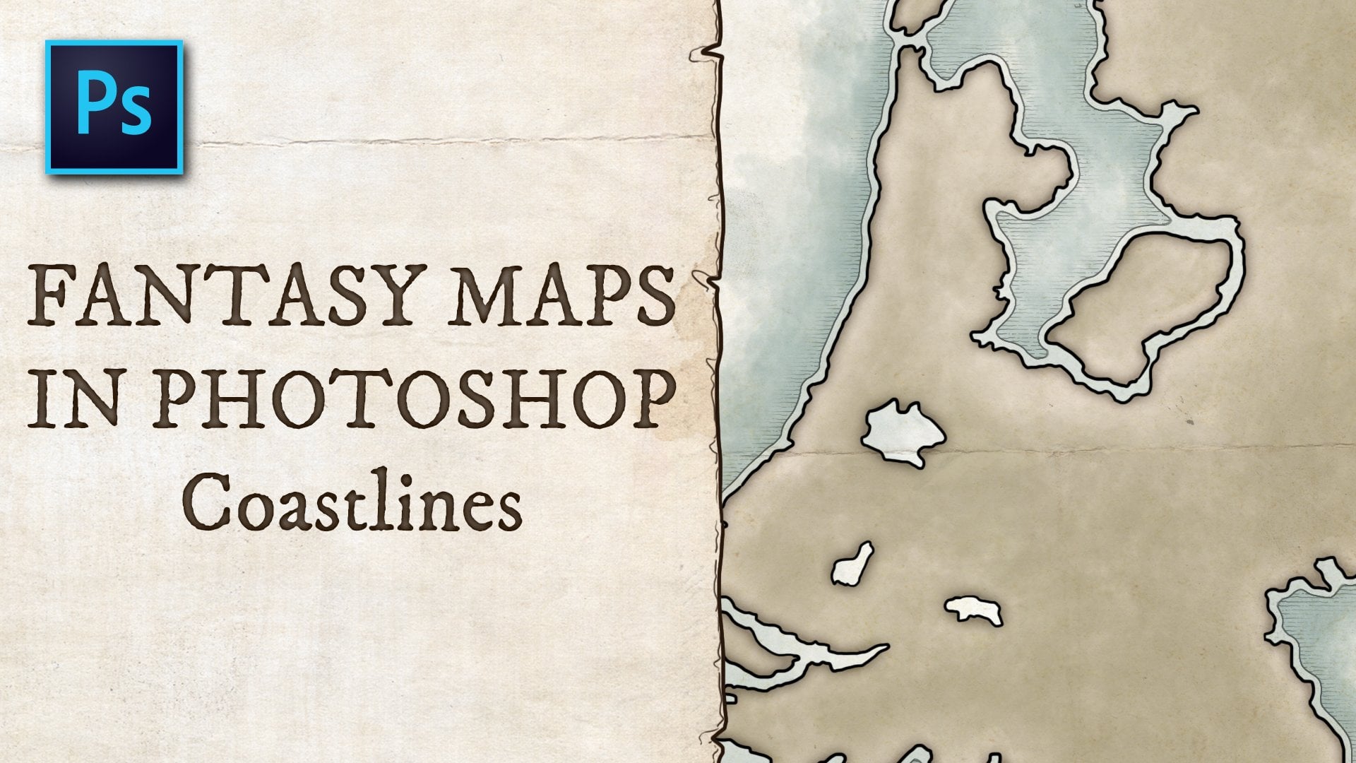
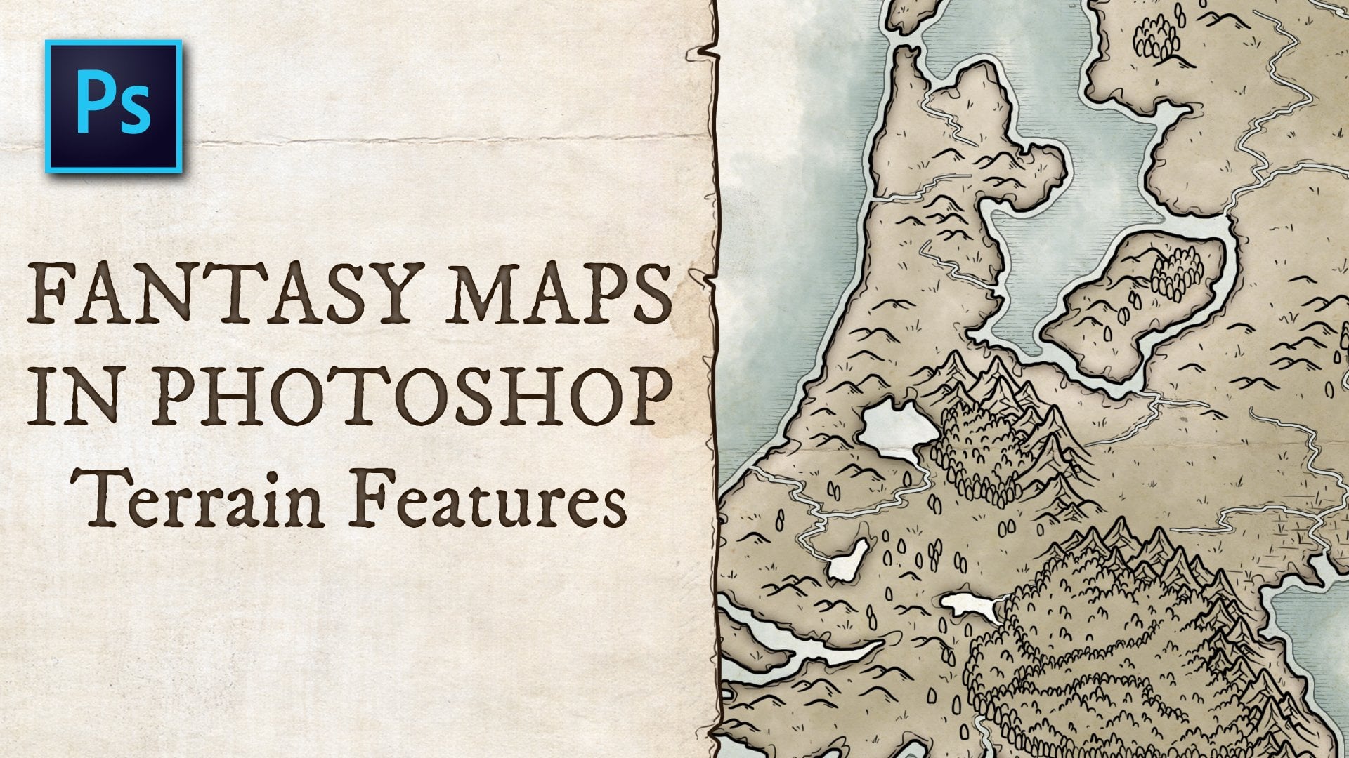
3. Terrain: when I'm moving on to the night of work, the first thing that I like to do is to draw the drain, so I get an idea of what's going on underneath the city. So let's stroll. We've been simple round brush, five pixels. Boyd. Um, it's like black for our main color. Created a new layer we'll call it. Sure, Very simple thing. That's for all the short First, just follow what would drawn escaped here. I want to come sling to be a bit rougher because this is a small cliff area. No, too high enough to impress it. But a small clip, uh, around on which the cost of this bill here we don't see coast like it's no need throwing it here again. Clip goes back to ground level or water level, actually on or back to the smooth coastline like before. Just tracing are our original sketch, so that's the shores done. Now I want to draw the cliffs so create a new layer. Cool it clips. All right now, filling by drawing sort of like layers only. So what? This you can see. It looks as if there's several layers overall as you go down that step is drawing details around the shores. So work, we're going to create a new layer and call it to rain on. At this point, I like to start organizing my layers a bit more, so we'll create a group for slayers. We'll call his group terrain. So now when we draw the stuff, we can just turn off all littering layers. Turn it back on again. Um, so now draw some details around shore. Um, I like to draw these little wiggly waves. Is that some texture to your your shores? Basing a bit more interesting to Luca? This doesn't have to be precise. Atal, here. I want to think I had a little bit and we're going to have to wrote here. So let's have let's have these two rain lines follow the road for a bit before they go back to the show. So now we've got the basics for our shores laid out. Next step is to draw some some waves in the river to show in which direction the water is flowing on. We're going to create a layer below all the other layers and call it waves and just have these waves um, followed a river and emotional luck kids, um, rivers flowing in that direction. And I want the waves to go inwards like that. This creates the idea that water is flowing. That that direction If you were to draw, uh, adding the other direction, you're suggesting that the river is that I imagined a bridge, things and sort of supporters here. So the former going to float around that? No, that is done. Let's bring the sketch back. Andi, that's let's start growing some grass because I imagined is being a grassy area. So same layer s string that's speak slightly smaller Brush four pixels is and draw all these squid here lies and you can try to show height with these by drawing the sort of like contour lines. So we have a hell right here. So this is higher. *** lower and lower on lower I Maybe here's another hill. So he goes by this on. And so and then we would be drawing the cross. Same fashion. Asked his control airlines. So that's a way of doing it. And you can show hides on your map up way later on. When we're going to shape is is going to to be even clearer. What's high around? What's low ground? Now that we've got a lot of these lines drawn, it's time to start Copy, pasting them, and I do this to save time. So let's take a bit of a growing here, selected with the lesson tool. Andi, hold the old king while selecting to move toe on. Just drag it over here. Come on. T to rotated, Uh, dragon in position like that. I'm going to select another piece. And again, it's like to move toe all the old turkey rotated. Just repeat that to just to speak the things up a bit because this can be very time, couldn't you be? And we have a city that we want to draw. I try not to do this too much and not too early on. As you see, I have drawn quite a bit of the stirring details before I started copy pasting them. And that is because that weight you won't have copious repeating patterns, or at least not this much. So that's all the terrain details. Now we are going to draw some trees on the way I like to do. That is um, I personally don't really like drawing trees, so the way that I like to do it is I drove four or five trees and then duplicate them and rotate and 90 degrees. I do that four times so that I have 16 to 20 trees that are you, so you won't have a repeating pattern, and I don't have to draw all of them. And I used those 16 to 20 trees to filling all the forests. So let's get started on a dream. Make sure we create a new layer called trees, says brush back to five pixels or whatever you were using before Andi. Let's start growing these squiggly lies. Make sure now ordered lines that you draw for the trees are connected so that you can easily select the inside when we're going to color it these away to make sure that you've got it totally enclosed. By selecting the one store and clicking outside the tree, now you can see the outside is selected, but not the inside. And that means that the tree is totally enclosed at some layers, just like we did with the cliffs. Really, by drawing some extra layers, you create some depth and the idea that the tree isn't actually flat. Um, consider this off for a second. So waking clearly see what we've got. So that's our first tree. Now let's draw its 2nd 1 similar way. Just no. Select these trees, like smooth and break into the site. So now we've got duplicates. First command T and rotate 90 degrees like type. Don't be back over again degrees and again. 20 trees that we can use to populate the map. Drafting somewhere Mo Being away. Bring back sketch on. Let's just drag these trees where we need to keep in mind that you do this acid duplicates and no, the trees themselves his way. Way Keep the original trees. No working in the last couple of trees, so I can't afford to take the original ones. I don't need to save them for later anymore. No removed this case again. Andi. I want to hide all the terrain details underneath the trees. How we're going to do that is it's like the Magic wants to click outside over trees, modified a selection expended by one big soul. Goto drains layer and click the layer mosque. But now we've applied in their mosque to our terrain layer. That only shows what we had selected. So only shows what's outside of the trees. And this is very handy tool, because this way it's still there. It's only head, and we could also have to lead it up those base souls. But if we decided to move our careers around at a later stage, that those pixels would be gone. And by removing the layer mosque that we just created or disabling it, we can still bring those touring details back. So that's a handy tool to keep in mind, not just for days, but in general. If you want to hide something, but you're not sure if you're going to need it later on, just apply a layer mask, do it to hide it, and that is pretty much it for drawing during. The next step would be to draw the houses Castle City walls, the roads, the fields finally, uh, filling the last director rain details inside the city, and then we're going to Corot. Let's hand onto drawing the city itself.
4. Walls: the next step would be to draw the buildings and is in the city walls, the castles, the fields around the cities. Well, I like to start with at this point is to draw the walls and the towers, so that's what we are going to do first. So let's create new layer called towers. And on this layer, we are going to drill or collars. Bring back sketch on Look for Tower is good for the size reference for to reference the size that we want for our towers. I'm going to quickly draw this outline on. This is just to make sure that we have this size for the tower ready. Now it's like the shape tal on. Draw a rectangle over it, and this rectangle is what we're going to to use to make sure that we draw the tower in the right proportions. We cannot get rid of two quick reference, and we've got this square, which is the good reverence for size and shape for our towers. Now we aren't just going to draw over it, using the brush tool on a dis point. It's a good idea to think about. What do you want your towers to look like There are many ways that you can design your towers. They can just be towers with open roofs and colonel ations air outside. It can be towers with pointed roots. Obviously, these are square towers, but you can also draw round towers for your city. Let me show you what I have in mind for this. So these are just plain towers with Crennel ations on open roof. And the other one is Teoh. Classic Point Andrew on. I want to go for a more sophisticated to sign in this map. Um, something like this to have got peace towers with a very steep pointed roof in the center and slightly less steep roofs around the edges. That's what I'm going for for this for this city. How are we going to achieve that? We need to know what this will look like from the top. So we've got square towers. The the highest point of the tower will be in the center. So just bring these lines in andro, another square in the center of the tower and what this square represents. Um I will show you in a minute. That's this angle, right? here because when you look at the tower from above, you would see that angle and then just bring the lines to the center, and that will be a total of two tower. So that's the design that we're going to use for our towers, and we're just going to move it into place. You can convert it to a smart object if you want to be able to scale it and rotate it without, um, destroying the pixels. Sometimes they may look that may look a bit and and just make a duplicate. Holding old dragged him to the next place where you want the tower to be on. Just go all around your city walls. This way, if you want, you can skill them up or down to create larger or smaller towers. But keep in mind that when you skilled him over, up or down, no, the lines also get thicker or thinner, so you don't want to do that too much. Now merge them all together because we've drawn older the towers for destitute bols. Now let's create the gatehouse is from the city, so I want to use this one right here for size reference on, Let's just create the base again. From which we are going to, uh, get two right proportions. Bring it to its own layer on. We're just going to trace this so we can call this layer base. This is the basically which we are going to design our gatehouse created new layer and calling gatehouse and ritual. This will be the actual gatehouse. Bring back the opacity for the base a bit so that we can see what we are drawing. And I want this gatehouse to be a rectangular building with round towers on the corners. So when I like to do is used to shape tool for that, let's draw a circle on. We're just going to trace that circle for our tellers design, so make sure that we go back to the gatehouse layer on. We can erase the parts that we don't need and just draw the outlines of the towers and again to center circles. Right now we can start growing the roof off the gatehouse. I like to go for some sort off sloped roof designed, so we'll go for something like this, very simple and go side. It doesn't have to show what the gate has Loosli, that's our gatehouse Done. Can do now is, um remove the tower guides. Make sure that we stay. Keep working on the gatehouse layer on, create a smart object, Put it in place on duplicate it for the nasty gatehouse to the north. Something that I want to do for this map is created smaller gate. I was in the West End near the docks here and here, so I'm just going to draw a very simple, small it house designed for that. This is just going to be rectangular shape. Um, it seemed to get size something like, I think this this is just fine for a small gatehouse and again draw the roofs similar to dio other decides on a bring back. I'm bring that to direct place. What I like to do here is put it on its own layer and created a smart object from it. So we can rotated without having the pixels. Except where sometimes when you don't create a smart object from a pixel layer, you start rotating it. And now we are ready to start drawing the walls. I've got a technique for this. It's it's May seem very complicated at first, but when you get the hang of it, it's actually a lot quicker than drawing the walls. I should would normally dips to create a new layer and call it waltz and bring back to sketch Foot is, um on we are going to use to line Tool. Let's say we're just going to roll lines like we did for our houses on A and we can see what the walls are going to look like. Why I like to use this technique is because it creates evenly spaced lines. So let's set these 25 pixels and sent them to black because are lying are distant to be black. So this is the outline, the stroke for the shape created. You just drove the walls like that for every section of wall. I messed that one up. So bring it back, Andi. Well, um, when all the walls are in place, we are going to after Anil ations, which takes a couple of steps to get right. But, um, as I said, when you get it right, it's It's actually a lot faster than just drawing to my by hand, so we can now hide all the sections off wall that are showing through the towers by going to the tower layers like the outside expend with one pixel on a create a layer mosque, like with it before. So we are only showing the areas off the walls that are outside of the towers, not inside the towers, so we don't have time showing through, Um, Andi. They're still showing rooted. Gatehouse is We don't want that to select the outside of the gate houses expend the selection with one pixel on. Right now, you don't create a new layer mask because it's already there. Instead, um, we can erase the area inside the gatehouse. So we in first the selection and we just hit delete, and I'm going to show you what that looks like in a minute when you press old and you click on the layer mask like you can see what this looks like. Um, it's just the layer mask, it's or a white field, and everything that's white on the layer mask is shown on the walls. Layer everything that is black on the layer mask is hidden on the waltz layer. So when you select in, I earn area and you delete it. It becomes a black area and it's hidden. It takes a while Teoh, to understand how these words and there are lots of videos online that you can see that explain this feature alone. So if you find this confusing, you can just ah, look up a video about layer mosques to get a better understanding of how they work. Now select the line to again and said it to about two pixels. We want a very thin line for this Onda. We just draw a line across every wall section like this and this area will be where we are going to draw the colonel ations. Just do that for every wall section around town on when we are done, we're going to go to the next step off the drawing, the creme relations. So right now we can merge these all together into one shape and if we want weaken, even draw. Ah merged the rules and the criminalisation layers. Together we can merged in my person command e and we click preserve the layer mask so that the layer mask is still there and we can still disable it and bring back the sections, Um underneath the towers and gatehouse so great a new layer and that layer We can draw all the lines for the criminal ations go all the way around town drilled in this way and that's going to take forever There is a way, faster way to do this. Used to pen tal click on one end and on the other. This way you could create a shape and we can make the shape a dashed line. Also, send it to center. Um, make sure that the line overlaps three entire Quran elation areas. In some cases, you might have to make a bigger ah figure. So 15 pixels will do for a year on. We'll go to the dashed the line options make this in dashed line. So did Dash will be very small for this. Um, I think that let's just experiment for a bit. 0.2 works and the gap off one is perfect, actually. So we're going to leave it like this. We set the color to black and now we've already got Ah, you got an idea of how we are going to do this. All we have to do is delete the areas outside off nick regulations later on. As you can see, this is incredibly fast compared to drawing it by hand. And as I said before, it may take a while to get the hang of this to do this as efficient as possible. But when you know how to do this, you can do it. You control walls, accumulation. Shins s so fast. Now that we've drawn all accumulations, you can select all the layers that we made on restaurant. Is the layers merged together by pressing command E Now they are pixels instead of shapes. Onda, we can, um, remove parts of it. We want them to only be shown inside the colonel ations areas to go to the walls section and selected area inside accumulations here. I actually messed up. I didn't close it. So we're going to pick the brush. Make sure that's close later on, now that we select the inside everywhere, we're going to expend to selection as previously Andi Ah, apply a layer mask to this Now it only shows the areas that we selected. So the areas inside the regulations and lines that showed a colonel ations no longer ago outside of what we've created here are our selection went out of the Quran elation area because we didn't close it. So we select the inside, we select the expansion selection, expended the selection with one pixel, and we want this to show white just like the rest. So we're going to fill our selection here with white for a shift a five to fill it with white. And now this is what this area is also shown. So when we turn off the later mosque, you can see we see the colonel ations in the area now enable the layer mosque for our for our wolves section and we can merge both layers. Preserve the layer mosque again. Bring back the towers in the gatehouse and you can see now the wolves for our town are no done. It's lesson. We're going to draw the castle. I'll see you there
5. Castle: All right, so now we are going to make a costal for arm up Ondas, as we see in sketch here, this is what the castle is going to look like. So that's but turn off the drain for now. Um, so these are the shapes that we are going to work with. I'm going to use the rectangle shapes with this, just like we did with the gate to get the right proportions and then rotated on, Go over it again to get the more natural Hendro and look for this. So let's get started. The first thing I like to do and this is something that I do throughout my men making processes group certain layers together. Um, so now we've got the gatehouse tower and wall Slayer. Unless just group us does together and call it walls. Let's create a new group and call it Castle. Mm. So that's first just just traced these shapes. So we know what sort of size the squares that we're going to make need to be. Create a new layer and call it sketch. Amazing. What we're going to do here is just traced the sketch that way. Thanks. Rotated. So that is more or less straight. So this this is what we're going to be working off. So these are our shapes that we need that's now big, are shaped, Tool said into square or rectangle said to the line. Stew doesn't really matter and just restaurants these layers on merged together called a sketch to remove the other sketched up. Now that we have underneath this, bring back the original sketch and that we can rotate back to how we needed to be. And now we've got a good reference for all the correct angles for this, and that's great. A new layer and call it possible. No. And now we're going to draw over Theo Pounds and you're going to draw creditor nations again. So and that's stood up on first. The first thing that I like to do for that it's just roll along for this center, create a new layer for that and will probably emerge that together off this one later on. For now, let's create a new layer and call it room and just draw, and I'm for one end to the other. By holding the shift key. I want you joining town and point where you want to lying to take off from, well, the shift key. Draw another point, but your president and just draw go back again to close blood. Alternatively, you can use the line tool for this and set it to about what would it be? Four pixels with a black feel, No outline, and then it will split back. This this is actually a section off wall so that this doesn't have a roof. One of the reasons why you would like to use a brush to us, because you can easily I didn't right away that you're working on it. Um, if you're using the lying toe, you're actually creating shapes instead of basil. So you have to most of those two together before you can edit them. All right, let's them all together now. Restaurants them merged in my person commodity. Let's erase the lines, Merchant with the roof lies. That's the racer lines that we don't need. And this is what we're working separate layer for this because right now we can remove everything without being afraid that we're going to remove the outlines. I see that we forgot set section here, so let's bring back the lying toe again. Just adding so much needs together with roof lines again. Raise, descend, Andrea Hyde, sketch in the walls. Now you can see that we've got the basic for our castle. Don't, um I won't influence here a swell so selective brush tool and draw a line just like we did before. So these are our rule groups on I want to be well used to be similar to what we've got with the towers. So I want a similar design where they go like this, and then you've got the tower underneath it. So how we're going to do that is we're going to add lines like these ones here. Um and I like to use to be thin so you can see that they're not super. Probably not like outlines and more like, don't just details that we're having. By now we can remove the sketch layer. I want to add details to peaks of two towers. So that's the file being that we're going to add. That's great new layer for this. Remove this section. Good. Top of the tower. No, I've got the main part of her castle. Dumb final thing that we need to do is we can either height the walls underneath it, or you can just add a fail underneath the castle. And how we're going to do that is going to her castle layer where we have all the outlines . Select the area outside of the castle and whipping the castle walls, modified a selection by one pixel, modifies selection and expended with one pixel on in first selection by pressing Come on shift, I create a new layer cold feel. Make sure it's underneath the causal there and village live white. There's no a white layer. If you turn off the background, you can see it. There's no white feel within the castle, so that blocks out everything that's underneath it. If you can see the castle walls still there, the city walls. But we've blocked him out with the white feel. It's now myrtle these things together. Onda should layer is still called Castle. I like to have all my layers named 22 of confusion on as Thick Regulations is a final detail. What this and again, well, merges with the castle. There it will create a pop, just like before the lines going through it. Make sure it is running for the center. Go to more options. Making a desk. Nine. Fitness waas A couple of one. So those are our criminal nations. And what this society, if it's nicely whipping the war so we don't need to make any changes to this. I was just merges with the castle there. Unless you can see now we have thistle, one layer, all these lines, and that's our causal. Done mixed. That would be, too, after buildings. And later on we're going to add details to the courtyard of the castle. But as something that I want to add in the final face of the map, we're also going to blend some trees around the town and at some details within courtyards , between buildings, etcetera. So that's something that we're going to go back to later. All for now, let's start laying out the buildings
6. Buildings: all right, So let's now get started withdrawing the buildings. Let's collapsed on groups that we have so far and create a new group for the buildings. I would like to keep it with a load of walls personally within the city group. So right here. But it isn't reading that her. Where is, Um, there isn't. I like to keep it blow holes. It's because that means I can still roll fruit, a castle, city walls and whether add layer it is. Let's bring back this case that we have. So I'm going to draw pretty simple houses, and some of them are going to be connected like large have sisters are joined into one units building. So there's a couple of different designs, and I'm going just going to speed this up because it's a very tedious job, especially if you want to look for a little. You can see my process. Just speed it up. Andi get started now, - But
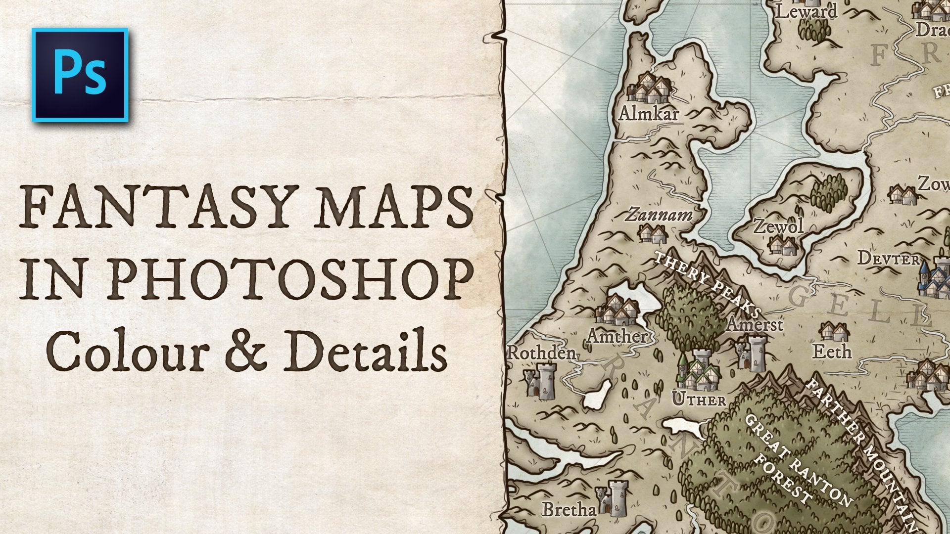
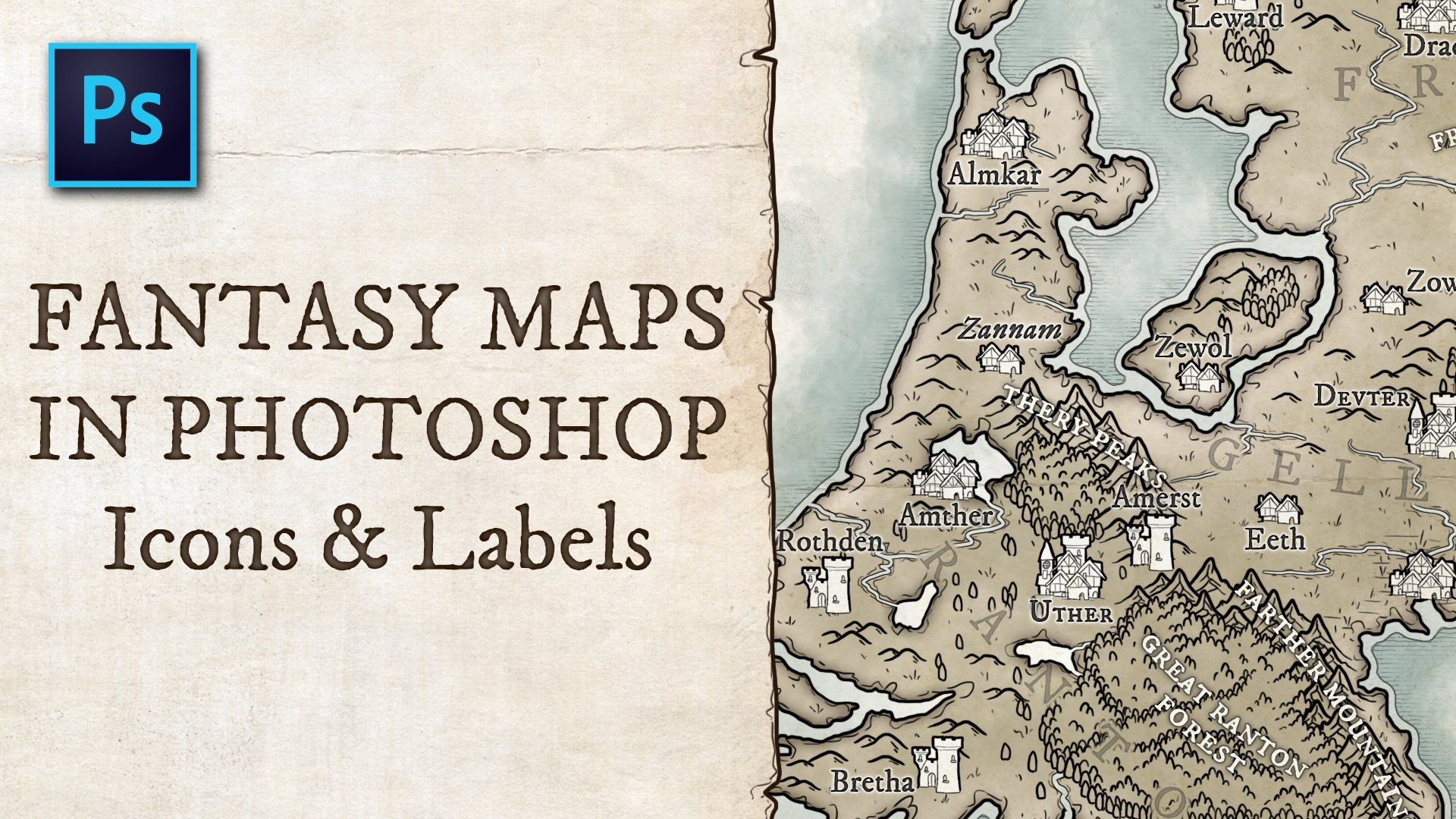
7. Important locations: So now we're done drawing the buildings and illustrate a new group and call it important buildings. Teach will be the important location. So if your city create a new layer, I also called a important buildings on this later, we'll draw old line. Art was being a bit on, so we're just going to roll the important locations of your city being taverns to blacks, move the church. Whatever you can think off locations that you warned people to to explore on the way we're going to draw This is much the same asked. We do with the normal buildings. We were going to, uh, drilled along with the basic brush, and you can add details to. I like to make my important buildings a bit mawr more detail than the general buildings, but make sure that you're drawing in the same style, making them a bit more detail than other buildings speaks them. Stand out. So it's not just that they are marked as an important building, but when you look at the map particular ones, you immediately think, oh, that that building stands out. Let's see what it is for the church. I want asymmetrical design and drawing that diagonally is quite hard. So what I decided to do is bring up the grit and used to shape toe like we have our buildings to create a symmetrical shape that will be the basic design for our church. And I'm just wrong these shapes on top of each other on you'll see that they're not think this is isn't going to be a pretty sketch, but it's going to help us make sure that when we draw over this, when when we've put in place are churches asymmetrical design. I'm just using various shapes toe check tools to get this design. I'm using the square shaped toe in the ellipse shaped hole. Finally, um, let's bring all these layers together. The tower is a bit small, so let's increase the tower a bit. Now select older ships, and we can rotate it on a scale it down so that we've got the right proportions for the for the church because at this point it's a bit too big, and around this you do make sure that the proportions are so said to do about 70% for now and district good. Of course, this may be different for your maps and just see what size work for you. We've now emerged all the layers, so it's just the outline. Now we control over that, using the simple brush tool, and you can see that for from this it's a little easier to, um, to actually draw the shape of to church and make sure that it's a symmetrical shape. It's a bit tricky to get straight lines diagonally. Practice makes it easier, but the first company, but hard and also so let's stroll the church on. Let's skip through, drawing all the other buildings. - So what I want to do now is a credit Phil Layer for every element. Right now, it's just outlines, and you can see the underlying layers through it. Chilis. Let's select a wants to and like the outside, they spend the official selection with one basil and inferred it until we have now selected the inside and his new layer called Feel and fill it with white. And we do that for the Port of layers imported buildings first, because that's what we're working on right now. But we're also going to do it for the the General buildings. Just let the outside expensive selection in first a selection Soviet. We've selected the inside creating new layer called Phil and get it white. We'll do the same for Woolls, so rules towers, gatehouse will get their own field layers. Um, and the reason that I'm doing these feel layers right now is because when we're going to color it, um, we can just call her on the field There we can look the transparency off the layer, which something that I'll go in to get to that on makes it a lot easier to color the layers that we want to color. And this is just a bit off, um, preparation for that sort of gatehouse. Finally, on we're done with Phil layers and as you can see our life to name all my layers on, not just feel but was a gatehouse feel in towers. Walls feel because that just makes it so much easier to find your layers when you needs to Final thing that we need to do for this layer, just make them important. Buildings pop out. So let's go to the important Buildings group and selective fill their that we've got for them on double click it to open the layer style, pedal a slight stroke and add a 10 pixels stroke outside and said it to white. What you, as you can see here, it's creates a stroke around the buildings on because we're working with black and what, you don't see it right now, but later on what we're coloring. This will add a wide stroke around the important buildings, which helps them stand out even better. That's it, for now, let's head on to the next lesson.
8. Roads & bridges: So the next thing that I want to do is strolled of bridges and roads. So create a new group and call it Roads On and bridges. That's to me in a bit. So and bring up the sketch. Let's see what we had. A mic for the bridge. So how I imagine this bridge is, um, two small stone balls. It's a small stone bridge, and we're just going to start drawing those two walls, draw a straight line on, bring it back to the gatehouse. That's it for this fall and then the next. That's no right. Yes, just like this. And 2nd 1 Yes, let's do it like this close to bridge by drawing a small in line and at some couples to add texture to the bridge. This way. Want look as flat. It won't just be a plane, great, uh, square, but it will actually have some details on it to make it look a bit more interest used. That's important. So let's move on to the next bridge. For the smaller gatehouse. This will be a smaller bridge, a swell bring out line and bring it back. Try to get it just right. No Yeah, this is This is good. And now, the next line. Yeah, Yeah, This looks good and close this war off. Been lying to close off the bridge on some couples to it. Final thing that we want to draw for the bridges is a line underneath the gatehouse to ensure that it's actually a a closed off section, that we can select the outside off without being afraid that we select the inside of the bridge. I'll show you what I mean. It's let's hide all the layers above and you can see that one side of the bridge is open. So we want to close that. Bring back to Gate Android Thin line just on the outside of the game. Same for the other bridge. And if we hide the buildings now, you can see that they are now closed off. We can select the outside, expend our selection with one pixel in verse art collection and create a new layer. Court bridges, Phil, fill it with white, as we always do, and now we've got our bridges in place. The next thing that I want to do is draw the roads, so let's just start drawing the outline off the roads on. You can do like the terrain with all these small, squiggly lines, but I like to do here is drawing more solid line, and you can You can have it jump around a bit, but I would like it to be solid to make sure that it's totally enclosed and easier to select on filled the inside of the road if you draw it like the terrain. Yeah, uh, it looks good. It has a nice look to it, but it's also harder to fill it. When I saw it coming, I would have to fill it all by hand, and that's totally doable. And if you care about small details, that's absolutely something that you should do. But keep in mind that it will take a lot longer. So we're just drawing the roads now, and I'm drawing you Can. You can't see it because we field our buildings, but I'm drawing underneath the buildings layer so that the road, the outlines of the roads, are one connected line. - So right now we've got most of the roads in place, and let's just select the outside of the road and you can see that you don't select inside of Europe. Um, if we would in first the selection now would also feel, um, older patches of grass between roads. So let's select all the patches of grass as well, because when we converse our selection, these patches won't be selected. Right now they are. But when we in first our selection, they won't be. So here's a leak somewhere. Let's find out where it is, right? That so fix that and, uh, and let's continue selecting. See if there are any capsule here. Here, here. We forgot a patch of grass, so we'll do that later. Here. We also forget the road around the docks. So, yeah, let's do that right now. I strolled up. Go in there and as you can see, things persons takes a little while. It's not the most interesting part of drawing the city, but ah, doing it this way allows you to once a worthy outlines, heart drawn to quickly select the roads and fill them. So in the core ing stage, this will be a lot easier. That's also draw this road that we forgot to draw on that c we're leading out of town. Let's speed things up a bit and let's not select the outside. Yes, this is enclosed so well, just had onto the field layer. Right now, I feel roads feel first of selection, and Philip were That's a gray so that it's easier to see what we feel at the moment. Make sure that to fill their is below the road slave. So now you can see that we forgot we didn't feel the section at the docks. Beef cuts. We've got to enclose that properly. Select all the batches of cross. That's what we're doing now. Expend our selection with one big soul and delete that from the field. Now we've got older roads, cards exact for that back a bit around the docks, we forgot. So let's close that snooty outside one of my spend one pixel. And first we're not going to feel everything. We're just going to feel this with a brush Philip of White. And that's the roads done for our map. It's finally fixed this bit on. Then we can call this section of the map. Done
9. Docks, trees & fields: all right, let's no start with drawing final bits of Leinart where we are going to draw the docks. When we've drawn those, we are going to add some final trees inside the city and filling the bits of terrain between roads that we left out earlier. So let's start with the doctor in and create a new group above roads and bridges. Call it docks. That's the real A bit on. Create a new layer called docks. Um, that's, you know, a having sketch for a So just draw a straight lines and you can You can draw docks made of what you can draw docks made of stone for a city of this size are thing are I think I want to go with planes. So that's the docks we can know selected outside of it. Using your wants toe. Select our in selection with one pixel, expanding it. First, a selection creating new layer called it docks. Phil. Make sure the layers below delight our fill it with what Now? We don't see the shores underneath it. Select a small tree for this copia and create a new group inside the city group, and that's call it trees will do that above the important buildings so that you can show that the trees are taller than the buildings. But we do with below the walls in the castle. So this shows that the castle and the walls are actually dollar in the trees. So original group call it city trees. This way we won't be confused. City trees credit new layer called trees based the tree that we just cos I think this one is a bit too big for inside the city. So press come on t and shrink it to about 75%. Now we can make duplicates of this, uh, 90 degrees and degree angles to get some variation. Let's make the buildings slightly transparent. We can clearly see what trees are. I'm just spread them around, um, the city where you want them to be. So this is in the open areas where there are no buildings or not in law. This this makes toe. This adds a bit off, you know, flavor to the town doesn't look as dull as boring as it otherwise would. I used to live in the city. I moved a bit further out on Dhere. There's lots of trees, lots of green. And I actually love it. Tell me. And I like showing that in my mouth's that more cosi feeling, you know, having at least some nature or parts spread around my maps. It doesn't have to be everywhere. Um, you can leave some areas just open. So I'm thinking I'm going to keep this open. Um, let's see. Yeah, I think this isn't maybe one but this to around nowhere. Churches on this one go here. Yeah, I think that's make sense. And again do the same thing that we always do. Select the outside, expend our selection with one big soul and in first that selection creating new layer called Krys, I feel fill it with white. Make sure that the layers underneath the line are We can bring back the buildings now to fool opacity. And I've got some trees scattered around town. It's not a lot. Most of this town has been, has been filled with houses, pretty much to wards its first extend. Um, but we'll have some trees coming her scattered around, you know, So it's time to go back to the drawing. The terrain features that we left out at the beginning. That would be the one between the buildings and the roads on. Keep in mind way we're going to use the same four picture brushing. And keep in mind that this is the high ground with the cliffs. Um, and sit in rivers are the lowest areas in this map. So the high ground goes like this. There's a hill. It goes down in this direction direction. So we're working from high, too low. So that's also the direction in which we want to draw the grass. Even within the city. Let's pick that four pixel brush again on start drawing these strange. So that's the final bits of the terrain. Don, let's now do the last bid or blowing work that we're going to do for this map. And that's the Fields. Fields are actually very simple. We're just going to draw the outlines off the fields on later on, or we are going to color the map. We're going to add some texture today, so for now we're just during the app lines of the fields. Let's get back to the city Group on. Let's see, I want the fields to be at the very bottom off everything. So put it below the roads and bridges group called his group fields create a new layer Kulik, Fields and Dinges with a small five pixel brush This start, Roy, make sure we for black and white selected as our colors draw the outlines of your fields And these fields. They are an important part of the town. Chili much. Many people forget to grow fields outside towns of cities. Many people forget to draw fields outside of dirt towns in cities. Um, but actually, you need miles and miles fields to support a city like this. Uh, there have to be fields nearby. And those fields will provide food for the people in the city. Even if you're drawing drawing just a small town that will need lots of fields to support it. I don't know the exact numbers, but you can usually look at a own well building for forums. But it is something to keep in mind. Um, of course, it depends on what sort of city you're drawing. What sort of people are living there? Uh um My no, always be necessary. Um, depends on the technology of your people. It depends o R the way they live, you know the culture, but it's something to keep in mind on if you leave them out. It's best if it's a conscious decision rather than that you just fuck up to Adam Bernice. That's the way that I think about it. And let's create Phil Layer service like the outside of our fields. Her extend our selection with one pixel in first, a selection to create a new layer. Call it fields, fill fill it with white and make sure it's below DeLorean heart. I'm looking at that right now. Hi, Sketch aren't think we are ready to move on to the next step and start adding to flat colors for our map. Very excited to get started on that. I hope you're too. So I'll see you in the next lesson.
10. Flat colours: When I start with having colors, I like to work from the bottom up, so that's going to water layer now. We don't have a layer for the water. We can do two things. We can add a color of the water to the background. Or we could create a new layer for us and that's just created your layer water. And just to make sure that we don't compute it with loan work, let's call it water color pink and blue. I've got a basic color palette and I want to use feel free to copy these colors. Um, I opened the color screen for a second so you can see what color I'm using. So this is my blue for water. Um, and this is just basically or we're not going to do anything with it right now. As I said, we're going to lay out the flat colors just that vestige on. That means that will not go to act shading or details yet. We'll do that. Any mess. Listen, um, supported Toray. We want to select everything inside the shores. So what I actually do is, instead of selecting every bit off the inside, I'm good specked it outside as usual, I spent selection with one pixel inverse that selection crazy new layer cold during car and get it with white. So this is our to raise. What we're going to do now is we're going to look the pixels of this layer. You can do it by pressing this button. What that does is that transparency off the layers is now lots odor water area. Those are transparent exults. You can see the underlying layer off at the water through it the terrain, the pieces that we just feel Those are not transparent, those or wife. So what we could do We can change the color that looked a transparent getting that allows me to just begin large brush drool over it. And I wont have to worry about coloring water. You could also do It is by creating a selection, but I find his future. Next is the cliffs we're going to droll. Listen what you see that we cannot selected if we don't get looked at Leinart and the actual cliffs layer is behind all the other Leinart here on this is what we got. So this is not a enclosed Bill Leinart So what I'll do is ultra. Just make a selection off the terrain, color by command, clicking on the front wheel. I will not create a new there for the clips. And we've made a selection off the terrain layer so I can only draw on the terrain. No, on the water. And that makes things a lot easier cliffs color so that we're confused on select a great what? Distinctly playing grave? A bit lower. Mm. It's all right. This? I guess so. This is the color that I'm using for cliffs on Bring that are brushed with a decent size. Um, Phyllis, What? You can see, we've also drawn over the shores. Um, what we can do now is select a shores layer on. Really? What? That slashing clips cold. So now we've got the basic color for the cliffs. Later. Um, a little thing that we need to do is to treat It's like the outside of trees. And this is where it comes in handy that we've made sure that the trees are all enclosed so that we can select the outside, expend our selection first that selection. And now we have selected the inside of the treats creating new layer called trees colors because green that we want for that and this is agreeing that I'm using for the trees and just I showed it to treat color layer is the load line more? And that's the trees colored Now, if the trees trees were no enclosed and we wouldn't be able to select the inside on, we will have to draw every treat freehand so there will be a tedious process of drawing inside to tree and every pixel that we call it out side of it. We would have to raise again on, and it wouldn't take hours to get a only the trees color. Now let's move on to the fields. We've already done a feel for that. So what we're going to do, IHS, I love that layers that we could only draw on what was got there and see what's in the inspection for, was it not for for someone like here, I think, Yeah, I think I'm going for this one from using this color for the fields. Next up our roads and the bridges again look the layer so that we can only drawing roads on big color for ropes. I think this one will being nice colors. Yeah. So they using discolor for the roads. And that's a lot of transparency for a bit to control castle court nor so that we conclude , is as well I imagined out being sort of road like a swell. Just a large square, uh, locked a later again for the bridges are one does to be made of stone. Something similar, Teoh The color of the cliffs. Um, look, the transparency for does um just letting the color moving up the dopes again locked his transparency. That's what we're going to do for all the layers. So we'll keep on doing that. I just have a Bronco. This is the brown, and I'm just in for the docks on. I'm also going to be using this color in combination with another color for the houses buildings. So look to transparency again. And what I just said, I'm going to be using the this the previous color in combination with the letter world for the houses and what I mean by Diaw days actually going to have one color in the foreground I should see here, and one in the background which is currently What? So swat those around by clicking his arrows? Well, President s keys. Um, that's like the darker at the difference can be pretty salary, but lighter in here. Something like this. So these are the colors that I'm using for the houses. This is the light color, and it's just a darker Well, I'm good. So make sure that you've got the lighter color in the as the foreground color and the darker color is the background cup Auriol away around. Just make sure that you've got both of them. Now go to color dynamics. Make sure that this is until six and put foreground slash background chitter to 100%. I don't need to control this. Just you know, what this does is that every time your drawer it begs the color between do that you have selected, so you will have light and dark colors. And every time you call her a house, it gets a new shade of overall. So the reason that I use it is because the city loose way list, uh, morning from mountain, an accident of variation that look every buildings to sing that somewhere. Maybe more weather than all the others. Um, later on, I'm going to manual. Change this a little bit. I'm going to have the houses in the slums a bit darker, and I want the houses around the castle to be a more reddish brown. That's things that I'm going to change afterwards. But for now, I'm just going to use this to make sure that every building has a different color. This is something that you can use for the trees. This well. I think the trees in this map arnold a very important part of it. But if you are doing a forest work so obviously instead of Brown's, you expect two shades of green that's holding colors for buildings, Lady. The next step is, as I said, do at some color variations to different our district. So let's start with batting some variation today into the slums, and we will not to be a bit darker, so that's selected by drawing a selection around with lesser tool on open the U and saturation on by person. Come on, you, um, let's see. A wanted to be a bit darker, but still situated swell something. Doctors for the Sloane's and I wanted down no district around the castle to be a bit more banish. So that's all these building, uh, run here, I think. Jesus. Well, sure I'm not selected any other buildings show that ripped? It's this election year. All right, so this looks good. Now open the same panel again by pressing. Come up here on with this slider, you can changed clone. So if we bring it the saturation up to 100 conceded not These are some orange, uh, colors. So let's bring this back to one same or reddish room and bring this back to zero and saturation so you can now see any. It's more all right. It's a bit too strong for me. The difference. And let's bring this back to you one in minus 10 Pink works. It's all resume out. This difference is very subtle, but it's there. The same goes for him slow. It's It's not like an entirely different color from your Estes town, but it's it's there is a bit different. It's a bit darker, and that's what I want for it. Umm so next next thing that we're going to color are the important buildings, and we're going to use the same colors on the same techniques this we used. So bring, like, other brush on Mr Drawing. Make sure that there is a looked. These buildings are slightly more detailed. So Well, I'm afraid some people here at some great around it natural to to show stonework. Um, here. We need to clear out. The courts are just go around town, make sure we didn't miss any. The important buildings. Blacks move something else. This church here. And then there are barracks that for the barracks I want to, um, to have a red roof, actually. And I'm going to take the color for that roof. Rome. Another bat. And that's this one. Um, let's see. Oh, this color. To make sure that we turn off the color dynamics to this, I'm draw Dhruv. And again, we need to make sure that you re clear. Fill in the courtyard later. All Andi, that's the ruse. And for the walls. I want to just I want to select a great cover again. So perfectly confident we used on the bridge in the kiss. Uh, let's just feeling the wolves here. It's gray. We're going to remove the color inside the courtyard, so go to the important buildings layer. It's like I want to and select the inside barracks to courtyard extended selection by one pixel on his lead to believe pixels in the courtyard. On just a quick look. I believed us. Pull our reporting buildings kind of high, everything else just to see just going right here. So that's all the important buildings that we've got locations of interests so we can continue by lowering the city treats. But do the trees fail? It's like the tree color again look, the transparency of the trees layer and just things Them green pulled the trees inside the city snow and look off the sodas Look very quickly, not of wolves won't feel collected transparency. Get our great for again on just trona walls. Well knows gray. The towers feel these large towers may no roofs, and I wonder. Rules to be red is well, go make sure that we've got to transparency locked so tower stone and only gatehouse and stuck to transparency and colored and moving to the castle looked and transparency of the field layer and colored roofs right here. We want the wolves to be gray. So get over here. Be sure that we've got this gray instead of red. And right now we have a lot of blood colors. Lady on. That's it for this lesson. The next lesson. We are going to start adding some shading and some texture to the train on the houses, The structures forward to get started on that, I'll see you in the next lesson.
11. Shading: So right now we're going to dive into them up and start shading. Um, I'll show my entire process, but basically what will be doing throughout the entire process of shading is taken based color. The flat color that we just drew create a new later on top of it called shade septum, blending mode of that layer to multiply and created clipping mask so that it's over the flat colors. Well, don't pick the base color. And when we draw on it, a creation eye shadow attacked. And that's thanks to the blending. But you can see that it's blending mode. Um, makes different layers interact with each other in different way, and a multiply blending mode is a good one to create shading with, um, on and off, using some slightly different techniques for out the process. But basically, that's what I'm going to do just at this stage. So right now I want to Chris, select this brush the ink blot brush in the area of the river. That's that's the the area where the river is the deepest. That's why it will be the darkest part of the river. And when we're going on to the next stage of adding lighting to the mouth well, actually, at some highlights around the edges on the waves for just go around. And as you can see, I've transparency set quite low to 25%. So I just built this up with layers, and the more I draw on, a single Spartans are hurt gets, and the deeper it looks now deterring color, creating new layer cooling shade. And by pressing old you can create a clipping mask. Students clipped over the terrain color. For this, I'm going to use the same brush but said it 30 pixels and sent transparency too 50. What we're going to do right now is for all the grassy lines that we do on the lower side, so decide where the small squiggles are pointing to. That's where we're going to draw a shadow. So select the cross color. Make sure that we set our layer to multiply. Just go across parts terrain like this. That's all the details for the terrain. Don. Let's head on to the cliffs. So there's a new layer above cliffs, color coded, shaded in critic clipping mask and set the layer mode to multiply on select a heart round brush at 50%. Opacity on below. Beach off. Make sure make sure that you have to cliff color selected on below each lying Draw a shadow . No. Select the Grady in tow and makes sure that it sets to radiant thing Among the 2nd 1 from the left. Andi, you control What that does is let me show on a new layer, you radiant burst of color from the sent you can drag How big you want it to be on you consent to the opacity lower And that way you can create a Grady And of course, and I like to use that for shadings was select a gray said this to 25 to multiply and along the bottom look way are going to at that subtle, brilliant so that the bottom end of Kate is significantly darker, I hope. Now let's move on to the trees There is a new layer called shade that is to multiply on, pick the tree color, then the hot round brush and in the bottom right side. I want to create a shadow light source in this map is coming from from here. So, um, this part of the dream is going to be touched by light, and this part is going to be in the shadow. And that's the same for every tree so considered A when you're drawing shows, moving on to the fields credit new layer called shade and what we're going to do here. As I said earlier, we're going Teoh to show the texture off the fields. Wave shading. So what we're going to do is we're going to pick that in broad brush on set it to 100% capacity wave pressure, sensitivity for opacity turned off. Make sure that you have transfer and this man you turned off as well you can get there by clicking this brush on. I can, uh, decrease the size off the brush to about this. Picked a color of fields and again set the layer to multiply. Make it a clipping mask on. Draw over it like this. I want us to be a bit lighter, such as opacity to 50%. Yeah, this is good on the way that you should lay this out is the lines in the field should go in the area. Um should go across the length off the field, so the longest end. So I just feel these fields any like this. That's because shaving for the fields done on right now let's move on to the roads and the bridges for the roads. Let's create a shade layer. Pretty clipping mask started to multiply, and she liked the color enough we have for our roads. Um, I just around the edges droll. Make sure that the edges of the road are a bit darker. Was have to be to, um, too much coming pretty. So just to add a bit of texture on to the bridge is for the bridges Were going to use a hard brush again. Um so select the heart brush. My face is said to 10 on Consider where the shadow was coming from sort of direction. Delight is it's coming from there. So there will be a lot of shellfish cast on this bridge. Actually, I guess small shadow are, you know, just here on saying for this bridge on this type large coming from here. So this this rich here is actually going to cost a shadow. And I won't be a shed on December to bridge on from hero. We're going to use this same technique. We're going to do everything with the heart. A round brush for the doctors, the buildings, the locations of interest city trees of walls and the castle. So from now on, I'm just going to speed it up. You can see my process, but I've explained that what I'm going to do in this shading stage from now on.
12. Lighting: So with all the shading now done we had on to the next stage, which is adding lighting to the map on. We basically do the same thing, except we don't work with the multiply blending mode, but with this screen blending mode. So let's just start from the bottom up again, starting with watercolor, create a new layer above shade and calling light. You get created clipping mask and said that blending mode to scream. Let's let our water color again. Our Anglo brush again. They bit smaller and ready edges start adding some so lights take it a bit lighter, so this way you can show that around the shore. So after the river, the water is a bit more shallow on. You know, As you go more into the center of the river, it becomes deeper around the docks. You can show that it's a bit more shallow. Next step is to take our waves layer. Those are the small wrinkles, uh, Brinkley lines in the water that's at a color overnight and make it white. Uh, no. These lines aren't black but white on a that blends in nicely Blue Mason look more like water and that's it for the water. Now the terrain color. We're going to do that same thing again, but instead off adding shading below the grasslands. We're going to add lighting above to cross lines so select are in block. Said it, too, for two big souls again at 50% opacity. Andi create a new layer above shade, called it light credit clipping mask instead of blending motive screen on just at lighting above the cross legs. And again, we just go around like this. So I'm just going to speak that up now, so you don't have to watch for the entire process of me adding these highlights. But eso that's older terrain shading done. Let's now move on to the city. We can leave, the field says they are, and the roads to you might. You could decide to act. Some highlights around the center area, so big in broad brush, make it a bit smaller on credit. New layer Call it lights. So this way you can add a little bit more texture to the road for the bridges. Speak the heart round brush again. Five pixels graded layer called Lied on said it to screen big to write color on, just draw light on the actions that would be catching the light. So that will be coming from this direction again. So catch these these sketches here and I made, you know, be some stones lying around. All right, on again. I'm going to move on, hand on shading to the docks in their houses. Um, for the docks again, Just been lying's and for the roofs, what I like to do is to, um, at a highlight around the top of the roof. So that's it. This this scream just just at a highlight like this. And it actually does enough to show that this is to talk off the roof. Um, and this is the area that that's catching the life. When you zoom out, it helps pick up the roofs. Um, you can You can go and shade all the rooms, like like when did but shading. But with one with one side shaded and the other one unshaded, we've already created that contrast between dark and light. So we already we've already shown what psy catching the light on what side discovered in shadows. So there's really no need to draw. Once the light on one side and just this showing that the roof there's the roof line, which is catching the most life. That's that's That's basically enough right now. This way on the roofs, killing a little flat. What you can do later on is a texture brush. Go over the houses.
13. Cast Shadows: So with the shading inviting done, it's no time to add some final finishing touches. First thing that I want to do is to add a bit more depth to the map by adding cast shadows . Um, what I'm going to do is create a layer underneath all of this. This So what we're going to do is we're going to create a new group and we're going to call it cast shadows, create a new layer called it cost shadows, and I was like their heart around brush make it bigger. You can draw nice blocks of shadows, select a middle gray color Eso. I like to use this one for that and just roll the shadows on. You can do this afterwards. You can do it right now. I like to do it right now. You can change the blending mode just like we did before and set it to multiply. So you get an idea of what it's going to look like on what we're drawing now is the shadows that are caused by the buildings, the structures, towers, walls. On. This way you can create a lot more depth to the map. You can show this is probably the most obvious way of showing where the light is coming from. So it's it's important that you keep consistent with this. Um I have my shadows going diagonally in this direction. Add approximately a 45 degree angle. Um, and it's important that you keep this consistent minor. Um, you know, if you let it slide here, and there is not too bad. But if this house would have a cast shadow in that direction and this one there, um, you know, you can see that things are getting very confusing, will be even more confusing is if this one has to shadow there, and this one there, then there would be no clear light source. So try to keep this consistent on. You know, with these shadows, you can also show this size of buildings. But there's these tiny buildings have shows like this, so this chapel would probably have a larger, shallow on. You know, this dis church. Thus these domes have shut it like this. Then the the main structure to church should be pretty big. And then you have to tower and you know, from the top down, you can't really see if This is a very told Tyler. Or if it's a more modest one, you can see just by drawing in itis Right now we've made this tower super toll. And if we draw the shadow more like so it's a very modest with my just our very modest, very low. Um So what? This You can also shape your buildings and should just what they look like. How how told they are And I personally like Teoh, keep this pretty rough not to detail, but you can consider the exact shape of your buildings. And how exactly would that shadow look like? For me, it's This is just a small detail to add a bit of depth to it. But as you can see, I don't really follow the exact shapes of to building. It is something that you could do could consider. And you do the same thing for the towers. Of course, As you can see, these are pretty big tower. So the shadows would be pretty impressive compared to the houses. Um, And is this massive castle tower? No, just looming over over this part of the town. Um, and to support issue, you could actually go back to the to the buildings layer and add that shadow. This entire area is covered in shadow. You see what difference that makes Didn't this way. It's covered in shadow, and this way is just as it normally is. So you can see it clearly does make a difference. Um, and it is. It's nice to be trying toy around with database, see what sort of effect you can create pain of the same for the trees. Um, awesome. Shown here on way, are working on the in the city Citigroup because I want the shutters to go over the road. And if I would place him in the drink group, you can see that the shutters would be underneath the road so little it would take a lot more work, but no for there for the trees. Just draw the shadows around and she should be a little bit more careful. Don't with with the buildings, but it's not too bad. Um, so I'm just going to speed that up now on. Get back to you when this is done for drawing shadows, next step would be to add labels to the map, so we're going to do that in the next lesson sooner
14. Labels: so the way that I want to go and label this map is by adding numbers on top off the city and then have a reference key where each number as its descriptions, the number one will be the cause. Soul number two will be to Coastal Square that you felt the barracks and the church and the ends and temperatures etcetera. Um, so the way I want to do that is by first putting down the numbers. Let's create a new group for that and call it Legal's on in the labels group. We are going to have to groups that would be the key on the numbers. Create a new group, call it key, put it in the labels crew and in the other group and called it numbers. So we just go. We're just going to put down to numbers right now. Select the type of tool for that, and then you can click anywhere on the map on, and you can write text there. In this menu, you can change the color. Change it to white for now on. Let's make it say one. I'm using this form on. Set it to italic on Let's this size to about 20 for this number one is to costal number 22 is to courtyard number Pretty is the castle square Number four. Step barracks five, Mr Judge, and just go around your city like this. I like to do it in some sort of order from the top down or from, um, along the way that players might come across it from left to right in a way, just just in a way, you can kind of predict where the next number will be if you're going across it. Um, sometimes that's not possible because the locations are scattered throughout the city. So it just got to find something that works for you. Um, yeah, this is This is a way that I like to go around about it. So I'm probably just going from the castle way down the city to the south on dMarc. Any locations outside the city can also more district's this way, unless let's use letters for that. So we'll start with ABC until we've labeled all the district's, um, start by this area here, which will be the government district. Let's not have a metallic but regular, but this be probing old town, See will be the dogs. Dean will be the merchant district. He will be the slums and f will be, Ah, district Gold South Bend. Now we've got old numbers and letters in place. Let's create. So as you can see, some of them are a bit hard to find. We know where they are, so it's probably easier to find them to spot them. If you don't know where you should be looking for them, it can be hard to find them sometimes. And what we're going to do now is we're going to add markers underneath them. Before we do this, we need to set old text two black for a second. Andi Crazy new layer underneath first number Eckel it markers. Make sure it's below the first limber. And now let's draw a circle around our numbers and make sure that it's large enough for older numbers to fit India Circle. What we're going to do is we're going to select the shape toe, make sure that it's set to lips, set the field toe white on a stroke to black, have it about four pixels wide stroke and make sure that it's aligned in the center. Now by pressing holds old you control circle from center. Let's draw a circle around five. Keep in mind that we want to be large enough for five to get into it. Something like this. We can now duplicate this shape, removed a still from the duplicate and removed a stroke from the original. We've now got Phil on its own layer on the stroke in its own layer. Let's drag this around by making duplicates of it. Press hold down old and just drag it. T cover every number. All right now, Merck's all these shapes together, but selecting the mole in present. Come on, E. I make a duplicate off it person. Come on, Jay. We've not a two layers for one of the for the duplicate. Let's remove to feel it's a weight that we've only got the under outer stroke. And for the original, let's let's remove the stroke. Now we've got a feel on its own layer and a stroke on this own layer, and it'll come in handy later. While we want to add some effects studio. The next step is to create the key. Let's start by selecting the type tool on and just write down all the names off the locations. So let's start by it. One. That's just click here. Make sure that we line it to the let and one will be. Castle two will be courtyard, the Castle Square barracks, pure library, double down in and tavern. You keep it unless you can see this is quite a bit longer than the rest of the names. So for now, I'll leave it like this. Maybe at some point all put it underneath it so that it would look like this and then continue on to eight. For now. Let's just see how this list turns out. Eight is de stay a while in intent. Burnt The Merchants Guilt Thieves Guild Blacksmith Shrine to Let's come up with a name for to go here. Um, we're us. So that's our list. What we can do in this case if it's in nicely, but which can also do, is let's put that list right around here on for now. I didn't find it disturbing that double down in and Tavern name is so long, so we'll just leave it like that. Otherwise we could say that we make it bring it down. That may come in a little. Do the same for. To stay a while in a tavern and analyst would look like this. Next part would be to label or our district so at one blank line and write down a, um, government district. Old Town docks, merging district slows and was the south. And right now we need to add a background to this to make sure that it's easier to read. So let's select are shaped door and drag a square around it. Leave some area to decide on. Well of now we can reduce the capacity of this a bit to make it blend in with the map a bit more. So let's say 50% and just move it around a bit until we find a spot where it looks good. I think well, right here is perfect that we've also reserved some room for a title right of here. And let's add that right away, create a new group called Title and our map will be cold. The city off twice. Let's set the size 2 50 for the main text in them. For twi riff, let's send it to 100 I want this to be a regular text and old camps. A line in the center at the leading should be 75 85. So I like some distance between the city off and the name of the city, but not too much. So this is very compact, very easy to read. Um, the only thing that you see here is that it some of the underlying elements, these buildings and these lines are a bit confusing. So what we can do now is add an outer glow to this, though click on the text layer go to outer glow Andi and a very light gray color. I used this color and said the blending motor luminosity This way it blends in nicely with the background colors. The size is good for now. You might want to toy around with the size because that greatly depends on the size off your compass. What works? So just tell you around with the settings to size under the range, the jitter, maybe opacity, so I'll just send it back to what I had 100 size and 25 range. Andi, That's the labels for my map Stop member Dumb lads not move on to next lesson, which will be finishing. Touches some details to make the line work. Pope Some details to make the map look a bit more weathered. We're just going to take a look at that on. I'll see you there.
15. Finishing touches: What is next lesson? We're going to Assam. Some nice touches to are lying worked away. Make it to make it stand out a bit more to make it a bit more interesting to look at. Right now, it's just blame black, and we're going to add some color to it to make it blend in very nicely with the map and the underlying colors. We are also going to make the text a bit more interesting. There's not a lot of texting this map, that just a title. The key on you know, the numbers. There are not a very important part of the map. They're not very dominant part of the map, but they are important, and just adding some effects to it may help them blend in very nicely. Besides that, I want to discuss with you how you can create in nice, nice, very simple but nice looking border design to give. The impression does that this map is actually drawn or painted on a texture on that lends a lot of character to drum up. So let's now just get started on started coloring our life. The way we are going to do that is actually very simple. Um, we are going to go to one of our line work layers. Let's go to the trees layers at a layer style to down by double clicking on the layer and select color overnight. As you can see, this changes to color off the line art. What we are going to do is we're going to make this a very dark gray color. This is one that I like to use for this and said it. The blending mode to luminosity now said the film owed off the layer itself zero. And what this does is maybe you can't see it in the video. If you experiment with it yourself, you will prop. Probably see, um, this soaks up some off the underlying colors, so you have a very dark shade of green as the outline for the trees on it does this with everything. So we can just copy this layer style by right clicking on the layer and select copy layer style and paste it on all our line Ardley layers so terrain pace, layer style and again, it soaks up some of the green color of the group across, and you had a very dark green line are and do it for the cliffs pace layer style. And here you'll see it's more of a grayish tome than we get here on and for the shores paste layer style. The waves are white. We're going to leave us as they are. So that's it for littering Lee players in our city. We're going to do the same thing for the out of lines for the fields pays the layer style on. You can also just select multiple layers off course. So it bridges lying art into roads, lying arts like both of them paced layer style. And there we go. And what this does is it looks a lot softer. I like. Right now, the lion heart is very hard. Uh, this way it will lose just a lot softer and look more blend in with the map on right now you might see it. Or maybe you don't actually see it. Uh, in this video, it soaks up some of the underlying color. Now, there's one downside to this, and that's if you're dealing with very dark. Curbs on the line are actually gets lighter than that color itself. That's when you see with the castle here in the shaded areas, the Leinart gets lighter than the actual colors, so here will have to play around with it a bit. We can either make the color darker. So this seems to work. Or we can, uh, meant to shading a bit more subtle like this. Some 5% maybe still no from right. So 50% seems to do the job, and right now it looks a lot softer. So that's a first thing that I like to do with my maps, everything blessed together and a lot more as I said him a loose, a lot softer. So this is definitely something that you want to do. Next thing is to, uh um to make the text blending a bit more for this. I want to use a very dark shape ray for my text. So detects will be, um this is very dark gray color. This is the color that I like to use for it. Andi again, you might not notice it at this point, but when you changes back to black, it looks a little look harsher. Nothing that I like to do is to add a inner glow to it from the center. Um, very subtle, about 35% opacity and just reduce the size to a point where you're just starting to see. It's very subtly. So you start to see is these white areas within the text, and this way it looks a bit like it strong with thing. So 10 pixels will work at this ice, and we can copy this layer style again and faced in full in numbers. Make sure does our color in brown s well ended the same for the title? Um, we already have a layer style attached to it, so we don't want to just pasted order. Watch would lose did this outer glow. So let's manually add that inner glow can be a bit larger for this one because this text is , um, the text itself is larger and again said it to a very dark brown. And there you have it color. The text mixes blending, just like with the Leinart we've blended in detects a bit more with the map. Now let's do the same for the markers, and that's why I captured the outline and a feel on a separate layer. We can now go to the outlines and change it from black to dark brown. And the other lines of the markers that you see here are now dark brown. This well, finally, let's do this thing for the key. We've got the key here on Let's set the outline to Dark Brown. On color wise, I think that's all the finishing touches that we are going to make to the mouth. Next thing that I like to do is again make our buildings stand out a bit more, and that's adding another outer globe toe old older features of the during the trees, the walls, the towers, the buildings. Now what I want to do for that is, let's go to the castle, go to fill their. So that's the base color layer for older, all the elements at an outer glow off about 50. I think that seems to be too large. 25. Maybe I make it very dark brown again and again. This is something that you can tell your out with. See what works for your map at the size that you're you are working with. Um, I think this is what these are just setting, said I'm going to use for this map on. We're just going to paste this copious layer style and taste it on a lower Phil. There's so pretty gatehouse field towers, field waltz, feel paste, this layer style. Andi. This adds a very dark brown outer glow. Cool all our elements. Trees. All right, so now that's done. Finally, let's to the very last thing that we were going to activities map and then it's actually done. Let's add a border. And with border, I mean a a frame for a month. We're going to put it in. And as I sat, we're going to add a border that's we're gonna make it look like it's it's hand drawn on some sort off party. So how are we going to do that? Creating new group. Call it, um, border. There's a new layer and cooled a border. Now we are going to pick the brush, the ink blot brushed up we have, and we're just going to color pinches white and machine. What shouldn't do this to regularly? Because that way you're going to lose that hand drawn effect. Just go around and she's like this African. See, this is no fully covering the map. Yah! Dis point. Um, but we're going to work with layers. So at this point, I just want to get the general shaving on. Let's break. Let's roll in next layer to make sure that the at least very edges Ultraman are fully covered in white, we can no on a core over late to this. By applying a layer style, I pick a very light off white color for this. And now we have got our fantasy city all drawn drones. Scratch. I lasted for the finishing touches. Let's now move on to the final thoughts where we discuss what we've done in this course.
 Daniel Hasenbos, Freelance Illustrator