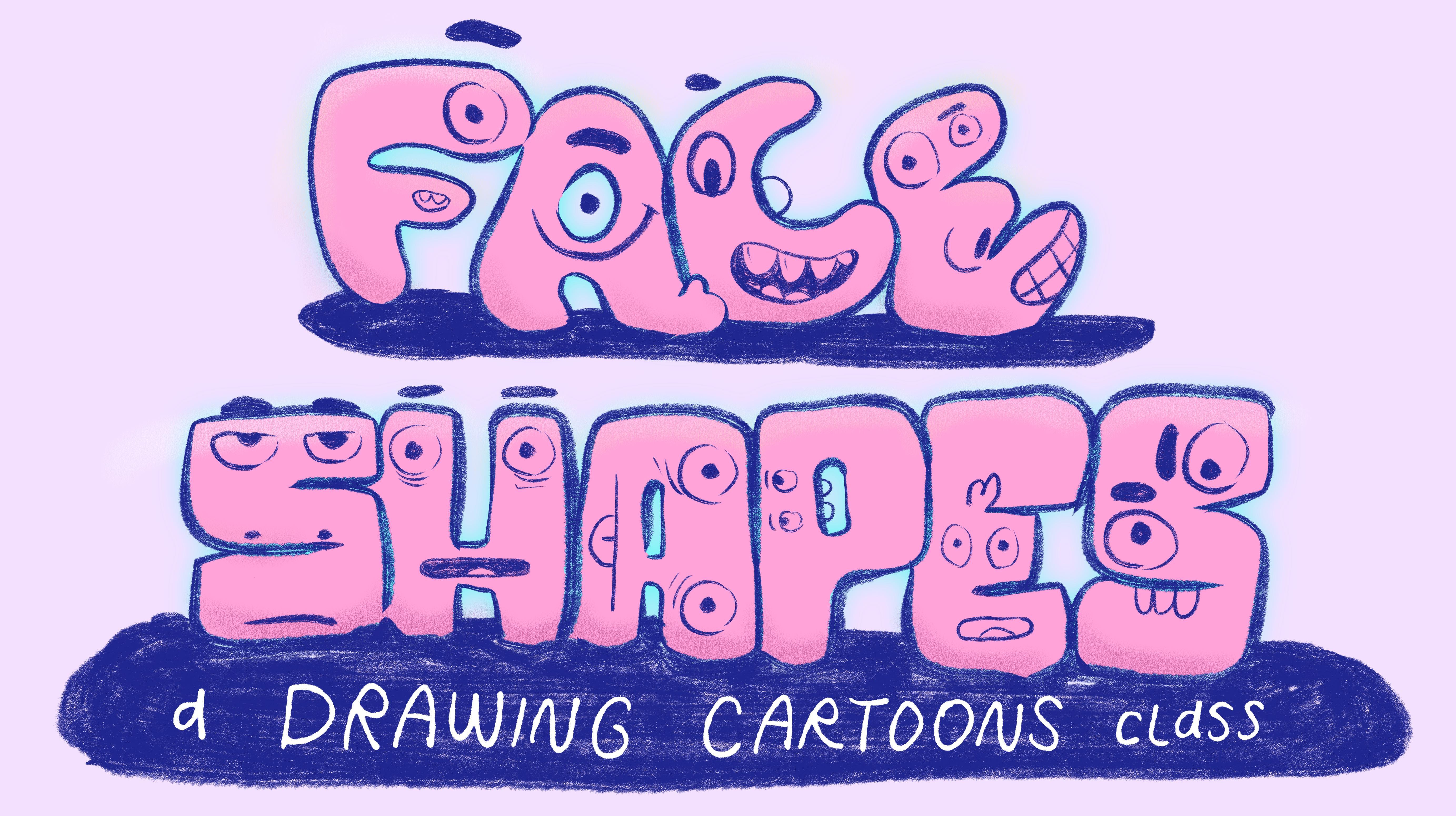
Transcripts
1. Introduction: The secret to drawing your own cartoon character
is there are no secrets. There's only process
and practice. But to build the skills
you'll need to bring a character to life requires
a look behind the curtain, and that's where we
find the shapes, forms, and concepts that'll
direct and inspire us all the way to a
finished character design. Hey, I'm my remarks. Character design, it's
an essential part of how I get my job done, but it's also a really fun way to spend an afternoon drawing. So I'm going to share
a series of easy to follow steps for designing
your own character. Then you'll join me
as we go line by line through a whole
class project together. Whether you're trying
out cartooning for the first time or you're
a lifelong enthusiast, you're gonna come away
from this class with a stronger sense of the
fundamentals of cartoon art. If you're new to my
skill share channel, welcome. Thanks for coming by. Over the years, I've
taught a lot of cartoon related and
cartoon adjacent topics. But if I'm being honest,
at the end of the day, all a cartoonist really needs to know in
life is how to make the right face shapes.
I'll see you in class.
2. Class Preparation: Hey, thanks for
joining me here today. Let's get prepared to
do some cartooning. Now, this course was made using exclusively digital tools because that's how I work. That said, the concepts in almost all of
the techniques we cover here today are going to be accessible through
traditional drawing supplies. Let's talk about your
digital options. Most people are familiar with digital tablet software
like Procreate. You can work with any
software you need. What it needs to be capable of is pressure sensitive
drawing tools, layering effects
and capabilities, those are basics
that are common with even the freest of
drawing applications. I might suggest Procreate if
you're working on a tablet. It's a one time purchase piece of software, the most popular, universally beloved piece of
drawing software out there. For me, though, I work with a program called
Clip Studio Paint. It's a subscription based
program on the tablet, which is not ideal for everyone. If you're looking for
something on the desktop, which Procreate doesn't do, it's a one time purchase option. On top of that, Clip Studio
Paint is a great tool for the comic artist
because it can make speech bubbles and
do page layouts. That's why I really love it. Aside from those two,
let's say you're totally new to
digital drawing and you just want to get a taste for what it's like without
investing in anything, you could try a free drawing
app like sketch dot IO, which opens up right
in the browser. It's got pressure
sensitive drawing tools and layering capabilities, things we need to achieve the visual effects we're going
to create in this class. Now if you're working
traditionally, you can keep it pretty simple. You need some basic
drawing paper, a graphite or non
photo blue pencil, some inking tools
like a Sharpie, microns, or if you're fancy and you want to
play with line weight, you can use a calligraphy nib dipped in ink or a brush
dipped in ink as well. Regarding color, color pencil is probably your best bet if you're working on drawing paper. Let's say you're working on
watercolor paper, though. Watercolor and guash
might be your friends. It's open to all options there. Now that we've got our supplies all set up, let's get to work.
3. Inspiration For the Class Project: Going to start by sharing my specific inspiration for
this class because I think understanding that is going
to help you really focus on your goals for
the class project. It began with an afternoon
where I just had Pixars inside out to playing in the background
while I was getting some things done
around the house. The sound was off just
like it is right now. This always happens when I have a cartoon on
with the sound off. I was just captivated by the visual
storytelling in the film. The emotional
narrative that comes through without
influence of soundtrack, folyart, dialogue, any of those other
aspects of the medium, the face shapes carry
this story so well. That's true for many cartoons, of course, that's the
nature of cartoon art. But with this particular
film and just the nature of the inside out film series is that it offers a really specific
challenge to an artist. The idea of trying to represent a range of dynamic expressions on the face of a
character who is defined by a singular emotion, that's a fantastic little
sandbox to work in. It's the right type of
narrowing of a set of rules to challenge you to
develop your skill set further. For me, that's always a big sign that this could be a
topic for a class. My first step to developing this course was to dig up the
concept art for inside out to take a look at how
these artists set about finding their main
characters for their story. The cool thing about
concept art is it's a great time for
wild experimentation. When you finally
settle on a character, there's compromises
made to make it work for the sake of
the plotting story, technical aspects
of the project. There's all these things
that factor in that aren't there when you're just
coming up with a cool idea. Experimentation is
always a major part of digging into a project, but I think it's
important to notice the goals of the
experimentation. For this particular project, it's face shapes that evoke a specific emotion yet are
adaptable for expression. Notice, while
there's abstraction to the overall
shape of the head, the narrative
features, the eyes, the eyebrows, the mouth, they're all capable of a
broad range of emotion. It's like an emotional range nested inside an
emotional concept. So our task here today
is the same task that the Pixar concept
artists set out to do when they approached
Inside Out two to explore the way shape
language can represent an emotion and then to
design features that are adaptable within that
set of guidelines. And that's our focus
for today's class. Let's get started with
a warm up exercise to get our creative
process revved up.
4. Shape Language Warm Up: All right, everybody,
let's get warmed up, start moving that
pencil around the page, loosening up the arm, practicing your hand pressure and all that. We're going to start
by exploring in little bursts the
techniques we're going to dig into
throughout this course. A big part of getting
good at art is learning to understand exactly
what you're looking at. Watch this drawing as I build it out with just random abstract. Shapes and line. The image changes every time
I add a visual element. I create positive
and negative space. The shapes evoke a feeling without any meaning beyond
just their simple mark. Once you get a sense of just the emotive feeling
that a mark represents, you start to understand the general concept
of shape language, the fact that we have
preconceived notions as to what a shape
feels like a circle, a triangle, a square. Start putting some
shapes on your page. You could do exactly what
I'm doing here if you want. Sketch out six
basic shape forms. Start with some
classics like circles, square, maybe a triangle, then get into a couple more unique oddball organic shapes. Now, without too
much forethought, turn these into faces with some basic narrative
visual elements, eyes and a mouth, possibly some eyebrows
along the way. Think of your options
for decision making here as you sketch
out these faces. You're playing with
your principles of art, for example, scale,
emphasis, variety. For each face you design, make the next one feel
totally different. Shift those features
around that face. What happens when you squish your expression down at
the bottom of a square? What happens when
you point the eyes down towards the chin
shape of a triangle? Every shape implies some
narrative direction, the size of an eyebrow, the direction of a pupil, the angle of the mouth. One of the let's say
magical things about cartoon art is that with just a couple simple
visual elements, you can apply a whole
interior world to a drawing. So we've got line and shape. Let's throw some color in. We'll dig more into color
in a later chapter, but just watch how
variety of color pushes this idea of who this character
is further down the road. Every specific shape
I make further defines their specific nature. These are not just broad
emoji style emotions. There characters existing in
a particular time and place. And what does it take
to accomplish that? It starts with the simple belief that shape language
tells a story. Now that we've warmed up
to some of these ideas, let's dig into our
class project.
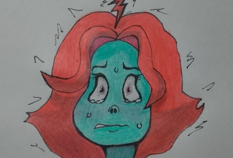
5. Designing Character Features: We set out to design the
features of our character. Let's decode this inside
out to concept art. I'm going to take each of
these faces and really quickly translate them into a flat
front focused design. The takeaway here is to understand the visual elements
needed to design a face. First, we need a
couple basic shapes that come together to
represent the head. It's always some variation
of an oval, circle, soft edged rectangle combining to form the skull and the jaw. Hair adds some iconography
to the silhouette and this simple cross
hair guideline helps us position the
narrative features, eyebrows, eyes, and mouth. Notice as the artist explores a character
named suspicion. We've got some
behavioral elements like the darting eyes,
squinty eyelids, and some physical elements like the hat, the raised collar, then beyond that, variations in the placement of the features that shift up and down the head. These are the basic
concepts we're going to explore in the first step
of our design process. Now here's the trick
to getting started. The inside out
movies have covered a lot of emotional territories. I want to select an emotion that I haven't
seen addressed in the films. I'm using one stopfiers.com slash EmotiNS to
help me brainstorm. Now, of course, you could
simply choose an emotion used in the film and just create your own variation
of a character. But just for fun and coming up with some new prompts,
I'm using this site. The cool thing about
it is not only does it give you a
definition of the term, it also gives you a list of physical signals and behaviors to use as prompts and
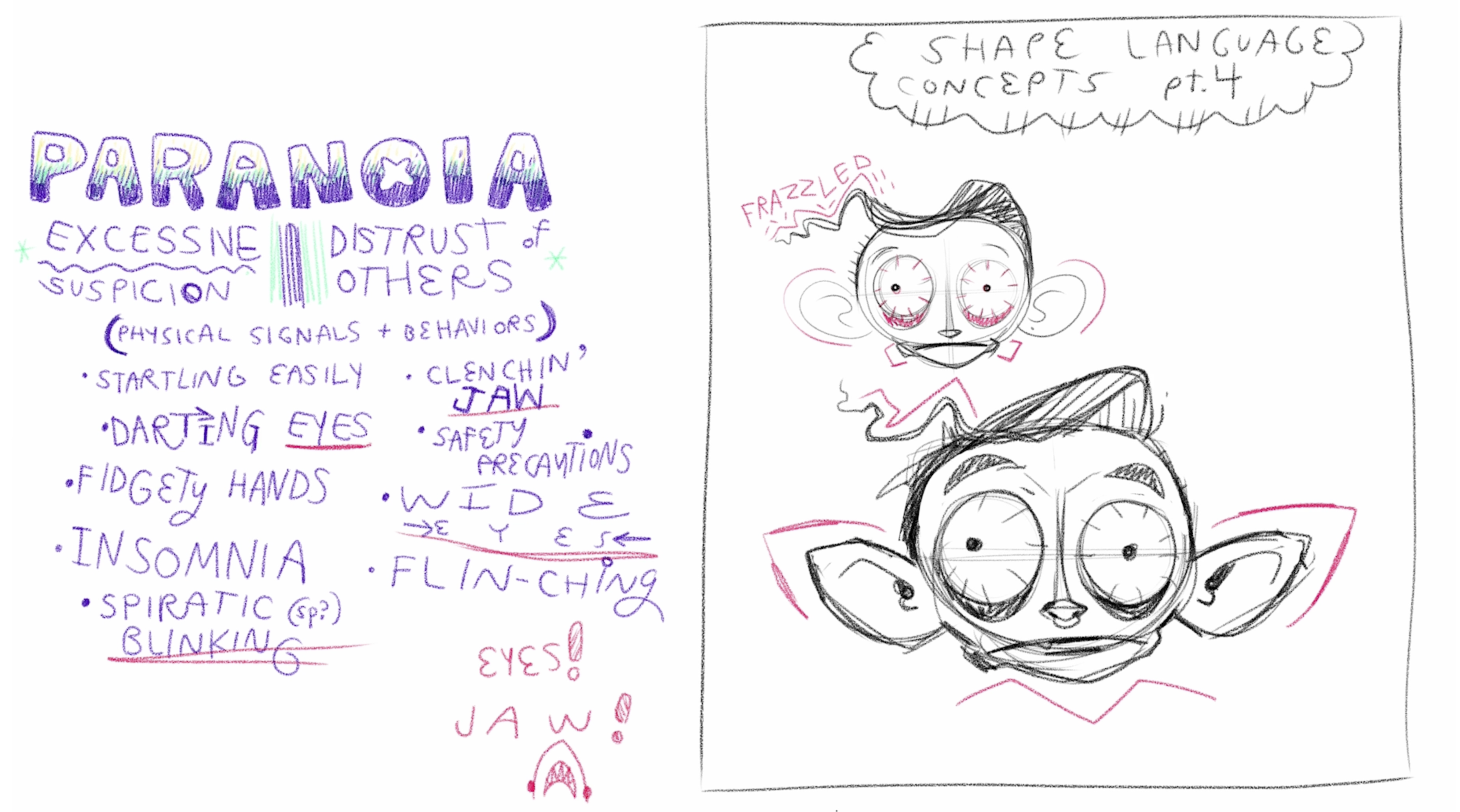
inspire your shape language. I selected paranoia, which is defined as
excessive suspicion, a distrust of others. The list of physical
signals and behaviors, I selected my favorites. Most of them, you'll notice, have to do with the eyes, a key narrative and
emotional feature, some detail into just the
mouth so that clenching jaw. I really like that. Sometimes the ideas
aren't actually rendered, but they can add to the
direction of your choice making. Another example
would be insomnia, which is a state of being, and I can use that to inspire some of the visual
elements of the character. Now the concept of the
cartoon facial expression is a deep topic. I made a whole class about it, but we're going to
set that aside. If I was to give you a
single recommendation outside of my own
classes, I would say, check out Preston Blair's book originally called
Advanced Animation. This is something you can find bits and pieces
of on the Internet. It's extremely popular. It's inspired a few
generations of cartoonists. One of the key pages
that I remember staring longingly at as a kid is
the facial expression page. The main takeaway here is the squash and stretch
nature of expressions. Notice big loud expressions stretch the face like
yell and fright. Then more intense
frustrated expressions squish the face the
way mad and sneer do. Some expressions wide
in the face like smile. All that is to say
is the language of cartoon art has a
rich vocabulary and the more you've studied it, the more rich your visual
descriptions can be. First round of concepts
is very abstract, keeping the shapes
extremely simple. Notice again, I'm pointing
the face directly forward. It's the easiest way to
place features without dealing with perspective
or three D forms. Nice flat two D
design process here. Some things I've tried
right away is breaking symmetry because paranoia
is a an unbalanced feeling. You can't sit in a state
of paranoia for very long. It's very distressing
and exhausting. It's not a comfortable state. Breaking symmetry seems like a great way to represent that. I've also decided to play with specific features one at a time before moving
on to the next one. I'm dealing with just eye
shape, eye placement, eye scale, and people
size and placement. Here's a tip for
designing the mouth. This one comes with another reference from
Preston Blair's book. This idea of dialogue, mouth sounds
inspiring the shape. For example, I'm going with paranoia and we've got this
idea of the clenched jaw, the sound comes to mind, like the stretching
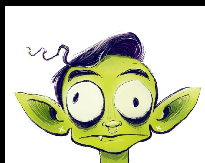
of the mouth, clenching of the teeth. This first sketch feels too old. I want my character to be
a little more youthful and that requires
softer, smaller jaw. Usually, the bigger the jaw, the more defined the jaw, the older the character
looks and feels because the face grows into
itself over time. Smaller jaw, but still
that wide e sound mouth. I've got some funny
ideas going here. Paranoia, this heightened sense that someone's following
you or watching. I'm going to use the characters sensory organs like
the ear and the eyes to try to overdetect what
might be going on around them. The extended ear here. Some evidence of this
insomnia descriptive element could be bags under the eyes. So let's take the conclusion of this first round of concepts and move into just a second set. Now, you can play this game
all day if you'd like. I find that the more I work, the more what I want
to say emerges. That said, there's often a point where you reach
diminishing returns, especially if it's a simple, fun afternoon project like this. You decide how many concepts
you want to build out. I'm going to keep going here. I'm starting to wonder if this character is even
human in the first place. I think the idea
is they are not. That's not really the point
of the inside out films. These characters are not human. They're abstractions. I have to embrace that as I continue to exaggerate
the forms here. While they may not be human, I do want them to evoke
a human like presence. I'm actually going to
scale back down the ears, make the mouth smaller,
see what happens. This character feels
very young now. Notice how big the eyes are, this naive open eye
energy, very useful. Now let's see how we can enhance the silhouette
with some hair. How can the hair evoke the
energy of this character? I'm going with frazzled
as an adjective. One last round of
iteration on this design. Want to answer a couple
important questions that I'm going to need as I move into the
final illustration. For example, not just the
silhouette of these features, but what are some of the key
descriptive lines we need? For example, the hair, it has this wave that goes out
across the forehead. I want the bags under the eyes to have a certain
amount of depth, the nose has a certain placement and shape about a
tiny little nose ring there and something else I'm
discovering here at the end is the idea that a character
is awake all night, this insomnia feeling, I can add this extra flavor of a vampire esque nature
to this character, which that's a fun
pairing, paranoid vampire. I like that. Now, I've answered all the questions
I need answered for the shape language
of this character. We've completed this
conceptual stage. Now using this as a reference, we're going to begin work on the final illustration
of the character.
6. Turning Shapes into Forms: Focus of this lesson is learning to turn a
shape into a form. Every shape in our concept
sketch coincides with a form. Every circle becomes a sphere. A simple way to
think of it is form reveals the third
dimension of an object. It also reveals the placement of the camera that's
in our brain, our point of view of a subject. Point of view is
such a crucial part of art narrative
art specifically. It tells us how we're
looking at something. So if we're drawing a face from three different
points of view, we can choose the front, the side, and the classic
three quarter turn, which is the hardest to draw but reveals the
most information. You'll notice the front
face and the side flatten the image and you
get something that exists somewhere between a second
and third dimension. Front view and side view aren't really how we observe
the real world. But while I've
taught other classes and drawing faces at
a three quarter turn, I think for this lesson, because we're focusing so
much on the design elements, we're going to stick
with the front view. But of course, we can still
apply form to this design. Let's take a quick look at
Preston Blair's book again. He's got a full page all about the simple idea of
construction of the head. You can see here there
are many ways to represent form in a
simple character design, a simple head design. And the key to that, no matter what visual
style you're working in is understanding the
concept of contour. If we apply contour
lines to this circle, we can transform
it into a sphere. Think of a contour
line like you're running your pencil
across the surface of an object and it's bending
with the curves of the object. Then when we observe
those lines, they evoke the overall third dimensional qualities
of this form. There's a front facing
character established with contour lines and here's a side facing character
with contour lines. Notice the density of the lines can change
the feel of the form. We can converge the lines around the nose to deepen that nostril. And we can turn lines in different directions across
different shapes and forms to establish a
directional shift, create visual contrast. Like the neck here,
I'm drawing the lines perpendicular to the lines
across the sphere of the head. Let's look at how contour lines establish this
illusion of depth. Let's take a simple object. Let's say this circle actually represents a coin and
I'm going to draw with this purple a rectangular
grid system around this to establish the actual center of the object and the pie pieces
that radiate from that. Look how every section of this
coin appears to be equal. Now let's actually
take that grid system and place it flat on a table based on a
single vanishing point. Notice how the coin actually
gets warped by perspective. Now those pie pieces
all feel different. Notice the actual center pushes
back visually into space, moving further towards
the background, and all the pie pieces, while they are still
the same size, visually appear different. That's the illusion of depth. This also can help establish our eye level if we're
thinking of a character. If we're looking them
straight on in the eye, the character is going to feel perfectly balanced
right in front of us. But if we're a little
lower looking up at them or a little higher
looking down on them, it changes the angles of the contour and the
different surfaces we see. For the sake of what may be an introductory lesson
to contour for you, we're going to keep
things pretty simple. So let's take our
little character sketch and just establish that the eye level is perfectly
even with our eye level. That means the contour
lines are flat right where the pupil center is and they curve as they move across
the spheres of the eye. The nose, I'm going to do vertical contours and
they curve away from us. The further they go from the center, the same
thing with the head. The vertical at the center of that sphere is
perfectly straight, but contours curve away from us, eventually resolving in the
outer edge of that circle. Now we can get a little
more complicated with this. Let's say we want to
deal with the ears. You have to establish
what part of the ears curve in
what direction. I'm saying the top curves
around from the back in on itself and the flat broader part of the ear has these
longer contours. This becomes very
helpful in the hair, which has this frazzled wave we established in
the concept art. Notice my contours bend and arc around and then
they are overlap. By the fringe of the hair, and then we can
address the eyebrows, even somewhat if we want to, we can take this
a little further. We could even establish
the contours of the skull itself and the actual eye socket where
the eye is sitting. This reminds us that
we want to establish this dark insomniatic
feeling in our character. My work can be graphical, but it actually implies a third dimensional
space in the way I use light and texture. Some of these ideas are more rooted in they're inspiring
my final line work, but I don't always draw them. But I think these
little exercises, understanding contour, studying the form of simple objects could
be super helpful. So maybe do a study
of a coffee mug with the contour line or even something as simple
as a can of soup, just to understand how lines bend and curve as they move
away from our viewpoint. So now as I enter into
the final sketch that becomes the reference
for the ink work, I'm going to do in
the next chapter, I'm going to take
inspiration from the contour lines in
very specific places. For example, right away, this idea of the pupil and
this chaotic broken symmetry, insomniatic filling
we're going for. Notice how I use two simple
contour lines to bend the pupil away from our eyeline. One perfectly centered pupil or somewhat centered pupil and
one that's curving away. Notice, when I put that little grid system
around the pupil, you can see it's been warped
by a change in perspective. That's that lesson we've just been spending a
few minutes going over applied to a very
simple visual element. Here's its influence again
throughout this design. Let me actually just turn off
the linework and show what my brain is seen when I think specifically
about the contours. Of the characters
and qualities of this actual paranoid
vampire esque figure, they come through
in the contour art. Shape gets us pretty
far along this journey, but if you want
to take design to the next level when it comes
to character development, understanding contour and how it represents form
is really useful. In this step, your goal is to create a final sketch of
the character's head, all the features in place, posed as if it's something of a class photo,
maybe add a neck, shoulders if you want, and
then in the next chapter, we're going to move
on to final inks.
7. Inking Techniques: I noted in the opening
to this course, you're welcome to work
traditionally or digitally. I'm going to try to speak in ways about my techniques
here that can apply to both. The first step is
when sketching. You want to sketch at
a scale that suits your sense of motion when you
draw, as well as your tool. So I'm going to scale my
drawing up just a bit, but I don't want it too
big because there's a sweet spot where my
linework looks best. It's kind of like
if you consider your voice sits at a comfortable volume
when you're speaking, to yell is exhausting and it's emphasizing your best qualities and to whisper is
the same thing, but on the other side,
the volume spectrum. Drawing is the
same way. You need the right sense of scale. Find draw a circle, see what feels comfortable and natural when you just
want to execute a circle. Always push yourself
to go a little bigger, but not too big where your gestures don't feel comfortable. That said, when it
comes to drawing tools, working digitally, your options
are really just endless. You can download 1 million
different brushes. Any drawing app comes
with quite a variety of brush types that simulate
real versions of brush. Working traditionally,
things get a little trickier
because to establish a good relationship with a
brush or a calligraphy pen, something that as
you apply weight, it changes the volume
and quality of the line. Those are tools that get tricky. You're welcome to work
with just a sharpie or a micron or a ballpoint pen, if that's all you
have to practice some inking techniques
because inking a much about selection of lines
as it is quality of line. But I'm going to be
using tools that are comfortable with me
and I'm going to do two inked versions
of this character, one with a smooth brush. It's got a nice clean line. Then I'm going to do
a textured brush, something that feels more like a dry ink quality where it reveals the texture
of the paper, yet the pressure
application qualities are basically the same. Whatever tool you're inking with, you want to
be comfortable. Little exercises
like this help you understand what pressure suits your sense of motion as well. Do a quick little exercise to understand what
we think about when we inking in a cartoonish style means you're representing,
for the most part, the outer edges of surfaces, but you do need
to consider form, meaning that the
pressure of your pen, the adjustments in line
quality from thin to heavy should represent where the source of light
is coming from. If I'm going to ink a
bunch of little spheres, notice the line is a lot
thinner, almost invisible, it points where the
highlight is strongest and the line is heaviest as we move into the darker
core shadows. Consider the smooth brush tool, a one pass style linework, meaning it looks best if you can create a line in
a single gesture. The less lines, the
stronger the image I find. Now, when we get into
a textured brush, the rules shift a little bit. I actually find texture brushes look best when they're
a little sloppy. Consider this maybe
a soft pass line. You could actually build up the line through
different passes and the texture reveals itself more through a sketchy looseness. We can play with value in a way we can't with
a smooth brush. The smooth brush is on or off, whereas the textured brush has gradient capabilities.
All right. Starting with my smooth
brush technique, remember, I'm establishing a placement
of the light source when I I'm saying the light is
overhead of this character, just a general idea, but it does help me
direct my lines. As I ink the eyeballs, the lines are heavier on the bottom than they
are on the top. Same thing when I get
over to the ears. Notice the outer
edge of the top of the ear has a thinner line
weight than the bottom edge. I also use my inking to
establish where surfaces overlap and darken spaces in
the depths of the contour. For example, the inner part of the ear as we disappear
into the ear passage, that's the darkest point
of the the mouth actually opens just a little bit to show a bit more of
this paranoid stress. I thought that imperfect line does a good job of
representing that. That's like you're looking
into the cavity of the mouth. Hair is a little different. I'm drawing contours,
but I'm also leaving out lines where
highlights need to be. Actually, the negative space, the highlight becomes
the contour itself, and the black becomes the
deepest parts of shadow. You'll notice I
ink very quickly. This is pretty much an uncut version of me
inking this character. Goal with inking is to
be able to work quickly. You've established
the image through the sketch and you've answered most of your questions already. Inking should feel a
very confident process and you can work in a way
that feels natural and comfortable and
it actually makes the image easier to read at that point because you don't
have these spaces that are overworked or
still being decoded. You have the quickest, simplest solution to the
overall idea of your character's I find
that the quality of the inking tool actually
changes that rule for myself. For example, the smooth pen, I want as simple and
efficient as possible with just little
accents of texture. For example, below the eyes, the edge of the eyebrows, the little shaved area
where the hair is parted. There's little bits of texture, but overall it's quite sparse. Color is going to
pick up the slack on some of the form
of this character. Now, when I work with
this more textured brush, I'm actually a little looser and I'm actually going to allow for more imperfect lines than I would with that
smoother brush. Again, this is just
personal preference. I find the textured brush
is a little more free. I'm drawing the same qualities as I did with the other brush, but I'm treating them
a little different. For example, notice that
wobbly line on the ear. If I was working with
that other brush tool, I might have undid that
and tried again to get a cleaner line because I feel it'd be very distracting. But when the line
is a little softer, when there's a little bit
more character and the value, this shade of gray that
this line exists in, I'm going to allow for
more imperfections. Because the pen is gray, spaces like the hair actually reveal the quality of the
lines with more detail, you can see more of the brush
stroke across the page in this version of the also have more variety
and line weight. I can make very thin lines, which adds a bit
of a sketchiness. You can almost see some
of the planning stage in this final version
of the ink character. This tool also allows me to push things in and out
of focus a bit more. For example, the nose ring
can be very, very light, this most soft gray in the
pupils can still be dark, but they can't quite achieve that high contrast feeling of
the smooth brush technique. Okay, so there's an example of two ways to ink the
same character, and I really encourage you to explore some of
your drawing tools. First, try adjusting the
scale of how you work. How big is your sketch? How much gesture? How much
motion does it take to get from point A to B across
your drawing surface? Are you more inclined
to smaller drawings or larger scale drawings? How does your drawing tool influence your decision
making when you ink? What qualities if your work are highlighted by
the drawing tool? Is it your weaker qualities
or your stronger qualities? Maybe you're better suited for a slightly messier tool because
that's how you draw best. On the other hand, maybe
you're someone who aspires towards cleaner, more
efficient linework. There's no right or
wrong answer to this. It's only the journey,
good luck and have some fun with experimenting
in the ink realm, and I'll meet you over in the coloring realm
when you're finished.
8. Color Scheming: Color scheming,
pretty clever title. Basically, what I'm
getting at is what is your strategy for
selecting colors? In the world of cartoon
art, high contrast colors, broadly emotive colors is a great way to begin
developing your palette. I'm going to be working
with complimentary harmony, which is a tried
and true technique very easy to understand, and I'm going to
create two variations of a color scheme
for this character, just like I did with the ink. We'll explore different
ways of thinking about the process and what
each color scheme reveals about the character. These are techniques that
you could apply digitally, of course, you don't
need to be an expert at digital coloring to do
what I'm about to do. If you're working traditionally, I would probably
recommend a nice set of lendable colored pencils
like prismic color, I guess, is one of
the popular ones. Or blending markers, that
could be really nice as well. Complimentary harmony says that a warm color and a cool color on opposite sides of
the color wheel establish a pleasing aura. You can say, for example, I'm establishing
green and purple as two complimentary colors
that have a nice harmony. To develop the harmony, you can fill out the value, meaning purple with more
black or more white. That's going to help us
apply form through color. Shift this line and grab another color scheme
about blue and orange. Now when we apply them to forms, we can see they instantly
work to create something iconic in that colors in nature tend to have
softer blends. There's the occasional
high contrast complimentary color
scheme in nature, but it's exaggerated for dramatic effect, for
emotional appeal. And it works every time. Let's try another one, a version of red and a version of green. I find you don't
want to lean into colors that are symbolic of particular things
like holidays. I I'm going to use
red and green, I don't want it to
feel like Christmas. I've got more of a pink
and a greenish blue. As a cartoonist, I have a fairly particular way
of applying my colors. I start with what's
called flats, which is just
overall solid layer of a single color that works
as a base to build on. So I'm using the Lasso tool or a basic freehand selection tool depending on the software
you're working in. I'm putting down a
lighter shade of the greenish blue
and then hopping to the other side of
my color scheme and grabbing a deeper
red for the hair. That set of rules
there makes up most of my creative decision
making right off the bat. Now I just need to play with
subtle variations of this. My first step is to
find my shadows. I'm going to choose
a darker value of green and get in the deeper
parts of the contours, the eyes, and the ears. Now I'm actually drawing my colors in a colored
pencil like technique. This is the same tool I used for my textured inking process. But digitally, you can put lighter colors on top of darker colors and
eradicate them. I can work back the shadows that are around my ear
contours a little bit. I get my shadows established, I'm going to layer
them up a bit further, so I'm going to pick
another shade of the green, somewhere between the
lightest value and the darkest value and connect the skin
tone to the shadow. Expanding value is a
great way to imply form. I've got some
highlights in the hair. Other digital technique here
is applying a clipping mask. You notice that the color
of my line art has changed. What I've done is I've
created a layer above my line art and I filled
it with a solid color. In this case, a dark
color that's not black, but it's black adjacent. It's black with a bit of my
complimentary color in it. Once you apply the
clipping mask, it makes it, so the color only appears on top of
those black pixels. It's a really easy way to
add a bit more character to your line art and sort of reduce that high contrast quality
of black line art. Now I'm going to add another
layer above my flats layer, and I'm going to use
the airbrush tool to create a bit of
texture on top of that. And this will also have a
clipping mask applied to it. So it only shows on
top of the flat color. That allows me the freedom
to just color outside the lines without
worrying if it's going to show up on the
actual white of the page. Closer we get to
the finished work, the more important I feel it becomes to look back at things we established in the
early conceptual stages. So some of the physical
signals, the behaviors, the qualities of this
actual character, how are we reinforcing them
through ink and color? The idea of this character
having insomnia can be established by adding
some dry eye effect. So not exactly veins in the eye, but the sort of reddish quality and the shadowy areas
beneath the eyeball. Adding some extra
highlights on top of the eye you give it more form. Some other little
highlights through the hair just to bring out the light and distinguish
that frazzled look. Remember, keep a close look to where particular
surfaces overlap. For example, the hair, adding a shadow below the hair that
comes down the forehead is a great way to imply contour without literally drawing
any contour lines. Same thing with the nose. The
space below the nose could use a nice shadow
where the nostrils are and the space
on top of the nose, it's catching the light
could use a nice highlight. Just to review, we've got our base colors mostly
on a single layer, establishing the
broad guidelines of our complimentary
harmony color scheme. On top of that, we have
some clipping masks that add shadow texture, and at the end of it
all some highlight. You can consider
your color scheming, that basic set of rules. Now let's take that other set
of complimentary harmonies, the greenish to the purple
and follow those same steps. I'm going to use for my flats a vibrant green
for the skin tone. A deep purple for the hair. Now step one, establishing
shadows through some contour. I'm using deeper values of green to find those dark areas, a layer with a
clipping mask applied to airbrush in some
more subtle shadows. I can do the same thing
with some highlights to make the head just feel
a little rounder, you know? And then one last pass through is my texture
drawing tool using white. So the flats establish
the midground. Shadows push things back and highlights move
things forward. That's a simple
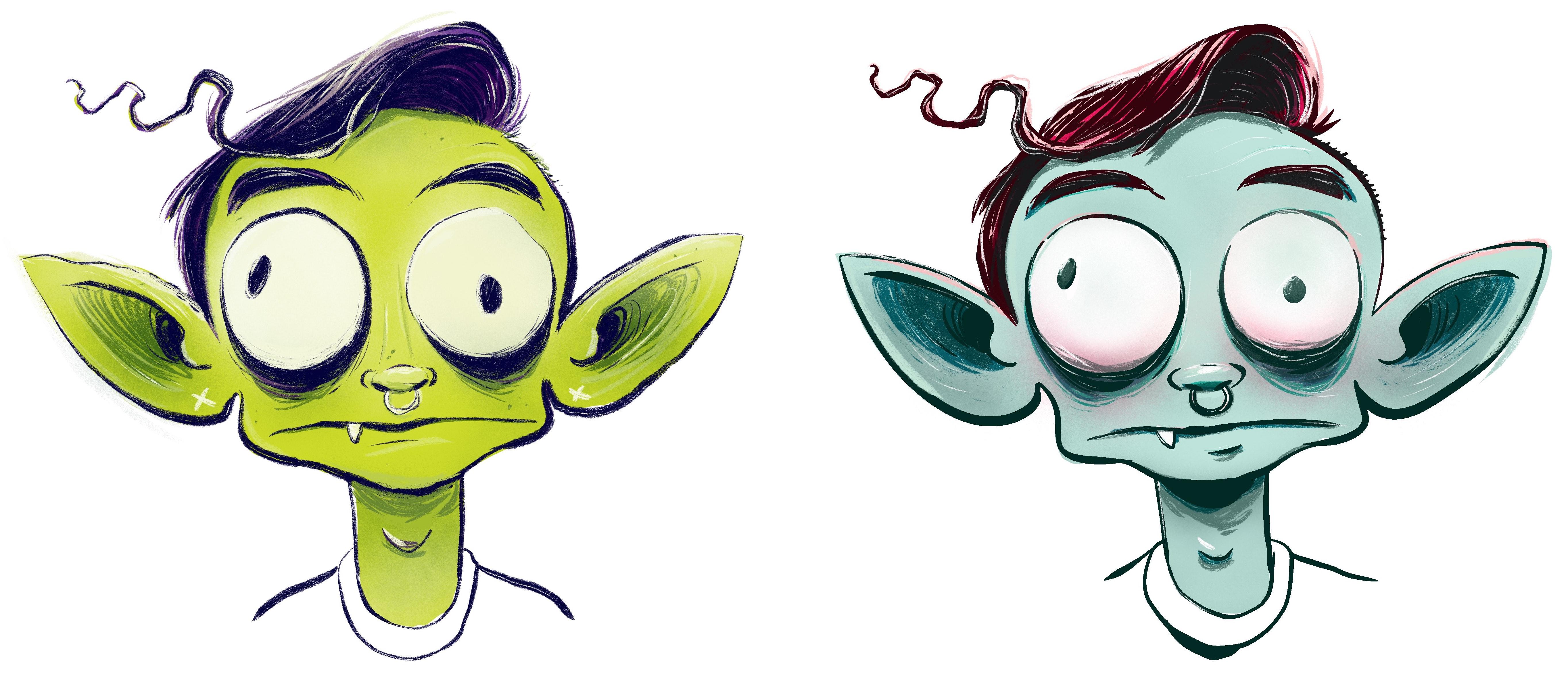
approach to form. Okay, now we have two distinct versions of
our paranoid character. I cannot decide between
the two of them, which means this is a
successful class project. I love both of my boys equally. Now, let's talk about reviewing our work and sharing
it with the world.
9. Sharing Your Work / Further Learning: I hope you had fun here today. But as far as I'm concerned, the classroom experience is not quite over yet just because
you finish your drawing. For me, a big part
of creating work is the opportunities it presents
after the work is done. For example, I'd love
to see your work shared in the class projects
section of this course. That way, I can give you a little cheer or some
feedback if you want, and even better than that, the skill share community will
get a look at what you're creating and that might inspire them to make work of their own. That's a pretty cool feeling to know you're doing
that for somebody. Feel free to participate in that type of way if
you're open to that. Now, on top of that, something you could
really do for yourself. That's exclusively for
you is step back from your work imagine you're a
different person for a second. Look at it with fresh eyes and think about what's
really working and what are some spaces that maybe you're a little weaken that
you could really practice. You know, I discussed
the roles of some different materials
and color theory and these stages of
creative process. Some of those become natural feeling to us and we
dive right in and some of them were skill sets that
we're maybe a little wary of dipping our toe into because we have expectations of
ourselves and all that. It's good to understand where you are in your
creative journey. Do a little critique
session with yourself. That can
be really valuable. Even more valuable than that is sharing your
creative experience, the joys of at the trials and tribulations in your
class project post. That honestly is
going to encourage me to share maybe a more in depth review of
your work and offer some advice on where you could
go for further learning. That's a classroom experience. And now because I mentioned
further learning, I got to do a little
self promotion. I've got a whole skill
share channel out there, and if you haven't
checked it out, you might want to take a look. If you like this
class on cartooning, I have some deeper dives into the ideas of cartooning
on all kinds of levels deeper dives
than what we've covered here on designing
the overall cartoon face, classes on expression,
classes on body language, classes on the broader ideas
of narrative cartoon art. If you're a conceptual artist, I've got classes
on World Building. Technical classes on
using ink tools and finding inspiration in our
favorite Illustrators. There's, I think, about 20 courses on
there at this point. Odds are, you're going to find something that's going to
inspire something new in you, and that's what I'm here for. All that said, I look forward to seeing your work and I
hope you have a good day. See you in class next time.