Transcripts
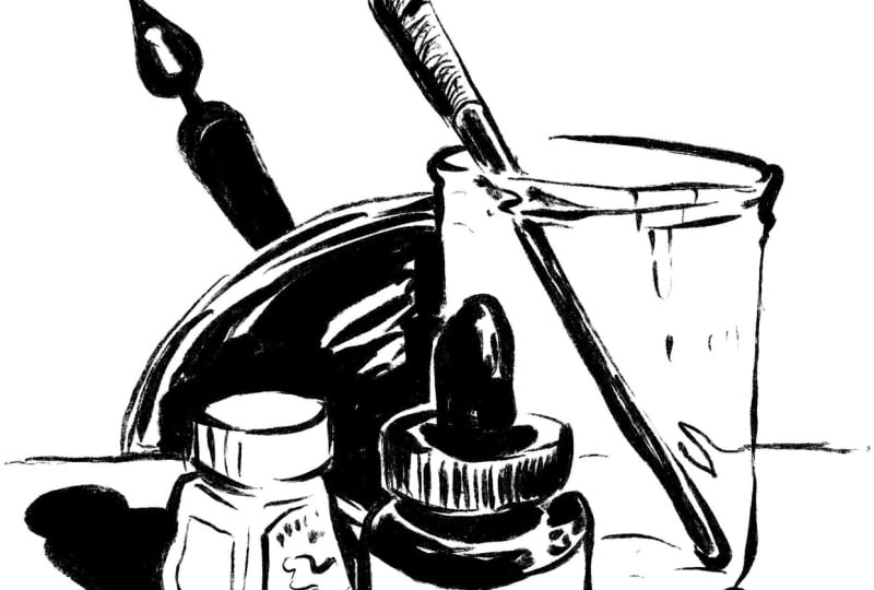
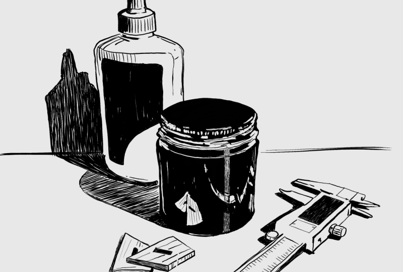
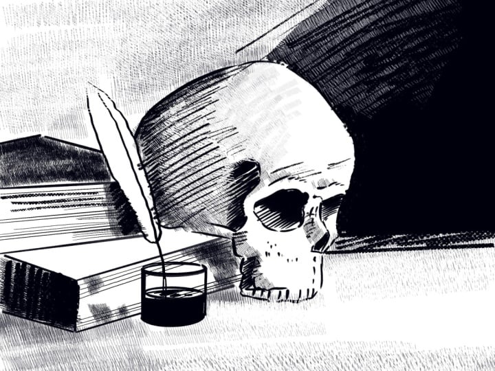
1. Introduction: Hey, my name is Zira Marx. As a cartoonist and illustrator, pen ink is a big part of
my creative practice. But I'll be honest,
there was a lot of trial on error before
I could really get a grip on these amazingly expressive but
challenging tools. So I thought it was time I
made a course that really hones in on my own
personal penink technique. Here are the skills we're
going to focus on today. Developing line control,
expressing light and shadow, transforming flat shapes
into three D forms, setting a tone with texture, and most importantly, saying
more with less lines. This class is made up
of four simple lessons and a goal oriented project, things that you
could focus on for a single afternoon or take a
lifetime trying to master. So let me introduce you to a new point of view
on pen and ink.
2. Get To Know Your Pens: Welcome to class. Before we get started with our
drawing practice, let's discuss our tools. Now, I want this course to serve digital and analog artists. It's really a course
about thinking and the tool is really secondary to how you go about thinking when
you make a line. So we'll get to the
digital tools in a bit. But let's talk about
traditional tools. You might be familiar
with this band, Pigma, also known as the micron, it's available in all kinds
of technical tip sizes, really refined, thin lines, but they also make a brush pen. You can see that the
tip of this pen is felt and it's simulating
the tip of a brush. But unlike a brush, it doesn't start to spread
apart its bristles. It holds its felt
tip really strongly. As long as the tip isn't
starting to wear down, you're going to have
this really refined line on your brush pen. The ink is also archival, so you could paint with
watercolor over the top of it. If you want to step up your
pens just a little bit, I would recommend the Kuratak
which is a Japanese brand, another archival ink, and there's more variety of
brush tips available. So if you want to really
dig into line weight, the quality and thickness of a line, this is
the brand for you. They last longer than
the micron I find, but they only cost $1 more. Whereas the microns about 2:50. The KurataK is about 3:50 a pen. And if you're working
with a brush pen, make sure you have a
nice compatible paper. I recommend the
Strathmore Bristol board. It has a smooth surface. It's about 100 pounds weight, which is a little
bit like cardstock, and this is going to
take your pen ink really well without bleeding. Okay. Now, when selecting our
drawing tool and procreate, we want to simulate the
feeling of that brush tip pen. So let's go to our library. Pen section and we want
to browse and choose a pen type that has a really
narrow taper on one end, the other end and gets nice
and wide in the middle. You can tell this
is light touch, heavy touch, light touch again. Any of these that
have a strong body to them that resolves in a point are going to be
good options for us. For example, we can try the Sanderlin set this to
around 25% in your size there. And just test it out.
Our goal is to be able to without way too much effort capture a really narrow
tip on one side, get wide, and then
get really narrow again from tiny to big to tiny. Whether you like a nice
smooth line or you like one that's got a
bit of texture to it, meaning it feels a little dry. Both work for the lesson
we're covering here today. On the left, make sure
your size isn't too small. If you're starting at a 5%, your line is never going to be that dynamic because you're hitting a wall as to how big this pen could
get really quickly. So try the extremes, really narrow and really wide. But more in the middle is
a sweet spot where you can capture both feelings without adjusting the setting too much. So I'm going to work with the Ivarsque pen because I like the texture
that comes with it. But you're welcome to
choose whatever you like.
3. Lesson 1: Line Control & Line Weight: Our first lesson is to dig
into and wrap our arms around the line control and line weight of our drawing tool. Now, I can still remember the first time I
tried to work with a brush pen and the
chaotic nature of it, not being aware of how
much hand pressure gave me what quality of line. And the learning
curve was higher than another type of drawing tool like a pencil
or a ballpoint pen. But I could instantly see why I wanted to build
that new skill set. It comes down to one
word, character. As a narrative artist, character comes from different
aspects like my writing, the voice of my
work has character. But in essence, the line
I put on the page is probably the
strongest presence of character in any
illustrator's work. Even in just this
little text treatment I've got here on the page, you can see how dynamic the character of
this line can be. It can be super heavy over
here on this number one, or it can by even accident, be super narrow and precious
and brittle and fragile. If we start to think
of our line itself as a voice in our work, then we can embrace the chaotic nature
of the tool and also seek to refine it and
take some control over it. Developing a technique
with your brush pen is about modifying your
movement of your hand, but also letting go
control a little bit, which is a great
lesson for the artist. In terms of skill set
building for this lesson, we want to focus
on hand pressure, speed of our hand and reckoning with that
unpredictability of the tool. This first exercise
will take you about ten to 15 minutes and
it's really just about managing your line
control. We're going to start. It's going to make
a new layer so I can turn things on
and off easily. We're going to make six dots across the top of our page and six dots across the bottom. Now our goal is
to create a nice, evenly weighted line
down the page from one dot to the other. Now you can see right
away that's very uneven. It goes from narrow to super narrow to gone
to thick again. A big part of that is the
way I'm moving my hand. Notice, when we instinctively move our hand with the pencil, we tend to move in a writing fashion because we're most often making words and a lot of that motion comes
from the wrist. But drawing needs to
have bigger gesture so we can take more control over
the character of the line. We don't want to just use
our wrist because that gets very manageable after
about that distance. See where the line
starts to break. Instead of just moving
from the wrist like this, consider moving from the elbow like this or even the
shoulder like this. If I'm moving more from my arm, really quickly, I can see that I have stronger
sense of control. Now, no matter how
much you draw, there's always warming up
that needs to be done. Across these six lines
connecting dot to dot, you can see I'm getting
more control as I go. I'm remembering what it takes to take control of
my hand pressure. But let's develop some
more technical skills. With another exercise. We want the six dots back on the screen. This time, we want to go from narrow line weight to
really wide line weight. I've got my pen
set at about 23%, top is narrow, bottom
is really thick. About halfway down, you want to be somewhere around the
middle width of the line. Our goal is to create a nice, even ascent to the full
thickness of the line. Now you notice from
this little lesson, there isn't a lot of symmetry
between the beginning and end in my line at this point because whether
you're right or left handed, the taper in your line is
going to feel different at the beginning until you really gain a lot of control
over your pen technique. I would honestly say for myself, I don't have a whole
lot of control. I think the uneasy walkiness is really compelling.
Why do I believe that? Because maybe one of the most famous artists who
work with line was Charles Schultz and his value as an artist was the fact that
his line had that nervous, unique character and that was projected onto
his characters. Their personality was directly bonded to the quality of
line Charles Schultz made.
4. Lesson 2: Highlight, Shadow & Depth: All right. Lesson two, highlight, shadow and depth. Let's first prove to
ourselves how quickly line weight can actually
establish depth of a scene. Let's just draw a box. It represents a
composition, a window, a frame of time and space, we're going to establish
a circle shape. And the center of the frame
with a mid size line weight. Imagine this frame
is of a stage, and let's put a line up here that represents
the horizon line, the sky, the ground, the object on the ground. Now, let's say we want to put a circle further away
in the background. Not only do we want to draw
it up closer to the horizon, but we want to change
the line weight. If we use a lighter
line weight like that, the object feels further away. It has a sense of what's called
atmospheric perspective, which basically means air
has an opacity to it, the further away something is, the more air between our vision of the thing and the thing, the lighter it feels. Now, if we want to put a circle close up in the foreground, let's scale up our line tool a little bit and draw it here. There's the edge of a
circle really close to us. I barely doesn't even
fit in the frame at all. Now we can play this
game even more. Let's say we want
to put two objects between these two objects. Now we've got some rules here. This is midground,
This is background, and this is foreground. Something's between the
foreground and midground, it's line weight needs to
be between these two lines. There is a weird little circle
fitting right in there. Let's say it's between the
midground and the background. If line weight exists
between those two. Once we establish some
rules for our line weight, our composition can feel unified, can feel
more believable, can feel more engaging,
can feel more clear when we start to
play by those rules. In this case, line weight has a language within
this composition. Now, let's say we
want to use line to establish values of light. A pretty common drawing
exercise when learning to use your pencil tools for the first time is to
draw a five value scale. One, two, three, four, five, one being the brightest, highlight and five being the deepest what's
called core shadow. Now we want to illustrate these five values of light
using what's called hatching, which is basically,
in this case, just vertical, even weight lines at different
amounts of density. The closer the lines are
together, the darker it is. The more space between the
lines, the lighter it is. I'm just going to really evenly draw really dense
vertical lines. The point where they're
actually overlapping. That's in this world
of this composition, that's the deepest value of shadow we can create and that's the brightest amount of highlight we can create. Now, instead of going
one, two, three, four, we're going to jump
to the center, we're going to go to box three. It's easier to balance our
light source in this way. Now we want to find something in terms of line density that fits between these two options. I'm going to space out
my lines nice and evenly so there's my gray value between high light
and core shadow. Now, let's try to do four. It's not going to be as dense in its line weight and
line work as five, but it's not going to
be as sparse as three, it's going to be
a little tighter. Now two is going to
be a little sparser. There's a five value scale. Highlight, three values of gray and the deepest
core shadow. Let's apply this to a really
simple drawing exercise. Let's draw a rectangle in space. By space, I don't mean
just floating in space, but sitting on a table. Now let's imagine the
light source is coming from this direction and
pointing down at an angle. Now our challenge is to take
our inking tool and to use these five values of light and shadow to establish the
light source of this room. Now, I know that the back of this box is getting the
least amount of light, I'm going to make it really dark and represent value five. Now, let's say the top is getting more of a
value two to three. Notice the direction
I'm drawing my lines. I'm following the
angles of the surfaces. Let's call that a two and then
let's say this is a three. Now we can go a little
further and because this exists in a space
with a flat surface, we can continue our core
shadow across the ground. Now, even this really
simple exercise shows us the power of density of line and how it can just
instantly evoke without overexplaining where light
sources are in the room, as well as the form of the object in
three dimensional space.
5. Lesson 3: From Shape To Form: Okay. Lesson three is going
to focus on turning shape, a two dimensional rendering of a thing into the
form of the thing, meaning adding that sense
of a third dimension, making an object feel like it exists in a time and a place. Now, the good news is we already understand how
line can represent light light is the
essential aspect of turning something
from shape into a form. For this exercise, it's
going to be really helpful to find a reference
photo to work with. I've already gone so
far as to hop over to Pintris and find a still life. I'm going to sketch out its basic shape, roughly a circle. Is shadows a circle and
its little top is a thing. It's right about there. It's
got this imperfection here. In some nice clean, simple but broad gestures, I'm going to find the
form of this object, but also use my line to develop the character
and express my style. Tinted. I tend to draw the shadow areas first
because it's easier to capture the darker areas and then once I'm
warmed up to it, I can press down
a little lighter. There's one sketch of the
object. Just for fun. Let's mix up an inking tool
and see what happens if our line is a little cleaner. Just for the sake of variety, here's a really
messy inking tool. Let's look at our three
sketches and what happens when we become familiar
with an object. The more we draw it, the more we internalize
some of its qualities, and we can develop a sense
of abstraction and style. The first version is a little
fussier with the stem part. Same thing with the second one. When I switched to
this brush tool, there was something
about it that made me want to deal with this
element a little more. Then when I went back
to a messy tool, a tool that was very messy, we can see there's a simplicity. There was a speed with
which I rendered it and it decided the information
of that little stem, the visual details
of it as they exist really became less important
and it became abstract. It became reckless
little line artists, a couple of little zigzags. They give it a unique quality, but don't quite tell
you what the thing is. As we develop our inking style, we have this balance of what
do we render in a way that provides information and what do we abstract in a way
that develops style? By reckoning with those
two things back and forth, we eventually find a look to our work that is totally unique.
6. Lesson 4: Clarity & Tone: Lesson four, we want
to elaborate and dig in deeper on something
we covered in Lesson three. This idea of becoming
familiar enough with your subject where
you can develop your style in coordination with what the thing actually is. Getting so comfortable with
the design that you can leave things out and change the tone of it and
make it your own. Let's look at a fairly
busy still life photo. If I want to draw
this in my own style, I need to be able to break this down into its key elements. Let me do a sketch over the
top of this photo to show you exactly what I'm looking
at and what I need to know, to be able to draw my
own version of it. Let's shift it to
black and white. So we can focus on
its values of light. Even more important
that is to disassociate with what the subject matter actually is. Think of
it as just things. It's no longer fish and
lemons and bread and parsley. It's a bunch of
objects in a space. Let's get to know how they are positioned and what their
basic shape language is. First, let's assess
the direction some of these
objects are placed. The two fish are
going like that. The bread is sitting
at an angle like this. The lemons have a round
and a flat feel to them. And these are little flat bass. Let's look at just the basic geometries that
are happening here. We've got this circle, got these long ovals and if we want to bring
these things to life, we simply need to add a little bit more
visual information. There's a pretty clear
illustrated sketch here. We can tell what our
subject matter is. We can tell my idea of
the surfaces it's sitting on putting a little more
shadow under there. We can add little bits of
information that tell us texture and even little bits of information that imply light. This sketch has a nice balance of information that we want
to know about the still life, as well as plenty of freedom
to loosen up and ink this in a really fun way without
feeling like we need to capture all the visual
details of the design. With this in mind, I'm
going to go back to the original photo and I'm going to loosely ink over the top. My sketching process
helped me get to know. Technical aspects
of this design. The point of view,
the arrangement of things relative
to each other, replacement on the table
and give myself an idea of how I want and what I want
to represent about them. Now, in terms of details, things I choose to draw
usually enhance some aspect of the form of the
design or a texture. There we go. A nice loose, light
inking style.
7. Class Project: Sketching: Class project is always
two goals for me. One is a sense of
personal expression and getting out some
ideas that have been living in your head for a
while maybe and creating something that just speaks
to the moment for you. The other is trying to juggle
the technical aspects of a new skill set and bring them into your creative process. For our class project, we're going to first discuss
the steps and goals of it. Step one is to set up a
really simple still life. One that reveals something
about your creative space. Personal subject matter,
things that have to do with your art supplies or
your inspirations, or just things
you're eating that nourish you while you make art. Step two, with a still life is to create a good opportunity to practice these new skills. There should be things about the still life setup that are going to inspire us
to do the following. Work on our sense
of line control, work on our sense of
highlight, shadow and depth. Work on our sense of
turning shape into form and work on our clarity
and tone and our style. Our still life should be drawn
from observation, ideally, but for the sake of the
setup here of this lesson, I've got some photos to show you what I'll actually be
looking at as I work. Of course, photos are always a great reference point to
help you really learn to see the subject matter
as what it actually is and the way light plays
and shadow works in a space. Let me show you the photos I took I've kept it very simple. I don't have any
fancy photo studio. I've just taken one
of my drawing pads, opened it up with
some clean sheets of paper and leaned
it against the wall, at odd angle to some of the lights on the
ceiling in my studio. I just so happens
that this works quite well for setting
up a still life. Now, that was my first photo. Often a still life needs a little bit of
revision to really arrive at a great solution for your goals
with your drawing. In this case, I've got a little
too much subject matter. I think I don't need to
draw all these things to practice the techniques
I want to focus on. I simplified. I took out
the colored pencil and the brush and just focused
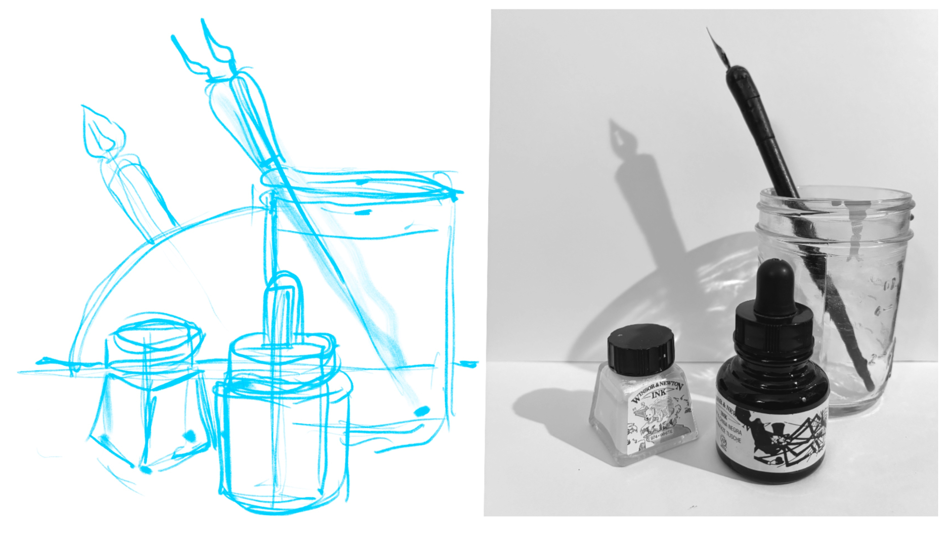
on the idea of the inks. What I started to notice once I started to move the
pen around is it makes a really nice shadow on the wall if you tilt
it at the right angle. You actually get a good
look at the pen itself and that little keyhole
opening in it. I've imported my still
life into Procreate and I'm first going
to adjust saturation, to strip out any distractions
of color, basically, and play with the brightness
just a bit to give myself a sense of where the shadows and
highlights are strongest. If I start bumping
up the brightness, what's left the bottles
themselves, their caps, the pen, things I'm noticing here is this nice blur that happens through the glass, some little highlights
that emphasize the form. Then why I bring it back down
and those shadows come in? Like, this actually something maybe I was
subconsciously doing, but we get this nice hand on a clock reflection on
the wall that shoots right between these shapes
in this nice negative space. We get this nice arc here. Take a good hard
look at your photo. And think of overall not
what the subjects are, but what positive and
negative space they make. Now, before I start to sketch out my scene with the pencil, I'm going to just
take my ink pen and do what's called a notan study, and that's what I have here. I'm just going to take red and mark over the top of this so you know what
I'm talking about. A notan study disregards what the subjects are
and just looks at the values of light and dark
within the composition. Things that are really
dark are the bottle, this cap, the pen. From there, we've
got the next shade of gray down the line, which is this shadow here, this idea of this
shadow against the wall and even the edges of the jar. That's our deeper
shades of gray. Then beyond that, jumping to the other
side of our value scale, we've got what are
our highlights? Well, there's that
nice space there. Got this nice space around
the subject matter. Even in this design, the bottle itself mostly appears white because
the ink is white inside. Then even on the table, we've
got this nice white space. The Notan study is a way
to break your brain from the subjects and
their meaning and sentimental value and
the jump to detail. Be a composition at its root speaks with its
overall forms first, and then we look closer, we find the details,
we find the meaning. But I think it's really
important for the artists to see the positive and negative
space balance of their design. As they go to build the composition with
their sketch and their inking or whatever
medium you're using, you have more confidence
and focus on what is making this overall image work
and instantly connect. All right? So we'll
set that aside. Now that we've got
a strong sense of what's going
on in this scene, I'm going to grab
a pencil and just sketch out placement
of things and scale. I'm not going to draw them
with any type of detail. I'm just going to
get some shapes on the page and as
loose as possible, build some structure
for me to ink over so here's our sense
of a horizon line. Our bottle, this one, our ink bottle is going
to go about there, our little white ink bottle
is going to go about there, and then the glass,
it's right about there. Now I'm going to
start to fill out these shapes just a little bit, keeping very close attention to the distance
from here to here, the distance from here to here, the distance from there
to there, there there, where this thing is actually sitting within the composition. Now let's get that angle
of that pen locked in. First and foremost,
what's important is the angle of the pen, which is roughly that. Then once I know the angle
and its overall length, then I could start to
design the actual pen. So a big part of developing artistic practice is looking for steps between the steps because then you never
need to go back. You're always just building out further and further
little by little, and you're not like,
whoops, I got to backtrack and fix these
things and erase them. The slower you go, actually, the faster you work and
the stronger your images. Once I get a sense of
the overall shapes, I start to think of them
a little more forms. But before we do that, let's get this shadow
on the wall here. The arc goes from
there to there. Let's mark that out and
let's get this nice angle of this pen shadow on the wall. For me, that pen shadow
was a happy accident and at this stage of my
creative process, it's becoming the most
prominent aspect of it. So creative process like this, leaving room for new ideas. This is what separates
your brain from AI brain. AI brain jumps right to conclusions and it doesn't
have that organic journey of a creative process
where you discover things along the way that
just fundamentally change what you're making. All those choices
resonate within the work and they make it
interesting to talk about. If you want to think of how
we separate ourselves from these automated tools that are taking us over
in a lot of ways, you build a richer
creative process and your work will always resonate more if you have
that happening for yourself. Does that make sense? I hope so. Now that I've blocked
everything out, I'm going to start
to find the forms the angle of this bottle. Again, I'm not really
looking for precision. I'm looking for a general sense of the composition
to inspire inking.
8. Class Project: Inking: There's enough of
a sketch to let me feel good about
my inking process. I'm going to switch back
to the pen that I've been using overall
and just as a little warm up and I come
over here and feel out the width of the pen based
on the size percentage. I want nice variation
of my line weight. I want to be able to
build really small lines but also get nice and wide and fill in solid
blacks without much effort. There we go. Let's delete
that and start fresh. As you're inking,
don't be afraid to just leave aspects out that you aren't sure what you're going to
do with them yet. So I'm trying to find a nice loose feel to these objects without
really committing to too many solid blacks yet because I feel like
I'm going to want to negotiate and take some
creative liberties with some of the
shadows in this scene, especially once I get
into year because right now I've got deep grays against black and I'm working really high
contrast with this pencil. This is going to
be black against black if I start
filling them in, which maybe isn't exactly
what I'm going for. I might get a little too muddy to unclear
what we're looking at. Edges first, a nice loose hand. It's fun to play with
different materials. It's fun to distinguish
the glass here, that is empty from the
glass here that is full, little things like, well, how am I going to render
this little paint detail down the side? How important is
that to my design. I think it's a subtle detail that you may or may not notice. It just shows that the
bottle has been in use. Another version of this
might emphasize that. Let's look at this
pen for a second. Right now, it feels
very flat and adding a touch of
contour is going to go a long way to show the form of it and also the
point of view of it. If we look in this photo, let me switch colors so you can see this is a very valuable
angle, so is this. That's super useful.
Now in our ink version, I know that I really just
need this line and this line here to match up pretty well and that tells you a
whole lot about that pen. Now, let me just block out where this shadow
is going to go. Things I'm adding like this little shadow
here on the table, its intent is to
make this bottle pop more and to establish the things like
placement on the surface, not to tell you more
about the bottle, but just give it more mass. There's a nice
little shadow there that pushes that bring
this around the front. We could also emphasize
this little shadow that's happening under here as well. Let's look behind here. We've got this nice little gap, and then I'm going to
add this shadow here. I'm going to leave a little bit of room around the bottle just to preserve that
detail of its shape. You got to be
careful with shadows because sometimes they can eradicate the shapes of things. For now, I'm going to
bump in and almost like this aura of light gets preserved around
the edge of the bottle. If I'm doing that, I'm
leaving this little gap, then I can more confidently fill in other aspects of the bottle. The little nipply
thing here at the top, it's got a nice highlight,
then it's solid black. I'm going to preserve
that little highlight there and start to just blacken
out the thing in general. Use some hatching lines to fill that save some little highlights
on the bottle itself. Moving in a contour line revealing the shape
of the thing. Even when something's
getting filled in solid, it's probably worth moving
in the shape of the object. When I draw things that
are inside other things, I try to lighten
my line weight so, whereas the label here
more on the surface. I'm going to come down
a little harder with that capture a touch of the typography
and forms in there. I'm going to keep
them abstracted because if you start to
block out lettering, it draws the eye in a way that may not be
what you're looking for. Keep things abstract,
especially if they're information like letters
or numbers or logos. Okay. Let's come
over to this pen. Something I want to
preserve on it is that idea of the character
of the body of the pen. I was explaining how there's this nice little crack happening here in it.
I want to save that. Here's the cork type texture. Then just some hatching
lines to show that this is a material that is distinct
from the material below it. Now, the handle itself has
a nice highlight on it, but it's mostly solid black. The highlight is on this
opposite side right about there. I'm going to try to
save that and keep it present as I in the
body of the pen. Now let's get back to the
shadow of the pen itself. As a cartoonist, silhouette
is a big thing for me. Silhouette equals
iconography, familiarity. It makes something really
well suited for narrative. I just love finding the silhouette of something
and really making it pop. This pen almost as a cartoonish
silhouette at this point, I'm just taking some artistic
license and making it stand out in a way that maybe it isn't quite true about
my photo reference. As quick as we got here,
we can be finished. Look at that little
detail. That's fine. We're going to pull
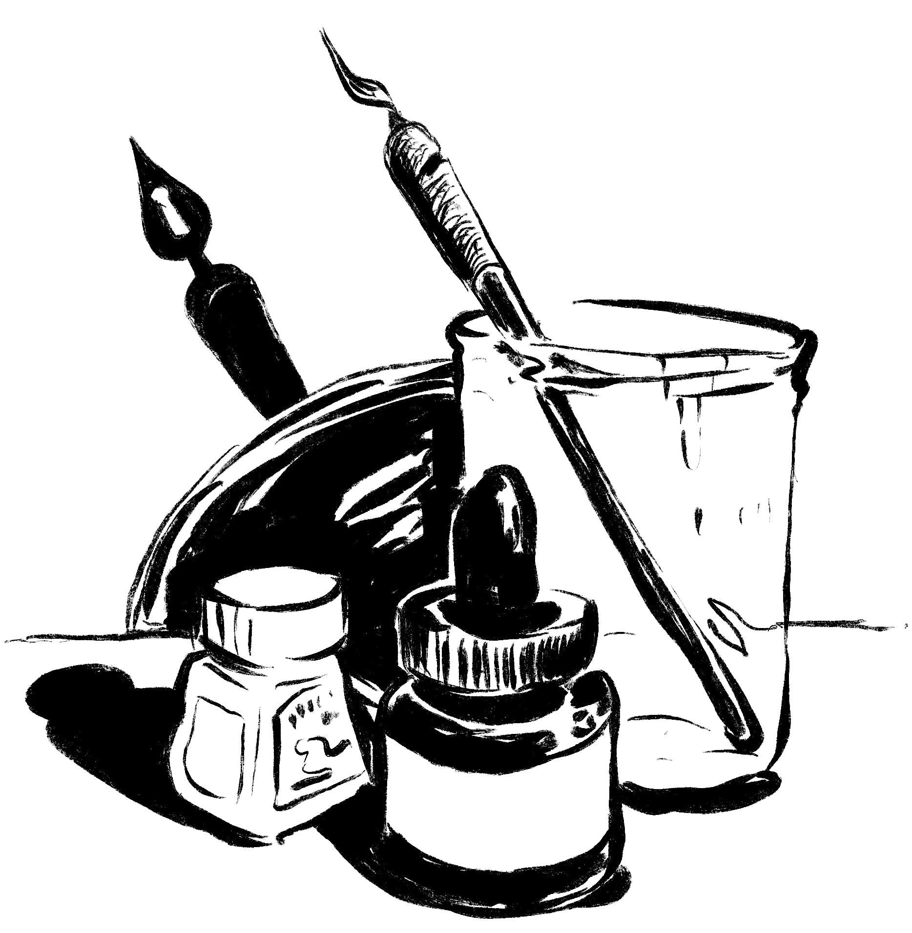
that off of there. So here's my ink still life, a couple objects from
my creative practice, done in a nice, loose, textured indian style, playing with line weight, focusing on highlight, shadow, trying to create
a little sense of depth for these
objects in the scene. That's my let's bring that
line across actually. My uh Horizon one is
doing in my shadows. I'm turning my shapes into forms by adding the
contour of the objects, and I'm sharing a bit about the tone of what it feels to work
with these materials, the messiness of ink that
is also its character, that balance of
chaotic materials, but also the precision
of the tool. I think that's all
there and how I ink, and I think that's a great way to think about developing
your own style, whatever your balance
of clarity and tone is. That's our class project. In the next chapter, we'll
just do a little wrapping up. So let's go to that.
9. Sharing Your Work!: Okay, I hope you had fun
exploring pen and ink, and if this course
inspired you to create a class project,
I would love to see it. You can post it in the class project section on Skillshare. I check in every day
to see if there's new work from aspiring artists, and I love sharing
feedback and guiding you towards next steps in
your creative journey. I have a channel of over 20 courses that
focus on narrative art, cartooning, comics, and more pen and ink techniques like the ones we cover today. So if you have a moment to leave a positive review
for this course, that would be really
nice because it helps. Others discover it. Now, as a bonus chapter, I'm going to dig into
some of the artists who influence my work and
this course in general. So if you want to join me
there, that'd be great. Otherwise, I'll catch you next time and I look forward
to seeing your work.
10. BONUS: Inky Inspirations!: I was thinking about
the techniques I wanted to focus on
with this course. I couldn't help but remember one of my
favorite graphic novels, illustrated by Jillian Tamaki, who's a contemporary
illustrator, cartoonist. They work in comic art, illustration and
children's books. This one summer is maybe my favorite work that
they've been involved in. It's inspired things I've made. Gillian's ink work has a looseness and a control
and a remarkable clarity. And they draw everyday subjects, they carry emotional weight, but they also feel like they're
excerpts from a journal. They're so personal and simple and almost train of thought
and they're whimsy. There's this nice almost
italicization of their line art. It feels like elegant
and loose and there's so much texture
of the tools present. You can tell how confident
they are with their work. While they explore so many ideas and topics in their line art, there's a looseness that
still makes it feel slightly unresolved or open in the
way like a fading memory. Can be. That's Jillian Tamaki. Next, we're going
to take a look at cartoonist Walt Kelly. He's best known as the creator
of the Pogo Comic strip, which ran from the early
40s up through the 1970s. As line art feels
like a rubber band, I guess, is the way
I would describe it. It's elastic. It's efficient. It's full of energy,
potential energy, but it also there's this warmth in his character
designs that comes through his line art is great
for a motive expression, as well as loose, gooey, almost set design work. It's a perfect formula
for cartooning. Whether he's drawing
these big globby trees or a turtle or a bird, there's this amazing sense
of work building that's unified by his loose,
consistent style. Last but not least, we're
going to look at Tomi Ungger, who is a prolific illustrator. Their career ranges from political cartoons with very
serious and heavy topics. Poster art editorial work
and children's books. Is ink drawings have this bold, really economical precision. They're fearless in the way they use just a few decisive
strokes to communicate. But of course, they can still be playful and that tone comes from the strong contrast and graphical clarity that's present and not so much
the small details. His style really shows how a strong illustrative
voice can adapt across all different narrative forms while staying unmistakably
clear and individual.
 Ira Marcks, Cartoonist