Transcripts
1. Introduction : Hi, Welcome to my class on painting landscapes with gouache, using a limited color palette. I'd like to share with you my tips and techniques for using gouache to paint a stylized scene. Throughout the class, I'm going to paint three different landscapes, and while I do this, you'll see how I use the gouache in a flat layered way, adding the detail in last with lots of different brush marks. I'm Kate Cook, artist, illustrator, and surface pattern designer. I've spent pretty much all my working life painting patterns and illustrations and using lots of color. But sometimes you can get too carried away with it and end up using every shade you come across. I want to show you how I control my use of color to gain a more consistent and harmonious composition by choosing and mixing our color palettes in advance, is a great way to stop us adding more and more unnecessary colors and make us use our brush marks to achieve what we might have tried to do with another color. This isn't a class about painting a realistic and highly detailed study of a scene. It's a class about how to stylize what you see, what to include and what to leave out, and how to use brush marks to achieve the detail. I also want to show you how I tackle painting a landscape in quite a systematic way. I break it down into stages, so it doesn't seem quite so daunting. I'm going to take you step-by-step through everything. Starting with the materials I use, the way I find a scene to paint, my color planning and paint mixing, sketching the scene, and my painting process is going to be great fun, and I think you'll find this a really relaxing and rewarding class to do. By the end of the class you'll have the tools, techniques, and confidence to do my project and paint your own landscape in gouache using a limited color palette. Let's get started. First, I'm going to tell you about the project I've set. See you in the first lesson.
2. The Project: For the project, I'd like you to find a photo of a scene that inspires you. Maybe it's a photo you've taken when you're up walking, or a photo from a holiday. It could just be a picture you find in a book, magazine, or on the Internet. If you paint one of the scenes that I painted in the class, then feel free to use one. I've put them all in the class resources for you to download. I'm going to take you through how I choose a color palette, mix my colors, get the bright pink consistency, and also how to experiment with all your brushes to achieve some interesting marks. That's the key to the style I'll be teaching you, brush marks. Even if you don't feel massively confident in your drawing skills, it's not a problem. I'll show you how I use lots of different brush marks to make layers of color and paint which give definition to the areas, shapes, and elements in the scene. It's a great technique and one I've developed over the years from my days as a textile designer and a slight obsession with patent. Before you get started on your painting, I've set some brush exercises to get you more familiar with the different marks you can achieve with each brush, it will give you a great reference to look at as you develop your painting, and will help you get the best out of using a limited color palette. Don't be nervous about doing this project. I'm going to give you loads of help and I know you're going to really enjoy it. We aren't looking for lifelike realism in this painting, so there's no real right and wrong. I'm going to guide you through every step from sketching to paint application. If you've never attempted a landscape before, then this is the perfect time to try. Or if you've done loads of landscapes, then my tips and experience with painting them in garage might really help kickstart a different style or technique. Let's do this together. I'm so excited to see what you can produce. I love looking at all my student class projects. If you share your work in the gallery, then I'm here to help encourage, and give any advice I can to help you on your landscape journey. Once you've done the project, you'll be well-equipped to carry on painting the world around you and no longer be daunted by the prospect of painting a landscape. Let's get started. First, I'm going to show you the materials I use. See you in the next lesson.
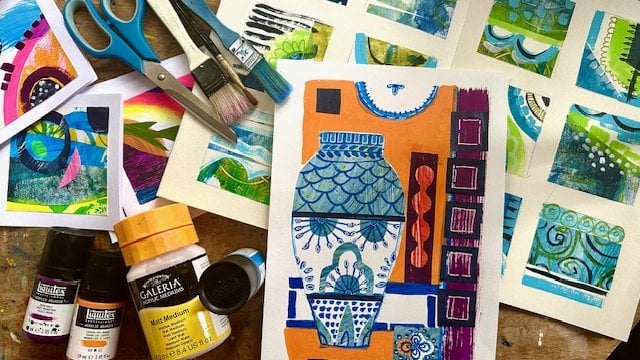
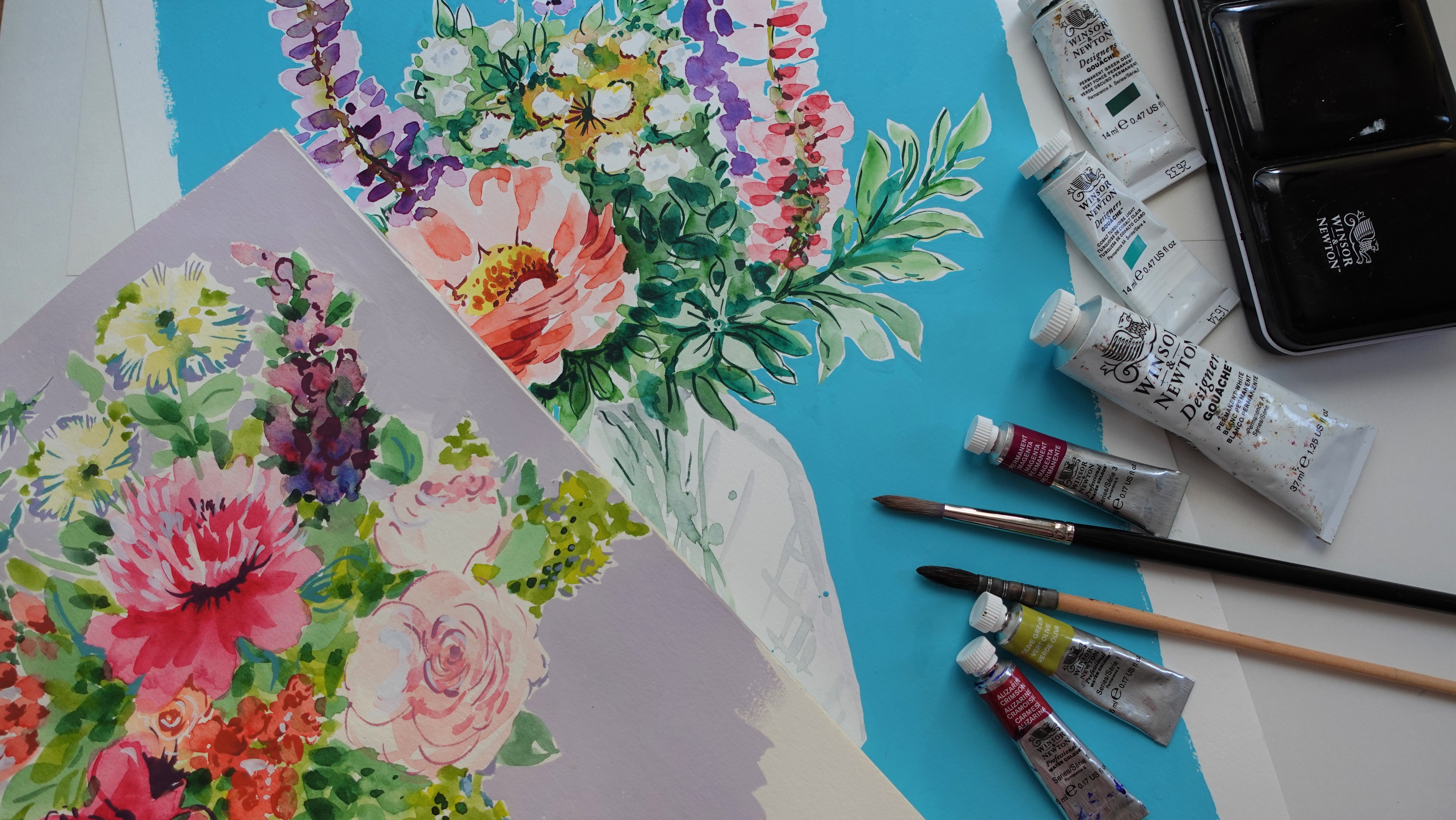
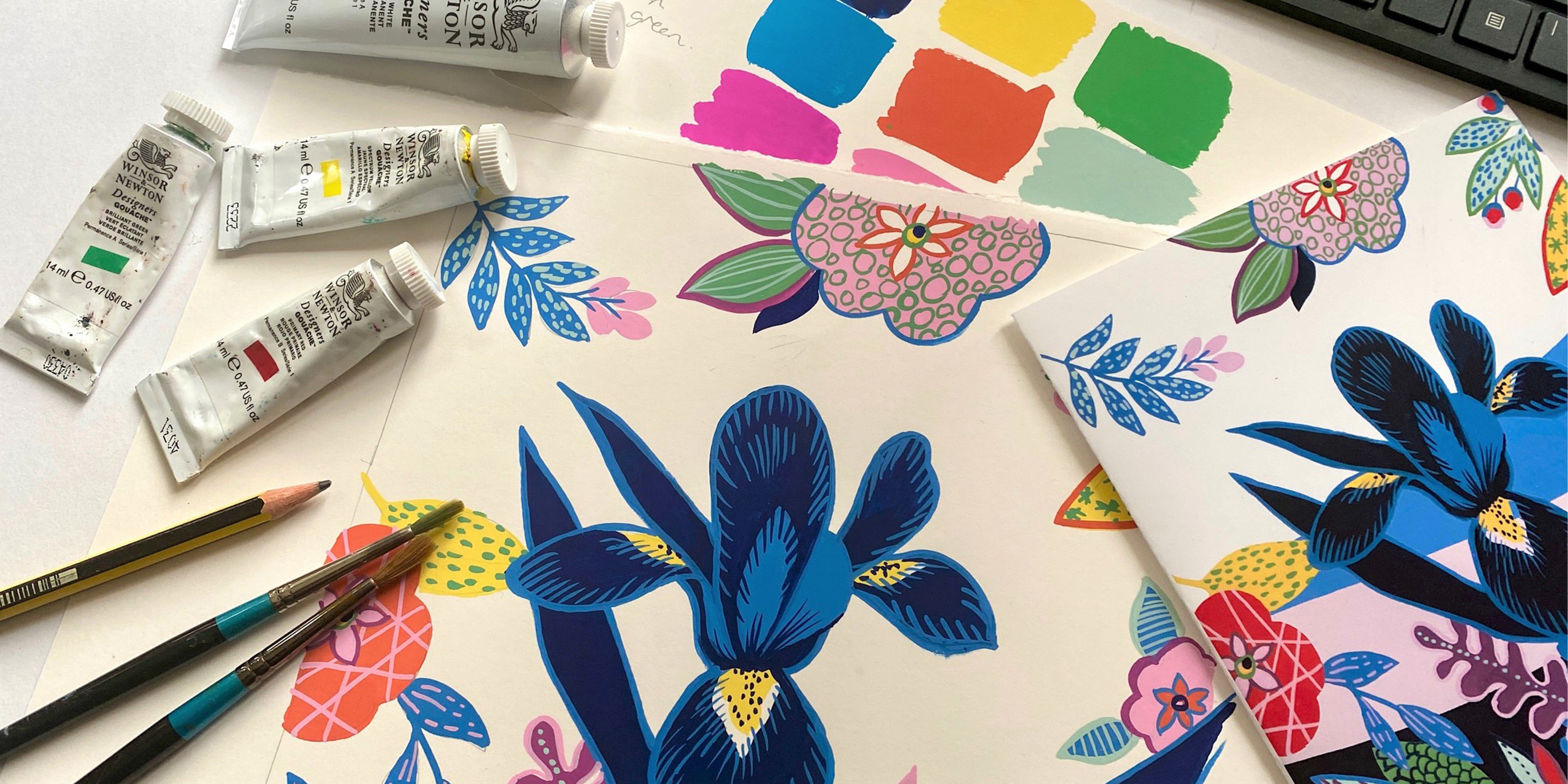
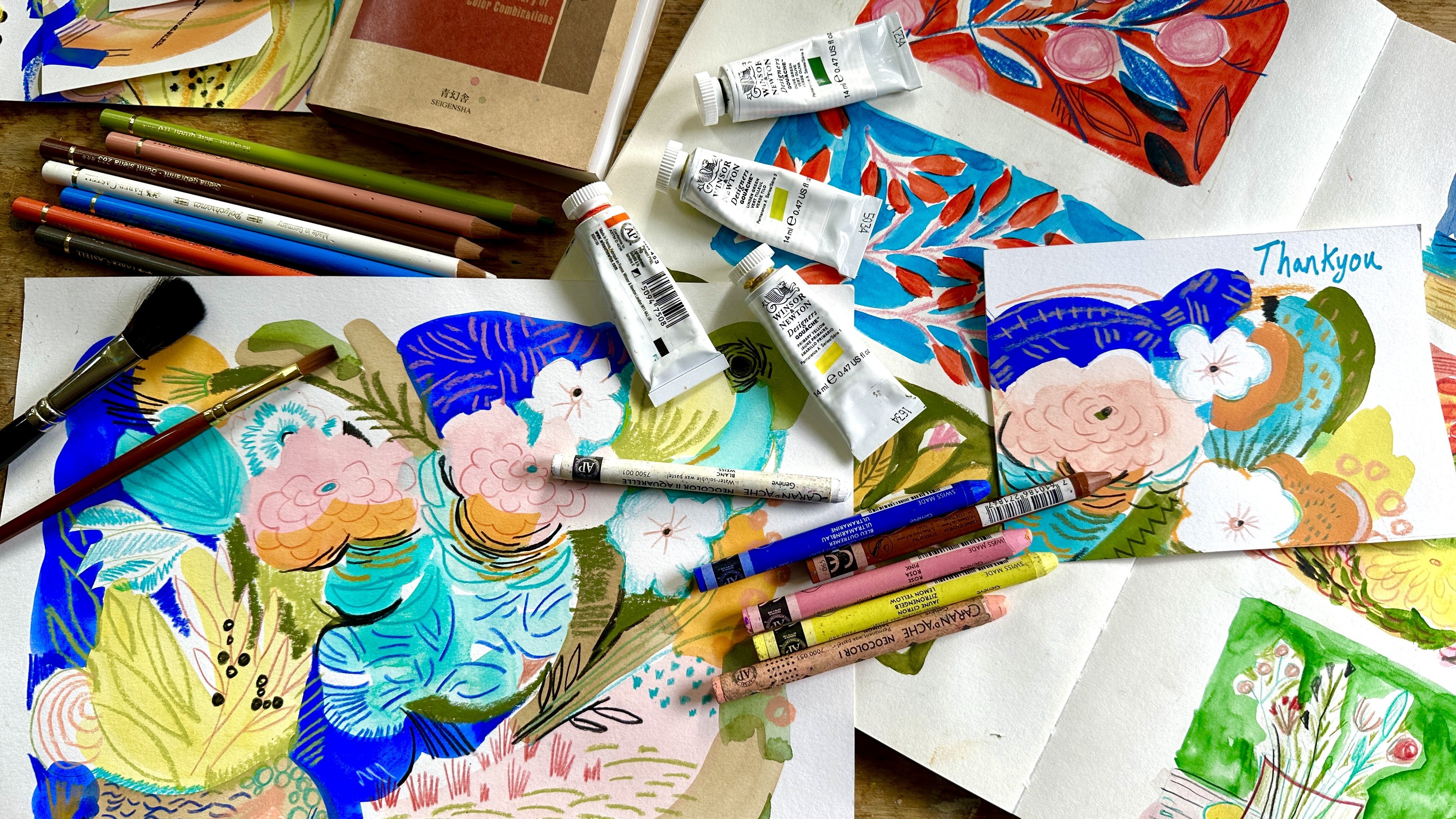
3. Materials: In this lesson, I'm going to talk about the materials I like to use and what I would recommend you buy if you want to do the project. Now, I always like to use a limited color palette, so I don't feel that you have to have tons and tons of different colors of gouache paint. Really, I will suggest the ones I like using, but you use the ones that appeal to you, the color palette that you like. Don't feel obliged to buy every single paint color under the sun. I like to use Winsor & Newton gouache. It's great quality and easily available in the UK, but use whatever brand is affordable and available to you. Now the colors I'm going to recommend having for this class are just a guide. Use what you have. But the ones that I really like start with permanent white, I can't live without permanent white, which is why I have such a big tube as I use quite a lot of it, and of all the whites, I find permanent white the most opaque. Now for the yellows, I use primary yellow and yellow ocher. For the reds and pinks. I like flame red. Sometimes I use a bit of windsor red, brilliant violet, and opera pink is very useful. Greens. I like sap green, sometimes use olive green, and cyprus green is really useful as it's quite a bluey green, so it's great if you need a teel. For the blues, I mostly use indigo. But if you have an intense blue or a sky blue, that's fine too. For Brown, the one that I cannot live without is sepia. I pretty much use it in most colors and I find it really versatile. I can turn into all sorts of different browns. I also like using red ocher as the redy rusty tones are quite useful, and of course black. I prefer to use jet black as again, this is one of the most opaque blacks that I can find. I mix my paints in cut down plastic cups. You could use old yogurt pots or if you have a deep palate, this would work. What I don't like using is a flat palette or plate as it won't contain your paint well, and you'll be more inclined to use it watered down like watercolor, rather than mixing it to the right, creamy consistency. I keep my pots in a Tupperware container to stop them drying out. Brushes. I have hundreds. Over the years I've gathered quite a few. Not all of them are in great neck now though. For this class, I want to use a selection that I know will make some good marks. A few round brushes would be good. Sizes 1, 2, and 4. I've got flat brushes size 2 and a 12 millimeter or half-inch. A filbert brush, which is a flat brush with a slightly rounded edge, size 2, and a couple of angle brushes. I think they both quarter of an inch, and a couple of rigger brushes size 2, which have slightly longer bristles. These brushes are a mix of both sable and synthetic, and to be honest, I don't have a massive preference either to brush type or make. Just use whatever you have or prefer. Paper. I like to use a heavyweight cartridge paper. At the moment I have an A3 pad of Canson mixed media cartridge, that's 200 grams or a 120 pounds in weight. But there are plenty of different brands that are perfectly acceptable. If you do want to use watercolor paper, just make sure it's the smooth variety. As you want your paint and brush to glide easily over it. I'd also recommend using a smooth sketchpad for doing any paint or pattern exercises in. I love this sketch book for [inaudible] , but just use whatever you have as long as the paper is a reasonable quality. You will also need a jar of water for washing your brush, some some tissue for dabbing it off, an HB pencil and an eraser. That should just about set you up to get started on some landscape painting. Next, I'm going to show you how I experiment with all my brushes to find interesting marks. See you in the next lesson.
4. Brush Experimentation: In this first lesson, I want to share with you how I doodle in my sketchbook and keep a little reference of what marks my different paint brushes can make. I like to do this. When I'm in the middle of a painting and I'm feeling like I keep doing the same marks all the time, I can have a quick flick through my sketchbook and get some alternative ideas. I think it really helps to know what your brushes can do, so it's worth spending a bit of time experimenting with more. Make sure when you use each different brush, that you make a note of the type of brush you used. I've painted some squares of color in my sketchbook, light, dark, and mid-tone, and I use a contrasting color on top. Try and use the brush in as many different ways as I can find. Dots, line splotches, crosshatching, loop circles, groups of lines. Another method I'd like to use, is to go back over my initial marks with the background color and paint over them, altering the shape and stan of the mark. This is something that you can't do with watercolor paint, but with guash it works to treat. It's also a great way to blend two areas or different colored paint together, using one color to paint on top of the other and vice versa. You can get some really good fusions of paint marks. I'd like to set you a little exercise that will get you experimenting with your brushes. Pick out all the ones you think might be good for painting in guash, and mix up a couple of contrasting colors in guash more if you like. On paper or in your sketch book, paints some squares of color and have a good play with all your brushes. See how many different marks you can make. Don't forget to write down which brush you are using. Have a go at going back over your marks with the background color, and then paint the two colors next to one another and see if you can blend them with marks using both color paints over the top. This is going to give you a great understanding of your mark making and brushes, and will stand you in good stead to try painting your own landscape for my project. To recap. Gather your brushes, mix at least a couple of contrasting colors, paint some squares in your sketch book, go through all your brushes and experiment with marks. Try blending two colors together using marks. I really hope you have a go with this, and if you do, please share it with the class, and I'll always try and give you some feedback. Next, we're going to look at how to use those brush marks to depict elements in our painting. See you in the next lesson.
5. Using Your Brush Marks: In this lesson, I want to cover how I use the marks and patterns we made in the last lesson and show you how I create objects in my landscapes, like tree trunks, flowers and foliage, and areas of water. I'm going to start by painting out some objects, which I'll cover with the marks. Tree bark is a particular favorite of mine. So I'll play around with that and try a few options. Also, trees and foliage. I've painted lots of tree trunks and a clump that I'll create into a bush. I've got a round number 2 brush to start with and I've mixed a few different colors. I'm going to use a darker gray on top of the three gray trunks. I'll start by using just an elongated block mark to cover the trunk. On the second trunk, I'm going for the same mark but horizontal. On the third, I've changed to a smaller round brush and I'm just doing some diagonal lines. Now with flat number 4 brush, I'm using the pale gray that I use to paint the base of the three trunks. I'm painting blobs on this dark brown trunk. So this is light on top of dark. I'm back with a round number 2 brush and using dots again on this tree. I'm varying the size as I go down the trunk. On the next tree, I'm doing fairly large circles, just trying to keep the marks within the boundary of the tree. On this big trunk, I'm using little dots in a lighter color. I'm going to add foliage to this tree a bit later too. I'm also using a few lines to vary the marks and suggest the shape of the roots at the bottom of the trunk. I will be going back to paint another layer of marks over all these trunks. But it's just easier to work on all of the different trees at the same time. Now for that clump of foliage or bush. Again with the round number 2 brush, I'm trying some marks around the edge of it in the same color to add texture and make it look a bit more organic. I'm mixing up my marks using blobs and dots and lines and leaving gaps in various places. I'm going back to those gray tree trunks and using the paler gray base color again, I'm painting over the darker gray marks to get a more interesting shape. The same with the second trunk and the horizontal marks, and then the trunk with diagonal lines. I'm just going back the other way with the diagonal lines. So I end up with a stitch mark. For the brown tree trunks, I'm doing the same using the original base color and painting it over the lighter gray marks. Just a dot for this one and some lines painted diagonally on the second trunk. For the third trunk, I'm doing a cross through the middle of the spot. Now to that whole tree and I'm using an angled brush to paint in some foliage. Just blobs at the end of the branches at this stage. I'll also add some more branches in at the end. I'm using the round number 2 brush to make the edges of the blobs look at bit more interesting and a bit more organic like I did with the bush. Now, I'm using the dark teal green to paint some blob black marks on top of the brown brush to give it texture and more definition. Back to the whole tree and I've got a pale lilac color to go on top of the rusty brown foliage. With my round number 2 brush, I'm adding lots of blobs and dots to break up the larger areas of paint. Quite like it when it goes over the edge of the brown onto the white background as it diffuses the edges a bit. Next, I go back to the leafy bush and use the brown base color to soften the darker paint marks and blend them in more. Finally, I've got some white paint that I'm just using in a few places as I highlight. It's going to help define the comps and branches of foliage in the bush a bit more. Next, I'm going to experiment with some flowers and more foliage. This time on a green background. So I'm painting out the base color shapes. Now I'm using a small round brush and a dark teal color to make some stoke like marks and also I use some drops to suggest leafy like shapes. I use the same color on the bush shape. Like before, add some blobby areas of the paint to start to define the shape of the bush. I'm going back in with the green base color to make those little leaf dots look a bit more interesting, and the same with the bush foliage. I'm using some lines and dots to define the edges of the dark tale and also run the edges of the brush. Onto another color, and this is a sandy yellow. With a small round brush, I'm trying some circle shapes to suggest flowers and a few other marks for leaves and grass. It looks quite well in the bush, which actually looks more like a grassy bank. But that's quite useful. So I'm happy with that. It will be a handy reference. I'm going to try some pinky orange color now and see what it looks like to suggest some flower heads. Then a bit of really dark aubergine for more definition in my grassy bank. Finally some white, just about some highlights. Finally, I'm going to play around with some marks to represent water. I've painted an area of pale blue as a base. Then I'm going to use sandy yellow to define the edge around it as if it's surrounded by beach. Then using a slightly darker blue, I'll make small brush marks to suggest the dark areas of the water. Once I've done a bit in the middle as well as around the outside, I go back to the original pale blue and paint back into the marks to diffuse them a bit. I'm also going to use some white around the outside beach area to break that up. I want to keep it quite light as when it's part of the landscape, surrounding land looks best if it contrasts with dark colors. You'll see this when I paint the coastal landscape. I'd really love to see what you could come up with if you try this. So we've got the dog, it would be really good if you could use some brush strokes you used in the last section and use them to try painting some tree trunks, water, and some foliage and post them in the gallery. That would be great. Next, I show you how I look for good scene to paint. See you in the next lesson.
6. Finding a Scene: What makes a good scene to paint? I always have my phone on me when I'm out walking the dogs, and if I see a view I like, I'll take a snap of it. I'm certainly no professional when it comes to photography but I know what I'm looking for. I want an element or two to draw the eye into my view. It could be a path, a fence, the way the trees point their branches, maybe a stream or river. I also look for a focal point that I can use. The place where your eye comes to rest in the view. Maybe just off center to the composition. This could be anything from a clump of trees to a building or boat. I've painted this scene of the shoreline many of the time as I love the curve of the beach and I've made the focal point the clump of trees in the distance. I think there is some very technical formula for working out a good composition, but clearly, I didn't pay attention when that came up to art school. I just rely on my instincts to tell me what works and what doesn't. You can always use your artistic license and overemphasize the lines so it creates a stronger pull. Once I decide on my color palette, I can also use color to create this effect. But we will talk about that in the next lesson. I then need to decide on the size of my painting; square, landscape, or portrait. I usually do square. I think it's because I have lots of square frames. But choose the shape that suits the scene you've chosen and encompasses everything you want. I want to show you some artists that really inspire me. This is by one of my favorite British artist, Daniel Cole. I love the way he uses lines to draw the eye in. This collage is by John Piper. Again, you can see how he's used the shore to draw you in and the little road buildings as a focal point. Another of my favorite British artist, Kurt Jackson. The textures he uses are so gorgeous and that egg yolk yellow, well, it's just genius. Now to find a scene to paint. I've been out walking the dog this morning and it's a beautiful autumn day. I've taken lots of photos, some in a square format and some in landscape, and then I'm going to decide which to use. I'm going to try painting this one as I like the way the light shines through the trees and makes a focal point, and the branches of the trees lead the eye in. I'm going to have to make the foliage down the bottom a little more simple and sterilized, but otherwise, it shouldn't prove too complicated. To recap, when choosing a photo, consider lines and shapes that lead your eye into the composition. A focal point just off-center is probably best. The shape of the composition, square, landscape or portrait. Now we look at choosing a color palette. See you in the next lesson.
7. The Colour Plan: In this lesson, I'm going to show you how I choose my color palette and I limit myself to only using certain amount of colors. This means when faced with an array of different shades, I choose only a few that will represent them. In the photo, I've chosen to paint, there are huge amount tones of green, but I'm going to liberate them to just four; pale green and mid green, khaki and the darker teal green. By choosing and mixing my palette in advance, it stops me adding color off to color and keeps my palette consistent across the picture. This is definitely throwback back to my first job in the fashion industry as a colorist. I spent the best part of three years mixing paint colors for fabric designs. We were always limited to a maximum of eight different colors in a design as everything was screen printed. More colors meant more expensive designs to print. It's something that's always stayed with me enough and I find the one discipline I can actually stick to. I've printed out the photo and now I'm going to list all the main colors I can see. I think I want to limit my palette to about 10 colors. I usually give must-have one extra color that I can add in as I paint, but only if I really need to. This is my list. I've got four different greens; pale green, mid green, khaki and the dark teal and I've got a pale gray and white for the sky, a sort of lilac gray which is in the tree trunks and also the type I can see in the trees, a yellow ocher that's amongst the leaves, and also a orange terracotta. Finally, a dark aubergine as my really dark tone. I'm fairly imaginative with my choices and don't stick to very realistic times as I want to find more color. The sand and the orange are very much interpretations of sessile tones I can see in the photo. Next, I'm going to show you how I mix my colors. See you in the next lesson.
8. Mixing Your Colours : In this lesson, I'm going to show you how I mix my paint and match it to the colors I've chosen in my color plan. I'll need my Gouache paints. I've got a good range of colors to use. But the colors I tend to use most are permanent white, sepia, sap green, primary yellow, flame red, olive green, indigo, red ocher, and jet black. I'm pretty sure all these will get me to the colors and tones I want to mix. I should say at this point, I very rarely use color straight out of the tube. Apart from white. I always mix at the very least a bit of white in with the color I'm using. But that's not to say you won't find the exact color out of the tube that you want. It's just over the years I've become extra frosty about making the color my own. I'm going to mix my paints in these cut-off plastic cups. I always use these old cups as I like to mix plenty of paint and I can't do that on a flat palatal plate. You could use this sort of deeper palette if you have one, you might think, gosh, that's a lot of paint, but I really don't want to have to risk mixing more color halfway through my painting. Also, I'm pretty good at recycling paint. By that, I mean, I just remix my colors for my next painting. I can keep a set of colors going for a few weeks before the paint starts to go a bit lumpy and old. To keep my paint, I always put my cups in an airtight Tupperware box. Or you can put them on a tray and then in a zip sealed plastic bag. Sometimes they do dry out, but by adding a few drops of water, you can mix them back to health again. It's quite handy to have an old washing up bottle filled with water that you can add a few drops of water when needed. I'm going to use an old brush to mix my paint. Don't use a lovely new one. Save them for painting. This one is a size six I think. But use whatever you have, although not too smaller brushes, this tends to be tedious to mix with. I'm also going to need a jar of water, some cuts of paper or your sketchpad, some paper tissue, and some decent light to see what you're doing. I've also got the printout of my photo I'm using, its not the best quality, but it will give me a reasonable idea of the colors and tones. You could also refer to the photo on your phone or monitor screens as that's probably going to give you a better quality of color. I usually start with the lightest tones, in this case, that's the pale gray. I won't bother mixing the white as it will come straight out of the tube. I start by squeezing out some permanent white in my cup as that will be the predominant color, and then use a combination of black and sepia to get the tone I want. Grays are notoriously difficult to get exactly right. They used to drive me mad as a colorist when I had to match colors exactly. There really are 50 shades gray more in fact. But I'm not going to get too fussy with this gray. It just needs to be pale for the sky and the highlights. Next, I'm going to tackle the greens, starting with the pale green. Again, I start with some permanent white, and then I added a little sap green. Start off with a tiny amount and keep adding, the sap green is a bit too bright and pure. I want to dirty it a bit. So this is where my favorite sepia comes in. It's a good way of calming down color. Without having too much red or yellow pigment in it, that might change the shade too much. As you can see, I paint out a small square of the color to test it. This is because Gouache when dry, slightly lighter in color. So your wet paint can sometimes be deceptive. I also like to keep these paints [inaudible] is so if I run as a color, I have something to match a new mix too. I'm happy with the pale green, so I'm mixing the mid green next. It's just the same ingredients as the pale, but just a bit more of the colors. For the [inaudible] I'm going to use some of the olive green, a touch of white, and a touch of the red ocher. Another really useful color if you want to dirty up a color and add a warm reddish tone. The teal green is much more of a blue-green, and I'm going to use some Cyprus green as a base, if I didn't have this, I do use sap green and some indigo. I need to turn it down a bit. So again, a touch of white and some sepia will do the trick. I'm going to make the sand color, which I can see in the autumn leaves in the foreground of the picture. I have some yellow ocher which is pretty close to what I want. Again, with a touch of white and sepia, I can get the color and tone to exactly the right balance. But if I didn't have the ocher, I'd use my primary yellow and a little touch a flame red and some sepia to dirty it. Next, I want to make the light gray that I can see in the bark on the trees in the foreground. It's gray here in the photo, but I want to bring out the lilac tones to make it a more interesting color. I start with some permanent white, a bit of indigo, some sepia, and some brilliant violet. I would use the flame red if I didn't have the violet or a pink, it probably won't work so well, but it would still do the job. Now that mid taupe that's in the trees and branches, and this is pretty much sepia with some white to get it to the right tone. If it looks too yellow, I can add a bit of indigo to counteract that because I want it to be more of a brownie black color. The terracotta or orangey tone. Again, it's not a strong in reality as I want to make it. I can see hints of it amongst the foliage and in the word fence, but I'm kind of making it up a bit. Artistic license as they call it. For this I'm going to use some flame red, some sepia and white. Finally, the darkest tone I'm calling [inaudible] I can't really see [inaudible] in the photo, but I like the way it will combine with the terracotta teal and so on. So I don't care if it's really just a dark gray brown. My color is having a purple angle. To get this, it's a combination of indigo, sepia, some violet or flame red, and a bit of black. So there we have it, colors mixed and ready to go. As I've said before, if I start painting and really feel like I'm missing a color, then I will allow myself one extra. Sometimes it's not until you get going that you realize you've missed a crucial color. So a few things to take away from this lesson. Make sure your paint consistency is like double or heavy cream. Mix plenty of paint and store it in a Tupperware box or bag. Try to mix your color rather than use it straight out of the tube. Mix your paints in cups or deep palette. For dotting up a color that's too bright, I recommend using a little bit of sepia, but other colors that can work quite well too are red ocher or the black. But remember to use a tiny bit at a time, as it's much more difficult to reverse. Try recycling your paint from an old to a new color palette by adding more paint and reactivating with water. Use an old brush to mix your paint. Paint out your color on paper swatches and wait until it's dry before you decide if it's the correct color you want. Keep your paint swatches to use in case you need to mix more paint and need to match it. Join me in the next lesson where I'll show you how I draw out the scene. See you in the next lesson.
9. Sketching the Scene : Now I'm going to sketch out my scene starting with this [inaudible] landscape. I've got the printout of the photo, a ruler, set square, pencil, and eraser. First I'm going to draw out the boundary lines of my scene. For this one, it's a square format. I'm drawing a 20 x 20 centimeter square. I'm going to start by putting in the horizon line, and then I'm going to sketch in that big tree on the left. The one that's got another smaller tree twisted around it. I want to just get the main trunk and some of the branches in. I'm really not going to sketch in any great detail, I don't really see the point, I'm going to paint over it all. The sketching is really just a guide so I know where to start putting in my color fields, and I will just add that little gate next to the tree, and that bush area in the background on the horizon. Then I want to get that tree line in, that curved treeline, which is so good at bringing your eye into the focal point of the picture. I'm going to put a few of these trees in. I'm not going to put them all in, I'm going to be quite choosy. Just put the ones in the I think are important to the scene, there's a little fence there that I'm going to suggest. Now I'm putting in that tree on the right, that's got a few branches coming off it that are quite a dynamic angle, which leads the eye in again. Few more branches in the background, just suggesting where these trees are. Now I'm going to put the ones in that sit on that lovely curved tree line. Just a few of them there. Then there's a branch that sticks out of this large tree on the left, that's another quite good branch to bring the eye into the center of the picture. Just get those bushes in the distance, the fence was a bit big. I don't really feel the need to stop adding lots of foliage in, and that foreground is obviously quite busy with foliage. I'm just going to rely on my marks and patterns to interpret that. I might put that bush in, just suggest that. But otherwise, that's pretty much all I'm going to do. I'm going to do my second painting now, this coastal landscape which I've chosen. It's one I've painted quite a few times. Love that curve of the beach, I'm just putting the horizon line in first of all, and then I'm going to suggest where the path goes, because that's quite a crucial element to lead the eye in. Then I'm just suggesting where that fence is, and where the bushes come in the foreground. I'm not going to put any detail of that. Then the water line where the beach comes in. Just want to make sure I get that nice curve of the beach. Now I'm going to put the rough outline shape of that beautiful tree just bending over the beach, and the background where there's some fields and a few bushes. Then the harbor master's office, which is a striking building in black and white stripes. I really want to put that in, I've painted that so many times now, and the trees across the river. I just want to make sure I get that beach curve right and where the bush is. Really not going for any great detail at this stage at all. I think that's done. For my third painting. I'm going to show you how I paint a landscape looking through a foreground of vegetation. For this, I've chosen a few photos. This photo is great because it's got a scene in the background, and plenty of foliage in the front, but I want a bit more interest in the foreground, so I'm going to combine it with some photos of flowers and leaves that I like. I'm starting by putting the shoreline in just behind the vegetation, and then the horizon line where there's a strip of land. That's the water in between the foreground and the background, and then I'm just adding in the sea wall on the right, and there's a jetty that sticks out into the water. Then some fields and hedges and bushes in the background. Just fitting those in, suggesting the shape of them, and I'm not going to put any detail into that background. I think most of the detail in the painting is actually going to be in the foreground anyway. It's just that little corner of beach that pokes through, and then I'm going to start drawing some long grasses, some of the foliage that is in the photo of the rushes and nice spiky leaves. I'm just going to suggest some of those. Again, not putting any great detail in, it's really just a guide. I'm drawing the thistle head now. I love this photo of a thistle head, it's quite an interesting shape. Quite like the spikiness of it and those lovely tendrils. I'm going to put one as a focal point in the middle of the picture, and a second one next to it, I think. Then I am going to put some of these pretty flowers in. I think they'll look quite interesting to paint, and more obviously, with that lovely violet color are going to work well. I've got three flower heads there, and then this fern, I love ferns, they're really nice leaves to paint. I'm going to put one in the corner there, add a bit more of the spiky, beachy leaves over to one side. Just a few more bits in the right-hand corner. Yeah, I think I might put another thistle, smaller, just in the right-hand corner to balance things up a little bit more. That's all three sketches done now. As you can see, I didn't really go into any great detail with them. In the next lesson, I'm going to show you how I start the painting process, by using what I call color fields, to fill in the larger background areas of the picture. See you in the next lesson.
10. Painting Colour Fields Final : In this lesson, we're going to tackle the initial way I start to put down paint. I like to start with painting in the larger areas of background color. That way I have more chance of getting a nice, smooth, flat area of paint. I tend to start with the lightest color. I'm going to use the power grade paint in the sky first and leave areas where the larger tree trunks and branches go. Out of the sky painted I move on to the pale green. I'm just filling in that area of graphs in the distance all around the base of the trees and up to the horizon. It's a triangle of green in the middle of the picture. Although I'm just using these lighter colors to paint the background at the moment. I will return to using them when I start to add detail over the top. You'll see how the layers of colors build up as the painting progresses. You can see why it's so important to mix plenty of your color in a pot, so it's the perfect consistency and goes on in our very smooth and flat style with not much streakiness. As you can see, I've also used the mid-green to paint in the mid-ground and some of the foreground. This is just a background color waiting for lots of layers of detail on top. For some reason, my footage of painting this failed to work. So I can't show you that when I was doing it, but yeah, don't you just love filming naught. But anyway, now, I've moved on to the lilac gray, which is the base color for my tree trunks. You'll notice I also added some of the tree foliage in the mid-green, again, very loosely painted. I'll add marks on top of this to do a better representation of leaves. This lilac gray is quite a handy color that I'm using now. It's a nice contrasting mid-tone, unlike heart works with the green. It's better than a boring old brown. I have smudge my green paint in an area that I want to keep white. I'm just going to paint over this march with some permanent white. I might have to do this several times just to make it really white. Now, I'm carrying on with my lilac gray. I'm going to use it for all those tree trunks in the background is, I think it's going to be a good color to work on top of, both with the lighter and darker colors when I start to add some detail. Then I'm going to leave the trunks in the foreground for the moment as I think I want them to be tobe as a base color, and I'll use the lilac gray on top for the detail. The brush I'm using by the way is a round number 2, I would use something slightly bigger but I like the control of a smaller brush for areas like the branches. To be honest I can't be bothered to switch brushes. Very lazy. I've speeded up filming a bit now as I think you'll be getting the idea of how I tend to get the base color painted in. I'm using the lilac gray along the horizon to in a clump of bushes. I'm also going to use it over the top of the pale green and just start to suggest some shadows. But I'll come back to this more later. I've actually decided I'm going to use the lilac gray in this tree on the left in the foreground. As I want to pain the small tree which is twisted around it in the top, so it gets a bit more of a subtle contrast. Now, I'm using that toe, which is slightly darker than the gray, so contrasts quite nicely. I've started to paint the smaller trees in the foreground on the left to the right. I'm certainly not going to attempt to paint every branch in, I'm just picking main ones and making sure they also tape a nicely into the distance. I'm adding a few more branches here and there. I'm also going to add some shadow down on the side of some of the trees and along the horizon. I'm going to fit in that foreground on the left around the tree base as well as I quite like the toe contrasting with the green. That's all the background color fields done. Now for some detail. See you in the next lesson.
11. Painting Detail : In this lesson, I'm going to add the layers of marks and patterns which will represent the detail in the picture. I'm starting by using the pale gray again, and I want to add some quite big splotches of it over the white sky so it blends better between the solid gray and this area of pure white sky that represents where the sun is shining through the trees. For this, I'm using a flat brush in a size 4 as it gives me just the right shape of mark I want. I'm taking care not to go over the top of the trees, but if I do, I know I can go back in with the tree color and paint out the mistakes. I'll try to vary the monks by turning the brush around as I paint. Now, I'm using the pale green again. I'm putting that gate post in on the left. Then next, I'm using that lovely ginger orange color. I paint the wooden fence in the distance. It's such a nice contrast to the green and the gray. I'm going to use the sandy yellow color now. I feel like I can see hints of yellow on the horizon, so that's why I'm adding it. I'm using my round number 2 brush again and making small round marks to blend into the green. It doesn't contrast and show massively well, but it turns the green a lot more of a leafy green color. This is how you can make your limited color palette work for you by tricking the eye slightly as the two colors work together to make another color when used in this way. I'm also going to use it in the distance on top of an area suggesting the bushes that I'm painting gray, are quite like the yellow on top of the gray. It's nice to use for some of the detail there. I'm also using some of that ginger orange as well to make it a little bit more interesting. I'm back to the pale green and I'm using it to make some marks over the top of the mid green to blend the two areas together. The brush I'm using now is the Filbert number 2. It's the slightly flat, rounded brush and gives a wider mark. I'm going to change my brush and use a flat brush now, size 4. I'll just use the tip of it to dab the paint in a thinner, longer mark. You can even use it to make some cross hatch marks too. Onto that dark teal, and I'm using my wide flat brush size 4 to make some quite bold marks in the foreground to represent the darker green foliage. I'm also using it further back in the mid-ground to suggest some darker areas of foliage too, also in the tree trunk on the right to show you the ivy that's climbing up. I'm changing to a small round brush size 2, and I'm going to try and suggest some lines to represent stokes and branches that I can see in the foreground. I'm relying quite heavily on artistic license here, but I want to mix up my mark making so the lines are a nice contrast. I'm also going to use it to suggest some shadows and define that fence a bit more. I'm painting in some trailing stems amongst the ivy. I think I'll also use it to do some fine dots over the green midground area. Again, blending this space with the different colors and marks, small stokes amongst the foreground. It's just a case of looking for areas that have a dark aspect to them. If you squint your first graph, you'll be able to spot these dark areas better and understand where to aim your dark brush strokes. Now, I'm using the mid green again and putting some marks over the pale green to blend the two areas more. As you can see, it's a really good way to blend the edges where two colors meet so you don't just get a line. I'm also using it to suggest some more shadows in the distance from the tree trunks and also on the horizon line. You'll notice I'm not paying massive attention to the original photo of this scene. It's really only there to use as a guide. Then I'm doing my own thing as far as the marks are concerned. I just judge as I've got on what looks nice and try to keep a balance of flat areas and more patent areas. If I go too overboard with the marks, it's going to become confused and messy. I'm trying really hard not to go mad with marks, but it's quite difficult. I also worked back over some of that dark tale that's on top of the mid green area. By doing this, I think I'll achieve some more interesting marks. I'm working back into those clumps of dark teal ivory just to blend it a bit as the shapes are pretty big and bold. Here, I'm using the green on top of the taupe to suggest some more leaf-like shapes in the trees. I'm trying to break up the smooth lines of the tree foliage so they aren't quite so rounded. I'm just using the round number 2 brush. I'm back to that clump of ivy in the foreground on the left, and again, adding spots on top to make it more interesting. I really like the way that you can lay a gooish light on top of dark. Something you can't do with watercolor. I'm also using tiny dots of green to change the shape of the marks in this bush on the right. Next, I'm returning to the pale green, and with the round number 2 brush, I'm using crisscross lines to represent the bark on the trees. The pale green seems to be working quite nicely on top of the lilac gray. If it wasn't, I could always add a bit of permanent white to it so there's more of a contrast. I've got my Filbert number 2 brush now, and I'm doing some part blobby marks in the tree foliage to break that flat mid green up. I'm trying to hold back and not go too crazy with the blobs. I'll put some down in the mid-ground on top of the green just to break that area albeit. Now, I've changed to the round number 2 brush again. I'm using some different shape marks. This is why it's so good to have a sketchbook with some art-making experiments in to refer to. You can forget how to vary a mark quite easily when you're in the middle of a painting, so it's useful to have a reference. I'm using more wiggly lines to suggest the foliage in the foreground. It's a nice contrast of shape and makes these plots look a bit more like bulrushes or flowering grasses. I'm also going to use some brush strokes to define that bush on the right so it stands out a bit more. I'm putting some highlights around the edge of it as what is amongst the ivy. I quite like those wiggly shapes, so I'm going to echo them in the trees. It's just a case of having fun with your marks really and seeing what works. If you don't like it, you can paint over it or only do a tiny area, and then if it doesn't work, move on to a different mark. I'm back to the dark teal now, and with the flat number 4 brush, I'm using it to make some darker marks amongst the trees. I'm also using it to suggest some shadows down the branches. Again, I'm trying not to overdo this as if I get it wrong, the painting will come very heavy. I'm not just using lines, I'm using bigger marks as well as I feel they give a more interesting look, more like the tree book. I'll probably go back over them with the taupe if I think they look too heavy. I'm also using it in the distance to add some more branches in the trees that are further away. Next, I'm going to use the ginger color and put some brighter contrasting marks amongst the foreground. In doing this, I'm trying to balance out the use of this color in the picture. I've changed to the round number 2 brush, and I'm just adding some dotty detail in the trees. I know this color doesn't appear here in the photo, but I don't really care. I like it and it's working for me as it's breaking up the pale green blobs. In fact, I'm going to add the sandy yellow color too. I'm also using this to highlight some areas in the foreground and on the fence. Now, I'm going to use my dark khaki for the first time. I didn't use it anywhere in the color field baseless as I've saved it to use as detail. I've got my flat number 4 brush, and first, I'm using it in the full ground to add another dimension to that bottom left area. I'm also going to use it in the mid-ground, and I'm just using the tip of the brush to suggest some graphs like marks in contrast to the other marks in this area. I'm going over the top of some of the pale green spots to break them up a bit. I'm also going to use it as those leaf-like mark in the foreground for that central clump of stokes and grasses. Again, I'm thinking about the contrast of the marks. I'm also using it on the horizon line to add a bit more depth to the distance, and it's quite a handy color for the small tree trunks in the foreground to get some shadow. I've speeded up my film a bit now as I said, you should be getting the idea by now and can see how I progress with my marks, trying to keep it balanced with the color and using it to break up the foliage a bit more. I'm now using the lilac gray to go back over and layers and detail. I think it's a good contrast in color to use on top of everything, just to add a few more little bits of detail. But I'm trying to be quite subtle and not overdo it. I'm using it to correct a few things on the tree trunks if the taupe is a bit heavy in some areas. I want to use the taupe again to try and get that really nice bulk pattern on the big trees in the foreground. The way I intend to do this, is paint some blobs with my round number 2 brush. I will let it dry and come back to it with lilac gray marks over the top. But for the moment, I'll carry on with the taupe and use it to define the tree trunks and branches a bit more in the distance. Now, I'm back with the lilac gray and I'm putting spots of it on top of the taupe spots to try and represent that interesting bulk effect. Hopefully, it doesn't look too much like an animal print. But I think it's quite effective. I'm using some permanent white straight from the tube to work back into the pale gray because I want to achieve that dark wood sunburst through the trees. I'm just using a round number 2 brush and dotting around the white in the gap in the trees. Now, to use the final color, that dark aubergine, which is really a color I want to use sparing just to add some depth and shadows, no big patches of it. I've speeded up the film again so you can see how I cover the whole picture, adding some extra dark small branches here and there and some darker details in the fence and the foliage at the front. I think I want to calm that aubergine down a bit so I'm going to go back over it with the taupe in places that I think need it. My final step is to use that white again, and with the round number 2 brush, I'm creating a sprinkle of dots to show the sun shining through to the trees and the dap of light bouncing off them. I think I'm done. Some key things to take away from this lesson and from the previous one. Paint the larger background areas first. Start with the lighter colors and build up to the darkest. Refer to your mock exercises and try to use a variety of different ones. Keep revisiting your colors so you can make new and interesting marks. Finally, please post your paintings in the gallery so I can see how you're doing. That's the final painting. I'm quite pleased with it. I've overdone a few areas, but on the whole it's pretty good. In the next lesson, I'm going to show you how I tackle acoustosine. See you in the next lesson.
12. A Coastal Landscape : In this lesson, I'm going to paint the sketch I made of the coastal landscape. I'm going to adapt the paints I mixed with the first landscape to use for this. I won't go back over how I chose the colors so hopefully, you got the idea in my color plan lesson. They won't be massively different from the last painting. I'm just going to tweak them, mix a bit extra, and still stick to a limited amount of colors. Again, I'm starting with filling in the large flat areas of the picture, so I have a background painted in to work on top of. I'll start with the lightest colors, a pale blue-gray for the sea, and a different pale-gray for the sky. I'm not going to to you all the way through this, but let you sit back and watch while I play some nice music. We'll have a chat about what I did at the end. I'm just putting in the last few details using the pure white and an angled brush to suggest in mass in the distance, and getting some of that white to represent the reflection on the water. It's quite a good brush for those backs. Then I'm going to use a smaller round brush just to add some dots along that path and in the bushes. I think we're nearly there. I'm quite pleased with it. I think it works quite well. I've really loved that lilac against the ginger in the tree. To recap, I started with the lightest colors and filled in all the big areas like the water and the green foliage in the background, and that big bush in the foreground. Once I've done that, I started adding detail in the path and fence, and then that big tree. Next, the bush, and I used a variety of marks and colors to add some interest. I then ended up using some marks to show the ripples of the water. I've carried on using darker and darker colors and then start going back to some of the lighter shades to get those more interesting marks, and so the detail adds up. It's just a case of deciding when enough is enough. Next, I'm going to show you how I paint a landscape, looking through a full ground of foliage. See you in the next lesson.
13. Landscape Through a Foreground: In this lesson, I'm going to tackle my third painting, a landscape, seen through a foreground. I'm going to again carry on with the colors from my previous paintings. This time, I'm not going to change them too much. I'm going to leave a few out and add a more intense violet, a pink, and a very dark burgundy, so that I can replicate the colors of that beautiful flower, which I still, don't know what the name of it is. The way I tackle this scene is we're going to paint in the larger areas of color first. This is pretty much all the background and I'm going to leave areas of the foreground bare. It's a bit more tricky to do this obviously as it's a case of painting around the foliage. I like to leave gaps for the foliage because I suppose psychologically, I feel that I know where they are then and I like to paint my gouache straight onto white paper really. It changes slightly when you paint color on top of color. I'm starting with the palest colors and I've decided to use the same pale gray, the sky as well as the water. I'm now going to move on to a slightly different pale gray that I'm using for the lightest areas in the background. As you can see, I'm going to use it for a bit of this sea wall in the distance, as well as this beach area just in the corner on the right. There's this little square of beach that's crossed by some grass. But I'm going to put in that pale gray first and then I'm going to move on to my mid green, might just want to put in that field in the distance and then I'm going to use it again on the beach for that stripe of green grass that goes through the middle of that little area of beach. Fill in a bit more. Now, I'm on to this mid gray and this is really just the horizon and I'm not going to do any great detail in the background because really this is just to contrast with the details that will go on in the foreground. I'm using quite neutral colors I'm just getting a bit of a wall in there at the side and then I'm going to use it to define that coastline a bit and make the two grays of the water and wall defined a bit more. But again, there's not going to be any great detail here. But I like the fact that there's a few constructions to contrast with the foliage and now I'm using my darkest green as a sort of tealy green. I want to go in and put the background around all the foliage that's in the foreground, if you know what I mean, so I'm painting around some of the main of leaves and those thistles and all the other different foliage that I'm going to put in. Now I will paint over this green but I think I'll really want the dark green to go in first so that the predominant foliage will really stand out because obviously when I paint on white rather than that green, it will work better. Now I moved onto that pale green in the distance and I'm using that dark green again in the distance as well, just to get some definition and get those trees and bushes in. You can see this paint is getting a bit old now but I'm going to carry on using it you can tell because it's got a bit bubbly and that's really a sign that gouache is a bit fed up and doesn't want to carry on being used much longer. But I have been aching this paint out for quite a long time now and it probably is about ready to give up and go in the bin. I'm back with that mid green and I'm going to now put in some of those leaves and stalks in the foreground with it. It's quite nice contrast against the background, against the sea and the sky and it shows up well on that dark background. I'm not going to worry too much whether I'm leaving some of white, because there are other colors to go in here that I'm going to layer up and eventually I'll probably go back to that dark green and paint around few bits and pieces. But for the moment, say in this corner here I am actually painting over the dark green and it is slightly different when you paint over a color to when it's just on white. You can add a few leaves here and there and now I am going to put in those grasses and I've got a nice sort of sandy beige I'm going to use for the grasses and just suggesting some of them in the foreground and one's that are sticking up over the view as well. I'm being quite heavy handed over here. I'm just putting in quite big blobs of areas of the color and what I can do is paint some detail into it and then go back with that background color of the grays of the sky and the sea and paint back into that color to refine it a little bit eventually. As you can tell, I'm not really looking at the photo I'm just putting leaves and stalks in where I rather look at them really and where they work around the thistles and the flower. I'm carrying on with adding bits and pieces all round this foreground in the beige, I quite like the color, the contrast of it. Just a little bit at the side, make this grass look like their leaning over and in the distance, I'm going to use it as well, that sort area in the distance is appear as well on the distance that I will put in later and I'm going to suggest that beach now by using it for the stone area and now I am going to paint those flowers in. I'm going to use that really dark burgundy to paint in the majority of the flower area. Because I'm going to come back with the pink and paint on top of that. Next, I'm moving on to painting in those thistles and I'm using this to pale slimy green to paint the inside of the thistle or the background of the thistle really and I'm leaving spaces where those lovely curly leaves go and I'm just doing the third one just on the beach end of the foliage. Now, I'm going to use the mid green to do the fern on the left-hand side. Sorry, you can't see it very well, my hand is in the way. I've painted the stalk and then the fronds of it. I'm just using it now to paint in blobs for the leaves. I'm going to go back in with the paler green and paint on top of that, not in massive detail, but in enough to give it a more interesting look. I'm just putting another frond in between some of the foliage as well. I think these marks are quite a nice contrast to lots of those pointy leaves. I'm just going to use it also in the thistles to do those lovely curly leaves. It's not a huge amount of contrast between those two greens, but I'm going to use that dark green to define them a bit, a bit later on. That's the third one I'm doing now. I think you're getting the idea of how I'm working this foreground. I'm just using it in that grassy area on the right. Now, I have an apology to make. For some reason, the filming of my pink flowers didn't quite work. You can see here what I've done, I've just painted the mid pink that I'm using. I'm going to put the vial on top of it as well, but you can see the effect it has. I've just copied the flower really and stylized it a bit. Now, I've decided to go back in with that pale gray that's the sea and the sky. I'm just housekeeping really, tidying up a bit around the flowers and the leaves where there's white bits that I've left. I'm back with the beige now. I'm just going to get rid of some more of those white areas, paint them as inner stalks. Put a few more grassy fronds amongst the foliage, just mix it up really, and try and get a contrast going on, not have too many dark gaps showing through. A few single lines are quite nice as a contrast. You can see I'm just filling in those white spaces and painting layers over the top of some of the other colors. Next, I'm going to return to the gingerly color, which I've already used in the background. I'm going to use it as a darker color on top of the grass areas. I think it works quite well onto the beige. I'm just using short little brush strokes with quite a small brush. Just getting some definition in the grasses really, make them a bit stronger using a few dots as well. Trying to mix up my strokes, make them go in different directions to give a bit more interest. I'm just finishing off a few of the grasses so you can see over the sea. Now I'm going to go back into the main area of the foreground and put in some bits and pieces, maybe outline a few of those beige leaves, put some stalks in, a few more marks to define the grasses that hang over the beach area. Now, I'm using the dark green to just define those leaf fronds that wrap themselves around the thistle just to make them stand out a little bit more because I don't think they were strong enough really without that. Now, I will add some dots to suggest those spikes of the thistle. I'm going to use the darkest color first on top of the green, and then I'll come back later with a paler gray to suggest the more highlights of the spikes. Again, using it in the third one. I quite like the contrast of the dots against the other marks I've made. I'm just going to define that flower a bit more and paint back in with that dark burgundy into the pink so we get a interesting shape going into the pink. I'll be using the violet next. That's more of a lilac I suppose. Just trying to get those tiny little flowers that are almost like little daisies that grow off the pink stocky fronds. It's quite a pretty flower really. I'm showing you what it was. It's quite a nice flour to use actually. I'm back now using that pale gray of the sky and sea. Again, painting around areas and working in to the grasses just to give a bit more interest, define them. Again, I'm just using blobs, I'm not trying too hard. But I think as you layer things on top of other colors, it creates a really interesting textures and shapes. Now, I'm going to use it as a bit of a highlight in that thistle. I'm really trying to work on those spiky bits. Just painting over the top of the dark and the mid green really seems to be quite effective. Quite like that. I don't want to put that light color everywhere though because if I use it too much, it's just going to look like a patents do. I do quite like to define those thistles a bit more. They're the main thing in the center of the painting really. Now I'm going to use them as dots in the center of those tiny little daisy flowers. I'm back with that dark green again. Let's move here into that grassy area, do layers and layers going back between the mid green and the dark green. I just want a bit of definition in the far distance just so that those blobs don't just look like blobs and they actually look a bit more like bushes and trees. But again, like I said before, I'm really not going to go for great detail in the distance. I just want to break up the solid color a bit more. I've put a bit in the gray, but not too much. I just want to make that light green area a bit more broken up. Now you can see, again, I had video failing mishap, where I can't really show you what I was doing in the fern, but you can see I've painted lots of blobs into it. Now, I'm using that really dark burgundy from the flower to get even more depth amongst the foliage. It's quite a nice color to use. I'm going to use it in the background as well. It is my darkest color, so that's what will define things. I'm putting that pairing and just defining those bushes and fields and that sea wall area where there's various bits of wood and garden that stick out of the sea, put a few of the tree trunks in. Now, last full, I'm going in with some white, not a lot of it, just in the area of the beach to break that up, make it look a bit stony compared to everywhere else. In fact, I think I probably need another color. I might put in that mid gray, mix that in as well. It just needs to look like gravel really. I think we're nearly there. I'm pretty happy with that. A few more dots, a few more little brush marks. I think we're done. Some key things to take away from this lesson. Paint some of the darker colors in first as a background for the foliage in the foreground. Don't make the landscape background too detailed. This way, it contrast better with the foreground. Don't be afraid to leave gaps in the foreground foliage, which you can fill in later. Next, we have a recap of what I've shown you in this class. See you in the final lesson.
14. Final Thoughts : That's the class over. I really hope that you enjoyed painting landscapes with me. I'm really looking forward to seeing your project work. I would love it if you post it in the gallery below, along with any of your brush exercises that you've been doing throughout the class. It really gives me a great deal of joy to see, people's work. I will always try and comment, and give you lots of feedback. Let's just have a recap of what I've shown you in this class. I've talked about the materials to use, and given you tips on how I store my paint and what brushes I like to have in my repertoire. We've experimented with them and built up a little reference library of brush marks to keep our mark making various and interesting. I've shown you how I find a good scene to paint, looking for lines to draw the eye in and a good focal point. Then we made a color plan and I demonstrated how I like to mix my colors to get the right consistency of paint. I sketched my three different scenes and then showed you how I start off by painting the background colors first, or fields of color, as I like to call them. Then I moved on to detail, referring back to all those brush exercises we did in the sketchbook. I've shown you three different types of scenes to paint. I'm hoping that one of them has inspired you to do something similar for my project. Don't forget to share your projects and any brush exercises in the gallery so I can see how brilliant you are. I love seeing your work and hearing your comments so don't be shy. If there's one thing I hope you take away from this class, it's not to be intimidated about painting a landscape. Once you've broken it down into my step-by-step process, you'll be all set to paint the world around you. Go forth you wonderful creatives and paint, paint, paint. Please follow me on here. I think there's a button above that you can press to do that or follow me on Instagram, Pinterest, wherever else you can find me. I think there are details below that will tell you all about that. Also downloads if you want to use the photos from the class. That's me signing off really. See you next time. Happy painting.
 Kate Cooke, Textile Designer and Illustrator