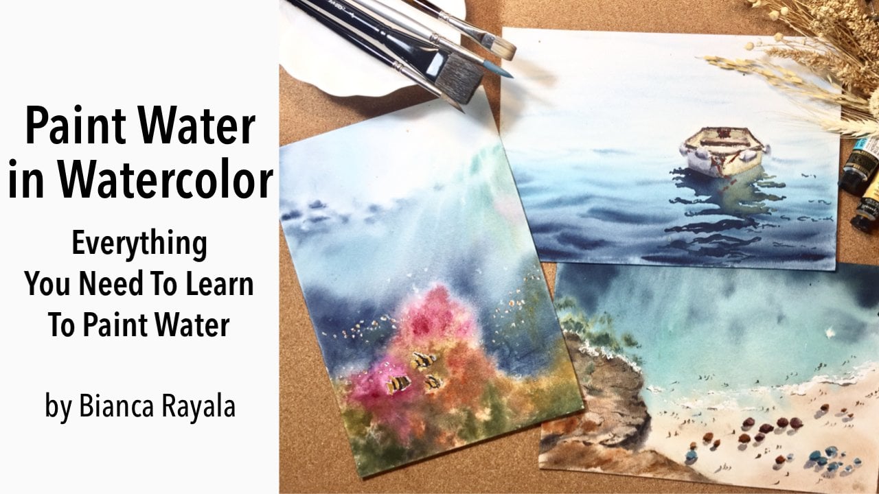
Transcripts
1. About The Class: Hi, I'm Bianca Arayala, and I'm a watercolor artist. My purpose is to
inspire people to discover and pursue
their creative fashion. I love the vibrancy and
spontaneity of watercolor. The beautiful flow of water
and pigment on splashes, splatters, and leads
simply amazes me. It has a special way of
allowing me to freely express my emotions
in every stroke. In this course, we will
embrace the freedom in watercolor as we paint
beautiful bird artworks. In your final project, you will create a
panorama painting of flamingos on water and
a vibrant Macau parrot, using liberating and modern
watercolor techniques. To achieve that,
I will guide you through sketching, color mixing, and step-by-step painting
process in a way that you will fully understand
the mind of watercolor. I will teach you how to be fearless in using water to make watercolor work for you to have a life-changing
painting experience. Art has a power to make life
more colorful and alive. That's why I can't wait
to share the same thing, the same experience with
you through this class.
2. Preparing For The Class: In this course, I'm going
to teach you how to paint birds using a variety of
different watercolor techniques. We will start with
learning how to portray beautiful flamingos and
incorporate water in the plot. On our second project, we will do a much liberating
painting experience, focusing on color bleeds and color connection as we paint
a vibrant macaw parrot. Since I've seen from
my previous courses how you appreciate breaking the lessons into small
practice exercises before diving into
the main painting, I will be showing you how to plan the composition
of your painting, how to easily sketch, how to choose colors and
maximize limited color palette, how to keep the painting
loose, hairy and expressive. We will learn how to lose
control of watercolor by taking away the fear of using
lots of water and pigment. I'm excited to guide you
on each area so you can enjoy and fully maximize the learning experience
from this course. Let's start with the materials
that I will be using. First is watercolor paper. This one is an A4 size watercolor
sketchbook from Etchr. It is made of 100 percent
cotton cold press paper. The good thing about
using cotton paper is its ability to absorb good
amount of paint and water. It also doesn't dry as
quickly as irregular paper, which allows us to work
without feeling so hurried. Next is watercolor paints. This particular palette I'm
using is from Paul Rubens. One is the glitter set while the other one is a
regular watercolor set. We will also use an
opaque white paint. For the flamingo painting, I found it very interesting to use these glitter paints on white paper because of
the pastor-like shade and gentle shimmer
the colors possess. I will use few pinks, blues, and purple from this set to
paint mostly everything. Since it is impossible to create really dark tones using
the metallic set, I will just use few
dark colors from my regular palette to paint dark tones like flamingo legs, beaks, and some highlights. It is not a big problem if you don't have a glitter paint, you can definitely use regular watercolors
for this project. I will be sharing some
alternative color mixing recipe using a regular
watercolor as your guide. For the macaw parrot, I will be using the
regular set as I wanted to create very bright
and bold colors. Now, for the brushes, I have here two kinds
of front brushes, both from Silver Brush. First is renaissance brush, which is made of pure red sable hair for
my washes and second is silver silk 88 synthetic brush for defining the painting. You can also prepare a small flat brush to
paint the water fragment, but it is completely
optional since you can use your own brushes
for that fragment. I want you to
prepare also pencil, eraser, two cups of
water, and tissue paper.
3. Peacock Pencil Sketch: Welcome to our class
where we will be painting a beautiful peacock. Let's start with
a pencil sketch. On a landscape format paper, I will position the head of the peacock in the first
third part of the paper. I don't put it in the
center as I want to have more space to portray the expressive
feathers on the right. I start sketching
the general shape of the head and the beak. Next, I draw the crown-like taft then proceed on
drawing the body. Keep your strokes too
light so you won't damage the paper when you
need to erase mistakes. Next, I draw the tail feathers, just copying the outline and not diving in too much details. I draw some outlines
for the feathers and draw random-eyed
feathers around. I go back to the head and draw some details on
the beak and eye. Let's finalize the sketch
by defining some lines and comparing it once more
to the reference photo. This is our pencil sketch.
4. Peacock First Wash: The painting process is simple. First, we place the tonal
values on the initial wash and then we add the contrast and
details on the second part. We will still paint in a very loose and
expressive style, so expect that we
will play with a lot of water freely
flowing on our paper. I encourage you to play
and enjoy the process, to let go off
control so you could experience the joy of
letting water paint for you. Here I'm getting a saturated
mix of sea blue and some partisan blue colors to
give the color some shimmer. Sea blue is quite
similar with pale blue. I start painting this
lower part of the body since it is the part
with a dark tone. Then using a watery brush, I spread the color to create a change in tone
from dark to light. I load my brush with some paint again and splatter going
to this direction. I splatter by tapping
the handle of my brush. I continue lightening
the inner part of the body to create dimension. I also got a thicker paint to darken the outer
fragment as well, and the portion connecting the
body and the tail feather. Now I get a very light mix of blue to paint the upper
part of the body. I also get a green
shade by mixing sea blue and lemon yellow to paint
the area below the head. The important thing on
painting the body is to make sure we apply
correct tonal values, so we can give the body
a form and dimension. I do the same process
on painting the head. I start with a dark part, then spread the color by
diluting it with water. I leave the white portions
on the face unpainted. For the beak, I just get a very watery mix of violet
muted with a bit of black. Let's move on to painting
the tail feather. I create the green mix using
lemon yellow and sea blue. My mix is very creamy
and saturated. I let the colors
connect by adding the next color while the
first color is still wet. I try not to copy the details exactly as I see them
in the reference photo. So what I do is I play with color transitions to
portray this fragment. I use the same
colors and mix and match them to create
different shades. In this way, we also avoid
getting muddy color mixtures. I carefully paint
the portion near the body so the colors
won't get mixed up. Using a synthetic brush
with a creamy mix of paint. I create some loose
strokes to add texture. I also mix a bright
turquoise color to add a little splatter. Now let's mix colors
for the eyed feathers. I use sea blue and hookers green to create this blue-green color. With a creamy mix of paint, I dab my brush on the paper to paint the eyed feathers and I paint mostly on the right side and limit the
strokes on the left. Next I add Indian yellow
color on the eyed feathers. Last layer of color is sea blue. Now that all of the
eyed feathers are done, I will create a watery
mix of sea blue mixed with a bit of
this leftover greens. I paint the area with a tea mixture and I
let the paint for the eyed feathers to bleed
and flow to the watery paint. This is the part where I
want you to enjoy watching the paint bleed on
the watery surface and let go of control. It looks scary to have a
pool of water on your paper, but trust me, the watercolor
movement feels like magic. I paint just a small portion
on the left side as I want the feathers to be
concentrated on the right. I soften the edge. We're just adding a lot of water and also
splatter some paints. The tricky part here is
to know when to stop. I suggest you stop before
you think it's enough. Try to step back and
stop yourself from adding some more strokes to
avoid overdoing the colors, especially on the left side. Our aim is to put more weight on the right side and keep
the left side very light. Now that I'm done painting
the background feathers, I create a very thick mix of blue-green to darken
the eyed feathers. Your brush must not
contain water at all for the paint to stand out
from the moist surface. Next, I get my fan brush and get a thick mix of
burnt sienna and yellow okra mixed with my leftover paints to paint
the texture of the feathers. I make a very light round
strokes with a fan brush. I use my liner brush to paint very light
random strokes around. This process should
be done while the background layer is
still moist so the strokes would look soft and would blend in smoothly
on the base layer. While waiting for
this layer to dry, you can use your
natural hair brush to sip in the extra puddles
of water on your paper. I suggest doing it
this way or using the tip of the tissue
to sip the paddle, rather than wiping them off to preserve the natural
effect of the splatter. Let this layer dry completely
then we will paint the contrast in details
on the next video.
5. Peacock Adding Details and Contrast: Let's finalize our peacock by enhancing contrast
and adding details. I use my synthetic
brush and a mix of dark blue color with sea
blue and Payne's gray. I start painting the dark
portions on the face. Then using the same brush, I soften the edge so it will blend smoothly
on the first layer. I do the same thing on the other dark
fragments on the face. I keep the top part of the head, the lightest parts so
it would look rounded. Next, I paint the crown
also with a creamy paint. It has to be thick, so it will stand out
against the background. I darken this part
below the head. I still use Payne's
gray and sea blue. I simply look for
the dark tones on the reference photo and adjust
the tones on my painting. I finish off the head by
painting the eyes with black. I left a small white dot on the eye part to give
life on this eye. Lastly, I get a violet
color to enhance the beak. We are done with the head. Now let's paint the
texture of the body. I get my natural
Red Sable brush, flatten the hair and
do some dry strokes on some portion of the body
to portray its feather. Make the strokes light and
dry to create this effect. Next, let's add details
on the tail feather by adding some dry
semicircular strokes too. I just use a darker
shade of green to paint the lower part and yellow
orange on the upper part. I noticed that the
eye feathers have lighten so much after drying, so I will repeat painting
over them again. Using the synthetic brush, I dab thick paint on
each eye feather. Notice that I don't
outline each completely. I still keep my stroke
loose and not uniform. One thing is consistent, and that is I'm using thick
opaque layer of colors. Next, I create a brown mix using burnt sienna and ocher and
paint some diagonal lines. Since I don't want
this stroke to look this strong
and distracting, I use my fine brush to spread the color from the
diagonal stroke. See how the brown strokes have lightened and faded
using the fine brush. As for our last step, I use my liner brush to
create the extra thin, fine strokes for added texture. Let's finalize the painting by adding some dark spots here in the tail feather to separate
it from the background. This is our final painting.
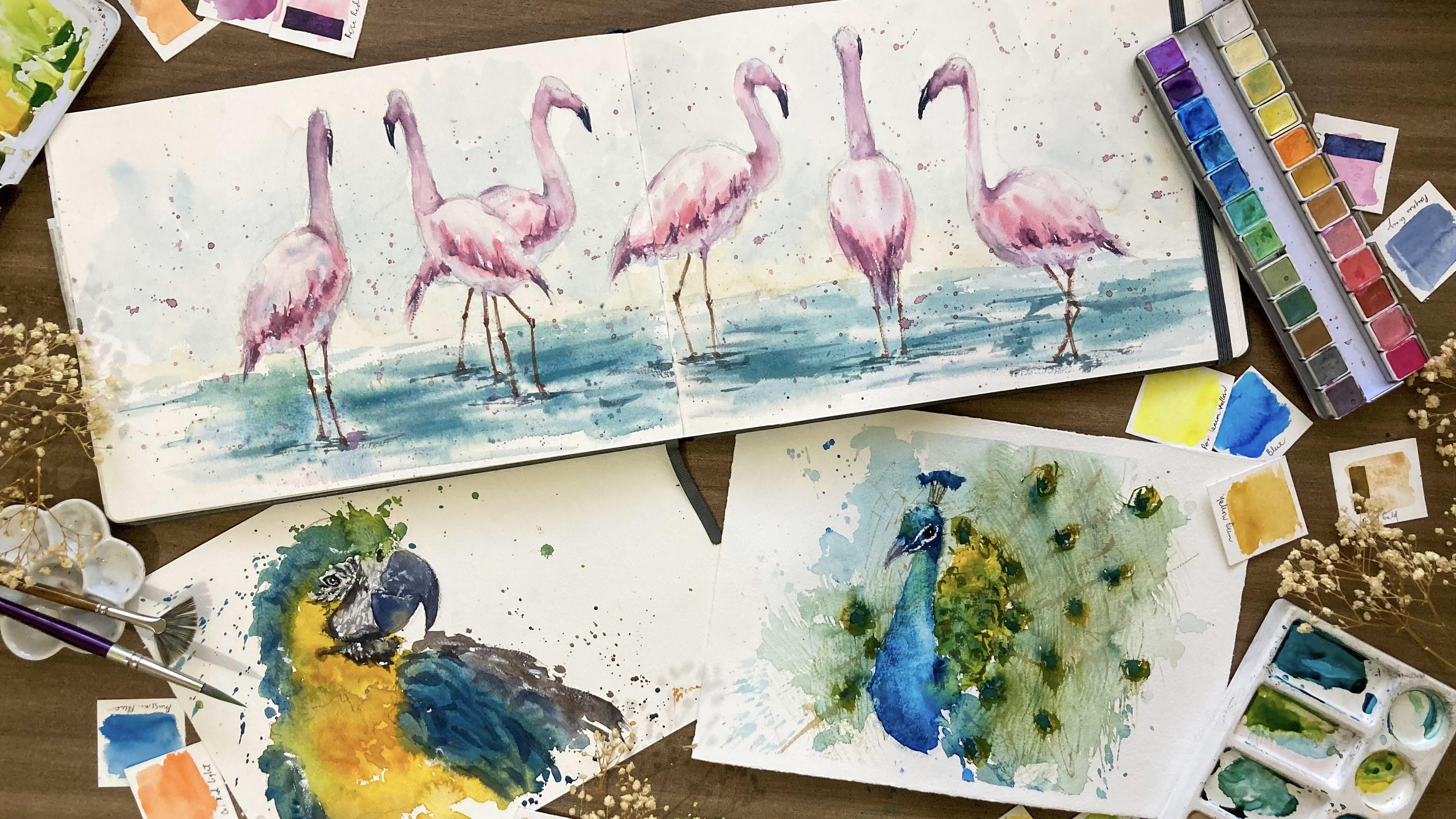
6. Flamingo: Pencil Sketch: In this lesson,
let's look at how to plan your composition
and why it is so important to consider this
before doing your painting. How we arrange the elements
in our painting will determine where we want to
direct our viewers attention. With that, it is
essential to identify the correct positioning
and the horizon line to prevent our work from looking
chaotic, but rather united. Regardless of paper size or format that you will be using, the first thing you
must decide on is where to put the horizon line. It should not be at the center, but rather on the
upper or lower third of your paper depending on
what you want to focus on. For an instance, if this
is my sketchbook spread, I will be painting on the
entire spread as I wanted to have a panorama of flamingos
enjoying the water. First, is to identify
the horizon line. I position it on the lower third of the paper as I want to have a bigger space on top to paint the full body of the birds. Second step, is to decide the number of flamingos
you'll be placing, and of course their position. We should position them in a way that they look connected. That's why if you would
notice everything, these two flamingos
overlapping each other. Notice also this one flamingo
at center of my page, so that it occupies both
pages of my sketchbook. Doing this connects
the flamingos on one side and the flamingos
on the other side. I encourage you to look beyond what you see on your
reference photo. Feel free to add or eliminate things that you feel would
enhance your picture. Now, let me share
a practical tip to make sketching a lot easier. Using this reference photo, let's draw one flamingo. When I sketch regardless
of the subject, I also look at the general
shape of the object. I refrain from drawing the details because I don't
want to overcommit on one area only to find
out later on that the overall shape is wrong and I need to do it all over again. I start from the head. Again, focus on
the general shape. Make light strokes first
and then we will define the shape later on once we have established the general shape. Draw lightly the big shapes
that you see on the body. Then lastly, sketch the legs. When you see that
the proportion of the neck and body is alright, you can proceed on finalizing your lines or shape of the head and adding some guidelines
when painting the wings. That is how we sketch the bird. We start from top to bottom, focusing on the general
shape of the flamingo. I provided a copy of the pencil sketch for this class project in
the resource section. You can also download on the resource section
the reference photo and the final painting. The resource section can
be found in the project and resources tab
below this video. Now, let's move on
to color mixing. I mentioned earlier
that we will be using just a handful color to
paint the entire piece. [NOISE] You would
notice on my painting that the flamingos have
some cool and warm shades. Cool blue shades to paint
the reflected light on their body from the sky and the reflect of
water under belly. Also, warm pink shades to show their pretty
blush pink color. For the cool blue tones, I used symphony blue
and symphony purple. I diluted with good
amount of water to create the watery and light
tone mixed like this. As an alternative, you may use any light blue and purple
color like horizon blue and amethyst genuine and create a mix similar to this. Next, for the blush pink tone, I use pink and deep interference red to create a
shade like this one. As an alternative, you can use any pink
or light red paint like acrylon rose and then
dilute it with lots of water. Now for the water, I will use sky blue, a bit of yellow green, some symphony blue to create a nice vibrant shade
for the water fragment. Feel free to mix the blue
colors that you have in your palate to create a
nice vibrant blue shade. An alternative that I can
suggest is horizon blue, a bit of amethyst genuine, olive green and indigo. That's all we need to prepare
before we start painting. I'll see you in the next
video for first wash.
7. Flamingo: First Wash: Welcome to our first
class project. In this lesson, we will paint a panoramic view of
flamingos over water. Before I proceed painting, I'll just lighten my sketch by raising some strokes
using a kneaded eraser. The lighter the sketch, the better our
work will be since watercolor is a
transparent medium. We will paint our picture
using one layer technique. We start on building the
colors of the flamingos, then move on to the waters, then finalize the
painting by adding details, contrast
and highlights. Let's start with
the reflected light on the flamingos from
the head to the body. I use the light
purplish blue mix from my glitter palette
for this fragment. [MUSIC] While this layer is still moist. I blend in the light pink color to paint the flamingos body, the belly part of the flamingo. I painted it again using the purplish blue color to
show the reflects of water. Notice that I leave a portion of the body here on top and
paint that to create volume. There are also some parts under the wings that
I've painted with a slightly darker pink shade to create dimension on its body. Keep your strokes light in order to achieve a soft
blend of colors, I still use the same colors
that I mentioned earlier. I just vary the consistency to create light and dark tones. [MUSIC] Let's move to the next bird. I do the same thing of painting the headfirst with a bluish mix, then softly transition
to pink color. [MUSIC] You would not see a hard edge
between the blue color and the pink color because
I made sure to connect this to colors while the
first one is still wet. I still leave the top
parts slightly unpainted. [MUSIC] By this time I'm
sure you're getting the rhythm on
painting flamingos. We start again from the head and then slowly
transitions to the body. I always refer to my reference photo to
look for the spots that should be light and spots that should
be dark in tone. You often hear me
mention about tone. Tone is the lightness
or darkness of a color. Tonal value gives an object
depth and dimension. If you paint the birds with a single tone the
image will be flat. We change the tone of
the color by either adding or eliminating
water from the mixture. Light tone is achieved with the pigment mixed
with lots of water. While dark tone is achieved with pigment with less
amount of water. [MUSIC] Going back to our work, we give dimension to the body of the flamingos
and we're placing very light tonal values
on the upper part of the body since they
are lightened by the sun. Then place a slightly
darker tonal values by the wing area and
under the wings. [MUSIC] At this stage, you may feel that the
birds look pale or plain. Don't worry or
doubt the process. This stage of
painting is the sign to place the tonal values. Later on, we will already
apply more contrast, and then you would see
that the image will be more defined and formed. [MUSIC] I encourage you to
keep your strokes light and avoid over
dabbing your brush. By doing so, you can create
a soft blend of colors. Most importantly, you
will avoid muddy colors. [MUSIC] Now that we are done with the
base colors of the birds, we will let this layer dry
before adding contrast. I will see you in
the next video and let's paint the water fragment.
8. Painting The Water: To paint and water fragment, we prepare the area first with clean water
using a flat brush. I only provide the area
below the horizon line. [MUSIC] Next I get a watery mix of pink color to paint the reflection of
flamingos on the water. I don't paint the
entire area with pink, but just those right
underneath the flamingos. [MUSIC] Next I create my blue mix for the water, and it is made of sky blue, a bit of yellow-green,
and symphony blue. Using my flat brush, I gently paint the water
with soft strokes and I let the paint to bleed
naturally on the wet surface. You can see a soft
bleed on the surface because my paper is still
wet during this time. [MUSIC] I create a creamier
and darker mix up the same colors and paint a darker tone underneath
the flamingos. [MUSIC] Again, the water
fragment is still wet, that's why I don't
create hard edges as I paint this dark
blue color on top. [MUSIC] When your paper is
turning dry already, I suggest to let it dry
completely then pre-wet with water before proceeding
with adding darker tones. [MUSIC] Now, let's paint an
airy background. I started the horizon line using a very light wash
of yellow ocher. The surface is dry, so I need to work fast to
avoid unwanted hard edges. [MUSIC] I slightly tilt my paper, so the paint will flow down. [MUSIC] Then a transition to
a pale blue color and let the two colors
blend naturally. [MUSIC] Since I don't touch
or manually blend the yellow ocher and blue
color with my brush, I tend to avoid the green
mix on my background. I gave the background very
light and transparent so it will not overpower the
lightness of the flamingos. [MUSIC] I spray some water at the edges to create some soft edges. [MUSIC] I let this layer dry before I go back to painting the flamingos. While waiting, I want to
add some more depth on my water fragments using the blue mix that
I initially have. I add some pink gray to it
to create this deep blue. [MUSIC] I do some strokes and also
some splatters to create interesting effect in
the water fragment. [MUSIC] Now, let's proceed on defining the flamingos on the next video.
9. Flamingo: Final Details: I want to mix of very darker color rather
than simply using black. Using pink, gray, violet, some browns from my palette, I create this rich-dark color. Notice how thick, creamy and opaque my mixture is. We need the mix to be this
thick so it would stand out. Next, I enhance the shadows
on the face and neck of the bird using a mix
of violet and scarlet. I use one brush to apply the pigment and another
brush to soften the edges. I intentionally didn't paint too many details on the
face like the eyes. I continue doing the process of enhancing the
shadows on the neck. Now, using the same dark, pink-violet mix, I paint some spots to
portray the wings. Don't need to outline
the entire wing. Suggestive lines are
sufficient to portray this. Now you can see
that the flamingo is slowly coming into life. I just add some dark spots
here and there to enhance the contrast and to emphasize the light pink color
of the flamingo. I constantly look at
the reference photo, squint my eyes to
see which area has dark tones and which area
should be kept light. It is a good
technique to properly apply correct tonal values. Now, let's go to the next bird. We will basically do
the same process. We enhance the shadows
starting from the head, neck, and then wings. I recommend that you use a synthetic brush in
applying a hint of colors, so there is only a
controlled amount of water in the brush. Then use a soft brush to
soften or blend the edges. Also, don't be afraid to use dark colors since we
need to use dark tones to make the light tones shine. I paint the small
visible portion of the beak with my dark green mix. As we paint this broods, it is sometimes tempting
to overdo the strokes. To avoid this common mistake, I advice you to look
at your work using a camera view or you can also face your work on a
mirror so in that way, it gives our brain a different
perspective and allows our brain to identify if it
is time to stop already. We are almost halfway through. I've painted this
[inaudible] first since my paper is still a
bit wet in the center. I look at my reference photo, identify the dark spots I see when I squint my eye and
translate it to my painting. Again, as you do this step, your brush needs to have a
very minimal amount of water in order for you to layer
a rich vibrant color. Then using a dump brush, slightly soften the layer
to create a nice blend. Do the same process on
the shadowed areas to define the form of the
body and the neck. Another tip I want to share
is to keep the wash as transparent as possible so you won't lose the
freshness of your work. We are down to the
last two flamingos. I'm pretty sure that
you already know well the rhythm of
what we are doing. However, for these
last two birds, since the other one is partially covered with the bird in front, we need to create a contrast to separate the two birds
from each other. I set the first as shadows
on each of their wings, and as the last step, I will outline lightly the
intersecting fragments of the birds to control the
shape of the one in front. Lastly, I will also paint their beaks and add up on
the shape of their heads. Don't worry or don't feel
discouraged if ever you don't get everything right
in the first try. Remember that everything can be learned through practice
and observation. We learn by not just watching
how the instructors paint, but also by observing
how they hold the brush, how they mix colors, the consistency of mixtures, the timing of
application, and more. Try to analyze
everything you have observed and put
them into practice. As we practice, we understand
the medium even more. We understand by experience
how watercolor behaves. Let's finish the painting
by painting the legs. Again, we need the legs
to really stand out. Using a very thick mixture with an almost dry brush I paint the legs with
a dry brush stroke. I paint them with one or two quick
strokes to make it look natural and not shaky. I add a few highlights
on the water by adding some more dark strokes right underneath their feet. Now, we need to unify
the entire picture by building connection between
the sky and the water. I do so by adding splatters. Using the scarlet and
violet mix that I have, I create a milking mixture of paint and splatter
around the area. I load my brush with lots
of pigment and gently tap my brush to create
this small splatters. Lastly let's add some
white accents on the beak and some spots using
this opaque white paint. I also splatter some paint
on the water fragment. This is our final painting. I'll see you in the next
video for our second project.
10. Parrot: Pencil Sketch: Welcome to our second
project which is painting this gorgeous
Macaw parrot. In this lesson, we will
learn to appreciate the spontaneity and
controllability of watercolor. We will embrace the
natural beauty of bleeds, blooms, and color connection. Let's start first
with a pencil sketch. In drawing any subject, I use the same principle
that I keep on sharing on all my classes. It is focusing on the general
shape of the object from top to bottom and finalizing the details
in the latter part. When we say general shape, we look at the
outline of the parrot and identify the big
shapes that we see. Notice that I start from
the top part of the head, the next is the beak, and then move on to painting
the outline of the body. I just look for the
big dominant shapes on his wings and body and avoid going much into
so many details. Our painting approach
is very loose so our objective is to ensure
that the general shape is correct and in proportion and all the details and textures will be shown
through watercolor. Now as I finalize my sketch, I make sure that the eye is in correct alignment with the beak. I also check if the head is in proportion with the size of the body to prevent
having a very small or a very big head. Again, the small
fine details will be shown with the help
of watercolors. There is no need
to draw in detail the feathers on the
head and the wings. When you're happy
with your sketch, slightly erase your sketch, the light and the strokes
before proceeding to painting. I provided a copy of
the pencil sketch in the resource section
together with their reference photo
and final painting. The resource section
can be found in the projects and resources
tab below this video.
11. Parrot: First Wash: As we paint this Macaw parrot, I want you to
challenge yourself to lose your control
over watercolor. You see, watercolor
needs water to work. With less water, it is easy to
control watercolor. But as we loosen up and
let water take over, believe me, the whole
painting experience will be so liberating. Don't be afraid of water. Don't be afraid to
mess your drawing. If it didn't work on the
first try, then try again. Remember, it is just a piece of paper and we don't
want a tiny piece of paper hinder us from discovering more about
this beautiful medium. Let's start painting. I will paint from
top going down. I get a nice vibrant
lemon yellow and a mix of little cadmium yellow
to add some depth here. I load my brush with a very
saturated mix of color. I make sure also that the
belly of my brush is really full so I can achieve bright
bold color application. I do splatter some paints on the side to
create a nice loose effect. Next, I transition to green by mixing the
greens on my pallet, like hooker's green, tree green, sky blue, and my
leftover yellows. I add a tint of blue
because later on, we will transition to blue
and I want the colors of the entire piece
to be united. Again, I create a very saturated
yet fluid mix of paint. As I lay the colors
on the paper, I just let them bleed
and flow naturally. Notice the puddles of
blue paint on my paper. You would see how watery my mix is and how loose
the strokes are. There's actually no
detailed and tight strokes done to paint the feathers. I let the natural splash of paint portray the
form of the bird. Now I need a darker blue color, so I add Payne's gray to my sky blue to add depth and
dimension to this part. We need to vary the
tones to achieve this. As I paint the blue fragment, I create big bold strokes using my brush to
cover large areas. The lesser stroke you do, the cleaner and fresher
the artwork will be. Now let's paint the
yellow orange feathers on the bird's face and body. I create a rich yellow-orange
mix using lemon yellow, cadmium yellow and
Indian yellow. Again, my mix is very
creamy and saturated. As I apply it, I connect it to the blue fragment on the head. You will see natural
color bleeds between blue and yellow. I avoid blending them
manually using my brush, so I will not create
a harsh green mix. I let the two colors
blend naturally to create a beautiful
natural green blend. Since the consistency
of paint that I use for both blues and
yellows are really thick, the color bleeds are
not too explosive. I continue painting the body
with the same yellow mix, but I add a bit of cadmium
red light to alter the tone. It also makes the
overall image more interesting if there is a
play of colors and tones. Now, I want you to notice
how I dab my brush to apply my paint and how I maintain a bright and thick consistency. As they reach the edge, I make this loser by
splashing my brush. Now let's paint the wing
with the vibrant blue mix, which is the same with the
one that I used earlier. Again, I let the blue and
yellow blend naturally. Now for the outer
parts of the wing, I create dark purplish
brown mix using violet, branchana, and a bit of brown. For the dark feathers
below this beak, I use the same dark brown mix, but I add some paints
gray to change the U. I maintain a thick
consistency so I can layer it easily on
top of the yellow. I use the same color to paint
the dark spots on the face. To create this small strokes, I remove the excess
water from my brush. Now, I've changed my brush
to a synthetic one to paint some illusions of
feathers on the wings. I use a synthetic brush, so the brush doesn't
contain much water, and I can create
this defined strokes while the fragment
is still moist. Remember that we
are aiming for a loose in impressionist
type of painting. Don't get lost in painting every feather that you see
on your reference photo. Some suggested
strokes are enough to portray the image that we want. I scratch the paper using my
nail to lift some colors, and add texture
on the wing area. I try to work or add darker thorns while the
layer is still moist. Doing so will help me create define strokes with soft edges. If your work turns
completely dry already, the hard edges may
look distracting. The key here on this
step is to learn to work fast so you can maximize the time that
your paper is still moist. I will see you in
the next video, and let's paint the face
and the final details.
12. Parrot: Final Details: Let's finalize the
painting by adding some contrast in
painting the face. Using my dark blue color, I add some strokes
on the head to show the dark tones
on the feathers. Now let's paint the beak. I make my mix extra darker and thicker to create an
opaque color for the beak. I drop a small amount
of yellow to show the reflex of the yellow
feathers on its beak. Then I darken the outer part to show the form and
shape of the beak. The same thing is done
on the upper beak. I mainly use paint
spray to paint this. I adjust the darkness
depending on how it should be based
on the reference photo. [MUSIC] Now let's paint the portion of his face with the
lavender color. Let's mix violet and sky blue and make it really
transparent and watery. Make sure that the
beak has already dried so it won't bleed once you paint this particular
area of the face. [MUSIC] Using a very thick color, I paint the small details around the eyes and also the
outline of his eye. Carefully paint the outline of the eye with a thick paint. This will help you make
the eye look more alive. [MUSIC] I'm now adding
some highlights of this dark color on areas
that I want to strengthen. You can do dry brush stroke to paint the texture
on his face. I will also use an opaque white paint
straight from the tube, to add final accents
and highlights. I will use it first for
this dark feather here below the beak and next on the texture
of the beak itself. You may use your
finger to blend it in. Lastly, I use it for some random spots and
of course on the eye. This is our final painting.
13. Key Learnings and Class Project: We have come to the end of our course and
I hope you got inspired to paint and enjoyed watercolors
like never before. If you follow the lessons
and trust yourself, I'm sure you can easily
create your bird paintings. Doing the two class projects
will open yourself to understanding the mind of watercolor through different
painting approach. I want to see your
final paintings in the project section, so I can personally witness
your creative journey. As you do your final projects, don't be afraid to use
water and pigment, and feel free to experiment and create expressive strokes. Step out of your
comfort zone and try something you've
never done before. But most importantly,
don't forget to have fun. Thank you so much again for joining me in this class and I look forward to seeing
you in my other classes.
 Bianca Rayala, Top Teacher | Watercolor Artist