Transcripts
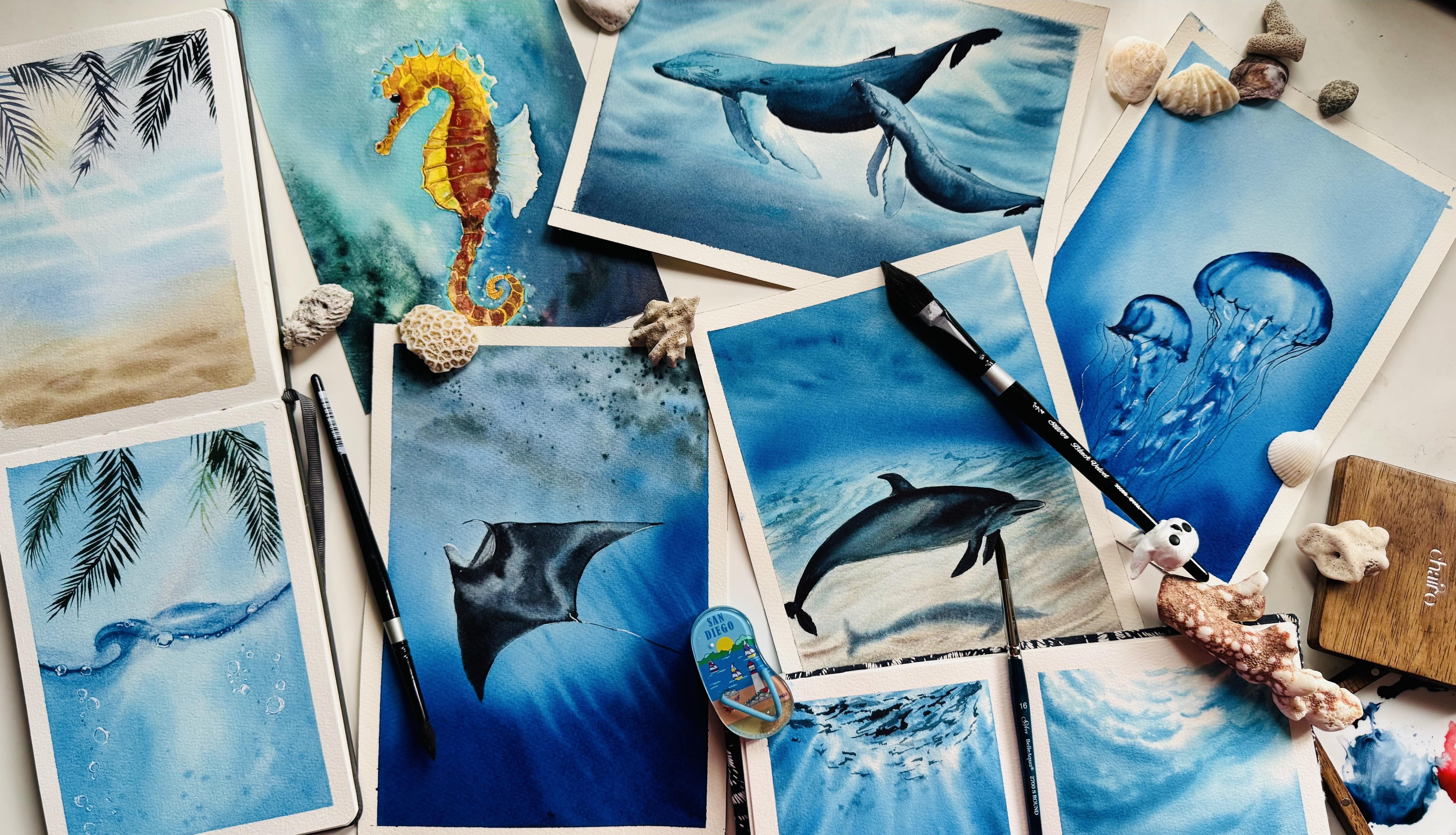
1. Welcome to underwater world!: Ocean is a masterpiece of
light, depth, and color. So let's bring this magic
onto paper. Hi, everyone. I'm Swati Ji haiti, a watercolor artist
by passion and a product manager by profession based out of Bangalore, India. I go by the handle tinted
Toodles on Instagram, and I welcome you to
my class of painting realistic underwater
scenes in watercolurs. I'm brand educator
for Silver Brush, as well as for Siram
stationers in India. So the inspiration for
this class is I went on to a snorkeling experience
in Philippines last summer, and I was thrilled to see all those beautiful
animals underwater and how light rays work along with the sea waves to create
beautiful reflections, refractions and how I can see all these
animals underwater. This inspired me to capture
that magic in my paintings, and now I want to share
that journey with you. Let's go through what all you will learn
throughout this class. This class focuses on
maintaining light and depth, the secrets to painting
underwater scenes that feel alive and realistic. Water control, which
is essential tips to master the balance of water
and paint in your work. It also talks about reflections and refractions
techniques to make your underwater animals look like they definitely belong
in that environment. We will start the class
with two practice sessions, which also covers all
the techniques required, the basic techniques required to go along with this class. One of the practice session
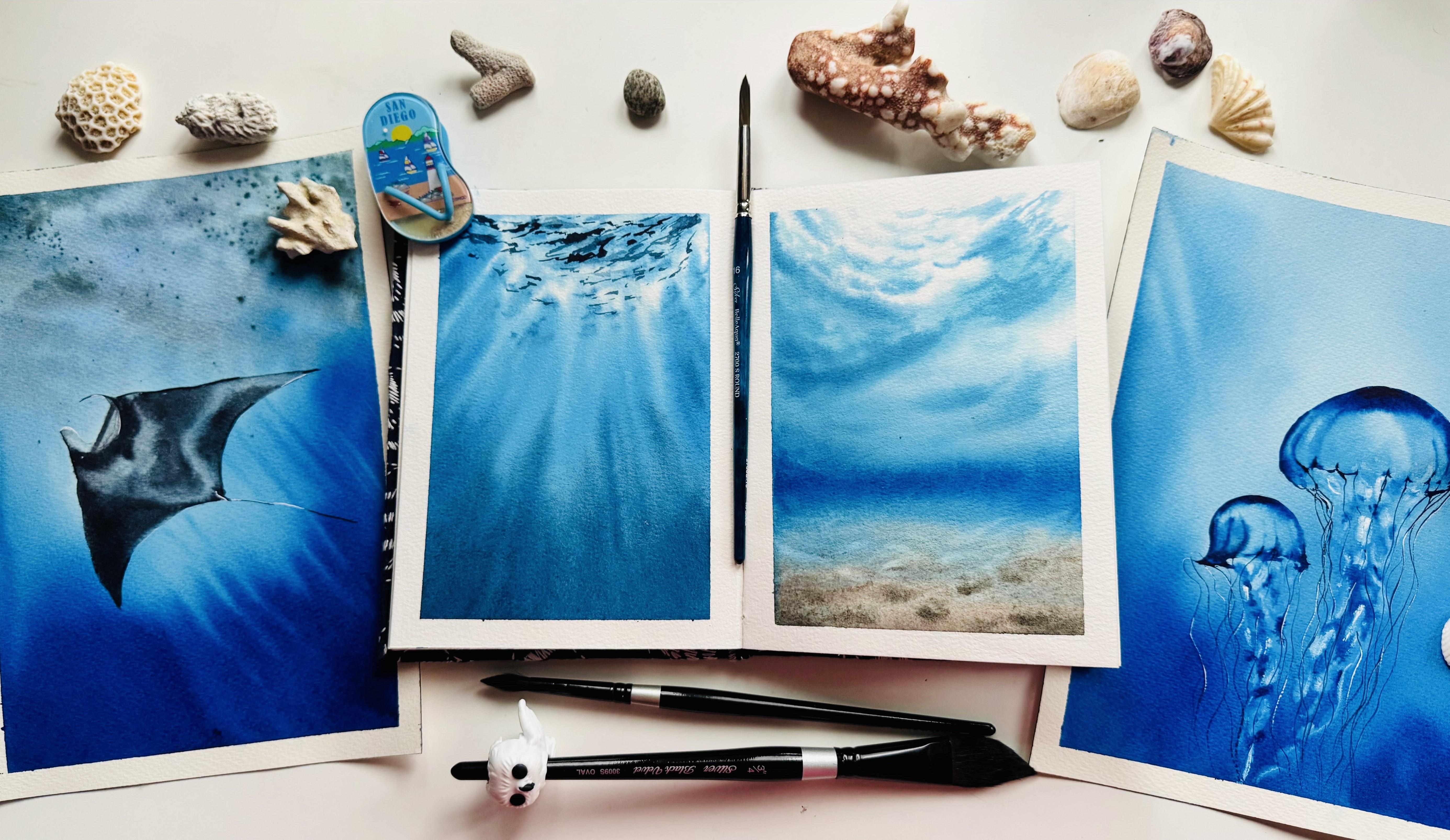
is underwater rays. We will learn how to paint those beautiful rays of light streaming
through the water, and the other one is
underwater seascapes. In here, we will
understand how to depict the subtle textures and
tone of the ocean floor. Once we are done with
the practice lessons, we will extend onto it and
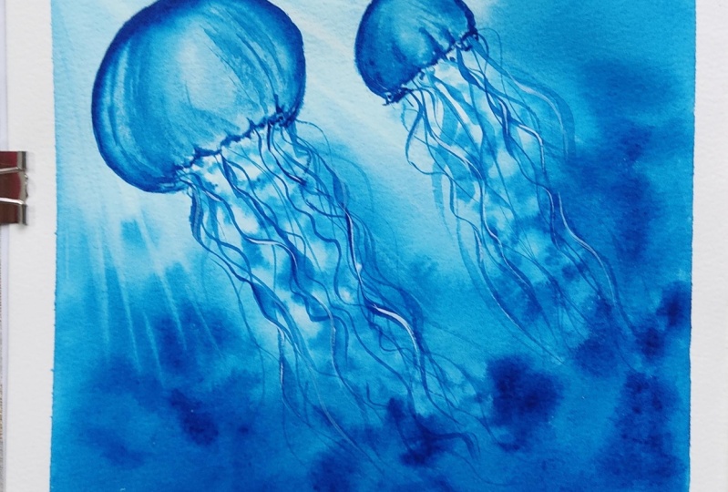
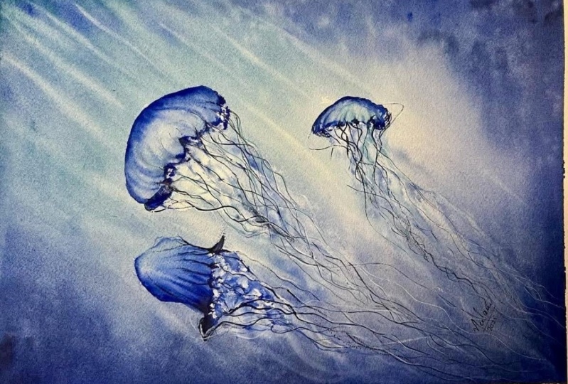
paint two main class projects, one with a jellyfish, which is also a
monochrome painting, and the other one
with sting ray. Monochrome jellyfish would be a perfect way of practicing depth and the
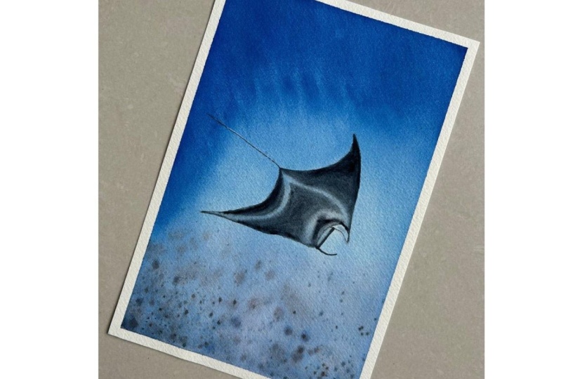
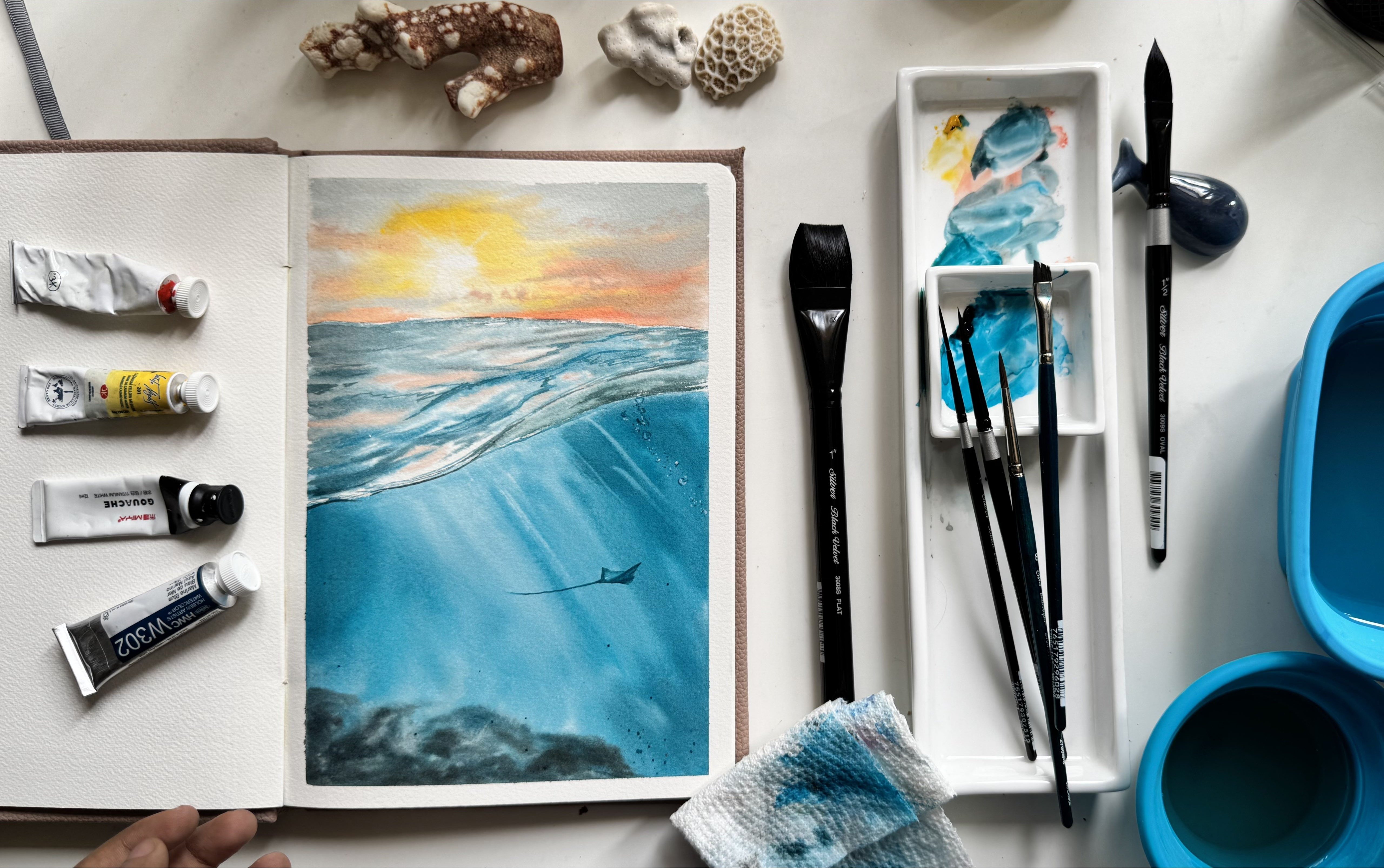
flow of underwater movement. Whereas with the sting ray, it is ideal for understanding
how light changes as the animal approaches the
land surface of the ocean. These projects are mainly
structured in such a way to help you to paint any other watercolor scene
with any animal in it, be it near by the
ocean surface or in the middle of the ocean or
nearing to the water surface. With this, by the
end of the class, you should be able
to paint any of the underwater scenes
that you come across. Along with this, of course, I'll be covering all
the supplies that I'm using for the painting
and all the colors also that I'm using
beforehand so that you can keep them ready and dive
in right into the class. So what are you waiting for? Take up your snorkeling gear and your painting brushes and
join me on the class.
2. All the supplies required: Before we get started with the practice class and
also the class projects, let's go through all the
supplies that I'll be using. For watercolor paper, I'm going to be using
Saunders water food. This is cold press
and finite green. It is also 300 GSM, which means it has
a good capacity to hold good amount of
layers of water. This is the texture,
how this is looking. You can use any watercolor
paper of 300 GSM size, and that should be good. Next up, with
respect to brushes, I am mainly using silver brush, black
velvet series brushes. One is oval wash brush,
size three fourth, and two are round brushes, 3,000 as series, size
eight and size four. This I'm using
mainly four washes. So even with two round brushes, you should be able to
complete the entire class. Along with this, I'm also using a lineup brush with which I'll be adding some
details which is required. I'm also using a
spray bottle in order to spray water onto the paper, but you can skip this
and use just the brush and water directly
from your tumbler. I'm also using a palette for mixing paints
directly onto this. The colors that
I'll be using for this entire class
series is very limited, which I'll be showing next. So with just one palette, we should be able to mix
everything properly. Terms of watercolor. We'll be using from different brands, but majorly one
main shade of blue, which is cerulan blue. You can use any
brand cerulean blue. I'm using from Mission gold. And for adding
depth to the blue, I'm using white Knights
cadmium red light. For the sand part
within the underwater, I'm going to be using
mainly these two shades. One is bled stone genuine. This is a granulating
pigment from Daniel Smith. You can skip this and use any shade of brown
that you have. And a lavender shade. This is also from Mission Gold. With these two, I'll be painting majorly the underground
part of the paintings. Another shade of blue that
I would be using is from Smike which is
heloturquois shade. Of course, a jar of water and a masking tape
for taping down your paper and a
transparent board to tape on so that it doesn't soak up your water and it
still stays intact. You have gone through all
the supplies that are there. I'll be just fetching
out all these colors that we are using and also go through some of the
basic watercolor techniques and get started with the class.
3. Colors used for the class: Let us swatch out all the colors that I'll be using
for this class, starting with the shade of blue, which is cerulean blue, and I'm using from Mission Gold, but you can use from any brand. You can see how pigmented
and beautiful this color is, and we are going to use
the same for adding multiple layers on
to our painting. Just with using one color, we'll be able to achieve many different shades
with the help of depth effect and
completing our painting. So this is our major
blue for underwater, which is serlan blue. In order to add some
darkness to the same, I'll be using cadmium red light. Okay. So when I mix blue with
cadmium red light, let's see what's the
color we're getting. We get a darker shade of blue. And this is the
blue that we want. Okay, adding more. So this is the darker shade
wherever we want of blue, that would be using. This is from the brand
white Knights, but again, you can either use a darker
shade of blue like Indigo, Persian blue, or you can use the same mix in
order to get a darker shade. Next up is bled stone genuine. So this is a granulating pigment from Daniel Smith for
a shade of brown. You can use Sepia or any other brown as a
replacement for this as well. Next up is lavender. We won't be using
lavender directly, but we'll be mixing
that with blood stone genuine in order to get the underwater seabed color. So let me mix it here
for you and show. And with the different
variations of this color, we'll be using it
in our painting. I'll be guiding the amount of paint to be added
then in there itself. So this is the color
we are looking for. Next up is helo turquoise. Again, this is from Schmiqe
and you can use any shade of turquoise or
even peacock green or any lighter shade
than serlean for, um instead of this
color as well. So that's totally fine if you
do not have the same shade. Not worry, you can use cobol turquoise or any
other lighter shade. Even you can mix this cerulean
blue with more amount of water or a little
bit of green or gradient as well and
get to this shade. And, of course, in the end, we'll be using some paints gray or black for final detailing. We'll also be using
white quash for adding all the details and as well as an effect
for painting jellyfish. So let's explore that
more in the class, and let's get started
with the class project. First, we will go
through all the practice lessons and learn how to paint any
underwater scene, the basic background of it. And then in the class
project, one by one, we'll be exploring with just
one shade Cerlean blue, how to paint the entire painting with two jellyfishes in it. And the next one is a
bit more detailed with all the other shades
that we have used here. Okay, so let's get started. See you in the class project.
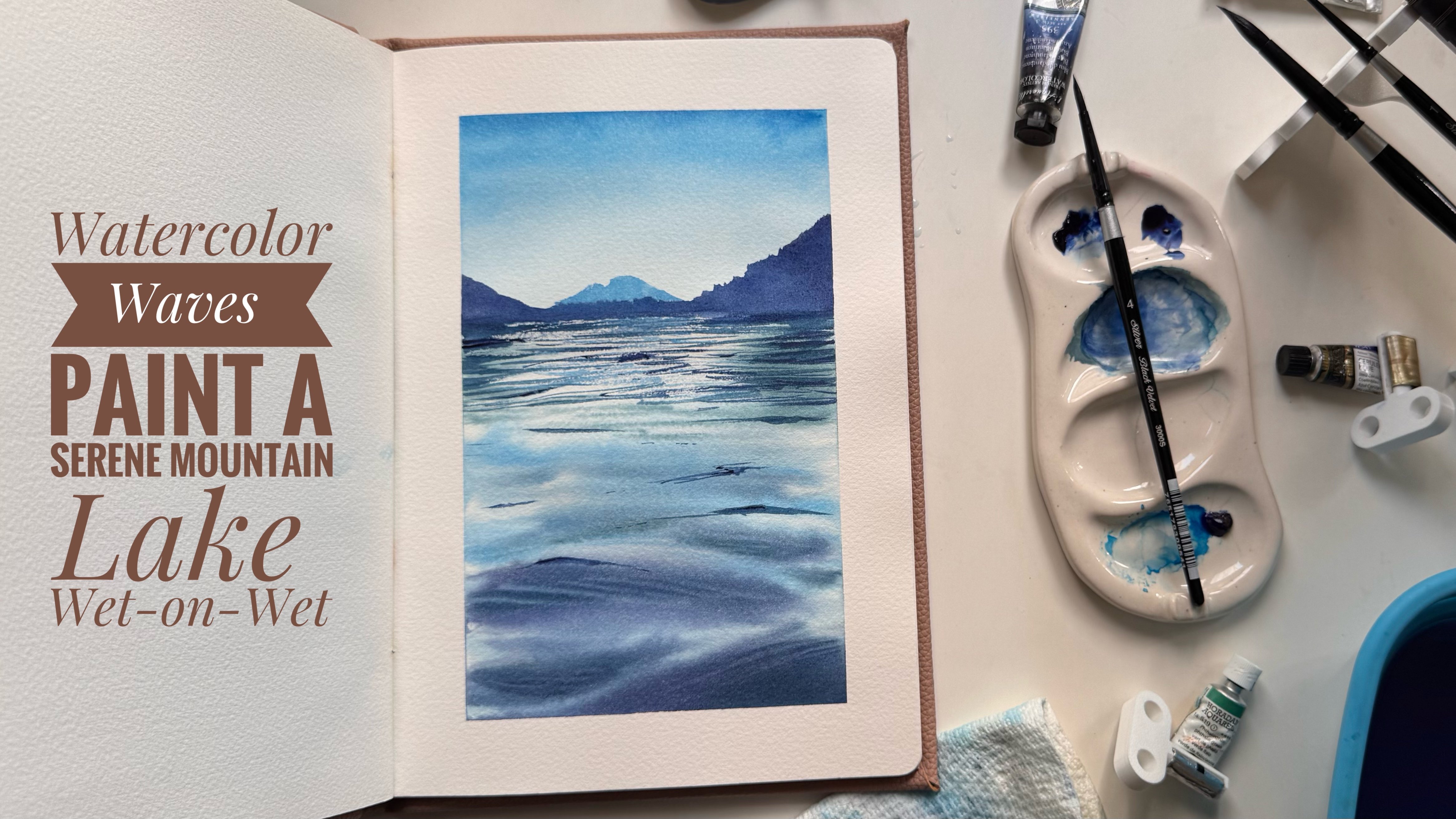
4. Practice project 1: Welcome to the
first class lesson. This is a practice project, so I'll be showing
you how to paint a very basic underground
scene in watercolors. It's going to be on
a ton wet technique, so I'm going to apply water. I'm using a silver black
velvet series, oval brush. And I'm applying from top to bottom itself because
that's how I'll be applying the strokes for
the underwater as well. So it is better to have in
one angle from top to bottom. Also, I'm not applying
too much of water now itself because when I'm
going to put the paint, it will be in a diluted form, so I do not want
that to stretch or, um, dilute on paper a lot. This is the space
where I'll be leaving some white spaces for the
water reflection part. With my round brush, I have
taken some cerulean blue. Now I'll start applying it in an angle till the
middle of the paper, it's inclined towards right, and as soon as it goes
towards the right, it is inclined towards left. Okay. And all this, I'm bringing the
strokes until half of my paper itself so that I can paint it with another color from below to show
depth in the painting. Light is reflecting from this angle where I
have left white space. So if your white space is in
another place on your paper, you can decide the
rays similarly. Make sure to keep some white
spaces on top because that's where we can show the maximum sunlight
which is peeping in. I'll take the same
cerulne blue and add some cadmium red light to it in order to get a
darker shade of this color. I'll apply it in the same angle
that we have done on top, extending it to the
bottom of paper. I'm switching to size four brush and I'm going to
lift off some of the paints. For this, you need to have absolutely less
water in your brush, apply some pressure,
lift off the paint, and dab your brush back
on the tissue paper. Now that there is
less water on top, I'll be applying
one more layer of just diluted servian
blue so that I get to see different shades of the blue happening there once the paper completely dries off. If your paper is too wet, it will disperse a lot. So make sure to soften
the edges and remove excess of paint by
lifting it again. Adding one more dark layer, extending it little
bit here and there. I'm maintaining the angle in which the rays are coming in. This is what will help
with the perspective of underwater and the light
coming into the ocean or sea. So make sure to go
in the same angle. You can practice
a couple of times and also leave some spaces be the white space or the
lightest shade of blue on your paper and not fill it up with one single
shade everywhere. With the dark shade and applying some blobs
here and there. This will be the second
layer the reflection. Once it dries off, you
can see the difference in colors and also depth in the
reflection that comes in. This is completely dry, and this is how it is looking. You can see that there are
different layers of blue that we can see even the white is
retained at certain places, and we have the first layer
of light blue that was there and the darkest layer
also is visible below. Now, I'll take a
smaller size brush size four and try to at or just
enhance some of the places with darkest shade of blue so that we can emphasize on
some of the waves that are forming on the
upper surface of water through which the reflection of
the light is happening. So I'll again take
cerulean blue, mix it with cadmium red light
to get this darker shade. We can also use any other
dark shade of blue, even indigo or Iditrine blue, if you want, even Persian blue if you do not have these shades. Make sure to again, maintain
the same direction in which, uh the waves will be applied. Applied in a zigzag manner because there are waves
which are created, so there'll be ripples and it will not be a straight line. Diluting that a bit with water and continuing
that or a layer below. Adding variations
with the same sheet, but with different
dilution ratios will always give that sense of a naturalistic painting because not everything is of
same color or same sheet. We do not know how much
the light is reflecting, so using different
shades will help us get the visualization
coming to life. Make sure to use a brush with a very thin tip for adding
these manu details. Now, again, with a damp brush, I'm going to lift off the
panes wherever possible. So this is mainly to achieve multiple layers
of reflection happening, to make it look more three D and not just a two D view
where only front, reflection is happening and
the back there is nothing. So we have waves
coming in all over, and the reflection is
happening from each of it. I can see the direction in which I'm using my hand
while painting. That helps me with
maintaining this size. That helps me in maintaining the direction in which
these waves are added. I'm happy with how
this has turned out, so let's remove the tape. Here I'm able to see
different layers of water and reflection. It is giving me a look of
underwater sea or world. In our class project, we'll use the same
technique and, along with different
sea animals. See you in the next
practice lesson where we'll also learn how to get water, along with the ground part of the sea. Okay.
5. Practice project 2: Thank you for continuing into
our next practice lesson. This is also going to be
a button bet technique. So I'm applying water for
the entire part of paper. And in this, I'm not following any line or angle
in which I apply water, this can be anything. This would be the
underwater horizon line where sea needs the land. From there, I'll start
again with Cerleneblue and add the line,
separate to line. Next, I'm switching to a
lighter shade of turquoise, Helius turquois from Schmiqe. You can either use that or
also use cobalt turquoise or any other lighter
shade of blue. Taking more of water and
extending it up further. I've also added some
zigzag lines on the land just so that this also forms the
reflection of water on the land. What we learned in the
first practice lesson, applying the same here as well, little bit maintaining the angle as we go towards the top. The first practice lesson can be something
which we are seeing from nearby to the sea surface. And the second one which we are doing now is more from the land. So we are already
sitting on the land, and this is what it
is looking like. Creating some elevation here
so that the paints all flow down and we'll continue
applying the helourquois. Since we are far behind, we get to see a lot of white space, the
reflection happening. So I'm trying to retain that with the help of white
spaces on the paper. Switching back to Cerleanblue and working towards again
for multiple layers. With a damp brush,
I'm just smoothening these harsh edged curves
so that when they dry, it looks very
smooth and distant. Nearer the object, sharper we
can see further the object, it will be a little bit trying to merge with
the background. Retaining that
property here as well. A I'm taking the mix here, mix of lavender and
brown for the land part. Lavender because
it's pastel shade. So it will be easy to merge with the um blue that we have. And it also creates
a good disposes into good color which we really want for the actual meeting
point of land and water. With a very dilute form. I'm just extending the same
blue on to half of the land. Need to understand that um it looks blue whenever you're
underwater and on the land. It looks blue, the further
things always looks blue. So trying to depict that here. Mixing blue to our
current shade in order to show some grooves in the sand. It is very similar
to having a beach. Inside underwater as
well when you land, it might not be a straight
surface that can be sand with a lot of grooves in it, how
you see on the beach. You're trying to depict that with shades of this
dark tone here. Based on the dilution and the colour you
have in your brush, you can continue to
apply it multiple times. And once it starts to dry, you can see where else the depth is required and lift off some of the paints maybe to
give us the exact view. Even in the distant,
though we can see blue, we want to show
reflection or some sort of white space on the paper. I'm lifting here as well. I'm doing this with a liner
brush because it really helps with creating these
lines, which we won. This is nothing but
reflection from above, so it will be wavy
patterns of lines. Lifting must be done when
your paper is still wet. Once it is dry, it might
take a lot of time to lift, but you could still
be able to do it. Now that I'm using blue shade, it is very difficult to
lift once the paper is dry. If you're using a blue shade
which is less staining, you can also lift off
once your paper is dry. Lifting off here
and there gives us the illusion of bumpy areas, which is exactly what
I'm looking for. Now taking that dark shade again and adding some splatters. Since this is a practice lesson, I'm doing it on a
smaller piece of paper. I'll be switching
to a line of brush for getting those
tiny splatters. You can skip this
part if you're not comfortable with adding
splatters as well. The paper is almost
dry, you can see, adding the final grouse
with the darkest sheet. Having patience and
working on multiple layers helps a lot when you're trying to paint something realistic. I'm happy with how
this has turned out. The brown that I have used here is actually granulating pigment, so you might see even
more granulation. But you can skip that and use any shade of brown that
you have for this. I have skipped adding the waves with darker shade because my
main highlight is the land. We'll work upon this
in the class projects, but adding a sea
animal here as well. You can see the granulation
and white spaces coming up very beautifully creating the reflection
lines on the land. I would say practice that bit
more so that you can paint any underwater along with corals or fishes roaming
around, et cetera. This would look really nice. Now that we are done
with practice lessons, we can get started with
our first class project. See you there.
6. Monochrome Jellyfish 01: Oh. Break down the paper as shown here for first class
fratre and this would be, we are going to paint
jellyfish underwater. So they have very free
flow movement within water and um it's just
having two main parts, that is the bell shaped
body and tentacles. Let's capture it on the paper. First, I will draw a very
rough sketch using a pencil. Easiest way to draw the bell shaped body is
first drawing the circle. This decides the
actual size of it. If you want much bigger
one, welcome to do so. I'll be drawing
two of them here. Now you can place the body
anywhere within the circle. Based on the moment
of the jellyfish, the bell shaped body
will be changing. Either it will be collapsing
to form a semisphere or it can also be
forming almost a circle. Now with the kneadable eraser, I erase the excess of
graphite from paper. Tentacles will flow
from there until down. I have left that
space there and we will paint the directly
with watercolors. You see this. Here I'm giving a bit more
curve to the body, which means it has expanded
a bit more inside. That's why you can see not an entire semisphere but an umbrella or inverted
bowel shape here. I'm good with this sketch, so let me apply water
throughout the paper, and I have all the
pressures required ready. Taking down some cerulean
blue onto my palette. I'll be majorly using this color for today's
class project. Activating that by applying
some water onto the paint, and I'll continue to
add water on to paper. Expand this quarter with
the help of an oval brush. Applying some more water to the edges so that the paper can stay wet or moist
for longer duration. I'll start with size eight brush and dilute some
cradine blue with water. Start applying it from
bottom of the paper. I'm leaving some
white space there. We'll come back to it later. As I go up, the water is
more and the paint is less, like how we have done in the
practice lesson as well. This would be the darkest shade
at the bottom and on top, it will be much lighter shades. Keep the bell
shaped body that we have a bit white itself
wherever possible, because like we
have experienced, blue is not I mean, blue is a staining color, the shade and it'll be
difficult to lift off later on. So if we want to
show some reflection on the jellyfish, it
would be difficult. So I'm keeping some
white space now itself. Using the help of water itself, I'm moving around
to make sure it becomes very fluid the moment, and there won't be any harsh
edges once the paper dries. You can remove excess of
water accumulating with the help of a paper
cloth from the edges. Now, before it dries completely, I'm going to try and
lift off some of the paints from the
bell shaped body. Now I want to show
the light reflection, how we had done in
the practice lesson, but from just a side. The light source is way up here. These are not near the
surface of the sea. It's coming from a
virtual point on top. You can see from
where I'm trying to bring this
triangle cone sheets. You can also have your
own virtual point and lift off some of these pans. Now, once the paper
is still wet, squeezing out some
fresh white wash. Using this now itself to paint oral arms and the tentacles. With size a wrong brush itself, I'm adding these oral arms here. Remove excess of blue again
from your brush and continue. You can refer a jellyfish
or refer to how the final tentacles looks in the painting before
you start this step. I'm just taking
white and going in a specific direction where I feel the oral arms
and tentacles can be. Take good amount of white quash and dab
it onto the paper. There is still water
and blue on the paper, so it will mix with
each other and form a very beautiful, um, And form a very beautiful abstract tentacles that
we are looking for. This is how in general, we see jellyfish as well. They're a bit slimy, so you will not get to see the harsh edges of
their oral arms, and I want to retain
that naturally. We'll add one for the jellyfish, which is behind as well. Here, there was a lot of water
accumulated on the paper, so you can see it
as disposing a lot. You can wait until some of
it is dry and then continue. But I'm taking
absolutely no water in my brush in order to
control the water here. Switching to a smaller
size brush in order to add smaller arms in the back. It is in its solid form itself. I'm not mixing a lot of water. So if it is having good amount
of gosh on the paper also, not to worry, it is creating that feathery effect or the
slimy effect that we want. And even if it dries with a harsh white edge,
that's totally fine. Adding some tentacles
now itself, but we will come
back to it later. If your paper is dry
by now, do not worry. And if you have too much water, you can lift off and add the tentacles there so that they stop mixing with the background. Now with blue, I'm going to add some depth
here and there. This is to show the shadow or the dens of the oral arms and tentacles that
are coming together. They still have some mass, and we want to show that
and capture it on paper. Randomly add here and there
where your brush strokes are ending to highlight that
particular shape that you have. See blue, I'm going
ahead and adding the bottom part of
our bell shaped body. So there will still be
all these oral arms and tentacles are attached to it coming in from the bell itself. So we want to show that
in a three D form. As in when you paint, you can explore on how these
are forming naturally. It may be completely
different than what I have on paper and
that's absolutely right. This is fluid and it can take any shape that you want it to. Just go with the flow and add depths wherever
it is required. Now this is good. I'm happy with how
these oral arms and tentacles have formed. I'll come back later to
add the final details. Now, I let it completely dry so that I can start painting
the bell part of it.
7. Monochrome Jellyfish 02: Now this is completely dry
and also I have changed the water to make sure that there is no residue of the blue shade
that we used before. Now to start with the bell
portion of jellyfish, I'll be first applying
water onto the bell part. So here also, we are going
to do wet on wet itself. So for this reason, your paper should be completely dry before you start
with the second layer. Taking Cerdean blue here again, and I'll draw an
outline overall. Main aim would be to live
some space in the middle of the bell to show some reflection as well as the curved
nature of the bell. I'm doing this with round
four size brush and with very limited amount of water in the brush and lots of paint. I switch to the bigger
brush in order to smoothen this first layer. And bring it down slowly. I have very limited
amount of water in the paper and on
the brush as well. So that is why these lines are retaining and not spreading and mixing with the background. If you have too much of water, you can use a tissue paper
to remove excess of water. These lines are just to show the variation and the
curve nature of it. Now, I'll also go ahead and
do the ending of these lines. Extending it to the back
of the bell body as well. So tentacles and the oral
arms is three D here. So we need to make
sure that even though back part of it is
covered in the painting. With whatever paint is
there on the paper, I'll just bring it down
and mix it slowly. This is forming our
second layer on the jellyfish and
third layer overall. This is not entirely layering, but still we do
get difference in tonal values once it
completely dries off. Making sure to keep
that white space as much as white as
possible to have that bright reflection
which is coming from top of the
surface of the sea. With these angles and curves, you can manage to show what
is the bulge in the head. On top of the bell body, it's always dark,
and as we come down, it can be translucent or transparent based
on the jellyfish. So usually it will
be translucent. So make sure to keep the top a bit more darker than
the other parts of it. Starting with the second
jellyfish as well. For this also
applying water first. If this process is too slow, you can always use the
speed icon in order to set the speed of the painting. I make sure to
keep it completely at the live speed so that students can
follow along and paint. For the second jellyfish, there is a curve or a bulge that is happening at one side because it's trying to move up. In order to retain
that movement, I have given or added some paint blue with a darker shade onto the
entire left part of it. Once it dries, we get
to see the depth it has created because of the
movement of jellyfish, and that's the
reason it is having higher tonal values in there. No So the second layer of blue, there was a depression
that has been created, and on top of it,
you can continue to add all these details. Make sure there is not
much water on paper, else they will again disperse and not be visible entirely. Either you can wait till
the paper is dry semi dry or you can also lift off the water with the
help of a paper cloth. Adding some cadmium red light to this to get a darkest tone. You can also continue with
the same sheet if you want, or you can get a
darker tone like this, or you can even use indigo. This is for the darkest
shades wherever required. I'm happy with how
the oral hands and the well body
has turned out. Now next step is adding tentacles and lots
and lots of it. So for that, I'll be
taking a liner brush and start with the darkest
shade that we have here. So we have done those
U shaped endings, right on the jellyfish. From there itself,
you can start each of these tentacles and make
sure to keep it wavy. If you want, you can
practice these lines on a separate sheet of paper before trying it
directly on here. If you do not have
a liner brush, you can definitely
go ahead and use a black pen or a dark
blue pen, as well. Some of the tentacles, I'm making sure that it's
not completely coming up here because they might be intertwined between
the oral arms. So just the ones that are
going through the arms, I'm not drawing them entirely. Now with white quash, I'm adding some reflection on these tentacles
here and there. For these bulged
tentacles, definitely, go ahead and add it because light is falling
directly onto them. So there will be a
reflection coming on top. These details and making
sure of the light and movement of the object is what helps you make anything
look realistic on paper. So take your time and you
can definitely decide to stop wherever you feel like
your painting is complete. So this is where I
feel that this is complete and let me start
to remove the tape. This can be called as a monochrome because we have used majorly one
color throughout. In the next class project, we'll be using more
than one color that is two colors and see what
can be done there as well. So for now, this is a
monochrome underwater painting with lots and lots of depth
and realistic nature to it. Hope you enjoyed
the class project. I would love to
see all your work, so please make sure to post
it in the project section. See you in the next
class project.
8. Stingray sandscape 01: Oh welcome back to
next class project. And in this, we are going
to paint a sting ray, which is nearby to the
surface of the ocean. So first up, let's
draw a sting ray, and it is coming in from top to the bottom with a bit of
force from this direction. So this would be
our main object, and this is more like a portrait
photograph of sting ray. So the background is
a bit, I would say, blurred out, and that's what we will try to maintain
it over there. Starting with two
curved lines like a V shape and then
completing the body of it. So this part is mouth, which is in this arc. And here we have fins. Again, in order to show
movement within water, there is a angle or motion in which the curves
are created here. So once we paint, we
can maintain that, and with the help of depth, we can retain the motion. Now, I will erase those
helper lines which I had. This looks good, and I'll be adding tail later
directly in the end. We'll start this
by applying water. This is again going to be
a wet on wet technique. So applying lots of
water onto the paper. And spreading water with
the help of an oval brush. I have taken cerulean
blue on the palette. Now, with size
eight round brush, I'm going to start
from top of the paper. So here we are almost near
to the ground of ocean, so it's dark blue on the top, and on below, we want
to show the ground. I'm keeping this
spray bottle handy if and when I feel the water
is less on my paper, You can skip this
and just continue to use brush only to
apply water as well. I'm tilting my paper
onto the right side. The reason being I
want that to flow to that direction because
stingray is coming in to the ground from
the top left corner. So that's the reason the
waves or due to its motion, the water will also be flowing in to a particular direction, and we want to retain that. With the help of water
and its fluidity, just make use of it and tilt your paper in order to
get that done naturally. Now, for the second layer, make sure to add in this angle itself because it will dry
in the same direction. Mixed up. I'm going to take
some lavender and spread it across to the bottom
of the paper. Like I have explained
in the practice lesson, Lavender helps us mix the
color with the brown easily, and that is the
reason I'm using it. And since this is going to be a portrait kind of a painting, we do not have to focus much on how the ground is
looking, et cetera. So imagine that it's being
focused through camera and we just see that there is
ground and there is water. And our main focus
is the sting ray. Lifting of water from some
parts of the sting ray. Now, again, with
size eight brush, I'm going to apply one more
layer in order to have the darkest tone in the
top part of the paper. And second layer on the ground. So just adding some
blobs of paint here and there because
that's the reflection part. To this lavender,
I'm going to add some blood stone genovein which is a granulating
brown shed. If you don't have
it, you can skip and just use any brown
shed that you have. Even burnt umber works. And just randomly add
it with the blobs here and there to
give us the feel of the variations
in the ground that we have done as part
of our practice class. Mixing a little bit
of serlene blue here in order to
get a darker shade. Here, also, I'm trying to retain white spaces in an
angle because this is, I assume you are on the seabed, and there are lines of the
texture created for sand. So trying to depict that here. Taking a darker mix of the same and adding some
splatters below. Okay. And with the same shade, I'm going to add some depth to the grooves of the sand line. And here is, again,
my feeble attempt to remove some of the
water from stingray, but you can see
sustaining pigment. So that is okay. We will see
how that can be handled. But wherever you can, make
sure you're removing some of the paint so that we can
bring in a good curve. And now, when the
paper is semi dry, I want to show the
motion that we were talking about the other time. So sting ray is coming from top to
bottom with high speed, and this is how the
water follows it. And in order to
show that motion, I'm just bringing in a
paint which is already available with zero water in
my brush from top to down. So this follows this
brings paint from top. And again, I'm
removing the paint and making the same motion
again with a lighter sheet, which is lifting off the paint. Okay. So one movement up
to down with your blue, which is already
available on paper. And after removing the
paint from your brush, one movement down to up in order to lift
along the same line. If your paper is still
wet, this might not work. So wait until it is semi
dry and then do this. I let it completely
dry and come back to add the details
on our sting ray.
9. Stingray sandscape 02: Now, this is completely dry, and this is how we can
see the motion that I wanted to depict
with the help of aticular lifting is
visible here on top. And the splatters are
also come out very well with the dark
spots that we did. So it's giving us
the illusion of ground and as well as
the sea part above. I have used a granulating
pigment here for the spots, so they have also dispersed with the availability of water. If you do not have not to worry, you can mix some black, which is PV K 12 with brown in order to make
it a bit more granulating. Now, let's start with
painting our sting ray. I'll start with applying
water on the sting ray also. This is to make sure that
once I start painting, the paper is not dry fast. If you are painting on a
smaller size of paper, then you can skip adding
water and just dilute your pigments and start directly applying
them on the paper. If I'm carefully applying water, that means when I'm
applying paint, I do not have to be much
careful because the water goes and settles in at the
border of water itself. I've taken some paints gray on the palette,
and with that, I'll start applying
it on one side of the fin and also in the depression in the
other side of the fin. There is some reflection
which is coming and falling on top of stingray. So in order to depict that, we want to make sure some of
the pieces are untouched, meaning it should not be
filled with gray overall. These are the major regions
where I want it to be dark. So once I'm done with this, I will let it slide and mix with water which
is already available there and start back where
I feel it is required more. What I'm trying to do
here with the brush is controlling water and how
much it spreads on the paper. Now, with a smaller size brush, I'm just mixing around so that extra excess of
water which is there on the paper that comes
back to the brush along with not forming any harsh
edges once it dries off. If you have already
added black overall, I would suggest just lifting off at certain places where you do not want to have the
black and show reflection. Either way, it works. Now, with the damp brush, I'm lifting up at some places, mainly where there are curves within the initial
layout that we had. I'm trying to maintain
that outline here. The other side of stingray
is usually white in color, so it will be either
reflecting the ground or blue wherever it is going. Keeping that in mind, I have kept a very
dull color for it. Now, in order to add its tail, it is going to be a long one, and it will be coming
from that side of the paper and mating it here. Switching the brush
to a liner brush, and with one swift motion, I want to make sure it comes. So checking the
amount of paint in my brush by drawing one
on the masking tape. Once I get confidence, you can also use a scale or a ruler and draw
this with pen, as well. Coming back for the details on stingr because now
it is almost dry, and this is when I can add the final darkest
shades on the paper. This is good. I'm happy
how this has turned out, so I'll start peeling
off the tape. Tail of the sting ray
is still not complete. I'm waiting for it
to dry before I can connect them
with white quash. Now, I'll come back
here with white quash and slowly connect them. Adding some highlights on the other parts where there
is curvature as well. So this is the final
look of the painting. I hope you have enjoyed it and have learned a lot from
this about the motion, retaining the motion in watercolors and
lifting, et cetera. I cannot wait to see your works in the project and
resources section, so make sure to post it there. A
10. Thankyou: Thank you for joining
my class and going through all the class projects as well as practice sessions. I hope you had a lot of fun and also a lot of learning
throughout this course, and hopefully you'll
be able to paint any of the underwater
watercolor scene. So make sure to post
all your works in the project section so that I can see all your works and improve on how it
can be done better. Also, make sure to
leave feedback or a review which I can work
upon for my upcoming classes. So until I come up with something
new and exciting, Shaw.
 Swathi Hegde, Watercolor artist | Aqua | Night sky