Transcripts
1. Introduction: There are so many choices available for watercolor tools, that it can quickly become overwhelming especially if you're new to the world of watercolors. If you're wondering what tools and materials you'll need to get started, you've come to the right place. Hi, I'm Emma. I'm a watercolor artist. Welcome to my Skillshare class. In today's class, I will be sharing some helpful tips and information on how to choose the tools you'll need to get you started in your watercolor journey. We will be looking at the essentials from different paints, papers, and paint brushes, along with extra tools that can help supplement your watercolor practice. You will also learn how and why different quality materials perform, so that you can make more informed decisions when shopping for your supplies. Once you've got your tools ready, I will share some simple, fundamental exercises, so that you can start practicing with your tools and learn how to use water colors. For your class project, you can combine the techniques learned to create this cute little bookmark or inspiration card. My aim is to provide some ideas and information that you can use to better decide for yourself what would suit your needs best. Last but not least, I hope that you have fun learning along the way as you delve into the wonderful world of watercolors. Hope to see you in class.
2. Overview: Now, before we get started, I just wanted to point out that the tools and brands that I share in this class are ones that I personally used myself. By no means am I suggesting for you to get the exact brands or tools because I understand that some of these things might not be available to you locally and prices may vary from country to country. At the end of the day, your own personal preferences, your techniques, your work process, will also influence your selection of tools. In saying that, I hope that the pointers that I provide in this class will be able to guide you in deciding the best tools for your needs. Now, I've provided the links to the supplies and materials that I've used in this class, which you can find in the Projects and Resources tab, so be sure to check that out. All right. Without further ado, let's get started.
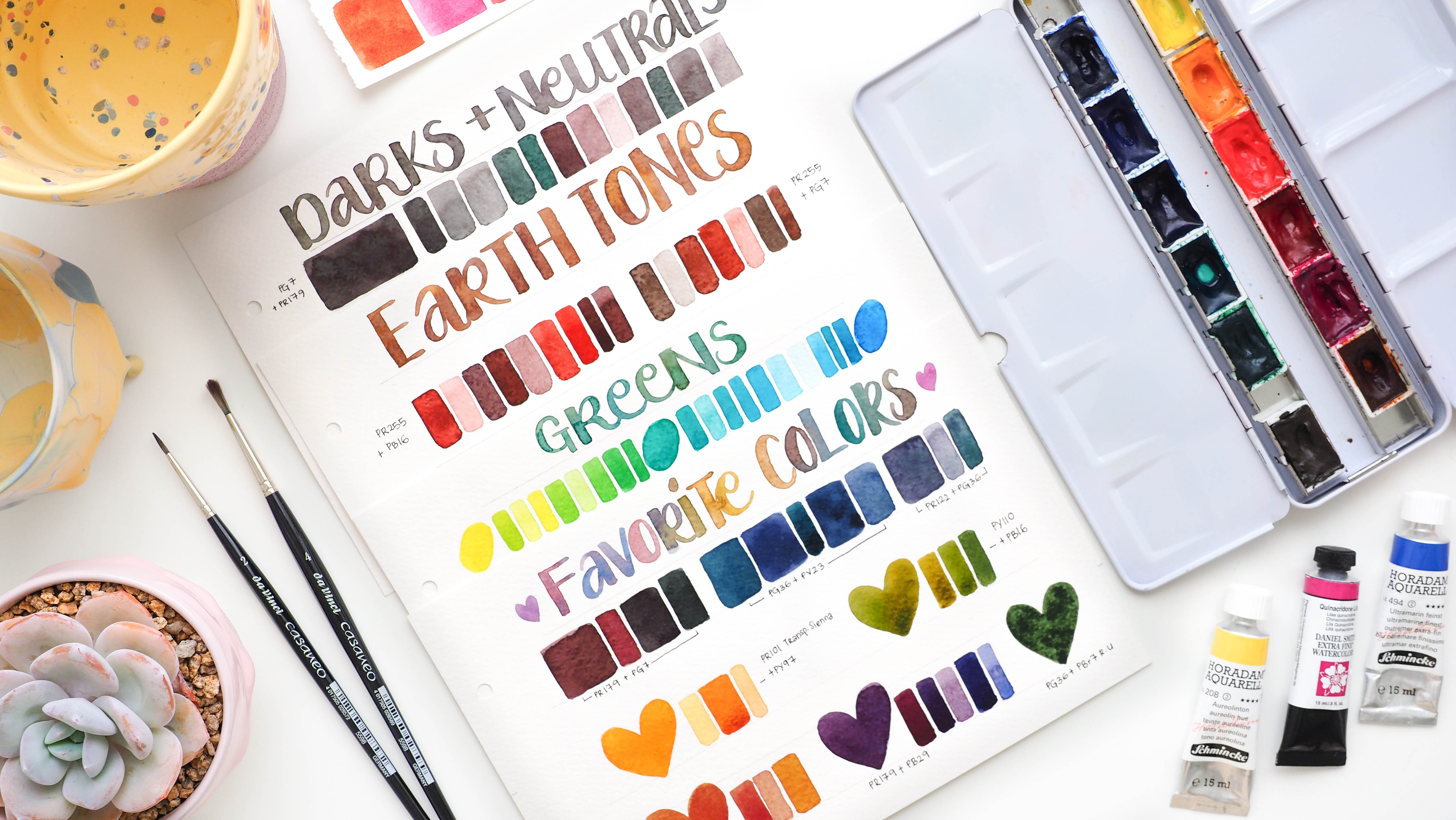
3. Watercolor Paints: Watercolor paints are made of finely ground pigment mixed with a binder, also known as gum arabic. This binder is what holds the pigment in suspension and allows it to adhere smoothly to the paper once it's applied. Tiny amounts of solvents are also added to increase the overall performance of the paint. The three main forms that watercolor come in, are pans, tubes, and liquids. Pan watercolors are hard dried cakes of watercolors, which you can usually find in half pan and full pan sizes. They are typically packaged as a set in a plastic or metal pellet, but you can buy individual pans to create your own palette. Tube watercolors have a similar consistency to space, and are therefore more smooth and creamy in texture. They are great for mixing large batches of paint, especially when you do large washes or a large-scale painting. They can also be used straight out of the tube for a more saturated mix. You can squeeze them into an empty pallet, let them dry overnight, and then reactivate them just like you would pan watercolors. Liquid water colors, as the name suggests, come in a concentrated form, which require the use of a dropper to transfer it from the bottle and onto your mixing palette. Now, depending on the brand and line of watercolors, some are more concentrated and thick because they are pigment based, dibase liquid watercolors, on the other hand, are usually more watery and lighter in consistency. Nonetheless, they both produced really bright and saturated colors. Now that you know the three types of watercolor paints, here are some things to consider and be aware of when choosing your watercolors. The first is quality. Generally, the quality of paints can be divided into student grade and professional or artist grade paints. Student grade paints usually have less pigment in them and more added fillers. They sometimes use multiple pigments to replace one expensive pigment, which allows them to lower the cost significantly. But this can usually result in less vibrant colors and sometimes a chalky texture, which can cause muddied colors when doing a lot of color mixing. In really cheap paints, the use of a low-quality binder can also affect the overall performance of the pigment. This usually results in inconsistent coverage and a poor flow ability. In saying that there are quite a number of reliable student grade paints in the market that are good quality and suitable for a beginner's needs and budget. Professional grade paints usually consists of a fuller pigment load and formulated with less fillers, which means they are richer and more vibrant in color. The use of high-quality binder and pigments also ensures a more even distribution and allows the paint to blend better. Professional paints also consist of a large range of single pigment formulations, which provide cleaner and more vibrant and luminous mixes. The next thing to consider is the permanence or the lightfastness of a color. Lightfastness or permanence refers to the durability of color in daylight. The higher the lightfastness, the stable the colors, meaning they won't fade or degrade over time under normal conditions of light and humidity. Fugitive colors on the other hand, will fade and shift color because their pigments are not chemically stable. If you're looking to hang up your paintings, give them as gifts, or sell original copies, then you want to make sure your pigments have a good permanent rating. You can usually find the lightfastness rating of a pigment on the tube or packaging, or the brochure that comes with paint sets. Otherwise, you can find this information on the brand website about their specific range of watercolors. Next, we're going to look at different pigment properties. These are important to know so that you understand why a certain pigment behaves the way it does. You could use that information when trying to achieve a certain outcome or when using different watercolor techniques. The first is transparency and opacity. Transparent colors allow light to pass through and reflect back the white of the paper, giving colors a luminous effect or glow, which is a unique quality of watercolors. Transparent colors are best used when building layers of paint to create a desired color effect. Opaque colors, on the other hand, give flutter washes and fuller coverage because when used to the fullest strength they do not allow light to pass through them. You can also use them for toning down or desaturating color mixtures. You can usually look for these symbols to determine the transparency and opacity of a color. Next is staining and non-staining pigments. Just as the name suggests, some pigments stain while others can be easily lifted out, whether with the brush, sponge, or paper towel. Depending on how you plan to execute certain techniques, keep in mind the staining and non-staining quality of a color. For example, if you plan to do techniques like lifting, choose pigments that are low or non-staining. Finally, granulation. Some pigments contain heavy particles that concentrate into patterns as it draws on the paper. This granulation characteristic is often used to add visual texture to a painting. Hopefully the things that we've covered so far give you an idea of what to look out for when selecting your paints. Now, if you are researching a certain brand or wanting to find out more about the different pigment characteristics and cues available, I suggest grabbing a watercolor brochure from a couple of brands at your local art store or from online art shops. Otherwise, you can also find these information straight from the brands websites.
4. Watercolor Paper: A good-quality watercolor paper is one of the key things to have in order to fully utilize the capabilities of watercolors. So you can use the best paints and brushes, but if you do not use the right paper, it will not allow the rest of the tools and medium to perform to its full capability. This can turn the whole process into a very frustrating experience. So let's get to know a bit more about watercolor paper so that we know what things to look out for and consider when looking for the right paper to suit your needs. Water colored paper is typically made from cellulose, which is derived from cotton or wood pulp. Cotton is a lot stronger and more durable than wood pulp due to the length of its fibers and is naturally acid free, meaning it will resist yellowing and deterioration over time. Cotton fibers also have better water retention and can withstand heavy applications of water and paint. Based on these qualities, a 100 percent cotton, which is often referred to as rag paper. It's generally considered the best quality paper. Paper made from wood cellulose is not as durable cotton and it needs to be chemically treated during the manufacturing process to remove the natural acid content. Watercolor papers are usually manufactured with a coating or sizing of gelatin, starch or synthetic substance. This coating or sizing reduces absorbency, so that pain doesn't sink straight into the paper. Otherwise, it would behave just the same as a paper towel. Now, paper can be both internally and externally sized. Depending on the quality of the sizing, it will affect the absorption rate, as well as the spread of paint and water on the surface. So as with watercolor paints, watercolor papers can also be divided into student and artist grade. As you can expect, artist grade paper is usually made from a 100 percent cotton fibers. They also have a well-balanced amount of sizing, both internally and externally. The use of high-quality sizing also ensures an even distribution of paint. Student grade papers are a less expensive option, as they can either be made from wood pulp or a combination of wood pulp and cotton. While not as strong and resilient as a 100 percent cotton, it can still withstand a good amount of liquid and scrubbing techniques. That being said, quality within a student grade can also vary from brand to brand and depend on the manufacturing process. So here I'm just going to do a brief demonstration to illustrate the difference between student and artist grade paper. The one to my left is the Canson XL paper, which is the student paper and the artist grade paper to my right is the Arches brand. They're both cold press in 300 GSM weight, but the Canson XL is made of wood pulp, while the Arches is a 100 percent cotton. Here I've applied a heavy wash of water and as you can see, the Canson XL started buckling in no time. I let the water sit for a bit, but you'll notice that the student paper isn't really absorbing the water, as well as the 100 percent cotton paper. But the same goes to when I applied paint onto the paper. It seems to be sitting on top of it rather than soaking into it, which could be due to the external sizing and the wood pulp content. As you can see, the artist paper is taking the paint really well and distributing it evenly across the surface. Which means it's got a good quality and well-balanced sizing. The paint here is flooding and not blending as well due to the slow absorption rate and this can likely cause backgrounds to appear when working with a really wet wash. Now, that being said, I have still been able to successfully practice lighter washes of painting on this paper. It's inexpensive and I think will work well for mixed media projects and quick small studies. It also depends on the kind of painting as well as the techniques you plan to use. Next let's look at the three different types of surface finish that watercolor papers come in. The first is a rough texture. As the name suggests, this paper has the maximum surface roughness between the three. Because of the rough texture, it's great for techniques like dry brushing. Hot pressed paper, on the other hand, has a smooth surface finish, making it great for really detailed work. Cold pressed papers stands somewhere between the two with a medium textured finish. This surface allows for a reasonable amount of detail, as well as giving your work some texture, which makes it a popular choice. Now, your painting style will also influence your choice of paper finish as the texture affects the appearance of brushwork and detail. So you can definitely experiment with either one, but for beginners, I would recommend starting out with cold pressed paper. Watercolor paper also comes in different weights, which is usually measured in grams per square meter or by pounds. The higher the weight, the thicker the paper, which means more resistance to warping and buckling. But this also means that thicker papers are more costly. A good mid-range weight to start with is 300 GSM or a 140 pounds. It's suitable for medium to small sized works and may need stretching depending on the heaviness of paint application. Now, paperweight does not affect quality, but it does affect how much water it absorbs. So depending on your painting style, your needs may vary. Now, watercolor paper is available in several different formats, including loose sheets, rolls, blocks and gummed or spiral pads. You can also find some packaged as convenient travel journals. So watercolor pads are pre-cut watercolors sheets that come in an array of convenient sizes. The pads are either glued on one side or come in a spiral bound. Blocks are similar to pads, except that they are glued on all four sides, which basically keeps the paper flat and keeps it from warping while you work. Now that you know more about watercolor paper, hopefully that gives you a better idea on what to look out for when selecting your paper. But just a recap on some of the things to consider. For good, reliable quality paper, it's best to select ones that are labeled a 100 percent cotton. Now, depending on your budget and your needs, you might opt between student or artists grade paper. It's understandable, you wouldn't want to break out your artist grade paper for small practice paintings, but it's important that you choose a good quality student grade paper by reading up about the brand or even reviews about the paper. You can start out with student grade, but I suggest also investing in some sheets of a 100 percent cotton artist grade paper to create final paintings on. Now, 100 percent cotton is usually acid free. But to be safe, check for the acid free label, especially if you're buying student grade papers. In this section, I'm just going to share a little bit about the brands and type of watercolor paper I've used and enjoy using. So I'll start with the artist grade paper. One of my favorites to use, which is the Arches cold pressed block in 300 GSM. It's glued on all four sides, so it doesn't require any stretching which is handy for when you're working heavily on wet, on wet techniques. For this paper, I enjoy using it for when I need to paint in lots of layers and create some nice wet on wet blending like this painting here, for example. It just really handles the paint very well and feels really nice to paint wet on wet washes on. The pads are a bit cheaper, of course, and might need stretching, but I generally don't stretch my papers because I don't really feel the need to floor my type of painting. The most I'll do to keep the paper down is to tip the sides with masking tape. Another brand I enjoy using is this Fabriano artistic cold pressed block, also in 300 GSM. It's a 100 percent cotton and also comes in 20 sheets, but it's slightly cheaper than Arches. It has a nice surface texture to paint on and can also handle a lot of wet on wet techniques very well. This one is the stonehenge aqua cold pressed block, also in 300 GSM. It's cheaper than the previous two papers, and it's also really nice to paint on. Its got a lovely cold press texture and these are the paintings I've used them for. Now, this next one is the Strathmore 400 series, which is a student grade paper. It's 300 GSM weight, cold press and acid free, but it doesn't state anywhere the ingredients of the paper. So after some research, I found that it doesn't have any cotton content at all. But I have used a desk practice paper and found it still decent enough to use for its price, especially for painting out rough ideas or practicing brushstrokes. So this next one is the Canson XL watercolor paper, which I used in the student versus artist grade demonstration. As you would have seen, it's not great for heavy applications of paint, but I do like the smooth cold press surface for my quote, paintings and more illustrative style work. Normally I would scan these pieces and enhance the colors digitally or fix any hard edges if I need to. I'll keep a digital copy because the ecoline liquid watercolors are not as light fast as the Dr. Bh Martin's hydrous range. They also come in the spiral bound format, which I like to use as a practice journal for lighter forms of study. Now, I bought blocks and pads for convenience, but now I also buy sheets for a more economical option. They cost a little lesser if you get them in large sheets, which you can then cut up into sizes that suite your projects. What I recommend is getting some sample packs to stuff with so you can test out different brands and surface types. Hopefully this gives you a bit more perspective into the decision-making process to help you in choosing the best paper for your needs.
5. Paint Brushes: The next tool you'll need are some brushes. Now, there are a variety of brushes available for watercolor, but in this lesson, we are mostly going to be looking at round brushes. This is because the round brush is a very versatile brush that can create a range of strokes, hence it's a great place to start for beginners. Before we look at the different hair types, let's familiarize ourselves with the common terms often referred to when talking about watercolor brushes. The first is capacity, which refers to the brush's ability to hold and retain moisture. Release refers to the brush's ability to distribute liquid slowly and evenly. Point here refers to the brush's visibility to come to a point when wet and retain that point while painting. Snap or spring is a brush's ability to spring back to its original shape when wet. Brushes with low snap will remain bent when pressed onto a surface. Generally speaking, a good brush should be able to hold a good amount of moisture and release it smoothly and evenly on the surface. You want it to maintain a fine point and spring back to its proper shape after each use. Although the snappiness of a brush can depend on your painting style and personal preference. Brushes generally come in three different hair types: Natural, synthetic, or mixed fibers. Natural hair bristles can vary in range from sable hair, squirrel, ox, and goat hair. The pricing can also vary depending on the source of natural hair, but generally, they are more expensive than synthetic brushes. Natural hair brushes are usually more durable and have the ability to hold a lot of paint and the ability to release it slowly and evenly. This brush that I'm using here is a Rafael Kolinsky Red Sable and is one of my favorite brushes to use. It retains a nice fine point and has a good amount of spring and snap to it. This is my preferred brush when I'm doing a painting with lots of layers and soft blending. Synthetic bristles are usually made from materials like nylon, taklon, or polyester fibers. They are a lot firmer than natural hair brushes and will spring back to form quickly. Although synthetic brushes generally do not hold a lot of liquid and release it as consistently as natural bristle brushes, these days you can find good quality ones that are manufactured to mimic those same qualities closely. Synthetic brushes are definitely a good alternative for a more budget-friendly price. Now, the brush I'm using here is a Princeton heritage synthetic brush and it's a very good quality and affordable brush to work with. It holds a nice point and the springiness of the brush allows for more controlled and firmer strokes. It also holds a good amount of liquid. I usually use my synthetic brushes for a more graphic or illustrative style painting. You can also find brushes that are made with a blend of natural and synthetic fibers. Again, performance and quality will vary by manufacturer and construction. Depending on the blend of fibers as well, you might find some with softer or firmer bristles. This silver black velvet brush is a blend of synthetic and squirrel hair. It has a very nice sharp point when wet and a good amount of flexibility to the brush. It feels nice and smooth to paint with, but it does have less snap to it so the bristles can feel very soft and a bit floppy compared to a synthetic brush. Choosing a brush will ultimately come down to personal preference because the way certain brushes feel in your hands will vary from person to person. If you are completely new to watercolors and still not quite sure about the medium, I would suggest starting with a good quality synthetic round brush. When you've had a feel for it for a while, and you find that you do enjoy the medium and want to keep exploring, then you can go ahead and invest in a really good quality sable brush. That's just a suggestion of course. It all depends on where you're at in your practice, what your budget is, what you prefer, and you're painting style, etc. Next, we'll look at brush sizes. I recommend getting a round brush in three different sizes; large, medium, and small, to cover a variety of tasks, from large washes to fine details. One thing to note is that brush sizes are not standard across brands so a size 6 round brush from one brand might not be the same as a size 6 round brush from another brand. Once you've got your round brushes covered, another good brush to have handy is a flat or angled brush, which are good for large even coverage. You can certainly use a large round brush washes but sometimes a dedicated brush for the task can make things a little easier.
6. Mixing Surface: Next we'll need something to hold our paint and allow us to mix colors before applying it on paper. If you've got one of these pre-packaged travel pan sets, then you already have a mixing palette that comes with it, which is very handy, especially when you're on the car. But once you start mixing lots of colors, you might find that you need the extra mixing space, and that's where you can utilize any of these palettes here. It can be in any size, and it all depends on the scale of your work, as well as your own personal preference. The most common mixing pellet you might have seen are these plastic ones with little wells and they are very cheap and easy to get it in any art store. I used this one for years since my high school painting days. Then I got this one which has more wells and it's got this flat mixing surface in the middle, which is handy when you're mixing two or more colors, and you want to adjust your pigment to pigment ratio. It's just nice to be able to see your mixes on a flat surface. I have since moved on to using ceramic pellets because I find them very nice to mix on and the colors don't beat and they just glide nice and smoothly on the surface. I also like using these ones with sloping walls because it allows the water to puddle at the bottom here, and you can separate your watery mixes from your more pigments at once. These are not as travel friendly as the plastic ones obviously but when your painting at home or in your studio, they're very nice and steady and won't move around as much. They are a lot easier to clean as well, which is definitely a plus for me. Now, these pallets are made specially for painting, so they will cost a bit more, but if you're looking for a cheaper alternative then a good old dinner plate will work just as well. If you have one or two old ones lying around, can start using them as a mixing surface and it won't have to cost you anything extra. Dinner plates are great since they're ceramic or porcelain, they'll be nice to mix colors on and having a large flat area like this allows you to mix more colors and it's also handy for times when you need to use a larger brush. You'll find that a lot of the ceramic home wares or kitchen wares are great to use as a mixing palette. I usually get cheap ones from Dyson like this dipping clutter and you can get ones that have deeper wells if you're doing a lot more watery mixes. Also ones with separate wells, if you want your mixes to stay contained. This plate here is also from Dyson and it's pretty travel friendly and just convenient to pull out whenever I need that extra mixing surface. There are lots of options and it all boils down to what you prefer working with.
7. Water + Paper Towel: The next thing we'll need and the most essential to water colors is none other than water. Any container that can hold a good amount of water will do. Preferably something sturdy and stable so it won't tip over easily. Some artists like to use two jars to separate their clean and dirty water. One jar is used for rinsing out all the pigment and as the other is kept clean so that it can be used to add into paint mixtures and for pre-wetting the paper before applying paint. You want to be sure to use clean water for those things so you don't end up with muddied colors. Another way to use two water jars is to separate your warm and cool colors. Just like with the dirty jar, when you mix all colors together, especially colors sitting on opposite sides of the color wheel, you will get a muddy mixture. Keeping the two separate will avoid that. This might work for some, it might not work for others. It really comes down to personal choice. Some people might even have a third jar of clean water if that's their preferred way of working. I do prefer separating my warm and cool colors and I usually have this squeeze bottle as my clean water that I use for activating my pigments, and when I'm applying a wash of water for wet on wet techniques. It doesn't really matter how many jars of water or the type of container you use, a good rule of thumb to follow is, once your water gets really muddy, it's time to refresh it. Last but not least, we'll need some paper towel. You can use an old cotton rag or tissues. But essentially, you want something that can block the excess moisture on your brush, to help you in controlling your water and pigment ratios. You can simply dab your brush gently on a paper towel whenever you need to blot off excess water. A good tip when you've loaded your brush with pigment and find it is a bit overloaded, simply dab the side or the belly of the brush to remove the extra moisture without losing too much pigment from the tip of the brush. A paper towel is also great for blotting out mistakes while the paint is still wet and for mopping up unwanted puddles of water from your paper. This makes it a great tool for lifting techniques. You can scrunch up the paper towel or tissue and blot out paints to create interesting textures like clouds, for example. We'll explore this more in the coming class exercises.
8. Extra Tools + Materials: Now that we've covered the essentials, we're going to look at a couple of extra tools that you might already have, or are optional to get to supplement your watercolor practice. The first are pencils. It's good to have one or two in hand for when you're laying down a light sketch, or your watercolor paper, or planning out your painting, and composition in a separate piece of paper or sketchbook. Pre-planning your paintings, especially when you have more than one element to your piece, will save you a lot of time and potential mistakes. You don't want to be constantly drawing and erasing of your watercolor paper because this can weaken or even damage it. I usually use either a mechanical pencil or a traditional one, and I use a HB lead for both, which makes lighter lines. Of course we'll need an eraser. We can use any soft eraser that is gentle on watercolor paper. I like using kneaded erasers because it's easy to lift off just enough pencil marks, and still leave you with a guide. You can mold them into any shape for precise erasing, and they're usually pretty mess-free, which is great. Next, we have drawing pens. These pigment ink pens are usually waterproof and permanent, and come in a range of sizes. They're great for adding details to your paintings, and to create a certain style or look. Now apart from black ink, white ink, and metallic are also another way to add fun little elements to your paintings. What acrylic ink, guage, or white [inaudible] pens are great for this. You can also find gold, iridescent inks, or even metallic sheets of watercolors. Another easy way to add interesting textures to what are called washers is by using salt. Simply sprinkle some of the paint that is still damp, and let it dry completely before scrubbing it off gently to reveal the textures. All right, our next handy tool is a masking tape or washy tape. You can use masking tape to tape your paper down onto an art board to reduce paper warping, especially when working with wet-on-wet techniques. Both tapes are also great for creating a nice clean frame around your painting. Finally, a tool that I think will be very handy to have, especially when you start to learn more about your colors, and how to mix them, is this color wheel. It's got basic information about color theory, and they're just great to have as a quick guide, especially when you're planning out your color schemes, or doing some color mixing.
9. Practice Overview: Once you've got your tools ready, now, we can begin the fun part. In the next few lessons, we are going to look at a couple of simple exercises to help you get comfortable using your tools, and to understand how water color works, now these exercises are not just for beginners, they're also good as warm-ups before painting or as a refresher for times when you're going through a creative block. You can always refer back to them whenever you're feeling uninspired or stuck.
10. Basic Techniques: Now, as you begin painting with watercolors, the two basic techniques you want to get familiar with are the wet- on- wet and wet-on- dry technique. Understanding these techniques and learning different ways to apply them can help you exhibit the unique and beautiful qualities of watercolors. Let's start with wet -on- wet. Wet-on- wet is when you apply paint to an already wet surface. You do this by either first wedding the paper with a layer of water and then applying paint, or by dropping paint into another layer of wet paint. Working wet-on-wet is best when you're trying to achieve strokes with softer edges or a smooth transition and blend of colors. Let's look at wet-on- dry. Wet-on-dry is when you paint straight onto dry paper or onto a layer of paint that is already dry, which is a technique also known as glazing, wet -on- dry is best used for when you want more controlled and clearly defined brushstrokes. You can easily combine both techniques because when you lay down paint wet-on-dry, you are essentially creating a wet area into which you can then start working wet- on- wet. Now that we know about these two basic techniques, let's look at some essential things to be aware of when painting wet- on -wet. The first is that greater wetness will always flow into a lesser wetness. What this means is that if your brushes wetter than the paper, when you dropping the paint, it will disperse and spread into the water glaze. But if your brush is damp or has less moisture than on paper, it will act as a sponge and absorb moisture. Now, this is useful if you want to do lifting techniques or soap up excess moisture from the paper. Sometimes if you find that when you're dropping paint onto wet paper and there's barely any flow or dispersion, this could be due to the brush having too little moisture than the paper that it's inset trying to absorb the liquid instead of dispersing it. Understanding this dynamic will help you find the right balance between paper wetness and brush wetness. Which brings us to our next point, which is the different levels of paper wetness. I've split the levels into four stages which are very wet, or flooded, wet or glossy, damp and almost dry. Now sometimes you might find other artist explain it in three or even six different stages. But essentially what you want to take away from understanding these wetness terminologies is that the different levels of paper wetness will influence the way paint behaves on paper. Let's look at the first stage, which is very wet or flooded. This is where you can see water bubbling on the surface and it completely obscures the texture of the paper. When you have too much water on your water glaze and you come in with a very loaded brush, the paint will float on the surface of the water instead of flowing across the paper. An excess of moisture will also cause pigment to pull on the edges of the shape and leave you with these hard outlines when it dries. Now, you can certainly work with a very wet wash and move the paint around by tilting your paper or letting gravity and the painters do its own thing to create beautiful organic and spontaneous effects. And you can let it dry as is wanting interesting textures. But otherwise, you can simply brought up the excess moisture with a paper towel or brush. Next is the wet or glossy stage. This is where you can see a nice even sheen of water and the paper texture is visible. The water is quite reflective, but you're still able to see the little bumps of the paper. For paint to spread and diffuse nicely across the surface. You want it to be at this nice glossy sheen stage. The damp stage is when they're still moisture on the paper. But the sheen has become mat or rather dull. Adding too much moisture during this time will create what a blooms or backgrounds instead of a seamless blend, because the moisture will push up pigment that have already started to settle on the paper. So blooms and backgrounds aren't really a bad thing unless of course they show up when you least expect it. That's why it's important to understand how they happen so that you can choose to incorporate them purposefully into your painting and we'll explore this further in the coming exercises. The next stage, which is almost dry, is where there is no machine, but the paper's still feels a little cold to detouch. If you want to start painting, a new layer went- on-dry, then the previous wash of color needs to be completely dry beforehand so that it doesn't lift or bleed when it's not supposed to. By being aware of how wet your brushes and how wet your paper is, is good practice for moisture and flow control. Which in turn allows you to execute different techniques and achieve desired outcomes. Over time, you'll start to get a feel for it and it will become more intuitive with practice. Keep in mind that paper quality will also affect how paint is absorbed and dispersed, as we've discussed in the tools section. If you find that you're still having trouble working wet- on- wet, be sure that you are using the right paper for the type of painting you're doing. Last but not least, remember that paint will flow where you've applied water and will stay within the boundaries of that wet area, unless you extend the area and create more shapes with your brushstrokes. Depending on the amount of paint you apply to the wet area. It can either fill up the whole shape or fade out gradually into clear water, creating soft feathered edges. All right, now let's start practicing these techniques and learn how we can create flat and graded washes. How to blend two or more colors, how to sustain the wet-on- wet process and create textures and effects, and then learn different ways to combine the two techniques.
11. Exercise 1: Washes + Color Blending: In this exercise, we are going to start with creating a simple flat wash, which is basically a solid sheet of color, evenly spread. I'm going to do this one using the wet and dry technique. I'm going to paint straight onto the dry paper. You could go ahead and draw out the shapes so you have a guide, or you could paint it freehand if you prefer. Now, I've prepared an even mixture of pigment and water and I've got that ready to go because when you work wet and dry, you want to work fairly quickly so the paint doesn't dry before you apply the next stroke of color. Otherwise, it will leave hard edges or streets of uneven color. It's fairly easy to control when working at a smaller scale. But for larger areas where you want a smoother and diffuse blend of colors, it's best to work wet on wet and pre-wet the paper. I'm just filling up the entire shape with paint and making sure that I spread it across evenly with my brush. Now, I go over it one more time just to even it out and I make sure that there's no standing puddles of paint anywhere. If there's any excess moisture or paint, be sure to soak it up with your brush or paper towel so that it doesn't flow back into the wash and create a background as it's drying. Now let's create some graded washes. A graded wash essentially shows a transition of color from dark to light, or even a transition between different hues. I'm going to create the first one, wet and dry. Similar to how we did the flat wash, we are going to apply strokes and work from top to bottom. The only difference is we are going to decrease the amount of pigment on the brush by rinsing it little by little, every couple of strokes so that the color gradually lightens and fades out. An alternative way is to add water to your pink mixture to dilute it, and get the same results. You can practice both ways, but I'm going to demonstrate this using the first method, which is rinsing off pigment from my brush. I've prepared a mixture of paint and I'm just going to swatch it on a scrap piece of paper to make sure it's in a consistency and color value that I'm happy with. Then I'm going to apply the first two strokes from one end to the other and move slightly down each stroke. Then I'll quickly dip my brush in water and wipe off the excess moisture on the edge of the jar about once or twice, and then make a few more strokes with the remaining pigment in my brush, overlapping slightly the previous stroke that I put down. My goal is to extend the wet area so the paint can flow into it as it gradually fades out. Now, an important thing to keep in mind is the water dynamics we talked about in the previous lesson, where greater wetness will always flow into lesser wetness. Here you want to make sure that when you apply or following strokes as you fade out color, your brush is not overloaded and wetter than the last stroke, because you don't want to end up pushing the pigment back up. If you feel your brush is still loaded with moisture, simply dab it gently on a paper towel. What you want to do is extend the wet area and coax the paint on the paper to flow into this new extended area so that it gradually fades out. To finish off, I've rinsed pretty much all the pigment from my brush, and I'm laying the last few strokes where the pink fades out into clear water. Now, this method of fading out is very useful for when you want to soften a hard edge and further it out. Now I'm going to create the second one using the wet on wet technique. I make sure I thoroughly wet the paper and let it absorb the moisture for about a minute. I'll check that I have a nice even [inaudible] and no standing puddles. Then I'll apply about two horizontal strokes of paint before I rinse off some pigment from my brush. Then lay down another stroke or two that is lighter than the last one. I'll repeat this process until I have no more pigment left in my brush. Since the wash is still wet, I'm just going to use the paint mixture from my palette and add a couple of strokes at the top of the wash just to deepen the color a bit more. Before I let it dry, I carefully even out the paint, keeping in mind the wetness of my brush and paper. Next we're going to practice creating a variegated wash, which is basically the mingling of two or more colors. To keep things simple, I'm just going to use two colors and have them meet in the middle and blend to create the third color. I'm going to use permanent rose and lemon yellow deep. Just make sure they're activated and ready to go. Here, my mixtures are fairly pigmented, but with enough water to facilitate flow. With this first example, I'm going to work wet on wet so as usual, I'm going to wet the paper nice and thoroughly. Then I'll start painting my first color from top to bottom using horizontal strokes across the paper. I'm just grabbing more paint and adding that from the top just to deepen the color a bit more. I'll keep adding more strokes until I'm two-thirds of the way. Then I'll rinse my brush and grab my second color. I'm going to work from bottom up towards the first color. I'm going to continue painting horizontal strokes two-thirds of the way, just like I did with the first one. Now, where two colors overlap, I'm going to soothe my brush back and forth horizontally just to help the colors blend a bit more. Now I'm going to let that one dry. Now in this second example, I'm going to show you how to blend two colors and create a transition color like we did in the first one. But two separate washes of color, one on top of the other. With my first color, I'm going to paint a graded wash, wet and dry like we did earlier on, but reducing the pigment in my brush gradually and then fitting it out into clear water. Now I'm going to let this layer dry completely before glazing on the second layer of color. Once it's completely dry, I repeat the same process as before, only this time I'm looking from bottom upwards. You can already see here where the two colors overlap. You get the transition color, which is a nice green hue. This is basically one of the ways you can use the glazing technique and overlay different transparent colors to get a different color. Those are some ways to blend colors and create a variegated wash, but you can also create ones that are more organic and not as uniform and they can be in all sorts of shapes. Yeah, have a play around with dropping in different colors or different shades in a more irregular fashion. Notice how to color spread and make some paper. You can overlap the colors which are brushstrokes or just that it spread and mix on their own. Just experiment with it and have fun.
12. Exercise 2: Combining Techniques: All right, now let's look at a few ways we can combine the wet on wet and wet on dry technique. This is especially useful for when you want more control over your brush strokes, but you also want some nice soft color blends. I've painted a couple of shapes that are now dried, and I want to go in and add more layers to give it more dimension and form. Let's start with this shape here. I wanted to darken the middle part here just to give it the illusion of space and show that it's curving. I'm going to glaze another layer of the same color, but instead of applying the paint first, I'm going to wet an area larger than where the paint will flow. I'm only dropping the pigment in the center where I want it to be darker and then just letting it fade out into the water glaze so I get soft edges on both sides. If the paint is spreading too much, you can either extend the water glaze or use a damp brush and gently lift and feather it out or sweep the pigment backwards. While the wash was still a bit wet, I dropped in slightly more pigmented and paint to deepen the color. All right, this next one here, I wanted to blend two colors at the bottom part of the leaf, so I only wet that part of the shape with water. Then I dropped in my colors where I want them, and then to get a nice clean edge at the tip of the leaf, I simply pull the paint into the dry area. All right, I'm going to do another one here, and again, I'm wetting only the bottom part of the shape where I want the paint to fade into. This time, I paint the tip first wet on dry and merge the paint into the wet areas so it fades out gradually, similar to a graded wash. All right. Hopefully with the examples I've shown here, you get more of an idea of how you can adapt the basic techniques to create certain outcomes and results.
13. Exercise 3: Creating Textures + Effects: In this lesson, I'm going to show you a couple of ways to create interesting textures and effects by extending on the wet on wet process. There are a couple of methods and options to use. But essentially you want to work during the stage when the paper is damp or closer to that stage. The first option I'm going to use is some salt. I've thoroughly wet the paper and letting it sit for a bit. The salt absorbs the moisture and I have a nice glossy Xin to work with. Then I've just dropped in some paint and created a simple variegated wash. The paper is still quite wet, but I've dropped in some salt just to see how it would respond at this wet stage. Now, you can see that the big chunks of salt does start bleaching the color a little. But because the paper is so saturated, it's not as distinct as if it were damp. I'm going to let that sit just a little bit more. Now at the paper has still got a glossy sheen to it, but I can see that most of the moisture has settled into the paper and the texture of the paper is a lot more visible. I've gone ahead and dropped in more salt. Now I'm going to let that one dry and work on another wash. This next one, I'm going to use some rubbing alcohol in a spray bottle, which is actually something I have that is used as a surface cleaner. Similar to salt, it repels the paint and pushes it away to reveal a lighter color. It's another option to experiment with when creating textures. Play around with how you apply it. You can either spray it if you have something similar or you can use a dropper and drop it into the wash or even use Q tips and debit in. I've let my wash sit for a couple of seconds and then I've just gone ahead and sprayed some of that solution into the wash. As you can see here, the effects are quite prominent. Now I'm just playing around with adding a darker color just to see how that will turn out. You can see that the latter parts have been completely bleached of moisture so the paint isn't flow in those areas. But some parts you can see the colors still bending in. Next we are going to create some watercolor blooms, also known as backgrounds, or a cauliflower effect. They are basically a flow mark created when a lot of moisture meets an area of less moisture. When you're adding very wet paint to an already drawing wash, the significant difference in wetness will push out pigment that have already started to settle on the paper, resulting in these unpredictable textures. Now, there are certainly times when you want to avoid blooms, especially if they seem out of place in your illustration. But other times you actually do want to incorporate them to add visual interest to your painting. Let's start creating some. I've let the paint sit for a bit and settle onto the paper, but I also left a bit of it pulling in the corners just to see how that will affect the wash. As I'm painting and also being aware of the levels of paper wetness. As you can see here, some parts of the top washes have a dull shine, some parts still glossy, and the parts where sprayed rubbing alcohol are completely dry. Here I dropped in some water with a very loaded brush to create some blooms. Then I continue dropping more water as the paint had settled more in the paper. It's getting a bit more distinct. Here, I dropped in more paint as the wash was at a damp stage. You can see how the flow of paint has slowed down a lot and it's creating more hard edges instead of blending smoothly with the rest of the paint, like it does in this corner where the paper is still wet. Experiment with different levels of paper wetness and brush wetness and even your method of applying paint or water to the paper. Whether you brush it in, drop it in, spray or spreader it in to see the different results you get. If there's a process you really like, you can practice on it more and incorporate that into your painting. Another technique that can be used to create certain effects in watercolors is lifting. When you're lifting, the brush needs to be drier than the paper, but not completely dry. To remove any excess moisture from the brush, simply debit on a paper towel. You can lift once or twice. But after that, it's best to rinse your brush and start over so you're not spreading paint back into the area you just lifted. You can also play around with the shape of your brush and use a broader stroke or a pointy tip. Depending on the pigment property, you could easily lift out non-sustaining pigments that have already dried by using a DEM brush and scrubbing gently the area you want to lift and then using a tissue or paper towel to block up the pigment. Remember, anything that's absorbent can be used as a lifting instrument. Here I'm going to create clouds using a scrunched up tissue paper. There are so many possibilities to explore. I encourage you to experiment and combine the different methods and techniques to discover what effects you can come up with.
14. Exercise 4: Colour Mixing: All right, so in this exercise we are going to learn more about our colors and know what mixes we can create, especially when working with a limited palette. So when starting out, you don't have to get a huge range of colors, you can start with a few basic primaries and get familiar with color mixing, and then build your palette from there with colors you find you tend to use more. All right, so we're going to create a basic color wheel using the three primary colors. Now, the traditional primary colors we grew up learning about are red, yellow, and blue. But as you come to discover when mixing these colors in any medium, they don't produce mixes as clear and saturated as when mixed with magenta, yellow, and cyan. Now, this is because each primary color has a warm and cool color bias. So in order to create vibrant mixes, both primary colors need to be biased towards each other, meaning they both should want to mix the same secondary color. So to create a vibrant violet, for example, we need to mix a warm blue and a cool red. But if you mix a warm blue and a warm red, which is leaning towards yellow, it will create a less saturated purple shade because the mixture will essentially have all three primary colors present and when you mix all three primaries, it creates a dull muted color. So what you'll find as you dealt more into color mixing, is that there is a three color mixing system and a six color mixing system which is also known as the split primary system. The three color mixing system basically uses cyan, magenta, and yellow as the primaries, whereas the six color system consists of a warm and cool version of each primary. Now, I will get more in detail on this topic in my next class, which we'll be exploring more about colors, but for now, to keep things simple, we're going to stick to a three color mixing system and denote cyan, magenta, and yellow as our primary colors. I will be using my Winsor and Newton Professional paints for this demonstration and their three primary colors in the range are, Permanent Rose, Winsor Lemon, and Winsor blue red shade. Now, this will differ from brand to brand, so you can look up information on a brand's website or brochure to see their designated primary colors or even information about a color's temperature. Now, feel free to use the reds, blues, and yellows that you currently have because this exercise is meant to explore what colors you can mix with the palette you already have anyway. All right, so let's start mixing some primary colors. Now, I'm going to create a simple triangle and do the mixing on paper. You can do the same or create a traditional color wheel because it's essentially the same thing, but I'm just working a little bit more organically to explore mixing on paper and on my palette. So I'm just meeting each primary color halfway and blending it gently where it meets to create this secondary color. Next, I'm going to do the same mixes but on my palette, and paint that in-between the two corresponding primary colors. Now, we'll start mixing the tertiary colors, and we get that by mixing a primary color and a secondary color. So here I'm adding some more Permanent Rose to the orange mix to get a red-orange hue and then I'm mixing more yellow into the orange mix to get a yellow-orange hue. Remember, you can swatch it on a scrap piece of paper to check the mix if you're not quite sure whether you've got the right pigment ratios. So as you can see here, with these three primary colors which are essentially close to the cyan, magenta, and yellow, they produce nice vibrant color mixes. Now, the next thing you want to do is, if you do have different shades of reds and blues, say if you had a warm and cool blue and a warm and cool red, you can go ahead and experiment mixing those around to see the different shades of purple they create and you can do the same with mixing your greens and oranges. So here I'm just using my sennelier to watercolors and mixing the [inaudible] and quinacridone red with the yellow-blue and I'm also just swatching tiny bars of the two mixes and varying the hues by adding more red or more blue in them. I also mix the Winsor and Newton-Permanent Rose with the sennelier yellow blue and as you can see, these two combinations produced a brighter and more vibrant purple. Now, the important thing is not about finding the perfect shade of purple or orange or green. Rather, it's more about knowing how to create the shade that you want to use in your painting and as I said before, this exercise is meant to help you get to know your colors better and know what mixes you can produce with the palette you already have, as well as understand why certain mixes don't produce vibrant results. All right, now let's practice creating some dark neutral tones. So as we learned earlier, mixing all three primary colors together creates muted, less saturated colors because they neutralize each other. The more pigmented the mixes, the more darker and closer to black they become. So you can create different shades of gray or brown depending on the proportion of each primary color in the mix. This is especially useful for when you want to create dark tones for shadows, or create neutrals like browns or even tone down the intensity of a color. This is why complementary colors, which are colors sitting on the opposite side of the color wheel, produce neutral browns or grays when mixed, because they will essentially have all the three primary colors present in the combination. Oftentimes, these dull mixes are referred to as a muddy mix. So we're going to start mixing a couple of these complementary colors just to play around and see the different browns or grays we can get. Now, orange and blue are complementary colors, but this orange that I use was more of a deep yellow. So it was actually mixing a nice green shade because this yellow is leaning more towards the cooler side, and therefore it mixed well with the blue. So while complementary colors create a striking combination side-by-side, when mixed together however they produce a redder dull shade. But the way to truly take advantage of this combination is to add only a little bit of the complementary color of the color you want to tone down. So for example, the color green in nature is not all vibrant and bright. It's actually made up of different shades of green and you can create a nice natural green by adding just a little bit of red or magenta to the mix. So you can play around with the color proportions to mix a variety of deep dark shades. All right, so hopefully you get a basic understanding of the color relationships through these simple exercises and use that to help you create mixes that you are looking for.
15. Exercise 5: Water & Pigment Ratios: In this exercise, we are going to practice a pigment and water ratios to create different levels of transparencies within a color, as well as to create varying transition use between two colors. The first exercise we're going to practice is creating a value scale. Value here refers to the lightness and darkness of a color. In water-colors, we lighten our color by adding more water as opposed to adding white. I got some scrap pieces of paper ready so that I can swatch the colors off before laying it down on my paper. I'm going to use Payne's gray for this exercise because it's a very deep color and you can get a wider range of values with it. All right. I'm going to start with the lightest value of the color. I'm creating a very watery puddle of paint here. There's just a tiny bit of pigment here with a lot more water. I'm making sure each block is a gradual increase of value. The amount of pigment to water ratio will eventually increase until at its fullest strength, the block is very pigmented with only a little bit of water in the mixture. Now you can see how using one color, you can still get varying levels of color value, which is very useful for creating contrast in your painting. Here I'm starting with the darkest value. Instead of adding more pigment, I add more water to gradually dilute the mixture. Have a play around with creating a light to dark or dark to light scale so that you have a better sense of water control and get an idea of how much water or pigment you need to get a certain value of color. All right. Next we're going to create transition use to practice a pigment to pigment ratios. These are the varying shades of colors that are produced between a mix of two colors. Essentially bridging the two together. You can mix any two colors on the color wheel including complementaries, but for this example, I'm mixing colors close to each other on the wheel. I'm essentially creating an analogous color scheme. All right. I'm going to start with a pure color of permanent rose. Then I grab a little bit of my second color, which is the Windsor yellow deep and add that to the permanent rose mix. The third block is going to be about an equal mix of the two colors. There's no exact method of quantifying the ratio. It's really a practice of gauging how much of either pigment a mixture has to have to get a desire shade of color. That's why creating a scale like this helps to at least visually depict the gradual change in color. In this fourth block, there is more yellow in the mix than pink. The final block is a pure color of the yellow. Now you can take this up a notch and create a value scale as well for each shade of color. You can see how using just two colors, you're able to create a range of views and values which are important in creating color harmony, as well as creating more depth and contrast in a painting. Play around with different colors and you can also switch colors freely without creating chart of scale and just have fun exploring.
16. Exercise 6: Layering: We learned how to glaze in the basic techniques exercise by overlaying another wash of color over another dried layer of color. In this lesson, I'll show you a couple more ways you can practice glazing to understand how layering works. Since we're building layers, we are going to work from light to dark. So I'm going to use two colors like we did in the previous lesson, and get that range of transition colors. But I'm going to be working mostly with these lighter and medium range of values. This is because we want to retain the translucency of the color since we will be overlapping them one on top of the other. So for the first layer of cycles, I'm painting them all over the paper and varying their sizes and color mixes. I work from left to right since I'm right-handed and I don't want to accidentally smudge over any wet paint with my hand. I also make sure to leave enough negative space between each cycle. As I'm laying down different mixes of color, I'm also thinking about each placement and making sure they balance out the entire piece. So I try to make sure I don't have a shade of color sit heavily on one side, or in a very vertical line which can be a bit distracting to the eyes. Once the first layer of cycles are completely dry, I'm going to repeat the process with a second layer of circles that overlap the first one. With these last few circles, I played around with combining the different hues in the same shape. That's it for the first piece. In this next one, we're going to create a cute decorative treaty letter. I'll be working in this lighter value of color, then glazing several washes off that color in areas I want it to be darker. That contrast and color value is what gives the shape more form and dimension. I'm applying the first wash of color all over the shape and then letting that dry completely. Then I'm going in with the same slightly watery mixture, and painting the sides that I want to be darker. So here I'm dabbing off some of the moisture from my brush to get it to a finer point so that I can work with more precision on the edges of the shape. Next, I repeat the process for the third layer, and paint only the sides I want to darken. On this side of the letter, instead of a flat wash I'm fading it out and charging in more pigment at the top pot just foreign bit more contrast. Now again, once everything is dried, I'm going to glaze over some fun details using different shades of blues and purples that I have on my palette. This is completely optional but I've added some white ink and iridescent bronze ink, just as a little something extra. Experiment with what you have and play around with different colors, combined techniques and methods, and just see what you can come up with.
17. Exercise 7: Brush Strokes: All right, in the following exercises, we are going to practice using our brush and explore the different brushstrokes and marks we can create with it. In this example, I'm using a round brush. Depending on how it's held and the direction in which you move it, you can create a wide range of marks. So when you touch your brush at an angle, you can use the very tip of the brush to paint thin lines. You can keep your motion steady by placing your pinky finger on the paper to keep the bristles from moving up and down. Keep your brush perpendicular to the paper, and while keeping your wrist fixed, try moving your arm from the shoulder as you paint a thin stroke. To create broader strokes, press down on the belly of the brush with a little pressure. Try varying the width of your strokes by pressing down, lifting up and pressing down again. You can use your practice papers or even the back of an old painting for this exercise and try to fill up the page with thin lines and practice painting them close to each other without touching. This is a great exercise for you to gain more control and confidence of your brushstrokes and develop muscle memory for crisp, confident lines. All right, next, you can try creating patterns with your brushstrokes by varying the size and length of lines. You can also practice basic lettering strokes to get a better feel for your brush, or paint fun outlines of shapes and fill it with varying width of closely painted lines. All right, so another good way to practice precision of brushstrokes is to paint negative space or around positive space, which is around your subject matter or object. So in this example, negative space is space around the letters. You can use a small brush to get around tighter areas like when painting around the letters, and a big rush for wider strokes to fill up the rest of the background. In the second example, I've combined the wet and dry and wet on wet technique by wetting parts of the painting with water so the edges remains soft and diffused, while I paint around the letters both wet and dry and wet on wet. Next, you can also explore dry brushing techniques by dabbing most of the moisture off your brush, and then painting with fairly pigment and paint. So, here I flatten the body of the brush gently by pressing it down on a paper towel, and then using my fingers to spread the bristles out like a fun. Then I grab some concentrated paint and create gentle sweeps across the paper. As you can see here, brushstrokes are another great way to create textures and patterns wet on dry. All right, so feel free to also practice with different brushes that you have and continue experimenting with a range of strokes.
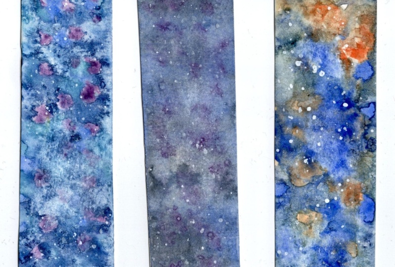
18. Class Project + Painting Demo: For your class project, you can upload any or all of the class exercises, or you can combine the techniques you learned and create either a bookmark or an inspiration card as your final project. What you choose to paint is entirely up to you. You can get really creative here, or you can choose something as simple as shapes and export techniques and color mixing. You can go about it any way you want. I created two examples just to give you an idea of how I combine what we've learned so far in this class. This first one, I've chosen a word that I wanted to incorporate into my inspiration card, and I've taped down the corners of my paper so that I get a nice white frame like on a postcard. I decided to go for a graded wash background using two colors, but I faded out the edges from both ends because I want to keep more of the paperwhite in the middle section of the paper, which is where I will paint in my word. Here, I'm just mixing a slightly more pigmented mixture of pink and blue to get a nice purple shade that I will use for my lettering. Now that the background is completely dry, I'm going to paint the letters in free-hand. But I've marked very lightly on the paper where the first, middle and last letter would go just to give me a guide. Now, you can draw out a very light pencil guide of the word and even practice drawing and painting it on a practice sheet of paper. Or alternatively, you can also paint the negative space around the letters. I paint fairly quickly because I want the letters to bleed into one another. While each letter is still wet, I charge in with a darker pigment and drop it randomly around the shade. I also play around with varying hues on each letter just to create some interest. At the same time, I'm dropping in more pigment to deepen the color a bit more. While I let that dry, I paint some decorative lines around the word, playing around with different levels of transparency and hue variation. I'm still using the same two colors that I did with the background, but adding either more pink or blue to the mixture to get the varying shades of purple. I'm also dropping in a mix of colors, so they create a nice blend wet on wet. Here, I made sure the previous layers have dried before glazing over more lines. All right, to finish up the painting, I decided to add a splatter using a more pigmented mix of the paint. So I've loaded my round brush with some pigments at purple and tapped it on a second brush over the paper, and then repeated the same thing with a another color. Once everything was dried, I decided to add a few final details using some gold ink. Now, for my second example, I've created two bookmarks. One, a little galaxy painting, and the other I've created a pattern of triangle shapes. For the galaxy painting, I'm going to create a variegated wash of deep purples and blues, and I'm going to blend those colors in wet on wet. I continue dropping in more pigmented paint to deepen the color because watercolors tend to dry a little lighter than how it appears to be when it's wet. I've also dropped in some salt to get some nice textures happening, then I added a couple of drops of pigmented paint gray just to add punches of deeper color. I've let the paint settle in a bit more before I dropped in some pigmented cobalt turquoise light. At this stage, you can see how the flow of paint is a little bit more distinct. Now I'm going to let that one dry and start working on the second painting. With this bookmark, I'm going to use the two colors ice watched in the previous lesson because I quite like the color combo and the range of transition colors. I'm just painting in different sizes of triangles and fitting them closely next to each other with a slight gap, and I'm just playing around with the different shades of turquoise green and yellow green. To finish off this piece, I glazed over some line details within the triangles just to create more visual interest. Now, to finish off our galaxy painting, I splattered some white into creating the stars and also painted some in with my small brush. I added some iridescent in details as well, and there you have it. Two little bookmarks ready for use. All right. Hopefully the examples that I've shown you give you some ideas on what you can create. I look forward to seeing your projects, so be sure to upload them into the project gallery. If you have any questions at all, include them in your project and I'll be sure to help out where I can.
 Aima Kessy, Top Teacher | Dainty Rebel