Transcripts
1. Introduction: Hi. My name is Aga and I'm an experienced
coding designer, but I love teaching as well. This is why I'm a top
teacher on Skillshare. Throughout all my career, I've been sharing
my knowledge on various conferences
all around the world, from Lisbon to Singapore and it's high time
to share my passion and my knowledge with you. In this classes
titled essential tips for accessibility
in HTML and CSS, you will find out how to check
if your HTML is semantic. What to avoid when
writing accessible CSS. How to run screen reader
on your computer. Why animations are dangerous and you should be
careful about them. The last one, how to quickly
implement accessibility tips, even if you don't work as a
coder in your daily routine. Everything in very concise
and short classes, you will immediately
gain benefit in your daily work as
a designer or coder. We all know that accessibility
is crucial topic these days and we can neglect it both
as designers and coders. Accessibility is super
important topic. About 15 percent of population live with some disabilities. This is why we, as designers and developers should be aware how to make our products
more accessible and you can start doing it
now by joining my classes. It's high time for you to
gain the basic knowledge and find out more about
accessible HTML and CSS. You might probably know that web content accessibility
guidelines documentation is very complex and
not an easy read. But in my classes, we'll focus on this topic
in a very practical manner. Of course, as usual
in my classes, you'll get the homework and
I strongly recommend you to share your results in
the project class section. But what if you don't
have coding experience? Don't worry. I've already prepared classes titled code your own
portfolio and thanks to them, you'll be able to gain the
fundamentals of HTML and CSS. After finishing them, you can
directly go to these classes and start learning
accessibility. However, if you're already familiar with writing
HTML and CSS, you're strongly
invited to jump into very first lesson
of this course. What is very crucial about these classes is that
you will implement the gained knowledge
to gain theory into practice by getting
one task from me. The special bonus
for all the people who will fulfill
that class project, I will send that
accessibility checklist you can use in your daily work. See you in the first lesson.
2. Why we should learn accessibility?: Lesson number 1, why we should learn
about accessibility. The very first thing
that I actually should start with is the definition
of accessibility. Accessibility is making the product accessible
to everyone. Of course, in these classes, I'm going to focus on
the digital products such as websites or apps. Of course, accessibility not only covers the digital sphere, because it also
concerns the real life, for instance, architecture
and 3D world. To give you some
insights why learning accessibility and why taking
care of it is so crucial, I will deep dive
into statistics. As Pew Center states, more than 15 percent of the whole population
have some disability. Over 2.2 million people
have vision impairments. Eleven people among
all people with disabilities have
cognition problems. For instance, remembering
information or digesting them, so processing it
or concentration. Over 98 percentage of homepages
are not fully accessible. There are tons of work to do, and we as coding designers, as coders, as
developers can help. There are certain categories of impairments we can stumble upon and we should have in mind when designing or
coding the products. First of all is auditory,
then cognitive, neurological, physical,
speech, and vision. You may think that accessibility
might not concern me because I don't suffer
from any diseases or I don't have any
problems or challenges. But actually, live proofs
that from accessibility and from accessible products, everyone can take benefit. For instance,
imagine a situation when mother would like
to use social media, would like to watch some videos, some Instagram Reels, but she's in the same room with her small kid who has
just fallen asleep. Thanks to the captions, to subtitles that
were delivered, not only for people
who can't hear. We also cover all these cases when people just can
turn their volume up. It's totally beneficial. Very often it also
happens in my real life. Whenever for example I'm own bus and I would like
to watch something but I don't have
my headphones on, I'm just watching it with
the volume turned down. The same applies to the situation
with aggressive colors. Whenever you're tired at night, you can use the dark mode. This is why we designers, we should carefully think about the colors we use on a website and about its consequences. You can also imagine a situation when you're holding
many backs and your hands are busy and it's
tough to use your mobile, but you have to quickly
write back to your mom, and it's tough for
you to navigate because the clickable
area is super small, so you have to focus on it. But actually, the
situation doesn't let you. There are many other
real use cases of accessibility features. We should think
about them broadly, not only about old
people or people who officially suffer from
some impairments. But everyone can truly benefit from our care of
accessible products. Accessibility helps both
people with permanent but as well as
temporary impairments. Please keep in mind that
accessibility is not only about the people who get older,
about aging society. It's all about us,
about our neighbors, about our parents, about
our younger sister, and people from work. Basically, everyone.
3. How accessibility is measured and definied?: Lesson number 2, how the accessibility is
measured and verified. At the very beginning, I
actually owe you a definition what WCAG actually stands for. This abbreviation means web content accessibility
guidelines. These are the guidelines
that our website, our digital product,
has to meet in order to successfully pass the
accessibility audit. The very important
information is that accessibility
sometimes might be considered tough or
might be considered boring because of the very
complex documentation. Frankly speaking, it's not
an easy read so I totally understand if you haven't had a chance to dig
deeper into it, this is why I created
this classes so that you can see that
accessibility is actually something that we can implement in
our daily practice, in our daily workflow. How we should think about semantic HTML and how we should think about
accessible CSS. In terms of principles that
are within WCAG actually, there are four categories
that we should remember about and
these are perceivable, operable, understandable
and robust. Which means that if we
want our products to meet all the criteria that
are mentioned in WCAG, we should enable the user
to perceive our product, to understand it, so also the copy is super
important, the UX writing. As well as navigation, their users should be able
to navigate on the product and of course, interact with it. All these four main categories effect all these users actions. Of course, we can't forget about very important term when
talking about using websites by people who
can't see or people who have difficulties in vision and these are screen readers. Screen readers are piece
of assistive technology and they use text to speech. They read the content
of the website and they speak out loud. This what they have
recently read. They change text to speech in order to people
who can't see, who can't consume
what is on website, could at least here its content. People who use screen
readers navigate within the website using keyboard
or keyboard shortcut. Of course you can lounge screen readers and
test it on your own. If you are a Windows user, you can go to the Windows logo and then open Narrator settings, Turn to toggle under
use narrators. This is the small tutorial
which you can use. Unfortunately, I'm
not done Windows user so I can't show you how
to do it step by step but for sure you will find
some tutorials on the website. In terms on a Mac, you should go to
System Preferences, Accessibility tab, voice over, and then enable this function. How to do it? I will show you
just in a second. Let's launch screen
reader on our Mac. First of all, I'm opening
System Preferences. Then I'm looking
for accessibility and I'm opening voice over tab and I click "Enable voice over". Adam not responding, untitled window any text
blank, as keyboard focus. Your text field inside a group. Sorry. If you close the window, the voice over would
be switched off so you can quickly decide whether you want
to use it or not and which moments and of course you can go
directly to the web browser, is it or not and which moments and of course you can go
directly to the web browser. There also some Chrome plugins, so I'll show you
this as well and this plugin is
called Chrome Fox, if I'm not mistaken,
or screen reader. Let's check how
the plugin works. I'm opening just random
wired.com website. The whole system
startup in London. Link illustration of
Eiffel Tower in Paris against a yellow background. Linked lists item, the hottest startups in Paris, illustration of Berlin
against fin background. Linked lists items. Recommend you to play
with this Chrome plugin and to check how it
works on your end.
4. Semantic HTML code: We know why accessibility
is so important. We also understand how the screen readers used
a code of our website. But the very important thing is, the semantics of HTML, would actually means
writing semantic HTML. Let's start with an example. Semantic HTML. We can compare it to telling
a story with emojis. If you see this set of
five different emojis, you have probably couldn't guess what is the story behind it. Of course, you can
have some ideas, but actually you won't
be 100 percent sure. The same happens with the
computer and the browsers. We have to give a very
proper instruction what is happening
on our website, what types of information
we're going to present? Actually, what is the
structure of the information? What is the structure
of the document? The situation
changes when I give you more context, for instance, that I have a friend Jane and recently she was
super hungry at work. She likes to order Chinese food, but she has to be really careful about spicy food because her
stomach doesn't like it. If I give you this small
pieces of information, you would interpret this head of emoji in a totally
different manner. Exactly the same happens
with the browser. If we're going to
deliver the whole story, and if we're going
to wrap our content with meaningful HTML tags, the browser will
immediately understand what we're trying to
convey to the user, so does the screen reader. This is why it's so important
to carefully use HTML tags. Because our HTML is semantics, it deliver some type of
information, for instance, that we are having a link, a paragraph, a heading, the level of the heading, and also can give
various information about the structure
of the website, for instance, that we're
having the header, the main part, and
also the footer, it's super important
to use them. This is why we aim at deliver
context to the browser. Please don't forget it, that semantic HTML is the core of writing
accessible code. There are two aspects
of semantic HTML code. The first one is the content. We're adding the meaning or wrapping our content
with semantic tags, like headings, like
paragraph, like links, like lists, unordered and
ordered and so on and so forth. But there is also the second
aspect which is the layout. Everything that is connected, how the information are
actually organized, whether they are important
so they're on the very top, or they are less important or more detailed
so in the middle or whether it is a
information that we usually keep in footers like
contact information, emails, links to privacy rules, and so on and so forth. If you check the code, you will immediately see that we're having some
logical structure. We start with the
navigation, so nav-tag, then we add a header, the very top of the website. We're having some sections. Each section also
has an article. Each article has a proper
heading and a paragraph. If you look at the very top, you will see that in header, we're having an h1 tag, which usually we start
our website with. Let's see how our
website is rendered. For this, I'm using package atom-live-servers starts server. It should open my website. I'm going to the
copy of portfolio. You will see that I'm
having the header with H1 and if I
go to the bottom, I'll see one section
and then another one. This three section are super
similar to each other. The only difference is the side of placing the elements
at the layout. But in general, each
of them is an article, has the heading of
the second level, some texts, which is a
paragraph, and then a link. Then at the very bottom
we're having the footer. Maintaining a logical
sequence on our website and in our code is
super important because then we have more
seamless experience for the person who can't
see but would like to follow the structure
that we defined. Remember to be careful how
your content is structured, because it's super important. Thanks to having an
order in our hierarchy and keeping it well into code. We deliver very clear message to the people who
use screen readers. This is the paramount
of importance to pay attention to it. As we already know what
semantic HTML means, we can deep dive
into detailed tags and find out which tags and
attributes are important to make our code
more accessible.
5. HTML attributes and accessibility improvements – Part 1: It's high time to jump to
HTML code and find out more about attributes and tax which will help you to
improve your accessibility. The very first HTML tag
that I would like to mention is the
DOCTYPE declaration. It's always on the top
of the HTML document. Why it is so important? It tells the browsers which
version of HTML we use. Thanks to it the browser knows how to interpret all the tags. In HTML5, we can use
semantic tags such as nav, such as header, such as footer, so article and
main and so forth. Thanks to this
DOCTYPE declaration the browser will exactly know what information pass
to the screen reader. The very important thing about
website is its language. Thanks to lang attribute, the screen reader
will know how to read the information presented
in the document. If our website uses English, we should apply lang
attribute with en, which stands for English. It means that the whole
document is written in English. The screen reader will read every piece of text
using English. But sometimes happens
that we might quote something in another
foreign language, for instance, Spanish. We have a part of Spanish quote, just quickly, I'll just
wrap the lines of codes to you'll see it more easily. I have a piece of
text in Spanish, but the other paragraphs, the list, the navigation
is in English. Let's see how
screen readers will manage with this problem. Accessibility window toolbar. You are currently on
the toolbar audio. Overview. Voice-over.
Visited, Link, Contact. Link, Works, Link, Experience, Behance, Link,
Twitter, LinkedIn. Heading level one-two items. Hi, I'm Jane Doe. Hi, I'm Jane Doe. As you can hear, it's
not the best experience. This is why it's so important to apply appropriate language, appropriate lang attributes to the elements on our website. In our case, we should have English for
the whole website. But for this piece
of information, we should add another lang
attribute and add ES, which stands for Espanol. Let's check how it works. You are currently
on a text element. Chrome. As you could see, the
experience is a way better thanks to
this lang attribute applied to the whole website, but also did it give an element that is different from
the whole website. The screen reader
will know that it needs to switch the language. Summing up, the lang
attribute helps the screen reader to read the content of
the website properly, to pronounce it in
appropriate manner. But also there's another feature
of using lang attribute, which is the service
of Google translation. Thanks to defining the website, thanks to adding to
it a proper language, Google will show to
the user a small pop-up asking whether the
content of the website should be translated
or not according to the settings of the
user in the browser.
6. HTML: button vs a vs div: Let's talk about the
structure of our website. If you look on this
portfolio website, you'll immediately
grasp some general idea about the information
architecture, so you know that
this is probably the very main
headings, which is h1. Then when we scroll down, we're having quite big caption, we're having smaller headings, and also sum up of the whole
website in the footer. Let's see how it
looks in the code. I'm opening now div tools, which will tell me about the proper tags that
are used in the code. Here as mentioned is h1, so this is the very
first heading that tells the search engine what
is happening here. Thanks to this h1, we might assume that
this is going to be the website that
describes Jane Doe. We have a set of list
items in an ordered list, which is the ol. But thanks to the ordered lists, we're having this number in
front of each of the row. This is the list. If we go deeper on, you will see the sections, and each section has h2 inside. If we choose this element, we'll see that we're having h2, and here's another one. We're having h1, h2, and if the website is
complex will also apply h3. It's always very
important to remember about that whole
structure in the sitemap. Let's quickly see what
WCAG documentation states. In terms of headings, here we've got the
information that we should nest headings by
their rank or level, and the most important
heading is h1. It's very important not
to skip heading levels because it might
be confusing and should be avoided
wherever possible. Let's check the real
example in website, and this is the blog by
Tobias Van Schneider and he has on his blog,
different blog posts. This is an example
of one of them. If we go to the div
tools and check element, we'll see that it's h1. The very first heading from the list on the site structure. Then we can go and see there's short
info about the outer. Here it's created on div tag. We could search another one, which is more meaningful, for instance, aside or section. But let's check the next one, which is the heading h2, so we've got h1, h2, which makes perfect sense. We're going further, and here's the paragraph, the very first of
the blog posts. In this place we're
having a quote, and it's great because we're
having blockquote tag, which is semantically
associated with the function of this
element of the website. We're having paragraphs, and at the very bottom,
there's Read more. There's h2 as one. Let's check the
smaller headings, these are h2 as well. I would go probably with h3, the third level of the heading. But they might be
also used here. No. Actually here we're having
links only and the div. I will maybe show you more code. There is div. The next one, there is spam. These are numbers so I would
go with order to list, instead of adding spam to be
more semantically correct, just as it is presented on
portfolios from Jane Doe. Remember about h1, and h1 is also super
important in terms of SEO, search engine
optimization because the search engine looks
for the meta descriptions, the meta title, but also h1. It looks on the site
map of the website, which is created thanks
to this structure that we add by defining
levels of headings. We have already covered
why site structure and keeping the proper levels of headings is so important.
7. CSS and accessibility – part 1: Welcome to Lesson number 5. In this lesson we're
going to cover how we can make our
CSS code accessible. If you think about
accessibility and CSS, which of course is
responsible for delivering visual
layer of our website, the very first thing
that usually comes to our mind is the color contrast. I will show you how we
can quickly check it without additional plug-ins or without additional
piece of software. Now let's jump into
our portfolio website. I would like to show you how to use simple contrast
checker on DevTools. I'm using Chrome, but
it's also in Firefox. You can grab this element
explorer and navigate, for instance, on the
element of the navigation. In this small window, you will see that there
is accessibility section and we're having contrast, that it's 17.2, which means that we pass
the contrast requirement. But if we would
change the color, so I would quickly
at one property, for instance, I know
that EEE, it's gray. If we navigate to
this element again, we'll see that contrast as 1.05, which is super small. It's actually very tough to
differentiate the color of the text with the color
of the background. Once we're aiming at
the bigger values, in terms of color, you will see that the contrast
ratio is bigger as well, and we are passing it. For instance here, there is this boundary, this range in which
we will not fulfill the accessibility
requirements in terms of the color contrast. I strongly recommend you to
use it because it's simple, easy and attempt
and don't forget that color contrast
is very important. There is another
very important tool about styling of the
elements of the website, which is the styling
of the hyperlinks, so all the links. Usually links are
presented in blue, or with the underlying. It's very important
not to use color only because for people who suffer from some vision disabilities like daltonism or
a monochromatic, we should keep it in mind. Instead of only applying
colors to links, we could also differentiate
them by adding some background or underline. Let's imagine that
we're having link somewhere in our text,
for instance here. Where is the link. We have the default styling, which is the underlying and for visited
website, it's violet. I think that we could also
turn this link to black. It will be fine. But it's important to keep
at least one source of visual cue for people that
this is the clickable element. Of course, we can apply more. We can also apply more
distinctive, a solution. So I added the link class, and we could quickly
style it here. I'm adding background,
for instance, whites for the link
and color black. In this way, it would
be easily seen, this is the hyperlink. Of course, you can apply more
visual appealing solutions. Everything is up to you. But the super important thing
is that relying only on color-coding might
be not the best in terms of accessibility. There is another CSS property
we should be careful about. The screen readers
won't see element to which we apply
visibility hidden. I'll click, you've
disappeared for awhile. If we add to this img tag, property, visibility
and value hidden, you will see that
the image is gone. It's actually
hidden, but the code stays in our HTML structure. However, there's
assistive technologies like screen readers, wants see this element, just as we can see
it on a website. Please remember about it
when adding some animations or some changing
state of the element because screen readers
won't be able to read them. The same applies
to display, none. We shouldn't be also careful. There is also
really nice article which I strongly recommend you
to read it by bits of code. This is about the
visibility property and that it's isn't only
just a bad visibility, there's also a section
about accessibility, about assistive technology. If you're eager to find out more and read more about
possible techniques in CSS, for hiding elements, I strongly recommend
you to check this out.
8. CSS and accessibility – part 2: There is one pseudoclass that is strictly connected with
accessibility, and it is focus. Let's see how focus works
and what we should avoid when implementing
this CSS feature. Let's check the
portfolio website so I can show you the
pseudoclass in practice. If I start using tap keyboard, you would immediately
see that something is happening with the
element that are focused in a given moment. Now I'm on read more, and you can see it by
this blue outline. This is what focus does. If you would like to
change this, for instance, the color of this outline, maybe I'll hide
myself for a minute. I can write a new class. So I'm adding CSS class focus, and I can add outline color. For the demonstration
purposes, let's choose red. If I start to test, it works. Please pay attention to
the fact that the element of the list and the navigation
are with a blue outline. This is by default. But if I jump to
buttons, these are red because I created separate
focus pseudoclass. Of course, I can change the
color for these items as well. I would need to create
selector like this. At focus, outline color, and I can apply
pink, for instance. If I start navigating, you will see that
the outline is pink. This queue, this visual
queue is super important because it gives
people the information where are they currently
on the website. On many website, I stumble
upon the situation where the outline
was set to none. For instance, I can
write selectors. For each element with
focus pseudoclass, the outline would
be set to none. Maybe I'll enlarge a bit so
you could see it better. If I start using tap key, you will see that
you are changing the position on the website, but actually you
have no visual clue where your cursor is. It shouldn't happen, and we should always keep
in mind that outline at least should stay
blue by default. Of course, you can
change the color depending on your design, depending on your
concept and idea. However, please remember that
setting outline to none is super not supported in
terms of accessibility. We've covered the
topic of pseudoclass, but there are also
pseudo elements, pseudo content, such
as before and after. The information that you should keep in mind is that
before and after pseudo content elements
are actually red and recognizable
by screen readers. Let's quickly jump to the code and see how pseudo content
looks like on a website. Let's imagine that
we would like to have a small tag, for instance, and displayed near the heading, that this is the new
piece of content. Maybe it would be easier if I show you rather
than describe. We would like to create
pseudo content, for instance, h2: after or before, maybe with the content. Here I'm adding the
contents and the value. As you can see, the
word now is added. Screen reader would see it. But I would like to style
it a bit differently. On the black background
with white color, I would change the
line height to zero. I would change the
font-size to 15. Let's say, font-family
would be the, I don't remember which one
are used for Space mono, mono space, let's say. Maybe it'd be easier
to sans-serif. Letter spacing, one, and I'll add padding. We're having there
like a piece of the content that is
generated in CSS. We need to remember, and if you look on the
different headings, you'll see that it's
added to every h2. But of course, we
can create class and then associate it, this before pseudo
content with this class. Let's check how
the screen reader see this pseudo elements. I'm opening system preferences and I'll switch
our VoiceOver on. Out of group with two items
and group with two items, three items and article
with three items, three items heading
level 2, four items. New, I got a group
for the artist. As you could hear, the
VoiceOver, reads new iPad app. So it sees it. It's good to have in mind
because we tends to use these techniques for
displaying or positioning some more complex
layouts or concepts. Actually, it's good news.
9. Animations and accessibility: Welcome to Lesson number 6. In this lesson we're going to cover super important topic, which has animations and
its accessibility factor. First of all, I have to show you one very important fact, maybe you haven't heard yet that as many as 35 percent of adults that are aged 40 years
old or older in the US, so it's approximately
70 millions of people. They have experienced some
vestibular dysfunction. What does it mean? Let's quickly go through it. People with vestibular disorders usually experience
motion sickness, headaches, balanced
problems, chronic diseases, and noisy when looking at large scale animations
on the screen. Let me tell you a bit more
about vestibular disorders, about actually vestibular
system itself. Vestibular system actually
is a part of inner ear, this is why it's conveys the
information about the space, so the spatial information, but it's also responsible
for sensory information, so this is why people
with vestibular disorders actually experience
such symptoms as noisiness or feeling dizzy. You should also remember
that all this flickering, all this blinking elements with a very high frequency
might be very dangerous for people who
suffer from epilepsy. There's another thing
that we should keep in mind when designing, when implementing the
animation on our websites. We have to keep in mind that not everyone is going
to be impressed by our animations and quick changes of the state of the components. But there is the good news, there is really
great role in CSS that helps people to
skip the animations and actually get rid
of them on a website. Let's see how it can be done. I'm going to add on, and if you see the website now, I will refresh it. You will see that the image of Jane is being
rotated constantly, so there is a
constant animation. If we dig deeper into
the code we will see that there is a
keyframe animation defined in CSS and it transform element by rotating it
by minus three degrees. If we see it in the code, there is class intro-img, so animation is
added to this image and it goes infinitely and each animation
takes two seconds. I would say that for people who suffer from
vestibular disorder, which is actually remove
this kind of animations but at the same time we want to deliver cool experience, so having something moving, blinking on the
website sometimes might be find attractive
by other people, right? To have this approach balanced, we can apply something that it's called
prefers-reduced-motion. This is the media rule, maybe our lines, so you could see
it in the middle, prefers to reduced motion. This means that if the user has the reduced motion
option switched on, we can add some conditions here. For instance our animation
rotate was added to this class and for instance here we can add animation name none. We overwrite the
animation name property and for user with preference
of reduced motion, this piece of code
would be applied, this CSS would be applied. Let's refresh our
website now to see whether there's
any change, where? Actually it's not. Why is that? Because I don't have
this preference of reduced motion switched on. How I can do it, on a Mac is on an System Preferences
and I can type here, motion, for instance, and it highlights me
the accessibility. Now we should go to display
and check the reduced motion. You will immediately see that with reduced
motion checked, the animation doesn't work. Thanks to this CSS rule. If we remove it, so I'm going to divert bottom, I'm commending this piece
of code and refresh. Without this rule, even if I have this reduced
motions switched on, the animation still works. This is why it's so important to add just a couple lines of code. Seriously, it doesn't
take a lot of time, so please remember about this CSS media feature because it will help
a lot of people. Actually, there is one
very important element widely used on a website, super popular that has some
problem with accessibility. Could you guess, what is this? Only it appears on the very top, it's frequently used
on e-commerce websites and the answer is Carousels. I will quickly show
you the example. You probably know
the whole banners that are automatically changing after a couple of seconds. From accessibility perspective, is super important to
have the control over it because if the
screen reader reads what is currently happening, it can't catch up with the speed that very
often is very high. There's a super
interesting article, how to build a more
accessible Carousel or a slider posted by Jason Webb and he's adding some
tips and sharing his experience on building
accessible 360 km. He's also sharing his
experience based on providing accessibility audits
on many websites and he highlights that
the most important things that we should remember. The very important
rule that I would recommend to keep in
mind is disabling auto play because without it we can't actually
meet the WCAG 2.2.2 rule which states about
pause, stop, and height. Please remember whenever you're implementing arousal
or designing it, we have to implement
pause or other controls. There is a really good
example prepared by Jason, so here we have the Carousel that can be of course controlled
by our cursor or mouse and it slides and also
by the block black dot, we see the current one. But the coolest thing
about it is that we can navigate this Carousel
by the keyboard, so if I use the tab key, I can go to the link section
from each of the tiles, but I can also use the arrows. I can also use this elements
on the very bottom, so this small dots to
navigate to the given tile. There is one important
thing that we cannot imagine our lives
without, these are gifs. The very important
thing about gifs is that are not fully accessible because they're auto played so it's not very
advisable for people who have some problems
with cognitive problems or problems with the motion. What we can do as developers, as coders to make gifs
more user-friendly. There is a really good thing and this is a gif for library, which help you to implement gif with accessibility in mind. As you can see here, we're having play so
we can control gifts, which is super cool
because especially nowadays we having tons of gifts on various articles as on medium so please remember that
we have some libraries that are very useful
in my opinion and how gif works. Well, I will pause this gif because it also
tires me as well. We're having attribute
data-gifffer, we're adding the gif by img-tag. We can also add the
data-gifffer-alt attribute and of course we need to implement the library
but everything is easy to do because we're
having the script. We need to add to our
website and thanks to it, the gift player, well
it work out of the box. I strongly recommend you
to check out this website and this library
gifffer with triple F and I hope that you will make the gifs more user-friendly
and more accessible.
10. What is ARIA: Lesson number 7. What is ARIA? ARIA stands for accessible, rich, Internet applications. These are set of
attributes which, we apply to our
code in situation when the native
HTML doesn't manage to cover the
accessibility issues. ARIA bridged the gap
between accessibility and elements that
we cannot simply describe with semantic HTML. Let's dive into examples. Imagine the situation
that we're having tabs and the user can
switch between tabs. The tabs are created
with the button tag, but the screen reader has to know what is happening
on the screen. For instance, if we
have button itself, the screen reader
would tell button. But in terms of tabs and
it's specific functionality, we won't get any information from the assistive technology. This is why we need to
pass more information, convey the message
that we're using tabs and the person can switch
between them using keyboard. This is why we're
adding role attribute, which is one of the
ARIA attributes so role and assign
a value to it, tab. You can also imagine situations
like appearing models, some tooltips, or
alerts for the user. In this situation, we'll also need to take
care of accessibility and ARIA help us a lot. I can show you a piece of code. We're having div, a
container in which we show, for instance, the information that your username
is email address. We're giving
additional information and it's appear as a tooltip. We're having id, it doesn't matter whether
it's ID or a CSS class. But the important
thing is that we're having another ARIA role, and we add the value tooltip. How we can associate this tooltip with a
given element in HTML. You can see that we're
having a part of the forum, so label and input. If you see input has of
course type which is text ID but also another ARIA attribute, which is aria-describedby. Here, we're adding the name
of the ID of this tooltip. These two objects are
connected with each other. This is a very
important information for the screen reader. Thanks to this ARIA role and aria-describedby
the full information would be delivered to the user. There are more examples
of ARIA usage, and I can show you this website which is ARIA
examples on GitHub. If you would like to dig deeper, you can see here, for instance, button input, you can go to HTML code and
look for some examples. For instance, here we're having
aria-controls, aria-live. Well, I would like to
stop here for a minute. This one is super interesting
because sometimes we're having some element
that changes dynamically. For instance, numbers on stock. If you imagine such
situation that someone is entering
the website and would like to check this talk
which changes every second. It's important to discriminate the information that actually
it's in life element. Summing up ARIA gives us
a lot of possibilities and it's more complex topic. I would like you to
remember that ARIA handles cases such
as navigation. Also, form hints,
errors, some widgets, messages, some
others to the user, some interactive content. Please keep in mind whenever
you're trying to implement something more complex and also more interactive
with the user.
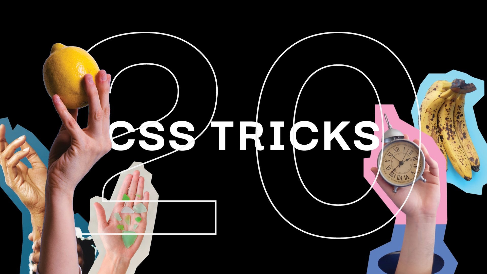
11. Class project: Let's talk now about
the class project. I prepared one task for you and this is doing the
accessibility audit. In the class package
that you can download from the proper
section on Skillshare, you will find out the website which is called 20 CSS tricks. By the way, this is
the website that is called through my classes, typeful just like that. So feel free to check it out. I'm adding the link below. Feel free also to go through this classes if you'd like to find out more creative
techniques in CSS. But my point is that I prepared this 20 CSS tricks website. We can open this
website in the browser. Look what's happening here. There are some
accessibility issues which would be good
to fix by adding some HTML and CSS code. Later you can do
the screenshots of the most critical things and upload them in the
class projects section. I would totally appreciate
your input there. For first three people who would apply a couple of improvements
for accessibility, I prepared something special. I'm waiting for your answers and of course it would be great if you could use the
knowledge that you gathered in this
particular exercise. Let's submit once again. First, download and
open the zip package that you've found in
the project section. Then check issues in
HTML and CSS files. Click "Create Project" on Skillshare website
under my classes, and then upload
screenshots or package or lists of issues
you've found and fixed. Good luck.
12. Summary: It's high time for the
summary of the classes. I prepared a mind
map for this course, and we can quickly go through it to revise all the
material we've learned. First of all, you know
that accessibility is making the websites
accessible to everyone. It's super important
topic because it affects really big number of people. It's not only about impairments, it's only about some
temporary tap situation in which we have some
difficulties in, for instance, reading a message
or listening to a video. You know all of that. We can differentiate
certain number of categories of impairments
such as speech, auditory version, neurological, cognitive, or motion physical. It's good to remember as well that accessibility
can be measured, and actually is very
strictly defined. We have to know all the rules to meet the criteria successfully. The main standard, the official
organization is W3C, who is responsible for WCAG, which is web content
accessibility guidelines. This is documentation that
we should remember about. We also know what is
screening reader, which is a piece of
assistic technology. Also, we know how to
learn screen readers. We know that they are also
available in mobile phones, and I strongly recommend
you to test it. We also know what is semantic HTML and what is so important. We know that DOCTYPE
declaration should been the very top of
our HTML document. We also know that there are
some HTML tags that are responsible for adding semantic
of our site structure, such as header, main,
article, footer, and so on. We also know that headings
hierarchy super important because it makes easier for the user to navigate
on the website. Screen readers also can move within the document
in more logic way, and we also know
that accessibility and search engine
optimization are connected and not only should we care about
accessibility, but also about SEO. We also covered HTML attributes, and we know that they
improve accessibility. First of all, this
is Lang attribute, but also very important
alt attribute for images, which we can also add
on portals services such as Facebook, LinkedIn, so we should keep this in mind whenever the image
is declarative, we should keep alt empty. I also told you about div versus bottom
versus hyperlink, so a tag, this is
important to keep in mind that div is some
very generic text. We should be cautious when using for buttons or hyperlinks. Of course, a CSS is
another big topic we should remember about
in terms of accessibility. Of course, contrast is the very first that
comes to our mind. But there are also
some CSS properties such as display, visibility, but also pseudo-classes,
focus, or outline, but also a pseudo
content such as before and after,
pseudo-elements. When talking about
visual sight, of course, we have to mention
animations, so motion, topic in general, there is a very useful CSS media feature
prefers reduced motion. Thanks to it, we can serve the balanced
experience to people who suffer from
vestibular disorders. Maybe I should add
it here as well, that we covered
vestibular disorders. Of course, at the very end, we're having class projects. I strongly recommend you
to download the package that I prepared for you and
do the accessibility audits. Please share your results. You can add it as
a screenshots of the places where you corrected the code can create screenshots, for instance, of your
notion document, or linked to the notion. I will really appreciate it. The goodness is that if five people submit their
results, their homework, I will share with all of you the accessibility checklists you can use in your daily work. It's worth doing the homework. Thank you very much for
joining this classes. I hope that you are not scared
of accessibility anymore and that you will dig into
this topic more frequently. Of course, see you
on social media. You can visit me on Twitter. I can upload, or you can
subscribe to my newsletter, or you can visit
me on Instagram. See you later. Bye.
 Aga Naplocha, Creative coder & designer