Transcripts
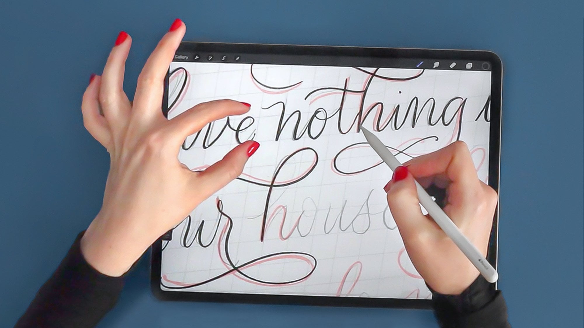
1. Introduction: Hi, thanks so much for joining me in this
class. My name is Ian. I'm a traditional and
digital lettering artist with nearly ten
years of experience. I'm also a creator of digital resources that help people to get better
with their lettering. In this class, I'll be
teaching you how you can add personality and fun to your
letters by decorating them. There are hundreds of ways
we can decorate our letters, so I'm going to keep it simple, and we're going
to be focusing on just 12 that will be of
most benefit to you. I'm going to break down
these into four sections. First, we'll be
looking at decorating the inside of our letters with
different inline effects. Second, I'll show you how to
use some shading techniques. Third, we'll be adding some
dimension to our letters, and fourth, we'll be creating some effects by
erasing our letters. You're welcome to use your
own lettering artwork in this class by made life easier by including four
different hand letter quotes that you can apply
these decorations to. Plus, some brushes to aid you in some of the effects that we're applying to the letters. Equipment we'll be using
in this class is an iPad, and Apple Pencil, and the app procreate
to do all our work. By the end of this class,
you'll go away with a series of decoration effects that you'll be able to use on
your own lettering. So grab your equipment
and let's get started.
2. Inline Decorations 01: If you want to follow along,
it might be worth importing the four different hand letter quotes that I've supplied and also the brushes
that come with it. Feel free to pause the video now so you can get those sorted. In this section, we're
going to focus on these three decorations
inline, dots and moti. The quote we're going
to apply these two if done is better than perfect. You'll notice in each
of these documents, if you click on
the Layers panel, which is the two little
squares round corner, that every word is on
a different layer. That's a good
practice to get into putting the words on their
own layer because it means that what we can do is if we click on Done and click
on the Transform tool, which is the arrow, we can move it around freely
from everything else. And also it means we
can change the color. We can apply effects to
just that specific words. If we can apply masks and then we can redo
those if we make mistakes. It gives you a lot of options if you get into the practice of putting every
word on a different layer. Times I forget and I do the whole piece
and then I'll, no, I want to go into then I have to go select and separate them all, but this is a good practice. Another thing to do
is we're going to be working first on
the word perfect. What I'm going to do
above where that is is create a new layer by
pressing the plus icon and that just helps me to
know where the decoration is rather than having it
randomly on another layer, near some other words, it just helps me to keep
track of where they are. For the inline one, we
are going to select the monone brush from the class brushes if
you can install those. First, we want to see what
size we've got our pen to. That maybe is a
little bit too thick. You want to get a happy
medium between not too thin, so it disappears and
not too thick that overtakes the letter form
that's already there, maybe reduce that
down a little bit. And two fingers tapping
on the screen is undo, which is something
I probably use most of all in Procreate. It's a good shortcut to
get into. Let's test out. That's about good enough. What we're doing
is we are drawing, it's a bit like a
skeleton sketch of this letters inside the word. As you can see if I zoom in, we're trying to get this space here and this space here
and the space on the end, it needs to be roughly equal. We're not looking for perfect. As it says in the cote, done
is better than perfect. We're just looking for it to
roughly be in the middle. Because if we don't, it's going to look a bit
odd like we have here. Sometimes I go off and
then I have to undo and I'm trying to get a
nice straightish line. I probably don't want a
perfectly straight line, which we can do is if
we draw down and hold our pen on the screen and
gives us a straight line. If I tap my finger, it will be a perfectly
vertical straight line. Because it doesn't
follow the contours of my letter and also
my letters I've drawn free hand and so I wanted to keep that free hand look. I just practice,
maybe not that right, so I'm just going
to do it again. A good thing, as I mentioned about doing on a
separate layer than what the original letters are on is that I can raise
bits if I need to. What I like about this style, I got a retro 50s, 60s look to it, but in a modern twist. See, curve letters are probably one of the
trickiest ones to do. It's just a case of
it's building up your muscle memory
and just going slow. And trying to get that curve. Something you can do
is if you click on the library and click on the
monoline brush at the top, where we've got stabilization. I've got it on 50%
at the moment, but if you really want it to really help you
with those curves, you want to bring it all
the way up to Max or nearly Max so that
when we do it, Procreate will help you to keep those curves
nice and smooth. It just depends on how
much practice you've had of drawing lines. I mentioned this is something a style that doesn't
take too long, but it creates a great effects quickly and easy to do and it's something I use quite
a lot in my work, and it might be
something you choose as your basic arsenal of decorations to use
with your letters.
3. Inline Decorations 02: Next up, we're going
to use the word better to do the dots. Dots are, I suppose, a form of in line
like we've just done, but instead of a solid line, we're going to do dots instead. We can change the color
over to black because we've got some white
lettering there. Again, getting into the
practice, I normally forget. I have to keep reminding
myself that I need to click on the lettering on one and then add
a layer above it. Otherwise, I'll start creating something on the previous one. With dots, you can
manually do it. You're just dotting the page, maybe make that bit bigger. Evenly spaced dots
around your letters. But because I'm
not very patient, I've created brush for you that will help you
do that really quickly. It's just called inline dots. These don't have to be dots. These could be squares,
they could be stars. They could be anything you want, it just adds a bit of interest. It's a bit like those
neon signs that have the bulbs in them
illuminated letters. With these ones, just
checking the size, we can then draw with them
like with the inline, we're trying to keep it
right in the center. What I do is if
there's a short space, I normally do my own dots because I find actually it's
harder to draw the line. There might be too many dots. That one worked out all right. But you're just going around trying to get it in the middle. What's good about this is if you do make mistake and it's
going out a bit too far, grabbing the eraser
tool and maybe selecting the taper
on the manline one, where we can just erase the ones that maybe gone a
bit skew whiffy and just put them back in like that rather than having
to undo and redo those. When it comes up to
overlapping something, what I do is either
draw and then stop and then jump that
one and then start again. Otherwise, sometimes
you end up with one right close together and
it looks a bit awkward. When I'm doing an E, which normally I'd start here when
I'm drawing the letter, but I do start a bit further
in when I come back down, is the right space,
but a bit wonky there's just following on up. Here, I would just do it
mainly it's only a couple of dots and the ones in the middle. Roughly spacing those out. There we go. That's
another great way. It looks different from the in line we've got at the bottom, but it gives us this
fo lighting up effect.
4. Inline Decorations 03: And then onto the last one, which we're going to
use on the word done. For this one, we
are going to select the brush called taper
from our class brushes, we are going to
select a new layer and then clicking on colors, we're going to select white
as we've got some black text. With this one, slightly
different from the other two is where we're not going
to go around the whole of the inside
of the letter, but we're going to add elements to both sides or
either just one side. But whatever we
do on one letter, we're going to
continue that theme throughout the rest of the letters to give
it consistency. We might choose to do
a diamond shape in the center and then add some
long teardrops either side. We can keep it one side
and then follow that on the left hand side of them or we can do it both
sides if you want. With this one, you can
get really creative. They don't have to be diamonds. They could be something else. You could use more of a flower
type of line through it. With petals coming off. It's just creating
a decorative effect or some stand letters. It's up to you how much
you go to town with this. It could be the case
that you just do different size circles slowly getting smaller
towing the edges, or you could use wavy lines. This one definitely has more of a vintage feel to it,
more traditional fill. But you can create a more modern depending on
the shapes that you use. But as I mentioned,
it's probably not best to do each letter in a different style because you've already got some other
styles going on. It's best to figure
out which one you like and then replicate that
through the whole letters.
5. Shading Techniques 01: In this section, we're going to be looking at
shading techniques. We're going to start
off with looking at gradients and then applying stippling
and then finally looking at some line gradients. We're going to apply
these decorations to the D one thing every
day that scares you. Zooming in on the
word one thing, that's the word we're going
to apply the gradient to. Opening up the layers panel, you'll see there's two
layers called one thing. We've got a black outline
and a solid gray color. We're going to apply the
effect so gray color. The black outline is there to make it a bit bolder
and stand out a bit. Pressing the plus icon, we're going to add a new layer, making sure we've
got a mid gray color and the mon line brush. The reason why I'm doing
it in black and white and gray is just so that we don't
get hung up about colors. We can just focus on these
decorations and applying them. So what you want to do is draw a line straight
through your lettering, make sure there's a bit
of space either end and then join that shape up, making sure there's no holes, filling any holes, and there's a bit of
space at either end. Then grabbing a mid gray color, dragging it into that
shape, it fills it. At the moment, it's bit weird. But what we're going to do is opening up the layers panel, we are going to restrict this shape to the
shape of the letters, and this is called
a clipping mask. If I click on that
layer where the thumb now is and click clipping mask, it restricts everything on that layer to the layer
below, which is lettering. Now if I was to draw
anywhere else on this, it wouldn't show anywhere
apart from overall lettering. It's a really useful
thing because it means that we can erase and do effects on that without
affecting the layer below. So it's a really
good thing to use. I use it lots in my work, and I'm sure you will too because it's just
such a powerful tool. Now what we're going to do is go over to the adjustments menu, which is this magic one
icon and go down to about fifth on the list
called Gaussian blur. To apply this effect, we are going to go and drag
our pencil across the screen. As you can see, it goes from
harsh line to really soft, but we only want
about, um, ten, 11%. That just creates that gradient for us really quickly and really easily over a whole word run
just individual letters, which is a really quick and
easy decoration to apply.
6. Shading Techniques 02: Next up, we're going to
use the word scares and we're going to apply some
stippling shading to it. First off, let's create a new layer above
the word scares. Stippling is a form of
shading using just dots. To give you an example,
what it's like is to create the dark tones, you have lots of dots close together and you're constantly tapping to create those and then to make those
tones lighter, you start making less dots
and spreading them out. As you can see, you can get
this dark to light tone. But as you can see
in this method, it's a lot of repetitive
tapping on the screen. As I'm always looking
for an easier way of doing things, let's
just clear that. I've created a brush for you
called a stippling brush. What you can do is just run the brush up and down and it'll create
loads of dots for us. What I like to do
is start by making the bottom third quite solid, lots of dense populated dots. Then I can start tapping just a few dots above and then I make my mid tone by adding
a few more in here, less crowded in the base. Then you can zoom out
just to see if you can see that gradient going
on there or squinting, I use the eraser tool
with a monoline brush in if I just want to
neat up the edges. I like having a bit
of a white border to and that takes much less time than constantly
tapping your screen. Then when we go through
the rest of the letters, we are trying to
make it consistent. The level is always on
the third where it starts to transition from the really
dark tone to the mid tone. Sometimes I'd do either one
letter at a time or I go through just making
the dark tone first, this lower third. With this, you're
just painting rather than tapping your dots, which really helps the longevity of your pencil nib
and of your screen, actually, or screen detector
if you're using one. Once we've done
that lower third, then we can just start
doing a few taps, a few brushstrokes to fill. And what these dots do, it just adds a bit more text to it. The simple gradient. Also, people don't know that you haven't dotted your letters. They think you've been spending hours and hours doing lots of
refined dots. There we go. Then we can just go through
with eraser and just neaten up where the dots have
maybe gone over the edge. That's the advantage of
doing another layer, then raise the edge of the
outline of your letters. Of.
7. Shading Techniques 03: Lastly, we're going to apply some line gradients to the word. We want to select the mon
line brush from brushes. We're going to open
our layers panel and click the plus icon, create a new layer, make
sure on black in our color. Then what we're going to do is about two thirds of the
way up our letters, we are going to fill
them with a black color. We're going to leave
a little white margin between the shape and
the edge of our letter. I just drawing around.
Doesn't have to be super accurate because we
can edit that in a minute. And then drag and drop the
color swatch into it to fill. I'm going to do that in the same place along the
rest of our letters. Drag and fill. The last one. Now, what we're
going to do to make it easier for ourselves to turn on the side so we
can draw our lines down. What we're going to select
is the on line brush in as an eraser and then
starting at the top, we're going to raise it
to create these lines. The first line is start up here. The first line is
going to be re thin. I'm going to do it
on the U and then we can copy it to
the rest of them. Then we want to
make our next line about twice the
size of that one. Then three times the
size of the first one and then one more line, which is about four times
the size of the first one. It doesn't matter how
many lines you create. We're just doing four for now
or we end up with five of the black ones we can just
kat up that first line. But what it does is create this step down gradient
of those lines. We use that one as a reference now to copy it to the
rest of the letters. That gives us what I think
is quite a cool effect.
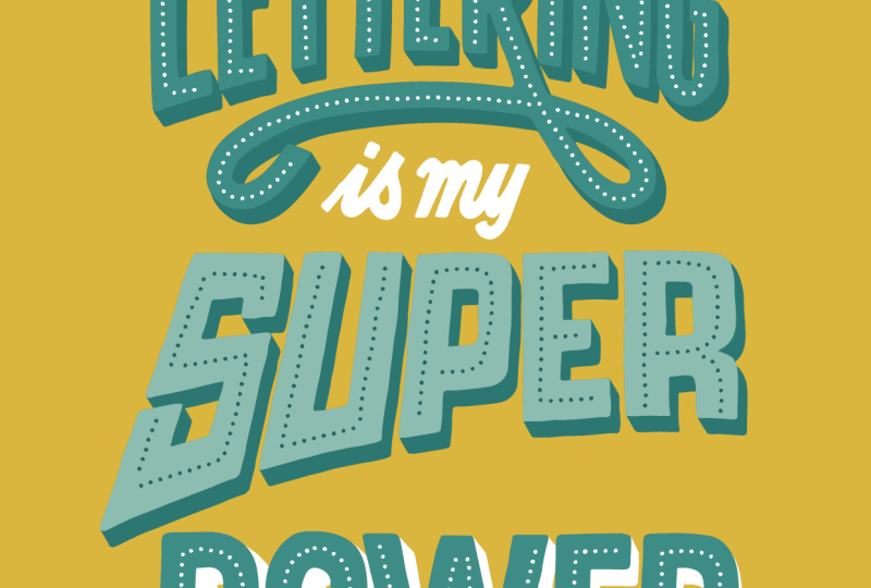
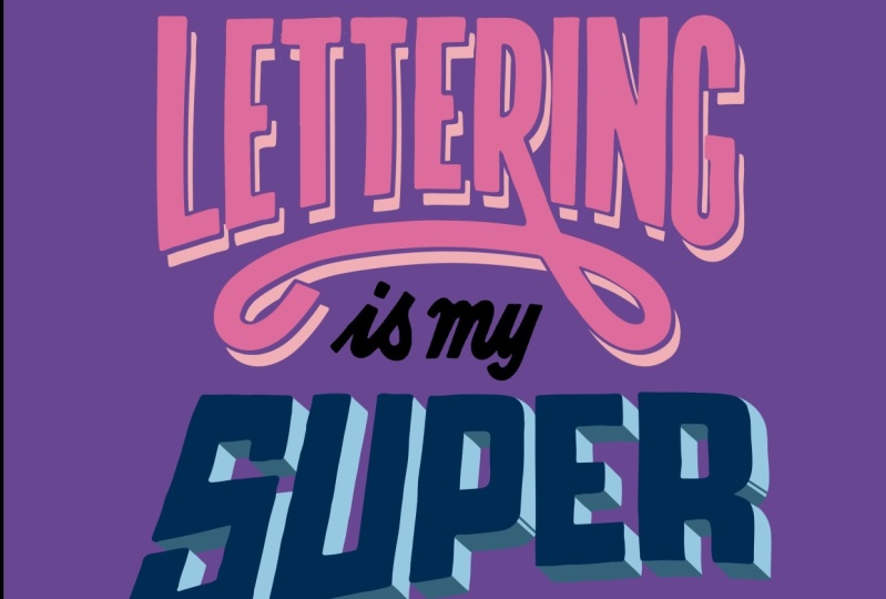
8. Dimensional Effects 01: I in this third section, we're going to
look at decorating our letters with
dimensional effects, starting off with line shallow, then moving on to three D
and then finally bevel. We're going to apply
all these decorations to the quote lettering
is my superpower. Zooming in on the
word lettering, this is what we're going to
apply our line shadow to. But first of all, we
want to duplicate this layer two times. Opening up the layers menu, we're going to swipe the
layer we want to duplicate to the left and then select
the option duplicate. I'm going to do that
again and we're left with three identical layers. Tapping on the bottom one, we're going to change the
color of this to gray. First of all, we're
just going to unselect the two
layers above it, so we can just focus on this
and see the effect applying. Click on the color wheel and we're going to
choose a light gray. Now, if we tapped on the thumb now and
selected fill layer, it would fill the whole
layer with that color. We don't want that,
we just want the word lettering to stop
that happening. Tap on the thumb now and
then select Alpha lock. Alpha lock, a bit
like a clipping mask restricts what you do just
to the object on the layer. Be we don't need to edit it afterwards you're just
changing the color, we don't need to do
a clipping mask. We can just use
Alpha lock, which is more of a permanent
solution for this. Once we've selected Alpha lock, which has a little
tick next to it, we can click fill layer and it fills the layer with
the color we've selected. Now, we want to edge
that in a minute. So we're going to
tap on the thumbna and tap on Alpha lock
and it turns that off. Now we're going to do the
same to the layer above. We're going to select white going to tap on that and then we're going to
select Alpha lock, tap on it again, making sure
Alpha lock is selected. We're going to select
fill layer and that fills it with white we
can't see at the moment. But if I bring back
the black one there, we've got a layers
ready and also we want to turn off Alfock again on that layer so
we tap on the thumb now. Next we're going to
move the gray layer, and that's going to
come our line shadow. We tap it on it, select it, and then we select
the transform tool. Now before we move
it, we want to make sure that we've got
snapping turned on, snapping in magnetics
because that will help us to put it down into
a 45 degree angle. We can go ahead and move I think that's going to be good
for our shadow and then deselect that by
click on the arrow. You might think that's good enough for a shadow.
You might like that. What I like to do
go on a few steps further is just to
make it more readable, I like having a white gap between the main lettering
and the shadow beneath. It just helps the viewer. To do that, we're going to use that white
layer that we've created. We're going to tap
on the white layer, tap on the arrow to transform
it and we're going to then move it in the same
direction as the shadow, but halfway between the main
lettering and the shadow. As you can see, it's created this line shadow
with a gap of white. You might be happier on how
that looks and that's fine. But the problem at the moment is because we've
got that white layer, if we change the background, we see the white layer
is still showing up, which in some instances
might look okay, but for this one, we want to
make sure it's not showing. What we're going to do is change your background
back to white. And then what we're
going to do is select the white layer and
delete it from the gray layer, then we can change the
color of the background and then the white
layer won't show. To do that, we're going
to tap on the thumb now of the lettering
and click Select. What that's done
is just selected the object on that layer, which is the word lettering. Now tapping on the gray
layter gray layer, and tapping on the thumb now, we're going to then select clear that doesn't look
like it's done anything, but now we turn off white layer and
click on the background. We see that the white
layer is not showing up now and it's just the shadow. Now we can change
the background, we can change the color of the top layer of lettering and the shadow
of the lettering. Again, this might
be fine like this, but there's one more stage
I would like to go through, which is if we zoom in,
there's this white border, but some instances the gray
is touching the black. I do is I go in with
my eraser tool and just erase parts that are
touching the other letters. I just going around the letter, just adding a bit of a margin. Here where it's overlapping a little bit, I'd
still take it out, so it's left with a solid
part of the shadow. Again, over here, I might just delete that bit there
because it goes too thin. Here, if I make a margin, it leaves a little tiny bit, so I'm just going to raise that actually, it looks better. I'm searching around.
There's probably enough of a gap
to have it there. Again, this is all
about readability at line getting a
bit too thin there, so I'm going to raise that
back around the I here, give it a bit of space
between the shadow of the R. Actually, this one here, where the N
is actually covering it, I'm going to delete the whole thing because
it's mainly hidden. If I put a margin around it, the gray line will
just be too thin. Again, on the shadow of the, the G is covering it,
so I'm just going to delete it together. It's hidden underneath there. That's it for the
lettering part. But we've got this flourish
at the bottom here, so we're just going to
do the same thing where the lines getting too thin and butting up
against the black. We're going to
delete that a bit. Just about get away
with that bit, do this bit over here. There we have our line shadow, and that's now ready
to be changed color of the lettering of the shadow
itself also like I said, having that white
board, it just helps to make it a bit more
readable for the viewer.
9. Dimensional Effects 02: Now with the super word, we are going to apply
three D effect to this. Similar to what we've
just done with lettering, we're going to duplicate
this layer, but just once. Swipe to the left,
click duplicate. With the bottom one selected, let's just turn off the
top of those two layers. We're going to color this gray. Again, we go through
that process of tapping on the thumb now,
clicking Alpha lock, clicking on mid gray and then tapping on the thumb
again and set fill layer, it fills that just the
lettering with the color. Click on the thumb now
again and select Alpha. And we're going
to bring back the top of those two layers. What we want to do now
is going to move this like we did with the lettering
down into the right. Again, click on the arrow, making sure snapping is on. We're going to bring
it down to the right. I think I'm happy
with the length of that shadow, clicking
the arrow again. Now what we're
going to do is with the same color and on the same layer and with the
monoline brush selected, we are going to go round the
whole of the word and give the example of the
E here where we're going to join the
corners together. The corner of the black to
the corner of the gray. What it does is it leaves
a little triangle and then we're going to fill
that little triangle in as we can see is starting to connect those two together
to make it more blocky. We're going to go round all
our letters doing that, joining wherever
we see two edges, two corners that we can join up. And they're all going
in the same direction, they're all going this bottom
right way, 45 degree angle. If you come upon a letter
that's got curves in it, you draw a slightly curved version of what
we're doing there at 45 degree angle and fill it
in. Same with the P here. The S has multiple ones because you've got some
inside here as well. If it's covered, then
just match it up with the other corners that
you've been doing this 45 degree angle
down to the right. There we go, and then
you just check over your work and just see if
you've got all of them. I normally miss one. Been a good down. I haven't
today. That was stage one. Stage two is to apply darker tone to the panels to emphasize the three D effect. All the panels that
are facing downwards, we're going to make
this darker color. I select a darker
shade and on the E, for example, we're going to
shade it here, here and here. All those ones that
are facing down get darker color on them. What we're going to
do is going to create a new layer first to do this on. Then if we change color, we can change the equivalent
darker shade as well. But rather just a
layer and we're going to make it
a clipping mask. A clipping mask, as
I mentioned before, is where everything
on that layer is restricted to
the layer of low. If we click on it, then anything we draw will be restricted to just
that gray layer, which is really helpful because what we're going to do is draw a line where we draw those corners and we're going to fill in this
whole area here. Now, the quickest way to do this is to draw around
the whole thing, making sure that it joins up. If I turn the clipping mask off, you can see that we can
then just fill that area. Then we can turn the
clipping mask back on and you can see it's
restricted to that area. It might be easier for you to
turn the clipping mask off, draw in these shapes. So you can see
that you fill them in and then turn
it back on again, or you can do it with
clipping mask on and you do a nice straight
diagonal there, and another one
over this side and hope that you've joined them
up and you can fill them. If you don't join them
up, it's not a problem. Draw thinking you've drawn up, it will leak out so you just
undo if you want to see it, you can just turn
off the black layer and just make sure
you've joined it up. Like so. Alternatively, you
can just color in manually, you're worried about it going everywhere
when you fill it. But as you can see, it's
slowly making it more three D with this extra
tone on the panels. When you come to doing a slightly curved
one, same applies. We just do where
the curve turns to go up into the
vertical horizontal, we draw a 45 degree line. Fill it in. Sometimes
what I like to do is just do another line on its own to emphasize
that it's a corner. Same on the P right on the bend, we draw a line and draw another line there and then we fill in this area here. As long as it's
pointing down this way, that's where we need to
put this darker shade. It doesn't matter
if you make a mess, we can either undo it or
we can just erase it. That's the advantage of doing
it on a separate layer. When it comes to the y, there's a lot more that needs to be filled than
the rest of letters. We've got this panel in here, so we just need
to make sure that it doesn't overlap here. Then we've got this area here and this area
here we need to fill. When we look over our
word, make sure we've got all the areas where
we need to do it. I think that's done. That's
our three D lettering. It's quite impactful look. It really stands off the page. It's one of the effects I
apply the most at the moment.
10. Dimensional Effects 03: Lastly, we're going to come to the word power and
we're going to create a bevel effect on it. First of all, we're
just going to lower it slightly so it's away
from the shadow, the three D effect of the super. We just click on the arrow
and bring it down a bit. Next, we're going
to create a new layer above the word power. Arch is this one, it uses one of the decorations from earlier on in this class, the
inline effect. What we're going to
do first is create that inline effect
to the word power. Mline brush, and
then we're going to draw inside these letters. Again, trying to keep
the balance of space, so it's in the center. Don't feel afraid
to because I know warble especially
rounded letters to undo. Now, once we've applied that
in line to our letters, we then can start creating
this bevel effect. I stated with a P,
what we're going to do is join the middle
line to the edges. We do a diagonal
line to either edge. Then when we have a bit where a line butts up
against another one, we're going to draw from
corner to that corner of the P. Then when it's a
corner like this one, we're just going to draw
a line straight across. That's how P done. When it
comes to circular letters, we can either leave it as it is, or we can draw one in the bottom
right hand corner and one in the top
right hand corner. In the W at the ends, we're going to join
them to the corners. When it comes to
these joints here, where it changes direction, we're going to take a line down into where it changes direction on the corner
of the letter there. We want another
one here as well, it leaves us with
this space here. Again, above it,
we're going to draw two lines creating
that triangle there. Whenever it changes directions, that's where we're going
to draw a new line. With the E, we've
got these ones here, which we're going to
join to the edges, but also it butts
up to another one, another line we're going to
draw to the corners here. Again, this one, it
changes direction, Is going to draw this
line over there, same at this bottom corner. Then the end piece is where we create these little triangles. As we zoom out, we
can see it's really coming together in this
bevel wood effect. It's like a reverse
chiselwod effect. If it was actually
a physical thing, it would come up to a point. On the R, we've got this
leg coming out as well, so it's butting
up against there, the corner there and
the corner there. That's our bevo effect,
partly finished. We've finished, I
suppose, the outline. Then what I like
to do with these, let's take the E, for instance, is create a separate layer. I'm going to create that
layer and I want to make it blow both those black layers. Then what I can do is maybe
let's go for a light gray. Then what I'm going
to do is I'm going to color in some of these panels. This one is going to be actually
where the light sitting. White will be the top and
then I can create maybe the next source of light
coming from the right, so we're going to do
that light shade there. Then every panel
that's on the right is going to be that color
throughout my whole of my word. With the three D, adding
other tonal shades helps to emphasize the
effect we're applying to this word and applying
it to these letters. Then I might choose, actually, I'm going to go for a dark gray at the bottom here. Every panel that's
facing down this way. Lastly, I have a mid gray
for this left hand side. If we zoom out, we can just
see how much more the effect is taking hold on the E than it is on
the rest of letters just because we've added
some of those shades. I've done it in black
and white for this, but you can use lots of
different colors if you want. They give you matching colors or they can be
contrasting colors, but it just helps to emphasize that effect on the letters.
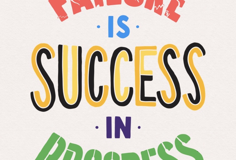
11. Erasing Techniques 01: In this last
section, we're going to be looking at
erasing techniques. Well first focus on cracked, then going to divided,
and then finally stencil. We're going to apply
this to our last quote, which is failure is
success in progress. Let's first zoom into
failure because we're going to use that word to apply
the cracked decoration to. Open up our layers panel because we're going
to be erasing straight onto the
lettering for this one, but we're also
going to be moving part of the letters around. What we're going to do so we've got something to fall back on, we're just going to
duplicate by swiping to the left and press
duplicate that layer and then turning
off the lower one, so we've got a copy of it
in case it all goes wrong. What we're going to
do is, first of all, we're going to create
cracks in our lettering by raising parts of the
letters to make it look. We look at the word
failure and we think, something's gone
wrong or you've tried something and it's not
gone the way expected. This is a great way of interlinking what the word is and the effect
you're applying to it. What we're going to start
with is this S tool, which is the selection tool
up here on the toolbar. And we are going to move
part of the letters around. What you're going to
do is just draw over this jagged D line across
the bottom of the F there. Once I've done
that, I'm going to select it by clicking
the arrow tool, which is the transform
tool and then I'm going to move it away slightly. And adjust it too. Make sure you've got the snapping settings off
for this because it might become annoying
because it will try and snap to certain
points, we just want it free. We can use the green node
there to rotate it slightly, and I'm going to
bring it down a bit. It looks like the part of
the litter is cracking. Then once we're
happy where it is, we just press the arrow
tool again to confirm that. We're not going to do that
with every single letter, we're going to do it
in parts of letters, maybe some, maybe not. But we're going to go
across our letters. I might do this big area
here on the A. I'll get the selection tool and do a jaggedy rough
selection of that part. Use the arrow tool or
the transform tool, and move it away, rotate it
the other way this time. I'm going to leave the and
maybe do a bit of the. Let's do a little bit. Let's do a bit here and we
can cut it out. Like it's falling away, maybe
reduce the size slightly. And then miss the U and
maybe to the leg of the R. Rotate that slide,
bring it down. And maybe let's do a bit of
the E over in the corner. We've done our bits
that are falling off. Now we're going
to do some cracks that don't go all
the way through. But what we want to do to add to these bits is normally when
you crack something like a biscuit or something like a bit of toast,
it's never just clean. There's always bits
of crumbs coming off. What we're going to do is
grabbing the taper brush, where you're going to just
put in in groups of three, maybe some little bring it down a bit, little dots nearby. As it cracks, it pushes
out parts of the letter. It might be the case
if you want to use the eraser and raise parts
which might have fallen off. Doesn't always a clean cut
is when you break something. And we do it in sets of
three because it just visually appealing.
We've done that bit. Now we're going to
grab the eraser tool again and now we're going to do some
other cracks in it. We might have a crack coming
down over on the right here. Because we're using
the taper tool, it gets thinner as it goes down. Again, we keep swapping
between the eraser tool and the paint tool
because we're going to add some more
dots into there. I might have a little
crack over here. I have a long crack
on the A going down. And we can also add some
dots inside as well. On the eye. I might have
bits actually missing. Then we can add in those bits that are missing
that are popping out because it's broken. A U, you might have
a crack going on one side and another crack, but doesn't quite meet it. Some cracks over this side
maybe coming from the middle. And then we do maybe crack this one or the art actually goes
straightway through, but doesn't move the letter. The crack that
joins Then finally, maybe we can crack forming
here and it comes down. I got another one that joins it here maybe a bit of a
crack on the side here. There's our word failure,
and it's all cracked. You can go as far or
as little as you want. You might want to just crack
them in half and that's it. But it's erasing it to create a certain feeling that this
decoration gives the word.
12. Erasing Techniques 02: Next, we're going
to use word success to do the divided method. But first, like we did
with the other layer is swipe to the left
and click Duplicate, so we've got a backup of
our lettering because we're going to erase again
on the actual lettering. Click on the eraser tool,
select them on line. What we're going
to do a bit like when we did the
inline decoration, we are going to run a line
down the middle of our letter. But instead of starting here, we're going to start
right at the end. And this will divide
our letter into two, or if we've got a
letter like the E, it's going to divide
us into three parts. Then the middle part,
we can just join up with that other letter and then go back through
the other letters which just divided into two. A Now we've done that, we can then go to Layers panel, click a new layer and tapping on the thumbnail
with the success layer, clicking option we haven't
used yet, which is reference. Now, select the new blank layer. Now what we're going
to do is we're going to this is going to
use the layer below as a reference as we're
filling on the blank layer. I'll show you for example, we're going to grab maybe
a lighter tone of the gray and then we're
going to drag and drop. Onto the part we've got there. I will just fill that
part of the layer. As you can see, it's taking
reference from this layer, but we're applying
it to a black layer. Then we can turn that off
and on, change the colors. It's really helpful, maybe we go for even
lighter one on here, drag and drop and it
will do it on there. If there's any because if this was the
normal in line one, it would fill the whole letter, but because we cut it open, we can then fill parts of it. I might feel the
bottom of this one. I might feel the inner
one of that one. Let's go there for that one
and then maybe a lighter one in side of the Go for
the bottom of that one, top of that one and the
bottom of this one. That gives it a drastically
different look. I feel this one is quite
playful and vibrant, especially if you choose some
really contrasting colors, a nice vibrant color palette
to drop into those letters.
13. Erasing Techniques 03: Lastly, we're going
to use the word progress to a stencil effect. Those who don't know
what a stencil is a stencil is like when
you're working off the computers
intermediatory item that has for our
case letters in it, so you can either paint or stamp or draw those letters
from that stencil. The limitations of that
are the letters like PRO where they have a counter in the middle which isn't
joined to the outside, it means that there has
to be a line connecting it to stop that falling
out or getting lost. But we're not restricted to those limitations, so we
can do whatever we want, but we'll keep that theme of
stenciling in the lettering. We're going to do is open up a layers panel and we're just going to duplicate
progress just in case, turn off the bottom layer. What we're going
to do is not raise actually on these letters. We're going to click on the
thumb now and select mask. What a mask does is it lets us erase without permanently
erasing on those letters. If I get eraser tool, making sure that our
color isn't white, I can raise part of
the letter there, but it hasn't permanently done anything because I can then turn that off or I can color it back in if I want to but it just means that the integrity of
the letters stay as they are. Which for this one
is really good because we might change our
mind about where we wanted to arrays and we can
go back easily without having to do all the undos
or whether we've thought, Oh, no, I've done it wrong and I can't get
those letters back. Get the arrays tool
selected and for this, maybe the taper
we're going to use. Traditionally, a stencil
would look like this where you'd have
something connecting this counter together
like this, say. That's fine. I sometimes
arrase just part. And then maybe with the R, we
can just erase the top bit, arraying a little
apart just transforms those letters to look a lot different from what
they originally were. With the Yo, I might
do it traditional way, which is a line
connecting the center. Then with the G, I will probably
do similar with the Yo. Then I might do similar
to what I've just done. I quite like that
coming off the top. And then the E will cut
off all the end bits. It still the integrity of the letter. We know
what it looks like. The E definitely gives off the army vibes because they use stencils on the
side of their equipment or storage because they'd have a set of all
those letters and then they just quickly put the paint over the
letters they want to add. Then for the A, I'm going to do the top and the
bottom straight through. There we go, there's
ostensil method. You could if you wanted to go straight down on the
R there if you want, make it look a bit different. All you've got to do
is make sure that you don't turn one letter, say U into looking like two Is, you still need to be readable, but you can do a lot
of these things, a lot of different raising to
still keep the integrity of the letter and gives a bit more personality and
just interest to it as well.
14. Final Thoughts: We've covered a
lot in this class. We've seen how something as
simple as a line or some dots can instantly transform
the look of your lettering. We went through some
shading techniques and how to apply
them and procreate. We covered dimensional
effects and making our lettering
jump off the page, and finally seeing
how raising parts of our letters can actually
add decoration to our work. Thanks so much for following
along with this class. I hope you've
enjoyed it, and it's given you the confidence to go and give your
letters personality and fun by decorating them. Feel free to ask
me a question in the discussions tab or submit your work in
the class projects.
 Ian Barnard, Hand lettering Artist