Transcripts
1. Trailer: [MUSIC] Do you ever sit down to create something beautiful and
it's going so well, only that was a mistake, and that one, and this
one, another one. You messed that up. You
got to throw it away. Wait a second. No, you don't. [MUSIC] Because with the magic of Photoshop, we can fix that. Traditional artists rejoice. We have access to real magic. In this class I'm going
to show you how to fix almost anything with just a few simple tools
found in Photoshop. Spilled some ink?
We can fix that. Wobbly lines? We can fix that. Colors ugly together?
Totally fixed. If you ever wish to
have an undo button, like I do all the time, well, don't worry pals because we
can fix it in Photoshop. Whether you want
to make a print of your work or just put it online, we can fix your mistakes. Let me show you how. I've been using
Photoshop to enhance my art and to fix mistakes
for over 10 years. As you can see in these pieces, it doesn't have to
be big mistakes. It can be tiny ones or it
can be big ones as well. The important thing
to know is that anything you do can be fixed. In this class we will
take this piece. It's not that bad, but there's things I want to change around. I'll show you all my favorite
techniques and tools and how to use them with lots
of different variations. I'll even give you the
original artwork so you can follow along with
me as we fix it. By the end of class you'll
have the skills to do this to your own art and I
encourage you to make your own before and after. So what are we waiting for? Let's learn how to fix art
magically in Photoshop. [MUSIC]
2. Photoshop Basics: [MUSIC] Hey guys. Welcome to the class. I want to start off with
a little disclaimer. It's not my job to make
tutorials for Photoshop but I've been using it for
over 10 years to edit my art, so I've picked up a lot
of tips and tricks that I really like but you're
not limited to them. I encourage you to learn more about Photoshop and to try out different things to see
if there's anything that you like more
than what I'm doing, but I will share lots of techniques that will work for lots of different
works of art. Let's start. Now let's learn
some Photoshop basics. Here's a little intro for
getting around in Photoshop, maybe you already know all this. You can skip this
lesson if you do, it's up to you. The newer Photoshops
have this thing where if you have hover tool it
shows you what it does. This can be really helpful. If I click this and
I right-click it, there's other tools in here
and I can click any of them, and it'll also show me
how to use those instead. You can click "Learn more" if you want to learn
more about it. To zoom in you can hit "Z", and it will open up the
zoom tool and you just hold and click with your left mouse key
and it will zoom in, or you can hold and go
up and it'll zoom out. Of course, you can scroll in and scroll out if you go up or down. Up here you can hit "100%", and it will show you
at 100 percent zoom. Let's say I want to move around, I can hold the "Space" key to go the hand tool or I can just hit "H" and it will
select it for me. I can hold the "H" key and it will just zoom out from me and put me
where I want to be, or you can hold
the "Space bar" at anytime and move around as well. I'm going to go back
to the zoom tool and just hit "Fit Screen", and this is how I
usually like to work with it just
filling up my screen. Another thing you
have to be familiar with is the Layers panel. It's down here and you can
make it bigger if you want, but it's really easy. You can just grab and
drag things around. Since it's a layer you
can just paint over something and then I can
hide it but it's not gone, or I can delete it with
little trash can down here. I can also copy it by holding
down "Alt" and letting go. You can also use "Control
Z" to undo anything; you'll see me doing that a lot, and I can also use different
blend modes for the layer. As you can see, they have
very different effects. I usually use Screen to Lighten, Multiply to Darken, and I can change the
opacity of the layer. Opacity means how
see-through it is. I can go to zero which
means it's gone or 50 percent if I
wanted you to make it more subtle or 100, so I can just make it anything I want and just see how it looks. I'm going to delete this
layer, and now it's gone. You can also label
your layers if you want to just by double-clicking. I don't really do this because
[LAUGHTER] I'm not that organized and other thing you might want to play
with is color, you can change it here. You can go up and down
to get different hues, and then down and up to
make it lighter or darker. You can also change your workspace, there's
different kinds. If you are painting for example, you can go into the
painting workspace and it'll just change
everything for you. You can see all
these brushes here, but I just tend to use
the Essentials workspace. You can also go to
Window and open up different windows for
things that maybe aren't opened that you
might want like Patterns. I'm not going to explain
all these tools right now, I'll just explain them as I go, but pay attention
to this top panel. There's all stuff you can do, and I encourage you to look through it and just
experiment and see what things do or watch some
other tutorials as well. The more familiar you
get with Photoshop, the more you find creative
ways of doing things. Those are the absolute basics. Just remember not to
use this top tool right here to move around. This is to move around
your actual artwork, not your Canvas. Make sure to use "H" or a "Space bar" to move
around the actual Canvas. I have mine locked in so it looks better
for the recording, but the newer versions of
Photoshop it's not locked in. If you want to change this
I can move around anytime, or vice versa have it
like I have it here. Depending on how old
your Photoshop is, the default settings
are different. Just go to Edit, Preferences, and Tools, and turn on Overscroll. This is what it looks like. You can move it around anywhere. I just like to have it centered, so I like to keep mine off. You can also change your keyboard shortcuts
by going to Edit, Keyboard Shortcuts, and you can assign new ones or
things that don't have one, like none of these
have one, for example. You can see if they have one
or not because if they do have one you'll
see it right here, and you can change the
ones they do have for certain things, whatever
you want to do. If you're wondering why
my background is still, you can just go to Edit, Preferences, Interface, and you can change it
to different themes. You can change your
standard screen mode to a custom color. I have my light blue selected, and you can make
any color you want because you're staring
at this all day. [LAUGHTER] That's it for
the absolute basics. Don't worry about the rest, you'll just learn as you go. Now let's jump right in.
3. Follow Along!: Before we dive in, I want to encourage
you to follow along with me with your
own work of art. Because the only way to
learn these techniques and commit them to memory
is to do that. The only way to learn anything
is to learn by doing. If you want to
follow along with me exactly as I do things
with my own artwork, you can download the
scanned art that I'll be using in the project and
resources section of the class. If you want to, you can
follow along with me and do everything I do and then try
it again on your own art. After all, the more
you repeat something, the easier it'll be to remember. The class project
is to make your own before and after of
your own artwork. You don't have to make
anything new to do this. Just pick a piece that had some mistakes or maybe the
colors, proportions were off. Whatever the case, photograph or scan it in and fix it up. You don't have to use all
the techniques I show, and I always encourage you
to find new ones as well. On watching the class, I highly recommend periodically pausing and trying out
what I showed to learn it. I'm going to repeat
myself again because repetition is the only
way to master a skill. Just try everything
and try it again and try it again until
you memorize it. If you find your own way of doing something, go
ahead and do that. There's no perfect way of
doing things and there's millions of different ways of
doing things in Photoshop, you can find your
own favorite way of working with a
wonderful software. Now let's do some
magic. Let's dive in.
4. Scanning Your Art: [MUSIC] Let's start
with learning how to scan in your artwork. If you want to photograph
your art instead, you can watch the next lesson. When you scan in your work
like I am doing here, just make sure that
the scanner bed is cleaned first by
just wiping it down. You can use a cloth
that's reusable and just make sure that
there's no dust or hair or anything like that. But it's okay if
you don't clean it, it's really easy to
fix little things, even your pet's hair. My other tip is to make sure
that your painting is dry. We can get impatient sometimes, but if it's not dry, it will smear a little
bit on the scanner. As you may notice, I'm not placing my
artwork all the way at the edges and I'll
show you why in a second. Here I am with my scanner menu. I have an Epson V600 scanner, which I really love. Make sure that you can
see all your settings. Every scanner will be
a little different. Here I have to go to
professional mode. Sometimes you can click
"Customize" or something. Let's just preview our image. As you can see,
these edges are a little darker and that's why I tend to just center
my art pieces unless they're really big. It just makes it
more consistent. For my scan, I just have to draw a bounding box around my art. It doesn't have to be perfect. But if you're just crooked
like mine is right here, just add it in around the edges and I'll
show you how to straighten it out,
it's really easy. Before we hit the Scan button, I want you to take a
look at a resolution. It's supposed to mean
pixels per inch. If we have a smaller
work of art, like this is a smaller one. We want to scan in
at a higher DPI, even if we're printing at 300, which is usually what
most printers ask for. If you look at this work of art right here, as you can see, this is the original and
here's a print of it. The reason I got it to
be so high-quality is because it scans it in at
a higher DPI. It was 600. As you can see, you
can see all the detail and all these pencil marks which are supposed to be really small but it looks very HD
because the higher the DPI, the more pixels it captures. If you have a really
tiny painting and you want to scale it up to like
being a shower curtain. You can scan it at 1200 DPI, which is four times as much
as their printing size. But even if your
art print is big, I always recommend to
scare at 600 just in case. Six hundred usually works out perfectly and we'll
just scale it to 300 and I'll show you how
we will double its size. Let's just scan that in. The other thing you
have to think about is the file format that you save it as do not
save it as a JPEG. JPEG is not lossless. That means every time
you resave your image, the quality will go
down a little bit. We want it to be lossless, so save it as a TIF file. TIF and PNG files are
what I always save my files as because
they are lossless. No matter how many times I save the same image if
I make changes, it'll be the same quality
as it was originally. I'm scanning this in
just 600 DPI and a TIF. Here's my scanned image, I want to show you guys how
big it is, it's 48 megabytes. That's pretty ginormous
for a photo file, but it's worth it
and you can always re-save it as a
PNG to save space. I opened up my document in
Photoshop and I'm going to prepare it so that I can
start working on it. The first thing that
we want to do is go to image, image size, and we want to change the
dimensions to being 300 DPI. Right now it's by seven inches. That's how small
this painting is. But because I scanned it at 600, I can change this to 300
and it will double in size. If you scan in a 1200, you can quadruple your size. I'm going to turn resample off. Make sure this is
off because it will lower the quality of your piece. As you can see, the quality is exactly the same
as it was before. This is the preview
and now we have piece that is 13 by 13
inches. Pretty cool. Now let's fix the crookedness
that we have here. Click this little square and this is called the crop tool. You can just hit C and we're going to just rotate our
image to look more straight. You have these little
guidelines, but as you can see, my paper wasn't a perfect square because I've cut it myself. The square doesn't
line up completely, but if yours is a
perfect square, it will line up. I can just use any
line as a guide if I want to or if you're like me and you'd like to just tilt your image and make it look even better than the original. I'm going to crop
to how I wanted to look which is like this. I think that looks better with a little tilt and I'm going
to just go a little to the right and I'm going to center it the
way I want it to look. I'm just eyeballing it. You can see these little
guides here that help you to see what's
centered and what isn't. It makes me want to
go this way instead. I just eyeball it.
That looks good to me. You might be wondering how
to get rid of these edges. Just unlock your layer by
clicking this little lock. Make a new one by clicking
this little plus sign. Put it underneath this layer by dragging it over and we
have white selected. I'm just going to edit, fill, and make sure to select the color
you're actually using. My background color is black and my foreground
color is white. I'm going to do foreground color and now we have a
white background. What I can do is just take an eraser, which is right here. Use the brackets to make
it bigger or smaller. I'm going to just erase this. Don't worry about
being super neat. Just erase the lines. Now let's learn about how
to do basic corrections. But if you want to learn how
to also photograph your art, you can watch the next lesson. If not, you can skip it.
5. Photographing Your Art: [MUSIC] Okay. Now, let's
learn how to photograph a photo of your art and make it into a print
or whatever you want to do with it just to make it
look really nice and clean. I personally prefer scans
because I think they're better. I think they're better quality, they're even, they're
perfectly straight. But if all you have is
a camera or an iPhone, like any of these
modern phones nowadays, they have really good cameras. I'm going to show you how to
use an iPhone specifically, because most people don't
have professional cameras. I have one, but I'm not going
to use it because I would just want to show you
that even with an iPhone, you can do it. If you're on an iPhone,
I'll show you the settings. I don't have an Android phone, so there might be a little
different for that. But you can just tweak
your settings and see what works and
what makes it better. The first thing you
want to do is go to your camera settings
and then go to formats. Make sure it's set to most compatible instead
of high efficiency. High efficiency tries
to reduce file size, so most compatible is better. Also in composition, you want to have your
grid on because this will help you
to make sure that your artwork is straight
when you photograph it, which is very important. If you don't want to
do it, that's fine, but I think it really helps. To photograph your art, you
need to find a sunny window. I don't have very
many sunny windows. My house, it's just
trees all around it, so it's not that bright. But in my studio, even with the small window
because my artwork is small, I can use this
little tiny corner where I usually have my plants. I just move them out of the way. I put a white piece
of paper underneath the artwork and I just
put it on top of it. I also have this little page I got from a craft store
just for backgrounds. I'm going to use the back of it, which is completely white. I'm going to hold it up
the opposite side of the window so that the light bounces off of it and
goes on my artwork. This will help make the
part that is closer to me brighter so the
light is more even. Trying to photograph from faraway, you want
to get in close, as close as possible
so you can get the highest size image. You can use the lines to
help you to frame it right. But just try to
make it look flat. Try to be parallel
with your work of art. I encourage you to take multiple photos and just to tweak it here and
there a little bit just to eyeballs as best you can so that we have some
more to choose from. Just be sure to get the
corners of your piece. That is the most important part, and I'll show you
why in a second. Over here, I took away
the white page so that there is no light coming in so that light is not
bouncing just to show you that it is darker without it. Once you're happy with those, let's go through our photos
and choose the best one. Here we have our photos. These first two don't
have the white page. It means you can see it's
a little bit darker right here than it is with the ones with the white,
see, darker, lighter. It's not a huge
difference, it's subtle. But it really helps
when we edit. I'm going to pick the
best looking photo, which I think is this one. I'm just going to open
that in Photoshop. Now, that we have
our photo open, the first thing we're
going to do is go to image, image size. I want you to notice the size
of this beast of a photo. It's 42 inches by 56 inches big, but our resolution is only 72. If you want to have your
artwork be a print, you will need to
make your resolution 300 pixels per inch. But if you want to have it just be on the web,
it doesn't matter. Seventy two is fine as well, but usually 300 for
everything honestly. Makes sure re-sample
is turned off. If it's turned on, it will degrade the quality
of your image. We're going to just turn that
off and put this at 300. It will do the math for us. Now, our new size is 10
inches by 13 inches. Now that we have our print size, we can go in here and go
to this tool right here. It's the perspective crop tool. You can right-click anything to see what other
options there are. Here we have the crop tool, which is normally
the normal one here. You just look at the square
one and just right-click it, and you can find
the one you need. We're going to hit all
the edges of our artwork. Take your time with this. You can tweak it a little
before you finalize it. Just make sure it's perfect. This will make sure
that the perspective of our artwork is as if
we're right above it. We're going to hit "Okay." Now, I know it's really subtle. But if you look at it,
redoing and undoing, it's just a little
bit straightened out because I did a pretty good job of taking a photo right above. But if you have
problems with that, this will straighten
it out for you. Now, step 2, we
want to make sure that the light of
the page is white. This is what I always
do for my pieces. I unlock this layer by just
hitting this little lock key. I duplicate it by going down to the plus just dragging
it down, and I hide it. That means that
they can't see it. Now I just have this one layer. In case I mess something
up on this one, I always have the
original right here. The first thing I'm going to do is click this little circle down here and hit "Levels." The reason I'm making a layer in the layers
panel over here, instead of just going
to filter levels, I don't want to do
things on my original. I want to do them
a separate layer, second hide it and show it. I can change the capacity of it and nothing is
destroyed over here. It's called working
non-destructively. We're going to hit the little white
eyedropper tool over here. We're going to try to find the best place we can sample to get the
white of the page. Now, I work on watercolor paper, so it has a texture to it. If you are working
on a smooth paper, it will be easier to do this. But I'm just going to go around. Don't go into the darkest
part if they have uneven lighting because it's
going to look like this. This is not what we want.
We're just going to try to whiten it as much as we can and keep the bird looking good. I think that looks good.
You can also do this with the black parts if you have any black ink or anything
in your work, which I do. You don't have to,
but it just evens everything out a little more. I'm done with that. Now, I'm going to go down here
again and hit "Curves." Curves is one of my
favorite things to do. You have this little
graph where you can just put down any point
anywhere you want, and it just does
different things. I'm just going to move it up to the point where
the background is white or though as white
as I want it to be. Ignore the bird being crazy. We're going to click
this layer right here. Hit "Control I." This
will invert this layer. Then over here I'm going
to pick a white color. You can click it to
pick your color. I'm just going to have
white and I'm going to open my brush. I'm going to change
the size of it, make sure it's the soft one. I'm going to make it
big, maybe like 500. Then I'm going to
paint in the parts that I want white,
the background. I'm just loosely painting it in. As you can see, it's
making all of that white because we're in a mask. Any black pixels don't show up, any white pixels do. Now, if I hide this and show it, you can see that we are
making the background white. Now, you can also make
the brush smaller and getting these Nixon
crannies around your objects. You can zoom in if you need
to just to see things better. Now, here's a fun trick. You take your curves layer,
so I'm in this one right now. I'm going to click
this again and put it all the way up to
where it looks crazy. We can see here where we have
parts that are selectable, we don't want selected. Make sure this time we're
on the black brush. Go back to the mask and just paint in the
part, that look crazy. This way, we are using
a smaller brush, and we're just getting into
the nitty-gritty parts. You can definitely zoom in and make sure that
everything looks perfect, especially if you're
doing a print. But I'm just going to quickly do this just to show you
how it can be done. Then when you're done with that, go back to your little
graph and just put it down to what it was
before. There we go. Not everything got removed. Like right here, you can see
a little bit of texture. This part was just really dark. I can put this up a little
higher to get rid of that. I can go in here and get
these Nixon crannies. Make sure your brush is
white and just paint in the parts that you
want to disappear. This is a really easy way to use your iPhone to photograph
your art and to make it print level worthy or just high-quality or just
looking like a scan. In the next lessons,
I will be using my scanned artwork because
it's more professional. But if all you have
is your phone, if all you have is a crummy
camera, don't worry about it. Just try doing this and you can see how
big your print can be when you make it 300
without re-sampling. You can see exactly the numbers for how
big the sprint is. Now, keep in mind with a better camera, you
can get a bigger one. Some places you can print
smaller than 300 DPI, but I recommend 300 DPI for
that best quality prints. But this would be perfect for social media or
something like that. Now, our artwork is ready
for basic correction.
6. Basic Touch Ups: Now let's learn about
basic touch ups. Every time I throw in any image, I always do the same things. Let's first talk about why
I work non-destructively. If I do something to this layer, let's say I go to Adjustments, Curves and I do this. I'm just like, Yeah,
that looks really good. Now this layer has that on it. If I do anything
else on top of it, I can't really turn
the back layer on or off and I have to undo
twice to get back there. If I don't undo it, it's just going to
be stuck that way, and if I keep doing more stuff, there's only so many
undoes that I have, so it'll just be gone
forever, the original. The first thing I
do always is make a duplicate layer of our
original and I just hide it. This way if I mess
something up on this layer, I'll always have the original. Anytime I do any changes
on the main layer, I can always duplicate it
just in case I'll need it. Instead of using the curves
layer on this layer, I can go down here, this little circle
that's half white and half black and
you just click it and you can choose any of the settings that were found
over there that I would use. If you click it,
look what happens, it's on a new layer. For example, I can make any adjustment I want
the same as last time, but this time I can hide it and I can show it and
I can see the difference. Another cool thing about
working like this, it's something I'll show
a little bit later on, but if you click this over here and you fill it with black. I'm just going to hit Control I, because it's white,
I'm just going to invert it to black, so now it's all black, and I
take my little brush tool, and right now my
black is selected. I'm going to select white
so I can just hit X. And you can always click any of these and
change their colors. Make one black, one white because that's
what we'll be using. As you can see, I can paint
in what I want to be lighter. This is called a mask. Anything with white
pixels will show through, anything with black
pixels will not, so for masking this filter. Remember what I said
before about being able to put the opacity down and up. I'm going to delete this
and I'll just show you guys the basics of what I do
when I open any image. We're going to go down here to this little circle
and we're going to do the levels layer. We're going to get rid
of this background by just clicking the
white eyedropper. We're just going to
pick the white of the page and it'll just
lighten it all up. We can do the same thing with
the black if we want to. Not every piece you
make has outlines, but I can pick the darkest dark just to darken a
little bit more, and it'll just darken my
outlines a little bit more. The levels panel you
can play with here as well you can make
your darks darker, you can make your
lights lighter. You can just slide
these and see what they do and see if you
like it or not. I tend to just play with
this middle one though, and just make it a
tiny bit more dark. We're just doing that, we've already made the
image look so much better. The next thing that I usually do has actually a fun tip in it. Notice that these sketch
marks are actually green. You may have noticed
that I like to sketch with colored pencils
that are erasable. The reason why is because I can pick a color that is not
included in my piece. I have all these colors, you can see I have
a whole rainbow. I really like the Pilot
Eno brand and also the Erasable Prismacolor
pencils are great. What I do is I sketch with a color that is
not in the piece, and then I can just erase the colored pencil
marks with this fun tip. But before I show it to
you, when I zoomed in, you can see that this is why the page is still showing
through and I'm just going to pick my white again and just go in here and get it out. I'm going to zoom in till
I can see the lines, but also most of my piece, because there's a little bit
of green here and there. I'm going to go to the original
layer by clicking on it. Image, Adjustments,
Replace Color. Now I am being destructive because whatever I do right now, will change the original piece. I'm just going to pick that
green with the eyedropper. Try to pick the
greenest part and go to lightness and
put it all the way up and it's going
to make it white. Fuzziness is where you choose
how much of it's selected. If I put this all the way
down, nothing is selected. If I put this all the way
up too much is selected, so you have to find that happy medium where your
pencil lines are selected, but not the actual bird. I can preview it and just make sure nothing is
selected in the bird. That looks absolutely perfect
just maybe a little higher. You can see here around the
eye it even got rid of that. Click Okay. My sketch
lines are gone. Over here you can see I
still have sketch lines. That's because it
interacted with the yellow and so it made a little
bit of a different color. I can also click that and
instead of making it white, I might just try to
make it more yellow. As you can see, I've selected
too much of the piece. I'm going to go
down to where only the sketch lines are selected. I'm going to try to match it to the color of the
body of the bird. I might have to tweak all
of these a little bit. Put the lightness and saturation
up and as you can see, the sketch line is much lighter, so I'm just going to
put the fuzziness up a little bit until it's completely gone, and it's gone. This is a really neat trick
and this is why I like to use colored pencils that
have color in them. Over here, for example,
this hidden captured. I can just select it like
this using the Lasso tool, or you can hit L, and I'm just going to hit Image, Adjustments,
Replace Color. Do the same thing
I just showed you, but this time I don't
have to worry about the rest of the piece
being affected. Sometimes you have
little stragglers here and there where
they just don't want to change and you just
have to do it manually. I can put the fuzziness higher because it doesn't
matter as much. Now I have my sketch lines gone, and I have my background
white and my blacks black. Another layer that I
like to add on top is down here again,
with a little circle. Let me click Curves. I like to just put it on
top a little bit up here, and on the bottom a
little bit down here. That just very lightly
increases contrast and the colors that I
can just put it down to make it a
little bit weaker. I can do it again,
but this time, I'm going to go back
to that little circle and click Hue Saturation. I can also increase the
saturation if for example, my colors one is brighter, I'm using cheaper watercolors, and it'll just make
it look more bright. Here's the original, and here it is with all
these little corrections, it just looks a lot
more vibrant and fun. That's it for just making
it look better in general, I did this for all my pieces, even the ones that
don't have issues. But let's move on to fixing mistakes like
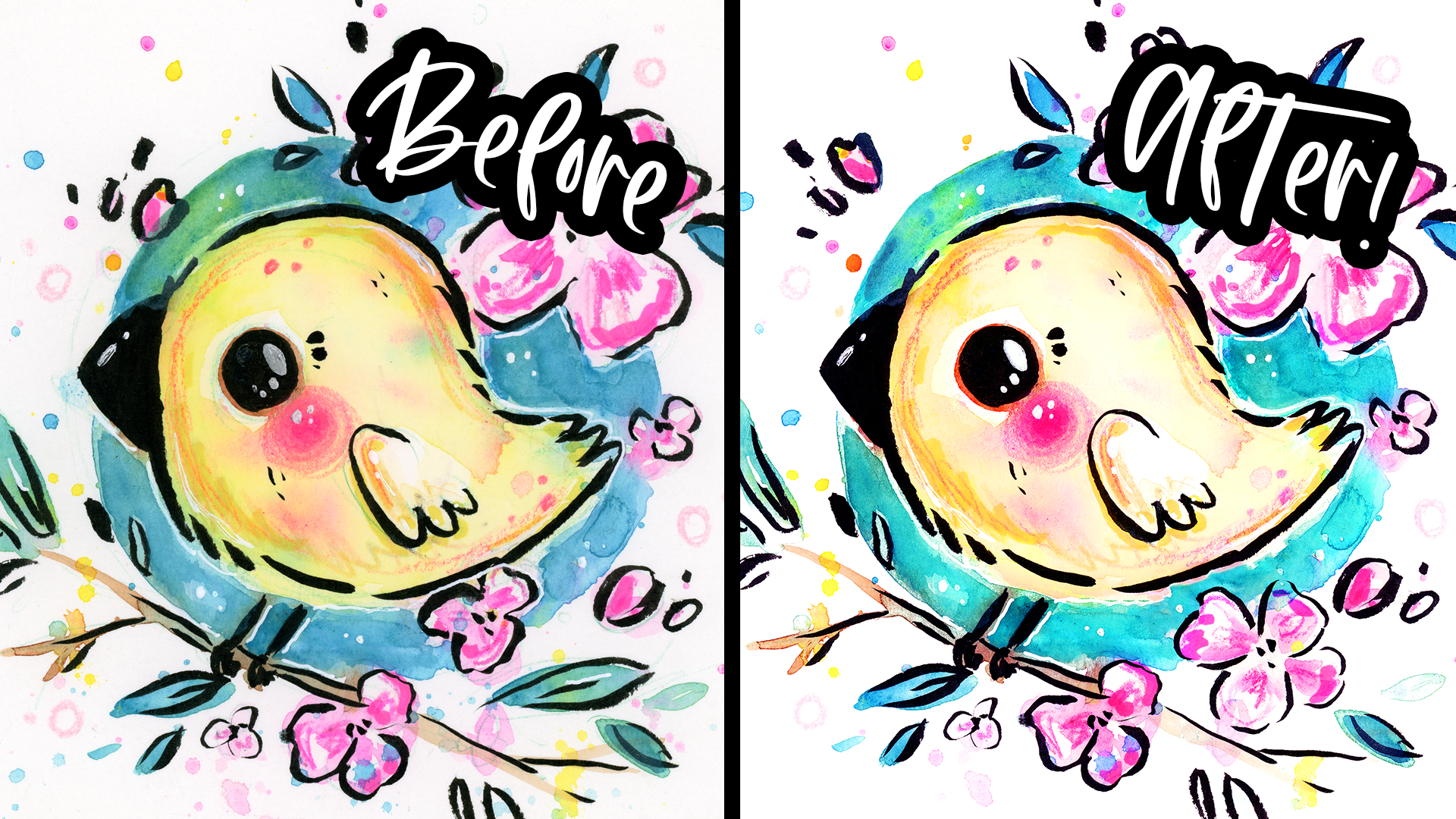
this right here. It's bothering me so much. [LAUGHTER]
7. Fixing Mistakes: Let's learn how to fix mistakes. You see
this little piece? I would say I did this on
purpose because I knew I was making it for this class,
but I really didn't. Go on our original layer. If you want to
make a copy again, you can because I took
out the sketch lines, so I'd made a little change. It doesn't matter how
many copies you make. In order to move this, we're going to use the
Quick Selection Tool. If you right-click here, we have Objects Selection, Quick Selection, Magic Wand. They're all great tools. But for this one, we're
going to do Quick Selection. So I'm going to use
the brackets to make my brush smaller. I'm just going to
keep hovering over it as I click or with my left key. I'm just going to try to
select the whole flower. If I select it too
much by accident, you can hit the minus right here and subtract
from selection. I got the flower and I also
think I want the leaf. So I'm just going to click again and get that leaf in there. As you can see, it's the computer doing
all the work for us. I got the background. I'm going to hold Alt and it
will do the minus for me. I'm just holding it,
and I'm going to get this background
out. There we go. I got it selected. I can hit Control X to cut it, and I can see here I
got it pretty good. I'm going to click
Control V to paste it. I'm pasting it. You can paste in place if you ever need to by
going up here, Edit, Paste Special, Paste in Place, or Shift Control V. I'm going to place this
where I want it to be. I'm going to zoom out, and
this is on a separate layer. We're just going to see
where we want to put it. I think I'm going to separate the leaf
from the flower as well. I'm just going to
select around it. Again, Control X, Control V, and I'm going to
move it to where I want it to be, maybe like this. Then I can always put
on auto select up here. If you're automatically
selecting things by clicking them that you
probably have this on, you can deselect it
or select it or I can just click the
layers and use them. Put on Auto-Select, you'll
see I can click the leaf, or I can click the flower
and they'll select it. It depends on how many layers you have and where they are. I'm just going to eyeball it. So maybe like this
and like this. Let's say I don't
like this flower, I just don't think
it looks good. I'm just going to hide
that. Let's say over here, I don't like how
this looks either. What I did is I sat
down and I recorded some more flowers and
even some words for the illustration because I
thought that would look cute, maybe I will just try it out. Just make sure if
you do this to do it in the same style you
did it in before. Open your new scanned file, go to Image, Image Size, make it the same size
as the other ones. Now it's going to be the
same size if I bring it in. I'm just going to grab
this and copy it. Now notice how here
it's off-white. It doesn't look right. But if I bring it in here and I paste it underneath
these layers, the background has turned white and the blacks have turned darker because we have
these layers on top. That's part of the fun of
working non-destructively. So I'm going to hit Control T and they'll
help me to rotate it. I'm just going to
throw it in here. I'm going to put it
on top of everything just so I can see better. We can do that whole
pencil hack here, just select it, Image, Adjustments, Replace Color. I have this green
and make it white. Make sure I select all of
it, and boom, it's gone. I'm going to take this and I'm just going to
make it look good. You see how I drew an extra j just because I thought this
j wasn't good enough. If we want to put it in, I
can just erase the old j. Let me just hide our little
birdie for a second. Now to move it over, use the Lasso Tool again. I'm going to show you
something interesting. Go to the Move tool or
just hit V. If I do this, it will go over because it's selecting the pixels
of the background. So I'm going to edit, cut or Control X
and then Control V. I'm going to put it
where I want it to be. I'm going to go to the blending options
and go to Multiply. I do this all the time. What it's doing is it's only
showing the darker pixels, so it's making the background
as if it doesn't exist. I'm just going to place it
until it looks about right, and I don't think
that j looks good. Let me try this j instead. I'm going to do the same thing. Control X, make sure
you're on the right layer. Control X, Control V, and we're going to put where
we want it and hit Multiply. Control T will help you to transform it and you can
just go left and right, and just rotate it to look
exactly like you want to. See that looks so
much better to me. I can go up and down or
left and right to adjust move in increments.
That looks perfect. Same thing here, I lettered in this part and
I didn't like it. Let me go to the layer
that has that part. I'm going to erase
this part right here. One more thing is right
here, it has this. We want to remove that line. Select it with the
Lasso Tool, Control X, Control V. We're going to
place it in its place, put it on Multiply, and just place it
where it needs to be. I'm just using my
keystrokes again to just put it exactly
where I needed. Once that's done, I can also move in the e. I can do Control X,
Control V again. I can just make it look right. Then I can also
erase this part with the h that is overlapping with the e. I'm finding
this layer with the h, I'm just erasing this
little part right here and make it blend
a little better. That looks about
right, just breathe. Then we also got
these little flowers. What I can do is just
do one at a time. So I'm just going to
erase some of this. What I'm going to do is
just select the whole part. Hit Edit, Copy Merged. What this does is it copies
everything that it sees. I can hide all of these or delete anything that I need
to and just paste it in, and then we can do Multiply for this layer and put it where
we think we want to go. Control T to transform. I'm just putting it where I
think it would look good. Now I can go in and erase those flowers that
I don't want there. In order to put it here,
I'm going to have to remove all the stuff
in the background. I'm going to hide it for now
and I'll get back to that. I'm going to open up that layer again and copy the
flowers that I want. So I think this one looks good. You can always just do
it over and over again, just in a scrap piece of paper until you find when
you really like. I'm going to copy it, and I'm going to
paste it underneath these layers so that it
gets all these effects. I'm just going to
place it in place of this one and just
Multiply just so I can see and hit Control T and just rotate it until
it looks right. Maybe something like this. Maybe I want to shrink
it down a little. I can just go to this edge
and just shrink it down. I hit Enter to just let it sit. Here you can see I completely
replaced a flower. How do we fix up the rest
of this? It's very easy. Just go to your layer, your original one with the bird, and erase all of these. We don't want any of these. I like it overlapping with the flower here so
I'm going to leave that. What I'm going to do is the
flowers on a separate layer. I'm going to stay where
I'm with the bird and I'm going to select all of this. This is one of my
favorite magic tools. Edit, Fill and click this, go down to Content-Aware,
and click Okay. As you can see, it
tries to fill it in with surrounding it. Here it's getting this part
right, but not this part. So I'm going to select
this part again. I'm going to do Edit, Fill, Content-Aware, and it's
going to change it up. Every time you do it, it makes it a little bit different. Now my other tool that
helps with this is the Clone Stamp tool or the
Spot Healing Brush Tool. The Spot Healing
Brush Tool is great if you want to have the
computer do it for you. So you just click this and
it will just take it away. Same thing with this
here, in this here. This line, for example, it will just automatically
fill it in for you. The Clone Stamp tool
is when you want to sample a certain area. I can make it bigger
or smaller with the brackets and I just hold Alt and just click and
I can paint with it. I can also change
the brush type, so I can click this one
right here to make it a soft brush so it looks
more blended in. I can do it again. I can just keep doing that, keep hitting Alt where
I want to copy it from, and I can just
paint in this area. Once I'm almost done
painting again, just to smooth out the edges, I'm going to do the thing with the Content-Aware one more time. Select it, Fill, Content-Aware. That looks really good
except this one little spot. I'm going to show you guys another thing that
I do is kind of like [inaudible] So I
like how this looks. I'm going to edit, copy this, and I'm
going to paste it, and I'm going to move it over to sit where this mistake is. Hold Control T to rotate it and just put it over it until
it looks about right. I can also take the eraser
and make it soft as well and just erase out this right here and down here as well to blend
a little better. Then I can right-click
this layer. You can do this with
any layer you want to merge and just click Merge Down. Don't click flattened image because I'll just
flatten everything. You just want to
merge down, make sure the layer is on top. Now that they're one layer. This line looks a lot better. I didn't like that outline, I can just fill in this little tiny place
and it should work. There we go. Can zoom
out and look at it. I think it looks a little
weird right here still. So I'm just do it again. Edit, Fill, Content-Aware, and see how it made that
line straight for me. I can also do the
Stamp tool one more time just to fill in
that little area. This is a really
good way to just edit lines and outlines. I just use it all the
time, to be honest. We're going to go back to here. Because we are in Multiply, this background is
showing through, but maybe I don't
want all of it. Maybe I want to
erase some of it. I can just go to the Eraser tool and just do this or I can
just paint it in white, on top of it, if I don't
want to be destructive, but I like the
flower where it is, so I'm pretty set on that. I'm just erasing. Let's see that looks
better without it. No, I like it showing
through more. So I'm going to just
keep that there. Now with this new flower, look how much better it looks. Here's the original and here is the new one with
the new flower. Now that you know basic tools, you can fix things
like this easily. I think the eraser
sometimes is the best tool. Sometimes the Band-aid
tool is all you need, especially for a
little blemishes like this and any splatter
that I don't want, I can easily remove. But if you use the Band-aid
tool on an area like this, it might take in this beak
and mess it up a little. For that kind of stuff,
just use the eraser. It's just practice, and the more you
use these tools, the more you'll know which ones work and
which ones don't. You can always try one
and if it doesn't work, just undo it and try again. When the background is white, I usually just use an eraser
just to keep it simple. But if the background is
not white and you want to get a little spot like
this, just use this tool. It helps if you make it the
size of what you're working on so that way most
of it stays the same. I'm just going to
go through here and just get a little spot check and just remove all these
things that I don't want. So here we have a sketch
line that was all too dark, it didn't get picked up. If something doesn't
look right, I can try different technique
on it until it does. It definitely helps to
be zoomed in when you do this because there's
just things you won't see, but they can show up on a
print and you don't want that. You want your art
to be as perfect as possible if you're going
to be printing it. But if you're doing
this for web and you're going to resize
it to be smaller, there is no need to be
this perfectionist. I'm usually not
this perfectionist. I'm a messy person that doesn't really care too much as
you can tell with my art. Once I do a spot check and I
just get everything I need, I'm pretty happy with it. Now if I wanted to
include this text, I can remove this stuff
like I showed you. For example, if I want
to keep this flower, I can just make a new layer
and get my brush tool out. Make it whatever brush I want. This really helps you
if you have a tablet and just make white behind it just so that I can read the texts and
then I can completely remove this and do the
Content-Aware Fill. But I think I like it
without the texts. I just wanted to show you
guys that you can add things in last minute and
change things around, just like I did with
the flower here. When you're done, you can
just delete all these layers that you don't need just
by hitting the trash can. You can select multiple
layers by just holding Shift as you select, you start on one and then you hold Shift and it goes
in that direction. I'm going to keep this flower. What I'm going to do is
I'm actually going to merge it down into
my original layer. I'm going to delete these
because I don't need them. Now we're going to continue
onward to proportions.
8. Fixing Proportions: [MUSIC] Now, let's learn
about proportions. I'm going to play with
the shapes of all this. Go to Filter and Liquefy. This is going to
be a blast to do. I love doing this. This is
my favorite tool honestly. If you ever have a
problem with proportion, you just make your brush
really big and you just very lightly touch what you want to move around.
It's a kind of [inaudible]. See. That is so cool. This is my new masterpiece. This is $10,000. [LAUGHTER] I'm just
kidding. I'm just going to very lightly touch
it and move it. I'm very lightly doing this, and I'm just tweaking
my brush size to the area I'm working on. You can hit "Control Z"
and undo just one time, just whatever you did last. You can always compare to the original by
hitting "Preview". We're really just
moving things around. I'm going to make my brush
really small to fix this eye. Now, be careful with
overdoing this. I'm going to show you
guys what it can do. It can really mess up your art. Let's say I overdo
it. Do you see that? The pixels are all warped. Even if I did it
like this much and I did it like this and
I didn't like this, the pixels are warped, so
try to do it as little as possible to keep
everything HD. Now, I'm also going to
go into these flowers. I think some of them need a little tweaking
with their petals. This tail could be rounded
out a little bit more. This is really practice. When I first started
using this tool, I might have gone a
little crazy with it. You just got to be
careful not to overdo it. Because if you do,
it's noticeable. You ever see those
pictures of people that use Liquify [LAUGHTER] and it's a bathing suit
picture and you can see they shrink their waist
because everything around it is shrunk? You don't want that
with your art. We're just going to very
gently do everything, and pay attention to
everything that it's touching. If I do this, for example, my flower's messed up, so I just got to be careful. I'm really slow when I do this. I just zoom out and zoom in just to see
what it looks like. You can zoom right down here with the little
plus and minus. I'm just eyeballing it
and feeling it out. Maybe make the beak a
little bit smaller. The circle right here that's
surrounded the background, it doesn't want to click
a circle in some parts, so I'm just going to
keep changing the size of my brush and just
moving things around. I want this a little bigger. You could say I'm being a
little finicky with this, but I'm telling you it makes
a huge difference because as humans we are programmed to see the right
proportions of things. Anything that you do, even if it's really small, it's a little bit off,
it's noticeable, usually. Maybe I want to make the wing
in a little bit more and just change the
shapes of the lines. This is great for line work
as well. Look at that. I think that looks so cute. I can click the "Preview"
key again and just see. Look at that. Huge difference. Maybe I want to just make
the leaves, some of them, just a little bit more wavy,
a little bit more fun. I think I'm pretty good.
I'm going to hit "Okay". Now I'm going to zoom
out and I'm going to show you the
before and after. This is before,
and this is after. Now, if you're going to use Liquify more than
once, be careful. If you click "Filter" and
you try to go to Liquify, you might be confused because
there's Liquify up here. If you click this again, it'll use all the
same effects I just used on the image one more time, which does not look good. [LAUGHTER] Make sure to
always click the second one. See. That looks weird. Another hack to make sure
that your proportions are right is to flip your image. Go to Image, Image Rotation, and just flip it horizontally. We can see how it
looks backwards, and this helps us to notice if there's something
that isn't balanced. The thing that I
noticed the most is that there's too much
empty space right here. It wouldn't hurt to just add
a little something more, but I don't know. I like it. But if you look at the bird, it looks right, so I did a really good
job with Liquify. I'm going to undo that. By doing that, actually, I think I do want to move
these little flowers. [MUSIC] I'm just going to do that real quick with the things I
already showed you guys. That's it for
fixing proportions. Really, it's just one tool that I just love,
and it's great. Just don't overdo it. Now, let's move on to
enhancing contrast.
9. Enhancing Contrast: Now let's get into
enhancing contrast. What is contrast?
Let me show you. If you go down here and
click "Hue Saturation", and you put saturation
to negative 100, you can see that
all the color is gone and we're left with
just black and white. Contrast is the difference between the darks
and the lights. If there's a higher contrast, the image pops out too more.
It's more interesting. If there's a lower contrast, it's more dreamy and subtle. Usually in art, you
want more contrast. For example, it
wouldn't hurt to make this background a little darker and this part
a little lighter, maybe even a little bit darkness right in the middle
of the flower. We're going to just
delete that layer. I'm going to show
you how to do that. Down here, hit "Curves" and we're going to
just darken it up. Then we're going to
hit "Curves" again, and we're going
to lighten it up. I'm going to hide the lighter one and start
with the darker one. I'm going to hit "Control
I" to invert the layer. Make sure to select
this one down here, not this one, this one. Hit "Control I",
it's going to be black so that way nothing
is showing through. I'm going to take
our paintbrush, make sure it's white, and we're going to make it soft. You can change the
size of it like this. We're going to paint
in some shadows. Let's start right here, just with the background. You can paint more carefully
than I do. It's up to you. Maybe I want to make
some of these leaf tips a little darker, just put a little
variation in them. Maybe the cheek and the
insides of the flowers. You can always change the
opacity of your brush up here if you want to
make it less opaque. That way you can
paint a multiple times in area to
make it more opaque. Here's what it
looks like with it, and here's what it
looks like without it. I have just increased
the contrast. If I do the same thing again, where I hide all the saturation, you can see that
there's a higher contrast now between these two, and in the middle here. Now I'm going to
show the one that's for the highlights and I'm going to hit "Control I" on it, and I'm going to
do the same thing. I'm going to paint in the
parts I want lighter. I'm making my brush
a little bigger. Now, this is a little
too bright for me. I can go back into this and just make it a little
bit less bright. I'm just going around and
just winging it like always. Here's what it looks
like without it, here's what it
looks like with it. I can make the opacity lower on it or I can just tweak it here, and you can see I can see
exactly what my tweaking does. I think something like this
looks good. Another thing-
10. Playing With Color: [MUSIC] Now let's do my favorite
thing, play with color. You already saw me use the hue saturation tool to
just add some saturation. But I can also use the hue tool to change the
hue of the whole piece. Now this looks a little crazy. If you go off a little bit to the left or right,
it looks fine. This is cute, but we're not
going to do any of that. What we're going to do is
do a hue saturation layer. We're going to invert the
canvas like we did last time. Get our brush out. First, we're going to
make crazy colors. That way when we paint, we can see what we're painting. We're going to paint in, let's say the body. Let's say I want
to make the body a little bit different
than this yellow. You can already see
how it's working and I can make my brush smaller. Hit "X" and it will
switch my color. See if I keep hitting
X, it switches them. That's why your other
color should be black. I'm just going to paint in the areas that I don't
want the colors changing, just redefining my edges. I could just paint
carefully the first time, but I know myself, I won't. I'm going to just make
sure this chick is fine. Now I can tweak the
color of the bird. I'm just going to make it maybe a little bit more orangey, just a tiny bit and maybe put the saturation up
a little bit more. I can do the same thing with each thing that
I want to change. Let's say I do the
flowers next, Control I, use your brush, hit "B", hit "X" to switch brushes. Don't worry, the
more you do this, the more it becomes
second nature. Also make it something
extreme so you can see it. Then just make your
brush big enough and you can see exactly
where your painting. Let's say I just wanted to make some of these flowers
a different color, but the other ones I
want to keep pink, I can just paint a
couple of the flowers. Nothing is stopping
me from doing whatever I want and
getting creative. Let's say I want to make
these a little bit of a different pink to add
variation or purplish. I can do that. I'm going
to get the rest though, because I like them
being uniform. I'm going just see if
anything looks better. Also the chick is
the same color, so I'm going to grab
that. Let's see. I can always hide it and
unhide it to see the original. I think I like the
original more. But that's what
happens when you play. You get that idea. Another tip is to make
your canvas really tiny so that you
can see it from far away and you can see how the colors are affecting
it. I don't know. I'm torn, maybe just in-between. [LAUGHTER] They both look cute. I actually think the chick
looked better before, but the flowers look better now. I'm going to go
back to my brush, make it black, and just paint over it
again to unselect it. Now, this isn't the only
way to change colors. Let me hide these color layers for a second just to
show you what I mean. You can work directly
on the canvas with a tool we
already saw earlier, Image, Adjustments,
Replace Color. What we can do is select
any color we like, like this pink of the flowers. Remember to edit the fuzziness
until it looks right and we can tweak the
color like this. This doesn't always work
perfectly because see, for example, the yellow looks
a little off right here. I'll show you closer up. See this blue looks
a little weird and if I make it a
yellow, look weird. Sometimes you don't
want to go too far out, but this is also an easy
way to change color. I use that way
quite a bit and now there's one more way
to change colors. I make a new layer,
just a simple layer with the little
plus and square right here and I'm going to pick a color I
want, so any color. I'm just going to
paint over the parts I want to be a different color. If I just go down here
and I go to Color, it will change the color for me. The only thing about this option is it changes the
outlines as well, so you have to be
careful where you put it and it's very
uniform looking. I don't really use
this one that much, but you can if you want to. Here are the colors that I edited. I think that
looks much better. I might do the same thing
again with hue saturation for the background because if you want to replace
colors better, if it's a very uniform color, here we have some green and that will
confuse it a little, it won't pick this up, so
it'll look a little grainy. What we're going to do is the hue saturation
that we already did, Control I, hit "X" to
switch your brush. This time I'm just
going to put down my saturation just so I can
see it in black and white. I'm just going to go in here and just paint
in the background. That actually looks
pretty cool as a gray background. I like that. This helps me to see
if I missed any color. Like I said before, there are so many ways to use Photoshop. Just find what works for you. I got everything I need.
Let me to go back to normal saturation and I'm
going to just tweak this. I love that so much. That is just beautiful. This is one my favorite colors. Right here, it looks off. This little area
is a little green, so let's just fix it. We're going to select
it and you can refine your selection by
holding Alt and Shift. I'm going to subtract from it and then I'm going to
add a little bit more, try to get those splatters. Let me just get
everything around here. I'm going to go to
Image, Adjustments, Replace Color and I get this green color,
increase the fuzziness. I'm just going to try to tweak it to match the other
parts of the composition. I'm going to lighten
a little bit, increase the saturation
a little bit. As you can see, that
looks about right. It matches this part right here and that's the
closest part to it. Click "Okay". That
looks so much better. If I want to remove
this neon green, I can do that again, but I like it. I think it adds a
little character. There's one more thing I
want to show you guys, it's a little trick
that I like to do. Just go to Gradient Map down
here in the little circle, and we're going to
pick a fun one, maybe pinks. I don't know. Just pick anything you like
or you could make your own. I'm going to now use this
and just do something fun. If I do screen, it will make my outlines
light and I can just lower the opacity on
this to be really low. As you can see, it gives it a vintage look because the
outlines just got lighter. It's almost like Instagram
filters when you do this. You could try a different
one and see how it looks. I could try different
blending modes. As I scroll through these, you can see how each
one is very unique. If I make it a little higher
and scroll through them, I'll get different results. It just lightens
the whole thing. I can hide it and unhide
it and I can just try different ones until I
feel like it looks right. This is adding a little purplish pink
undertone to everything. I want to put it down
to maybe 25 percent. Speaking of adding a
tone to everything, one of my favorite things
to do is down here, go to Color Balance. We're just going to move these around and see what they
do and see what we like. We're just bringing out certain
colors and muting others. I usually go towards
the pink and cyan area. This is just what I do. This looks really
good to me already. Look at this. Then we
can go to shadows. This is bringing out
or hiding more of the darker areas
and I love that. I can just lower the opacity a little bit on this
so it's more subtle. But I think that
just adds so much to unifying the piece and
making it feel cohesive. Also notice that the
lines themselves become a little bit
of a purplish tint. I usually do this either
bluish or purplish and it just makes the
work look more cute. Just to make all the colors
pop a little bit more, I can do another curves
layer and do it like this. Just two points. One's higher, one's lower. Just see how that looks. It just gives a tiny bit of a pop and it just
pops off the page. This is my style of art and if it's not yours,
that's totally okay. Now let's learn how to remove the background if
you ever need to.
11. Removing the Background: [MUSIC] Now let's learn how
to remove the background. Before I show you guys how
to do it on our artwork here is random scan of a
lemon that I have. It doesn't have a splatter
background to it. It's more simple. There's
a bigger contrast between the foreground
and the background. What I'm going to do is go here and click Object
Selection tool. If I hover over this, this is a brand new tool that just came out and
I just love it. I can click it and it will
select the lemon for me, pretty much perfectly, and I can also add
to it by holding Shift and click on the shadow and it selected
both of them for me. Let me show you
how good this is. I'm going to cut it and
I'm going to paste it, then I hide the background. Let me just add in maybe
a red or something. Look at how well it did. It got a little bit off right here because the white of
the page was right here. But I can easily fix
that with my mask, and I'll show you guys how
to do that in a second. But overall, it did a really good job at
removing the background. This little thing right
here is just magic, look at is actually
doing it on citrus. That's a coincidence. Back to our illustration. If your pieces and
this loose his mind with all these crazy elements, you'll be able to use
this tool just by itself. But if I try to use
it here you can see just selected this
little part right here. Well, this one is not going
to work as is too complex. You can also outline with this
tool if you want to select a smaller piece like
right here, for example. I'm just very
loosely outlining it and selected it
perfectly for me. What we're going to do to
make it select better is, we're going to just outline
everything really loosely, and just show this
is what we want. It got most of it,
as you can see. Now to erase the parts that we don't want like
here, we got the background, we're going to right-click it, click the Quick Selection tool, and click the minus. Then we're going to make
our brush smaller and we're going to just draw in
where the background is. We're just erasing
the background and some parts just make it even smaller like right here
and just scroll through. We did a pretty good job
by getting everything. If you want some splatter
or something I didn't get, you can go up here and
hit the plus or just hold Shift and just click on the little splatters
you want to include. Control, Z if you get
the background by accident and just try again. I'm getting all the
little splatters. I want this little
colored pencil mark. We're going to do
something kind of fun. We're going to click
this down here, it's a circle with a
rectangle around it, it's called a layer mask and we're just
going to click it, and ta-da, everything that we
didn't select is now gone. Right here you can see
it's selected weirdly. What I can do is I can
get my brush tool out, I can make a layer
underneath it, make it that red color so
we can see everything. We can see here the
parts that look weird or whether our background is left or anything like that. Right here, for example, maybe I just want to
delete that completely. I go in here and I
paint with black, hit X to switch your
colors, and now it's gone. Maybe I want to remove this as well and I need to make my brush harder so that it doesn't
look weird at edges. I can just go in here
and just fix it up without destroying anything
because it's in a mask. This is something you might
need to do if you want to sell your art on a
stock image website, sometimes you want to make a different colored background, whatever you need
to do, it's really not that hard to
remove backgrounds. I want to show you
guys how easy it is. You can always paint with
white if you want to include something
that was excluded. But I'm just using
my mouse here. If you have a tablet
that's even better. But just try to do your best. Don't worry about it too much. Ta-da, we are done. If I hide this red layer
and this white layer, you will see this
checkerboard pattern that's actually showing us
that there's nothing there. If we save this as a PNG file, it will save the transparency. If we do that, we'll have this
nice transparent artwork, we can put them
wherever you want, t-shirts or change
the background color or whatever you want to do, you can do that now
because it's transparent. Let's say I want
to make it a light yellow background,
I can do that, but you will notice something. What is this? If you're going to
remove your background, be sure to make a clipping
mask for all these layers. I'm going to click
this hold Shift, click up here, and
right-click it, and click Create Clipping Mask. Now all of these layers
are inside this layer. That means any pixels outside of this bird don't show up, so now you see that
weird effect, it's gone. I'm going to go back to my
normal white background. If you're wondering if you
miss anything important, maybe you didn't realize it, you can click on the
Mask and click Control, I, and you'll will invert it, and you can see right here we
got a petal that we missed. I can take my brush, make sure it's black and just paint it until I don't see it. Same thing with the splatter. I can do the same thing,
just make it the size of it, and anything else that
I wanted to include, that looks like
it's been left out. When I'm done, I
just hit Control, I, one more time and we'll
have everything back. Now I know everything
that I want is included. That looks good. So now
let's talk about exporting.
12. Exporting Tips: [MUSIC] That's it for
all my techniques. Just remember when you export, do it in a TIFF file for
the highest quality, or a PNG, most printers
will tell you what to do. Usually, nowadays you
just use RGB files. But if you need to convert
your colors, you can go here, edit, convert to
profile to change your color profile,
and it'll preview it. You can see there's
a very slight difference, almost the same. But here you can see my source and here I can
change it to anything I need. Most printers will tell you
what you need, like I said. Always use this one, don't use Assign Profiler because
if you do that, it will actually change
the look of everything. If I click this, for example, see it
just got really bright. I like that. [LAUGHTER] But it will just change your
colors without you meaning to. That's why I always use
convert to profile. Let me show you how
to actually export. Go to file, save as, and this will make you save that as either a TIFF or a PSD. This is if you want to
keep the original file. If you want to save
as a PNG or a JPEG, it won't let you until you
flatten all your layers. You can right-click here
and click "Flatten Image", and then you can save
as anything else. See now it's letting
me do whatever I want. But I like to keep at least one original
PSD document of my work, or at least a TIFF. But if you want to save for web or Instagram or something, go to File Export and Export As. Over here it will let
us select PNG or JPEG. Over here we can
change the width and height of our image
or scale it down. Why would we want to do this? Let's wait for it to load
up and I'll show you. You can see right here
it's 34 megabytes. The size of this file
is pretty big as a PNG. But if I change it to a
JPEG, it's much smaller. Now it's only two megabytes. A lot of places
will have a limit, they say you can't upload a size bigger than
two megabytes. For example, if
that happened here, I would put this
on great quality, the highest quality
you can put it on, I always like to keep
it high-quality, but then I would
just scale it down. Let's say I make it 25 percent, 1080 is usually the
size for Instagram, so 25 percent is higher than
that, so it's just fine. But I can see right here
the size of it still, and then maybe I
want to make it to 1500 just to put it right
under two megabytes. You can see everything
changes and the size changed. Now it would fit a YouTube
banner for example. You can play with this, if you put the quality down, it changes the size as well. But you don't want
to have poor quality for your art as a JPEG. This stuff, I only use
for exporting to the web. I don't like to put the quality down of
my work otherwise. But if you don't have a lot
of space on your computer, having it at 100
percent as a JPEG will save you a lot of space in great quality compared to a PNG, or a TIFF, or a
PSD, like I said. But if you do have the space,
I recommend to save bigger. But see this is 15 megabytes, and then the PNG is
more than double that. You could save as a JPEG. I just don't recommend it
because it's not lossless. But if you need to save space, save it as the
highest JPEG you can, and try out not to
save it a bunch of times afterwards
and make changes. But anyway, when you're
ready to explore your image, make sure that the color
space is what you need it. For example, you can convert to sRGB if you're saving for
Instagram or something. But I like to just keep my
embedded color profile, which is what I showed you
guys how to do it earlier. Just see what profile
you need and keep it as that one for whatever
you're using it for. For example, sometimes
printers need CMYK, sometimes they just want
Adobe 1998, it's just random. Just make sure just
to embed that and keep it the same so the
colors don't change. Now just hit "Export"
and you can rename it here and save it. This little bump
was bothering me, so I decided to fix it, and I just used the mask layer. That's it for editing
your art in Photoshop. Here you can see
the original and here you can see
our finished piece, and I know it seems
like a lot to remember. But once you use these tools, a couple of times you'll just know what they
are and you'll just be easier to remember
which tools to use where. You can re-watch
the class as many times you need to
memorize everything. If you experiment, you'll
also find new ways of working with things
that you can enjoy. That's it for editing
your artwork. Now let's talk about
trust digital art.
13. Tra-Digital Art: [MUSIC] Tra-Digital Art. What is that? It just means you take traditional art and
you edited digitally, like we did with Photoshop. But if you have a
tablet of some sort, it could be even a cheap one, they connect to your computer
and using Photoshop. Or if you have like an iPad
and Apple Pencil like I do, you can use Procreate. You can paint over your
artworks that have issues. Like if you want to
change something up or if you just want make
small tweaks, for example, what this cute Jesus portrait, I didn't like how I did
the face and the eyes so I repainted it a bunch of times [LAUGHTER] until
it looked right. I redid the outlines as well. That just made my final
piece looks so much better, and it looks
traditional because I'm using traditional
looking brushes. But because my original
piece really is traditional, the whole thing
looks traditional. I just loved doing
this if a piece isn't working out or make a
really big mistake. As you can see with
these examples, I also do this for tiny, tiny tweaks just to
add more sparkles or more outlines or a little
details or just anything. If a piece needs a
little more spice, whatever you need to do, it's really fun to just
paint over your work. Don't feel like
this is cheating. Just do it and think of it
more of a mixed media type of thing where you're
using various tools and techniques to
make your art better. I hope all this inspired you. Now let's finish up the class.
14. Class Project & Goodbye!: Now, let's talk about
the class project. You guys did so good at
watching the whole class. For the project of this class, I want you to pick
one of your artworks, could be something
that you filled up and either photograph it or scan it, do all the editing I showed
you guys how to do on it, whatever you need to do to
make it look better and even tweak it and play with it and
just see what looks best. Maybe you'll make a
couple of color options. That's always great
for print on-demand. Whatever you do to share it, share your before and after. It's always fun to see what
you can make something into. If you want to learn how
to paint or draw like me, I have 24 other
classes at this moment on everything you
can imagine and I explained all my favorite
techniques in those. You can go ahead and watch
them, whether it's drawing, painting, inking, whatever,
painting kitties. But otherwise, stay awesome guys and I'll see you
in the next class. [MUSIC]
 Yasmina Creates, Artist & Creativity Cheerleader