Transcripts
1. Introduction: Do you know your basic
watercolor techniques, but feel unsure about how to actually use them in a painting? Or maybe you're
simply looking for fun projects for
this summer that can help you build confidence and strengthen your skills
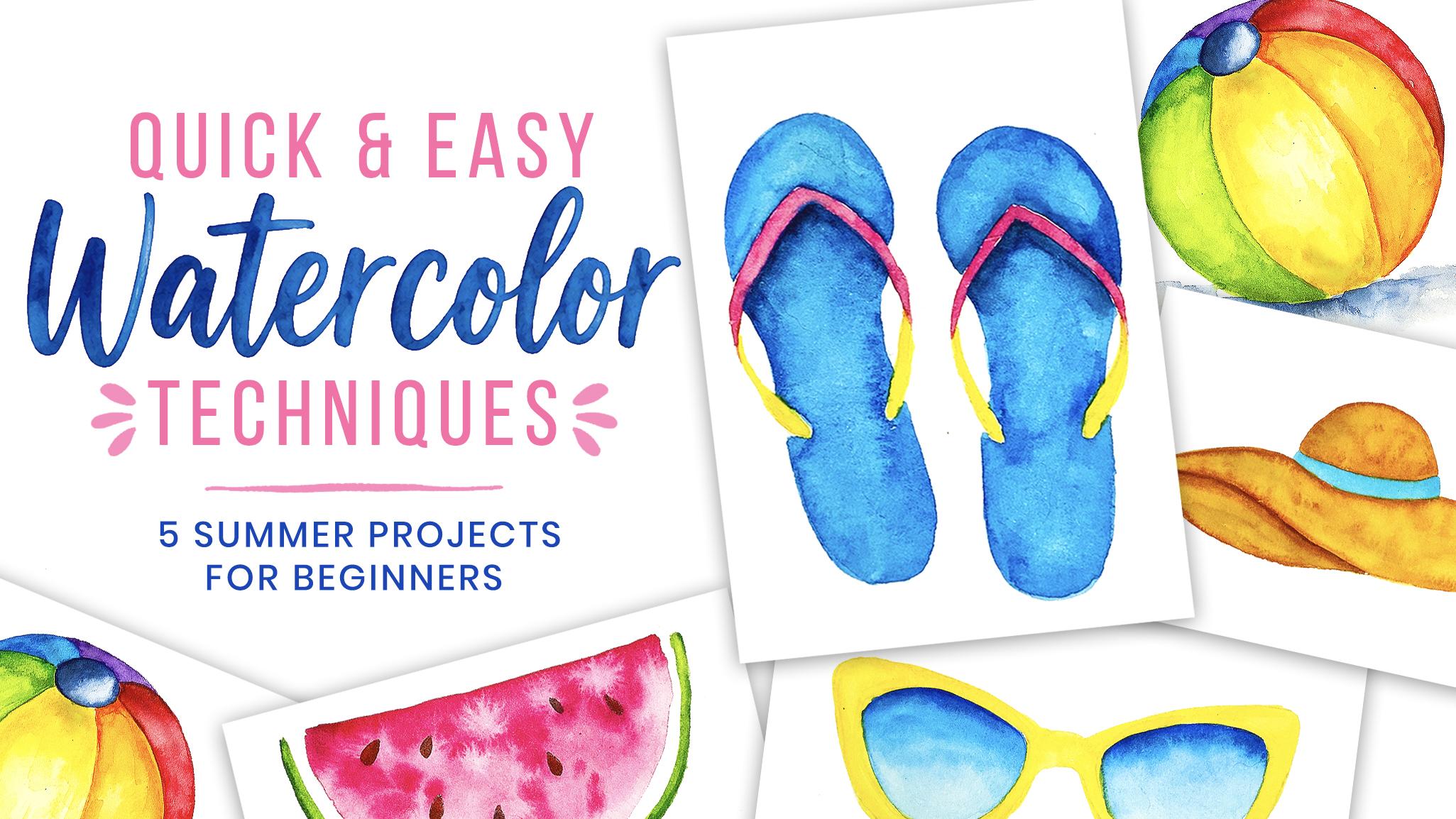
without feeling overwhelming. In this class, we'll create five fun mini paintings inspired by summer while using simple watercolor techniques
that are perfect for anyone, even if you're
just starting out. There creative. My
name is Shannon, and I'm a hand letter and artist from the beautiful
Island of Barbados. And this glass was
inspired by one of my popular appropriate
summer illustration classes. But this time, we're using
real watercolor paint. Together, we'll
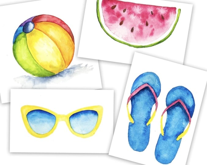
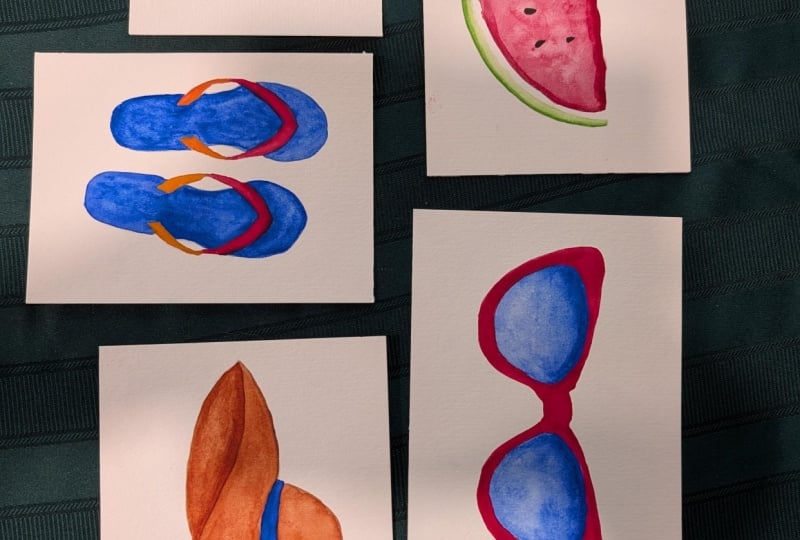
paint a beach ball, trendy sunglasses, flip flops, a watermelon slice,
and a beach hat. This glass is designed to
be simple, approachable, and easy to complete
in one sit ten, or you can spread it out as a quick daily challenge to get those summer vibes flowing. For your class project, you'll choose one or more
of the summer illustrations we paint together to share
in the project gallery. For this class, you'll need your basic watercolor supplies, so that's paints, paper,
and paint brushes. And you can grab the sketches
from the projects and resources section of this class and sketch them onto your paper. Whether you're brand
new to watercolor or just looking for a
quick, creative escape, this class is here to
help you loosen up, have fun, and create something beautiful in just a
few minutes at a time. So grab your watercolor supplies and let's start painting.
2. Creating Blooms – Watermelon Slice: So we're going to kick
off with our watermelon, and I have it already
sketched onto my paper, and I'm going to take
some of my red from my palette and add a
little bit of water to it, and then I'm going to paint
in the top of the watermelon. And you're just going
to paint this like a flat wash and start at the top and then bring down your color to fill in the shape. And because we're not using
a specific mixed color, we can always pick up
more from the palette and add a little bit of
water and continue painting. Then when you're finished
filling in the shape, you can clean your brush and pick up a little
bit of water, and you're going
to drag that brush along the outer edge
of the watermelon. A then I'm also going to pick up some water
and wet the pink area that I painted so that I
can add in color. As you paint, you
may notice that you get an uneven patchy texture, and that is fine
because we want to have a more natural looking abstract texture on
the inside of this. I'm just using water and reactivating some of the paint
and creating some blooms and then I'm going to pick
up some red from the palate and then I'm going
to drop it into a few areas just so that we
get some bleeding happening. You can also pick up
some water and add it into the paint to create
some blooms as well. Next, I'm going to
pick up some green directly from the pan and
paint the watermelon frind. And while that is still wet, I'm going to get a
darker green and add it along the outer edge
of this green section. A you can then clean your brush and use
a little bit of water to just smooth out the
transition area between these two greens. You're going to allow
this to dry for a few minutes or use a heat gun to speed up
the process if necessary. And then you're
going to use some brown to paint some tear
drop shapes for the seeds.
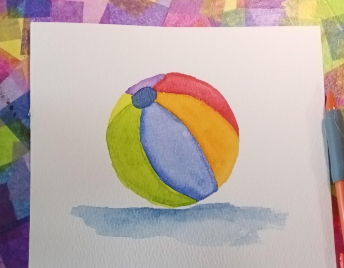
3. Layering Colors – Beach Ball: So now we're onto
our beach ball and you can use whatever color
scheme that you want. I'm using rainbow colors, and you're going to need
just a darker shade of whatever color you're using. So once your design
is sketched onto your watercolor paper,
let's start painting. And I'm going to
start with a section in the front and I'm
using green and I'm picking it straight from
the pan and just adding that color along the edge
of one section of the ball. And as you can see
for this whole class, we're not really focusing on
having everything perfect. We want to have a lot of fun and playfulness to our design. So it doesn't have to be
a smooth wash of color. In fact, you're going to just
paint along the outer edge, and then you're going to
use some clean water to lightly add a diluted version of your color to the
middle of the ball. You can also pick up more of
your color and add it into a few areas just to create a little bit more of
a color contrast, but ideally you
want the center of this section to be lighter
than the outer edge. A You can also pick up a little bit
of clean water to add a few blooms across this color just for a
little bit of texture. But again, that is a
personal preference. I just like the look of the texture in my
watercolor paintings. But if you prefer something
a little bit more smoother, you can leave it as it is. But again, you want the center
to be much lighter than the outer edge so you can just use your brush to
lift color if necessary. Now, when you're finished
with that section, we're going to move
on to another one, but we're not going
to paint the section that is right next to
the one we just painted because then we will
have your colors bleeding and being a
little bit too muddy. The next color that I'm
adding is orange and again, adding the darker color
along the outer edge and using water to
add the later center. Once you're finished, you can then move on to the
next section, again, leaving space so that there is no unwanted bleeding until you fill in all of the
colors of the ball. After you've added that
first layer of color, you're going to allow
it to dry completely. Then we're going to add a
second layer just to add a little bit more
shadowing and depth. You can use the same
color that you use for the first layer and add a little bit to the top and
the bottom of each section. You can use more shorter, looser strokes rather than
trying to be too precise. Then you can clean
your brush and lightly blend it into
the color underneath. If your color is not visibly much darker
on this second layer, like, the yellow was you can mix in a little
bit of a darker color. So here I added a
little bit of orange to my yellow just to add that as the shadowing because my yellow wasn't necessarily having
that type of contrast. Then for the orange, I added a little bit of red and added in the shadowing
for that section. Because we're using more of a wet on dry layering technique, we don't have to worry about colors bleeding across sections, so we can work right
next to other colors. But if you find that
there is bleeding, you can swap and alternate
where you paint accordingly. Then finally, we are going to add our color to the
top of the ball, and we're going to try to
have a shadow on one side, which for me is going to
be the left hand side. So I'm going to just build up some of the darker
color on that side. And then we're going to add a
shadow underneath the ball, and I'm using that same dark
blue colour to just add an abstract line under the ball using a dry brush technique, and then just adding
a little bit of water underneath to feed the harsh
line into the background. If you need to
darken the shadow, you can just add a little bit of a darker color right underneath where the ball
and the shadow meet, and that is it for
your beach ball.
4. Glazing – Beach Hat: I next up we're
painting a beach hat. And for this, you only
need two main colors, which would be a
brown for the hot and then whatever color you want
for the ribbon around it. And you can also use a darker version of
whatever brown you have, but those are the main
colors we're using. And once your design
is sketched on, we can jump right into painting
using our light brown, and you're just
going to use that to fill in the top of the hot, as well as the brim. A a if you want to add more texture and
character to your hat, you can add a few drops of water to create some blooms
while the paint is still wet. As I'm painting the brim, I'm going to be conscious of which side I want to
be my highlight side, which is going to be the
right side of the brim. I'm going to make that
a little bit lighter than the other side of the hot. I'm also going to add some
blooms and texture as well. And then when it
comes to painting the inner part of the hat, this is going to be painted
using your darker brown. And before you start
painting this inner part, you need to make sure that
your previous sections are completely dried just so that there is no bleeding
because we want a sharp, distinct line between the brim and the inner part of the hat. And if you're painting and
you notice that it is still a little too similar in
contrast to the rest of it, you can add just a little bit
more of your darker color and create a more darker shadowy
color for that inner part. Much like we've done for
some of the other paintings, you can clean your brush
and use some water to lift some color from the
inner part just to create a little bit
more contrast where only the outer section is darker and I noticed that the texture was a
little bit too intense, so I just added a little bit of a diluted glaze of that brown color over
the brim of the hat. And then you're gonna
allow that to dry before we then start
painting the ribbon. I'm going to be using blue, so I just added some water, and I'm going to paint it in
that band across the hat. You can use a flat wash of
color or you can use a mixture of water and paint just to create a little
bit of contrast. I just wanted to get
a little bit more of a separation between the inside and the outside of the hat. So I went in with a little bit more darker of a brown and added a small line along where the two meet just to separate those sections a little
bit more distinctly. And that is it for your
beach hat painting.
5. Lifting Color – Flip Flops: The final thing
we're going to paint is a pair of flip flops. And because we're going to
be painting two slippers, it's going to take a little bit longer than our
previous projects, but they are just
as easy to paint. So you're going to
need three colors, one for the sole
of the flip flop, then the band so the main
color I'm using is blue, and I'm just going to add
some of that to my palette, and I'm using a somewhat
of a diluted consistency, just to fill in all
of the color for the flip flops and leaving
the area for the band empty. You can add this color as a solid wash or you can add
a little bit of texture. It doesn't really matter. All you're trying to do is fill in the color for that flip flop. Then we're going to
add some shadowing. And to do this, I've
added a little bit of a darker color, which in this case, for me, I'm using a pins gray and I'm
mixing it in with the blue. Then I'm going to
paint that shadow right next to where the band
is hovering over the soul. I mainly focused on adding
the color at the bottom, but you can add a little bit at the top of the band if you want to add a little bit more of a separation and contrast
between the two elements. Then you're going to let
that dry completely, and then we're going to start adding our color to the band. I'm going to use red. And again, you can paint
this in however you want. Then we're going to switch to the other color for the
inner part of the band, which I'm using yellow And one last way you can
add texture is by lifting. So I'm going to use some
clean water and just go over the entire area that I'm
going to be lifting from. So mainly the blue area, I'm not touching any of
the red or the yellow. Then you're going to
use a clean piece of tissue or paper towel to just lift some of
that color from those areas and just
continue lifting until you're satisfied with
how your painting looks. And that is it for
your pure flip flops.
6. Graded Washes – Sunglasses: In this lesson, we're going to be painting some sunglasses, and you can use just
about whatever colors you want for this. Also, I'm using blue and yellow. So I'm going to make sure that I've sketched my
design onto the paper, and I'm going to
lightly erase it because we don't want
it to show through. We just want to be able to see our sketch and then fill it in. So I'm going to start by painting the frames of
the sunglasses first, and I'm going to paint
in a flat wash of color not too worried about
texture for this one, but if you want to, you can definitely use water to create variation in color
and texture if you like. Once your frames are
completely dried, you're going to then
start working on painting the lenses
and you're going to pick up your darkest color and just use it to
outline the lens. And the darkest set of color is going to be at
the top of the lens. Then you can use some
water to lightly blend the color down and into
the rest of that section. If needed, you can pick up
more of your darker color and just add it in along
the top of the lens. You're trying to create a nice graded wash
from dark to light. Then you're going to
repeat the same steps to paint the other lens
where you start with your darkest color
at the top and then blend it towards
the bottom of the lens. Again, if needed, you
can build up color at the top of the lens and lightly fade it
towards the bottom. And that is it for
your sunglasses.
7. Wrap up: Congratulations.
We've made it to the end of this summer
watercolor class. And I hope you had fun
creating these projects and learned some new techniques that you can use in
your future paintings. Now it's time for you
to share your project, and to do that, simply head to the projects and resources tab of this class. Tap the Create Project button, upload an image of
what you made along with any other information you want to share
about your project, and then click the
published button. If you've enjoyed this class, leaving a review really
helps other students find it and know what
to expect and don't forget to follow me on
my Skillshare page so that you'll be the first to know when I release new classes. Thank you so much
for painting with me today and I'll see you
in the next class.
 Shannon Layne, Lettering, Procreate & Art