Transcripts
1. Introduction to Easily Create a Professional Book Cover Fast with AI Art and Canva: Hello, and welcome to your
cover creation course. My name is Mattha Dewey, and I will be your instructor. Now in this course,
I'm going to be showing you how to
create a cover for your book quickly and easily
using AR image generators, and of course, a design
program such as Canva. I'll be showing you how
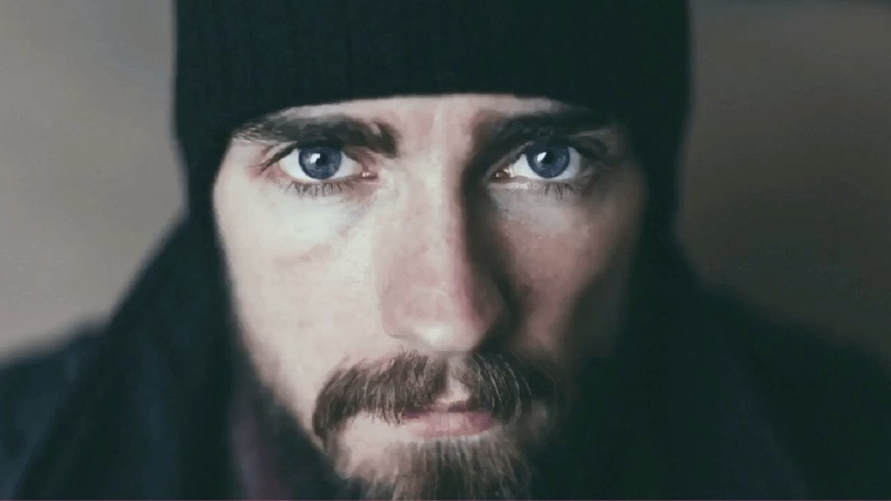
I turn my old book cover for the four horsemen
from this into this. Not only is this cover a lot better than
what it was before, but it is also a
lot more fitting considering the genre
and also the market. A lot of people will judge
a book by its cover, which is why it's so
important to create an appealing cover in order to get more people to
look at your book. Now this course is for the independent author who
doesn't have the money to hire a cover designer to create something that
looks professional. What we're going to
be doing is making use of free services
and software, a free AI image generator, which I recommend, as well
as free design software, such as cretter, or Canva,
either one will do. If you have a
laptop or computer, you have all that
you need to create professional looking
book cover such as this, this isn't the only
course that I teach. I have an entire library
of writing courses from fantasy to science
fiction to thriller. So if that sounds like
something you're interested in, be sure to check out my profile. With that, I'll see you
in the very first lesson.
2. Finding an AI Image Generator: Hello, and welcome to
the course on creating your professional book
cover using ARR generators. The first step on
this journey is selecting an art generator
which you want to use. Now there are many great options out there, free and paid. The most popular and widely used paid AR generator
is Mid Journey. Mid Journey is an incredibly
powerful ARRT engine. It creates some of the best
and most realistic AR art which you can use
for your book cover. And it is often the most
preferred professional version of ARR generation. But as I said at the
start of this course, we're going to be making use of the free and
available options and creating a professional
looking book cover. Now, just like mid journey, there are also a lot of free
versions of ARR generation. But there is one version
which I highly recommend. This one is known
as Playground AR. It allows you to create
detailed pictures which you can use for
any of your projects. I've often made use of
playground AR to create background animations for
my story reading videos. You should be seeing examples of the animations that are created from our story readings now. The reason I enjoy using Playground AR is that
it's quick and it's effective in creating
images that I could use that create an interesting
backdrop to the stories. For the purposes of this course, I'm going to be
using Playground AR, and I'm going to be
showing you exactly how to use it in the next video. Of course, if you are already familiar with some
ARR generators and have one that is much more preferred than Playground AR, that is no problem at all. I'm going to be showing
those who don't know how to use AR generation to their benefit in order to create a book cover that looks good
and also fits your story. As you can see in the
playground AR showcase, there's plenty of free art
ready for you to make use of. You can also use the
search bar above to find any specific that you may want to use for
your book cover. But of course, it helps to
create our own AR art so that where we can make
sure that the images perfectly fit the story
we're trying to tell. Not to mention, we need to
include the title of our book, as well as our author's name
on the book cover itself. We don't want the
text to detract from the image or the image to
detract from the text. With that, I'll see
you in the next video. Time. Tie.
3. Using Playground AI Image Generator: Hello, and welcome back to
your course on creating a professional book cover
with ARR generation. Now, since I'm going to
be using Playground AR, I recommend you create a
profile with Playground. It is free, as I said before. It's a perfect AR tool for creating artworks
for your book cover. At least in my opinion. Now, once we have
created our profile, we go back to the
playground website and we should see a create button
in the top right corner. Clicking that, we are then
led to this screen over here. Now, there's a lot of information that's been
presented to us here, and that can be intimidating. I'm just going to
go through what is important for
creating your AR art. First, I'm going to
start on the right. We have AR model. Now, think of this as different
updates to the AR models. At the moment, one of
the best updates is stable diffusion
XL, extra large. We have had previous versions
of stable diffusion, as you can see here, 1.5 and
2.1, and both are decent. But Excel is the
g21 at the moment. It'll help you create
fantastic artworks and using the different filters
as we'll go through now. You'll see that these
artworks perfectly fit the artistic style of almost any book cover
you're looking for. We'll go of Excel. Next, we
have the image dimensions. Now these dimensions don't
match up perfectly with the dimensions of a book
cover, but that's okay. We're going to make
use of this one over here, 512, by 768. Now this may seem like a low
resolution, but don't worry. This is something that
we're going to fix once we create our first AI generations. Now, prompt guidance
and quality details, we're going to leave
at the default values of seven and 50. For seed, you need to make sure that this box has been checked, the randomize each number
to get new variations. The reason I have this box checked is because
we want to make sure that the images generated
are different every time, especially if we want to
create something specific, and the images
that we're getting back aren't what
we're looking for. If we leave this seed the same, this random number the same, it would generate
similar layouts than the ones that
they've just generated. By having this box checked, it's a great way to ensure
that we'll get images that are different from the ones that simply don't work
with our book cover. We'll leave sampler the same. As for number of images, I recommend selecting four. When it comes to AR generation, you are going to generate
a lot of images. This is because some of them
will simply not work out. Either the images
will come through a little warped or there
might be a flow in it, that's very difficult to fix, and it's better to just generate a new image or some of them might be a
lot better than others, and you want to see if there's a better version of that
book cover you have in mind. Now moving over to the left, we have filter at the top. Now filters differ depending on the different
model we are using. Now there are many great filters here and some of them will probably work better with
your cover than mine. But I'm going to
be using some of these to help generate
my book cover. What better way to
demonstrate how this all works than putting one of my book covers on
the line as well. For me, I'm going to be making
use of no filter for now. But if I want to make use
of a different filter, I might use lush
illumination or cinematic. But I think that none or lush illumination
will be enough. There are other filters here, and if you want to go back
into different models, such as 1.5, there are
different filters here as well. I have used back and forth, depending on the
project, but if you want to create a cover that
is similar to mine, which is going to be a cover for more young adult fiction, then I use X L, and I'll use none or
lush illumination. Now, below this, we have prompt. This is where we're going to
be doing most of the work. What we're going
to do is describe the image we want created. Now we're going to
do this simply by putting in the details
of what we want created. For example, I want a male
figure, leather jacket, cool shirt, I want him to be middle aged because that's
the character. I'll go on adding
more and more details as I think them up. Simple things that we will
separate with an apostrophe. But let's leave that for now
before we start generating out because there are some other details we
need to talk about. Below the prompt box, we
have exclude from image. This is simply about
cutting out things that we don't want in the image
and we see appearing. I'm going to leave this blank
for now because we haven't generated any images
and I haven't seen it present something I
don't want an image yet. But if you ever want to exclude something from an
image in your generations, you'd click custom
here instead of none. And include those details here. Finally, we have image to image. This is simply about
taking an image that you want fixed and adjusting
it in some way. We can put another image into here and we can adjust
it and make the AR, build upon it, use that
image as a foundation. What you'll get is
an image that has a similar size and layout to the one that you insert here, but it's going to be
modified by the AR. You can also adjust how
much it modifies it. Only a small amount, for example, in which case, you'll see most of
the previous image, but these adjustments
will be made by the AR. But for now, let's
leave that aside because we want to create
an image from scratch. Let me just fill out this
prompt first of all. This is some of the first
generations that I have. The prompts that I use simply describe the character I
want in the book cover. Man, brown hair, short
beard, brown leather jacket, middle aged, serious expression,
cove in blue flames. This is all to do
with the book itself. Now, the added prompts
that I have, dynamic, stylish, art station
detailed epic and beautiful. These are simply prompts that are typically include
when I'm generating art. You'll find that a lot
of the AR art that has been generated on the site
also makes use of it. The reason being
is that it conveys the feeling that you want
to create with an image. Art station is a popular site where artists post artworks, and AR art generator reads this and creates
something that is fitting and
professional looking and would probably
appear on the site. These are some pretty
cool generations. But as you can see, there
are some flaws in them. For example, don't much like
the shirt for this one, and I feel that the
hands are a little warped in this one
and in this one. I can then delete
these images here. But this image I
feel is pretty good. There's also a good
spot here where I can put the title of my book. Of course, I don't want
to stop here just yet, and I can just
generate more images. Now you'll notice
that below generate, there is a little
safety trigger warning. Sometimes the ARR
generation thing will create an image that
isn't fit to be seen. With that amount, it will automatically detect
that and delete it. Once more, it takes some
time to generate the image? As you can see, it's
already been 37 seconds. It might take up to a minute, might have to take 2 minutes. But once it's done,
it's done and it's certainly a lot faster than creating an image from scratch. It's generated some more images. Again, I feel that some of them work and
some of them don't. In this case, all of
them just don't seem to fit what I'm looking
for, and that's fine. I can always generate
more and adjust the prompts as necessary.
Why does that? Let me talk about creating something that's of
a higher resolution. Those of you who
are familiar when it comes to artworks know that 512 pixels by 768 isn't a lot, and that makes it a bit more
difficult to work with, especially if you want
to adjust it personally. Now, you can fix this by simply creating
an upscale image. By hovering over an image like, you can go to actions and you can click upscale
by four times. What this will do is
take the image itself and upscale the sars by four
times as pixel resolution. This will end up creating
a cleaner, larger image. There might be a
slight adjustment to what is presented,
but that's okay. You then click download, and you've got your image in
your downloads folder. I see using the filter has
made some adjustments to it. It's added a real
magical look to things. It's also created a longer
hair do for the character, which I feel just doesn't fit. I'm just going to go
to the prompts here and go short brown hair. Once more, delete
these images and keep generating more until I get something that fits
like this one does. But of course, I'm sure you're excited to test
this out yourself. So please check
out playground AR, make use of the prompt
ideas that I have here and adjust it
to your own story. But of course, you can also experiment with this,
get used to it. If you feel that things are
going in the wrong direction, you can always
adjust the prompts. Add more details, get it as close to possible to
what you're looking for. When you find something
that looks good, download that image and try to build up like a
folder of ten images. From there, you can pick and choose whichever image you feel best suits your book cover
by asking your friends, your family, or simply saying, is this one better than
that one and so on. In the next lesson, what
we're going to talk about is creating a book cover, placing the title in
our author's name, and making sure it's the
right resolution size. With that, have fun, and I'll
see you in the next lesson.
4. Setting the Book Cover Format: Hello, and welcome
back to the course. Now in this lesson, we're
going to be talking about setting up the
book cover format. That means choosing
a picture that we feel will work best
for our book cover, and then creating a file, whether it be in your own
art program or in Canva, we will be editing
and adding the title. Now, let's first take
a look at our options. As I said in the
previous lesson, I recommend collecting a
larger array of images, if possible, for
your book cover. Once you've collected enough, you now need to decide which one will best suit your novel. I've collected here nine
pictures that I feel best captures the character or the story theme
that I'm going for. But obviously, I need to pick only one that I feel work best. Now, there are some here, which I think look pretty good, but at the same time, I don't think they will do so
well as a book cover. For this image, I feel
the jacket is too large, the face is too close, and for that reason
it clutters the page. Now the reason I'm worrying
about this is because I also need to fit in the title and the author name on this book cover. For that reason, this
image simply won't work. I'll delete that one
along with this one. I then need to
select the ones that I feel match the
characters look. For example, this one of a
hoodie, again, not so much. This one looks far too casual. I got to find something that
emphasizes the character, and I feel that some of them
just don't do it justice. This one again is
a bit too much. And I feel this one
is far too stylized. That brings it down
to three images. Now, these three images I feel look very good,
but at the same time, I can only choose
one, and there's one that I feel that best
matches the character. This one I feel is just too heroic and stand offish doesn't
fit what I'm going for. This one I feel is far
too intense and angry. But this one I feel is a lot
more thoughtful and present, but at the same time,
still stylistically, it's a cool image to
have as a book cover, and there's plenty of
room around here and this lower half to
include a page title. Out of these three images, I feel this one best
suits the character, and at the same time gives
me enough room to add in titles or anything else that I want to include
into the image. But for now, I'm
just going to be adding the title and alonm. This will be image number three. You must really think
about these details. Obviously, if your cover doesn't include a character
and includes a scene, it might be a bit easier to find one that best
suits the cover. It also will be one that you can include a title and it won't detract from the image or the image distract
from the title. But you don't want to have
a bunch of different ideas that simply won't work when you've got plenty of
ideas that could work, and then just clutter things. Now having chosen our image, we now need to create
an image format. I'm going to be using
Canva because it is a free service that you
can also take advantage of. Canva includes the
basic features, but if you want to
adjust the art, I recommend using free
software such as Creta, that you can edit the image as you want and
also add a title. But for now, let's just say
that the image is okay, and we just need to
simply add our title. Well, then I recommend
using Canva. Since we're going
to work with Canva, let's go to create a design, go to custom size, and I recommend the
following resolution, 1600 by 25 60. This is the resolution that I use for all of my book covers, and it's very easy to use this
resolution when you try to create some promotional
images as well for your book. With that done, we now
simply need to upload our image and add it
to the background. You can easily add
your image by going to uploads and clicking
and upload image. Once you've done that, you're
ready to start testing out different titles and edits
for your book cover. That's something
we'll talk about a bit more in depth
in the next lesson. Use this lesson now to
organize your images, find the one that you'll feel
will best suit your novel. If it's more than one,
around three is just fun, but you don't want to have
so many images to work with. One way to also cull the images is to just compare them to each other and decide which one you feel looks better
than the other. Once you've got
your one or three images, create the format, 1,600 by 25 60 on Canva, and we can start
adding in our title, and of course, our author name.
5. Title and Author Placement and Design: Hello, and welcome back to
your cover creation course. In this lesson, we're going
to be finalizing our cover, which means we're going to add our title and our author name. Now we have chosen our
image, but of course, we also need to look
at the different ways that we can format our title. This is the second most
important part of the cover. We need to now find
some inspiration. Of course, you can
look at your own books and similar ones
compared to yours, one of the best places to
do that is, of course, the Amazon bookstore or
any online bookstore. We can check out the covers, see how other authors
had their set up. I'm looking in the teen and
young adult section right now because that is where my book would fit in
probably the most. With that a mind,
what I notice is commonplace along the professional
book covers is having the title of the
author at the top of the page and the name of
the book at the bottom. What's also clear to
me while looking at these other examples is that the images themselves tend to put a vignette
around the center focus, so that where the title
stands out a bit more, as well as the author name. But the image itself will also pop compared
to that vignette. With that in mind, I then
go back to my book cover, and I'll start
editing it as such. First of all, I'll
add basic text, such as my name. I'm not going to adjust
the font just yet, so we'll just take the
standard font for now. But we definitely change
it once we get to it. This is just a fill in for now. That clearly doesn't
look too good. Now we need to adjust the image, and I'm going to add
vignette around it, so it puts more focus on
the character's face, the flames here in the jacket
and the brighter area. I select the image.
I go to edit photo. Now, there are tons of effects that you can do to improve it, filters that you can add, which will adjust the colors, but I feel that I'm going
to leave it at none for now and just
establish the vignette. I'm going to adjust, scroll down to texture, and I'm going to increase that and just see if I can get
a dark vignette around it. Et's try 57. What apps I
put vignette very high? I feel that detrats
from the image. The colors don't pop so much. I'm going to take it
back a step or two. Let's make it 70. Now, with that done, I can see about
adjusting the colors. I feel that the colors
for this look very good, but let's just try a few filters and see if anything
really stands out. That is a too blue.
Don't care for that. I want something that
will make the age pop, but also not too much that
brings down the colors. Some of these are interesting, but they're not exactly what you would see
on a book cover. A lot of them seem to dull the brighter tones
of the picture. This one I feels far too warm. But I like what it's
done with the flames. Maybe we can adjust that and just bring the temperature
back down a bit. Saturation. We'll just
put that down in touch. That's not that. Now
let's have a look at the text before we get to side tracked with
the image itself. Now, the author name
isn't going to be flashy. We want the title to stand out. I'm going to use
some basic text, something very simple,
and aerial, maybe anon. Aton bit too bold. Let's try Futura. Futura looks good. Bowl is not too much, but I think I'll
leave it at that. Again, let's go back to our image and see if we
can find anything else. Let's go back and check
our inspirations. Now let's stand it, so we go
here and adjust the image. I'm going to add an
effect to the, a lift. This will help things
stand out a bit more. Instead of making it a bright w, I'm just going to go
for a slight gray. Maybe a little bit brighter
than that, just a little bit. Instead of some low case, I'm going to go full Matthew
Dewey with full caps. That looks good. Now,
let's adjust the title. Now, in these examples, you see the titles are big. For some of them, it's
the entire cover, but a lot of them will just
take up a huge space in the lower third or lower
half of the book cover. One thing that's
also important to note is choosing a font that best suits your story and theme. For example, this one over here, it uses a flowing one. It's to underline the sense of witchcraft magic,
that sort of thing. Then we have this one here,
which is a lot more bold, simplistic, and very medieval. It's very standardized,
but also at the same time in
such a way that it isn't like common print either. Returning to the image, think about the theme that I have for this book and see if we
can adjust it to suit. Now, my book is set in a
modern setting in a city. With that amount, I'm
not going to be using something that is
flowy and I'm not going to be using something that looks like old medieval
script either. It's going to be modern print, but at the same time, I don't want it to be a
boring modern print. I'm also going to look
at the ways that I can divide the text. Now, I feel that combining the and four together
just doesn't look right. If anything, if we have
to separate words, we've got to keep
them all separate, or I combine four
horsemen with each other. Again, I then have to
then look at this and see if I can put it
in the lower case, or should I say in
a smaller font. I think I'll add
that separately and then just edit the
four horsemen itself. But at the same
time, I feel that such a length is not conducive, so I'm going to actually
separate them like that. I think that's going
to be what's best. With that amount,
I got to also try and figure out how
to fill up as much of the bottom third year as possible so that where
the title stands out. The amount, I think I'll
separate this as well. I'm going to enlarge that. And separate this and make this one also a bit
larger like so. But now the text doesn't really
work well to each other. Let's see if I can
find one that does. If it's not the text, I can also separate the letters and
adjust their spacing. I'm going to put this off to the side rather
than centered. That way, it follows the
dynamic line of the image here. That a mind, I could also
do the same thing with the four and bring
it down like that. Already, this looks
like a lot more professional than
my older cover. Now this is an older cover that I created a few years ago, and included my own drawing, included my own text, and the difference
is very clear. For example, the
text is at larger, the image is a lot better,
a lot more colorful. And the author name isn't
so small, is it full caps. One thing I should say
is that the text also helps to confirm the
type of genre that the story is going to
be in if the title and the image itself don't
already tell the reader that. The reason I'm going for
more modern looking text is because I want something that fits into a current time period. That way, the reader
doesn't believe that what they're looking at is more of a fantasy or something that's set in the future
a science fiction. If you want something that looks a bit more science fiction, what you would do is use
actually thinner text. This is commonplace for
a lot of Safa novels. But when it comes to
more modern settings, you'll find that the text
itself is a bit more standard. And bold, not so thin. If I went for the four horsemen, but I use this text right now, it would appear
as if it's set in a more futuristic setting or has a lot more sci
fi elements to it. It suggests something that's
a bit more futuristic or spyh more than it is
actually a action adventure. One more tip that I'll give you before you settle
straight into creating a book cover is that
when it comes to moving things around and you want to
make sure they off center, You click and hold to
drag things around, but you'll notice that it
automatically locks in place. Well, if you want a bit more freedom in moving things around, you can hold down control, and that will break
all the bounds and locking in the system. You can move things exactly
to a point where you feel your eye says it's
where it should be. With that, you're ready to
start creating your cover. We should do the best of luck. In the next lesson, we'll be talking about where
to go from here, as well as some additional tips, and also, of course,
your final project. I'll see you then b for now. O
6. Final Touches and Marketing: Hello, and welcome back to
your cover creation course. Now, this is the last video as we have finally
got our book cover. But now we need to go
a step further and to create some more promotional
material for our book. One of the best ways
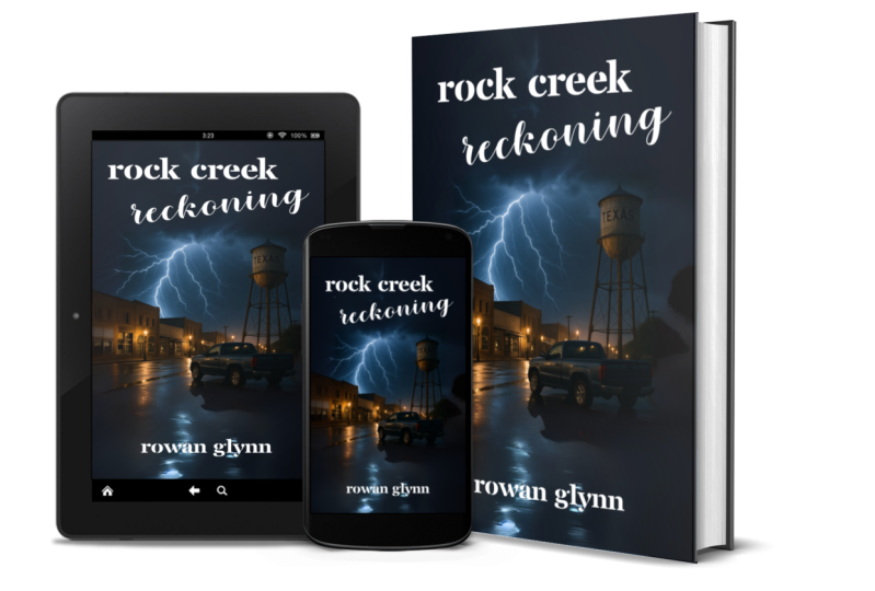
that I think a lot of independent authors overlook is creating a three D book cover, which is basically a
digital image version of your book as if
it was a print book. It will have a picture of your
book on a phone, a tablet, something that lets
the readers know that they can get this
book digitally, and if possible, they
can print it as well. Once more, we're going to
make use of a free service, but these are the two things
you'll need first of all. You'll need your
cover, which is, of course, one of the
most important bits. But the next is just
a blank color that you feel will best fit
the spine of your book. Now, this is a
promotional image. It's not the actual
printed book, so the back is not
going to be shown, and the spine is irrelevant. So it'll be blank as well. I have a 600 by 600 image. I took the darkest background
color from the image, and I'm going to be
using that as the spine. Now the next service that
we're going to be using is known as DRY book design, that allows you to create a
three D mockup for your book. You can see examples
of this below. If you're selling an ebook, you can select a phone or
tablet, and that works well. If you're printing
it, then you can also select one of
these templates. You can also get a composite, which is what I
would normally use. This way, you can show
off the digital versions and the physical edition
in different formats. Find one that best suits
what you're going for. Now, personally, I like to use this one here in the
bottom right corner. It shows off the book, it
shows off the digital sides. Also, if I'm just selling
the e version of the book, then I can easily
erase this part out and just show off
the phone and tablet. That being said,
let's just select one and I'll show
you how it works. I'll select this. And
then I'll click next. Once that's done, you'll have two options for
things to upload. The very first is of course, your book cover, and the
second is your span. Click here on browse
and find your book cover PNG or J Pig
and upload it. Here's my book cover,
upload that first. Once it's double selected, you won't see anything,
but don't worry. You simply need to click
upload, and there it is. Once that's done, these images will then upload and
you're ready to go. After some time, you'll
see your images will load, as you can see Man has here, and there's the bind in color. Then I'll simply go
here and click next. It might take a moment,
but once it's done, you should have
your image ready. Simply click on P&G if you want a transparent
version or JPEG, but I would recommend a PNG. Once you click on that, it will then download the image files. You won't be able to move
the screen, but don't worry. It is working on it,
and soon it will have the mage downloaded,
just like that. And there you have it, an
excellent promotional image to show of your book cover. I highly recommend this tool, whether you are an
independent author and you plan on self publishing, either be through draft or digital or on your own website. Or if you are a
published author. This is a great way to create something that looks
snappy and interesting, and you can put it on
your social media with a link to your book and
really just show it off. With that, we are ready to
talk about our final project, and that's simply to
create a book cover for your book and show it off
in the project section. I want you to use this
opportunity to also show off your work and
perhaps promote your book. Create your cover, create your three D composite
image if you want. And go to the project
section, the finished, tell us a little bit
about your book, and if it's out,
where we can get it. I'd like to thank you for
joining me on this course. If you're interested in learning a bit more about writing, I have a library of
writing courses from fantasy to science fiction to
thriller all of my profile. Be sure to check
that out. With that, thank you again
and happy writing.
 Matthew Dewey