Transcripts
1. Welcome!: There is a playfulness and freedom to working with collage, which allows us to
explore ideas without the fear and
permanence which can come from working
directly onto the page. Hey, my name is Mel, and I'm an artist and educator, and I love to create
colorful and playful art, which is full of joy. Collage has allowed
me to loosen up, let go of perfection, and has really helped me out of periods of creative block. It's the thing I
always reach for when I'm feeling uninspired or overwhelmed because it's such a low pressure
way to create art. Today, I'm going to
share with you one of my favorite collage
techniques, combining color, mark making, and
playfully drawing with scissors to
create beautiful, folk inspired
botanical collages. This class is suitable
for all levels. You don't need to have
any drawing experience, but if you're an
experienced artist, I think you'll also
have fun, too. Drawing with scissors takes
away an element of control, which can open up a
creative way of image that would just not be possible working traditionally
with pens and pencils. Okay, so if you're ready,
let's get started. M.
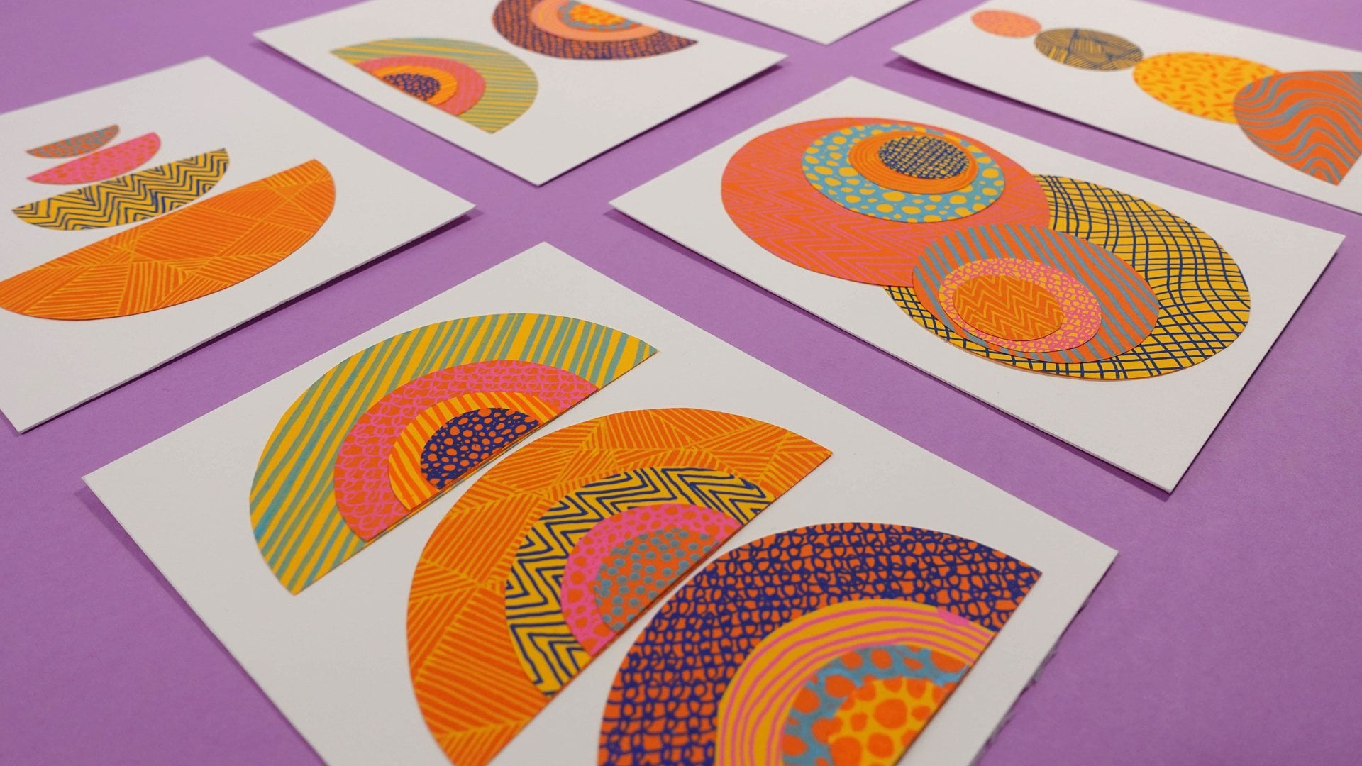
2. Class Project And Resources: In this class, I'm going
to walk you through my process for creating a folk inspired
botanical collage, which combines color, shape, and pattern to create really unique and
eye catching images. I'll be walking you through one example from
start to finish, but I often create these
little artworks in series. So feel free to create one, two, or 20 collages, depending on how hooked you get
on creating them. You can follow along with my example in the
class or use it as a framework and adapt it to your own style and materials. If you'd like to share
your class project, I invite you to take a photo
or scan in your collage. When you're ready, head to the Projects and Resources tab
and click Create Project. You can add a cover
photo and title, but don't forget to upload your photos to the actual
body of the project. This is also where you
can add supporting text, telling us how you
found the process. Provided alongside the class, you will find a
class resource PDF, which includes some
composition references, some sketching guides, and mark making references, which you might find helpful whilst working
through the course. If you would like some
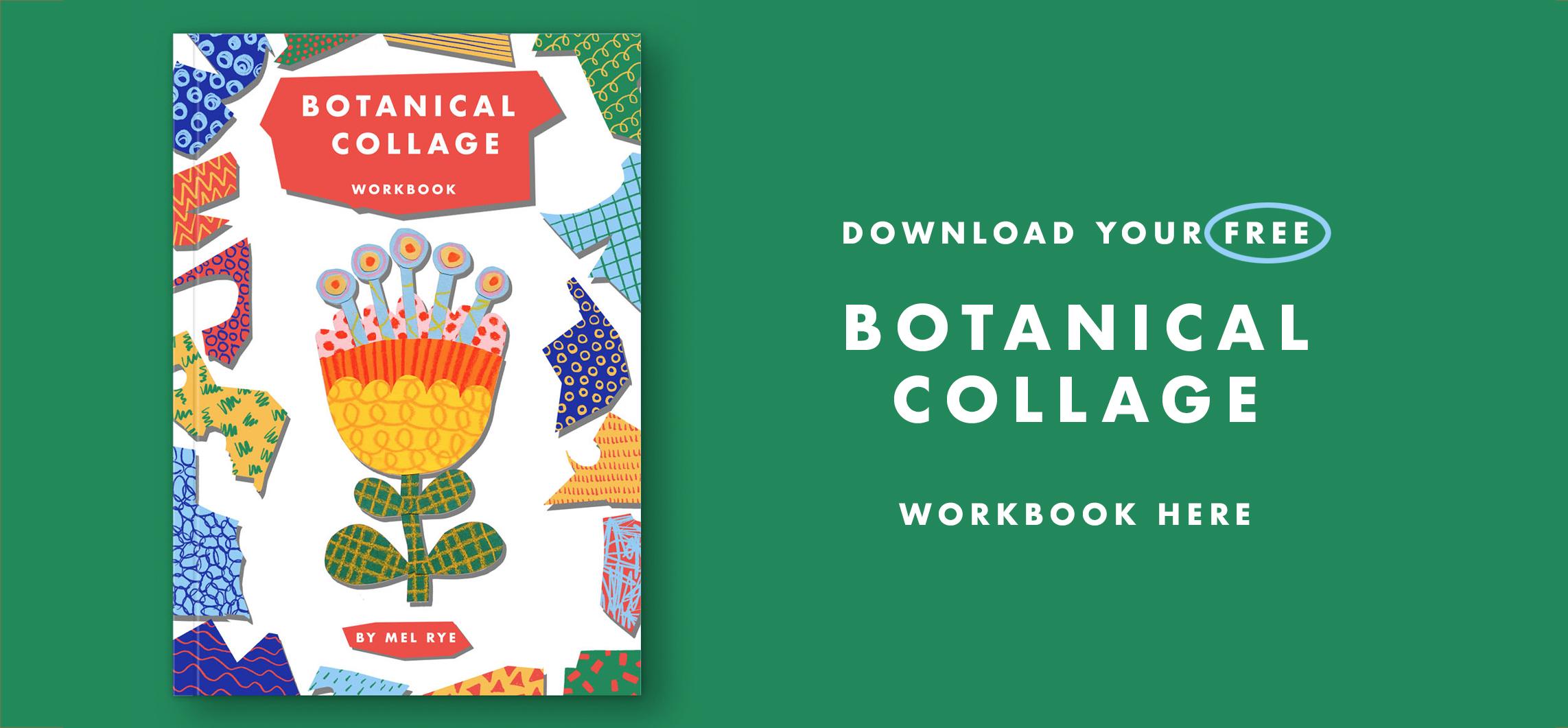
additional resources to support your college making, you're welcome to
visit my website and download my free botanical
college workbook. Finally, don't forget
to take a look around the project gallery at other students projects
to encourage others, and of course, to fill
your own creative well. You can really
make someone's day by leaving a positive
comment on their project. So don't miss that opportunity to spread a little bit of joy. Next, we'll go over the tools and materials you're
going to need, so see you in the next video.
3. Tools + Materials: The materials you're
going to need for this class are pretty
straightforward. You'll need a selection
of collar papers. Now, for me, color
is really important. So I like to work
with colored papers. If you're curious, the brand I like to use is called
Canford paper. They come in a range
of gorgeous colors, but any colored paper
you have will be great. If you don't have
any colored papers, you could use paint or ink or markers to get a colored
base to work on, or you might enjoy working
in black and white, which can be totally
awesome, too. In which case, just some
plain white paper will work. Remember, we are going
to be drawing marks and patterns onto the
collage paper later. So you're going to
be changing it up. You'll need some paper
for your background. This could be a color, or it could be plain white. It's totally
personal preference, and you may not really want
to decide that until later. That is the great
thing about collage. You can just change your
mind and be flexible, so there's no need to
decide that right away. You'll need a selection of art materials to
make marks with. Now, don't stress too
much about having enough. You can get a great
little piece from just having one pen or one
crayon to make marks with. But it can be a really
nice opportunity to try out different
materials you have that are maybe
ing at the back of your materials cupboard that you haven't
got to know yet. Just gather a bunch of different
materials together and we'll narrow it down when we take a look at color palettes. Of course, you are going to need some scissors to cut out
your collar shapes with, and you'll also need some glue. Any paper glue will be fine. I like to use a simple
glue stick just because I find it easy to work with without getting glue
where I don't want it. You'll also need a pencil, an erasor, and a few sheets of scrap paper just to help us out during the planning stage. All right, so now we have
our materials gathered. We can take a look
at some examples of botanical folk art to
help us get inspired. Join me in the next
video when you're ready.
4. Gathering Inspiration: So what is foc art and why are we using it to inspire
these collages? Focart is a loose umbrella term that describes
handcrafted objects, including painting, sculpture, furniture, basketry,
or utensils. And traditionally,
foc art was made by artists who were self taught or learned to trade through local communities rather
than being formally trained, which gives Focart its
distinctive stylized look. Styles vary hugely,
but in a nutshell, you might expect to
see bold colors, decorative designs, flattened perspective,
and strong forms. These are all visual
traits which lend themselves perfectly to
working with collage, which is why we are using
it as our inspiration. Put together a pinterest board full of examples you're
welcome to take a look at and use to help you create your own mood board if that is something
which you enjoy doing. But let's take a look at
a few specific examples together to see if we can
draw out a few design rules. One of the first things
you'll be struck by is that in most
but not all cases, focart botanicals
are symmetrical. Sometimes you'll notice that things aren't
perfectly symmetrical. There are often
little playful tweaks in the symmetry where things might be interrupted by a little asymmetrical detail, or the design itself may
be very symmetrical, but the hand crafted nature of it may show small
little differences. These are not machine
made images after all, and that is a big part of their charm and why
I love them so much. Next thing to note is that focart botanicals
are simplified. So we are not aiming for
realistic interpretations here. And this is also why they work
so beautifully in collage. Often, you may find a flower simplified all the way
down to just a circle. But even the more
complex forms are very much simplified symbols
of flowers and leaves. You'll spot a lot of simple geometric shapes
in focart botanicals. Look out for circles,
semicircles, tear drops, triangles, and
simplified leaf shapes. You'll often find
patterns in foc art. Sometimes these are simplified representations of the textures, like lines representing
the veins on a leaf or dots representing the seeds in a sunflower
head, for example, But you'll also
find a lot of what I'd call decorative
embellishments, like circles or dots which
accentuate the shapes, but don't necessarily represent something you'd actually
find on a real flower. One of the things I love
about folkar is the colors. You'll often find at least one very saturated color
in the palette. And often colors can be
quite unexpected, too. So leaves don't need
to be green and are often more unrealistic
colors like pink or blue, which just makes
them so much fun. Black and White also works beautifully in
Focart botanicals, and black and white paired with one really highly
saturated color can give you an
amazing result, too. In the next video,
we're going to use these visual characteristics to sketch a few ideas to
plan our collage. See there.
5. Sketching Ideas: Now we have a few ideas about what focart
botanicals look like. We can use this
information to do a few quick sketches
on some scrap paper. These sketches are going to
be very loose and rough. The joy of collage
is that it just kind of unfolds as
you start cutting, but it helps to have just a reasonable
idea of the kind of shape we're going to
make before we start, mainly so that we create the right size pieces of
textured paper to cut out. I find that it often helps
to start with a circle with a straight line a bit like a lollly pop and build
out from that shape, or not, if you want to
keep it super simple. So I'm just going
to grab something circular to draw around. Go to press quite
hard just so that it shows up okay
for you on camera, but these can be super rough
and sketchy and loose. Okay, so There's
a starting point. In the class resource, there are a few
composition references and sketching guides, which might be helpful to use as starting points
for your sketches. So don't forget to download that if you'd
find it helpful. One really simple way
to begin is just to use the circle shape and
add a few layers to it, which could contain
different colors and patterns to
add some interest. Something you often see with folks style flowers is what I
call a little crown on top. So some little sticks
with circles on the end, which represent, I guess, the stamen of a flower. Alternatively, we could approach the shape with a more
upward angle to the flower. Remember, these flower
shapes are highly simplified and used
flattened perspective, which is good because
we're going to need to cut out these
shapes with scissors, so we want to keep them
reasonably simple. This could either be
just with one shape or we could add a few layers of
different colors into it, which can create a really
gorgeous layered effect. The other flower style, which can be really
fun to work with is something more
simple like the way you might represent a doodle
of something like a daisy or sunflower
with curved petals. And again, this could have some more layers inside it
to make it more interesting. Some other variations on this, which can be really nice are a kind of seed pod
style botanicals. So that would feel
kind of like a circle or sphere with a
little crown on top. What works really
beautifully with this is to add some little embellishments into the center of the circle. Don't go too detailed though, because remember, each of these shapes we're going
to be cutting out. Keep it simple. There will be opportunity later
to add more detail. Another really nice variation is to cut your circle in half. You could either leave that as is for something really simple, or you may enjoy
adding more layers, maybe a scalloped edge
to look like petals, maybe some of those
little dots or some other way to add a
little stylized twist. You can be really playful here. Remember, these types of folktyle botanicals don't
need to look realistic. The other thing we
can experiment with is sketching some
different leaf shapes. These can go from looking
pretty leaf like right down to simplified tear
drop or circle shapes. You can be really playful
with Focart two and have a mix of different leaf
styles on one stem. Typically, you will find they
are symmetrically placed, but there are no rules here, so go with whatever
appeals to you. Something else it's fun to experiment with is the
angle of the leaves. They could be pointing
up a little or they could be going
straight out to the sides. This is exactly the
type of thing we can play with as we start
cutting out shapes. So don't worry about getting
your sketch perfect at this stage because everything
is flexible with collage. All you really need to know is roughly the type of flower
shape you're aiming for. All right, so now
it's your turn. Play around with a few sketches and try out some
different shapes. But remember, don't get
bogged down in details. Things will get tweaked and adjusted as we put the
collages together. So at this stage, we just want a rough sense of the shapes we're aiming for. Next up, we're going to be
picking our color palette. So make sure you have
your supplies to hand. Then join me in the next
video when you're ready.
6. Choosing A Color Palette: Okay, so the next task is to
choose our color palette. You may be, in some
ways limited in your color palette by the materials you have
available to you, or you might be
feeling completely overwhelmed by choice right now if you have a
lot of options. So here are some rules you can use to help you
pick your colors. Limit your color palette to
a maximum of five colors. Now, that includes
the materials you're drawing with and
the collarg papers. So if, for example, you have a blue paper and a blue marker or crayon or pencil or whatever that's
the same kind of color. That just counts as one color. Limiting your palette to
a maximum of five colors will just help keep
everything looking cohesive, and too many colors in your
palette can feel really overwhelming once we start combining everything
together with mark making. Rule of thumb in
your color palette is that there should
be some contrast. Now, the best way to
imagine contrast is if you took a black and white
photo of your colors. If they all at the
same shade of gray, then there isn't
enough contrast there. So you need at least one color, which has a pretty
deep tonal value paired with something lighter. For example, if I
was using this blue, then a color like this together with it is going to give me
some really nice contrast. Remember that black and white as a combination is awesome, and that can look really gorgeous with just
one vibrant color, or maybe two if you're
feeling fruity. There you have instant contrast, and I'll bet you have some
white paper and a black pen. Now, in terms of the materials you're going to
use to draw with, avoid anything which smudges, because it will be really frustrating to work with
when you come to start handling and cutting
out shapes because your gorgeous mark making will smudge and it will end up
where you don't want it. Don't worry about choosing the right colors for botanicals. Remember, folktyle botanicals
often use unusual colors, so you don't have to
have a green in there. Go with the colors
which feel fun and joyful and are just
pulling you in today. So let's have a look
at the colored papers that I've got to hand today. I haven't got a
massive selection, but quite a few
things to pick from. So I love working with this yellow. It's
my favorite color. If you've seen any of my
other online classes, you've probably seen me
use this color before. And that is definitely one
that I would like to use. So the yellow I'm actually really I know we don't need to have
a green in there, but I'm really feeling like this very kind of vibrant green is kind of pulling
me in today as well. It feels like really
nice and full of energy. So I think that is going
to be one of my colors. And it's also a nice
darker tonal value, so it's contrasting to
the yellow pretty well. So I don't need to worry
now about contrast. Also loving this blue. That's a really nice selection. I might just pick
one more color. I don't think I'm
going to have as many as five in my palette, but maybe four is enough. Think maybe something
on the warmer spectrum. I quite like this sort
of Cory. Let's see. Yeah, that's a really
nice selection, actually. All right, so I've
just pulled out these colored papers that
I want to work with. So I've got a selection of materials that I can
sort of put with them. I have recently been
exploring these little they are arena
neon color aqua crayons. They're not the kind of material that I often use for drawing, but I'm really
enjoying the kind of different marks and textures
that they're giving me. And there's not in my
usual way of drawing, there's not a lot that
I can use them for. So they're quite nice to use just for this kind
of mark making. And I've got a couple
of the colors here that will go with what I have. So which one is closer? I think that is almost
on the pink spectrum. So I'll call that one a pink. And I have a I've got a Posca marker that is a very close match
to that green. So I'll choose that maybe, and I've got some Yeah. I've got a couple of crayons
that I can use as well. If I want to add those in, there's a pale blue. So I've just pulled
out a stack of my materials that
I have that match the colored papers
that I have chosen. I might not use all
of these materials. This is actually quite
a lot to work from. But it's just good
to know that I have those to play with
if I want them. In the color palette
that I've chosen, I've got four colors, and this deep green is the one that's got a
much darker tonal value, so that's giving me
a nice contrast with the other colors that I've
chosen that are a bit lighter. All right, so now it's your
turn to review the materials you have available to you
and pick your color palette. Remember, you don't need to choose as many as five colors. Use that as a maximum. If you want to color
some white paper, pause the video and go
ahead and do that now, then join me in the next
video once you have your materials ready in
your chosen color palette. See there when you're ready.
7. Fun With Mark Making: Before we begin playing
with our materials, we need to have an idea
of the size we want our finished collage to be so that we make collage papers
which are big enough. This will depend
on three things. The amount of collage papers
you have to play with. Of course, less paper means you might need to make
your collage smaller, but if you have loads of
sheets, it could be bigger. You also need to consider how fiddly you want
the cutting out to be, because if you go
for a small collage, say something around this
size for your background, that is going to make
those shapes quite fiddly to cut out because
they'll be very, very small. So think about what feels most comfory for
you cutting wise. The other thing to
bear in mind is how you like to explore mark making. If you're someone who
likes to make really big, kind of sweeping lines
and patterns and marks, then you might want your
collage to be a bit bigger. So maybe something
around this size for your background would work
or maybe even larger. Whereas, if you're
like drawing in a really kind of
detailed, finer way, then scale your collage down to maybe something a bit
smaller like this. Going to be making
mine A five size, which is roughly six by 8 ". That's a pretty manageable
size to work with, for me, both in terms of the amount
of materials I have, the size of the shapes
I need to cut out, and also how I like to
play with materials. But pick a size to work
at, which suits you. So I've decided I'm
going to go for this sketch to base
my collage on, which is a bit
seed pod inspired. So I know my largest shape, which is the sort of
head of the seed pod. Is going to be a little smaller than half the size
of my collage. Now, that's really
helpful to know so that I can make the most of
my colored papers, so I can do a few different textures
on each sheet of paper. Because that's the largest
shape in the collage, that is going to be the kind of dominating color of that
particular collage. So I'm just going to pick the color which most
calls to me today, which I think is going to
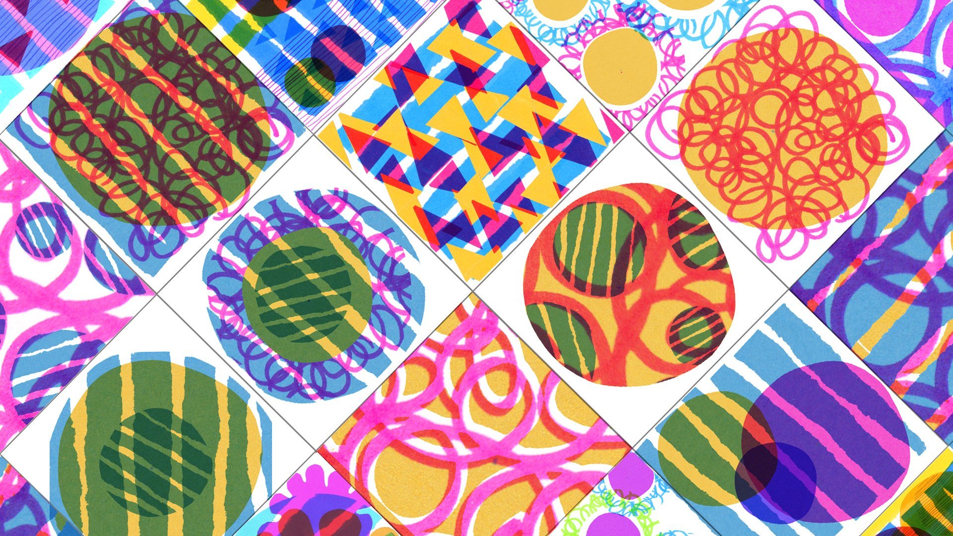
be this sort of Cory color. Now, in terms of the marks
you make on the papers, it can be really loose
and expressive like scribbles or something more
formal if that feels right. It's really just to add a little extra texture and
interest to the overall image. And it's also just quite
fun to play with materials. If you find yourself
getting stuck for what kind of marks
to make on your paper. There's a mark making references section in
the class resource, just to give you a few
ideas to get you going. Now I've created some marks
for my largest shape. I can create a few more
patterned areas on my collage papers to use for different parts
of my collage. Now, I don't know yet which
colors are going where, but I do know that I've
created the largest shape. So now I can create pieces around half that size for all the other bits
of my collage. So I'll explore some
different patterns and materials now just to
give me lots to play with. Something to bear in mind,
it's always a good idea to make your patterned areas
a bit bigger than you know you want them to be just
so that you have pattern going continuously all the way to the edge of your shapes. It's also a good idea to leave a few little blank spaces
on your collage paper because you may need
something quite specific later on once we
start putting them together, so always leave some blank
paper to play with later. I had a little bit of an ink. Not a catastrophe,
but you know how paint markers can sometimes
splat out lots of ink. This is the great thing
about working with collage. When things happen that
kind of seemingly go wrong, it doesn't matter because
we haven't used it yet. So I'm just using those
kind of big blobs of ink to kind of uses my material
to keep making some patterns. And you never know sometimes these things can end
up actually like, really happy accidents where you want to use
that for something. So there's no real problem
when things like that happen. Okay, that's probably enough
for now for that sheet. I'm gonna leave that and move on to some of my other colors. So, I've just created a load of different textures and patterns on each of my
different color papers with a mix of my
different materials, keeping everything within that color palette of four colors. So notice that I haven't filled the whole
paper on any of them. I probably will need to make some more textures
and patterns later, but I just want to see how
I get started with these, and then I'll add more later. So, now it's your turn. Fill your collage papers with marks and patterns and have fun. Don't forget to leave
a few spaces free as you might want to create
specific pieces later on. In the next video, we'll
start drawing with our scissors and cutting
out paper shapes. So join me there
when you're ready.
8. Cutting Out Shapes: Okay, now comes the fun part. I know that most
people really want to draw out a shape in pencil
and then cut it out. But please resist this urge. One of the super
fun things about collage is that you can
draw with your scissors, and the whole charm
of it is that you will end up with
shapes which are more expressive and organic
than you would achieve by meticulously
drawing out your shapes first. The other aspect of
drawing pencil shapes, which can be problematic is that we do not want
to be left with any pencil marks on your collage because it just
really spoils the effect. If this feels intimidating, then remind yourself that
nothing is permanent. This is the joy of collage. If we mess up, we can
just cut another one. Something else to
bear in mind is that as you begin
cutting your shapes, it's easy to make a shape
smaller and refine it that way, but you can't make it
bigger once it's cut. Start with a version
of your shape, which is a little bigger than you want the finished
thing to be, and then gradually trim it down until it's about
the size you want. Going to glue anything
down at this stage. So just start laying pieces down on your background paper, and also don't worry yet about
whether this will in fact be your background paper because we might change that later too. So, this seed pod is the design that I've
decided to use as my guide. Now, I intentionally
didn't create a color plan on my
sketch because I enjoy making the decisions about which papers to use where as
I go through the process. This bit is kind of
intuitive and playful, kind of like a fun puzzle. Once you've started combining your colors together
with mark making, you get these different
effects anyway, which you can't always predict
at the planning stage. So I generally find that even if I have planned
out my colors, I always change my
mind later anyway. So I'm going to start
with my biggest shape, and that is where I made this large area
of pattern for that. So I'm going to start by
roughly cutting it out. Have to be a bit careful
about my green ink there just because it might
still be a bit wet. So I'm really just
using the background to figure out roughly
the size and shape. So I'm going to just
try to create a sort of circular ish shape. And what might do is actually So I've just cut out my patterned areas very loosely just so that I can kind of use them
a bit like a palette. It's a bit easier to see
what I have like that. So I'm going to
now have a look at what is going to
go on top of this. Obviously, to get the contrast, it wouldn't work very well if I use the same colored
paper again, so I'm going to use
something different. So I quite like the
yellows. Let's see. Yeah. I think that's a bit
bigger than I wanted it, so I'll just make
it a bit smaller. That's what I mean
about start big. And then if you
just reduce size, then it's quite easily done, whereas making it bigger is
a bit more of a headache. So I quite like the
yellow one there. I wonder if I have enough
to do the same at the top. This is why it's good to have all this spare paper
because it's quit. I think I'd quite like to use the same pattern,
the top and bottom. Okay. I feel like there's
a shape missing now, so I'm just going to add on a little one. No,
I'm just testing. Am I going to use the same color for this bit that sticks
up or a different one? Hm. I quite like the blue. Maybe I'm going to replace
the top part with the blue. Let's try it and see. I can always change
my mind later. So I'll try cutting it all in one that shape and
see how that looks. H. So now that I've cut it, I feel like there's
not enough contrast between these two shapes. So actually, I think I want
to do it with the yellow, again, just so that it has a bit more contrast
against that pink. So I need to just make a
bit more of that pattern. So I'm just going to use that that was
the right shape and just cut around it because I know it's the shape that I want. Wasn't happy with the contrast,
so I'm going to use that. Yeah. That does look better. So let's have a
look at my sketch. Let's have a think about
these shapes in the middle. So I don't want to use yellow again because that would be a bit too much yellow, I think. I need to either use
the blue or green. Now that is quite a
good combination. That's a really nice strong
contrast against that. I'm going to give that
a go. I'm just going to cut these kind of
tear drop shapes out. Again, I'll start bigger than
I think they're going to be That's maybe about the
right size, actually. Okay, so reasonably
happy so far. Got some nice contrast
going on there. So I maybe want to add it like
to get some blue in there. But the blue is not contrasting
enough. With that part. So actually, maybe I'll do the stem and the leaves with blue, that might
be really nice. So you'll notice that the way that I'm creating the
collage and composing it. The proportions are not
quite the same as this. I think the seed
pod head is a bit bigger and the leaves and
stem are a bit shorter. I'm quite happy about that. When you do your sketch, it's really just to help you get a kind of a starting point. Doesn't need to look
exactly like it. Quite like the blue, the blue
stem, that's quite nice. So, I want to make
this yellow shape a little bit smaller, I think. I'm just going to cut a bit off. Because I'd quite like to have that layered effect
of more than one. Adds a little extra something. I'm also going to add some of these little circles in there. I feel like Let's try these little off cuts because they
only need to be tiny. Let's try some blue with yellow. So again, I'm making
them quite big. I might cut them down smaller in a little while just because it's easier to make them
smaller and bigger. Before you start
sticking things down, it's quite difficult
to get to refined. We'll start refining things after we start gluing as well. Yeah, I quite like
the blue there, and then for the two in between, I need something that
stands out a bit more. I'm wondering about
maybe another dark green that's got these dots on.
Yeah, quite like that. Okay. So these balls
that are either side, they're just sort
of, I don't know, little representations
of more flowers. I think I'd like to use more of the Corly color because it's
only there at the moment. And I might actually
use a bit of the coral in the leaves.
We'll see. We'll see. So I'm going to shorten this, I think to make the
leaves come off it. I'm going to use these
two colors together. I'm going to just give
that a little bit of a gentle curve so that it's
sort of following that. It's a bit too big
at the moment, but I'm going to just
cut it a bit smaller, refine it down and make
it a bit more leaf like. Okay, jazzy leaves. That's looking really nice. Now, I'm going to add these
little stick sticks on top. For me, right now, I feel as though I
need those to be dark green because
there's not enough dark green on here to
give us all the contrast. You'll notice I am
slightly running out of space on my college
paper background. It doesn't matter.
Remember, we haven't actually chosen the
backgrounds yet exactly, but it's just to help
us put them together, and I might cut things
down smaller as well. So sometimes I might
change my mind about a piece if it just
doesn't feel right, and this often comes
down to contrast again. If two pieces of
paper next to each other have the exact
same tonal value. They can just feel like
they're not quite working. That was the case when I tried that blue piece at the top. I'm trying to alternate the
amount of tonal value so that all the individual shapes I'm adding feel clear and defined. I'm not going to stick
anything down yet and I might actually cut the shapes down and refine
them a bit further. At this stage, we just want
to have all the pieces. Okay, now it's
your turn to begin cutting out your shapes
from your collage paper. In the next video, we'll assemble all our
pieces together, so join me there
when you're ready.
9. Putting The Pieces Together: Now we have our shapes cut out. There are a few
decisions we need to make before we stick
everything down. First, we'll make sure we're
happy with the position and arrangement of the shapes and secure a few bits with glue. Now, depending on the
shape of your flower, you may like to just
have a little play with adjusting the position
of a few little bits. Even very tiny adjustments
can make quite a big impact. Let's see what happens if I just move these
bits in the middle. There's not a lot
that I can play with the movement of
particularly on here. I can move these up and down. I can't really move
these that much. I can change the angle of these, but it's maybe just really
minor adjustments like if I just make the angle of those slightly more
upward pointing. Maybe slightly
further spaced out. Yeah, that makes a bit of
a difference, actually. If you have a stem and leaves, you might also like to play with the angle your leaves are at, and also whether they're all the same size or whether
there's some variation. Once you're happy with how
your shapes are arranged, we can begin to glue a
few pieces together. And my advice is
to start by gluing the smaller pieces down onto
the larger pieces first. Don't stick anything onto
the background just yet. So when you start gluing, make sure you apply
your glue on a bit of scrap paper well away
from your collage. It's a very obvious
thing to say, but it's so easy to
get over excited with this part of the process and
end up with glue everywhere. Believe me, I do it all the
time and then regret it. So once you've secured a few
of the smallest pieces down, we can decide whether
we want to keep this background paper or
switch it for something else. So you can stay with a simple white paper or you could decide to
use a colored paper, and this could even be a color which is not in your
color palette, actually. And sometimes choosing
something quite different often works pretty well to give the whole piece
a bit of contrast. Generally, I find that using
a very deep color with a dark tonal value work
quite well to make the vibrant colors that I
often work with really pop, but something very subtle can work beautifully if
that's more your style. The other thing
that you can decide is whether you want to stick with the same size of background or whether
you want to scale it up. So I often really
like to compose my collages on quite
a small background because I find it just limits the overwhelm that can come from a much larger background. But if I try perhaps just a
slightly larger background. It's quite nice
just to introduce a bit more space
around my collage. So I'm just going to try a few different colors
of paper that I have leftover just to see if there's a color that I prefer
over my white background. So I do really like this
very deep kind of royal blue that I've got in my
pile of colored papers. The one thing that I've
noticed though is that where I've got those dark
green little dots on the top, there's not quite
enough contrast and they're kind of getting
lost in the background. So what I might do
is actually just cut a few new little circles in I think the light blue
and switch those in. And I think that's
just going to make it pop a bit more against
the background. So I'm going to now stick the whole collage down very
carefully on this blue. So don't forget, plain white
can also be a great choice. Have a play with any
papers you have. And then once you've
decided on your background, glue everything down securely. Being careful, of course, not to get glue where
you don't want it. Okay, so now it's your turn. Arrange your paper shapes, decide on your background color, and then glue all
your pieces down. In the next video,
we'll take a look at some ways to add a few
little final touches, which can just add a
little extra sparkle. So join me in the next
video when you're ready.
10. Finishing Touches: Alright, so hopefully, we have a gorgeous looking
little collage now. There are a couple
of things that you can do at this stage
if you want to, just to add a little
extra sparkle, but it's totally optional. If you've made something
and you're like, Ah, no, dot want to touch it,
then by all means, it could be completely finished. Now, one thing
which can be really nice to add is a
little more pattern or mark making on top of our collage pieces to accentuate
the shapes or textures. For example, parallel lines
are something I often add on leaves to give
the feel of the texture, and that often works
well on petals too, just to make them
feel more connected to the botanical
element we're creating. You'll need to make sure
that if you want to do that, you're using a material
which will stand out against the color and
texture you have underneath. But this can also be a great
solution for increasing the tonal value in an area if you feel it's
lacking in contrast. Something which can
work really nicely if it appeals to you is to use the color of your
background paper to add some additional
textures or patterns. If you've opted for something with quite a dark tonal value, such as this dark blue
that I've picked, or maybe you've picked a
dark green or even a black. If you're working
on white, though, I would recommend that you stick with your initial color palette and just find a sufficiently contrasting color
from within that. So in my example, I have got a posca pen that is about the same
color as my background. So I'm just going to test it on my scrap
paper just because they do have a tendency to blob out ink sometimes
when you start using them. So I don't want to
add too much on here, but something from my sketch, as I was doing it, which I
haven't really got on here, is these kind of fanned lines
on the top and bottom here, which I thought might
be quite nice to add. And there's enough contrast with what's underneath
for me to do that. So I just thought I would
add a few little lines. I've already kind of got the
line textures on my leaves. So I don't really feel as
though I need those there. So, the other thing
I've found for me, there's a bit of a
lack of contrast in these circles in the middle. So I'm actually going
to add going to draw on top this sort of deep blue to
do a smaller circle there. I think it's just going to
help to accentuate that shape. So it's a great little
technique to use if you just need
to I don't know, boost some contrast in an area. I feel as though I've got the
same thing happening here. So I'm going to just add
some more dots, I think. So I think I'm just going to add just a little line up the center of the leaf
here like a vein. Don't feel the need
to add lots of linear textures just because I already have them on there, but feel like it would just be nice to introduce a
bit of blue there. And fact, these little
balls on the side. I think I'm just going to add a little bit more texture there. They've got the pink on them. So nice kind of
circular textures, but it's quite low in contrast. So I just feel as though
adding a tiny bit more. I'm just going to make
it look really finished. So another thing which can be nice to add at this stage is any additional foci
style patterns to embellish your
collage further, and you could do this
either by drawing or by cutting out a few
tinier paper shapes. It's much easier to do
this at this stage. Once the min collage
is stuck down, just because it can all be very fiddly when everything
is moving about. Examples of what I often
add on our tiny circles, and sometimes I'll
use something a bit jazzy like a gold
paper or gold pen for these little
embellishments because it just adds a little extra
flourish to the whole thing, and I'm also a bit of a
sucker for metallics too. It may be that you feel there's a particular color you need to add in a part of your collage
to make it feel balanced. And this is why collage
is so brilliant. You can try that
out, lay a shape on your collage to
see if you like it before committing to
it by gluing it down. So have a play around with any final little embellishments
you may like to add. You can revisit your
initial planning sketch to try out some ideas if
you find that helpful. Now it's your turn.
Take a look at your collage and
determine if there are any areas you'd like to
embellish further with more drawing or
smaller paper shapes, or if you just want to increase the contrast in some areas
to make them pop a bit more. In the next video, I'll talk you through a few ideas
for next steps. You may want to explore. If this is a technique you'd
like to delve into further. So join me there
when you're ready.
11. Next Steps: Alright, so we've got this
gorgeous little collage, but where can we go from here? The first thing I
would encourage you to do before you tidy your desk is to keep any little shapes and pieces of paper which are
large enough to be useful. The reason for this
is that sometimes, particularly if you want to use this process as a way to
work through creative block, or you just want to develop
a regular creative habit. Having a few shapes which already exist can
just break down the resistance which
can be present in that first step towards
creating something. Finding a little
shape which might inspire another and
then another can really just give us
that head start we sometimes need when we're
stuck in a creative rut. Find a little envelope or folder to keep your off cuts in. This really can be
such a valuable place to start making from, particularly when we're
feeling not entirely inspired. Another thing I would
encourage you to try if this is a
process you enjoyed and you'd like to develop it further is to create
more collages. They work really beautifully
in little series. Try keeping your color palette the same across a series to keep that coherence and
avoid getting overwhelmed. Revisit your sketches we did at the beginning
of the class, maybe add to them and
make a few more pieces. Pretty soon, it will
start to become like second nature to make these
little botanical artworks. And really, the
possibilities for the different collages you can make are absolutely endless. Another direction you
might enjoy taking this in is to develop a collage
into a still life. Adding a vase to
hold your flower, a few more blooms, and maybe a texture to suggest a surface and another to
represent a background, and suddenly you have an
awesome still life collage. If you go down this route, I'd suggest either scaling up your collage size so that the cutting out doesn't
become too fiddly, or you may need to simplify your botanical elements to
make them more manageable. Another suggestion for an
awesome way to develop this class project would be to explore some different
subject matter. Botanicals are awesome, but
why not try some abstracts, portraits, animals, shoes, food, or anything else
which inspires you. This process can be applied to literally any subject you'd
like to make a collage from. So go, play, explore,
and have fun.
12. Thank You: T hank you so much
for joining me today. I hope you've had fun and made something gorgeous that
you feel proud of. This is a great little
technique to come back to when you're feeling stuck
or overwhelmed creatively, when you want to come
up with new ideas and different ways of
interpreting shapes, colors, or textures, or just when you need a bit
of creative playtime. I can't wait to see
what you've created. Please remember to post a class project if you feel
comforty sharing your work, and let's also support
each other by liking and commenting on those other student projects in
the gallery, too. If you'd like to share
your work on social media, you can find me on Instagram
with the handle at Mal Rye. So please tag me and use the hashtag modern folk collage so that I can see
your gorgeous work. If you enjoyed the class, I would be really grateful if you would consider
leaving a review. This is so helpful, both for me as a teacher, but also for other students who may be considering
taking the class. If you'd like to find out a
bit more about me, my work, and other courses I teach, then the best place to do that
is on my, which is at MK. And if you'd like
to stay in touch, then I'd love for you
to join Mel Mail, my quarterly newsletter, which you can sign up
for on my website. Thank you so much
for joining me. I hope you had fun today, and I hope I'll get to see
you again soon. Bye for now.
 Mel Rye, ✎ Artist + Educator