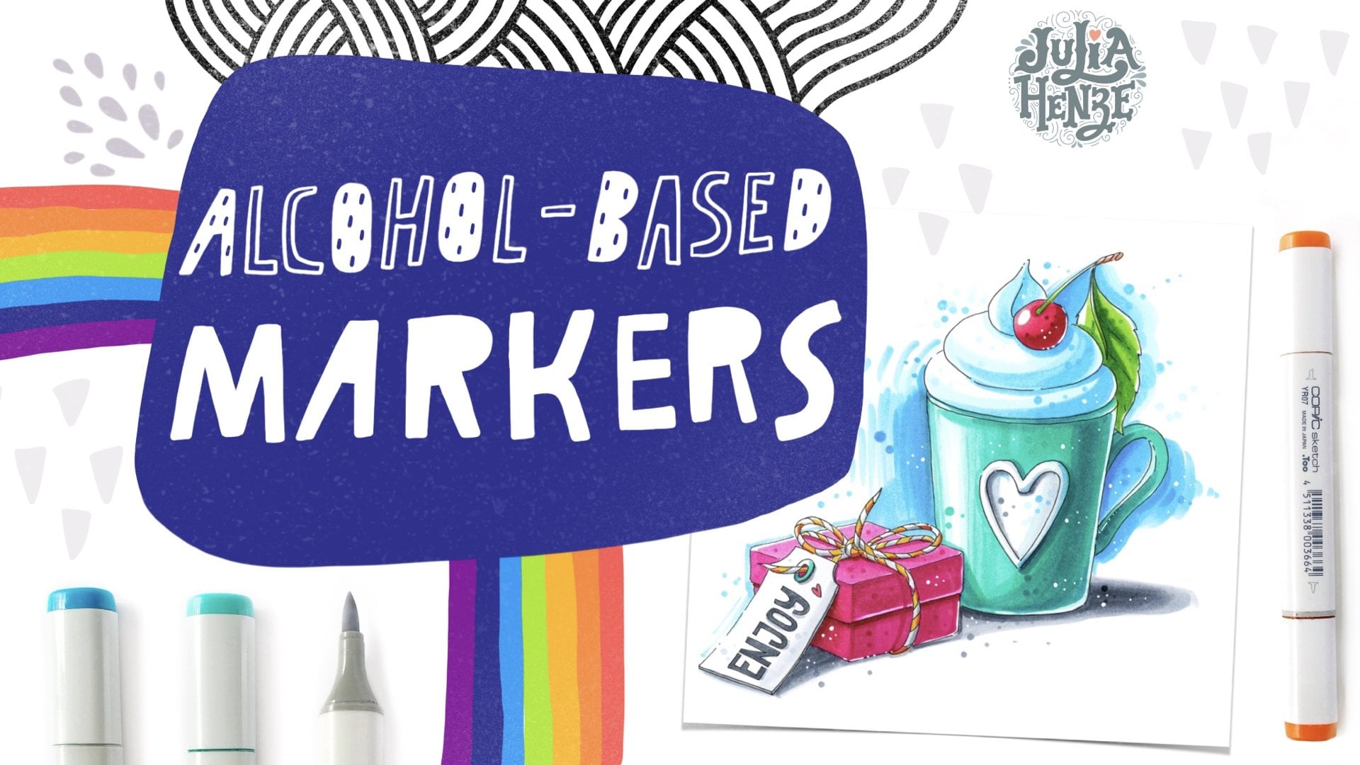
Transcripts
1. Let's Start!: [MUSIC] Hi, everyone, and welcome to this class. I'm Julia Henze, an artist and the top teacher
in your Skillshare. This class consists of five
step-by-step tutorials on sketching different kinds of fruit with
alcohol-based markers. In each part, you will not only draw different
fruits or berries, but also learn something
new about marker sketching techniques
and drawing in general. You will develop your smooth sketching
style along the way. We will start with the easiest
drawing, the kiwi fruit. I will show you how to make a pencil sketch and refine
it with a fine liner. I will take you through
the step-by-step process of coloring
with markers. In the following videos, we will draw a branch with
oranges, blueberries, and cherries, and we will finish with the color
for strawberry branch. By the end of this class, you will have much
more confidence in creating colorful
marker sketches. This is an excellent class for those who are already
familiar with alcohol-based
markers and want to take their skills
to the next level. If you're new to
alcohol-based markers, please watch my first
Skillshare on markers. Markers one-on-one,
the basics and step-by-step sketching
before you do this class. In that class, you
will learn all you need to know to start
out those markers, how to choose markers, and how to create your
first collection. Also, how to select
suitable paper, a colorless blender,
fine liners, white pens, and how to do the basic strokes, apply coloring techniques,
texturing, and shadowing. I'll be delighted
to see your work in progress and your
finished sketches in the project gallery. Also, if you want to
draw other fruits, berries or vegetables, don't
hesitate to share them too. I look forward to seeing
all your art works. Are you ready for a new
drawings adventurer? [LAUGHTER] Let's
get started then. [MUSIC]
2. Tools and Materials: [NOISE] Let me show you what we're going
to use in this class. First, we need a pencil and a soft eraser for the
preliminary sketch. Then we will obviously need
some alcohol-based markers. I often get questions
about markers. Do I really need
expensive Copics or can we use other brands? The answer is, of course you can. There's definitely certain
quality difference between brands, but all alcohol-based
markers are blendable, which we need for this class. I'm going to use my
favorite pro markers and pro markers brush
from Winsor & Newton. Their regular pro markers
has this bullet nip on one side and a chisel
nip on the other side. Pro marker brush also has a chisel nib and a brush
on the other side. There is no
particular reason for me to use one or another type. I just happen to
have some colors in the pro marker version and others in the pro marker brush, especially in the beginning, it's a bit easier to
blend with a brush nib, but they're actually both great for not too
smooth sketch blending. At the beginning of every
video of this class, I have to mention
what colors I'm going to use in that video. But don't feel overwhelmed if you don't have
exactly the same colors, or if you use a different brand, just try to choose the most suitable colors
from what you already have. As for paper, I'd like
to stress the importance of having the right paper
for drawing with markers. I'll be using this Winsor &
Newton extra smooth paper. Of course, you can draw
on any paper you have, but if you want to achieve
more or less smooth blending, the paper should
be pretty smooth. Another paper that
I also use for my marker drawings is this special bleed
proof marker paper, it's quite thin but
very good for blending. This is Winsor & Newton's new special marker
paper heavyweight, which is also great
for blending, but I got it after
finishing all my videos, so I had no chance to
use it in this class. The last of my
favorites is maybe a little bit less suitable
for very smooth blendings, but its heavy weight, double-sided, and absolutely
great for sketching. I also happen to have a sketchbook with
this paper inside. It's absolutely
awesome to have it in a sketchbook because you can draw on both
sides of this paper, which is not possible with all previous papers
I have shown you. However, when you
draw in sheets, it's not necessary
and maybe even useless to have
double-sided paper, but I just wanted to
show you that it exists. Further, I'm going to
use the fine liners, a thin one, this is Winsor
& Newton fine liner, 0.1 millimeter, and a
thicker one, 1.5 millimeter. The last one is
actually optional. I like to have some
contrast in my sketches. If you prefer only thin lines, you don't need a thicker liner. My last tool is a white pen
or marker, also optional. No worries if you don't have it. I just like to add this both to my sketches to make them
look a little bit shinier. That's it for materials,
let's start drawing.
3. Sketching Kiwi Fruits: In this first part
we will draw kiwis. This will be the easiest
drawing in this class. It's always nice to
start with something easy and build obvious
skill along the way. The last drawing with the strawberry will be
the most difficult one, but if you draw all
the fruits with me, this strawberry won't
be a problem at all. Here are the colors I'm
going to use in this video. I start my drawing with a
pretty simple pencil sketch. I draw the left root first, it's a hollow of kiwi, so we can see the upper
part which sits here. It will be an ellipse in
our drawing, a bit skewed, and the fairy branch
part is a half circle. Another ellipse more around is the kiwi in the background. Here we have the white core, also an ellipse, but much smaller and here is that small
thing from the flower, I guess also an
important detail. Now, when the pencil
sketches done, we can move on to the
refining with a fine liner. I use my smallest prime liner, a one point millimeter, and just refine all the
lines I have already drawn. I know it's difficult
sometimes to draw a nice clear line at once. It's a matter of practice, but there is also a
trick that can help you create a good
line. Let me show you. You can do it in
one smooth movement or you can draw a
part of the line, stop and then go further
with the next part. The small the gaps
between the parts, the smooth that looks. But if you do it is in this
example, this is also great. Here is what you shouldn't do. Don't draw too many short lines and let them cross each other. I think it looks a bit untidy, especially in combination
with markers. Let's continue. I remove the pencil
lines very carefully with the soft erases so I
don't damage the paper. Before we start
drawing with markers, I want to show you
what I'm going to do with the chateaus in
this picture and why. It's an imaginary scene, so we don't have any light
and shadow reference. Without light and shadows, our sketch will look
flat and boring, so we need to make something up. I place an imaginary
light source on the left. That means that the
green part of the kiwi, and this place here will be the lightest and the other side
will be in the shadow. The farther from the
light source, the darker. Then we have a cast shadow here. I draw an elliptical shape here, another one here, and then connect them to one big shadow
from both berries. Of course, you can make it
a bit smaller if you like. Let's start coloring. I draw the lightest middle part first with my lightest marker. Just make an ellipse here. The green part of the kiwi
has that uneven structure, so we can apply a
flicking technique here. Press the marker a bit
against the paper and then do this flicking movement so that marker barely
touches the paper tent. Now we can apply to
the actual drawing. I use my lightest green now. I leave a highlight closer to
our imaginary light source and add the darker green. It's my second light green, closer to the middle, with the same flicking
technique but shorter strokes. Add just one stroke here to make it a bit more interesting, and blend slightly with
my lightest marker. Add some seats with my darkest brown special
for the seats, just some dots here and there. If you close to each
other and a view farther apart so it
doesn't look boring. Now, I grab my lightest brown. I use the chisel nib because
it covers more area, leave some whitespace between the color and the line
to make it livelier. Use a small part
of the chisel to go along the line and
continue coloring. I'm not worried about
the color being an even now because
we will create more layers and because the kiwi skin is not
really even either. Next, I apply darker brown, it's important to make this
hollow ground movement here to keep the round
shape of the shadow. Now, I get back to the first
brown marker and blend them. This is my third brown mark darker than
the previous ones. The same hollow frond movement. I use a bullet nip here so I don't mess up
with the contour. Also here, I leave some space between the
color and the line. It makes the drawing
lighter and livelier. Now we can add some
texture to the kiwi skin. With the mid tone, I put
the dots here and there. The previous layer
is already dry, so the same marker
appears much darker. I mean, use the same color
as the previous layer on the particular and start where darker dots closer
to the darker part. I also make the kiwi dark with the darkest of
these three markers. The other half is
not in the light, so I don't use the lightest
marker here at all and start to draw
with my second brown, the mid-tone, go carefully along the contour line and just
color the whole thing. Now, I can add the shadow with the darkest marker with the same hologram
movement as I did before. A bit darker here. I also want to make the
other shadow darker. Every time I apply new
layer to a dry one, the color gets slightly darker. That's a great
feature of markers because this way we
can create lovely, smooth, and dark shadows. I blend the darker color with the light one
here and there, but not too much because I don't want
to have it too smooth. I also darken the
shadows a little bit. Add more texture. For the shadows, I use grayish purple. If you don't have such a color, you can use the gray
markers instead, one lighter and one darker. I start with the lightest and draw the shape of
the shadow first. I don't worry too
much about the shape, it's not a real shadow, we're only needed to make our sketch look more
or less realistic. Next, I add a darker color
closer to the berries. Blend the colors together with the lightest
of the two markers. I like it a bit darker. Now that the colors are dry, we can add even more
darker dots and shadows. Multiple layers create
this beautiful texture on the kiwi skin. For perfectionists among us, we can go on and on
with making shadows darker and textures
more amazing. We're actually done
with our drawing. The next few steps are extra. I add some more texture with my second thicker fine
liner, 0.5 millimeter. It's darker than
my darkest brown, not really necessary,
but fun to do. This is only for
the brave people. Don't do this now if you're afraid of ruining your sketch, but you can definitely practice with it on
some draft paper. I just draw the contour
again over the first line. Now it looks a bit more solid. One tip. It's much easier to do it when you
rotate your paper. If you thought we
had enough texture, we can still add some
more with a white marker. I put them quite
randomly here and there and make some slightly
bigger than others. That's all for kiwis. I hope you enjoyed this video and can't wait to move on to the next one where we will draw a beautiful
branch with oranges.
4. Oranges Branch | PART 1: In this part, we will draw a branch with three oranges and some
leaves around them. These are the colors
I'm going to use. We will need some
orange and brown tones for the oranges and the branch, a few greens for the leaves, and a yellow and two
paints for the flower. I start with a
pencil sketch again. I don't have a reference, so I try to create a nice
composition by spreading the three oranges
and adding a flower, some leaves around and
between them, and the branch. We don't see the part of the branch behind the
oranges and the leaves, so it's very important that
we don't just draw its ends, but imagine a line extending
from top to bottom. The orange leaves have
an elongated shape pointed at the tip. I make them even bit smaller
than there are in reality, just because I like
the shape more and it's still recognizable. I'm still trying to find
a good composition, so I want to see what happens if I move the oranges
just a little bit down. It looks pretty good, I think. I now have some more
space for the leaves. I also draw a few leaves behind the oranges to create a
three-dimensional look. I have some leaves
in the foreground and some in the background. Add some more curves
to the branch and a dot for the flower stalk. The pencil sketch
looks down now. I don't really want
to draw everything in detail and draw once
again with a fine liner. I prefer to have
the main lines and leave some space for spontaneous sketching
with a fine liner. But if you are a bit unsure
about your drawing skill, it's absolutely okay to draw out every leaf and all
the other details. Just keep in mind that a sketch shouldn't
be too detailed. I use the same thin fine
liner, 0.1 millimeter first. Here, I want to
show a different, more sketchy way of drawing than we use for the kiwi sketch. Try relaxing your
wrist for this part so that the movement doesn't
come from your wrist, but from your whole arm. It's not smooth but
more like a short line, pause and a short line again. There is a double
line in the middle. Practice it on some
draft paper first, if you've never done one before. This way, we can vary
the thickness of the line and make
it much livelier. Now, we just draw
with fine liner using the pencil lines
we already have, and adding more details. I draw the leaf nerves with
a very little pressure. Now let's take a look at how
we will color our sketch. I choose a light source
on the right again. To be consistent I will do it in all the following videos. We already know how to
draw a round shape. There is a highlight here. It gets darker further
from the light source, and here is the darker sport. It's a bit more
complicated with the leaf. Here the side closest
to the light source is light and the
other side is dark. But also every section of the leaf has a lighter
and darker part, light closer to the light source and dark farther from it. If we draw it in this way, we get a lively and
more engaging picture. There will be, of course, even more shadows form
other leaves, for instance. But for now, it's just important that you understand
what I'm going to do. Also the branch rob
light on the left on the side of the light
source and dark on the right. Now, let's start coloring. I begin with a flower. Color the stamen with a yellow marker and
petals with light pink. Now I add the darker
pink to the lower part, and spread it with
a lighter marker, and repeat it to make it
a little bit brighter. For the oranges,
I draw some dots with my lightest
orange marker first. I try to vary the
pressure levels so that the dots looks
slightly different. It gives some texture
to the orange. Then I go over to
more even coloring, but not too much. It still should
have some texture. Now, I take my second light orange and
keep drawing with dots. Here I can use the chisel nib to speed up the
process a little bit, take even darker color and so we create the
roundness in the orange. Add an even darker color, still with points, darker closer to the leaves
because of the shadow. Here we can color more
evenly because it's very dark in this part and we don't really see the textures anymore. By the way, we always can add them at the end
with a white marker. Oops, I see that I forgot to draw a part of the orange
behind the leaves. Draw with a pencil first, and then with a
thin, fine liner. This part is darker because
it's behind the leaves. I use a darker orange and leave a small white stroke
as a highlight. Maybe it makes sense to
darken it even more. Yes, it's much better now. Add some more texture
with the darkest of my oranges which is
actually dark brown.
5. Oranges Branch | PART 2: Now, I do exactly the same
with the other two oranges. This one is bigger, so I use a chisel
nib more often, otherwise it will take
ages to color it. Of course, we have this dark shadow from the
leaves of the right side, the opposite side from
our light source. I use the darker color
along the leaf shape, and blend it with a lighter
color but not the lightest, and dark dots everywhere
for the texture , the flower stalk. Repeat the whole process again. Here, we also have this dark
shadow from the leaves. As you can see, I never
start drawing shadows first, instead, I build up my color from the
lightest to the darkest. This way, I have a lot of
control over my sketch, and can usually fix my mistakes
easily if I make them. It also looks more accurate, because I have already
practiced this line a few times with
my lightest color. The next step is
coloring leaves. Again, I start with
the lightest marker, but now I color it more evenly, no dots this time. Instead, we will try to get
a smooth look by blending. I take one shade darker green, draw along the lines, and blend it with the
first light marker. The other side of the
leaf is in the shadow, so I use my darker green here, then apply an even
darker shade to the darkest spot and
just a little to the lighter part and blend
it with the lighter green. You can already see beautiful
shape it starts to get. This is the way I will
color all the leaves, the only thing that will change sometimes is the tone
and the detailing. This leaf is in the background, which means it's way darker
in its totality than the ones in the foreground
and we see fewer details. I will make the
shadow darker later, but I will not draw
the numerous in detail as I did in
the previous leaf. We also can make the
other leaves more or less detailed to make
the whole sketch look very playful and cool, or even leave some uncolored
areas here and there, or even all leaves. I keep coloring all the
leaves in the same manner, light on the left, and dark on the right. Don't forget to make
the shadows dark. Here you can see how
this door color puts one leaf in the background and the other in the foreground. The dark green behind the flower also creates
such distinction. We unstick the flower
from the leaves, the light flower comes forward and the dark leaves go back. The next thing I want
to color is the branch, also dark on the right and
lighter on the left, plus, I leave a small stroke
color to create a highlight as I did
in the other places. Add an even darker shadow on the right with my darkest brown and a few darker dots in there. As I've already said, the ink appears darker when the previous layer
gets completely dry. A little bit more darkness in the shadow will create
a stronger look. Now, we're almost
done with our sketch. Let's add some shininess
to it with a white marker. Again, different sizes of dots. I'll just draw
some of them a bit bigger and let the other small. Make sure you apply them in the darkest areas
to make them look clear and stop at
the right moment because too many of those
will just look weird. Here we can add a highlight
and a few more dots. The last step is adding the counter line with
a thicker fine liner. As I already said,
it's easier to draw some lines by
rotating the paper. There is no room where I
make the lines thicker. It's more like a feeling, but usually, it's
on the shadow side. That's all for the orange. I hope you enjoy drawing it. Let's move on to blueberries.
6. Blueberries | PART 1: Welcome back. Now we're going to draw one of my favorite berries,
the blueberries. The beautiful thing about this berries is
that as they ripen, they change the color from
green to magenta and to blue. Sometimes we see all these
colors on the same branch. You can color all the berries
the same color if you want. But I'm going to give them
different colors because it's really good practice for anyone who wants to
learn this technique. For each berry,
you need to choose a light and a dark tone. Each time you will
discover that blending these tones will be
slightly different. Some colors will
blend perfectly. Others, not so much, but it's not blending
competition, so don't worry about that. Just explore your markers and
their blending properties. Here are the colors
I'm going to use. Two blues for light
blue blueberries, two for blue blueberries. Magenta and dark purple
for a magenta blueberry. Light and dark purple for a
purple berry and four greens. Three for green berry and
all the four for the leaves. Let's start with
our pencil sketch. First, I determine
the composition. Even if I have already
made the sketch before and thought
out the composition, I don't just copy it. I look very carefully at the
direction of the leaves, the distance between the
objects and the general look. It's essential to
do this in order to improve your drawing and
your drawing skills. Notice the shape of the leaves. They are wider and a
little bit rounder now, and the berries have a
kind of flower shaped top. Sometimes it's pretty tricky to understand how the lines go. But this is the beauty
of the pencil sketch. We don't need to be afraid
that it will turn out wrong. We can always erase the wrong lines and
draw the right ones. But again, try to look
carefully at what we are doing. Does it look good? Great. Doesn't it
work right yet? Just erase it and draw again. No big deal. Now that the sketch is done, let's move on to the fine liner. The thin one first. Again, with a very
relaxed wrist. Let's shake all the
tension off and draw the same way as we did before. Remember that if you can draw
along line in one goal yet, do it in a few steps, as I showed you in the first
video with a cutie foods. Now we can get rid of
all the pencil lines and go over to the most
fun part, the coloring. Have already color it
round shapes twice, so this must be as
easy as apple pie. I want to color the
blueberries on the right. First, I start with my
lightest blue again. Now, I want to show you what
we're going to do first, wherever you so that you understand where the
shadows will be. Because we have
this small flow in year with a beautiful
English name, calyx. As always, the light source
will be on the left, the shadows on the right. Here will be a shadow
from the calyx tool. The calyx itself is here
in the light spots, so there will be a
highlight on it and a shadow inside it to show the small deepening
in the middle. First, I call it the light
sport with my lightest bloom. Then I grew up my middle light bloom and
color the other side. Blended with the lightest color. I think we have a
pretty smooth surface. Now, let's add the
darker shadow. Don't forget to leave a white stroke here
under the shadow. Then I call it the shadow inside the contracts
with the same column, the left, and I do the
rest with mid light blue. Further, I had a dog deep
shadow with my darkest marker. Now, we just do the same
with the other blueberry. The only difference is
that the calyx is not the lightest here but we
do the same steps. We start with the
lightest color. At this second light. Blend with the lightest add darkest. Blend with the midtone again. There will be a shadow
instead of the calyx again, dark on the left because this part gets the
least amount of light. The dark blue is
already dry here so I can make it a bit
darker with a new layer. The barrier on the bottom
right will also be blue, but a little lighter. I use the same colors, but more of the light blue
and less of the dark. There will be dark shadow
from the living room. The calyx will be darker here
and lighter at the bottom.
7. Blueberries | PART 2: Maybe I made this berry
a little bit too dark, they look all the same now. I can make the berries
on the right darker, but I actually like
them this way. I think you understand
the idea and can make your own berries darker as
in my toy layout sketch. Just repeat what
we did before and the second layer
will be way darker. Now, I want to call
it the green bearing. I start with the lightest color. Color it entirely this time to make a gradient a bit softer. Then add the second light green, blend it with the lightest. The third one, not
the darkest here. Blend again. Now we do exactly the
same with the red, purple or magenta berry. Magenta for the light side and dark purple
with the shadows. For the purple berry, I use a light purple for the light side and dark
variable for the shadows. Let's color the leaves. Here again, the same idea
as I've showed you before. The right part of each
leaf is in the light, and the left side
is a bit more in the shadow and the same
goes for the leaf sections. The left side will be
lighter than the right side. Again, I start with the lightest green at the second light. Blend it a bit with the
lightest. At the third. Blend with the second. Add the darkest, and blend with the third. Of course, you do not use
this scheme every time. Sometimes I might skip
a step because it's a sketch and edge shouldn't
be perfectly smooth. I love making some
parts pretty small, others more rough
or even uncolored. We have already done it in the orange part and so that it creates a
lovely sketch look. Here it's very important to separate the green
berry from the leaf, by adding a darker
tone around it. Here we have a shadow side, so it helps us to do this. Look at how it comes
from it right away. It looks like magic, but it's actually so simple. The shadows under the berries are even darker than
the other shadow, so I apply a few layers with
the darkest marker there, and keep coloring
all the other leaves in the same manner, creating shadows on the
every berry and making leaves in the background darker than those in the foreground. I want to make the
blueberries on the left just slightly darker though on the shadow side to
give them some more volume. Now, the difference
with a berry on the right is also a
little bit bigger, and also make other
shadows a bit darker. Again, for the volume. I don't color over
the lightest parts so there will be a
round highlight. I think we have
enough color here, so let's add some
shininess to all berries with the white marker
on the darkest parts. I highlight here, and some dots here and there again. Optional again, I want to add
the thicker contour line, mainly on the shadow side. Now our blueberry
sketch is done, I'm so curious about what colors you have
chosen for your berries. Don't hesitate to share your sketches in the
project gallery. I'll be glad to see
all your creations. Now, let's move on to the
next part where we will draw a cherry branch that
will be truly amazing.
8. Cherry Branch | PART 1: Welcome back. In the previous videos, we have already learned how to draw three different fruits; cherries, oranges
and blueberries. In this part, I
will show you how to sketch a beautiful
cherry branch. Here are the colors I'm going
to use for this sketch. Three red tones for the berries, four greens for the leaves and two brown tones
for the branch. If you're ready, let's begin. As always, I start with a pencil sketch and
for drawing cherries, it's especially
important that we make them elegant by drawing smooth and graceful
lines and letting the leaves and berries
flow together beautifully. I choose the diagonal
composition because it creates some tension in this sketch and makes it
look more attractive. The leaves are wrapping
around the branch. I use curved lines
for their stems and all the other details to make
them elegant and lovely. I draw the cherries in bunches. Some of them will be
in the foreground, and some others in
the background. When we add color to them, it will create a
great sense of depth and make the sketch look
more realistic and engaging. The sketch is much more complicated than
the previous ones. This time I draw the
details more precisely, determine the shape
and the width of the stems at the point of
teeth where I want them to be. The details on the branch and even the lines
on the leaves. I won't get confused
[inaudible] with a fine liner. The pencil sketch's done. Let's refine it as always
with our thinnest fine liner. Here it's also very
important that you keep the stems thin and
everything curving. Again relax always
before you start and just go over the lines
we have already drawn. The fine line sketch
looks pretty good to me. Now, we can go over to the most fun part,
coloring with markers. Actually, we use
the same technique as in the previous parts, but here we have to deal with
other kinds of fruit skin. The [inaudible] and oranges
have texture skins. The skin of [inaudible]
is smoother, but also [inaudible] Cherries, as you probably know, have very, very
smooth and shiny skin that reflects the surroundings and create highlights
here and there. Let's see what we are
going to do with them. Here is our cherry. The light comes from
the top-left corner, so most highlights
will be on the left. You can draw them as a circle, but I prefer a
more sketchy look, kind of smaller rectangles. Also, cherries often have reflected highlights
on the opposite side, the bottom right, and
sometimes around the stem. Let's draw them too. But for the rest, everything will be the same. Lighter colors on the
side of the light source, darker on the opposite side. You can draw them very
lightly with the pencil first to make sure you
don't forget them. I start with my
lightest marker on the left side and color
around the highlights. No worries, if we
forget some of them, later we can get them back
with the white marker. Then apply the mid-light red and blend it with the lightest. Notice the shape of the shadow. It has a rounded form as if we draw around the
light-colored part. Now we make the right part of the shadow darker
with the darkest red and blend it with mid-light red. Now I see that I forgot to
draw a line here again, but it's not a problem. I can draw it with
a pencil first and then refine it
with a fine liner. Let's Some some highlights on the second berry in a
bit different place. Something like this
will be fine, I think.
9. Cherry Branch | PART 2: By the way, all the
cherries have a shadow on the left side of the
dipping around the stem. Here we make the
shadow nice and dark and add even more darkness with the darkest color when
the first layer is dry. Here we live a white stroke
between the fine liner and the marker lines and then we color all the cherries
in the same manner. This cherry is behind the previous one so it
will be the darker. Here, I don't use
lightest color at all, only the mid light
and the darkest. Of course there will be
shadow from the other cherry. This cherry is behind the other cherries
and under the leaf, so it will be double dark. Here I will only use the darkest red and one very
small highlight. Now, the cherries are done. We can move on to the leaves. We already know
how to color them, starting with the
lightest color, adding the second light, blending, adding darker greens , and so on. When I was drawing
with a fine liner, I said it was important
to draw with curvy lines. Here we try to do the same, a little bit curvy
and not too much. That we actually follow the fine liner lines and create some shadow between
the leaf sections. I make the points of the leaf darker to emphasize its shape. I don't want to color
the next leaf too much. One or two light green
strokes will be enough, so we create a nice
and light sketch, not too detailed, and keep
the focus on the middle part. The next leaf is in the middle so we will color it
in much more detail. Adding shadows to all
the leaf sections. Here we also have to separate the cherry from
the leaf with the darker green and add a large shadow
with the darkest marker. The next leaf will also
be quite detailed, but not too much. I want to leave left
side light and sketchy. This way, we can direct
the viewers attention. Keep it in the middle
and at the same time, ensure that the edges on
the sketch are not boring. Darker shadows also create
tension in our sketches. When the first layer gets dry, I add another one with the same marker and
make it darker. Now we want to color
the stems with my lightest marker and at a darker shade, with my second darkest green close to the barrier
and to the branch. The last thing I want to
color is the branch itself. I start with my lightest brown. Keep some strokes on the left uncolored for the highlights. I see I forgot to
draw this line here. No worries again, and add the shadow
to the left side of the branch under the
highlights and on the leaves. Make it a bit darker especially here
behind the leaves. Add some more dark
color to the leaves too to make the shadow
a bit stronger. The coloring is done. Let's add some more
shininess on cherries. Again, some dots on
the darkest parts. Not too many, not too
close to each other. Make some of them a bit bigger
to create some contrast. The lesson is adding the thicker line to the
contour of the leaves, berries, and the branch. Again, don't do it if you're afraid to
ruin your art work, or you can practice first
on some just paper. Adding thicker
line, we can refine the leaves still
and other lines, and create a more solid
look in our sketch. But it is totally great
to leave it as it is. Our cherry branch look
fabulous, I think. Let's move on to the
very last drawing in this class, the strawberries.
10. Strawberries | PART 1 : In this last video, we're going to draw
some strawberries. This is your last
sketch in this class, and it is one of the most
difficult as I said before, but I'm sure that it won't
be a problem because we have already had a lot of
practice with other fruits. For this part, we're going to
need the following colors. Yellows, orange, and pebble
blue for the flowers, reds for the red berry, and greens for the green
berry and for the leaves. We start out with a
pencil sketch and just trying to create
a nice composition. You can follow me and
simply copy what I'm doing, or you can create your own composition and see
where creativity takes you. Then what you need
to do is to create some contrasts between
bigger and smaller berries, change the number of flowers, or play around with the leaves. I start with a big picture, sketching it very lightly, not applying any
pressure on the pencil. It might be even a little bit difficult for you to
see what I'm drawing, but I really want the
sketch to be very light so I can change it later. I'm not drawing any
details at this stage, just identifying
where the berries, leaves, and the flowers will go. Once I've done that, I can draw the details. Strawberry leaves are
very different from blueberry leaves
or orange leaves. They are more round and their
edges are more serrated, which means that are
shaped like teeth, but differently from a
cherry, a bit rounded. The berries can all be
shaped differently. Some can be oblong,
other more round, or they can just have
an unusual shape, for example, a round
top and a pointy end. This is what I'm drawing but you feel free to choose
a shape you like. Now, verifying the drawing the way we did in the
previous videos. You know it very well right now. We erase the pencil marks
and move on to the markers. Let me explain a
little something here about what we're going to do. The strawberry itself
is very easy to draw. The hard part is drawing these little things
where the seeds grow. These parts are a little deeper than the rest
of the surface. I'm going to show you how
to draw these deepenings. I will make them bigger than usual so you can see it better, but you can make them
as small as you like. It will be just a bit more
difficult to draw I think. Anyways, I start with
little circles like this, and I leave some
white inside them. Then I take my darkest red
marker and add the shadow. This gives volume
to this deep parts. Now we can color
the seed yellow. I will add some more color. Now you can trace it with a fine liner but
you don't have to. You can just leave it as it is. I hope you get what I'm
trying to show you. The seeds look a little
bit more defined now. Let's now do the
same on our sketch. First, we draw the circles with a pencil and then
we will color them. I'm placing them a
bit farther apart, so I have more
space for the color and it will just make
it easier to color. Looks like I've got enough
circles, let's color them. I want to start differently from what I've just shown you. I start with my darkest
marker and make the shadows. It will make it easier for me to see where I need to use
the lighter marker. I draw this semicircular lines, then I can color
around the circles. I leave some white
space around them. This will be our highlights. The strawberry is
a very shiny berry so you can always see
these highlights. You can add more of
them later if you want, but let's leave
it like that now. Moving on, let's take a darker
marker and keep coloring. Then we add a darker marker here under the leaf where
the shadow will be. Then with a even darker marker and make the whole
shadow side darker.
11. Strawberries | PART 2: We blend the colors
where they meet. We leave this circles
white for now. Just color and
blend around them. It's starting to look good. You can see that the berry
has some volume now. One side is lighter and
the other is darker. It creates a nice
three-dimensional effect, which makes our sketch more
lively and interesting. We go over the
shadows once again, not with the darkest marker
but with the second dark, and blend it a bit
here and there. Then we draw the same
semicircles and the circles. In the middle here, I use my mid light
red, by the way. I will see you how it works out. I might make it darker
later if I need to. In some parts, it's
not really a shadow. It's the same color as
the rest of the berry. On the other side, I use the lightest red. I can see now that I had put these semicircles in
the right places, so I can make them darker
using my darkest marker. Let's color the
seeds yellow now. You can see that
they're too light, especially on the shadow side. Let's add a darker color, like some orange here. Oops, I missed one circle here. But it's okay. I make the shadow here
with the darkest red, and I made the seed
darker with orange. Again, I add some dark marker through the shadows to
make them a bit sharper. I have to go around every seed. It's actually a really easy, but you end up doing
a lot of work here because you can't just
color it all in one go. Now, we can refine the
seeds with a fine liner. I go about all the way
around some of them. I go nearly all the
way around the others. The fine liner, it's a little bit more
volume to the seeds. I add some medium red
in the middle here. Blend it with a darker
and lighter colors to make it a smooth gradient. I go over the dark part with my darkest
marker once again, to bring all the shadow and to give my sketch even more volume. I love to have some
contrast in my sketches, so I keep it in the
shadows and the volume. It looks like the most
challenging part is over. Now we can draw the
easier elements. I will start with yellow. First, I color the
centers of the flowers, using this rotating motion to make the color more saturated while keeping the shape rough
and not perfectly round. Then I move on to the petals. But I don't color
them completely. I leave some parts uncolored. Let's make the
centers a bit darker. It's brighter. Now, I move
on to the second strawberry. I start coloring with
the lightest yellow. Then add the lightest green. Then I go back to this lightest yellow and blend
it with the green. We have a nice gradient here. Now, I want to add
some pink on one side, as if the berry is just
starting to ripen. Look at how beautiful
colors turn out here. Now, I take the
light green again, and make the shadow
side a bit darker. Again, I add some more
pink to make it brighter. Just a tiny bit of red. Then some pink to blend. Wow, it looks so
beautiful, doesn't it? Now let's add some
seed dots here. We're not going
to draw the seeds the way we did it
for the big berry. We just place a few
dots here and there. That's some shadow on the leaf. Now I grab my pebble blue marker and start adding
shadows to the flowers. Pebble blue is greenish
and grayish blue, and is serrated for
shadows on white objects. You can also use oregon gray or light
blue color if you want, but I prefer more complex colors because they make our sketches
look more attractive. Here, I add a little bit
more light yellow again, and a few orange goes to
the center of the flower. I made the shadows a little bit darker with the
same pebble blue. I add green leaves to the flowers with
my lightest green, and color the light part of the other leaves with
the same marker. Leave white strokes in
there for the highlights. Then I add some shadows to the shadow side with
a medium dark green. Now I can make the shadows even darker with
my darkest green. Objects behind always look
darker than objects in front. This leave here will
also be the darker. This leaf, under the petal
will be pretty dark as well. Add some more darkness to the shadows on all
the other leaves. Blend it with my lightest green, and color it a lighter
side somewhere too. Now I want to make the
shadow from the leaves on the strawberry a bit deeper
with the darkest layout. The previous layer is
completely dry now. As we already know, the new layer always looks
darker than the previous one. I make the seeds darker too, with some orange and add a darker shadow
to the deep part. Make the green
shadows dark as well. Blend it with the medium
light green to make the leaves look smoother
and add volume. With my lightest green, I color the stems, and the leaves on the small
strawberry in the middle. With medium light green, I add shadows to all of
them on the right side, and add a bit more darkness to the leaf in the middle to
create some more volume. Blend the mid with
the mid light green. Now we can go over to coloring
the other big leaves in the same manner we did in all the previous videos where we had some
leaves to color. If you didn't watch the
video with the orange, I would suggest getting back to it to see my method
of coloring leaves. But briefly explained, we color the right side of the leaf
and each leaf section light, and then left side of the leaf and each leaf section dark. I constantly go back and forth with lighter and darker greens. I make sure those
as dark as I can and leave the light
parts as they are. Shadows create tension on our sketches and make
them look more engaging. For instance, here,
the sober creates a shadow that falls
on the leaf under it. If you don't draw this shadow or don't make it dark enough, your sketch will reflect and
not very interesting to see. But with the dark shadow, it looks absolutely fantastic.
12. Strawberries | PART 3: Now we color the other
leaf in the same manner, and here it's especially important to make
sure there was dark. A little colorful it
is now and how it pops when we're at a dark shadow with my darkest
green under the strawberry. Make it just a bit
darker around it. The shadows are less
light on the left side, so I use my medium-light
green here. Make sure those here darker. I apply my lightest green to the stem and
the small leaves. Add value to them with
the medium-light green. Make shadows darker
with the darkest. We also have shadows
on the stem. One from the flower and
another one because the stem has this round shape and the
lower part is in the shadow. Reduce the contrast with
medium-light green. Make that part green with the lightest marker and the
stem in the background will, of course, be darker, so I use mid-light
green to color it. Add shadow with the darkest. Now we can clearly see that
it's behind the other stem. Add some more darkness
to the shadows here. Now it looks much cooler. Yeah, I do the same thing
as with other leaves, but I start with a
medium-light color because this leaf is
on the shadow side. Not completely in the shadow, but it's darker here. I leave a white stroke
along the line. It creates a charming look and makes the
strawberry shine a bit. More shadows with burble
blue on the flowers. Something fine line around
the seeds deepenings, textures on the flowers. Now they look less boring. Another strawberry also mark the seeds deepenings very
lightly and not all of them, we don't want to make
them too present. Now, we can add some shiners to the strawberry
with a white marker, some dots here and there. As I said in the
beginning of this class, it's not a problem
if you forgot to create the highlight
on the right, we can use the white marker
to make it white again. As a finishing touch, make some shadows darker
and add more white dots. The very last step, carefully draw counter where
the thick of my liner. That's it. Our
strawberry branch is done, and looks amazing. I hope you enjoyed
drawing it and it was not difficult but even if it was, I'm sure that if you
keep practicing, you will soon get
the hang of it.
13. Final Thoughts: [MUSIC] You guys made it
all the way to the end. Well done. I hope you enjoyed this tutorial and improved
your marketing technique. Now you have five
amazing drawings of foods to add to
your art collection. Remember, this class
is just the beginning. I hope you keep
practicing, experimenting, and use the techniques
to create your own art. I look forward to seeing
what you have created. Please share your artwork
in the project gallery and let me know if you want
to get some details feedback. I'm always happy to help
you grow as an artist. You can also take a
moment to check out the other student's projects and write the view words of encouragement in
the common section. Every artist can use some extra motivation and support on the creative drawing. If you share your
drawings on Instagram, don't forget to use the
#JULIAHENZE_SKILLSHARE. I would love to showcase your fantastic artwork
in my Instagram stories. Also, if you have any questions, thoughts,
or suggestions, please leave a comment in the discussion section
under the video. I would love to hear your
thoughts. Thanks again. Have fun and keep
practicing and making art. See you in my other
classes. Bye bye.
 Julia Henze, Artist | Teacher | Urban Sketching Lover