Transcripts
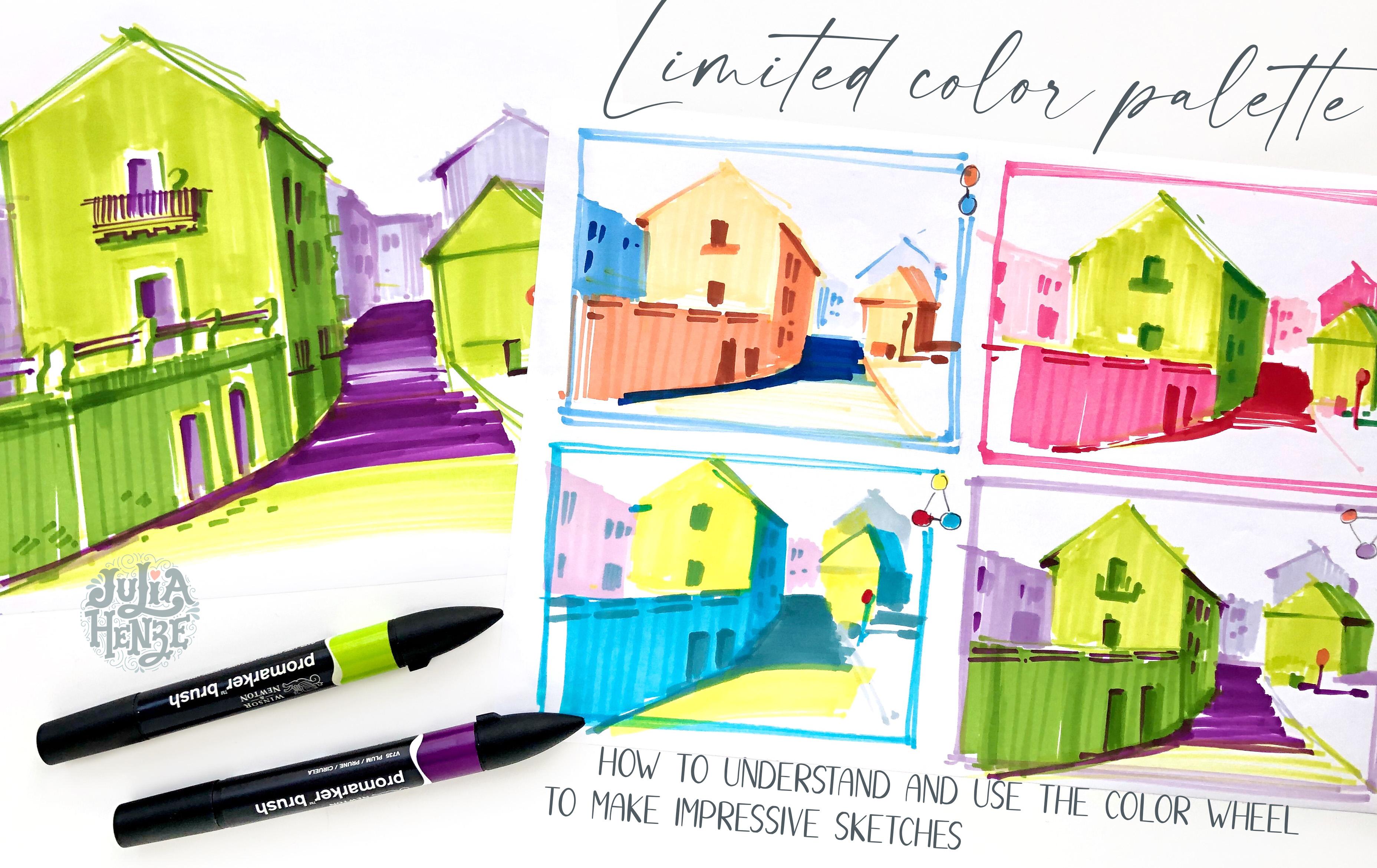
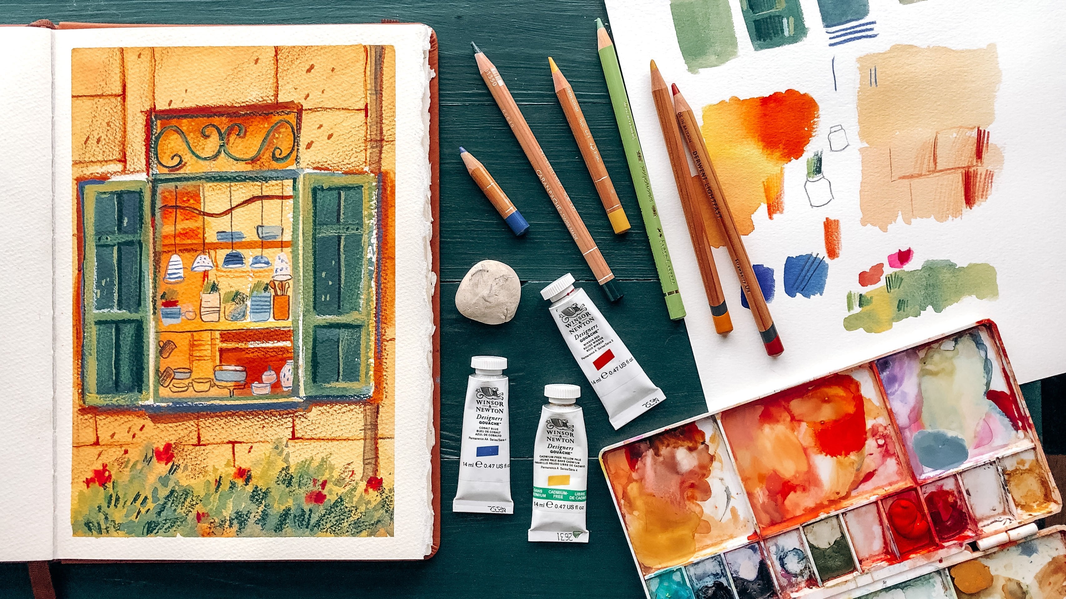
1. Class Overview: Hi guys. Welcome to my class. I'm Julia Henze, a level sketcher and illustrator based in Netherlands. In this class, I'm going to show you how to use a limited color palette based on the color theory. You will learn how to read the color wheel, how colors interact with each other so you will be able to choose color confidently and intentionally. How to create your own color schemes and apply visual effects that will make your sketches looks stronger. I'm going to use this photo as a reference for my sketch. Whether it seems not very inspiring at the first site, but this scene gave us an excellent possibility to apply some visual effects using harmonious color combinations and a sense of depth. For this class, you will need some paper, of course, a pencil, graphite water color for sketching, and any tools and materials you like the most for coloring. Markers, alcohol, water-based, garage, acrylic paint colored pencils. Watercolor will be absolutely great. Do you prefer to draw in Procreate or use other programs to create digital art? You can definitely use them too. I'm going to work with alcohol-based markers limited to sets of six colors because they are one of my favorite drawing and media and because they have a limited color palette anyway, so with alcohol-based markers, you're always forced to make choices. You might think it's a disadvantage, but it's also a good thing. The color limitation is challenging, and as artists, we want to be challenged, and we want to push our boundaries and develop our drawing skills. Grab your favorite drawing tools, and let's get started.
2. The Basics of Color Theory: But before we start the job, we need to talk about colors. Color can be a very powerful tool that you can use in your art and also for your clothes and interior. By the way, if you learn to use it effectively, with color, we can set a mood, attract attention, or make a statement. The color wheel or the color circle is the basic tool for combining colors. There are 12 segments on the wheel, and each one represents a color. There are three primary colors, yellow, blue, and red. We cannot make primary colors by mixing any other colors, but we can use them to create other colors. By mixing two primary colors in equal proportions, we create a secondary color. So yellow and red make orange, red and blue make purple, and yellow and blue make green. These colors, orange, green, and purple, are secondary. Then we have tertiary colors. Tertiary colors are colors made by mixing equal parts of one primary and one secondary color. So red and purple make red-purple or magenta, purple and blue make blue-purple or violet, blue and green make blue-green or cyan, and so forth. You can probably imagine that keeping mixing colors that way, adding white or black and changing proportions, we can create any color we want based on just our three primary colors, yellow, blue, and red. This course is not about mixing colors, of course, but I just wanted to accentuate how important the primary colors are. Further, we can classify colors as warm and cold. We call it the color temperature. Temperature can play a significant role in creating a particular mood in your artwork and conveying feeling. In general, there are dual families of colors, warm ones and cool ones. To make it a bit easier to understand, let's take only primary and secondary colors. The dividing line splits the reel into warm and cool colors. So red, orange, and yellow are warm colors. They're vivid and energetic and evoke warm feelings because they remind us of warm things like sun and fire. While purple, blue, and green are cool colors that give us a soothing impression and evoke a calm feeling, reminding us of things like water and grass. But there are no absolute rules for that because the temperature is relative. A red can be classified as a warm color when compared to blue. But when we compare two or more variants of the same color, like these two reds, we need to look at the undertones. The red on the left containing a yellow undertone can be classified as warm, while the red on the right containing a blue undertone can be classified as cool. The same happens with greens. The one on the right containing a blue undertone is cool, and the one on the left with a yellow undertone is warm. The same with blues and yellows. I think you understand now that for the temperature, not the color itself is leading, but its undertone. In most cases, even when you see a color on its own, you can easily define if it's a warm or a cool color. But in some situations, it's quite hard to say what it is, and this is the reason why artists sometimes have different views on the same colors. By the way, there are also neutral colors, when you can't define if it's a warm or cool color. Black and white are officially neutral colors. However, when you look at different media, you can also come across cool and warm whites and cool and warm blacks. Next important theories we need to talk about are a hue, tints, shades, tones, and saturation. Hue is a basic color, the pure color. It could be any color of the color wheel. If we add white to the hue to make it lighter, the result will be a tint. If we add black to make it darker, the result will be a shade, and if gray is added, the result will be a different tone. But more generally, the word tone simply refers to the relative lightness or darkness of a color, then it's just another word for value. The saturation defines a range from pure color to gray at the same lightness level. The pure color is highly saturated. It looks very bright and vivid, while the less saturated colors look duller and more grayish. Now we learned how to read colors in the color wheel, we can move to the color harmonies. There are some color combinations that are considered to be especially pleasing. These color combinations are called color harmonies, and they consist of two or more colors. There are quite a few color harmonies, but in this class, I want to show you some that are easy to understand, to remember, and to use. The first one is monochromatic. In a monochromatic color harmony, we use one single hue plus its tints, shades, and tones. For example, when we make a door when using only red and white gauge or just one blue pencil. There is also an achromatic harmony that is actually the same idea, but with neutral colors, white, gray, and black. A sketch made with black ink as achromatic. The next color harmony is complimentary. The idea of complementary color harmony is very simple. Complementary colors are pairs of colors opposite to each other on the color wheel, like red and green, orange and blue, yellow and purple, and so on. The strong contrast between these colors creates a vibrant look. Analogous color harmony is pairs of colors next to each other on the color wheel. They usually match very well and create a very harmonious look. It's quite a safe choice. However, it's important to make sure that there is enough contrast between the colors by changing tone, using a lighter or darker color, temperature, using warmer or cooler color, or saturation, bright or muted. Otherwise, your artwork may look very harmonious but a little boring. The next and the less color harmony for this class is triadic. The triadic color harmony uses colors that are evenly spaced around the color wheel. As you can see, the primary colors also form a triadic color harmony. To successfully use it, we have to balance them very carefully by using colors in different proportions. We can, for instance, let one color dominate our sketch and used the two others for accent, or the other way around. I know it's a lot of information and probably you won't be able to retain it all at once, and it's absolutely fine. The most important thing is that you now have a basic understanding of the color theory. So we can start to talk about a plan to do your artworks.
3. Step 1 - Sketching With a Pencil: But before we jump in coloring with different colors, we need to study all the reference and plan how we'll draw all these buildings, this lower wonderful ground, the doors and windows and where light and shadow will be. So we don't need to think about it later when we'll be very busy choosing colors, creating a sense of depth, and making our scene look impressive. We will make a mono or achromatic thumbnail sketch with a pencil first. My pencil is all blue, so it will be monochromatic. With the pencil, we'll be able to raise lines if we want to. We will draw on a small format only the essential shapes and obvious shade the masses to get a sense of the overall value relationship. Later on, it will make our drawing process much easier and our final sketch more engaging. As I said before in this class, I'm going to show you how to draw a quite complicated scene without following any perspective rules. Instead, we will compare every line we draw to imaginary horizontal and vertical lines, and measure angles between them. It shouldn't be a 100 percent perfect measurement. It only helps us to find more or less the right direction. By doing this regularly, you will train your eyes and it will get easier and easier for you to determine an angle. I want to start with this big house in the foreground because it's the largest shape in this scene. This is what we normally do when we start making a sketch. Always work out from the largest shapes to the smallest. A thumbnail is a very rough sketch. So that means that we need to limit ourselves to the largest shapes and lines. We don't want to draw any details at all at this stage. So let's start to draw the house. It's right to start with the upper left corner, and this is our first measuring point. Here we need to imagine or draw a horizontal line that comes against the top of the roof or you can use a pencil and lay it down on the picture. Then, try to assess an angle so you don't need to use a protractor or any other measuring instruments. It's just an estimate and then we draw the actual line. The same is for the other side of the roof. I think it will make sense to add the right side to this small house, even if you can't see it here. Adding an extra dimension will make our sketch look more interesting. I also measure an angle here, but this time I use a vertical line instead of a horizontal. Maybe we're measuring roof's angles without, or I see it without any measuring. Even though, this measuring technique is especially important for lines like this one. Because it's really tough to see what is happening. It looks like the road goes up here, but the line itself goes down. It's very misleading and I often see beginning artists making mistakes here. So don't forget to measure this angle, maybe even twice. Also, this is a quite tricky line to draw without measuring. I want to make the house a bit taller, so I draw new lines parallel to the initial lines. Doors and windows have smaller shapes and I don't want to draw them out in small thumbnail, so I only determine where they will be. If you squint your eyes, you will see that these two doors look like two dark spots. So I just roughly shade this area. Here first, where it says the length of the line between the edge of the roof and the point where the roof of this building in the background will start. Then we measure the angle as we're used to. Here, again, I draw the windows very roughly. There's some buildings in the background. We barely see how many of them they are and what they look like exactly, but it's not important for us. We only need to create a suggestion of some buildings by setting a few lines. We will come back later to the difference between the fore and the background regarding the contrast. But there's also a difference in accuracy and precision of object lines. The further away the object, the less accurate we draw it, with fewer details and less contrast. We can see a curve here and it's very important not to forget to draw it. Because together with the walls bottom line here, it creates a sense of depth. As you can see, I drew it a little bit longer to make the sense even stronger. We'll finish our line drawing and move to shading. It's not very clear in this picture where light comes from and where shadows are, but considering the situation, we can assume that it will work best if I place a light source on the left. This is because the space between the big and the small houses is already quite dark. Because a large shadow from the big house will create more contrast in the picture, making it look more impressive. Let's take a look at the cube of over-share the whole scene. I place a light source in the same top-left corner. That means that the top of the cube will be the lightest. I would leave it right in my sketches, but as you can see, there is no surface like that in this picture. The left part of the roof would be such a surface, but we can't see it here. The cubes left side or the front side is a bit darker because there's less light on it. I would use the lightest color here. The cubes right side is even darker than the left because it's further from the light source, but not as dark as the bottom. I would use a bit darker shade for the left side and the darker shade for the bottom. Now you probably think that we don't see the bottom anywhere, but actually we do. The bottom side of the roof and the balcony, for instance, and the drop shadow will have the same value of darkness. In general, the rule will of course much more values between the lightness and the darker stones, but I want to limit them to three to make it easier for you to understand because we're going to color our sketch with a limited color palette. So we will use three values, light, middle, and dark. In practice, it will mean the main color, a lighter version of it, and a darker one. Oh, I have to make the cube's drop shadow a bit darker of course. Similar to the cube, the front side of the big house will have the lightest value as well as the front side of the small house. The wall here will be a bit darker at the middle value. The same is for the left side of the big and the small houses. The drop shadows will be the darkest. The two doors in the wall which I forgot to draw have the same middle value as the wall itself. But I want to create a bit more contrast and more tension in the scene, making them darker. This part of the road should also be dark of course. There's a drop shadow from all those buildings in the background and we have to shade the buildings themselves. Not too dark because objects in the background are never as dark as objects in the foreground, there's much less contrast, the lightest less light, and shadows are less dark. It's a neutral grayish mass. So we shade them very lightly and when we go over to coloring, we will probably use cooler colors for the background.
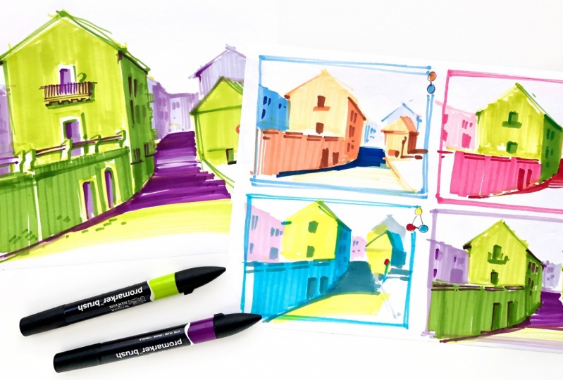
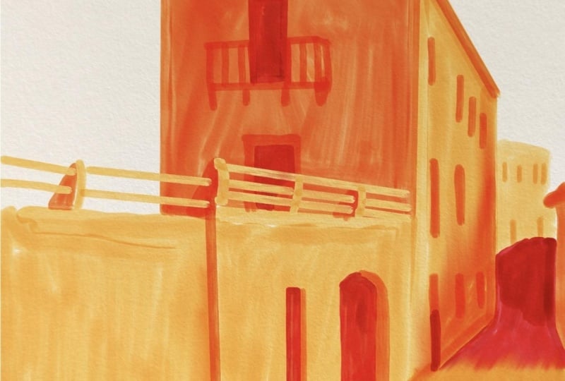
4. Step 2 - Experiment With Color Schemes: At this stage, we will finally use different colors. We will apply two of my favorite color harmonies; the complimentary triadic twice to create four different color schemes. I often talk about the power of thumbnail in classes. In the previous part, you already learned that the thumbnail small format helps us organize the composition and see the big picture. Because they're roughly sketch and shade only the largest, the most important shapes, and now we will do the same with coloring. We will color only the largest shapes and areas. By the way, I hope you've noticed that it's much easier now to redraw this picture because we've already made a well outline sketch. I can draw with markers directly without the pencil. Also for coloring, you already have a monochromatic color scheme. The first color harmony I want to demonstrate is complimentary. Remember, two colors are opposite to each other. I take orange and blue as my basic colors and add one lighter, and one darker, don't put both of them. This is our first color scheme. We have two sets of colors with three values; light, middle, and dark. Like the previous part, but this time not monochromatic. As we've learned, orange is a warm color and blue as a cool color, and it's a very good combination, not only because of very high contrast between them which creates a beautiful tension in the picture, but also because the use of warm colors in the foreground and cool colors in the background creates a natural sense of depth. Let's start the sketch. You already know how to draw this thing so it can't be difficult. I start with the lightest color and just follow the thumbnail we made in the previous part. The lightest color for the side face to the light source, the darker one for shadows, and the darkest water darker shadows under the roof and the drop shadows. Later, you also will see that I don't always follow the plan 100 percent. Sometimes I experiment a bit and use a darker or lighter color. It's totally fine and you should do it too. This Greg thumbnail sketches are perfect for experiments because they don't take a lot of time, and if one of them fail, you just draw another one in a minute. So the big and the small houses in the foreground are colored. Now we can go over to the cooler background. I use the lightest color for the builders here. As I already said, there is not so much contrast in the background, lighter bars look darker and dark shadows look lighter. As a result, that everything has more or less the same color values. You can notice the contrast immediately, it looks like the foreground houses get closer to us and the background buildings get farther from us. The buildings on the left are also more in the background than in the foreground, but this side is also in the shadow. I'd like to apply the middle blue here. I want to see how it looks when I draw the large shadow from the big house with the same middle blue. If necessary, I always can make it dark later, and a few windows in the background. Indeed, I think there's too little contrast yet so I want to make the shadow dark as I planned, and I add the few windows on the left. I think it looks very nice now. Let's try other complimentary colors; red and green. Also, amazing contrast between these two. The same as with the blue and orange, I add one lighter and one darker color to both, and I'm going to draw it in the same way. But this time, there is much less temperature difference as you can see so it will be more challenging to create a sense of depth, but we will try. This time, I make the building behind the small house a bit darker, just to see if it works and try to experiment with other colors too. The next color harmony we'll apply is triadic. We have three colors evenly space around the color wheel: yellow, red, and blue. I still want to limit my color scheme to six colors. This time, I had nothing to my yellow, at a lighter tone to the red, and one lighter and one darker tone to the blue. This time, I want to try something very different, I will color the lightest parts with the yellow to create a sunny look. Apply blue to all the shadowed parts, and use pink, the lighter version of it for the background, and the red itself you'll see. In the [inaudible] part, I told you that it is essential to balance triadic colors very carefully, and this is an example of how you can do it. A small detail, a flower or a traffic sign can make the whole scene look very powerful if you apply the most vivid color only to this object, and it will make no sense if you use too much of this color. I want to repeat the triadic harmony with other colors: orange, green, and purple, also just to see if it works. My additional color values are the same as for the previous thumbnail, only one orange, a lighter version of green, and one lighter, and one darker version of purple.
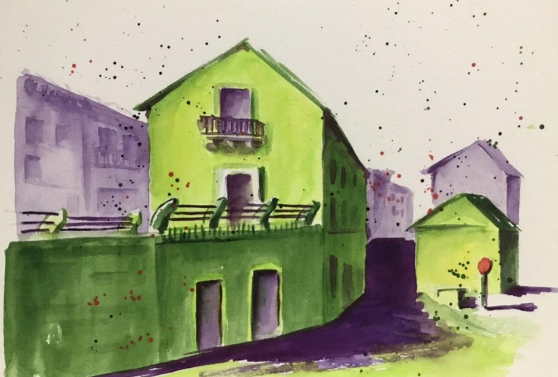
5. Step 3 - Creating the Final Sketch: Now, we're ready to draw the final sketch. We have to select the most successful color scheme. I think I like this one color combination the most, there is a lot of contrast and it's simpler, looking very nice to me. You can, of course, choose another one. By the way, sometimes, it makes sense to add some notes to your thumbnails so you can recall what color harmony you have used, what colors, maybe the reason for choosing a particular color, or with what other colors you could replace it if you think it would work better. Let's make our final sketch. I actually draw in the same manner as I did in the thumbnail. But this time, I'll add some more details and textures, not the many of them, because while we work with color and color contrast, we already make quite an impression. Many details will make our sketch struggled. We should keep it concise. Not too simple, but clear and to the point. Textures like this one make the sketch look more interesting, but at the same time, they don't take a viewer's attention away from the beauty of colors. If you draw with another medium, gouache, watercolor, or colored pencils, as well if you draw digitally, you can also create textures, for instance, with a dry brush or a different pressure. Here, I want to add a drop shadow from these stone beams and the shady side of the railing brackets. These elements make our sketch look livelier and more appealing. Also here, I'm still not drawing out every building, but I'm adding some more shades and lines to make the silhouettes a bit more recognizable. I colored this door and window gaps green in my thumbnail but now, I think maybe there's too much green and too little contrast. I prefer to use purple instead. Even when we have a shadowing and color implant, it's still very important to frequently look at our sketch and sometimes, reconsider our decisions. They say that drawing is a meditative process and that's absolutely true. However, in this case, meditation doesn't mean that you can relax and think of nothing, but it means a very strong focus on one thing, your drawing. Even if you make a wrong decision, you can avoid the same mistake in your next artwork because you draw consciously and understand what you do. I added some contrast to the bottom of the balcony because it's the same as the bottom of the cube, the darker side, and the whole balcony has a dark shadow which is a little bit less dark. I make it dark green. Here, I also choose to use purple instead of green for the same reason as the window and the door of the front side of the big house, to create more contrast and make it less green. The difference for the thumbnail is also that we draw lines a little bit more precisely. Here, for instance, I try to follow the silhouette of the road that creates a more authentic look. Here I make a part of the road a bit lighter to break up the boring dark area. Also here, I draw a bit more detail but not too much. I vary the color value just slightly because as I told you before, these buildings are in the background which means there is not so much contrast as in the foreground. The more significant the difference between contrast fairness in the fore and the background is, the stronger the sense of depth in your artwork. Add a lamp here, some balcony silhouettes, and then a little bit more contrast. I see that I accidentally colored the wet part of the no entry sign, so I'll repair it with a white gel pen. This is a tool I don't use a lot for this kind of quick sketches, but it might come in handy when I color wrong things. Let's put the finishing touch to our sketch, a texture here, a shadow there, and voila, it's done.
6. Final Thoughts: Here is my final sketch. I know it was plenty of information in this class, but I hope you've learned a lot and enjoyed sketching. You don't need to follow all three steps every time of course, for instance, you can decide to apply the color combinations from the thumbnails to other scenes if you think it would work for them. Then you just create a monochromatic value scheme and make your final sketch using one of the color combinations you already tried. But if you want to be very sure of the results, it really makes sense to create a new color thumbnail for every new scene. It takes a little time, but it helps a lot. I wonder if you can create your own color palette based on one of the color harmony as I call it in this class. I didn't use an analogous harmony, for example during the art to make your thumbnails and a sketch based on it or maybe you want to try to apply my color pellets differently in one or another way. I'll be happy to see all your experiments thumbnails and sketches in the project gallery and if you are on Instagram, it will be great to see there as well. Don't forget to use #juliahenze_ skillshare and if you have any questions about this class or about drawing materials or have suggestions or feedback, please leave a note in the community page under the videos. Good luck with this sketching and I hope to see you very soon in many other classes. Bye, bye.
 Julia Henze, Artist | Teacher | Urban Sketching Lover