Transcripts
1. Introduction: Hey, I'm Mel. I'm an illustrator, artist, and teacher living in Nottingham in the UK. Drawing and being creative are part of my job which I absolutely love. But I found that when life gets really busy and there's just no time to create just for me, it really negatively impacts on how I feel. During a particularly challenging period in my life, I started doodling and drawing patterns as a low-pressure fun way of experimenting with drawing and mark-making, which I could squeeze into just a few minutes each day. Not only did I find this daily practice opened up new ideas for me creatively, but I became a little addicted to the feelings of calm it brought, as I was able to completely get lost in the meta-state process of drawing repeated shapes and marks. I want to share this with you because it's a practice which just has so, so many benefits, and it's accessible to absolutely anyone, and I really do mean anyone, whether you work in the creative industries, or you haven't drawn since you were a kid. This class is for you. I've come up with 14 days of prompts for us to work through together using materials you'll already have at home, basic shapes and simple exercises. In just a few minutes each day we'll develop a daily pattern drawing practice, which cultivates mindfulness through drawing patterns and creates a quiet space in our busy lives. By the end of the class, you'll have 14 beautiful person drawings, which will act as a blueprint to develop your person drawing practice should you want to continue it beyond the 14 days, as well as a toolkit of mindful drawing exercises that you can return to whenever you need to restore some calm in your life. If you're ready, let's get started.
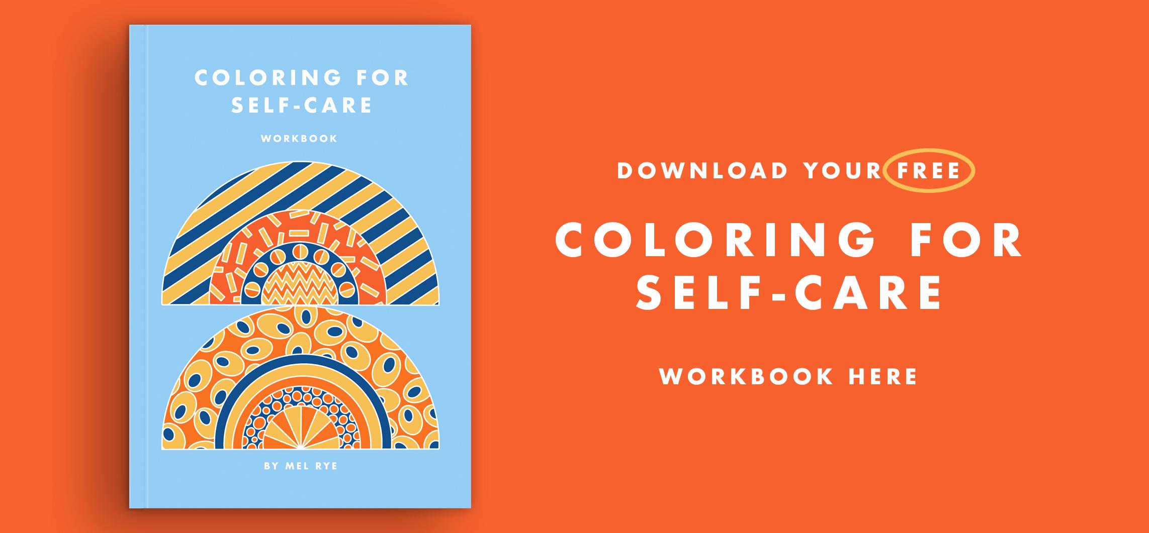
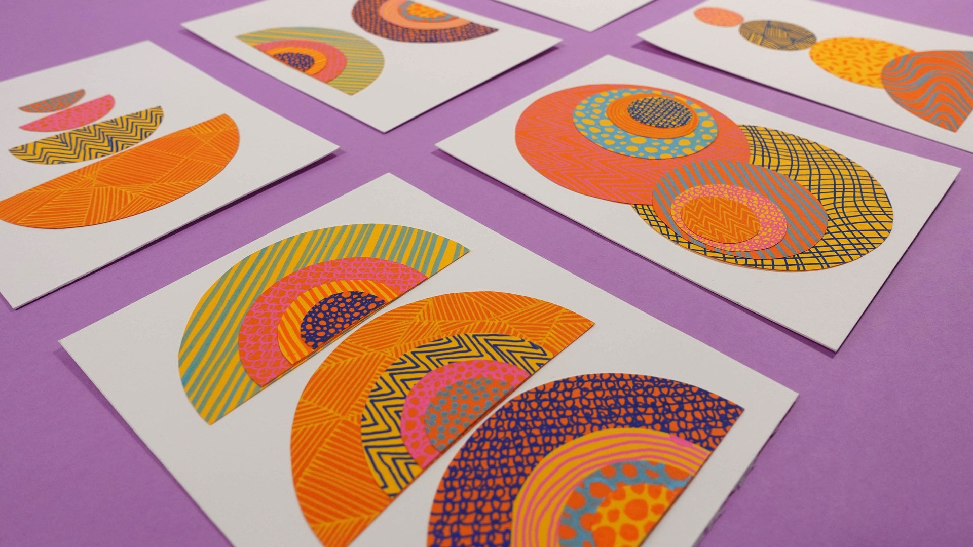
2. Class Project + Overview: For your class project, you're going to be following along with me as we mindfully draw patterns together in response to 14 days of prompts. The drawings you create in response to these prompts are your project. This class is structured in such a way that there are a few different approaches that you can take depending on how much time you have, the materials you have available, and how confident you feel with the processes, as well as ultimately what you want to take away from the class. I will be guiding you through 14 different starting points from which to draw patterns, which will give you a framework to apply to your own ideas, inspiration, style, and drawing materials to create a mindful drawing for each prompt, which is completely unique to you. My aim here is to give you the tools for this to become an ongoing daily practice if you wanted it to. You could take the class 100 times and create 100 different patterns from the same prompt, if you wanted to. The prompts are arranged in such a way that they start simply and gradually become a little more challenging. The last three days also require a couple of additional materials beyond just a pen and some paper. But I'll go into this in more detail in the tools and materials video, so you know exactly what to expect. Within each prompt video, we will be exploring a complimentary topic each day, such as where to find inspiration, making random-less look balanced, color and mood, and host of other ideas which will gradually build your skills and knowledge throughout the 14 days. Each day, we will also have a different mindful focus to our drawing, so that you will also be developing a variety of tools to help you draw more mindfully. If it feels a bit intimidating to create your own drawing from a prompt. I will be demonstrating from start to finish one example pattern drawing for each of the 14 prompts in a separate draw-along video, guiding you through exactly how to create it so that you can practice drawing mindfully along with me. If you are here because you'd like to be guided through some meditative pattern drawings, feel free to just go ahead and watch the draw-along videos only. The most important thing is that you can just relax and enjoy the process. It's really important to note that I am not a mental health practitioner. I'm just someone who's really interested in mindfulness and how it can be achieved through drawing. I've personally seen a lot of benefits from these mindful during practices in my own life. If you're struggling with your mental health, I would highly encourage you to seek out professional help. This class is not intended as a replacement for that support. It is totally up to you whether you take the class in order or you can jump around, skip a day, do two or more prompts on one day, repeat the same prompt for all 14 days, make up your own prompt or you could take the class over a month or longer, do whatever feels right. There are no rules, so feel free to use the class, however suits you best. When you're ready to share your project, hit the "Create Project" button under the projects and resources tab. There's also a class resource here that you might find helpful that I created to accompany this class. To share your project, you could scan or photograph your drawings to include in the project body. You can also include text to reflect on your experience of drawing mindfully, and then upload a cover photo to polish off your beautiful projects. Don't forget to hit "Publish" when you're done, and you can come back to edit your project whenever you want to add any new work. It is totally up to you how much you share. You could share one, some or all of your drawings in response to the 14 prompts. Lastly, don't forget to take a look around at other students' projects to encourage others, and of course, to stoke your own creative files. You can really make someone's day by leaving a positive comment on their project, so don't miss that opportunity to spread some positivity.
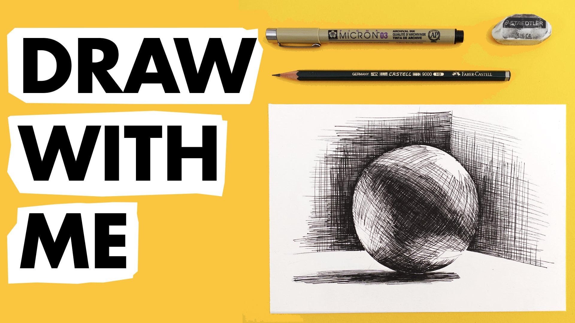
3. Tools + Materials: The materials you need for this course are really basic, you'll have them already at home. Very simply, you just need something to draw with and some paper to draw around. As I've mentioned already, this course is really adaptable to suit you. In fact, it's better when you make it your own. Although I'll explain the tools and materials I'll be using, I'd urge you to use the materials that you already have that you're familiar and comfortable with. I'll be talking about analog materials, but this class can definitely be translated to digital drawing if that's your thing, you need something to draw with. This can be literally anything, a marker, fine liner, fountain pen, crayon, pencil, ballpoint pen, paint markers, highlighter pens, even paint and brushes if that's your thing. Choose something which feels comfortable to hold, fluid to draw with and familiar, so it's not stressing you out. Also something that's just really easy to pick up and use and not too precious so that you can just get drawing straight away, whatever you choose, it doesn't need to be black, and it doesn't need to be super fine, as its often expected with this style of drawing of patterns. You don't have to stick with the same drawing tools throughout. You can switch it up an experiment if that feels right. I'm going to be using a few different pens throughout the class. My favorites are a barrel fine tipped fiber pen. I love this one because it's so comfy and easy to use. I'm also going to be using a Tombow ABT Dual Brush Pen. These are great as the fine end is really fantastic to use for detail, and then you can use the facet brush and to block in any areas that you want to color. Later in the class I'll also be using some colored fine liner pens and Posca paint markers. The last three days of the class begin to explore color. If you have any colored pens, that would be great. You'll also need some paper. Again, this is super adaptable, you could draw on some scrap paper, printer paper, a roll of paper, or maybe something a little thicker. It may be that you would enjoy the opportunity to gather your drawings together into a sketch book, which can be a really nice way to approach the class project. On that front, I am a serial sketchbook starter, but I very rarely complete a sketchbook. But I found that for a daily mindful pass and drawing using a little sketch book or journal has been really perfect for me. This one I filled up pretty quickly and I just loved the fact that it's small. It's about the same size as my phone. I can just stick it my pocket and carry around with me and just do some drawing wherever I go. It's not that important what your paper quality is like. I generally find that using cheap materials is really helpful in breaking down barriers to cultivating a regular practice because you feel less precious about making mistakes and just go for it if you're using cheap paper. In my case, I tend to use the sketch book as a place to explore patterns of work regularly. Then I might come out of the sketchbook to work on paper, if I want to add color or make something larger. Throughout the demonstrations in this class, I'm going to use loose sheets of medium weight cartridge paper, and later on I'll be using hot pressed watercolor paper. I like using this paper because it has a smooth texture, is nice and thick so I can use paint safe in the knowledge, it's not going to buckle. A note on size, again, this is completely adaptable, you should pick a size to work out, which feels right for the materials you're using, the way that you like to draw and how much time you want to spend drawing. The examples I'm going to be demonstrating in the class will all be around about six by eight inches in size. This is a size I feel happy working out on paper and should show up well on camera. Although you'll notice that my daily practice sketchbooks, a half this size, around four by 5.5 inches. Of course, the smaller size means that you can complete the drawings quicker. If you're using quite a fine pen or you're concerned about being able to complete a drawing each day, I'd recommend keeping the size pretty small. If you know the time is going to be a challenge for you, I've created a handy dandy template in the class resource which I would recommend using, if you think that you'll struggle to find more than about 15 minutes per day. Towards the end of the class, we will be exploring a couple of problems which require us to have a colored background. I'm going to be doing this in two ways. I'm going to use some colored paper, and I'm also going to be using some acrylic paint. With this in mind, if you have some color paper and some paint, that's excellent. But if you don't, you could achieve a colored background by using magazine pages, colored paper carrier bags, or maybe you have some markers or paints that you could prepare some white paper with to color it. How you color the paper isn't super important, and it's best to just do this in a way that feels right and natural to you, and using the supplies that you have available at home. As well as something to draw with and onto, it will also be helpful to have a pencil, a razor, a ruler, and a cutting mat, a knife or a pair of scissors, some scrap paper to test out some ideas on, and some masking tape or washi tape is also really helpful. In the next video, we're going to warm up and begin to shape library to use in our patterns. When you're ready, join me then.
4. Warming Up + Noticing Shapes: Before we jump into drawing our patterns, I'd just like us to do some quick warm-ups to get to know our drawing tools. We'll also do a mindful awareness exercise to begin to create a shape library that we can refer back to in our 14 days of pattern drawing. Just take a scrap piece of paper, or use a page in the back of your sketchbook if that's what you're working in, and start to make some marks on the paper to test out your pen and see how it behaves on your paper. If you have a selection of pens, this is a good opportunity to experiment with them to see if there's one that you like more than the others. If you're using a selection, I suggest noting which pen you're using, and keeping the marks you make with that pen near that label so that you can refer back to it. Just try some lines and squiggles. We just want the pen to feel nice and fluid moving across the paper, comfortable to use. You don't have to hold it in a particular way to make it work, and make sure that it's not going to run out on you. Once you've got a pen that you're happy with, take a blank sheet of scrap paper, and I'd like us to just take a few deep breaths. If you feel comfy closing your eyes, you might like to do this too. Just as you sit slowly breathing in and out. As you breathe in, I want you to imagine all your thoughts, all your anxieties, to-do lists, and anything else floating around in your head to be gathered up into your breath. Then I want you to exhale really slowly and fully. You feel like you've breathed out all of those floating thoughts with your breath. At the next exhale, try to release any tension in your body as the breath leaves you, particularly in your shoulders, forehead, and throat. Next, I'd like you to become aware of your body. Fill the parts of your body that are in contact with the chair or ground, pressing down firmly so that you feel really connected and grounded. Now, we can start to notice our surroundings. Any noises we can hear, textures, temperatures, smells. Just notice any information as you sit with your eyes closed. If you can easily reach it, lay your hands on the paper in front of you and feel the texture of the paper on your fingers. Notice the sound that it makes as you pass your fingers over it. Now, if you had your eyes closed, I'd like you to open your eyes and observe your surroundings. I'd like you to look around and just notice any shapes around you. For example, I can see scallop shapes in the pattern on my shirt. If I look at my mug from above, I can see a circle shape here. These shapes do not need to be complex. Actually, simple shapes are in many ways better than complex ones, as you'll see later. We're just noticing the shapes, and now we can start to record them on our paper. Don't worry about repeating the shape if it's from a repeating pattern. Just record each shape once. Once you feel like you've exhausted your immediate surroundings, expand your awareness a little wider. Look to the edges of the room, the window and door, and what you can see beyond those. Once you've exhausted this range of awareness, you could start thinking about imagined or remembered shapes. The idea is that all the drawings we'll be doing throughout the 14 days are based on simple repeating shapes. If we have this little library of shapes we can refer back to, this will give us lots of material to work with if we get a little stuck. It's entirely possible and would be really effective to use one simple shape, like a circle, for example, for every single prompt. Don't worry about how many different shapes you have here. Just a handful can be enough to generate a huge range of pattern drawings. Feel free to return to this exercise as often as you'd like. It can be a nice way to begin your daily drawing practice each day, just with a few deep breaths and a little mindful awareness of your surroundings. You could keep adding to your shape like we gradually too, as you notice different shapes around you over the course of the 14 days. Now hopefully you have selected a pen you'd like to get started with, and you have a few shapes that you can use for inspiration. Let's dive in to day 1.
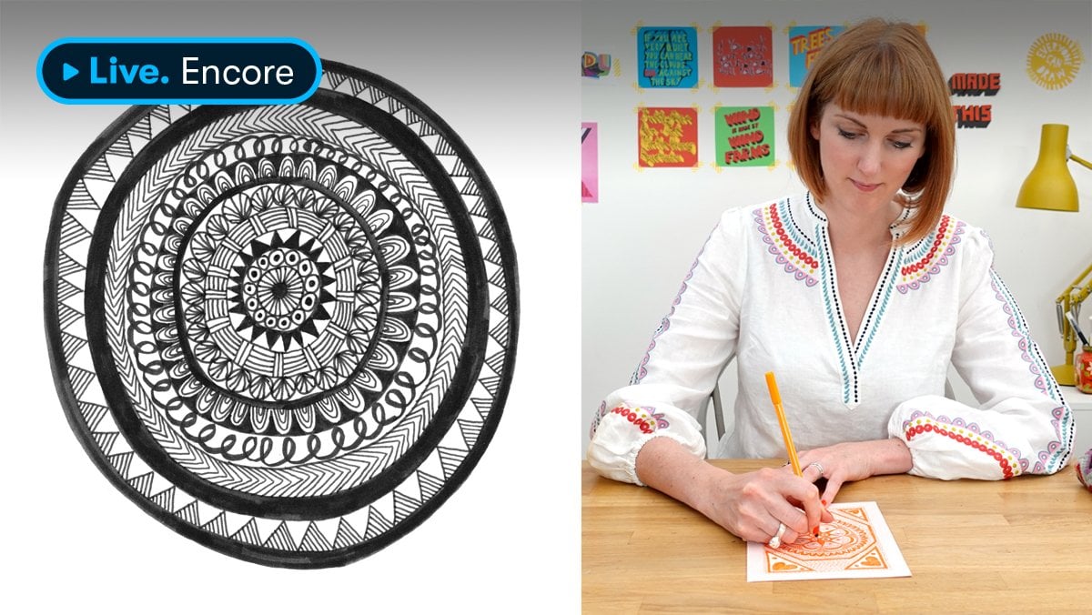
5. Day 1: Concentric: Our first pattern drawing prompt is concentric. If you aren't familiar with the term concentric, it literally means shapes which share the same center. Think of an archery target or a tree ring for example, and you've got the idea. You start with a smooth shape and then draw a larger one outside it, and repeat that again and again, and watch your pattern grow. Today seems a really good time to talk about inspiration. As we go through this 14-day journey together, some days you may feel really inspired and have lots of ideas for how you'd like to respond to the prompt, and other days, not so much, don't worry, this is totally natural. The most important thing is that you're here, you showed up, and you're gifting yourself this precious time to draw. Whether you feel inspired by the prompt or not, it doesn't matter just keep drawing. This is when those draw along videos might come in helpful so you can just relax and draw along with me. In terms of looking for inspiration though, these are some of my top tips to help you find it. If you're able to get outside into nature, this is just the best place to get inspired for drawing shapes and patterns, as well as it just being a really great thing to do for your soul. Notice the little shapes and patterns that you see around you, and snap some photographs, or capture some quick sketches that you could add to your shape library. If you're unable to get outside, you could, of course, do some online research. You could create your own mood board of things which inspire you. These definitely don't need to be pattern-based, although you'll find lots of those online too. But just by browsing and collecting together images which you love and resonate with you, which could be images from nature or maybe you're more into architecture, interior design, fashion or something else, I'd recommend collecting together between five to 10 images. Sometimes if we have too many, it can be quite overwhelming. But this should be enough for us to begin to extract some interesting shapes from which can form the beginning of pattern drawings. Observe your surroundings. As you'll see from the warm-up, often all we need to do is notice what's around us. Just slow down and look at things differently. You'll find that often the most mundane of objects, and the simplest of shapes can give you so much material to create different pattern combinations with. For example, I'm really drawn to using circles a lot in my own drawings, and just from this one simple shape, I've created a huge range of different pattern drawings. Inspiration can come from anywhere. If you notice a shape whilst you're out for a walk or on the phone or in the supermarket, make sure to capture these little moments of noticing by taking a quick photo that you can refer to later. You could revisit some of the warm-up shapes we did and use one of those as your starting point for a pattern. Hopefully, you'll feel a little inspired by a shape to begin drawing your concentric pattern. But there are some other things that we could consider to help us plan our drawing. Firstly, what shape or shapes will you use? You only need one simple shape to repeat, but it could be interesting to try more than one shape too, as you could alternate them. Where will you place the center of the shapes on the paper? It doesn't have to be in the middle, I usually start from the smallest shape in the center and work my way out. But you can also do the reverse and begin by drawing the largest shape first and then fill in with the smaller shapes. Will you fill the paper with your concentric pattern or would you just leave it as a free-form shape? This might depend on how much time you have and how large your paper is. Will your concentric shape or shapes stay at the same angle or could they rotate? Will you draw just one concentric pattern or several on the page? Will your concentric shapes be evenly or unevenly spaced? One thing I'd like you to pay mindful attention to today for our concentric prompt is carefully closing the shapes you draw. Bring your awareness to where you begin and end each shape, focusing on the points at which your pen touches the paper. As you close the first shape, shift your attention immediately to where you will begin your second shape, and so on until the drawing is finished. Having this to focus on in your pattern drawing will help you to feel mindfully connected to the drawing, giving your brain a much needed rest from all that internal charter. Don't worry if your mind wanders, just bring it back to focusing on that start and endpoint of each shape as you draw. Now we have lots of different possibilities for how we could draw our concentric pattern drawing for day one. If you feel overwhelmed by the possibilities or you'd just like to be guided through your first pattern drawing, join me in the next video for the day 1 draw along, if not, I'll see you tomorrow for day 2.
6. Day 1: Draw-Along: For Day 1's concentric prompt, I'm just going to use a simple circle repeated to fill the whole page. To create some contrast with the background, I'm going to use some washi tape on the edges of my paper to create a border. This is completely optional, but it's just an effect that I really like because I feel that it really makes those drawings look like they're nice and finished. Before I begin my drawing, I'm just going to pause and take just a couple of deep breaths and close my eyes. This is just to stick into my brain that I've arrived at my drawing practice today. Hopefully, it's going to start me off in the right frame of mind. Really nice deep breath in and out. I feel ready to draw. I'm going to start in the very center of the page with a tiny circle and work my way out with other slightly larger circles. You don't need to be completely accurate. Just guess roughly where the center is and draw a tiny circle in the middle. Now, I'll keep drawing slightly larger circles around the outside of that circle. Try not to let your lines touch, but try to get the new circle as close to the last one without those lines touching each other. Leave a gap, that feels challenging, but comfortable for you. As I'm drawing these circles, I'm bringing my awareness to this spot where I begin and end each circle. As the circles are quite small at the moment, I'm drawing them in one line and one movement. I keep focusing my attention on that beginning and end point of the circle. This really helps me to stay focused on the drawing and just not be drawn into the million other things that I could be thinking about. But I do notice that sometimes even when I do that, my mind does begin to wonder. Don't worry if that happens to you. Just bring your attention back to the drawing and carry on. One thing that I find really helps me is to keep actually changing the point of the beginning and end of each circle. In this one, I've started at the top edge, next I might start over to the right-hand side and continue my circle this way. The next circle I will perhaps begin at the bottom. Just making these small changes is just enough to nudge my thinking mind back onto the drawing. As you start to get bigger with your circle, you might find it helpful to have an extra piece of paper or scrap paper or tissue just underneath your hand. Because it's very easy for this part of your hand here to start picking up the ink and smudging it on the page. Once you start to do that, you might find that you have to draw your circle in two or more sections instead of one continuous line. But that's okay, just keep thinking about those start and end points, even when they're in a half circle. The other thing you'll see me doing now as the circle gets bigger, as I start to rotate the paper as well, this is also another helpful way of keeping my mind active on the drawing. Just because it keeps offering a little bit of a sort break, every few seconds to move the drawing, so I'm able to refocus back on the drawing again each time I move it. As the circle gets a little bigger, it might start to get less circular and a little more wonky. This is totally okay. In fact, I really love the wonkiness, which I'll be talking about that a bit more later. At this point, we have a lovely free form concentric circle person. You could stop here if you like what you have or if you don't have much time today. But I'm going to continue creating more circles, so I can fill up the page. As you get closer to the edges of the page, you won't be able to draw full circles anymore. Just keep repeating the shapes outside to make that concentric shape to fill in those corners. Something else that I often do with this type of pattern that you might have noticed is, I change the direction of the lines that I'm drawing. Sometimes I'll create that curve in a clockwise direction, and then sometimes I'll do it in an anticlockwise direction. I think sometimes just changing it up can also just help to bring your mind back to the drawing. The drawing part is done. I just now need to take the tape off and then that will be Day 1's drawing complete. If you are using tape as well, just a tip to help you take it off without tearing the paper is just keep the angle of it quite low to the paper, going back on itself. Don't be tempted to just pull it up. Always keep it low and just back on itself and quite slow. Hopefully we can take it off without tearing the paper. Here we are, Day 1's concentric prompt drawing completed.
7. Day 2: Random Fill: Hi and welcome back to Day 2. Our prompt for today is Random Fill. To elaborate what I mean by this is to repeat a shape over and over to fill your paper. But the shapes are not arranged in an orderly way, they're just randomly placed. With this prompt today of Random Fill, I thought it was worth us reflecting on what randomness in drawing patterns means and how we can make random fill right and balanced. Often, making something random can be surprisingly difficult. As humans, we're often wired towards uniformity and patterns. In the context of drawing a random fill pattern, how can we achieve visually appealing randomness? Here are some tips. Vary the size of the shape you are repeating. This could be just a little bit or quite a lot depending on the effect that you like. Vary the angle of the shape that you are repeating, even circles, because they will still look different drawn at different angles. The easiest way of achieving this is actually to move your paper rather than to try to draw the shape differently. If you have the option too, you could use more than one pen, as the varying line thickness will add some randomness. Odd numbers always create better-looking randomness. If you're creating clusters of circles, for example, think of drawing them in groups of three, five, or seven, for example. Keep moving the section of the drawing that you're working on. This is because as we get into a rhythm of repeating a shape over and over, our marks will start to become really similar. Natural pauses or breaks such as just moving your pen to the other side of the paper can just help to reset the motion and the rhythm you will have got into without breaking your flow. I often imagine a clock face when I'm drawing. I'll think of roughly going towards number 12 and then 6, for example, followed by 3 and 9, and 1 and 7, for example, yet still, in a relaxed and random way, it just helps me to remember to keep spreading out the pattern from the central point. With this type of pattern, there are a few considerations to help us plan our drawing such as adapt the size of your paper and the size of your drawn shapes you're using, to suit you today. Filling up a page with drawn shapes can take a long time if they're small, so you could use a smaller sheet of paper or a section of parts of your page. Because you'll be drawing the shape so many times and entering a rhythm with it, keep the shapes simple, so avoid complex angles or many sizes to your shape. I love to use circles, but ovals, triangles, rectangles, and squares, will all work really beautifully. Will you allow the shapes to overlap or will you keep the shapes separate? With this prompt, because we are filling our paper with repeated shape, it's very easy to rush in order to get the drawing finished. We lose that enjoyment of the process and of being in the moment and instead, we become a bit like a machine churning out shapes. I'd like to invite you today to really try to slow down and enjoy each and every shape. In slowing down our drawing, we may also find that we can slow down our breathing and in turn, we can slow down our chattering mind. If slowing down means that you just don't have time to fill the page, this is not a problem. This applies to all the prompts too. Remember, you can always come back to it or you can scale down the size of your drawing if you need to, or just leave it part-completed. The process is always more important than the finished product. Now, we have considered how we're going to go about our random fill prompt for Day 2, it's time to start drawing. If you'd like a little guidance, join me in the next video for our Day 2, draw along. But if you feel confident getting started, then please go ahead. I look forward to seeing you tomorrow for Day 3.
8. Day 2: Draw-Along: Day 2 is random fill prompt, I'm going to use a triangle shape. I'm using washi tape on the edges of my paper as I did yesterday because I love the contrast it creates when you peel it off. The person just fills up the page but leaves that lovely clean white border. I'm just going to pause now and take a breath or two with my eyes closed as that signal with my mindful drawing practice is beginning. Now I'm going to start drawing triangles so I will begin with just one triangle. Then I'll use that triangle as one side of the next triangle and so on. I'm working with quite small triangles here as it suits the pen that I'm using. I want this texture to become quite sort when you view it from a distance. But you could easily increase the size of your triangles if you'd like to. This would also make it quicker to draw this type of pattern. I've picked a triangle intentionally for this prompt because it really encourages me to slow down a little as my mind needs to keep thinking about the three-sided shape and how the next shape connects with the last. If the triangle shape feels a little unnatural or you're just not feeling it, you could totally do this with circles. I just want you to pick a different shape to yesterday. I'm trying to group my triangles in clusters of odd numbers to achieve that making randomness look balanced effect. You'll notice that I'll keep changing the part of the drawing I'm working on too and I'm also rotating the paper as I fill it up with shapes, all these things will help keep that randomness going. I'm thinking about our mindful focus today and intentionally going slowly. Of course, this means the drawing will take a bit longer but I do have time for this today and I'm really enjoying it. If you don't have a lot of time today, there are three things you could do. First, you could decrease the size of your paper, just section it off so you can complete the drawing quicker. Second, you could draw your triangles larger. This will help you fill the page quicker. Or thirdly, you could leave the drawing unfinished. It may be that you find a spare few minutes later or another day to come back to it and finish it. But if you don't, it's really no big deal if you don't fill the whole paper. Is the process which is the really important thing. Here we are, our random fill with triangles is complete. I hope you enjoyed that and I'll see you tomorrow for day 3.
9. Day 3: Uniform Fill: Hi again, and welcome to Day 3. Our prompt today is uniform fill. As you may have guessed, the intention with our uniform fill prompt is to fill the page with repeated marks or shapes but in an ordered and uniform way. This is a nice contrast from yesterday's random fill prompt. Although we'll still be filling the page, it's going to give us a completely different effect. Depending on the shape you choose to draw, you might be drawing continuous rows or columns or you may be drawing a shape then placing the next shape next to it again and again until you fill your page. How you decide on the way in which the pattern is uniform could be open to interpretation. Clusters can be uniform, for example, if you repeat them in a uniform way. As we're working in a more structured way in this prompt, I think it's worth us reflecting on accuracy versus wonkiness. There isn't a wrong or right way of drawing from any of these prompts, but if words like uniform, structure, and accuracy fill you with dread, please don't be put off by these prompts. My own drawing style is pretty wonky. I really enjoy that wonkiness. I tend to be more drawn towards that. I will usually draw straight lines and circles freehand. I'm really not worried too much if they aren't perfect. It's all part of that charm. However, you may be the opposite and really adore geometry and straight lines and be itching to get out your ruler and that is totally great too. As I mentioned earlier, I really want you to make these drawings your own. Let's take a look at what that might mean in practice in both instances of wonkiness versus accuracy. Let's take the example of a scallop person, which will be in rows across the page. In my wonky method, I just start drawing the scallops and keep going until I'd finished the page. But if I was more interested in the accuracy side of things, I'd use a pencil and ruler and draw out some light guidelines first to make sure that each scalloped row was straight and evenly spaced. Here are a few other examples of the same shape used to create a uniform fill pattern in both an accurate and wonky way. Maybe this will help you decide whether you're drawn to one approach or the other. In preparing to draw a uniform fill pattern, some aspects we might want to figure out before we begin are, what is your shapes or shapes going to be? You could use more than one shape as long as you are repeating them in a uniform way. For example, alternating or evenly spacing particular collections of shapes, you could revisit your shape library if you need a little inspiration to help you decide on a shape to use. Will you be approaching this pattern in an accurate or wonky way? If you going accurate, just try roughly sketching your patterns on some scrap paper to get an idea of the space that you'd like to achieve, and sketch out some pencil guidelines on your paper. We can think of a uniform fill pattern taking shape almost like we'll writing on lined paper, starting at the top and gradually working down the page. Whether you go left to right, or right to left will depend on whether you're left or right-handed. Going whichever way means that you won't smudge your drawing. Your shapes may be separated with space in-between or touching or perhaps you use a shape which spans the full width of the paper like a scallop or zigzag. Have a play around with the effects that you can create. As you fill your paper with a uniform pattern today, try counting each shape as you draw it. If your shapes are too tiny or drawn too quickly to count individually, you could count the rows, columns, or clusters of them instead. Keeping count of the shapes as you draw them will help to keep your mind focused on the drawing rather than being distracted by other things. If your mind wanders or you lose count, just don't worry about it. Just start again at one wherever you begin again and go from there. This is the same as you would bring your awareness back to your breathing in meditation. You can just bring your focus back into the drawing. If you find counting too distracting, just try focusing on the repetitive rhythm of your drawing. Unlike the random fill drawing where we were introducing natural breaks to achieve randomness, this drawing will encourage us to work continuously and seamlessly. Try to keep your attention on each repeating shape as you draw it. Let's get to our drawing now. As always, if you'd like to join me in the Day 3 draw along, I'll be walking you through a uniform fill pattern in the next video but if you're doing your own pattern, you can skip that video and I will see you tomorrow for Day 4.
10. Day 3: Draw-Along: Today's Uniform Fill prompt, I'm going to use a looping shape, which reminds me a bit of knitting. These will form natural rows across my paper. As before, I'm going to use some washi tape on the edges of my paper to create that border effects that I like. Because this person is going to fill up the whole paper. I'm going to just take a couple of mindful breaths before I begin, so that it kind of signals to my brain that I'm about to start my mindful drawing practice, and then I'll be a bit more ready to start drawing. Deep breath in, deep breath out. Let's do that again. Take breath in and out. It's surprising what a difference. Just a couple of breaths can take, it does really help me to just get into the zone, I think. I am right-handed, so I'm going to begin drawing in the top left corner of my paper and work my way across each row and gradually down the paper. I don't smudge my drawing. If you're left-handed, I would recommend starting in the top right-hand corner and working your way towards the left so that you don't smudge. Starting right at the top, I'm actually going onto my washi tape with my first row. I just quite like to get that really sharp edge. I'm going to keep these links loops quite small, so they build up quite a nice value on the page. When you look at the page from afar, it will just look like it has an even tone on it. When we start experimenting with shape tomorrow, this will come in really handy. As our mindful focus today is counting. I'm not going to count each individual loop as that would just be too much. But I'll just try and keep count of each row instead, a bit like you would do anything. You can see that each row I'm making is slightly overlapping with the one above it. It really does look like a piece of knitting. It looks like all those loops are connected together. I am losing track a little bit of the counting because talking, drawing and counting at the same time is pretty impossible for me. If you do lose track, just don't worry about it. Just start again at one on the next shape and carry on. Don't try and recount your shapes or anything like that, that would drive me nuts. But this counting when you're doing shapes repeatedly, it's just a really simple tip that I like to use sometimes just to keep my mind from wandering off to those to-do lists and all those things that chatting away in the back of your mind. It can just help to focus my attention on the drawing and forget about everything else. You might find with this pattern, you have to take a few breaks, because you're repeating the same movement again and again and again, repeatedly, you can end up getting a 80 hands or cramped in your hand. If that happens, just take a little break and have a stretch and then come back to it. I can actually really fill myself calming down and relaxing the more rows I draw. Makes me wish that I was able to knit. I think knitting actually shares a lot of the same qualities as this type of drawings is a very simple repeated action again and again. I think that's why knitting can be really relaxing as well. Another great tool for self-care. I need a hand stretch. Something quite lovely about seeing just the difference in the rows that you create, all the different shapes. If you're doing a different shaped me. Even though you're repeating the same thing again and again and again, there's something really lovely about seeing all those things that are the same, but they have such tiny little differences within them. You can really notice that when you see a page full of the same mark over and over again. This one's quite hard on the hands I'm finding, but I do really find that there is so helpful for me to have a physical focus to a meditative practice because I find that when I tried traditional meditation techniques, that focus on the breath, I just find it really, really difficult to keep my focus on the breath. Whereas these drawings and patterns and the mindful exercise is like counting. It just really helps me to have that very physical and tangible focused. The drawing is finished, so I'm just going to remove the washi tape. Don't forget too if you're using tape, just [inaudible], just back on itself carefully and that's going to minimize the chances of it tearing your paper. Another thing you can do if you have particularly sticky masking tape or washi tape that's always tearing your paper, you can put it on your clothes and then take it off, before you sticky it on your paper, just to take some of the stickiness away. That can really help to prevent paper tearing as well. There we are. Day 3, Uniform Fill Prompts complete. I hope you enjoyed that and I look forward to seeing you tomorrow for Day 4.
11. Day 4: Shape Fill: Hey, welcome back to Day 4. Today's prompt is shape fill. What this means is rather than filling a whole page with a pattern, we can fill a defined shape such as a circle, triangle, or other shape with our pattern drawing. This can be a beautiful compromise if you're torn between that wonky versus accurate look because you could create a really character for messy or wonky person within a very neat and accurate shape which is one of my favorite ways to use hand-drawn patterns as I just love this effect so much. Because we're thinking today about shape, I think it's worth us reflecting on shape and meaning and how particular shapes can make us feel a certain way. For example, shapes with rounded edges are softer and more approachable, while shapes with sharp lines and edges depict strength and presence. Here are a few ideas about the use of some commonly used shapes. Circles and ovals tend to send a positive emotional message of harmony and protection. Circles have no beginning or end and can represent life, unity, perfection, the self, eternity, as well as the universe, and even God. Circles are a really powerful shape in terms of meditation. It can be amazing as a shape to base our pattern drawings on. Mandalas are based on a circle. Literally translated, mandala means circle. Triangles are an interesting shape as they can be viewed differently depending on if their sides are equal or different in lengths, and whether they're sitting on their base or unstable if they're not. Triangles have energy and power associated with them as they can point out direction depending on where the base is placed. When pointing up, they represent stability and power. When pointing down, they become unstable. The triangle is primarily a masculine shape, but when inverted it also represents female reproduction. Squares and rectangles represent honesty, solidity, stability, and trust. As squares and rectangles have straight lines and right angles, they have a very mathematical balanced fill, communicating practicality, conformity, rationality. The equal-sided square specifically symbolizes community, integrity, direction, and being practical and elemental. The four sides of the square can typically symbolize different things. For example, the four main directions of north, east, south, and west, the four major seasons of winter, spring, summer, and fall, or four main elements, air, earth, fire, and water. With these ideas in mind, perhaps think about the specific feelings you feel drawn to today. What do you feel you need? If you feel you need grounding and stability, perhaps an output pointing triangle would be a great choice. If you feel drawn toward harmony, maybe pick a circle. This is by no means an exhaustive list. You may like to pick a different shape entirely, such as something more organic, like a flower shape or a cloud for example. The most important thing is to pick a shape which feels right for you today. Hopefully, you now have a shape in mind which resonates with how you feel today. Now we need to think about a couple of things before we can start drawing. To fill your shape with pattern, you could either sketch it lightly first in pencil then erase it later once you've finished drawing. A tip here, before you start, just test the pen that you're drawing with to make sure that it doesn't smudge even once it appears to be dry because some pens just don't like to have an eraser used over them. Alternatively, you could cut out a paper stencil and tape it down to your page, and then fill that with pattern. This is the method I prefer to use just because I don't have to worry about smudges. Also, as I do this practice regularly, I have cut some simple paper stencils in a variety of shapes which I can pick and choose from. I've included some templates in the class resource, you are already welcome to use if you'd like or you could just create your own. You could fill your shape with a random or uniform fill pattern or you could start at the edge of your shape and fill it towards the center, filling it in a concentric way. This would build on the drawings that we've already created in days 1, 2, 3. If one of those prompts spoke to you more than the others, use that approach to fill your shape. Unless you are approaching these prompts with a concentric pattern, and so drawing your shape's outline. For the shape to be clearly defined, it helps if at least some of the marks or shapes at the edge of the shape are more perpendicular rather than parallel to the edge. This just helps to give you a really nice sharp edge to your shape. In terms of the pattern you fill the shape with, consider whether you want the pattern to mirror or contrast with the shape. For example, if you're filling a circle, would it be interesting to try filling your circle with an angular pattern made from triangles or squares, for example, or would you prefer the pattern to mirror the overall shape? You could fill a circle with other circles, for example. As we thought about the shape we're using and what its deeper meaning or symbolism may be connected to what we feel we need today, we can use this to set an intention for our drawing and for the rest of the day. An intention is a guiding principle for how you want to be, live, and show up in the world. Whether that's at work, in relationships, during your meditation, or in any area of your life. For example, if you feel drawn to use a triangle as you feel you need to inject a little more stability and grounding today, your intention for the drawing could be stay steady, calm, and focused. As you draw your pattern, try to keep bringing your attention back to this intention that you set for yourself. Setting an intention brings an idea to your focused mind, your thoughts, and your heart, which in turn can bring it into your reality. Hopefully, you're feeling inspired to begin your drawing now. If you'd like to join me in the Day 4, draw along, I'll be walking you through a shape fill pattern in the next video or you can skip that and I will see you tomorrow in Day 5.
12. Day 4: Draw-Along: We have a few things to think about for today's Shape Fill prompt. I'll just talk you through my decisions. I'm going to use a circle for the shape that I'm filling. I've already mentioned that I just love circles and I'm really drawn to them. Those associations with harmony, protection, and unity really speak to me and I find them really powerful for meditative drawing. I want this to connect to the mindful intention that I'm bringing into my drawing today, which is harmony, so as I'm drawing, I'll be reflecting on this. You could have a totally different intention if you like, and it doesn't have to be connected to the shape. Think of what feeling you feel you want to channel today. I'm going to create a simple circle template by using another sheet of paper the same size as my drawing paper and drawing round a circular object on it. Don't forget there are some stencil templates in the class resource that you're really welcome to use. Then using a scalpel and cutting mat or a pair of scissors, I'm going to cut out the circle from my paper stencil. If I was using a triangle, square, or rectangle today, I would probably actually use the washi tape or masking tape directly on the paper rather than making a paper stencil. Do whatever works for you. If you feel like you can't make a stencil today or you don't really want to, you could always change the shape and use some tape to create a straight-sided shape. If you didn't have scissors or a scalpel when cutting mat to hand, you could simply draw in pencil around something circular. Just keep those pencil lines really light so that you can rub them out easily later. Once I've done that, I don't need to take the boarders this time on my drawing paper because I'm not filling the page, but I will use the tape just to attach the template to my drawing paper just so that I don't have to worry about it moving around as I'm drawing. In terms of the pattern I'm going to draw, I would like to draw a pattern which is fairly simple but looks quite imperfect and wonky so that there's a bit of a contrast with this more perfect circle. I'm going to use a series of wonky wavy lines inspired by nature as they remind me of the sea or the grain that you see in wood, which I think will really work with this overall feeling of harmony that I'm aiming to create from this drawing. Now my paper is prepared and I'm ready to draw. I'll just take those couple of deep breaths to begin my mindful drawing session. Really deep inhale. Really long exhale. Always makes me feel much better and ready to draw after doing a couple of deep breaths. I'm actually going to begin in the middle of the circle and work my way up and down so that I can draw one fluid, wavy, wonky line to work from. I'm now just drawing a line, this next to that first line I drew. A bit like the concentric prompts. I'm trying to keep it as close as I can but without touching. Although it does touch in a couple of places, but on the whole it's not touching too much. Then in some areas, I'm going to just accentuate the curve by going a bit wider, and then in other areas, I will go closer to the line before. If you do that over the course of the whole drawing with a wobbly line, it ends up creating a natural wavy effect, which I quite like. You can really do anything inside a stencil. It can look really great with a variety of different things, even very messy things. If you feel to say you want to really good scribble, it can look great because the circle or any shape actually that very defined shape can really tame an otherwise very chaotic pattern, so it's a really nice contrast. This is one of my favorite ways of working with pattern drawing, is to put it inside a shape like this. You can see on this slide, I'm adding a couple of extra bumps in the line. Just so I want to change the shape a little bit, so as I draw the next line, I just accentuate that a bit, maybe add another one here. Just so that it gradually gives it a different shape to the one I started with, makes it a bit more interesting. You'll notice that I'm starting at the edges of the circle and working my way inwards for each line. This is because I'm working with the stencil and this way I'm not working against the paper stencil and butting my pen against it and tearing it. It's the best way to achieve a more crisp edge. It depends how thick your stencil is, you can start drawing on the stencil and then draw into the paper. Mine is quite thick because I've used that medium-weight cartridge paper for it, which is the same paper that I'm using to draw on. Having a stencil that's too thick, I think actually makes things a bit harder, and if you're using them to draw as we are today with this. Actually, I think using center paper for stencil is usually a little bit easier if you're drawing over it. You can see how the lines are changing now, as I've added a couple of extra lumps and bumps and as you travel down the shape, you naturally have to change it because of the changing outline of the shape that you're working inside. As I mentioned before, it works better using a shape fill if your lines are quite perpendicular to the edge of the shape, and just in this spot here they were becoming quite parallel to the edge of the circle. I'm just intentionally trying to bring the angle of them back in that section so that they become a little bit more right angles to the circle's edge rather than parallel to it. It just helps to give the shape a little bit more definition and when you've consider finish these lines really crisply. Now I've reached the bottom of the circle, I'll go back to the center and work my way up to the top. It's best to always be working from a line you've already drawn, rather than beginning at the blank edge. At the top, for example, and trying to join them and because it's just going to flow more seamlessly and more harmoniously if you keep working from a line that you've already drawn. The other really helpful thing about using stencils is if you were working on something quite large or something that was taking you a long time, it just a really great way of keeping the background really clean, so if you wanted to come back to this drawing. It's going to stay really clean because the stencil is attached to it. The shape is really reminding me of wave or wood grain, all of these things, I feel do associate with my mindful intention today of harmony which is quite nice when it works together in the way that you hope that it does. Now, I finished the drawing part, we can take our stencil off or if you have drawn a pencil line, you can rub that out. Just make sure that your pen is nice and dry and we'll have a look at what it looks like. There we go, that is shape fill prompt, complete.
13. Day 5: Stripe: Hello. Welcome to Day 5. Today's prompt is stripe. This prompt sounds really simple, but let me explain a little further. Of course, you could interpret this as strike as in a striped pattern. But actually, I'd like you to consider it more as a way to structure your pattern. You could think of it as layers or rows. So far, we've looked at patterns which fill an area. But now we'll start thinking about dividing the page up first and then filling those areas with patterns. This gives us a few more options for the types of shapes that we can use in our pattern because it gives us a structure to work within. Is also a great way to get that blank page a little bit less blank. This can be a great tool to use if you find the idea of filling a blank page or shape with one texture intimidating as we all do at times. These stripes or rows or layers if you prefer to think of them that way, definitely don't have to be straight. You could use curved, wavy, zigzag lines or anything else in between. I've included some templates in the class resource for you to use if you'd like to of a variety of different stripes structures that you could use to divide up your page. You can of course, make up your own stripes structure, whatever helps to get you started. This is a great time to begin to consider adding depth and interest to our pattern drawings as they begin to have a more defined structure. You may find that you want to begin to add a little bit more to them and just to give them extra sparkle. Here are a few ways that you can add depth and interest. Once you've added the main shapes on your pattern, consider whether you could add a second pattern inside those shapes. For example, parallel or [inaudible] lines inside circles. A circle inside a scallop or a triangle inside a circle, for example. Alongside this, you could use different pen thicknesses. For example, drawing the largest shapes with a thicker pen, which you could then fill with parallel lines drawn with a thinner pen. Could you add a second outline to your shape or if they're already touching, perhaps just add another line on the inside of the shape. Could you block in certain areas of your pattern to add depth and interest? As a general rule of thumb, think of shading alternate areas to prevent overpowering your pattern like a checkerboard. The areas of blocks in color are separated by lighter areas. As we think of structuring today's pattern in stripes, here are some things to consider before we begin to draw. Will your stripes be straight, curved, weakly zigzaged or structured in some other way? Will the stripes be inked or will we leaves them as invisible dividers between your layers of pattern? Will you add an additional pattern to each stripe? For example, will you add triangles, parallel lines, angled lines, scallops or some other pattern? Will you add any areas of shading to create depth? Will each stripe be the same or will you alternate your stripes content or even make each stripe contain a completely different pattern? As we officially thinking in stripes or layers today, I'd like us to reflect on and connect with our breathing. When we're stressed or anxious, we tend to breathe much faster and shallower and sometimes even hold our breath. When we are relaxed, our breathing tends to be slower, deeper and we can breath from deep in our bodies by slowing down our breathing and breathing more deeply. We can actually calm our body and mind down. You're breathing can really change how you feel as we're working on drawing our striped pattern. I'd highly recommend that you begin at the top of your page and work your way downwards. From a practical level, this prevents you from smudging your drawing. But from a mindful perspective, imagine that with each stripe or layer that you add, your breathing can just get a little bit deeper, a little slower, and perhaps a little longer. If you find it difficult to slow your breathing, you could just try taking one deep breath between each stripe. Giving yourself that just little space to pause and breathe and just let go of any tension. I think we're ready to begin our drawing now, it may be that you have an idea that you want to get started with straight away then please go ahead. If you'd like a little additional guidance then join me in the next video for the Day 5 draw along.
14. Day 5: Draw-Along: For today's stripe prompt, I'm going to use straight lines, but hand-drawn so not with a ruler. Then I'm going to fill those stripes with triangle shapes which I'm then going to fill again with additional patterns and shading to add some depth and interest. This is a pattern which will fill my paper. I'm going to take the edges of my page to get a border. Remember this is totally optional. You might like to draw right up to the edge and that's absolutely fine. I'm just going to prepare for my drawing by taking a couple of deep breaths. Breathing in and out. Always really help with me to do that. I'm going to begin by drawing my stripes, which will be inked. They're going to be part of my pattern. I'm not too concerned about them being perfectly spaced apart or perfectly straight. As a general guide, mine are probably around about one centimeter apart from each other. You can see my lines are quite uneven and wonky, but that's totally fine. If you prefer to work really neatly with a ruler, do feel free to do that if that's what you'd prefer to do. Next, I'm going to draw triangles along each stripe. These will connect together so they're forming a zigzag line and I'm going to use the full width of the stripes. The tip of each triangle touches the top line and the base touches the bottom line. As I'm working down the paper, I'm reflecting on my breathing and imagining slowing it down. I think it can sometimes feel quite unnatural to try and change your breathing patterns so don't try to change it, just observe it. If you like, you could also pause at the end of each stripe to take one long slow breath and then continue. You can see that I am not lining my triangles up vertically, they're all just random as I'm drawing them across the page. If you're somebody who is very precise and you really like things to be a bit more accurate and measured, you might enjoy getting some pencil marks and a ruler to create some columns, to make all your triangles line up vertically in columns if that's more your style. As you can see, the widths of my triangles is varying quite a lot. I quite like that, gives it a really a hand-drawn feel. That's the first part of my pattern. Next, I'm going to begin to add some additional pattern to the triangles on the bottom of each row. As you can see, we've triangles with their basis at the top and triangles with their base at the bottom of each row. I'm just going to go for those ones with their base on the bottom of each row. I'm going to draw some lines parallel to one side of the triangle to fill it in and I'll repeat this for each triangle in the row. Then I'll go to the next row and still use those parallel lines but this time I might change the angle of the [inaudible] other side of the triangle just to add a bit more interest. I think I'm just going to use a bit of scrap paper now because I'm going over my drawing just to protect it from being smirched. This next row, instead of going at that angle, I'm going to go use the other side of the triangle. I'm alternating so I'll come back to this angle. I've finished my parallel lines in my triangles. This is already quite a nice pattern and you could totally just leave it there. I'm just going to go a step further though and I'm going to block in the triangles that are left white with my black pen. If you're blocking in areas like this as well after you've drawn other shapes, it's quite a good opportunity to correct any little bits that look a little messy or wonky. Not that that matters if they do look messy or wonky, but it's a great way of just covering up any bit seizing. Wish I'd done that bit a bit differently. I've finished the drawing part, now I'm just going to take the tape off and let's have a look at how it looks with the border. Great. Here's my fifth pattern from the prompt stripe. Have a great day and I'll see you tomorrow.
15. Day 6: Grid: Hi again and welcome to day 6. Building on yesterday's stripe prompt. Today, our prompt is grid. In a similar way to the stripe prompt, the grid can be a great way for us to break down a big, scary blank page into smaller sections which we can then fill with pattern. I really highly recommend using these processes of dividing up your page if you often feel a little unsure of where to begin or find the blank page a little daunting. Dividing our page into a grid also opens up some opportunities to do some cool stuff with our patterns. Specifically, I want us to consider mirroring and rotation. These two different options work beautifully in a grid structure and will give you quite different effects. Let's take a quick look at each. As the term suggests, mirroring involves creating a mirror image of your design. If, for example, in your first square on your grid, you drew a diagonal line with some parallel shading lines on one half of it, if we mirror it horizontally, it will look like this. Then we can also mirror it vertically, and it will look like this. When using mirroring, it is worth bearing in mind that it will look better if your grid has an even number of squares horizontally and vertically, so that your pattern doesn't feel cutoff. It's most effective if the design in each grid square is not centered. The mirroring has more of an impact. As an alternative idea, rather than mirroring each square or rectangle in your grid, you could actually mirror the whole page by just having two grid squares. You could create a line of symmetry down the middle, for example, create different shapes in your grid one size, and then mirror those shapes on the other side. Rotation is a great technique to use in a grid structure and involves repeating what was in the first square, but just rotating it 90 degrees. This way of creating a pattern tends to work best in groups of four squares. Using an even number of squares in your grade is actually easier to work with, I think, because you can just find the middle and then find the middle again if you want more squares and work that way, whereas mirroring tends to work with most shapes. Your grid can be a bit rectangular. If you're rotating your pattern, you really need each squares to be more of a square than a rectangle, otherwise, it can look a little off. As we prepare to draw our grid-based pattern, here's what we need to make some decisions about in order to get started. How large will your grid squares be? You could just divide your page into four or you could draw a much smaller grid of say, 8, 10, 12 or more squares. If you're drawing on rectangular paper, you'll have more squares along one side than the other. In order to center your pattern, I suggest always starting with a center line first and draw your grid squares from the center out. It doesn't matter if you have a little border around the edge. It can actually look really good. Also, feel free to use one of the templates I've provided for you if you like. You don't have to be super precise about this and use a ruler. Remember what we discussed about wonkiness versus accuracy. You can totally just very quickly freehand, just sketch out a grid. It really doesn't need to be that neat or precise. You also then need to decide what to draw in each square. If you're going to try out the mirroring or rotation methods, this will look most effective if the design inside the square is not uniform and it's not centered. Rather than doing something in the middle, concentrate on one edge or in one corner of the square. This way, it will look much more interesting when you fill the other squares with a mirrored or rotated version of the pattern or even if you decide to leave each square the same orientation and not use mirroring or rotation, it just adds a little more interest to create your design off-center. Another way you could use the grid structure, if you're not so keen on doing the mirroring or rotation, is to create something different in every alternate square. You get a checkerboard effect, which can be really lovely. If you do that, I'd recommend trying to make the two different designs very different in tonal value so that the pattern looks quite obvious. The tone and value of a pattern is affected by how much of the surface is covered in pen. More area covered in pen looks darker so both could be filled with parallel lines, for example. But if one square's lines are much closer together, it will look dark in value because more of it is covered by pen. In terms of how to repeat the same design again, if you are mirroring or using rotation, one simple solution which works well is to use tracing paper or once you've drawn your first grid square, you could use some pencil guidelines and measures to mark out where the different shapes should go. How accurately you want to repeat each grid square is a totally personal choice, as I tend to enjoy one wonkiness so I don't tend to use any tracing paper or measuring to help me unless I'm doing something very complex. As we're drawing in our grid structure today, we'll be thinking about how our first square might look different as we mirror, rotate or draw it again. We can take this idea and apply it to our thoughts or specifically, one niggling negative thought to change our perspective and reframe it. I'd invite you before we begin the drawing to reflect on a thought or a feeling that you may be experiencing, which just feels a little unkind or negative or judgmental, and see if there is a way that you could flip it around to find the positive in it. For example, if you're lacking energy and feeling exhausted, you could transform that feeling into, "I'm in touch with how I feel, and I'm taking this time to rest and refill my well." Another example may be, perhaps, you're lacking confidence in your creative ability. Maybe you feel like you can't draw. We all have days like that. Perhaps, you could reframe that feeling as, "My drawing skills are developing, the more I practice." As you draw your pattern today, try to work with this idea of visually and metaphorically rotating or flipping, looking at something from a different angle to find even just one small positive thing that you can replace it with. I think we're ready to draw. Remember to check out the class resources if you'd like to use one of these templates or feel free to create your own. For those who would like to draw with me in the draw along, I'll see you in the next video. Otherwise, I'll see you tomorrow for day 7.n
16. Day 6: Draw-Along: I'm going to draw out a really simple grid today in pencil as I'd like to make the person within each square more intricate. So I'd like to have just eight squares or rectangles to create a motif, which is going to repeat twice on the paper. I'm going to use some tape on my edges again because I'm not sure yet if it's going to touch the edges of the paper. I'll begin by sketching out a horizontal and vertical centerline. I'm not using a ruler but you're welcome to use a ruler if you'd like to, and then I'll add two more horizontal lines to create my eight sections. They're not that even as you can see but I'm not really that worried about it because I quite like things to be a little bit wonky. I'm going to use mirroring in this pattern so I can leave these grids' sections quite rectangular. But if I was going to be using rotation, I would be making them a little narrower by bringing the sides in and making them more square. Because I'm going to be doing a lot of different patterns layered together, because it's going to be a more intricate design, I'm going to bring my shape library back in for this pattern so that if I get a bit stuck for ideas I've got some shapes to refer to. I'm going to do my usual couple of breaths to prepare and I'll consider this idea of reframing now too so that I can bear it in mind as I draw. Something bubbling away in the back of my mind today as I'm filming this demo for this class is just all those doubts and anxiety thoughts associated with creating a class. I'm going to reframe my inner critic and I'm going to think I'm doing my best to create something which I hope will be valuable to other people. So that's just the reframing of what I feel is bubbling away in my mind today. If there's anything that you're assertive, just like a little niggling Dao or something a little bit negative, just try and think of a way that you could turn it around and make something positive from it. Okay, so I'm just going to take a couple of deep breaths to prepare now and start drawing. In and out, in and out. I'd like the finished pattern to look like two complete motifs, one at the top and one here, so I'm going to focus the drawing around the bottom right corner of the top left square. You don't need to draw anything hugely complicated. I'll start by just doing some curved lines and some parallel lines. Then I might just have a look at my shape library and think about what I might like to add. I quite like this scallop with a circle insides, so I might add that as a layer, add a straight line, and perhaps some circles. You can see that I started in the bottom right corner of the square and I'm gradually working my way towards the top left corner. I don't know if I'm actually going to fill it in completely, the square. I might see how it goes, but I'm just gradually adding more elements into my grid square, which I can then copy into the other squares. Let's have some triangles. Because of this triangle layer, I am going to go into that border a little bit. So that's fine though I think that would be making it quite interesting. It's still going to be quite centered. That shape's inspired a bit by this one here, I'm just elongating it to make it a bit longer. I might just put a little line down the middle. Once you have a few shapes completed in your first square, you can then mirror image it in the top right square. Any marks on this center line that I've drawn, the pencil line down the middle, they're just going to continue. So it's just a case of working out roughly where they should land on this horizontal line. It can help to put the largest shapes in first. This big diagonal line, for example, will be a good one to do. I can see that it comes just a little bit more than halfway out from the center, probably about here. So I'll start by just putting that in and then that can really help us to work out where the rest of the pattern comes, so this circle next, for example. Oops, it's a bit wonky, never mind. I can see that this big curve, for example, doesn't actually reach the centerline so I'll have a look at how far along the borderline it comes out. So it's about there, and it's just about halfway between that diagonal and the edge of my border, so back to there. Now I can draw a curve in, like this. Don't forget really you don't have to be super accurate. This isn't really about accuracy in your patterns unless you want it to be. You could use a ruler and work all this out more accurately if you wanted to. Let's get these triangles in. You'll notice that it's actually easier if you finish a complete shape on those horizontal and vertical lines. You'll notice that I'm trying not to finish a triangle or a scallop shape halfway through but trying to make complete shapes, and that way it's just going to be a little bit easier to match it all up. Now I just need to do these lines here. Because they are hitting that center line, I can start at the point where they meet that center line and just make them mirror up like this. I think I've managed to copy that. You can see there's quite a lot of wankyness. This one looks quite different to this side. This is part of the appeal of hand-drawn patterns is they're not completely accurate. If it's something that you'd like to do to be accurate you can, of course, use tracing paper or you can do some measuring to get those center points a bit more accurate and to get those meeting places on the lines more accurate. I'm now going to do the mirror image with this horizontal line, it's going to become a circular shape. We know that the points that meet this horizontal line are just going to continue. Again, we're just working out roughly where they should come on the vertical center line. Again, I will start with the biggest shapes first. You might find that when you get to this point, that you want to actually start doing both of these squares together because you can see how that is going to connect. We can just join those lines up and once you get to this point, it becomes easier to do the two of them together. I've now created what I did in the first square, in those other four squares. You might want to actually go in and think, well, actually I could add a little bit more, I could fill in the edges or perhaps there's a big space, it could even just be in the corners, perhaps just adding in something like a little diamond might just a merit triangle. Now, I'm going to repeat the whole thing again so the only thing that we'll need to just be mindful of is how the top here connects, making sure that we get those shapes connecting so it's making a nice continuous image all the way down. Rather than starting with the straight diagonal line like I did before, I'm going to start with the lines that touch this horizontal to try and make sure that they follow seamlessly on. As we did with these two squares, you might find that once you've drawn the whole thing in once, rather than doing one square at a time, you might find that you want to do all four in one go or perhaps two and two. Whatever works best for you and how you can think about the mirroring really does give your brain a bit of a workout thinking about mirror imaging but it's great for a mindful exercise because it can really help to keep her mind on the drawing because we have to be thinking quite carefully about what our next steps are. This is a great style of drawing to get really lost in and get into that flow state. For these parallel lines in the middle, I think the easiest thing is actually going to be to do across first of all, that goes all the way through like this, through that center point. I've got my first square, I've now repeated and the person's looking pretty good. I do feel like I want to add some more depth and interests though. I'm going to go in and do some shading in some areas. I might add a few little extra shapes here in there as well. I see how it looks once I start adding some shading. A great way, this part where you're shading in and adding sections. You can really just use your imagination and you don't have to keep sticking rigidly to the mirroring or rotation idea. You could just start doing different bits and different squares if you want to, just really about making the pattern comes to life. However, you feel you want that to look for you and your pattern. You may even decide that you want to add color at this point. You can feel free to stop at any point because we do have a nice complete pattern. I'm going in and adding extra part for me make it feel more what I would consider to feel more complete. I feel like I want to just add a bit more around the outside because when I take the tape off, it's not really going to look like either a free form Hatton or having a border. I'd like to actually, fill the background so it's going to have a bit more impact. Quite like just adding these kind of additional areas of darkness. I feel like they really make the other areas of pattern pop-out. I'm just adding a bit more as I'm filling in towards the edges of my paper. You can see that as you get to the edges of the paper where I've not been so accurate, it's more obvious in those corners, but it doesn't matter because we've got quite a big space over here, for example, but much smaller space over here. If we were doing it more accurately, they'd all be a bit more even. I don't really mind so much. I'm just trying to work with this idea of the checker board that we discussed earlier. Because this area is white in this area doesn't have a lot of value. Where I've just done the chevrons, I'm just adding in a dark area in between, just so that we can keep the distribution of dark tones looking a bit more even across the whole thing. Although this pattern is looking quite complex, there's actually not that many different shapes in it. We've got mostly straight lines, curved lines, there's quite a lot of parallel lines, and some shading, and some scholarships and some crescent shapes, and that's pretty much it. You can see that with all those simple shapes combined, you can create something which looks actually quite complex. I think I'm going to stop there. I'm fairly happy with that. I'm just going to take the tape off, and here we are. That's our day six pattern in response to the prompt grids. Have a great day and I'll see you tomorrow.
17. Day 7: Straight Lines: Hi again and welcome back to day 7. Of course today marks our halfway point so give yourself a high-five for making it this far. Today's prompt is straight lines. You know me well enough now to know that you definitely don't need to make your lines perfectly straight for this prompt, it's just a jumping-off point. This could be another way for us to think about taking our blank page and dividing it up before we begin to give us a structure to work within our passing drawings, as we've done with this stripe and grit problems. Alternatively, you could work with the straight lines prompt as a way of filling a different shape entirely perhaps combining it with the Shape Fill prompt from day 4. You could also use straight lines to create the pattern within a different type of structure, such as a stripe or grid. As we explore more ways of making passes through the 14 days, you'll find there are so many different ways that we could begin to combine two or more of them together. Lines are probably one of the most used shapes in this type of person drawing or doodling. Lines can be used to define shapes or fill areas of pattern. Today I want us to look at drawing lines differently so that we can explore some different ways of drawing lines in our patterns. We can just do a little mini exercise here, which can prompt some exploration. In the class resource there's a page of mini practice squares, those squares that are designed to help keep you under 15 minutes per day but you could use those to sketch out your ideas or if you have some scrap paper you could just sketch out some squares on a piece of paper. Now, I'd like us to initially just consider straight lines. How many different ways could you fill a square with straight lines? Don't worry about this being in any way presentable and neat it's just an exercise to get us to consider some different options. Of course, we could use the lines to add a horizontal or vertical stripes, which we could add different thickness or spacing to, which means that there can be lots of ways of doing that. You could also of course have straight lines going at a different angle, not necessarily horizontal of vertical they could be diagonal. You could also lay out some stripes to create hatching in as many different angles as you like. You could pick one corner of your square and make the straight lines fan out from that point. Next, let's think about using straight lines to divide up our shape. How many different ways could we do this? You could divide your shapes simply with one line and then treat the two sides differently. You could also add more straight lines to divide up your shape. This could begin to introduce a stripe structure or a grid if you have two intersecting angles of straight lines. You could also draw straight lines more randomly to divide up your square shape. Now, let's consider how we could use lines to work with the shape. For example, imagining our square as the outer or inner edge of a concentric pattern. Our lines in this instance are working with the shape we're working in but we can also turn this around and make our lines be completely independent of the shape they're filling. All of these examples so far are with straight lines, but we could also begin to consider using curved lines too and combining them with some straight lines to add a bit of contrast. Here Here a few examples. You'll see from this quick exercise that there are absolutely tons of possibilities for using lines in different ways, either in dividing up your page or filling an area with pattern. Maybe one of these quick little sketches has given you an idea for how you'd like to tackle our straight line prompt today. Think about where do you use straight lines to divide up your page if so, will they be inked or left invisible? Will they be random or uniformly arranged? Will you fill those straight-sided shapes with more lines or another pattern? You could also use straight lines to fill another shape if so, what would that shape be? Do you want it to contrast the straight lines, for example, a circle, or mirror them, for example, using a rectangle? Will those straight lines be randomly or uniformly placed? You could also create a pattern within a different structure, if so what would that structure be? For example, you could use a stripe or grid structure. Also, consider, will all the lines in your pattern be straight or will you contrast them with something more rounded, and will your lines be solid or might you break them? Also, consider will your lines be the same thickness or might they be different? As we're working on our drawing today particularly bearing in mind that we're working with straight lines for our prompt, it can be tempting to become quite focused on how straight the lines are, how neat they are, or how we're filling up our page to draw our pattern. We can become easily dissatisfied with what we're creating. Today, I'd like us to focus our attention on letting go of perfection and control. As humans we're quite conditioned to always want to make things right and complete and they don't need to be that way. If you draw lines which look wonky or you don't have time to complete your drawing or fill the page, just embrace this it does not invalidate your drawing. In actual fact, I would really recommend if you are used to using a ruler or you feel compelled to within this prompt, just try not to just today. Allow your straight lines to be imperfect and try to enjoy that imperfection. This is something that I hope that you'll be able to apply to all of your drawings through the 14 days. Now it's drawing time join me in the next video if you'd like to draw along with me or skip that if you're ready to get going on your own design and I'll see you tomorrow for day 8.
18. Day 7: Draw-Along: Welcome to day 7, Draw Along with the straight line prompt. I'm going to use straight lines to divide up my page into sections, and I'm going to do this randomly, rather than making them into stripes or a grid. Just so it's a bit different to what we've already drawn. Tempting though it is, I'm not going to use my ruler for my lines. I'm going to get rid of my ruler, gone. I'm just going to really lean into that one kinase. I know I'm asking a lot today to give you this prompt and then ask you to try to embrace the one kinase and imperfection. But let's just see how we go. My drawing is going to fill the page. I'm going to use tape on the edges as I've done with the other drawings. But again, this is completely optional. I'm just going to take a couple of deep breaths to prepare for my drawing and get me in that zone. Deep breath in, deep breath out, breath in, deep breath out. I'm going to draw some straight lines randomly across the page from edge to edge to divide it up into smaller shapes. I'll make this quite random. Just keep going until you feel as though you've reached a point where the lines feel like they're covering the page, and it feels quite balanced. Now I'm going to use more lines within each of the shapes that I've drawn. I'm going to make the lines parallel to one edge of the shape. I'll just choose an edge to start with. For example, if I start in the middle with this shape here, I'll choose this edge and I'll just fill that shape with more straight lines that are parallel. As you choose the shape next to it, then pick a different edge to draw in parallel with so that the angle of the lines changes each time. If I go to this triangle shape here, I'll pick this edge and make my lines parallel here. I'm trying to draw them straight and not touching as we've practiced before. Sometimes they will touch and sometimes they won't be very straights, but don't worry too much. That's the first two. Now I'll go to this shape next to those two, and I'll pick this edge to draw parallel lines. As you choose the shape next to it, pick a different edge to draw in parallel too, so that the angle of the lines in each shape changes. This is helpful for two reasons. Firstly, it keeps our mind active thinking about the shapes and angles, so we don't start mentally wandering off back to our to-do list. Second, it adds more depth and interests to the pattern than if the lines were all going in the same direction. If you like, you can also try doing some different spacing between your parallel lines. That can also be a nice way of just changing up the tonal value of each shape, so that it gives the whole thing a bit more depth and interests to this shape. I'm spacing the lines out a little bit wider. It's going to appear lighter from a distance. Then the shape next to it, I'll try to create the lines much closer together. That will give it a darker tone to it when it's viewed from a distance. Just going to use a bit of scrap paper and my hands, I think I'm starting to smudge bits of my drawing. This one I've spaced the lines a little wider. I'm trying to keep my lines fairly straight and not touch. But if they go a bit wonky or they touch, I'm really trying to embrace that and let go of how I feel it should look. Equally, if you run out of time today, just try leaving this drawing unfinished, and maybe you can reflect on this idea. It's better to have a half-completed drawing than no drawing. It's the process that's more important than the product. When you're doing this pattern. If you find that you have done T-shapes next to each other with lines at the same angle, which happens a lot and don't worry about it. It's not a problem. Just try and do a different angle for the next shape that touches the ones that you've done. You can see, for example, this corner shape. If I use one of the lines that I've drawn, the lines will be at the same angle as either this shape if I draw the lines in parallel to that edge, or they'll be the same as that shape if I draw them in parallel to that edge. But I could also think of using the corners of the paper as well. If you get to a corner shape that has that issue, you could just use the edge of the paper as your other angles. This method of dividing up your page just with simple straight lines is also just a really nice and very easy way of breaking up your blank page. If you struggle with a blank page as I think we all do sometimes, and you don't know where to start. Just start by drawing some lines to break it up into smaller shapes. Then it gives you a smaller canvas to think about because you're just thinking about those little shapes. My shapes are relatively large. The shapes that I've drawn suit the thickness of the pen that I'm using. But you could definitely use more straight lines and make your shapes much smaller if you want to feel, especially if you're working with a finer pen. Or you could make them bigger. These are all ways that you can adapt these patterns to suit how much time you have and the materials that you're using. Some intentionally using these fairly thick pens because they show up better as I'm drawing on camera. But sometimes it's really nice to use a finer pen. If you want to use a finer pen, but you don't want to spend as much time on it as I'm taking on this one. Just scale down your size and maybe go half the size or even a quarter of the size or smaller. The great thing about this practice, as well as these types of drawings are really easy to just stop partway through and you can come back to it and start again because you laying down a structure usually which you then continue or fill in in some way. It's a super easy practice to break up with gaps. If you can only work on it for 10 minutes in the morning and then you want to come back to it later in the day and you have maybe 20 minutes. It's super-easy. I could leave this now and come back to it later and I'd know exactly what to do. Whereas I think sometimes if you're working on something more representational drawing wires, if you're drawing from an object or drawing a character, for example, it could be a little harder to break the flow of that drawing once you started it. When sometimes when you come back to it, it's quite hard to get back into the right headspace and mindset to match how you began that drawing. Because if you are really wanting to go to town on your detail, you could be making quite wide parallel lines in the shapes and then do other shapes or patterns inside those, treat them like stripes. But I feel like today I feel like doing something a bit more simple. It's going to take the what's your tape off the edges? Here we have my imperfect straight line pattern. I hope you enjoyed this one and I'll catch you again tomorrow.
19. Day 8: Curved Lines: Hey, and welcome to Day 8. Today, we're going to develop a little further from yesterday's prompt and draw curved lines. We already know, having discussed yesterday, the many different approaches that we might take for this type of prompt. We could divide up our page, we could fill a shape or we could create other pattern structures by using curved lines. Something I think it's worth exploring before we begin today's drawing though is drawing freehand curves. It isn't that easy to draw curves always, particularly if you're new to drawing. I thought these tips might be helpful. Use your hand, wrist, or elbow as a pivot to help you draw a nice sweeping curve. Make sure your hand is always inside the curve for this to work. If you need to draw a tighter curve or a circle, lift your hand off the paper so you aren't working against your natural arc shape. With this process, it's also easier to draw the curve if you move fairly quickly. Going slowly makes it really difficult to draw a nice curve. On some scrap paper, practice drawing curves in both clockwise and anticlockwise directions. You will find one way will probably work better for you than the other. Doing a few quick tests or warm-ups on a bit of scrap paper can really help you to get a nice fluid curved line when you come to your actual drawing. If you're doing a curved line which keeps changing direction, rotate your paper to make sure that your hand is always inside of the curve where possible. Before we begin our curved line pattern today, we need to decide, will you be using curved lines to divide up your page? If so, will they be inked or left invisible? Will they be random or uniformly arranged? Will you fill those shapes with more curved lines or a different pattern entirely? Will you use those curved lines to fill another shape? If so, what will the other shape be? Do you want it to contrast with the curved lines, for example, a square or triangle, or mirror them, for example, a circle? Then will those curved lines be randomly or uniformly placed? Will you create a pattern within a different structure? If so, what will the structure be, for example, could you create a striped pattern or a grid with curved lines? There's a lot of things that you could consider if you take this approach. As we're reflecting on curves and softness to our lines today, I'd like us to extend that softness to how we treat, think of, and speak to ourselves. We can be so critical of ourselves and tell ourselves really negative things. Things we would never say to another person. Whatever it is that you're thinking or however you feel, I'd like you to imagine what your best friend would say to you today. Someone who wants the best for you and cares deeply about you. Imagine it as your own personal cheerleader. Today, be your own best friend. Inspired by these curves that you'll be drawing, I want you to think of something positive that you can say to yourself today. This may be something you feel you need today specifically like you really smash that whatever it is that talk or that piece of work or that drawing or whatever, or something more general like you are a caring and kind person. Now it's time for us to get drawing those beautiful soft curves. Join me for the draw-along in the next video, or skip ahead to Day 9, if you're happy to draw your own design based on today's curve line prompt.
20. Day 8: Draw-Along: Hi, and thanks for joining me in today's Draw-Along with our prompt curved lines. I'm going to approach this prompt as a way of dividing up my page. In addition, I'm going to create my pattern within a shape as well, so I'm going to use the Shape Fill technique that we explored in day 4. I'm going to use a triangle shape today to fill because I'd like to channel some of those fillings of stability and grounding we can get from an upward pointing triangle. I also think it's a nice contrast to the curved line pattern I want to create inside it. I'll begin by using tape to mask out the triangle shape on the paper just because I think it can be a little bit easier than using a stencil as you don't have to worry about it moving as you draw. For any straight-sided shapes that I use a Shape Fill, I normally tend to use tape instead of a stencil. I'm just going to pause to take a few breaths to signal the beginning of my drawing practice to get me in the right mindset to draw mindfully. Deep breath in, deep breath out, deep breath in and a deep breath out. I've just got a piece of scrap paper here to practice on because I'm going to start with a really wiggly, random and looping curved line, which breaks up this triangle shape into lots of smaller areas. I'm lifting my hand off the paper to help me achieve a slightly better curve. I'll do a little practice on this scrap paper to get the feeling of the motion. Then I'll be able to create this really long random new looping curved line. That's my practice one. I'll just try and repeat that kind of motion. So keep my hand lifted and just keep the pen moving and fluid. You can break the line because I didn't want to have too much more up there, I need to get back down here. So I'm just going to break the line. If you can then sort a look at your pattern and you'll see if there are any areas that need breaking up further. For example I'd quite like to break this corner up a little more. Perhaps something here. I think that looks about right, that looks not too busy, but there's quite a lot of areas going. You can just keep going until you feel like you've created enough different areas to work inside. Now, I'm going to use more curved lines to fill these areas. I'm going to work with the shapes that I've created, rather than keeping them parallel or disconnected to fill up the inside. So you can see that I'm just using a corner of each of the shapes that's been created as the starting point for where the curved lines are beginning from and then they bend with the shape. You get this quite lovely three-dimensional effect from the using curved lines in this way. We're going to use a bit of scrap paper under my hand because I think I'm getting some pen smudges there again. Drawing curved lines like this creates a really lovely three-dimensional effect. It also really helps to maintain your focus on the drawing because you have to keep thinking about how to make the lines react to the shapes around them. It can be really helpful to keep us mindfully engaged with the drawing process. A bit like how we were using the straight lines yesterday and how those were reacting to those shapes that they were filling. I think this one is a little more challenging because the shapes are so much more varied. I'm just really enjoying these curved lines and the simplicity of this pattern. I have the added complexity of it being within a triangle shape. But if you wanted to add more, you could always add additional pattern or shading within these curved stripes if you wanted to. Thinking about our mindful focus today and developing a kind of inner best friend or cheerleader to cultivate a more kind internal voice. As I'm drawing these curves, I'm going to think about that little voice sings and really encouraging things. This could be a collection of different things, or it could be one particular thing that you could repeat over and over. For me today, I felt as though I needed a little bit of reassurance. I'm just imagining that voice saying things like you're doing great and this drawing is going to look fab and those types of sentiments. Quite enjoying how three-dimensional it's looking. It almost looks like it's growing out of the page. I'm really finding this particular drawing quite impactful for me today. Maybe it's the combination of the positive inner voice or more about the curves and the shape. But I'm definitely feeling more grounded and positive now than I was before I started drawing. I'd love to know if you find any particular impact through this 14 day drawing practice. So do feel free to let me know in your class projects or by posting in the discussion board if you feel happy to share. I've now filled in my shape completely so I'll just remove the washing tape from the edges and there we go, my curved line pattern. I hope you enjoyed this drawing and I look forward to seeing you tomorrow for day number 9.
21. Day 9: Radiate: Welcome back to Day 9. Our product today is radiate. The literal meaning of radiate is to spread out in all directions from a central point. I really love to create patterns around the idea of the prompt radiate because it really suggests positive things to me. For example, warmth, love, energy, enthusiasm, and light, for example. With the prompt radiate, we already touched on it in Day 4, when we looked at shape fill, but I'd like to look in a little more detail today at using stencils. Stencils can be particularly effective for the prompt of radiate, as we are creating something, which is visually circular, and may also have lines perpendicular to the circular shape, if we're thinking of some radiating from a central point. If you haven't yet tried using a stencil for one of the other prompts, I would highly urge you to give it a try today, with some simple circle stencils. Depending on the size of paper that you're drawing on, find one or two circular objects to draw around, which are a little smaller than your paper. Then cut the circles out with a scalpel and cutting mat or scissors. It doesn't really matter how thin or thick your paper is to use for the stencils. I actually like to use thin paper so I can draw seamlessly over the edge, without my pen butting up against the cut edge. It is one of my top tips for using stencils. Keep both the stencil with a circle hole in it and the circles that you cut out, as they can both be really fun to use. To maintain the cut circle, if you're using scissors, gently fold your paper, and make a very small cut on the edge of the circle, just big enough to get your scissor blade through. Then carefully keep cutting normally. As we create our drawing based on radiate today, here are some things to consider. Will the center of your radiating shape be in the center of the paper, or will it be positioned differently? Will you use one or more stencils, or draw the radiating shape freehand? If you do use a stencil today, will you use the circle or the circle-shaped hole as your stencil, or maybe both? Will you represent the radiating by using shapes perpendicular or parallel to the center of the shape? Either would work really well. Will you pass him fill the page, or will it be within a shape? Today, as you're drawing your radiating pattern, I'd like you to consider what positive feeling your drawing is radiating, and reflect on this as you're drawing. We've already mentioned that radiate brings to mind ideas around warmth, light, enthusiasm, and energy, but your drawing could be radiating something entirely different. Think about what you feel you might need today, and let your drawing radiate that towards you. Let's draw. As always, feel free to join me, and you draw along, or skip ahead to Day 10. I'll see you tomorrow.
22. Day 9: Draw-Along: Hi and welcome to my day 9 draw along with the prompt of radiate. This is one of my favorite prompts, so I'm really looking forward to this and I hope you enjoy it as much as I do. To prepare for my drawing, I'm going to create a circular stencil. I'll just draw around this empty container, which I'll cut out carefully with scissors to preserve both the inside circle and the outside whole stencil. I have now my circle with the whole cutting here and my circle stencil. I'm actually going to use the circle stencil today and create lines radiating from it. It's going to be more about filling the background than the inside of the circle. But you could really explore both approaches. Because I'm going to be working with the space around the circle today, so the background, I'm going to be filling up my paper again. I'm going to use the tape again today to create that border to give me a really nice crisp edge. I'm also going to create a loop of tape with the sticky side on the outside to help position my circle on the paper. Although, I'll likely hold it down as well as it can easily move, but this can just help give you a little bit of extra stability. In terms of positioning, you can really position this however you'd like. It could be central or could be off-center, it could be cropped off the edge. For example, each of these options can give you a really fantastic effect. I'm going to position my circle towards the bottom of the page today as I'm visualizing this drawing to represent warmth and the sun. I just feel as though positioning it in this way will bring to mind sunrise and sunset when the colors generated by the sun are at their most vivid and beautiful. In terms of my mindful focus today, I'll be considering those feelings of warmth, light, and energy that you'd associate with that imagery. I'm just going to take a few slower, deeper breath to prepare for my drawing. Deep breath in and deep breath out. Another deep breath in and another deep breath out. Now, I'll begin drawing lines from the circle to the outer edges of the paper. I'm going to keep these lines straightish, my wonky version of straight lines, anyway, but I might decide to add an additional person or some shading later depending on how it looks. I'm going to use the other end of my pen to get some variation in the line thicknesses, as well, quite like how I've started off, but I want to make this quite dense feeling within radiating in the background. I'm just going to fill in some thicker lines. I might come back to my thinner pen in a moment. I'm going to revisit my thinner pen and just keep going. I want to make the background quite dense. You really feel that there's a big difference in contrast between the background and the circular shape. I think that's fairly well covered. What I would actually like to do now is to use a second circle stencil that's a bit smaller so that I can actually get the whole shape on the page within the borders that I've drawn. I'm actually going to use the same stencil. I'm going to take this one off and actually make it smaller. I just carefully peel it off and I have something else circular that I can draw around that is a bit smaller. I'll just take the tape off for a moment just so that I can create this smaller circle. Again, I'll preserved this in case I want to reuse this stencil for another drawing. I tend to reuse my stencils over and over again because I create my drawings at the same size. They can be applied to lots of different drawings and it's quite handy to have them all ready to use, so when you're then doing a daily practice, you might be that you already have the shape of stencil that you want to work with that day. What I'm imagining in my mind is this almost halos around the sun that you get are varying degrees of intensity. If I now create some extra lines with a circle placed here, I'm imagining that it will look even more intense as a representation of something like the sun. Let's see if I can reuse this tape if it's not too big. That's okay. This extra circle, I don't want to have it quite as intensely filled as the background area. I'm just going to put a little point in the middle of my circle, where I'll probably use that to originate my lines from so they do really feel like they're coming from a central point because the angle will be a bit tighter with the smaller circle. I'm going to go all the way to the edge again. Start by imagining a clock face. You can't do it so gradually, in this quarters if it makes it a bit easier, needing to use a bit of scrap paper again, because I'm doing some smudging. I'm just trying to use the pen a little differently now. I'm trying to use it a bit on it's side and a bit more likely to give these lines in this smaller circle, a slightly different feel to that background effect. I just need to slow down my strokes. I just noticed when I was going too fast, my pen was jumping and it was leaving a big gap. I'm just slowing down my strokes a little bit so they don't leave that thick gap. We don't have to keep drawing from the center of the circle stencil. That's really helpful to do at the beginning so that we can get the right angles going around the outside. Once you have a few drawn in, you can just start on the edge of your stencil, which might make things a bit easier. I'm just going to revisit the other pen I was using because I think it would be nice to give a slightly different and finer line, slightly different tone to the pen, as well. It's quite nice to have that bit of variation. I think that's finished now, so I'm just going to take the stencil off and the tape and we'll see how it looks. Here is my day 9 drawing from the prompt radiate. I hope you enjoyed that draw along and I'll see you tomorrow.
23. Day 10: Overlap: Hello and welcome to day 10. Today's prompt is Overlap. Overlapping can be used in so many ways to achieve different effects in your pattern drawings. It's a really versatile prompt. You could overlap a small shape over and over to create a random or uniform fill effect, you could overlap one or more larger shapes over the page to divide up your page as we did with the stripes, grid, and lines to give us smaller areas to fill him with pattern. You could overlap two or more fill patterns to create a layered effect. This is particularly effective if you use the shape fill, for example, two circles so that the overlapping area of pattern is very defined. Thinking about overlapping larger shapes, it can be useful to think about using directional marks to fill in your overlapping shapes to give the design some three-dimensional qualities. What I mean by directional marks is really simply the angle of the marks you're using. If, for example, all the marks in your pattern are aligned to the same angle, your pattern will look very uniform. However, if the angle changes, you can create more depth and interest if you are overlapping shapes, such as two shape-fills circles are seen here. We can also create depth by the increase in tonal value, where the two layers overlap each other. In effect, the parts which overlap are creating a type of crosshatching. As we prepare to start drawing our overlapping pattern, we can ask ourselves a few questions to help us plan our drawing. Do you want to structure your pattern with small overlapping shapes to create a random fill or uniform fill with large overlapping shapes to divide up your page into sections? Or do you want to overlap the patterns as well as the shapes to create a layered 3D effect? Or perhaps there's another idea you have for making your pattern overlap. If you are using overlapping shapes, you could consider whether you will be filling those shapes with similar or contrasting shapes to create the patterns. For example, overlapping circles could be filled with straight lines or triangles to add some contrast or they could be treated as concentric circles to work with the curved line shapes. Each option will work really well but give you a completely different result. With the overlapping shapes in our drawing today, it can help to think of these shapes as visual symbols for our thoughts. We all have minds full of thoughts constantly to-do lists, past events, imagined conversations, etc. You may have heard of this as the monkey mind. It's that kind of constant in a dialogue, chatter, or wandering mind. When we're practicing mindfulness and meditation, we can feel disappointed when our mind wanders and we lose focus and the monkey mind takes over but this is completely natural. What I'd like us to try to do today is just imagine zooming out and just observing your thoughts as they crop up, allowing them to be there, and just letting them exist, and then float away again as you continue to draw. You could imagine them as the shapes you're drawing and overlapping. Your pattern today becoming a visual interpretation of your thoughts. It's time to get drawing. Feel free to draw along with me in the next video where I'll be doing the draw-along or if you're doing your own thing I'll see you tomorrow for day 11.
24. Day 10: Draw-Along: Welcome to Day 10, Draw-Along, working with the Prompt Overlap. Today I'd like to revisit the shape fill technique again in order to create overlapping repeated shapes. I'm going to use stencils again for this drawing. I'm not going to outline the shape. I'm just going to allow the pattern within the shape to define its outline. I'm going to use circles again because those are great shapes to use for overlapping. But I'm going to create a couple of smaller stencils to the one that I used yesterday because I want to create a more layered effect with lots of smaller circles on the page. If you don't have a lot of time today though, or you just like the idea, another idea could be to use the stencils that you created yesterday and just create two circle shapes which could overlap. This makes it really beautiful design too. To start with, I'm going to take the edges of my page because this drawing will fill the page, even though there might be some white space in the background as well. I've taped the edges of my paper, and now I'm going to create a couple of smaller sized stencils with circle shapes. I'm going to use the tape and I'll use the outside edge as one size and the inside edge as another size. I'm now going to take a couple of extra deep breaths to prepare, breathing in and out really fully, and again, breathing in and out again. It feels so much better now. Now I'll begin by just placing my stencils anywhere on the page. I could do both of them at once or I could just use one of them. I think because I haven't started yet, I'll just use both of them together. I'm just going to start with some really simple parallel lines. I'm going to use both ends of my pen as well, so that I've got some different tonal values created by the different pen thicknesses. Once the first circle is completed, I'll then move the stencil and fill it again with parallel lines at different angles, and gradually they will build up some really nice tonal values. You can see already that where these two circles overlap, they're creating a darker tone where those lines at different angles are crossing each other because they're creating a cross-hatching effect. I'm gradually going to add more circles. I do want to leave some white space around the circles as well. I'll just decide where I'm going to add each circle using some of those principles that we talked about in making the randomness look right, so I'll keep dotting them around in clusters of odd numbers to try and make it feel like a balanced composition. Because I've got the taped border around the edge, I'm also going to have some circles which go off the edge of the paper because I think it will make the whole piece look really more balanced to have that bordered edge around the outside by the time it's finished. I'm going to keep the pattern within each circle the same, just simple parallel lines. But you can see because I'm using both ends of this pen, there's slightly different tonally because I've got some thicker lines and some thinner lines. But I love how as I add more, it's going to just build up in tone with these areas overlap with the crosshatching. But if you wanted to, you could put different patterns into the different circles. That would also create a really nice effect. Also, using some different colors could be great in this particular drawing as well. If you do that though, I'd recommend not using too many, 2-3 colors maximum. We'll be going a bit more in depth into using color in Day 12. You can see that I'm intentionally choosing places to put each circle which overlap a little bit with another circle on the hole so that we're starting to get these overlapping areas, which I really like. I'm going to switch back to the thinner one now because I feel like I've done quite a lot with the broader end. You can see this is a super simple way of drawing a pattern, an overlapping pattern. But using these directional marks makes it really effective, and sometimes the simplest solutions with drawing some of these patterns can create the most effective visual drawings. Sometimes we can tend to think it has to be complicated in order to be effective. But that's often not the case. Sometimes simple is better. I've chosen to put big circle spanning this corner because I think it'll be nice to give that corner a very defined edge, where I've put the tape there. It helps to almost frame the whole drawing and make it feel complete when you can really see the defined edge. I feel as I'm drawing this, it is actually quite an accurate visual representation of my monkey mind. All these layers though is getting jumbled together, going in different directions. In terms of this observing our thoughts, it's something I'm really trying to practice as I have a really strong monkey mind, which one does offer any opportunity, is why I think I find this practice of drawing person's work's better for me than just breathing alone or other types of modesty visualizations. Having a physical focus to my mind and hand really helps me to quiet down the chapter. I'm just going to keep drawing a few more circles until I get to a point where I feel like there's that sweet point of the randomness looking right and balanced, which we touched on in Day 2. I feel as though I'm almost there. What I'm looking for is where there's white spaces, do they feel as though they're too large? I fear that I might need about three more areas, something just in the corner here to define the corner. Again, something that would define this corner and possibly a little hint of something here. I'm trying to make it all feel quite balanced because I think if I leave those white areas, it just feels a little bit like incomplete for me. It's just quite an intuitive process. It might be that you just suddenly think actually I think that's finished now. You might enjoy leading more white space, so I think it can look really lovely to have lots of white space. I feel like I want to have a bit more, a few more circles on my composition just to really represent the very busyness of my chattering monkey mind. I think this will be the last one. I feel as though if I do anymore, it will start to become too overcrowded because I want the circles to still be defined, even though they're overlapping. Yeah. I feel as though that's probably enough. I'm going to stop there and just remove the tape. Here we are, this is my daytime drawing in response to the prompt overlap. I hope you enjoyed that draw along and I'll see you tomorrow.
25. Day 11: Organic: Hi, again. Welcome back to Day 11. Today's prompt is organic. This is another of my favorite prompts, as there are so many ways of exploring this prompt. Sometimes, I like to think of this as free-form, a very natural way of creating something without there being much of a plan. It may start from a small shape or a line, and gradually grow across the page. I think this prompt will really speak to you, if you're someone who is really inspired by nature, as there are so many parallels here with the natural world. Another reason to love this prompt is that it can be so adaptable, in terms of how much time you have. You can add to your drawing as much or as little as you'd like to suit however much time you want to spend on it, without there being an obvious point at which it's complete. It can also be really helpful if you struggle with perfectionism, and feelings those things need to be filled-up and completed. As we think about a pattern that feels organic, we can consider adding some interests by varying our line weights. To do this, you could use more than one pen of the same color, or a pen with a brush tip can give you a really nice range of line weights. Alternatively, if you prefer just sticking with one pen, or you only have one pen to hand today, you could try achieving different line weights by varying either the angle of it to the paper or the pressure, or both. You might be surprised by the different effects that are possible from just one very simple pen. It's worth just revisiting your warm-up sheet, where we just tried out all these lines and squiggles. You could add to it, and see if you can get some different line weights from your pen. Varying your line weight really compliments more organic patterns, as they feel less uniform. If you're creating distinct shapes, such as circles, squares, triangles, etc., this will work better if you increase the size of these with a thicker line, and decrease the size with a finer line. If you're working with lines, consider how close together or spaced apart your lines are. Thicker lines with more space between them will appear closer to us than finer lines, which are closer together. As we are creating something with a less defined structure for this prompt, here are some ideas to help you think about how to construct your organic-looking pattern. Do you have a shape in mind you'd like to create the pattern with? I'd recommend keeping it simple for this prompt and relatively natural. Circles or lines work really well. Take a look back at your shape library, if you need a little help. Although the pattern will grow organically and be somewhat random, it can help to have some idea of the general shape you would like to create on the page before you begin. Even if you just feel you'd like something random, but fairly centered, or perhaps something more concentrated towards the top or bottom of the page, just having a very loose sense of where you'd like your pattern to be positioned on the page will just help it to go a little bit more seamlessly when you start drawing. Remember those tips we discussed around making random look right and balanced? When we look at our random feel prompt for Day 2, those can be really useful to us in this prompt too. To recap, vary the size, angle, and thickness of the shape you're repeating. Draw your shapes in clusters of odd numbers, and keep moving the parts of the drawing that you're working on. Remember that clock face, and working towards the different numbers on the face. As we create an organic pattern today, I'd like you to bring your awareness to making each shape you draw, touch at least one other shape. This is not only a great mindful drawing activity, but this can also help us to achieve randomness and an organic feel, as it prompts us to move around the page in a particular way. You may enjoy visualizing this as a mindful stroll on a walkway of shaped stepping stones. We've got a few different possibilities to get us going, and I think we're ready to draw. Join me in the next video for our draw along, or if you feel that you don't need the additional guidance, you can skip that. I will see you again tomorrow for Day 12.
26. Day 11: Draw-Along: Welcome to the Day 11 draw-along. I'm really looking forward to our organic prompt today as it's one that I find really inspires me with lots of different ideas, so I really hope that you enjoy this one too. I have a couple of different pens here. These are the ones that I tested out at the beginning on my warm-up sheet and you can see that they have given me quite a range of different line thicknesses to work with. I'm going to actually switch between both pens. The fine and with my Tombow pen is not hugely different to the other pen, but it's just nice to have that little bit of variation. It's a slightly different kind of black. I might also introduce, I've got a much finer pen. This is more like a fine liner-type pen, which is quite a bit thinner than either of those pens. I might use this pen for some of the smaller shapes in my drawing too. I'm going to use simple circle shapes of different sizes to create my organic pattern. Before I start, what I might just do is add onto my warm-up sheet and just do a few circles using the different pens just to see how they look. You can get a lot of different effects with the brush pen depending on how you use it. But it's just helpful to have something to refer to as you're drawing so you know what to expect. They need to be quite big with the brush and let's try this really fine one. That's very, very different. They work well for very small shapes and let's try my Berol fiber tip. That's quite in-between the two and I'll just try the other end on my Tombow pen. It's quite nice. I think that's actually a bit thicker than the Berol pen. You have got four lines thicknesses here, you don't really need that many, to be honest. I may find that, perhaps at the start, not using either the fine Tombow and, or maybe I won't need to use this one because those two are quite similar. If you're just using one pen, don't worry about it. Just have a little practice with using it at different angles and different pressures to see if you can get a different effect. I have an image in my mind of the drawing being quite random and organic but quite centered on the page. I'm going to bear this in mind as I draw and I'll use those techniques that we discussed around making randomness through right and balance to give it that natural and organic effect. I'm just going to pause before I start, just take a couple of deep breaths to prepare for my drawing. Deep breath in and out. I'm going to start with my thickest pen. I think it's sometimes easier to start with larger shapes and then fill between them with smaller shapes. I want to try and avoid going to the full thickness of this pen when it becomes a very fat line. I'm going to use it at a fairly high angle to the paper. I want thickness but not the full thickness. I'm just going to start in the center and start with a fairly big circle and more touching. I'm not taping the edges of the paper today because I don't think I'm going to actually reach the edges. In this drawing, my largest circle won't be a lot more than about a centimeter or just over a centimeter in diameter, going down to really, really tiny circles. Adapt the size of the circles that you're drawing or another shape if you're drawing a different shape to suit whatever medium you're using. Because if you're using a much finer pen, you might want to be actually using much smaller circles. Also for a lot of people, tiny shapes are just not something that they enjoy, so feel free to scale up. If you prefer doing really big shapes and you want to increase the size of your paper, you can do that as well. I'm just going to start drawing a few larger circles in. I'm going to switch to the other end of this pen and just start to fill some of those areas with smaller circles. They're not tiny, but you can see that they are smaller. You can see that I keep rotating the paper. That's so that I can keep drawing at different angles to help make them look random and it's also helping me to keep working on different parts of the drawing all the time for that randomness. I'm generally drawing clusters of 3-5 shapes each time. Not that you need to be counting them, but remember odd numbers tend to look slightly more balanced. This is, I would say, quite an intuitive process as well. Then we've got these techniques to help us achieve randomness, keep changing the angle, and doing odd numbers. I think you just get into a mindset where you are just drawing quite intuitively and working out, which is the next part of the drawing that you're going to move onto. I'm going to just switch into my really fine pen to do some tiny circles. Because they're so small, I think I'm doing more of them. I'm doing more like seven or nine clusters. I'm just being mindful that each shape touches another shape as well. I think it feels quite natural to do that. But it's also a really nice way of keeping that randomness going, but also keeping your attention on the drawing as a really nice mindful exercise to work with keeping your shapes touching. Just be careful that you don't start to smudge your drawing. I'm going to bring in a piece of scrap paper now just to protect the background so I don't start smudging. I've got quite a big variation in the size of my circles. You can see that the smallest circles to the largest circles are very very different, but you don't need to do it as different as that. They could be a lot more similar in size and you still get a great result. I'm going to switch pen again because I'm happy with how it is so far, but I want it to grow larger. I'm going to go back to my Tombow pen, get some larger shapes come back. I'm going to go down to my medium-size again, do some of those medium circles. I think I'm going to go in with my thinner pen again. I feel like I've just worked all the way round in a rotation, filling areas with that medium pen. I feel like I want to go round with smaller shapes now. In terms of where I'm deciding to go, the last pen, I almost did a full circle around with the thinner pen because I'm using these tiny circles to fill in where I feel there's a gap. For example, this area here, I feel as though that needs to be filled in. I might do that with the mixture actually. I might use the thin in here as well, just to get some slightly larger circles in there, and then I'll fill the gaps with smaller ones. I feel like this is a bit harsh in here. This shape is once around that off so I might just add a couple more medium circles in there, which will just help me to fill the smaller ones in. The great thing about this pattern as well is that you can just decide when to stop. There's not really an obvious point. I mean, if you wanted to, you could absolutely keep going and you could fill the paper but you can stop at any point before that and it will still look complete. I think it's almost finished. I feel like I would just like to take the pattern a little higher and lower because at the moment it's getting quite close to the edges on the sides, but this [inaudible] bit at the top there. I might just take it a little bit higher and lower. Something that I tend to do rather than just keeping things in the center, I quite like to use diagonal lines composition. What I'll probably do, I think, is use some form of, we've got this shape going up here. I'll probably take the top higher in this direction and the bottom higher over in this direction just so it doesn't feel too symmetrical. I'm quite happy with that. Now compositionally, I think it is quite a nice flow to it. I just need to finish off with my sign pen in these particular areas at the top and bottom and then I think it will feel quite complete. I've got to a point now where I think this drawing is finished. I feel as though compositionally the whole thing feels balanced, there are not any obvious areas that feel like they need more circles. There's still plenty of white space to contrast against the drawing and intuitively to me, it just feels right. As you develop your path in drawing, you'll likely develop a bit of an instinct for when things feel complete. It's quite a personal thing as it depends on so many factors: the materials, the style, size, et cetera. It's really just tuning into your own intuition. I hope you enjoyed drawing this beautiful organic pattern with me today. Thanks for joining me and I'll see you again tomorrow.
27. Day 12: Colored Lines: Hi, again. Welcome to Day Number 12. Today, our prompt is colored lines. You may have already been drawing with colored lines because I did say at the beginning of the class that you don't have to be drawing in black. Don't worry if you have, it's just a slightly different focus as today we're just going to be a little more intentional with the colors that we use. Hopefully, you may have a colored medium at home already that you can use, it doesn't have to be anything fancy at all. If you have kids, maybe they have some markers or crayons you can try out or that old blue ballpoint pen that always floating around at the bottom of your bag, all these things will work really well. You may have something like this set of pens like mine, which you bought because they look pretty that you find that you don't really use them that much. Well today, now is their time to shine. Bringing color into our pattern drawings is an important thing to experiment with because of the very close relationship between color and mood. After all, we're creating these drawings in order to help support our mental well-being. We can use color intentionally to help cultivate the feelings we want. Let's take a look at how color can affect our mood. Bear in mind here that the way we each experience color is completely individual. Although I'll goes through some general associations, be sure to tune into your own feelings towards each color. Red has more opposing emotional associations than any other color. Red is linked to passion, desire, and love, as well as power and anger, aggression, danger, warning, excitement, and energy. Study show that being exposed to or wearing red can cause elevated blood pressure, increased metabolism, heart rate, and respiration rate. All of these physiological changes naturally cause your energy levels to spike, and the increase in your metabolism can also increase your appetite, which is why red is such a popular color in restaurants. Responses to red often depend upon past experiences and cultural influences. Some may find red fun and playful, while others feel it's too bold, exciting, or even dominating. Consider your own feelings towards the color red. Blue is often associated with feelings of calmness and serenity, it's often described as peaceful, tranquil, secure, traditional, conservative, and orderly, and is often seen as a sign of stability and reliability. Businesses that want to project an image of security often use blue in their advertising and marketing. Blue can also create feelings of sadness or aloofness. Consider how this is communicated in a painting that heavily features blue, such as those produced by Picasso during his blue period. Blue is often used to decorate offices because research has shown that people are more productive in blue rooms, and blue can also lower the pulse rate and body temperature promoting physical sensations of calm. Green has strong associations with nature; think grass, trees, plants, so it's often described as a refreshing, restful health-giving, and tranquil color that is thought to relieve stress and help to heal. Green has long been a symbol of fertility, but could also be seen to represent jealousy, luck, and safety. Our own experiences and cultural influences may play a big part in how we interpret green and how it makes us feel. How does it make you feel? The color yellow can be bright and intense, which is perhaps why it can often invoke such strong feelings. Yellow can quickly grab attention, but it can also be abrasive when overused, yellow can feel energetic as it increases your metabolism and has associations with freshness, excitement, optimism, energy, light, and cheerfulness. On the flip side, yellow is the hardest color to read and can elicit feelings of frustration. People are more likely to lose their tempers and babies tend to cry more in yellow rooms. People often describe this color as mysterious, spiritual, and imaginative. Purple is often associated with royalty, wealth, wisdom, romance, sadness, frustration, and in some parts of Europe, purple is associated with death and mourning. Purple tends to be quite a polarizing color, people tend to either really love it or hate it. What's your reaction to purple? Orange can be a very strong and energetic color. Like yellow and red, it can be very attention-grabbing, which is perhaps why is often used in advertising. People often describe orange as bright, happy, energetic, warm, and uplifting, and it can be associated with spirituality, love, and compassion. In some cases, however, it can seem too bright and overwhelming. Much like purple, orange tends to be a controversial color, people tend to either love it or hate it. Many people immediately connect pink with all things feminine, including associations with softness, kindness, nurture, and compassion and it's thought of as a calming, fresh, joyful, and happy color. It might also brings to mind romance and holiday such as Valentine's Day. Some shades of pale pink are described as relaxing, while very bright vibrant shades can be stimulating, creatively inspiring, or even aggravating. Although we're moving away from a monochromatic drawing in today's prompt, I think it's worth us just taking a little look at black and white so when we're using them, we can consider what they communicate. The color black has a really positive association with qualities like sophistication, elegance, and beauty. In Fengshui, black is associated with the water element and evokes power, mystery, and calm. Throughout history, this somber color has been tied to death and do things evil and bad. Black is the perfect example of how color meaning can differ from one culture to another. In many Western traditions, black is associated with death and mourning, whereas in China, the color of death is white. In Western cultures, the color white is often associated with religious ceremonies such as weddings or christenings and is often used to convey a sense of purity, simplicity, freshness, cleanliness, and peacefulness. The color white often seems like a blank slate, symbolizing a new beginning or a fresh start. In many Eastern cultures, however, white is symbolically linked to death and sadness. White can also be described as cold, bland, isolated, and sterile. We know a little bit now about different colors and their associated meanings and moods. But I would recommend for you to reflect on how different colors make you feel rather than what a color is necessarily known for, as you might have completely different experiences entirely. This class is all about drawing for yourself after all, so if you feel really drawn to a particular color today, then please try and tune into that and just go for it. Test out any colored media you might be using on some scrap paper first just to see how you find working with the new material, as well as looking at the color it produces. Often, colored caps can be quite misleading, so it's always worth testing out your materials first. You may be a little limited in your choice of color by the supplies you have available and that is totally okay, just use whatever you have. If you need to use a color wouldn't usually pick that can actually be a really interesting experience in itself because it can make us look at things differently. Because this prompt is just about the color and not about the pattern, you could create your pattern using any method you like. It may be that you want to revisit one of the previous prompts if you felt particularly inspired by one of them or you could just make up something totally your own. You could, of course, extend this prompt by choosing more than one color. We need to be mindful that, of course, the more colors you pick, the harder it may be to tune into those sensations that the color communicates to you, so I would recommend keeping your choice to no more than two colors and pick colors which are near each other on the color wheel. The reason for this is that colors next to each other on the color wheel share hues in common. So they tend to be more similar to one another, both in terms of the feelings they evoke and how they look visually. For example, these are all examples of harmonious color combinations. If you are really experienced with color or as you develop more practice and experiments, then, by all means, start exploring different color combinations. But if you're quite new to drawing, I'd recommend just sticking with one color to start with and build up from there. Because today is all about the color, when you're drawing your pattern today with your colored line, I'd like to invite you to really immerse yourself in the color you're drawing with. Imagine that you're seeing this color for the first time and think about how you might describe it, how it looks, what it reminds you of, and how it makes you feel. You could imagine this color is a light or mist which he could breathe in. If you can visualize this, notice how it makes your body feel to be breathing in this color. This can be a great exercise to try out as it can really help you to identify colors which have a positive impact on your well-being. Let's get to our drawing. Join me in the draw-along in the next video, or if you want to skip ahead, I'll see you tomorrow for Day 13.
28. Day 12: Draw-Along: Hi and welcome to our day 12, Draw-Along. I'm going to begin by testing out a few different pens that I've gathered together on some scrap paper. These are pens I've chosen from my supplies just because they are colors that I like and feel drawn to today. Hopefully by testing them out, I'll settle on which one I'd like to work with. I feel quite drawn to work with cool colors today in a blue-green spectrum. I find these colors really tranquil and calming, which are the feelings that I'd like to evoke in my drawings today. I think the one that I'd like to work with today actually is this one. I think that's a really nice vibrant blue and it's into greeny-blue spectrum, so I'm going to work with that one. In terms of the pattern I'm going to draw, I'd like to revisit the organic prompts to construct my pattern. This is a prompt I always feel as though I have a lot of different ideas for and in my mind, I have an image of water and gentle movement of the waves in the sea, which I think would tie in really nicely with my color choice and with those feelings of calm that I'm trying to channel today. This pattern will fill at least a large part of my paper, if not all of it, so I'm going to take the edges again today just so that I can have that finished edge if I end up filling the paper. I'm just going to slow down and take a couple of deep breaths to prepare, breathing in, and out. Once more, breathing in, breathing out. I'm just going to create some gently curving organic lines for my starting point. Then I'm going to draw other lines which connect to them arching up and arching down, a little bit like the way that I was using the curved lines for the shape fill prompt. In this instance, rather than doing the lines horizontally, I'm going to do them vertically and just see if that makes a difference to the overall effect. I'm just going to start in the middle with one curved undulating line and then I'm just going to start drawing more lines basically. This pattern could be left as an organic shape on the page with white space around it, or it might fill the page write-up. We'll see how it progresses. This is what I quite like about the organic prompts as the drawing can just unfold through quite an intuitive process. You can see I've just changed the shape of the line a little bit in that one, just so that I can start to create some slightly different shapes. I might also start working from the center out as well just to go towards the edges of my page, I might fill the page or I might leave it as free form vertical shape. We'll see how it goes. Just following the line that I did before, trying not to touch it, if possible. Just trying to, in some places, accentuate the curves, and in other places, just take the curve as close to the line as possible. It's just giving it a really more interesting look. As I'm drawing, I'm really focusing on this color. I do think that for me, blue does evoke quite a calming response. I can feel that I'm physically becoming calmer. My breathing is slowing down and I feel mentally calmer, which is so interesting to notice these effects. I'd be so interested to hear if you find any effects from the color that you're using. I think I probably am going to leave this one as a free form shape, although it touches the top and bottom. I don't think I want to fill the page completely with today because I feel as though having that white space around it accentuates the curvy shapes on the edge. I think just one more. Sometimes it's quite hard to know when to stop, but I do know that I don't want to fill the page with this one. I don't think I can do too many more without it starting to get really close to the edges. I feel to say that's completed for me today. It feels quite balanced and organic. I think if I did a lot more, it would maybe take it too far. I'm just going to remove the tape. I didn't really need it on the sides, but it was useful to have it there in case I did decide to fill the whole page. There we are, that is my drawing for the prompt-colored line. Thanks for joining me today. I hope you enjoyed it and I look forward to seeing you again tomorrow.
29. Day 13: Colored Background: Welcome back to day 13. Today is where I think things start to get really interesting, as our prompt today is colored background. You've most likely been drawing on a white or cream paper so far, so today we can introduce a second element, or second layer of color to our drawing. There are some different ways you can do this depending on the supplies and time you have available. You could draw on colored paper, or magazine paper, paper carrier bag, or whatever other colored paper you might have around, or you could use paint, or markers, or some other material to color your white paper and then draw on it. I really like to use both methods. It depends on what's I feel like doing that day, the colors I'm drawn to, how much time I have, have I got time to wait for paint to dry, for example. There's no wrong or right, or better way of doing it, so just pick a method which suits you. Because we're introducing a few new variables now with different drawing surfaces and tools, something I thought it really important for us to touch on before we begin drawing today is swatching. Swatching is very simply doing some little tests before we start our drawing to make sure that we have the best combination of materials to make an effective drawing. It is totally up to you whether you stick with using a colored pen on a colored background, or if you want to go back to using a black pen on colored background, if that's what you were using before. Either will work fantastically. But in either case, we still want to do some little tests to make sure that the combination you pick is going to look the way we hope it will. For example, some pens will be more transparent, but others more opaque. Both are awesome effects, but you need to know how they behave in order to know what to expect from them, and how the colors will look. For example, the ink in these fine liners is quite transparent on paper. The background color underneath will really affect how the color looks. We just need to know that the two colors layered together still look really effective. We'll need to be a little careful about the color of your background, ensuring it's not too dark or too vibrant for your choice of pen. For example, a yellow pen probably won't work well on very many backgrounds unless they are very light, or if your ink is very opaque. If you have paint markers like these, posca pens, or gel pens, for example, you can get away with more bold background colors because the ink is more opaque. You can actually draw with a lighter color, like a yellow, or white, on a darker or vibrant background, and it will still have enough contrast to look effective. Here are a couple of tips to help you choose a good combination. Start with a color you love, either for the background, or the pen color, and then work from there. If you're using a black pen, that one color with black should work pretty well as long as your favorite color isn't too dark, you need to have a reasonably good contrast between your pen color and the background, so that your drawing doesn't just disappear. Once you have a color you love, you could find a second color to work with by using some color theory relationships. For example, colors near each other on the color wheel will create a harmonious feeling. Whereas colors opposite each other on the color wheel will create more of a feeling of vibrancy or tension. If you have a few options, it's best just to try them out, and see what works best. To create some swatches, just paint, color, or cut little tester pieces for the background color paper that you'll be using, then try each of your different pen possibilities with a few marks or squiggles on your tester piece. Don't let limited supplies put you off. You can totally make this look magical using any pen. Be creative about how you can introduce some color into your background by seeing what you have around the home that could work. Similarly to yesterday, because this prompt is just about the color and not about the pattern, you can create your pattern using any method you like. It may be that you want to revisit one of the previous problems if you felt really inspired by one of them, or you could just make up your own. Today as we have two colors working together, even if one of those colors is black or white, remember they are still colors too. I'd like us to reflect on the different effects these two colors have on us, and on each other. Think of using two colors almost as a color conversation. Yesterday, we thought about color and being immersed in that color, and how that made us feel. Today is quite a similar approach, but having two colors, it may be that those feelings or effects from the color are reinforced by each other, or there may be some tension between them if they're quite different. For example, if you're using blue, that could evoke feelings of serenity, calmness, and a cool temperature. If you're combining blue with a color like red, orange, or yellow, this might give you an almost opposite feeling. One is vibrancy, energy, and warmth, quite the opposite to the feelings that the blue would give you. This doesn't necessarily mean that they are working against each other. If you've heard of Yin and Yang or dualism, you would know that opposites and interrelating forces can in fact be hugely complementary to each other. Just reflect on your two colors as you draw today, and consider how each of them make you feel, and how they relate to each other. Are they similar or very opposite? We've discussed a few different approaches, and now hopefully you feel ready to draw. Join me in the next video, draw along, or if not, I'll see you tomorrow for our final problems of day 14.
30. Day 13: Draw-Along: Hi and welcome to our penultimate draw along with today's prompt, which is colored background. I've got a few sheets of colored paper here, which I'm planning to use for my colored background, rather than painting or using markers to paint my white paper. From the selection of colored paper that I've got, I've chosen these three colors to narrow my focus down because these are three colors that I really love. They're colors that are speaking to me today so I'll be working with one of these. I've also grabbed a few of my pens out, which I think might go quite well with these colors. I'm quite liking this hot palette today. I'm going to create some little swatches just to test out the different color combinations of the different colored pens that I've got out with the different color background options that I've got. I've just cut a little piece of paper off the bottom of my background selection. If you can't do that because you don't have enough paper or you don't want to make it smaller, you can always just test out a little bit of your different pen combinations on the back of the piece of paper. I'm just going to start by just doing some squiggles on each color just to see how it responds. I wanted to use a paint marker today. I'm using one of my posca pens just because I feel like I want that real vibrancy. Those are the pens that I was thinking I'd probably be working with. One thing I did notice when I tried to yellow on them all, when I first put it on it looked really vibrant and then as it soaked in, it's really dulled down. I don't think I'm going to use the yellow. The purple, I think, has really come out quite dull on all three backgrounds. It almost looks quite brown on the yellow one. I'm not so keen on the way that looks so I'm going to discard the purple and the pink isn't that effective either actually. It's going to disappear on the pink background, but I expected that it might have been a little bit more vibrant on the orange and the yellow, but it's not as vibrant as I was hoping for. The one that I think I'm going to go with because I'm left with my blue, which has come out really well on all three, is the blue on this really vibrant pink. Because I think it's just really, really strong. The color has come out really vibrant. I think the pink underneath the blue is making it sing even more. I'm going to go with this color with my pink background. That's going to be my color combination. The color swatching is such an important part of the process for this drawing because it's so much about the color. Don't be tempted just to skip that few seconds that it's going to take you just try your pens out on your colored backgrounds because it can make such a big difference. There's nothing worse than spending ages working on a really stunning drawing for it to just disappear into the background because you haven't got enough contrast with your two colors. Today because we're focusing really on the color and the colored background, we can create our pattern however we want. I've decided that I quite like to revisit the grid prompt and try a pattern with a rotation. I've already done one with mirroring, but I haven't really gone into the rotation aspect so much. So I'm going to try that today. Because with the rotation, it's more important that the grid squares are actually square, I am going to use a ruler a little bit just to mark out my center lines and make sure that those grid squares are actually square. I've just used my pencil and ruler to put some guidelines on my paper. I've did the center lines first and then I use the measurement of the widths of my paper to measure from the center up and down so that I've got a fairly equal square. In addition to that, I'm also going to add some tape to my edges. If you do this and you add tape rather than adding tape to the outside edge of the paper, we need to consider that pencil line is the outside edge of the paper now so that we make sure that we're not making our squares uneven again. Then on those sites, we just treat it as we have done with our other drawings and put the tape right on the edge. You don't have to add the tape. Remember it's completely optional. I just quite like having a little border around any of my pattern drawings. I'm just going to take my a couple of deep breaths to prepare now and start drawing; in and out, in and out. I'm going to start with my top-left square. Remember, with any of these grid patterns, if you're mirroring or doing a rotation it's always better to create your design along one edge of the square or in one corner of the square so that the rotation or the mirroring is more obvious. I think I'm going to start with a I'll use this line, I think, this here, and create a strong triangle which will go to the center. Then divide that in half, and then guess I'll divide it in half again and in half again. That's then obviously thinking about how it's going to rotate, that's going to appear on this line, and then on this one, and then on this one. In addition to those triangular areas, I'm going to add some scallop on the edge of my triangle, a little circle inside the scallop. Think that's just quite a quick and easy way of adding a bit more interest. Now I think I need to put something inside the triangles because there's quite a lot of blank space here. I think what I would try first is let's have some parallel lines going in this direction. Then I'll just mirror that I think on this side of the triangle. Then I think I'm going to just create a border, quite like to block some blue in because this combination of the blue and pink is really quite strong. I'm going to color this border section. If you don't have the same colors as me or you feel like changing your design a little bit as you go, please do feel free. I hope you know by now that all I want you to do in the class is to use it as a structure to help you create your drawings so you don't have to follow exactly what I'm doing if you feel like doing it slightly differently. That's partly complete. Now, I feel as though I want something circular. I might actually add a circle on the ends there to mirror this circle on the end. Actually, I think I'm going to make that like the beginning of a concentric. Then I think I'm going to add quite a thick border to that, which I'm going to make blocked in blue. I might not add too much more now, what I think I'm going to do is actually begin to do the rotation so that I can easily put those bits of pattern in, and then if I want to add more to the overall design, I could add it once I've repeated those elements. I'm just going to put a point in the middle of this grid square. I'm rotating 90 degrees. This triangle's base is going to be down here. Then I divided it in half and in half again. Don't forget, you can always use tracing paper to copy your first grid square more accurately if you feel comfier doing that. Now for this large circle, so to try and get the right size of it, I'll think about how close the edge of it comes to my tape so that I don't make it too big or too small. Then it comes roughly a 1/3 of the way down the triangle both sides. Really enjoying this color combination. I feel as though usually I think blue is quite a calming color, as we discussed earlier. I think this particular blue, because it's so vibrant, it's almost an electric blue. It's made more electric, I think, by having the pink behind it. That pink is really giving it quite a kick. I think rather than being a calming blue, I think this blue is quite an energizing blue, which with the pink is also quite an energizing pink. I feel as though these colors are really working together in this particular example. T think the great thing about the grid technique, especially if you're using mirroring or rotation is that it's often a bit of a surprise, the final result, because you put some elements of pattern in that first grid square not entirely sure how they're going to look once they've been mirrored or rotated. The pattern really comes together quite nicely. Sometimes it gives you quite a surprising result. I've got my main pattern now drawn in. I think I would quite like to add a bit more in terms of the background. I'd like it to be quite directional so that when it's rotated it's very obvious that is rotated. I might actually just add some really simple parallel lines in the direction that the triangle is going in. The other really great thing about parallel lines like this is that they will do a really good job of defining the edges of the pattern. Where that tape is going to come off, those parallel lines would do a great job of just creating the edge. Here we are, day 13 colored background. I hope you enjoyed that and I'll see you tomorrow.
31. Day 14: Color + Shape: Hey, and welcome to Day 14, our very last prompt. Our final prompt is color and shape. This is where I tend to find my happiest place in drawing patterns. Something I have fallen in love with in my own pattern drawing practice, which I hope you're going to love as much as I do, is combining colored shapes with a pattern drawing layered over the top. This prompt combines a few of the things that we've already done. Shape, fill, colored lines, and colored backgrounds, among others. You may decide to bring in other prompts that you may have enjoyed like, organic, for example, to create pieces, which for me feel as though they're becoming more personalized. The way I usually go about this is to use paper stencils, as I've mentioned back in Day 4, around Shape, Fill, and Day 9 when we did radiate. I'll use colored paints to lay down a simple geometric shape, let it dry, and then draw a pattern over the top with a colored pen. If you're someone who is more into loose watercolor style painting, this will also totally work beautifully. I love flat geometrics, but a very organic looking watercolor shape could also be really beautiful, and again, it could either be a very loose organic approach teamed with a natural organic pattern on the top Or you could introduce some contrast by combining a loose watercolor painted area with a very structured geometric pattern drawing. There is so much potential and so many options for this prompt. You could totally create your colored shapes, however, suits you best with markers, crayons, or you could cut out some colored paper shapes. Really any means that you have of creating a colored shape. Leaning right into the way that you like to draw here will make this process so much more satisfying and create a result, which feels more personal to you. In planning our drawing today, I thought it would be helpful to discuss a few simple composition tips. Whether you are going to use a geometric shape like me, or go for something more organic. I would recommend to start with just using one large colored shape on the page to give your drawing a focal point. You could revisit our discussions around shape and meaning from Day 4 to help give you an idea of the shape that you want to start with if that's helpful. In terms of your drawn pattern, you could then repeat the shape, for example, using the Shape Fill technique, like the circle drawing with a circle background. If you do this, I really recommend moving the two shapes a little off register, so they're not exactly on top of each other. This just adds a little more depth and interest to the whole thing. Taking this one step further, if you feel confident doing so, if you wanted to, you could always then another Shape Fill pattern or more to create a layered overlapping effect. You could also use a different but complimenting shape. For example, these different shaped triangles or a semicircle with a circle or you could use a completely contrasting shape. For example, a sharp triangle on a circle or an organic pattern drawn on top of a geometric shape or vice versa. In addition, you could explore how the two shapes are placed. I really enjoy using something simple with my composition such as just moving one shape to overlap partially with the shape underneath or using mirroring if the shape I'm using would work with that process before we begin our final pattern drawing, a few things you might like to consider. If you are using paint, ink, or any other wet medium, make sure your paper is thick enough to take it without wrinkling, as that makes it really difficult to draw on top of. If I'm using paints, I usually create these types of drawings on hot pressed watercolor paper rather than in my sketchbook. I'll keep my sketchbook for markers and crayons. If you don't have a lot of time today, keep it small and manageable, create your colored shape with a marker or crayon. Remember, it's more important that you can show up and create something, even if you only have five to ten minutes. Similar to yesterday, it is totally up to you whether you want to use both colored background shape and colored pen, or go with a black pattern, either are great. Whatever you decide to use, it is worth doing some quick swatches like we did yesterday, just to check that the color combination works, and that whatever you make your colored shape with is also compatible with being drawn on to. The additional thing to look out for today when swatching is how the pen behaves both on the plain paper and on the colored area, because you may have your pattern drawing over both areas. As this is the final drawing of our 14 days of prompts, I think it's really important that we can just take a moment to stop and reflect with some gratitude on what we've just accomplished. The fact that you've shown up every single day and made time for yourself to draw, the fact that you've kept going no matter how busy you got, I'm so thankful for you taking this 14 day journey with me. Let's mindfully reflect on what we've just accomplished today as we wrap up our final drawing. Okay guys, it's time to get drawing our 14th and final drawing with our color and shape prompt. I can't wait to see what you create. You can join me in the next video to create alongside me or skip ahead to the following video, if you prefer.
32. Day 14: Draw-Along: For our color and shape prompt today, I'm going to be using acrylic paint to lay down my colored shape onto white paper, which I'll draw my pattern on top of once it's dry with a colored fine liner pen. I'm going to use two of my favorite things, a circle shape and the color yellow for the background shape. Yellow is a great color to use as a background shape because it's not too dark and being one of the primary colors, if you're using a translucent medium over the top, it creates great color variation. A blue pen will appear slightly green over the yellow area for example. If you don't have acrylic paint, no problem, watercolor, gouache, colored pencil, markers, crayons, cut out colored paper, any medium you have which you can lay down a colored shape with and draw on top of will work. Before we begin, I'm going to prepare a little tester swatch of the paint color I'm going to use, so that I can try a few different colored pens with it. I've chosen this yellow color, which I'm using directly from the tube as it's going to give me a really strong yellow. Because I'm using paint today, the type of paper that I'm using is slightly thicker than that I've been using so far. This is a hot press watercolor paper, so it's a little bit thicker, it's still really nice and smooth though, which is really important, so it's really nice to draw with a pen. The reason I'm painting it like this in a couple of stripes is so that it gives me the opportunity to test out the pens that go both on the colored yellow part and the white parts because I want to see how they interact with both. Whilst I'm waiting for my paint swatch to dry, I'm going to create my circular stencil. I'll just use a bit of tape to attach my stencil to my watercolor paper as I've done before when I use a stencil. You definitely don't have to use a stencil to do this part of the process, the painting a shape. I've also done this by sketching the shape out lightly with pencil or using a lightbox, so if you'd rather use one of these other methods, then please do. Also, if you were to use a straight-sided shape instead of a circle like a triangle, for example, you could use the masking tape method. In this instance, I don't want to use pencil marks because I do find that they're usually visible if you draw them under something that you're going to paint in yellow, so that's why I wanted to use a stencil for this painted shape today. Just to note that using stencils, usually, if I'm using stencils with paint, I would normally use a sponge and dab the paint through it which minimizes the chances of the paint smudging underneath the stencil. But I've found that using a sponge actually makes the paint half quite a rough texture to it when it's dry, which makes not such a nice surface to draw on with a pen because it can feel very scratchy and rough, so I'm going to be carefully using a paintbrush and really just focus on the edges of the circle. I'm just using strokes inwards towards the center of the circle, you don't want to go in the opposite direction because you may end up pushing paint underneath the stencil onto the bits that you don't want the paint to be on. I'll just take the stencil off and check the edges in case I need to neaten them up with a small brush. Let's see. That doesn't look too bad on the edges. I've now painted in my circle, I'm going to go back to my swatch which is now dry. That's the great thing about acrylics, there's not much time to wait. I've just picked a selection of colors which is the rough range that I'd like to be going for something quite in a hot color area. I'm just going to start making some marks and squiggles and lines, you can see how the penlet color is much more vibrant when it's on the white than when it's on the yellow. This is why the swatching is so important because if I had just looked at those penlets, they all look quite similar and they all look like they would be quite effective. But you can see how different they are when you actually try them out on the paint swatch, they really do react differently. Some of them really react to the color underneath, and some of them really don't. Actually, I just really liking this pink today. I quite like when the pink goes into the yellow, it becomes orange, so there's a really warm, hot color palette with the mixture of the yellow, orange, and pink. I'm going to stick with this pink pen. I'm ready to now start drawing my pattern on top of my colored circle. I'll just give it a test, it's already dry, it dries super fast. In terms of the shape fill, I'm going to use the circle shape, again, so it's the mirroring or repetition of the same shape, but I'm going to use a straight-line pattern to contrast with that circle shape. Before I prepare to start drawing, I'm going to use the same stencil that are used for the painting, and you can see it was positioned like this to paint the circle, so I'm just going to move it just up a bit. This is something that I really like to use a lot in my work, if you've watched any of my other classes, you'll know that I really like to use this off-register effect because I think it just breathes a bit more life into illustrations or drawings that could otherwise look a bit flat. I'm now ready to begin drawing, so I'm just going to take a deep breath to prepare. Breathing in and out. I've really found that doing these deep breaths before I start drawing really, really helps me to just get in the zone, I really recommend it. I'm going to divide up the circle with random straight lines and then fill those shapes with more straight lines parallel to one of the edges. This is the same pattern as we did for the straight line prompts, which I've already shown. But today, we're just doing it in a circle shape, so it's going to look a little bit different. I'm not going to outline the circle with my pen because I want the person drawing to define the edges for me. I think often by outlining shapes, we can tend to flatten them, which sometimes is great if we are after that look, but mostly, I prefer not to leave it outlined. I'm trying to create my straight lines fairly randomly, but within a circle it does feel a bit different to how we did it before with a rectangle because you need to think about all different views, so it can help to keep spinning the circle around. I've got quite a few lines there to start me off, and now I can go back in and just do those parallel lines looking at one edge of each shape. I'm going to get a piece of scrap paper fairly early on because I've got this pen sitting on top of the paint, it's quite easy to smudge, so I don't want to do that. I'm just going to go as close to the edge as I can, and be quite careful here because I'm defining the shape. I don't want to butt up against the stencil too much and then have an impact on the circular shapes. I'm just being a bit more gentle in any shapes that are on the very edge. If you remember from last time we did this pattern and what we're trying to do is not repeat the same angle of the lines into shapes next to each other, it can be quite a challenge at times. It doesn't really matter if you do end up having they are at the same angle, it's not the end of the world, but it just creates a bit more visual interest if you can keep them different in each. This type of pattern drawing, drawing over a colored shape is something that I've begun to use an awful lot in my daily pattern drawing practice. I think for the reason that it combines a lot of these things that we've talked about throughout the class that can have a real impact on how you feel. For example, how shapes can affect your mood, and we've got some really strong use of shapes here, and the use of color as well. I think I'm really drawn to using these kind of colors, so I think the combination of both of those things, the shape and color, is one of the reasons why I really enjoy this particular prompt so much. In terms of our mindful focus today, I'm thinking about the gratitude for this journey that we've been on over the last 14 days and creating this series of peaceful drawings that I hope you've really enjoyed. I think it's really important to give yourself a bit of a high-five at this point because it would have been much easier for you not to do these 14 days of drawing and to do something much easier like sit and watch TV or just sit and chat or be on social media. But you've done something that's really awesome just for you to support your own well-being and mental health, and I think that that is something that should really be celebrated. I hope that you feel that you might actually you want to continue to keep this space in your life for, it doesn't have to be for pattern drawing, it could be for any other kind of creative outlet that allows you to just have that kind of precious time when you can do something that is just for the very purpose of filling up your well. I hope that you feel like that is what has been happening over the last 14 days from this pattern drawing practice. Now, I've finished the drawing, so I can remove my stencil and we'll see what the finished thing looks like. I really love these layer drawings with the colored shapes, they've become quite a big part of my personal pattern drawing work recently. I feel just adding that additional element of color and shape just really takes them somewhere new and more personal. I hope you enjoyed this final drawing as much as I did.
33. What Next?: We've completed our 14 patterns from the 14 days of prompts. Firstly, congrats on making it all the way through, but where do we go next? If you loved this practice as much as I do, I would highly recommend you continue. If you've been working in a sketchbook, fill it up. If you feel inspired to come out of your sketchbook and create a larger drawing, or maybe draw or paint onto board or canvas, then go for it. The prompts we've worked through together can be interpreted in so many ways. They should give you plenty of scope to continue with the daily practice, or of course, you could make up your own new prompts. We have also already explored in some instances, combining the prompts together. For example, the Shape Fill prompt is something I often combined with other prompts. As you continue to practice, try experimenting with combining different prompts together to create new pattern drawings. Maybe you feel you'd like to create a beautiful series of complimentary drawings and display them in your home as a mindful anchor which can help reconnect you to those feelings of calm you had whilst creating them. It may be that you want to try out drawing patterns with some new media that you haven't used yet. Maybe paint or ink, printmaking, or digital work. You might find some of these techniques begin to cross over into other areas of your practice. For example, drawn patterns can work beautifully combined with illustration, painting, graphic design, or printmaking in particular. In addition to developing your pattern drawing skills, I hope that you also feel that you've begun to cultivate a mindful awareness. Being able to tune into the colors, shapes, or patterns which really resonate for you. With this awareness, comes the ability to create work which speaks to you and other people at a deeper level, which has the potential to enrich your creative work, whether it's intended just for you or for a wider audience. I want to tell you just a little bit about how this practice has fed into both my personal and commercial work. In terms of my commercial illustration practice, I found it incredibly effective to use drawn patterns to add an element of interest and texture. For example, these greeting card designs I created, were designed after a fairly stressful time in my life. You could say they were created as a form of art, self-therapy, but from an aesthetic perspective, they really work, and these have been my most popular designs by far. I think there's an aspect of pattern drawing which is very relatable to audiences. We're all human and therefore we all relook. On the more personal side of my work, I wanted to share with you some insights I've had about being drawn to particular shapes and colors. Around 20 years ago, I had a session of hypnotherapy in which I was asked to visualize an image, a series of paintings on canvas, which made me feel happy. I chose a very simple yellow circle on an orange background. Maybe not hugely groundbreaking, you might think, it calls to mind sunsets, and those colors are definitely cheerful and happy. What I found interesting though, is that as life moved on and I forgot all about this hypnotherapy session, some 20 years later, I found this print that I've made at school around the time of that hypnotherapy session, which is pretty much exactly that image I'd imagined. When I saw this print and remembered what it was connected to, I was suddenly struck by the fact that in every aspect of my life, my home furnishings, my creative work, my clothing, I have since surrounded myself with yellow and orange circles. A nice story maybe, but I can hear you thinking, how does this help you? Well, I think that it can be helpful to be mindful of the choices we're making, even in situations which don't feel related, to help us see those connections we may be missing. To give us the opportunity to lean into what fills us up and makes us happy. If you can tune into it, you'll be drawn to the shapes, colors, and patterns that you need in your life at that moment. Over the course of 14 days or longer, maybe you'll begin to see some patterns emerging. As you practice mindful drawing, I think that you'll develop a strong intuition for those shapes and colors that makes you happy, and just knowing that can be such a powerful tool to use in so many aspects of your life. If this 14-day practice was just exactly what you needed and now you feel ready to move on to something new, then that's awesome too. I wish you well on your creative journey.
34. Thank You!: Thank you so much for spending two weeks with me drawing every day to create beautiful patterns, which I hope have helped you feel a little calmer and more connected with yourself. If there's one thing you take away from this class, I hope it's the urge to continue showing up and making time for your creativity. Whatever that may look like for you. I would love to see what you've created and hear about your experience of creating it. If you feel comfortable sharing, please post your work as a project under the Projects and Resources tab. If you post any of the work that you create from this class on social media, be sure to tag me and use the hashtag, MelRyeSkillshare so I can see what you create. If you'd like to hear about my future Skillshare classes and my contest and giveaways, be sure to give me a follow here on Skillshare. If you have any questions or run into any problems, do feel free to reach out in the Discussion tab, and I'll do my very best to help you. If you've enjoyed this class, please do consider leaving me a review. I would so appreciate it. Thank you again for taking this class. It really does mean a lot to have you stop by and spend time with me learning these skills. I hope that I'll see you in another one of my classes soon. Bye for now.