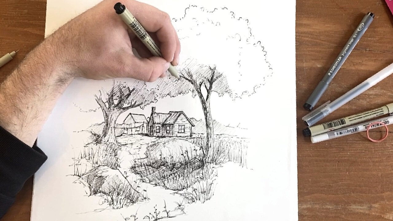
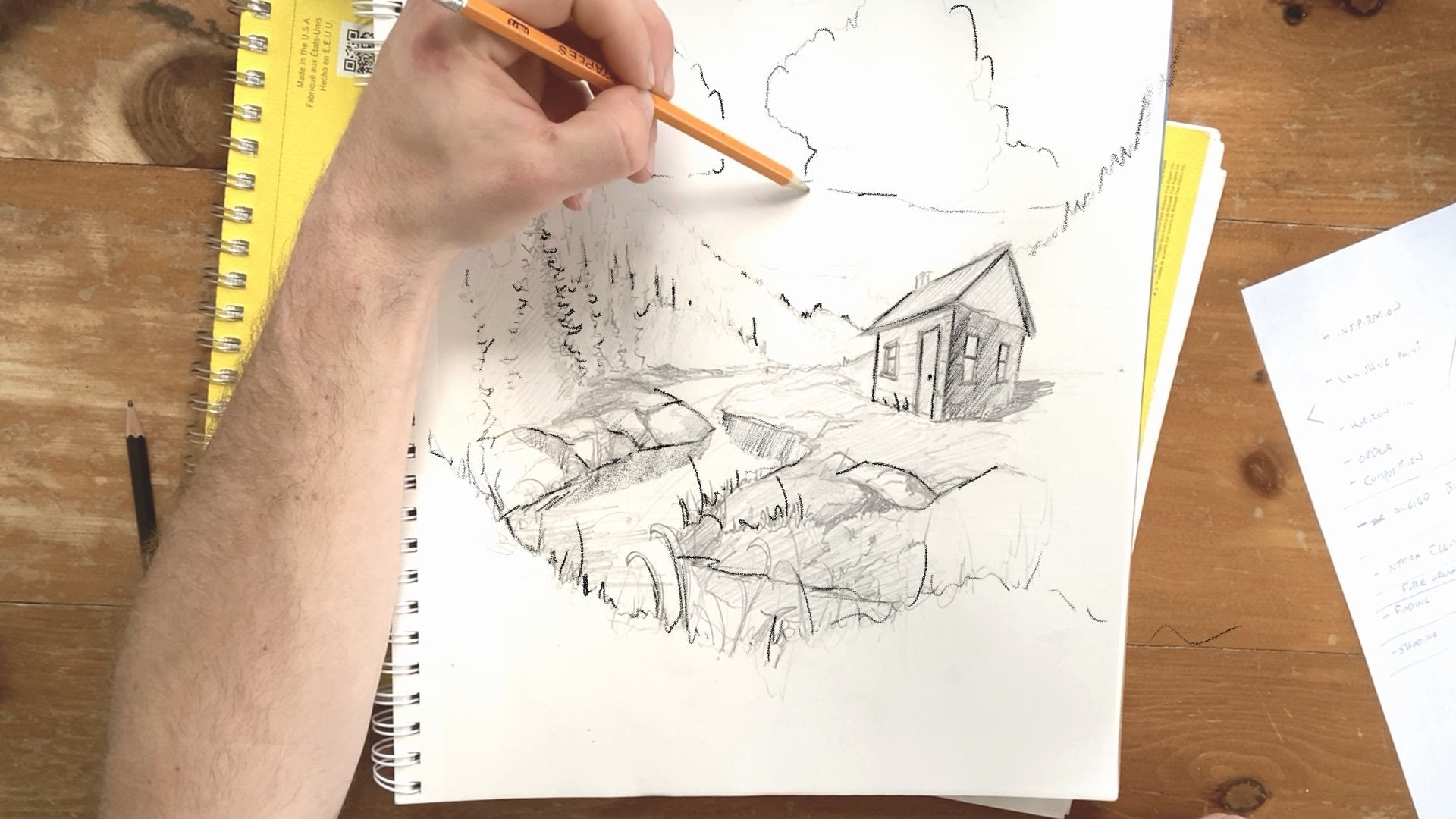
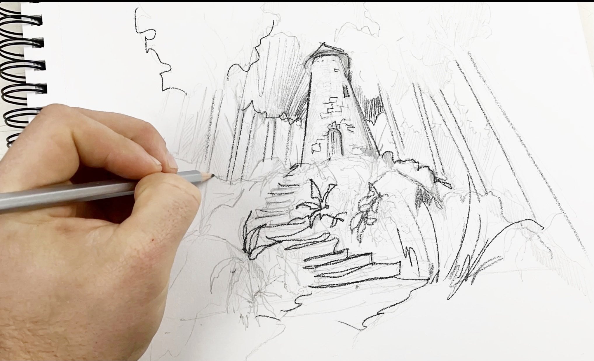
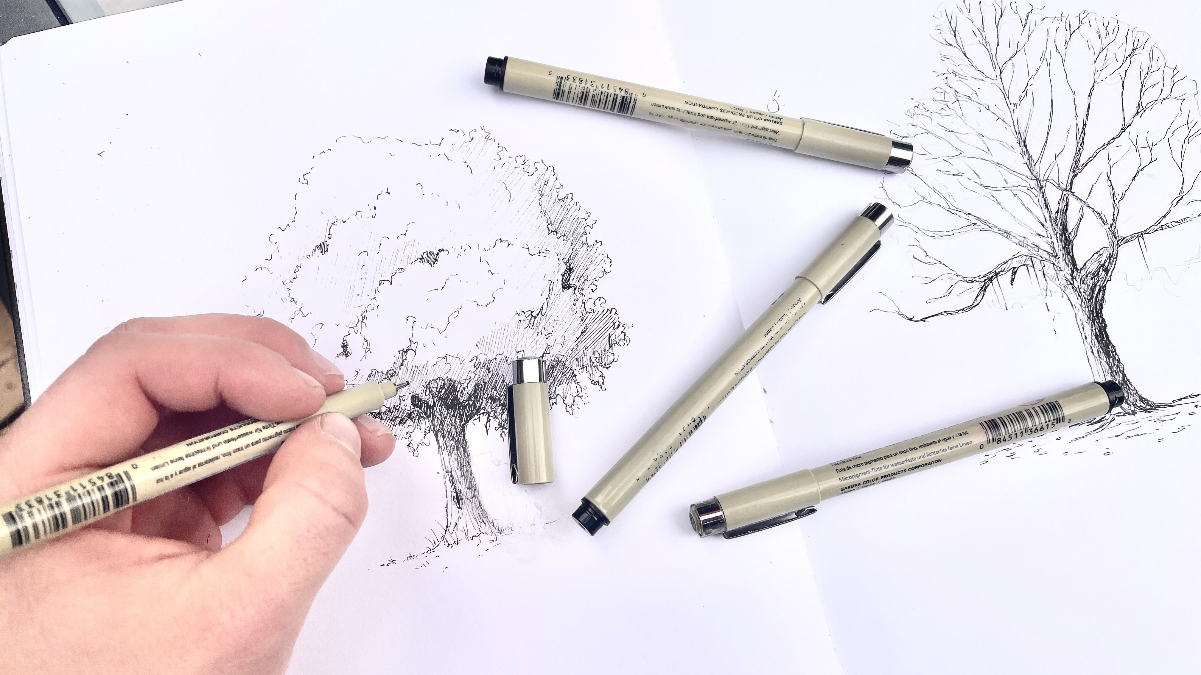
Transcripts
1. Introduction : Art allows us to explore places, places that don't exist. But often artists might feel
unsure about how to create new and fantastical worlds without just copying existing
ones, stroke for stroke. In this class,
you'll learn how to draw an imaginary landscape, complete with focal points, environmental details,
and a composition that really immerses the
viewer in your world, no matter what you
choose to draw. Doing so will not only
expand your imagination, but it'll add some
valuable tools to your drawing toolbox, stuff that you can use for creating new worlds on the page, but also in any number
of artistic endeavors. Hey, I'm Sam, I'm a
pentatonic artist from Ontario, Canada. Whether I've been drawing
for publishing houses, music labels, private clients, creating prints for Etsy, or creating content for
Instagram and TikTok, drawing from my
imagination has been a central part of my
artistic practice. In this class, I'll guide
you through my process of developing an imaginary place
on the page step-by-step. We'll start by talking about focal points and composition. About how to guide
the viewer into your drawing with pathways and clever design as well about how shapes can tell a
story and evoke emotion. Then we'll talk about
the details and how to use Pinterest for
references and how to sketch those
references to gain confidence in the shapes before you put them in
your final drawing. Then I'll go over how I make concept thumbnails
that will help you iron out the kinks and your composition and then we'll get to that final drawing. Lay it all out in pencil first, creating a skeleton of the imagined place
before detailing in other elements
that guide the eye deeper into your world
and provide Easter eggs, clues that really aid in the telling of
your visual story. This class is meant for
artists of any level. The fundamentals of
design here are so useful no matter
where you choose to take your environmental
sketching skills. This class doesn't
focus too much on boring jargon or
theory but instead will get you thinking
about how art can tell a story through the lines
that you lay on the page. When you draw an
imaginary place, the story gets to be your own. If you're ready to get
started, pick up a pen, grab some paper, and bring
along your imagination. Let's get sketching. [MUSIC]
2. Project Video : [MUSIC] In this class,
we'll start by discussing how key concepts
such as composition, the role of light in buildings, and how to incorporate
inspiration, how all those things
go together to tell your visual story
of your imagined place. There'll be multiple
chances for you to try out these concepts in the
first half of the course. Creating a Pinterest inspiration board, sketching details, and creating thumbnail
sketches to keep your mind imagining
imaginary worlds. The second half of the course, we'll be creating a fantastical
location of your own. You can draw something
similar to mine or makeup entirely
your own creation. Well, I'm drawn to
natural landscapes and more fantastical or
medieval-inspired buildings. These tips can apply
to sci-fi art, steampunk locales, and more. This class does not
focus on color, just drawing with black
and white mediums. Color is a building block you can add next and I've linked some great classes
which focus on color and color theory in
the class description. For this class, here are
the supplies you'll need. You'll need some
thicker paper to draw on and pens or pencils. I don't focus much on pen
size or the kind of pencil, so don't worry
about it too much. But I'm using a HB pencil
for most of the class. For more recommendations check
out the class description. But you can also use
a tablet and stylist too using a program
like Procreate. It will also be handy
to have a phone or tablet nearby even if
you're drawing on paper. That way you can easily
access reference photos. One more thing,
keep an eye out for the top tip banners
that will pop up like this throughout the class. Those zero in on some of the most important
information I think you should really keep in mind when you're drawing
an imaginary place. Before we dive into the details, let's discuss how landscapes and locations tell a visual story.
3. On Landscapes and Emotion : What do you feel when you
look up over a city or when you see the world
open up from on top of a mountain like this? Landscapes in places
are all about emotion. When you look over
this landscape, you're likely emotionally
influenced by the forest, the water, the calm location. That's why creating
imaginary landscapes is so much fun and it's
such a special challenge. You work within the world of the purely visual to evoke
emotion and give the viewer clues as
to the landscape and how we should feel about
the place you're drawing. That's the bones of this
class and I thought it might be useful to begin here. Let's explore this
idea for a second. How observing landscapes
and how they make us feel can help us build
our own on the paper. First, keep in mind
that landscapes work in tandem with the details and the man-made
structures within it. The buildings, this
lamp post, the signs, the fences, tell
us how we should feel about a place
and what is it for. But check out this landscape. If I sketch a cabin up here on this mountain, the mood changes. We might be struck by
the isolation of it all. The tiny size of the cabin in comparison with this
vast sweeping valley. Conversely, how does this cabin in the vacant desert feel? We infer different things
about the buildings and the things within
a drawing based on the surroundings.
Where we are. Often big open spaces evoke
mystery and magistery. Small enclosed spaces
evoke com and comfort. But the landscapes in
details within a piece all work together to tell the
story of the drawing. That's the idea
that we're going to use to our advantage today. In the next few lessons, I'll go over key
things to keep in mind which can help
tell your story.
4. Point of View : [MUSIC] In every piece of art, but especially fantastical
or imagined art, your point of view matters. A point of view is
where the viewer is in relation to the objects in the
scene that you're drawing. It establishes the
relationship we, the viewer has to the landscape, to the buildings and to the details within
the imagined place. I'm going to break
down the idea of vantage point it in two parts. First, it's going to
be about how close or how far we are away from
the main part of our drawing. I'm going to break
down the idea of vantage point with the
example of a house. First, if I'm going to draw
the horizon line down here, generally gives us a lot of
space to work with up here, and I'm going to draw this
house very large and imposing. I'm sketching out this house. Now this would allow
us to add a lot of details about the home itself, making it the real
star of the show. We could add some
trees behind here, and maybe some other
environmental features, maybe a mountain
in the background. But it really
positions the house as the main part of
this environment. In fact, to me, at least, it makes it look
like the house is acting upon its environment. By that, I mean, since
the house is centered, and we are so close to it, it's almost towering
over top of us, it appears a little
bit more imposing. It gives the house a
little bit more power over its surroundings. Conversely, if I draw the
horizon line up here, which makes it look
like we are going to be looking down on the scene, and I'm drawing the
same house from above. Perhaps it's much
smaller in this drawing, but we can infer that it's the same size of house by the
fact that there's one door, maybe there's a
tiny little window. But the landscape expands
or around the house. This would give us some great opportunity to draw the same thing I
do in the last drawing. Maybe a huge mountain range, maybe a cliff making
it look like it's cascading off the side
and some other trees, the same trees that
were visible here. But now at least I view the
scene completely differently. As opposed to the last scene, I think it gives the landscape much more power over
this focal point, over this house here. We can draw some little paths
leading out from the house. But by positioning
this house very small and positioning the
other landscape elements around it with more detail, it allows us to explore the environment or say
something about the house. Perhaps if we want to add more details around
the environment or give the sense of
scale or vastness I think this is a really
effective angle to draw from. Lastly, one way that
I really like to add immersion to my
imaginary scenes is by drawing the drawing from a vantage point of
someone on a path towards the focal point or towards the building that is going to anchor our scene. I'm going to draw
the same house, but I'm going to try
to draw it as if the horizon line is in
the middle of the page. Now remember, the horizon
line is eye level and so it's positioning is if
there's a person walking right here or us, we are level with the house. I think this angle gives
us some entry points because if I draw a path
leading towards us, to me at least it makes it
look like I could walk up the path and enter in the
house from the front door. It's a very neutral or
eye level vantage point. It's not towering
over above us and we're not towering above it, it almost makes us feel
like we're walking into this scene the
way we normally would. Now we're talking about
imaginary places so this house hopefully is going to be
something a little bit more interesting than this. But that gives you
an idea about how the vantage point intentionally places the viewer in your scene. By keeping an eye on that
and doing it intentionally, I think you can achieve some
really interesting effects. In the next lesson,
we'll talk about the focus of your
drawing focal points, and how we can
know how to create the main point of
our visual sentence.
5. Composition: Finding a Focal Point: [MUSIC] A focal point is the
main part of the drawing. The most important
thing that you really want to make sure the
viewer doesn't miss. Then fantastical
or imagined art, it becomes so much
more important. For the purposes of this class, we'll use a building
as our focal point. Here's a couple of
methods to draw the viewer's eye towards
that focal point, towards that main part
of our imagined world. First, let's talk about
the rule of thirds. The rule of thirds
basically divides up your page into nine
different boxes. In this concept is that our eyes are drawn
to these points. By positioning the focal point, maybe I'm going to make
a little castle here. On these main points we
tend to look towards them. It's a really
interesting way that you can draw interest
towards these scenes. The focal point maybe is this castle here but if I
want to draw another point of interest like a towering
mountain behind it, I can make that peak or the center point on
another of these points. Our eyes are drawn to
them and by positioning these items on these axis, it's a really great way to
draw attention to them. Now, another idea is spacing. Negative space, the white
space in your drawing, the empty parts are really important and that's a
really great way that you can create emphasis and draw the eye towards
the focal point. I'm going to draw that
same castle again. Then if we imagine that maybe
this is a forest behind it, it's on the rule of thirds but I promise this is a
different idea. There's going to be a forest and maybe a mountain range here. As you can tell, I'll
draw the castle up here, there's white space
behind it and there's also space in-between
these other elements. We can almost block
the castle off. It has its own room
there and that can be a really effective way
to create emphasis. Another example may be that same castle way down to
the bottom of our page here. Maybe I'm drawing trees but the way that these
trees are positioned, it really does draw the
eye towards the center. I can do the same
maybe if I'm drawing a big mountain up here
and perhaps if I was going to add detail to
this mountain I would fade it out as we get
down towards the bottom. That little cushion of blank space around
the castle really does give us a
little bit more room to add emphasis without
crowding it out. If I added detail all
around here it would likely lose the
castle amidst it. Whereas now I think
there's more of an emphasis placed
on the focal point, even if our eye is also drawn to this craggy peak up here. One of my favorite ways
to create emphasis in focal points is by
using pathways. Just like in real
life when you're hiking mountains or hills
or walking down a street, roads draw the eye, lines draw the eye. I'm going to talk about a
couple of ways to do that. First, if I'm going
to use our castle again because I just love
castles as you can tell, I'm going to draw this
castle up here on a hill and perhaps there's
mountains around it, really into mountains
these days in forests. Now, a literal pathway drawn down here I
think directs the eye. We could imagine walking up here all the way to the castle. There's a
directionality to this, it's going all the way up here. But you can also do this
in maybe a little bit more of an abstract
way and that's using details and aspects of the environment to draw the
eye towards the castle. Not only could it be
a physical pathway but even if there's
no pathway there I could position things around the castle to draw
our eye up there. Maybe I'm going to draw
a rock down here or a tree that's stumped over. As you can see, these items create a directionality
towards the castle. This tree points upwards. The lines on this rock point towards the castle
and even this line which might be a
treeline for instance directs our eye upwards
towards the castle. Lastly, let's talk about
how you can create emphasis on your focal point
with light and shadow. Now, since we're
not using color, this is a really great tool
that we have in our toolbox. That's by casting
the certain things in light in order to
draw the eye to them. Let's talk about it in
terms of this example. Perhaps I want to infer that
there's another mountain over on this side that's
casting a shadow this way. Perhaps I can shade in this forest and if you can imagine what
that might look like, if it was darker you can see that the castle
being in light on a black background or a darker shaded background really makes it
pop a little more. In a much more I
guess detailed level, say I wanted to create emphasis on this side of the castle, maybe there's a door here or a person walking
up towards it. Even if this side of the
landscape is in the sun, maybe I could create
some interesting shadows on the castle itself, add some details here to draw the eye
towards this contrast, our eyes are naturally drawn
towards sharp contrast. By creating some nice shadows on your castle or putting it in the light
around dark elements, it can really draw interest.
6. Composition: Foreground, Midground, Background : [MUSIC] Most works of art
contains three key areas, the foreground, mid-ground,
and background. In this lesson, I'll go over each of those
and talk about how you can use those spaces within your drawing to
both add interest, draw attention, and tell
stories creating a relationship between the areas
and the characters in details you
place in each spot. To give you a visual example
of foreground, mid-ground, and background, let's draw
some more lines on the page. I'm going to draw
three here fairly lightly but for our purposes, this can be the foreground, this can be the midground, and this can be the background. The first thing to keep
in mind is how where you position the focal point
or different elements of the drawing can tell you more of a story about the
surrounding landscapes. Let's say for
instance I'm drawing the castle way here
in the background, up on a hill. If I want to draw a
full environment, I need to still draw
some details and some environmental elements
in the foreground. Just like we talked
about earlier with the idea of pathways, this also is it gives
you an example or a great way to add
some Easter eggs to the scene to add
some detail and also contribute to the
environmental storytelling that you are trying to achieve. Since the castles are in
the background we have so much space to work
with and that can often be a great way to add some further details that raise questions about the scene. Perhaps here I'm going
to draw a sword and we wonder whose sword this is and why is it sticking
out of our rock. Maybe in the
mid-ground back here, I'm going to draw some
banners drifting in the wind, a tattered a little bit. I'm still trying to draw
interest towards the castle, but here I've included some environmental details around it. The foreground here is the part closest to us
with the mid-ground occupying that shape of the scene in the background
in the very back. This brings us to
the second point, which is the
foreground, mid-ground, and background is a great
touchpoint for knowing how much detail and how large to make things
in your scene. Well, a lot of the times these planes meld into
each other and they're not as clear-cut as
these shapes here. It gives us a visual
reference and I know that this sword in the
foreground is likely going to have more detail than these flags in the background or maybe trees that stretch
up towards the castle. I find that if I fading
out details as it gets closer towards
the background, you can really add a sense of scale and space to your scene. However, likely I want
to keep some detail on this castle or
this focal point, even if it's a little
bit further away from us to make sure that it still seems a inviting place or it still has a
place of prominence. But let's talk about creating an unusual relationship
between the planes. For example, I'm going to
redraw that sketch I drew earlier with a little
castle and I'm going to completely cut out the
mid-ground and instead draw that massive mountain here. I think that creates a sense
of emphasis on the castle, but it also creates a
question in my mind, at least about the
relationship from the castle to the larger
landscape behind it. It directly brings the
castle into conflict with the mountain back here because there's
no distractions. There's not a mid-ground to
soften the middle distance. Now there's nothing here. It's just the castle
in the foreground, and the mountain
in the background. To me, that creates
a really dynamic relationship and causes me to question the role of
the mountain back here. Now, remember this sounds similar to when we
talked about vantage point and that's because it is. I think a lot of these tips meld together but I think by
having them in your toolbox, maybe it'll help you
remember in a different way, or maybe you connect
with one tip focal point over
another background, mid-ground, and foreground. But in the next lesson, we'll talk about
details and shapes and shape language can
help further tell the story of your
imagined environment.
7. Telling Stories Through Shape : [MUSIC] While the
way elements in our drawing are composed matter, the shape of those
elements that matters too. With pencil or pen or
any drawing utensil, shape is a really valuable
tool in the toolbox because shapes tell us what we should think about different objects. Here is an example in lots of well-known
fantasy landscapes. If I draw a tree, for instance, and I draw it with
nice soft curves and soft bushy foliage, I think that that tree
looks pretty inviting. But if I draw the same tree with scraggly branches and
lots of right angles, I think to me that at least
that looks a lot creepier. Yes, it has no leaves, so we don't really
associate that with life, but I do think the shapes, and really do give a visual
clue about the landscape or add an aura of mystery
or maybe some discomfort. As well-known fantasy landscapes that have a lot of
circles in them, and rolling hills often create a sense of
comfort or home. I'm not sure why, but I do like those really soft organic shapes complimented maybe by
a soft background, and compare that to
jagged mountains. These arrow shapes
really are a little bit more terrifying and
have harsher lines, straight angles,
and sharp points. Maybe we associate that
with negative things or scary things because of knives or blades or
something like that, and we see this in
character design as well. I think a lot of the fantasy characters that we associate with fun or comedy usually are more round or
have softer angles to them, whereas a lot of bad guys like in Despicable Me, for instance, or shaped like these harder
or triangular shapes. I'm not a very good
character drawer, but that gives you an idea. Basically, just keep that in
mind too as you're drawing. That was soft, lyrical, or organic shapes, usually imposed com or comfort, harsh, jagged shapes fear. This next element of shape language would
be scale or size. If you look back to this drawing when we talked about
foreground and background, I think just like the
idea of emphasis is created with a relationship between the foreground
and background, there's also a relationship
of size and scale here. The capsule is very
small in comparison to the shape or the detail
in the background. It imposes it over top. How do you feel
about this castle as opposed to one that towers
over the landscape? I think that there's
the wider sides of the castle in the
fact that it's large, it takes up more space on the page than the mountains
in the background. Give it a sense of
prominence of sturdiness. The bigger the focal point in relation to other
objects around it, you can create a sense of importance or
scale or solidity, or take that away. Maybe I want to create
an imposing castle, but I want it to seem
a little creepier. Well, I can go back to the shape language we
just talked about, and maybe I can thin
up this castle, make it a little
bit more spindly, and then maybe add some
arches that arch up towards the sky and make
it look a little bit rickety and unsturdy. To me, at least this looks
a little less sturdy, and this castle looks
a little bit less trustworthy than
the one before it. Not only does incorporate
some nice sharp angles, but it just looks a little
bit less structurally sound. When I want to
make a castle look a little creepy as well, I can create some weird
architectural elements that don't really make
a lot of sense, and it jot out at
strange angles. Now, we're going to
take a short detour and talk about a pretty
fundamental question. What do you want to draw
in the first place?
8. What Should you Draw? : [MUSIC] No matter
if you choose to draw exactly what I'm going
to draw in this class, my hope is that afterwards you'll continue drawing
imaginary places. The key question you might have every time before you
pick up the pencil is, what are you going to draw? Well, I can't answer
that for you, but I have, I guess, a few methods that
I've found really useful when I'm a
little stumped about how to even begin picturing the imaginary world
I want to draw. First, it's thinking
about inspiration, not just in vague terms like your favorite movie or
your favorite video game, but specifically what about that world or what
about those scenes inspires you because
you don't want to copy what existing artists
have done all the time. You want to copy the
feeling that you get. I find that a really enjoyable
and rewarding thing to do, but change is for everyone. If you're stumped, really think about the movies you love, the books you love, and what specifically inspires
you about them. Another method I love
to do is drawing fast and loose without thinking. This is really
great if you put on some music or podcasts
or if you have a movie going and you're not really thinking about the
final product at all, you're just doing a
light landscape gesture drawings on the paper. Lastly, I gave you
a cheat sheet, so if you check the
class description, there's a handy
little sheet on there that has three columns, and when you combine the three
columns in different ways, it gives you a different drawing prompts that you can
turn it into a world. But now we're ready
to hop onto details.
9. Drawing Details : When I am drawing or
designing imaginary world, I always start with
reference photos and the references that I
incorporate into my work. I don't end there but I
start there and here's why. Even though it sounds
contradictory, because I'm drawing
an imagined world, real-world references help
me keep it on track and help keep the viewers immersed
in the imagined place. For example, if I
am attracted to nose architecture or Viking long ships or any sort
of element like this. Knowing which details
I have to get right is really
important so then I can twist the ships or
twist the castles or the huge halls
to my own devices. Take for example the idea
of a castle on a hill. If I don't know how
the bricks look or how bricks were laid back in
the real medieval times, I don't know how to draw my fantastical
version of a castle. Even though you might not know exactly how a castle looks, often, you have an idea of
how bricks should appear. If I draw those wrong, it really ruins the immersion. But if I get that
right I can then twist the castle to
my own purposes, make it spiral up into the
sky or make it contain huge arches or other
worldly elements. But it's based on
real-world inspiration. The same applies to
natural environments. Even if you want to draw a floating spaceship in the middle of a medieval valley. I know I'm all
about the medieval. I just love that
medieval time period. It can be helpful if I want to create a sense of immersion by studying how a village
would be laid out. For example often
thereby water or often they'll be roads
leading in as well. If I'm drawing a
steam punk village, I want to keep in mind about maybe some of the
infrastructure elements. Is there a train
leaving downtown or where does the sewage go? Some of these small
little details can be so useful in adding immersion. In the next class, we'll
put this idea to work. Creating a Pinterest
reference board and sketching some details we can include
in the final drawing.
10. Creating a Reference Board : [MUSIC] In this lesson,
I'll show you my method for creating a Pinterest
reference board. Then how I do sketches of details that I can reference when I'm drawing
the final drawing. Let's dive in. The reason
I love Pinterest is because it's so easier
to find images, and it's also easy to
save them without having to copy, paste, download. You can have them
all in one spot. The first thing I need to
do is create a new board. When I'm looking for reference photos or when I want to find out
what I want to draw, I often will start with the background of the
landscape that I'm going for. Even though I'm drawing
a fantastical place, usually there's a real-world
location that looks similar. In my mind that would be
like the Scottish Highlands. If I'm starting with
the background, I'm going to look up
Scottish Highlands, and look for photos
that both contain the natural elements
that I find captivating, but also from an angle that
I think I want to draw from. Now it's important when we're
picking up these drawings, you never really want
to draw the image exactly or if do, you want to contact
the photographer, this is really useful for
bringing the natural elements. Next, we want to talk
about your focal point, about this main building
that we're going to incorporate into the drawing. Whether that's a castle
I'm going to draw, or a spaceship or a
futuristic building, think about maybe a
real-world location, a real-world object
that might look similar or have
similar qualities. I find the world of castles. There's so many
fantastical castles, but there's some incredible
real castles as well. I think you don't go far without running
into an initial style, and I think this one's
going to work well for me. Lastly, I'd like to look for some other
environmental details. I can add some Easter
eggs that I called them before to my drawing as well. I'm going to check out a
bridge because I want to add a bridge in the foreground. I'm going to twist it
to my own devices, but I want to find one that looks like it's a real place, and then I will change
it up how I like it. I find this is pretty beautiful. Has some nice moss
which I really love. Lastly, I find a texture, or a vegetation, or some sort of texture in your drawing is really
useful to save as well. Again, I'm in a fantasy
world here in a castle, so I'm looking for more
of a natural texture. But even if you're drawing course on from Star
Wars, for example, looking at skyscrapers can be a really useful way
to add textures or elements into your drawing
and getting a sense for how the lines in
them might appear. Don't stop here and go
through Pinterest and add more stuff to your board. Well, I only added a
background or an environment, a building, and then some
details and some textures. There's really
endless possibilities for you to create a
board of inspiration, a Pinterest mood board. Pause this video, create
a Pinterest mood board, and then come back, and we'll go about
sketching them.
11. Drawing from References : The second part of this
lesson is going to be sketching some of
these references. Because as I talked about
bridges, castles, swords, all these imagined details that I want to put
into my drawing, it can be helpful
to have a chance to practice them before I'm confronting them on the page in a final imagined
places drawing. Open up your sketch book or grab a blank piece of paper
and let's get to work. Let's draw some of the
references that you found on Pinterest or that you
screenshoted on Google Images. It's important not to
draw them directly. Sketching them is a lot
different than drawing note-for-note the actual object. Be careful if you draw them too directly and post them
online without credit. We don't want to be ripping
off other artist's work or repurposing photos or other people's art
for social media. This is more for
our own purposes and we're going to use it in our final imagined places drawing where it'll be
stylized in our own way. They should be quick
and easy sketches done in small-scale, perhaps all on one page and different details
you want to include. Maybe a door, maybe a
castle, as I mentioned, or anything that really would aid in the creation
of your world. Not only will this spark ideas about how it
can look on the page, but this is the time
you can practice any of the tricky shapes you might
come across in these details. Because often these
central details or architectural motifs might be the trickiest thing in your
drawing to draw as well. Creating the sketch
reference sheets is a great way to test
out designs and elements before laying them on the page in your
final drawing. Don't forget to post these in the class project page as well. I'd love to see what you found inspiring and what your
little sketches look like. But remember, don't
take too much time, try not to take more
than five minutes. You just really want to
sketch out the shape, getting a feel of what
this might look like, and later on, we're going to start diving into
the drawing itself. Now that you've pinned at
least a few different details, environmental ideas or buildings that you
might want to draw, it's time to create some
thumbnail sketches of them. This is a great way to work
on the shapes and practice, get your hand-eye coordination
down before we can start implementing them
into our final drawing. I found a really great
way to ensure that I don't draw too long
or too detailed, this is just to
box in my drawing, creating a thumbnail sketch, which we'll also use
in the next lesson. I'm maybe going to
stick with three. Now, I'm going to draw
the main element that I want to incorporate into
my drawing in each box. For example here, I might just draw the
river because I'm really interested in the
reflection and the way that the stones
meet the water here. Or here, I might just
draw the bricks of the bridge because I know I could never come up with
this bridge in real life. Or here, maybe just this
main tower because that's the casual structure I want to put it in our main drawing. The key is to not take too long. Take maybe five minutes and
just sketch in these details, get a feel for the shape, for the shadows, and for the scale. This is really great useful last step before we start sketching
out concepts of the composition that we're
going to draw in the page. Pause this video, take
five minutes and draw three or four of the
details that you've pinned. In the next class, we're going to talk about
drawing from thumbnails, getting into the
nitty-gritty of sketching out our final imagined
scene. [MUSIC]
12. Concept Thumbnails : [MUSIC] I find when
I'm confronted with a huge white page that I know I'm going to fill
up with a drawing, and maybe frame, or sell, or give away, there's a
certain amount of fear. I get a little
tremble on my hand. I feel a little bit
nervous, very excited, but definitely a little nervous. That's why I love to do
little thumbnail sketches before I start because
while sketching details and those
detailed references that we talked about earlier,
well that's valuable. It can be really helpful
to sketch out thumbnails. Concept thumbnails are a
really good way to get a feel for the final composition
of your drawing. You can work out any kinks
and draw really lightly and small without worrying
about the details. You can imagine
the details as you lay these concept thumbnails
down on the page. Let's get into it. To start off drawing thumbnail sketches, you're going to do what we
just did in the last lesson. Draw some smaller boxes, the same aspect
ratio as your page, like the same general
dimensions, just smaller. You can make them whatever
size works with you, but I usually like
them fairly small. The reason why I do
these after I've drawn detail reference sketches
is because now I have the details in mind and then imagine them in the landscape, in the composition without
having to draw them in here. Instead here I'm focused on the general look of the drawing. You notice in my
Pinterest board here, I have this lovely little
rock formation, which I like. I like this more, the more
I look at it and I really want to incorporate that, and so I want to sketch in that, and maybe the castle
that I drew as well, but I'm not going to add detail. I want to sketch in
the basic elements. Maybe some really
light lines and maybe some background details like clouds and stuff like that. But this is to get an idea. If you're like me,
at least if you know that this is the castle,
these are the rocks, maybe this is the
river and the bridge that I've pinned as well, your mind can fill in
the blanks and you can maybe imagine what
those details or what the shading or what it
could look like even without having to draw them
in very accurately. Now, we're going to
do some of your own. I'd say maybe do three or
four thumbnail sketches of the details and the
environments that you've pinned in different layouts. These are going to be useful and we're going to pick one, and that's going to
be our final sketch. The crazier, the
better. The rougher and the sketchier the better. Sometimes my concept sketches or composition thumbnails
are so rough and wild that I don't think someone
would understand what they are if someone who wasn't
me was looking at my art. Pause this class now and take five or 10 minutes and draw some really quick rough
concept sketches. This is integral as we move on to the next part
of this class, which is finishing up our
own imaginary location.
13. Sketching a Final Drawing : In the same way that thumbnail sketches are a great
way to practice composition without
too much consequence before you commit to a drawing, sketching out your
final drawing is a great way to do the
same thing with details. We have the
composition down pat, we know what we're
going to draw. We also know what we're
going to fill it with, what's going to be in our scene. Now we have to unite the two. Grab your final piece of paper. I'm just going to use a
sketchbook 8.5 by 11 paper. It doesn't really
matter what it is, could even be printer paper, but we're gonna get to work
drawing out a final drawing. First, how do we choose
which thumbnail sketch to bring onto the paper
in a final drawing? Because we had to decide
that first before we even start sketching
out this final drawing. One tip that usually helps me decide which angle to
draw from or which of my practice sketches to use is looking at the focal
point and deciding which of these sketches allows me to draw the focal
point like I want to. Usually that's the
part of the drawing I'm most excited to draw, whether it's a castle
or a skyscraper, or a blimp or a spaceship. Often when I'm sketching
out these drawings, I'm gauging which
angle feels right, and I'm imagining maybe how it would look
with detail on it, even when I'm doing
these rough sketches. I think, for example
this sketch down here, it really attracts
me because I like the way that it has
a strong background. It's nicely composed with this on that rule of thirds
on that lower axis. But the castle is close
enough that I can still add some detail and add some points of interests and maybe some pads that
lead us towards it. The good thing is
that we're just drawing a drawing [LAUGHTER]. If you end up not
liking it halfway, you can just grab a new piece of paper and start over again. This is a no pressure situation. I'm going to just focus on the most prominent lines first that I drew in this
thumbnail sketch. I'm going to draw them
really lightly here. That is the joy of sketching
first with pencil. At this point I'm not really
focused on any details. The main part that focal
point is the thing we want to make sure we get
right first in this sketch. I'm going to tackle this
castle now and draw in just those prominent lines
that I drew in that sketch. Along the way, I'm
referring back to the thumbnail sketch to make sure that I'm getting
the dimensions right, that's still fit the size
that I sketched out at first. I often sketch out
the vague shape of the focal point to make sure it is in proper
dimensions here. This can always change later. I'm going to add that bridge. Again, just like when you're drawing the
thumbnail sketches, it's alright to go over
your lines multiple times. Now, I can refer back to some of the
reference sketches I did as I sketch in some of
the environmental details. Again, I'm not shading
at this point, just trying to get
their outlines right as I finish this drawing
a little bit more. This is also since we didn't add these details in the
concept sketches. This is also where you
can really be intentional about how you're
placing these details. You see here with these rocky
crags that I'm doodling in, I wanted to create a line
down towards this castle. This is like an arrow shape, as I talked about before, almost like a
metaphorical pathway leading towards the castle, and I'm keeping that in mind
as I sketch out the size and dimensions of these rocky crags. I'm also keeping in mind the story I want to
tell about that castle. As I talked about earlier, the core of this class
is visual storytelling, and in this case, I
like the idea of having that neutral angle
to make us feel we are walking towards it. An eyeline, the horizon line halfway up the page,
as I mentioned. Again, you'll notice
I'm not really sketching in textures
because we'll do that in the next lesson
as we add more details. At this point, I'm just
trying to get the environment right and make sure that
perspective is alright as well. This stage is especially important when you are
including straight lines. I don't have many straight
lines in this sketch, but if you're
drawing a futuristic seen or even the size
of the castle here, these are harder to get right, and I find when you're drawing really
sketchy enlightened, loose, I've drawn this line
probably about 10 times. To me it's not
completely straight, but it's achieving
the effect I want, and I achieve that by getting the median or the average of
all the lines I've drawn. If that makes sense. Now, I'm not drawing in details, but I want to refer back to
my reference sketch here as I draw this tower of the castle. I'm checking out how the
perspective worked in that Neuschwanstein castle as I draw this cannulation part, and that poke lovely
pointed roof. Then I'm referring back to that lovely Scottish highlands photo to make sure I'm capturing the outline of where I'm going to add
detail and texture later. When you're sketching
like this and when you're laying it down
on the final paper, this is also a great way to mentally gauge
the foreground, midground, and
background and determine the amount of detail you're
going to put in each one. If it helps you to even sketch out the lines
like I did earlier, and write the letters in, so you have a visual cue. This will help you know how to fade it out because I mean, I'm really big fan of fading out backgrounds
and making sure that the shapes behind
the focal point are a little bit less detailed nor to make
this stand out. This is also a good workaround because this rock formation, as you saw in the
reference photos on my Pinterest board,
is really detailed. I don't want to draw
all those details. This allows me to
skirt that [LAUGHTER]. In the next lesson
when we do Lindy, those details, you'll see a
little bit more what I mean. Next we're going to darken these lines and add
more details to the details and details to the focal points and less
details to the background. We're basically going
to finish it up here.
14. Adding Detail : As we talked about the details that will give your
drawing flavor. They can be anything from
grass flowing in the wind to swords or helmets or people
flying around or cars. This is where it's most helpful to use your
Pinterest board and your references that
we talked about earlier. Because now we're going to
try to add in the details and flesh out the focal point and add some textures
to this drawing. If you didn't have
it handy before, I definitely suggest
getting your Pinterest board or any of the screenshots
that you sketched out in reference photos. You get that up now,
you will need it for this part of the
class where we talk about implementing the details in a little bit more detail. I'd also suggest giving your pencil a sharpen
or maybe grabbing a finer pencil or a
harder pencil nib. Again for some suggestions, check out the class description, but we're going to
be adding details, so you want a little bit of a sharper point to work with. Not a big deal, but it
would be a good idea. Now, we're going to start
adding some details. We're not shading, we're just adding the lines at this point. It's still a little bit lighter. Then after this class,
I'll give you a chance to darken in some of those details. I suggest starting with the focal point because
that can give you a good gauge of determining the level of detail in other
parts of your drawing. Specifically, how much
detail you add to your focal point and
where it is will tell you how much you need to
fade out the background or how much detail
you could add in other parts of the drawing to draw interest towards
the focal point. Remember it's your world, so
I'm not saying you have to copy your references directly. But as I mentioned, the
part that inspires you or the part that feels right for the world you're
trying to create, keeping an eye on that photo
can really help you nail it. But as you can see, I'm transposing this to
my own purposes. I'm not following it directly. I'm just copying some of these elements that
otherwise I might not really remember exist. Such as the bottom of
this crenelated tower. That's a really really
cool architectural element that I might not think
about otherwise. Also, in tricky perspectives like on the side of this tower, this is a really helpful way to get those right by
having photos handy. These are some hard angles
here and I'm guessing that whether you chose different photos of your
drawing along with me, there are some
difficult parts of your references and that's why this part of the
drawing is so important. Also, keeping an eye on
some of the textures as well that I could maybe add. I'm going a little bit
heavier than I did on the other sketch because I can go back and
darken in these lines later on. Once I had the focal point done and any other
elements around it, I can start to go on to
the environment itself. I find a really good way to start with this is just starting with the biggest areas
of texture or detail. For me, this definitely the
highlands seen up here. Again, I'm not shading
at this point, but I want to add a
little bit more detail to these rocks, and I'm following these
craggy outlines that I see in this reference photo as well. This is really
helpful when you're looking for other
environmental details because this big hillside right
here likely would have some of the
same rocks that I see in the Scottish Highlands. I'm adding them in the same amount of
detail at this point. But then later on, I'll be shading parts of them in depending on how
close they are to us. It's funny. I find
in sometimes in the reference photos when
I'm sketching from detail, if they get a little
bit pixelated when you zoom in and
that can actually be a good thing because just like the pixels
when we're drawing, we can't really hit every centimeter or every
tiny little detail. Even though there are pixels, our eyes catch up
on those details. Similarly, when you're drawing, even if you're not catching
every tiny little detail, the point is to try
to make or give an illusion of detail through
the lines that you do draw. Now, we didn't get a
reference photo for this, but I'm going to add a
little off-kilter signpost, like the idea of guiding people into our scene a
little bit more. I've realized also
in this drawing of the bridge here that it contains some really nice vegetation
references as well. Up here I know that
I want to start with a little bit more detail
in the foreground. I can sketch in some
of these leaves. I think another really key point of drawing in details is answering questions that
maybe your composition poses. For example, here, this castle has a
bridge attached to it, and I never really
thought about why while I was composing
the sketch. Now I need to figure out
what would be on this side. Is there another path
I can draw or can I give the impression that this is castle's
part of a larger network. I think a cool way to get both of this might
be to add another path. I'm going to doodle
in and I give the suggestion of another
path going up in the forest. Then maybe up here I can draw another castle-type
structure that's a little bit less detailed. To me at least just
like we talked about in the previous lesson about the castle and the
mountain behind it. I think by having
this focal point, this is still the central
part of the castle, but the path naturally
guides your eye here, and then you're drawn
up to this area. There's a relationship
between these forms. I like how that adds some
questions to the world. I wonder if you can do
that in your own drawing? Is there an element that you
implemented that you can expand on similarly
to this bridge? Maybe for you that,
I don't know, a tree that has been cut over or maybe there's the sword that
you draw in the foreground. Can you add another
clue in the background? That raises more questions
or answers some of the questions that your
visual story is asking. Don't be afraid at this point to look for more references. Just like I talked about your drawing and
raising questions. Sometimes it raises
questions about how to draw certain
things as well. Because I think this flagstone texture is really interesting, so I'm going to add
some flags stones here using that sketchy
shape to guide me. Now, since this is starting
in the foreground, I'm going to fade out these
shapes and make them much smaller as they fade backwards. A good trick that really has helped me in
the past is that if you draw some of these
shapes just like leaves here in the foreground, with a little bit more detail, as you move back
into the drawing, you can fade them out. Next, we'll highlight
get it son and shading.
15. Shading and Light: [MUSIC] We're nearly
done our imagined place, your best friend when
you're trying to tell a story about
an environment, light tells us so
much about the mood, the time of day, and what we should feel about the
place that we're looking at. For example if you want
to draw a spooky scene, it's likely not going to be a very sunny scene and
that changes the shadows. A lack of sun means a
lack of harsh shadows, more consistent lighting but maybe darker
backgrounds as well. Often we associate the
sun with happiness or maybe more calm atmosphere and the shadows with maybe
more mystery, more murkiness. Keep that in mind
when you're adding shadows and lighting
to your drawing. What time of day is it? What do we want to tell the viewer about
how we should feel? One thing I really like
experimenting with is seeing if my purpose for the
time of day comes across, for example in this drawing, I'm drawing it in the morning. I want the sun cascading
over the hills because this drawing is all
about going on a journey. I want to infer that the
people living in this cabin, I'm going to be traveling down the valley towards the sea, and at least to me, I
associate the morning with setting out on an adventure or starting things
in the morning. Whereas maybe if your
drawing is about a campy castle on a hill, a sunset scene might
be great because I often associate coming home with the evening of wrapping
up business with coming back to maybe a roaring hearth in your fire, in the castle. With all this class, the key is being intentional. Thinking about what you want
to achieve before you tackle your imaginary place
in order to tell better visual stories as well, it's important to pick
an angle for the sun. I often find it useful to X
out where the sun may be, even if it's farther back
outside the page to make sure I'm consistent with how I'm
shading in the drawing. Keep in mind that if the
sun is higher in the sky, it means it's near to noon. Whereas if it's lower, it'll cast longer shadows, especially that's important
if you're thinking about a sunset scene. I'm in the mountains,
and so I also want to be cognizant of the fact that
if the sun is over here, these mountains are
casting quite the shadow. I think that can add some
nice emphasis to this castle. I'm going to go about starting
to shade in this drawing, and I want to start lighter, especially when I'm
shading it around the focal point because I don't
want to muddy the waters. I'm also looking back
at my reference photos during this process because
I want to shade in a way that emphasizes the texture
without taking away too much. I know that still maybe
with the sun around there, it's 4:00 or 4: 30 in the
afternoon and there'll be some sunspots on the other
side of these mountains. But because I want to
emphasize this castle, I'm going to pretend that
there's a taller mountain just outside the frame here. Now, we don't talk
about pencil technique that much in this class, but this is what you want to
use the side of the pencil. I usually shade with
straight lines and I'm keeping back of my
palm on the page and moving my hand back and
forth fairly quickly to achieve that nice,
softer pencil approach. But this also
applies when you're drawing with pen as well. It's a similar
technique when we're talking about shading
such as this. Now before we start
to darken stuff in, I want to focus on
the focal point. I'm keeping in mind
it's a circular shape with the sun coming
from over there. This is also a time when it's helpful to look for references that have the same light
that you are achieving. Whether that's googling
the similar shape or similar time of day. This can be really
helpful to making sure that you're achieving
the right shading. Especially when you're
talking about shapes with angles such as a curved tower. One thing to keep in mind
is that similar to details, light often gets blurrier the farther away it is from you, so even if this side of the
mountain was in shadow, I still want to make this
one far away a lot lighter. This enhances the sense of space and scale in your drawing. In the next class we're
going to talk about revising and tweaking
your drawing. We're nearly done. Now we can take a step back
and see what we need to change or add or fix
in your final drawing.
16. Revising and Tweaking your Drawing: [MUSIC] We've added some
shadows and sun and shading. But as far as details go, there's probably
some room to darken or maybe even room to add more emphasis
in different areas. If you hold your drawing back and take a look at
what you've created. Maybe there are some mistakes or maybe there are some areas
that didn't quite work out. Let's take a step back, when you physically take a step back, hold your sketchbook at arm's
length and check it out. Look at what you've
drawn. This is the time when you can
look for a few things. First, check for things
you might have missed. For me, I can tell right
off the bat that I completely neglected the river. I'm going to take out some
reference photos of rivers and sketch this in
a little bit more. Next, you want to check
for your level of detail. Did you achieve the sense of
scale that you wanted to? Does it feel like you're
drawing has depth. A good checklist for that is going back to the
lines we mentioned, the foreground, mid-ground,
and background. Up here, I can see that I
have some details here, but I don't like contain
that many details back here. I'm going to add a
few more gestures of shapes to add some
elements of interest. Also checking back
to this reference sketches that I've drawn
and seeing that maybe I could add some cooler elements down here by the water to guide the eye and just add some more complexity
to the scene. Lastly, you want
to ask yourself, is your scene
interesting enough? That might sound harsh, but
it's a really great way I've found to push yourself
outside your comfort zone. Are there shapes that
you neglected to draw because they're
too difficult? Are there elements
within your drawing that feel like they could
be explored more? Are there ways that you
can make your composition? Ask a few more questions or
tell a little bit more about the world that is
being explored here. I think for me I see that
I had the path up to this second building
that's cloaked in shadow. But I can explore that more. I've talked a lot about bridges and I really liked the idea of drawing more bridges here. I wonder if I could even
just add the silhouette of a bridge back here.
It sounds very lame. We're talking about
fantasy world to be excited about bridges, but I just find they add a lot of beauty
to the landscape. To me at least, drawing
bridges is a cool way to practice some complicated
shapes like arcs and the way that
stones are laid. I want to make sure that when
I'm drawing this back here, I don't take away from
the focal point too much and maybe I'm even
verging on that here, but I think it adds some
interest to the scene as well. One more thing, this
is a good chance to darken in the shading, add maybe some more
complicated shapes in the shading to
give it some texture. Now that we're confident
in the composition, we can just darken in
what we have here. Now, as I mentioned
a couple of times, I think this class gives you some tools that you can use as a jumping off point as you
add color, characters. As you continue to maybe to draw the scene in
different ways or explore a story in
multiple frames. However, I think
when I zoom out, we have a really great bonds of a concept or an
environmental drawing here. Now you can finish
it to whatever level of detail you want. But I just have one
request is that you post this in the
class project page. I'm so excited to see
what you create and hopefully you are invigorated by the world that
you've drawn as well. Maybe it'll cause you to
ask questions about who lives there or the stories
that could take place there. Hopefully it makes you want
to explore it even more. Pretty sure if you can implement some of the
tips I've talked about, it will make the audience
or your viewers maybe captivated and maybe feel
like they could walk into this environment as well. Even though we're done, we've taken a look, we've
added some more stuff. I'd invite you to sit with
your drawing for a little bit. I think I like the idea of
trying to talk to my art, whether out loud
or in my head and ask if there's anything
else I can add to it. You don't want to overwork it. But often pieces of art will
look done or feel done. The best art keeps you engaged, especially when you're
creating worlds like this. Hopefully you're engaged
in the process and you feel maybe there's
more you can add. That's pretty much it. We
have our completed drawing of an imaginary place. What's next?
17. Next Steps: [MUSIC] You made it, you
completed an imaginary place. Through this class, we've
gone over the building blocks of concept art and
environmental design. We've talked about focal
points and composition, drawing interests towards the
main parts of your scene. We talked about lighting, shading, details, visual design and references,
and getting inspiration. Keeping these concept in mind, I think will help your
visual storytelling flourish as you move
on to any medium, whether it's paint,
watercolor, acrylic, oil, procreate digital
brushes or anything. These building blocks are integral if you want to
keep creating stories. I hope this class gave you a
little bit more confidence to create places
that don't exist, to follow your imagination and trust yourself along
the artistic process. I'm excited to see the fantastical place
that you created, so please don't forget to post it in the
class project page. I want to see what you
created and I want to hear a little bit about the
place that you imagined. Bonus points if you can
tell a little story about the location
that you drew. Thank you so much for
taking this class, I hope it's been helpful
and happy drawing. I'm excited to see
what imaginary places you explore next. [MUSIC]
 Sam Gillett, Pen // Pencil // Procreate