Transcripts
1. An Introduction: Our brains are wired
to look for faces, so much so that they find
faces where there aren't any. This is why portraiture is
such a powerful art form. It's what we're most drawn to and what we can most
deeply connect with. Hi. My name is Al and I'm a portrait artist and
illustrator based in Florida. I've been creating portraits for over five years and I've been sharing my artistic journey over on Instagram @lilstarnerd. I love making my
artwork colorful and expressive to reflect
the way I see the world. When I draw a portrait,
my focus is on capturing the beauty that
I see in this subject. I try to add a bit of myself or my perspective into my
work and I looked for ways I can connect to
the subject in order to make it feel more
personal and full of life. I often focus a lot on the eyes, the windows to the soul, or features that
make them unique. In this class, you'll learn an expressive approach
to portraiture and how facial features like
the eyes or mouth can be used to make that portrait
more striking and lively. Throughout the
process, we'll cover how to choose and break
down a reference photo, basic sketching and
shading techniques with a series of exercises, effective techniques for
measuring proportions, how to add your
unique perspective by emphasizing certain features. Finally, how to use color as a narrative device to
finalize your portrait. This class is great for
artists of all skill levels. We'll cover some sketching
basics to ensure that even beginners
are ready to create, but we'll also talk about ways to upgrade current skill levels. By the end of the class, you'll
have an approach you can use to tackle any subject to create more expressive
illustrations and infuse more of your own
perspective into your work. I'm so excited to
share my passion for portraiture with you and I can't wait to see you
in the next lesson.
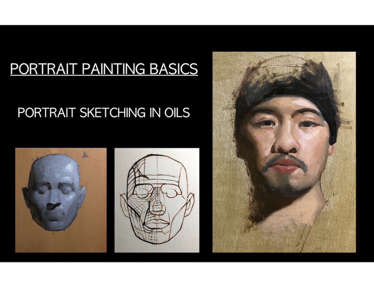
2. The Class Project: [MUSIC] The final
project of this class is to create your
very own portrait. To help you along that journey, I created a class guide book. This book will break down all the skills that you've
learned and help you apply them individually
and then bring it all together for
the class project. This book includes key
takeaways from the lessons, diagrams, examples
and practice sheets, and plenty of sketching space. For the final project,
I want you to have fun and make a portrait
that you're excited about, but I will be looking
for some key elements. I'll be looking
for an interesting and dynamic reference photo, accurate proportions, clear emotion and expression, and the purposeful
color palette, but remember that the
most important thing is that you're excited and
passionate to create. Make sure to share your
progress in the guidebook as you follow along the lessons
in the project gallery, and of course, share
your final portrait as I'm so excited to see
what you create. [MUSIC]
3. Expressive Approach to Portraiture: So many artists make portraits, but not every artist
knows how to make a portrait unique
and expressive. The key to beautiful and
unique portrait pieces are a lot of skill
and a lot of thought. I develop my process
to approaching portraiture over
years of practice. I'm going to share
that process with you to get where you want
to be a little faster. I've always loved making
portraits and it's always been what I've been
drawn to as an artist. I've always loved
looking at faces, watching people talk
to see how they move, and see how the light
plays on their faces. In short, faces are what
I'm passionate about. Over my many years of
practicing making portraits, I picked up on things
along the way. I learned to ask myself specific questions that helped me get to where I want to be. For example, what is the
goal for this portrait? What expression do
I want it to have? What story am I trying to tell? Having any old portrait
is fine and good, but making a portrait that
makes you feel something, or can tell a story
is far more exciting. Asking myself questions
like these help me make a lot of decisions
throughout the process. Another thing that I've
learned that it's very important when
practicing portraiture, is determining
what you can do to make this portrait
unique to you. I'm sure many of us have
a Pinterest account, and a lot of times we all end up using the same references. Is it really that
exciting to make the same portrait that 20
other people have made? When I go into a portrait
knowing that I need to add my own unique perspective
and twist on things, it makes it a lot easier to feel more connected
to the portrait. In the end, I want a
product that I feel connected to and
feel ownership of. I want this portrait
to be my own. As I'm choosing references, I ask myself, how can I
make this portrait mine? As I'm drawing the portrait, I continue asking
myself that question, what tweaks can I make that
make it more unique to me? As you practice portraiture, you'll develop an eye
for certain things. You'll be able to find
reference photos more easily, and within those
reference photos, you'll be able to pick out features that you
want to highlight. Whenever I look at
a reference photo, I look for one key
feature that really stands out to me that
I'd like to emphasize. Whether it's the color in
the portrait, expression, lighting and shading, or even
something like face paint, makeup, things like that. I've also learned that not all portraits are created equally, and oftentimes you'll need different mediums depending
on the reference you choose. Some references are more suited towards gouache or watercolor, while some are better for
oil or colored pencil. When choosing your
reference photo, think about what medium will be best to highlight
this reference. Like I said, I've been practicing
portraiture for years, and I've been able to break down my process into a
few major steps. These steps are
warming up, sketching, finalizing my sketch,
adding shading or color, and adding final details. I find this process to be very intuitive and could
work for anyone, but I absolutely encourage you to have fun with your portraits, and follow your artistic
instincts as you continue your portraiture
practice after this class.
4. What to Look for in a Reference: A great reference photo is the first building block
to a beautiful portrait, but they can be tricky to find. There are a lot of
elements that make up a good reference photo, and now we're going
to talk about what those elements are. Using and working from references
is super-important for building your mental
rolodex a facial anatomy. Not only will references help us create a beautiful portrait now, but learning to use references and how to understand
them is super important for
creating a foundation for learning to draw
from imagination. Using references are a
fundamental part of art skills and all of the greats used
references. We can too. That being said,
it can be hard to find the right reference, especially for something
like a portrait when the subject is only one thing. I'm going to walk
you through a large array of reference photos to help you learn
how to pick one and learn what to avoid. Here's a board of
reference photos with many references to choose from. Before we discuss what
we're actually looking for, let's discuss what
we're not looking for. If we're being honest,
portraits can be pretty boring. As beautiful as
any face could be, it's not always interesting to look at two eyes, a
nose, and a mouth. When we're looking for
a reference photo, we want some extra element
to add that interest, because without that interest, we get something like this. It's a nice photo, but when we look at her face, there's not much to look at. She's not making a particularly
interesting expression. There's not much
contrast to her face. Despite being in a
bunch of leaves, there's no interesting
shadows on her face. There's not much
emotion in her eyes. There's no story here. Here is another example
of what I would consider a boring
reference photo. This is a perfect example of what I hate in reference photos. No part of her face is obscured. We're looking head on at her so we can see all of
her facial features. Except for this little
tilt of the head, we're not really seeing
many different angles or an interesting face tilt. Her skin is perfectly smooth. There's no texture or
anything interesting there and she has no
expression on her face. There's no interesting
lighting or shading. There's no contrast and there's nothing
really to look at. Basically, if it looks
like it could be a perfume or jewelry
ad in a magazine, it's probably not a
great reference photo. Now let's look at
some examples of some great reference photos. This to me is beautiful. Not only is the head
at a slight angle, but there's amazing
shadow and color here. While she's still not
showing much emotion, that's something that we
could play up on our own. There's a lot to work with here. Great highlights,
great contrast, great cast shadows, we've got strong bold lines, and soft fluid lines. Here's another
photo that I think would work really well despite having a lot of the same issues that those previous photos had. We're looking head-on,
there's not much emotion, but there's so much
lighting contrast. It's creating these
really interesting shapes on his face that would be
a lot of fun to play with. Here is a great photo. Not only are there
interesting colors, but her head is at an angle that obscures one of her
facial features. The angle and the
lighting make for some beautiful
shadows and lines, not to mention her
face has freckles. That's really interesting
and fun to draw. She's got a great
expression on her face. Overall, this is an
amazing reference. Here's another example. Again, we're looking
for at least one of those elements of tilt, shadow, light, texture. In this photo, we have a
slight angle to the head, but we also have those freckles. Despite otherwise being a
somewhat flat portrait, those freckles add a
lot of visual interest. Here's a photo that uses
a very strong expression. When you have things like
wrinkles in a face or a smile lines or even when
you squish your face, that adds a lot of
interest to a photo. The thing is a photo like this, where the skin is
perfectly airbrushed and smooth can seem
really appealing. You think that this
might be easier to draw because there's not
much texture to worry about, but the truth is
trying to accurately capture this very
smooth and large, expensive cheek is
very difficult. When you have things
like wrinkles and smile lines and
creases in the face, that actually gives
you something to draw. It's way easier to deal with these creases and
the contrast that that creates than it is to
deal with one smooth gradient. Overall, what we're
looking for is at least one major element to our reference photo that
makes it different than this, whether that be harsh
lighting to cause shadow and extreme
expression, wrinkles, freckles or some sort
to the skin, overall, something that
breaks up the face so it's not one large shape. The key for someone
who's more of a beginner is finding
a reference that has enough detail but
not too much detail that it's overwhelming. Something like this might
be a great example. There's interest to the face, but not so much so that it would be overwhelming and you
would lose track of it. Whereas a photo like this might
be a little too detailed. Like I said, overall, it's a lot about preference,
different subjects, different lighting,
different poses, etc, will inspire different people and inspire them differently. As long as the photo speaks to you and you're excited about it, that's what matters
most because that will translate into
your portrait. Now it's time to go
find a reference photo for yourself to use
throughout this class. I recommend choosing
a few different ones to work from
throughout the class. If you're having difficulties finding reference
photos that you like, I've put a few in
the resource section of the project gallery. Now that you know how to
pick out a reference photo that speaks to you, where
do you go from there? The next step is to
learn to visually understand that reference and translate it onto paper. [MUSIC]
5. Breaking Down References: [MUSIC] Now that we've picked a few good reference photos, we're going to take a
closer look at them. We want to try to break them down in a way that's easier for us to understand and translate into the beginnings
of a portrait. I have a bunch of reference photos in here that
we're going to break down. I'm doing this digitally so I can better demonstrate to you. This is something that
you can do digitally, you can do traditionally, there are pages in your
guidebook for this, but over time, this should be
something that you learn to do visually without actually
having to draw it out. Now the goal here of breaking down a
reference photo is to better familiarize ourself with it so that when it comes
time to drawing it, we can do a better job. We want to break down
this reference photo into something we
better understand. Looking at it now, it's
a lot to deal with. There's a whole
lot going on here. We can't possibly draw
every single pore, every single little hair, and it's a lot of visual
information to take in. We want to break it
down into its parts. There are a couple of ways
to break a reference down. Here, there's not a
whole bunch of contrast. If we want to do contrast, we can see there's
a triangle here, there's a little shape here, there's one on the nose, but overall there's not a
lot of contrast to look at. Instead, let's break
this down in shapes. Overall, we see there's
a pretty distinct shape for her skull here. We have a pretty distinct
shape for her ear. When we look at the eyes, here's a great example of a whole lot of
visual information. Eyelashes, eyelid folds,
eyebrow hairs, bags. But we don't want to
worry about that. We're breaking this down. If you zoomed out or
really squinted your eyes, you'd see that there is
one large shape here, and here there's
one large shape. The whites of the eyes make
their own little shape. You can see when you zoom out, you can see the
beginnings of a face. Obviously, it looks silly, but we're starting
to understand where these shapes are in
relation to each other. The nose, with this highlight, I see a little button nose here. If we wanted to, we could even block out this highlight here. Everyone's brain works
a bit differently and breaking down by shapes
might not be for you, but for some people, this might be a great way
to understand what it is that you're looking at and build a plan for your portrait. Let's try another one. Here's a great example
of where we can start mentally making a plan. In a future lesson, we'll talk about adding
emphasis to certain features. But as we're working here, we can already start
thinking about that. When I look at this
reference photo, what speaks to me? What pops? For me, I'm looking at his eyes. His eyes have a lot of contrast and a lot of
life and a lot of color. I'm also looking
at his mustache. His mustache is super interesting visually
and that might be something I want
to highlight.. As I break down this
reference photo, I'm going to think
about what is it that I want to keep in and what do I think is information
that isn't as necessary? I'm thinking about
his face shape, where his features are in
relation to that face shape, and what information
might be unnecessary. For example, outside
of the mustache, there's this facial hair and
there's this facial hair. That might not be
something that I find as interesting and so I might
decide to leave that out. I also might decide
to simplify and make this one distinct area rather than a bunch
of individual hairs. I'm also noticing that there's
a large highlight here, a highlight here, and
a highlight here, all areas that I really
want to preserve. This is also another great
example of a facial feature with a lot of detail that
we might want to leave out. Lips are always very detailed and they're often
really hard to capture. His upper lip is pretty simple. There's two distinct areas
of light and shadow. But this lower lip has
a whole lot of detail. This might be another area
that I decide to make one distinct shape with
perhaps one little highlight. Here's a great example
of a photo that can be very easily broken down
by shading shapes. First of all, we have
this large shape here that's all light, and a shape here
that is all shadow. We have more shadow. A lot of her hair is shadow. We can block that in as one
large shape if we want. Here is one large
shape of shadow. Those are the major basic
shapes of our reference. Now if we want to
get more detailed, we can zoom in here and we
can start breaking down. Here's some shadow. Here's some shadow. Shadow. We really start understanding the nuances of the face in comparison
to the bigger picture. We don't want to
get too caught up in individual facial features. Something that really wouldn't be productive when breaking down is simply tracing
the facial features. That's not giving us any
extra information that we didn't already know in order
to prepare for a portrait. Let's talk about
breaking down by color. It's very similar to blocking
by shapes or shading, but we're going to think in
terms of color this time. If I were to give you
3-4 colors, a dark, medium, a light, and a white, where
would those colors go? We're going to pick
out our darkest darks. Here's a darkest dark. Our nostrils, the
corners of the mouth, eyelids, maybe the eyebrows. Your first instinct
might disable all of this is the darkest dark. But we want to make
sure we're preserving the darkest dark for really the darkest areas on the portrait for
the most impact. Then we can certainly
looking for the second darkest areas and the shapes that these make. Then we have our
second lightest, and because this is a
pretty light skin portrait, we can safely assume that all of this is going
to be that area, whereas your white or your
absolute lightest color will be for the highlights. With this knowledge, you
should be able to break down any reference photo into its
parts, shapes, or colors. This makes it way
easier to not only translate it into a
drawing or painting, but also to tweak or emphasize parts of the photo to make
it feel more like your own. Now that you're more familiar
with this reference photo, it's time to start
sketching. [MUSIC]
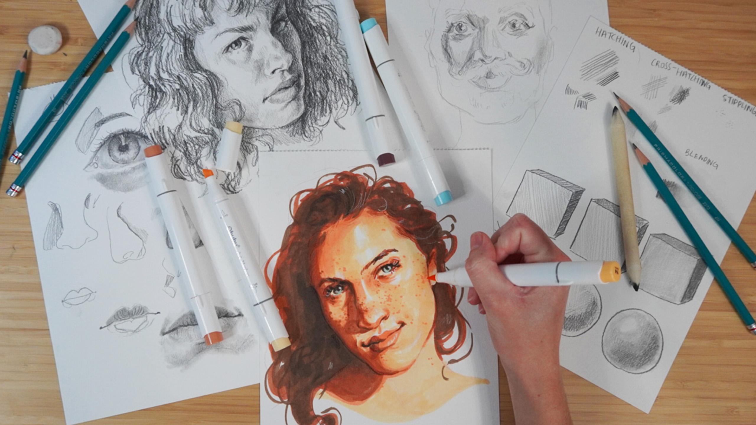
6. Warm Up: Sketching Basics: [MUSIC] Sketching seems like
a simple and basic process, but there are actually
some great techniques that artists use to elevate
their sketches. We're going to go over a few of those techniques to make sure that our portrait has
the best fonts possible. Before we get into sketching something as complicated
as a portrait, I want to go over the
basics of sketching, especially when you're
leaning into realism. Portraits are really complicated and they rely a lot on shading. Understanding shading
techniques with graphite pencils or any other
supply is really important. We're going to talk
about a few of the major methods for shading. First up, we have hatching. Hatching uses a series of parallel lines to
imply depth or value. Obviously, when we use
something like graphite, we can use the
pressure to create different values as well,
which comes in handy. Something a lot of artists do, is use hatching but follow
the form of a shape. If we have something
with different plans, their lines might follow the direction of those plans
to help imply that form. Next up we have cross-hatching. Cross-hatching takes hatching
and crosses over it. This is the method
that I use most often I find it very intuitive. Often it employs hatching
and cross-hatching, the more you layer
over a certain area, the darker it becomes. For lighter areas I'll often use hatching to fade
into those whites. It's important that
we're keeping our wrist loose and being much more
natural with the lines. Especially when
we're doing shading, we want to build up our
values so we want to start as light as possible
and slowly build up. Another example is stippling. Stippling uses a series of
dots in order to imply value. I find this to be the least effective method and in my opinion, the
ugliest method. It's often used in tattoos and comic art and it
can look beautiful, but I find it's very
time-consuming and things like cross-hatching and
hatching are just far more easier to use. Finally, we're going to
talk about blending. Blending can be done done
a few different ways. I have these blending
stumps here, but you can also
use your fingers, paint brushes, Q-tips, or bundled up paper. Using blending is great for
very realistic portraits because it helps you get
those nice smooth values. The only problem is when you
have to do very large areas, it can often get very patchy and you might not want to
waste all that time doing blending when you could have interesting texture with
hatching and cross-hatching. Another thing I
recommend you have on hand if possible is
a kneaded eraser. Kneaded erasers are
great because you can get them into a really
fine point if you want to do things like
erase little lines or dots for flyaway
hairs or pores. It can also be used to lighten overall areas by picking
up the graphite. Now, that we've talked
about those examples, I want us to use them
to shade a shape. It's one thing to be
able to theoretically understand these techniques and another to be able to
actually use them and control them in a way to
make believable form. I'd like you to practice
along with me if you have a sheet for
this in your guidebook, we've got six shapes here. We have a sphere and
a cube for hatching, cross-hatching and
blending and if you'd like to try stippling,
you can do that as well. I'm using an HB pencil, but for this
practice you can use whatever pencil you'd like, including a regular mechanical
or Number 2 pencil. Starting out with hatching, we want to use parallel lines and we don't want this
gap between them. If you like that look, absolutely go for it. But we want to block
in one solid area. I'm going to follow
this direction of the form here to imply form. I'm doing another
pastor really dark enough that value and
get rid of any gaps. Now, this part of the cube is going to be our darker side, here will be our
second darkest side. I'm going to do just
one layer here. For this face of the cube, going to go much
lighter and leave more of those gaps to
imply way less shade. Now, let's try this
with a sphere. If you'd like to use
rounded lines to help imply that circular
form, go for it. We're going to stick to
three or four major value. We're going to start
with the darkest area considering a light source is
coming from this direction. Again using hatching, lines all going in
the same direction. Now, we're going to go with
our second darkest value and we're going to go in
with our lightest shade, preserving an area
for the highlight. You can see how with
just a few values and with only parallel lines
so we can make a sphere. Now, let's try it
with cross-hatching. This time we're going to start
lightest and go darkest. I'm going to do one layer here to imply a
really light area. Here I'm going to
go a bit darker. I'm going to do another layer
in the opposite direction. You can already see that
that is much darker. Here we're going to
do three layers. What I like about
cross-hatching is it adds so much texture and visual
interest and like I said, is much more intuitive. Now, we're going to do
this with this sphere again with the same
light source and again, I'm going to start
lightest to darkest because we're building
up that value. I'm going to cover one area except for where we want to
preserve that highlight, then would that second shade, we're going to go in
a different direction to create that cross. Finally, we're going to go
in with that darker shade in another direction or even in the same direction
we've already gone. You know what, I
still think that's not quite as dark
as it could be so I'm going to do
another layer and now we're going to try blending. You've see that there's
a lot of texture here, which again you might like. But if you want to
go for something a bit more realistic and smooth, that's where blending
works really well. I'm going to put one
light coat there, slightly darker code here
and I'm not picking up the pencil this time and
an even darker one here. When you do light areas, you want to make sure you have
a relatively clean stump. Otherwise, you might make it much darker than you intend to. Now, I'm just going
to smooth it all out. Now, we're going to go
in our darker area. Again, smooth that out
in our darkest area. For me there's not
quite enough contrast here so I'm just going
to do another layer. Again, we want to
build up that value. Now we're going to
do the sphere and this is pretty much
going to be either hatching or crosshatching
or a mixture of both and then blending
on top of that. It's essentially building off of the same techniques
we've already used, we're just taking it that
little step further. [NOISE] Now, that
we've got this down, we're just going to very
easily blend it out. Like I said you can
build off of these, you don't have to pick
one and stick to one. If I blend all this out and I decide my dark values
aren't dark enough, I can come back on
top scribble more on and I don't have to blend
it out if I don't want to, I can employ
different techniques. Before we move on,
I want you to be nice and warmed up
and by that I mean, having a loose wrist get those creative
juices flowing and most importantly learn patience. Because it'll be using a lot
of techniques like these, there's going to
be a long process of building that value. We're probably
going to go through a few ugly stages to get
to where we want to be. Doing exercises like these and taking the time
to properly warm up helps you remember to be patient throughout
the process. The most important thing
to remember when sketching is to keep your wrist
loose and be patient. Make sure to practice
these sketching methods in your guidebook. If you'd like to
share your work, post it in the
project gallery to share your progress
with the class. Make sure to keep practicing these skills as we move forward. With these principles in mind, we've got the tools to start the skeleton of a sketch[MUSIC]
7. Sketching: Creating a Skeleton: We've got the rundown
of sketching methods, but how do we use
them in a portrait? The first steps of a
portrait are hugely important in determining how the rest of the portrait goes. We want to start
out as strong as possible and as
confident as possible. Often the hardest part
of any artistic process, whether you're drawing,
painting, whatever is starting, no matter how much theoretical
knowledge you have, no matter how prepared
you are often making that first mark
is very intimidating, especially with something
as complex as a portrait. It can be really difficult to know how or where do I start? But in my many years
of drawing portraits, I found a few ways to get rid
of that fear and jump in. A major trick is what I call
the circle and cross method. The circle and cross
method employs a circle and some lines to give you
the basic form of a head. From that forum you build off of it and create the rest
of your portrait. The circle will
encompass the majority of the skull or the
dome of the head, and the cross are lines that imply major mid lines are
structured points of the face. For example, if you wanted to draw someone looking head on, a circle would be used
to capture the dome of the head and a cross would be used to show you the direction
that the face is looking. We have a vertical line to show us the mid
point of the face. Basically between the
eyes and down the nose, this line helps us know whether the face is looking
left or right. For example, if a
line we're here, we would know that the head
was looking off to the left. We then use at least
one horizontal line to show about where
the eyes are. For example because this
person is looking head on, the eyeline would be about here. If they were looking down, it might be somewhere down here and if they
were looking up, it might be somewhere up here. We want these lines to
follow the form of the head. Some people use a lot of lines, for example here is the eyeline, here's the nose line
and the mouth line. You can use as
many guidelines as you want or as
little as you want. I tend to use this as a
starting point to warm myself up to get rid of that blank canvas
or blank page fear, it helps you get a rough idea of where your head will
be on the page, but you don't have
to be worried about strictly sticking to it. Speaking of figuring out where
this will be on the page, this is also a great way to determine how big your
portrait will be. Example for this portrait, I want us to be about
center of the page so I can map out where that top
of the head is going to be, so I know that the head will be taking up about this area. Now we have relative placement
and size of the head. If you have
difficulties drawing to scale or figuring out the
skill that you want to draw, and I highly recommend
using this first step. In this portrait,
she's looking off to the left and the
mid-line of her face is, I'd say about here, and her eyeline is about here. Again, this can be
super rough at. This point remember,
we're warming up still, so we want our hand far
back and we want to keep it loose wrist
and light lines. Choose one of your references
that you've picked out and practice getting down
the size and shape. Try using the circle and cross method and see
if that works for you. Some people prefer to go in
with a really light sketch of the entire head and get a loose idea of what they
want it to look like. If that's something that
works for you, go for it. You can use as many sketch
layers as you need. Now that we're all at the
point of having a circle and cross or a very light
base for our sketch, now we need to figure out
where do we go from here? There are a lot of different
ways that people go through making a
drawing or a portrait. Some people like to
start with outlines and work their way into
the center of the face, and some people like
to go vice-versa. Some people start in one corner
and work their way down. This is another thing
that can take practice, but I recommend listening to your gut what feels
natural to you? I tend to work from the center outward specifically
with the eyes. The eyes are the center
point of the head and everything tends to line up with them in one way or another. If I start by
putting in the eyes, I can work around that to figure out where
everything else goes. For this sketch, I'm
going to start with the eye closest to
me and work that in. Again, we're keeping
loose and light here because we want to
keep our portraits unique and interesting to us. Don't worry about being exactly photorealistic and
copying your reference, especially when
we're warming up. This is about where I will
start with my portrait. From here I would go through
the natural steps of working out towards the
outside of the face. We're using very basic
and soft lines and very basic shapes to very lightly and roughly
map out this portrait. We don't want to go too dark or even add too much
value at this stage. As you're doing the sketch, you might want to do a few
of these warm-up sketches. It's a great idea to get
comfortable with your process. Now we know how to start
a portrait sketch, but there's a lot more
to a face than that. Before moving on to
the next lesson, lay down a skeleton
of your own portrait. In the next lesson,
we'll talk about sketching facial
features. [MUSIC].
8. Facial Features: Do's and Don'ts: [MUSIC] Facial features
are incredibly detailed anatomical structures, and getting those
details right can be the making or breaking
point of your portrait. Let's talk specifically
about the do's and don'ts of eyes,
noses, and mouths. Facial features have
a lot of details, and it's really easy to get
overwhelmed by those details. It's also really easy to represent facial features
unrealistically. The first thing that you
need to know about all of these facial features
is to not use outlines. We're definitely
going to use lines, especially when we're
sketching our sketch is comprised of lines. But as we get further
into the portrait, we're going to build off of
those lines and use value. We don't rely on outlines, we want to rely on
shading to imply lines. Also remember that
facial features are organic structures, which means there's no straight
or hard lines anywhere. There's a lot of planes, natural curves, and
organic shapes. There's also not
exactly even spacing. There's a lot of
organic clustering. A really great
example of not quite understanding this
is in eyelashes. I see a lot of very
beginner artists drawing eyelashes,
something like this. That's just not what
they look like. There's this even spacing
and they're straight lines. That's not what they look like. Open up your guidebook and draw along with me as we go through these
facial features. We're going to start
off with an eye. Obviously, as we sketch this, we're using these lines. But these will be erased or used as a base for
shading later on. Now what we don't want
to do is go in with one heavy-handed line and make one distinct outline
for the entire shape. Another thing that I
often see people do is create a point on the
outer corner of the eye, when often this lower lid is folding back underneath
the top lid. We want to represent that. I'm going to draw the iris now. If you really look
at a reference photo of a very close-up eye, you'll notice that the iris is actually not a perfect circle. Going to draw the pupil in. You'll also notice that
the iris is made up of a bunch of little
striated lines. I often see people do
something like this. This is a great place
to rely on shading. The outer corner is often much darker than
the rest of the eye. I'm going to block that in. The upper lid also sticks
out over the iris, so that top half of the eye is also going to be more shaded. If you ever have the time, I totally recommend looking at the anatomy of facial features. Because understanding
the anatomy will help you draw it a lot
more realistically. Based on the light
source, the lower half of the eye is much lighter. Now I'm going to blend this out. I'm going to go back in
with my kneaded eraser and get some of
those lighter areas. Here's where implying those
lines can be really fun. Finally, I'm going
to go back in with my pencil and make
those little lines. We're not going in
with sharp lines. I'm going in with these
little circular motions to create these uneven
but smooth lines. Now let's move on
to the top lid. The top lid can trip
a lot of people up. People tend to draw eyelashes coming straight from
the top lid when in reality we have the
shadow underneath the top lid and a
small fold of skin. Then there's the
top of the eyelid. It's from this fold that
the eyelashes come from. Depending on the
perspective of the eye, you'll also see a lot of
bending of the eyelashes. There's a lot of creases
in detail in the eye. Don't be overwhelmed with it. Don't feel like you need
to get all of it in. Already you can see how we're not really outlining the eye. We're using these
shading techniques to imply a line here. We can take that further by shading in the white of the eye. Outlines down here
won't be needed because we'll have this
difference in value. If I were to shade this out, this line is now gone, but we can see that that is where the white of the eye ends. Now let's talk about eyelashes. Like I said, they come from
this top fold of the eyelid, not underneath the eyelid. They also tend to grow
from different places. I might have one
that starts here and one that starts here. It's not all perfect. They might come down over
the white of the eye, and they might go
much farther up. Now the key to the movement
is one swift stroke, like a Nike swoop. We want it to be as natural
and organic as possible, and that can take
a lot of practice. Eyelashes are really fun to do. I often add a lot more
than as in the photo, or I add length. Especially in places
like the lower lid, I love making them
a little bit messy. One thing that is
often really important is the bag beneath the eye. Here's where we're really
going to be relying on shading to imply the shape. The bag is important. Oftentimes people
want to leave it out because they think
it's unflattering. But really this is
giving a lot of information about the
shape of the face. Your eye is an eyeball. There's a whole sphere
underneath here that creates this eye bag
and the protruding lid. Look for larger shapes of shadow and block that
in with shading, rather than creating
an outline of it. Be careful to preserve areas of white for
nice highlights. Now let's talk about noses. Noses can be very confusing. It's very tempting
to go in and put an entire outline of a nose. But when you look at someone, you don't see an outline. You see areas of shading
that imply an outline. When a nose is at an angle and you can
see the ridge line, oftentimes that's a great
place to actually use a line. Not an outline, but a line. But creating this
harsh contrast and this harsh shape can
be really interesting. But when you're looking
head-on and a nose, there are no harsh lines
created, at least in the bridge. We really have to
rely on shading. Depending on the
shape of the nose, you might have more or
less shading to work with. Also, of course, that
depends on the light source. If the light is
coming from this way, we might have a
really harsh shadow here that would
create a harsh line. When we talked about
picking reference photos, we talked about finding harsh lighting and
harsh contrast. That's because it gives us a
lot more lines to work with. When you're you
using soft lighting, you don't really have
those harsh shadows to create shape for you. For a nose with very little
contrast or harsh shadows, I'm going to start with the bottom of the
nose, the nostrils. I'm going to start
out my sketch here. Obviously, I'm using lines now, but we want to get
rid of these later. Nostrils are often going to be a pretty dark area
on your portrait, but they're not
guaranteed to be. There also tends to
be this plane on the ball of the nose
above the nostrils, a plane that goes downwards and the plane of the
ball of the nose. When drawing a nose, you really
want to look for planes. For example, there
is a plane of shadow here with this reference photo and a plane of highlight here. There is often a
highlight somewhere here or down the
bridge of the nose. If these are the
corners of the eye, there's usually a plane
coming from that end of the corner down
to the nostrils. Being able to recognize
and identify all of these planes help you figure out where the shading
is going to go. Now that I've noticed
all of these planes, we're going to go in and
really shade this nose in. The corners of the
nostrils are much darker and the bottom corners of the nose are much darker. Of course, in these photos, underneath the nose and the
nostrils are very dark. While the nose can often be pretty difficult to get right, it's really fun to do. Now that I've blended, I've lost quite a bit of that contrast that I really wanted, so I'm going to go
back in and add that. Here's a nose and you can see
that there's no outlines, but we can still
recognize it as a nose. Now we're going to
move on to the mouth. Now, mouths can get
very complicated. There's lots of little wrinkles, lines, highlights, shadows. Here's a great
place to simplify. Unless you want to put a lot
of emphasis on the mouth and that's what the highlight of the portrait is going to be, there's really no need
for it to be so detailed. It's really easy to
draw a mouth like this. But oftentimes our upper lip
can bleed into our skin. The outer corners of the lower lip often
bleed into our skin. The line that the mouth
makes is often wobbly. There's little shapes there. Corners of the mouth can
relay a lot of expression. I'm going to very lightly
sketch in the shape of the upper lip here
and the lower lip. With regular lighting,
the upper lip is often in more shadow than
the bottom lip, because it's angled downwards. It's in shadow while the lower
lip is catching the light. There's also often
these two budging areas of the lip that are
often shaded around. You can see on this
reference photo there's this shape right here of light. Of course, the top lip is going to cast a shadow
on the lower lip. You can see this shape right
here of light in this photo. Whereas here is more shaded. Again, that's because
of planes of the skin. Let's draw this out, but let's
do this a bit simplified. Because like I said, there's
a lot of detail here. The shape of the lips or
the expression that they take is another great
place to play around with, add uniqueness and
expression to your portrait. I'm going to go in with a layer of shading
for the top lip, weak layer of shading
for the bottom lip, and I'm going to preserve
those lighter areas. Right here at the crest of the lower lip is often
pretty in shadow, until where the chin protrudes. There's often also the
shape here of the lip. Whether or not you
want to include that in your shading is up to you. But I often find that it makes for some
interesting shapes. We're also going to
include the creasing of the corner of the mouth and the shadows that that creates, and the cupid's bow. Now I'm going to go in and
blend all of this out. I'm just going to lighten
up some of the areas that got a bit away from
me with the shading. Now I'm going to go back
in and add a bit more of that contrast and build up
what I've already got here. Again, we're making the crease
of the mouth pretty dark, and we'll add some of
that texture in the lip. Not too much, just
basically the same shape as those eyelashes coming from
the crease of the mouth. We're going to do the
same on the bottom lip. We don't want this to be
too dark or too obvious. We want it to very naturally blend in with what
we've got here already. Highlights on the lips
can be really fun, but we don't want to
overdo it. There we go. Some major do's and don'ts
of facial features. These tips for drawing
facial features should enable you to more
accurately and easily draw faces and give you a boost in confidence
going into a portrait. But how do we put these beautifully drawn facial
features together? Before moving onto
your actual portrait, practice a few variations
of these features. In the next lesson,
we'll talk about proportions and
measuring techniques, so you can confidently
place these facial features on the skeleton you've
created in previous lessons. It's all coming
together. [MUSIC]
9. Proportions and Measuring Techniques: [MUSIC] Proportions
of the face are key to making it look realistic, no matter how beautifully drawn
your facial features are, that won't matter if
they're in the wrong place. In this lesson, we'll go over some measuring
techniques to ensure proper proportions for an accurate and
realistic portrait. It's really easy to put facial features in
the wrong place, I still do it all the time. If something is a little wonky, it can actually bring
a lot of personality and interest to your portrait. But, for example, we're looking at a three
quarter view of a person, if one eye is here and
the other is here, that might not look quite right. Or if one eye is here and one is here that might
not look quite right. There are plenty of
ways to get things just off enough that it
feels uncomfortable. There are actual
tools specifically made for something like this. They're called proportional
dividers or scale tools, and they basically
look like this. You can measure
how far something is and translate that
onto your paper. But there's a pretty easy DIY
way of doing this as well. I have a very quick
portrait that I recently painted to
use as an example. Now, there's two
different ways of using this DIY technique. One will require just
the one pencil you're using and another will
require some other tool, colored pencil, or whatever. Let's say this is our
printed out reference, a picture, whatever. We want to transfer this onto
the paper, a 1: 1 ratio. We want it to be the same size. What we're going to do
is we're going to take this and start measuring. I know that my head is about this large and I'm going
to make those marks here. This measuring technique
is super simple. I am lining up the bottom of
the pencil with the bottom of the chin and I'm grabbing it where the hairline starts
and I am just making really loose rough marks and
we can just keep doing that. Here is how wide the head is, here's how wide the eye is. You can basically keep
doing that until you've entirely reconstructed
your portrait. I don't recommend you
use it for everything, but it's a great idea to
get started with scale. That brings us to
our next method. This is still a reference photo, but maybe it's on our
phone, so it's not quite to the scale that
we want to draw it out. It's no longer a 1: 1 ratio, which means we
can't just measure how big this face is and
translate that onto our paper. Instead, we're going to
find some features on our photo to turn into
our own measuring unit. I tend to go with the eye. That makes sense for me, but you might choose
something different. We're going to take the edge of our pencil and I'm
going to line it up with the inner and
outer corners of my eye. I'm going to make note
of how long that is. I can keep going
back to this eye and reference how
big this eye is. Even if I don't need to
make a mark on my pencil, if I lose that mark, I can come back and just measure it again. With this measurement
of the eye, I can now figure out, okay, how many eyes until I get
to the end of the face? About two eyes. If I have my own eye here and I know it's about two eyes
to the end of the face, I'm not going to try to make
this eye match this eye. What I'm going to
do is I'm going to remeasure the eye
that I've drawn. Now I know that it's about two eyes away to
the end of the face, and so we're going
proportionally. By making our own
measuring unit, we can figure out the
scale or the distance from any place on this photo and
translate it onto paper. You can figure out how many eyes tall or long the head is. Maybe the distance
from the inner eye to the bottom of the
nose is one eye long. Similarly, we can also
make lines on our photo. If we know that the bottom
of the nose is about one eye distance
away from the eye. But we don't know how
far into the eye it is, I can draw an
imaginary line here from the corner of the
nose up to the eye, and so it's about one-quarter of the way through and boom, now we have the
corner of the nose. Using these measuring
techniques are a great support
for your drawing, but I don't recommend that
you fully rely on them. If you get one
measurement slightly off, your whole portrait could end
up looking slightly wonky. I recommend you learn how
to track with your eyes. When you track with your eyes, you're basically constantly
flipping back and forth between your drawing
and your reference photo. It takes some practice, but you slowly learn to measure the scale with just
your eyes alone. If you draw something and it
doesn't look quite right, you can use those measuring
techniques that we've talked about and figure out if
something is a little off. We want to sync our
pencil movements with our eyes as we're looking
at the reference photo. We're actually looking
at the reference photo probably more than we
are at the drawing. This helps us keep in
mind the bigger picture. We're going to track
with our eyes and use those measuring techniques
to make a great sketch. But remember that the key
here is proper proportions. We want to use those measuring
techniques to make sure that no feature
gets away from us. When we get really
focused in the nitty-gritty and forget
the big picture, before we know, we can draw an eye that's way too
big for the face. Remember that every
once in a while, take a step back, look at the big picture and use those measuring techniques. These tools and techniques can take some practice
to get the hang off. I encourage you to keep
practicing and learn as you go. While you're doing that,
in the next lesson, we'll talk about
making your portrait unique and learning how
to add your own style. Before you make
your final sketch, we'll discuss
expression and adding your unique perspective to
the illustration. [MUSIC]
10. Expression: Your Unique Perspective: [MUSIC] Being able to copy a reference photo is super impressive and can
make for amazing art. But adding your
own perspective to these portraits can take
them to the next level. I've got a really basic sketch here of a photo that
we've already looked at. Now I think this photo
is really interesting. I think there's a lot
of great contrast. I love the colors. I think it's a really good
basic reference photo, but there's not much emotion
or expression going on. But that means it's
a great blank slate for you to put your
own perspective on it. Whenever you look at
a reference photo, you shouldn't feel trapped
into copying what you see. Every reference photo
should be an opportunity for you to put your own twist
on what's already there. You should feel comfortable
and confident in turning that
reference photo into exactly what you want it to be. When you look at a
reference photo, think about how you
can make it your own. Oftentimes that can
be exaggerating or altering the expression
or facial features. This is also a great
place to embrace your style and bring that
into the reference photo. When we are focusing on realism and working
from a reference photo, pushing the limits of
realism, adding stylization, and putting your own
twist on things is a great way to make it unique. Not everything has to
be photo-realistic to keep the essence of
a realistic portrait. When you're looking
at a reference photo and you see this blank slate, you want to think about
what is interesting to me. What do I want to
say about this? What do I want to bring out?
What do I want to highlight? When I look at reference photos, I often think about what I find beautiful
about that person. I want to bring joy and beauty
into the world and often that's what I end up
highlighting in my portraits. In order to do that for
this reference photo, I would probably really
highlight his eyelashes. They're very bold and beautiful
and I really love that. I would also probably edit out this facial hair
below the bottom lip. Not because I don't like it, just because I
think it takes away from the rest of the photo. I also want to make
him a bit more smiley. His expression is a little
bit dull and plain, so I want to really
lift everything up to make him seem a little
bit brighter and happier. Of course, I want to
keep in the mustache and maybe even exaggerate
the curls a bit. We're going to add in
a bit of smile lines. I also really love the shading of the bags beneath his eyes. I think I want to
emphasize that as well. There's a lot of contrast and I really want to
keep that in here. Basically, as you're looking
at your reference photo, you want to think,
what do I like? What do I want to highlight? What do I want to get rid of? I love the highlights
in his eyes, so I'm going to do my
best to preserve those and maybe even make them bigger than they are in the photo. Remember that we've
talked a lot about looking at shapes
and planes and don't be afraid to exaggerate
them or make them a bit harder than they
are in the photo. On the cheek here, there's a
bit of a triangle of light, but it does fade into
the rest of the skin. It's not a harsh triangle. But I think it'd be much more interesting if it was
a harsh triangle. I really like his cheekbone. I'm going to emphasize
that over here. If you really like to play
with light and shadow, really emphasize and
push those areas. If you really like color, find places to really
add the saturation. You could even enlarge
in certain features. Another thing you might want
to do is swap out features. find a couple of different
reference photos. Maybe you like the eyes and
expression on this one, but you like the
nose on this one. Our goal here is to be inspired and connected to our
reference photo. We want to put our passion into it and that's going to
make our best outcome. If you're unsure of how
to alter the expression, you can look up photos of what
that expression might look like and translate that
onto your reference photo. Is it realistic to make the
eyes a little bit bigger? No, but it could
look really fun. Remember to keep in mind
the mood of your portrait. If you're trying to do
something moody and dark, large eyes might not be
the way you want to go. Think about how you can overall enhance your overall mood and story of your portrait by
altering certain features. In this lesson, you should
have picked a few elements or features of your
own reference photo to highlight or alter. By now we've gone through
all the basics and all the building blocks of the mental plan
for the portrait. Now let's put it all together and start the sketch. [MUSIC]
11. Sketching: Putting it All Together!: [MUSIC] We've picked
out a reference photo, broken down that photo, learn how to draw the features, learned the basics of sketching, and determined how to
make this photo our own. Now, the next step is
to put all of that into practice and
start our portrait. First photo, a portrait
in pencil to get ourselves warmed up for the
colored portrait later, it's time to make a basic sketch using all the things that
we've talked about so far. Pick a reference photo
that you really like, and let's get started. I'm going to start
with that basic circle and cross method. Remember to keep your wrist loose as you start on
this basic sketch. Of course, remember to be
patient and kind with yourself. Now is a great time to put on a podcast or a video or a movie, sit back and take time. Your sketch won't be
perfect the first time and it might
take a few passes. We want to take it slow and
give yourself plenty of time to capture the reference
photo the way we want. We're also keeping in mind
that we have the freedom to exaggerate the
features the way we want, and don't forget to practice
your measuring techniques. Here's a great example of me using the
measuring technique. I'm going to see how far
apart these two eyes are, there about one eyes width. Remember that the key to
sketching is to start light and build up your value so we don't want to go
and heavy handed. If you have H pencils, I definitely recommend using H pencils to keep yourself
from going too dark. Make sure that the
only lines you're drawing are lines
that really give you information that
you need to know and can fill in
later with shading. I love the shape of these bangs, so I'm going to really
emphasize them. Also made her eyebrows a little bit angrier than they
are in the photo. Here's a really quick
first pass of the sketch. If you're not satisfied, you might want to
lighten it up and go back over with a second pass. The more sketches you do, you lose a bit of movement, but you might get a
more accurate sketch. Depending on what
you're going for, it might be worth it to
give it a few more tries. You can see that I'm really
just blocking in shapes and using lines to emphasize
where shading is going to be. We want to keep
this sketch basic. We don't need a lot of extra
information right now. We don't need to know
where every little shadow will be or every freckle. Don't be discouraged by getting things wrong the first time. Remember to be patient. It's going to take
time to get it quite the way you want it. I love the shape of these lips, so I'm really going to push
that expression in them. Remember that every once
in awhile step back, look at the big picture, literally get up, take a step back and look
at the big picture. Squint your eyes, see if it looks the way you
want it to look. If anything looks
a little wonky, using those measuring techniques to double-check
your proportions. Oftentimes things
will look or feel a little off and we
can't quite put our finger on it until we start checking
those proportions. I've got a rough sketch here, so I'm going to really
lightly block in shading where I know there's going to be a lot of contrast. I already want to start
working on getting rid of some of those lines. Again, not at all
going too dark. We really want to
focus on starting light and building
up that value. Now that I've blocked
in the shading, I can tell that this eye is pretty far away from
where I want it to be. We're going to move that over. That's a great example
of why we want to do a really light layer of
shading pretty early on. Having that layer of shading
is going to give us a lot of information that we
didn't have before. Because we're avoiding outlines, we don't quite know
where this plane of the faces compared to this eye. When we start blocking
in that shading, we can see that some
of these shapes aren't matching up
with the photo. Shapes that we didn't have before based on just the sketch, I really want to exaggerate
this hook in the nose, eyebrows, and the anger in them, and the shape of the lips. I want them to be
a bit more pouty, a bit more expressive. As you're working
on your portrait. Think about what
overall expression or story you want to tell. Also look at the portrait and thinking about
what features you're drawn to and using
all that information, think about what you want
to exaggerate or alter. We've got the bones
of the sketch down, but this isn't all
there is to it. In the next lesson,
we'll continue building this SketchUp to a more
complete level in pencil. Once you're satisfied with
this stage of your sketch, you can move on to the
next lesson. [MUSIC]
12. Finalizing Your Pencil Sketch: [MUSIC] Let's continue
working on this portrait, building a value and
making it beautiful. We've got a basic sketch down. We've got our
shadows mapped out. We have the beginnings
of a portrait. What we're going to do now is basically finalize
this portrait. Now's the time to
really add that value, really push the
contrast for emphasis, exaggerate the emotion and expression and add any stylistic
choices that you want. I'm bringing out my 2B
pencil at this stage. If you have a darker lead, I would definitely recommend
using it at this point. But you can also just keep going with whatever you're
already sketching with. Here's where we really
want to think about preserving highlights
and where we might want to change or tweak
things or make things darker or lighter to achieve
our overall effect. I like to start with the
eyes and work my way out. But remember that we're
also building value. So we're not too worried about getting our darkest darks yet. Remember that we're
avoiding outlines. Anytime you draw a line, it should imply some shading
or be the edge of a shadow. You also don't have
to strictly stick to your sketch if you see that
a line is maybe wrong, or you'd like to
do it differently. Feel free to go with the flow. Tweak and edit as you go and constantly adjust if
you feel the need to. [MUSIC] I'm going to keep the hair really
simple because that's not what we're
focusing on today, but I do want to block
some of that in. This is a great example
of where we're altering our reference photo instead
of keeping every element in, like the hand and the hair, we're narrowing down to just
what we want to focus on. Having unfinished edges or
using negative space to your advantage is a great way to make the photo
a bit more unique. We've got a pretty decent
value mapping down. This would be a great
time to go in with a blending stump to
really smooth this out. Once you do that, you can go back
with another layer. Oftentimes when we use
the blending stump, we lose a lot of detail
and a lot of the contrast. We could also keep
it to just this basic hatching or crosshatching. I'm not going to blend it, but I am going to still go
back and add a lot of value. There's really not a major
contrast except for maybe about here and it looks a little off because that's
the only major place. To give this more impact
and a lot more expression, we really want to
push that contrast. Whether your reference photo has dramatic lighting or not, you still want to look
for places like areas of high contrast that you
can really emphasize. I also want to push her
expression a bit more. I don't think she's looking
quite angry enough for me. I'm going back and
really trying to push this whole area further
and further into shadow to really
emphasize the contrast between this half of her face
and this half of her face. [MUSIC]. When it comes to
editing your photo, you also might decide that
in a situation like this, we might want to lose a
lot of detail back here. We could spend a lot
of time trying to retain all of this detail, but it might make for a
much more impactful photo to obscure this a bit more. As you work, you'll realize that you're going to
have to go back and rework areas that you felt
might already be done. As I've added a whole lot
of value and contrast here, I'm realizing there's
a lack of contrast here where it could
benefit to have some. I'm picking up a B pencil
so somewhere between that HB and 2B that I
was working with before, just to add in those
areas that need value, but not quite as dramatically. [MUSIC]. I've got the face
where I want it to be but now I want to work on
the overall mood of the portrait to really emphasize the dark anger mood
that I'm going for. I'm going to go in and work
a bit more of this hair in, not for detail, but to
really darken up the page. Having this hair over here does provide the information
of the line of the face, but besides that, it's really
just emphasizing the mood. We're using it as a tool for expression rather than
information of the portrait. Think about how you can
manipulate elements in your photo, like
hands, clothing, or other props even hair, to enhance the overall
feeling of your portrait. There we go. We have a complete expressive
portrait in pencil. Now that we've gone through the full portrait process from beginning to end to make
ourselves comfortable with it, let's move on to the
final colored portrait. Finalize your sketches and post them to the project gallery so we can all see where we're at before we move on
to color. [MUSIC].
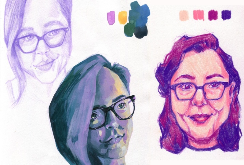
13. Sketching with Coloring in Mind: [MUSIC] The sketch for a portrait impeller
is going to be a bit different than
what we've been doing. I'll be using a red pencil
because this will be lighter and will blend with any coloring
supplies that I use, but a gray pencil will
work just as well. We've talked a lot
about building value and adding contrast, but we're not going
to do that this time. This is going to
act as a guide or a roadmap for adding color. We want to keep only the vital information in this sketch. We also want to make sure
that our lines are a little bit more clear and a
little less messy. Whatever you use to sketch, but especially if
you're using graphite, make sure to keep it light. We don't want to
go too dark and we don't want to add too much. Because like I said,
this is going to be the sketch for adding color. We're going to do a
sketch of the face, but we're not going to
worry too much about adding value to
the entire thing. I'm starting in
the exact same way with the circle and cross method and I'm just
going to start mapping in the features. As I'm sketching, I'm
thinking about what I might want to alter or emphasize
in this portrait. I really love the glowy do
we look here and I want to emphasize that serine feeling
of basking in the sun. I'm going to change
her expression to be a little bit happier. I'm going to do a second
pass at this sketch. To do that I'm going to
put my reference right next to my photo so I
can constantly look back-and-forth and
pay more attention to my reference photo and track with my eyes to make sure I'm doing an
accurate sketch. [MUSIC] I want to line up any of the
areas that have gotten too dark and now I want a very lightly map in
some of that shadow. I don't need too much. I just want to give myself enough information
to do the color. It's a very minimal sketch here. Here's a really basic
sketch with color in mind. Our sketch this time
was a bit different. We kept our values lighter and didn't go into as much detail. Now that we have this
sketch done with the idea of adding
color in mind, let's get to the actual color. But first, make sure to post this version of your sketch in the project gallery
and let me know if you prefer working in red
pencil or gray pencil.
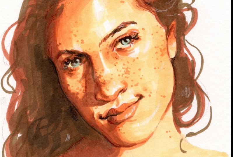
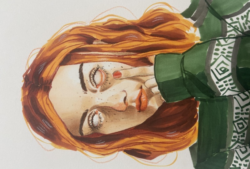
14. Limited Palette: Adding Color!: [MUSIC] Adding color to a portrait is such a great way to
enhance your piece, highlight certain elements, or add perspective and personality. We're going to talk about using a limited color palette to add to our portrait to help
convey the overall story. Now, we're going to
talk about using a limited color palette. We're using our color
palette to give a base color to the sketch and then enhance certain areas. We're not going for
an entirely perfect, realistic-rendered portrait, so we don't need
too many colors. I think most people will find a good spot between 5-6 colors. I'll walk you through my color
palette and explain why. I have my lightest color. This is for the base skin tone. Basically, this is going to
be the base of my sketch. This is my enhancement color. Basically, this is
where I'm going to add a lot of saturation, this is going to
be used to enhance certain elements of the piece. Here is a mid-tone
shading color, a darker shading color, and a color for
my darkest darks. If you're trying to color
more realistically, you're going to
want a light tone, a medium tone, and a dark tone. Theoretically, three
colors is all you need. But generally, you're going
to want some variation, so maybe two lights, one medium, and two darks, or some
variation of that, which puts you at
about five colors. I have six because I chose an eye color which will also
add to that enhancement. It's a bit of a highlight color, it's very different,
so it'll pop out. I also chose this color palette because they think
it's going to really nicely highlight that serine
feeling that I'm going for. I want to really capture that feeling of
soaking in the sun, which is where these
colors will come in. Because these are so saturated, I wanted these to be a bit more desaturated to help
that contrast. When you're choosing
your color palette, there's different ways
you can go: You can try to go more realistically, in which case, I recommend
finding a way to saturate or change it a little bit to make
it more exciting. Or you might pick your
mood specifically inspired by the mood
that you want to go for. For example, if you're making
something dark and moody, you'll want a darker
color palette. No matter what you're doing, remember that your color palette is supposed to enhance the
story that you want to tell, it needs to help highlight the emotion that you're showing. There's different ways to
add color to your sketch. I'm going to basically
color the entire thing. But if you'd like, you can
build up your sketch to a more complete level and use color to enhance
certain areas. You could have a fully
rendered sketch portrait and only add color to the
eyes of the lips. If you're going to be coloring
the entire thing, like me, we want to save the most
saturated areas and the most contrast areas for the areas that we
want to highlight. I'm going to jump right in. I'm going to be
using the chisel nib just to help cover
that surface area. I'm also going to try my best to preserve highlights where I can. Remember that you're
not going for hyper-realism with color, we are using this to
enhance the sketch. Because we're using a
limited color palette, we can't get every
single tone variation, we're just doing what we can with the colors
that we have. You can see that the sketch
shows through pretty easily, which is why we wanted to be very light-handed
with the sketch, especially if you're using
something like watercolor or any other transparent
or light medium. Now, there's a lot going down here in the
shoulders and the neck, there's a lot of collarbone, but that's not really what I'm
going for in the portrait. I don't want to add
a lot of unnecessary visual clutter or detail, so I'm just going to round
this out like a bust. Now, I want to go for these
really saturated colors a little bit later
in the process. Because this is
also my mid-tone, it'll be used as a transition between the shadows
and the light areas, but I also want to save
this for when it's time to really punch up areas
that I want to highlight. Instead, I'm going to move
right into the shadow and I'll blend it out a
little bit with this color, but again, I want to
save this for later. This is my lightest dark color so I'm also going to use it to basically map out all
of the dark colors. Just like in the sketch phase, we're building up on value. I want to embrace the hard
lines of this shadow to really emphasize the idea that we're basking
in the sunlight, that we've got this really
harsh lighting source, so I'm not super worried about blending it out really nicely. Just like I said,
really use mapping in those darker areas. [MUSIC] I'm going to take this color as our mid-tone and soften some of those areas
blended out a little bit, but really I want
to already start adding in that saturation. Remember this is my color for really enhancing and
highlighting certain areas. I'm using it as a mid-tone, but I also really want to use
it in areas that I really, really want to
draw attention to. In places that I maybe don't
want as much attention, I'm going to blend
it out a little bit. Here where I'm more
employing it as a mid-tone rather
than a saturated, exciting color, I
don't really need it to be as harsh or as bright. But here, I'm going
to use it in the eye, and here's where I do really
want to draw attention. I love drawing
attention to the eyes; the eyes are truly the
window to the soul and I love to emphasize
that in my portraits, so I want to put a lot of this saturation around the eyes. We're going to go
in with the eyes. Here is where we
really want to add that contrast because this is an entirely different color. This is the base, and now we're going to go
in with our darker color. We're going to go and
add all those shadows, but we're going to start
with the eye because we really want to focus on adding that intense contrast because this is where we want
the most attention. Where you want the most
attention is where you're going to want your
most saturated colors, your most different colors, and the most contrast. [MUSIC] Now, the hair is not
the most important part of this portrait, so I'm really messily
blocking it in. If it's something that
you do want to highlight, then you're going to want
to put more time and detail into it, but for me, this is just
distracting information from the highlight
of the portrait, which is the eyes and the face. Finally, we've got
our darkest color. Remember what I said about
highest area of contrast. Because this is
our darkest color, we want to preserve it to only the really important areas, or areas where it's going
to add important depth. Because I really want
to highlight the eyes, I'm going to make sure that I
use the darkest color here. But even so, I'm going
to use it sparingly. I also want to add it here
for that extra bit of contrast in some
areas of the hair. But we're going to blend
it out up here because I don't want there to
be obvious contrast, I just want to add some depth. Taking a look at it, there are some places that aren't quite the way
I want them to be, so I'm going to go back and
fix some of those details. This is definitely a process, you're not going to get
it right the first time, so don't be alarmed if you do
have to go back and change and edit things
[MUSIC] There we go. We have colored a portrait
with a limited color palette. We've got a beautiful,
expressive portrait that we have put so much
time and effort into, but it's not done yet. Before we can be finished, there's one last step
which happens to be my favorite, final details. Post a picture of
your portrait now to the project gallery so we can compare it to the
final version later, so you can see how much these final details really add to your portrait and
make it pop. [MUSIC]
15. Final Details and Highlights: [MUSIC] This final step is such a fun part of the process. We don't want to
overwork our portrait, but now is a great time to look for those final details we can add to really make it come together and feel complete. We've got the basic color here, but there's obviously a lot of detail and interest missing. Right now, it's
looking a little flat. It's saturated, it's pretty, but there's something
raw missing and that's where my favorite
step comes into play. We want to stick to the
limited color palette, but we're going to add a
few extra supplies here. You want some white. I have a white colored pencil, but a lot of people
like gel pen. I personally prefer
the white pencil. I have a black pencil. Any dark color will do. I sometimes use blue or purple. But I think black will go
well with this color palette. Then I have a darker
skin tone color. Now to finalize this portrait, we want to really
bring it to life with those final details. I love to actually go overboard. We don't want to
overwork our portrait, but it's hard to do that
here because we're just going to be adding
little tiny details, for example, highlights,
pores, wrinkles, freckles, scars, flyaway hairs, eyelashes, things like that. Those little
"imperfections" that really make us look
like real people. I'm going to start with
the highlights because I find them to be super fun. You definitely want
to make sure you have a highlight in the eye. I'm also going to
add some other light here and really just
start adding highlights, highlighted eyelashes, some
eyebrow hairs, on the nose. Even if it's not
actually in the photo, just wherever I think it
might look pretty, really. One thing that's
great about using a colored pencil for this is, it's much more subtle than a
harsh gel pen and so you can really have fun adding a lot of more subtle highlights in. I'm also going to add some
highlights in the hair. I'm going to take my
darkest pencil and use that wherever I want to emphasize
some very serious contrast, so I've lost the edge
of the face a bit and I'm just going to very
lightly add that back in. Basically, wherever
you want to emphasize any lost contrast or
push it even further. I'm also going to add freckles. She has a few in the photo, but I'm going to add even more. I'm also noticing that I
didn't really add in a lot of this contrast that's
up on the forehead and it's looking a little wonky, so I'm going to add that in. We're doing whatever we can
to add some personality, add our own perspective here and make it feel a
little bit more lively. Not necessarily
lifelike, just lively. I also want to go back into the hair and add some flyaways. Then I want to take
this darker skin tone color and use it to map out any of the features
that got lost. We're also using
this to add some of the details that we couldn't
really get with marker, but aren't dark enough to
need a black colored pencil. As you're doing this, think about what you can
bring forward, what you can push back. Add crispiness to any features that were lost and really work on highlighting the areas of the face that you
want to highlight. Before you know it, you've got a beautiful expressive portrait. This lesson gave
you a few ideas for finalizing your portrait
and adding that last-minute dose
of personality and the result is a beautiful
and unique portrait. Make sure to post your final portrait to the Project Gallery. I'm so excited to see what
you came up with. [MUSIC]
16. Conclusion: [MUSIC] Congratulations
on making it to the end of the class. We've covered a lot in this class, from
reference photos, sketching fundamentals,
facial anatomy, color palettes and expression. Now you have a beautiful and
creative portrait of your very own to be proud of
and to share with people. Feel free to share
it online and be excited about what
you've created here. Of course, you're leaving this
class with the techniques and tools to keep practicing
and improve your skills. I hope you've learned a lot
in this class but if you only take away one
thing, I hope it's this, adding your own perspective and creative twist to a portrait is the best way to elevate your portrait and
make it unique. Make sure to share your
beautiful portraits in the project gallery so we can all see what we've accomplished. If you do want to
post it online, make sure to tag me on
Twitter or Instagram @Lilstarnerd or use the
#lilstarnerdskillshare. While you're at it, make sure to check me out on Instagram, YouTube or Twitter
so you can stay up to date with my next
Skillshare class. Thank you so much for
joining me in this class. I'll see you in the
next one. [MUSIC]