Transcripts
1. Intro: Hello everyone. My name is Rebecca. I am the creator of the YouTube channel left to draw manga. I left he create manga style illustrations. In this class, I'll walk you through my entire portrait creation process, from sketching to line art, coloring and shading, appeasing it as p x. But this process can apply to other softwares as well. By the end of this class, you will have a better idea of how to create a manga portrait of your own. So let's get started.
2. Setup & Rough Sketch: I'll sell for this class, I'm going to assume you have a little bit of knowledge about a PSP and how it works. I will briefly explain things along the way. However, if you're a total beginner, you may want to take a little bit of time to get to know your software. Today I am using an iPad template to Apple Pencil and IP is Px, it is paint x is free and available on iOS and Android. You didn't need to watch ads if you want to access all of the brushes for our limited time, I'm TPP, so I watch the ads to get the brushes. Instead of paying money, I'll select I mentioned in the intro, you can use wherever software and devices are available to you, sell. I've opened Dave is paying on my iPad. I'm going to tap them my gallery button to go to my gallery. Next I press the plus button. This will open a tab with a bunch of different canvas options. I often pick HD size. So that's why I'm going to choose now that our canvas is open, Let's get ready to start sketching out. But before we deal, I want to quickly go over some simple hand gestures that we will use throughout the process to zoom in. And now I use two fingers and do a kind of pinching motion to ideal. I tap with two fingers, anterior deal, I tap with three. These are basically the only ones I use. Anyways, back to our canvas. I tap this button to look at the brushes. The brush I'm using today is the pencil number teal, that you can use, whatever one you like. This is a default brush and the only setting I changed is pressure thickness. I made it a 100 percent instead is 0. When it's set to 0, the brush won't change in size depending on how much pressure I apply. However, if I set it to a higher percentage ILA change with how much pressure I apply. I want the brush to change in size. So I set it to a 100 percent. Now that the pressure is ready, I'm going to turn on the symmetrical ruler. Part 2 we are joining today is in front you to make things easier and help the base be symmetrical, I often use rulers to turn on the ruler. I tap here and then tap here, then the ruler will appear. I turn the ruler so that it's the direction I want it to be by moving the slider to 15. Now whatever I draw on one side will appear on the other. Okay, now that we have everything set up, Let's start sketching. I'll sell you can press this arrow to hide the interface cell the plaintiff sketching is to help us get things in place without worrying too much about the details. Later we will clean things up. But for now we are just trying to figure out where we want things. For the head. I'm going to start by sketching a circle. Many people often say to me, How do you draw like that? I can't even draw a circle. Well, I'll let you in on a secret. Circles are really hard to draw. Don't worry about making it perfect. Just get the general shape in place. Now that we have a circle, I will draw a line underneath it. This will help me place the jaw and facial features. Speaking of the jaw and chin area, I often think of it as the simple angles cell. We have these lines coming off of the head. These lines angling in towards the chin. And then a line for the chin. I think of the head as being the shape, but when I actually dry, I make a rounder and not so sharp. So let's draw the chin. Once I get the basic shape and place, I tweak it by making the lines thicker and erasing what I feel like I don't need. It's kinda like I'm sculpting out the sketch. I wish I could fully explain my thought process behind this, but it's kinda my intuition leading me when I'm doing this process, I kinda just keep adding and erasing and telling him pleased. I tap here to make the interface come back. Also, I tap here to find the eraser brushes. In this case, I'm using the airbrush trapezoid 40 percent, but it doesn't really matter which erase your use in this case. I just picked the first one that looked nice. Also today I'm drawing my original character, Doris. She is the main character of my web comic. My next during the papers, she's 15 years old, so we are drawing a character that is in there. Make teens how I draw the head changes on age and gender. I won't be covering the different ways I draw heads. Because for this class, our focus today is creating a portrait from start to finish. Anyways, now that we have the shape of the head, I'm going to start working on the eyes. I use my fingers to measure out where the middle of the head is. And I draw a line there. This will help me place the eyes. I start the eyelash line at the halfway point. Right now I'm sketching in the upper eyelash line. It tapers at the ends and gets thicker in the middle. Doris has very round eyes, so I'm making the shape very rounded. Like I mentioned earlier, this is my sketch. So we aren't going to worry too much about making things super clean. I draw tapering lines for the eyelashes. I often make doors, have three eyelashes unless she's wearing makeup, then I give her a little bit more for the bottom eyelash, I draw a slightly curving line. I often don't make the upper and lower eyelash lines connect. You can do that if you want to. It's up to you and how you want to draw the eyes. This lower line also tapers at the end. The irises are basically just made up of ovals, I John oval for the iris and the pupil. Iris is can kind of be different shapes. Feel free to make them more circular or more oval. And sometimes they can even look kind of squarish in shape. I also like to sketch in the highlight. I don't want the highlights to be symmetrical, so I turn off the ruler. That way I can draw the highlights in different spots. For the nose. I keep things really simple. I draw a curving line for the bridge of the nose and then a little curving dot for the tip of the nose. I turn a ruler back on because I needed again for the mouse and the eyebrows, for the mouth, hydraulic curving lines that taper as they go towards the middle. I often don't make the lines for the mouth connect. It's a stylistic choice. You can make them connect if you want to, or have them not connect. Feel free to play around with it. Then I draw some curving shapes for the eyebrows. Recently when I draw portraits, I like to give the character in expression that shows their personality. And I'll also tilt the head a little to add some movement. However, since this is for teaching purposes, I thought it'd be better to keep everything simple and kind of generic. So you can apply this to your own character when drawing the ears after make the top of the ears lineup of the top of the eyes and the bottom of the ears lineup with the nose, doors, his hair, we'll mostly cover her ears, so I won't draw any details on them. Far the neck, I drawn lines that slightly curve. For girls, I often make the neck kinda lineup where the pupils are located when they're looking at us. Actually made the neck a little thinner later on during my clean-up sketch process because if they looked a little thick here, I then add some lines for the shoulder area. My main focus is the face, so I don't put too much detail into them. So now for the hair, I like to give my character's hair with quite a bit of volume. So I leave a good amount of space between the hair in the head. I start by outlining the basic shape of the hair. And then I add in where the hair part will go. Darcy's hair part is on the left, so I place it their land drawing here. It's important to keep the hair part in mind because the lines we draw for the hair will go back to this point. Horse's hair is pretty simple. She has a little strand and then the rest of her bangs kind of tuck under her hair. She also has these strands that come forward and that kinda curve inwards. I'll add the details where the hair will be added with shading. I also drawing the color for the shirt. Now that I have an idea of where I want everything to go, I'm going to turn my sketch blue. I like to turn it blue, so it's easier for me to see my clean-up sketch when I do my second pass to turn my sketch blue, I tap here and then tap Alpha Lock. This makes it so I can't draw outside of the things I've drawn on the layer. I click here to change what color I'm using. I select blue. You can change your sketch color to whatever color you want it to be. And then they just go over all of the sketch with the blue color. I then lower the opacity by sliding the slider down. This makes my sketch lighter so it's easier to clean it up. Now that the sketch is done, we'll move on to the clean-up sketch.
3. Clean-up Sketch: For the clean-up sketch, I need a new layer. So I press this button to make one above my sketch layer. If you don't know, my layers are, they are basically like clear sheets of paper. I can draw on one without affecting the other one. So they are very handy. So now it's time for the clean-up sketch. You don't have to do a clean-up sketch. Some people only do one sketch. Some people do two or three, or maybe even for the planner, this is to get the drawing to a place where you feel comfortable moving onto liner. Also to move things around, I use the Lasso tool to select what I want to move. And then I use the transform tool to move anywhere I want to remove this selection, I tap here and then here. I felt like doors, his eyes were a little too far apart. So I select my rough sketch layer and then use the lasso tool around one of doors, his eyes. I then use the transform tool to move it in a little bit. I only move to the right eye because when I'm drawing over this side of this symmetrical cool ruler, the left eye will automatically be drawn slightly more in. So I don't have to worry about moving the SketchUp the left die. This is one of the nice things about sketching. We can easily change things because things are until lease at in place. Yet. I have found that the liner process goes a lot smoother if my sketches really clean. So I like to clean up my sketch a lot when I try to align our Dover sketches that are kinda messy, I often find that the liner process takes a lot longer because I'm redrawing lines and moving them and adjusting them to make the drawing how I wanted to let. But you can do wherever R6 for yield. In this case, I'm making things cleaner and making small changes to make the drawing look more how I want it. For the irises, I'm going to use the oval drawing tool. I find it by capping here and selecting this. When I use the oval drawing tool of the pencil number to crash, it doesn't like to fill all the way in. I know there is a way to make it fill all the way, but I never remember how to delete a cell. I'm just going to use the felt tip pen. This one fills in the circle all the way. I tap and drag to make the oval. I want another one for the people I wanted to be filled, so I turn the fill option on. Now I can make a filled oval. The rest of this process doesn't need much explanation. I basically just continue cleaning up my sketch in making a look how I want. Now that I'm pleased with how the giant legs we can move until I enter.
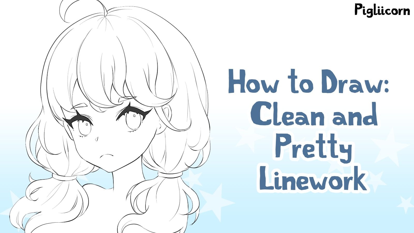
4. Line Art: So now it's time for the line-height. This is Barry going to make the drawing clean and neat. But before I start working on the line art, I decided turn doors on my canvas so she could be larger. I had the canvas in landscape, so it'd be a better format for this class. But in mind to people to go into more detail. So I rotate the canvas to portrait and made my sketch larger. Okay, so I'm going to turn my sketch blue like I did before by clicking the Alpha Lock and going over my sketch of the color blue. I then lower the opacity and add a new layer. Now you might think that since I'm working on the liner to that I'll use a different brush. But for this picture that's not the case recently, I like to use textured brushes for liner. So I'm going to keep using the pencil number two brush. I do switch my brush later, but we'll get to that. Also because I flipped the canvas around, I need to reposition the rulers. So I do that real quick. I'm going to be honest, I don't have a super steady hand when it comes to drawing on my iPad. I am pretty steady when drawing on my graphics tablet because I'm super used to it. But I'm still trying to learn how to draw smoothly on the iPad. Because of this, I kinda like to sketch in my line art with a textured pencil. The textured pencils are a little bit more forgiving, I think, and I find it easier to make clean looking line art when I use them, instead of doing long strokes that require a lot of steadiness. If I want them to look good, I instead do smaller strokes. That way things can look clean. I also work like this with textured pens because a lot of times you need to kinda build them up a little bit to make them look more solid. I found that when I started working on the hair, I wasn't a huge fan of beaming the sketch in the line art. I wanted to draw a long flowing lines, say switch to the dip pen, soft brush. This brush is very textured and is pretty smooth. Helped my lines be more stable. I tap here and turn on stabilization. I set it to 10. So I said it all the way to the max. Stabilization helps your lines be less shaky, which I need help with. And I also decide to turn on for spades so my lines get a little bit of a taper at the end because I think it looks kinda banks when working on line art, I turn my Canvas a lot that way. I can draw it in a way that is most comfortable for my rest. When I wanted to be really accurate and precise, I zoom in a lot and work very slowly. And when I wanted to draw a really long flowing lines, I tend to zoom out because I find it easier to draw them when I make the canvas smaller. Also, I like to flip the canvas to make things easier for my wrist. I do want to show you one trick you can do for creating smooth lines. If I tap here, I'm able to find the Bezier curve tool. I'll sell, make sure to have the setting fill turned off. I can create curving lines by placing a bunch of points and I can even adjust the line a little by moving the points. So I just go along the edge of my sketch and just keep tapping wherever I want to add a point. I like to add a lot of points. That way the line will be very soft and curvy. I think this tool is really neat, especially for drawing really long lines. When I'm done with the line, I press this button. When working on the neck and t-shirt area a switched back to that pencil number two brush. I felt like the shoulders, we're a little bit too high. So you choose m lower than I did in my sketch. After getting the neck and shoulders in place, I went back to using the dip pen soft brush, and adding more detail to the hair. For the underside of the hair, I like to add a lot of little lines to suggest here strands. I also added some by the hair part. As I was doing this, I set the pen to have force feed only on the end by setting this fighter 200. Often find myself free drawing lines until I think they look good. I make sure to keep in mind the direction the hair is flowing when adding these lines. Now the line art is done and we can move on to coloring. I love coloring, so let's jump into it.
5. Base Colors: We need to start by filling our line art with color. I'm going to merge all of my line art layers together by pressing this button. This way I can add more color layers depending on your device and the size of your Canvas, you may not be able to add a tunnel layers. My iPad is able to add quite a lot of layers. Thankfully, for the coloring, we will need a new layer. I make it under the line art layer. That way the coloring won't cover the line art to fill in the base colors, I'm going to use the bucket tool I have towards his colors saved to my palette. I'll selling using the paint bucket tool, I make sure to have the setting expansion set between 13 pixels. That way the colors will say they go into the line art and we won't get white pixels around the edges. I now just tap where I want to fill with color. After filling in the skin, I want to fill in the hair to make the shading process easier. I'm going to have the different colored areas be on different layers. So I make a new layer for the hair color. By using the bucket tool to fill colors, you may need to go into tiny areas and fill them in yourself. This especially happens towards the tips of hair strands. When I color my character braces here, I have to find all those spots at the bucket misses. And because his hair is dark, you can really see them. Like I mentioned recently, I like to use textured brushes for Meinert. However, it can be a little bit more work to fill in the colors. Like for this sweater, I was using a dark blue, but the blue wasn't totally filling in the line art. So there was some white gaps in between the colors to help combat this I increasingly expansion amount. So the color would fill more of the liner. This helped fill in the sweater more neatly. I did need to touch up a little bit by the color of the shirt. Lastly, I the eyes for them, I made a new layer. I make sure to have the eye color layer above the skin color layer because I'll make things easier later on. Now that the colors are in place, let's start shading.
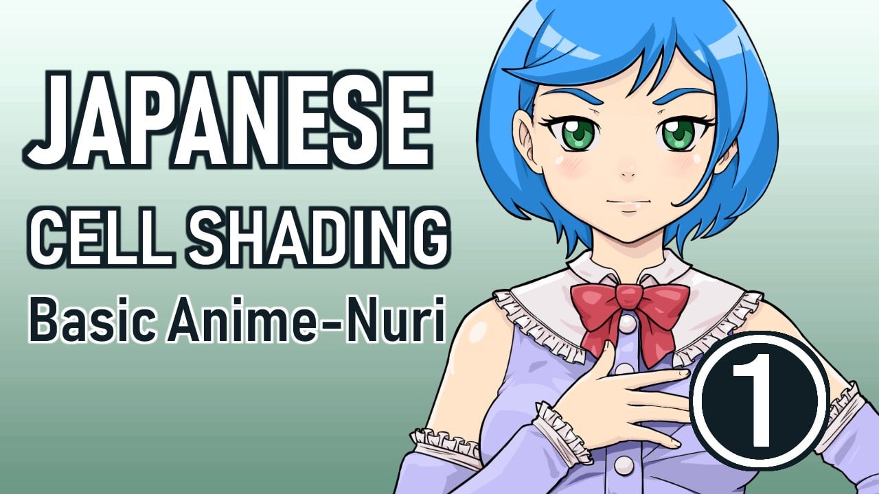
6. Shading the Skin: Now we are on to one of my favorite parts, shading. To start, I'm going to make a layer above my skin layer and tap on clipping. My layer is now clipping to the skin layer, so I'm not able to color outside of the skin layer. This helps the shading stay where I wanted teal and not go all over the place. Now I need my shading color. I select the color of the skin of the eye dropper tool and then make a new darker color when creating shadow colors. I like to make the color darker a little less saturated. And I also change the hue a little. In this case, I made a little bit more red to help it feel warmer. I'll, I'll sell it. I set this layer to the blending mode. Multiply, multiplying makes the color darker and also mixes a bit of the base color with the color we are applying. I really like how it looks and so I often like to use it, but you don't have to use it if you don't want to. I, so now we are ready to apply some shadows. I turned on my symmetrical ruler and add a shadow under the neck us. I'm using the dip pen soft brush for the shadows with a harder edge, I fill in the shadow of the bucket tool. In my art, I like to use a mixture of her cheating and soft shading around the cheeks. I like to use soft shadows because the cheeks are round and soft. For the soft shadows, I'm using the airbrush trapezoid brush. I add in the shadows around the cheeks and the job I'll sell when using a soft brush, I often have the opacity set kinda low. That way I'm able to build up the shadows and control how strong I want them to be. If I want the shadow to get darker, I just go over the same spot a little bit more. I find this process works well for me. Also, the shading may look kinda dark gray now, but I'm going to lower the opacity of this layer later to lighten the colors, I always prefer to add in the shadows dark and then light in them. If I want. I switch back to the depend soft brush to add the shadows under the hair. I also add some shadows by the eyelids, nose, and mouth. Sometimes while I'm doing this, I'll find little spots I need to be filled in. So I'll go back to my skin layer and fill them in. There are many different ways to shape things like the nose and the mouth. I recommend looking at how different artists shade these areas and find a way that you like. I keep the shading pretty simple. I also added a little more shadows by the hair again. Be creating art is often a process of meat going back and forth between things and trying to make things look how I want them. So sometimes they have to go back and adjust things. Now I lower the opacity to make the shadows less harsh. Now I like to add some black. I think this helps the face look like. Also, I don't know how I ended up applying shadow under the hair, but I'll just leave it because we don't see it anyways. So it doesn't really matter. Anyways, I make a new layer and clip it to the skin layer. I select a more reddish color tease for blush. I use the airbrush to add the blush to the face. I also add just a little too and nose area. I then lower the opacity to make the blush not so strong. I'm going to add another layer that I clipped to the skin. And this is going to be for a very subtle shading. I select the shadow color from the skin and start applying a shadow under the brow bone. I often like adding the shadow because it helps add more dimension to the face. I feed it out and make it softer with an airbrush eraser. I then lower the opacity to make the shadow really subtle. I also added a gradient at the bottom of the face with a soft brush. But it's kinda hard to see because I lower the opacity, but it is there and it's making a very subtle difference. Now I'm going to add highlights. So I make another layer that clips to the skin. You are probably figuring out by now that I use a lot of layers. I love layers and they make the process so much easier. Sell on this layer, I'm going to use a lighter color and apply it to our highlights will form on the face. So like on the knowns, the cheeks, forehead. I also play some highlights along the jaw line. I often just kinda like how this looks and I feel like it has the face have a little bit more form to it. I also add a little bit to the IL-8. Like with the shadows, I like to apply the highlight strong and then lower the opacity. For a lot of these layers, I actually kinda lower the opacity a little too much. And I ended up making the opacity higher later on during the finishing process. Okay, now that this gain is done, Let's move on to the hair.
7. Shading the Hair: For our shading the hair, I make a new layer, clip it to the hair color layer, and set it to multiply. That brush I'll be using is the feed water color brush. I did slightly change the settings. I lowered the setting thickness at end, so I'll taper at the end of ladle. I also lowered the spacing, so I'll have a harder edge. I also set pressure opacity and pressure thickness to a 100 percent. So that way the brush will change with how much pressure I apply. When I apply less pressure, the brush will get thinner and less opaque. Now that my brush is ready, I start to add the shading line. Drawing these lines, I make sure to once again keep in mind how the hair is flowing. Like I mentioned earlier, the Harris flowing from the hair part. So I have the lines flow from that point on the head. When adding these lines, I'm trying to make the hair look more detailed and hair-like. So I define the shapes of strands in add a lot of little lines. This process will continue for a little while until I feel like the hair looks good. I'll also I'm not sure. Hi, Mr. in the footage by filled-in the underside of the hair with the shadow color. I use the bucket tool for this. I tend to add a lot of lines towards the bottom of strands because they're at the bottom. I feel like they would get more shadow. And it's also kinda easier to add the detail at the bottom of strands. For the next step, I change the setting thickness at start. That way my brush will taper on both ends now, to help the hair feel less empty in the middle, I'm going to add a ton of thin lines and make sure to add variation in the lines. I don't make all of them the same length. I think this UPS they are have more form and feel more natural. I kind of go in a pattern of long line and then short lines and then another long line and so on. I tend to put the longer lines wherever I feel like an edge of a strand is, if that makes sense, to make things easier for my wrist, I flip the canvas so I can add the lines on the other side. I find that adding all of these lines helps the hair feel more detailed and have more form. If I'm drawing really long hair, often add another batch of these lines towards the bottom of the hair. Next I take a soft eraser and fade off the lines that I drew so they aren't as harsh in feed into the hair. Once again, I have the opacity of my brush really low. Then I take the airbrush and add a soft gradient to the middle area, here part and the bottom of the hair. Lastly, I lower the opacity of this layer so the shading is not as strong. Next, we need the highlights. This first batch of highlights we are adding will be soft and kind of subtle, will add stronger ones. Later on. I make a new layer and clip it to the hair color layer. I select the hair color with the eye dropper tool and create a new color that is lighter in color. And also make the heel a little bit more orange. I'll be using the fade watercolor mix brush again. This is the same one I used for the shading. I keep all the settings the same. I'll sell it. I decided to move the highlight layer under my shadow layer. That way the highlights won't cover up the shadows. I then start to add the highlights and basically just add them in between the shadows I drew earlier. I have them flow in the same direction. I make the highlight color separate wherever I feel like the hairs breaking into different strands. A lot of times when we think of adding highlights to the hair, the point is to make the hair look shiny, but the point of this layer is to help the hair have more form in detail. Well make it look shiny scene and now that's my favorite part. I flip the canvas again to make things easier for my wrist. I'm often doing flicking motions when shading here. So I like to be able to move my wrist in a natural way. To finish up, I take a soft eraser and fade out the highlights, fill it out and lower the opacity. I felt like the underside of the hair needed some more detail. So I made a new layer clipped into the hair color layer and made a darker color. I then start applying the color by lines. I do it earlier for the line art. Also, I set the layer to multiply. I sometimes forget to do that when I initially make the layer. I like to add a variation of lines coming from the top down, lines coming from the bottom. For many of them, I don't have them connect in the middle, but I do add a couple lines that go all the way from the top to the bottom. I wanted to add a gradient to only the underside of the hair. So I turn off all of my shading layers by pressing on the eye next to them. And I made a new layer that I set to multiply later. So you can do that now if you want to, I then use the magic wand, select the area I wanted. I use the soft brush to add a gradient to the hair. I turned my layers back on and lower the opacity of the gradient. Okay, We are almost done. If the hair, now it's time for the highlights. I make the hair look shinier. I make a new color that is really light and kind of a marigold. This time I make a new layer, clip it and set it to the Layer Mode Add. This will make the color look really bright and shiny. I then proceed to add a band of highlight going across the hair. I add this in a similar way that I did for the shadows with a bunch of lines I do earlier. While doing this, I like to use a soft eraser to fade out the edges. When drawing these lines, I like to make them form. It may kind of curving shape around the head. This helps the head feel my round in shape. If I added all of these lines in kind of a straight flat line across the hair. It would make you look kinda flat. So yeah, making the lines curved in form in a curve helps ahead have a more roundish looking shape. After adding the lines, I lower the opacity. I also use a large soft airbrush dad, some of the highlight color around the edges of the hair and around the band of highlights that I added. Okay, now the hair is done. We can now move until the eyes. My favorite part.
8. Shading the Eyes: So the first thing I'm going to do is add a new layer under the eye color layer. Do you remember earlier when I mentioned I like to put the eye color layer above the skin layer. It's okay if you don't. But basically I do this because it makes it easier to add the white part of the eye. The white of the eye layer goes above the skin layer and below the eye color layer. After filling in this area with white, I slightly lower the opacity. I feel like using just white can feel a little harsh. So I like to tone it down a little bit the next day, make a new layer above the 9x9. I forget to set it to multiply so you can do that now. I don't know, I kept forgetting this edit to multiply right when I would create the layer. Anyways, I make a kinda muted blue color and I'm going to use this to shade the top of the eye. I make the shadow go over the white part in the iris. I always like how it adding the shadow looks and I feel like helps that I kinda have more form. I then lower the opacity. Now we can start shading the iris and I make a new layer above the eye color layer and set it to multiply. For the iris, I'll use a darker green to shade the top of it. I'm going to use a super soft air brush to create the gradient. Hi, start to apply the color, but notice I didn't make the layer clipped to the eye color layer. So I fix that. There we go. Clipping layers are wonderful and saves so much time. I add the dark color along the top of the iris and a little around the edges. I also make a slightly darker color and add that to the top to make the shadow gets even darker. For the highlight, I make a new layer under the shading layer and clip it to my eye color layer. I set this layer to the Blending Mode, Add, so it'll be very bright, England, a bright yellowy green. I use the soft air brush again to add some of this color to the bottom of the iris. Once again, I play around with the opacity of the layer. Next is the highlights. These will bring the ice to life and make them look shiny. I make a new layer above all of my layers. This may my highlights will go over my line art layer as well. I then use white and draw a large tilted oval. Also, I have my symmetrical ruler turned off now because I don't want the highlights to be symmetrical. I want them to be the same on both sides, but I don't want the highlights to be flipped. I use like green and add a smaller highlight. Next I make a new layer under the highlight layer and fill in a good amount of the people with green. I like to add this color in the pupil because I feel like he makes the pupil look less stark and a little bit more friendly. I then use a soft eraser to fade out the green. I lower the opacity a little and then merge the highlight layer with the green pupil layer. I tap this and then select Duplicate Layer to copy the highlights. I then use the transform tool to move the highlight silver. Now the eyes are done. I also slightly shaded the shirt by alpha locking Lusher layer and then adding a slightly lighter color along the top with a soft brush. I kept this pretty simple. Now that all the different parts of the picture are shaded, we can now move on to the finishing touches.
9. Finishing Touches : Now finishing processes where we will take our picture firm. Yeah, it looks pretty good to be surprised by adding some filters can do for our picture self-assembly NADH at background. So Doris is not ingest del white void. I use the magic one tool to select around doors. And then I click this button to enter the asset library. I'm going to look for a simple cue pattern to put behind her. I like this hard line, so I tap on it and resize it using the finger gestures we talked about earlier. Once I got it in place, I decided to lower the opacity to make it a little lighter, to make my selection go away. I tap here and then tap bind, remove selection area. Now I'm going to add some lighting effects. I make a new layer above all my other layers and apply a yellow to the top part of the picture with a large soft brush. I set the layer to add and then lower the opacity. This kind of gives a picture a nice soft light. I make another layer, set it to multiply and use a burgundy like color for the bottom of the picture. Once again, I'm using a large soft brush. I often like to add gradients like this in my illustrations to help everything feel a little bit more cohesive. Next, I'm going to slightly change the color of my line art to help it feel a little less harsh. I make a new layer above my line art and clip it to line art layer. I then use a soft airbrush to apply different colors, similar liner. I often change line art to a slightly darker version of what the INR is by. So I make the line art by the hair a more reddish color and the liner by the face, a more tan color. I decided to make them out of the upper lash lines being very dark green dots and papillary MRI and help draw our attention to them. I still had a day, two of that brownish colors around the text because I think this looks kinda nice. Now it's time to add some filters. Now TS filters, you kinda need to have all the different parts of your picture on one layer if you want to apply the filters to the entire picture. So to do this, I tap here and select Add Layer from Canvas. This makes a new layer that looks just like my picture. I tap on the Filter button to go to filters. There are a ton of filters to choose from, but I'm only going to use if you, the first thing I'm going to adjust are the colors. So I select the Color Balance Scale, terror. I offer, I want the colors to feel warmer, so I make the colors more red, magenta, and yellow. Next, I wanted to adjust to the shadows and highlights. So I chose the brightness and contrast filtered I up to the contrast to make the darks darker and the lights lighter. I also turn down the brightness because I felt like the colors were a little too light. Now I'm going to add the noise filter. Noise is basically just a bunch of little dots. I like to add noise to make my illustrations have a bit of texture to them. I just play around with the settings until I write Caligula. Also, I have the blending mode set to overlay. Lastly, I add the effect blur frame. It adds a light shadow around the edge. I think this gives the picture at a nice feeling of depth and helps draw our eye towards the middle. I made it a burgundy color. So that is all for the filters and effects. But there is one last thing I went to deal. I make a new layer above all of the other layers and set it to add. I then draw some circles shapes on the hair for some highlights. I often use this style of adding highlights in my web comic. And because Doris is from my web comic, I felt like I needed to give her the circle highlights. I make the circles larger by the edges and then they get kind of smaller towards the middle. This is totally optional. You don't have to add these if you don't want to. After drawing all of the circles, I lower the opacity. And now let's take a look at the finished result.
10. Finished Portrait: Now we are done and here is our finished portrait of Doris. Your project for this class is to draw your own porch j, using the information you learned in this class, feel free to draw my character Doris or your own original character or some fan art. Please feel free to share your results with me if you'd like to check out some of my other work, he can find me, I youtube.com slash left to jama. And you can also find me on Twitter and Instagram. I hope this class was helpful to you and that you enjoyed it. Thank you so much for watching and I hope to see you again. Bye.
 Rebekah Anne