Transcripts
1. Welcome: Hey guys. My name is Maria. I'm an Illustrator and Character Designer from Turin, Italy. I have been working in this field for about four years now, and I have been teaching online for about the same time. You may have seen some of my previous courses on Skillshare or other platforms. I usually focus on tips on how to draw digitally with Procreate, as I'm going to do today or with Photoshop CC. In the past, I've been doing mostly rather large courses about the fundamentals of drawing or how to draw a full character in my usual Disneyesque style, starting from a photo reference. But today, I wanted to do something a little different, something that is very good for people who are just starting out in the digital art sector, or even for experienced artists who might want to try a slightly different fun style, I'm talking about chibi. [BACKGROUND] This class is going to focus specifically on how to draw chibi characters, either for fun art or for personal commissions or for sticker sheets. The uses for chibis are really quite endless. I think they're all equally cute. The reason why I started growing chibi characters is because of commissions, and also because of fun art. I am an avid reader and watcher of TV series as I think are most of you guys. Because of that, I do draw a lot of fun art in my free time. Some of the fandoms that I have been most active with in the past have been fantasy series like Wheel of Time or Game of Thrones or The Cosmere Saga by Brandon Sanderson. Honestly, I just think it's super fun to do. If that's the reason why you want to take this course, that's perfectly fine. It's a really good reason. If you're an artist and you offer commissions, that's also a really good reason. I illustrate books and create concept art for animation and gaming. But in between those bigger projects, I usually open up commissions from time to time. In the past two years or so, the client work has become so demanding that I don't do it as much. So when I do do it, I have found that if I offer chibi commissions to my clients, I can offer them for a lower price than I would my usual style commissions because they are faster to draw, but they are equally appreciated by people because they are cute. You can translate the same likeness to a photo reference to a chibi character that you would, to a more realistic character and that's exactly what I'm going to do in this course. In my case, I'm going to pick a reference of the K-Pop band, Black Pink. I'm going to show you guys how I go from that photo reference to a chibi character is at least similar to the actual person in real life. You can apply this knowledge to real people. So if you want to offer it as a gift to a friend or a family member, or you can apply it to a fan art if you want to create a sticker sheet of all of the characters over certain series that you enjoy. As for the tools, I'm going to be using an iPad. Actually, this is a first-generation iPad with Procreate. You can use studio clip paint. You can use Photoshop CC to take this class, it doesn't really matter. The only important thing is that you have a digital drawing software to use. I guess that's all for now. I'm going see you in the next video. See you there.
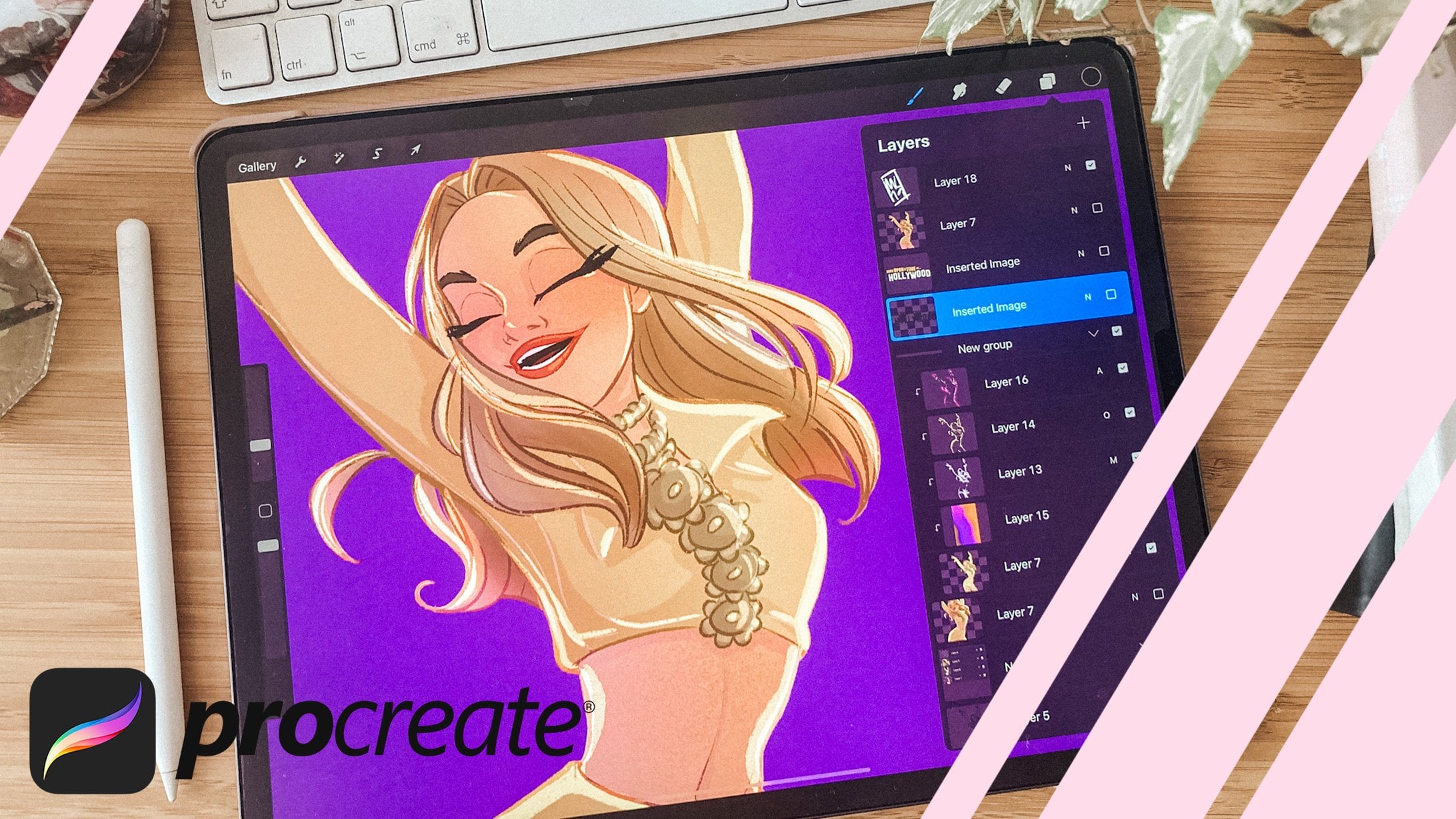
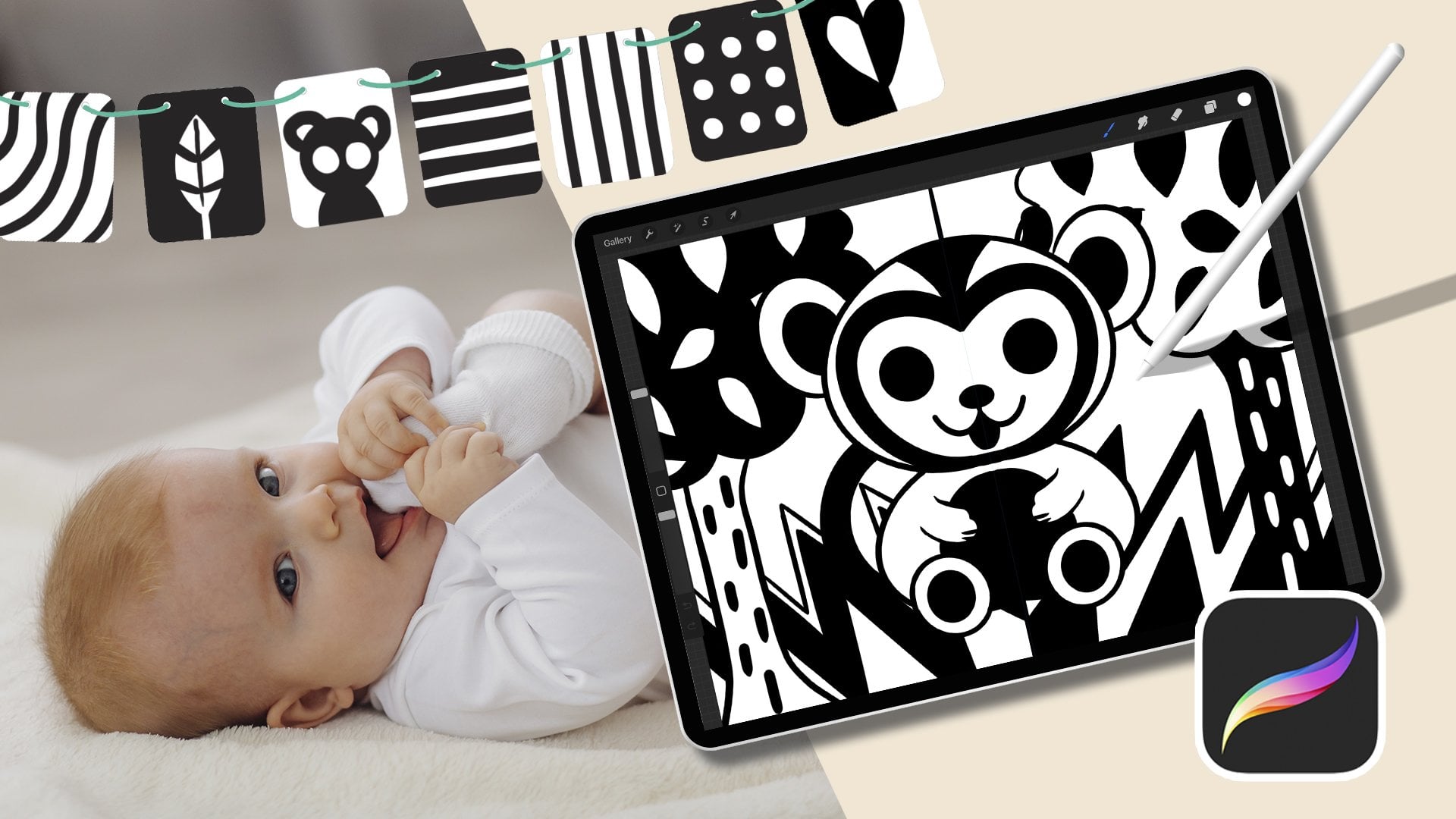
2. Tools: Hey, guys. Welcome to the second video in this course. In this video, I'm going to quickly touch upon the tools that I'm using. I'm using this iPad 1st Generation. Usually, I use an iPad, 3rd Generation for my client work. I find this one has become a little bit deficient in terms of battery usage. But iPad 1st Generation are actually still really good. If you can find one at a good price, I think they're still worth buying, especially if you don't do it as a job, but more like a hobby on the side kind of thing. Also using Procreate, which I'm sure you've heard about. It's a hugely popular drawing app. It's as good as Photoshop, I think. If you use Photoshop on your usual machine, computer, etc., you'll find this very similar in terms of how it works with the layers and the blending modes. When you open Procreate, you'll see you have a whole gallery of images that you've previously created. You can bond them together by just tapping on them and putting them one on top of the other, and it will create a stack which is the same as a folder basically. You can just rename it by tapping on the name of the stack basically. That's pretty handy. I think if you want to create a new canvas, so a new file, you just go and press the "Plus" button, and then you have your canvas pre-made settings. There are some already gathered and created and are native to Procreate and then you can create a new one. I usually go for something like 4,000 by 4,000 pixels for social media purposes because on social media most images are square, so it makes sense to create art that is already in a square. If you are going to post this on social media as a primary aim. Otherwise, you can create whatever ratio you prefer and you can change by changing millimeters, centimeters, inches, or pixels. I usually work in pixels because again, if your art is being created specifically for Internet digital usage than pixels makes more sense in terms of a unit measure. I'm going to create one, 4,000 by 4,000. This will decrease the number of layers that you can create in a file because of course, the larger the files, the less you can create layers. But 29 layers still seems a pretty good number for me, so I'm just going to go ahead and create one. When you have your Canvas here, as you can see, just move it around with your two fingers and you have your interface here, you have your brushes. You have all these different brushes here. Depending on the version of Procreate that you have downloaded, you'll have different brushes here, but my favorite one to do anything, it's the dry ink brush. Here you have your color settings. You can also change the way that you view the color wheel by tapping on these icons underneath, you have the disk view, the classic view, harmony. That basically gives you some pretty good settings on how to create color palettes value and the palettes that are already included in Procreate. You can create a new palette by simply tapping on the Plus and tap on creating new pallet. Then if you, for example, create a new color, here we go, and you use it on the Canvas, then you create another color and you use it on the canvas, you'll see that they appear here in your history. Then underneath, you have the untitled palette, which we can rename Sample Palette, which is your default palette at the moment is written here. You can set the default to the other ones, but for the moment we're using this one. If you go back to the classic view, you'll see that in the history you have all these different colors that you've used just now. It keeps the history of the colors that you have been using. If you have one selected, which is the last one, and then you tap on the sample palette empty space, it will record that color. You can add them to the sample palette, and then you see it also in your palette gallery. Let's go with the Fiorito set default palette because I quite like it. I'm actually going to start sketching in pink because I just really love sketching in pink and blue. I never sketch in black because it makes my hand go stiff for some reason. I think it's psychological. But anyway, you can sketch in whatever color you prefer. I think psychologically everybody has a color that makes them feel more at ease when sketching. If you feel you can sketch or you're a little bit out of luck, you can definitely just pick a color that you like and try and sketching with that color. It might make all the difference. When you're done creating your artwork, which of course we are not, but at some point we will be done, then you go on the little Range icon and you can select, "Share" and you will be able to share your image in whatever format you prefer, either JPEG or PNG, or usually group export formats. At the start, if you are trying to put some references into your Canvas, you can go "Add, Insert a photo," and insert whatever photo you want for reference. It will create a new layer that says inserted image and then just unsee it whenever you don't need it anymore. Those are really all the super, super basic settings for Procreate. In the next video, I'm going to talk about how I select the reference pictures for my chipping. See you there.
3. How to pick a reference: Hey guys. Welcome to the third video in this course. In this video, I'm just really quickly going to talk about how I choose reference pictures for my Chibis. Because of course, reference picture can actually make all the difference. If you are choosing the reference picture for creating some fun art or for your own purposes then this video might be of interest to you. Also, actually, if you have been commissioned by person to create a Chibi before them, you can ask them to give you some references that can help you make your job better basically. For example, if you're asking someone to give you a reference of themselves or over loved ones, it's always good practice to ask them to maybe send you a couple of pictures, one of a full body picture and one of a detail of their face. It's also really good practice to ask them what their eye color is. Because I can tell you these quite certainly. The eye color of a person is really difficult to tell from a picture, especially because pictures they can waive. Cell phones are usually mashed by filters, the fact that maybe they're not the highest quality because they have been sent by DM or by email and those things tend to compress the image. If you can just ask them real quick, what's your eye color or what is the eye color of the person that I'm drawing, then that will save you time in the long run. Also, good practice is to ask them if they have a favorite color or if they have a favorite fashion aesthetic so that you can create some clothes that are appropriate for them if you are creating out of your own imagination and you don't have a specific reference for the way that they dress usually. Instead, if you're doing a Chibi based on a real life person like a famous person, a celebrity like I'm doing now I'm doing a Chibi portrait of black pink which is a type of band. I have taken three different references here. I have taken google search images, it's pretty easy to get them. I've just imported them into the iPad. As you can see here they are similar. I mean, they are all full body pictures because of course I want to make a full body Chibi. One is all white, one is all black, and one is with mixed color fashion. The one that I prefer in terms of fashion is actually the first one here. The one with all the girls wearing very different clothes because I feel like, especially when it comes to animate a fun art of characters from a TV series, it's really good to really characterize the different people in the picture with their props and with their fashion sense because at the end of the day, Chibis are pretty similar to one another. They all have the same big face, they all have the same big eyes, and they all have the same body proportions. The only way that you can really make sure that people go like, yes, that is that person is for them to be super characterized in terms of clothing, attitude, and props. These reference picture here, for example, is the one that characterizes the personality of each black pink girl in a different way. There's the one with the trousers, the one with the long dress, the one with the slightly different color hair. At least we have some differences between them. We can tell them apart from. However, this image is pretty low rest in terms of reference. This is the problem because you want to be able to see detail when you get a photo reference. Again, if you are doing this for someone as a commission, do ask them to send you pictures that are pretty high rates. I mean, it doesn't need to be 4K, but it does need not to look like four pixels. couple them together. Let's not use that. I actually really like the all-black picture. I think it looks really easily and really elegant, but unfortunately, black isn't really a great color for Chibis. This is because the way that I draw Chibis at least. You want to be able to have some leeway with lighting and shading. If you have a pitch black dress, you can't apply any shading to it because it's already black. It's already as much shadowed as possible, you can't go any darker than that. All black is also not a choice. Therefore, we are left with the all white and pink background reference picture which I think it looks really cute. Also, even though the characters aren't and really as differentiated in terms of fashion because they're all wearing the same editors skirt. The good thing is that they are differentiated by their top that they chose. Each one of the top is different and it doesn't make the characters look different as well as their hairstyles. Hairstyles are actually super important with Chibis because they have this really massive heads. Therefore, their hair is also going to be super big in comparison to the body. Actually having really good hairstyles and different hairstyles from one another is also a great way to choose a reference. I hope that you found useful this little insight into why I choose the references that I chose. In the next video, we're going to actually get started. See you there.
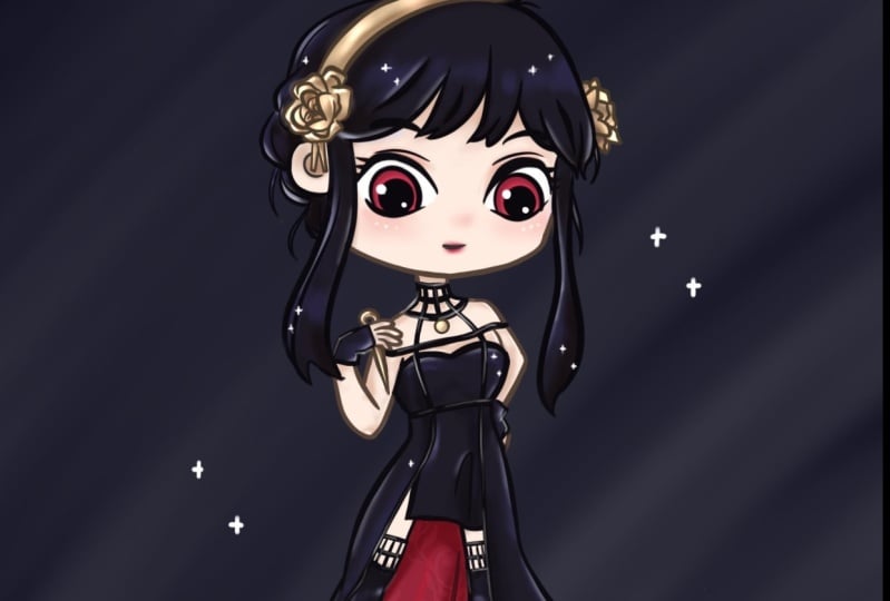
4. How to draw Chibi proportions: Hey guys and welcome back. In this video, I'm going to start approaching the topic of how to sketch a chibi. First things first, we need to talk about proportions, chibis come from manga and anime culture. From what I've read, chibi in Japanese means small. Something small, something cute. I've actually read it in real life, chibi is not such a good word because if referred to a person, it actually means you're short, like you're such a short person. But in relation to manga characters, a chibi is a small rendition of a full-fledged character. When you draw a chibi, of course, you have to make the proportions of realistic characters, or manga characters, or whatever other style of drawing into a smaller and cuter version. The quickest way that you can do that is to change the ratio of the head to the body. In a realistic or semi realistic drawings, the proportion is to have eight heads into a full body. If you take the length of the head, you then replicate it eight times into a body, and there you go. You have a semi realistic ratio. In most cartoon styles like Disney style, for example, you have basically five heads into a body. Instead, for chibi styles, you can have as much as just one head, to the body. The head is going to be as long as the whole body together. The way that I draw chibi is that I use a three head or 2.5 head ratio to the body. I'm going to show you now here. As you can see, there's two chibi characters that I made for a series called "Wheel of Time". I don't have photo references for these characters because they are characters from a book that I have read the description of and then made up my mind about how they look. I think these two characters are pretty good to take as an example because we can use one as a tall proportion and the other as a short proportion. As you can see here, I have a short version and a tall version here. The way that you can easily draw chibi is, well, for starters, to take the proportion grid that I have developed for you guys, and you can find in the course materials, download and then just draw on top. If you practice that a few times, you'll probably find that the proportions have become very familiar to you, and so you'll be able to draw them without the use of the guide. But if you want to just start and you can draw the head of a chibi and then calculate, for example, for the tall version TB, you can calculate how many times the one head stays in the body. It's one to 2.5 for the tall character, and for the short character, it's one, two, two and a third, I think for the short character. Once you have a great and once you have an idea of how to set the proportion for your chibi, you can definitely change this. You can make them one in three or you can make them one on one. It's totally fine, and up to you. Since all the girls in black pink are pretty slim, I'm going to use the tall character guide as a basis for the chibis. Of course, you're not going to be using the same pose, as this one for all the chibis. This is more just to have an idea and then you can change the chibi around when you become a more confident with drawing postures and gestures as well. The way that I sketch my chibi is that I try to respect the grid, but I do it freehand. You can do this by simply putting the grid into your Canvas, lowering the opacity of your character. Then draw on top of it. Or what you can do is that you can draw a freehand and simply keep the guide next to you. Or you can even make it bigger so that it extends throughout the page. Simply use those rulers to make sure that you are keeping the right proportions. You start with a circle for the head. You start with a quick circle. If you're using procreate, if you keep the Canvas tapped after you've drawn a rough circle, you'll see that it becomes a perfect shape. You can use that one, and make it a perfect shape. Then you trace a single line downwards, which is going to be the middle parting of the face of the chibi. Then you just add a certain triangle shape that points down towards that middle nine. That's going to be the jaw. Then you draw two small house circles for the ears, the torso, it's a rough rectangular shape. There we go. The more it's skewed, the more it means that the character is arching. Again, then you can draw two lines that signify the direction that the torso is facing. The middle part in underneath the breasts or for men underneath the backs. Then you can draw another circle, which is basically the pelvis and how it's rotated. Then from there you draw two oblonged circles, or we could define them more like rounded rectangles, for the thighs, and then other two for the Cubs. Then two little triangles at the end for the feet. Then to oblonged ovals for the arms and the forearms. Then one circle for the main part of the hand, the palm. Then from there you have four little triangles that extend for the fingers. There we go. You have a very, very, very basic chibi there. I've actually made the legs a lot shorter than the grid. I am going to fix that by simply tapping the lasso tool selection here, and selecting the part here from the pelvis down where I went a little bit too short, and then you can just make it taller. There you go. You can make just one side of your selection larger by selecting free form. Or if you select uniform selection, then you'll see that the whole selection becomes increasingly bigger or smaller. Always remember that the eyes of a chibi are really big. We're going to place them here roughly a little bit higher than the middle, horizontal partying and equally spaced. Looking at the middle part in one to the left and one to the right. The way that I draw eyes is that I draw them quite almost shaped. Then chibi don't have noses. You don't have to draw the nose, and then you just place a small smile. I don't draw the lips for chibis, because I think they look cute by being quite childlike. But if a character is supposed to be sultry or a little bit seductive than you can totally add the lips, but that's going to happen in the color stage. Don't worry about it right now. The hair is usually important in chibi drawings because their heads are really big. The hair is equally going to be super big or long hair for chibis, like really long hair, I usually draw the hair all the way down to the feet. That's because as I was saying, the hair is like super big. The reason is because of exaggeration. When you draw cartoon character, and when you want them to make them cute, or even if you want to, the idea of the likeness to the original character, but not necessarily the realistic likeness. You want to exaggerate certain features because they will resonate more with the viewer. In this case, you have really long hair. If you just draw the hair to the actual real life place where they got to. For example, say meet back for example. It wouldn't look very long in chibi form, because the head will still be quite big in comparison to the hair. For example, let's say here, say did these is the hair that we're drawing. To me, these looks like this person has shoulder length hair. Even though it literally goes to the meet back, it doesn't look as long because in comparison to the head it's not that long. To draw a really long hair, I usually draw them all the way down to the feet. That makes the character look like they have long hair, in my opinion. Instead, if the character has hair, say for example, above, then it will go on the shoulders, and that will look like the character has above. Or even shorter than above, to be honest, but there you go. This is how you draw a very basic blueprint for your chibi character. In the next video, I'm going to show you guys how I take this blueprint into an actual characterized chibi with personality. See you in the next video.
5. Sketch and Ink: Hey guys, and welcome back to a new video. In this video, I'm going to show you how I'm going to go from the basic blueprint of a Chibi to a full fleshed actual Chibi that looks like a character. I'm choosing the rightmost character here, the one with the green bob. For starters, this girl has a slightly different tilt of the head in this image. Whilst the central parting of the Chibi can stay the same, the actual tilt of the face is going to be slightly upwards like this and that's also going to be done obviously by moving the mouth and the eyes, because the eyes always go on top of the horizontal central parting. These characters body actually looks at a different direction in comparison to the head. I'm going to move the central parting or the torso as well, which gives the direction and tilt of the position of the character and then draw that curvy rectangle, which is the chest. Like that. I'm going to draw the circle that is the pelvis slightly backwards because she is pushing her butt out slightly. Then one leg goes forward with all triangular foot and one hand stays backward. The arms, we can only see one unfortunately, but one arm stays close to the body and we can see the hand. One arm we don't really know what's going on, so I'm just going to assume that she is putting it on her hip like that because that's what modal pose. Then we're going to have a bob for this character so because of this and a fringe, which is actually a really great thing to have in a Chibi. She actually has a straight fringe, but I'm going to take poetic license and change it into a three pointed fringe. Because that's a very anime fringe to have. It's also much nicer to draw in Chibi form and that's because in Chibi form and this is a general tip that I'm giving you guys for now, you want to have all of the objects, all of the shapes, you want them to be rounded because that will make the Chibi look cuter. Chibi are really not realistic at all, so it's okay to take some creative license to make them more cartoony, cuter, closer to their spirit, even though you're changing their features a little bit. This is the very basic blueprint. As you can see, it already looks very much like the same pose that she was making in the reference picture. I'm just going to lower the opacity here. At this point you can unsee the grade. I'm going to create a layer on top of it and I'm going to improve my sketch. I'm going to change the color to black because at this point I'm actually trying to create a proper sketch, not just body Manichean basically. Again, the brush that I'm using, it's called dry ink. You can find it in the inking category of the brush library in Procreate. When I draw, I usually sketch quite a few times before I reach a final image that I like and that I consider the fate to be inked. But instead, when I draw Chibis I try to be as quick as possible, so I'm going to try and do a sketch that is also considered to be inking. Inking is that part of the creative process where if you're doing cartoony designs, you are moving from the sketch phase, which has a very messy line to a very clean line that is just very clean and you can clearly understand what's going on in the drawing because of it. Usually you can keep that line and then just color inside the lines basically. The way did I draw the eyes is that I draw them quite all moon shaped and then I just add this triangular shapes for the eyelashes. There you go. Then I do the thing again with drawing a circle and then just keeping pressed on the canvas and procreate just changes my shaky circle into a perfect circle. If you want to quickly cover something that you have done a full outline for, you can simply press on the colors up here, black, and move it on top of the shape that you want to color. There you go. I'm going to add with white a little light dot. You want to add the light dot to the opposite side of where the character is looking. If the character is looking right in this case, then the light dot will go on the left. When you do line out, you want to make sure that you're creating weak and decisive strokes. So if you're not happy with how your strokes are coming out, you can simply erase them by using two fingers and tapping on the canvas on procreate. Instead, if it wasn't the last strokes that you took but you are not happy with, you're going to have to use the eraser. I simplify the ears quite a lot in these cases where I'm just using two strokes to signify the inside of the ear. If you're not happy with something, even at this stage, you can simply use the selection tool and move your shape slightly down. When you do the hair, It's bringing burden to break the hair up into branches. Because this will make the hairstyle look a little bit lighter. You're just going to break up the shape of the hair here and you can make it meet up again in the bottom part, but then just break it up midway. I'm going to proceed with the rest of the body, adding the detail of the clothing that is going to make this character look different from all the others in the image. For example here it's important that I add the detail of the number even though it's going to be a lot smaller than in the reference picture because the torso is pretty small. When you do the hands on this character, they're going to look tiny, so they can be very, very stylized. You can add even jewelry. The point with this Chibi is that you add as much detail as possible while simplifying it. As you can see, I'm making all this detail look very cartoony by making it super round and even though it's really small, you can still see the detail. The pleated skirt, there you go. You can add small brush strokes to signify certain parts of the body, like the knees for example. She's the only one, for example, that has checkered socks, so I'm going to add that detail as well. The feet and the shoes can be super simple because feet are always very small with Chibi characters. They're not as important, basically. They can be just our regular triangles that we did in the guide. Here is my finished line art sketch for this Chibi. In the next video, I'm going to show you how I am coloring this Chibi and making it even more similar to the reference. See you there.
6. Flat colour: Hey guys and welcome back. In this video, I'm going to take this sketch over GB, which in this case is also the line art for the GB. Because we went straight from the grid body mannequin to the line art for this GB, which I'm going to keep in this color workflow. What I'm going to do first is that I'm going to create a new layer underneath the line art. I'm actually going to rename the line art, actually line art because it's always good to keep your workspace tidy. I'm going to create a new layer, and on that layer, what we're going to create is a full color block silhouette of the whole character. You can either choose a random color that you want because we're going to be changing it or you can already choose the right skin tone color for your character. How can you do that? You can do that if you have a photo reference by simply tapping on the area of the skin that you want to sample and keep pressing on it until you see there's a little color wheel appearing on top. It's going to show you in the lower part, the color that you currently have in your color selection, and on the top part, the colors that you are sampling. You can simply raise your finger when you see a color that looks like the color you want to use. I'm just going to raise my finger here, and as you can see here, you've got a muted pink, which is the color of the skin tone of the character. For this part, I'm actually going to pick a studio pen brush, which is a finer kind of brush with no texture edges. Because I just need it to quickly color in the silhouette under the character and you can go underneath the outline, it doesn't matter. Because we are going to keep the line art for the final render of the GB so we don't need for the line art to disappear at the end. When you have finished up the outline for a specific area of the character, you can again do the same thing we did before for the pupils on the eyes. You can just tap on the color selection and drag it in the area that you want to quickly color and there you go. Same thing goes for the rest of the body. One thing that you will notice about the selection of colors is that sometimes when you color pick directly from a reference, it looks like the right color. But then when you actually apply it to the image and to the cartoony form, you see that it looks a little bit too dark or a little bit too dull. That's because when you have a realistic photograph, the colors are all immersed into a scenario with lighting, shading. The interaction between the colors make them look slightly different than they actually are, if they can similarly one by one. As you can see, this pink that was actually the exact same pink that I color picked from the character's legs, looks a little bit too dark and dull when just taken on its own. What I'm going to do is that I'm going to make sure that I'm on this selection of this layer. I'm going to go into this magic wand with the sparkles selection. As you can see here, we've got all these different adjustment options. I'm going to choose Hue, Saturation, and Brightness, apply it to the whole layer. Then with the sliders underneath, just move, make it a little bit more saturated and a little bit lighter. There we go. Even though this is not the correct color that I color picked from the image, I can see that it looks like the very fair pinkish color that the character and the woman actually is in real life. It's like the same thing that we did with the shapes of the body. Sometimes you want to simplify and change some of the details a little bit, just because that way you can make them more similar to the image in its spirit rather than the realistic portrayal of it. When you have this silhouette completely colored, you're going to create a new layer on top and tap on this new layer and select clipping mask. A clipping mask is basically a mask that is going to allow you to change color, for example, and when you color on top of the image, it colors only on top of the image. It doesn't color anywhere else. If you look at the layer underneath, you see that the lines are there everywhere, but they only appear on top of the silhouette that you already drew so it's going to make the workflow a lot faster. We're going to create a new layer for any element that has a different color from the skin tone. As you can see here, I am quickly coloring in the top and the skirt, which are the same white, which is not 100 percent white, of course, because you should always remember that white and black are usually never 100 percent. They're always some sort of percentage of grayscale or of another color. For example here this white is actually a purplish tint of white. If you use two fingers and you swipe, right, you will see that the layer becomes checkered. This is because the layer now is Alpha locked. This means that you can only recolor over the pixels that are already present on the layer and not outside of them. For example, now I can simply use the new color that I picked to drag it on top of the image and recolor the outfit. This may be too gray, so I'm going to go slightly more white. I think this is the perfect color. Because this is a white outfit now and the background is also white and it's hard to see, I'm going to quickly color pick this pink here and change the background color. In Procreate, the background color has its own layer and you can actually change it by simply tapping on it and it will open the color wheel for you so that you can choose what color you want to use. What I'm going to do is that to actually use the exact same pink of the image, I'm going to color pick that pink, then go into my sample palette and record that pink in the sample palette. Then go back to the layer view, go on the background color, and look at all the different palettes and choose that pink. I now have a reference between the pink and the skin tone. I'm going to make the skin tone slightly different, going again into the layer, making the saturation even more, maybe a little bit darker. The outfit as well, I'm going to just do some slight color correction. I feel like now the interaction between all these different colors works best. I'm going to create a new layer on top clipping mask again, I'm going to, again not 100 percent white, but pretty white to do the sclera, that is the white part of the eye. I'm going to color pick the inside of the mouth. On top I'm going to create a new layer. I'm not sure what color eye character has because, as I was saying, [LAUGHTER] it's very hard to tell eye color from the picture, but I am going to assume it's some sort of brown. You do the base color for the iris and then two fingers, you pixel lock the layer. Then in the airbrushing category, you select a type of brush that it's much softer than the inking brushes that I have been using. You can either select a soft airbrush or a medium airbrush and put the opacity down a little bit on this brush, and then you choose a color that is a little bit lighter. It doesn't need to be realistic again, it can be a fantasy color for the inside of the iris that really lifts out the eyes. Then we are going to go back down in between the cloud and the iris and the eyes. I'm going to color pick the color of the hair on my reference. Create a new layer. Go back to inking the studio pen brush. I'm going to color in the hair. Now, you only need to do the outline again because then you can simply bucket color the rest of it. Color pick the eyebrow color. There you go. Let's finish up with some detail. Now that we are done with the flat color for this character, we just have a few more details, lighting, and shading to make this GB really lift off the page. I'm going see you in the next video when we're going to take care of these details. See you there.
7. Gradients: Hey guys and welcome back. In this video, I'm going to show you guys how to enhance these flat color chibi in order to really make it stand out. Let's start by going back to the skin tone, main silhouette of the chibi. I'm going to pick a very soft brush from the airbrushing category. Probably medium airbrush is fine. Just put down the opacity slightly and make sure it's quite big in terms of size. Then I'm going to color pick the skin tone, then move the slider towards a more saturated version of that same skin tone. Then we're going to go in and color very lightly on top of the knees, elbows, on top of the shoulders, and on top of the cheeks to make that anime blush then it's really cute. After we've done this, I'm going to move on to the hair layer, pixel lock it as well, then color pick the green of the hair and move it as well towards a more bluish, I think, and slightly darker version and lightly recolor the bottom part of the hair to give it a slight gradient. Also the very top slightly very softly. You can almost not see it. You could be doing an even different green as well. Like a slightly more grayish-green on some areas of the hair like here, different locks of hair. But we're also going to do that with lighting and shading, so I'm not too bothered about it. We are going to move on to the lineart layer, pixel lock it. Go back to a rather hard airbrush this time, like hard airbrush or hard brush, up to you, which one you prefer. They are quite similar to each other, to be honest. We are going to color pick the color of the skin tone and move down in the classic view, move down to a much darker and not more saturated, just darker version of this color. Or you can also simply color pick it and move this slider, the third one, the one that goes from black to white and go down so that you're sure that it remains the same hue of pink, but it just becomes one of its tones and one of these much darker tones. Then we simply move on top the lineart, re-color it, but only around the areas that are skin tone color. This step basically allows you to keep the lineart, but simply make it a little bit less obvious, make it blend a little better with the skin tone and the rest of the elements in the chibi. You can make the brush pretty big wherever you're far away from other linearts that are a different color or you can make it smaller to go more in detail. When you are close to other areas of the lineart, then you need to be a little bit more precise. It's actually one of the best, I think, tricks when it comes to this workflow, because as I said, it allows you to be very fast with the lineart, but at the same time, it really has a good impact. It changes the lineart from being all-black to being more discrete, I think, and make the chibi a little bit more realistic because you don't see the lineart as much, which is what makes it really cartoony a apart from the obvious change in proportions. [MUSIC]
8. Lighting and Shading: Hi, guys and welcome back. Now that I have done all these little details and done some gradients, change the liner's color, I'm going to do some lighting and shading, which is going to be the cherry on top for your chibi. I'm going to create a new layer on top of all the clipping masks that we already have for all the flat color elements, and I'm going to change its blending setting, which you can do by tapping on the little n that you find here, going to change that to multiply. When you have the layer on multiply, it will basically multiply [LAUGHTER] whatever color you put on top of the image by the color that is at the base. I'm going to choose a muted purple, which you can choose over here, there you go, as my multiply color, which is going to be the shading of this character. Now, I'm not going to go in detail about lighting and shading because that's a whole kettle of fish, and I actually have a class for that on Skillshare. You just simply have to go on that specific class, which is called quick tips for lighting and shading in Procreate, and it's a full hour on shading and lighting. If you want to go more in-depth into these concepts, please refer to that class. Instead, what I'm going to do here is just to give you some basic knowledge of how to achieve these effects with your chibi. Because it's chibi, it's very cartoony, very simple, very minimal, the shading and lighting should also be very [LAUGHTER] cartoony, very minimal. Specifically, we're going to do cell shading, which is a way of shading where can basically see the clear outlines of your shading like this. You can see very clearly where I'm shading here, because it makes a definite line over the image underneath. Specifically, I am going to shade only on cast shadows. That means, I'm only going to do some shading in areas that are either covered by other objects, so for example, here, inside the eye, which is the area that is covered by the eyelids, inside the orbital cavity because that's covered by the eye behind some areas of the hair like that, to give a little bit more shape, 3D volume to the hair. That's also going to give the hair a little bit of different gradients in terms of color. Thanks to the shading, so that's like a double whammy. As you can see, I'm being really not very subtle about it. This is not painterly shading. This is the cell shading, so it is very clear where is the shaded area because it's a flat object. The only difference from cell shading in other cartoony examples is that, as you can see here, the very edge of the brush stroke, it slightly faded. That's because I've chosen a brush that is called medium hard brush. It's just slightly faded towards the edges. The more you press, the more it becomes dark and more visible, the less you press, and the more it becomes faded. I'm using that brush, but you can use a different brush, a more defined brush, it's up to you. I'm just going to use the shading to define the bottom of the hair because that's also an area that it's covered by the top of the hair. Of course, it's going to be shaded underneath the chin to give a little bit more definition to the jaw. As you can see, because the shading layer is underneath the line layer, the line is not affected by these lighting and shading layers. Of course, because the head is so massive, part of the shoulders is also affected by the shading. If the light is coming from this side, all of the areas on the right side of the body are going to be more in shade than the left side. Like this arm is going to be completely shade, for example. There you go. As you can see, quick and easy. I'm going to draw slightly lower to your opacity of this layer to about 45 percent, I think, there we go. We do keep the shading feeling, but it's not as prominent as before. Same thing, create a clipping mask, change this layer to overlay, change a color that can be yellow, for example buttery yellow, usually, for the lighting. We just repeat the same thing, give some lighting to the inside part of the iris on the side of the light dot, as well as creating some light reflection on the hair, always considering basically the geometric shape behind each bank and lock of hair. You do this, the old waves. It adds a level of liquid light to the hair, I think, and highlights also the fact that the hair is usually round, around the head, which is round. Don't worry if it seems really excessive at the moment, because right now, we're going to select the eraser tool. Pick a studio pen as an eraser or pick airbrushing hard brush as an eraser, and just erase some of the areas here. You just go and refine the light areas, making sure that wherever you have the little wave, you break up that wave. Really sometimes coloring and doing lighting and shading, it's more about erasing in some areas, than actually coloring. Make sure that you break up all these little waves wherever they are changing force. It's going up, breaking up, it's going down, written down. Once you have all of your hair high points, you can just do the same thing for some of the light dots around the body, wherever you see that you did a shading strokes, then on the opposite side, you can do a light stroke. Is quite subtle, just a little bit around the shape of the leg here, for example, a little bit at the back of the arm as if it's coming a little bit from behind. There you go. Turn this down a little bit, just a tiny bit, maybe 55 percent. Then always on the same layer, what you can do is also get a very soft brush [LAUGHTER] and lower the opacity even and make sure that it's quite big, and you can just very lightly do some lighting on top of the whole face. Right here, especially in between the eyes, because that adds a focal point towards the eyes, which is the most important part of the chibi, and you want your viewer to really be attracted by that area. I'm just going to add a very last layer. Click in mask, add either overlay or add in terms of blending layers. Let's see what's best. I'm going to give a little bit of a light point to the necklace, and just to add some interests there. I just remembered that I never did the lips. I'm just going to go here, create a new layer in between the clothes and the lips, and I'm going to color pick. Mostly color for the reference, and always with the medium hard, I'm going to just very lightly paint some very light lips on this character. The reason why I'm doing it with the medium hard brush, is because I want the outline of the lips to fatally open. Then I'm going back to the overlay, and I'm going to give a little bit of a light dot on the lips, there you go, slightly lower like 60 percent. That's it. We are done. Its super-quick, super easy, and let's just move on to the last video in this course where I'm going to quickly talk about the full process and wrap it up. See you there.
9. Wrap-up: Hi guys, and welcome to the last video in the course. From the start, we have seen how to use a proportion grid to create around chibi mannequin/body guide. Then from that type of body guide, we have built on top the actual lineart or sketch according to how confident you feel about your chibi. Add in all the details of the outfit that make up the actual likeness of the chibi to the real person in the reference. When you're done with that, you create a new layer underneath coloring in the whole silhouette of the chibi with your chosen color, either for the skin tone or a random color that you can change afterward. You can make as many adjustments as you want when you're done with the silhouette, because you can just pixel lock the layer and change that color as many times as you want until it satisfies you, or it becomes harmonious with the rest of the color palette. Then you can color pick all of the different elements of the character in the reference photo, adding them on top of the first outline using clipping masks. Clipping masks are a great way to save time when you don't want to worry about going over the outline all the times. You can just lay them on top of the main silhouette as many as you want. When you're done with the main elements and you're all colored out [LAUGHTER] then it's time to add some gradients, to add some more color interest, and make your chibi really stand out. You can add gradients to different elements because they're all on different layers. You can just pixel lock those layers, get a softer brush, then dry ink so that you can simply really lightly go on top of each element and just add some very, very light gradients. Again, it needs to be super subtle, so that you can add that feeling of softness and cuteness that is proper for every chibi. After you're done with the polishing and adding all these different gradients, you can add two more layers and that's it. One layer is called the shading and it's on Multiply. You do it by changing the blending setting of the layer to multiply and using a light purple to add some shadows to the character all on one side. On the opposite side from when the light is coming from, you can use either a very thick, very defined brush, like a hard brush, or you can use a medium-hard brush that has a bit more of a faded edge to the sides if you want to give a softer appearance to the soft shading. After that, you can add a lighting layer using overlay as a blending setting, and using a buttery yellow as color. You can apply this lighting on the opposite side of where you applied the shading basically and on the hair by using a wavy brushstroke all around the head and breaking it up afterwards with the Eraser tool. That's it. Then you're done and you have your great chibi that you can show off, you can give as a gift, you can use on social media as an avatar, or you can make a sticker pack with. As you can see here, I am creating the sticker pathways Photoshop because it's connected to my printer directly. I usually do this step on my computer, but you could do it on Procreate as well. You can just paste in all the different chibis that you have made, and arrange them on the page as you would on Photoshop. You can paste in all the different images that relate to your chibis, and keep the background transparent. To keep the background transparent, you can either just not have a background or on Procreate, you can turn it off so that you don't see the background, you only see the grade behind the Canvas. At that point, you can save the file as a PNG, so that you can keep the transparent background even when you have exported it outside of the software. You can upload it on websites like StickerApp or other websites that make stickers. You can just send it there and they will send you back a bunch of stickers with your chibis on, which is pretty fun. I want to disclaim that I have not been paid by [LAUGHTER] StickerApp to give you this advice. I just used this service before and I enjoyed it, I liked it. They have a ton of different settings, you can have stickers with glitter, holographic stickers, all sorts of stickers. That's it I hope you had fun in this video class. I hope that I will see your chibis out in the world or in the project section very soon. See you later guys. [MUSIC]
 Maria Lia Malandrino, Story / Illustration / Animation