Transcripts
1. Introduction: Hi everyone and
welcome to my class. My name is evil and I studied
visual communication. I have already done so both tails calendar's
short stories. I like to create
illustrations and to draw. Like. I find that even tracing a line on the paper can be
a wonderful experience. In this class, I want
to teach you how to draw food, leaves,
watercolor, pencils. The first time I
have illustrated, it was for a calendar. And I want to show you how it works from
the very beginning. With these techniques, you
will be able to draw any food, but also other subjects. I like to draw with watercolor
pencils because I liked the feeling of the brush spreading the colors on
the paper. Reason why. I also like to digitalize my
drawing with the software. So we, we see how it works. I'm really looking forward to start NICU in the next video, where we will see in detail the actions you must
take in this course. See you there.
2. Class Project: Now I will tell you the steps that you must take
in this class. Usually I prefer to work with real material instead
of digital techniques. Here we will use both. You can also follow only the first steps
without a graphic tablet. And then you have
just the version, the paper without
the digital colors. Here are the steps that you
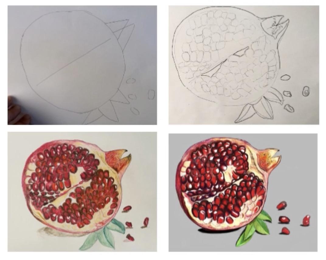
will do during the class. First, you will have to provide yourself a photo of a fruit, or it can be also a real one. Then you will have
to do a sketch of it with geometrical shapes. And then you will precise the
sketch with a bold pencil. Then you will create an accurate outline on the
sketch you did before. And after a while, you will transfer the sketch on another sheet of paper
to have it clean. After a while, you will add the colors with your
watercolor pencils. And then you will
create your own ink. Then you will outline your
subject with the ink, and then you will send
it to your computer. Change the luminosity,
remove the background, and improve the colors. Now, let's talk about the
class project that you can share on Skillshare's
website. So e.g. it can be the sketch with
the geometrical shapes. It can be the sketch with the
bold pencil, more precise. Or it can be the version on
the paper with the colors. Or it can be diversion on affinity with the
digital collage. I will remind you
at the beginning of the step when it is
a class project. So how can you upload
your work on the website? Simply go into the section, receive services and projects in your browser and there
you can upload your work. There I will also share some
resources like the material, all the steps that
you will have to do, the action you
should take and the recommendation I will tell
you during the class. Please share your work. Even if it's not perfect. Be proud of what you
did. In this section. You will also have the
opportunity to ask me some questions and I will
be glad to answer them. I'm very enthusiastic to
share my class to you, and I'm looking forward
to see what you will create for you in
the next video, where we will talk
about the material.
3. Material: Let's talk now about the material that you
will need for the class. First, you'll need paper for five shades of a thin paper
that you can take e.g. from your print device. Then you will need one
sheet of a thicker paper. Then this one should
support water. Then you will need a
sheet of carbon paper. And this one is
for the transfer. It is better if you
have a clipboard. So you can grab those
papers together, then you will need a
picture of a fruit. You can also take we are one. Or you can download a picture from a free archive of images. E.g. I. Use iStockphoto. Then you will need some
pencils. Light one e.g. three H, and a boulder one e.g. then you will need a
sharpener and an eraser. For the ink. You will
need a Chinese stone. Like this. And solid critique of black ink. You will need for that
some water and a pipette. If you don't have a pipette, you can also take a teaspoon to put the water
inside the store. Then you will need a thin brush
for the hotter shapes and also thicker one
for the shadows. You will also need water
brush for the colors. And also Penn, also
for the outer shapes. Of course, you will need
some watercolor pencils. And I either use fabric, Estelle are Qur'an dash, those are really good. Then you will need a
phone camera to take a picture of your subject and
send it to your computer. And finally, you will need computer graphic tablet
with the software affinity. If you don't have the
software affinity, you can use another software
instead, like Procreate. You can also follow the class. So I see you in the next
video where we will really start the
class. See you there.
4. Draw With Geometrical Shapes: Now we will start to draw. In this step, we will
draw the subject with general shapes.
Before we start. Every time I will tell you the actions you must
take in this step. And also during the class, I will tell you the
recommendations. Here are those instructions. First, you will have to draw an X in the middle
of your paper, and that will split your subject into and give an orientation. Then you will have to
draw with general shapes. And those are
simple, geometrical. And thirdly, you will
divide the inside of your subject to have
smaller divisions. I remind you that this step can be a project that you share in the projects and resources
section of the website. Now we're going to draw. And for this step you will
need the same sheet of paper, the photo of the fruit you
want to draw and light pencil. So first, let's draw the acts. The same orientation
as the photo. Simply draw an ax in the
middle of your sheet of paper. And this is a central line
that will help you to put the elements at
the right place. Then we will draw
the general shapes. And for the fruit will
draw a big circle. And the x cross z
it in the middle. Then I will draw for
other ovals on the right, for the seeds like this. And then I will draw kind of
triangles for the leaves. My recommendation for this step is to draw only with
geometric shapes. Because now we are building
the structure and it is after one that we will draw
the element in detail. Another example
for the real thing on the upper right
part of the fruit. I can represent it easily with two triangles
overlapping each other. Like this. Here I want to tell you a
second recommendation. Please keep the sweeter
borrowed proportions. Stay with hindsight at the beggining to
have an overview of your drawing and see if the proportions are
correct after what, it would be much more
complicated to change them. Whereas if I want to modify
the size of my fruit, now, I can just change
the curve here, e.g. and do it a little bit bigger. And then I can continue with the smaller elements
inside my pomegranate. Here are some other examples
for the geometrical shapes. And e.g. for an apple, you can draw two of us
overlapping each other. And then you have the
outer shape of an APA. Then you can draw a
rectangle and a triangle. And another small
triangle on the top. And you have chili pepper. With the acts are ways
crosses it in the media. And finally, I can
draw here novel. And then one more triangular
here on the top with the rectangle and
some curves inside. And I have a garlic. Now, let's come back
to our pomegranate. So inside the food, you will have the flesh. And let's divide those
elements in smaller divisions, always with geometric
shapes and lines. And that will help you to draw the elements after one,
one-by-one, the seeds. Now we have already an id of the composition
with a few lines. And finally, I can add the seeds inside the
divisions we just have created simply with four or five lines
for each of them. Always simple circuit. So this is the last
action of this tab. And I will finish all the seeds. And I see you in the
next video where we will see how to precise the sketch.
5. Precise the Sketch: Let's continue our class. And now we will use a bold
pencil and precise our sketch. While in the previous step, we were drawing only with
geometric and shapes. Now we will use some strokes and train our personality style. As before, I will tell you some tips all along
the actions you take. And also now I will give
you the instructions. First, you will have to draw some SLT lines on the biggest
shapes of your subject. Only. You will have to draw the smaller elements and
exactly how you see them. And finally, you will add the textures and the
shadows on the subject. I remind you that this step can be a project that you share in the projects and resources
section of the website. So let's start. First, take your ball
pencil and start to add some assertive lines on your subject you did before
with geometric shapes. And I will start on the border. And I'm looking at the photo while I'm adding some
lines on my subject. And as we are going
a little bit deeper, I will give you a
first recommendation. Observe that is the first key. Because to look
at something will allow you to draw it how we teach and to draw something
how you see it yourself, will bring a personal
touch into your drawing. As strength of the drawing
is that you can emphasize things with textures,
details, and exaggerations. While a photo is more
a copy of the reality, drawing can give a
unique look to it, and it is your eye that does it. Secondly, you can
continue to draw all the smaller elements
of your subject. With the tool I just gave you, you should be able to draw them with all their
particularities, exactly how you see them. So e.g. here on the upper
right part of my fruit, I will draw this weird thing. Exactly how I see it. So I look at my photo and
I draw this outer line, how I see it. And then I add the
textures inside. Like this. Another example here, with the flesh inside my fruit. Again, I look at the
photo and then I draw the outer shape of this small element
of my subjects. And you can repeat that with all the elements that
you see on your photo. Now I will draw all the seeds. And again, I look at my photo and I draw
them how they are. And here I will give you
a second recommendation. Here is my second
recommendation. Pay attention to your style
because there are many. You can draw with long
lines of small strokes. And it depends probably
on your emotions. Your choice makes your style. Find out how
comfortable you are. I usually draw the sketch
with the geometrical shapes, very roughly,
approximately, but quickly. And that allow me
to warm up my hand, release my anxiety
and fear free. Now I'm drawing with
the bold pencil. And with this tool, I can really press on the paper. Thereby, I can draw with passion
and lead my emotions go. The result doesn't matter
because this is just a sketch. And I will transfer it on another sheet of paper
to have it clean. Afterward. I feel
also more relaxed for the next steps where I
need to be more precise. I will finish all those
seeds and I see you in a few moments for the
shadows and the textures. Finally, we will add some textures and shadows
fall the shadows, usually just small areas under the seeds and
fruits are enough. And for the textures, you can do some dots are
hatching inside and the flesh. Like this. And hatching here. And I will gave you
last recommendation. Here is my third recommendation. Don't try to be perfect. This is just a sketch
and you will be more at ease with practice.
So don't worry. In the next video, we will see how to draw inaccurate outer line on
the sketch we did before.
6. Draw an Accurate Outline: Now we will draw a nice and accurate outline
on the sketch we did before. And here you have the
last opportunities to do some modifications
of your outer shapes. Then we will transfer it
on another sheet of paper. So here, the action
you should do is to draw a nice and
accurate outline. Let's start. First. Take a kernel red pencil and simply draw some nice lines
on the sketch you did before. So big in where you feel
the most comfortable and draw on the sketch on the lines you did
with the bold pencil. If you are happy
with your sketch, you don't need to do
this step and you can go directly to the transfer. But usually your sketch is messy and there are a lots
of unnecessary lines. So here the idea is to
clarify your strokes. I mean, to have an artistic or more
expressive drawing, either another exercise. Here, what we are looking
for is a drawing where it is easy afterward
to add the colors. Here is my recommendation. Find the correct lines
in your drawing. Look again at your sketch and see what is wrong or
what you don't need. And then find the
final outline that will represent your subject
the most beautiful way. So I'm always comparing
my drawing and my photo. And if I am happy
with the alto line, I did with the bold pencil, I let it as it is. Otherwise, I can do some
modifications, e.g. here, I will do this seed
a little bit bigger. So I correct the outer
shape here on my seat. Now, I want also to change the outer shape of this element. So I will also modify it and
do it a little bit larger. Now, I'm continuing
with all those seeds. And I add also the
reflections on them. Here. E.g. I. Will draw a little shape on my seed and this
area will stay wide. So this step take a
little bit of time. I do that in
approximately 18 min. So it is the occasion to
relax yourself and connect to your breath and also let
yourself go into the drawing. You can also put some music in the background if you want. I will finish all those Save. And I see you in a few
moments to the result. This is how the outer
shape has to look like. And as you can see, I did some
modifications here and there on this element and also add some seeds where I forgot
to draw them here, here. And I also changed a little bit the shapes of some
seeds here and there. So now when I will draw this outer shape on
another sheet of paper, I don't have to think if I have to change or
not my outer lines. So in the next video, we will see how to
draw the transfer.
7. The Transfer with a Carbon Paper: In this video, we
will see how to transfer our outer line on
another piece of paper. So the action you must
take here is to press everywhere with a pencil
on the color red, outer line we did in
the previous step. So let's start. In addition, if your sketch, you will need one sheet of the thicker paper and one
sheet of carbon paper. If you don't have the
sheet of carbon paper, you can also use the technique
with a sunny window. If you know what I mean. You put the subject behind the thick sheet of paper and then you put your
papers on the window. And then you try to draw on
the same sheet of paper, the subject that you
see through the window. But if you have the
sheet of carbon paper, which is better
because it is easier, you can put the thick sheet of paper first in front of you and then put the sheet of carbon paper with the
black side against it. And then you put
the sketch on them. After a while. You can grab them together with
the clipboard. And in my case, the subject is early to
be too high on the paper. So I will lower it just
a little bit to put it at the center of the
thick sheet of paper. Now, take sharpen a
pencil with a color visible and different than the outer line we did
in the previous step. And then start to press on
this outer line like this. And you will see that
this outer line will appear on the paper
beneath its magic. My recommendation
from this step is to press softly because we don't want that the papers outline
to appear too strong. Why? Because then we will
add the canal near it and they could
overlap each other. And that's not very pretty. So. Continue that until the end and check off if the
transfer is happening. Well, when you are done, look at the paper beneath
and check the transfer. If you press on every line, I forgot to press in this
area and also there. So I will complete
my outer shape here. And also there. I see you in the next
video where we will see how to add the colors.
8. Add Colors with Watercolor Pencils: Now we will see how
to add the colors. First, we will add
the colors inside the border and the
flesh of the fruit. And certainly we will add
the colors inside the seed. And certainly we will spread
the water on the colors. And don't forget that
we will penalize the illustration with
the software affinity. So for the details and also the light reflections
on the scenes, it will be easier to do it afterwards with
the graphic tablet. So let's start. First, makes sure that your
color pencils are sharpening. And here are the
color pencils that we will use during this step. Here, I did some examples on a separate paper to see
all the possibilities. And this is helpful to choose the colors for
your illustration. So first, I will start with my pink here inside the border. So my first recommendation
for this step is to press lightly first. And then when you are
sure about the color, you can press more. Similar device as before. Observe, especially
here, the tonalities. You can ask yourself where
the light is coming from. And you can see that the
seeds at the center darker. You can also notice that the light reflections
are all different. And you don't have to draw regulatory one element
after another. You can also take a color
for a moment and then take another color and then
come back with the first one. And pay attention that
the combination of the colors that you put
one over the other, because it can influences how
they are mixed each other. And I will show you
an example here. I add the pink first and
then I add the purple. The purple will merge inside
the pink with the pink. But here on the right, if I add the pink
over the purple, the purple stays inside the paper because
it is entrusted. My recommendation here. It is better to start to draw your element with the
light colors simply because it is easier to overlap dark color on a light
one than the opposite. Now that I'm a bit
more confident about, my tonality is I
will press a little bit more inside my food. Now, let's see how we can
draw one seed in particular. First look at seed. There is a red K4 and around it, It's little bit darker, and then there is this
light refraction. Here are some examples
about how I drew the seeds. First, on the right, you have a seed where I added the red
everywhere inside it. And then I added
purple on the red. And the second example
on the left is where I added red.in the middle, and then I added the
purple around the red. The purple looks brighter. And form the last example above, I added first the red and
then the brown on the red. And this is for the seeds
that are a little bit darker. So first, let's add some red
inside the seed everywhere. And you can let these days for the light reflection
when it is possible. Otherwise, you can
add it after a while, the wisdom graphic tablet. And then you can add
the purple around it. And we will add the
water afterward. Now I will show you how to add the water on the courthouse. And for this, you will need the water brush or a
thin brush and water. I like this step because
you can really play with the colors and also
because they become a little bit shinier
with the water, you can do either. Little strokes on
your elements are circular movements are
also long strokes. It depends on your shape. You don't need to add too
much water on your element. Just announced to
make your corrals more homogeneous and smoother. My recommendation
for this step is to start with the
lightest colors first, because your brush has to
be very clean for them. Then continue with
the darker colors. And if you have too much
color on your brush, you can take another
small sheet of paper and remove some color
from your brush like this. And then you can continue. Now I want to show
you an example about how I add
colors on my seeds. Again with the
purple and the red. So in that case, I will first draw a red.in
the middle of my seed. And then I add border
of purple around it. And you will see
that the purple, in that case, we'd be brighter. Now I want to show
you a third example for the darker seeds here. And I will add first some
red inside the seed. And then I add a border
of brown on the red. And here I am trying the
other technique with the brown next to the
red and not over it. So we can compare
with the water. And you can see that in
that case, brown is darker. So it depends what you want. Now, let's move on into our drawing with the
rest of the seeds. So I see you in a few moments. Now you may ask yourself, Should I do this seed, red, brown, or purple? But it doesn't matter. Because the most
important is that you appreciate what
you are creating. So you can create new
combinations of colors, e.g. purple and brown,
that's allowed. And as I told you before, your drawing doesn't have to be exactly the same as your photo, because the strength of the
drawing is that you can emphasize things and
make a new reality. So I see you in a few
moments for the result. Now I'm arriving at
the end of my exercise and I feel a little bit
exhausted and also hungry. Because as I told you, this exercise takes lots
of energy because you can really lead GO
a lots of emotions. So it was quite a long step, and I hope you enjoyed it. And we still have the work
with the graphic tablet. But for the next step, we will see how to do our ink. So see you there.
9. Make Your Ink: Let's see now how
you can do your ink. For this step, you will
need a Chinese tone, solid stick of black ink. Then a pipette or a
teaspoon, the thin brush, glass of water, and also a sheet of paper
to do some tests. Here are the actions you
must take for this step. First, add a few
drops of water inside the Chinese tone and then
makes the ink for 5 min. And finally, do some tests. If you don't have the
material for this step, you can also take a bottle of liquid ink instead.
That's also fine. So let's start. So if you decide to do your ink, which is better because
the ink is more real, you can add some water
inside this tool. Here you can see that I have
leftover ink from last days, but it doesn't matter
because even if it dries, you can reactivate
it with water. Then take your solid
stick of black ink and start to do theocracy
movements inside the stone. You can start slowly and
then go a little bit faster. I liked this exercise because it prepares
the mind for practice. It's relaxing and set yourself
in a peaceful attitude. It takes a little bit of
time to have the ink, as it takes a little bit
of time to get relaxed. I do that for
approximately 5 min. You can also put a calming music in the
background if you want. When you think that
your ink is ready, take your thin brush and do some strokes on your
sheet of paper. If you are happy
with the tonality, you can use it. Otherwise. Continue to mix. I think it is fine. My recommendation for this step, it is better to do your ink to dark than not enough because you can always add water
afterward to make it lighter. Then enjoy your
ink and have fun. That's the most important. See you in the next
video where we will see how to outline the subject.
10. Outline the Subject: Let's see now how we can add some lines with ink
on our subject. And for this, you will
need the black ink we just have created
with the Chinese tool. We will need the color
red drawing and also thin and thicker brush and
an extra sheet of paper. Instead of this thin brush, you can also take a pen. Here are the actions
that you must take. First, add some lines everywhere
you feel it is needed. Then add some textures and details and certainly
add some shadows. I remind you that this step can be a project that you share in the projects and resources
section of the website. So let's start. In this step, you will need
to be a little bit precise. So I think it's better
to do some tests before on another sheet of
paper to relax your hand. And you can trace e.g. long, nice lines
with confidence. About ten should be enough. Now let's take our Carlo Read drawing and start to
outline our subject. You can start wherever you feel comfortable for them
per, on the border. And to outline your subject
will define it more. Keep your hands relaxed. You can rest your forearm on the table to find
your stability. And some parts need to
be outlined bit thicker. And you can change
the thickness of your outline by changing the
way you hold your brush, and also with the pressure. E.g. here, if I hold
my brush like this, the outline will be thick. But here, if I hold
my brush this way, the outline will be thinner. About the pressure. The more you press on the paper with the
brush, the seeker, the outline will be, here is my recommendation. Pay attention to the
thickness of your outline. You don't have to outline
every leader element. Some parts look better
without the outline, especially where there
is a lot of light. E.g. here, I will just
do very thin outline. And if you have too
much ink on your brush, you can also take another
sheet of paper and do a little stroke on it to remove
some ink from your brush. And then you can draw again. Now, let's quickly have
a look how you can use a pen instead of the brush. Sometimes it's easier. But if you have a nice brush, the feeling of it
is much better. So with the pen, you can have a very
regular outline and it doesn't matter how much
you press on the paper. You can also use the back of your pen to have
thinner outline. And finally, the pen can also be very good tool for
the textures, e.g. it's very easy to do some dots. And now I will finish my
outline of the seeds. So see you in a few moments. Now, while you are
doing this exercise, you can try to be more aware
about the way you draw. And you can also ask yourself, what kind of outline
do you prefer? Do I like when it
is very neat and clean on do I like when
it is more irregular? So try to be more conscious and aware
about the way you draw. Let's look now at
how you can add the textures and details
on your subject. This is a significant part. You are free to use the
tools that you want. E.g. you can use a little spawn, a piece of food. The brush pen, you did
how you feel. So e.g. you can do hatching is
first with the pen. But I don't use them a lot. I find them a little
lift old-fashioned. All you can do
dots with the pen. Thirdly, you can take
a piece of bamboo. And this one is a little bit more random texture with thin and thicker lines. And finally, you can
also take an old brush with a little bit of ink on
it and brush your paper. And this texture
looks like smoke. So here I will use
the southern example and draw some dots
inside the border. Just to give the impression of a spirit is inside the flesh. My third recommendation
for this step is don't add too much
ink inside your subject. I have the tendency to have too much
textures and details, and then my subject
becomes too black. So add just a little bit of ink. Here. I'm doing an
experimentation with the piece of bamboo. You can always make your textures better
with the graphic tablet. Afterward. Here is when I brush my paper
with an old brush. And it can happen now that
you have an accident. But sometimes it makes
your drawing livelier. It depends on what you want. And now the shadows for this
thicker brush is needed. And simply add some small
areas under the fruit. Just to give the impression
that the subject, he's laid on something. And usually I do them
again with the software. Afternoon just to make them
a little bit smoother. I see you in the next
video where we will see how to take a
picture of our drawing.
11. Send the Drawing to the Computer: We will simply see
now how to take a picture of our illustration. Here are the actions to take. First, take a picture
of your drawing, then send it to your
computer and finally, save it into a folder. I usually take my picture with my phone when there is an
excellent natural light. So when it is sunny outside, I put my drawing
in a place where there is direct light on it. It's my recommendation
for this step, it is better to take a
photo of your drawing as close as possible so you
have the best image quality. Or if you have a scanner, it is even better. Scan it in 300 DPI. Then send it to your computer via AirDrop with the
Bluetooth, for instance. And then finally, save
it into a folder.
12. Affinity : Erase the Background: Even if I try to spend most of my time with some
tangible tools, I also like to have higher
contrast and brighter colors. I use for that the
software affinity and it gives the illustration
more polished result. So in this exercise, you will need the graphic
tablet and the file is saved. Here are the actions
you must take. First, import your
file on affinity, then change their luminosity, and finally remove
the background. Then in the Affinity software, click on the plus icon to
create a new document, and then click on the
print option here. A5 Cm. Why k? If you want to print your
work and 300 DPI here, landscape orientation and
transparent background. Then click on, Okay. Then to import your file, click on the icon in
the upper left corner, and then click on Place Image. And then select the drawing
where you've saved it. Then drag it in the
middle of your art board. Put it at the center. And now we will change
the luminosity. Going to need to change
the subject brightness, select the adjustments
and then Levels. And now higher the black until 1020 per cent and
lower the wide 80-90%. Now, let's clean the subject
and remove the background. First, select the pixel mode, and then choose the free
hand selection tool. Make sure that you add two
pixel in the feeder option. It will make the selection smoother and select
also the mode add, because we will do the
selection in several parts. Now with the freehand
selection tool, select all the
background part by part. So simply follow the outline
and then create a loop. Repeat that until you've
selected all the background. Select the mode, subtract
when you want to remove some selected areas that goes
too much over the subject. And then select the mode again. At the end, try to have all the areas where
there is paper selected. Here is my recommendation
for this step. Pay attention that
your selection is touching the
outline everywhere. It's even better
if it is a little bit encrusted
inside the outline. Otherwise there is a white
border around the subject. If you put it on a dark background of
another illustration. We will check that at the end. When you've made the
selection Everywhere, select the erase
tool and put 1,000. Big sense in this section. Then select the correct layer and erase all the background. It is better to do it
carefully so you don't have any dirty marks
left in the background. Now, let's add a black
rectangle behind the subject to see if there are some spots are if the
border looks good. So far that go into the victim mode and select
the rectangle tool. Then select black corner and drag your rectangle
on the subject, and then put the layer with
the rectangle on the subject. So you can see if there are
some white in the background that you don't want or if
the border looks good here, it looks pretty good. So only near the shadows. But it doesn't matter because we will change them after one. So you can remove
the background. And now we already have a much brighter and
cleaner illustration. In the next video, we'll see
how to improve the colors.
13. Affinity : Add Colors: Now our drawing appears clean. We just want it a
little bit more polished with brighter colors. So here is what we will do. First, we will add digital
collage where it is needed. And then we will correct
the imperfections, e.g. there are some spots are if
the outline is too large. And thirdly, we will modify the shadows and add
the light reflections. I remind you that
this step can be a project that you share in the projects and
resources section of the website. So let's start. Now in the software
actually tee, select the pixels mode
and then the brush tool, and go into the
pencils correction and select the natural
pens here for b, e.g. and then above the color, you can drag with the pipette. Your pen on the color
that you want to use. Click on that color and
in the color wheel, you can do it
brighter or darker. My recommendation for this
step is that you can also put an image of your subject in
the corner of your art board. And then with the same metered, if you go on the layer
of your illustration, drag the pipette on that photo and then choose the
color that you want. Click on it and do it
brighter or darker. Now, let's paint on our subject. And for that, it is better
to create a separate layer. So click on the peak cell layer and improve the
color where needed. E.g. weight is too irregular, or where we see the
white of the paper here. And we can also
emphasize some areas and that we want a bit
darker or brighter. So e.g. I want to paint inside
the border of my fruit. So first I will choose the
color that I have inside the border selected and
do it brighter or darker. Then I can do a test. Inside my border. I wanted Prader and
ideas, e.g. like that. And then I can paint
on the color that I have here to do it a little bit smoother
and more polished. Then I also want to cover the areas where I see
the white of the paper. So for that, I will choose
a brush a bit thinner, e.g. a big sense, and then
paint inside those areas. Now I will continue
all along my border, especially here when I find
that it is a bit too white. So I will take my
large fences and then cover this area to
do it a bit smoother. Then you can also look at the photo and see
how it looks like. E.g. I. See that there is some
yellow inside the border. So I can take. Carla, with my pipette, and then change a little bit the tonality and use
it for my drawing like this. And then I want to emphasize
the dark shade of purple at the bottom
of my fruit here. And for that, I will use the color that I
already have here. And paint inside my border. And dark and immense give
an impression of heaviness. It will add contrast and
wait inside the image. And then if you go into
the layer section, you can also see the
result before and after. And then I will add
some dark red dots inside of my border for
the texture magnets. So this is how it looks like. And then I want also
to cover this border. Here. I think I will use a light pink, More like that. And then again, I
will add the texture with the dark red dots. So this is how it
looks and the end. And now I want to add a layer of yellow on the flesh to do
it a bit more homogeneous. So I add the color, especially where we see
the color of the paper. Can I add a dark red
between the c's here? Nice everyone recommendation
for this step is to draw smoothly on the tablet simply because we don't
want to break it. My third recommendation is
to pay attention to the aesthetic because this
step is pure pleasure. You'll see your drawing
is becoming more and more beautiful. So enjoy it. And you can add some lines wherever
you feel it as needed. Pay attention to the way you hold your brush
because it can influence the width
of the strokes. Then you can also walk
on those textures and improve them to make them a
little bit more detailed. You can also add new columns
on your drawing, e.g. I'm here. I will add
a bright orange. And then you can also correct
the imperfections, e.g. here. I don't want
my outline so large, so I will take the color
under and simply paint on it. Here. I want to remove
that black spot. I can cover it with the
color under the shadows. Take the brush and
choose the black color. And then you can set a width of 15 pixels and add some
black softly to the shadows. You can also use the eraser. If they are too big. Try to do the border of
the shadow gradient. For that, you can
use a brush and go and follow the
light reflections. You can take a thin brush, e.g. a, big sense, and
then the white color, and then simply
paint on every seat. You can look at the photo while you are doing
it. It can be helpful. This is the final illustrations, so enjoy working on it as much as you want
until you are satisfied. And don't forget to manage
their layer. At the end. Here, click on Merge Down. And also to remove the
layer with the photo. So please share this
step on the website. That would be amazing
and see you in the next video where we
will export the file.
14. Affinity : Export Your File: Let's see now how to export the file and also add the
signature on your drawing. So here are the actions to take. First, create a PNG file of your drawing and then
check the background if it's clean and certainly export the cheaper version
with the signature. So let's start. When you're drawing is finished, you want to save it
in your computer. So click on the left icon in the upper left corner
and then select Export. Here, makes sure that you have the PNG option selected because of the
transparent background. My recommendation
here is to always export a PNG version
of your work. Because of the
transparent background, it's easier to use it for website or to do new
compositions and collages. Furthermore, you
can always create JPEG version from the PNG file. Then in the aria filled, you can select the
whole document. If you have only
one art board or otherwise select the
artboard you want to export. Then click on OK, name it. Then open the file
where you've saved it and check if the
background looks good. Because sometimes you'll have some spots or imperfections and then you have to open your files once again
in the software, affinity, clean the marks, and then export
it one more time. So here it looks good, so we don't need to change it. Now, let's add the
signature on your drawing. This is more for version
that you want to print and hang it on the
wall or whatever. So you can either add your
full name or your initials. Let's start with the initials. So first click on that icon and then Canvas and
transparent Canvas. Then select the brush tool
with the black color, a width of ten pixels. Create a new pixel layer. And then in the lower white
corner, write your initials. Nowadays, e.g. and now
for the full name, you can take a file that you
have already created before. And now I have my file
here that I can drag. In the lower right corner. I can show you that
maybe in another class, how to do the letters. So you can either use the
emissions are the full name, this is how you prefer. And then export JPEG
version of your artwork. So mortified little bit the
composition if you want. And then click on Export JPEG. And then, Okay. And now you have
a beautiful image of your fruit and your name. So we are done with
this exercise. I hope you've enjoyed
it and see you in the next video where I will show you other examples of fruit. I have drawn.
15. Conclusion: Great, you made an
illustration of a fruit. Thank you for watching my
video and please share your work on the projects and resources section
on the website. Here are some examples
of fruits and vegetables I did with the
technique I just taught you. You can draw any fruit you want, and also other subjects. I find it very practical. And of course it's
a figurative style. But it can be helpful
for many users. You can e.g. printed or
show it on Internet, make a postcard,
send it to somebody, do what you want, be creative. You can also make a pattern and collages with other images. So here is what I did. I have printed my
illustration on a nice paper, then I framed it. And finally, I will
hang it somewhere. So if you want to follow me
on Skillshare, please do it. Here is my Instagram name and see you in another
class. Bye bye.
 Yvan Mermod, Illustrator