Transcripts
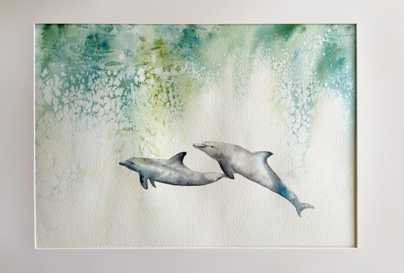
1. Introduction: Hello, and welcome to this
All levels watercolor class. Today, we're going
to be creating these serene dolphins together. This is going to be a lovely, relaxing class where we fill our paper with movement,
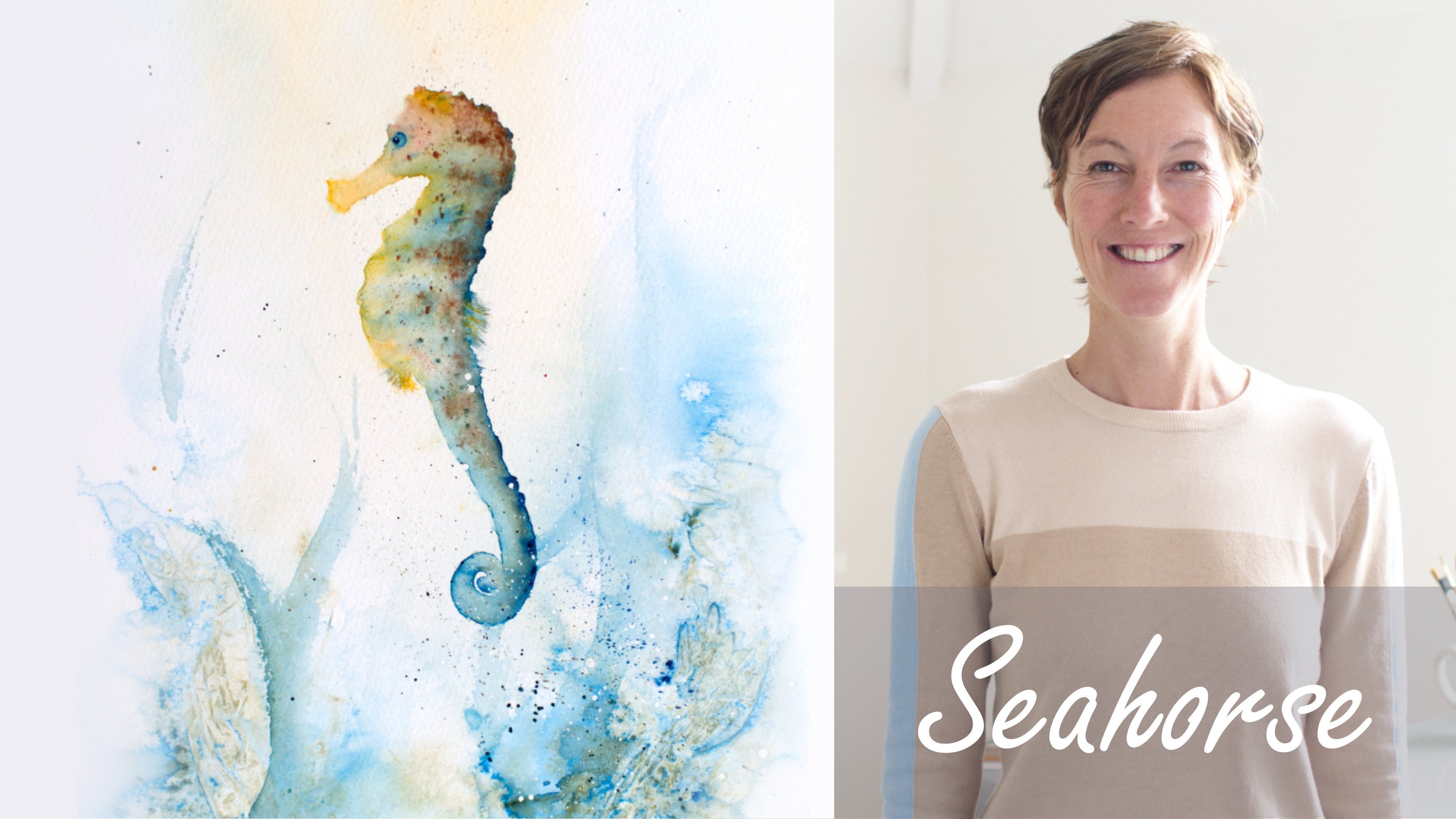
light, and texture. Oh, and a lot of water. So if you think you add enough, you may want to reconsider once you've watched this class. I'm Jane Davis. I live, paint, teach, and walk my lovely spaniels in the beautiful South Downs
National Park, England. Over the last 15 years, I've taught myself the free flow technique that
you see today. Not having been to art school, finding my own way has been
fun and sometimes daunting, but has allowed me to
develop my own style. This has led me to
teaching others, either on a one to one
basis or as part of a group in a wonderful studio in the heart of the South Downs. I also run a successful
commission based business, painting pet portraits and wildlife art in my
own home studio. In all my classes, you will follow
along in real time, where I can guide you
to keeping your work loose and fresh
without over fussing. I have over 20 classes
available in skill share now. If you're just starting out, my three beginner
classes will guide you. Then you'll find over
20 master classes, covering a wide range
of beautiful subjects. In each one, I'll share the techniques that I use in
my own professional work. We'll have a lot
of fun together, and you'll gain the
understanding and confidence to
incorporate everything you learn into your own work. Plus, I'll share a few of my tips and tricks
along the way too. As ever, I've provided you with a wonderful
reference photo, along with a downloadable
template for you to print out. The template gives you a stress free drawing so you
can just enjoy the painting. I'll be showing you how
much water you really need to achieve that wonderful
light and looseness. How to be bold and
fearless with your paint, and how gravity can create some wonderful
movement and interest. We'll also be playing
with some fun techniques to give us that lovely
underwater texture. I'll be demonstrating how
to create those dolphins with the lightest of touches while painting
or wet or wet. There's a wealth of other
tips and tricks I'll be sharing with you as we work our way through
the class together. If you'd like to learn
more about me or my work, please pop over to my website at Jane Davis wad colors.uk. This can be found
on my profile page, along with links to my
Instagram and Facebook pages. I'm very active on my
social media pages, where I love sharing my art, especially on stories
with many ideas, works in progress, and
tales of studio life. I really hope you will share all your paintings on the
projects and resources pages. As I love seeing
your masterpieces. And don't forget
I'm here to help if you get stuck or
have any questions. I want you to experience that buzz of painting
in this liberating, wet and wet, loose style.
So come and join me.
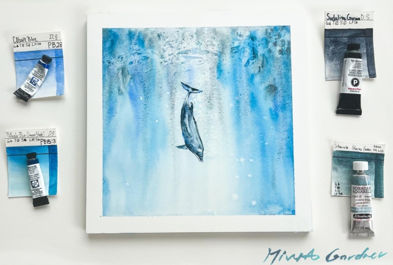
2. Materials: Y, welcome along to this
lovely dolphin class. It's been amazing
to put together. I've had a lot of fun, and I've done a lot
of experimenting. There's a lot of
dolphins in my studio. So let me share the materials I've used today to create
these beautiful dolphins. So to start with, I have my nice collection of
Daniel Smith paints. So to start with, I
have a Joseph Z grey. Gray titanium. And I love
these titanium colors. There's a buff, and
there's a gray. I'm only using the gray today. Great colors, really useful. I have a Bothelo blue, which is a really,
really vivid color. It's lovely. And I've
got rich, gold green. Now, if you haven't got these exact colors, then don't panic. Any gray would be
absolutely fine for the dolphins because
I incorporate little bits of blue
in there as well. The only thing I would
say, the Bothelo blue is quite magical
for these dolphins. I've tried other colors or
just a little wishy washes. They didn't give me
quite the same amount of sort of punch of color, especially with the
rich, gold green. They were nice combination. But don't feel if
you haven't got B fellow blue that you can't do this class,
have an experiment. You probably you could more than likely find a
better combination, a lovely combination,
something you love. So please please do have
a rummage to your paint, and yeah, you feel free. Discover, Explore,
have fun. Right. Before I carry on
wafting too much, the paper I've used
is Bockingford, and it's, as you can
see, unstretched, and it's 250 pound knot. Again, all of these are in the projects and
resources pages, so no need to try
and memorize these. I like working on
unstretched paper sometimes. It's just the
spontaneity is lovely. And also, although it
does buckle on you, It also helps, I think, create some nice washes. Because it buckles, obviously, then the paint runs
around these buckles, rather than just
coming going straight down and you having to
move things around. I enjoy it, but it feel does sometimes feel a little
more out of control. So if you want the control, or, as my husband
kindly pointed out, if you're wanting
to frame these, I would go with stretch paper because that will
give you a nice unbuckled piece of
paper at the end, so it won't be likes. Okay, brushes. I
have a number ten. That's mainly doing the
bodies of the dolphin. I have a huge brush, and that's just for wetting
everything down and actually applying the
paint at the top. But if you haven't got a
big brush, don't panic. It would just take
you a bit longer to wet the whole paper down. So don't feel you have
to have this big brush. I also had a a rigger. So I've used that
as well at the top, just to sort of
scoop out some pad. I used some of it
on the Dolphin. If I'm honest, I probably
started off with this, and I probably didn't
use it a huge amount. So again, don't pay if
you ever got the rigger. This, I probably use
more the size ten. And I have a number norms. So anything the small one or two would be adequate as well, just for doing the
tin li details. As a rather a small pencil, I'm sure why I ended up
with such a small pencil, but just a pencil to
sketch your Dolphins out. I have a little pot of salt, which is really good for
doing these lovely textures. I have some cling
fill, shrink crap, and there's another
something else you lovely people in
the state call it, which I honestly can't
remember now what it is, but that's for creating
this nice ripple effect. So a little bit of that. I have got paper towel, kitchen roll, little rubber for taking any pencil
marks out with. I have a hair dry off camera. Handy to dry paper as it
begins to finally dry. You can just just get it
properly solidly dry. But not essential by any means. Um They're in the projects and resources pages.
There's that template. As I always say, if you
follow me a few times, don't feel afraid to
use those templates. These have lovely shapes, so that it just make sure
you get those correct. And the reference
photo is obviously a ideal to follow to
refer back to as well. I'm looking around,
as I always say. I don't think there's
anything else to explain or help you with. So let's go and sketch them out.
3. Sketching Out: Okay, so before we can
get onto the fun bit, we need to sketch them out, and we need to make them
look like dolphins. Now, If you like me and you paint quite a lot of animals,
maybe particularly dogs, then I had a terrible default when I was practicing these, making them look like
little dog faces. And I can even see on this one. Look the nose os a
little bit long, so I might correct
that in a minute. But really take your time. And like I mentioned, there's that template in the projects and resources
pages. So use that. It's there for you to get
the right shape and get all those beautiful
curves just spot on. Cause this paintings
fabulously loose, and there's all that
lovely background, we need to make these chats really lovely and
crisp and right, and they're not big, so we
don't have a lot of room for sort of error if
they're not quite right. Also, make sure your pencil
marks stay lovely and light. Now, I know mine
are quite heavy. It's really so you
can see my painting, otherwise, it's not
particularly helpful for you. So I've made them
quite heavy with the thought of obviously not the outcome of the
finished painting, but make sure your pencil marks, particularly on the top side, because that's where the lights
going to be falling down, and we're not going to put an awful amount
of color on there. And because there's
a background, it's very hard then to
rub these pencil marks out without then rubbing
that lovely background out. So really take your time and make sure they're
lights and light, get the shape right
and even step away for 10 minutes and come back
and just check you haven't, like me, created swimming dogs. So yes, once you got that. We can then get on
with a fun bit. And as a friend of
mine often said, we can get splashing
s and paint.
4. Background: Okay, let's get on
with that background. Now we've got the sketching
bit done and dusted. I'm just going to remove my rubber because I don't
need that at the moment, and I'm going to get rid of my two smaller brushes because
I don't need those either. Just to leave that a little
more uncluttered on here. Get my salt a bit nearer. Okay, right. Big
brush. Lots of water. Now obviously, if you
haven't got a big brush, a little one will be fine. It will just take you
a little bit longer. And we want to wet everything, including the dolphins,
so Make sure. You wet this paper
down thoroughly, and you need it really wet. I have recently just completed
teaching a workshop. And I think everyone was quite shocked act how
much water I used, and particularly with this, we need those colors to run, and they're only going to run if we get this
paper wet enough. Now, obviously, you can see I'm working on unstretched paper. I I I love the
spontaneity of it, and I also, on this, I love how it buckles
because as I add this layer, the paint will curve around into those buckles and give you, I just want randomness, and it will give me
this randomness. But my husband was
slightly horrified, I was doing this unstretched
and wanted me to wanted me to do a
stretched board because he does all
the editing side, and it's very precise,
which is brilliant. And he did say, well, maybe people want to mount
these and frame them. And it is definitely
worth bearing in mind. If you wanted to work, if you wanted to frame your
work and Wanted it unbuckled. Then it's best to have it
stretched because it will, it's very hard to then frame work that's where the papers
kinked and buckled around. Anyway, I'm slightly waffling, and I'm just going to
duck my head up and down, make sure all this
paper is wet enough. Now I'm going to grab going to just tilt this for a second, and I'm going to get
hold of it as well in a minute and give it a good, a good tilt to get lots of
tilt on it and lots of run. So I've picked up
my Bothelo blue, and I've got my rich gold green, and I'm literally I can see
this drawing on me already. Let me just add a
bit more water. You see how that how
that's inkling of it. But I shall be fine. Okay. Literally all we're
doing is adding color right at the top. We need a lot more than
you would expect to do. So be really bold. Put the colors on top of one
another. It doesn't matter. We just want plenty of paint and plenty of
boldness. So be bold. Get your brushing, get that lovely Bethelo blue is amazing. Such a strong vivid color. It's gonna give us a
really lovely run. Now, Don't hang around too much. Don't fiddle because you just
we need this loving wet, and the minute it starts drying, you won't find that
will run as well. So I'm going to give
this a good old tilt. I'm almost holding it upright. I just trying to get a
little bit of a bind there. Now, you can see how that's
beautifully running already, but I can add more water
and get this flowing. Now, you can see as my paper's buckling
and moving around. It's just giving me randomness. You can see how it's
curving around. So don't be afraid
just to work on unstretched paper and just
have fun. Add a little bit. If you find, I've got a
little blue this corner, so I can add a little
bit more green. I'm just using seal this. I'm just poking me brushing, adding the little bit of
paint, adding all water. Now, the minute you
get something you like the look of and you go,
Oh, that's interesting. That's done something fun.
Pop it down and leave it. Don't keep fiddling. Now I think I'm
pop it almost out. I want to have a
slight sense of light. So I'm literally, bloating my brush up and
dropping that water in. I want to have a
light somewhere, so I want it to be a little
bit brighter somewhere. I can use a little bit of that. Puddling there.
So just have fun. It's just a lovely class. Now, I can see, I
love that there. I like how that's all doing. I'm gonna leave this. Leave it. I'm going to Popper missy. Popper missy class. Look at. I'm going to just
soak up some of this. I'm going to lay it flat. So I should have said,
make sure if you're In a spot where you can't get stuff off your
carpet. Be careful. Okay, I'm going to leave
that at a slight tilt. I can see, I've got my
little heart there, and I'm just going to
allow that to dry. Now, I'm just mindful. I've put mine. Finger
there, holding that up. Okay, so what I want to do, I'm going to
put some salt in. I'm going to keep
an eye on that. Now it needs needs
just to be going off. I don't know if the camera's
going to pick this up. Just here is perfect. This is a little bit too wet, and it won't work so well. But I want if I can just reach
over and grab this piece. This is just a
practice piece I did. You can see this has
been quite wet here. The salt I put the salt
down at the same time, but because I've got
it on a slight tilt, this has started to dry
quicker than this bit. So this is really
spread out with these, you can see they're
a lot tighter. So I will do something hopefully similar there
and get the same results. But it's worth bear in mind
every single one you do, if you could do 100, and they will all
turn out differently. So you just have to go with it. Don't overthink
it. Just have fun. Now, I'm No, I'm just going to hang on a
minute because I always do this too quickly
on these glasses. I'm just going to hang fire. And I will put the
pain, the salt down just to say as
it begins to dry. That's not quite ready yet, and you probably
don't need to watch me putting it on particularly. No, it's still too wet. And I will just sprinkle it. I want it. Sort of coming
up here and around here. I'll probably pop up a
little bit down here, just to try and get that lovely
sort of softness as well. So Yes, just watch
a piece and add the salt at the right time
and then allow it to dry. But before we do that, we also need to do that cling
film at the top, and again, that needs to be done
in a minute two, just looking at it
cause that needs to be done same sort of
time as a salt. But I think again, because that's drying
at the top there. Quicker than the bottom bit, I can probably get it on now. Se a hair there. Definitely
one of my hairs. I mind, Let's Pop that down. Again, don't overthink
this too much. I quite liked a
bit of, you know, these you're creating waves here and ripples and currents, so you wanted to squish it down, so it becomes these marks become longer rather than
square and choppy. You can see roughly
underneath how it's forming. I have a little look. Try not to move it around.
Once you got it down, try not to move it
around too much. Squish it over a little bit. Pop a little bit in that
corner there, as well. Again, you need this
not to be too wet, so if it's very wet up there, just wait a little minute because it won't work so
well if it's really wet. Okay. Again, give it a little bit of a squid you're kind of squiching it that way. Lovely. All right. I reckon I'm ready there, but my salt as well
so. Just sprinkle. Say, don't I'll bill a
little bit down there, and we will see
how that does, M. Obviously, you need
to let this dry. On its own, you can't really. You can't really put a hair hair dry over this until
the very end, where where you can almost
see that it's completely dry, and you can just
take the edge off it and get it completely dry. But the best thing is to step away now for
at least half an hour, even an hour, depending
how warm your studio is. So, yes, yes, have patience, and I'll see you in
the next lesson.
5. Dolphins First Layer: Okay, so once it
is completely dry, you're ready to
rub your salt off and do the unveiling
of the cling field, so, I don't know
what to do first. Let's do the cling field. Now, bear in mind, you want to make sure it is dry, but let's have a look, see what I've managed to
create under here. Yeah, yeah, not too bad. If I had to confess, I might have been a
little eager beaver on this one and probably didn't
leave it quite long enough. I should have
actually got a little bit higher up here. You can see. But still give them. You can see the effect it's given us. Sometimes you don't want
it too obvious anyway. And the next thing is
to rub that salt off. Okay, just gently really
make sure that it's dry. You scitch that away. Making a right mess of my u to. But I'm really
pleased with how that has the effect I've
managed to get on there. You can see. Partly, it's the
paper has sort of buckled. You know when it was really wet, you can see how that was
bending and moving around. So it's created some
quite interesting marks. And the socks worked
lovely. So I'm pleased. Right. I'm going to
just pop that down. You don't need mytle heart. You can see this as Won't be
great for Frame, would it? He is right. Sometimes he's been known to be
right annoyingly. L et's place that down. Okay, and I'm going to start on number one the Dolphin
little first one. I'm going to pick
up. Well, let's she don't need a big brush
so I can get rid of that. And I'm going to pick up
my one of the number ten, and we're going to wet
down the whole dolphin. So really take your time. Plenty of water again. Make sure you stay
within your lines. Especially important
because as you say, I've got some really nice,
interesting patterns here, and it's really hard to then take any if you go over your lines and you want to
try and get rid of them, you'll be getting rid of
the background as well. And it's a shame because I'm sure you've created like me some
interesting marks there. Bear in mind, if
you've put a hair dry over this at
the last stages, your paper will be quite warm, so this will dry quicker. Both fins down. Take my time, make sure everything's
right up to the edges on my little
dog like dolphin. Okay, I'm going to be mainly using the great titanium
and the Joseph gray. Absolute pets pick up the girt use a tiny little Bothello
blue, but not too much. We're just going to be working
mainly on the bottom area. Gain plenty of
water and allowing. A little bit of gray titanium. Lovely color for
pushing color out. So if you're wanting
something like that, it's a lovely paint. Sometimes I will use paint
just almost for what they do rather than their
color in some regard. Let's put a little bit of
blue the fellow blue up here. Just to break it up a bit. Just to tie that color
in from the sea as well. Just gently, gently tapping. Let's get a little bit
of color on that on the thin ride up se edges, and nice shape again underneath. Almost painting. We need a little bit of color
on that back as well. That way back in. So a little bit
of gray titanium, little bit of the Joseph gray. You is going to tap again. Let's have a little
bit of athllo. I wouldn't add the green. I was just looking at my green thinking,
will that be helpful, but they can make them look odd cause
dolphins aren't green, even in my wild
imagination of color. Now, I almost actually, for me, got this a
little bit too wet. I can see it puddling.
If it's puddling, the paint won't then
move. It will sit. And won't travel up because there's almost too much water for it to push tough. Let me have a look.
Obviously, I've got that lovely color
underneath, and I like that. I don't want almost
that back dolphin to be quite as obvious
as the front one. Now I can see I've
being a little untidy. I'm just gonna tidy
up my edges as ever, I'll work a little a
way from the camera, so I'm using my excuse of
being a bit tatty on that. A little better. What's better. Yeah, make sure your liquor
lines are lovely and crisp. I'm just going to
pop a little bit of grata on the top of that head, although I've got some
color underneath. That background, a
little bit of color. Yeah, that's nice.
Touchdown here. Just to follow that
through a bit. I'm going to leave that to
dry cause I think that's actually going to create
me something quite pretty. And of course, I have the
option of adding another layer. I'm not planning on because I'd like to keep
these loving and fresh, but there is always the option, so it's better to
pop the color down, leave it rather than
overworking one layer. Now, fairly quickly. Let's just put these
down for a second. I'm not clutching. We're going to wet
the second dolphin. Second, a. Nice, nice big
wet brush. Stick it sway. That's not my big big
brush. Is my number ten. And we're actually
going to touch the tail of number one dolphin, so you get a little bit run. And we will give it probably a little tilt in a
minute, as well. Give us a little
bit for sense of forward movement as
well. Both fins. We can do any little bits of tinkering on the
finishing off bits. Now, I've done an
unfortunate sploge. Rid of that because it's
strolling the body as well as a s. Look at my hands. I'm covered in
pthalo blue as well. Same rules. Say really make sure you stay
within those lines. Fabulous. Right? I'm going to same again really. Same colors. So I'm not
going to use the green. Put a little bit of That's the buff and a little
bit of pthalo. Pretty colors together.
Ideally, just tapping and allowing a tiny a little
bit of the Joss gray on top. Down to the fins. I love that movement.
So any movement you get like that, I just like. It just gives it's just gives that freshness to it
rather than fiddling. So a little bit color on
the back of the top fin. And again, underneath, back underneath again. Try
and keep the color. Although they are
the markings are lighter underneath
than they are on top. We'll do a second layer over
this on part of it anyway. So just to give a little
bit of scent that marking. You see there's a
stripe down the back. But we're only going to do
it on the front dolphin. Just added a little b fellow
blue, breaking up the color. Let's get a little fin in. Just keeping everything
wonderfully light, all your brush lice and light. Almost imagine the
weaving coal brebs, or you know when
people lay gold leaf. So it's that sort
of delicateness. So it's really just really
gentle, and nothing too harsh. You are just allowing that water and the
painter to create you something I think
the same rules. If you get something you like, and it's not I'm still
carrying on and doing stuff, but you like your dolphin stop. 'cause there's no point over fiddling if you have
something you already like. And I'm going to try
and take my own advice, cause I I love what's
happened here. This is just purely
lucky a little bit. It's just being having the confidence to put the
color down and allowing. Like I said, Every single piece you could
do this 100 times. They all come out
slightly differently. And that's the joy of
watercolor, I guess. I want to get the fins, so I'm just tiding up
the ragged edges because 'cause I'm struggling
to get close enough. That's better
fingers way. Right. I need to leave this because I say, I like what
I've got here. I need to stop doing that. I'm going to pop these down. And again, I'm just going
to allow that to dry. I'm not using any salt. I think we've already
got enough salt here. If you feel you wanted
to, of course, you can. Again, no cling film because there's already
enough texture going on. We want needs to be
quite nice and bold. So yeah, just allow
them to dry and we can do the last little tinkering off bits
in the next lesson.
6. Dolphins Second Layer: Okay, so how would
your dolphin dried? I love how mine have dried. I particularly like
this front one, which I was actually going
to do another layer on, but I might leave it and
instead do this one. So, you know, you have to
as I say, go with a flow. So I'm going to do almost what I was going to do on this one. But I'm going to wet
down the entire piece, and we're going to
try and get you can see on that reference photo, they have that lovely
darker coloring on top, so I'm going to see
if I can create that by wetting the whole piece. Again, very gently,
because we're now wetting down a second layer, we have to be quite
careful not to disturb that first layer we've
got there already. Wetting down the entire piece. Okay, if this if your front Dolphin was
the best number one, and you really like
what you have, then work on number two
like I was going to. So have a look at your piece. You may be joining me
on the first Dolphin. Or alternatively, if
you love what you've created and you really
don't think you want to add anything
else, then you're done. You don't need to
do anything else. So flick to the next lesson, where we just do a little bit of tinkering and just add
some of those eyes. So yeah, feel confident. If you love what you have, then yeah, be pleased
with yourself because you've got yourself
something beautiful. If you're like me, we want to
do a little bit more work, then yeah, just make sure
that's nice and wet, it is. And even simply by
wetting that down again. If you have anything that I had some sort of funny
markings down there. Simply by wetting that down. I've got rid of that, but we're going to sort of do a
little bit more, so um. Let me have a little
look. Let's have a little buff on these legs. Actually, I might have a
little bit pthllo blue. Try and add a little bit of add a little bit
of color to this. Can't I help myself. I will resist with the green, though. That looks nice,
just a little bit of a So I'm going I'm keeping everything
wonderfully light, just tapping. Strengthen a little bit under. Let's have these two comas here. It's always hard when
you've got a subject that has a lighter under bell, a lighter area,
but it's shadowed, and the darker area
is in the light. So you know you're
trying to work out which is the best to sort
of tackle in some ways. I tend to go with the light and not worry as much
with the coloring. List. It's really obviously
the wrong sort of choice. And it really needs the color to define that
creature, if that makes sense. But generally, I always
go with light and not worry as much with
colors and markings. Right. I'm going to give
this a tiny little tilt. I'm gonna hang onto the lis. We have I done with my heart? Hold on. Off camera. I'm just going to put
that about an inch high. I'm just going to give
a little bit of tilt. Just allow that paper
on a little bit. You can see that's
already starting to move. And I'm just going to
add a little bit of duck of the Joseph, a little bit of the buff.
Start somewhere here. Just going to tap. Give me a little bit more of a tilt. I've got hold of it now. So I'm allowing it to tilt. I tasking here hand
peeps in my hand, holding it up, seeing
what I've got. More Again, to screen your eyes, and again, the minute you
have something you like, if it's created something
beautiful, nice sweet baby. Oh, that was one. W that there. Let's see if we can
rectify that a little bit. I want to look at
my reference pho, to make sure I don't
go too off pie. A bit more buff to try and
break that up a little bit. Because I've got this on a tilt is starting to puddle down here. So I'm just going
to suck some of the upsts just with a dry brush. Take the excess moisture off. Yeah, that's getting
a nice sweep now. Again, I can water Here. Again, that water
to washed down. Brush away, have a little
peak, see what you think. I like that. Now I'm going to allow that to completely dry. And we'll see what it looks
like in the next lesson. But I like that one dolphin softer and
one a little harsher. Dally, probably the
front dolphin would be a little harder and the
back one would be softer. But I don't think it
matters too much. So I'm going to pop this
back with a bit of tilt. I want to keep that tilt
so it continues running. And, we'll see see
what that produces. H.
7. Finishing Off: Okay, then how did your second layer over your whichever dolphin
you picked look, or, indeed, maybe you didn't didn't need that second layer, but yeah, I'm pleased with that. You can see that's given
a little bit more depth. Got a sort sense of line
running down there. So yeah, I'm pleased. I'm's going to take
my little heart away, and we're just going to do
a little bit of tinkering. Just a minute little details around the eye and get
that little nostri in. I don't want to do too much. I like the sort
of freedom of it. I like the curve, so that was the important part for
me to get that shape. It's all shapes and textures
here on this piece. Again, if you love detail, you can then spend a little bit of time
getting the eyes in. But Yeah, I'm going to keep this a
little bit looser, I think. Right. So, ideally, you won't you won't have two of
a strong of pencil marks, but I'm going to see if I
can get rid of some of mine. See, the risk is. I don't know. If if I had some very strong
pencil marks here, I will then be sort
of raising some of that background as well, a little bit there,
which is I'd say, it was always going
to be the case because I wanted to
keep my pencil marks. Stronger, for you guys, I sacrifice my piece for you. Lose. Okay, let's brush
some of that away. A be. A be enough. All right, I want to just take
a little bit of light out. Where you think need be. I
don't want to take lots out. I don't want to
sort of these all being painted with
quite a soft layer. So I've got my number ten brush. It's damp. I'm just going to very gently run
along the top there. Got a little bit of
the kitchen roll. Give it a little bit of squig. So go gentle cause a lot of these colors will lift
out almost too well, and you'll be left with
with the under layer. That background. A little bit. Although it's got a very dark fin has
near this number two, just want to get a
little bit of light on the front to take some of
that line out as well. Think the Joseph Gray has created a little bit of
an outline in places. Beautiful color, though. So worth it. All right. I'm going
to start taking. If you have a little squint
at your reference photo, you can see that there's
a nice bit of light here that the top of the nose. Still think it looks
a bit like a dog, but having trouble getting away from that default default shape that I'm used to doing. Yeah. And that's just by doing
that, I've almost created. You can see there's that line there on the reference photo. You know, if you
squint your eyes, you've almost created
that already. String from that in
a minute, though. Again, same number number one. Randomly going around
random orders. I take a little
bit out of there. Squid you with a kitchen roll. Take your brush away,
see what you think. I want to take a
little bit here. I'll call a little raggedy here, just trying to paint for
a bit of a distance. See if I can soften
my line down. Gain really gentle. Gain squich. Just make sure when
you're squiging, you haven't got paint
from your laugh squig and you then transfer
it to the next piece, that's done that many a time. Okay. And then also this fin. I don't think I'm going to
do too much else with it. I quite like what's there. I don't want to do a. I want
to add too much detail, but I'll number two dolphin. Want to take a tiny
little bit out. You can see there's
a touch of light there touching that
front of that fin. I'm gonna gently try to
take f of that out as well. Ta squid, take get
your roll away, see what we think.
That's enough for me. Don't want to get it too exact. It's going around,
think it was obvious. Again, I've been a
little tatty here, but that I can do off
camera if I wanted to. But you can then run around
and if you fortunately, I haven't got a lot
of color there, so I can tidy that up, but I think that's enough
of taking the light out. So I'm going to pick
up my little brush. I'm going to be
quite careful now because it's very
easy to overdo this. I've just picked up the Joseph, and we're going to try and
pop that little line in. And there's a eye.
And that can be quite quickly softened
by running underneath. Just was giving a little bit of a squig take your brush
away, Se we think? Just want to an impression. We don't want to. We're
not pitting eyes in. There's no catch lights and
all that sort of malachi. It's just an impression of that shape. It's almost enough. I take my brush away.
That's almost too much. I'm just going to squig
I think that's enough. I don't want I don't want
a lot of definition there. But they have got a lovely I'm just trying
to scroll into picture. Number two has got
a lovely smile. So I can't resist putting a
little bit of a smile on. So just a little line. He I get some paint on
my bush. A little line. And we're going to
follow that up. Just to join almost like
a little V, isn't it? If you squint your
eyes, you can see that. Soften underneath it,
and we're going to run it to roughly
where the eye is. Just keep it really soft. Making it too obvious. Almost want to put the line
in and almost take it out. Til you're just left with a
slight impression because we can end up with a rather cheesy cartoon grin
if we're not careful. So you look at that
reference photo. Keep a really lovely trick is to look at the
reference photo. If you get that really nice
and close to the painting, flick your eyes back and forth. So if you do it quite quickly, They almost superimpose
themselves. If we get a little sort
of impression of an eye in again and run that off with a lovely
sort of soft brush, so we're not doing any
exact exacting eyes. Little bit too much. You can see how cartoony
Little tiny touches. You can see how you can lose a painting so quickly as well. So string that out. You can almost you
just brush it away with your finger,
soften it down. This is where you can
have a little bit of a tinker. Be careful. You don't take too
much off or out. Step away, S we think. I've almost lost my number. Number two almost lost
its eye, hasn't it? Let's pop that if we can get a little bit more
definition in there. Because we haven't really got any other detail in here
apart from shape and color, if we start putting the
eyes in very obviously, we're going to be because
we're all draw into ys, and we all want to look
at yes to start with. So I think if we put
anything too obvious, and it's going to
look like a cartoon. You know what, I think I
might leave this here. And as I always say if
you follow my classes, it's such a useful
thing to step away, come back, usually the next day, and you'll see any
any little errors. It's a really good trick because even though this hasn't been a very
long painting session, we've still probably been
painting for an hour, and you get a little. You almost can't see what you're painting or what
you're looking at. Become so engrossed in it. Yeah, I like what's there. I really don't think
there's any other tinklings to do on this piece.
It's just going around. If you've got a
little messy like me, I will off camera, just tied you some of
these little bits up. I can see who I've
been a little raggedy. It's just I'll be very careful just taking the
little bit car out. And that's about it, really. We want this to be, I
say, wonderfully loose. And a nice thing to do. Let me Let me just Let me just get this off out of the board for a minute
and those paints. It's to pop a mount round. If you've got a mount,
they're lovely because, you know, the edges of
these are quite rough. Well we've allowed the paints that run off the pages of stuff. Then it's really nice
to put a mount over your piece as if you
were to frame it, and you can sort of obviously find the best bits
of your painting. Yeah, and I think that's
worked quite well. I'm pleased with that. So Yes, I hope you've enjoyed this. And like I always say,
please share these. If you got stuck on anything, I didn't explain anything, quite right or
didn't make sense, please pop in the
discussions and just ask me. I try my best to get back back to people within
a couple of days. So yeah, give us a shout if
something didn't make sense, or you want a little bit
of help with your piece, but yeah, I'm there to help, and I hope you enjoyed this, and I hope you do a few. If you do share all your pieces because I
say it's my favorite bit, having seeing all
the work come in. So, as ever, thank you very
much for joining me. U.
8. Final Thoughts: So, I hope you
enjoyed this class, and you found it a really
satisfying painting to do. How wonderful was that? Just giving yourself
permission to play with water,
paint, and gravity. I hope you got some
fabulous texture and interest with that salt and cling film so simple
but so effective. Did the little dolphins
work out, okay? Remember to keep your
brush lovely and light and just place that
paint onto the wet paper. As I always say, it's worth
stepping away and coming back and looking at your
painting with a fresh pair of eyes and tweak if necessary. So we look forward to seeing
you in the next class.
 Jane Davies, Professional Artist and Teacher