Transcripts
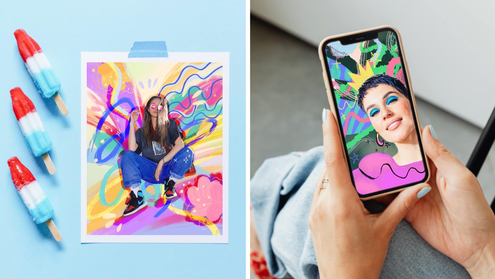
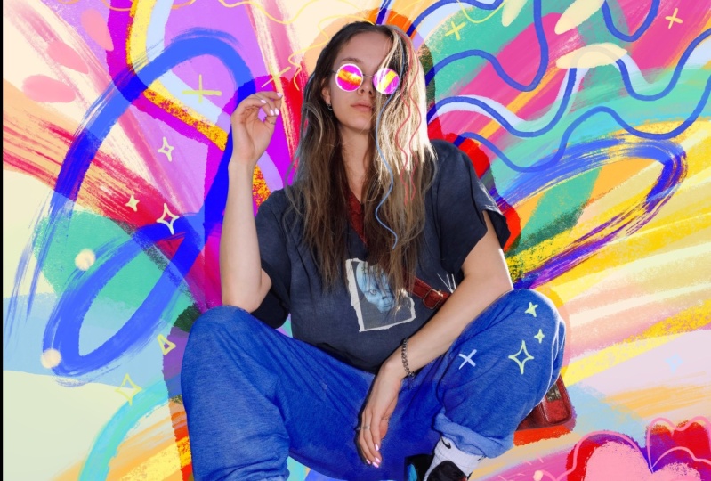
1. Class Introduction: Are you ready to unlock
your creativity? Digital collage
is a great way to express yourself and create
one-of-a-kind artwork. Regardless of your skill level. With collage, you can explore
abstract ideas and play with techniques and colors
without needing to draw. That makes it perfect
for everyone. And best of all, collage is
energizing and stress-free, creating visually
stunning artwork. Welcome, I'm yifat a North
Texas based artists, an industrial designer
by profession and a self-taught illustrator. And I'm so glad
that you're here. I turned to collage as
a way to loosen up and experiment with
something new after completing major projects. Commissioned mural for
a local Walmart store. In another mural for a
Houston, Texas Walmart. Collage is a trendy artform found in magazine illustrations, advertising, and poster art. It's also a wonderful way to decompress and find
your unique voice. Whether you're a beginner, eager to unlock your creativity or a professional
seeking fresh techniques, This class is for you. In class I'll show
you how to use the Procreate app to uncover the fundamentals of crafting
vibrant digital art. Throughout the class,
you will learn how to mix and match
various motifs. Practice essential skills,
such as digitally cleaning a photo and mastering layers to create expressive
brushstrokes. But here's the best
part, this class is all about having a blast,
playing with colors and unleashing your creativity. You'll end up with surprising and
oh-so-satisfying artwork. So join in the fun and surprise yourself with what
you can create!
2. Your Project: I'm really excited to inspire your creativity
through this class. I believe it's truly
magical to step outside your comfort zone and explore
new artistic pathways. The major goal of the class
is to provide you with examples and a workflow that you can easily
follow on your own. In the first part, I'll take you through my process of creating collage to give you an
overview of the Art process. And along the way, I'll explain
why I do things and share helpful pointers.
In the second part of the class we'll work together on a collage
project step by step. And I'll teach you more
techniques and share some amazing tips that I
can't wait to show you. I invite you to
explore collage with me in class and
share your project. Leave a short review
at the end, and follow my Illustration classes here on Skillshare. Are you ready? Let's start creating
collage together.
3. How to Set Up Your Artwork: All right, We're ready to begin. And if you're new to Procreate, let me quickly show
you my setup so that we're all gonna
be on the same page. So I'm going to
hit the plus sign and hit again for
creating a new canvas. And let me show you
how I set it up. We're going to change our
units to inches and create 14 over 11 " documents with DPI, which is your resolution, of 300. And that's a great
resolution for later on printing your document
if you so choose. So we want to make
sure we set up good size canvas in case we create something
really beautiful. All right, let's hit Create and we will pop up
to our new canvas. The first thing that
we want to be doing is setup our background color. Now bear in mind that
this can always change and I am known to mess with it. But let's start with
something fairly simple and light so that everything that we're
going to create a will contrast well against
this light color. And Up next we want
to bring in a photo. To bring in a photo,
we're going to hit the top-left wrench tool and choose Insert a photo
from the drop-down menu. And that would be a photo that
is already on your device. The photo that I'm going
to use is one that I've downloaded from Copyrights
free photo website. And I'll be sharing links to these websites in the
class description. Of course, you're free to
use one of your own photos. It's actually really fun to
create your project with photo of yourself and
work with that one, so that you'll create
something that is truly yours. Another tip, if you
download a photo from a copyright-free
photo website, please try to use one
that is fairly large. They're usually options between small files and larger fires. The larger files will be more detailed and will look
nicely to work with. Now let's see how we clean up the photo and prepare it
for our collage work. So we want to be sure to choose only our main subject and
remove everything else. So the simplest way to do
that is to use your eraser. You'll do best in
picking up one of the airbrushing brushes as your eraser for this
task and set it up large to remove the
majority of the background. Then we're going to
scale down the brush and pinch-zoom
our image and try to remove the more detailed
work to get as close to our subject as we can without
removing too much. Oops, I accidentally
erased too much. So I'm just going to tap
with two fingers to undo. And if you want to
redo something, just tap with three
fingers on your screen. Now I'm going to add a
new layer underneath my clean photo and start
spraying some paint. Now the work is going
to progress in layers. So don't worry if you
mess up this one, it's good because
we're going to add to it and add to it
and let it just evolve naturally. At this
early stage of the artwork, I just want to put something on the canvas that
would set me going. It's the dread of the blank canvas, we just want to put
something on it so that we're just going to layer on and continue
evolving our artwork. I'm just going to use
some spray paints and do some touchups. And Up next we're going to start painting our collage work. I'll see you in the next lesson.
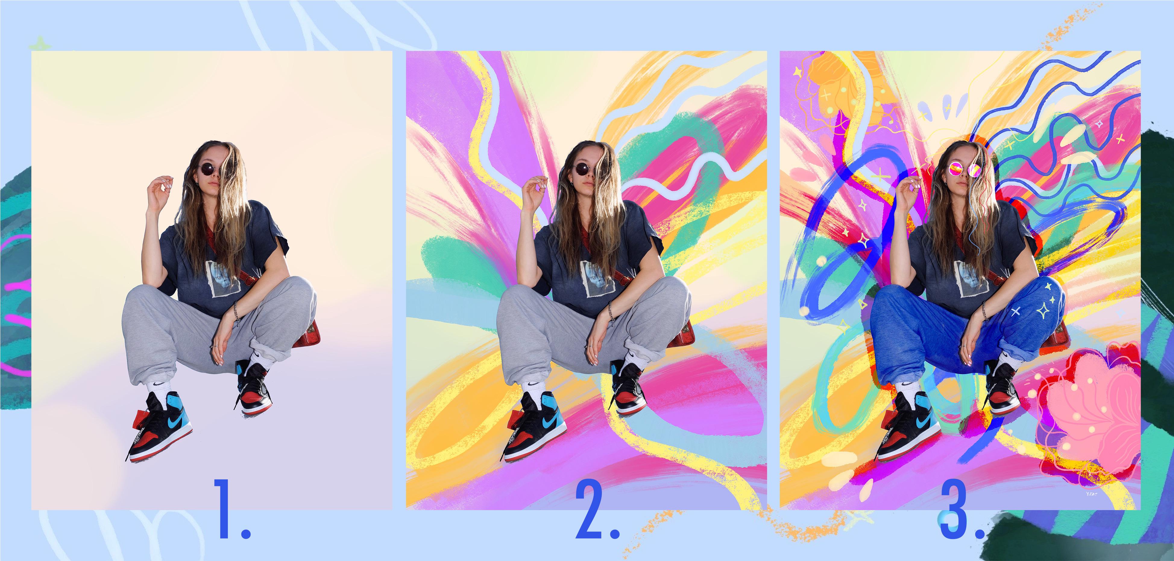
4. Exploring Ideas: So the way that I positioned
my clean photo on the canvas leaves a lot of room for adding elements
and motifs and colors. She's pretty much detached
from the bottom of the page, so I would want to
fill up that space. The fun thing to do
would be to create some kind of imaginary outfit. Honestly, when I draw, I'm constantly concerned
about running out of ideas. So I don't want to
end up stuck in front of what I've created so far and just start thinking, okay, what can I do? What can I add? And
instead of getting stuck, I'm just going to,
I'm just going to chug on and draw something. So I'll do a simple shape
for the earrings and then create totally imaginary outfit that is just a fun
place to start. That's the thing about
the creative process of this collage work that it's very flowy and we don't want to stop too much
and think about it. Don't overthink your process. Just Flow with your
ideas and let them come, they'll come as you work. So we've already
done the first part, which is cleaning up into
preparing the photo. And now we're starting to
mix and match ideas and build up gradually towards
the finished artwork. And you want to bear
in mind that there is no right or wrong
in this process, and that's what
makes it so fun. You can create one color
and then change it. You can create an odd shape, and that will bring
more ideas to mind. So what I would
like for you to do is to experiment and try different ways of working with your photo and just
let your ideas come. So in my collage work here, I would like to find a
good brush to fill up this fluffy coat
that I outlined. So what I'm doing
is just trying out different brushes and
seeing what clicks. And that's also a good way
for you to get to know the brush set that you have and find one that you'd
like its texture, you like the way the color
spills out from your pencil, I don't know,
you like the feel of the brush and just
work with this one. Okay, so I picked
this brush and it's honestly the first
time that I'm using it, I really love its texture. It's kinda like a
watercolor brush. I don't know. It's really fun. And the more I press on it, it brings in more color. And so it's really
good for layering. So I'm going to use this
one to color the coat. So I'll give you a few pointers about Creating Textures
is in Procreate. If you can see I'm
layering my paint. It's not really like
working on paper when you want to fill up a
certain area with color. Because when we work
on a digital canvas, the pressure that we
use on the stylist creates different brushstrokes
and then it really depends on the kind of
brush that you picked up. So I'm kinda playing with this brush and seeing if
I want to add more color. And what happens if repeating
the paint on an area that I've already
colored because the textures will
interact differently. So it's not just
filling up the space, it's more about
layering your paint and seeing how the layers
of paint interact. So if it's very transparent, I might want to add another coat and play with the pressure
that I apply on the stylus. That really helps with creating different effects,
using just one brush. So every layer in Procreate
has a small dropdown menu. So what we're going
to do now is add a new layer and create
a clipping mask. And that would mask
all the elements of the layer underneath
the clipping mask layer. And that is a
non-destructive way to add elements, to make changes, to recolor whatever is
on the layer underneath. So in this case, I want to add some dimension
to the outfit, to the coat. So I'm going to do it
in a separate layer that is set up in
a clipping mask. And I picked a
different brush just because I want to have
fun and experiment. What I'm trying to do here
is create highlights. And then maybe deeper tones
or deeper shades of purple. Just to have some playfulness. I would like to add
some dimension to the outfit so that
that it won't be too flat. So I basically started up
with one color and I'm building up some different
shades of the same color. Now you can leave
the clipping mask as is or merge it down. I just like to be tidy and
I'm like, Okay, whatever I'm, and I'm done with this element, I'm just going to merge it down, but you don't have to do that. Actually, it's much smarter
to leave it like that. I just liked to clean, clean things up so
I want to move on. So I'm merging down the two layers and I'm
going to add another one. And that would enable me to
add some more fun details. So I've picked up another brush that I really liked to use. If you've watched my other
class, that's the Blackburn. It draws pretty much
like a dry oil brush. It has lots of texture. I love it because it adds a warm human touch to
the Digital Canvas. What I want to do here is kind of comment on what
I've already done. I'm not sure, I'm not sure where this line is going,
but I like it. It also adds contrast and helps to anchor the
shape to the page. This is just how I feel. And so maybe I'm going to
outline the earrings and add more fun motifs, and make everything
more shiny and playful.
5. Layering Colorful Brushstrokes: I'm ready to add some more
color and layer more motifs on my Collage Work. And I picked this vibrant
blue to start off with. I think it just connects to the makeup in the photo
and the colored hair, but it's also just one of my favorite colors that
lately I've been using a lot. Here's a tip, Start with something that you like and
enjoy. For me, it's the color. And now I just want
to find the shape. It could be something
in the background. It doesn't really need
to mean anything. It really doesn't need to
be anything recognizable. Now I'm going to set up my
layer as a mask. So I'm setting this layer in an alpha lock and
that the mask that works on everything that is already on the layer
and lock the pixels. An alternative to
that would be to just add another layer and
set it as a clipping mask. Either way you're gonna
get the same result. So I've picked a new brush and I'm drawing on a new layer. And what I like
about this brush is that is very grainy. It's kind of rough. And to me it contrasts nicely with the gentle look of my photo. Since this is an early
stage of my work, I'm just going to experiment
and draw lines and try different colors
and different brushes. And this is a great way to get to know your
brush sets really. I am not sure that I love the colors though. We might want to edit and adjust the colors of
this final layer. So let's go ahead and
hit the adjustment of hue, saturation and brightness and tweak the
colors a little bit. Yeah, I think this
combination really works, so yeah, let's give it a
go and layers some more. I'm going to add another
layer and add more elements. This brush that
I'm working with, it's pressure sensitive
so I can create more of a noise texture with it when
I'm pressing very lightly. And it becomes opaque when I press all the way
down with a stylus. So it's really versatile. It's all about trying and seeing what clicks,
what feels right. I really like the darker color, but it might work better
behind all the other layers. So it will set up like a background and enhance
all the energies that, that I've already
layered on the page. Let's clear this layer and start over again this time with a different color
and give it a go. I really love this dark green, it contrasts with
everything else on the canvas and makes
the image come alive. Though, when I draw this layer, I don't want to fill
up all my canvas because I'll end up with just a large block
of dark color. So I want to add Dynamic
gestures and interest, but leave room for
the image to breathe. A fun thing would be just
to open it up a little bit with an interesting
eraser brush. I really love playing with the eraser and open up shapes. So give it a try when you create
your own project. How many more layers can you
add to your collage work? The answer is, as many
as you feel like. I'm really up to
some more drawing. I want to bring in
some more fun details. So I'll see you in
the next lesson.
6. Make It Shine!: How do you know when your
collage work is ready? It's up to you to know when you feel like you're done and you
don't want to draw anymore. Or you feel that
you're really into the creative process
and you want to layer in more motifs. I'm at this stage
where I feel like I want to add the personal
touch to my work. And so I picked
the six B pencil, which is one of my favorites. It really draws like a pencil. It's great to add some
personal touches with it. So I want to add some
whimsical elements. I want to add some spark
and make my collage Shine. So basically what
I'm doing is adding more to what is
already on the canvas. I'm using the dynamics and
the shapes that are already there and try to enhance
it and highlight it. We can add motifs like stars
or sparkle or even rainbow if we like. Personally for me, rainbow is just a show of joy
and cheer, for other people it might signify other things, but to me, when growing up, rainbow was a symbol of joy. So I just want to add
it to my Illustration. An important tip that I
would love to give you at this point is to sample
colors from the canvas. Use colors that you already
have, that you already set up for your work rather
than choosing new ones. And so this will
help you keep a consistent and tight
color palette. Picking colors from the
canvas to add the new motifs help them blend in and create
a more cohesive artwork. I think I'm pretty much at the finishing touches
of my collage work. So I'm going to take a moment to evaluate what I
have so far and see what stands out and what blends in too much and needs
some enhancement. I'm going to go
back to this layer. The stars that I
drew there are black and they really don't show
against the darker layer. And right now they
really blend in too much. So I'm going to go
over to that layer and select just the part
that needs changing. And then I'll go to the hue, saturation and brightness and really
bring up the brightness. Yeah, I think that works. I really love the whites. Also, just picking white
or black against this, all these colorful
things that are going on, on this canvas is a good choice. I like the cleanliness
of black and white with all the
vibrant elements. The thing is, I really love the black color in
this illustration. I think it's more
dramatic than the white. So I want to find
the right balance between black and white motifs. And so I am choosing to
keep the black colors. Maybe we can go back to
the darker background, make it blend more, and make it lighter. So let's just go ahead
and pick that layer. And Erase some. I love it. It's a very
gentle adjustment and it really works with everything else that
goes on the canvas. I picked a very
soft eraser brush. And that really
does the work well. So that's the thing with
this kind of Illustration. You can try different
approaches to solve the visual elements and see
what works and what doesn't. We can always go
back and adjust, change things until
everything feels just right. I'm almost done, but I want to go back to my background color and changes it because I'm not happy with the blue
background color. The background color
is something that I go back to often in the work. So a tip for you, Don't hesitate to try different color palettes
and see what works. The background color
is not set in stone. This is something
that is flexible and change organically
with your workflow. Finally, I'd love to add some more motifs just to
add some more joy and fun to the Illustration. I think this girl deserves a crown because she is glorious. So I'm going to draw a crown. It really helps her Shine. I love it. I'm using my six B pencil to do that
because I love the texture. So I'm just going to
clean up the crown now because my lines are
not really straight. I want the element
to look hand-drawn, but to be a bit more
refined. Alright, and that's pretty much it. I love the collage so far and I'm going to end it here. And Up next, you and I, are you going to work together
on the class project. And we'll explore
more techniques to add to your creative belt.
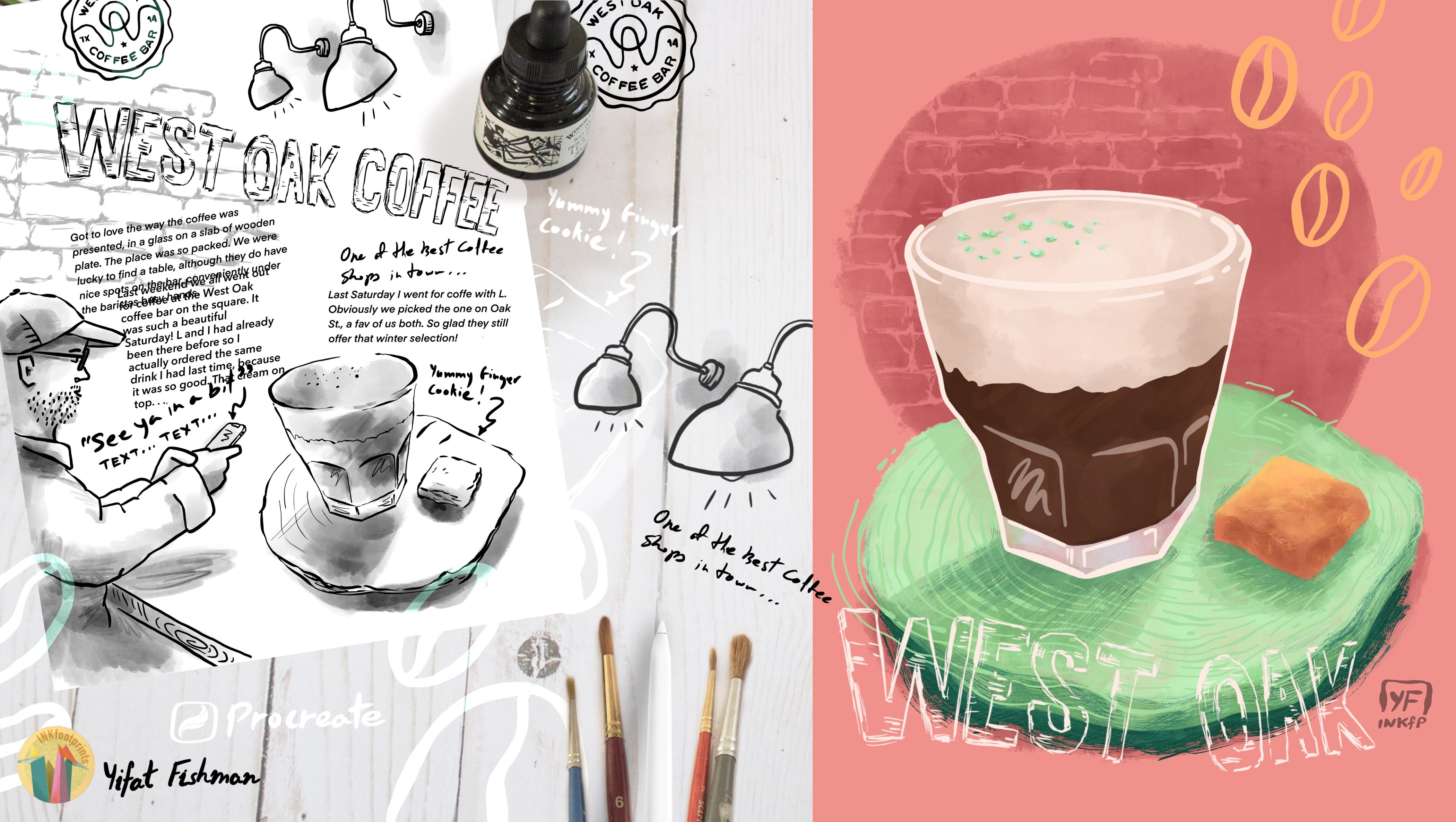
7. Project: Exploration: I want to show you the
photo that I've picked for my class project. I'm just going to finish
cleaning this up. I'm pretty much using the same method
that I've used before. As you can see, you can leave some areas that are a bit
more rough around your image and it's okay because
it's all going to work out into your
brushstrokes later on, so we don't have to really nitpick every
details in the photo. Alright, so I want to
show you how to do some color edits to your photo
within the Procreate app. To me, the image seems
a bit flat and I want to add some contrast
and vibrancy. So I'm going to up the
saturation a bit and see if I can play with a contrast through adjusting
the brightness. I want to show you some more advanced tools. Under Adjustment, you can pick the Curves. The first thing that
I want to try is to create an S curve. We do that by applying
to more pointers on this curve line and
Creating an S shape, a very gentle one. Pulling the curve upwards, opens up the image and
brings more light in. It also makes it flatter. Pulling the curve downwards, makes it darker, brings in
more of the deeper tones, but it also bumps
up the saturation. So for this image, I might just do something very, very subtle in the adjustment. And just to open up the image and brighten
it up a bit. This kind of collage
work that we're doing here is a great way to get to
know your brush sets. Now bear in mind that
I'm working with an iPad Pro and my brush set is possibly different than
what you see on your end. So you might be able to use some of the brushes
that I will be using. But if you don't want
to use them or you can't find them just find
brushes that you like. So that's the thing
about this exploration, is it gives you the
opportunity to find ways to work with your brush set and
utilize it for your artwork. My image layer is locked. If you caught me before I was
placing a lock on the layer so that I won't accidentally
draw directly on the image. I want to isolate it and build all around it with
external layers. So the way that we work for
this project is keep adding layers and I'm placing
them under the image and playing with my brushes and
playing with my colors. What I want you to
do here is flow. Don't stop in question
your brushstrokes. Let's say that this is the
rule that we're placing for ourselves here, to
trust our hand, okay? You can always go back and delete the entire layer
if you don't like it, but let yourself be creative and give yourself
the freedom to just play with this tool that
you have in your hand and trust that you're going to adjust it and
you will have all the flexibility in the world to do something
really fun with it. So I'm just going to add more
colors and bursts of energy coming out of my image and
see where it takes me. You'll see that as you start
building up your project, you also start to connect
more with what you're doing. So for me, I can see that my brushstrokes are starting
to relate more to the image. For instance, I want
to make her sit more on the page so I
built something under her shoes and apply
my brushstrokes in the same direction that
her arm is set in the image. This whole relationship
between artist and image really builds up
as the work progresses.
8. Project: Creating Dynamic Brushwork: So I'm pretty happy
with what's going on my Canva so far, I guess today I'm in the mood for happy celebration
of colors. And now I want to move
into a blending brush. So one of those old brushes, or oil brush will blend
colors and create Brushstrokes that look like they are
smeared on the canvas. And those brushes will interact with colors that are
within the same layer. You can always use the tool at the top right of your screen that has this finger-pointing, and that's the Smudge tool. It will pretty much give
you the same effect. So try it and see how
it works for you. You can set different
brushes for the Smudge tool. This brush really looks more
dynamic to me and I love how the paint interacts with the previous brushstrokes
and I've made, but I want to utilize the same effect on
my existing layers. So I'm going to go and try out this effect on my existing
layers and see how that works. What I like about this
effect is that we're working with something
that is already there. We don't have to come
up with anything new. We are reacting to brush placement that
we've done before, adding on it and building on it. So maybe some stains
that I've made previously are too stagnant. They're not going anywhere, but just playing with
this brush is going to give them
direction and energy. What I am trying to do is leave some of the brushes fresh and then I'll work with
other brushstrokes and add more of that
dynamic smear to them. So the thing is you don't want everything to look the same,
like we liked this effect, we like this wet brush, just going to make it work
all over the canvas. That will just create
a very boring image. We want to work with some
brushstrokes and make them work in certain
dynamic and other Brushwork, we might want to leave them
in their original state. So all these different
layers are going to work together to create an
interesting image. At some point, you might want to bring
in more definition to your work and create more
controlled brushstrokes. This really plays
into that balance between Dynamic Brushwork
and more controlled, designed and premeditated
brushstrokes. So here I'm adding a
layer with parallel lines that are more controlled and have more
thought behind them. And I really like
the interaction between everything
else on the Canvas. Alright, here's something
that I want to show you and that is how to work with
your background color. If we pick one of the
airbrush soft brushes, we can create gradients that
are totally controlled. So we can try to mix and match
different colors and see what kind of color combination brings everything else
on the canvas to life. And that is just
an alternative to picking one solid
background color. And this is something
that you can experiment and feel how it works with the rest of the Brushwork that is
already on your canvas.
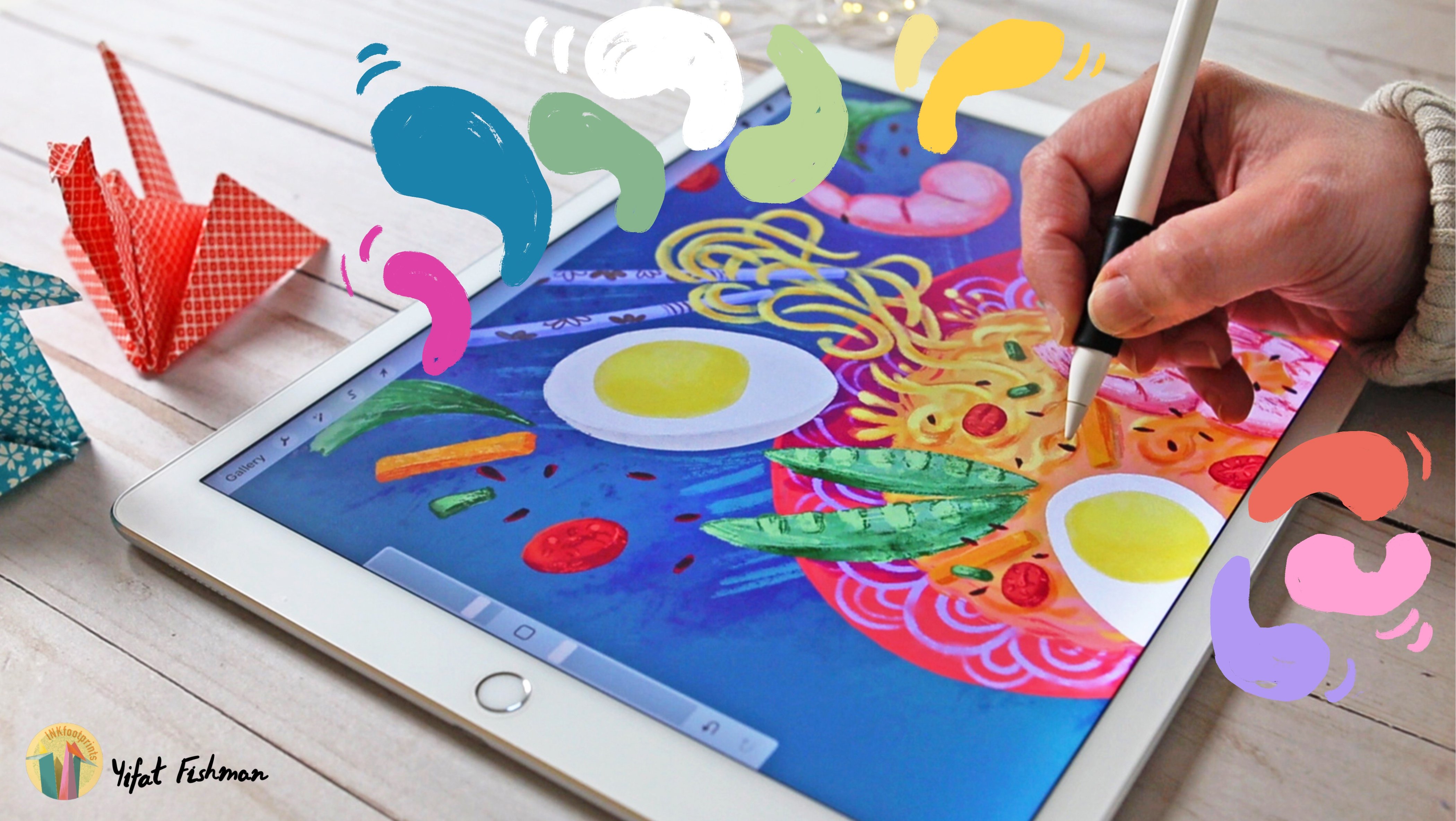
9. Project: Adding Details: If you're not yet familiar
with layers blending mode, I would like to introduce
that option to you. We can change the blending mode for every layer that we've created and have it interact
with the other layers. But I'm not going to do
it for the photo layer. I just want to show you
that option and we're going to use it later
in this process. What I do want to do now is add some personal
touches to the image. So this time I'm going
to draw over the image. I picked a line
brush that you can download from my
landscape class. But you can use any
of the brushes in your inking menu and they will do a good job in
adding fine details. It's a good idea to sample
colors directly from the canvas as you
work because it helps with creating
cohesive image. So I'm picking up colors by sampling directly
from the canvas, and I'm using those colors
to add to my image. Once again, I'm reacting to
what's already in the photo, in this case it's the hairstyle. So what I'm trying
to do is just add some more interesting
strands of hair. But what bothers me here is that my hand is a little
bit shaky and I can totally fix it with adjusting the brush
that I'm working with. So let me show you
how you can work with your brush to do
what you want it to do. So this might be a bit advanced, but it's a good skill to
know how to edit your brush. Tapping on the brush will
bring in the brush studio. What I'm going to look at here
is how to make my strokes smoother so that Procreate will actually correct
my shaky hand. I'm changing it and
then I can test it on this little pad
that I have on the right, it's a drawing pad, and
see if the amount of the stabilization that I've
applied is working. And now we can go
back to the image and apply those changes
to our collage work. Now that we have all the
Dynamic brushstrokes and fun things going
on on the Canvas. It might be a good idea to add motifs that are more designed
and more controlled, that will help to create some more complexity and add interest to
our collage work. I've chosen to create a botanical motif
and I'm trying to design it in a way that will interact with what is
already on the canvas. I can totally go ahead
and try to create a very realistic flower or
try to be very accurate, but intentionally I'm
creating a flower that is simplified
and so that it will look in the
same language of street Art that I'm trying
to create with my project. Then motifs that you
can choose to add to your collage work will
come from your world. It might be something
that you're really into. Maybe you like music. Maybe you like to
play an instrument. Maybe it's just your Art Supply, the something on your desk and your immediate environment. Look around and see
what inspires you. Or maybe it's just Thoughts. It could also be writing. You can write something, you can write a quote. This work is personnel, so make it yours. The motifs that you add can be completely new
to the composition, or they can react to what is already on the canvas
and enhance it. And something that I want to
add to my image is to create some shadows but the color that I picked doesn't
really work well. So let's adjust the
layer blending mode to one of the darker
blending modes available. I like to work with color burn. What I wanted to do here
is create shadow under my image and also
create a contour or an outline to help
make it pop and separate it from the rest of the brushstrokes on the canvas. I like to do this. I think it adds more
dimension to the image. So I'm just going to
play with this layer in its blending mode option and
see where it takes my work. The thing that I like about working with blending modes on the layer is seeing how the
colors interact and change. And of course, so we
don't want to overdo it. So try to find the balance between what is too much
and what just works. I really liked the
effect so far. I think it brings the
collage work to life. And up next
I want to show you some final adjustments
that we can make to our image and add more character
to your collage project.
10. Project: Advanced Techniques: In this final lesson
to the project, I want to show you some
advanced technique that will help you bring
your collage to life. So I'm going to add a new
layer and set it over my image layer and place
it in a clipping mask. The next thing that I
want to do is create the blending mode
for this layer so that it will interact
with my image. I'm picking color
burn so that it will show the creases in the pants because I am going to add
color to this lady's pants. So yeah, you can totally
make changes to the photo. It's not set in stone. We've already seen in the
beginning how you can edit the colors of
the entire image. But here is how you
can add as an artist, your personal touch to different elements of the
photo that you've chosen. So the sweatpants color
was just too bland. I want everything
to be more lively. So I picked this blue
from my canvas and painted it
basically on the pants. You can also choose to create a complete
imaginary outfit. If this is your vibe, go for it. You can add a new sweater like I did in my first project. The next thing that
I want to do is add some more playful motifs
that will create some pop and add movements and Shine and just be some
FUN visual elements. Okay, last thing
that I want to do is play with the sunglasses. So let's try with
an overlay layer. The problem with working
directly in Overlay, is it you don't really see the colors that
you're working with. So I might want to apply
it later in the work. And right now I'm going
to set back my layer to normal mode and redraw the
circles for the sunglasses. Now this is a really
FUN element because these are round sunglasses, so they can be in
different colors even. Let's see which one works. I can always go and adjust
my colors and change them. I can even create a mask
or lock my layer in alpha lock and add more
complexity to the sunglasses. I really like this
combination of bright yellow and bright
pink for my sunglasses. But they might be more interesting with some
added motifs to them. I've locked this layer in an alph lock and then
I can play with those colors that
I've chosen for the glasses and see what
kind of texture works well. I'm trying
different things here. I do try to work
with the limits of the color palette that I
picked for this element. Otherwise, if you can imagine
this little detail of sunglasses having lots of different tiny textures
and colors in them. I feel that that
would really miss the point of creating
one cohesive element. So I've picked a limited color
palette and I'm trying to create some kind
of visual language that will make them interesting. So I've picked these lines
that add shine to the glasses. But then I'm also
wanting to create an outline to help create a dimension
to those sunglasses. Last thing that we want
to do is export our image. So we're going to
save it as a JPEG and uploaded to our class gallery
for our class project. Another thing that you can do is export your time-lapse video. And this is super fun because this collage work really
translate well to a video that you can later on share with
followers or friends. Or just have fun, enjoying seeing how your work evolved and
how everything takes shape. And this is super satisfying!
11. Final Thoughts: Congratulations, you've finished the class and thank you for
joining me today. We started this class
with bringing a photo onto our Digital Canvas
and cleaning it. Picked a background color,
and started playing with different brushes to layer
colors under our photo. Then we added some
personal touches, doodles and whatever
our creativity inspired us to do at the moment. I hope you picked up
some helpful tips and tricks along the way to create your own
digital collage creation. I would love to see what you've
created with this class. So please take the time to share your project to
the class gallery. I see every project
that you post and I'll leave a comment or just give you
a little heart. If this class helped
you in any way, please take the time to
leave a short review. It really helps making the class visible
to other students. It also gives me a
feedback, letting me know how you
did in this class. I can't wait to see you in
my other classes as well. So please follow me
here on Skillshare. And if you want to check
out what I'm doing daily, I invite you to follow me on Instagram as well to
check what I'm up to. And that's it for now.
Thanks again for joining me today, and I'll see
you in my next class. Bye for now.
 Yifat Fishman, Artist & Illustrator