Transcripts
1. About the Course: Have you ever wished that your handwriting
could be everywhere? Now, it can with
my classes called Create Your Font and digitalize your handwriting,
everything is possible. You don't have design
skills. No worries. In just 2 hours, you'll turn your handwriting into
font that can be installed and can
be used anywhere in various forms of
graphic software. Classes are easy and
open for everyone. We're going to use
free software, bird font, and Adobe
Capture on mobile. By the end of these classes, you'll have your font ready. So you'll have your handwriting digitalized and ready to
be used anywhere you want. I'm Aga and I'm a
coding designer. One day, I connected the dots. I was learning typography and
I was observing my nephew Ignaze in his creative process
of learning how to write. This is how I came
up with this topic, and I created my unique style, my unique and very
fast process to digitalize handwriting
and creating font. On a daily basis, I work as a coding designer
or a UX designer. I'm an educator, so
feel free to check my other classes on coding
and creating websites, and also creating
animations in figma. And roll now and
start creating today.
2. The Story Behind the Course – Ignacy Font: Before we dive into the classes, I would like to share my
story how I actually came up with this idea to create such classes and to
digitalize handwriting. So it all started in 2020 in the very beginning when I
found out that my nephew, Ignaze, he was
6-years-old back then, that he's learning how to write. And I thought that this is a very exciting moment
because unfortunately, I don't remember my own
handwriting when I was a kid. But seeing other kids, how they put their
first letters, how they're trying to find out the perfect geometry and their style is
extremely fascinating, and it's worth keeping
memories out of this moment. So I thought that I need to observe how
Ignazi is writing. And I really enjoyed this
whole process because sometimes he was
putting the letters in the as in a mirror. So I think that everyone had some difficulties with
their first attempts. And what was interesting
is that at that time, I was also trying
to learn glyphs, which is the software for professional typographers
to create their own fonts. And I had an instant idea, Oh, my God, I need to combine
these two things. So learning glyphs and observing
Ignaze how he's writing. And the idea was let's create font out of
Ignazi's letters. So I took all the pieces of papers with Ignazi handwriting. I digitalized them
with Dob capture because this was the
fastest solution, and I put them into glyphs and then play a
bit with the software. So why I think it's
worth doing it? First of all, typography is
a crucial element of design, both in the digital
and analog world. And the character, the typeface conveys some sort of emotions,
create the impression. You can agree that IgnaziFont on the top left is definitely different from the other
one that I listed. IgnazisFont is more
about being playful. A bit childish, where the version on the right
is the display font. This is the Gilroy typeface. And this is very modern, hip, cool looking font. On the other side,
on the bottom, we can see very classic
one, very elegant. So for sure, we're not going to use it for crazy
ideas, definitely. And on the very
right on the bottom, we see something that
connects with technology, something that is
very straightforward. So as you can see
with typography, we can actually
create the ambient. We can deliver the
values of the brand. So it's very important to
have this in mind having our handwriting in the computer within one file,
it's very exciting. The funny thing is that a
couple of days, I think, after I was playing with
Ignazis handwriting, I stumbled upon this article, and Gucci back then
used this scrout logo. And it was very funny
because I thought that this aesthetics is actually
gaining the traction, and it's getting the popularity in the realm of design
and aesthetics. So I thought that,
yeah, maybe one day, Ignazi would be famous. But also another part was the website where
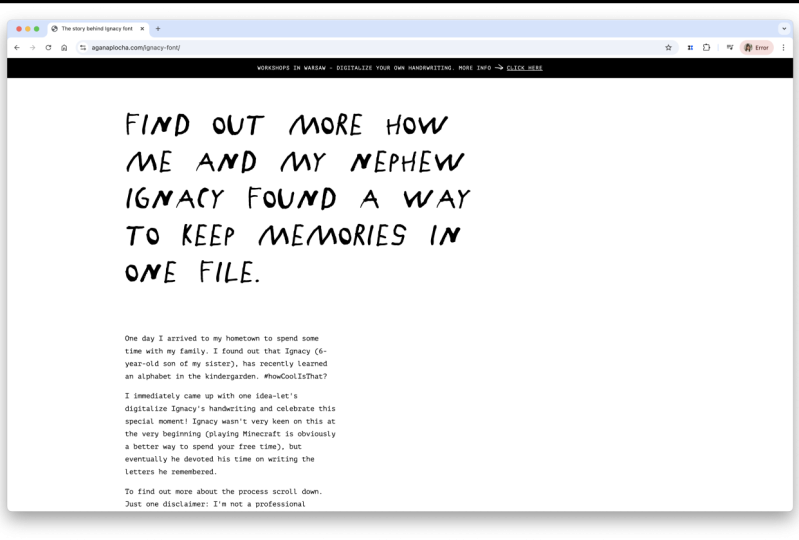
I was presenting IgnaziFont and I
was very excited about this project and wanted to share to as many
people as possible. So this is I wrote what I did, what were the
motivations behind this, how my process looked like. Of course, Ignaz
behind the scenes. What you can see here, everything is the font. So you can try writing. I you can try writing and also see how your name would be
written in IgnatisFont. I also saw showed some font
pairing, how I would see it. And also the whole glyphs,
the whole alphabet, all the glyphs that were
part of IgnatisFont. So I had a lot of fun, and this is this idea came to my mind that
maybe I should share it with people because there are more people who would like to
have their fun digitalized. And there is also one
very touching story because one participant
from my workshop, she decided to digitalize the
handwriting of her grandma. So she was collecting
all her notes, all the recipes she
found somewhere, and she was working on
it during these classes. And it was very it was very
heartwarming experience to see by the end of these
classes that somehow her grandma is alive
by her writing that is digitalized and can be used by everyone in different
sorts of medium. So I hope that
you're as excited as me and ready to start
working on your font.
3. Class Project: What is your class project? Of course, it's
creating your own font. After you do this, I'll ask you to
create the graphic, some sort of variation
with the font and upload this into the
class project section.
4. Tools – Installing BirdFont and Adobe Capture: Okay. So before we
actually start, we need to download all
the necessary tools. We need only three of them. The first one font word, the second, Adobe Capture, and the third one, the program that you use typically
for creating graphics. It can be Figma,
it can be Canva, it can be Adobe software
depending on your preferences. The good news is that all
them mentioned tools. So first of all, Fontbird, the second
one, Adobe's capture. These are for free, so you don't need
to pay for them, and you can also test them. If you feel like that this
is a good piece of software, you can donate Fontbird
because this is the open source and they
are open for your donation. So first of all,
start with fun Bird. Currently on the
website, funbird.org, and I'm heading to
Download section. As you can see, you need
to make a donation. But you can also type zero
if you don't want to do it, and then click Date. Once you click, you can find the right
version for your system, depending whether you use
Windows, Mac or Linux. After clicking on the
appropriate version, appropriate link, you just
install it on your computer. And of course, I will link this page under this video so you can quickly
access this website. Okay, are you done? Did
you install the Fonbird? Let's head into the second tool, which is Adobes capture. Adobe Capture, this
is the mobile app, so we're going to use
it on your mobile. And also, again, good
news is that it's for free and works on
both IOS and Android. So you need to head
to either Google Play or Appstore to download the app. Once this app is downloaded, we're ready to go and start
working on our first letters.
5. Handwriting in Theory: Okay, the tools are
downloaded are installed, so we're ready to go and
start working on the letters. And this is the
cool part because we're switching now from the
digital word to the analog. So you're going to
need a piece of paper and something to write. And I strongly recommend you to gather all
the pens that you have because we're going to experiment with
the thickness. So as you can see, this pen
is pretty thick, right? But I have a thinner version
which is this this pen. So depending what aesthetics
you want to achieve, we're going to just
experiment with the tools, the pens that you gathered. And after we'll be ready. After this exercise, we're going to create
the full alphabet. Later on, we're going
to digitalize it. So now, take the piece of paper, take the favorite pens, and start writing letters
on the piece of paper. And the very
important information I just wanted to highlight is that the letters should be
like a couple of centimeters, so you can see the M version. So it's like 2 centimeters,
something like that. I think this height is the
best one because later, it's easier to digitalize. This such dimensions. So don't be so please don't
write two small letters, and you can decide whether
you want to go with appercase only or
maybe small caps, or maybe you can mix all of them depending what you want
to achieve in the end. But for the first attempt, focus on one version, either uppercase or small case. And if you don't have enough
place on one piece of paper, just take the second one. It's totally fine
because we're going to digitalize each
letter separately, so it doesn't matter whether all of them are on one piece of paper or they are separated
on various sheets. Also, what I want to
mention is that the pens, they don't need to be black. They can be they can have
colors, but in the end, we're going to make it in black and white scale
in Adobe Capture app, so it doesn't matter, actually. It would be good to
have a high contrast. So white piece of paper
and preferably dark color, so it can be easily
differentiated by the software. So this is the time for
you to sit with a piece of paper with your pen and
start writing letters. What I strongly recommend you to do is to have a short warmup. So start writing maybe
sentences first. Try to look at it and think which letters you
like, which you don't like. You can also type you can also write a couple of
versions for one letter. So later on, you can decide
which of them you want to use in your final
font. Good luck.
6. Handwriting in Action: Okay, so it's time for
you to play nice music, take something to drink, and start writing your letters. Please remember that
it's totally fine to write a couple of versions.
We don't need to rush. Once you're ready, it's time to launch the Doby capture app
which you already installed on your mobile Okay, so when you enter
the mobile app, you click on the photo icon, the blue one and select shapes. Shapes, this is the functionality
of the app which turns everything that is seen by
the camera into shapes, the vector shapes, which you
can later save and export. With this panel, by switching
this.in the middle, you can decide
whether you want to how dense you want
your shape to be. If you switch it to the left, it becomes the outline. If you go to the right, it will be thick, more dense. And once you're ready,
you just click Okay, and then you can crop the image because we
don't need the artifacts. We just want to focus
on the letters. And once we are happy with the cropped image,
we click Save. And then we see that
this file is ready. We can rename it, for instance, Aga Letters, and
then I click SAFE. Once it's safe, I should
export it for my computer. So I enter my library, look for the appropriate file, and use Export SVG, and then I choose my computer. This is how I do it on IOS, but for sure, you will find the proper way
to do it on Android. If you did everything
in a correct manner, you'll see the file
on your computer. I put it into a separate
folder for my course files, and I'm able to see
the preview of them. So these are all my letters, and we're going to import
them in the bird font. But everything step
by step, don't worry.
7. First letter in BirdFont: Alright, so we
wrote the letters. We used Adobe Capture to digitalize the analog
world into SVG file, which is already
on our computer. And now we're going
to use this SVG file. SVG stands for a scalable
graphic vector file. Which means that we can
easily change the scale of the graphics inside without any quality loss because
everything is in vectors, so these are the shapes. And thanks to it, we
can create the font, and later on, we won't have
a problem to, for instance, use a very large headings with a very big height in pixels because this is going to
be a scalable format. Alright, so it's time
to use Bird font, our software to create
our very first font. So currently, I'm in Bird font
and I will quickly switch the theme from the dark
to bright because I just prefer more to
work in such a way. And we create and we click
here for the new font. And what we can see, we
have all the glyphs listed. What is a glyph? Glyph is just a character that
is used in typography. It can be either a letter, a punctuation mark, a special character,
so it's everything. So this is the glyph. The letter, the
number can be glyph, the letter can be glyph, the
upper case, the lower case. So everything here is the glyph. And by the way, one remark, once you are writing
the letters, probably as me, you forgot about the punctuation marks
like dot or semicolon. So in the meantime, you can do it. The process is the same. So take a piece of paper, write the punctuation mark,
which you can see here, and then use Adobe capture
to create SVG file, and then import this SVG
file to your computer. So we're going to have
separately letters and punctuation marks. So it doesn't matter whether they're in separate
files or in one. Okay, so let's begin with
the very first letter A. We're inside, and what you
can see are the lines. And in typography,
we use lines to keep the grid to have some sort of order in terms of the
visual hierarchy. And if you hover over these lines and especially
these triangles, you will see the
names of these lines. So this is the baseline. This is the top line. This is the line gap. In typography, in the
theory of typography, we called descenders, ascenders, and also we have the X height. X height is the height
of the small letter X. So this field, which you can
see here is the X height. So from this line from the
baseline to the X height line, we should have the height of
the letter X, and of course, we can change it because
depending on the type phase, some of them have higher
X height, some smaller. So it all depends on your creativity and on your aesthetics you
would like to achieve. Okay, so now we need
to import SVG file with our letters to the bird
font. How we can do it? Well, let's click in the
upper right for the menu, and then we had to
import and export. We click on Import SVG file, and then we select
the proper SVG. Okay, so what we see is
that all the letters, actually the whole SVG
file was imported. And what we're going
to do is I'm going to take a selected
letter, for instance, A, and I just use the cursor
and mark the whole letter. So I can take it
and put it inside the proper the proper lines, the guidelines in the grid. But the letter is too big, so I need to change the height. And I can do it by
choosing this resize tool. So I have the whole letter, as you can see, with this marks. The whole letter is selected, and I click the Resize tool. And then with shift
on my keyboard, and with my cursor, I'm able to change the scale without
squeezing the letter. Thanks to it, I can
keep the proportion. Without keeping
shift on a keyboard, you can see that
changing the the size unfortunately also changes
the thickness of the letter. So it's also interesting effect, and you can play
with it, of course. But my initial goal was to resize the letter without
changing the proportion. So once again, selecting, kipping shift, and then
my letter is ready. And I can by clicking on
the letter, by the way, be aware of it because these are the different shapes that
are connected together. So it's very important to
highlight all the elements. Then making the letter bigger. As we remember, this was
our X height, right. So everything above this line is going to mark the uppercase. So my letter is
ready more or less. This is A, and I can
select everything, control or comment C, copy. I remove everything
and go to overview. As you can see, this
is the letter A, and we're going to letter B.
8. Next Letters and Kerning in BirdFont: I'm typing Command
V or Control V, and then I'm able to
select the given letter, again, marking everything,
every element. Once again. Sometimes it's quite tough
to navigate in bird font, but I hope that
with every letter, it would be easier, and I'm able to move it, scale it a bit more. There are also some options
in bird font in which you can change the lines. You can make it more smoother. In order to play a bit with
the shape of the letter, I need to mark it and head to move control points
and click on the letter. Well, you can see, these are all the points that created
the shapes that we have. So taking by some notes, we can make the
letter more smoother, less quirky and we can play with geometry
of these letters. So if you have time
and if you want to play a bit with the shape, make it more rounded,
for instance, I strongly recommend you, of course, to have some sort
of an exercise with it. But basically, the handwriting is some
sort of not perfect. So I think that for
these purposes, we don't need to be super,
super, super precise. Actually, it all depends what aesthetics you
want to achieve. But now let's switch
to object to, and you can see that the
shape changed a bit. Okay, let's make
it a bit bigger. So again, resizing
to Yep, perfect. And now I'm heading to
overview, but before. Alright, so I need to
mark all these letters, the remaining
letters that I have. I can click Command
X or control X, so I get rid of it. I cut all the graphics, the SVG, and I had to C letter. And again, I'm choosing. I have two versions, but I think that I would
go with the thicker one. So I'm taking C and all the taking C and
all other letters. I'm going to paste to D
for now, they will wait. And heading again to C. You
can see here in the panel that you can have the access to each of the glyph,
of the letter. All right, so I'm taking
C. Yep, I'm taking C. Sometimes you need to be
patient with bird fund, but yeah, we've got it. Awesome. So I'm going
to scale it down. Yes. Also switching on the
guidelines to see if I have everything ready here. Okay, C is here. Perfect. And we're doing this exercise
with all the letters. Of course, if you're impatient, you can first do
some sort of like a first letters or first ten or even five and then
check how the font behaves. So I'm going to do five
letters for this exercise. And again, I need to take
the letter, scale it down. Yep, so this is my D letter. And sometimes you might
forget to copy the SVG file. If you do it, I have this
actually in the memory, but if you forget
to copy and paste, you can always import by clicking Import and
Import SVG file. This works the same in
the very beginning. Okay, so maybe from E, I will choose this one. And the rest of the
letters would be deleted. All right, scaling
down scaling down. If the letter is ready, Okay. So let's try to test
actually our font. If you enter into all glyphs, you'll see the glyphs
that we currently did. And we can also go
to the kerning, which is the space between the letters and check if
everything's correct. So Yeah, I'm clicking once again space and kerning and
show Kerning tab. And here with the caps
log because check that we used for the upper case, not for the lower case. So if you start typing a small
A, nothing would happen. But if you turn Capsg on, we'll be able to
see our letters. With the letters, the
glyphs that I've done, we can create the name
ab for instance or B B. And by typing the
arrows left or right, you can change the kerning
between the letters. It's some sort of the
technical detail, but mentioning at this moment
because maybe later on, you would like to play a bit
with these spaces as well.
9. Creating a Letter with Descender: So let's go to the overview, and I would like to show you creating the letter that
have the descender. So the letter that will
go below the baseline. So for instance, J. And again, I need to
mark the whole letter. Yep. This is J, and all the other
letters will go. Away. Alright. And again, remember resizing tool,
and my J is ready. What is important
here is that J is a bit takes more space. I will make it a
bit bigger. Yep. Something like this. And let's go back to the
curning tab and see. I think that I will change
the curning between J and any other glyphs because, because I would like to have this part of this
glyph connected. So maybe I'll change the
width of the letter and see. Yeah. Better, better.
Maybe once again. Overview, Curning story. Yes. Yes. For instance, in
German, ah, means yes. And this is nicely connected. So I really like this effect. What I see is that
this curning is a bit of should be smaller. Yep, and we're ready
with some sort of and we're ready
with our six letters. So now it's your task to create all of the glyphs that you have on
the piece of paper. Of course, it takes some
time, but you don't need to focus on all of them
in the first attempt. You can take your favorite
letters or maybe you can select some letters to create
separate the whole word. So I strongly recommend you to play a bit with
bird font now, and later we're going to
export the font and test it.
10. Saving Project: Okay, very, very important
thing that I need to mention is to save your file because
we don't want to lose it. So let's go to the funtbird. And once we have a
couple of letters ready, we can click on the menu in
the top right and then file, save us, and we can name
Aga font, for instance. We saved the file in PF format. So this is the formats
typical for Bird font. I click Save and our work is saved now,
but it's not a font. So I think this is the moment to export the font and test it. We're going to do this
in the next lesson.
11. Exporting Font: Alright, so it's time, it's high time for
exporting the font and test it in the selected, the preferred graphic software. In order to export the font, we click the menu
on the top, right, and then Import and
Export and export fonts. What is important is that
we need to add some sort of information to have the
font properly exported. So the file name
can be Aga font. The font format can
be named like Dad. We select formats, TTF, SVG, totally fine for now. We're going to install it on our system, name
and description. Family name. We can
write it like Dad style, the regular one because
we're not having bold, italic or modo version. And I think that all the information we can
write here our name, just to feel proud of our work. And I think that we're ready. So export settings,
go back to the step, click Export, and we can open this folder and have
the font exported. So this is Aga font
TTF and Aga SVG. Once I click on Aga font TTF, at least on a MAC, I have this option
to install the font. And once I go back to fonts, I should be able to see,
this is the Aga font. So I can also look for my
font by taping the name. And once I click it, I would
see all the glyphs that are kept in this
file. All right. So the font is installed, and this is the time
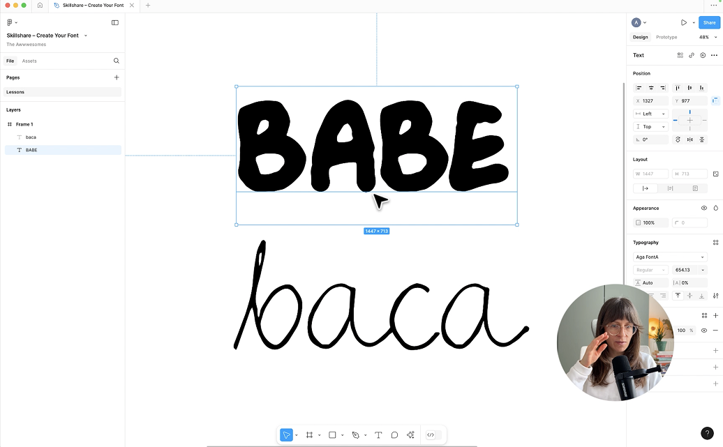
to start testing it. I'm figma, and I create a frame, white background, taking text. I already have very big size, and I'm looking for
my font Aga font new. Please remember that we're
going to use uppercase, at least in my case. And it works. So I have the font installed. It's ready in Figma. If I write all the letters, you will see that
the missing letters are in a different font. It's like a system font. But with my letters, I can, for instance,
have word babe. Yeah, so now is the high
time for you to test it. Later, I'm going to show you one nice effect which you can use on your social
media, for instance. But for now, let's head into the er version of the
fun, the thinner one. So we're going to go through the whole process
once again in order to have this sort of
letters digitalized.
12. Creating Font With Different Style: Okay, so it's now time to try the different
approach with the font, and I already imported SVG
file for different version, the type that it's a bit
thinner, going to show you. And we're going to see how
to create such a font, which is a bit different
in the aesthetics. I'm heading to the Bird
font, and this font, let's assume is
already finished, so I can pick file new and focus on working
on the new font. And because I use the lowercase, I'm getting the A glove, I use the small
glove, hand picking, importing the SVG file
with my handwriting. Import SVG file and using
Agi letters thin SVG. Okay, I can see it's here. So again, I'm marking a letter, resize tool to make it
smaller, like this. Remember that
currently, we need to have the X height adjusted. I would make it a bit
bigger like this. Yeah. So this is my X height. This line stays here
because I want this part of the glyph to be connected
with various next letters. And what we can also
do here is I'm taking the control with all
the points that I have, and maybe I'll do
a bit of some sort of cleaning and making this
letter at a bit better. Here we can a bit thicker. Okay. Let's see. I don't like this moment. So let me correct this modify this a bit okay. More or less. Yeah,
now it's better. Okay, so letter A is ready. Now, let's get back to B. Oh, because I forgot to copy. Let's get back to it.
Letter B, pasting. And this is my glip and all the other stuff
is not needed. And again, making
this letter smaller. Having the option with
guidelines to mark the X height. So this part of the letter should be
within these two lines. And again, like this, and I will switch it to this. B, and again, I would like
to make some corrections, maybe a bit bigger and more
regular, something like that. Okay. And now going
for the C letter. Okay, Let's see. Well, not perfect, but
quite happy with it. And now we can go
to the kerning, space and Kerning and
show Kerning tab. Is my old phone, but here we can
see that B should have a bit bigger urning
Yeah, something like this. And see as well. Yeah. I like it. Yeah,
looks really nice. So we're ready to export the font just as we did
for the previous one. So here again, file, and import, export,
export funds. You need to save your
fund before exporting. Okay, sure. We're going
to do it. Save us. And here again Aga thin font I got thin
font, ready to save. And now I import
export Export fonts. And click Check also
the name Aga then font. This is fine. This is fine. Click Export in the
Export setting stab. Now I see that my font,
AgathNHunt is generated, so I open it, click Install, and let's switch to Figma. With again thin font. And here we use
the smaller case, not upper case,
but smaller case. And it works. I'm really happy with
this variation as well. So you can see that everything depends on your aesthetics, on your style, what you
want to achieve in the end. You can also play with the points that are
creating the given letter, just as I did in Bird font. For instance, we type
if we get into A, you see that by selecting. This tool, we can
make this letter bigger and have more
crazy aesthetics. Depends what you like
and what you want to do. I strongly recommend you to do experiments and not
to create one fun, but many variations of it because this is all
about having fun.
13. Drawing Glyphs From Scratch: Okay, so what I
also want to show you as an advanced lesson is that you don't need to have this stage of handwriting
and using Adobe Capture, but you can directly
work in Bird font. So, for instance, when
I go to the Ahler I can start drawing my very first glyph. And of course, this one is totally different
from the handwriting. But of course,
everything depends on what you want to achieve. You can also create basic
shapes, so geometrical shapes. So for instance, I'm doing the circle and another
one inside, smaller one. But I need to have
the option, right? So it reminds me a
bit of the A letter, and I can also at the rectangle. And more or less,
it looks like an A, but here we need to
switch the mode. And recise the letter a bit. For sure, it requires
more time and more energy and flexibility
with drawing the lines. And I think that at
the very beginning, it's better to use with your handwriting because
it's faster, more effective. And then once you'll be
happy with the results, you can dive deeper
into bird fun and start drawing the shapes, connecting them, and working on the details of your
glyphs, of your letters.
14. Bonus – Animation Effect: Okay, so now I'm going
to show you really cool effect that you can
use on your social media. And to do this, we're
going to jump into Figma, but you can switch to
different software, the software that you currently use that you're accustomed to. So in Figma, I
create a new frame, and I will change
the dimensions to the one that
Instagram Story has. So it's 1080 and 1920. All right. And I select the text because I'm going to
write with IgnaziFont here, but I think it's too
big, so let's switch to maybe the size, and I think that this is fine. Okay. And what I do is I
want to record the process of typing with
IgnaziFont and later, I will have a really nice
typing animation that I can show to the world on my Instagram or Twitter
or whatever you like. So starting once again, but in order to record this, I'm going to use QuickTime. If you don't use Mac, if you don't have QuickTime, you can use, for instance, Loom. Loom is a free software
to some extent, and also it also lets you
to record the portion of your screen
because we are not interested into recording
the whole screen. But to a given field,
a given frame, I'm changing the
width and the height to more or less the size the proportions of the
Instagram stories. Okay, record. Okay, so I'm
ready to start. Hello. Whoops sorry. This
is Ignaz font. I created a with my 6-year-old NY. And this animation is recorded, so I'll just stop it
and we can watch. I like this way that
something has been typed. So feel free to make
your own version. When I launched IgnaziFont, I created a tweet about it, and I also used this animation. Back then, I was creating it, I think in pages on Mac. Yeah, and I got
really nice traction. Many people like this project. So I think it's worth showing to the world that you've
digitalized your handwriting, that you create
in your own font, and it's not that difficult. So I strongly recommend
you to play with it and to publish your
work and your design.
15. Class Project – Summary: Okay, it's high time
for the class project. Your class project
is, of course, digitalizing your handwriting
or just create a font maybe of the handwriting of your siblings or a partner
or whoever you like. You're strongly invited
to do experiments. And what I want
to ask you for is to create the font and
then use it in a graphic. And attach this graphic in
the class project section. I'm very excited for all the upcoming
projects and designs. And please let me know whether you like these classes
and you would like to see such a content from me
on Skillshare platform. Good luck with your work.
 Aga Naplocha, Creative coder & designer