Transcripts
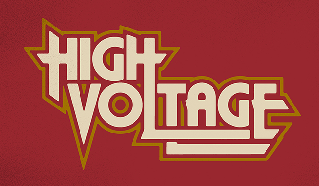
1. Introduction: Hi guys. My name's Brandon Rike, and in this class I'm going to teach you how to do a custom letter. For my biggest clients to my smallest clients, I use the same set of principles, get these lettering pieces done. In this class, we'll start with sketches. So, we'll be able to sketch out the words and really see how they interact with each other, how the letters have a relationship with the other letters. We'll cover selecting the right font. A font that is able to be manipulated and be adjusted to work with the other letters. We'll bring the Word in Illustrator and there we can really adjust every anchor point on it. I'll show you the correct tools to use to efficiently get this work looking how you want it to look. We'll also put a few finishing touches on it to have different options on how you can finish the type and really make it work with whatever your composition is. What I want to tackle on this class is how to teach you to not be intimidated by the whole entire idea of lettering. Lettering can be quick, lettering can be easy. So, enroll now and you won't have to be hesitant about your next project. You have the principle required to create beautiful lettering.
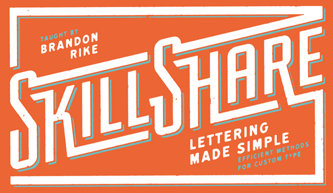
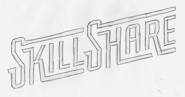
2. Sketching The Possibilities: Okay. So, when starting your lettering piece you have to think of where the lettering is going to go on the page, or on your composition or whatever it is. If it's a letter head or it's on top of something then you're going to have to think of how that's going to work. So if it's going to be two slanted or if it's going to be two straight or whatever you just have to be mindful of how it's going to end up on the final composition. A lot of times with T-Shirts you have to think of how it's going to go across the T-Shirt and across the torso. So, all that stuff is important to think of when you're starting your lettering piece. So, it's important to sketch first so that you can get an idea of how some of these letters can interact with each other. So for this, I just wanted to write out the word SkillShare. So I'm going to start exploring different ways the word SkillShare can work together. So, sometimes I'll start by just writing the word SkillShare out. SkillShare easy because there's 10 letters in it which would put the middle right there. So knowing the middle is important, of course, the letter I would be thinner than all the other letters. Everything else the weight is okay except for the L's, the L's, the weight, the bottom heavy so there's going to be empty space up in the corner of the L's. So, that's important to think of and it doesn't always come into play with every project, but it is important to know that okay I have an I or I have a W which would take up more space. N and M and M and W obviously take up more space, L is heavy on the bottom, T of course is heavy on the top and spaces underneath it that need to be filled in, so those are all things that you think of. The first step with a lot of people is they want to do a cool script and I'm all about cool scripts. I think people aren't exploring other areas of lettering enough they're so wrapped up in making really pretty scripts that they don't realize that lettering can be done to any type style. If I would be doing something in a script I could sort of start to see all the different ways that these letters can work together. S is of course the first letter dropcap all that stuff is fun to elaborate on. Okay, that's something that can happen. This L maybe could even come back like that. If everything's going this way it probably wouldn't make sense for H to go that way so I wouldn't do that, but that's a cool way I could do a script. And in this way, I'm sure I could find a font that would work with those, the S would have to be pretty custom. But I also like using some more machine type fonts. Stuff that's like really straight and seeing how those work together. So, something that maybe you would see on like an old electric box or something like that, I think those types of fonts are kind of cool to because they become very customizable. And for the sake of this class I want to give you a font or a type style that's pretty simple and if that type is fairly simple it's going to allow you to manipulate it a lot easier inside illustrator. So, if you have a SkillShare, the word out like that, well, then you can do sort of the same stuff you did there may be the top of these S's carry out like this. Of course the K and the R, those are always fun to bring down underneath the letters. When they come down though you leave empty spaces here which you don't necessarily have to fill, but you could fill it with a subheadline. So in this case we could use class, so just carrying this out more, okay, I get the idea of what I'm trying to do. Starting to think about all these angles, how these angles are going to work together. I'm not a big believer in spending too much time sketching. Just for sketching sake I want to get a clear idea of what I'm going to do once I get on the computer, and then I will just wrap up my sketching. There's no sense in staying here longer than you have to. You have to know that the majority of projects you're going to get in real life are, they're going to need to be done quick. And you being able to do them quick is going to make you a valuable asset to whoever is asking you to do that. As an artist, as someone who's grown up being really good at art, you probably take a lot of pride and how great you can make something if you spend enough time on it. As you become a professional graphic designer you're going to have to learn how to do what you do and do it quickly. And I think it's a very valuable skill to be able to do something quickly. So, for this class I want to teach you how to come up with the idea and how to create it and execute it quickly. So, that's the name of the game with this class is doing it and doing it quick. Let me just get these angles together again, really thinking about it, okay, the K can go out, the L can go out, the H's, crossbar can come across into the little open area of the S, and just kind of seeing how these things are going to work. Okay, I got it. I know how I want to do this, I know what I'm going to do inside Illustrator once I get to mess around with the vectors. I'm going to look around for a font that might be able to jump start me to this point, but that's it. That's all I'm going to do for sketching. I'm not going to spend more time on here than I need for the sake of this project. I know what I want to do and I want to go to the computer and do it.
3. Selecting The Right Font: Okay, for the sake of this project, it's going to be really good to start with a base font, and you got to know what to look out for with that font. You want to find something that's straight, something that you can easily manipulate, something that if you extend a portion of it, there's not going to be a whole new set of curves involved in it. Because for the project at hand, it would be best for me to be able to do the project as quick as I can, and that's not to lose quality, but that's to say that don't get yourself into something that is going to take way more time than what you have. You have to be mindful of the time that you have allotted for the project. You have to give yourself an allotted time for the project and you know make choices accordingly. So let's pick a font. There's obviously free font web sites and the majority of those fonts are horrible. So be careful when going to the free font sites, because you've got to know that, okay, Brandon told me that the majority of these fonts are horrible, so I need to make sure I'm not picking a horrible font. Because I've seen a lot of stuff out there and there's a lot of designers picking really really bad fonts. The font selection is extremely important. So, you have a website, DaFont, and there's a lot of bad ones on here, but there are a few good ones. There are a few ones on here that you can find that would work. So looking at this, there's a font Big Noodle Titling, that would work for what we're doing for what I have in mind, that kind of matches what I sketched. It's free for personal use, so you might get into trouble if you do too much with that font so I would steer clear of a lot of these things so. A lot of these are free for personal use and if you use them in a big project, it's possible that the creator of that font may email you and ask you to pay him for something. So, this font, Steal Fish, that's a good font. That could definitely work for what we're doing. The Font Franchise, that could work. So just taking a look around, I'm trying to find stuff that I know that the anchor points on these fonts are pretty straight. So all these lines are pretty straight and extendable. So looking through there, you get the idea. There's a few fonts on here and for this, I'm just looking at Sans Serif fonts, but I'm not going to use DaFont right now. My normal go to is myfonts.com, that's where I get a lot of MyFonts, so I'm looking around at these, and what's funny about MyFonts is you're able to find one that you like and it says, "Well, if you like this, you'll like these," so you're finding more fonts like this. So, okay, I'm getting closer and closer. This font could work, it costs $25. This font could work, it costs $25. This one costs $39, so you're just kind of looking around, "Okay, on this project, can I afford to buy this font?" Buy fonts. You're going to have to get used to buying good fonts. I think a lot of designers may go through their entire career always being super cheap with fonts and their work will suffer accordingly. There are great fonts out there, and if you get your hands on some of those fonts, you'll see how quickly they make your project go along because they just look so good. So, it's important to find the really good fonts and use them for the right things and to not be so cheap that all of your work ends up looking like crap because you are only working with free fonts. So, MyFonts, that's where I'm at most of the time. I do spend a lot of money on MyFonts, but I think it's warranted. Every project that I do, I'm saying "Okay, well if I spend $25 on that font, does it make sense on how much I'm getting paid for the whole project," and most of the time, I can justify that. Sometimes, when you get into the $300 or $400 fonts, those are a little bit harder to deal with, but you have to think, is that potentially a valuable enough asset for my project that I can spend $300 on. Another really great font website, they may not have as much, is Lost Type Co-op, and Lost Type is started by some designers just like you and me, and there's a lot of different font designers here. Joe Prince, Riley Cran, all kinds of people. James Edmondson, who has done a lot of really popular fonts. So I'm looking at these and I really like these guys, these Lost Type guys, and they definitely have plenty of fonts that are going to work for what I want to do. Looking through these, my favorite font that is going to work for these sketches that I created earlier, this I think it's going to be this font called Fairview. It was actually designed by Riley Cran, who's a great designer. So, let's download this Fairview font, and you can kind of see all the different ways it's used. Okay, it has straight lines in it, I could extend certain portions of it, and it would work well. It seems to be a pretty versatile font for what I'm trying to do. So, what's cool about Lost Type is you name your price. I usually put in ten bucks or twenty bucks and pay through Paypal for these fonts. I would encourage you to pay something for these fonts. They do let you pay zero or one dollar or whatever, but these are some really talented people making these fonts and I think they'd appreciate it if you threw a couple of dollars their way. So, pay whatever you're happy with, but I would say pay ten or twenty bucks for it. Do whatever you gotta do. Losttype.com/fairview, that's where I'm getting this font. So, I'm going to put in my $20 and I'm going to download this font.
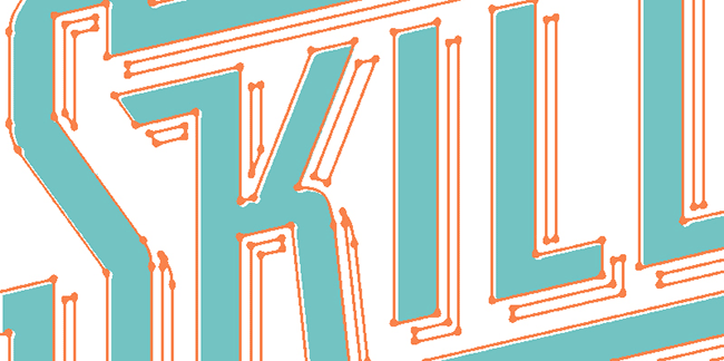
4. Building The Word: Part 1: Okay, so I've downloaded the fairview font. I use a font management program called Font Explorer Pro, and, so I installed it so you'll install your font however you install it. So now I have it available and I'm going to write out the word SkillShare with the fairview font. Now, not only will I write out the word SkillShare, I'll add a hyphen, the letter I, and I think that'll be enough for now. The lowercase is cool but I don't think I'll need it right now. I could use the lowercase I could see how that could work out but from sticking to my sketches, I'll probably stick with all caps. The other option is use the small cap option which is just a different version of the letters, a smaller version of letters. So, I think I'll probably do better using the small cap version, like that. So, I've got my pieces. So already, I'm going to be destructive, I'm going to hit shift command O and create outlines. So, I'm already at the point where I've lost editability for my letters, and that's okay. So, now I can sit here and sort of check out the different ways that I can mess with this. If there's any little kerning things maybe that K can step off that I a little bit, that's where you can just kind of nudge it around. But, you can take this I and I'm holding down option and shift, so I'm duplicating it. You take this I and make it the K that could come up above here. So, already you've been able to use one letter as another piece, so obviously the I and the hyphen and stuff like that, those are valuable because they're just lines, they're just rectangles. I want based on these sketches, it look like I brought these S's down a little bit which I still like. So the big tool in this whole thing is the second arrow down the white arrow your direct selection tool. Now, once you have your direct selection tool, you're going to drag and select the portions of the letter that you want to move. So, in this, I'll zoom in here, and you can see that the open anchor points aren't selected but this solid anchor points are, so this is really just six little anchor points but they dictate the whole thing. So what I want to do is, I've got those selected, I'm going to hit shift and the down arrow, I'm going to drop those down three. I got shift option arrow for that, and I'm going to do the same thing over here. I'm dragging with this direct selection tool, shift and down three, and then, you can hit command R and pull your rollers up and just kind of make sure everything's going along. Newer versions of illustrator will make the guidelines selectable, which I don't really love, but you can send all your lines to another layer. So this is kind of just act as guidelines that you can use, and you can know where the baseline is. We've now gone underneath the baseline with these S's. So I'm going to take this bar and I'm going to drag it across, just hold down option and shift to drag this bar down and we're going to drag this over to meet with this L, and there's other ways to fine tune those. Now I'm using the selection tool not direct selection, I'm using the black arrow, so, you'll know the difference between the black arrow and the white arrow as you continue doing this, but they'll do very different things. You're moving the whole thing when using a black arrow, you're moving fine little anchor points when using direct selection tool, but knowing how to use that direct selection tool is sort of the essence of this whole entire project and this whole entire class. So again, we'll take this direct selection tool and take the leg of this K and we can bring it down and for this point, we can just bring it across the bottom line here, to just maintain that angle of that letter. I'm going to take these two S's and I'm going to select everything over and I'm going to go up one, so I'm holding shift and up one. I'm going to do the same thing over here. What I've been thinking is that I want to take this bar and I want to intersect with this S. So I want this S to sort of have this weird little tail on the top of it, and that's what brings it all the way out, and that S can go across everything, I mean sort of combine everything. Now, obviously in the sketches, I showed you a slanted version. Don't mess with the slant, the slant is the last thing you do. Well, if you can have everything straight and be dealing with 90 degree angles then you can get a lot more done, and then the slant kind of can happen all at the same time at the end. So, if we're going to continue doing this little thing, let's make this R do the same thing that the K did so, shift and option I brought that other bar crossed, and then I'm bringing this K down, and I'm just going to eyeball to keep this angle because there's no shift that's going to keep that angle correct. So I'm just eyeballing it, but if you're moving something horizontal or vertical, you're going to want to keep your hand or your finger on that shift key to keep everything straight. I think I'm going to bring these H's down. I'm actually going to bring them past this new baseline, because I can intersect them and take the pieces out later and you'll see how I do that. So, if I brought this other leg of the H down on this side, so the second letter of the second portion of the word if you're following me, I might as well bring the K down as well. I'm going to bring it down and try to match right up there on that baseline. Now I'm trying to get everything pretty perfect right now but I'll show you how to get everything exactly perfect later. So, right now, I'm looking at this and I got a lot of things to sort of change that are intersecting. There is an open space here and it's not to say that you can't have the open space, you can have the open space, especially with a compound word like skillshare, it still makes sense. I think I need to bring this back out so the R can go underneath. So what I'm going to do now that I have these and I could have used the hyphen in the I here but I ended up using this I from skill and it was sufficient for everything I needed to do. So, at this point, I'm trying to think if there's any other little thing I want to do. Maybe this S could have a little kick out or whatever you want to call it over here. The scene up here it's going to have to mess with this L and it might fight too much with that L so there a little too close here of course I can move this up, but if I'm moving this up, I'm starting to mess with legibility where that S is a little too bottom heavy. If I'm going to do that S that way, I'm probably going to have to do this S in the same way. So, for the sake of this class, let's do it. Let's take this, I'll just delete this S. Bring this one right over, so I got this on top. I'm going to hit shift over one and delete the one underneath it just so I know we got the same exact thing. So, what's best to do is I'm going to get hide this guideline. We'll put this in the middle and for new and I'll even enlarge it, actually no I'm not going to enlarge it. If you enlarge it then when you hit shift and the arrow key that whole scale changes so don't mess with that. I'm going to hit shift O and make a new work pod, so I'll move this over. Basically to say, that's a stopping point for this type, and I don't want to lose that forever so I'm just going to make another art work.
5. Building The Word: Part 2: Okay, so now this one I can be destructive with. So, the first way that I'm destructive with this is to select everything, and I'm going to use on this Pathfinder here. I'm going to use the divide function. So, what happened now with divide is all of these shapes split up. So, anything that was overlapping or anything that was inside a contained area became a new shape. So, hitting. If I turn it on black that gives me an easy way to see what I'm dealing with. So, now it's black, I'm going to delete of course the area inside A and inside the R, we'll zoom in and clean up all these little doodads that are out here. So, this is where it starts getting a lot cleaner. So, this is why it didn't bother me to have all these little shape overlap each other because I knew I was going to be able to go back here, divide it all up, and then split it up. We'll go to this K as well. Another option is I could take this K and go up but I like that they combine with each other and they do the same thing. So, both of the S's are doing the same sort of thing. So, in that way, now I'm going to use the Pathfinder Unite button. Expand. Okay, so now everything's together. Now, you'll see this little guy is hanging down too low and that's okay. I can move this up with a Direct Selection tool and I'm just moving this to anchor points. Now, the big thing about this Direct Selection tool is you think you can do that sort of thing by just stretching it, but you're killing everything else. The line widths are changing, you're destroying the type if you stretch it. So, doing it this way, you get to elongate one area of it without messing everything else up. So, now, another thing is I'm going to take this Direct Selection tool. I'm just going to go along all these little baseline points. They should all be on the same exact line on the baseline here. So, in that way, up here I'll Align to Selection and these are your align, this is your align palette. You may have it down here. I have it up here. We'll align them all vertical line center. So, we'll kind of average all those and it's a smaller change but now I know that all of these points are exactly the same, are exactly the same thing down here. Now, I'll also take just a white box or we'll take a little gray box and we'll go up against this side here, we'll cut out these. So now, these all line up and usually the middle, the cross bar on an E, that is usually comes in a little bit more. You'll see it looks a little odd if it doesn't come in but it can go all the way up. Okay, so I'm cool with this. The only thing I don't love about this right now is I feel like the area above the crossbar is just a little bit too high. So, the types are a little too tall. So, if I just take the Direct Selection, tool I'll go down one and see what happens. I think that's down too far. So, I'll go down now and just fine tune. I'll go one, two, three, four. Okay. I like where it's at. Okay. Now, the other thing is these crossbars. Okay. So we got this K, we got the A and the R and the E, and I want them all to line up and they're not. So, let me put a new guideline here. I'll drag down from the ruler to do the guideline quickly. Okay. Then I'll drag down from the ruler, put the guideline on the top. I guess the K is going to dictate everything. Let's lock these guides so that when I select everything else they're not coming down. So, I need these two to come down and meet with my guidelines. Okay. Fits perfectly on there, and this to come up. I need this to come up. Now, this one you've got to be careful with because you're messing with the angle of the R if you do too much. So, that has got to go over just a little bit keep it intact and this R can come down. Okay. Now, let's do this E. Now, hopefully you'll see why I chose this font. Because there's very few anchor points on each one of these letters, and having very few anchor points allows me to quickly get everything where it needs to go as opposed to having a scripty font that there's a lot of curves in question. Since this is so straight and structured, it makes it a lot easier. Okay. So, I like where we're at with this. I think this is pretty cool. There's a few angles that we can mess with where this there could be a better angle here and just for the sake of the class we'll do it. Now, there's two things. I could grab this bottom to make a point and drag it out and try to match that angle. But I'm not sure that that's the exact right angle. One way I know it is the right angle is if I take this little section of this R. So, I'm going to draw a rectangle tool over this and just like we did before, I'm going to divide all this stuff up. So, all I really want is this little piece in here. So, I deleted all that other junk and I just have this. So, now this acts as a, I guess I could call it a jig or something, but this acts as a way for me to have a guideline from that R. So, now I have that R's angle and I'm going to minus front from this H and I'll bring this out going to align this up with that. So, now these angles match. But I don't like that spacing because now what I'm thinking of is the space between this A to the line isn't equivalent to that and I want to keep all the spacing the same. So, again, I'm going to eyeball this and I'll leave that there.
6. Building The Word: Part 3: Okay. So, now we have this, we're taking a look at it all. If there's any other ways to perfect it, we might as well do it now. I guess we could take this little guy and bring him up to this baseline just so he has some alignment somewhere. In a calm little guy because it's fun to personify all these little letters, because if you work from home by yourself, you need friends. So, if I can have a bunch of friends that are anchor points, then that makes my day better. All right. I think we're cool. I'm looking at the spacing between the top line here and if it's matching the spacing underneath it. If everything is spaced out in the same way, there's still an option to take this and angle off these little S thingamajigs. So, we could do that over those S's. I think I like that, I'm going to do it. So, we'll minus front on that. Again, right now, this is all one shape and that's okay. It's all right to be destructive with that because Illustrator is versatile enough that you can pick it apart if you have to. So, that's cool. Now, there's a point when you're going to keep thinking of things to do and it's too much, you're overdoing it and you don't want to overdo it. I could bring this K out here. I could do, let's see, I'll grab this L. Well, let's see, we'll match with these crossbars. So, like I did, I'm going to take a little box and just select the area I want to do, going back to divide. Ungroup those, select that little thing in the middle. So now, this, the width of this is right. So, this K could come out back here, not to say you have to fill up every negative space, but that's something that could happen. That K could do that and that H could do that. Let's do it. The angle that they're going to want to get cut off by is probably this S. So, I'm going to select this area, I'm just putting a box on top of the S, and I'm dividing, selecting that little area, and deleting everything else. So, this now becomes a cut off for this little kick out on the K. So, let's do that, and let's line these up with upper corner on the S. So, I'm getting this to line up right here. Okay, I'm happy with it. Let me hide this guide because it's messing me up. The only real issue I'm seeing is this space here, and this is something I think we even showed in a sketching process should this come over to here. Does that fight that L too much? Does it line up with that? Let's draw another little guide just to see where we stand with these. That's pretty, that's lined up pretty well. Let's stick with that. Done. So, we'll leave that there. So, this could be a stopping point. We'll hit shift or we'll do another art board, we'll drag this guy out, get rid of this because that was in the last phase, we don't need to do that anymore, and get rid of these guides. Well, let's just hide them. Now, we're going to combine all this stuff. So, unite is the pathfinder. Now, what I'm looking for are any stray anchor points and we look pretty good, but you could see where you would join things up and there would be an anchor point here. This is where you just want to go through and delete the anchor points. Astute Graphics has a thing called VectorScribe, and PathScribe is the actual one that I use and they have a function called Smart Remove Point and close path, and that will clean up a lot of stuff. But that's a plugin, so I'm not going to go too far into it. So, we could be done here, and what I was going to do if we can get back to the slant, we select all this and we use this free transform tool. Holding down the shift, we can bring it up, and that's just wherever you feel comfortable with it. That looks pretty cool. As far as the construction, this is enough, this is good. This will work for what we want to do. So, you could be done here or we can move on to doing some of the finishing touches to really clean this lettering piece up. So, we'll take it, we'll do some extra stuff to it after this.
7. Finishing Touches: Okay. So, you see where we've came with all these things, and now, we are at the slanted point, and that slanted thing in a lot of projects, I'll be done, and that's enough. I think that it's direct, it reminds me of an old industrial, maybe electric box, or like just something firm and strong. I usually just think of electricians and tools and stuff like that. But we can take it a step further, and I can show you a few things to give it a little bit more character. So, again, I want to hit Shift O and I'm going to hold Option down. I'm going to bring another art board down. So now, we've got all those stopping points. If we need to come back to them, we can. Let's take this, and we'll just go to a new layer with it. Send to current layer, select a new layer. Okay, so command O brings the canvas right back up to me. Okay. So, one of my first go to so that I could do to give this thing a little bit more dimension is I can put little cuts in the letters. Actually, I think I may have found, yeah. So, here's an old anchor point, let's delete this and get rid of it. In the astute graphics vector pack, there's a straighten feature here, so I'm going to straighten this little line. So, use your delete Anchor Point Tool, which is the minus button, and clean up all those vector points that don't need to be there. You want your lines to be straight, and you don't want more vector points than you need. So, let's draw a little triangle. I'm going to start here. I'm going to cut into the K like that and rotate it. Now we could have done this back when everything was straight, but for the sake of this, I just want you to see that these are all extra things. They don't need to be there, but they will add a little dimension to your stuff. Option, dragging these guys around. That one in there. Now, looking at it I think I didn't put those cuts in too far. I have to make them a little more subtle. I might loosen up these lines so much in Photoshop after this that these become really hard to see, and that's okay, but it's just sort of the essence of it is there; and that is what I'm after. Again, you get carried away. There are a lot of this stuff might be too much. Simplicity takes courage. You can leave it alone and be cool with it. But sometimes if you have the time, it's cool to mess with it. Okay, so there's a little emotion in that now, and it was cool that I tried it but I'm not going to use it. So, all those little cuts weren't come out. So another thing we can do is we can do object path offset path. I usually like to get a document set up and work with points because they're easier to understand. So that would be file, documents set up, and you change it to points. Now you're going to Object, Path, Offset Path, and if you hit the preview, you see how much this is going to pop out. So, what I'm doing is I'm building an outline of the simple word for it, it's not outlined, it's more of I'm building this path around everything. So, we got 30 point here and I do see that's too big. So, four point. This has built this outline around this. So I am going to turn that white and send it to the back. So, I am going to hit option and drag this option shift and it will help me drag it diagonally straight. I'm going to arrange and then right-click arrange to the back. So now, we've got this cool little drop on the back of this, which gives it a little bit of character. I'm going to get in here. I'm going to take this shape and cut it out of that shape. So, option minus front. So, we got it. I think that's enough character to let it stand out a little bit more. Okay. So, the drop is cool, and I like the way the drop turned out. So, I think I can bring into Photoshop and do some cool little things to it. So, I'll select this, cop it, and we'll go over to Photoshop and let's just work in a tabloid-ish type of setting will be one. We'll, 17 is fine. Or 17 by 11. Okay. So paste it, and we can paste it as pixels for now, whatever you prefer. I combine this with a white background layer. I'm going to be cranking contrasts, so I'm going to be blurring, and those blurring, and the blur and the contrast, it doesn't do anything if it's not in relation to something else. So, the black has to have a white against it to interact and to have contrast with. So, usually one of my go-to thing is I will do a Gaussian blur on this. I actually get it pretty blurry. So basically I'm taking all of the quality of it and all the fidelity of it and I'm destroying it, but that's okay. Let's just go to a stock photo thing. I use Shutterstock. Let's find a texture. We'll type in grunge texture. Here's something. This has a lot of specs in it. I'm not going to go into a big thing about texture and all that, that's another class, but this little thing will work for what I'm trying to do at the moment. I have plenty of brushes and stuff. But for the sake of this, we'll just use a thing that's easy to find. So you can go to a stock photo site or whatever. Wherever you get your texture, go out take a picture of your concrete driveway or whatever, you can get texture anyway. So, I'll take this and copy it, paste it over the top of this. It's okay to stretch it out at this point. We're going to invert it, and I'm going to do screen for the transparency layer there. Blur it out, Gaussian blur. So, this is just giving it a little grit. Now, take the opacity way, way, way down. So, that's what we're working with. We'll merge these two layers together and crank the contrast. Cool. So I'm going to select all the foreground type with my magic wand. Hit Command J over the background layer and that just selects it off of the background layer, and I need to select these other things, all the little background things, and that takes a while so I'll do a little shortcut. Okay. So, we have that and we have that, so if I want to change the colors, I can. But that's pretty much the piece, and you can do whatever you want to do with that. I found a photo that shows Skillshare. We'll place that in here, got it sitting on my desktop. So now for your little lettering piece, you got this, and let's be nice and trendy and we'll desaturate the background and add the grain and all that stuff. Take the saturation down. Let's change some colors. Let's take this black or grab this green. Okay. We will take a little drop, and we'll grab a little red that's back here. That is blue, or we can use the actual Skillshare colors, let's do that. Skillshare logo, that will work. So, this color overlay, which is the quickest way to change colors, we'll do it in the orange, and then drop color overlay. Do it in a teal, put those together in a grip, other around. Of course, you can add texture or do whatever you want to do to it. But, now we have a cleaner way of doing lettering, something that's got a little bit more character to it than the thing you're going to type out when you first get the font or whatever. Now, you can put some type under to use it for whatever, but at least you have an inspired lettering piece that you went the extra mile for, and through all those steps, hopefully, you can learn to do it quick and you can learn to create some really cool things in the time you have allotted, because if you can create some stuff that looks like it took a lot of time, in a short time, your client's going to be that much pleased with the work. So, I'm happy with how this turned out. I think it becomes a very usable piece of lettering, and I hope you had fun watching me make it and I want to see what you guys can do. Use any word, use any font and I'd love to get in there in the student projects and give me feedback. Thank you for taking the class. See you.
8. More Creative Classes on Skillshare:
 Brandon Rike, Graphic Designer & Band Tee Artist