Transcripts
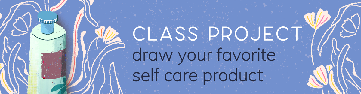
1. Class Trailer: Self-care looks different for different people. For some, it may be a relaxing skincare routine. For others, it may be an hour of drawing random things. Right rite here where the two things overlap, is this class. The perfect intersection of these two things. Drawing self-care products. Hi, my name is Esther Nariyoshi. I am illustrator and surface designer. I love showing my creative process to my students. Today, we're going to sit down and draw self-care products together. Drawing packaging is super and scary because they're basically simple geometric shapes being put together. We will start with a very unassuming box and turn it into this, and this, and this. You can be a complete beginner opening Procreate on iPad for the first time. No worries because I will walk you through every step of the way. Or you can be an illustration ninja, who knows the program like the back of your hand. Well, you're also invited because ninjas also need friends and this class is like a friend drawing with you. There. Welcome to my class.
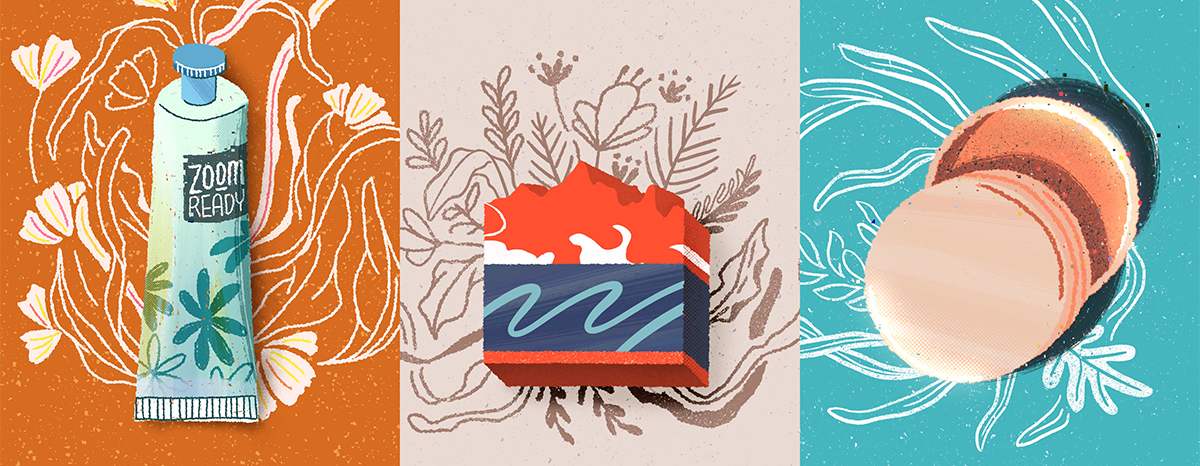
2. Class Material: For the materials of this class, you guessed it, iPad and Apple Pencil. I'll be drawing a handmade bar soap, hand lotion, and a facial cream, but you're welcome to use your own reference. The techniques should be very similar. Under Projects and Resources tab, you should be able to find some files that I've created just for this class. A brush reference guide listing some of my favorite brushes from the native brush library, and a digital journaling page where you can write your thoughts, take notes while drawing, just for the fun of it. Without further ado, lets get working.
3. Building Basic Shapes: In this section of the class, we'll draw a handmade bar soap together. So this is what your app looks like when you first open it. Let's get started by creating a canvas. You'll want to tap on the plus sign in a corner and then select your own canvas size. I'm going to go with 3,000 pixels by 4,000 pixels, and I will leave my DPI for 300, and I will hit "Create". By default, you will have a white blank canvas but I'm just going to add a bit of color to change things up. I'll go with this creamy color and maybe add a bit of texture on top of it. For the texture itself, I'm going to create a separate layer for it. You can just tap on your "Layer" icon and then maybe rename your layer by tapping on the "Layer" and then rename, I'm just going to name it as noise. For the texture color, I'm going to choose something that is a bit different but not too distracting. So this little purple seems to be fine, so I'm just going to go with it and see how it looks. I will use a brush that looks like dust. I picked this up from Creative Market. But for the rest of the class, I will stick to the default brush library. Depending on what color that you have chosen, you can also play with the opacity to make the texture a bit more subtle. With 5x and above, you have the ability to bringing your reference. All you need to do is to come over to the wrench icon here and then click on the "Canvas" and then toggle "Reference". You should have at least two options. The first one is to view the entirety of your canvas, and the second one allow you to insert an image. For this class, I've created a brush guide reference for you to use. You can download this image from our class resource area and then save it locally to our iPad. For our first illustration exercise, I'd like to draw a handmade bar soap. To get started, I'd like to use a very textured liner brush. You can find it under the Artistic folder. I believe the name is called the Tarraleah, this one in the middle. So I want to select my liner color. Remember that any color decisions that you make right now, you can still change your mind much, much later on. That's one of the huge benefits of digital illustration is that you can make your commitment almost last minute. That being said, I'm going to go with this very bold red color. I want to start by just drawing a big old rectangle. You don't have to be super precise because you can use the quick shape. What I mean by that is that if don't lift up your pen, just keep it on the screen with one finger holding onto your screen, you will have a perfect shape. If you would like to retain the hand-drawn quality of your shape, you can just double-finger tap on your screen and it will undo the quick shape and go back to your original drawing. I'll just stick with quick shape for now and later you will know why. To color it in, there are different options. The first one, of course, is how you approach a coloring book is to hand color everything in literally pixel by pixel. This approach gives you a pretty awesome texture and it's very therapeutic but also at the same time, it's very time-consuming. A quicker way to do that is to grab the color from the corner and then drop it in the area. Then boom, there you have it. Because the liner brush that we have chosen is pretty jaggedy on the edge, so when you do the color job, you might see this very thin line between the color content and the outline. So to fix that problem, you can just keep your pen on your screen when you color drop it, and then slide it left or right until you see that line has been filled. With that taken care of, I'm going to change the shape or proportion of our soap. So come over to Selection tool, make sure you're using free form and the Snapping is all turned off, and then you can just drag the handle to change to whatever proportion that you like and to re-position it. Notice that in the reference window, we can see the entire canvas, which is pretty neat especially when we work on the detail. To mimic the ups and downs of handmade soap, you can draw, but it seems a bit too smooth to me. So I'm going to cheat a little bit here by using Liquify tool, come over to Adjustment, and then click on Liquify at the bottom. So we're just going to focus on two main options. One is twirl left or twirl right, either way is fine. You basically just create tiny tornadoes to the points where we touch, which is pretty neat. It makes the movement a lot more natural. You can adjust the size, pressure, distortion, momentum until you're super happy about it. At any point, if you want to just walk back a few steps, just use double-finger to tap on your screen. For this class, we're only going to explore a few options here. But I highly encourage you to play on your own, just draw some shape and try all these options to see what they do. Once you're happy about it, go ahead and press "Push", which is the first option. It will let you push your shape in one direction. I'll make the middle part a bit higher than the edges. If you want to do some cosmetic fixes on certain details, you can use to Reconstruct tool. Basically, it will restore it to the original shape. It's the third to last option in the line-up. Seriously, I can do this forever, but I will spare you from that. So here's my final shape. Next step, we'll want to add a bit of dimension to our soap. Let's come over to your Layers panel and left swipe your soap layer and click on "Duplicate". Let's color the bottom layer a bit darker, still somewhat red but just a tad darker, so that it convey the idea of a shadow. So I'm going to just turn up the brightness, is the third option in your Colors panel. Just slide the slider a bit to the left and then color drop it to your shape. You don't see the change yet because it's covered by the first layer above. So let's click on "Selection" and then move it 45-degree down, so this will be the base layer, and then we'll just manually color in, just fill in the rest of the shape. We're roughly creating 45-degree lines connecting between the two shapes while just drawing on the bottom layer, still using the darker red color and using the same liner brush, and let's get working. If you want to draw a straight line, just hold your pencil down until you see the shape change and then let go. You can use the straight line as your guardrail and then just fill in the content in between. There's no super strict rule about it. Basically, if it looks great to our eyes, it's probably awesome. The goal of the first exercise is to get your hands warmed up, so don't overthink it, just go for it. I'll play some music here as we're both working on the piece. Somehow, all the places that I've been the only place where I fit in is here with you. Somehow, all the times that I was strong, I've known all along I'm there with you. This is a pretty cool stopping point. Now, let's look at our reference image and add a bit of texture to it. I really like this type of soaps that have marbling effect on them. For our project, I'm going to select a very contrasty color for our reds which is probably white. I know it's like Coca-Cola-ish, but I think it's easier for you to see from the screen if the color difference is very big. Now, let's create a layer at the very top for our white marbling effect. This time I want to use a brush that is smooth. This one is under Calligraphy and is called a Script. As you can see, I drew over the edge so that I can show you a little neat trick that's called Clipping Mask. When you open up the Layers panel, tap on the white portion, and click on "Clipping Mask". Basically, it will only show the overlapping part between the white portion and the red portion. This trick saves you tons of time when you draw because you don't have to be super careful when it comes to the edge. To mimic the marbling effect, we're going to revisit Liquify tool. It's under Adjustment, which is the second option, and liquify. So I'm going to use twirl left or twirl right, just to get things started. Another reason why I really love clipping mask is that it's on a separate layer, which means that we will have a lot of flexibility. Save that later on if you want to try out a different texture without deleting the first one, you can just hide that first layer and create a separate one to test it out. You can make your final decision later or you can just keep both. However, if you were to draw the texture on top of your soap layer, that means that if you do change your mind later on, you have to redraw the whole layer. So my philosophy is that I will have as many layers as possible. The more the layers are, the more flexibility your final work will be. Now, going back to our work, we have our white marbling only on one layer that doesn't look natural because a bar soap is 3D. To make it look more natural, we're going to extend the white drawing on the side of the bar soap. So we want to come to our layers and create a new one on top of the darker red and then turn that into clipping mask. For some of you, this may be a second nature to you already. So even before I mention it, you already know how to use it. But for someone who's new to the program, I might be talking too fast. Either way, you should be able to adjust the speed of the video over [inaudible] share media player. We're pretty much done with the shape portion of the soap. In the next section, I will show you different ways to add textures to our soap. I know it's an area that a lot of newer illustrator struggle because digital illustrations can look flat sometimes, so that's what we're going to work on together.
4. Adding Texture: In this section of the class, we'll work on adding some textures. To do that, I'm going to create a clipping mask layer on top of the bottom one. I'm going to long one finger hold the darker red to sample the color, and then I want to change the blending mode of the new layer to multiply, which is the first option. Basically, this will give us a darker shade of the red than what we have sampled. For the texture, I'm going to select the first brush under organic, and then I will just draw some very broad strokes. You don't have to be super careful when you draw because this is a clipping mask. We will not draw outside of the border. Depending on how textured that you want your soap to be, you can change the size of your brush and you can draw on top of your texture multiple times to make it even more expressive. You may have noticed that I only have the texture applied to the darker red. It's an easy fix. You just hold that texture layer and move it above the white clipping mask. Wallah. Now you have the texture applied to both. Now looking at the dark red texture against the white, it doesn't seem right. So I'm going to change just this inner section to maybe a grayish color. It's more like a grayish red, so it doesn't look super saturated. At this point, I don't want to physically paint on top of this, so it doesn't have both colors that will just be too distracting. Instead, I will just paint the existing pixels to a different color, and we can do that by using Alpha Lock. Go ahead and tap on your Layer and select Alpha Lock, and you will see the checkerboard pattern appearing. This function will allow you to change only the painted pixels but not affect the transparent pixels. It doesn't matter what brush you are using right now, just make sure you covered the white area. Even though we have two different colors, we still have the same visual consistency. A small detail like this probably doesn't matter to most people, but I think it's the small things that set your work apart. Next step, I'm going to add a simple label around the soap. First I'm going to select a color that is contrasty to both white and red. I'm going to use quake shape to draw a rectangle. Remember just one finger hold and then it snaps and then you can color drop it. As you might have guessed, I'm going to make this clipping mask as well so that it wraps tightly around the soap. You can click on the selection tool to move it around until you're happy about it. Because the next step, we're going to draw the other side of this label. Actually, I'm going to change the color a bit darker before I draw the other side of the label. Come over to adjustment, and the first selection, hue, saturation, and brightness and click on layer, which means that the entire layer will follow the adjustment. You can just play with the sliders down below until you're happy about it. At this point, I'm looking for contrast. I'm looking for a color that is darker or really light, so we can see the definition really well. Now I'm happy with the color. I'm going to start drawing the other side of the label. I will create a new layer that is above the texture, and then I will do a clipping mask so bad, I don't have to be super careful about not drawing outside of the border. I'll do a one finger long hold to select the color so it's consistent, and then draw 45-degree down. I will do enclosed shape so that I can use color drop, and you can see the enclosed shape from the thumbnail. Once we have that taken care of, we can work on the texture. I think I'm going to pick up the same texture brush. But in terms of color, I'll just do maybe a shade darker. In order to not draw upside of the edge, I'm going to do an Alpha Lock, which is double finger, right swipe or you can tap on the thumbnail and click Alpha Lock. You may wonder what's the difference between Alpha Lock and clipping mask. I have a class on Skillshare that is dedicated to explain the difference between Alpha Lock, clipping mask, and the layer mask. They definitely belong to the category of, they're the same but different. You're welcome to check out that class if you need a refresher. I've experimented with some textures for the label, but not really in love with it. Instead of cutting this part out, I would love to show you how to fill this layer with one color. For a texture to layer like this, it will not work super well with the color drop because procreate may recognize each individual patches of color as a shape instead of seeing the whole layer as one shape. To fix that, you can tap on the thumbnail and make sure the Alpha Lock is on and then tap on the thumbnail again, click on fill layer that will just color the entire area with one single color. This is the brush that I end up using, but I'm going to tweak it a little bit. If you tap on your brush one more time and you click on color dynamics and pretty much change everything to about 10-20 percent. Then you would discover the color shift in every stroke that you lay down. That's a really cool way to add texture to your work. The difference is pretty subtle if it's like only around 20 percent, but if you want the color to be a bit more drastic, you can always increase that number. But if you don't want to mess with the original brush, you can always just save a copy and then make all the changes on the duplicate. Here I picked up the calligraphy brush that we used before and then just draw a little wiggly line to add a little visual interest. We're pretty much done with the soap itself. In the next section, we're going to work on a floral background.
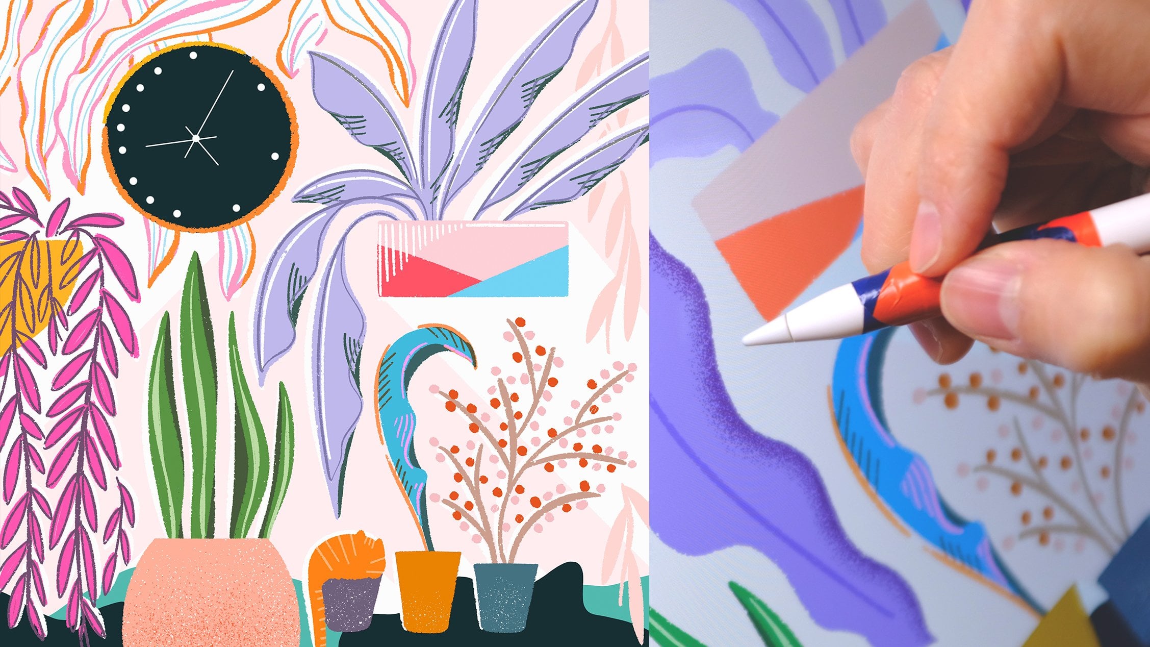
5. Adding Floral Background: This is what we have so far. I'm going to do a bit of organization here. I'm going to open up my layers panel and then just right swipe on every layer and then group them together. In this way, if I want to reposition the soap or resize it or recolor it, it can be done as a group unless I want to just change one element at a time. I'm going to move it down a little and make it smaller. You will see the proportion has changed, it's because I have the snapping magnetics turned off. I'm going to go back and turn it back on. Now when I resize it, the proportion is going to stay the same. Next step, I'm going to draw some floral decoration or foliage in the background. I'm going to create a layer between the soap and the noise, which is the textural layer for the background. I'll go with a color that will accentuate our soap, maybe something that is muted and quiet, and then I will go back to the liner brush that we had at the beginning. One thing I want to change before I start drawing is to make this brush a bit more smoother. Since we were just drawing squares, it didn't really matter as much, but now we're getting into curves. It will be super awesome if our curves can be a lot smoother. Go ahead and tap on your brush. Under the first category stroke path and the second option called streamline, turn it up a little bit. Let's see the difference. If we were to draw a regular S-curve here on the drawing pad with a streamline turned all the way to the left. The stroke is more true to your actual movement, but when you turn it all the way up, Procreate will do some smoothing for you. This is something that I use a lot when I draw curves. I would just start drawing some leaves and some very simple flowers. I don't really have a reference here. I'll probably just do some simple linework here. As you are working around the soap, feel free to turn your Canvas around so that you're always drawing at a comfortable angle. With that said, I'll just play some soft music and work my way around it. I'm pretty happy with how the floral arrangement ends up. Now I will work on some shadow over the floral so it doesn't look like it's floating. For the shadow, I'm going to create a clipping mask layer on top of the floral. Go ahead and create a new layer, tap on the thumbnail, and click on clipping mask. I'll use a darker shade of the floral color so it shows up better. In terms of brush, I'm using a spray paintbrush, so it's soft and dusty on the edge. It doesn't look as harsh. Make the brush a little bit bigger and then just draw around it. I like how the shadow layer makes the whole piece looks more grounded. It's looking pretty great so far. I think I'm going to do one more clipping mask so that I can add a bit of a highlight to the florals. For the highlight, I'm going to go with something pretty bold in terms of color and maybe choose a brush that is more solid. This yellow looks pretty good. I'm just going to go around and color a leaf or two here and there, just to make the entire piece more visually interesting so it doesn't look super blocky. I think this is it. I hope you are warmed up and let's get on to the next drawing.
6. Mid Class Review: In this section of our class, we're going to continue on our quest of drawing self-care products, we'll learn new techniques as well as revisit what we have covered. All right, let's get to it. We will start with a textured background like before, and we're going to use quick shape to draw a skinny rectangle. Then we'll color drop it. Before we keep on going, I'll show you what I intend to draw. Over here I have a tube of hand lotion. This is a roughly what we're going for, as you can tell a tube is not exactly a rectangle. We're going to change the shape a little bit by using the warp tool. Click on the selection at the bottom. The last category that says Warp. When you click on it, you will have a three-by-three grid. I'm grabbing the midpoint of our rectangle here to tuck it in a little bit, so the waist of the shape, if you will, looks a bit skinny. I'll also drag out the bottom portion so it's wider at the bottom. I will also make the top part a little closer so it looks more like a tube. Just think about toothpaste. Normal packaging I guess, that will help you to figure out the shape. Next step, I will move on to the color. I'm thinking something maybe cooler, but still very contrasty against our background. I think this is the ballpark. I'll just do a quick adjustment, so go to Adjustment, Hue, Saturation, Lightness and then just play with the slider until something clicks. Once you're done, I'm going to start drawing the little groves at the bottom. Depending on what type of look and feel you want to pursue, you can use quick shape to draw perfect rectangles. But I like the playfulness of the hand-drawn lines, so I'm going to go with that. It's super convenient to have the reference window in front of you when you are working on details. You can still see the overall picture from the window without losing the control over small details as well. Maybe the benefit is not super obvious now, but later when you have a lot more details, it's really nice. Next step, I will round the top, so it looks more three-dimensional. I will sample the color of the tube, and then I'll just use the same liner brush to finish drawing the arch. The edge looks a little bit too pointy, so I will erase that part off. Quick tip here. If you long hold your eraser, it will turn into the same shape as your brush. It helps your drawing to look more consistent. Now I will go back to the same liner brush using the same color as the groove. I'll just use a simple line to draw the definition of the tube, so it looks more 3D than flat. Next step, we're going to draw a little plastic cap on top of the tube. If you simplify the shape, it's basically a smaller cylinder with a larger cylinder on top. That's what we're going to do. We're going to start with the smaller cylinder. You can even just draw a rectangle if that's what you're comfortable with. Then just draw a little arch and fill it up with color. This color looks a tad too warm for me, so I'm going to click on hue, saturation, and brightness. Then click on layer to change the hue to see if I can tune the color down a little bit. I think I'm going to go with something cooler like a blue and you can also play with the saturation and brightness. This is a recoloring method that I like to use just to test how it works out with the environment around it because you can preview the color on the fly. I think I'm liking what I'm seeing here, so I'm going to just fill the rest up. You'll notice that even though I've changed the color to blue, my brush color is still the original yellow. You can just long hold to select the current color to fill it up. Now we can move on to work on the bigger cylinder on top of the smaller one, like the little handle. I'm going to use a slightly different shade of blue so that the two parts are not mushed together. Similarly, I'm just going to draw a wall first to cover it up and then maybe give it a dimension by extending it, adjust a little bit downward. You'll notice that I'm not really using quick shape at this point because I like my shape to be a little wonky. The wonkiness has character to our work. Just a quick reminder that don't forget to create new layers when you draw new parts, it will give us maximum amount of flexibility when we work on a piece. I have the two blue cylinder parts on its own separate layers, and even the tiny little white line that I drew has its own layer. I'll just continue on to finish up the little grooves here. Then to add more definition, I'll go back to the darker liner color and then just draw along the border of the smaller cylinder. It's almost like it's casting tiny shadows on the cap. I'm recording voice over here talking with my hands flying all over the place. I know you can't even see it, but I really enjoy the process. I hope you do too. Now we're done with drawing the shapes. I would like to add more texture to it, so I'm going to create a new layer on top of the cap, and then turn it into a clippie mask. I will change the blending mode to multiply. Currently, I have the same shade of blue selected, but because I'm using multiply, it's going to be darker when I draw. Playing with different blending modes is a very nice way to figure out colors, especially if you don't have anything specific in mind. In terms of brush, I'll go with this copper head that is under drawing folder. This is a native brush, if you go to Drawing, it's the last option. Somehow it seems like the blending mode has bounced back to normal, so don't worry, I'm just going to go back to the layer and then change it to multiply. You will see that effect automatically kicks in, so that's pretty nice. Let's go back and imagine our light source coming from the upper left-hand corner. It's going to cast a bit of shadow on our cap. That's what we're going to deal with next. Like always, we're going to start with a new layer on top of the lower cylinder and then turn that into a clippie mask. This time I'm going to change the opacity of my brush instead of the layer and then cast a very soft shadow. When it comes to opacity, I usually change the opacity of my layer inside of my brush. However, if your layer itself has a lot of different opacity, then it's better to change the opacity of your brush. Our layer here is by no means complex, but I just want to show you there's option of changing your opacity of your brush instead of your layer. I'm just scrolling through different blending modes for the fun of it. Sometimes you get really pleasantly surprised by a different effect by toggling different blending modes just for the fun of it. I think that we have the top part of the tube taken care of. I find it very relaxing to work on a tiny part of illustration and elaborate what I was thinking before taking on a larger part. Especially if you're going to use the same treatment, it's easier to test different method on a small part to see if it works out before you take on the whole illustration, if that makes sense. That being said, I think I'm going to add the same treatment to the body of the tube.
7. Brush Techniques: This brush I'm using is called oil paint underpainting, like what we did in the first lesson. I'm going to tweak the color dynamic a little so that each stroke has a slight variation from color to color. For this piece, I like my variation to be subtle so I won't go over 20 percent. But I encourage you to really play with those sliders and see what they do. You will probably find your style and your preference into process. If I zoom in, you will be able to see the grain of the dry brush, which I find really charming, because sometimes digital illustration gives you a flat look. A nice textured brush will really make a difference. One thing about tweaking the color dynamics is that the color is randomized so you can really predict. I'm just laying down different colors until I see a good combination. I think this is a really good stopping point. Next up, I will erase the groove part, the bottom part of it, so that visually it can be distinguished from the body itself. I just grab the eraser and then gently erase it off. By the way, if you want your eraser to be the same shape as your current brush, you just long hold that eraser. I think I've covered this before, but this is so cool. I just want to say it again just in case. If you look at a hand lotion package like this, it's very crinkly on the surface, especially after the first use. I wonder if we can use a brush to reproduce that crinkly texture. This one I've selected is the first option under organic. That's the same brush that we have used for our soap texture. I think this is pretty close to what I'm looking for like parchment paper-ish, keeping the light source in mind. We want the texture on the right to be a bit darker, and the left to be a little bit lighter. While it turns out that it does produce the crinkly texture, but it's a little bit too grungy for me, so I'm going to look for a different solution. Well, I suppose that I could've cut this part out, but by including it, you can see the flexibility of digital illustration in real action. Because we have the first crinkly texture on separate layer, we can just delete it if we don't want it. We can just move on from there to search for a different texture. The one that I'm using right now is under the Vintage folder, it's called honey eater. Right now, I'm just tweaking the color so that it looks lighter on the left and looks darker on the right, so that it looks like our tube has a belly to it in the middle. The shadow looks tiny bit too solid, so I would just turn down the opacity, maybe to half, like 50 percent. Now, so I want to play with the blending mode to see if another option would be more natural. Normally, I'm a very task-oriented person, I just like to get things done. But drawing is different, because I like to analyze the process and workout and understand why something works, why something doesn't. It puts me at ease without having a clear end goal for my personal creative projects. This is entirely different if you're working on a client project, because you have to find a happy place between what you want to do and what the client needs. Moving on, I think I'm going to add some additional stylized highlight, maybe choosing a very grungy brush. I don't quite know what I'm looking for yet, so I will just create a layer and then turn that into a clipping mask just in case. If I end up regretting what I'm doing, I would just delete that layer, no harm done. After a bit of testing, I end up with this thin dry brush. I like how it adds to the overall character of our illustration without being too distracting. I will probably add the same treatment for the shadow portion of it. I'm pretty happy with the look and feel of our tube, so I'm going to add a label on top of it. Again, I'm going to create a separate layer just right on top of the body of the tube, preferably a color that is very contrasty. You can go with white, but I think I'm going to go with maybe darker green here. Just to keep things consistent, I will use the same liner brush that we have been using. Just a simple label that goes across half of the tube. Just to keep things interesting, I will color manually this time. When you do that, it's helpful to turn down the streamline in your brush setting. By doing that, your strokes will actually reflect your movements. The program is not busy trying to keep your curves smooth. What I just did is to hold the layer and move it above all the textures that we just worked on, so that it looks more like a label on top of the tube. If you choose to go with this route, just be careful that you don't color every pixel. Otherwise, it would just look the same as the color drop. The charm of the texture is that it has blind spots, if you will, here and there so that it maintains the hand-drawn look and feel to it. This is a good stopping point. If I want to work out more, I can always come back to it. Our tube currently looks a bit floaty, so I will add a shadow to make it more grounded. I'm creating a layer between the tube and the textured dusty background. Just to make things a little bit more clear, I'm going to rename my dusty texture layer to noise. I'm using the scribble feature so that I don't have to drop my pen to type. Going in with a color that is not a pitch black, maybe a warmer black that is more on the darker brown side. I will go with the brush that is under Spraypaint and maybe the medium nozzle, so that it's softer on the edge. It looks a lot more solid than I intended to be. There are a few ways to fix that. My favorite way is to go to the brush setting directly and then turn up the spacing. It just makes any brush a lot less denser. I'm using a pretty large size for the brush so that it looks a little more spread out instead of having a very thin line. You can do multiple passes if you want your shadows to be a bit denser. It's always easier to lay down multiple layers instead of subtracting from one existing layer. But if you do want to subtract, I have a little trick for you. To maintain the same consistency, you want your eraser shape to be the same, even bigger or smaller depending on the shape, because a different brush will give you a very abrupt transition like this. Well, unless of course, if that's the effect you're looking for. Switching to the Spraypaint brush as our eraser shape. You can easily see how gentle this brush is against our original spray paint shadow. In this way, our tube will look more grounded. Then you can always play with the blending mode or opacity of the layer, just to make sure it sits nicely against our background. I'm pretty happy with how it ends up, so I'm going to do my organization here by right swipe all the layers that I want to group together. Now, I just want to do a final reposition before I start drawing my florals beneath it.
8. Bringing It Together: I'll start everything on a new layer between the background and the object. I'm pulling out the reference window again so that I can see the entire canvas while working on details. As you're working on your own foliage and florals, I encourage you to challenge yourself to make the leaves and the flowers overlap. It looks more interesting because of the interaction. Also when you are working on the individual leaves especially the long ones, make sure you have them twist and turn so that they don't look super flat. If you're interested in learning more about botanical illustration, I have a class for that. You're welcome to check it out. It will give you some ideas and inspirations on drawing florals. For the next couple of minutes, I will start some soft music as we work on the florals together. I'm pretty happy with what it ends up being. I think there might be one thing that I want to work on. There's always one thing that you can work on. Anyways, I want to work on this body of the tube because in comparison to everything around it, it looks a little bit too flat for me. I think I'm going to try out the manual color technique just to see if the texture will tie everything together more consistently. I'll sample the same color, but create a layer underneath the original shape, and I will turn the visibility off for everybody else except the two layers. You can just long-press the check-mark, and then only that layer will be visible, and then I will make the layer above visible but less opaque so that it can serve as a guideline. I'm really liking the charm of the hand-colored technique. I think I'm going to replace the original. I'll just simply delete the original and all the clipping masks will automatically cling to the layer underneath, which is the layer I just drew. I'm talking about all the five or six layers above. At this point, you can really call it a day. It looks pretty awesome. You can stand up, walk around, stretch, do whatever, get your fourth coffee, and I would love to show you more things by using some of the newer functions in Procreate. Right now I'm just creating one clipping mask just to lay down maybe a couple of paint strokes, nothing too drastic. Then I will come over to Adjustment panel, and the first option, hue saturation and brightness, to change the color. Eventually, I want to use the two new strokes as my base to add halftone effect. If you go to Adjustment down the list, click on "Halftone", and then layer, and you should be able to just slide left and right to change the size of the halftone effect. Before this function showed up, I had to use halftone brushes, but it's really neat to have the capability already built-in. I highly encourage you to play around and click on different sliders and tabs and see what they do. This is what I've decided eventually. It's somewhat of a subtle effect.
9. Adding Lettering: To keep on playing, I'll make this label a tiny bit taller so we can add some lightweight lettering. When you change the size of an existing shape, you want to make sure the size of your brush is relatively similar, so it doesn't look distracting because the whole piece needs to look consistent. Next up, I'm going to give it a name. You can name it lotion or cream, or you can name it something completely outrageous. After all, this is your own drawing. You can do whatever you like. The drawing still looks like a makeup product to me. But I also want to do something a little more playful than just plain lotion. I'll name it ZOOM READY. You know the feeling of waking up just a few minutes before a Zoom call, and with this magic product, you just pop it open and it will get you ready in seconds. We can all use products that make our life a little less awkward. I know I mentioned that this is lightweight lettering, but it's still lettering. I'm going to dignify the letters with a tiny bit more shadow, so that they look like they have been loved. Last but not least, we will add one last, I promise, one last effect to our label. Click on Adjustment and Clitch. Click on layer and then just go crazy with the sliders. Not too crazy. The goal here is to call attention to the name because it's fun, but not too much attention. You know what I mean? Okay, people, I think this is it. It's time for another stretch, another coffee, yoga, whatever. In the next lesson, I plan to show you a bunch of newer functionalities that came with Procreate. But we won't be drawing from scratch, but still buckle up.
10. Advanced Techiniques: As promised, in this lesson, I will show you a few more tricks using an existing graphic. Over here I have things set up pretty similar to what we have done before. Say that you are wondering what other color possibilities that you can use to change the scene a little bit. With the whole group selected, click on Adjustment, Gradient Map, and then Layer. At the bottom of the screen you will see a bunch of mysterious names with some color palettes. You can scroll through. Basically this will let you replace the existing colors with a new palette. You can use the existing ones and tweak on top of that. For example, if we were to go with this palette, you can click on the little rounded squares and move it around and see if you like the result. You can also tap on one of the squares to change the color, and you should have the full control of where you want the color ends up being. You see that you will have the real time preview as I changed the color, which is pretty neat because sometimes is just hard to imagine what a color could affect the whole composition. I'm just hopping around to change other scores as well. I'm using the color wheel to tweak the color, but you can also use other modes as well. I suppose that I can give you a textbook definition of what gradient map is, but you probably won't remember that. The most important thing here is to follow how you feel. Expressing creativity is not really a hard science and there's no right or wrong answer. Just play with all these knobs and sliders and see what it will do to your composition, whatever yours look like. Once you're happy with it, just click on Done at the corner of this small window. To match up with the new color, I will maybe brighten up the background as well. I'm going to go to my background layer and then just change it directly from there. When you work on the background layer, you can also preview the color changes real-time, which is pretty neat. One thing I have done differently in this set of graphic is that I have flattened my object into one layer. Which I haven't done previously, as you can see, the layer is at the very top, but this flattened layer is a copy, which means that I still have all my original layered structure downstairs. They have been grouped and hidden, because I want to show you this new trick. So come over to the adjustments and down the list, click on Blum and Layer. This will produce glow to your image, for that single layer. It's a pretty cool lighting effect, maybe it's not super obvious here, so if I turn the burn all the way up, you can see the leaking of the light. This effect will save you tons of time trying to hack it by using blur, and different blending mode. Depending on what colors that you have chosen at this stage, you should be able to play with it and have a pretty cool effect. Your numbers or percentages might look different than mine, but just play with it and see where it leads you. I'll play with the size and the transition, until I see the little lighting effect, the highlight on the upper left-hand corner. Nothing too drastic, just a little bit. The next effect we're going to cover is called glitch. It still under the adjustments panel. Down the list, click on Glitch and then Layer. By the way, the layer just means that when you do changes under that effect, it affects the whole layer, but if you want your effect to be only applied locally, you can use pencil. The size of the pencil would define the affected area. Under glitch, there are four different categories. We're just going to work with the artifact, but feel free to play with all those different tabs and see what they do. What I'm looking for over here is to create small dusting effect, nothing too crazy, but just give you enough visual interest. Since we have talked about the difference between the layer and pencil, let's give it a shot. Let's try another effect called noise, it's down the list under adjustments and click on Pencil. I'm just looking to add some noise in the content of my container, I guess on the surface of it. Since we have the privilege of undo, I'm just going to try a random percentage and see how this effect affects my graphics. One cool thing about effect is that not only this one, but most of others, is that you can still play with the sliders while previewing the effect on the fly. I'm looking to add a bit of green, but not making it too distracting by being super greeny. I'm just playing here until I find a sweet spot. You probably already realized that I'm giving you a very abbreviated version of my actual creative process, I do walk you through every step that I take. But before that, I actually did all the drawing and stuff, which takes a lot longer to do. Frankly, it's really fun to take all that time to figure out what you like and what you don't, and what each button does. I really encourage you to take the time to play yourself. I would love to see what you create under the project gallery. Until next time, have fun.
 Esther Nariyoshi, Teaching Illustrator based in the US