Transcripts
1. Introduction: Welcome to this class, Designing with Type,
Typography for Non-Designers. Where I'll be walking you
through a few of my tips and tricks for how to
use type and typefaces. We will be talking about the
emotion behind a typeface. How to lay out text. You can get your viewer
engaged to read more, and some tips on how to
work with body copy, so it's easy for people
to read and digest. This class is aimed
specifically at non-designers. This is for people
who use type for presentations or
social media graphics, but they haven't had any
training in typography. By the end of this short course, you will feel more
confident using type, and how to use it effectively to communicate the right
message to your audience. Hello. I'm Faye Brown,
and I've been teaching on Skillshare since 2012. I'm a graphic
design and branding specialist based in the UK. I'm a big typography geek who could talk about
typefaces all day long. However, in this class, I'll be condensing
this down into a short snappy 20-minute
class that will give you the know-how to use typography more effectively,
so let's dive in.
2. What Is Typography?: What is typography? Put simply, typography
is the art of arranging or designing letter forms. I like to describe typography
as your visual voice, although really that's not what a lot of graphic design is. It's communicating a message
without having to speak. We take it all in visually. Having a knowledge of
a few typography tips and tricks is a really
useful tool to have. I really became
fascinated by typography when I did my graphic
design degree course. It's a really big area to cover. Today we're going to
mainly focus on typefaces and how each can have
their own personality. As we go along, I'll
introduce you to some typographic terms
and a few tips on how to layout blocks
of text that's interesting for the
reader to follow. There are a number
of projects you can choose from for this class. You can choose one or
all of them if you like. The first one will be to
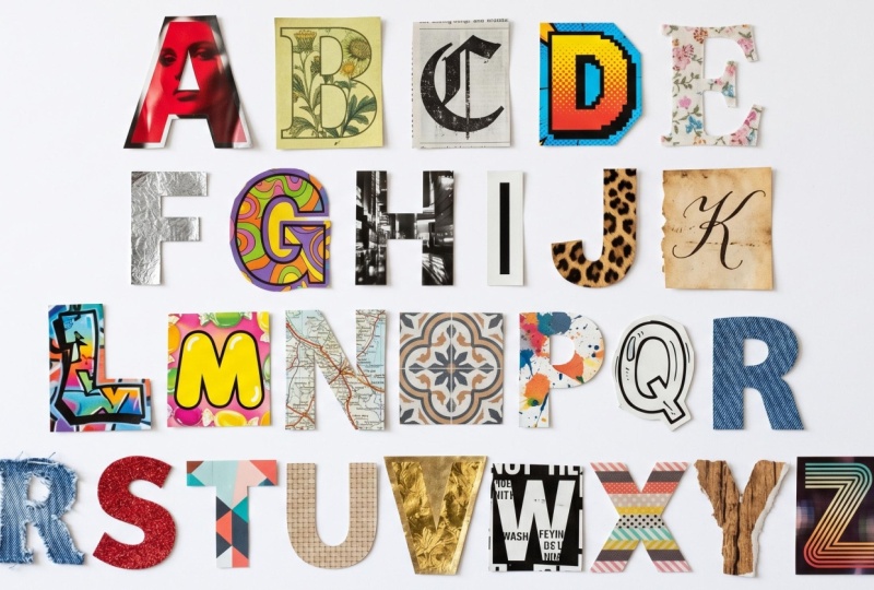
go on an alphabet hunt. You can take a camera
out and about and search for every letter
of the alphabet, ideally all different
styles too. Here's one I did on a
recent break to London. This project really
helps you realize all the different
styles of typefaces. As you go think about what
styles are being used for what and how do those
type faces make you feel? Maybe it's a shop. Does the typeface make it look expensive or more
budget friendly? Does it make it look
serious or fun? Does the typeface
look approachable or maybe a little bit scary? Is the typeface easy to read? Alternatively, maybe you fancy doing this
project on a rainy day, so you could use
magazines instead to find all the letters
of the alphabet. Try to use different magazines and see how they're using
typefaces in different ways depending on the subject matter. My son's Minecraft magazine uses very different typefaces to ideal Home Magazine,
for example. Just think about all of this
as you collect your letters. An alternative to this
is to pick one letter, maybe it's the first
letter of your name and try to find as many
different examples of that letter as possible. This might be harder
depending on your name. Here is an example of some
F's I found on pinterest.com. But it's more fun
if you can get out and about all look
through magazines. If you can find a mix of
uppercase and lowercase letters, that would be good. Uppercase letters
are capital letters. They are called
uppercase as back in the days of using metal type, the capital letters would
be kept in the top drawer. Just in case you ever wondered why they were called uppercase. By picking one letter, it helps you see all
the varying ways these letters can be drawn, even though the basic
shapes will be the same. Also included in the
class resources is a PDF of alphabets and numbers
of all different styles. You'll find this in
the resources tab. If you have tracing paper or
a thin piece of white paper, have a go at drawing
over these letters. It's a really good way to
understand letter forms and different styles
of typefaces. Also those a little bit
more confident in drawing, try redrawing them
without tracing. Those are your projects. I'll keep coming back to those, but now let's talk
in more depth about how typefaces can have
their own personality and how the typeface
you choose can change the way you read a word.
3. Choosing Typefaces: Choosing the right typeface. Can a typeface really evoke an emotion? Let's take a look. I like to use the word love
and school for this exercise. Let's start with love. Here's four different typefaces illustrating exactly
the same word. How does each one make you feel? Color can also play a big
part in visual design, but I'm purposely not including
color in these options, it's purely based
on the typeface. Pause the video if you like, and make some
mental notes on how these typefaces might help illustrate different
forms of love. I think the top left, is very friendly love. It's quite classic. It's a little bit weddingy,
if that's a word. It's an easy flowing love. The top right is
somewhat different. It looks a bit
scary, tough love. I can imagine this on an
album cover by a rock band,. The bottom-left love
is fairly modern, it's very confident and bold. Then a soft way with
the curved edges and roundness to some of
the shapes and forms. The bottom right love looks
very innocent and childlike. It's the love a toddler might have for their
favorite teddy bear. Now whether or not you
saw these words in exactly the same
way as me or not, doesn't matter, but
I expect there were similarities between
our thinking. You probably wouldn't
see the top right one on too many
wedding invitations. Just by choosing
different typefaces, we can shape how the reader
might relate to the word. Let's look at the word school, which is not such
an emotional word. Again, pause the video
and have a think about how you relate to these options. What do you think each
school might be like? The top left one for me, looks very traditional
and proper. I'd expect the school
to be well-established, serious in its
approach to education. The top right one
looks more fun. Maybe this would be
good for dance school. The bottom left one, this one reminds me of an
American sports college, I'm getting vibes of it
being very sporty school. The bottom right looks
like maybe a stage school, something quite loud,
and unexciting. You can do this exercise
with your name too. Let's say I was
designing a logo for someone called Charlie Hooper. We don't know what
gender Charlie is, we don't know what Charlie does, but just by looking
at these typefaces, we might start to form ideas in our head of
what Charlie does. You can have a go at finding
a typeface for yourself. There's a great website
called Font Squirrel, which is full of free typefaces. You can click on some
of the terms here as a starting point
and then click on Test Drive where you can type in your name and
see how it looks. Think about your personality. Does it feel right for you? This one is probably a bit too fancy for me, as an example. I liked that it's quite
friendly and bold, but a little flourishes
it has and maybe a bit too much and it's actually
quite hard to read. Another great website to look for typefaces is
creativemarket.com. You can search for fonts, and if you click on a bundle, you can again test
drive them all at once. These ones do cost money, but it's still quite
a fun exercise to do. This helps me compare
them easily and see what might be best for me. This was from a modern bundle, but you might want to go
for something much more decorative and funky
like this one. Just think about
your personality and what style might suit you. This is basically the
process that I go through when I'm
designing logos. Thinking about the personality
of the letters and how they reflect the business or person that I'm designing for. Have a go for yourself. What will help you
get started with this is knowing a
little bit about type classifications
from service to self service to script
and handwriting fonts. We will now take a
look at a few of those to help you
with your searches.
4. Type Classifications: Serif. A Serif font has small strokes at the
end of the characters. Serifs are usually associated with more traditional
typefaces such as Times and Garamond but many of the more modern
typefaces use Serifs, whether that's bracketed
like Garamond here or slab Serif like Rockwell or a
wedge Serif like Birch. Many books are written using traditional Serif
fonts like Garamond. The serous help form a link
between each of the letters, which in turn helps the reader's eye flow across a line or a
paragraph of type. The more traditional
Serif typefaces can help something look
quite businesslike, trustworthy, and
established, but they can also give off a vibe of
being a little bit boring. Sans Serif. Sans Serif is simply a typeface without Serifs,
sans, meaning without. The most famous
Sans Serif typeface is perhaps Helvetica, as seen here on the
New York Subway. A simple typeface family like this body copy which is in
Montserrat is easy to read, and it aids readability
for the reader. We often see Sans Serif
typefaces use on websites, although Serifs are making
a bit of a comeback. Sans Serif typefaces
in general will communicate a bit more of a modern approach
to the business, friendly, and accessible. If you are aiming at
a younger market, you might opt for a
Sans Serif style. All typefaces generally
fit into being a Serif or Sans Serif but then there are other styles in
terms to consider. Script-style typefaces
were developed in the 17th century based on writing techniques
using pen and ink. Since those days
other script styles have developed and
became very popular. Script styles can really range in their messaging from formal and elegant to heavy black
letter that's edgy and loud. Comic book styles can be
fun depending on the usage. Try to avoid Comic Sans. Comic Sans has been
used, overused and also used for inappropriate
things like warning signs. There's a warning
sign in our town about being electrocuted
and it's in Comic Sans. It's got a bit of a bad
reputation amongst designers. Although apparently,
it is one of the easiest typefaces
for children to read. Decorative typefaces
take in a lot of styles from ones like Budmo
Jiggler and Rosewood, they would only be used
to really grab attention, so headings, posters, possibly
logos in the right way. Decorative can also take
in styles of scripts too. Typewriter styles like this one are pretty
self-explanatory. This style can work
really well for dictionary definition
style designs. Stencil styles are typically typefaces that have breaks
in the letter forms. They are often used for army-style references and
also top secret documents. Display many previous
styles we've spoken about would come under this category but when doing font searches, this category would show up options that are great
for larger text, so headings and posters, somewhere work for
logos as well. Handwritten. These can also fit into script
because of the style, but handwritten typefaces
are very popular and can add a friendly
personable feel to the text. It's not just the
typeface alone that can help with communicating
a message. Using size and weight can also
be used very effectively. Let's take a look
in the next video.
5. Size and Weight: Size and weight. The next
slides you will see are often the same sans-serif
family called Gotham. Within that family, we have thin weight right
through to ultra. The letter shapes are
based on the same shapes, but the weight make them
look very different. If we want to create a
feeling of calm and quiet, a thinner weight
might work better, but if we want to shout about something or alert people
to possible danger, a heavy bold weight will grab
people's attention quicker. We can also use size to help
us with our messaging here. We can whisper or we can shout. Let's look at how this can be used in something called
typographic hierarchy. This is when we want to
invite the reader in and let that I follow the
information to eventually read, maybe like a full article. Let's take this as
a brief example. Let's say you saw
these two squares pop up on social
media or a website, which one are you
most likely to read? The one on the right
invites you in. It gives you an idea of what
the rest of the paragraph might talk about in digestible
chunks of information. Let's look at how
magazine designers do this within layout design. We see the headline. It's the
biggest text on the page. We see the subheading, which is the probably the second biggest text on the page. We also have a pullout fact which you'll probably read
after the subheading. By this point, you probably know if you want to read
the whole article, the rest of the text
is called body copy. Our eye skirted over the key
information very quickly, thanks to the way the
text has been laid out. When it comes to
layouts like this, we wanted to make sure
the text is easy to read. Some type faces are actually
quite hard to read, although you can get away
with them at bigger sizes. This typeface friendship
is quite fun. As a header typeface, it would work well on a poster. It looks friendly and quirky. It's also bold and easy to read. However, if we then use the same typeface for
a block of body copy, suddenly becomes a lot
more difficult to digest. It would probably give
me a headache if I read a whole paragraph written
in this typeface. Why is that? Let's take a look at body
copy and a few tips for making lots of
texts easy to read. First up, we might choose a fairly simple serif
or sans-serif typeface, nothing with too much character as this will make
it harder to read. Save those typefaces
for headings. Let's choose Georgia. I have set this
at 9 points size, which is generally a
good size for body copy. There's a few things
that we can do now to make this easier for the reader. First step, this is a big block of text
with very long lines. It's actually quite
hard for the eye to read a line of
text this long. Let's split this
into two columns. You'll see this in
magazines a lot. There will very rarely
be long lines of text. Between 10-15 words
on a line is usually a good amount, or
60-70 characters. By characters I
mean the letters, the punctuation, numbers, etc. The other thing
we can look at is the space between
each of the lines. This is called leading. These lines are
fairly close together and they make the text
look quite clumped. There's not much
whitespace around the lines to rest the eye. See what happens when I change the second columns line spacing, suddenly looks a little
bit easier to read. Although if we push it too far, it can mean that
I find it hard to meet backup with the
start of the next line. It's getting that happy balance. I was always told if you have a type size point
around nine points, generally, a good
line spacing would be 3-4 points above that,
so 12-13 points. This will depend on
the program you're using to how easy it would
be to see those values. I use Adobe Illustrator a lot, but that's an expensive program. On Canva, you don't have as much control
over line spacing, so then you are
trusting your eye. Hopefully these
little pointers have helped with what
to look out for.
6. Kerning: There are many typographic
terms I could talk about, but it's quite a lot to take in, and really it's something
to explore more if you get into graphic
design in more depth. But one more term
I would like to introduce you to is kerning. Kerning is the space
between letters. Once you know about kerning, you'll start spotting
bad kerning everywhere. Let's take the word start. Generally, most
typefaces have preset kerning when you use
them on a computer. But sometimes the free
ones might not be great and you need to adjust
the kerning yourself. I might want to bring
that A closer to the T as there is
a bit of a gap. I'm worried that if this
was a big word on a poster, that gap might make the
readability harder. Maybe it will look like
st art instead of start. You can use letter spacing to our advantage if we want to
add messaging to a word. For fast, I might close
up letter spacing. Also, I might make it italic so it looks like it's
going forward. For slow, I might widen that space so the
word is read slower. If you are designing a poster, I wouldn't suggest
you start messing around the letter spacing of each word as it will then start looking messy
and inconsistent. But kerning is a
good term to know about when it comes
to typography.
7. Your Projects: So let's look back
on those projects. Now you know a lot
more about typefaces, the emotion a
typeface can convey, and the different
classifications of typefaces. Go out and explore and see
how many you can find. Make a mental note of what typefaces have been
used for what? Do they help get
the message across? Or would a better style
typeface work better? Build your alphabets from photos or cut out of magazines and have fun really getting
to know letterforms better. Then why not have a go at
creating your own typeface? You can use a site
like calligraphr.com who do have a sign-up, although you can get
started for free. Then you can print the form out and fill it in with
your own letters. You can simply hand
draw your own letters. Think about the letter
shapes when you do this, some letters might take
a few goes to perfect. You could use Lego, paper
cutouts, pasta blocks, potato print stamps,
stones, ribbons, coins. Maybe use your initials
to come up with some creative ways
of making letters. But mostly just have
a little bit fun.
8. Conclusion: That's your introduction
to typography. I have two other classes
on this subject, The Art of Topography. It was my first ever
Skillshare class that goes into this area
in a lot more depth. Choosing the right typefaces explores that area a
little bit further too. I can't wait to see your
projects as I love typography and I would love to
see your alphabets from all around the world. If you'd like to join my
dedicated Facebook group and to my Skillshare
students, then please do. I'll pop a link in the
notes below on this video. I hope you've
enjoyed this class. Please leave me some
feedback if you did, and what other subjects you might like a short class on too.
 Faye Brown, Faye Brown Designs